MA U3: Reflections on Unit 2 feedback

FEEDBACK

There were two sets of feedback at the end of Unit 2 that I want to capture here, then I will reflect on both sets together at the end. The two sets are (1) Group feedback on my 3 minute video and (2) Unit assessment feedback.

1. Group feedback on my 3 minute video

At the end of Unit 2, we each made a 3 minute video about our art practice. Then the videos were shown to the class and we gave each other feedback. I am very grateful for the thoughtfulness of the feedback I received and I would like to capture them here.

My 3 minute video:

https://eliza-rawlings.com/2024/11/24/ma-u2-3-minute-video/

Firstly, my fellow MA students each completed a note on Miro after seeing the video and below are the notes they wrote for me, captured from the Miro board in no particular order:

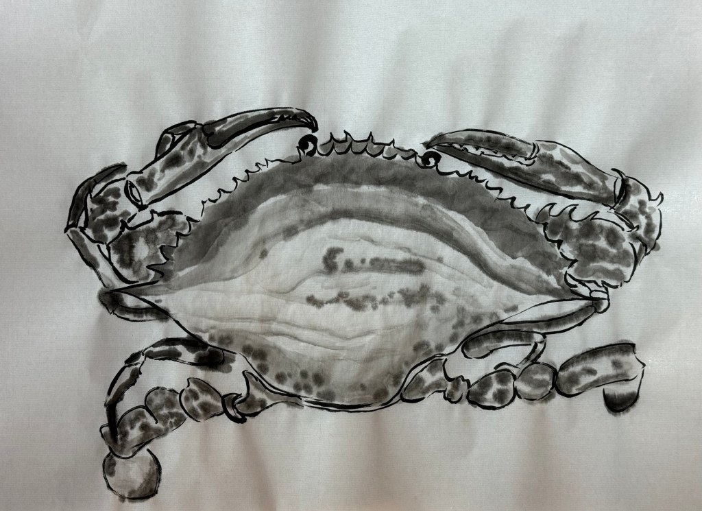
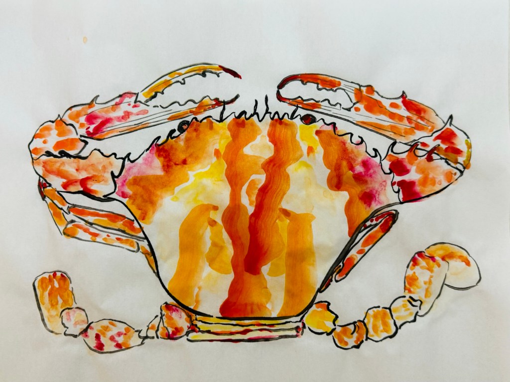
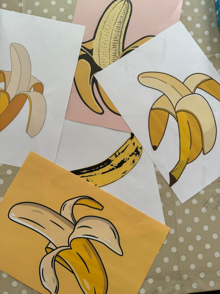
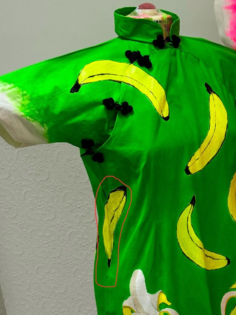
Ashton   I feel… ‘wow’ed by the consistent high standard of your work, 2!; amused that you described it as a pick and mix!! I also feel shocked to learn why the banana has been used in regards to racial slurs, I did not know that until now, and I feel impressed at the way you responded to that using humour when it’s a hard hitting subject.   I wonder …how this will continue to develop as there’s lots of paths combined to create these pieces – current/hidtorical racial prejudices and how they occur, cultural symbolisms, food connotations etc.    I think… the fact that you can split your work into what continues your narrative vs develops your style / technique is a very good understanding to have, and not something I’ve considered before. That you can still be developing your art practice even if not confronting heavy subjects, that it doesn’t have to pause in times you feel able to continue the narrative.

Sara   I feel… a lot of joy in your textiles work and curious about where it may lead to   I wonder … how this may link to other current affairs such as the example of the coconuts.   I think…your work appears well thought and considered with lots of interesting connections and a great use of metaphors.

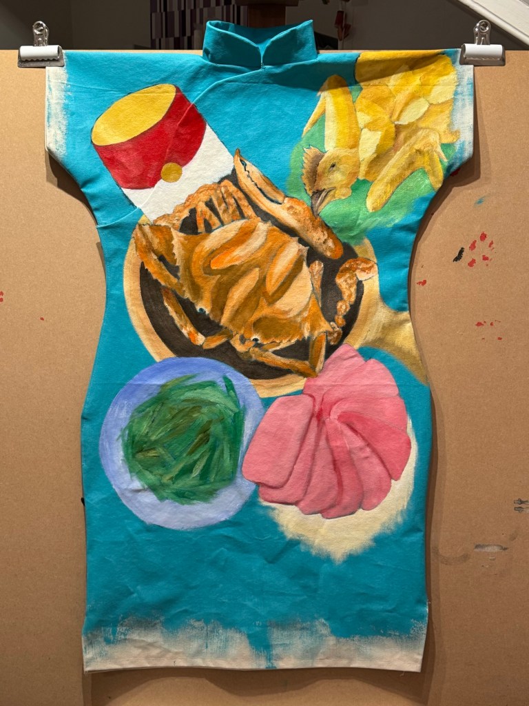
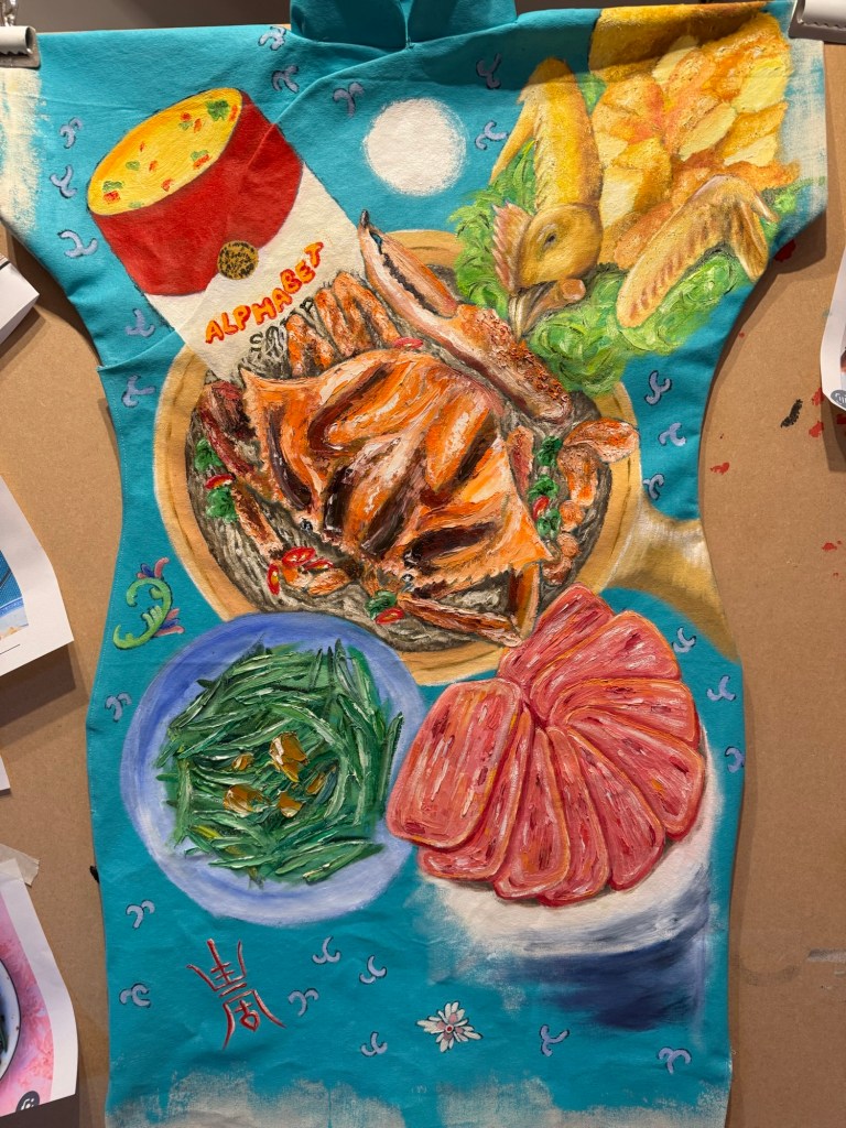
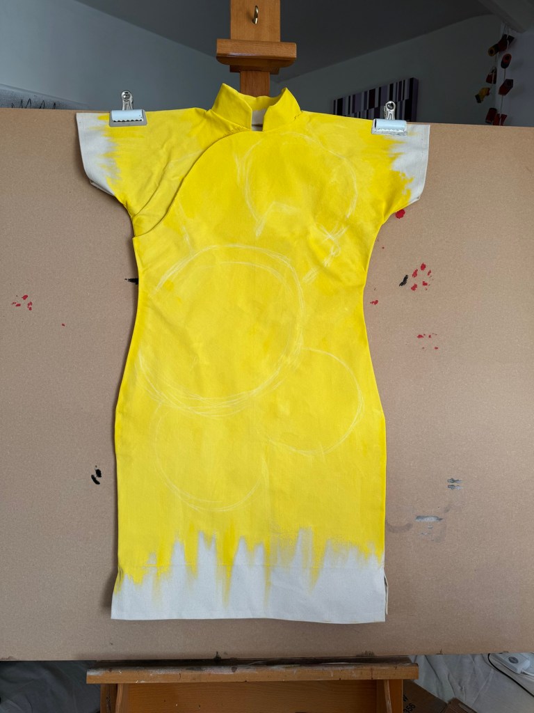
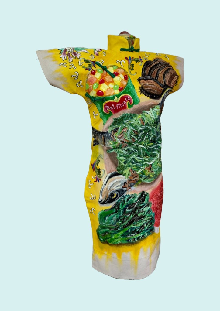
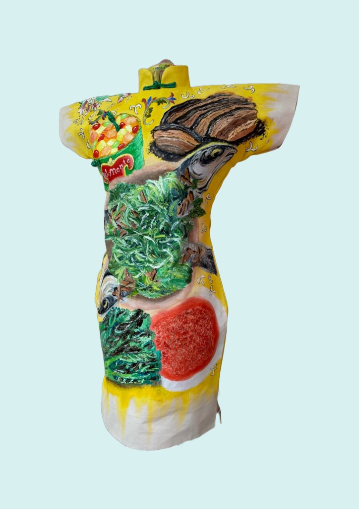
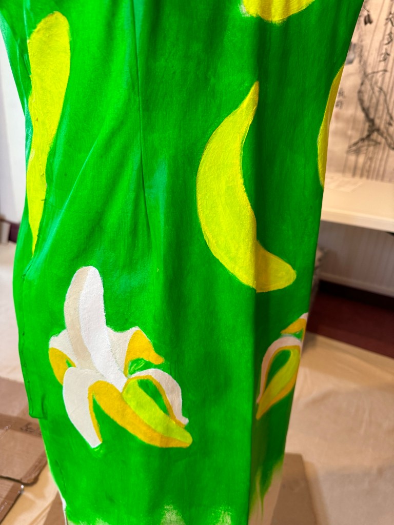
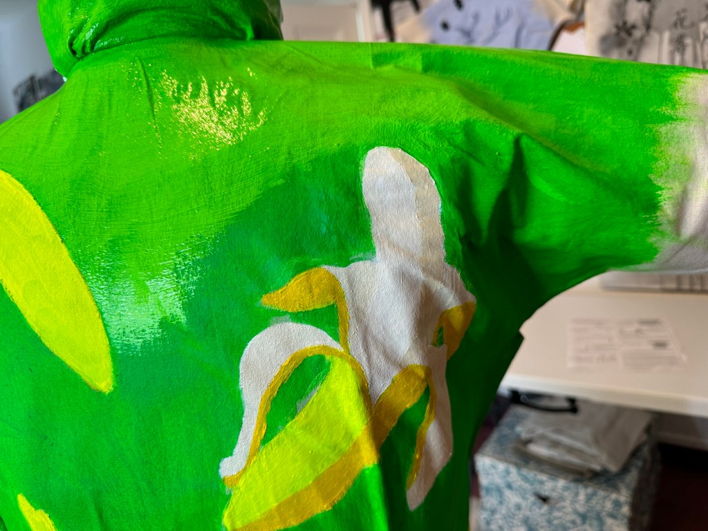
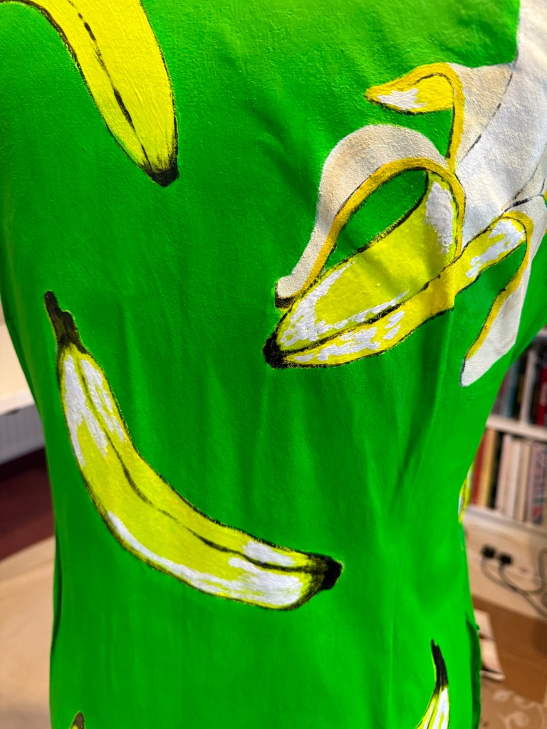
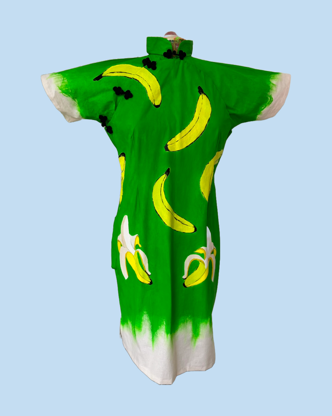
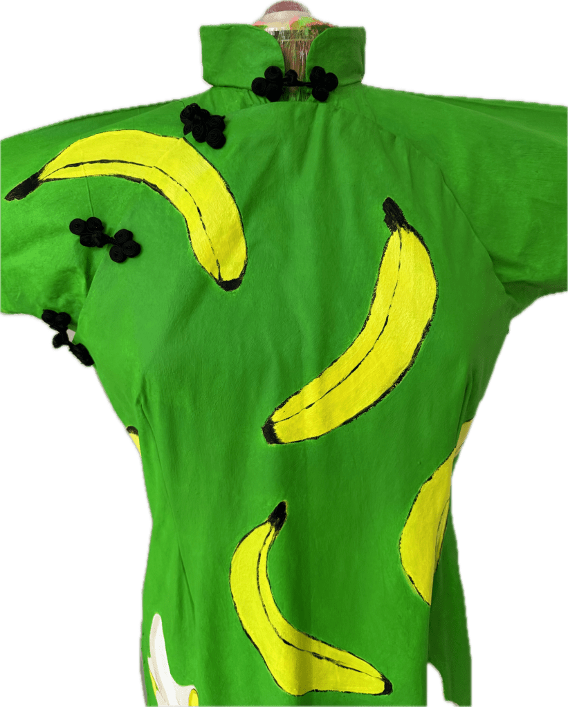
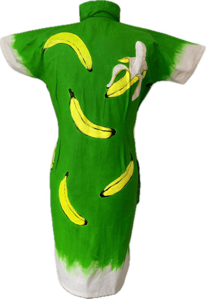
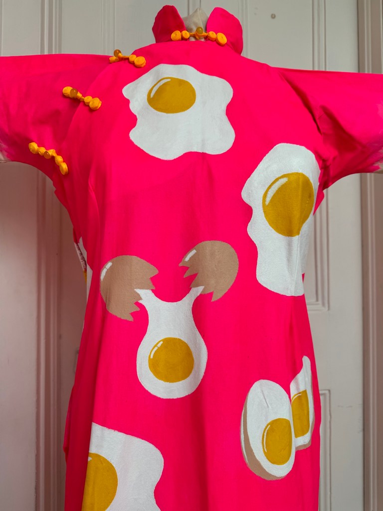
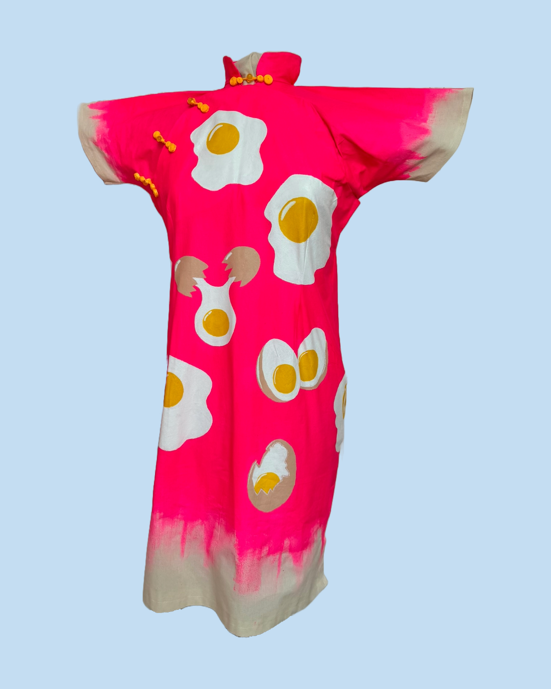
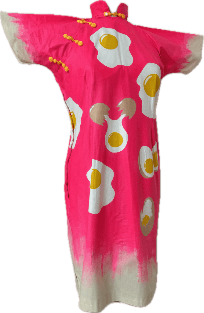
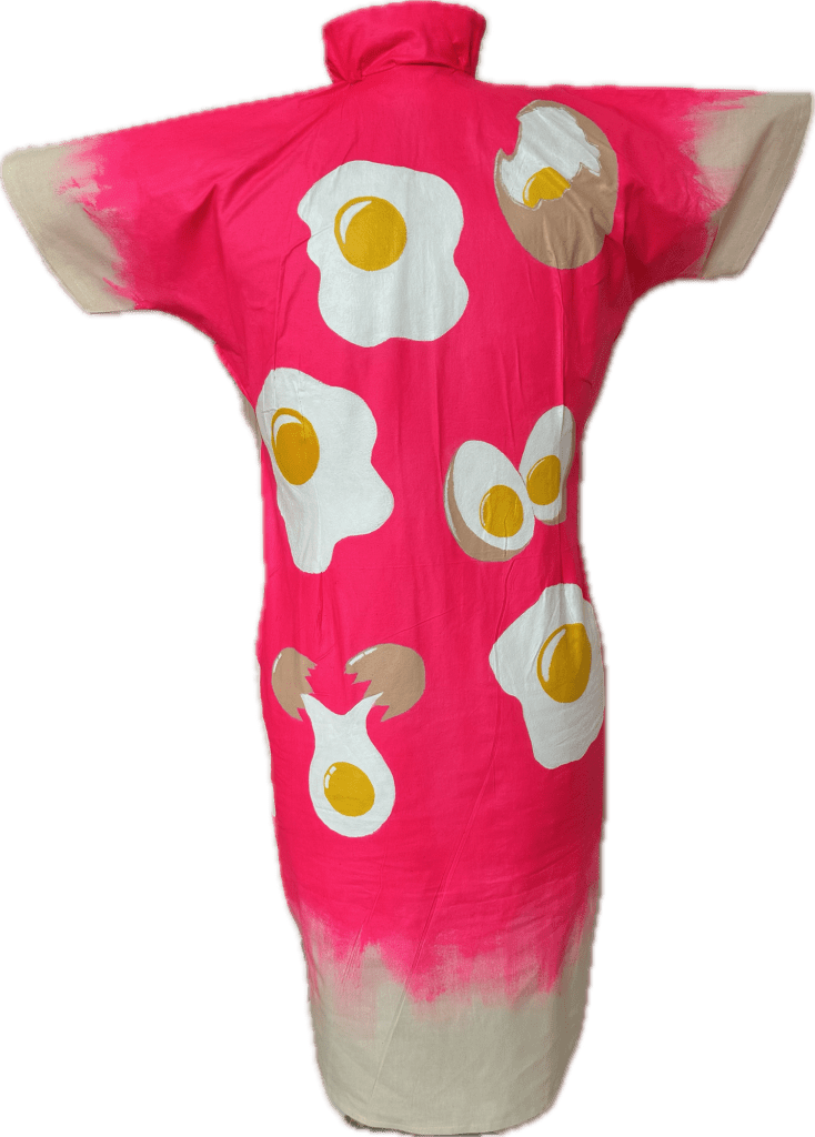
Karl   I feel… excited about your exploration of memory within your new painting   I wonder … how you can connect the culturally appropriated objects and your genuine experience in the work.   I think… that the process of making the dress and the painting on it  is a great metaphor for perceptions of cultural identity and the space between the pictorial image and the duality of  the dresses.

Roz   I feel…engaged with richness and quirky imagery, drawn into a powerful metaphor   I wonder… whether the dress will hold more opportunities or what 3rd element is needed now in this 3rd space to take you further along your journey   I think you have been very successful in your ordering of the complex that you offer clarity, but are sassy in your delivery. And that you are owning, controlling the defining of your status

Chelsea   I feel… that the pieces are funny which makes them more accessible because you don’t feel that you are at first glance engaging in a weighty subject.    I wonder… where this will all go next.    I think… its all very colorful and eye catching and offers a way in to learning about how we talk about people, it re-humanises that which others have tried to dehumanise, especially with the use of clothing.

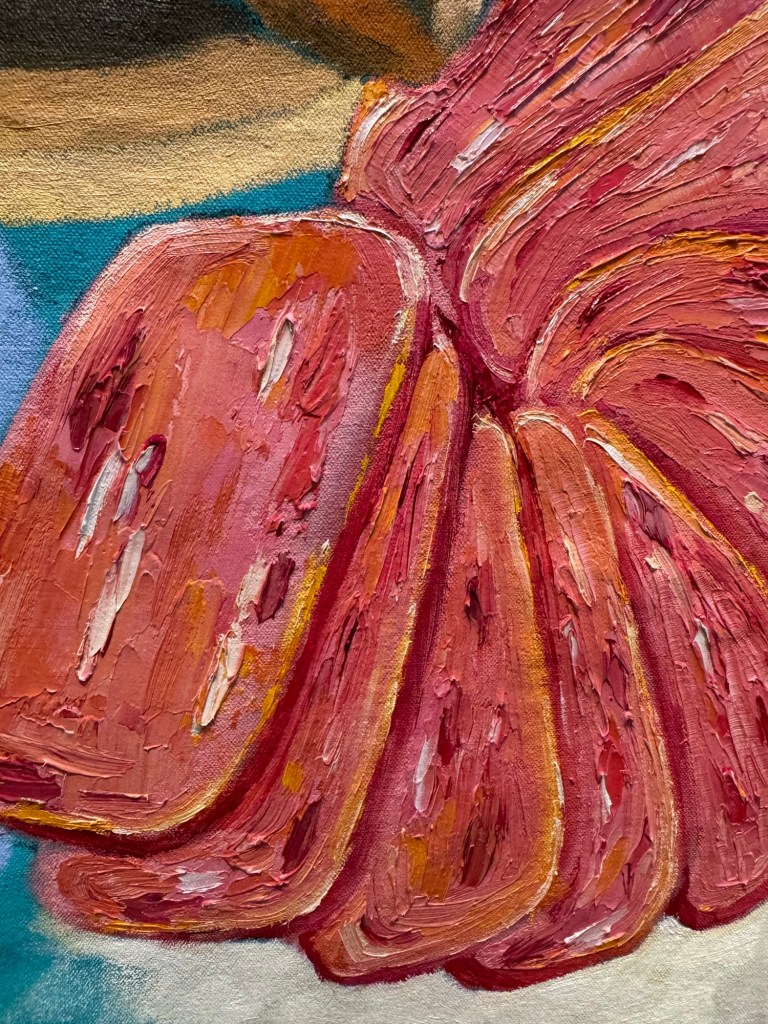
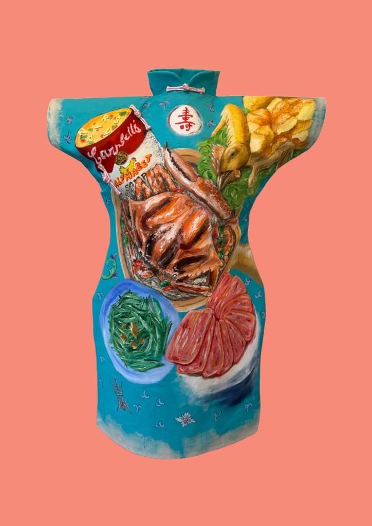
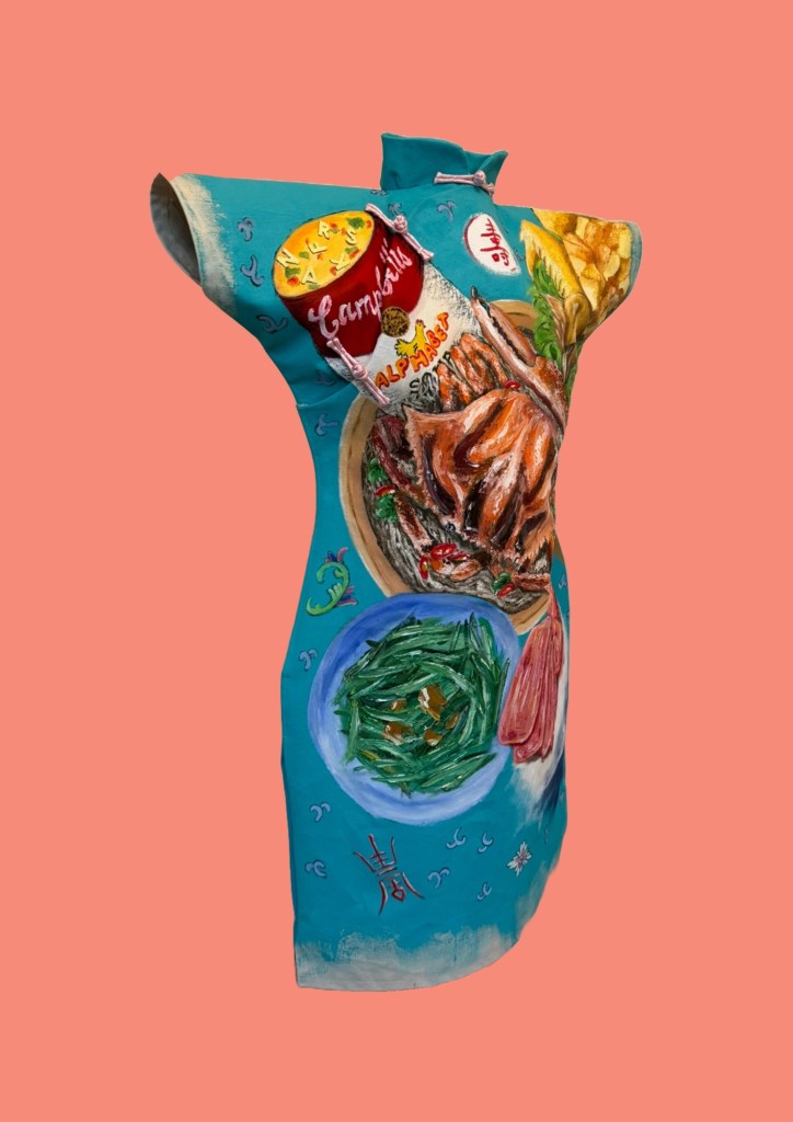
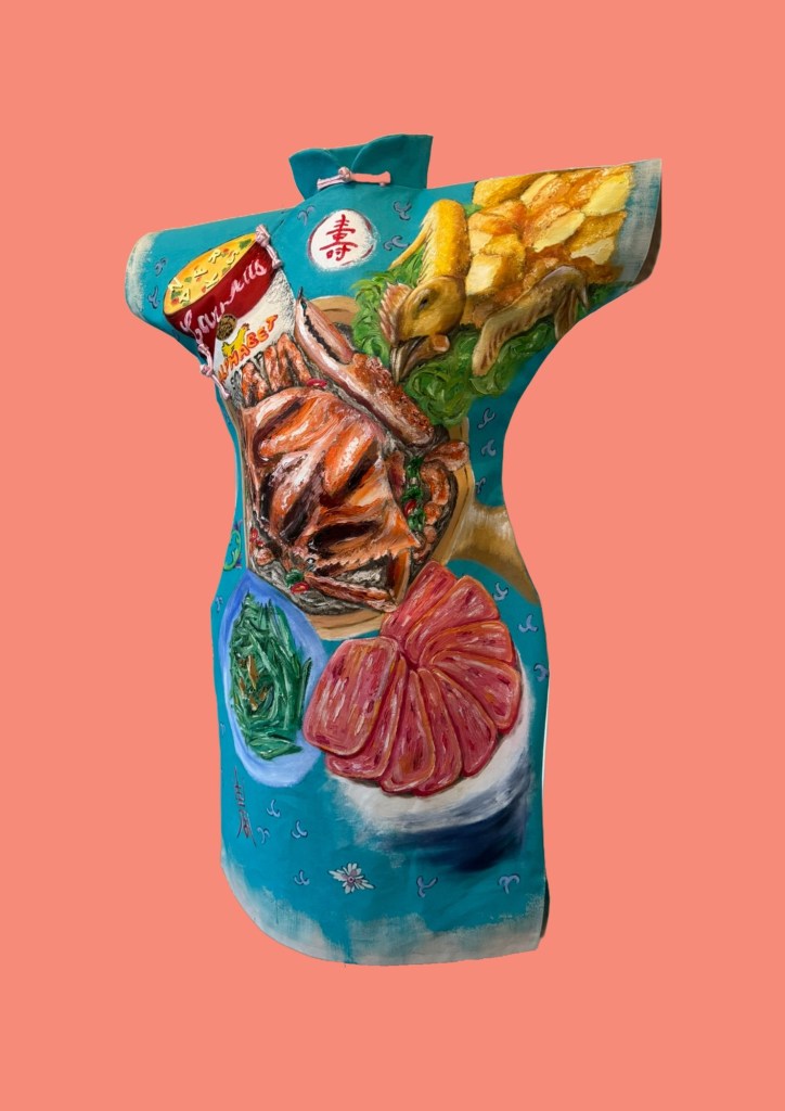
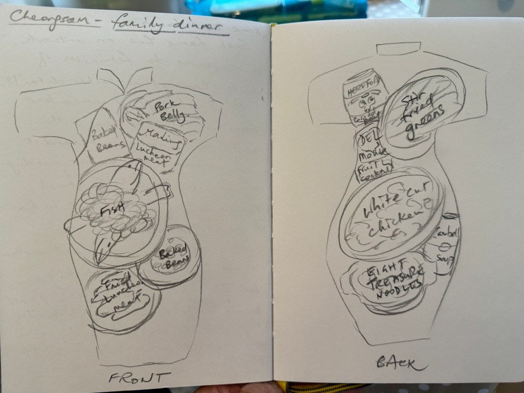
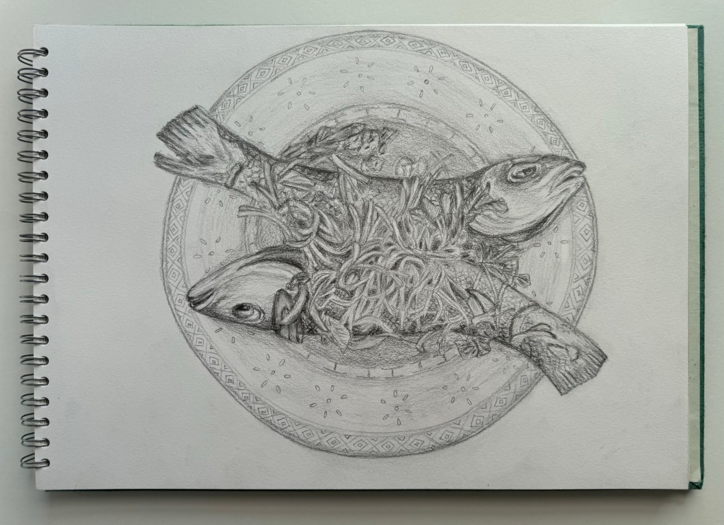
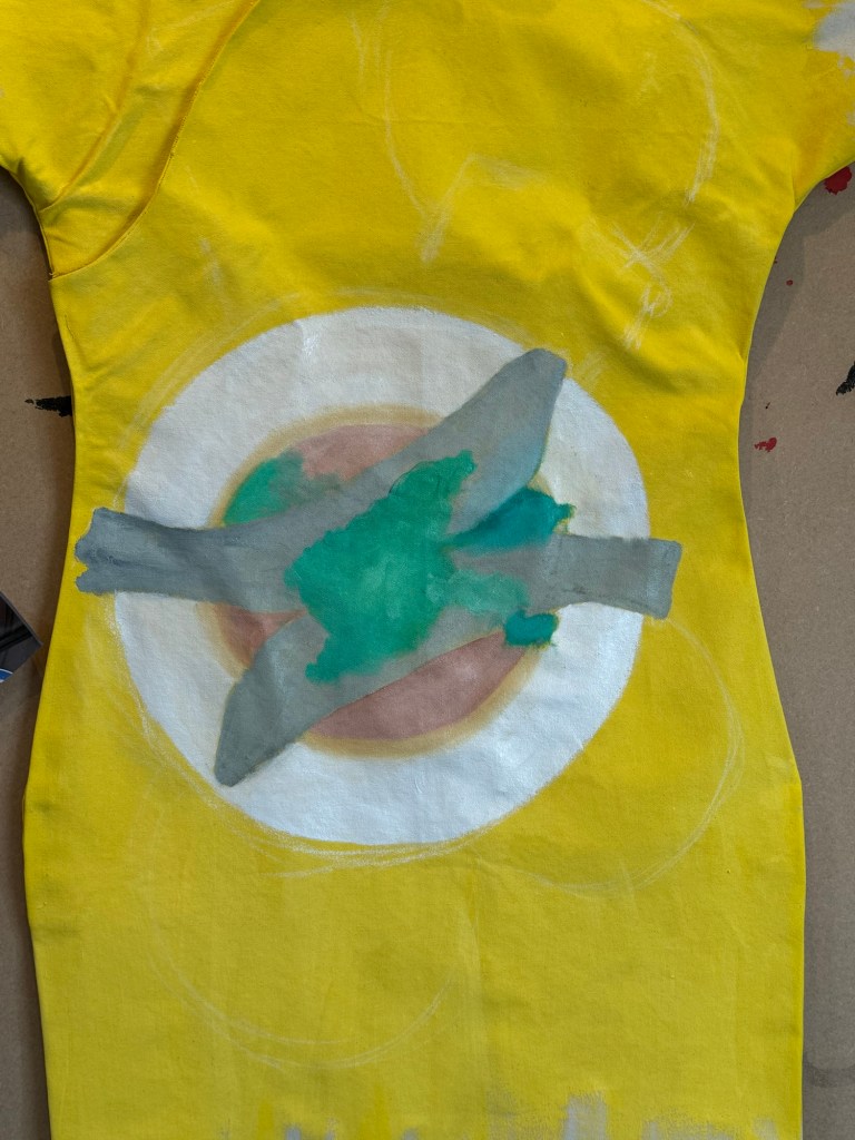
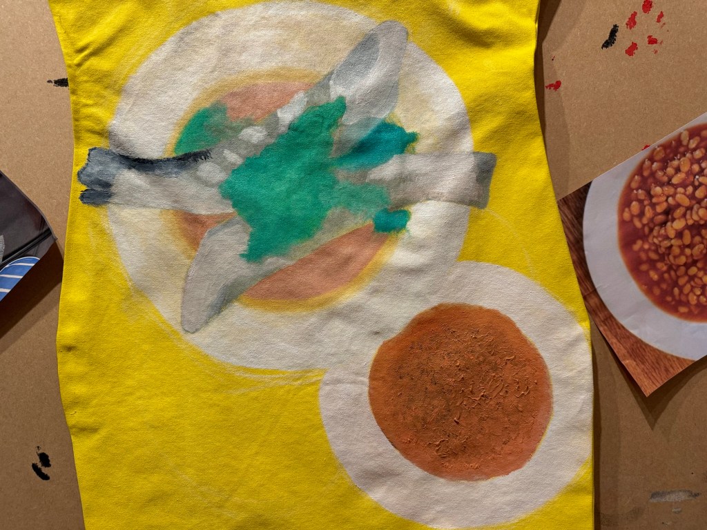
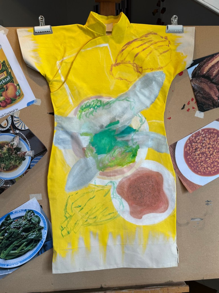
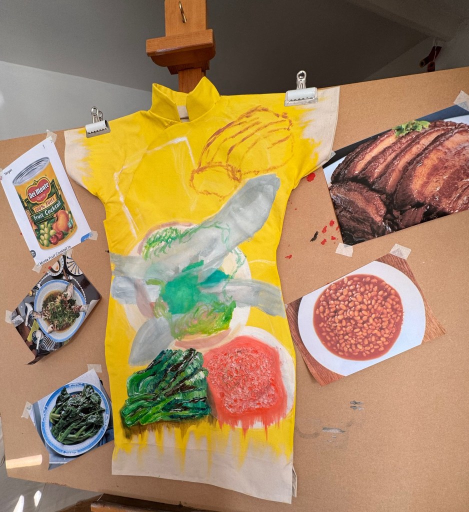
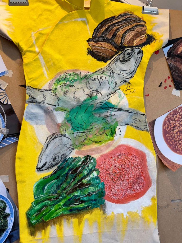
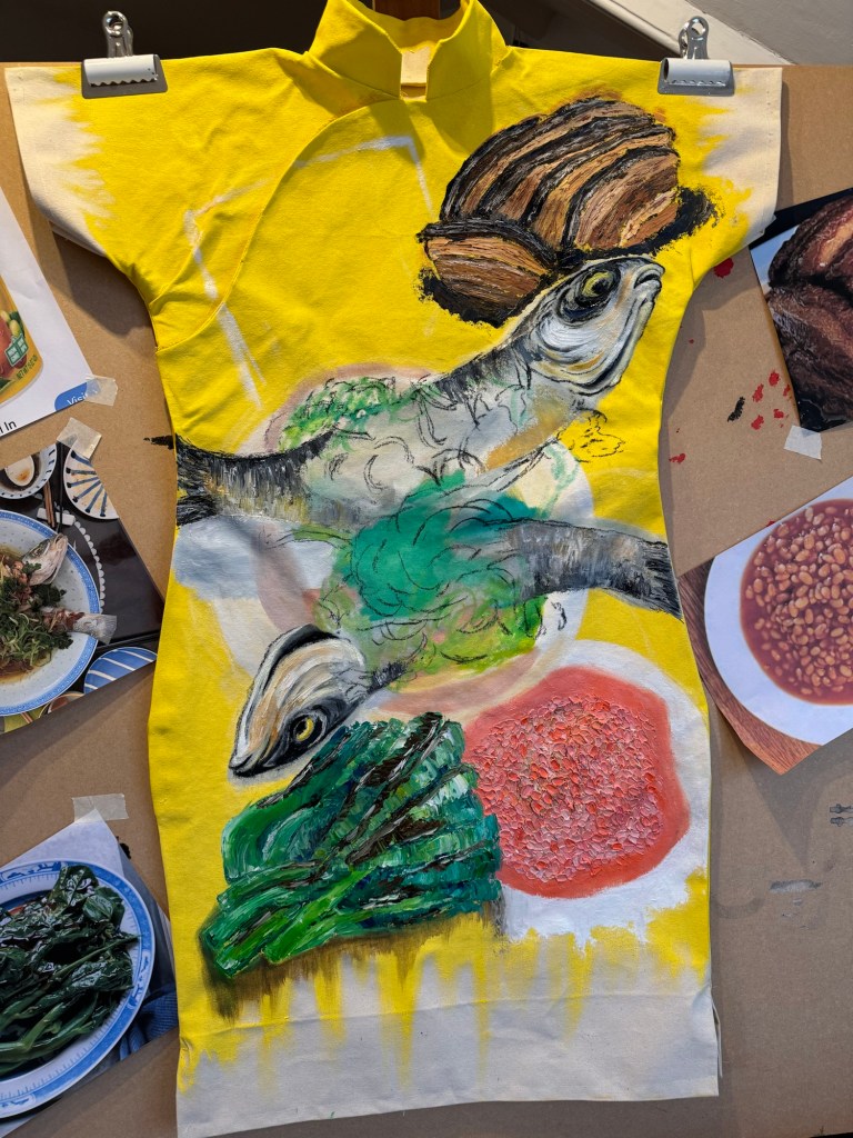
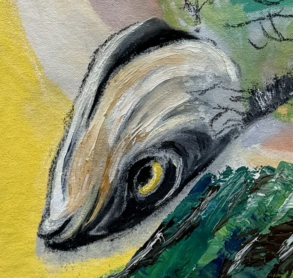
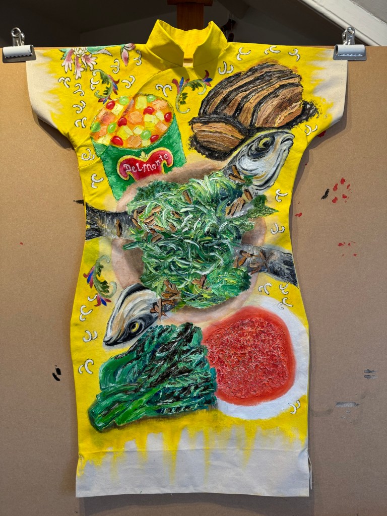
Bethany   I feel… nostalgia and familiarity, the 3rd Space idea, albeit from a different standpoint. I feel curious about your family history in HK, which was an odd colony.    I wonder… whether the metonymies might be handled more provocatively, more personally, as a feminist?   I think… I am drawn to the gritty, personal stories, the oddity of Cantonese steamed fish served with Spam.

Catherine   I feel I want more.  I like the element of surprise with your work, ….what will she do next….  You definitely have my attention Eliza.  And you are so eloquent – Bravo.     I wonder if you will use other clothes items in the future – the dress is so strong and powerful and a perfect vehicle for the way you express yourself and your research.  

Tom   I feel… educated in a nice way   I wonder … what she has discovered about process vs outcome   I think… the work deals with potentially emotive topics in a sensitive and restrained way

Ben   I feel… I wonder… making paint and making food have a great deal of crossover could they be brought together        I think… some lovely colour and ideas – looking forward to seeing how far it could be taken

Oi Fah   I feel… well informed   I wonder… good metaphor   I think… well organized

Daniel   I feel… the work is provoking – in a good way – to seeking   I wonder… where else could you take this work and how it could be expanded   I think…your aproach worked

Lais   I feel seen and understood through your video and practice, especially because of how you approach it and colonialism    I wonder what comes next for you, and if you will keep exploring textiles    I think this is beautiful work and it reaches me on a deeper level.

Madeleina   I feel… informed and inspired   I wonder… what other items of inspiration are hidden in Eliza’s attic which she could start painting on!   I think… Eliza is making a very important and insightful social commentary through her joyful creative work

Karen   I feel… a great balance of research and lived experience.  I hear a voice.   I wonder… how the dress images would translate in other media….   I think…the food is a great metaphor and I love the titles of the work.

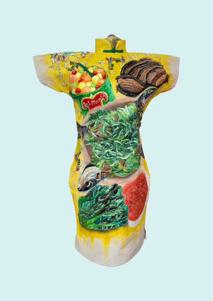
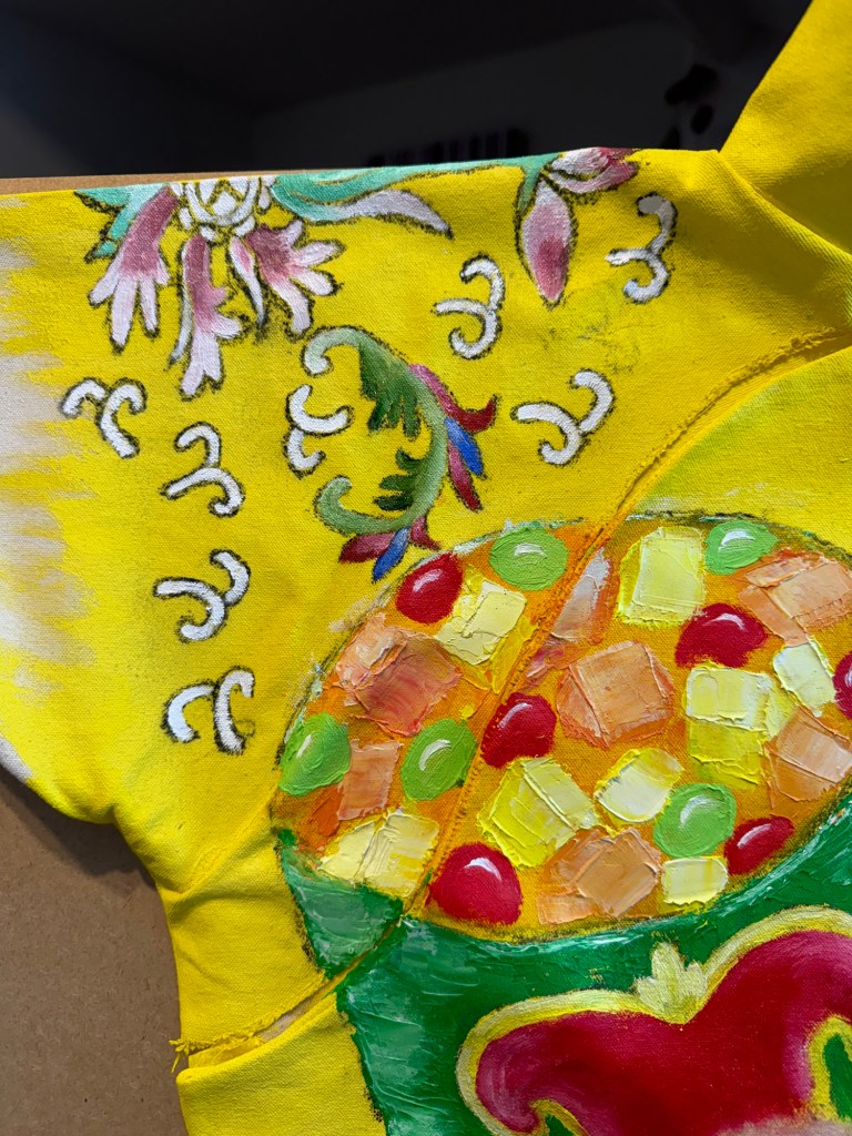
Holly   I feel… delighted by some of your images especially on the “family dinner” cheongsam dress   I wonder… how you view the differences or similarities between “narrative” and “style”, I wonder what would happen if you worked with actual food in your practice    I think… it’s interesting how you thought you had lost your mother’s dress but then found it after many years, sort of a metaphor there around identity and fluctuations in connection and expression with/of identity, I think you have quite a bit of clarity about what you’re interested in exploring there appeared to me to be a lot of coherence in the work despite your view that it lacked coherence

Martina   I feel… intrigued and amused. I want to see more    I wonder… if the dress-paintings are thought to be worn   I think…you should reconsider the relation between your narrative and stylistic work.  The two seem beautifully integrated  to me!

Terrye   I feel… inspired by your dresses – playful and colourful interpretations of your identity and a link to your past   I wonder… what happens if a  European dress is used as an alternative identity – you mention hybrid identity   I think…your process towards using materials is a way to create intrigue and excitement in viewing your work.

Jonathan   I feel… connected to your story – the narrative is important to you   I wonder… if we the audience only need to see small parts of this – eg the food – do we need to see it on a dress   I think… the narrative and style are connecting, maybe you can be brave a try just the food paints for a while?

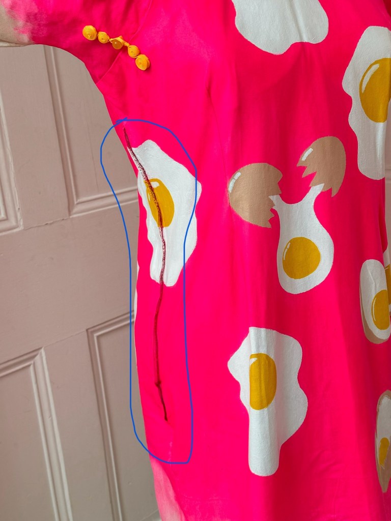
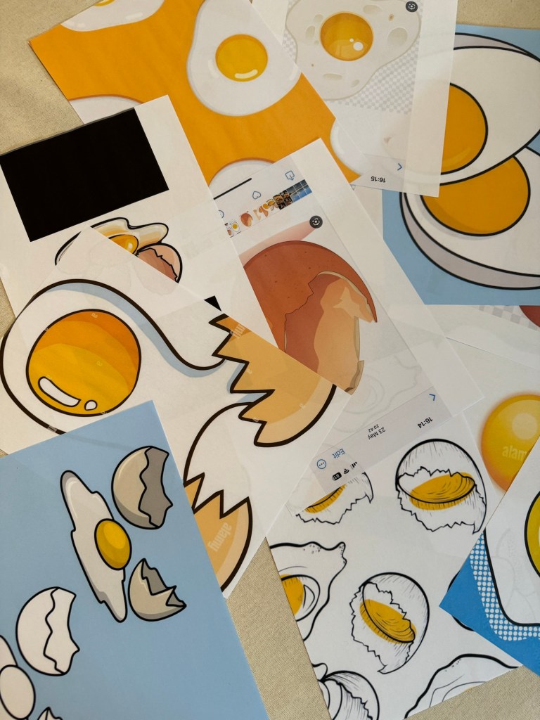
Lucy   I feel… lucky to hear Eliza, invited to a personal world that reflects moments in time that are not just culturally important but personally   I wonder… how do you feel in the dresses   I think…the way you use the dresses to respond to one another is exciting, how in response to the banana you made the egg to reflect you

Dee   I feel… transported to my mothers world of dress making   I wonder… What a catwalk fashion show of your art would look like   I think… The development of your style/narrative is an excellently engineered solution… the next development for me is the latest painting and I am excited to see what happens next

Victoria   I feel… inspired by colours and emotional    I wonder… inspiration background, ideas for research. If inner dialog is involved and what’s next   I think…interesting process, great ability to create deep emotional art. Very complex and simple at the same time, i really like that concept

Inna   I feel… I feel that bright colors are a source of energy and inspiration. They bring life to a work, drawing attention and sparking thought. Behind each vibrant hue, there’s a depth of carefully considered ideas, symbols, and stories. It’s not just about the visual impact but about how every detail communicates its own emotion and meaning. I wonder… What stories and carefully considered ideas lie behind each vibrant hue? I think… I also think the allure of bright colors lies in their universality—they resonate with people across cultures and contexts, carrying both personal and collective significance. They can symbolize hope, energy, or transformation, making them a vibrant language that transcends words.

Then we ran a video session where people chipped in with comments on what worked for them about my work. Summary of the video feedback on ‘what worked…’

– Connection to topical discussions

– Dresses

– Fitting my personal narrative

– Use of colour

– Clarity of thoughts and processes

– Metaphor of food

– Playful

– Wanted to look into it to see the stories

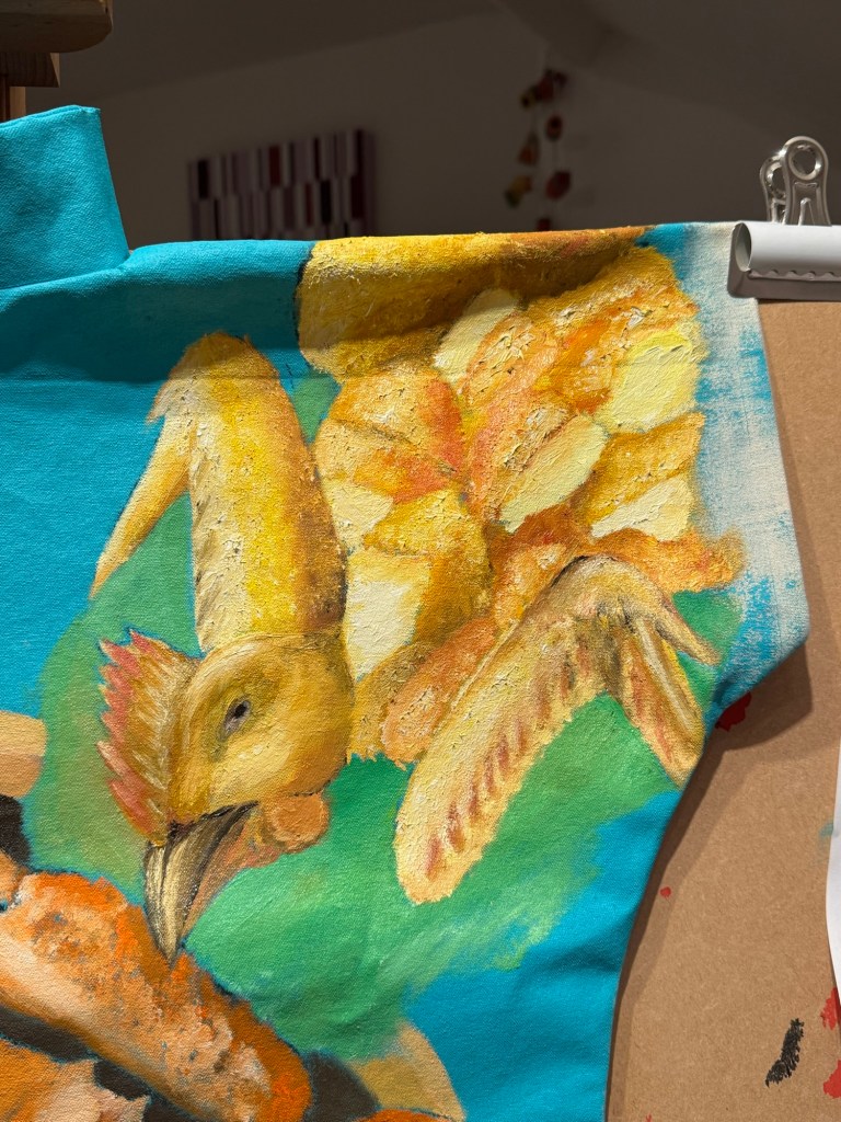
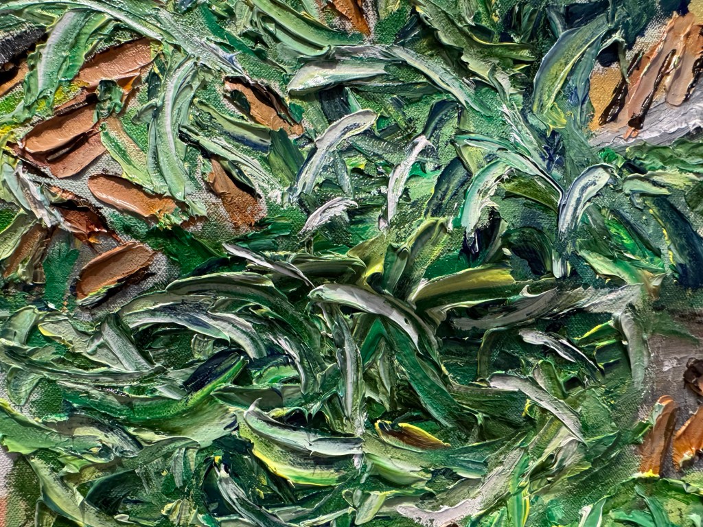
– Detail of the food and fish

– Balance of research and lived experiences

– Metaphor of wearing cultural identity

– Confidence in communicating narrative and views

– Dresses – sculpture as well as painting

– Oddness of the food combo

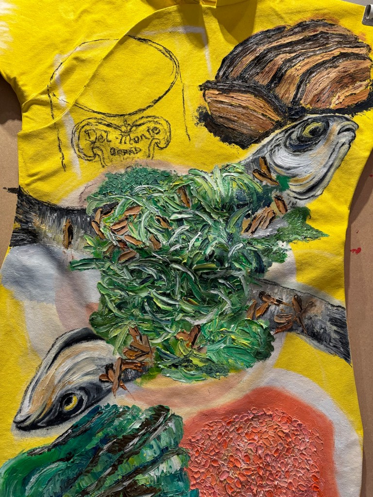
– Making tinned food appealing

– Strangeness of food is brilliant

2. Unit Assessment Feedback

At the end of Unit 2, I received some invaluable feedback from my course tutor. There was feedback on my practice and my research paper. I agree with much of the feedback and I will not list everything here. I will extract the key points that have caused me to think more deeply about specific elements of my practice. I want to use this blog to further explore my thinking and consider my response in order to develop my practice.

The specific points that I want to respond to are:

1. Is there a risk that the terms “banana” and “egg” can feel reductive, even when reclaimed, how do you (do you need to) account for the multidimensional experiences of diasporic individuals? Could these inadvertently reinforce the stereotypes they seek to critique, without offering sufficient nuance or alternative narratives? How might someone from the Chinese diaspora interpret these works? How do you want them to engage with the works?

2. …your HK family dinners bring a nuance and context to your broader theme. … Does this painting need to be on a cheongsam? What does the cheongsam canvas add or takeaway from the image?

3. …we encourage you to continue experimenting with different techniques, layering methods, transparencies, marks etc. E.g. how might you use thin transparent layers in your work? If you spend time looking at a variety of oil paintings in real life, what effects might you incorporate into your own work?

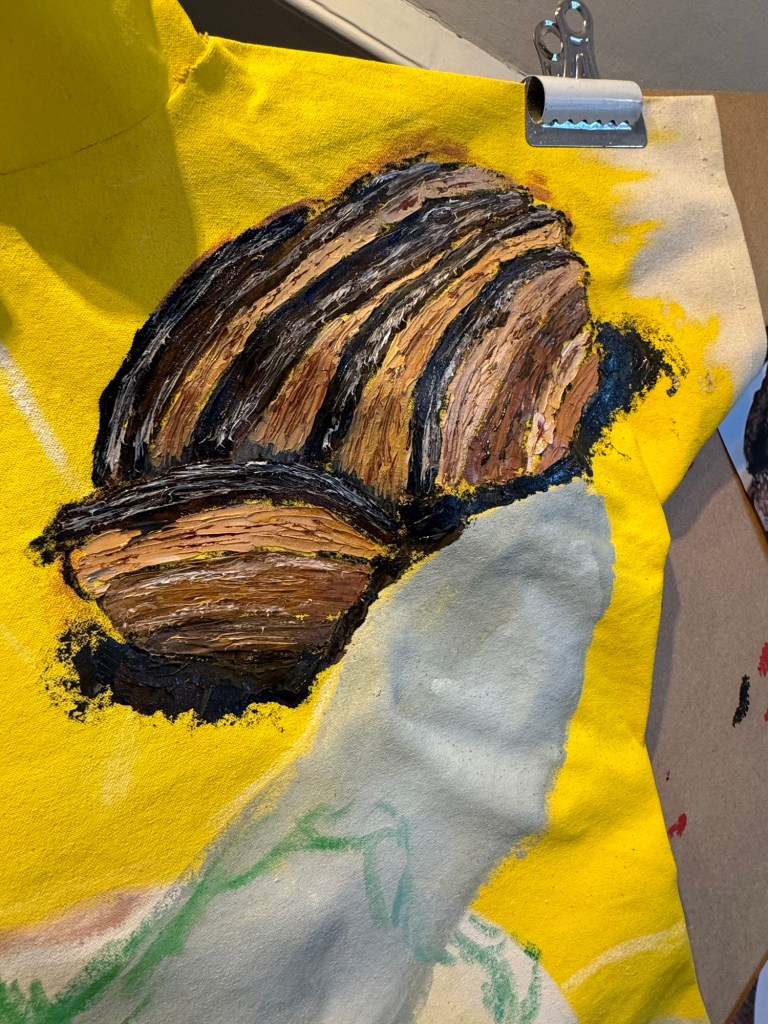
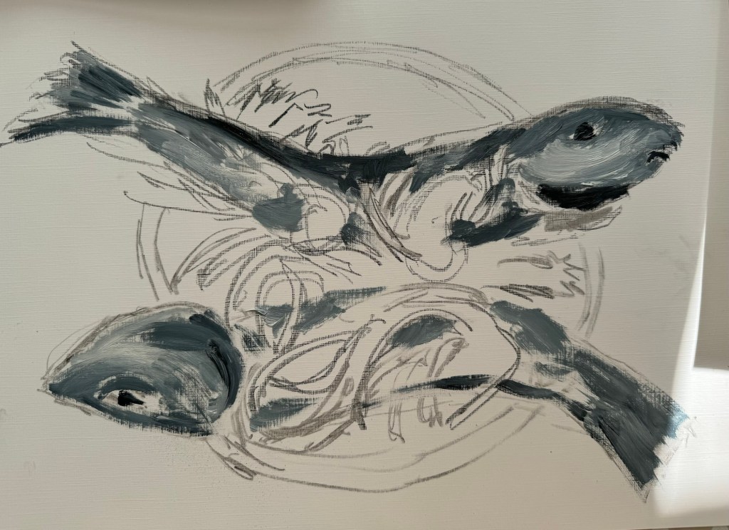
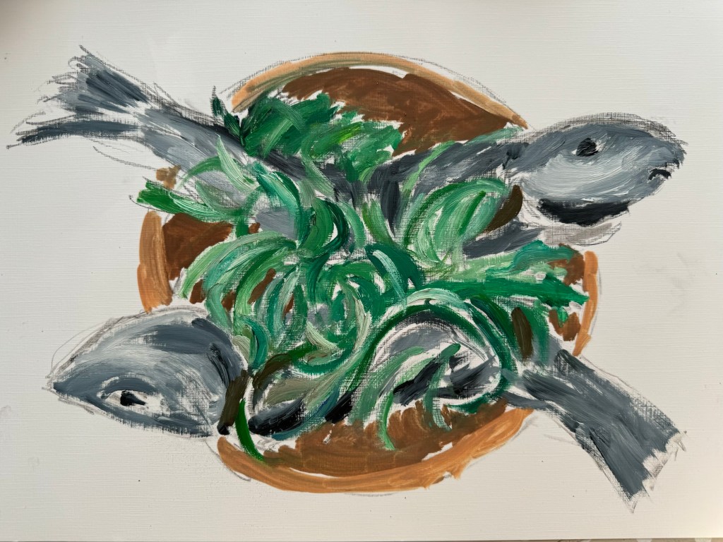
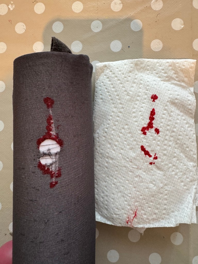
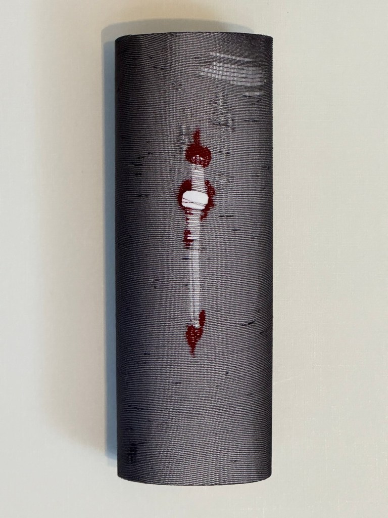
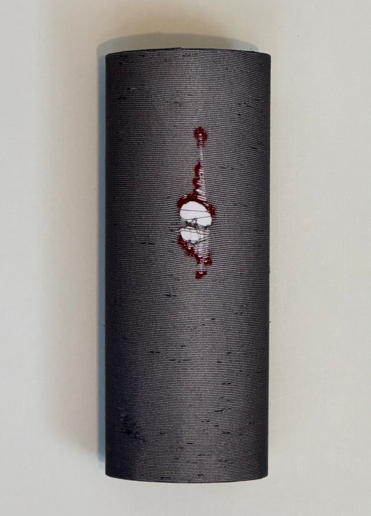
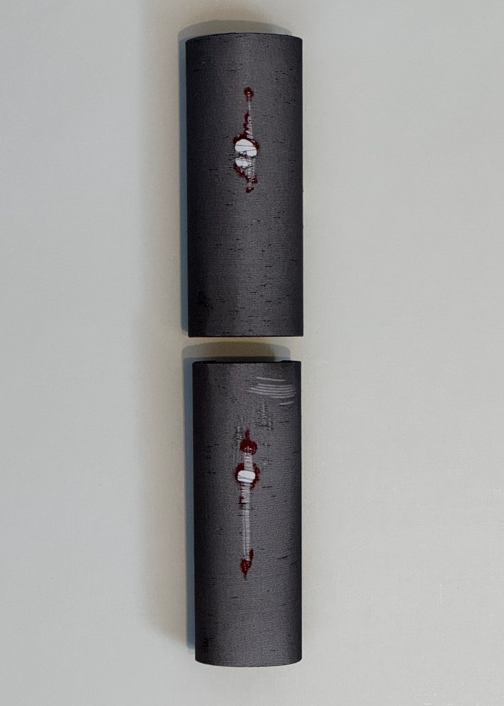
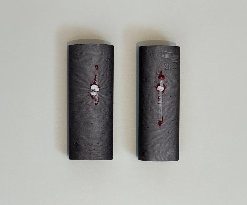
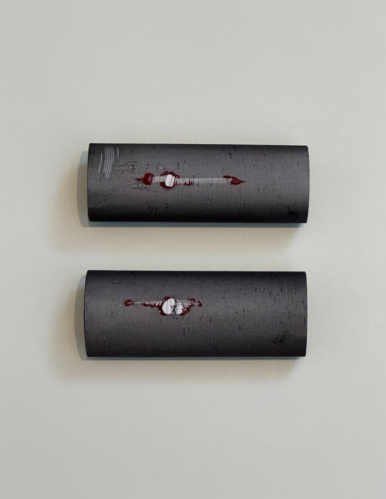
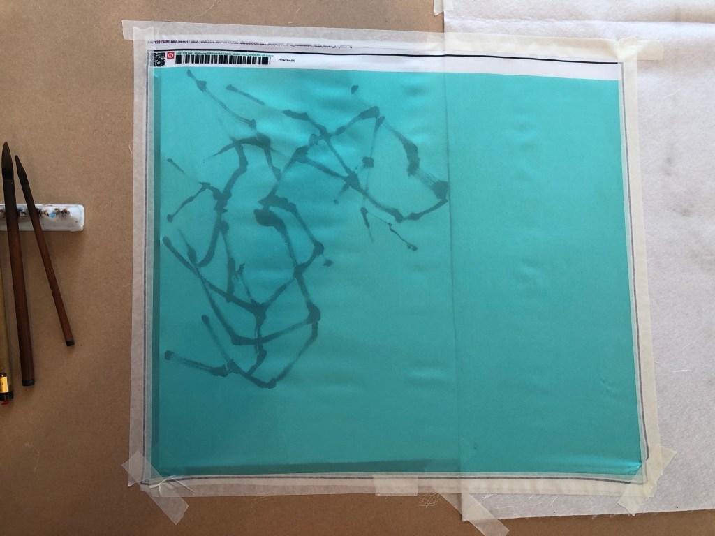
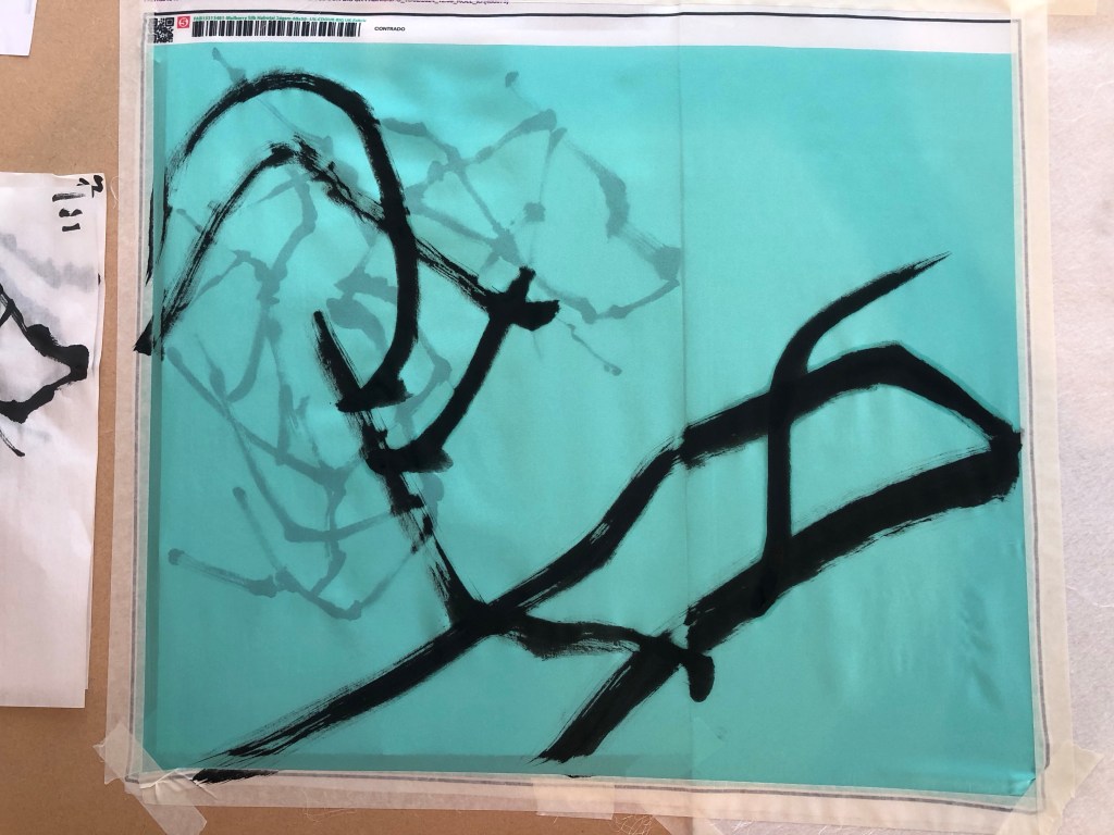
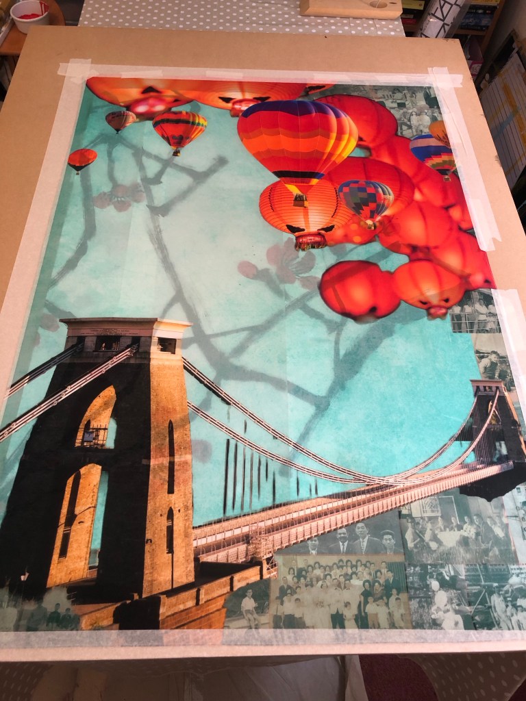
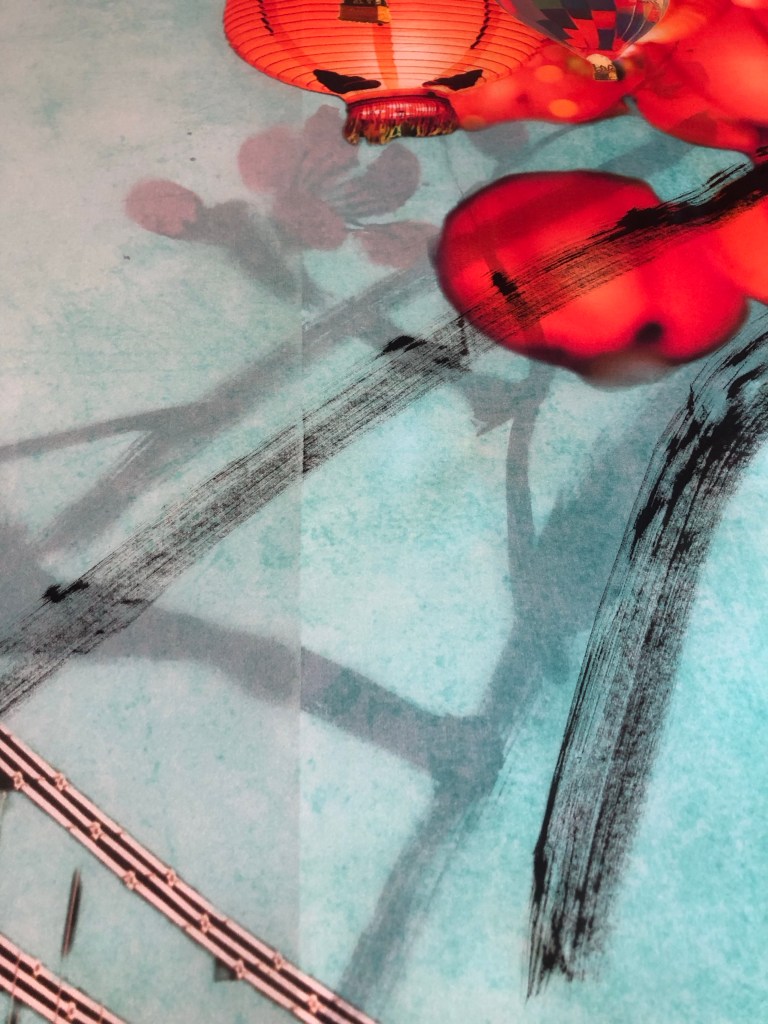
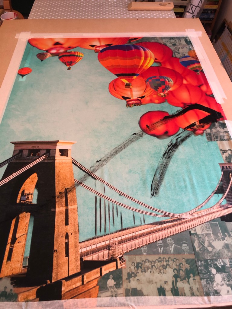
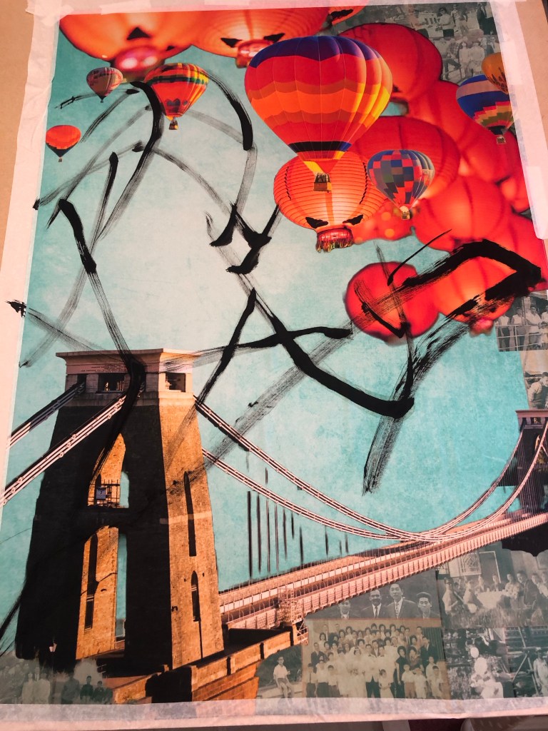
4. We also encourage you to go back to the documentation of the painting progression – some of us thought the fish dish was stronger at the earlier more “sketchy” stage, experiment with how “finished” elements of the painting need to be. How might this relate to memory? The sketchiness of remembering? The gaps in between the memories, the ‘flying white’.

REFLECTIONS

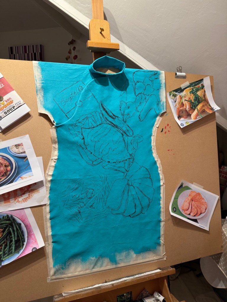
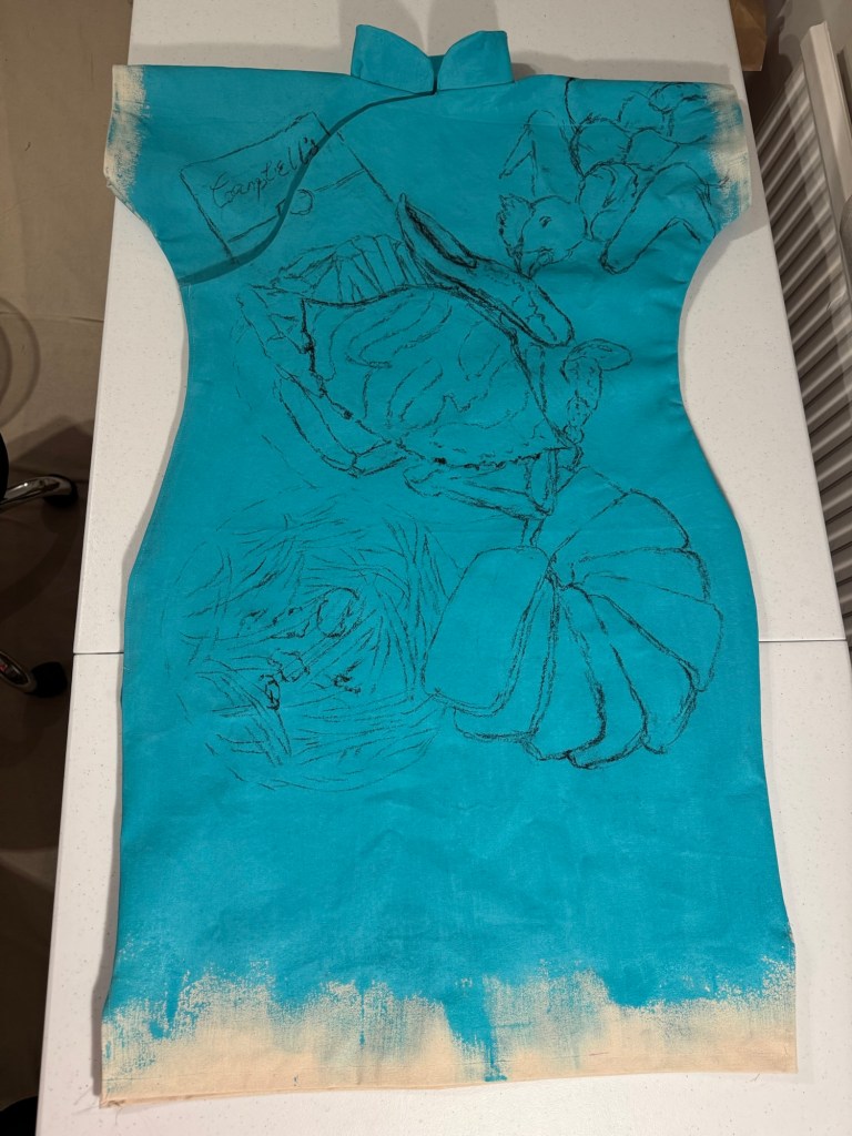
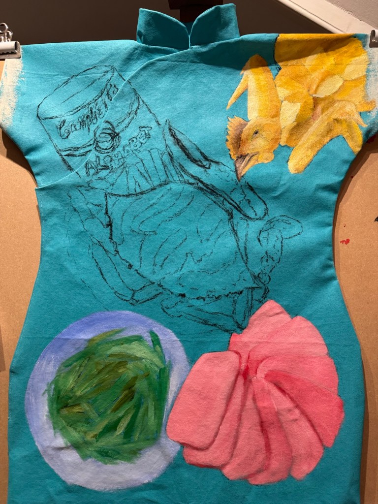
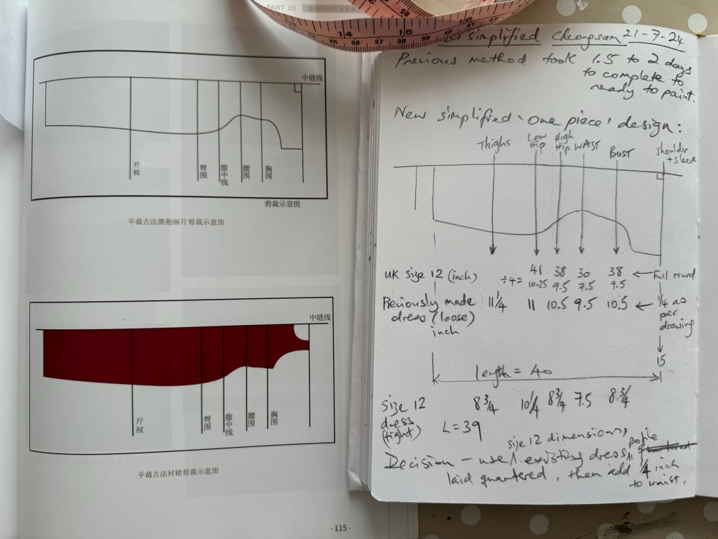
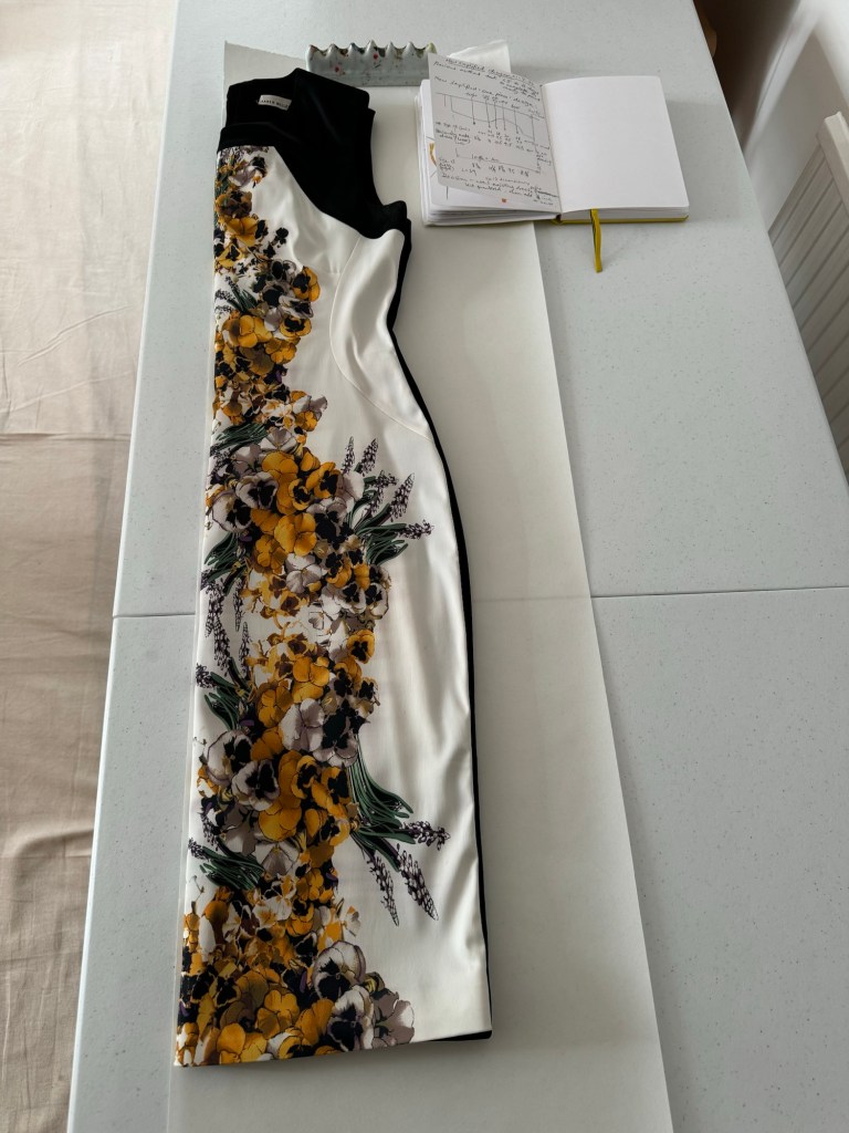
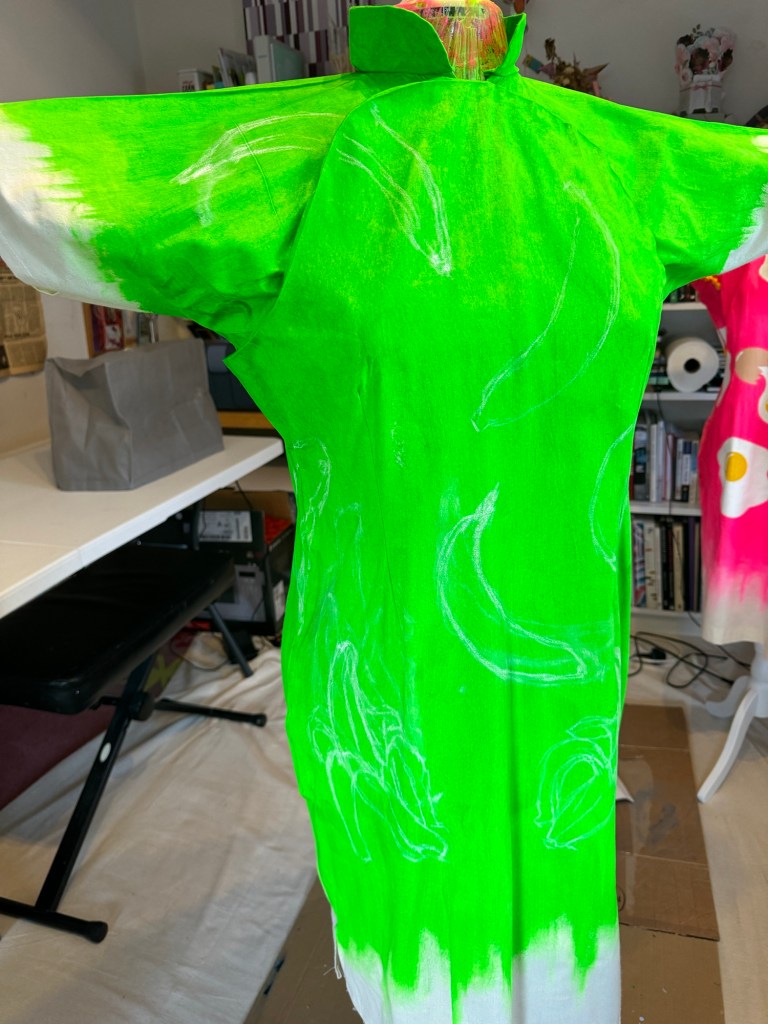
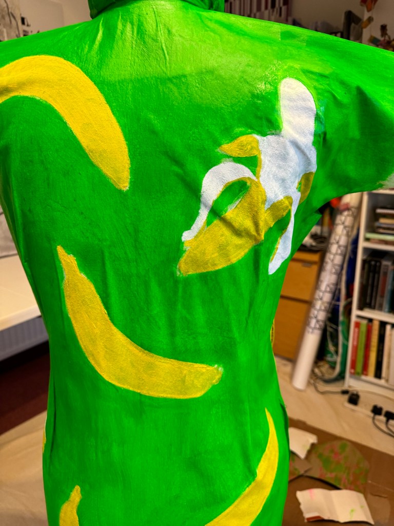
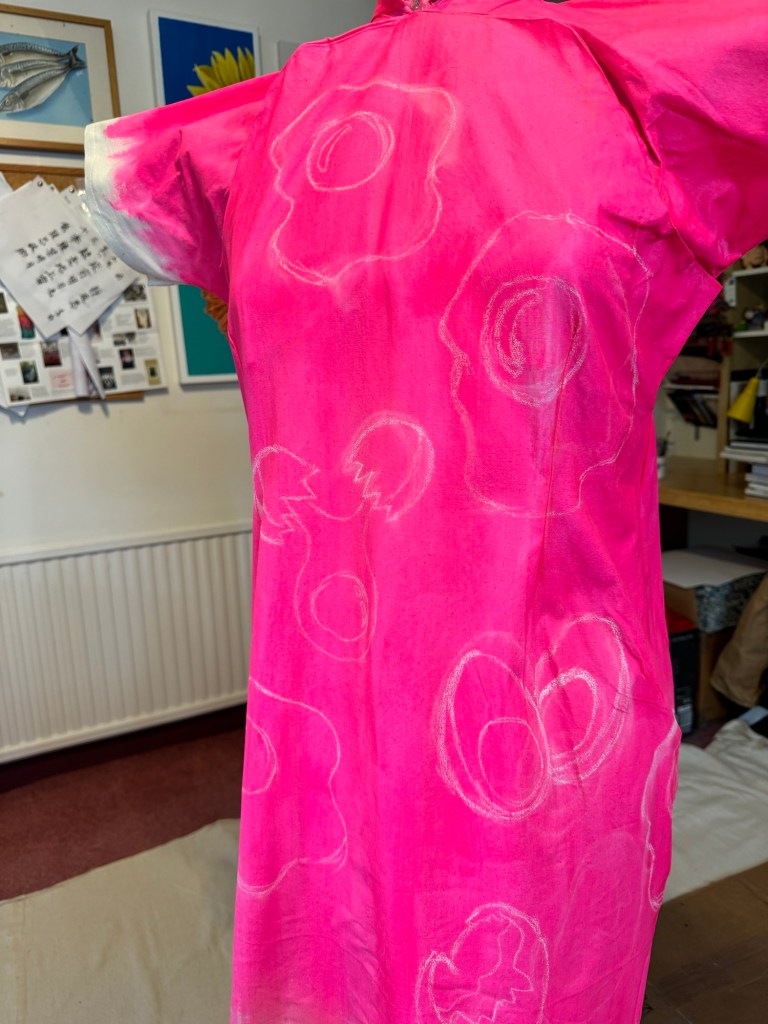
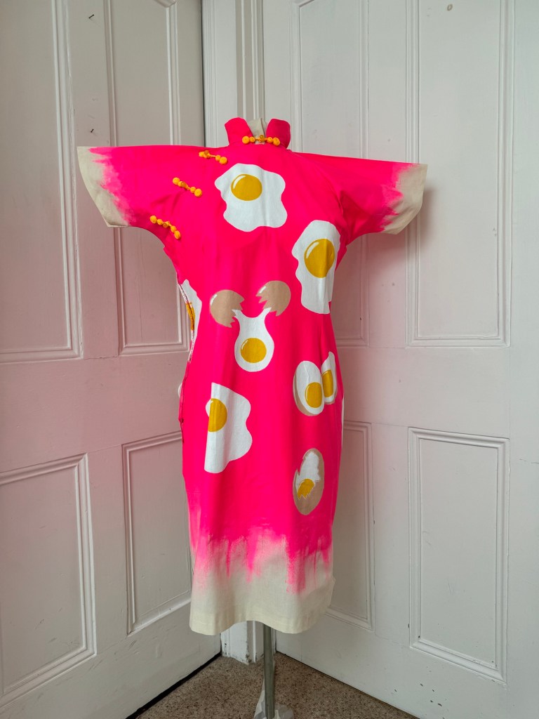
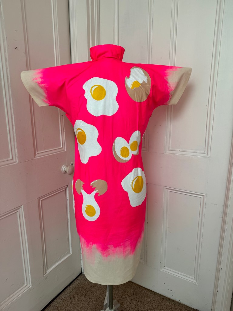
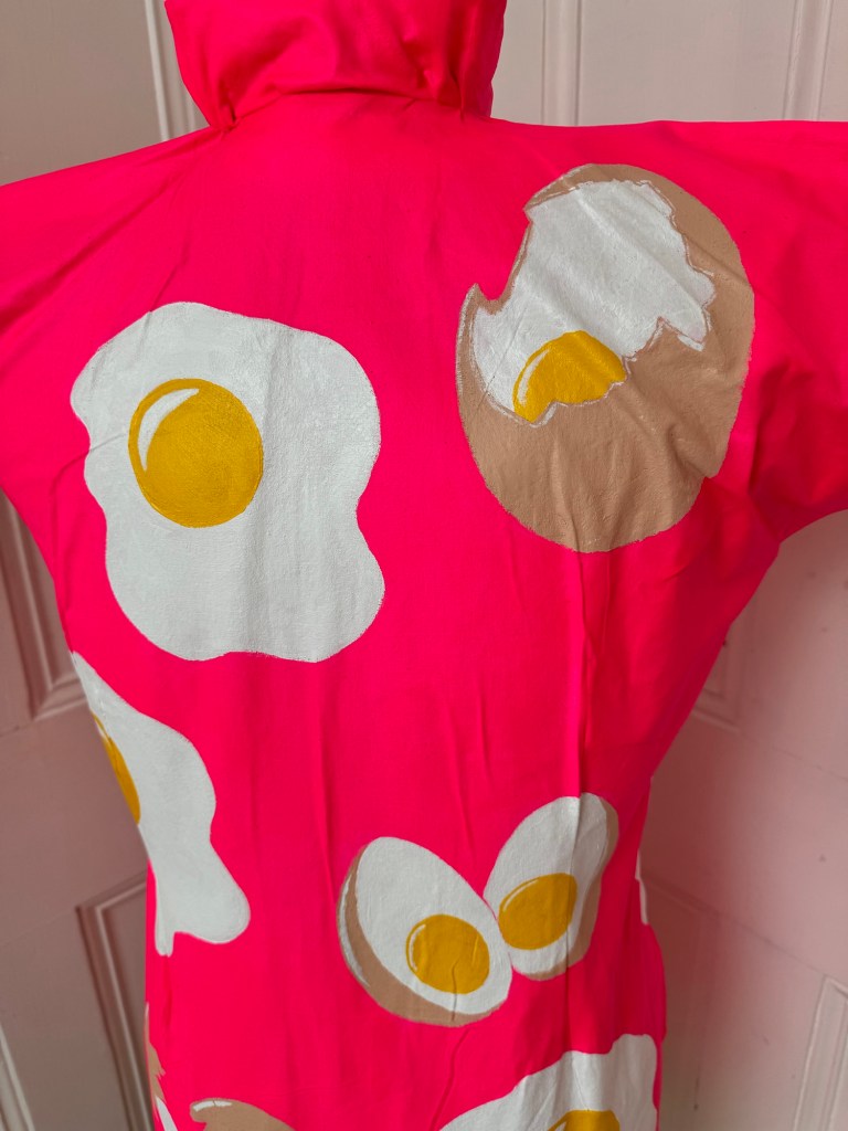
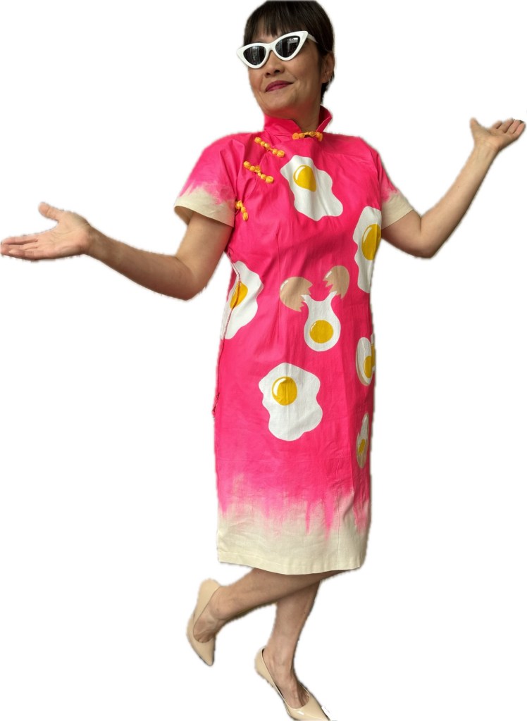
I really valued the group sessions. I feel blessed that I am in such a supportive community where everyone is thoughtful, kind and genuinely wanting to help each other to progress. I treasure their feedback, it is more than a gift. I started to make and paint on Cheongsam canvases in the last few months, I am still at an early stage with this exploration and I am constantly questioning if it is the right way to go. My group’s feedback gave me the confidence to continue as they seem to enjoy seeing the colourful dresses. Some of the comments have helped to reinforce my decision. However, my tutor feedback has caused me to rethink this point – does it need to be on a Cheongsam? What does it add or take away from the image?

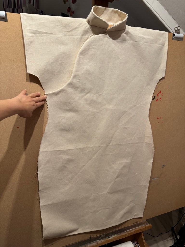
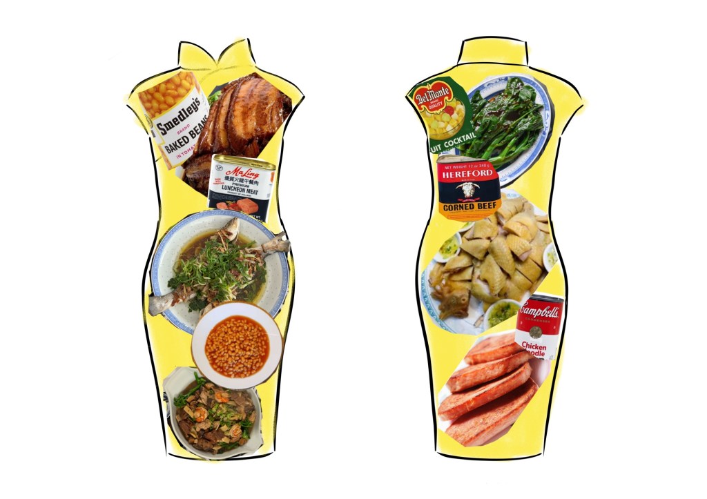
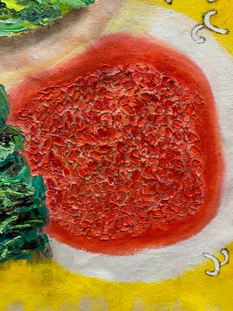
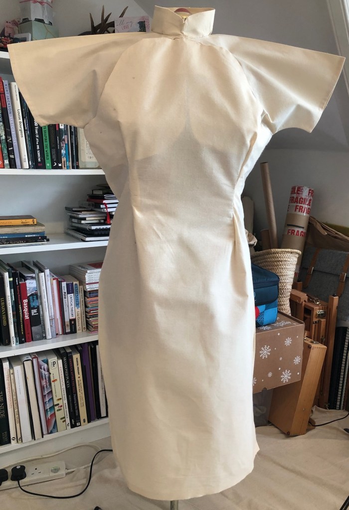
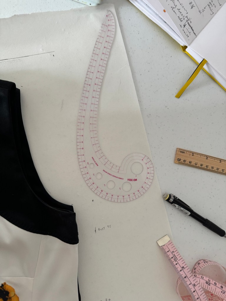
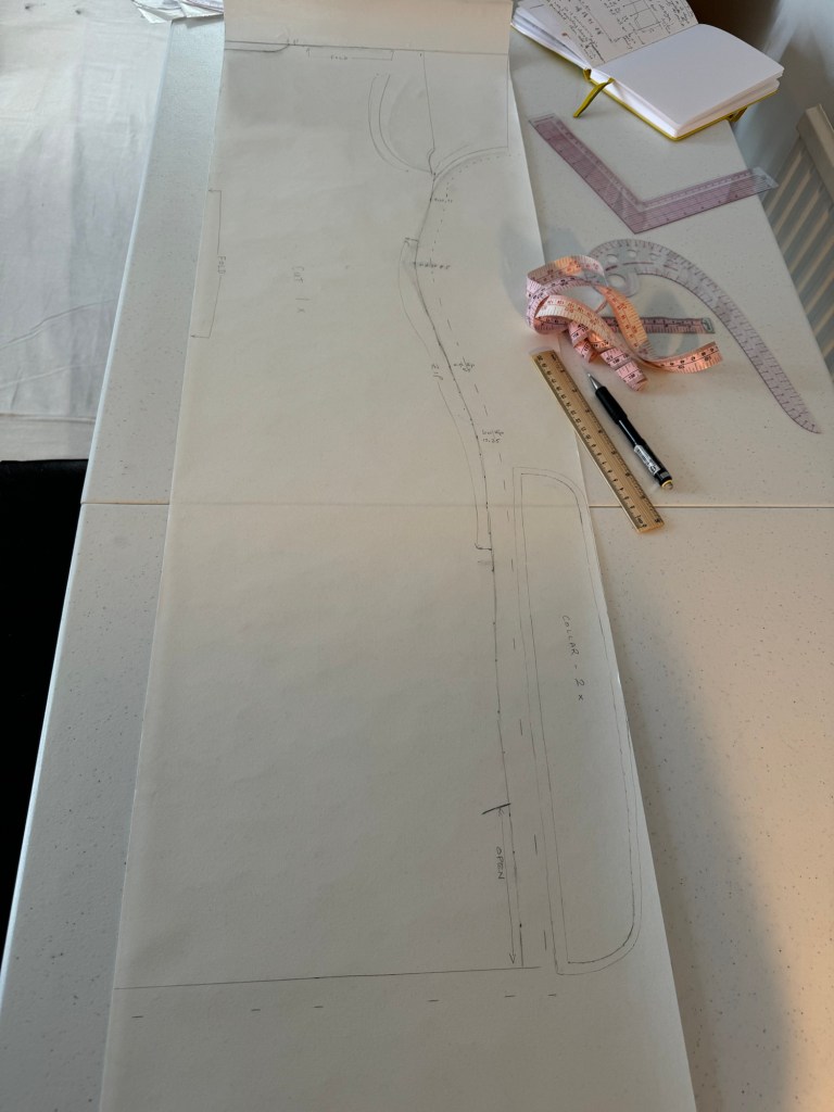
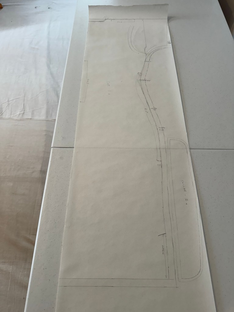
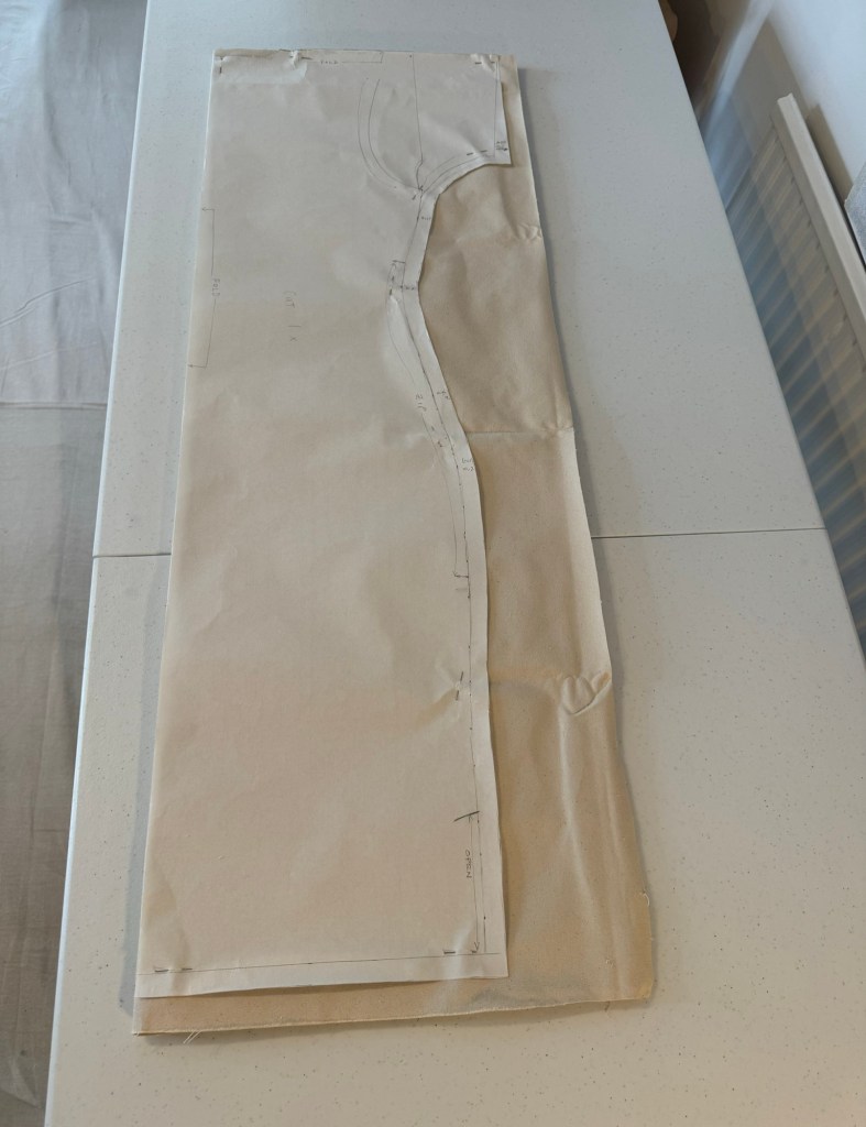
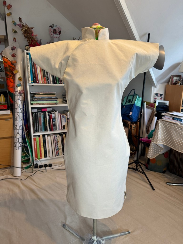
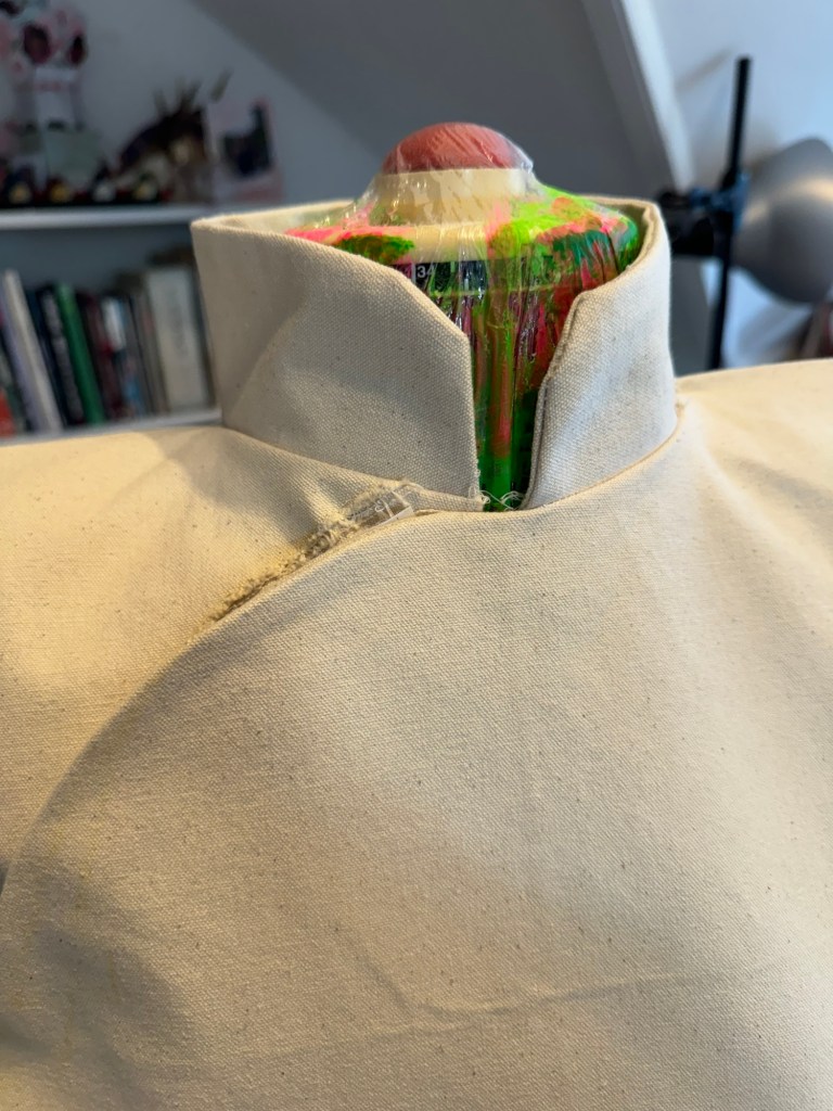
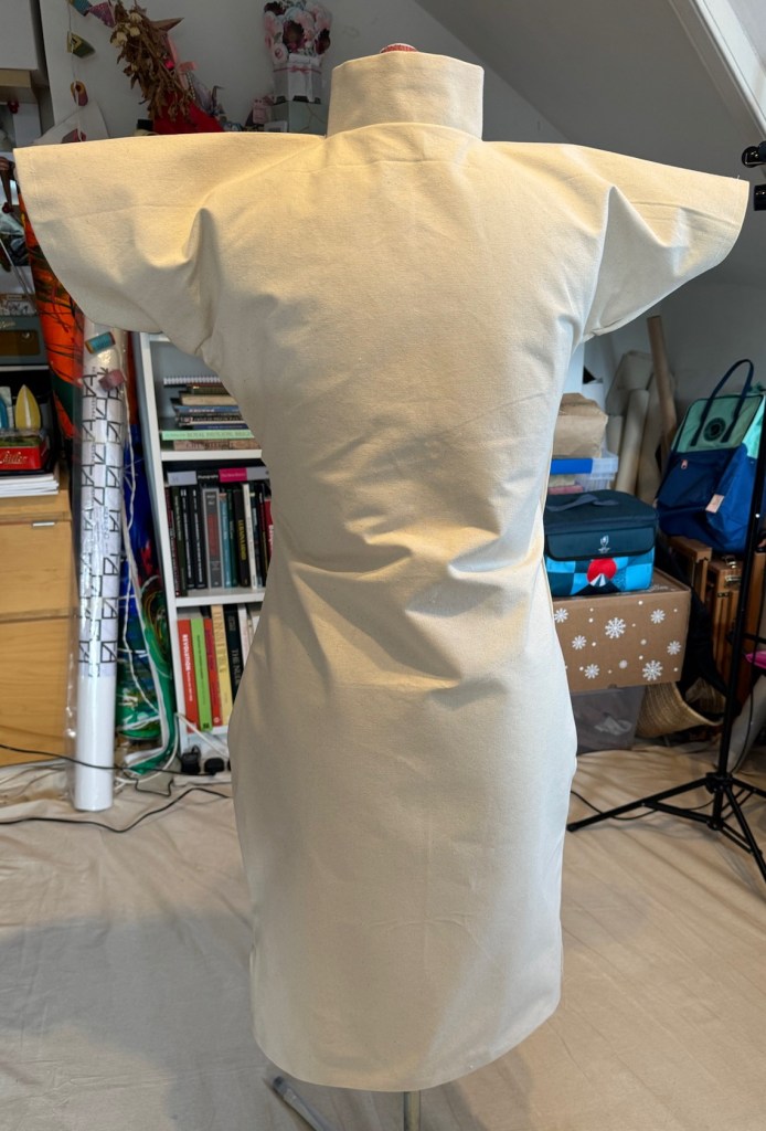
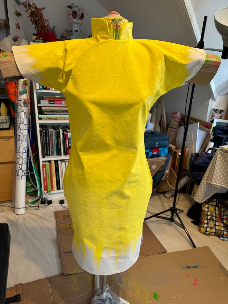
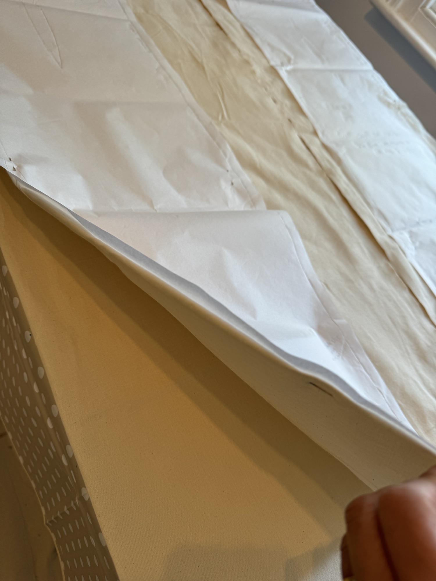
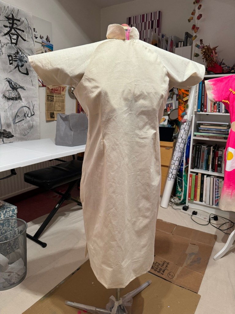
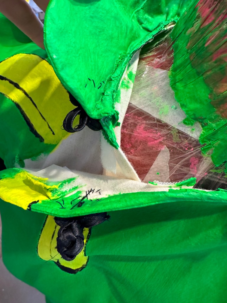
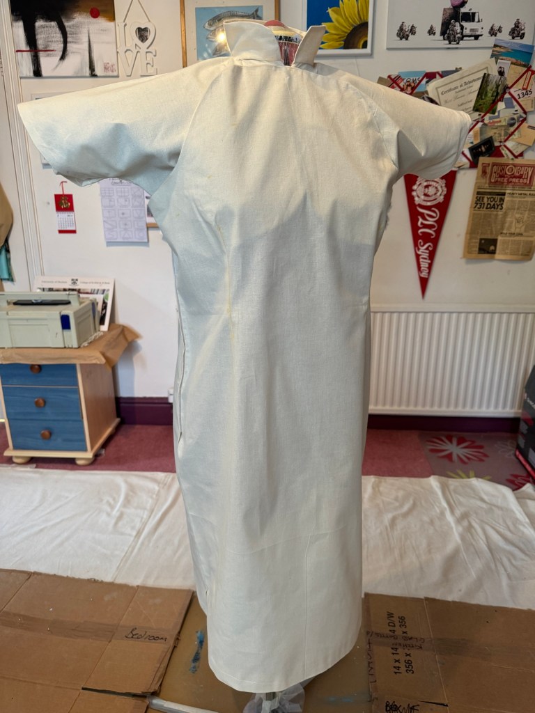
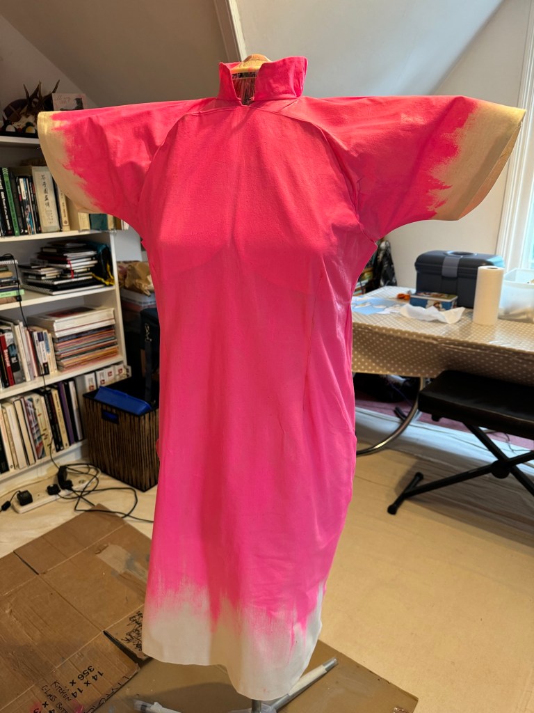
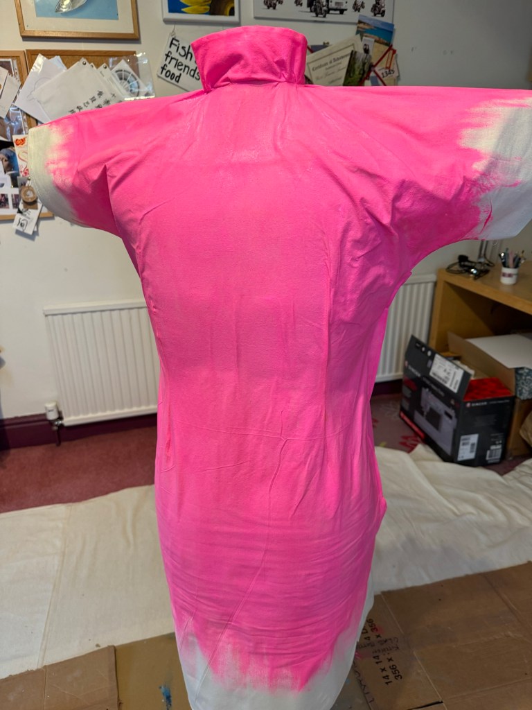
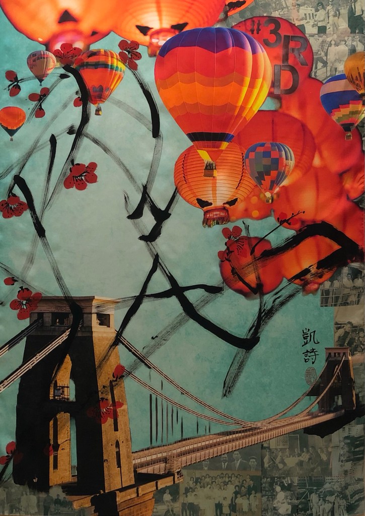
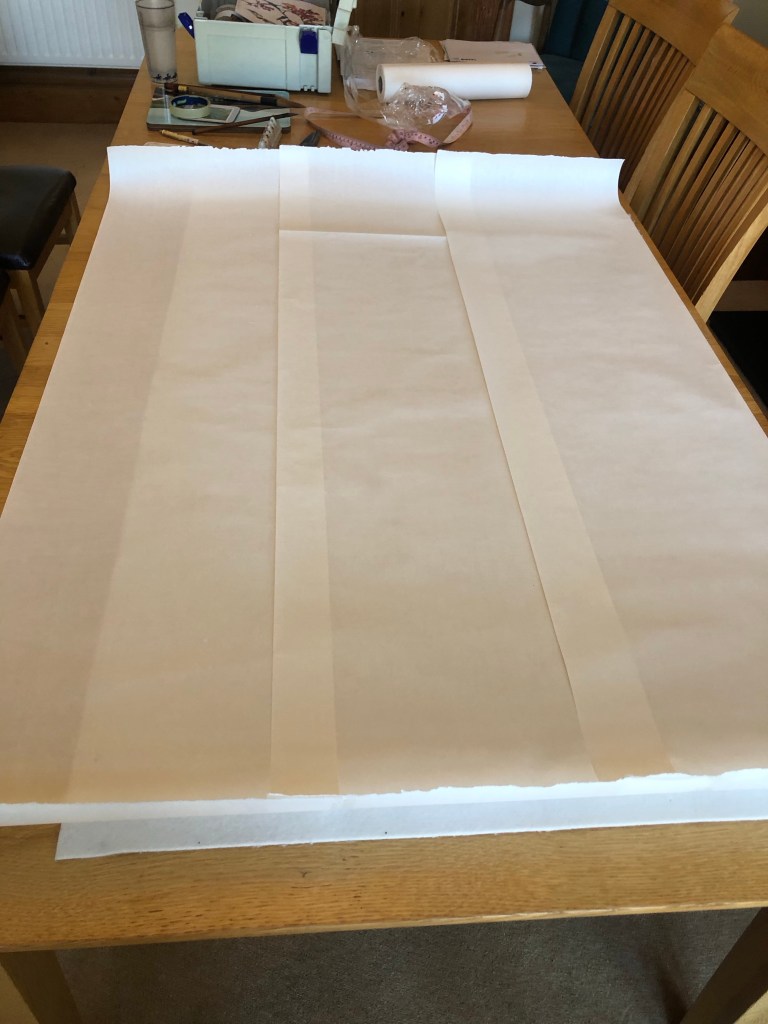
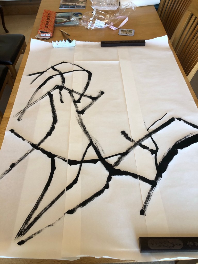
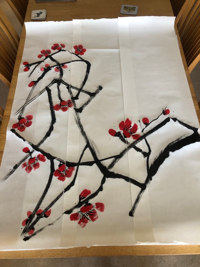
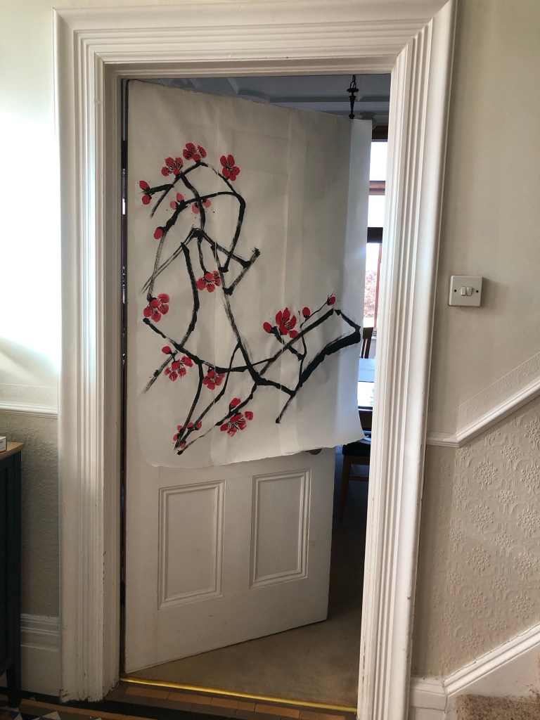
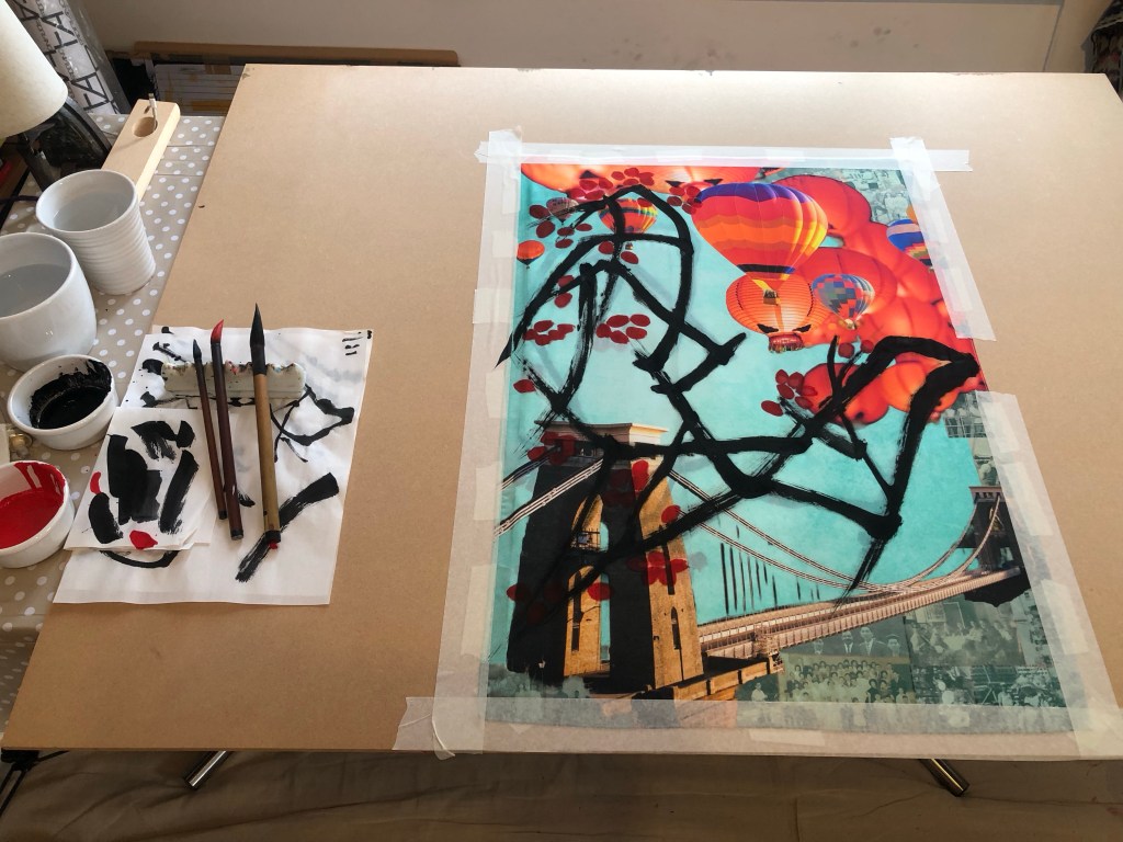
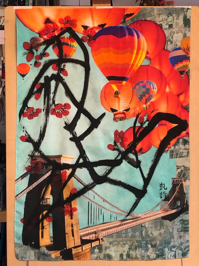
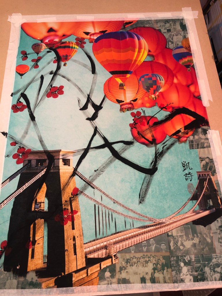
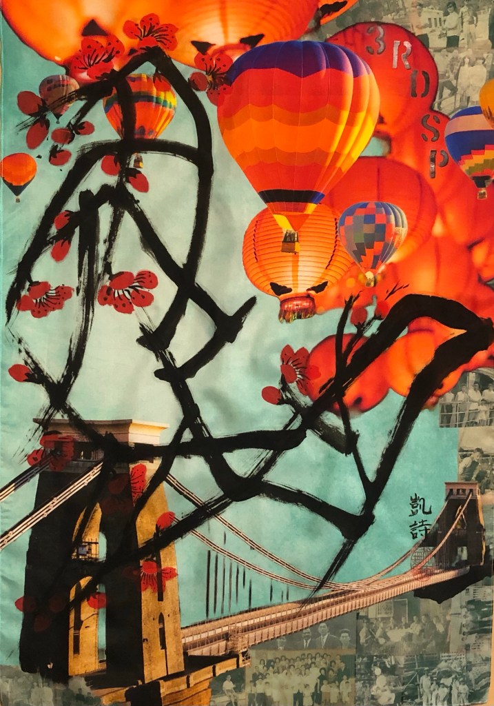
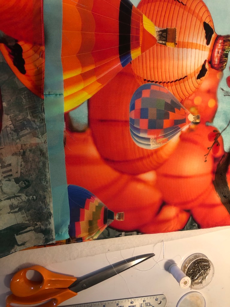
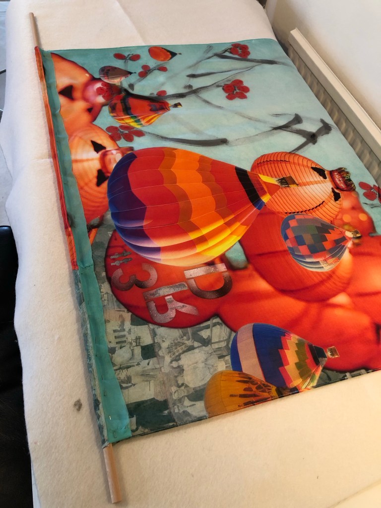
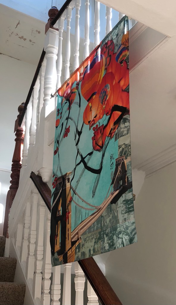
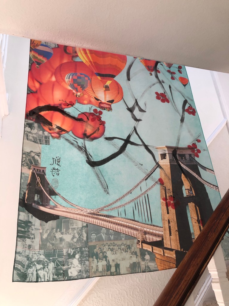
I have been thinking a lot about this since receiving the feedback. Making a Cheongsam painting is a special process in that it makes me feel that I have created something special (to me) when it’s finished. It’s not a judgement of whether it’s good or bad, it just means more to me because of the complexity of the creative process. I set out in my MA Study Statement to find a way to create something that is unique and recognisably mine and I thought I had found that when I started making Cheongsam canvases, hence I referred to it as my turning point. Also, looking back at my earlier work before joining the MA course, I have had attempts at making dress canvases. This was from a period when I was investigating the concept of Expanded Painting and ways to eradicate the traditional canvas. Below are images of the dresses I had made at the time (one of which was also a Cheongsam):

Acrylic ‘canvas-less’ Cheongsam painting
Acrylic ‘canvas-less’ little black dress
Front of large paper dress painting
Back of large paper dress painting

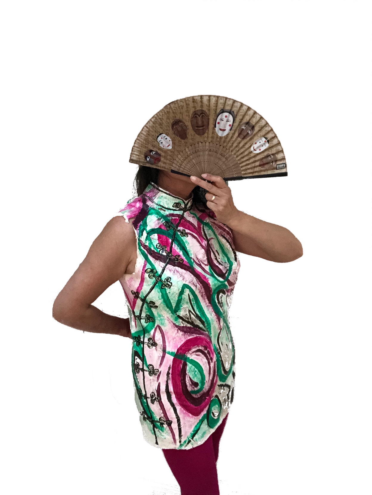
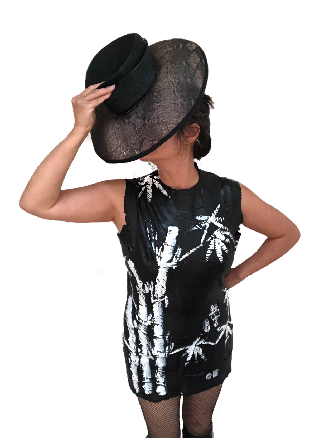
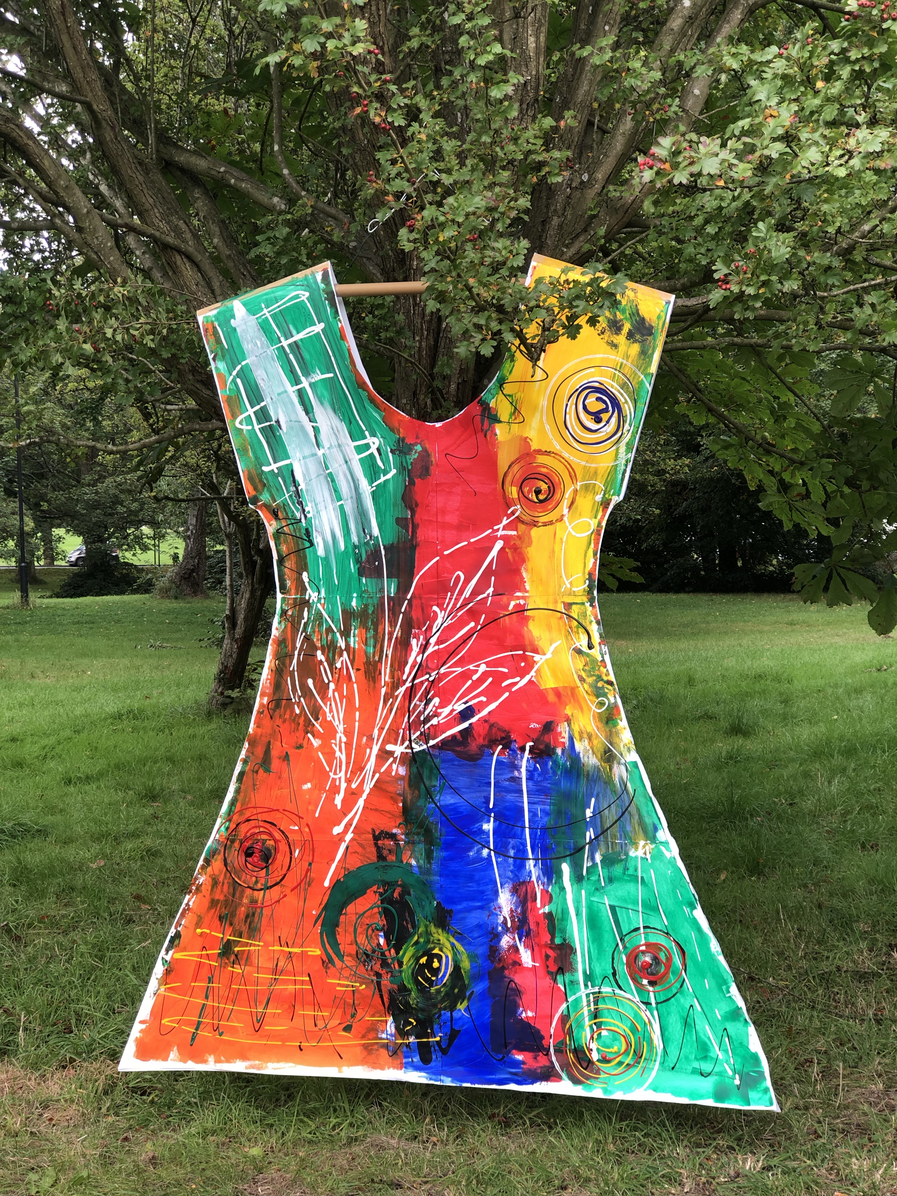
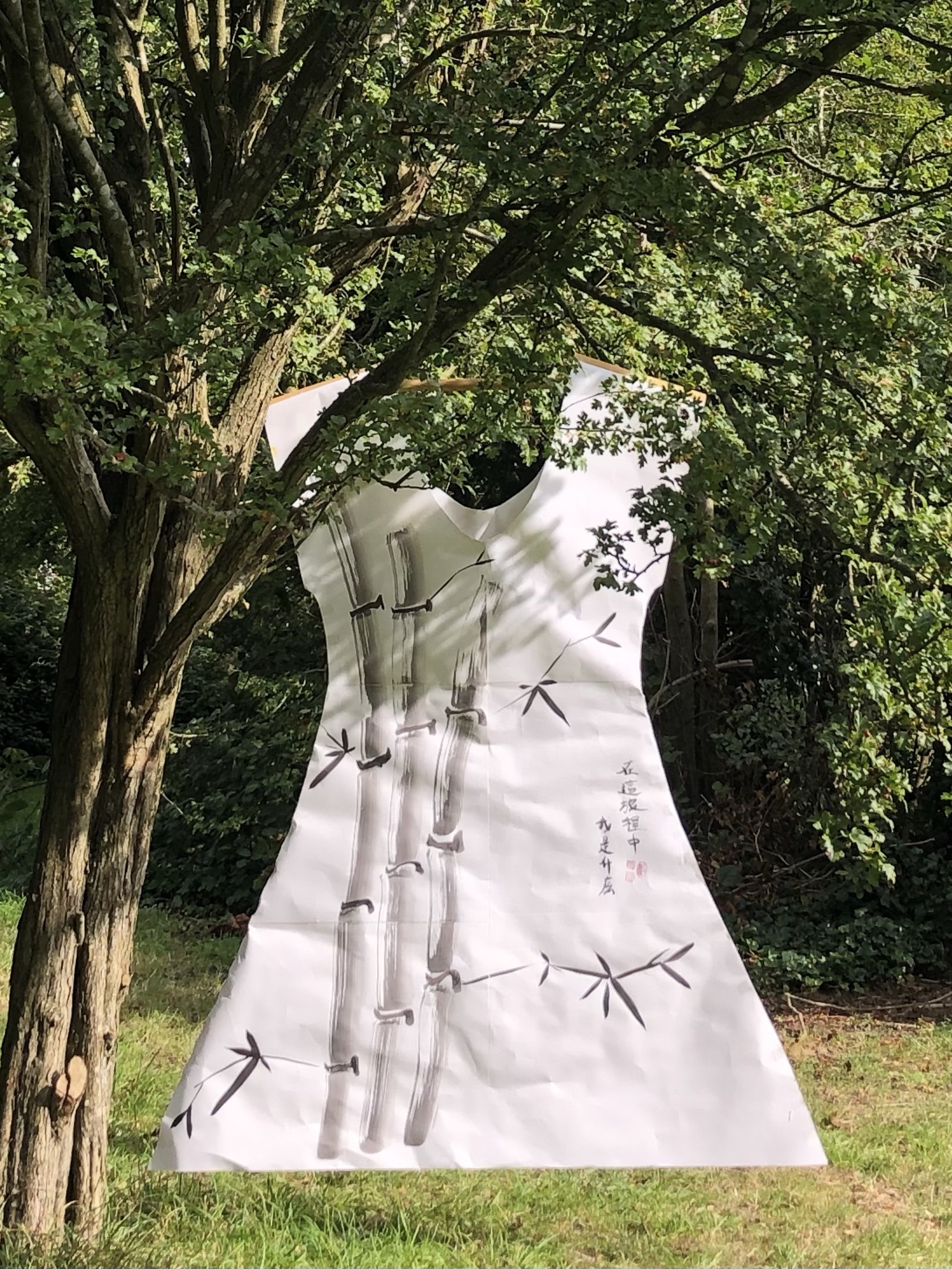
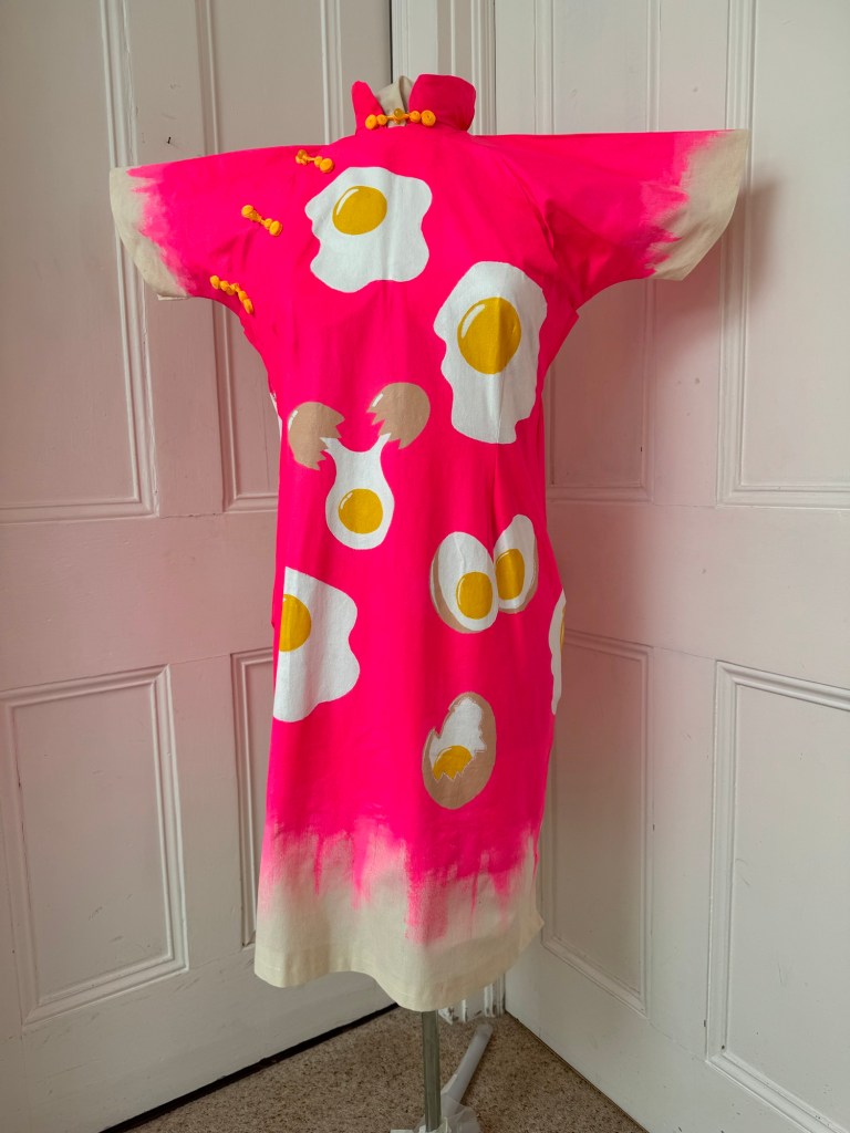
I like the way the Cheongsam or dress paintings are 3D paintings, a hybrid between painting and sculpture. I think showing them as 2D photos does take away from the image especially in my latest Cheongsam series as the curved sides of the dress obscure part of the image. Perhaps a film may help to convey the image better.

I believe the Cheongsam shaped canvas adds to the story and narrative that I am trying to convey about my journey and how we ‘wear’ our identity. Here is a past UAL exhibition about wearing our identity which I found interesting:

https://fashionexhibitionmaking.arts.ac.uk/wearing-our-identity-the-first-peoples-collection/

However, I wonder if my Cheongsam canvases can seem rather ‘gimmicky’. I think I understand the question from my tutor asking if I have the courage to make just a painting without having to paint it on a Cheongsam (I interpret that as ‘without the use of any gimmick’). My response would be – I’m not sure if I’m there yet, but I should try.

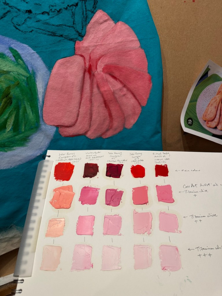
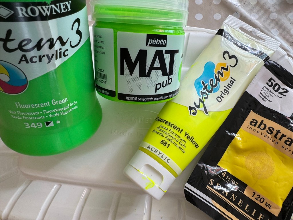
My response here also ties in with the feedback about exploring oil in more ways and trying different techniques. I think that is valid as I am aware that I have been using oil in a limited or single-dimensional way (undiluted and impasto). This can have the effect of over-saturation and I should broaden my approach to utilise all that the oil paint has to offer. By exploring thinner transparent layers and producing less finished images, that would add ambiguity and help me to convey my narrative of working from patchy memories.

On the other points regarding whether ‘banana’ or ‘egg’ are too reductive as metaphors – I plan to respond in a separate blog after completing some research.

LEARNING

I enjoy doing the Cheongsam paintings and I feel that I would like to maintain that element in my practice. However, not all my work need to be on a dress or 3D canvas. My priority now should be to explore more painting techniques and widen my ‘painting vocabulary’ so I can be more creative in expressing complex narratives. To do this, I will pause the making of the dress canvases and spend more of my studio time on painting.

NEXT STEPS

– Explore different techniques of using oil paint so I can be more creative and multi dimensional in my expressions.

– Explore different approaches to painting and ways of thinking about painting.

– Pause the making of Cheongsam canvases for now to release time and return to it at a later time.

– Respond to the ‘banana’ and ‘egg’ feedback with a separate blog.

MA U3: Cheongsam series – Family dinner #2

After making Family Dinner #1 (image below), I proceeded to make #2 with the learning.

Family Dinner #1

METHOD

I was overall satisfied with how the new Cheongsam pattern worked out. But I felt the measurements needed to be more generous if I were to wear the canvas because of the stiffness of the material. If it were too tight then it would be difficult to put on. Hence I modified the pattern to make it wider.

Pattern ready for cutting

I also learnt from the last dress painting that it was difficult to paint the back of the dress if the dress was fully sewn up and placed on the canvas – it was impossible to access the back while the oil on the front was drying for weeks.

Therefore I experimented in this case with not sewing up the sides and draping the dress with the back part of the canvas hanging off the back of the easel. The plan is to paint the front then turn the board to paint the back.

Back of the dress draped over the board

This family dinner has a main dish of ‘flower crab cooked in a clay pot’. So learning from my Chinese painting class – I studied the anatomy first and did a few ink drawings of crabs:

Then I chose the colour of the background based on another Chinese dinner service. It’s the same pattern of the yellow one I used on Family Dinner #1, but of a turquoise colour:

I experimented with different level of tinting to get the right colour and not too dark:

The composition was developed on my sketchbook then marked out using black willow charcoal on the canvas:

Composition drawings

Then I decided that I would sew up the sides of the dress because I felt it would be too difficult to turn the canvas inside-out to sew once it has been painted with oil. So I reverted back to the process I used previously after much consideration. I also used Velcro much more extensively along the complete opening of the right chest and side instead of using a zip or buttons because it would be hard to sew a zip or hand-sew fasteners due to the thick canvas. Hot glue was used to fix the Velcro in addition to the Velcro tape adhesive to ensure it was firmly in place.

Sides of the dress were sewn up

I started with the ‘pan fried sliced luncheon meat’. I once did a tinting paint chart of the different red oil paints I had. It was very useful to choose the colour of luncheon meat from the chart. I chose the shade according to my childhood memory – the colour of artificially-pink meat is difficult to forget!

Then I proceeded to loosely paint and mark out the rest of the composition.

Adding chicken and green beans
Adding clay pot flower crab and Campbell’s

Then more detail painting of the luncheon meat with some yellow edges for the oil used for pan frying:

Adding details to the whole salt baked chicken:

Around this time I received my Unit 2 feedback from my tutor with comments that made me reflect on how I apply the oil paint. So I experimented with some looser strokes on the crab shell.

The painting was finished by completing the Campbell’s alphabet soup and adding pattern details from the dinner service around the dishes. Pink satin fastening frogs were added as finishing touch.

Finished work – Family Dinner #2:

REFLECTIONS

I really enjoyed making this painting. Food is such a key part of Chinese and Hong Kong culture that appreciating food is deep in my DNA. The more I paint these dinners, the more I realise that it’s not just the eating that I enjoy, but the painting of food as well. Working from memory has been great, thinking back to all the meals where these dishes were eating – at home as well as at restaurants.

Some of the unhappy experiences from our family dinners that I talked about in the reflections for Family Dinner #1 did not enter my consciousness for some reason. I realised that some of those experiences were dish dependent. Perhaps the dishes depicted here were ‘safe’ dishes without chances to go wrong. Dinner #1 featured a steamed fish – that was always challenging…

Part way through making this painting I received my Unit 2 feedback and it has been very thought-provoking. It made me immediately reevaluate how I applied oil painting – perhaps I have been too ‘one-dimensional’. Always applying the same (fairly thick) way. I tried a looser approach on the crab shell and was happy with the outcome. I have been thinking about that constantly and I need to experiment much more. How to use paint in a way to depict my distant and fading memory?

The Unit 2 feedback also made me think more deeply about why I am painting on Cheongsam dresses. Why dresses? Why Cheongsam and is the time well-spent in making dress-canvases? There is a lot to think about and reflect on from the Unit 2 feedback and I will write a dedicated blog for that.

I was going to make another cheongsam dress painting after this one, but I think I will make this decision after fully reflecting on my Unit 2 feedback.

LEARNING

– Be more flexible and creative in using oil. Try different thick- and thinness to create impact, to tell the story.

– Doing something just because I enjoy it is not enough a reason to do it. Need to consider more deeply about why – I believe I do this and reflect already but perhaps need to go deeper to examine my reasons.

– In terms of the Cheongsam making process, the increased use of Velcro as fasteners was a success and should be used in future dresses. Using hot glue to fix the Velcro was also a good idea.

– Overall, the pattern development has gone well and I believe I have a well tested and suitable method of producing a Cheongsam painting canvas.

NEXT STEPS

– Experiment with thinning oil and layering.

– Explore ways to depict fading memory without being overly detailed.

– Complete and capture my reflections from Unit 2 feedback. Write a dedicated blog for that and determine next steps to develop my practice. What to do if not Cheongsam paintings?

– Finish the back of the Cheongsam when the front is dried.

MA U2: Cheongsam Series – Family dinner #1

After finishing three other Cheongsam paintings, I started this work with a new Cheongsam canvas design and thicker gauge canvas as described in this blog:

https://eliza-rawlings.com/2024/11/04/ma-u2-cheongsam-dress-canvas-new-method-and-design/

I then explored the possible subjects for this painting and decided to focus on food. In the last two ‘food’ Cheongsam paintings, food was used as a racial identity metaphor. Food in the context of this new painting is about memories of family dinners in the 1970s when I was growing up in Hong Kong. Food was and still is a very important part of the Hong Kong culture. Family dinners are very important and day-to-day life often centres around family dinners. The Hong Kong society is a fusion of many cultures and this is strongly reflected in its food. I want to make a series of paintings to explore my childhood memories and tell my transcultural stories through my family dinners.

METHOD

The idea of making paintings about my family dinners came to me when I visited my sister and she cooked a dish of steamed whole seabass with ginger, spring onions, shiitake mushrooms and coriander in soy sauce. She reminded me this was exactly the same recipe that our late mother used to cook for our family dinners. Seeing the dish and her description triggered many deeply buried memories. I started to remember all the different dishes that my mother use to cook – all those memories that I have long forgotten. I took a photo of my sister’s steamed fish as I wanted to incorporate that into my painting.

As soon as I returned home, I started to research images of dishes that I have had and worked on the composition. Below are some examples created using Adobe Fresco:

Here is a video of the Fresco creation process:

I also used my sketchbook to experiment with different compositions.

The previous Cheongsam paintings were in acrylic on calico canvas and I wanted to paint in oil for this work because I enjoy painting in oil and I wanted to return to oil after not doing so for some time. Also, I had in mind that the toppings for the fish would be ‘piled up’ and I felt that oil paint would give me more freedom and time to play with getting the right texture. I usually just start painting straight away on the canvas, but on this occasion, something was holding me back and I had the urge to do some study drawings first to give me time to think about the details and composition. Below is the study drawing for the fish dish:

At the top of this blog, I listed an earlier blog about using a new design for the Cheongsam with thicker canvas material. This latest dress design and material combination caused the waist area to crease on the mannequin. So far, I have painted all the previous Cheongsams on a mannequin. However, for this one, I felt that it needed to be painted flat to eliminate the creases during the painting process. So I moved the canvas from the mannequin to the easel.

Painting moved to the easel so that I could paint on a flat surface:

I proceeded to mark out the composition starting with the centre piece – the steamed fish. The placement of the fish dish is reflective of a Chinese family dinner where the steamed fish (if on the menu) would typically be placed in the centre as the signature dish.

Having roughly marked out the fish dish, I added a plate of steamed baked beans. Since Hong Kong is/was such a fusion of different cultures and heavily influenced by the British due to colonialism, it was not unusual to have imported tinned food served alongside traditional Chinese dishes in my family. In hindsight, it sounds strange and funny to serve these two very different dishes together; but at the time it was the most natural thing – food was just food especially for a child. I never thought about their origins or the reasons that caused these two dishes to came to be served next to each other. I remember my mother calling baked beans ‘pork beans’ at the time and I remember at times there were small pieces of pork fat among the beans. I researched this and found that manufacturers did put pieces of pork in with the beans but removed them due to World War II meat rationing. I am not sure if they reintroduced pork in the 1970s or if what we ate were left over from the old pre-war stock!

Other dishes were gradually added to the menu, each dish having their individual significance in the role they played in our family dinner. I also enlarged the two fish to give them more prominence and I wanted a tight composition as from memory, dinner tables in Hong Kong were always crowded with food.

I tried using charcoal with oil which I had never done before and below are photos of the initial experiment on oil-paper:

The experiment was not satisfactory because the charcoal did not work well on oil-paper, so I returned to experimenting on the canvas:

I was pleased with the charcoal effect and proceeded to paint the fish:

Toppings of spring onions, shiitake mushrooms etc. were added in thick layers of oil paint:

Time to add the dessert – Del Monte fruit cocktail.

To complete the composition, I added pattern details from the Chinese dinner set that my parents used at the time around the various dishes on the painting.

The completed front part of the Cheongsam painting:

The painting was put back onto a mannequin as I wanted the oil paint to cure according to the shape that it would eventually be displayed in. Then green satin ‘frog’ fasteners were added to complete the Cheongsam look.

Below are images of the finished front half of the painting with –

-Steamed whole fish with spring onions, ginger, coriander and sliced shiitake mushrooms in soy sauce;

-Braised pork belly with preserved mustard greens;

-Gai Lan (greens) with oyster sauce;

-Steamed baked beans (imported) and

-Del Monte fruit cocktail (imported).

Family dinner #1‘, oil and charcoal on 240gsm cotton canvas. Size: 98 x 68 x 28cm.

REFLECTIONS

So many thoughts and memories went through my mind while making this painting, it is hard to know where to start for my reflections. Like I have done before, I will use ‘free writing’ to capture them as they come into my consciousness as I write.

– Only in hindsight when I am doing this painting did I realise what a strange fusion of cuisine we experienced growing up in Hong Kong. Not only because imported tinned food like ‘pork beans’ (now known as baked beans) were served alongside carefully prepared Cantonese dishes, but the fact that the beans were steamed in a wok to heat up was rather amusing. Since my mother would not have known how baked beans were meant to be served, so steaming in a wok was her default method. As children, we loved mixing the baked beans with our boiled rice in our bowls because of the sugar and salt in the beans. Like many children all over the world, we (sadly) appreciated the processed food more than the poor mother’s fresh cooking!

– My father was the patriarch. He expected a well cooked meal twice a day (he used to come home for lunch). If the meal was not up to standard then there would be consequences. He was not physically violent but there would be a ‘dark cloud’ over our dinner, eaten in silence with the children exchanging glances but no one dared utter a word. The rejected dishes would be sent back to the kitchen to be remedied if possible (if overcooked then not possible).

– So my mother had to deliver two perfect cooking performances per day, everyday. Chinese cooking can be challenging, to get the taste balance, texture, freshness, aesthetics (just to name a few requirements) correct for every dish is very demanding. Especially when the ‘judge’ had high expectations. For example, for a steamed whole fish, the fish had to be cooked just right, not overcooked or undercooked – this is challenging even for restaurant chefs. If there was steamed fish then as soon as my father sat down at the table, he would split the fish open along the spine bone with his chopsticks and examine the ‘colour’ of the flesh, if there was any hint of pink along the spine ( meaning undercooking) then the chopsticks would be slammed down as a gesture of disapproval, no words needed to be said and the dish would be taken back to be remedied. It is no wonder my mother sometimes used Western tinned food to make up the number of dishes to get by. Since my father worked for the Hong Kong Government and was a life-long civil servant to the ‘Colonial Crown Service’, he was very accepting of Western tinned food because we (the colonised) were led to believe that anything from the West was superior. So in this context, colonialism in fact brought with it some occasional relief for my mother in her job of family meals planning.

– I think I chose a bright yellow background for my Cheongsam dinner because I love food and enjoying good food makes me happy as it is such a key part of my heritage. I always wanted family dinners to be fun, bright and cheerful. Although there were often ‘dark clouds’ that loomed over our family dinners, as kids, we would find reasons to giggle at the dinner table – it was our way of responding to the situation through kids’ humour.

– The background yellow is also similar to one of the dinner sets that my parents had hence I incorporated some of its design onto the dress. I will elaborate about the dinner set design on the back of the dress as it has an interesting history.

– There were other back stories to the dishes on the painting and on how ‘the family dinner’ was often where the dynamics of my parents’ relationship played out. I am reluctant to detail all of them because it would be unfair to my parents who are not around to say whether they wanted their stories to be told. Also, I am not sure if I am ready to express everything yet.

– I wonder, how does one find out if the dead would want their stories told and how does one decide whether to tell them anyway? Also, I can only tell a story through my lens, so whose story would I be telling?

– Recently, I have been thinking a lot about ‘process vs outcome’ in my practice. I have thought more deeply about this since I started to make Cheongsam paintings. I think it is because the work takes longer and involves more complexity, so the extensive creative process gives me time to think more deeply. Especially with this Family Dinner painting – the composition is more complex than the previous ones and painting in oil takes longer which is part of why I love to paint in oil – the process and materiality force me to take my time. The surrendering of agency to the process elates me. My thinking during my making process comes in many forms, such as reflections and memory recalls that I would often incorporate into my painting, or ‘put aside’ in my ideas bank for future paintings. All these thoughts go towards the sense-making of my journey, my identity and the world around me. It is right now at this very moment in time while writing this set of reflections that I have come to truly understand what ‘sense-making’ means – to me. I wish I could bottle this moment before the thought eludes me.

– I wrote in my research paper about two transcultural artists and their sense-making that takes place on the canvas. For the paper, I researched about sense-making and how that process fundamentally supports the human survival. In the context of migration, people displacement or in a transcultural setting, where the environment is new or constantly changing – I believe the opportunity to reflect and make sense of one’s experience is essential to survival in a meaningful way; to feel belonged in the world and not merely to exist. Unfortunately for many, the quest for physical survival can be overwhelming therefore depriving them of the opportunity for the much needed sense-making.

LEARNING

When I first started planning the structure of my blogs at the start of my MA programme, I had planned for the REFLECTIONS section to be free-thinking and free-flowing, capturing whatever came to mind related to the work or during the making process. The LEARNING section is there to bring the thinking back to the context of my practice to extract any practice-related learning and plan the next steps. This structure has helped me to develop my practice so far and is becoming even more important as my reflections become more extensive and ‘free’. So I will now try to extract some learning from the this piece of work and the above reflections.

– Referring to my thoughts on ‘process vs outcome’, there is increasing clarity for me as to why I am not always bothered about the work once it is finished. For me, the work is a way to provide a process – the process is more precious to me. The process gives me quality thinking time and it ‘walks with me’. I enjoy making very much, but it is the making while thinking or reflecting that is the most valuable for me.

– So what am I going to do with this realisation, or confirmation of what is valuable for me in my practice? I don’t know yet, maybe I don’t need to do anything to bring these thoughts to a conclusion, perhaps it is just a beginning with no end – that feels exciting. So I will go with ‘it’ and try not to over think ‘it’.

– I have thought a lot about how I could capture some of the more abstract elements that came out during the making process, perhaps onto a piece of physical work – could be painting, writing, 3D etc.. I remember in a much earlier blog, I talked about wanting to find ways to express my thoughts through abstraction as that might liberate me to express more freely without the confinement of physical preconceptions. A specific image that has been recurring in my mind since finishing the Family Dinner painting was the pink tinge (of blood) that would sometimes be visible along the fish’s spine as my father parted the flesh of an undercooked fish with his chopsticks. For me, that tinge of pink symbolised innocence and trouble at the same time. I need to do something with that pink to get it out of my head.

– As I was making this painting, many memories of other interesting family dishes and stories came to mind and I am bursting to paint more dinners to capture them.

– I also need to complete the back of this dress. I had originally thought about painting a second dinner on the back, but I have decided to not do this because I want to save some of the dishes for other dresses as I want to make a series of several ‘Family Dinner’ paintings. Also, I want to paint the design of the dinner set that my parents had because it has an interesting history.

– As for the new Cheongsam sewing pattern that I used for this painting canvas – I am very pleased with the new design because it does not have any darts so the canvas can be painted flat which means I can use thicker canvases and paint in oil which is my preferred medium for this current series of painting.

– The new Cheongsam canvas design also means I have reduced the making time of the canvas from two days down to around half a day. This improvement was due to a simpler design and my experience gained in making these canvases – I am now more confident in sewing with my machine and quicker in trouble-shooting. This means I have more time for the other parts of the creative process.

– A key learning in making Family Dinner #1 was to take time in my making. I have in the past rushed my work, for no specific reason but to just ‘get things done’. The study drawing of the steamed fish was invaluable for me and gave me the confidence to experiment and take chances when painting on the canvas because of my enhanced observations. I now appreciate why artists make study drawings!

NEXT STEPS

– Paint the back of Family Dinner #1 with the family dinner set design.

– Start to research and make Family Dinner #2.

– Continue to take time in my making, e.g. allow time to make study drawings and appreciate materiality.

– Experiment and play: do some abstract paintings of ‘the pink tinge’ to explore how to capture some of the ‘magic’ that I have felt during my making process.

MA U2: Cheongsam dress canvas – new method and design

Since I have decided to do a series of paintings on Cheongsam shaped canvases, I started to look for more efficient ways of making the canvas to give me more painting time. I was asked by my tutor if it was important for me to make the canvas myself or if they could be made by someone else. My response was that I felt I had to make them because that was part of the making process for me. I have become increasingly aware that the process is more important for me than the outcome since the process provides valuable thinking and reflecting time for me.

The photo below shows the design of the Cheongsam canvas that I have been using up to now. It is made of relatively light calico material and the design is easy to make. It is a loose fitting design and I have been putting in darts on the front and back to give a more fitted look in line with modern Cheongsam designs that have been influenced by European designers in the 1960s. This design has worked well as I have been painting simple pop art designs in acrylic and the materials worked well together.

However, for the next few pieces of work, I wanted to make more complex paintings in oil. So I needed a more robust canvas material and ideally a dress design without having to sew the darts which could be difficult with a thick canvas.

METHOD

I sourced a book from Hong Kong that has a simpler Cheongsam pattern that didn’t involve sewing darts to achieve the traditional fitted look:

I copied the design into my sketchbook and customised the measurements:

The measurements were checked against an existing dress of mine:

Dressmaker’s drawing tools were used to add in the curves and complete the pattern:

The pattern was pinned to the 240gsm cotton canvas for cutting:

The dress was sewn according to the instructions:

A mistake was made when cutting the front hence a part of the seam was showing. Hopefully it would be less obvious once the dress was painted.

Back view:

The dress was painted with a vibrant yellow colour – a mixture of gesso and acrylic paint to prime the canvas.

Due to the stiffness of the fabric, there were areas around the waist where the painted fabric was creasing heavily. That’s not great for painting so would need to find a way to minimise this problem:

REFLECTIONS

I was very pleased to find the simpler dress pattern especially because that made it easier to use thicker canvases for painting as I wanted to go into painting in oil which is a medium that I preferred.

However, not sewing in darts has caused the fabric to crease heavily around the waist and I needed to find a solution rather than adding darts to such a heavy fabric. Despite this, I was very pleased with the progress of experimenting with a new pattern that would really speed up the process of making the Cheongsam canvas.

LEARNING

I was frustrated by myself in missing out one small step when cutting which led to the seam being shown on the front chest area. Lesson learnt and I have made a clear note in the pattern as a reminder for next time.

NEXT STEPS

Find a solution to minimise the creasing around the waist and start painting!

MA U2: Working from a dream – Mending tights

While I was on holiday in Scotland during summer 2024, I had a dream one night about making a piece of art work with pieces of laddered (torn) stockings or tights. The ladders were ‘repaired’ using nail varnish. Then each piece was framed individually in an ornate thick gold frame. It was such an unusual dream that as soon as I woke up, I captured the dream in my sketchbook in case I forgot the details as I often struggle to remember my dreams.

Mending stockings or tights with nail varnish was a technique that I learnt from my mother when I was little. If I laddered my school tights then she would mend it with her nail varnish. If the tear was small or in an area under my dress then it was fine to repair in this way without having to buy new tights all the time. Otherwise it would have been costly with an active child. In hindsight, it was ridiculous to make small children (girls) wear tights as school uniform, it was most impractical!

When I returned home after the holiday, I decided to realise my dream to make some art by mending a stocking.

METHOD

The first challenge was that tights and stockings nowadays are usually made of ladder-resistant materials which means they don’t ladder!! I had to dig out some old socks in order to find materials that would ladder. After laddering the material, a piece of white card was rolled up and inserted into the sock.

Some tissue was placed behind the ladder then red nail polish was applied at various points to stop further laddering.

This process was repeated with a second piece to create two pieces in total:

The two pieces were placed on a large piece of white card, in different arrangements, to experiment with composition:

REFLECTIONS

It was such a strange dream that I could not think of what would have triggered such a memory during a holiday in Scotland. Throughout the planning and making process, I thought about all the things that we learn from our parents. My mother didn’t actively teach me to mend my tights, I just watched her and that technique was cemented in my subconscious.

During the last year when I have been making Chinese Cheongsam dresses as painting canvases, I have been thinking a lot about watching my mother dressmaking when I was little and how much I learnt from her without being conscious of it.

Thinking more about it – a week before I had the dream, I was looking at some old family photographs shown to me by a family member. Many of the photos of my parents that I had not seen for years. Perhaps seeing those images somehow unlocked the memory of mending my school tights. The act of mending tights is uniquely personal and it only happens between mother and daughter because boys do not wear school tights and it’s unlikely that fathers have nail varnish to hand. Also, a mended pair of tights hidden under a dress is a secret between mother and daughter, or between women when such techniques are passed from one to another. Those moments are precious.

It is usually at this point of reflection that I start to feel sad because I left home so young (14) and I must have missed out on so much learning from my mother, or just time with her to enjoy that unique bond, sharing secrets that only we knew about and that united us from the world. As always in life, we don’t appreciate how precious those moments are until much later.

I decided to stop after making two pieces and didn’t realise the whole dream of making multiple pieces into an installation. I may come back to it at a later stage. For now, I feel that this experiment has served its purpose in testing out the process and triggering reflections that will keep me thinking for some time. Overall, I am happy with how this quick experiment went and pleased with some of the images I produced.

LEARNING

I usually make work after lots of thinking and planning. This piece of work came from ‘left field’ (a dream) and the making was quick and experimental. I enjoyed the diversion from my main project and to get some results so quickly was enjoyable. A large painting often takes so long that having some quick work in between can help to feed my need for results as well as interrupt the agony of painting. I recently heard an artist on TV saying that painting has the word ‘pain’ in it – too true!

Also, I have become increasingly aware of the importance of my thinking during making. Before I start making work, I think a lot about how to make it. But during making, the work takes my mind to many places that I have either long forgotten about or didn’t know existed. Hence I am becoming aware of the quality thinking time that ‘happens’ when I am making art. In a recent discussion during one of our MA online sessions, we talked about process vs product. That was very helpful as I feel excited about my discovery of how important the process is for me, much more important than the product. In fact, I am usually not so bothered about the product as it is secondary to the process for me. Perhaps for me, the purpose of the product is merely to provide a process.

NEXT STEPS

– Continue to enjoy the thinking and reflecting time during my making process.

– Do not feel guilty about taking diversions from my main projects; quick diversions like this one has provided invaluable insight from my subconscious. I should value it.

MA U2: Cheongsam Series – Food as metaphor for cultural identity – ‘You’re a banana!’

This is the second painting of the Cheongsam Series – Food as metaphor for cultural identity. The blog below is the introduction to the series with background information on my thoughts on this topic as well as some research.

MA Y2 U2: Cheongsam Series – Food as metaphors for cultural identity – Introduction

The blog below is for the painting that responds to this one, called ‘No, I’m an egg.’. I was meant to do the ‘banana’ painting first but due to shortage of green paint at the time, the second ‘egg’ painting was completed first.

MA Y2 U2: Cheongsam Series – Food as metaphors for cultural identity – ‘No, I’m an egg.’

METHOD

Since I am not an experienced dressmaker, I am rather slow in making the dress canvases. I constantly look for ways to be more efficient in the dressmaking process, so the canvas materials for this dress was cut at the same time as the ‘egg’ painting canvas by doubling up the calico material to save time.

Here is the completed dress canvas ready for the banana painting:

Different banana images were considered for the design. I wanted a ‘closed’ banana and a half peeled banana.

Clear gesso and fluorescent green acrylic paint were used to prime the canvas and for the background:

Banana shapes were marked onto the canvas using white chalk to map out the overall composition before painting.

Then initial blocking out of the banana images were made:

I was not satisfied with the Daler Rowney System 3 acrylic fluorescent green colour – it was too dark and dull, I wanted a neon-look. So I bought some brighter paint by Pebeo.

The Pebeo paint looked brighter which was better.

The Pebeo paint dried slightly darker but still brighter than the Daley Rowney System 3 paint.

Since the Daley Rowney System 3 acrylic paint is a student grade paint, the pigment density was not great. I had to paint three coats to get a good coverage. Then I changed to the Pebeo paint and a further two coats were added. In total, there was five coats of acrylic paint which made the canvas stiffer than the ‘egg’ dress. This made sewing on the ‘frogs’ (Chinese style fasteners) much harder. See below for the not-so-tidy sewing where I had to just push the needle through wherever I could due to the thick canvas by that stage.

Finished work – ‘You’re a banana!’. Acrylic on handmade Cheongsam dress canvas. L105 x W76 x D30cm.

REFLECTIONS

The making of this painting did not go as well as the ‘egg’ painting because of the additional coats of green background colour required making the process more extensive than before. Nonetheless, I am satisfied with the outcome and the way the two dresses respond to each other. I will capture my reflections in full for both dresses in this blog:

MA U2: Cheongsam Series – Food as metaphor for cultural identity – Overall reflections for ‘banana’ and ‘egg’

LEARNING

There are several learning areas from this painting…

1. The Velcro ‘zip’

The learning from the ‘egg’ painting on the making of the Velcro ‘zip’ was very important and I am pleased that it worked out well for this painting.

Reminder of the problem on the ‘egg’ dress with the Velcro seam being visible from the front, not ideal aesthetically:

Taking the learning from the above has helped me to improve the Velcro seam for this painting:

2. Paint materials

Much time was spent on the many (five) coats of paint required for the background green colour. This was frustrating at times, but it was good learning. I should do more research into the colour and materials before embarking on a large painting. I knew student-grade paint typically has less dense pigment load and I should have been more prepared with this knowledge. The pink background of the ‘egg’ painting was ‘abstract innovative acrylic’ by Sennelier. It was relatively inexpensive with higher pigment load than the Daley Rowney System 3 acrylic. I was very pleased with the Sennelier acrylic and will bear this in mind in future paint materials selection.

3. Time saving methods

Doubling up the calico materials and therefore cutting two dresses together saved time. I will continue to look out for ways to be more efficient in making the dress canvas. I want to continue to make the dress canvases going forward because I enjoy the making process and it is good opportunity to think. However, I don’t want to spend excessive time on that part of the process because I knew I would become impatient and would want to get on with the painting.

4. More research up front

I could spend more time up front to test out materials, colour and composition (e.g. in my sketchbook) before proceeding onto the canvas. I think this will be useful and become more necessary going forward as I expect the next series of paintings to be more complex, both in idea and composition.

NEXT STEPS

After making these two paintings, it is a good point to pause and reflect properly on this series of work. I will capture my overall reflections in a separate blog. After that, I will go onto make more Cheongsam paintings because I am still excited and enthusiastic about this method of art making. I hope to crystalise my thoughts about the topic for the next painting while reflecting on this series.

MA U2: Cheongsam Series – Food as metaphor for cultural identity – ‘No, I’m an egg.’

After accidentally finding my late mother’s silk Cheongsam (traditional Chinese dress) in my loft, I have been exploring making my own 3D canvas in the shape of the iconic Cheongsam for painting. My reason for wanting to make such a canvas is captured in this blog:

MA Y1 U2: Cheongsam Series #2 – study drawing

Below are two blogs on the first experimental 3D canvas painting that I made as a start to the Cheongsam series of work. I have gained much invaluable learning through making this first dress because I am completely new to dressmaking:

MA Y1 U2: Cheongsam Series #3 – wearable painting

MA Y1 U2: Cheongsam Series #4 – Appropriation. Appropriation.

Then I started to think of subjects for my next paintings. I thought of doing something about my identity which is a foundation topic of my art practice. I explored using food as metaphors for cultural identity and started with a digital sketch of pop art ‘banana’ theme. The blog below explains what ‘banana’ means in this context with more background information:

MA Y1 U2: Cheongsam Series #5 – She’s a banana! – Part A

Then I decided to capture more about my thoughts on the subject with additional research findings. Hence I created a blog as an introduction to the Cheongsam Series – Food as cultural identity metaphors. This blog includes an extract from the film ‘Crazy Rich Asians’ where the meaning of ‘banana’ was explained as ‘yellow on the outside, white on the inside’ – a metaphor for a ‘Westernised’ East Asian person.

MA Y1 U2: Cheongsam Series – Food as metaphors for cultural identity – Introduction

Within the above introduction, I also talked about my personal response to ‘You’re a banana!’… my response would be ‘No, I am an egg.’ The two food metaphors were chosen as subjects of this Cheongsam series.

I wanted to make the ‘banana’ painting first, but I found that I didn’t have enough paint in stock for the chosen green background colour that I wanted to use. So while I ordered more green paint, I proceeded to create the ‘egg’ dress first.

METHOD

I made the canvas Cheongsam dress using the same dressmaking pattern that I had used before. Like the last dress I made, the material used here was also calico.

Learning from the first dress that I made, the pattern was a very loose fitting dress therefore darts are definitely required on the front and back of the dress:

The first dress that I made was hand sewn because my old sewing machine gave up on me. I bought a new sewing machine for this dress and I chose a heavy duty one since I was planning to sew thicker canvas materials going forward.

Below is the completed dress canvas in calico:

I chose to use fluorescent or neon colours with a pop art theme for this Cheongsam series because I wanted them to be fun. These food metaphors are often used in a light-hearted way from one East Asian person to another, hence I don’t want these paintings to be too serious. I decided to use fluorescent pink for the background for the ‘egg’ dress as a response to the fluorescent green that I had planned for the ‘banana’ dress. Pink was meant to be a fun response and I felt it would help the eggs to stand out in the design. The medium below was used to prime the canvas:

Below are the front and back of the pink dress canvas:

A variety of egg images were considered for the design:

The shortlisted eggs were marked onto the pink canvas with white chalk prior to painting:

Below are images of the finished painting:

The painting is wearable:

Finish work: ‘No, I’m an egg.’ Acrylic on handmade Cheongsam dress canvas. L105 x W76 x D30cm.

REFLECTIONS

I am pleased with the outcome of this painting. I feel the colours and composition worked out well with the eggs. I am also pleased that the canvas is wearable. Although I had not intended for it to be a piece of garment, being wearable will give more options of how to present such a piece of work. I enjoyed the making process, too. I will capture my full reflections for both the egg and banana dresses together at the end of the series in this blog:

MA U2: Cheongsam Series – Food as metaphor for cultural identity – Overall reflections for ‘banana’ and ‘egg’

LEARNING

Since dressmaking is so new to me, there were lots of good learning from a technical making perspective:

For this design, making the darts from the start (before painting) worked better so should bear this in mind. Get the dress to fit (if intending to wear) as well as possible before painting is key. Once the paint is applied, the sewing becomes harder and manipulating the canvas would risk creasing the paint.

The most important learning was the fitting of the ‘zip’. Instead of using a conventional zip, I used a strip of Velcro because that was easier. Since these dresses are not really garments for everyday wearing, I believe Velcro is sufficient and a good alternative. However, I learnt from this dress that how the Velcro is placed can make a big difference aesthetically. The two Velcro pieces have to be placed on the interfacing of the opening in a way that minimises its visibility from the front view. I hadn’t appreciated this because I accidentally did it correctly in the previous ‘blue willow’ dress, but I did it incorrectly here.

Incorrect way meaning the Velcro is visible from the front:

Correct way below – the Velcro is not visible from the front. I must remember that the edge of the seam for the zip-opening on the back piece should be left free, i.e. ‘not sewn down’; whereas the corresponding edge for the front panel should be sewn down so that the Velcro seam is rear facing when in place.

NEXT STEPS

Make the banana dress!

MA U2: Book art – Part 1

During the MA low residency at CSM in March 2024, we had a book art workshop where we learnt to make zines and some simple book. The artist hosting the session mentioned a book art event that takes place in Bristol once every few years. I was delighted to find that it was on this year and I attended the fair.

There were nearly 100 stands; it was a great opportunity to talk to and learn from experienced book artists. I came away feeling enthusiastic to try this beautiful art form.

Another reason for my enthusiasm was that I recently attended a Suminagashi workshop. Suminagashi is an ancient Japanese technique of making handmade marble paper and washi by floating water-based inks on water, then laying the paper on top to absorb the ink and water pattern. See post:

https://eliza-rawlings.com/2024/07/05/suminagashi-workshop-ancient-japanese-paper-marbling-technique/

Here are some of the Suminagashi paper that I made during the workshop:

Small A4 size sheets
Larger A2 size sheets

METHOD

From the techniques learnt during the low residency workshop at CSM, I made a few different types of simple books using the smaller sheets of Suminagashi paper:

I experimented with some Chinese ink calligraphy on one sheet of paper, then folded it into a simple book:

On another Suminagashi book that I made, I chose four Tang Dynasty poems and wrote them in the book using Chinese ink calligraphy, each paired with a small painting:

The seal on the last page of the book is a new Chinese stone seal that I designed. I managed to have it carved in Hong Kong and brought back to the UK by my Chinese painting tutor. The phrase on the seal means ‘The Third Space’, a concept that my art practice is based on so I will use it like my artist’s signature. The seal is carved in an ancient Chinese font.

Below is a video with my narration, reading out the English translation of the poems. Note that traditional Chinese books open from the opposite direction to English, Romance or Germanic language books:

REFLECTIONS

I was really inspired by the visit to the book art fair. It helped me to understand how broad the scope of this art form can be. I knew very little about book art until the low res workshop earlier this year and I am excited by it. I enjoyed making the simple books in this exploration, especially using the Suminagashi paper. Here is a summary of what I enjoyed about this exploration:

– I enjoyed the quiet pleasure in the act of folding paper carefully, especially with beautiful paper such as the Suminagashi paper. The feel of the material surface, the edges and creases all added to the meditative effect that this art form has to offer.

– I enjoyed learning a new skill in making books. Although I am only making very simple ones at the moment, I am excited by the potential complexity and scope that book making can offer. It is new knowledge and a new challenge for me.

– Once a book is made, it is like having a new canvas calling out for creativity that requires a new way of thinking compared to my other work.

For me, it is a two stage process: (1) Think about how I want ‘the canvas’ to be and realising that idea through physical making; then (2) express my art on the made canvas. The stages are similar to the Cheongsam (Chinese dress) canvases that I have been making for painting. That approach also requires creating a 3D canvas first through a step-by-step ‘technical’ process before any drawing or painting can take place.

The similarities between my book-making and dress-making to create canvases only occurred to me during the writing of the above reflections. I was beginning to feel concerned that I might be going from one thing to another too soon in my practice. I am not dropping the dress-making work, in fact, far from it – I have planned many other projects based on Cheongsam canvases. But I also want to explore book art and I now realise the similarities between the two in the context of my practice. I believe it can be explained as follows:

– The book-making or dress-making processes start by my following some guided steps, this way of making gives me a structured approach to starting a project. Meaning, it is unlike just getting out a plain sheet of paper or a pre-made blank canvas where you are immediately faced with having to decide what to paint. Through the structural and systematic start of the creative process (i.e. making a book or a dress), I can proceed to create ‘productively’ and while I am making the ‘complex canvas’, I can think about what to paint on the canvas or to finalise the ideas in my head. The process of making the canvas (which in the case of a dress can take several days) gives me quality thinking time whilst doing something productive and not just sat in front of a blank canvas feeling bad that nothing was happening.

LEARNING

Attending the book art fair taught me a lot about the scope that this art form can offer. In my own experiments, I have learnt more about the art of making books from a technical perspective – I am at a very early stage right now but I definitely want to learn more to make more complex or larger books.

My reflections above made me realise that the process of making the canvas myself (e.g. a book or a dress) has been a key part to my enjoyment in making art recently because I have been using the canvas making time and process to aid my thinking and to finalise my creative ideas. I have been doing this without consciously knowing it. I value the fact that making items such as a book or a dress are established processes and therefore give me a secure and stable route to start each piece of work. On the contrary, if I were to create a completely free-form assemblage from found items as a starting point, I would be inhibited by such an open and abstract process at the beginning of a piece of work – I would not know where to start and therefore it would be like sitting in front of a blank canvas again. This realisation is very important and useful for me because I can now think about other potential canvases that I can make from an established method in order to expand my practice.

NEXT STEPS

– Continue to make books and learn about book making to expand my knowledge.

– Think about other canvases that I can create in addition to books and dresses that would enable me to have the quality thinking time as part of my creative process and to avoid the ‘starring at a blank canvas’ problem.

UPDATE:

I made another book using a piece of Suminagashi paper folded into a small long book. In it, I wrote four short Tang Dynasty poems in Chinese calligraphy and coloured some areas using Chinese painting colour.

MA Y1 U1: Exploring Aesthetics – Part 2 – Painting on silk for MA Interim Show

BACKGROUND

Following on from Part 1:

MA Y1 U1: Exploring Aesthetics – Part 1 – Using photos

I ordered the silk printing from Contrado who provided an excellent service. The image I used was the final outcome from Part 1 – the Clifton suspension bridge, hot air balloons, Chinese lanterns and family photos collage. This blog describes the process I went through to do the Chinese painting on the printed silk. The largest Chinese painting I have done up to now had been A1 size and I ordered 1xA1 and 1xA0 for this experiment. The A0 piece was therefore by far the largest Chinese painting that I have attempted. The plan was to use this piece of work for the MA Interim show if it worked out.

Here is the finished painting and I will use it for the MA show:

METHOD

Since I have not done a Chinese painting of A0 size, I wanted to practice on paper before doing it on the silk. As mentioned in some of my Chinese painting blogs, Chinese brush painting is very unforgiving, you only get one go at doing a stroke, hence practicing was important.

Here is the set up with scrolls of Xuan paper stuck together to form a large sheet:

Using the brushes I selected in Part 1 and the composition that I practiced on A4, here is the attempt on A0 size after completing the wild plum tree branches:

Then the plum blossoms were added:

Finished trial painting on paper:

When ordering the printed silk, I had to decide whether to print a border. So I trimmed one of the printed samples to see what a borderless image would look like. I was happy with it and the prints were ordered without border, i.e. printing the image right up to the edge. I also ordered the option of hemmed edges.

Sample image cut without border

In addition, I ordered a small piece of printed silk to test what backing should be used (a piece of felt which is typically used as a backing for Xuan paper painting or just use Xuan paper). Also to test the amount of brush loading and how the brush glided along the surface.

I was not happy with the felt backing because the moisture was not being absorbed fast enough and the silk therefore retained the moisture for too long and started to spread – as can be seen in the close up photo:

So the decision was to use Xuan paper as the backing material for painting on the silk. I started with the A1 piece as practice. Since I do not have a stretching frame for silk painting, I taped the whole piece onto a large board to stretch the fabric.

Below is the finished A1 painting. I was not happy with the painting because the brush loading was too heavy for the branches and as a result, the painting overly dominated the piece. I was disappointed in this but was pleased that I learnt this before doing the A0 piece.

I used the ‘stuck together scrolls’ of Xuan paper from the earlier practice as the backing for painting the A0 piece. It also gave me some rough positions of the composition. The edges of the silk was taped down to ensure the material was sufficiently stretched.

After doing two strokes, I could see the ink picking up the seams of the paper underneath which was not good at all. Once I started painting I was reluctant to stop because it would interrupt my ‘energy flow’, however, I had no choice but to put down my brush and lift up the tapes partially to pull out all the Xuan paper underneath. This was not ideal but had to be done.

With all the backing paper removed, the painting process could resume but with no backing paper to help absorb the ink, there was only the MDF board underneath which was a risk because I hadn’t experimented on MDF before.

It worked fine and I reduced the brush loading as well as the number of branches planned for the composition because I didn’t want to overwhelm the overall image with too dark brush strokes.

The plum blossoms were then added. I also reduced the number of blossoms and tucked some between the balloons and lanterns. I wanted to leave sufficient negative space on the left of the painting to create tension on the canvas juxtaposing the busy right hand side of the image.

After completing the Chinese brush painting, I had the choice of finishing it there, or adding some spray painting. I like adding street art style spray painting to my work because of my home city of Bristol being home to many great street artists and the city is full of beautiful street art. Hence street art is a big part of my heritage.

I was mindful that the canvas is already filled with images and I didn’t want to overdo it. Also I didn’t know how my spray paints would perform on silk. So I experimented with the A1 piece first:

I sprayed some two tone black and white stencilled letters on two lanterns saying ‘3RD SP’ for Third Space:

I was happy with the outcome so I started to lay larger stencils on the A0 piece:

‘3RD SP’ was too much, so I went with just ‘3RD’. I masked off the area and proceeded to spray one letter at a time.

It worked out fine and to take further risk, I added a ‘#’ to proceed the lettering to add a contemporary feel.

After spraying, I found that for some parts, the spray paint seeped through the thin silk and nearly glued the material to the MDF underneath. The silk was rescued in time and was safely lifted off the board.

The finally finished work:

Since I have decided to use this piece for the MA interim show, I had to work out how to hang it.

I have chosen to hang it off a piece of 1 metre x 10mm diameter wooden dowel. this means I had to sew the header of the silk to make provision for the hang. I wanted to minimise losing the images at the top especially to avoid losing my father’s face on the top right photo, I added a piece of silk material ‘tape’ at the top as follows:

The sewing was complete and the silk painting was hung off two metal brackets to simulate how it would hang at the show:

One of the reasons for choosing a thin 38gsm silk material was that I wanted the image to be visible from both sides if it was hung in free air. This is how it looks from behind and I am happy that the image is still visible:

REFLECTIONS

This whole piece of work has turned out to be a much larger undertaking than I imagined because of:

– Using family photos in my digital collage: aside from the emotions involved (which I have not fully resolved yet), there was much work involved in ensuring the resolution was good enough for printing on A0. The print company Contrado was excellent in checking through my design before I placed the order.

– Using new materials: I learnt a lot from choosing the right kind of silk material but it was also very risky because I had not worked with silk before and the thinness of the fabric made it very fragile to work with. The whole process was new to me and I had to make it up as I went along. Due to the costs and lead time involved in purchasing the printed silk, I had to take extra care in the experimental process to minimise wastage of materials as well as time.

– Going large: I wanted to challenge myself to create something new for the MA interim show, hence I went for A0. I found it very challenging because I am still very new to Chinese brush painting and that lack of experience made the process much more stressful than if I had gone for medium that I’m familiar with such as oil paint or acrylic.

What I was happy with:

– I learnt a lot in making this piece of work, documented here and in Part 1. I learnt about new methods, materials and processes. All the practices and trials were essential.

– Starting to use old photos in my digital collage. I still have many photos in my archive that I could use when I feel ready and able to. I have to manage the emotions and fragility involved in using such precious materials. But I have made a start.

– I was happy with the final outcome and was relieved that I have something for the MA interim show.

What I was not happy with:

– I should have anticipated some of the mistakes along the way, it was all useful learning despite being stressful at the time.

– Since the A1 silk experiment didn’t go well with the branches being too dark (overloading of the brush), I was overly cautious with the subsequent A0 piece. Also, my paint brush was not quite large enough. It was one of my mother’s brushes. There was a larger one but it would have been far too large, also, its bristles were starting to fall out and I didn’t want to damage it further since I want to preserve my mother’s brushes as much as possible. So I made do with the smaller sized brush. I would have wanted thicker branches for the A0 piece. Additionally, I could have loaded the brush a little more but I was worried that it would turn out like the A1 piece. Hence I was being overly cautious. It all comes down to my inexperience with Chinese brush painting. I hope this will improve over time with more practice.

Further reflections:

I have spent much of my MA first term developing methods to work with oil and cold wax, however, when it came to the MA show, I went back to an earlier method of transcultural layering where digital collages were printed onto a thin fabric then a Chinese brush painting was layered on top. I thought I would be more familiar with this latter approach but the change of fabric to thin silk and going large made it more challenging than I expected. I am pleased I went with this because it has renewed my enthusiasm for this transcultural layering method and now I have several other ideas in mind to try. I want to continue to pursue both ways of transcultural layering for my practice, namely:

1. Western medium as the lead with oil or oil and cold wax as the top layer, scraped back to reveal images pre-printed on the canvas. The canvas here would be robust such as woven linen/cotton or board.

2. Chinese medium as the lead with digital collages printed on silk and Chinese brush painting or calligraphy layered on top.

Which one to use will depend on the context and the kind of painting I want to make. My current plan is to continue to work on both methods.

LEARNING

– I learnt a lot about working with silk and will continue to use this material. I need to look into buying or making a silk stretching / painting frame that can accommodate large pieces of silk, A0 or larger.

– I gained confidence with my Chinese brush painting and there are no short cuts there – practice and planning are key.

– From the aesthetics exploration perspective, I learnt a lot from the mistakes in the A1 painting. It’s easy to overwhelm an image and it showed once again for me that negative space is so important. Often less is more and leaving space on the canvas creates tension that engages the viewer. I was hesitant in adding the spray paint but I really wanted to do it to bring in that aspect of my Bristol heritage. I am pleased that I did it and managed to reign it in.

NEXT STEPS

– Look into a better set up for painting on silk such as a large stretcher frame.

– Source a few larger good quality Chinese paint brushes for larger scale work.

– Do a new piece of transcultural layering work with a new digital collage of family photos for use with another silk painting or oil and cold wax.