Coming from an engineering background where accuracy and precision are essential and at times critical to the work, I have found it liberating to study and practice art. Liberating because ambiguity is valued in art and it is ok to not have an answer or to leave it open for interpretation. Whereas communication has to be literal in engineering. If you have built a bridge to take a maximum of 50 cars at a time, then that limit must be correct and adhered to. You cannot say to the users ‘Maybe 60 cars is ok, not sure, what do you think? Perhaps just try it.’ The consequences could be disastrous.
But liberating the mind takes immense effort, it requires the brain to relearn how to see, think and interpret. It is mind-bendingly hard. When I first saw ‘The Treachery of images’ (1929) by Magritte – an oil on canvas painting of a pipe with the caption (translated into English) ‘This is not a pipe’, I struggled. The art work is literal and ambiguous at the same time. The drawing is clearly of a pipe, but not a physical pipe. Therefore, the caption is accurate – it is literal from that perspective. However, if someone had asked me, ‘What is that?’ I would have reply, ‘That’s a pipe’ when it is clearly a painting of a pipe and not a pipe. For me, the ambiguity comes in the interpretation of the art work and in trying to understand the artist’s motivation.
Googling the meaning of this artwork yields many different interpretations. The interpretations vary from ‘representation vs reality’, ‘the authority of language vs visual representation’ to more philosophically, ‘the relationship between words, images, and objects is not as straightforward as we might assume’. I do not know if Magritte ever explained his work with a definitive explanation (I hope not) and his later work ‘The Treachery of images’ in 1952, an ink drawing of a pipe with the caption ‘This continues to not be a pipe’, was another effort to poke his viewers to continue the search for the meaning of this very literal artwork.
The persistent tension that Magritte maintained between truth and fiction, reality and surreality is one of the great achievements of his surrealist art; it will no doubt continue to cause us to scratch our heads in search of the meaning despite the literal message that has been plainly laid out before us. I am thankful that through my art learning I have come to understand that – it is ok to not know the answer.
Magritte – The Treachery of images (1952) Indian ink on paper 19 x 27cm
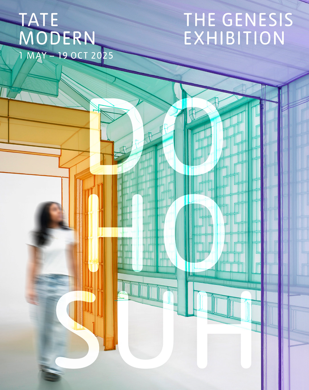
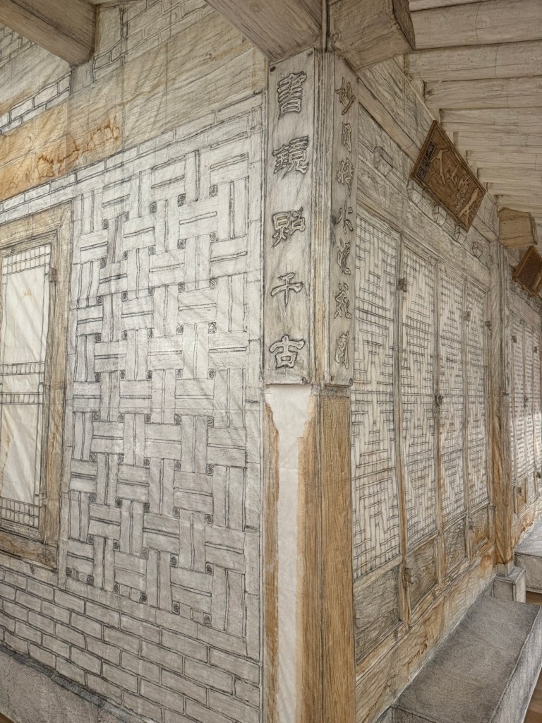
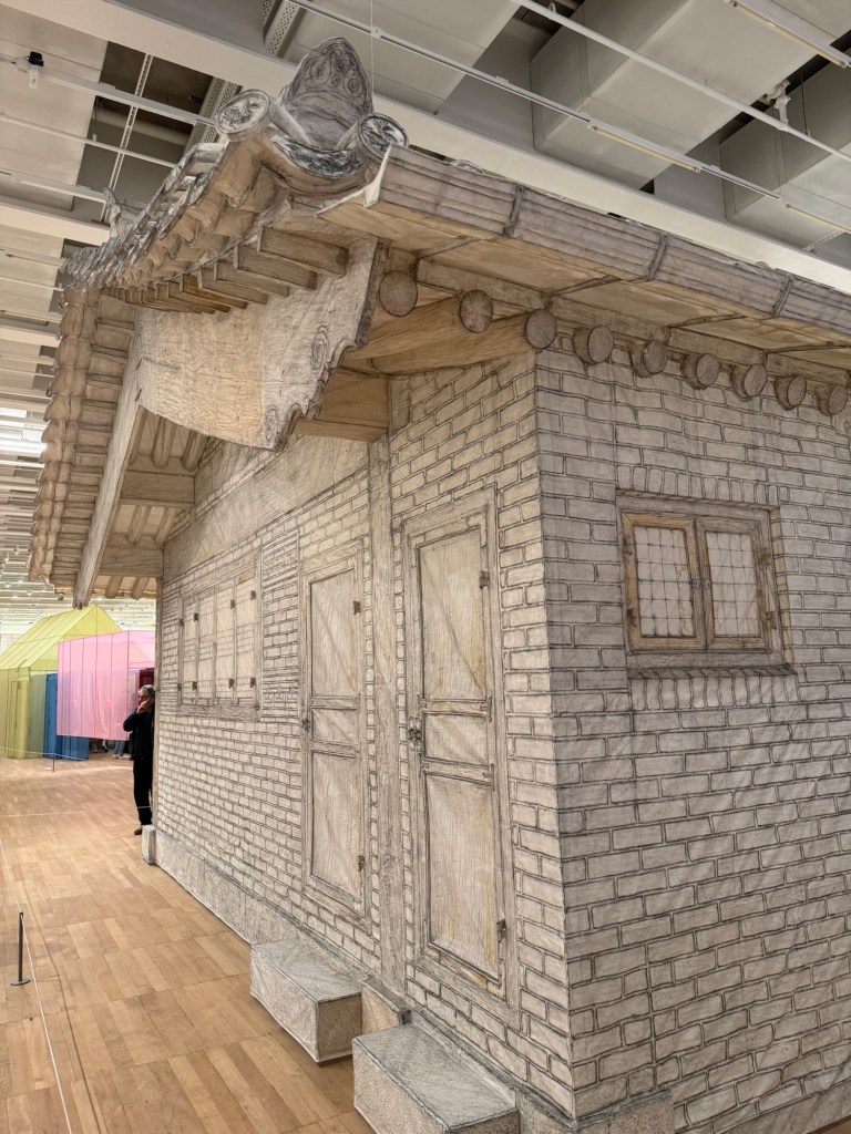
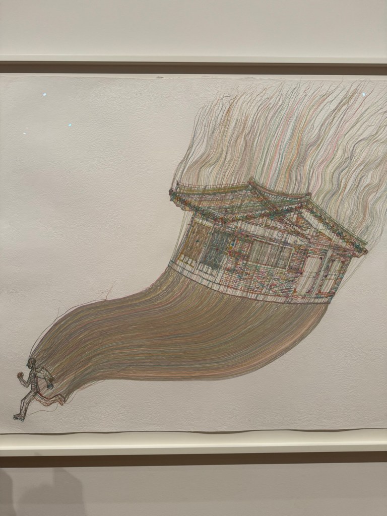
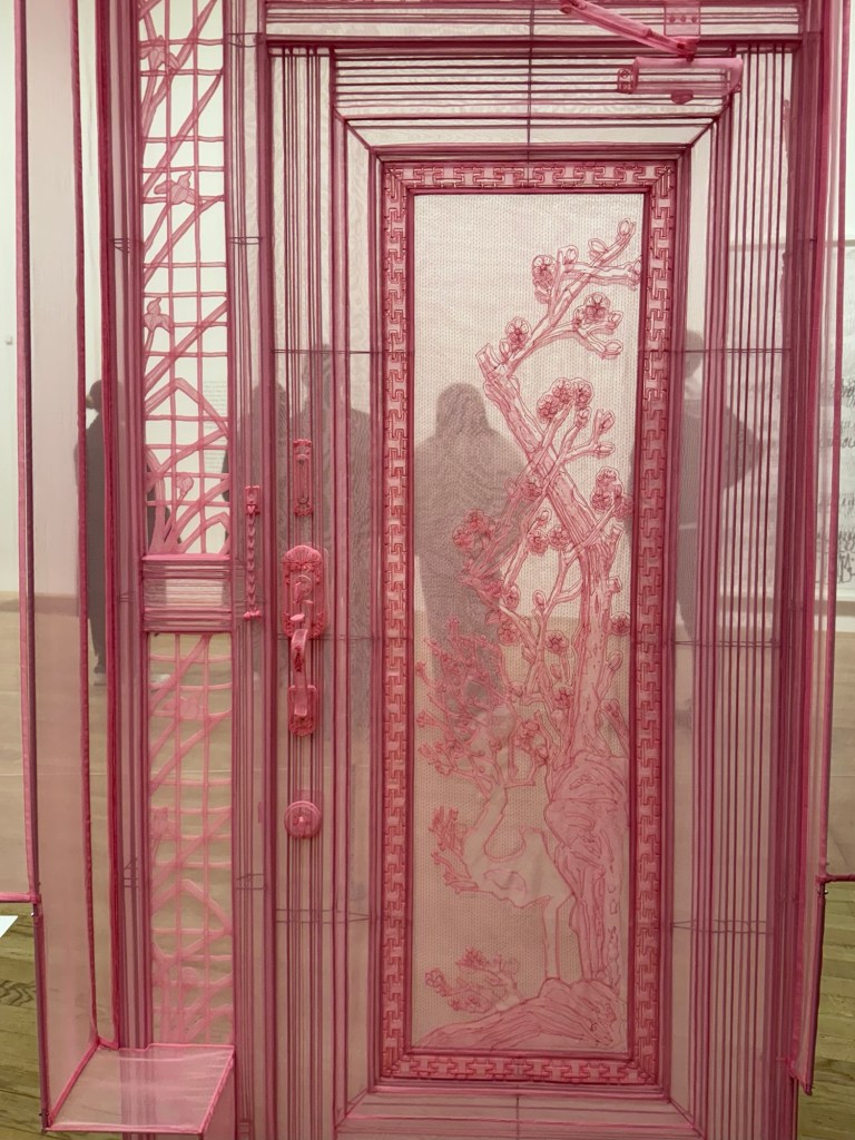
I was looking for an exhibition to go to with my daughter who lives abroad and was in London for the weekend. After reading a couple of reviews, I decided on ‘Do Ho Suh: Walk the House’ at Tate Modern.
The exhibition was very busy as it was the last weekend of the show after the end date was extended. As we walked between the monumental exhibits whilst navigating the crowd, I could hear frequent bleeping sounds. It was the threshold-wire sensors protecting the displays being triggered by keen viewers leaning too closely to examine the details.
A video playing on a small screen captured the artist working meticulously. A young couple standing next to me gave a running commentary in Cantonese about the intricate process and delicate materials used. It made me nostalgic because the artist’s hands reminded me of my brother’s when he worked on his wood board carving; they both use their slender but strong fingers with the same intensity. I was mesmerised by my own nostalgia.
A thin curtain separated a large area where a film was projected onto an entire wall. Two labels on the wall at the entrance to the area described the locations of the film. We couldn’t read the detailed descriptions as more people were pushing to come in. We gleamed the headlines and started watching. My daughter turned to me and said, ‘I’ve lived in places like that.’ I replied, ‘So have I.’ ‘Yeah, pretty universal,’ she muttered. I was not sure if she meant the experience or the place. Perhaps both.
We were drawn to a darker corner with intrigue. Looking through a gap between semi-transparent panels, I met eyes with another visitor. There was a momentary connection then we both looked away. My daughter called me over and said, ‘Look, Mum, there is a miniature toilet.’ We both laughed and took pictures of the toilet.
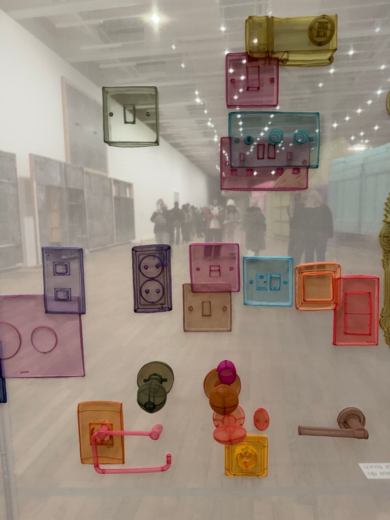
We returned to the exhibits in the main area. I felt my phone vibrate. It was my daughter posting a photo on the family chat of me staring intently at a display with the caption ‘When art meets electrical engineering. Rapt.’ We played who could name the country of origin of the pieces on display judging by the shape of the electric sockets. It then occurred to me that I moved away from home to another country when I was young and she has moved away from her home country, too. We now have that shared experience. I wonder where she calls home now.
Wading through a crowd watching another large film projection, some standing and some sitting on the floor, we reached the gift shop. The final few fridge magnets were half price. It’s the last weekend after all.
Detailed and visual descriptions to help reader visualise the entrance and the space setting the tone of what’s to come. Really helped me clearly to be in the space right from the start. Such clear visual description is consistent throughout the article which can be helpful if the viewer is not visiting the show.
The language is clear throughout and easy to understand.
The use of metaphors helped to make a point (e.g. readers like hanging bats).
Dislike:
After stating that the curators wanted to provide ambiguity, the writer was too detailed and delved just too deeply, leaving little room for readers to enjoy the intended ambiguity.
Picking arguments for the sake of it without understanding the meaning of the art work. Is it just to show off and rant for the sake of it? (Reference ‘space’ being ‘geopolitical’.)
It’s not always clear whether an interpretation is the curators’ views or the writer’s. E.g. Interpretations of the sonic metaphors (dissonance is productive, harmony through the broadcast of diverse voices, and so on) are they the curators’ intended meaning or the writer’s interpretation?
The last two paragraphs feel rushed and at a different pace to the rest of the article, reflecting the challenge of reviewing such a large show and the need to provide meaning without overwhelming the reader whilst trying to cover as much of the exhibits as possible
REFLECTIONS
The key for me is to strike the balance between giving enough details to place the reader in the space but not so much that the reader ends up feeling suffocated with details. Hence need to leave room for the reader to ponder, perhaps leave them wanting more. But more of what?
How to show passion or feelings in the writing without coming across as ranting, especially ranting for the sake of it?
Regarding whether a view/an opinion is the curator’s or the writer’s, that undefined boundary bothered me because – do I want my views to be influenced by such overt interpretations by another visitor (meaning that an art critic is just another visitor) before I see a show? Or is it in fact useful if I’m never going to see that show?
It’s challenging to review a large exhibition – the challenge being the need to strike a balance between providing meaning in the content whilst covering as much as possible without overwhelming the reader.
–
PART 2
An art review that I enjoyed reading:
Do Ho Suh: Walk the House at Tate Modern by Eddy Frankel in The Guardian
I enjoyed reading the review not because I liked it, but because it annoyed me, prompting my disagreement with the writer/reviewer which confirmed my decision to see the show despite it being awarded only 3 stars by the review.
Below are my notes about this review. I have quoted in italics the parts that I wanted to comment on, with my reasons for commenting, followed by my ‘Notes’ on what I learnt about good art writing for me. I have since visited the show and I have added further response to most of the points raised as part of my process of reflection.
Comment #1 –
‘It’s a bit like a vast portrait made in Homebase’. I feel this opening is belittling and condescending likening the art work to something in Homebase – is the writer showing his need to be seen as clever and therefore showing off too soon? It was disrespectful and off-putting for me. Or is it just so difficult to have an attention grabbing headline that anything goes including such tactics?
Note: Avoid using show-off statements to grab attention, this can put some people off and come across as egotistical or shallow.
Comment #2 –
‘Lots of contemporary art is about architecture and the lived environment’ – I do not agree so this statement alienated me as a reader.
Note: avoid sweeping statements especially when it is untrue, one could come across as ignorant or too lazy to fact-check. It’s ok to say that ‘much of the contemporary art that I have seen is…’ – that is stating one’s own experience without stating it as ‘fact’.
Comment #3 –
‘The works on paper can’t compete, and aren’t that great to begin with.’ – let me decide for myself whether they can compete or if they are great.
Note: don’t be over confident about your own opinion, it can come across as condescending which does not endear the reader or just lazy writing.
My response after seeing the show: the works on paper were amazing, very sensitive and beautifully executed in terms of aesthetic as well as process. The individual drawings were not that big but they were displayed as a collage that occupied a very large wall. Engagingly arranged.
Comment #4 –
‘The films – long, drawn-out, eerie portraits of dilapidated apartment blocks and an animation about building a home halfway between New York and Seoul – pass by unnoticed’ – well, the writer clearly noticed the film hence writing about it! Also, these are art films, not Hollywood blockbusters.
Note: don’t contradict oneself and be careful of the context of the work being viewed. E.g. the context of an art film may be different to a Hollywood blockbuster.
My response after seeing the show: the films were engaging and incredibly executed. There were clever details that clearly bypassed the reviewer. E.g. a film of a London flat where the main film was running at a certain speed while a view outside a window was showing a digger dismantling a building was seamlessly shown as a high speed stop-motion film – very cleverly executed to have a fast film framed within the main film and made it look like one film. The film about the empty flats prompted a conversation with my daughter as we have both lived in such flats when we were students. It resonated with both of us. Both films were busy with many viewers when I visited bursting out of the allocated space. So I would not agree that any of them were ‘passed by unnoticed’.
Comment #5 –
‘And there’s a part of me that thinks the work is too pretty for its own good’ – so the drawings earlier were great, now the writer says the work is too pretty. Which one is it?
Note: Be more intelligently critical in the writing or it could come across as incoherent and lazy in thinking deeply. If the reviewer is feeling undecided or conflicted – it’s ok to say so, don’t leave a contradiction unaddressed.
My response after seeing the show: the works were meticulously planned, aesthetically captivating and cleverly executed. Every piece was thoughtful and sensitive. I found the work mesmerising to look at. Every piece engaged me and I don’t always say that at an exhibition. I found resonance with the artist and his work.
Comment #6 –
‘Memories aren’t always pretty and pink, sometimes they’re horrible and filthy.’ – who are you to decide what our memories are like?
Note: be clear it’s your opinions rather than stating them as though they are facts – avoid wild claims as facts, it may annoy people like me that don’t want to be dictated to.
My response after seeing the show: Much of the work were not pretty and pink. There were different colour palettes and materials used to convey the artist’s memories. There were grubbier looking work – e.g. memory works that were entirely done in graphite – so how could they be ‘pretty and pink’? Once again, the writer is making untrue, broad and lazy observations.
Comment #7 –
‘But all this ceaseless excavation of often hyper-personal memory still works, largely because it manages to trigger your own memories. It makes you think of all the flat-shares you’ve lived in, all the houses of your childhood. Those rooms, buildings, spaces are symbols of past joy, love, laughter, tears and arguments, every grimy student flat is a container of memory, every childhood bedroom is a place of history. The difference here is that Suh hasn’t left any of it behind, he’s carried his past with him, refusing to let go, refusing to forget, and the results, at their best, are as beautiful as they are moving.’
Note: The writer has been rather negative using disputable and sweeping claims about the art work then returning at the end to credit the artist with some positive comments – the approach feels incoherent, coarse and lazy.
My response after seeing the show: This last paragraph seems to strike a different tone to the rest of the article. It is in fact a good summary and shows the writer/reviewer in fact understood the show. So why some of the earlier nonsense – were they just for effect to purposely provoke the reader? Is that approach just an art critic’s tactic?
ADDITIONAL RESEARCH & REFLECTIONS
My course tutor (rightly) challenged my thinking in what I have written above. Perhaps I was being too harsh on criticising The Guardian reviewer Eddy Frankel – perhaps he wasn’t being that negative and it was ok for him to express his opinions (of course it was). I acknowledge that I may have felt compelled to defend the artist, Suh, after seeing his show and I was touched by how beautifully and meticulously he approached his work. I felt that Frankel didn’t really understand the show or the artist hence was being lazy in his observations and use of language. By that, I mean some of his use of language was not considered enough or appropriate or the show – whether he was being critical or not. My tutor suggested that I read another review of the same exhibition to see how I feel.
I therefore read three other reviews. My notes are as follows.
1 – A reviewer and website that I do not know. It came up high on the ranking when I Googled for reviews:
Vocabulary used: tender, obsessive, and quietly radical, emotional imprint, staggering, sublime focus, not just an exhibition; it’s a gentle haunting, rendered in translucent fabric and delicate graphite, ethereal installations that blur the boundaries between architecture and memory, ghost-like, hand-stitched from diaphanous polyester in hues of rose, sea-green, and smoke-blue, incredible detail, painstakingly and lovingly reborn in thread and tulle, an embodied act of memory, obsessive and simultaneously moving acts of remembrance, preserving its textures like a fossil, it’s a love letter and a eulogy rolled into one, built on touch, labour and longing, map every inch of a memory before it disappears, soft, weightless houses, constructed using photogrammetry, deeply human, Spend time with it. Walk slowly. Let it in.
2 – A reviewer that I do not know from a website that I have come across before:
Vocabulary used: ghostly, painstakingly, every single nook and cranny, resemble an old sepia photograph, delightful sketches, coloured threads embedded in paper, reminiscent of Louis Bourgeois’ depiction, vulnerability, incredibly moving and beautiful work, like an archival display of exotic artefacts, architectural skins, they accumulate like the notes of a symphony, dwells on the desolation of the crumbling concrete blocks, a forgotten shirt trembling in the draft, clinging on in melancholy isolation, confers a ritualistic sense of dignity, unusual clarity and extreme pleasure.
3 – A magazine that I know well and would usually trust its content:
Vocabulary used: It’s a bit like a vast portrait made in Homebase, ghostly, beautiful facsimiles of the houses and apartments, fragile, wispy, delicate buildings, paper, carefully wrapped around the artist’s childhood home, a sort of memorial, the haunting power of memory, impenetrable and opaque, rooms made of wire and coloured semi-transparent polyester, re-created in wire and fabric, Some are grandiose and European in style, others are ornately Korean, Each space is a slice of the artist’s past, huge and transparent, gleaming white fabric, brightly coloured door handles, like a portrait made in Homebase, emotional focus and simple nostalgic obsessiveness, grey, grimy wall made of rubbings, works on paper can’t compete, and aren’t that great to begin with, long, drawn-out, eerie portraits of dilapidated apartment blocks, pass by unnoticed, too pretty for its own good, the trick of allowing you to walk through a transparent polyester house, Memories aren’t always pretty and pink, sometimes they’re horrible and filthy, ceaseless excavation of often hyper-personal memory, the results, at their best, are as beautiful as they are moving.
My thoughts after reading all three additional reviews:
Although I acknowledge that I was perhaps being harsh on Frankel, after reading the other three reviews, I maintain my view that Frankel’s use of language or vocabulary was lazy or lacked effort for such a sensitive show made with sophisticated artistic language and process. The other reviews, especially 1 and 2, made much more effort to accurately describe the art works and consistently used vocabulary that are aligned with the sentiments of the show throughout the article. It does not mean the review cannot be negative, but it needs to be expressed in a language that reflects or resonates with the show. Frankel’s language is not completely inappropriate but at times comes across as lacking consideration, hence I kept returning to the phrase ‘lazy in his use of language’ – they lack accuracy (compared to the other reviews) and sensitivity for a show with much delicacy. It feels like being served ketchup with a delicately flavoured consommé. That annoyed me because a writer of that reputation (writing for The Guardian) should know better.
–
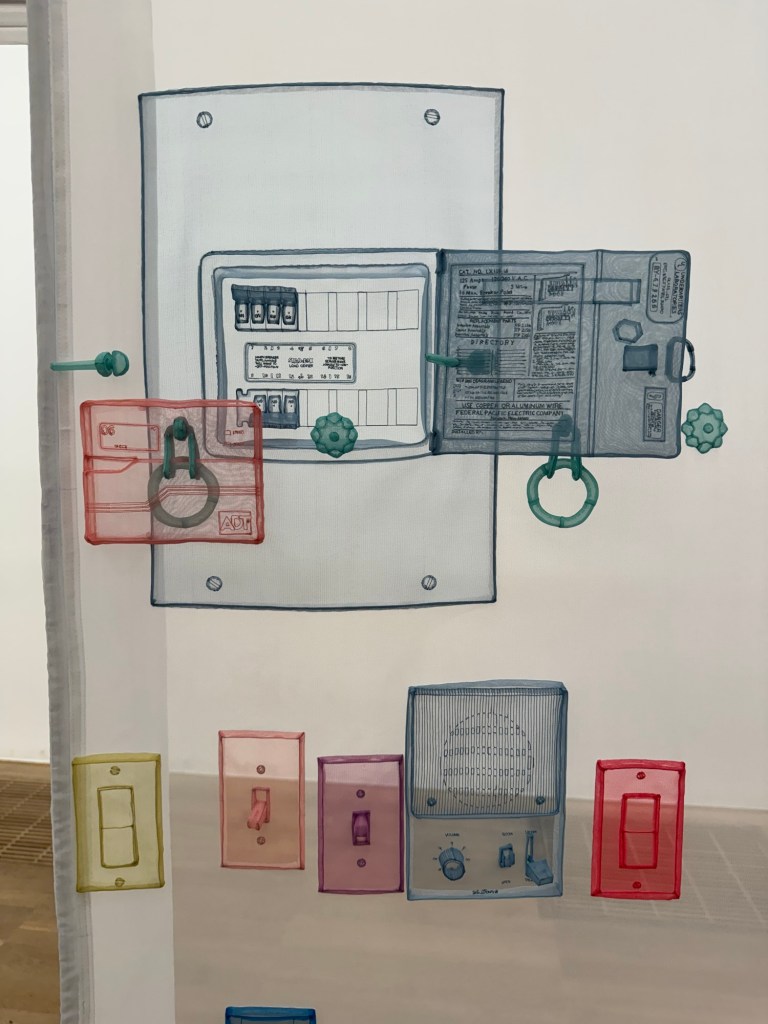
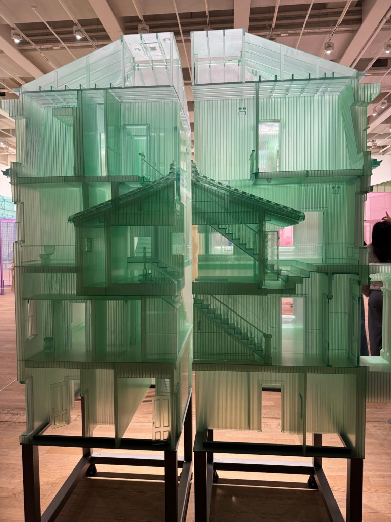
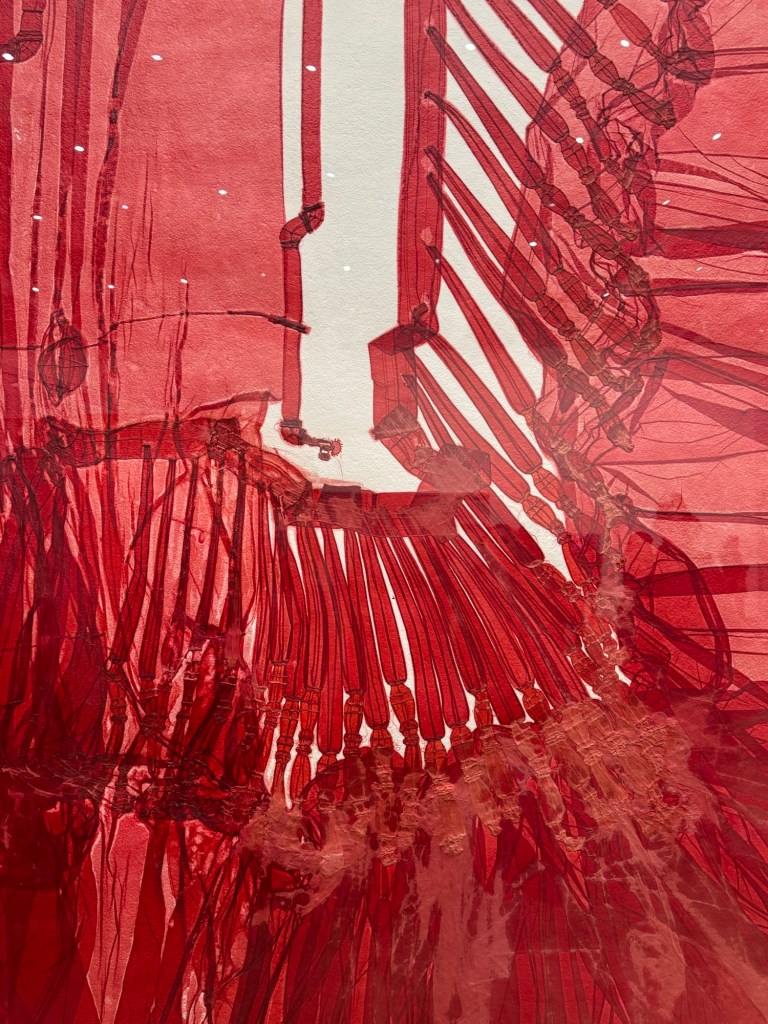
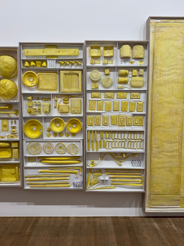
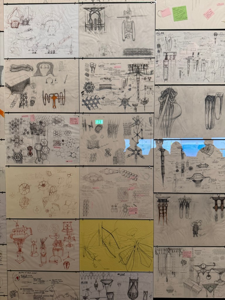
Some images that I took when I visited ‘Do Ho Suh: Walk the House’ at Tate Modern:
Does art exhibition reviews class as art criticism? If so, yes I do enjoy and actively seek out relevant content for shows that I’m interested in.
I don’t pay much attention to the author when I read art reviews. I will pay more attention from now on to see if I will have a favourite.
I listen to art podcasts a lot. As for reading, the only art magazine that I read regularly is the RA Magazine because I am a Friend of the RA and they send me a physical magazine every quarter which I enjoy reading. I like reading a physical magazine more than an online magazine.
As for art exhibition reviews, in addition to the RA Magazine, I mostly read those in The Guardian and BBC News.
I want to decide which show to see on my forthcoming day trip to London. I only have time for one show. Before reading the reviews, I was going to see the one by Kerry James Marshall and I was pleased to see the review gave it 5 stars. Then I read the Do Ho Suh review which although only had 3 stars, I found the review description very enticing and by the end of reading, I really wanted to see it!
REFLECTIONS
It was interesting that reading the reviews changed my mind about which show to visit, showing the power of such writing. It was also interesting that the star ratings did not influence my final choice of show to see. So I should ignore such star ratings in the future!
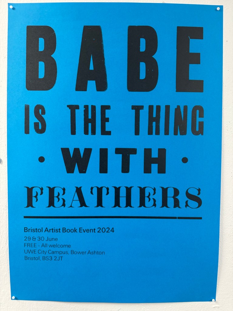
During the MA low residency at CSM in March 2024, we had a book art workshop where we learnt to make zines and some simple book. The artist hosting the session mentioned a book art event that takes place in Bristol once every few years. I was delighted to find that it was on this year and I attended the fair.
–
There were nearly 100 stands; it was a great opportunity to talk to and learn from experienced book artists. I came away feeling enthusiastic to try this beautiful art form.
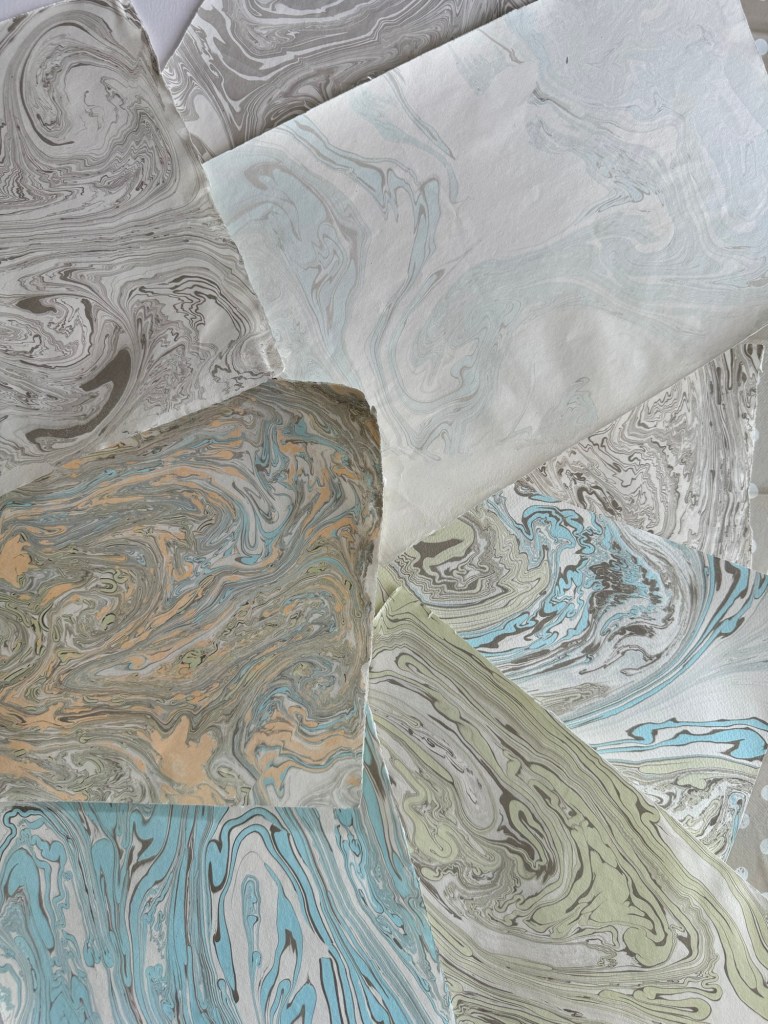
Another reason for my enthusiasm was that I recently attended a Suminagashi workshop. Suminagashi is an ancient Japanese technique of making handmade marble paper and washi by floating water-based inks on water, then laying the paper on top to absorb the ink and water pattern. See post:
Here are some of the Suminagashi paper that I made during the workshop:
Small A4 size sheetsLarger A2 size sheets
METHOD
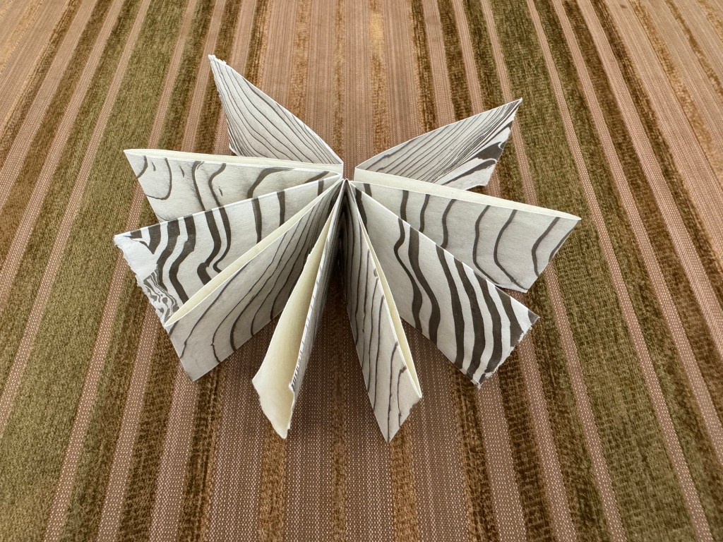
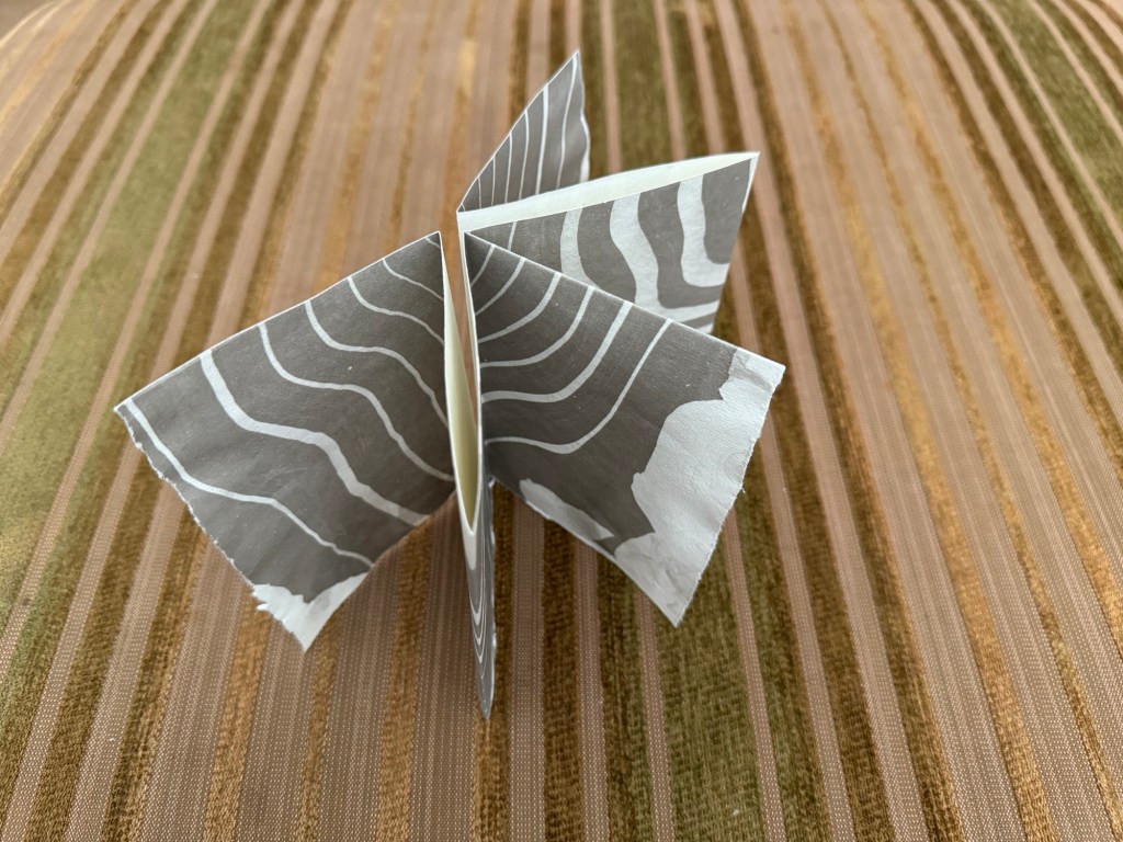
From the techniques learnt during the low residency workshop at CSM, I made a few different types of simple books using the smaller sheets of Suminagashi paper:
–
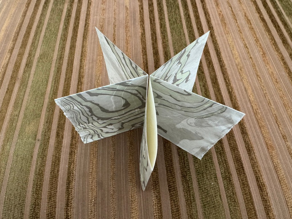
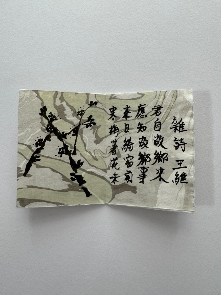
I experimented with some Chinese ink calligraphy on one sheet of paper, then folded it into a simple book:
–
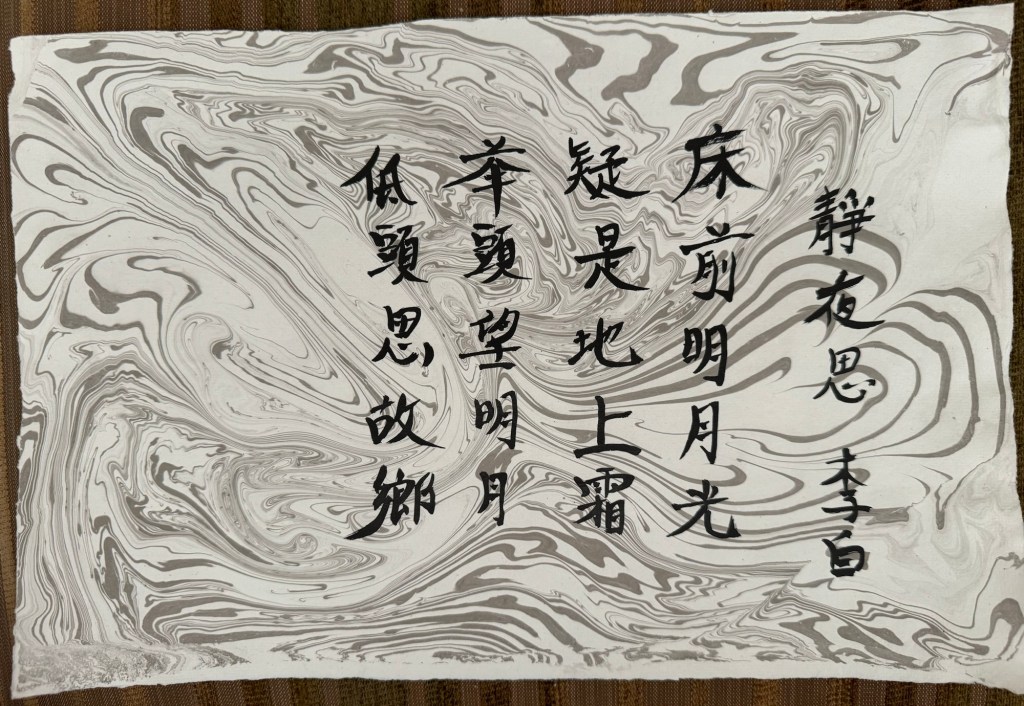
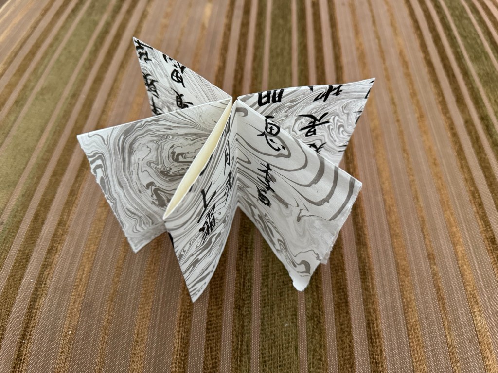
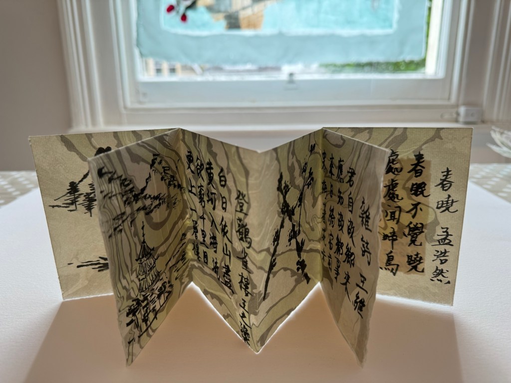
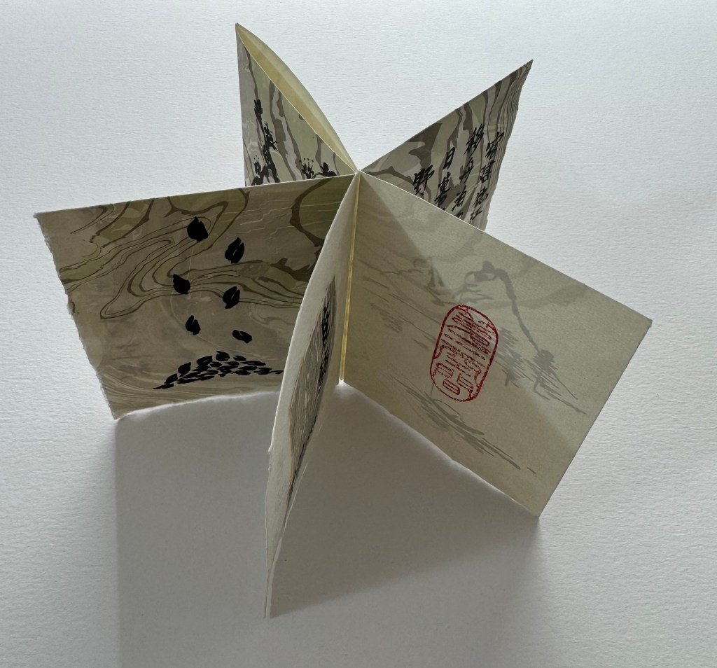
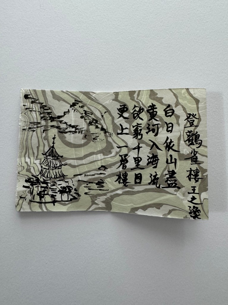
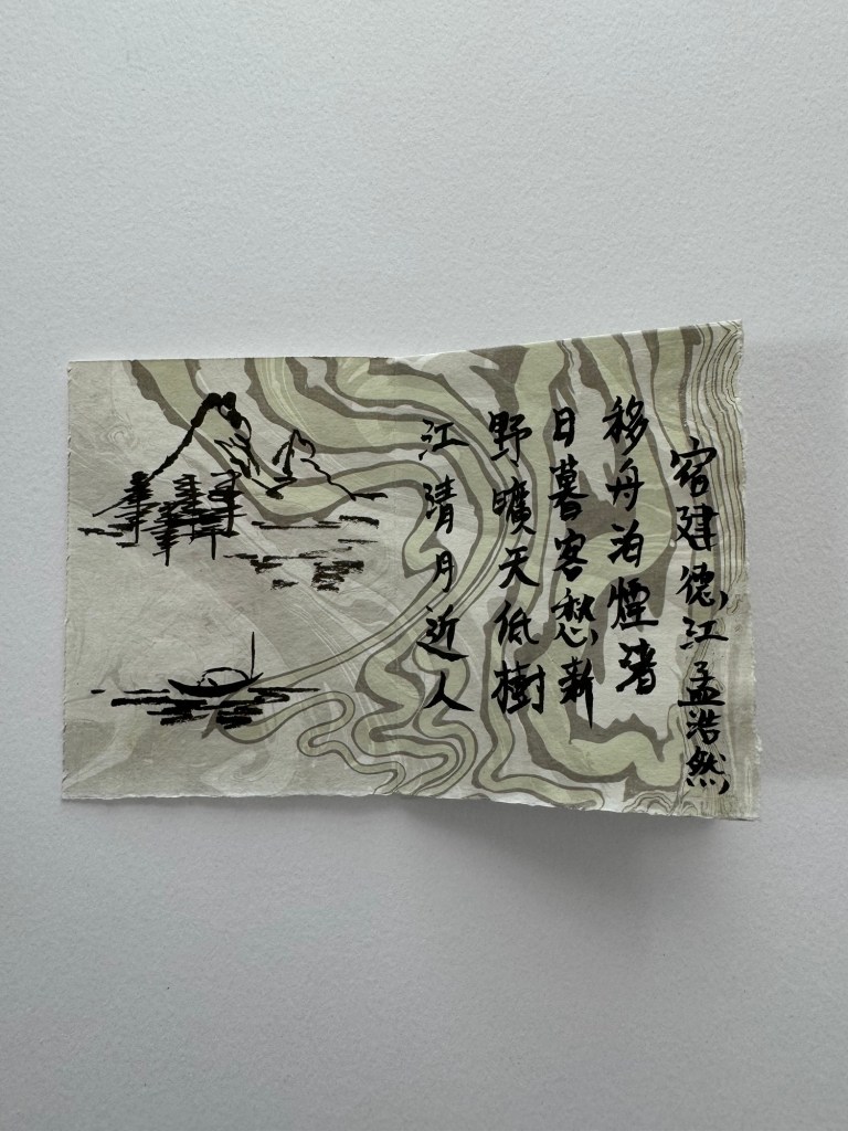
On another Suminagashi book that I made, I chose four Tang Dynasty poems and wrote them in the book using Chinese ink calligraphy, each paired with a small painting:
–
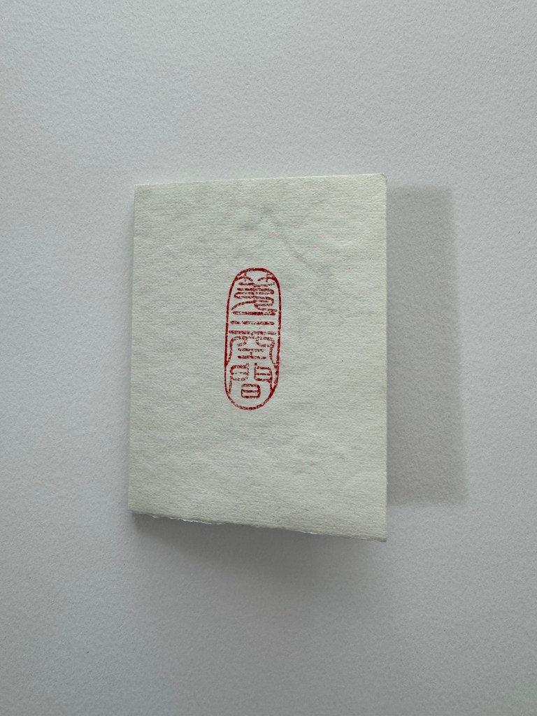
The seal on the last page of the book is a new Chinese stone seal that I designed. I managed to have it carved in Hong Kong and brought back to the UK by my Chinese painting tutor. The phrase on the seal means ‘The Third Space’, a concept that my art practice is based on so I will use it like my artist’s signature. The seal is carved in an ancient Chinese font.
Below is a video with my narration, reading out the English translation of the poems. Note that traditional Chinese books open from the opposite direction to English, Romance or Germanic language books:
–
REFLECTIONS
I was really inspired by the visit to the book art fair. It helped me to understand how broad the scope of this art form can be. I knew very little about book art until the low res workshop earlier this year and I am excited by it. I enjoyed making the simple books in this exploration, especially using the Suminagashi paper. Here is a summary of what I enjoyed about this exploration:
– I enjoyed the quiet pleasure in the act of folding paper carefully, especially with beautiful paper such as the Suminagashi paper. The feel of the material surface, the edges and creases all added to the meditative effect that this art form has to offer.
– I enjoyed learning a new skill in making books. Although I am only making very simple ones at the moment, I am excited by the potential complexity and scope that book making can offer. It is new knowledge and a new challenge for me.
– Once a book is made, it is like having a new canvas calling out for creativity that requires a new way of thinking compared to my other work.
For me, it is a two stage process: (1) Think about how I want ‘the canvas’ to be and realising that idea through physical making; then (2) express my art on the made canvas. The stages are similar to the Cheongsam (Chinese dress) canvases that I have been making for painting. That approach also requires creating a 3D canvas first through a step-by-step ‘technical’ process before any drawing or painting can take place.
The similarities between my book-making and dress-making to create canvases only occurred to me during the writing of the above reflections. I was beginning to feel concerned that I might be going from one thing to another too soon in my practice. I am not dropping the dress-making work, in fact, far from it – I have planned many other projects based on Cheongsam canvases. But I also want to explore book art and I now realise the similarities between the two in the context of my practice. I believe it can be explained as follows:
– The book-making or dress-making processes start by my following some guided steps, this way of making gives me a structured approach to starting a project. Meaning, it is unlike just getting out a plain sheet of paper or a pre-made blank canvas where you are immediately faced with having to decide what to paint. Through the structural and systematic start of the creative process (i.e. making a book or a dress), I can proceed to create ‘productively’ and while I am making the ‘complex canvas’, I can think about what to paint on the canvas or to finalise the ideas in my head. The process of making the canvas (which in the case of a dress can take several days) gives me quality thinking time whilst doing something productive and not just sat in front of a blank canvas feeling bad that nothing was happening.
LEARNING
Attending the book art fair taught me a lot about the scope that this art form can offer. In my own experiments, I have learnt more about the art of making books from a technical perspective – I am at a very early stage right now but I definitely want to learn more to make more complex or larger books.
My reflections above made me realise that the process of making the canvas myself (e.g. a book or a dress) has been a key part to my enjoyment in making art recently because I have been using the canvas making time and process to aid my thinking and to finalise my creative ideas. I have been doing this without consciously knowing it. I value the fact that making items such as a book or a dress are established processes and therefore give me a secure and stable route to start each piece of work. On the contrary, if I were to create a completely free-form assemblage from found items as a starting point, I would be inhibited by such an open and abstract process at the beginning of a piece of work – I would not know where to start and therefore it would be like sitting in front of a blank canvas again. This realisation is very important and useful for me because I can now think about other potential canvases that I can make from an established method in order to expand my practice.
NEXT STEPS
– Continue to make books and learn about book making to expand my knowledge.
– Think about other canvases that I can create in addition to books and dresses that would enable me to have the quality thinking time as part of my creative process and to avoid the ‘starring at a blank canvas’ problem.
UPDATE:
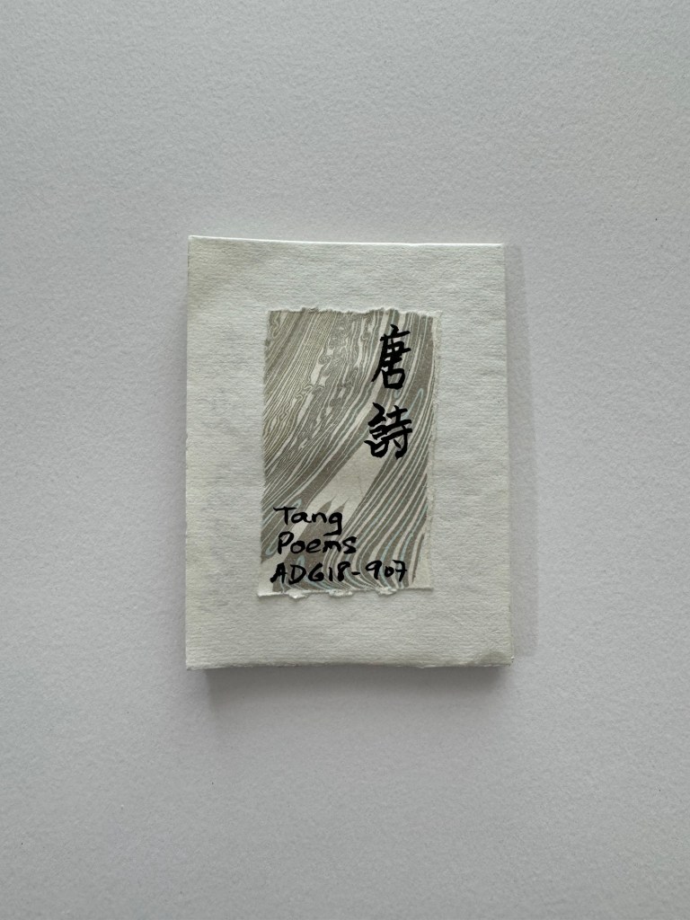
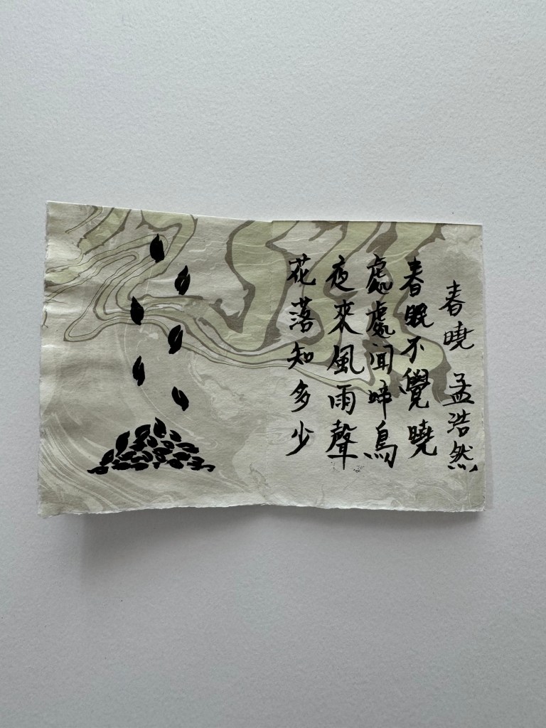
I made another book using a piece of Suminagashi paper folded into a small long book. In it, I wrote four short Tang Dynasty poems in Chinese calligraphy and coloured some areas using Chinese painting colour.
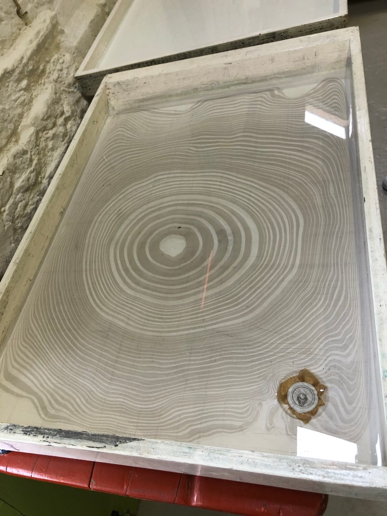
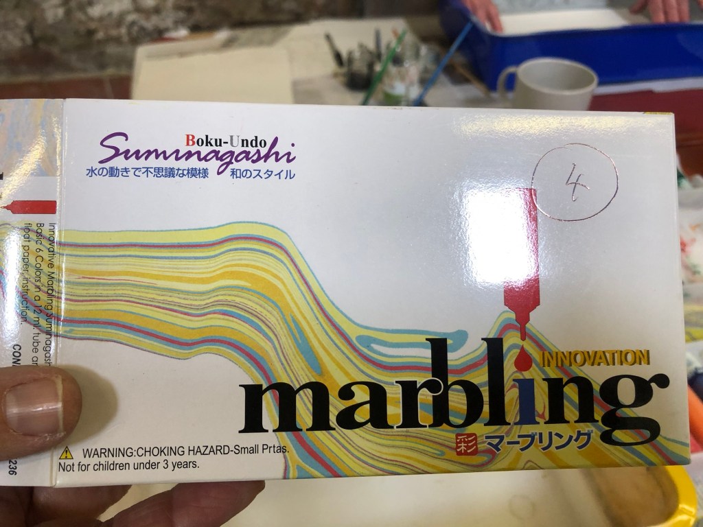
I recently attended a Suminagashi workshop ran by artist Sarah Amatt. Suminagashi is an ancient Japanese method for marbling paper or washi by floating ink on water then absorbing the pattern onto the paper. Here is a video showing the process as demonstrated by Sarah:
Demonstration by artist Sarah Amatt
Below is an example of a marbling pattern floating on water ready for the paper to be presented:
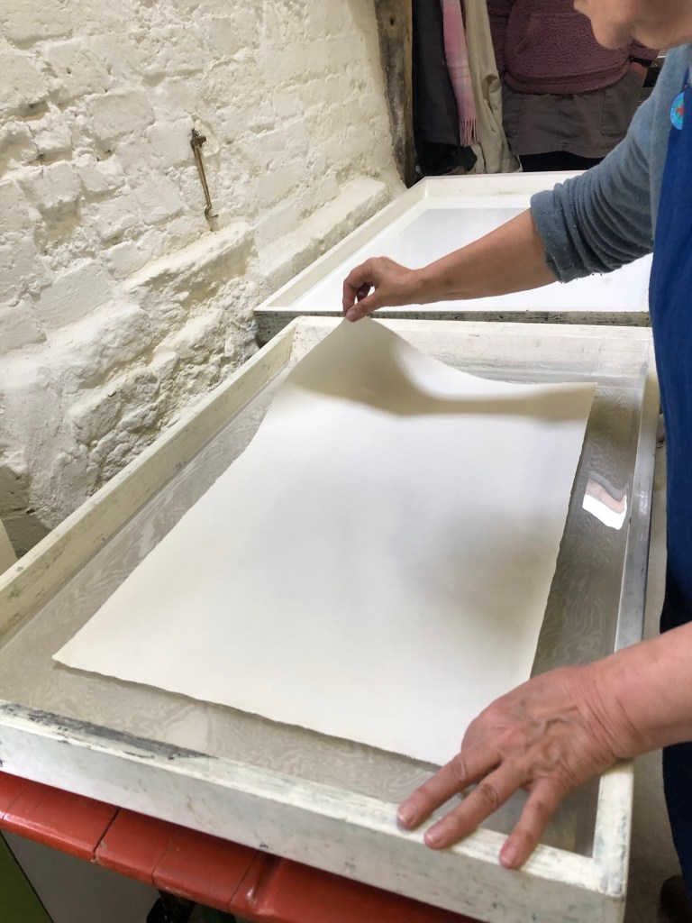
The next step is to place the paper carefully onto the water, either by ‘rolling’ it down from one corner, or holding the paper in a U shape and lowered down from the centre of the paper. This process should be done slowly with very steady hands so the paper floats and does not sink.
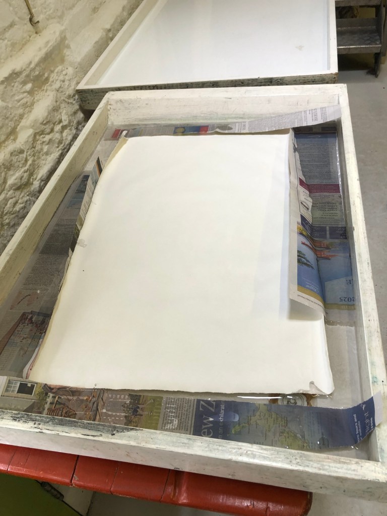
Strips of newspaper can be used to absorbed the extra exposed ink to keep the water as clean as possible for multiple uses.
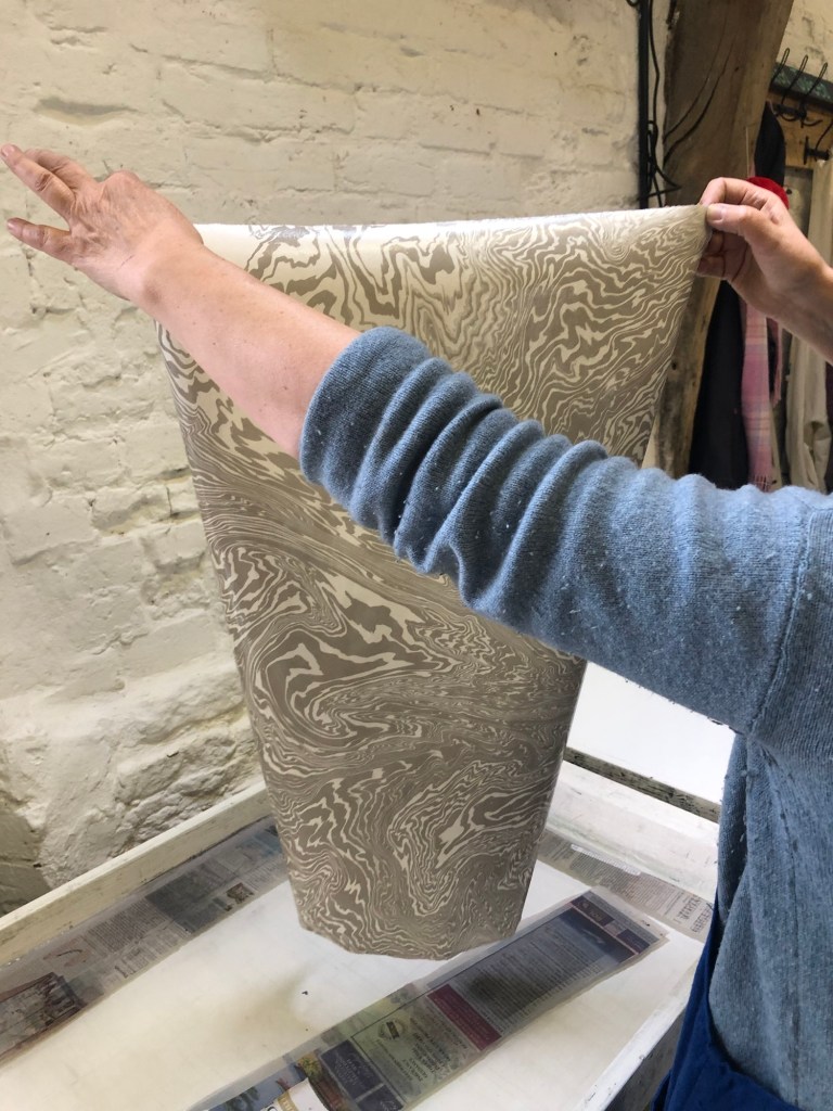
The paper is left on the water for a few seconds then lifted up carefully. It should be washed down with a few cups of clean water by a bucket or sink then put on a rack such as a clothes horse to dry.
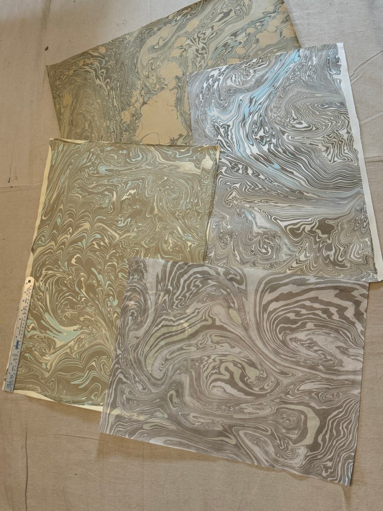
We made many sheets of various types and sizes of paper during the workshop:
Here is an example of a starter kit of marbling ink:
–
REFLECTIONS & LEARNING
It was an enjoyable workshop. Sarah encouraged us to experiment which was great. I had no knowledge of the technique or history of Suminagashi beforehand so the workshop was a good learning opportunity.
My reason for attending was to make some patterned paper that I could use in my art practice to make books or sketchbooks. I came away with a good stock of marbled paper. So overall I achieved the objective, learnt some new techniques and enjoyed myself.
NEXT STEPS
Play and see what can be done with the paper and make some books.
Below is an example of using the paper for Chinese calligraphy:
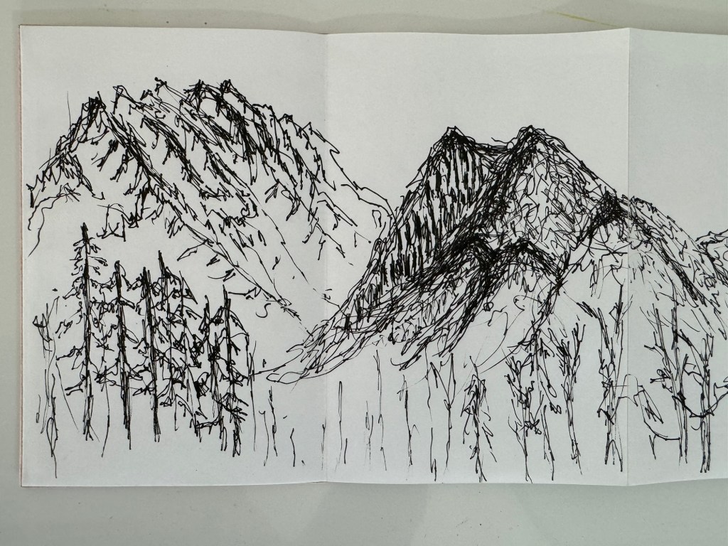
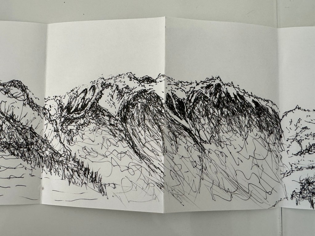
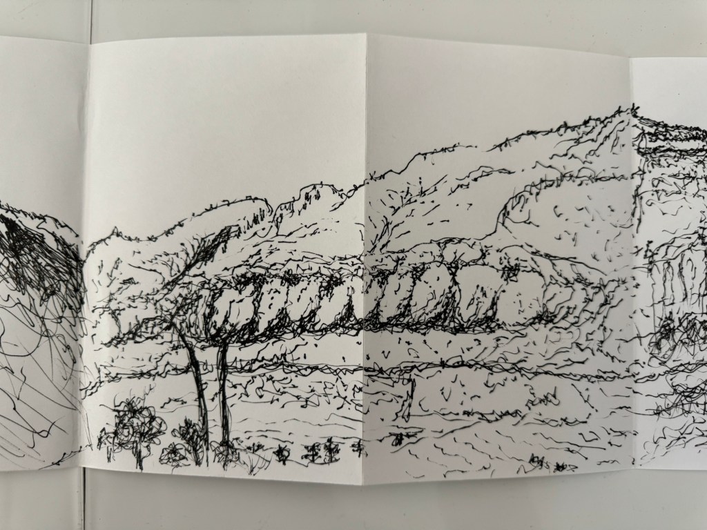
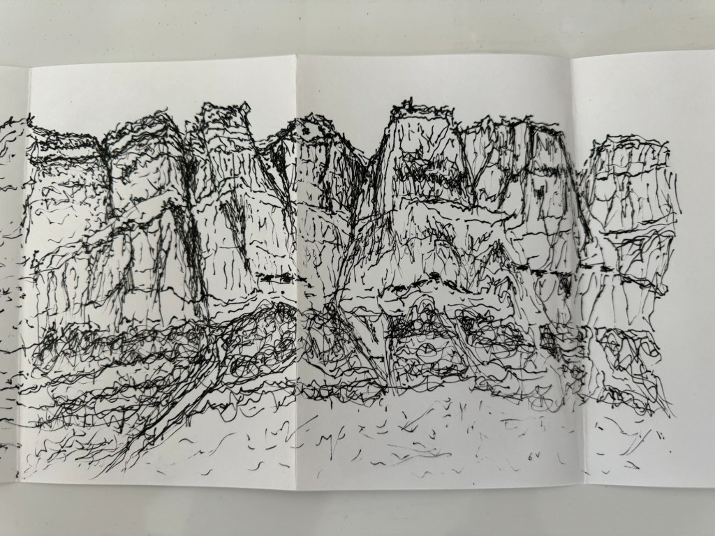
I have been travelling in North America including a wonderful 2-day train journey through the Canadian Rockies. Whilst on the train passing beautiful mountainous scenery, I decided to sketch with my non-dominant (left) hand.
Why use my non-dominant hand? Reasons were:
– I have been experimenting with drawing with my left hand recently and I have found it a rewarding experience.
– I was sketching live on the go and I had to sketch quickly as the train was passing through the scenery. I felt that using my right hand would be too slow as I would be prone to agonising or perfecting the drawings which would not be enjoyable.
– I really wanted to explore drawing with my non-dominant hand as a way to loosen up and free my mind.
A Pilot fine tip drawing pen was used with a Seawhite concertina sketchbook for live sketching on the go. Below is the outcome:
–
REFLECTIONS
I thoroughly enjoyed doing these sketches. Doing quick sketches with my left hand meant I didn’t have time to think or overthink which I am prone to doing with my dominant right hand. As a result, I feel my mark making was much more free than usual and I like the effect.
I enjoyed it so much that I kept drawing and didn’t want to stop. I also gained much confidence and I will not hesitate to draw with my non-dominant hand again. In fact, I prefer it.
LEARNING
I think I prefer this way of drawing because:
– I am prone to seeking perfection when drawing with my dominant hand and often over work a drawing, or feel disappointed with the outcome.
– I have little expectations when drawing with my non-dominant hand and in the case of these mountains, I felt pleasantly surprised and positive about the outcomes. I enjoyed the experience.
So the learning here is to step out of my comfort zone and explore new ways of making. Just explore without the shackles of expectations to free the mind. The outcome could be a positive surprise.
NEXT STEPS
Do more non-dominant hand drawing just for enjoyment and to exercise freeing of the mind.
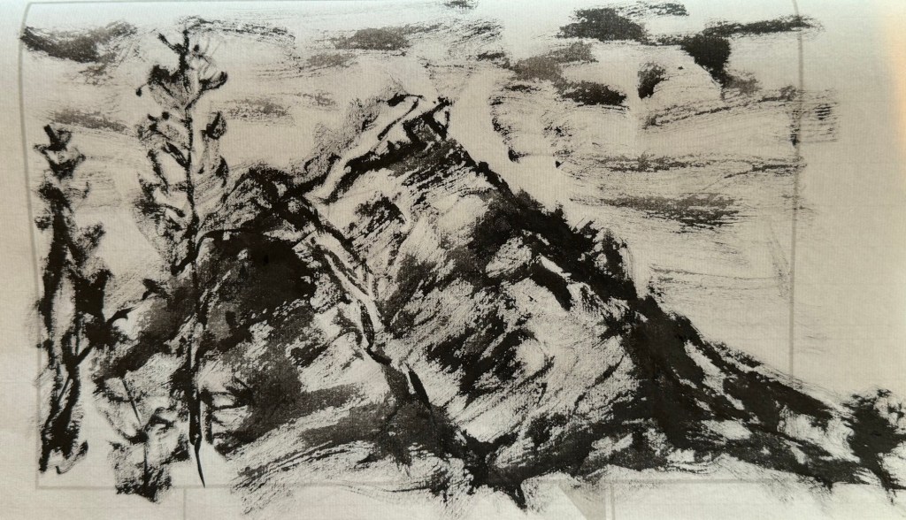
Try non-dominant hand painting, especially with Chinese brush painting. Just try to see what happens.
UPDATE
Below is my first attempt at non-dominant hand painting – Chinese brush painting with ink:
REFLECTIONS
The painting was started quickly and spontaneously, similar to the drawings that I did. But then I went onto touching it up wanting to improve it. So I was starting to use my non-dominant hand like my dominant hand. Meaning that I’m introducing the mental-barriers from my right hand to the left which would defeat the purpose of this exploration because my objective was to free my mind. So need to think through how to work differently with my left hand, otherwise, I might as well just paint with my right hand!
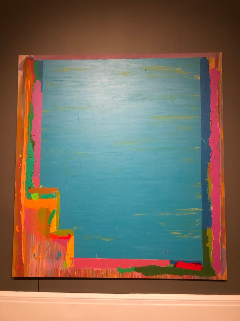
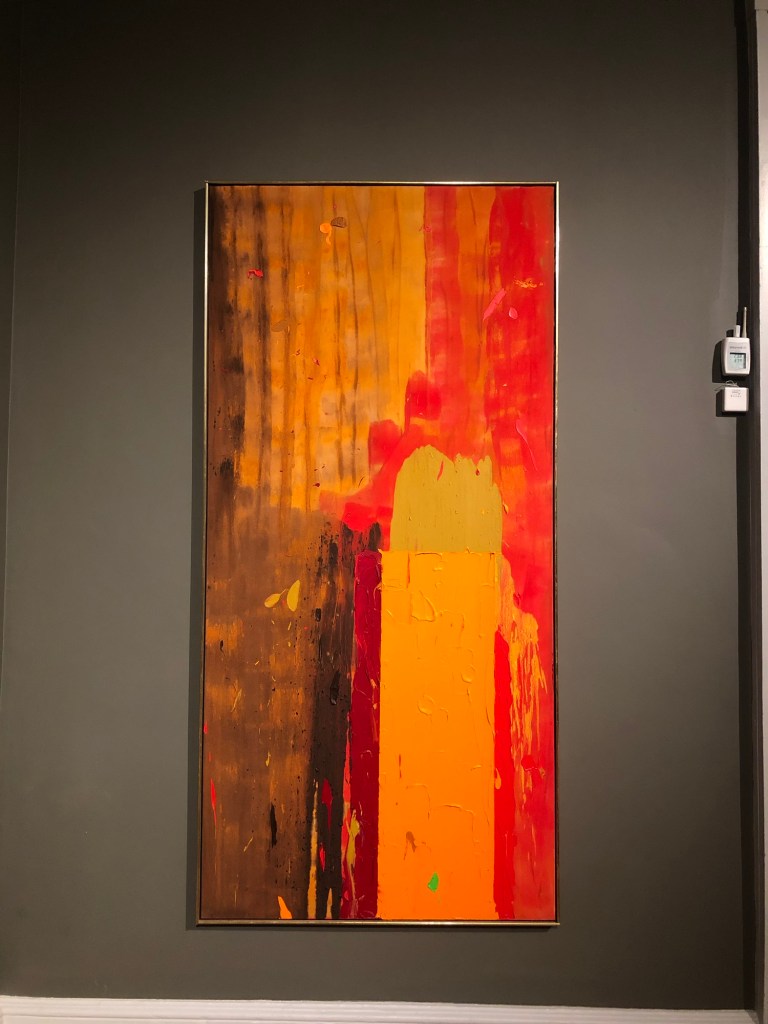
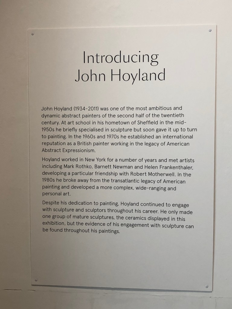
I recently visited an exhibition by John Hoyland at the Royal West of England Academy:
They also showed a 1970s BBC documentary about Hoyland where he was painting on a large canvas spontaneously over several days in his studio. I was inspired by his approach because I often over think and over plan my work and working like he did could help me to be more spontaneous. So I decided to set up a large canvas in my studio.
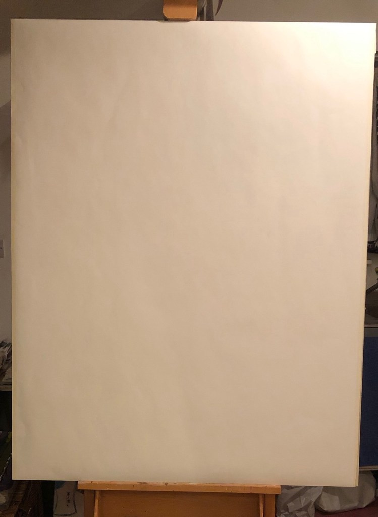
A few years ago during the COVID 19 pandemic, I bought a large roll of paper (Fabriano Accademia 200gsm paper by Fabriano SpA) but did not used any. So I decided to cut out a large piece, tape it to a board and cover it in gesso for some spontaneous painting work. Since the paper was only 200gsm, after covering it with gesso and the paper wrinkled, I had to face the fact that it was rather light weight for painting. I then wasn’t sure what to do with it and it became the elephant in the room and ‘stared back at me’. Then during one of our weekly MA sessions, we talked about how Duo Lingo, the language learning app, worked on a running streak to encourage ongoing progress. So I said to my colleagues that I would do a 21 day streak for the blank canvas. Since I said it aloud, I had to do it…
METHOD
The blank paper canvas was set up:
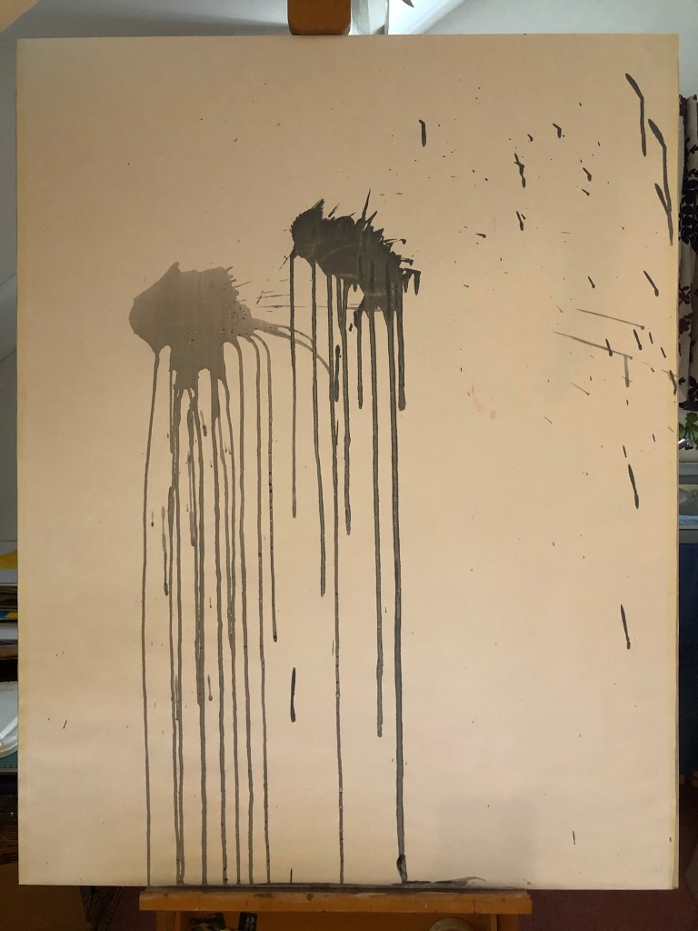
The idea of the ‘21 day streak’ was to do something on the canvas everyday (that I was at home) for 21 days, not to over think what to do. Just to make some mark, any mark. Below is what I did on day 1, splashes of diluted acrylic paint:
–
Below is an iMotion movie capturing progress of the 21 days:
–
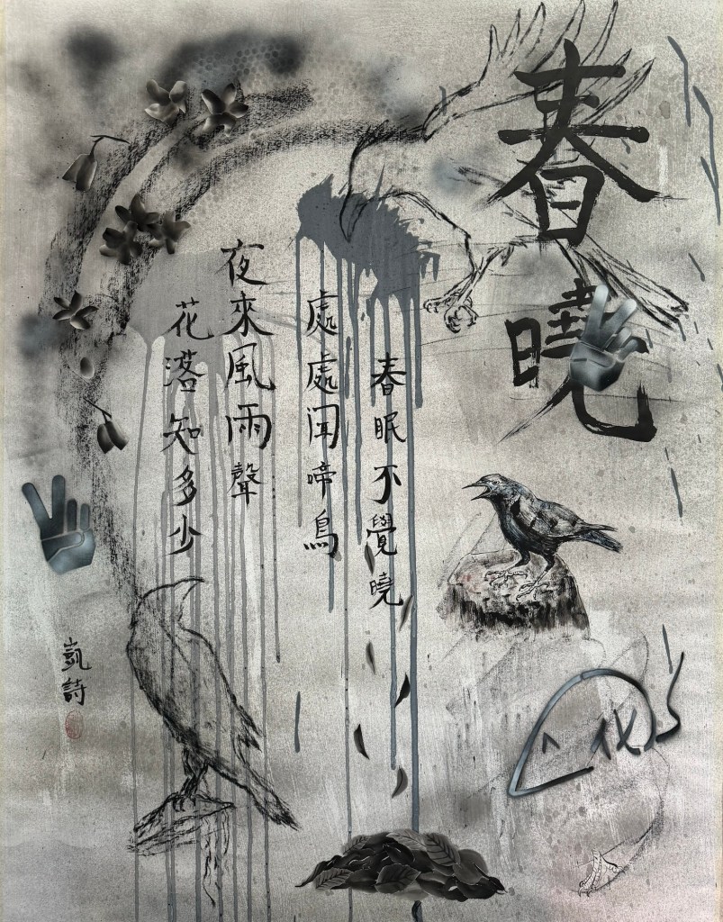
Finished work:
Mixed media on paper. H135 x W105 cm
–
REFLECTIONS
What I liked:
– I enjoyed the experiment and enjoyed responding to the canvas.
– The 21 day approach forced me to slow down the making process and not to rush to finish it as I am prone to doing.
– Doing something everyday was a good discipline, even if I didn’t have time or couldn’t think of anything to do, I had to do something such as drawing a few lines.
– Adhering to the ‘21 day streak’ process was like surrendering agency to the canvas; there was a strong sense of the to-ing and fro-ing of control between me and the canvas which was a new way of making for me. I liked it because it forced me to take time in my making. I needed this insight.
– I liked the Sumi-e painting collage of the fallen leaves.
– I liked the use of Chinese calligraphy.
What I didn’t like:
– I started off being more abstract and spontaneous. Then I started to do a collage by cutting out and pasting a crow from my Chinese painting work. That started the thought process about a composition. I resisted making it a properly composed figurative painting with crows, however, I felt that it became rather deliberately composed with the cut out crow being the turning point. I have mixed feelings about the meticulous style crow. It draws attention but perhaps too ‘meticulous’.
– I was disappointed that the canvas paper was too light weight for proper painting (I should have known). But I did enjoy having to take a more drawing approach and focusing on drawing style mark making which I have not done for a while, so all was not lost.
LEARNING
– Having a running streak is a good way to keep a discipline in a continuous making process.
– The crow was a turning point and then I sought out an ancient Chinese poem to fit the theme of the composition to bring the work to a conclusion which helped to bring the work to a neat finish. The poem talked about falling leaves which promoted the Sumi-e collage that I liked – but was that bordering on over thinking again? Am I over thinking about over thinking?! I think yes…
NEXT STEPS
I want to do another ‘21 day streak’ experiment. Having a blank canvas in the studio is a good idea for me to just ‘play’ spontaneously in parallel to my main line of work (making Cheongsam dress canvas paintings).
I will pay attention to not have a ‘meticulous crow’ moment too soon. I.e. not to put in an image that changes the course of the work too soon. Try to keep it loose, unplanned and spontaneous for as long as possible and surrender agency to the canvas.
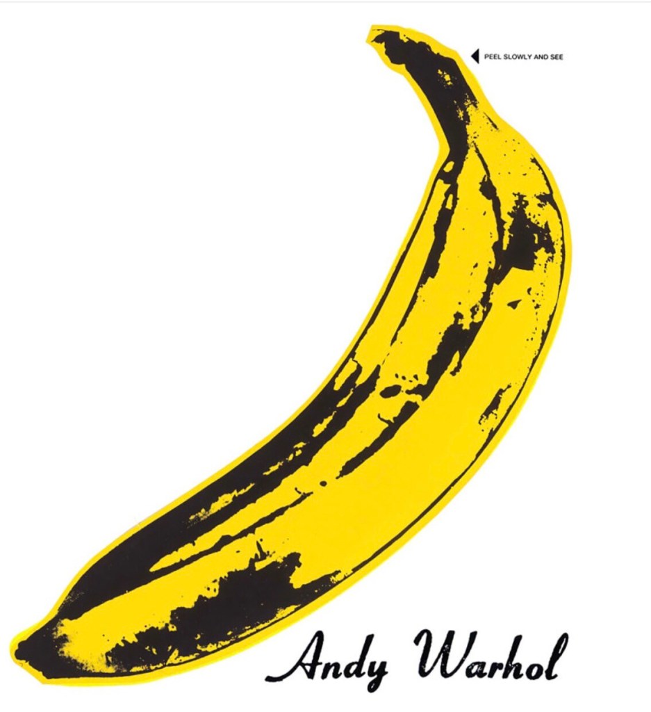
Following on from Cheongsam Series #4, where I made a 3D canvas in the form of a Cheongsam (traditional Chinese dress also known as Qipao) and I painted part of the Blue Willow pattern design on the canvas after researching its history. The reason for the Blue Willow design is explained in the Cheongsam Series #4 blog and after reflecting on the work, I decided that although I enjoyed the making process, I didn’t care enough about the Blue Willow pattern topic to make another painting on the subject to form a series. It was a very useful first attempt of that way of making (3D dress canvas) and I learnt a lot. I am keen to make another Cheongsam canvas but with a different approach to the design. I wanted something more vibrant and contemporary. Whilst mulling over ideas and looking for inspiration online, I was presented with an image of Andy Warhol’s banana:
I like the pop art banana and something about it made me want to paint it. Then I remembered the word ‘banana’ being used a lot in the 1980s and 90s to describe ‘Westernised’ Chinese people (yellow on the outside but white on the inside). I remember that very well and since my art practice is about exploring identity, Warhol’s banana image being presented to me online seemed like it was meant to be.
I researched to see if the word banana in this context is still being used. I found many articles about it and this blog from an East Asian reporter from Radio New Zealand was very interesting as it describes the background to the use of the word ‘banana’ in this context and also talks about why its use has become popular again as a result of the Hollywood film ‘Crazy Rich Asians’:
The article reminded me of how I was often called a banana by friends at boarding school and university. I didn’t find it offensive, it was a word that we talked and joked about a lot between ‘bananas’ during the 1980s and 90s. All those memories and the fact that the use of the word is on the rise again made me feel that I had to make this painting.
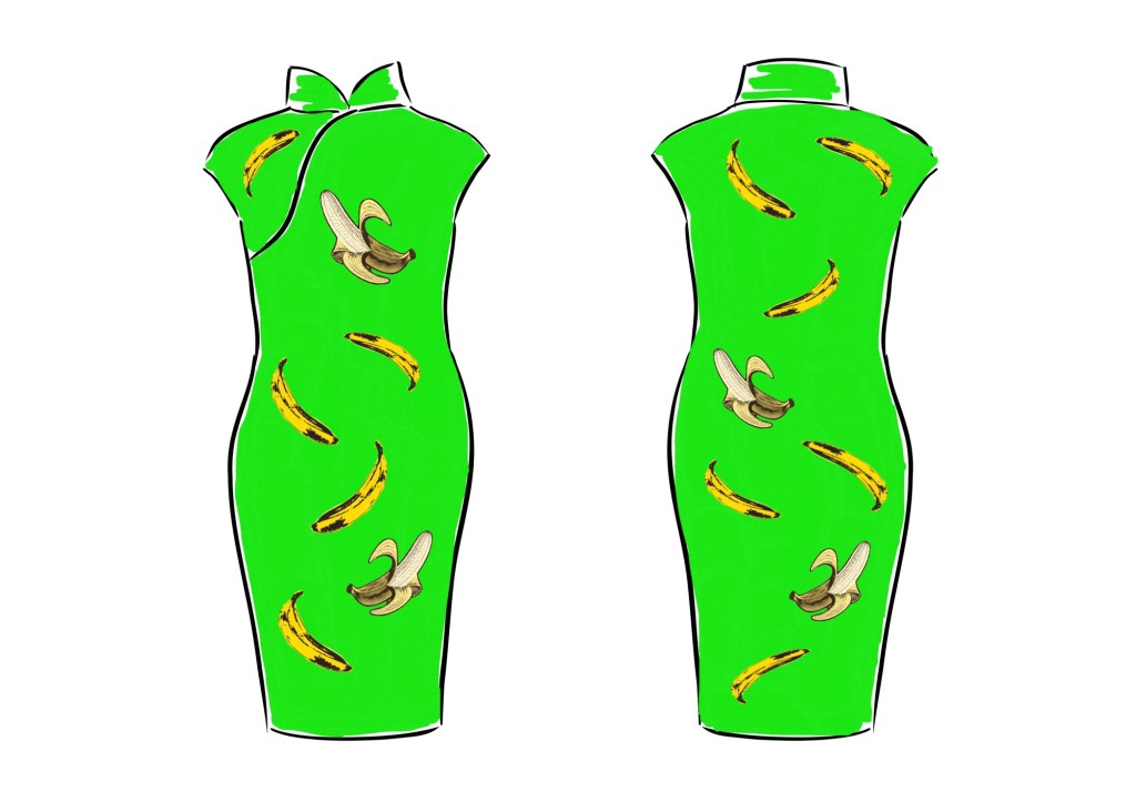
METHOD
I have started to use Adobe Fresco as my digital sketchbook and I made a design using the Fresco app. I used images of Warhol’s banana as well as another image that I adapted to show a half peeled banana revealing the whiteness inside. I decided on a bright green colour (as close to neon green as I could get it) as the background because I wanted this to be a piece of pop art on a Chinese Cheongsam dress – an unlikely and unexpected combination that challenges traditions.
Below is the image creation process captured as a time-lapse video by Fresco:
–
REFLECTIONS
Although this is work-in-progress and I have only done the digital sketch so far, I was happy with how the time-lapse video worked in Fresco. Presenting my digital sketch work in this way was a suggestion in my MA Unit One feedback. I am pleased that I experimented with the Fresco function as I want to do more with video and moving images in my practice.
I recently showed ‘Cheongsam Series #4 – Appropriation. Appropriation.’ in our MA class group crit where my colleagues suggested I could try screen-printing for the next dress. Although screen-printing is well suited to this design, I decided to paint the dress like I did with the last dress because I enjoy painting. I haven’t had enough of painting on a dress canvas yet so I want to do more.
In a recent MA class discussion, we talked about the making process vs the product. The discussion made me realise how much more I enjoy and value the research and making process than the product. In fact, once I have finished a painting or a piece of art work, I often feel rather indifferent towards the product. I have no desire to display them in my home let alone think about selling them. I love the process of research, ideas generation, making and problem solving along the way. Once it’s finished then I want to move on for the next ‘fix’ – i.e. I find the process of creating addictive.
LEARNING
Reflecting on the MA class discussion about process vs product has helped me to understand why I have no interest in displaying my art and how I often just want to move onto starting the next project. However, I wonder if there’s more to it than that – why am I indifferent to my creations? I will log this thought and come back to thinking about it at a later stage.
NEXT STEPS
Make the banana dress painting and use the creative process to explore the identity of a ‘banana’.