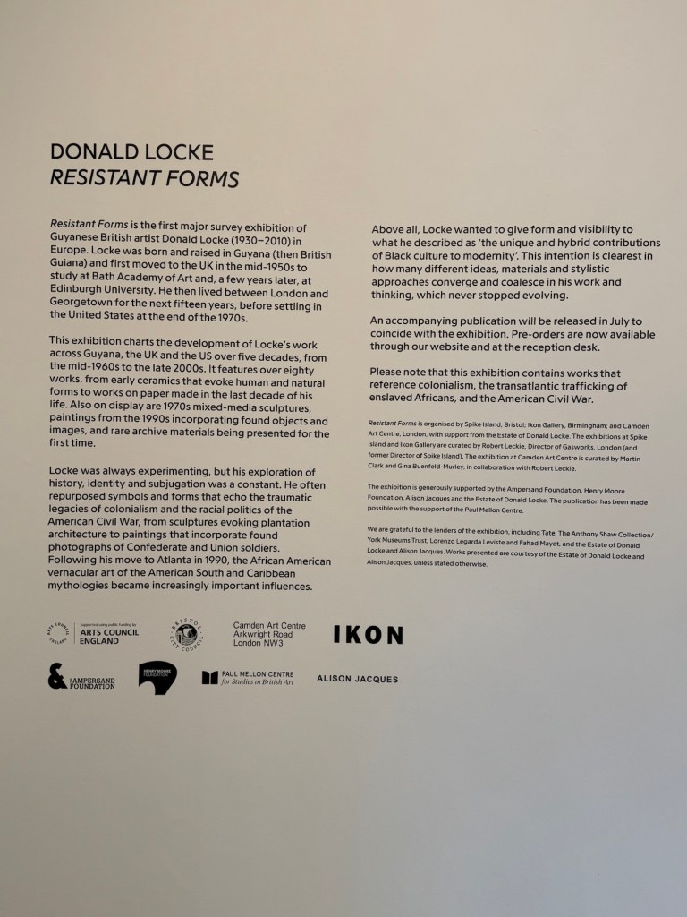
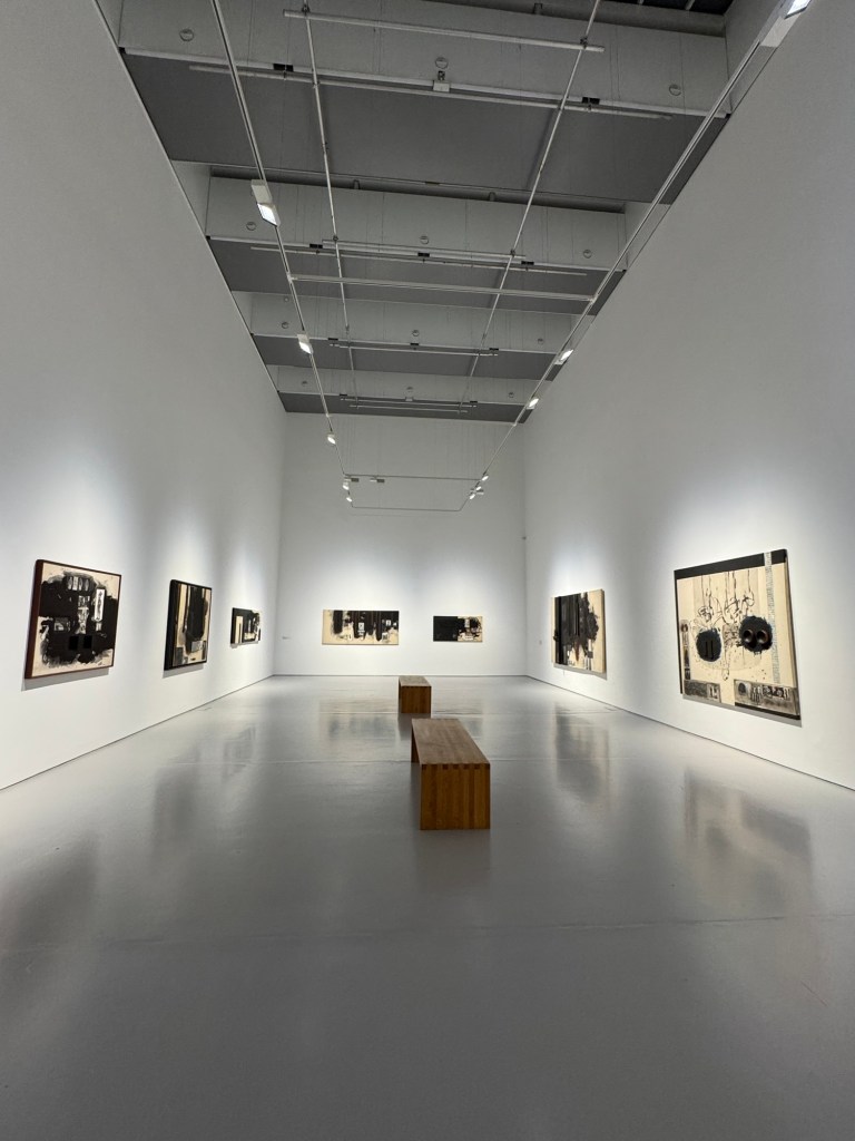
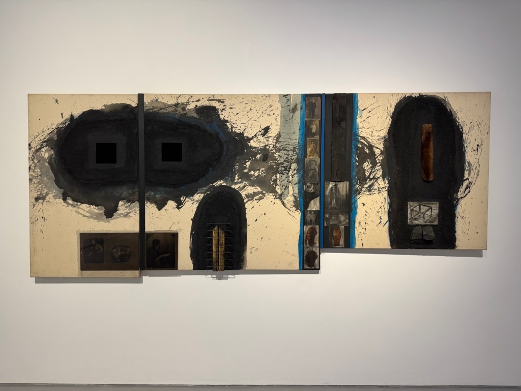
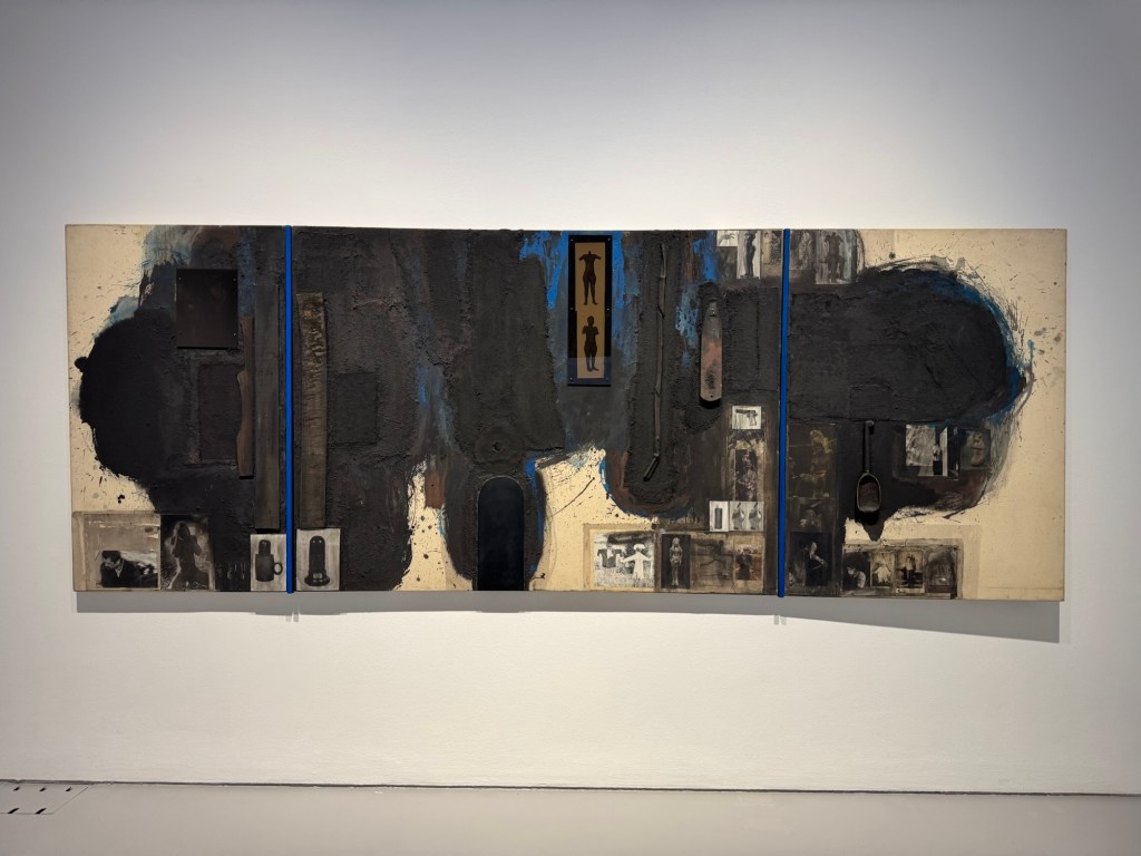
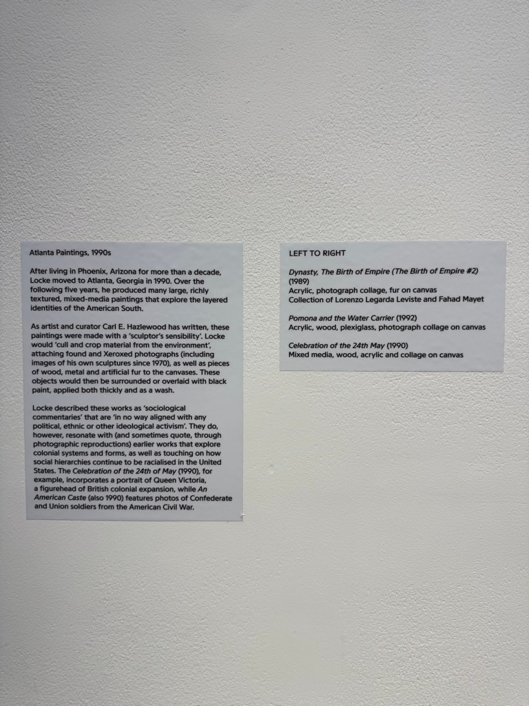
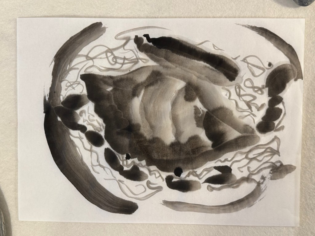
Today I visited Donald Locke’s exhibition Resistant Forms’ at Spike Island Bristol. Below are some of the photos I took to remind me of the work that I found particular resonance with.
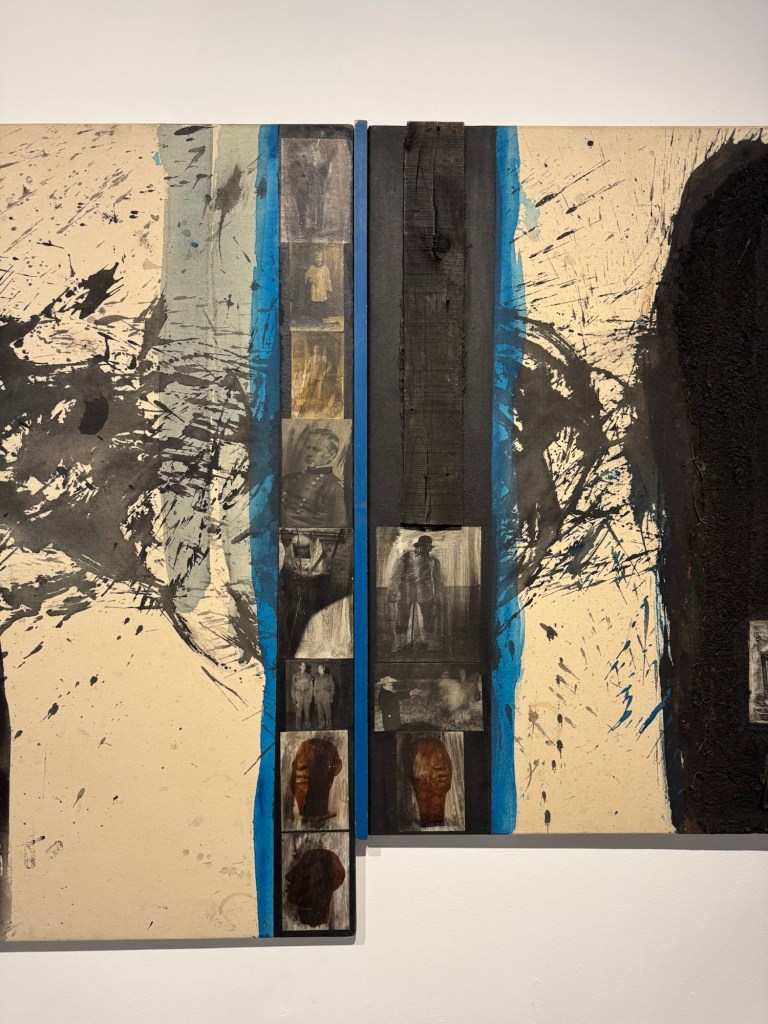
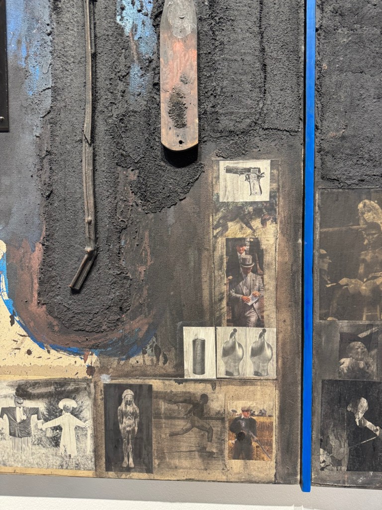
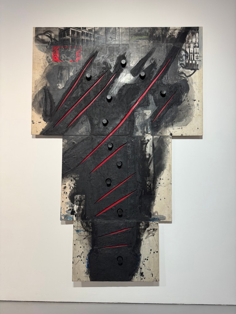
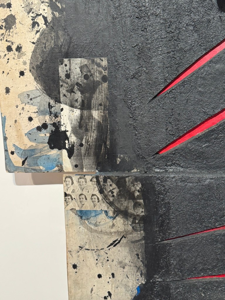
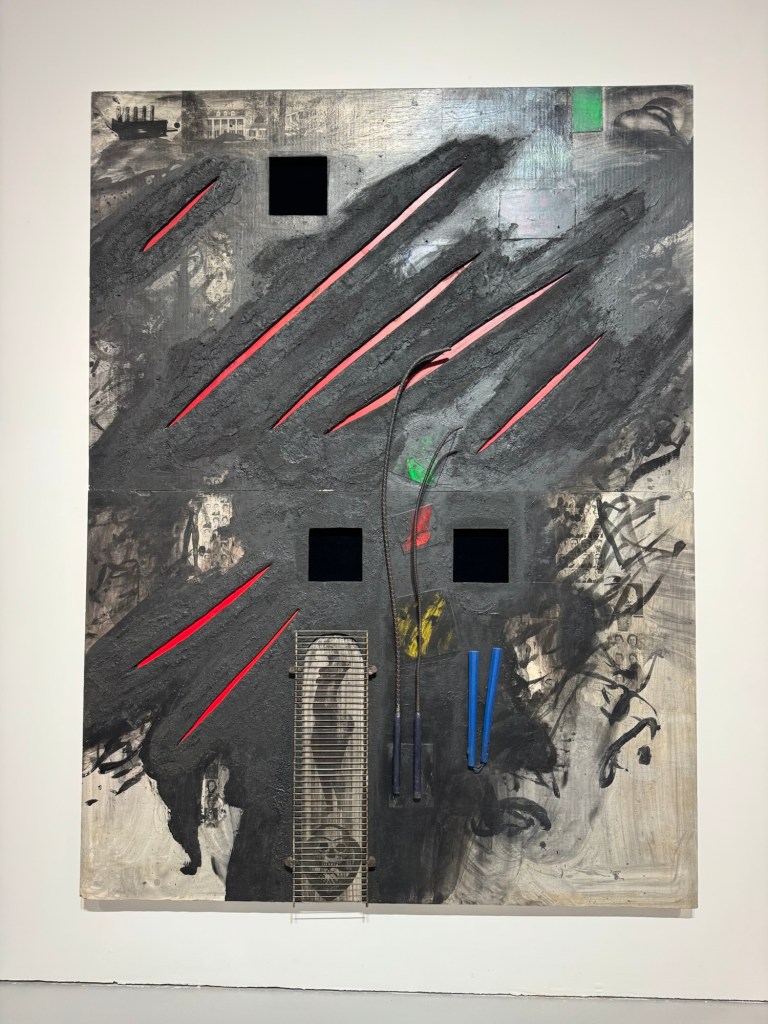
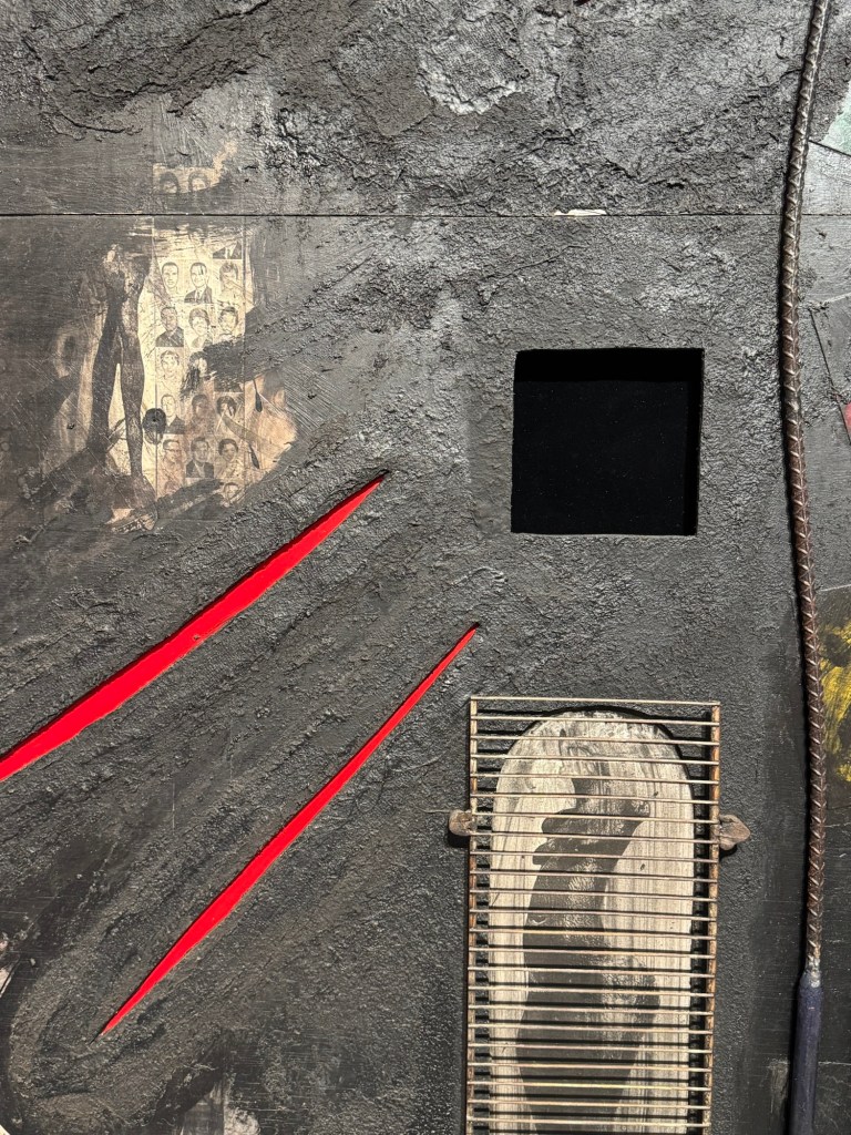
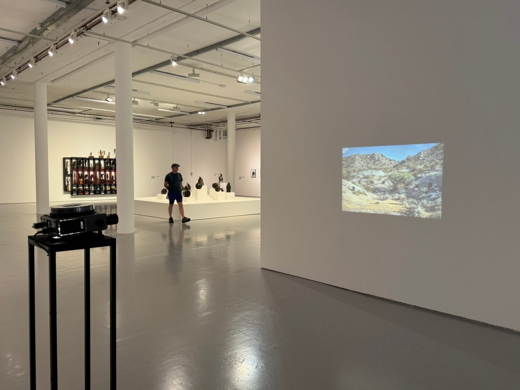
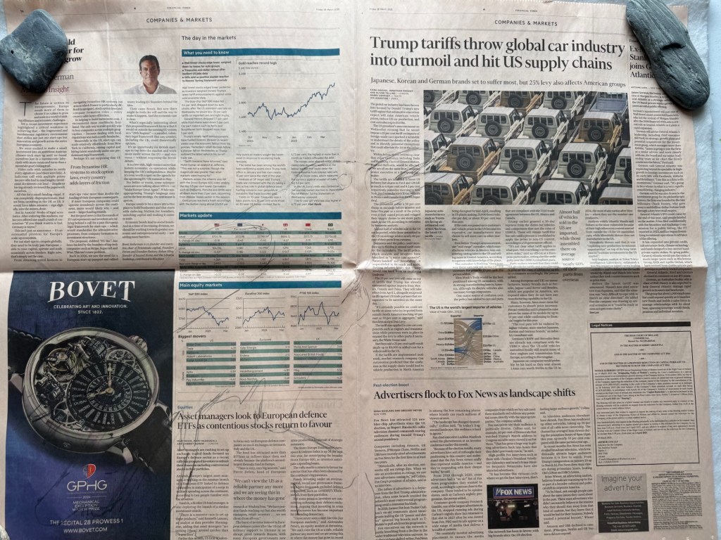
Use of collage, image looks like a crowUse of acrylic in a way that resembles inkAmbiguous use of photosLarge scale paintings with presence and energyClose up of the above showing photos collageUse of mixed media including metal grill mounted onto painting Placement of projector and understated size of projected image
REFLECTIONS
I want to capture ideas that came to me during the visit that made me think about how I could learn from Locke and build on my practice.
Use of mix media techniques:
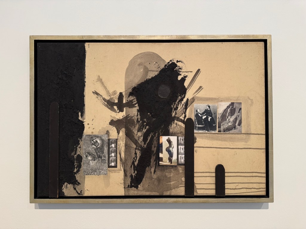
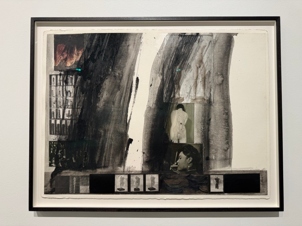
On some of his paintings, the use of acrylic paint with ‘dry brushing’ to create the flying white effect like in Chinese painting energised the painting. It gave me the idea of trying my crow paintings in other medium, such as dilute oil, to see how that works. The use of different materials to create collage was also interesting. I could use ripped up newspapers to create collage effect on a canvas then paint on top. Locke also used items like metal grills to good effect. I can consider what objects, metal or otherwise, that could be incorporated to add meaning and texture to the work.
Use of photos:
Some old photos were used in the collage. I have many old family photos that I have been considering how to incorporate into my work. The way Locke used the photos were more random – a few here and there. Whereas I have tried too hard in the past; I could just use small images in a few places – I don’t need to tell the whole story in one painting. I must remember this. Also, he had just pasted / stuck the photos (copies of) onto the canvas. I always felt that I should photo-transfer the images onto the canvas – this is not necessary. Locke also used images or photos of his own work (sculptures) in his paintings – those images (e.g. female nude) appeared on multiple paintings and acted as a link to join the works together.
Use of projector understatedly
The projector was projecting at waist height with a not too large image. It was understated and effective. I often feel that projection has to be big and has to fill a wall. It clearly doesn’t have to at all. The projection was also placed in a way that you have to walk through the beam to get past. It was an interesting positioning which makes the viewer interact with it.
LEARNING
There are no major learning from the visit and mainly just ideas that came to me as I studied Locke’s work. The main take away for me was to think about experimenting beyond just painting on the whole piece of newspaper. The news headlines remain important to the body of work (News), but through the use of collages, the newspapers could be incorporated to maintain the theme while opening up the materials that I can use. Locke’s extensive use of black was very effective which resonated with me.
NEXT STEPS
Start to think about how I can start to make more complex and ambitious work with multi media materials yet remaining connected to the topic of News.
‘News’ in Chinese ink painted with chicken feather brush
As I am making more and more paintings on The FT, I want to consider more carefully how to display the work and also making the newspaper art archival.
METHOD
1- Online research
I have been researching online for ideas. There have been all kinds of suggestions. I find this post useful as there are different suggestions to try.
However, none of the suggested solutions are truly archival due to the nature of the newspaper material. One of the comments said that newspapers were a museum curator’s nightmare. I think that sums it up. The only suggestion that is truly archival is to make digital images and gyclee prints. That is something that I will consider.
2- Ask an expert
Another investigation route that I pursued was to ask a paper conservation specialist at UAL. His reply was as follows:
“Newsprint is made using mechanical wood pulp for the paper fibres. These are naturally rich in a chemical called lignin.
Lignin is not particularly stable. It breaks down with time with 2 effects:
Some breakdown products are strongly coloured, making the newsprint go increasingly yellow and eventually brown.
Some breakdown products are acidic, leading to the paper becoming increasingly fragile over time.
This breakdown will still happen in dark conditions, but the energy from light makes the breakdown progress much more quickly. Ultraviolet has more energy than visible light, so can do damage more quickly.
It’s not possible to make newsprint archival.
UV-proof glazing would be beneficial if the paper is to be displayed in a window where it’s subject to sunlight.
If the artwork is illuminated using artificial light, UV exposure will be less. Fluorescent lights and halogen spot lights emit some UV. LED lights typically emit no UV.
Most acrylics will filter out some UV due to being made with UV-stabilisers to help make the acrylic last longer.
Last time I checked (which was ages ago…) framers quality UV-filtering acrylics and glasses were similar in price.
For storage, I’d recommend keeping the papers between unbuffered, acid-free boards. Many archival boards are calcium carbonate buffered, which helps neutralise the acids created as lignin breaks down, but alkaline conditions can also increase the yellowing of lignin (through a different mechanism than the breakdown route).
Sandwiching newsprint between glass/plastic offers some benefits in isolating the paper from various environmental effects, but might also lead to a surrounding microclimate rich in acidic breakdown products.”
– End of expert’s reply –
This was a very helpful reply and the sentence that I highlighted in bold again confirms that there is no way of making newspaper archival which is a pity.
REFLECTIONS
After doing this research, I have to accept that it is not possible to make newspaper archival. I feel rather sad about that and the engineer in me thinks ‘there must be a way, it just has not been found yet!’ However, I need to employ a solution now to manage or show the work that I have been creating while continuing to find a long term solution which may or may not be possible. If museums around the world have not found a solution then maybe I won’t be able to either – not in the short to medium term anyway.
Making digital images and then gyclee prints is a very good and viable solution. I will definitely pursue that and learn how to photograph my News paintings properly. As a start, I will need a light box frame that I can wall mount.
I have also considered sandwiching the News paintings between UV proof acrylic panels and mounting it away from the wall with spacers to let light in from behind – this solution also requires further experimentation.
The above are ways to present the paintings for photographing. Once I have found a way of photographing the work then I can consider making limited edition gyclee prints from them.
Other ideas that I have had are photographing the news page, then printing it on silk or other thin fabric, then painting or embroidering on the image.
LEARNING
The main learning was that there was no known way of making newspaper archival. I have to accept that and consider how to find ways to capture the image and reproduce in archival materials. Also, if I were to sell the original work on newspaper then what advice should accompany the sale? How should it be framed, mounted and what life time is to be expected? Perhaps letting the News painting degrade over time is one of its unique feature? As long as it can stay safely in a frame then what harm is there? It will go yellow or brown over time – perhaps that adds value like a vintage bottle of wine or whisky!
The key is to have clarity of how to manage the life of the paintings and offer archival alternatives to the originals. Not that I am planning to sell my work at the moment, but if someone were to enquire then I need to have prepared a professional response.
NEXT STEPS
Immediately:
Investigate ways to mount the prints for displaying and photographing. E.g. light box frames or ‘acrylic sandwich’ mounted on spacers.
Investigate ways to take good quality digital photographs of the mounted work.
Investigate ways to make archival gyclee prints of the photographs – what method of printing and what paper would be best? Best options for framing?
Consider what advice to give with any original art work – recommended ways to mount and likely life before degrading occurs. Think of ways to articulate the value of a degrading or degraded piece of News art. i.e. make the non-archival nature of the art a feature of the work.
Longer term:
Investigate options to print on fabric then paint on the fabric or embroider to create original art. Or print painted News images on silk as an alternative to paper – need to think why use silk or fabric though.
Since my recent re-evaluation of my art practice to enable me to respond to what has been happening in the world, I have been making a new body of work – ‘News’. I feel the urge to show my new work at my MA Degree Show. This blog is about the development of ideas and a plan for the Degree Show.
METHOD
Firstly, I wanted to explore if combining multiple sheets of ‘News’ would make a good composition. Since each sheet was made as an independent painting, I needed to see if they would ‘make sense’ together. So I stuck together a few paintings and put them up against two glass doors to see how I felt. I was encouraged by what I saw and felt there was potential in the concept. I then proceeded to design the installation – how should the paintings be presented?
–
Below are some mock up ideas that I prepared to discuss with my tutor:
–––
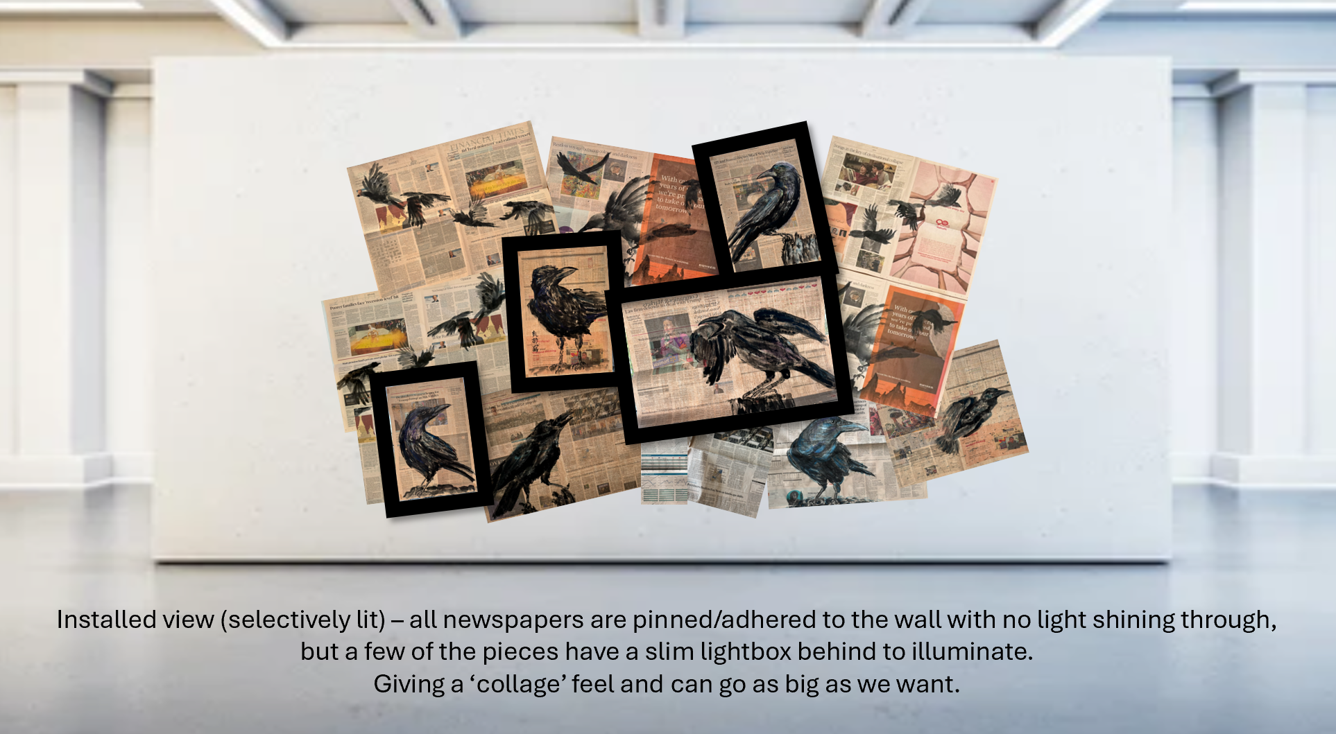
After discussing with my tutor, we felt that the first option had the most potential for the CSM site. So I proceeded to think about how to create one large painting by combining multiple newspaper paintings together that would be appropriate for the Show both in demonstrating the concept and that is robust enough for a public exhibition.
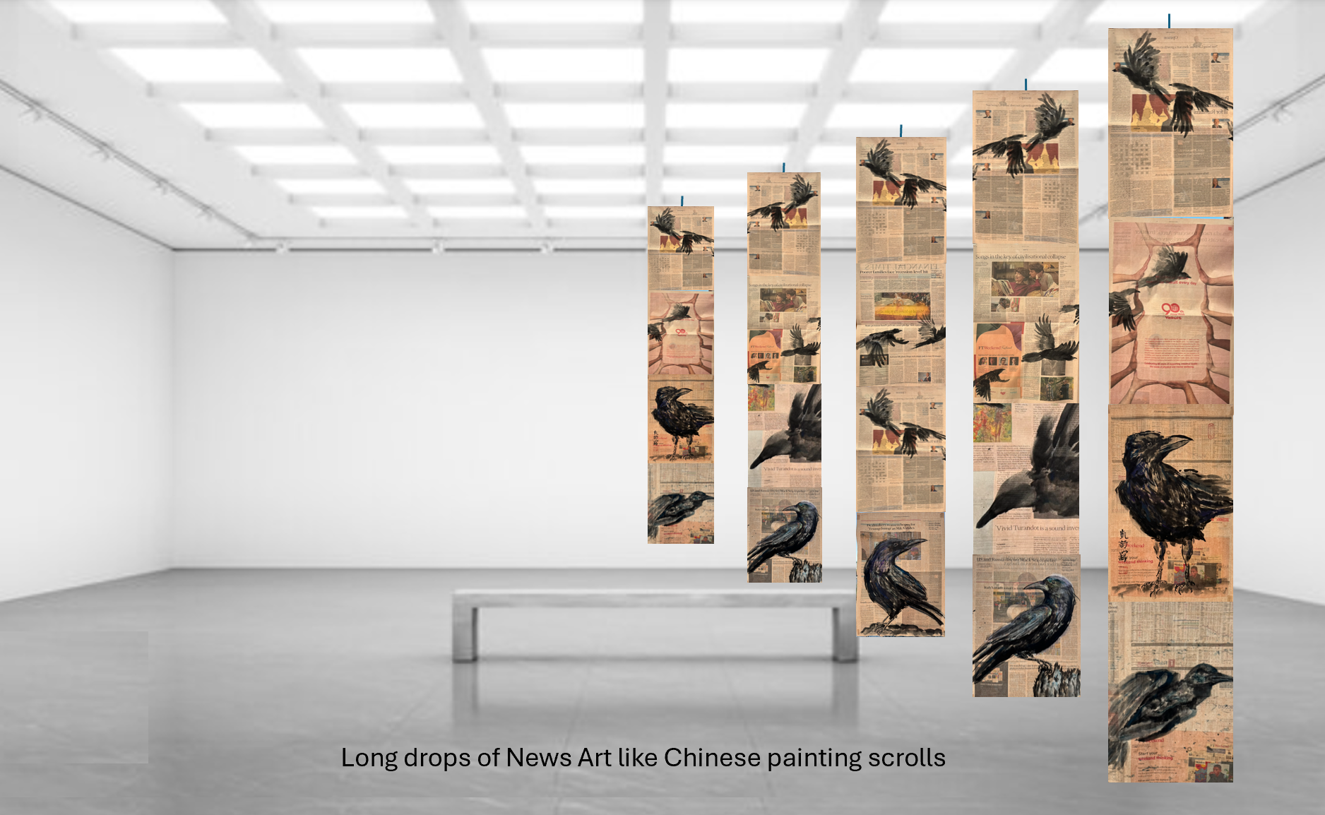
My tutor showed me an installation by a previous student who stitched together pieces of paper to form a long drop. I liked the idea of stitching together the pieces rather than just taping because I think it would be more robust and also reflect my wish to mend what’s happening in the world through my work – somehow.
–
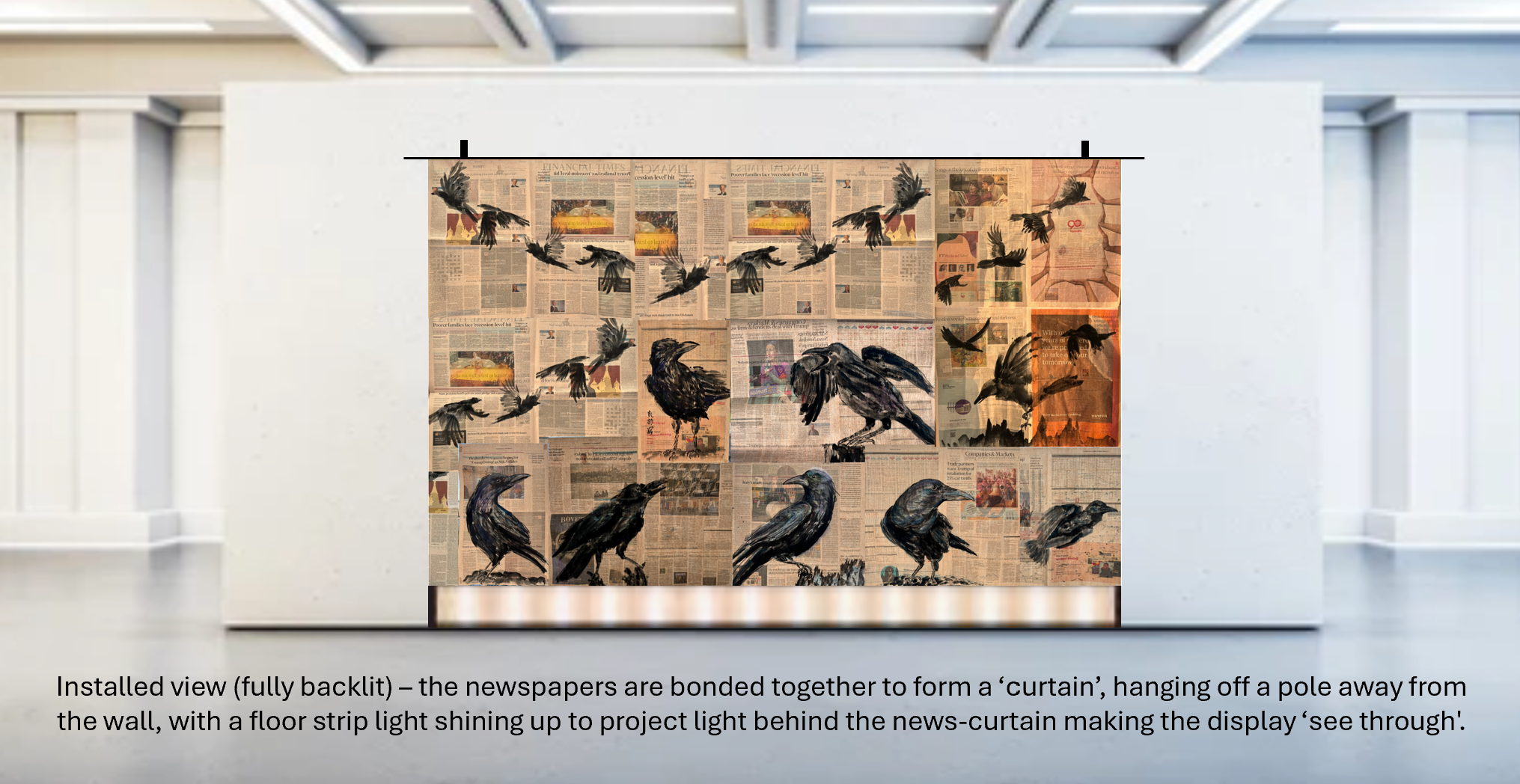
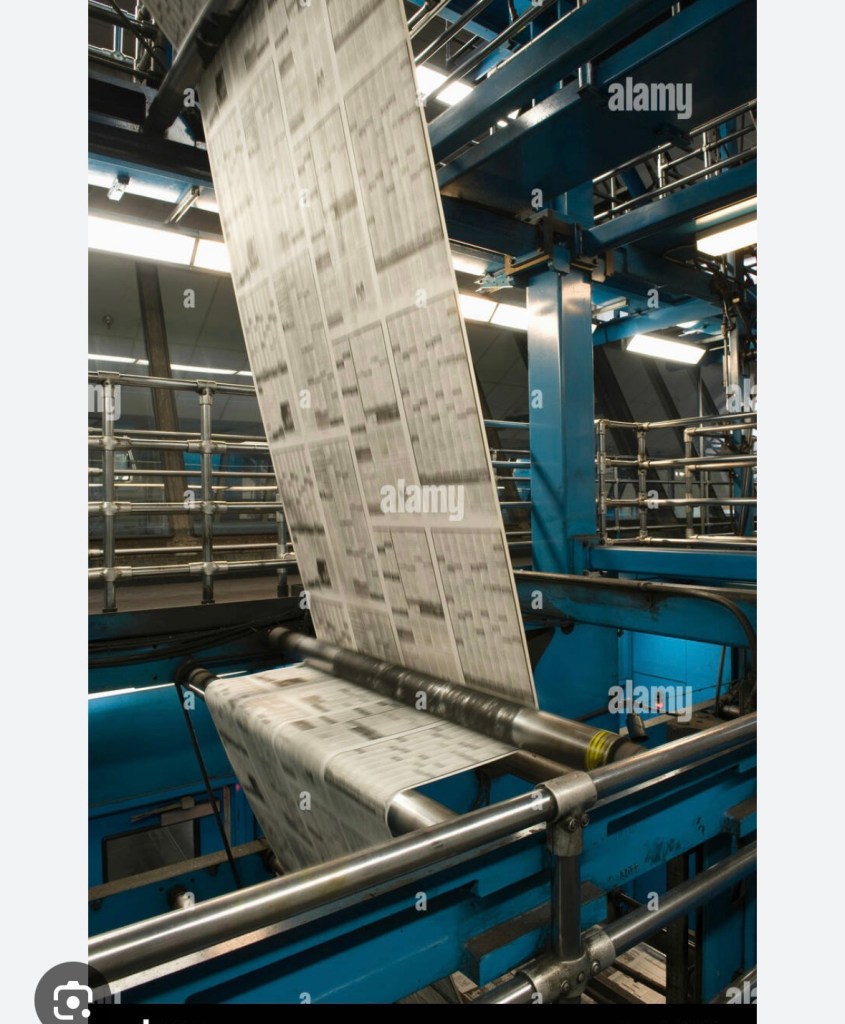
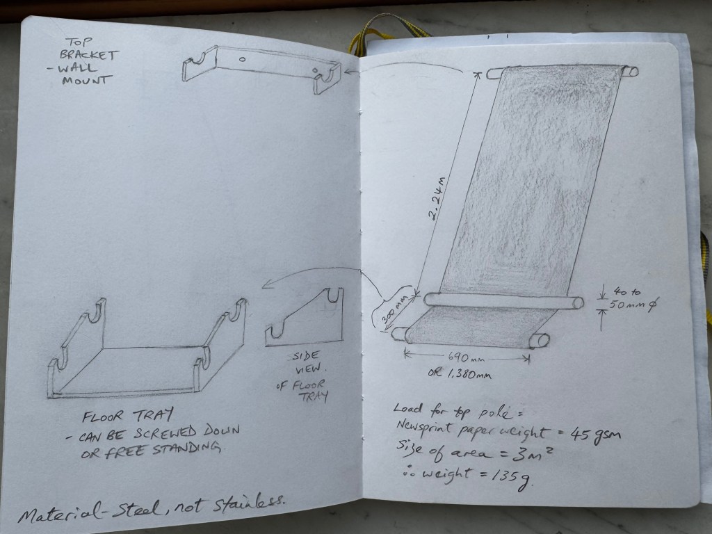
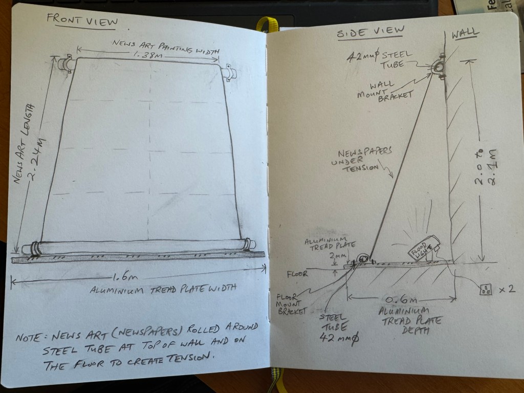
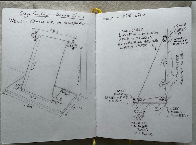
I then tried out different ideas on my sketch book and decided a narrower long drop (rather than a wide one as in the original idea) could work well to resemble how newspapers are printed and processed in the factory. Working so intensely with newspapers and examining newsprint so closely has reminded me of my time as a young engineer working on control systems for newspaper printing presses including many Fleet Street titles. I remember vividly how exhilarating and awe-inspiring it was to see the newspaper webs flying at high speed between feeder rollers around the monumental machines (see example image below). Since my art practice is about exploring my identity and engineering has been such a large part of my life (35+ years), I wanted to make an installation at the degree show that incorporated elements of my memory from those days.
–
I experimented with the ideas of using three tubes to represent parts of the printing machine. Initially, I looked into buying used feeder rollers from printing press refurbishment companies but they were costly. Then I considered using mild steel tubes (not stainless steel as they would be too shiny). Below is an initial design idea which I used to get some costing. A key objective was the ease of installation knowing how busy the build up would be with such a big student show.
–
Then I wondered if three tubes would be too many and considered a two tubes design. In all cases, one or more flood lights would be used to illuminate the artwork from behind. Here is a two tubes design:
–
After further discussions and advice from my tutor, the final design was to use 3 x copper plumbing pipes as the copper colour would complement well the Financial Times’ salmon paper. The second pipe on the floor would be placed behind the painting giving the look of the newspaper feeding into the wall. I considered using two small flood lights, but I might go with a dimmable flood light instead because I have found that the back-illumination light level could be critical – too bright and the images became saturated and if too dim then the reverse side images would be hardly visible. Hence a dimmable unit would give more flexibility for an unfamiliar site with unknown ambient light level. Here is the final design:
–
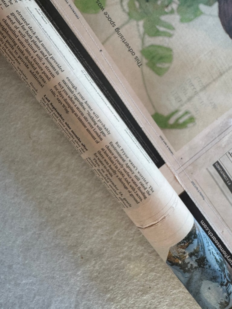
The next task was to test out the stitching and the wrapping of the newspaper around a pipe to see how the paper behaved. Also to determine the optimum pipe diameter to use.
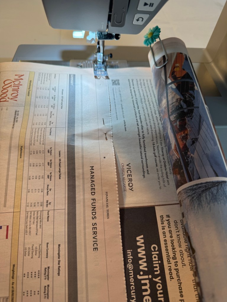
Using a sewing machine for large sheets of paper could be challenging because unlike fabric, the paper could not be bunched up to fit around the sewing machine body. Hence I rolled up the newspaper around a plastic tube and held the roll in place with a large paperclip so that it could be fed into the machine without damaging the paper. The two sheets of newspapers were held together using dressmaking pins just like I would do when binding fabrics.
–
The machine settings were as follows with the stitch size fairly small for strength but not tiny as it might rip the paper:
–
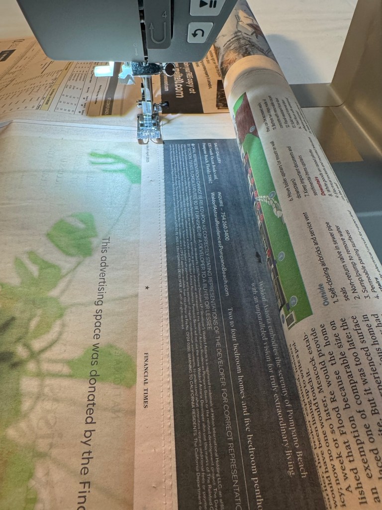
The paper was then fed slowly into the machine for sewing. Two rows of stitches were made to ensure strength of the bind:
–
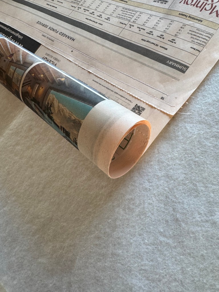
Completed sewing and with paper hanging vertically:
–
Below are close up images of the stitching and how the paper wrapped around the tube. This tube was of 40mm diameter and the paper wrapped well around it:
–
I tried wrapping around a smaller diameter tube (22mm) and it felt too tight and obviously would require more revolutions of wrapping and I felt that would introduce more risk in the paper not aligning and looking untidy:
–
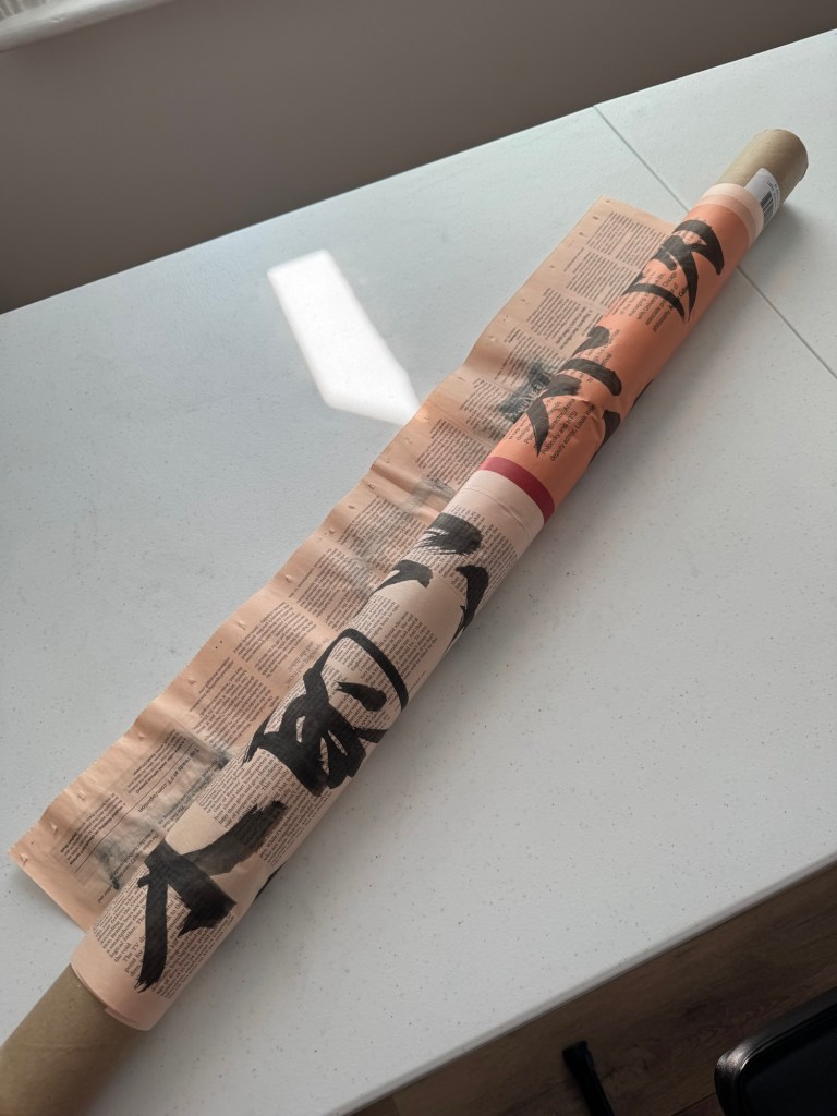
Another example of paper wrapped around a tube. This time with painted paper only as an experiment because the installation for the Show would only use unpainted paper to wrap around the tube.
–
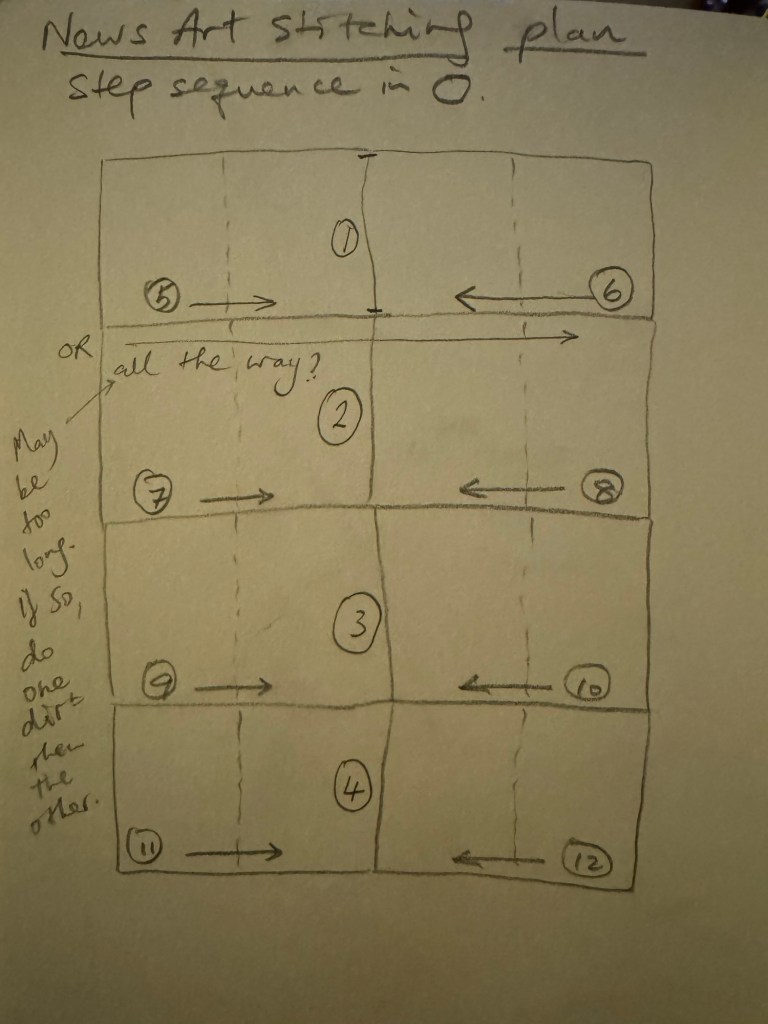
Since I am planning to create a painting size of 2 x double page spread broadsheets, that is approximately 1.36m wide and it would be difficult to feed into the sewing machine in one go, I created the following stitching plan to do the stitching half way, then turn around and do the other half from the opposite direction. I might try to do it all the way with some spare newspaper as an experiment to start with.
–
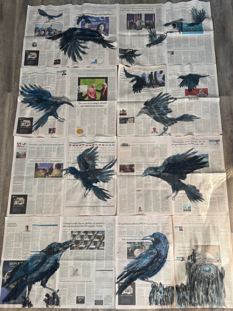
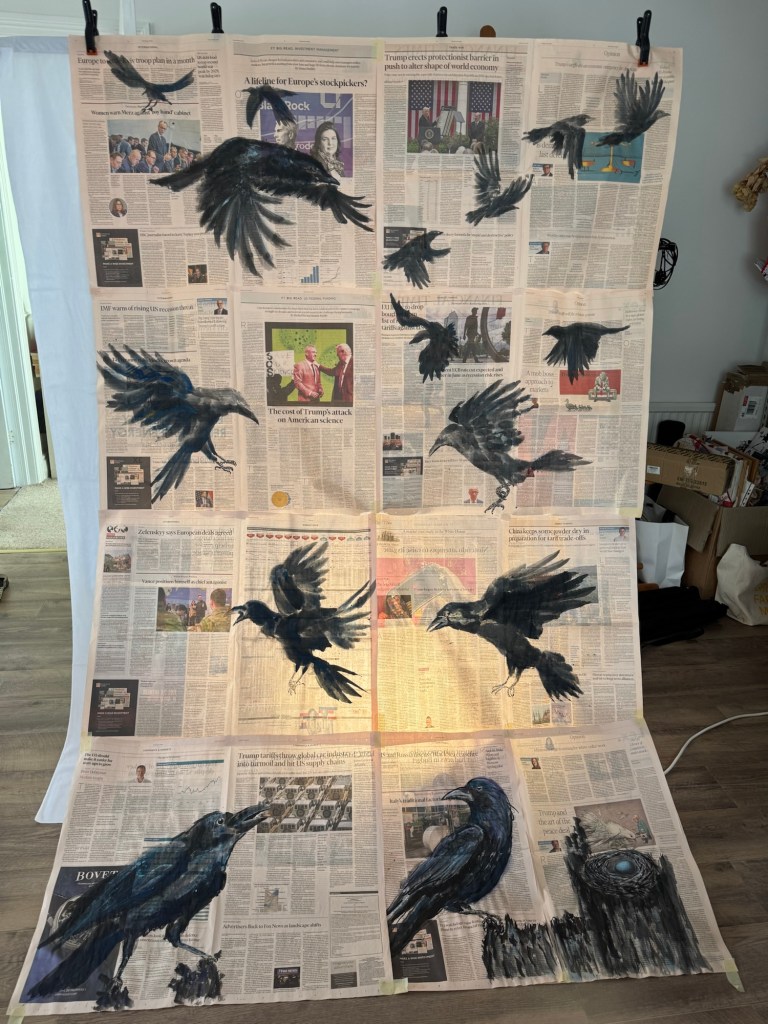
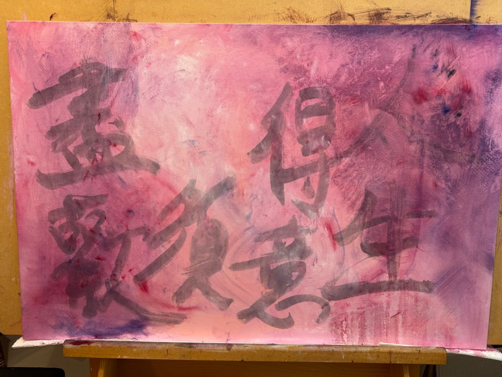
Final selection of eight paintings to form a composition for the Degree Show:
–
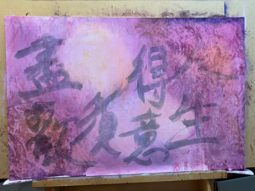
Mock up in front of flood light to test concept:
–
–
REFLECTIONS
I started to re-evaluate my art practice just before the Low Res in March and I started to make ‘News’ art at the end of March which is less than two months ago. I cannot believe how much has happened and that I am planning to show this new body of work at the Degree Show. During my recent tutorial, my tutor said that everything I have been doing as well as my commitment to interrogation have been leading to this and it does feel that way to me. I am feeling a momentum that I had not felt before and I am very excited (and somewhat nervous but in a good way) about showing this work at the Show. I do not know if it would work out or if it would present itself as I imagined. But I take confidence from what David Bowie said in this video where he was giving advice to artists:
My main takeaway from Bowie’s video was when he said, ‘…Always remember the reason you initially started working, you felt there was something inside yourself that if you could manifest it in some way then you would understand more about yourself and how you co-exist with the rest of society… If you feel safe then you are not working in the right area. Always go a little out of your depth, when you feel your feet are not quite touching the bottom then you are just about in the right place to do something exciting.’
I sincerely hope that Bowie is right and I look forward to finding out!
Another point that I have been reflecting on is that this new body of work is aesthetically and topically very different to my last body of work, The Cheongsam Series, where I was making oil paintings on dress-shaped canvases to explore my transcultural journey.
Much of my work in the last two years have been about my transcultural identity, but I knew that at some point I would want to go beyond just talking about my transcultural journey onto issues about society – issues that are still related to me, my lived experience but about other aspects of my identity. I mentioned this in my Study Statement from Unit 1 as my intention, but as I was making my transcultural work I have at times felt bounded to that topic and I was unsure of how to progress or transition onto the next body of work without seeming incoherent. Then when the ‘calling’ came to make work about the rapid change in world order and how people close to me were being affected, my urge to move onto the next body of work felt like a natural progression. Of course, there was much time spent on reflecting, agonising, experimenting, observing and reflective-writing that led me to making ‘News’ art. I am very pleased that I have gone through the transition process from one body of work to the next while I was still on the MA programme. This is because I felt safe and secure in trying something completely different in a supportive environment and I made it happen. I have learnt that I could do it and it wasn’t as scary as I thought it might be. Guided by my reflective process and taking it step by step meant that I felt in control of the transition – not necessary in control of the making but in control of the change process which gave me a solid platform to take risks in the making. This learning experience has been very important for me as I now feel confident to do that again independently after the course. I feel I can move onto the next body of work when the next ‘calling’ comes. I know I can rely on my instincts guided by my reflective process to make it happen. I expect I will return to my transculturality work at some point because there is still much to explore and I certainly have not exhausted the subject yet – far from it.
LEARNING
I have learnt that I now feel able to transition from one body of work to the next and take risks along the way. I will follow my instincts and use my reflective process to guide me. This has been an important realisation as I go forward to develop my practice.
As for the Degree Show, there has been a lot to think about in planning for the show and I have really enjoyed the challenge. Especially looking at sourcing the right materials for the installation – I learnt a lot in that process, such as to consider the materials’ behaviour, the aesthetics and planning for a site that I am not familiar with including all the contingencies to consider. It’s all good experience for any future exhibitions. Creating the paintings is only half the work, presenting it properly and all the site considerations require just as much work which is something to bear in mind in the future. Planning and allowing plenty of time is key!
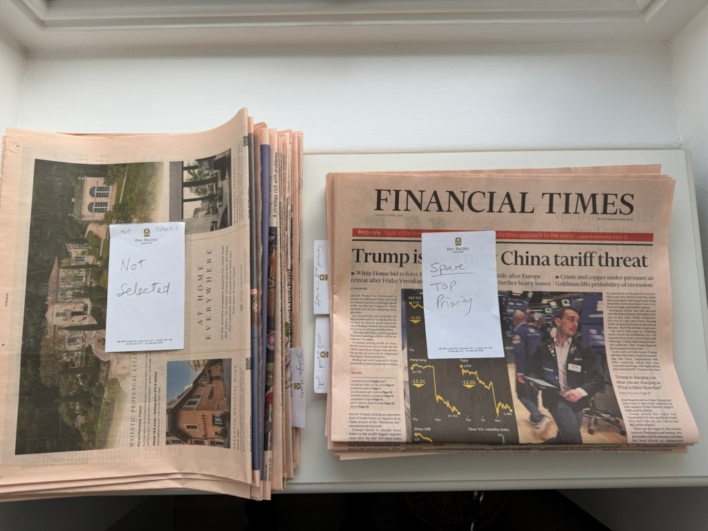
I have also learnt that I needed to introduce a new process of organising my materials – namely the newspapers! Especially considering news has a life span. My ‘News’ artwork needs to be about the here and now and can’t be left on the shelf for too long or the news story would have expired. So I needed to create a system to sort the newspapers so they don’t end up piling up in my studio. I decided to organise my newspapers as follows.
I found it helpful to have a specific topic for selecting the newspapers to paint on. In this case, it’s about the sudden change in world order due to the US Government’s drastic roll out of damaging policies.
So when I get a copy of the newspaper, I sort the pages into the following categories:
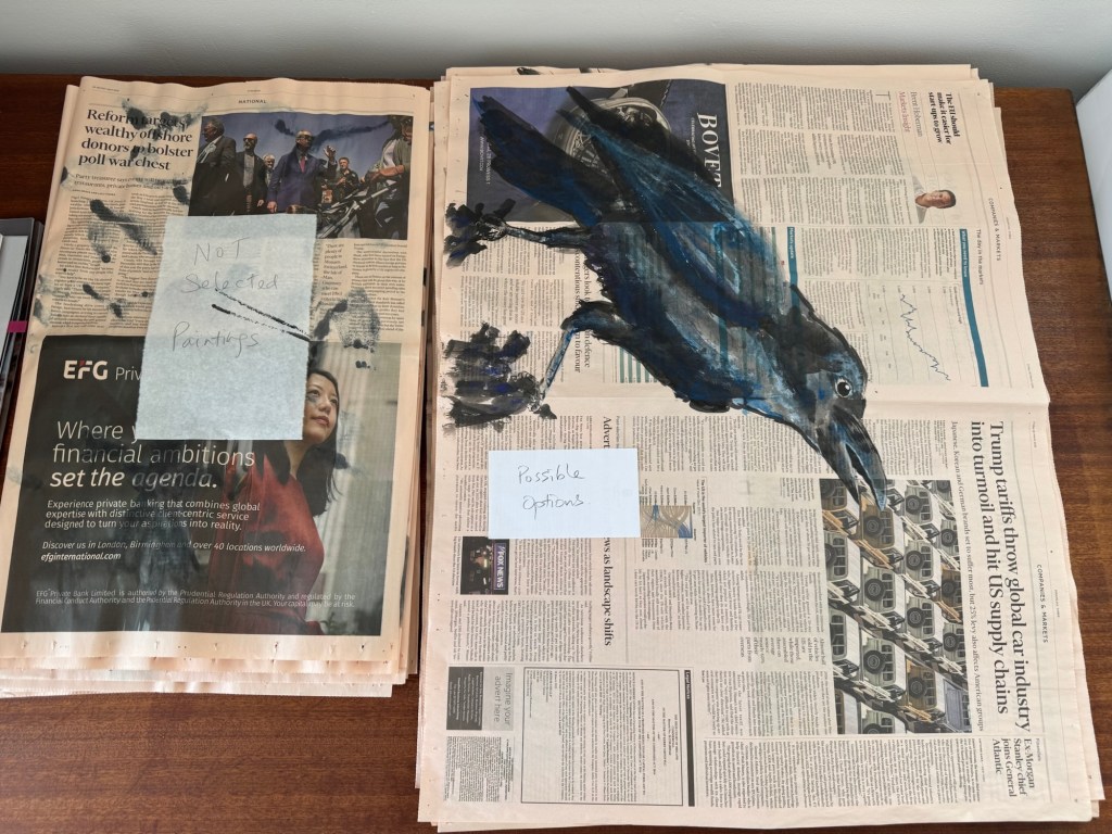
– Selected pages for painting – with the appropriate headline, perhaps an interesting image and not too much advertising especially not big dark blocks.
– Spares: top priority / second priority / good for practicing
– Not selected
Out of all the ‘News’ paintings that I have created, they were sorted into ‘possibles’ for the show and ‘not selected’. Then I continued to make more paintings until I had enough ‘good’ ones that I was happy with for the Show.
––
NEXT STEPS
Make it happen for the Show!
Always remember Bowie’s advice!
Maintain my confidence, follow my instincts and reflective process to develop future bodies of work.
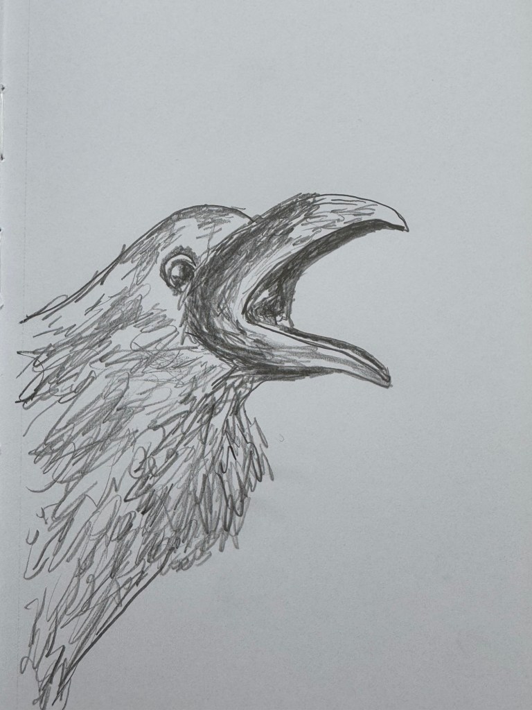
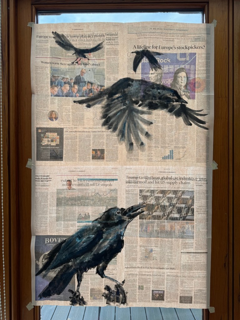
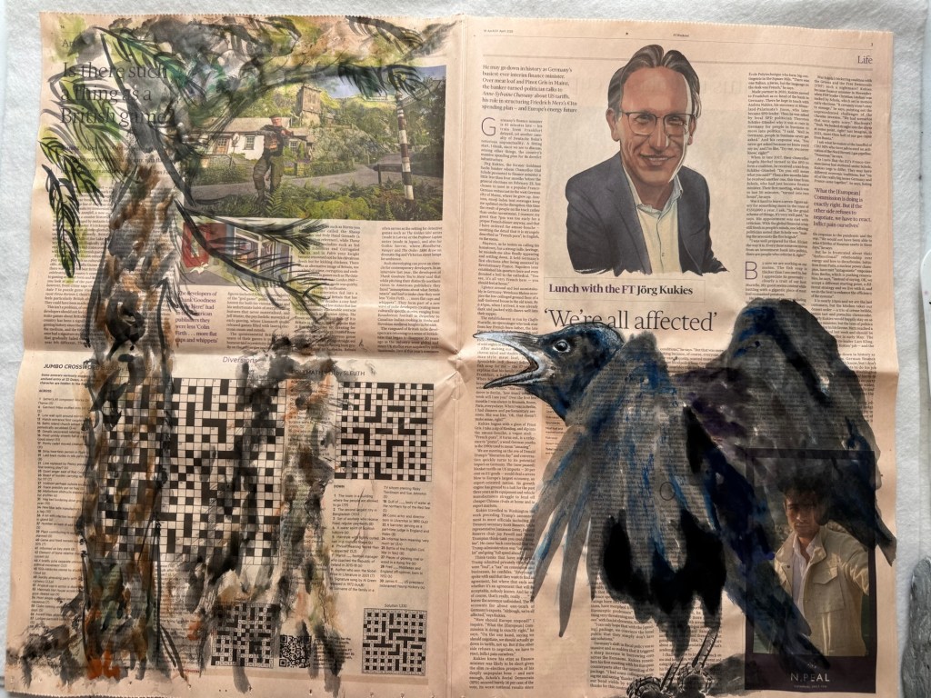
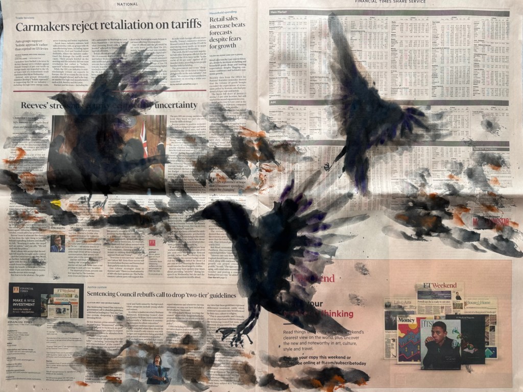
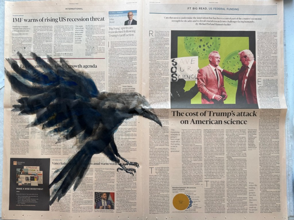
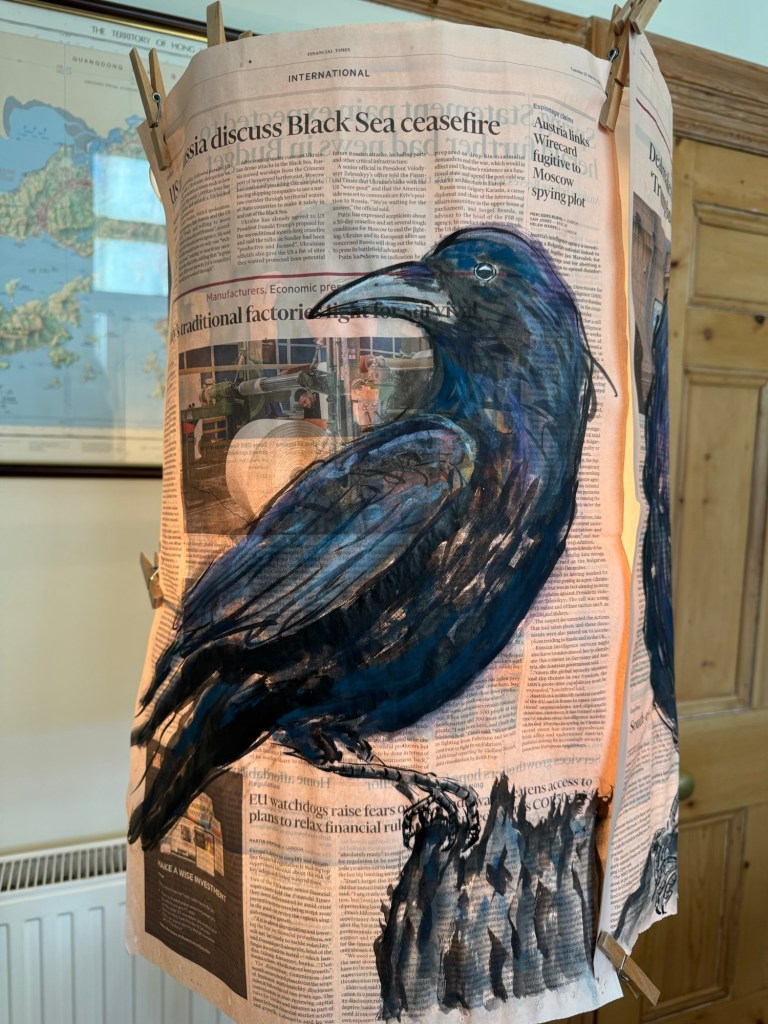
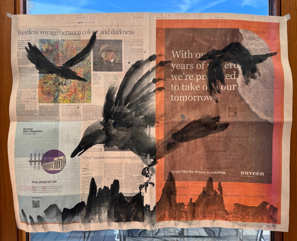
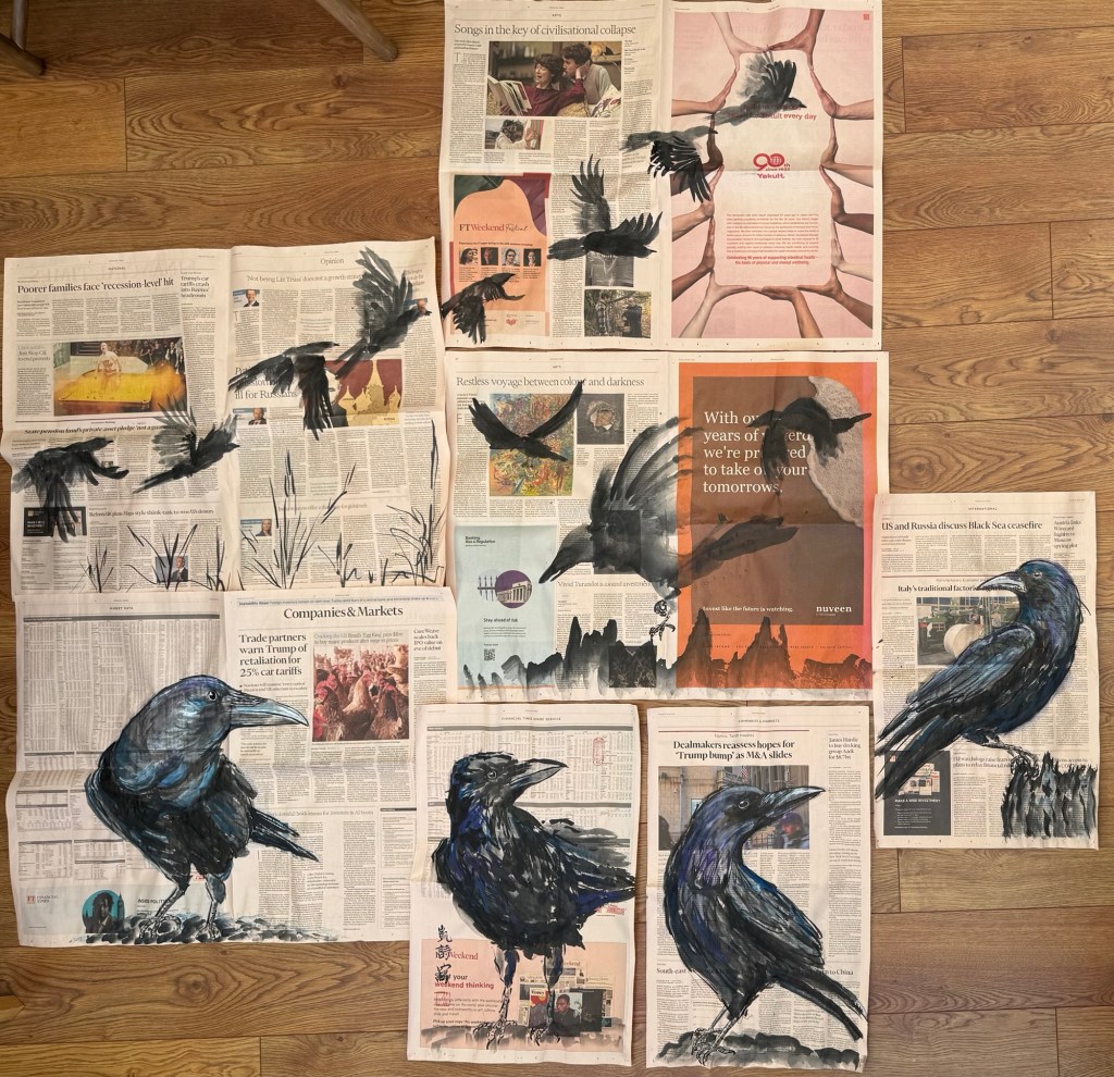
I have continued to work on my latest body of work – ‘News’. I decided to explore different crow expressions to use in my compositions. In particular, more expressive, angry or ones in flight. So that I have a wider variety of expressions to choose from when responding to news articles that I see.
METHOD
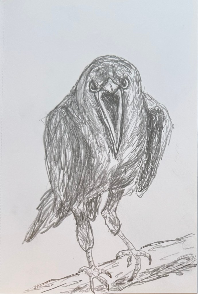
Lately, whenever I feel unsure about how to proceed then I have been returning to drawing. I find the process comforting and grounding. So I started with a few drawings on expressive crows using my non-dominant hand.
Angry crow:
–
This one was meant to be angry but actually looked anxious:
–
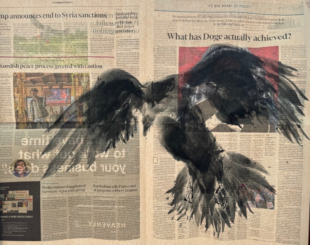
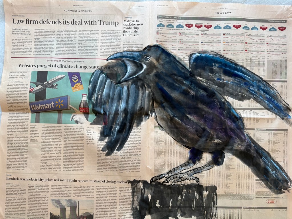
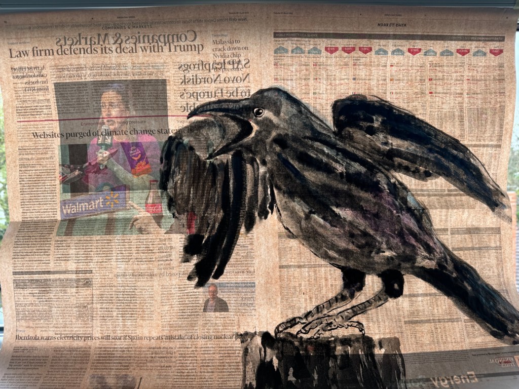
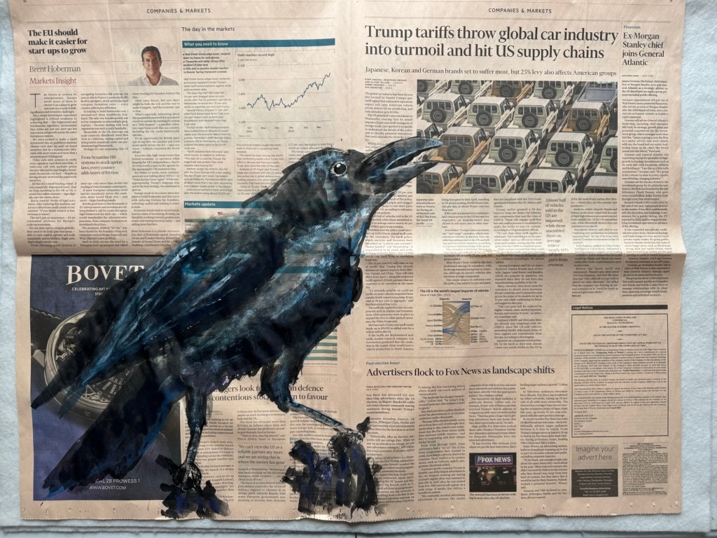
I then went onto painting on newspaper. I used charcoal to mark the outline of a crow that I wanted to paint. The newspaper was chosen especially for this composition – a shouting crow:
–
I then painted the crow – staying with my non-dominant hand. I was going to paint the wing behind the man’s head. But then decided to cover up the head. This was the finished work:
–
The painting was held up to the light. The man’s head was slightly visible despite being covered. What came through was a woman speaking on a microphone on the reverse side of the newsprint which made the composition more interesting.
–
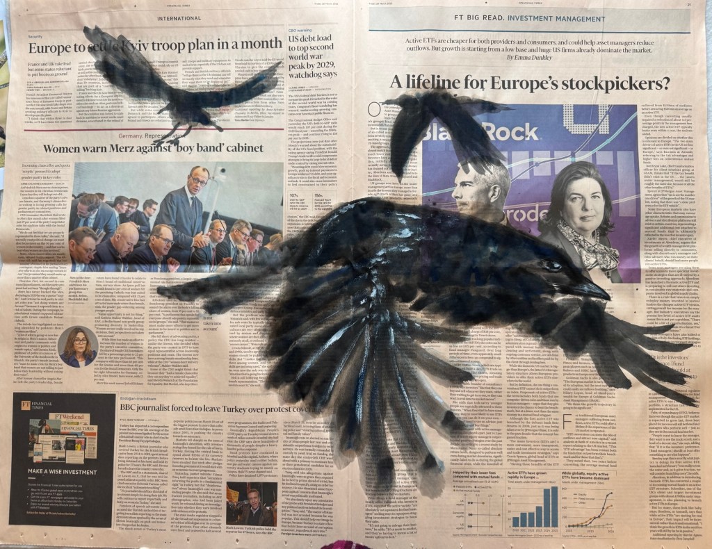
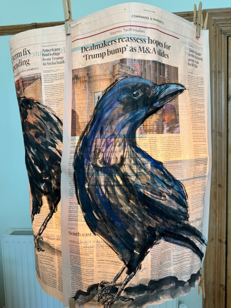
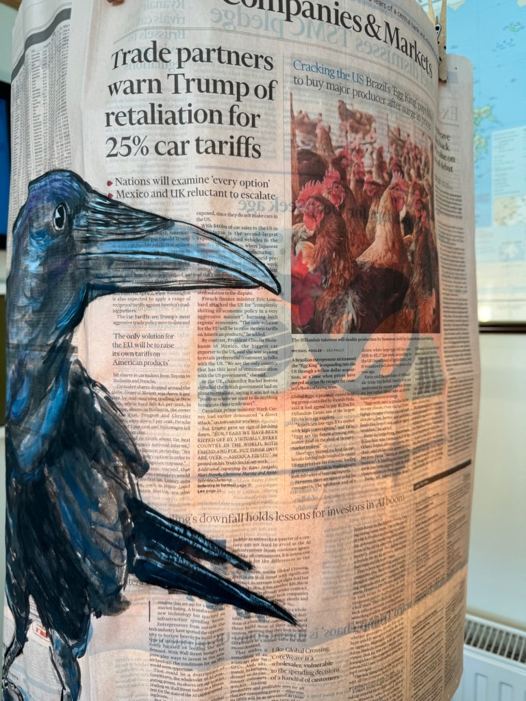
Then I experimented with a crow looking in despair up to an article about the tariff trade war. Perhaps it was not totally in despair, but certainly questioning what’s going on:
––
Again the finished painting was held up to the light as a metaphor for holding someone to account. The images on the reverse side made the photograph of the cars under the trade tariff headline more ambiguous.
–
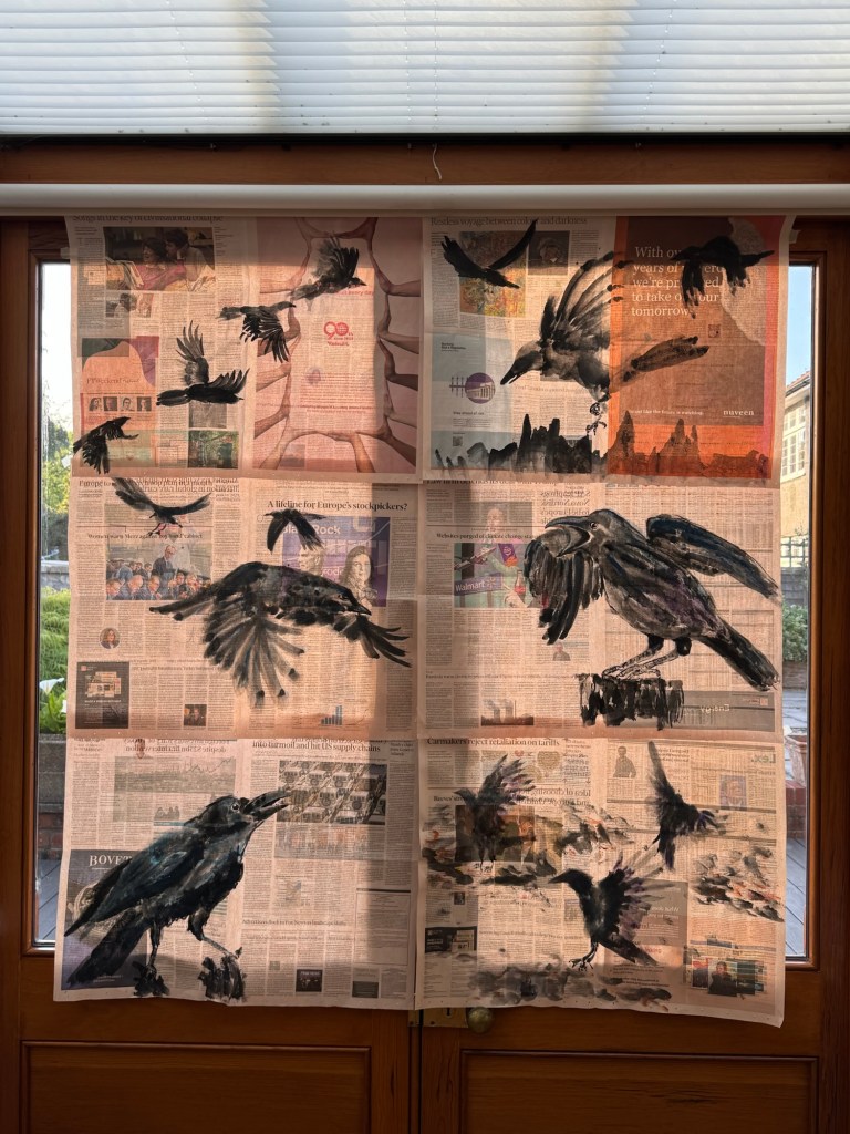
Crows in flight going in different directions:
–
Putting together paintings to start exploring combined composition:
–
Another shouting crow under the headline ‘We are all affected’. The crow was in line with the gun held up by the man on the left page. Then I noticed a large capital letter ‘O’ on the crow’s body – like it had been shot by the man in the photo. I added a pine tree around the greenery on the photo on the left, but I don’t think it worked. It distracted too much from what the crow was going through.
–
A few landing crows:
–
A large landing crow going for a prey:
–
A screaming crow in flight aiming at a photo:
–
REFLECTIONS
As I made more work, I became more confident about this new body of work. My confidence increased in both the concept and the process. My recent tutorial was very useful in helping me to reflect on my thinking behind the work and the progress so far. My increased confidence meant I was able to go for a more freestyle approach to my Chinese ink painting in the work listed above. The freestyle approach enabled me to be more expressive and spontaneous. The last few paintings shown here were done without needing to use charcoal upfront to mark out the composition which I was pleased about.
I was not happy with every outcome here, some of the depictions were more aligned with my intentions, some not so. But I was trying not to overthink it at this stage. Just wanted to keep making as I know from my Chinese painting class that it would get better with practice.
I continue to find Chinese ink painting ‘unforgiving’. I have written about this before and it still has not changed – it is just part of that medium and again, practice helps. ‘Just keep making’ is the key.
Also, I believe painting with my non-dominant hand has helped me to not agonise over my work too much because it’s not meant to be perfect. It will be what it will be! I have found it liberating to paint in this way and I plan to continue this exploration.
LEARNING
I am gaining confidence in the making process through practise and more importantly – I am pleasantly surprised by my confidence in tackling a completely new body of work that is very different from my previous transcultural work. I am happy that this major change happened during my MA course because the guidance available gave me the courage to do something completely new and experimental.
Also, the structure of my reflective practice has really helped me to realise the concept knowing that if I got stuck then the reflective process would help me to find answers or a way forward.
I feel very excited about this new body of work and I am really enjoying this way of making. It continues to help me to respond to what’s happening in the world through my practice which is very important for me right now.
To build on this, I want to think more about why painting with my non-dominant hand has become so important to me. Also I want to understand more about my overall process – from buying the newspaper to completing a painting.
NEXT STEPS
Think more about my reasons for using my non-dominant hand – especially think about this as I paint.
Start to be more considered when moving from one step to the next in my process to better understand the process with the aim of future improvement and development.
Keep making and think about what to do for the degree show.
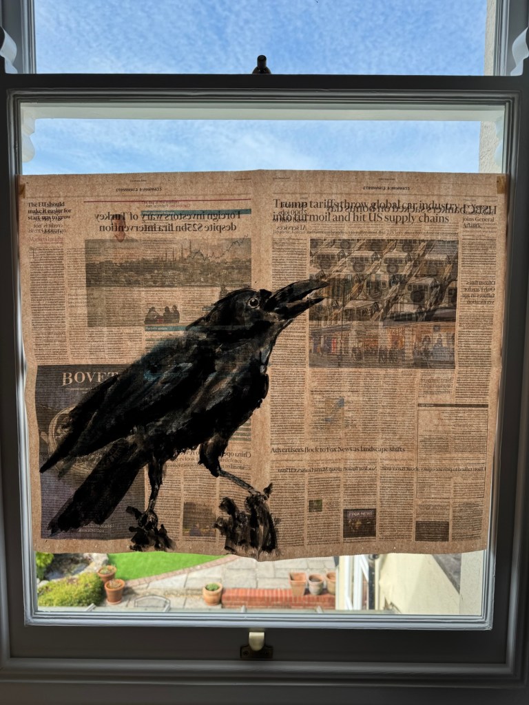
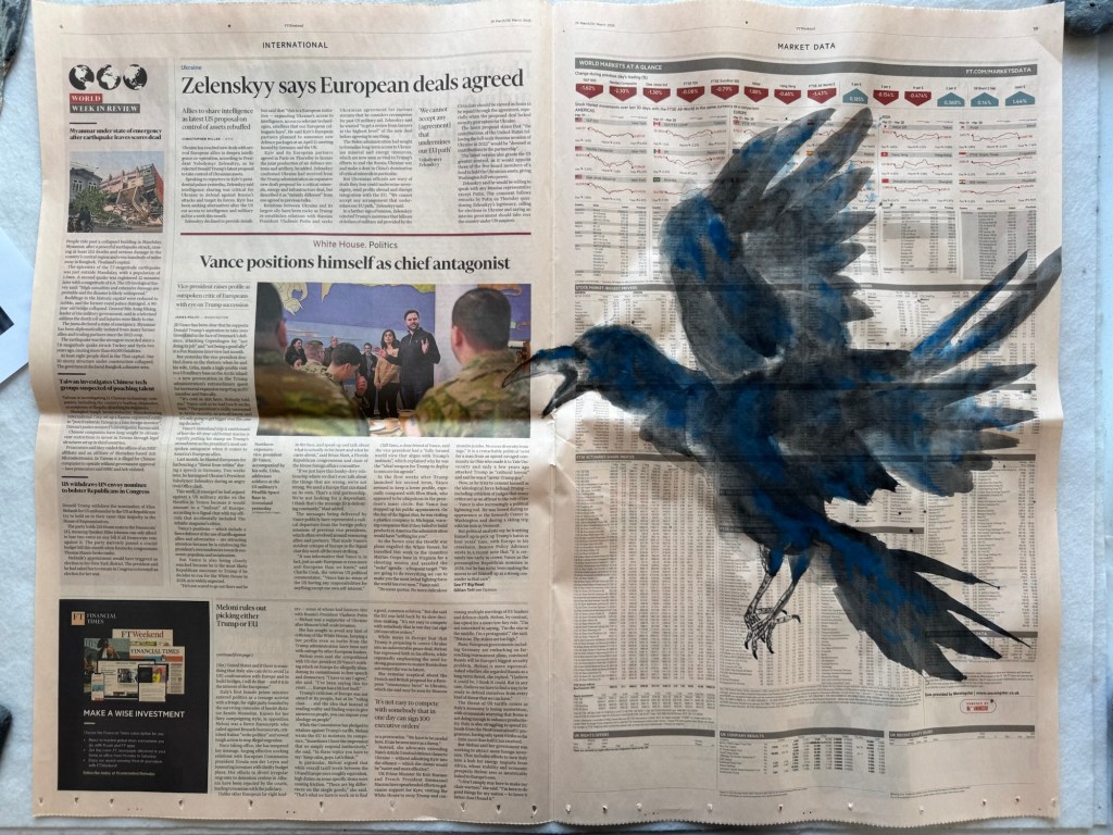
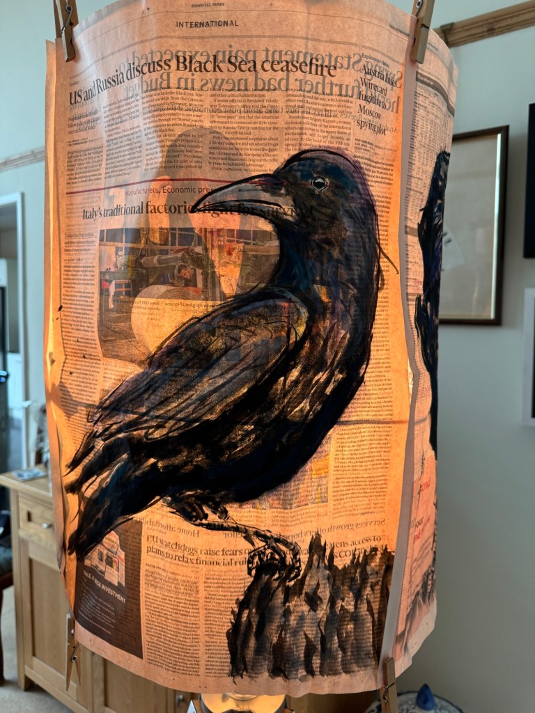
When I first showed my News Art to my tutor, we talked about the way I photographed the paintings in front of a window and letting the light shine through was a metaphor for ‘holding the news up to the light’.
As the saying goes, if you are ‘holding something up to the light’, you see through and understand the true nature of it more clearly; or you hold something to account. I felt it was a good metaphor and if I were to show my News Art then I would want to hold it up to the light. This way of showing also reveals the images on the reverse side of the newspaper adding more intrigue and ambiguity to the overall composition.
METHOD
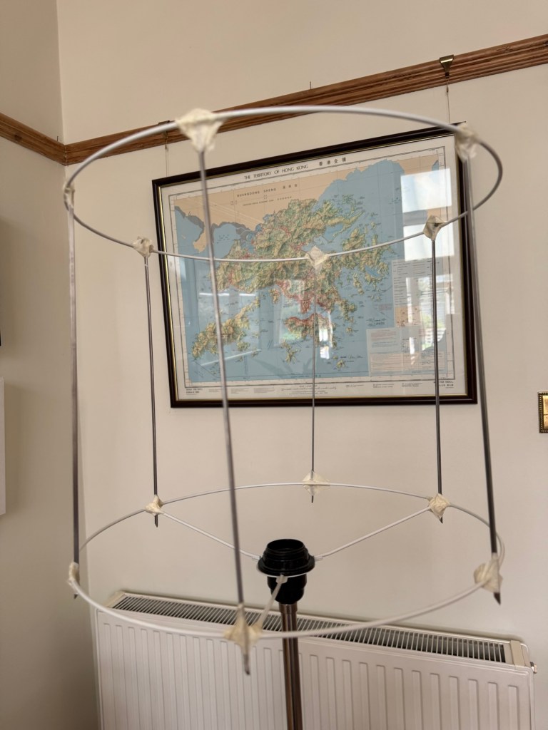
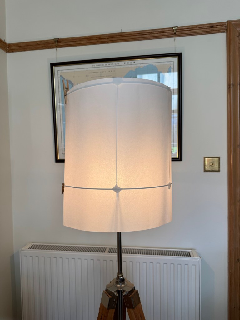
To find ways of showing the News Art with light shining through – it is necessary to not rely on having a window or sunshine for an installation. So I created a mock up lampshade frame to test how it would work if the light source was a light bulb.
Mock up lampshade frame
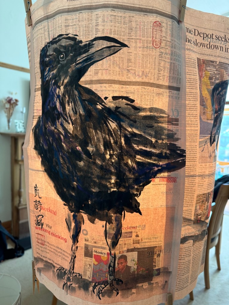
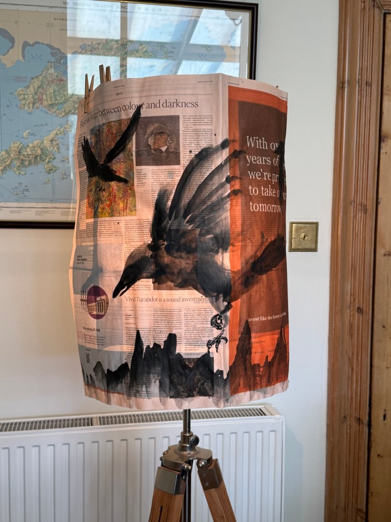
Then clipped the News Art to the frame with the light turned on:
–
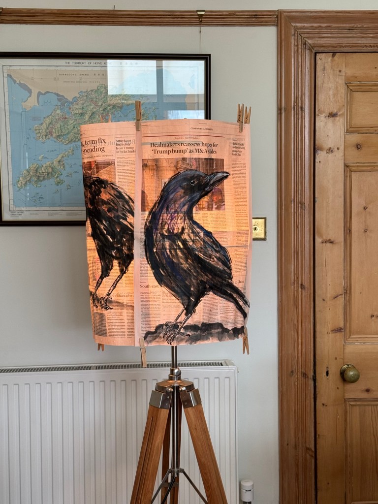
Tried a few different images:
–
This showed the reverse side images were coming through well:
–
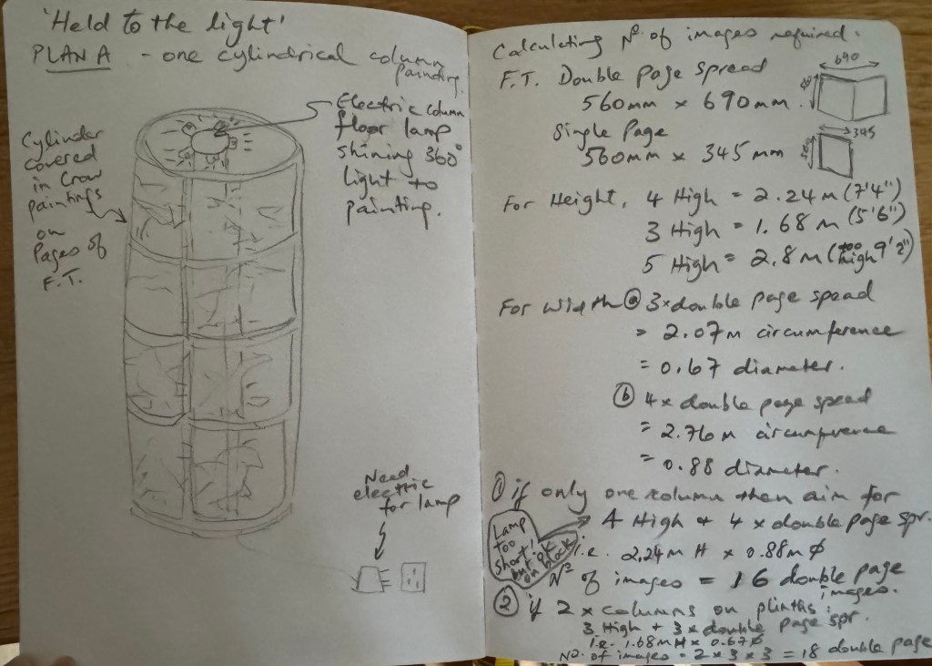
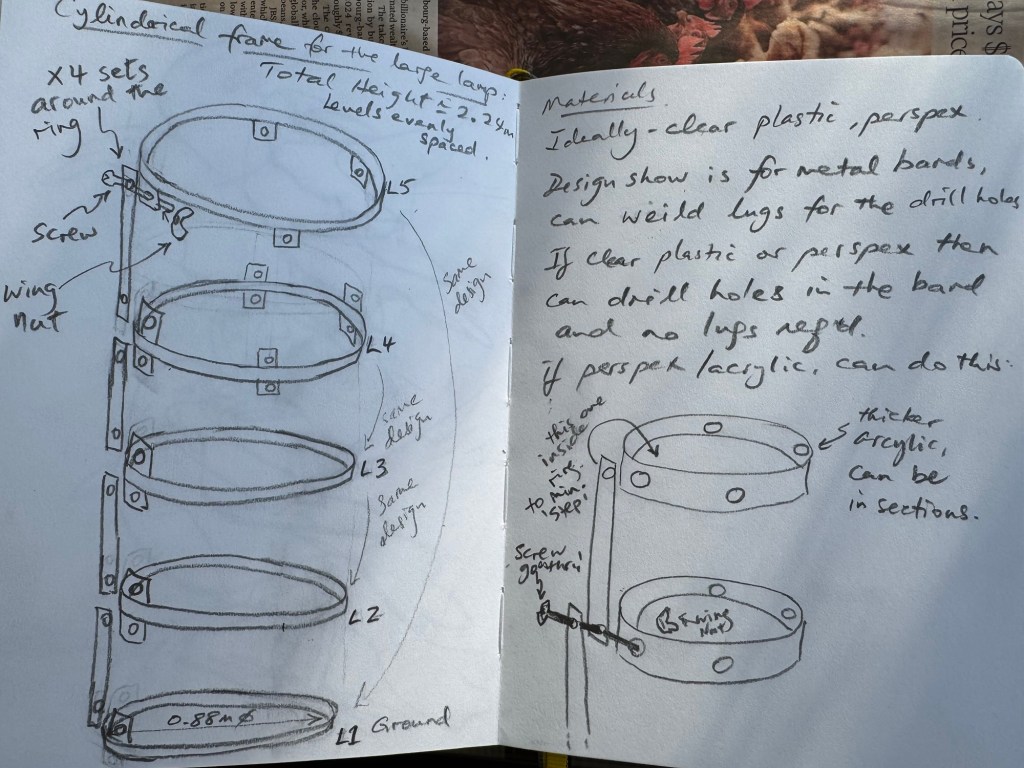
Then I considered a design for a cylindrical light tower to display the paintings in an installation:
–
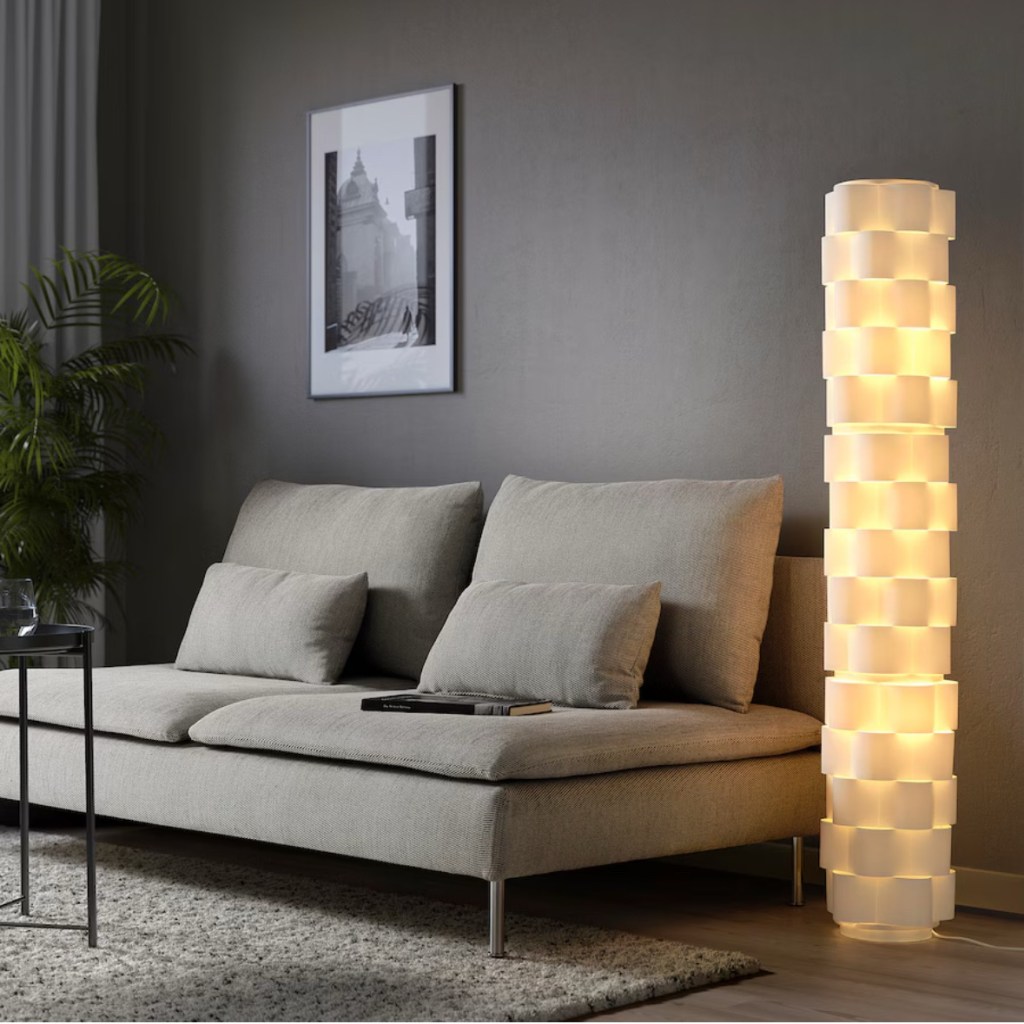
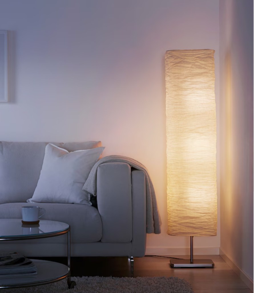
Some ideas were found online at places like IKEA with floor standing lamps that could be used instead of a custom made frame with the latter being a potentially costly option.
–
As an example, for the rectangular shade in paper shown above – it can take 2 double page spread of The FT at 3-high. It has more area than the circular one so would be better. This means 6 double page spreads per lamp. For a 3 lamp installation then that would mean 18 double page spreads in total. The rice paper lampshade could be slashed or torn to represent violence that is happening at the moment.
–
However, the rice paper shade around the lamp might block too much of the light. Hence more tests were done with the mock up lampshade and rice paper.
Mock up lamp with rice paper shade
There was sufficient light coming through the rice paper lampshade to reveal the images on the reverse side of the newspaper:
–
REFLECTIONS
The experiment was successful in demonstrating that a light bulb can illuminate the newspaper sufficiently to reveal the reverse side images, even with a layer of rice paper in between. This means the IKEA lamps could be used if I wanted a cylindrical installation.
A cylindrical installation means the viewer would have to walk around the lamp to see the whole composition. This maybe fine and could be a good way to install in the middle of a room with multiple floor standing lamps. However, if I wanted a large and flat composition like one large painting, then that would need to be hung on a wall or from the ceiling. If against a wall then I would need a light curtain of some kind to throw light onto the back of the newspaper. Ideally an enormous light panel or light box would be ideal but they tend to be very expensive. More to think about…
LEARNING
The experiments so far showed that a lamp with just one bulb was sufficient to show the reverse side images. Of course it would also depend on the distance between the light source and the newspaper. But the results were encouraging and I will continue to think about different ways to install my News Art work.
NEXT STEPS
Think of different ways to illuminate the art work in preparation for coming up with ideas for the degree show.
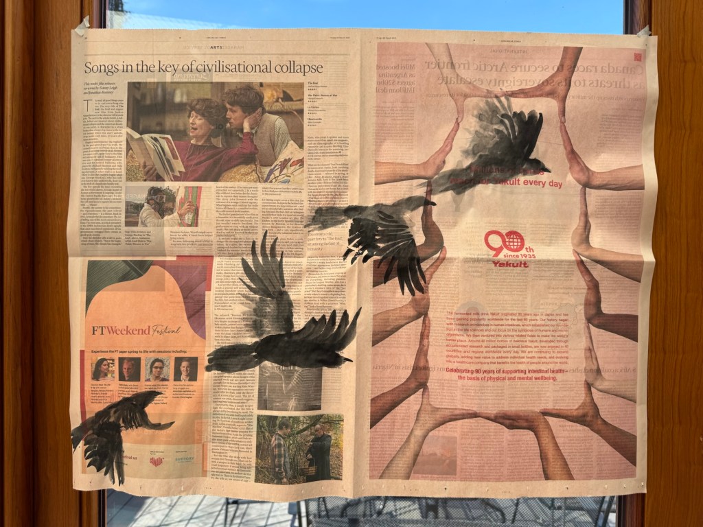
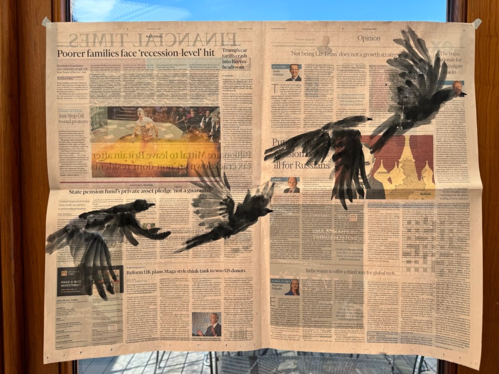
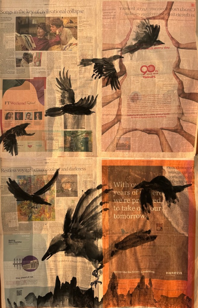
After reflecting on the News Art that I made in response to news headlines directly, I decided to be more subtle in the way I respond to the headlines. I decided to explore a more abstract way to express my feelings. What started my creating of News Art was the grief that I felt for the state of the world and my choice of using crows, inspired by the book ‘Grief is the thing with feathers’. So I returned to just painting some crow images as ideas came to me and not to overthink or be too deliberate.
METHOD
Without too much planning or thinking, I painted a few crows in flight using Chinese brush and ink in a free style Chinese painting approach. Then I held the painting up to the light:
–
Another painting done in the same way with a similar composition:
–
A more close-up view of a crow coming down for its prey with two others in the sky:
–
Since I had done quite a few of the crow paintings, I laid them out to see how they would look as a larger composition to get ideas on how to install these paintings as a group:
–
I finished by selecting two silhouette paintings that went well together and held them up to the light as one composition:
–
REFLECTIONS
I am pleased with the silhouette paintings. I like painting in Chinese free style. Some of the crow bodies were not quite right but overall the wings have worked out well. I feel they do give a sense of movement in flight. I am also happier with the more subtle and abstract approach to the news headlines selected. I also purposely chose the ‘ring of hands’ for the crows to fly through, like an escape route for them. We all need one of those at the moment!
Doing my newly discovered News Art has given me a reason to read the newspaper when I have felt inclined to avoid the news. Looking through the newspaper to pick out headlines to respond to has given me courage to face what’s happening in the world in a way that I didn’t expect.
LEARNING
I feel excited by my new discovery of making art in this way. I am gradually developing a process and as I get to know more about the newsprint material, I feel able to push things further such as how wet I could make it (very wet, surprisingly). I really like painting on the newspaper because it is not a blank canvas and the contents and images on each page give me so many ideas which is great.
One thing to bear in mind is that newsprint is not archival. This would be a problem if I continue to pursue this way of making. I need to look into ways to preserve the artwork especially if I’m thinking about showing these work at some point. Proper research is needed including asking specialists at CSM.
Overall, the main learning is to just keep making more work to explore this way of making. Ideas flood in as I make.
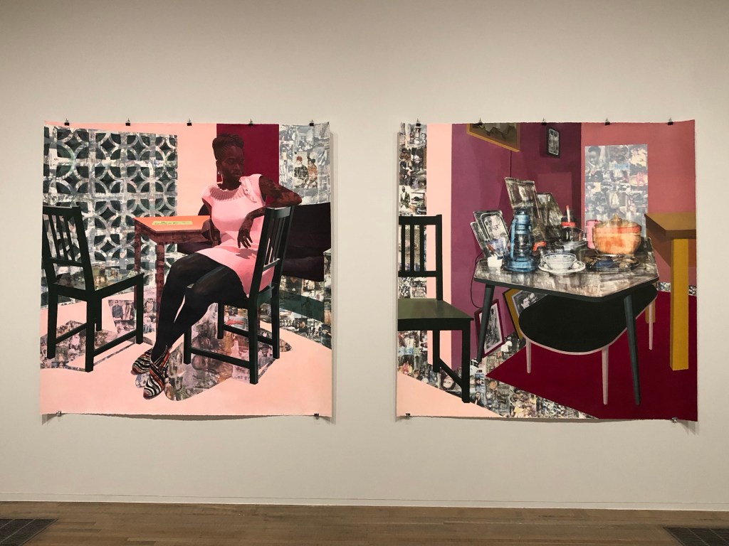
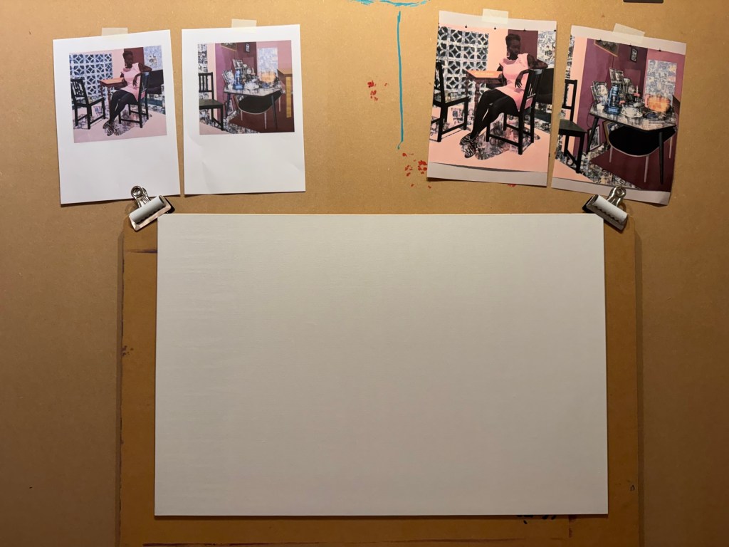
I had a tutorial with an Academic Support tutor from CSM and we discussed painting. I talked about one of my favourite transcultural artists Njideka Akunyili Crosby. I talked about how in awe I felt when I saw her large diptych at Tate Modern last year. The tutor suggested that I made a painting to respond to the work.
Akunyili Crosby’s work at Tate:
–
METHOD
I printed out Akunyili Crosby’s work to give me inspiration. A board canvas was chosen.
–
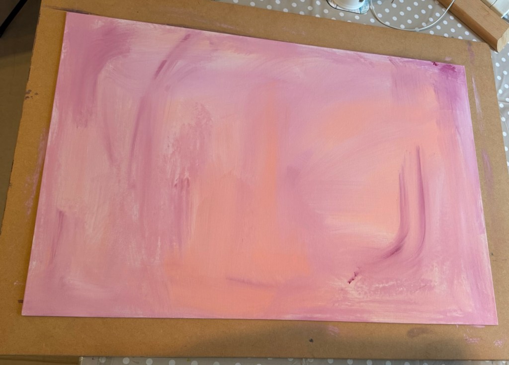
A thin acrylic wash of mixed colours was applied to cover the canvas.
–
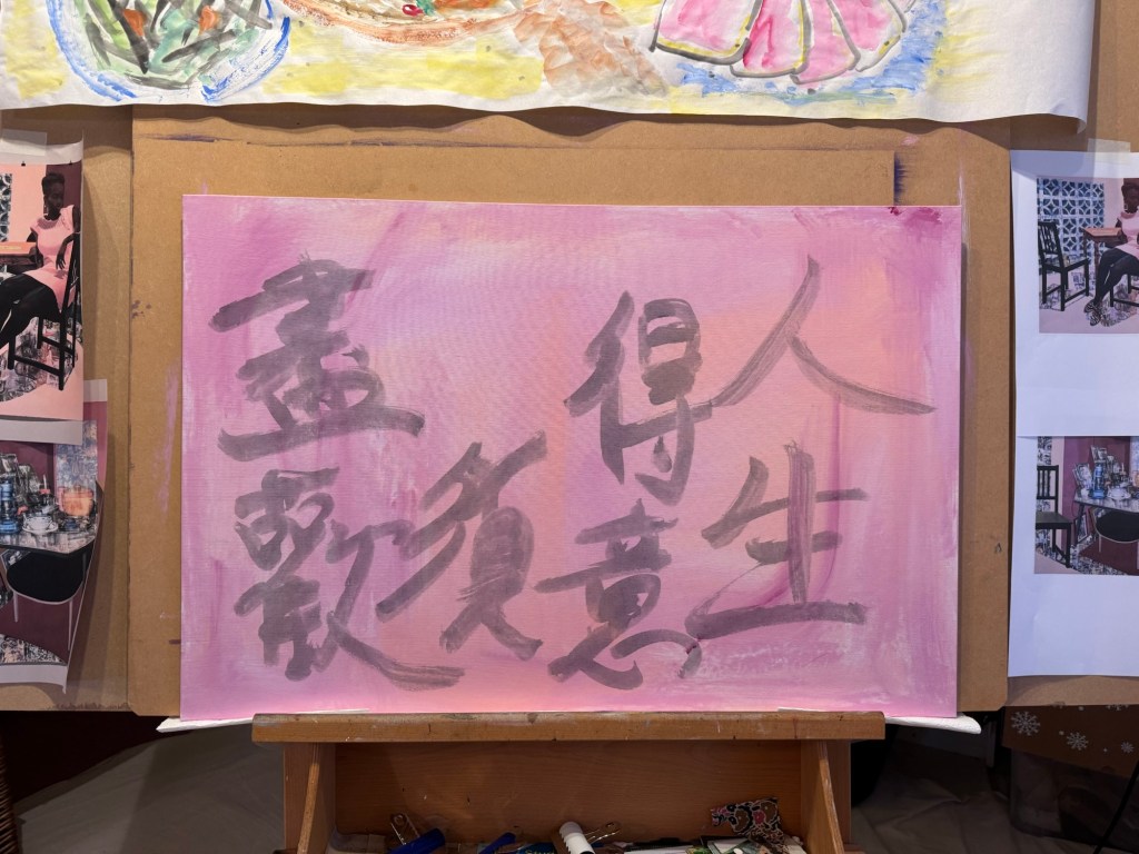
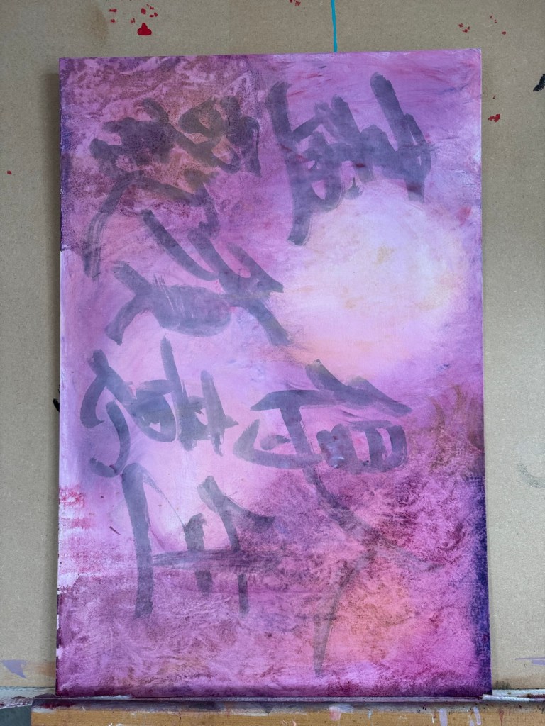
A line from a Chinese Tang Dynasty poem was chosen and written onto the canvas in Chinese ink to add some extra images onto the background. The line translates as – in life, when times are good, really celebrate.
–
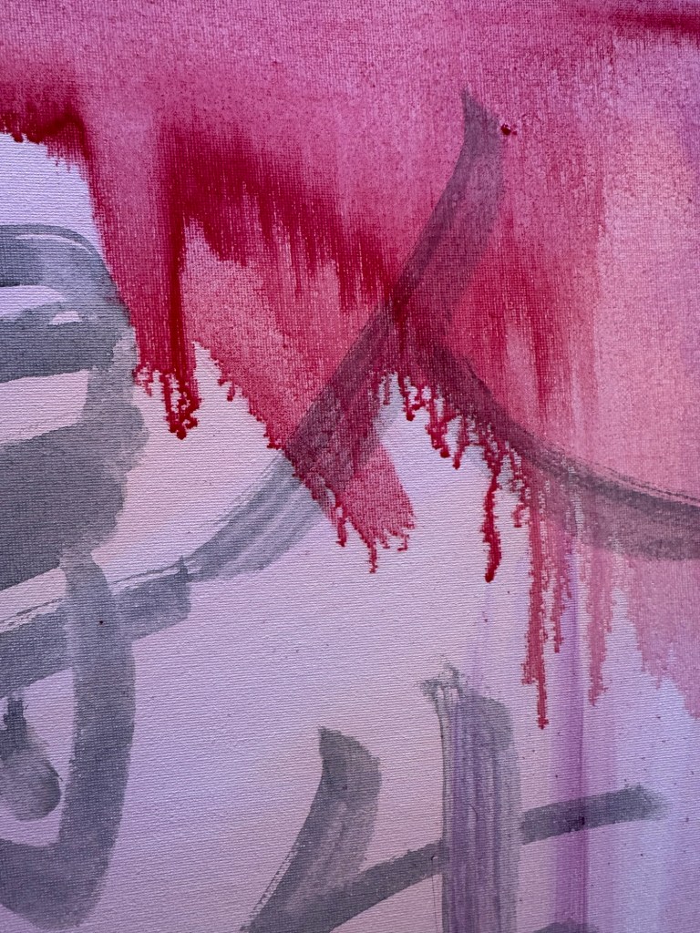
Then very thin layers of oil paint were applied loosely with brushes. The canvas was kept vertically for the paint to run down.
–
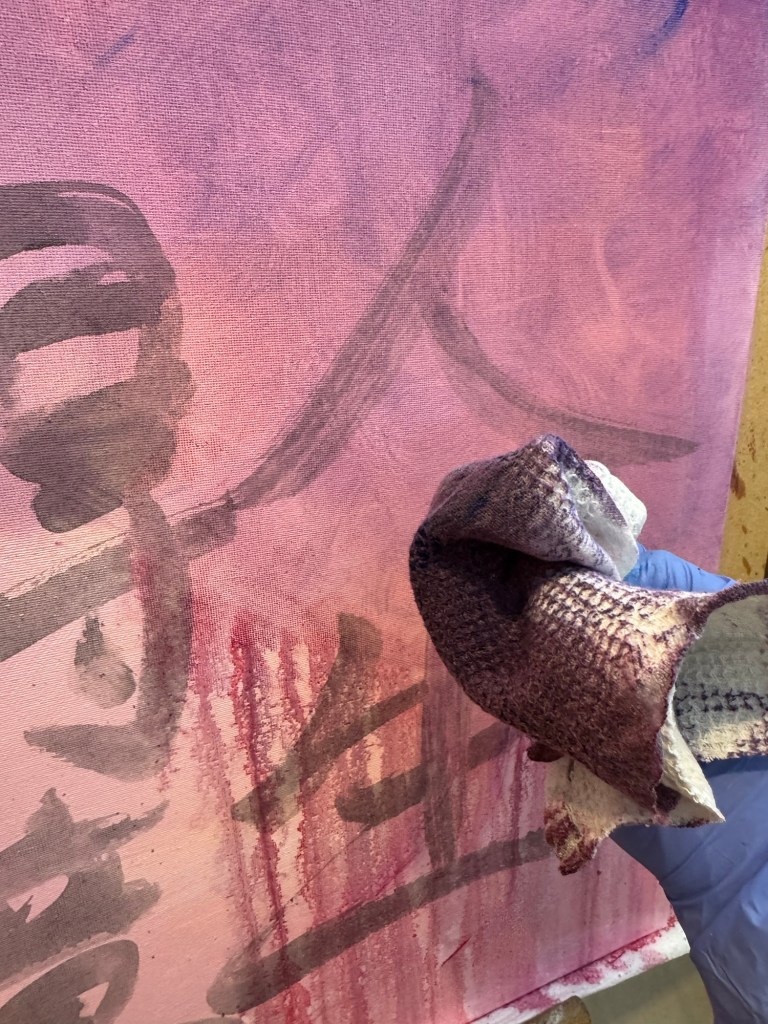
A piece of textured rag was used to experiment with creating patterns:
–
Work in progress, playing:
–
Playing some more:
–
Close up images to show the ragging effect. The oil was so thin that the background images were still coming through:
–
But what to paint?
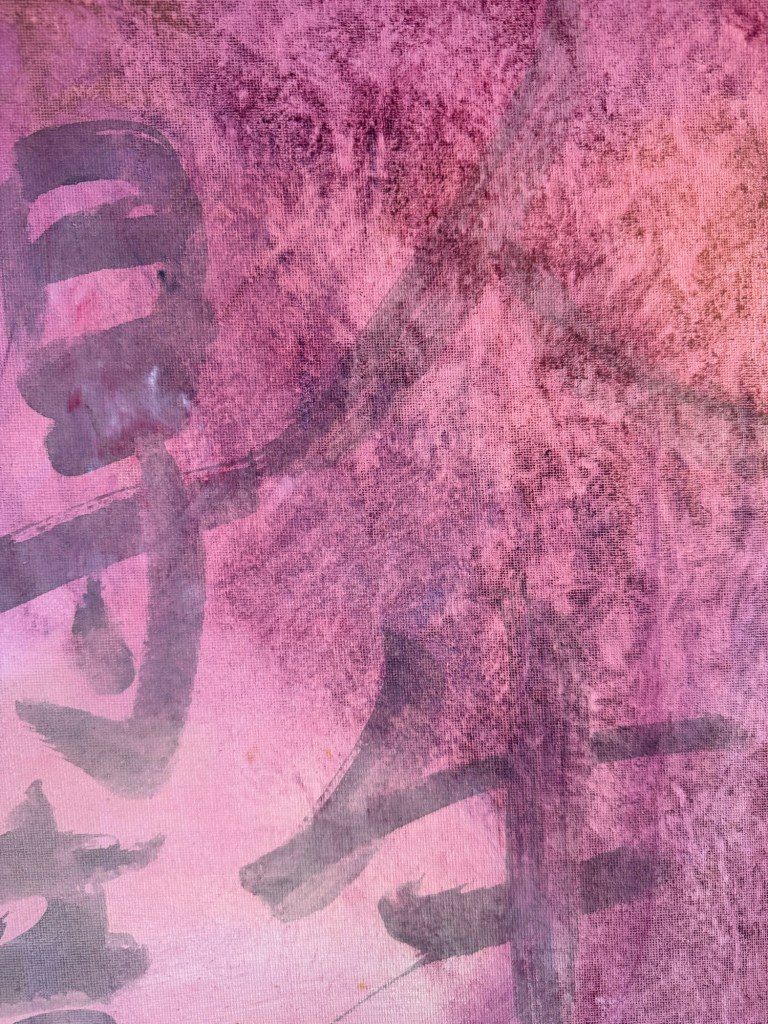
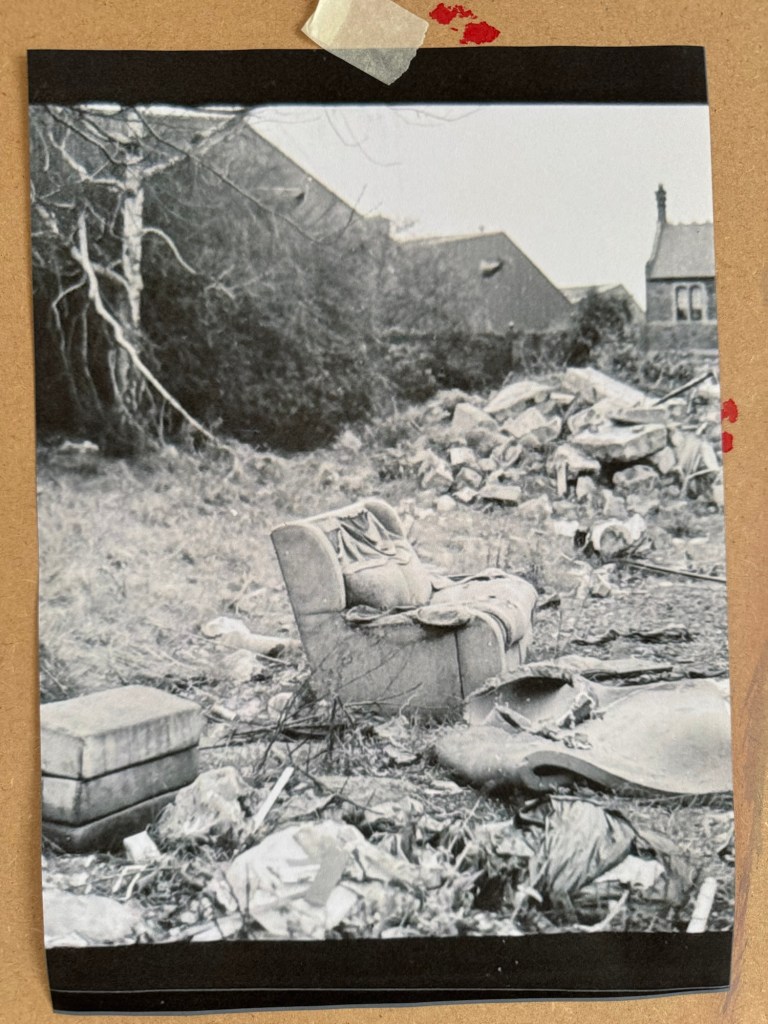
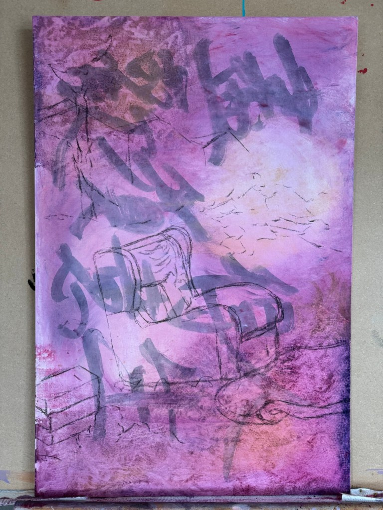
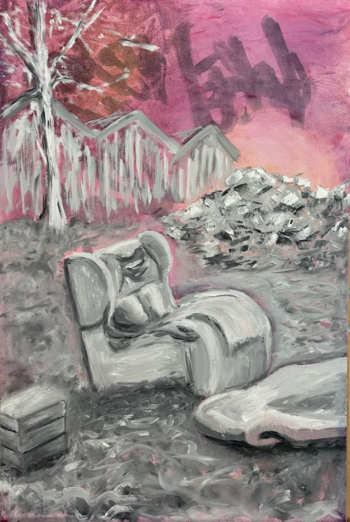
I decided to paint the ‘lone sofa’ photograph that I took when I went on a photography walk-about in Bristol. That was my favourite photo of the trip.
–
The canvas was put into portrait orientation.
–
Charcoal was used to layout the composition, choosing what to keep and what to leave out from the photo image.
–
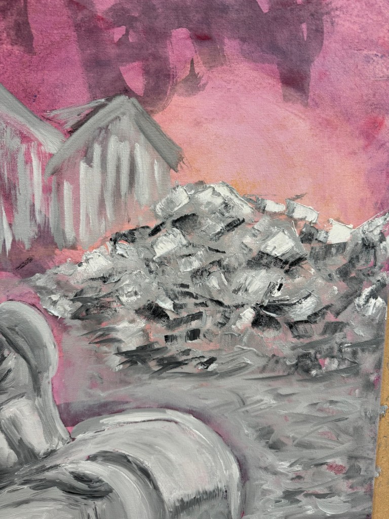
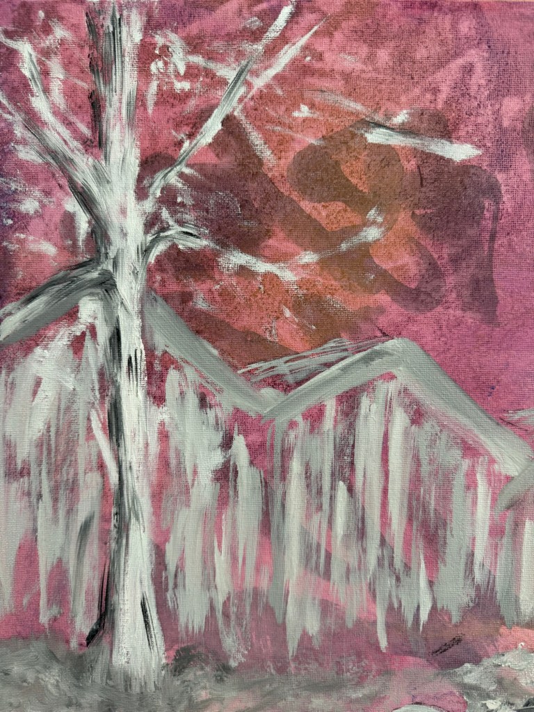
Close-up of areas of the finished painting:
A pile of rubbleA tree in winter
Finished painting:
–
REFLECTIONS
The oil experiments were not as useful as I had wanted – the outcomes were pretty much as expected and I can’t say I made much new discovery. So I need to do more research on this rather than just play.
The Chinese characters in the background were mostly hidden in the end. Again I could have used thinner oil. Or in this case, I feel it’s fine to obscure the background and use the Chinese characters as abstract patterns rather than to convey specific meaning.
The sofa scene – I mentioned in the last blog that I wasn’t feeling colourful so I opted for muted grey tones. That feels appropriate for this scene especially given the original photo was monochrome. I enjoyed the painting process which I tend to do most of the time. It was useful to focus on what to take out from the image composition, trying the less is more approach.
The piece of folded torn foam mattress on the floor was quite successful and also the pile of rubble. I think what was going through my mind was a dystopian scene and I wanted to create a dystopian effect to reflect my despair about the rapid change in world order, not sure if I really got that effect.
Although I started with wanting to do a response to Akunyili Crosby’s work. The outcome was quite far from that original intention. I think it’s because I made this painting over several weeks and my state of mind changed over that period and what I started off wanting to do didn’t seem relevant in the end. So I am comfortable with the change in direction.
LEARNING
To get more out of my exploration of oil, I need to do some research work, either online (YouTube) or books to gain new knowledge so I can take my experimentation to the next level.
It was only when I reflected afterwards that I was going for a dystopian theme. Perhaps if I had thought of that at the start then I could have created more of a dystopian atmosphere. I can research more about dystopian art. But how does that fit in with my transcultural practice? Should I go off on this tangent right now to risk having an incoherent body of work?
NEXT STEPS
Do research on oil painting techniques to learn new ways to use oil.
Do research on dystopian artists to see if that’s the vibe that I want to reflect my state of mind right now.
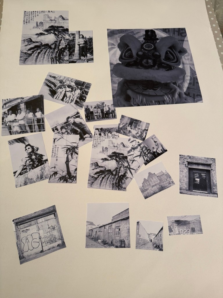
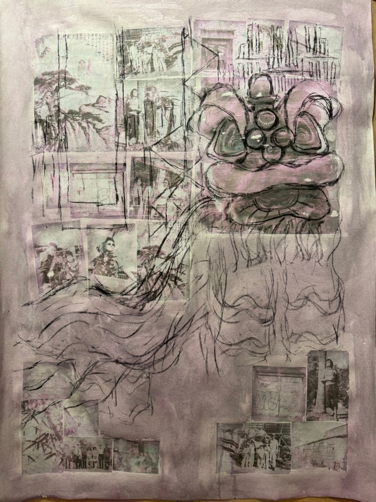
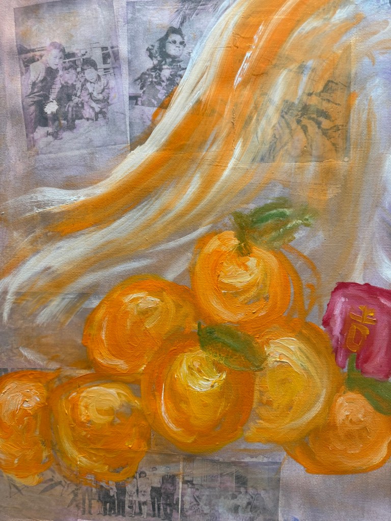
Following on from my Unit 2 feedback, I wanted to explore more ways of using oil. Also, from some photography work, I wanted to incorporate more photos into my work. So I started a new piece of work without knowing what I was going to do.
METHOD
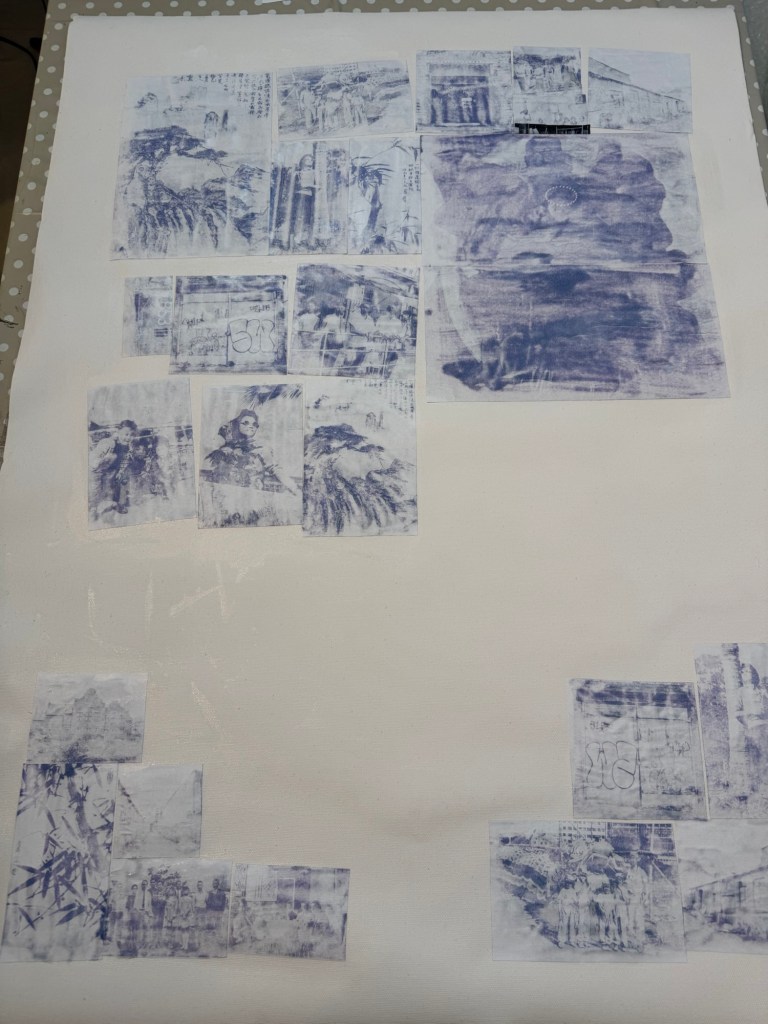
I made some black and white inkjet prints of various photos, some old family photos from Hong Kong and some recent Bristol streetscapes that I took with a medium format camera. Since it was around Chinese New Year time, I put in an image of a traditional Chinese Lion used for festive lion dance. I wanted to make that a dominant feature of the composition for the new year.
–
I used dispersion liquid to transfer the images onto a primed canvas:
Prints being stuck down using dispersion liquid
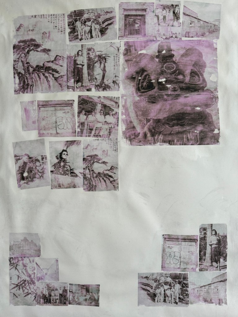
Printed images transferred onto the canvas. Due to the inkjet printer image, there was a pink / magenta tint to the transferred images.
–
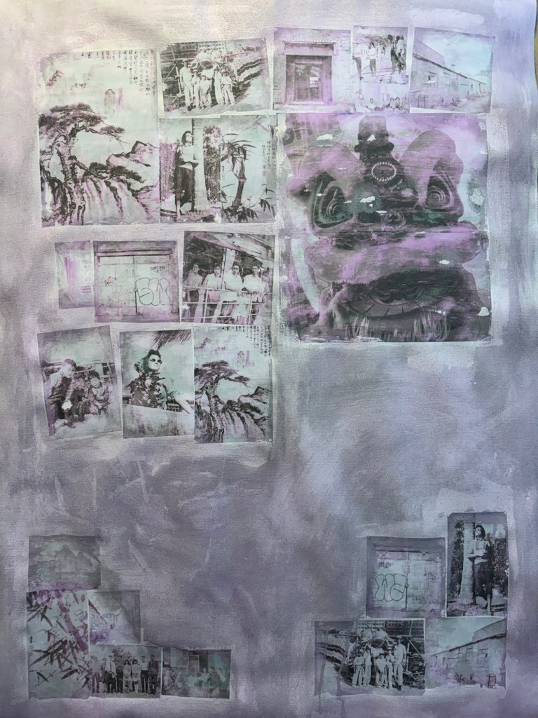
The canvas was covered in a thinned down acrylic wash:
–
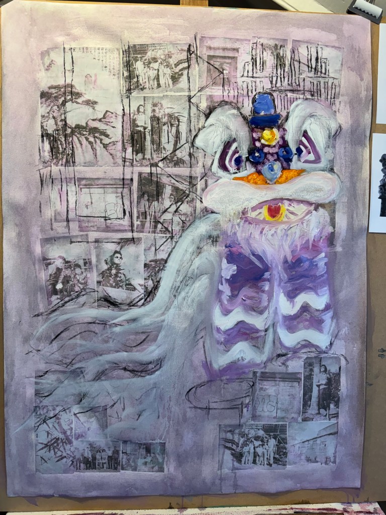
Charcoal was used to mark out the composition with the Lion being prominent.
–
Some iconic buildings from my childhood Hong Kong were added to the background.
–
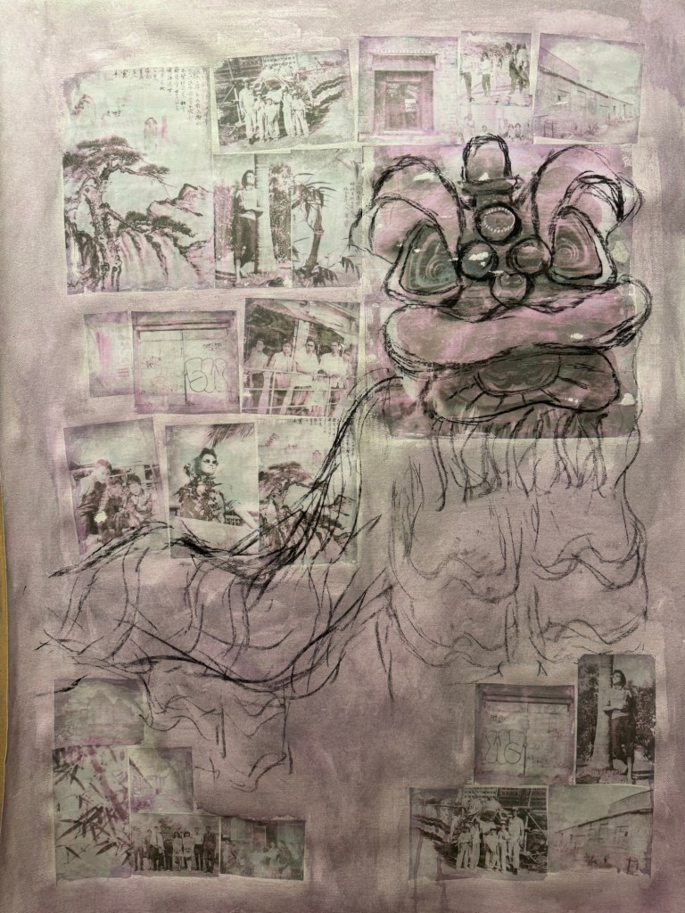
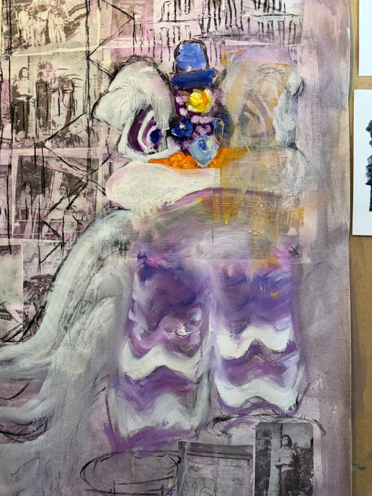
The lion head was painted in oil. But I was not happy with it, it looked too ‘cute’.
–
Since this was an experiment in oil, I started to wipe off parts of the image to create different effects.
–
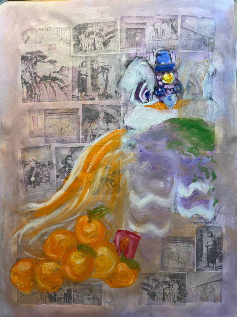
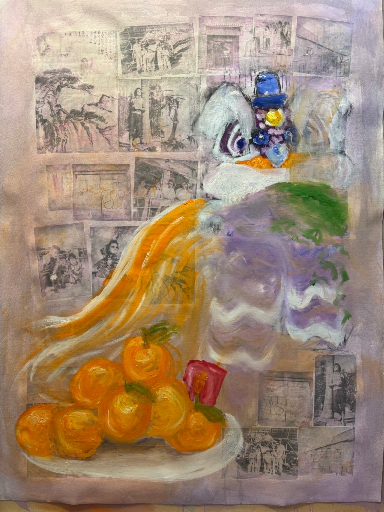
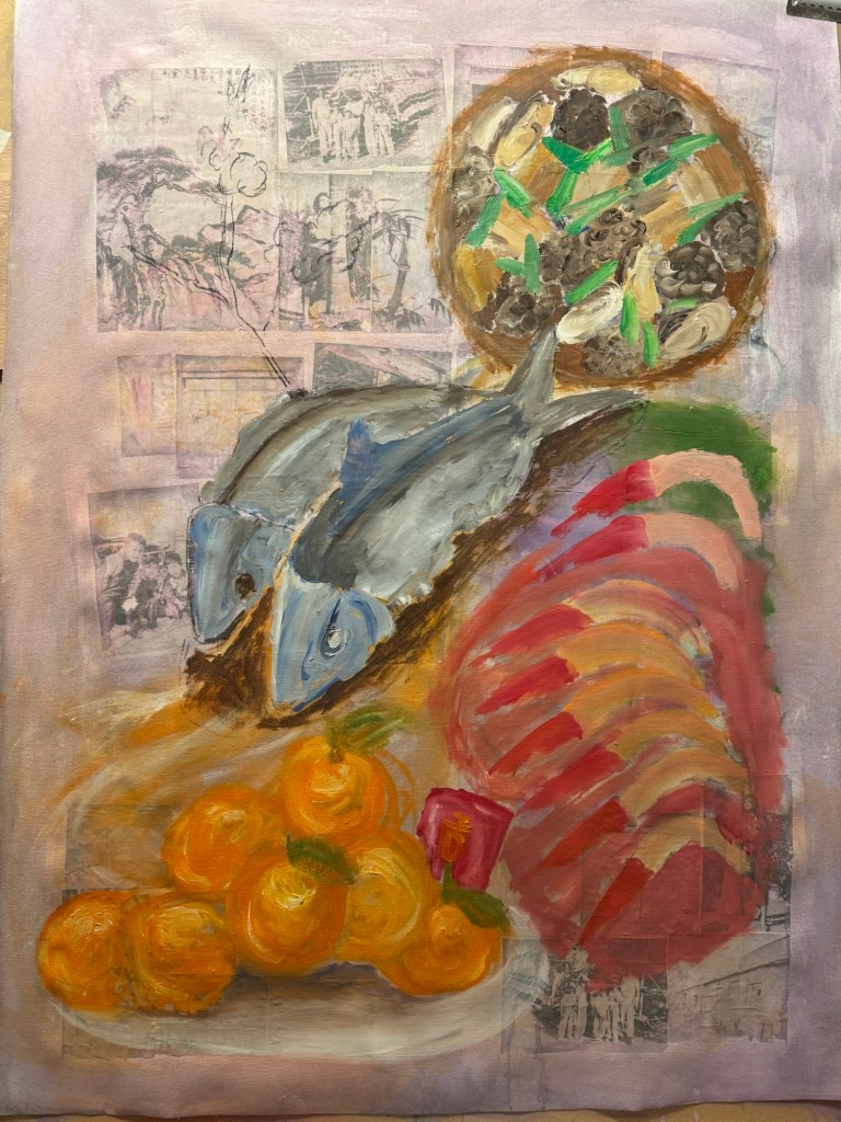
A pile of mandarin oranges were added as a traditional Chinese custom during New Year. I wanted to add typical Chinese New Year food to the composition in response to my decision after the Cheongsam series to do some Chinese food painting on a ‘normal’ 2D canvas:
–
I experimented with using looser brushstrokes and some thinned oil for the oranges:
––
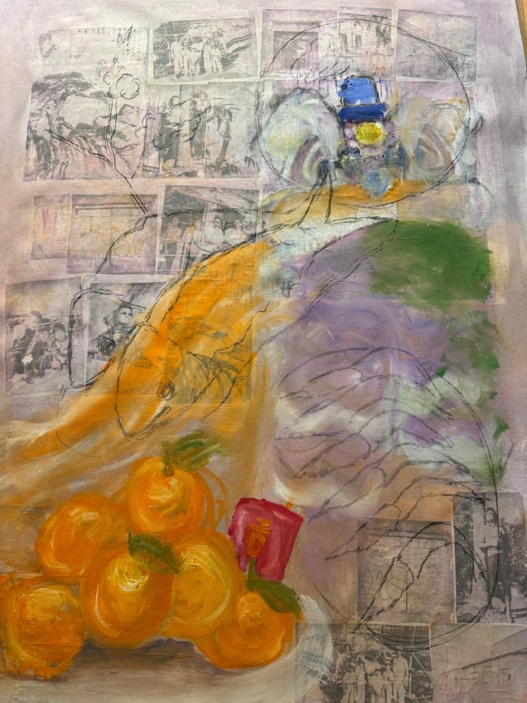
I was still very unhappy with the lion and decided to replace it with a complete family dinner with symbolic dishes for Chinese New Year.
Charcoal marks for New Year food dishes
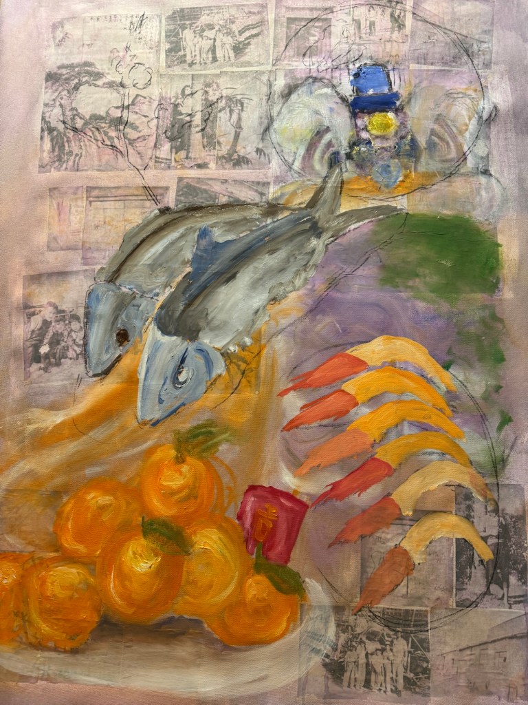
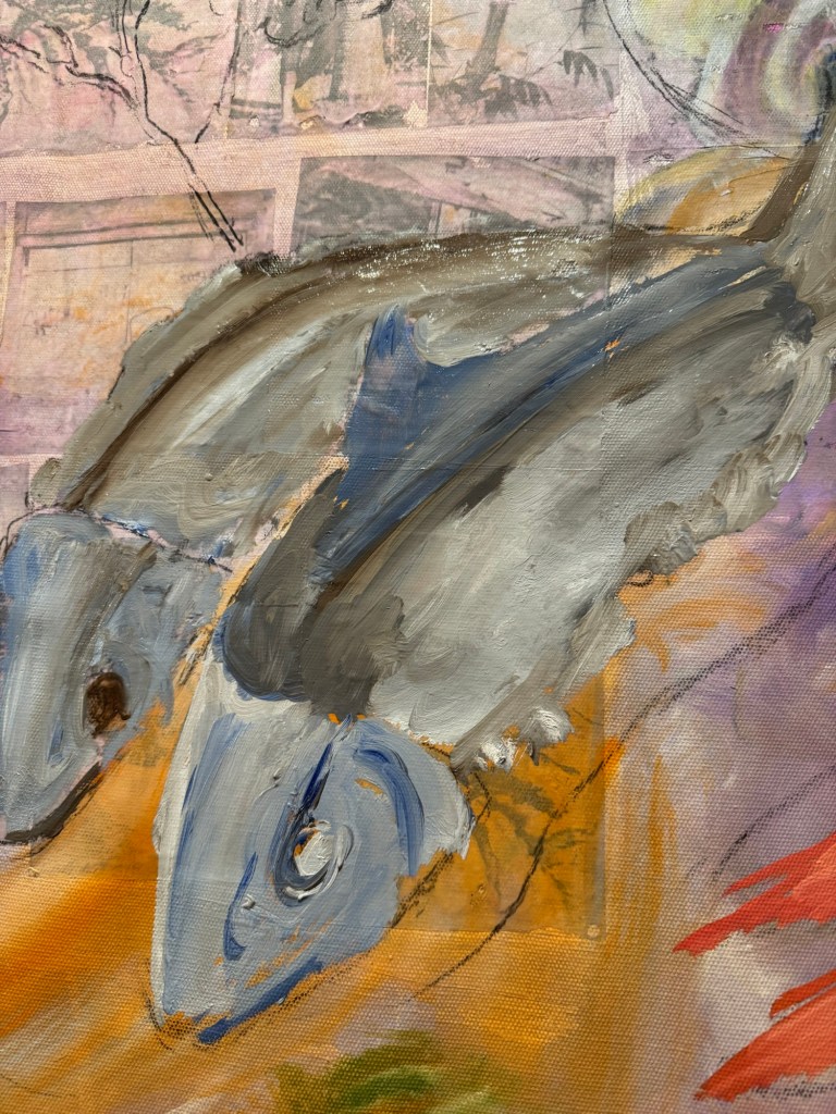
Thinned oil paint was used to mark out the shapes of the various dishes. Then more details were added to the fish first:
–Close up of fish (stuffed dace fish)
Other dishes were added:
–
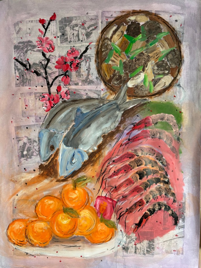
The prawns’ details were finished with Chinese ink and a peach blossom branch was added (also in Chinese ink) as it was traditional to have this plant at every home in Chinese New Year.
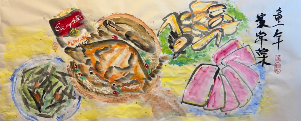
Finished painting – Chinese New Year dinner:
Mixed media on canvas. Size 102×75 cm
Menu:
Centre – stuffed dace fish. Symbol for having surplus meaning never falling short (of money). The word ‘fish’ sounds like surplus.
Top right – stew of shiitake mushrooms, dried oysters, pork belly and spring onions in fermented bean sauce. A traditional new year dish, a large pot is usually made and eaten over several days. ‘Dried oyster’ sounds like ‘good things’ meaning good things will happen.
Bottom right – prawns. Symbol for happiness. ‘Prawn’ sounds like laughter.
Bottom left – mountain of mandarin oranges with a red money packet (lai see), the phrase sounds like ‘gold mountain’ meaning good fortune.
Top left – peach blossoms, the blossoms opening signifies good luck and good fortune.
REFLECTIONS
I am glad I didn’t continue with the lion. It was not how I wanted as it was too detailed and cute. I was happier when the Chinese dinner idea started to develop. I was mindful that I wanted to experiment with Qi Baishi’s idea of painting between likeness and unlikeness. I was hoping the thinner paint and looser brushstrokes would give me more scope to express the unlikeness. I think I made some progress compared to the Family Dinners on the Cheongsam canvases, but there’s still some way to go.
I experimented with incorporating photographs but I think in the end they didn’t really add anything as most of the images were covered up. Perhaps even thinner oil would have left the photo images still partially visible.
I have never managed to combine oil and Chinese ink satisfactorily, I think using the combination on the prawns worked out well. I believe the thinned down oil helped the combination to work so worth bearing this in mind.
LEARNING
Try experimenting with even thinner oil paint and other techniques to apply paint.
Think more about what I want the photos to do (e.g. how much to be revealed) if incorporating photo images, then dilute the paint accordingly to achieve the effect. The experiment here was not fully thought through as I was just playing, but it provided good insight into how easily it was to fully obscure the photos.
Overall the painting was looser and less organised compared to Cheongsam Family Dinners, but I need to be more courageous about achieving unlikeness. Add more of myself to it and think about what feelings and intentions I have – not intentions regarding the composition, but what I’m trying to say.
NEXT STEPS
Experiment more with oil and different applications.
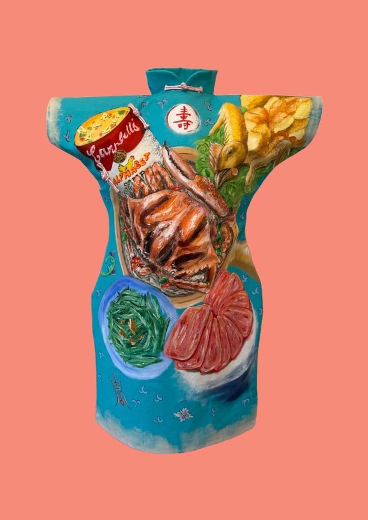
In my search and contemplation about ways of painting, I turned to a Chinese artists that I admire – Qi Baishi. His famous saying, ‘Painting must be something between likeness and unlikeness’ inspired me to experiment with different ways to paint my Family Dinner #2. Here is an image of my original painting in oil on Cheongsam shaped canvas:
–
METHOD
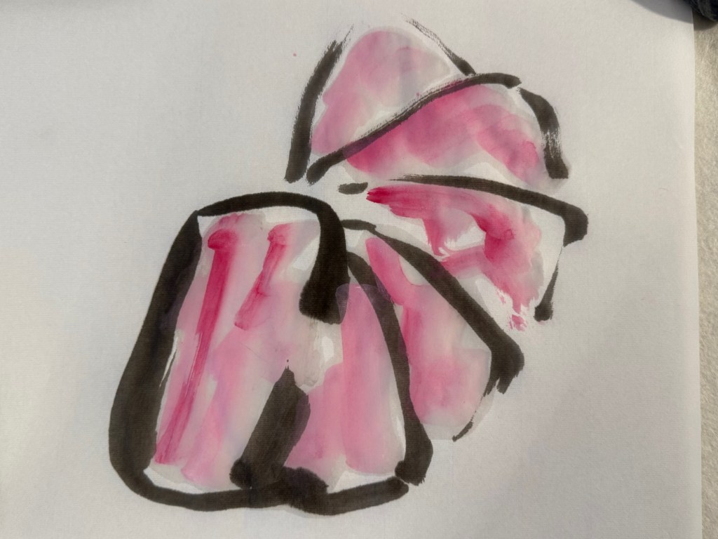
I started by doing some quick paintings of the individual dishes using Chinese painting materials: Chinese paint brushes, ink and rice paper.
Flower crabPan fried sliced luncheon meat
Here is the overall composition marked out on a long Chinese scroll of rice paper:
–
Work in progress:
–
Completed painting – Chinese ink on Japanese Moon Palace (rice) paper, 114x46cm.
–
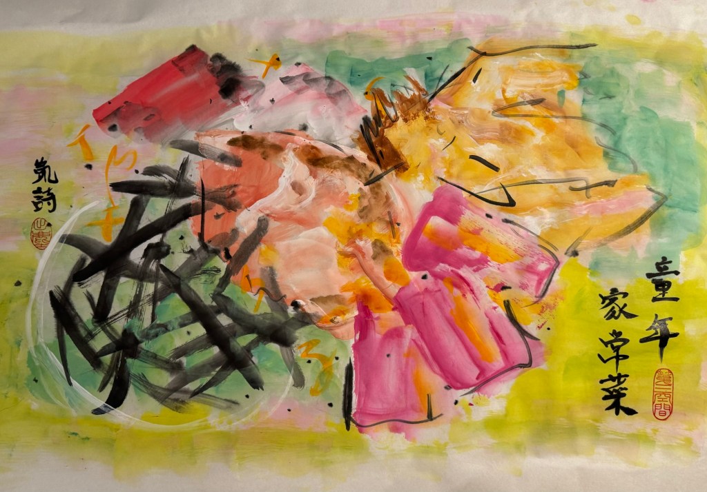
I felt the composition was too uniform and too neatly laid out. Hence I attempted another version with further abstraction to explore ‘unlikeness’:
–
REFLECTIONS
I enjoy painting in oil very much. I like the feel of the material, the viscosity when undiluted, the way it pushes against my palette knife or brush when painting impasto and then the luminosity when diluted. But painting in oil takes time (for me anyway) and I enjoy taking that time. I also like coming back to ‘play’ with the painting over several days.
Painting in Chinese brush and ink is a much quicker process. I can do several paintings in a day. Something about the materials make me want to paint fast with vigour. So I was pleased to do the Family Dinner explorations here using Chinese painting materials, it helps me to loosen up – both in my brush strokes and in my thinking.
One of the points I took away from my Unit 2 feedback was to paint more, and more. There was a question in the feedback asking if it was necessary to spend time making the Cheongsam canvases; I think that was a good question and perhaps I should spend more time painting and improve on that. Although I want to expand my practice to incorporate 3D, film and photography, I envisage my practice to always be rooted in painting – mainly because I enjoy it and I like the challenge. So I need to paint more to take it to the next level. I don’t know what ‘next level’ means, but I just feel the need to push my current boundaries – wherever that may take me!
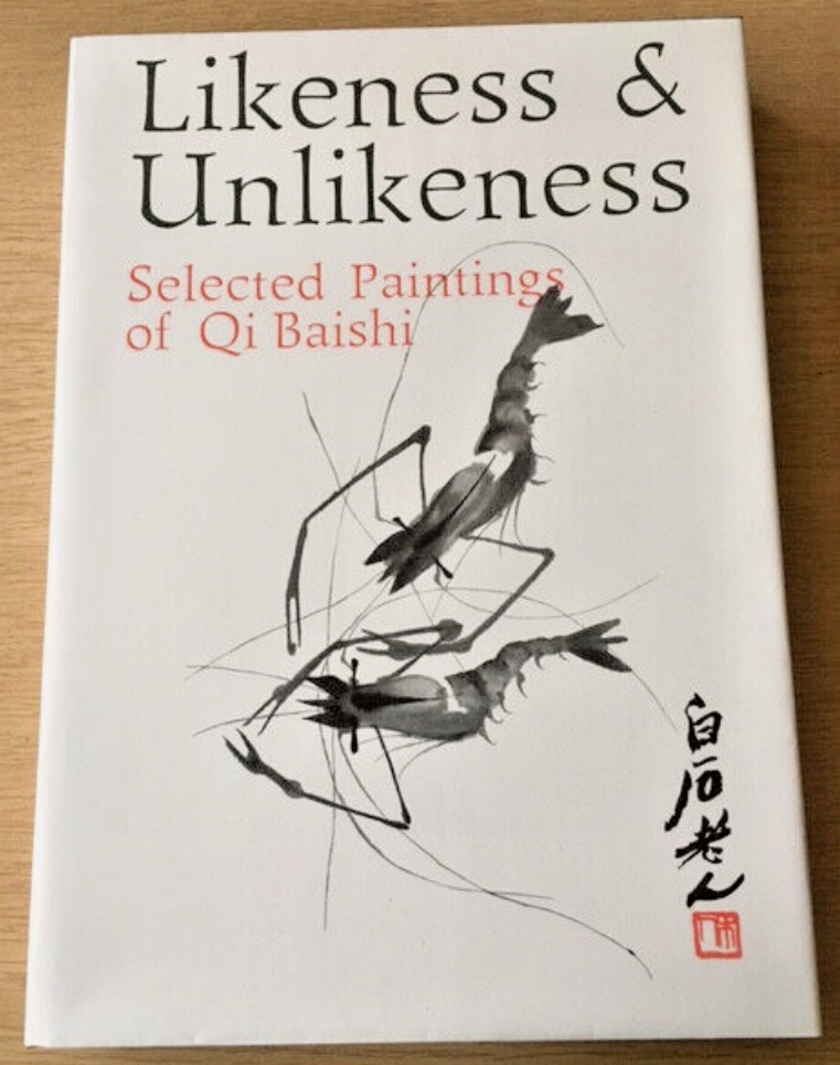
I managed to source the following book ‘Likeness and Unlikeness’ abour Qi Baishi’s work:
–
I need to do more research about what he really meant by his saying. Perhaps that would give me inspiration and new ideas to explore. I had thought that ‘between likeness and unlikeness’ meant a way towards abstraction. But when I look at his paintings, there was always good likeness (a shrimp looked like a shrimp). So I discussed with my Chinese art tutor what Qi meant – it appeared to be not about abstraction. She believed it was about the artists putting themselves into the work. I need to research this some more to really understand. I will start by reading the book.
I feel excited about the research between likeness and unlikeness…
LEARNING
I want to take my painting to the next level but I have not been able to decide how. The reflections above have helped me. I think I will return to painting on 2D canvas for now while I’m experimenting. I would like to return to 3D canvases such as the Cheongsam dress at some point because I have really enjoyed those paintings.
NEXT STEPS
I want to continue to build on my painting practice in the following way:
– Really explore oil as a material. I am used to using oil undiluted to create thick impasto layers, so I will experiment with thinner layers to give me more ways to express myself. Especially to find ways to create ambiguity, about distant memories.
– Research and understand the meaning of ‘between likeness and unlikeness’, start with experimenting in my Chinese art practices with ink on rice paper. Then maybe transfer the learning and understanding to painting with oil if it feels right.