In the last year, I have been mostly drawing or painting in Chinese ink for my ‘News’ series of work. Whilst ‘News’ is still an ongoing project, I have returned to painting in oil. Somehow, the winter months make me want to paint in oil with the hours of tinkering in the dark evenings.
My other reason for returning to oil is to explore additional ways to paint on newspapers. I have so far only painted on newspapers with Chinese ink for ‘News’ and I want to experiment with oil on newspapers.
I have felt for some time that I have reached a plateau with my oil painting; I also received some feedback from my MA about painting in thinner layers. So I feel it’s time to take that further and develop my oil painting techniques.
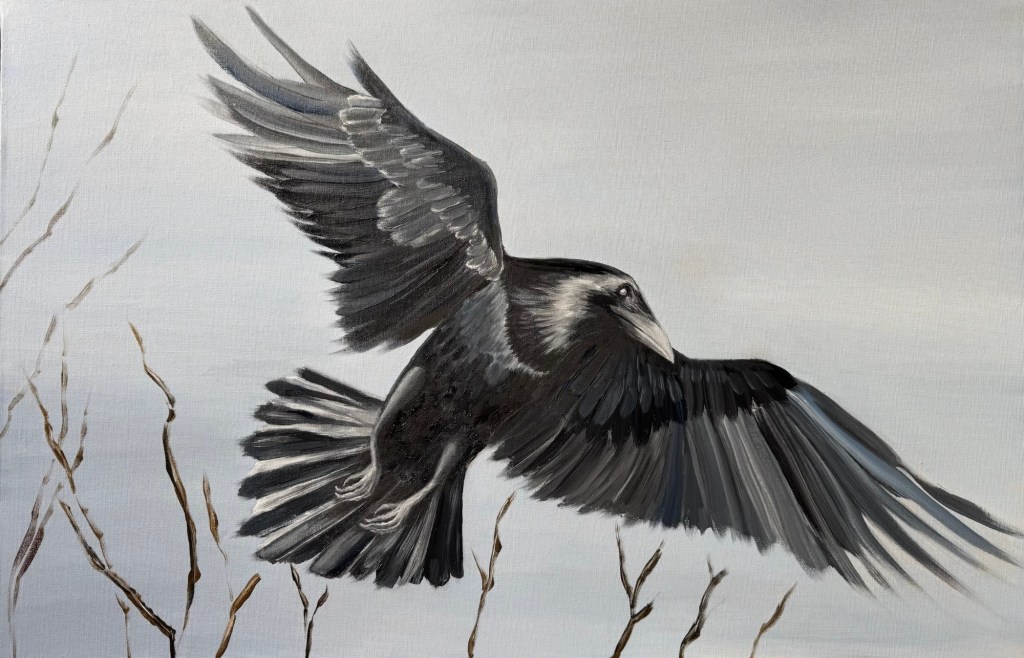
I joined a local public art class on ‘oil painting – improvers’, hoping to explore develop further. In my first lesson, I discussed the use of Winsor and Newton Liquin with my tutor and I experimented with it for a crow painting on canvas board:
Oil on canvas board, 76x51cm
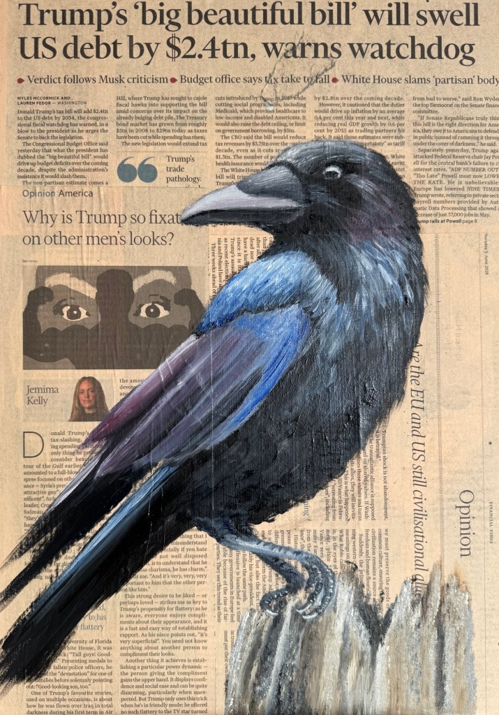
I also painted a crow on newspaper. Here, I made a news article collage on a board, then applied one layer of clear gesso and painted on top:
Oil on newspaper, size A2
I was hoping to use Liquin to make the oil behave and flow more like ink on the newspaper – it has made it more fluid and I could use soft synthetic brushes to apply the oil to reduce the drag on the canvas, but it is still oil which was ok. I was happy with painting in thinner layers but I was still focusing too much on the fine detail. I wanted to be more loose and I discussed this with my oil tutor.
My tutor made the following comments:
-Painting from photos makes one more prone to focusing on the details.
-Having lots of time can draw the painter into over focusing on the details.
-Suggested exercise to try – set a time limit to make a painting, say two hours, then just get the whole painting done in that time. It’s ok to go back and improve afterwards, but try to get the whole thing done in two hours.
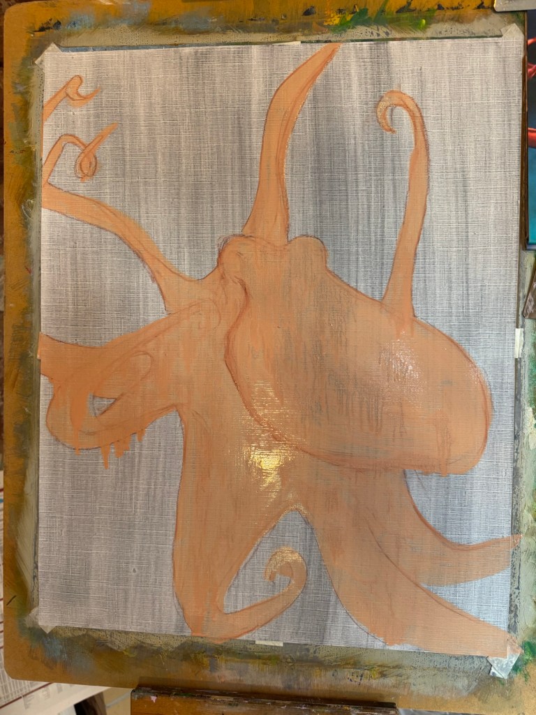
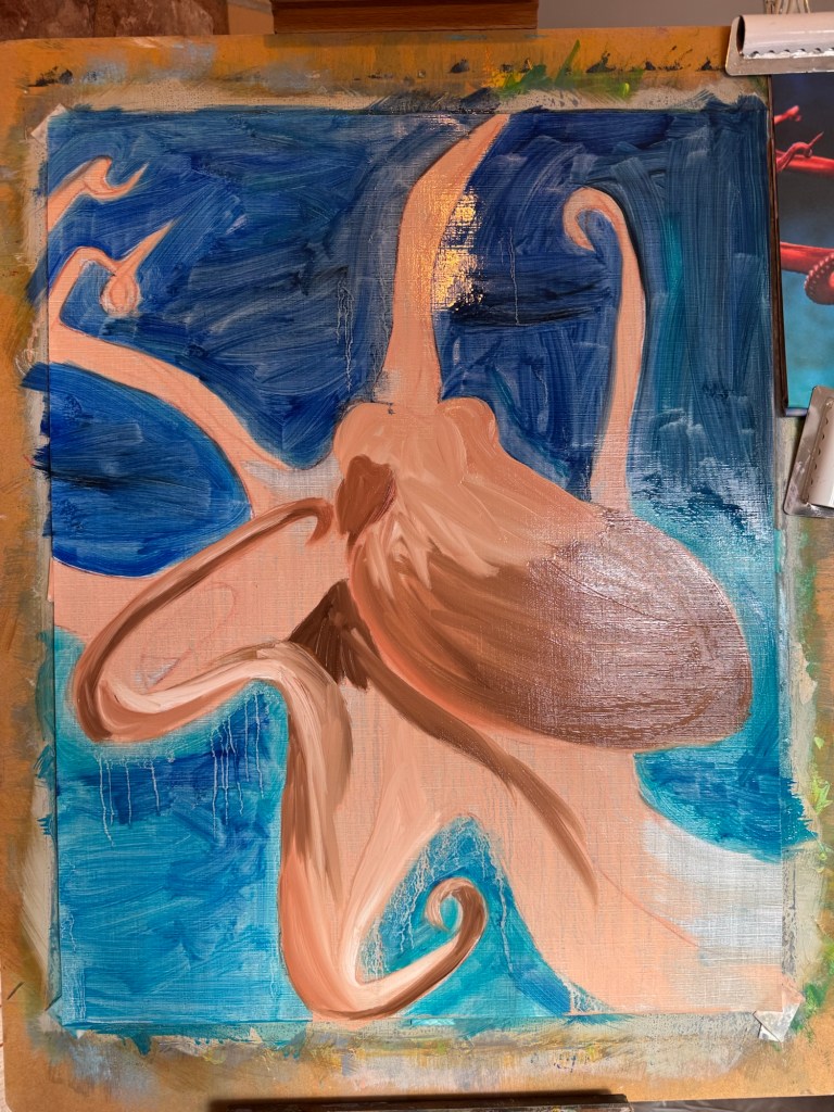
For the two hour exercise, I decided to painting something that I had not painted before, so I chose an octopus.
An outline of the octopus was marked out then a lean layer was added for the octopus.
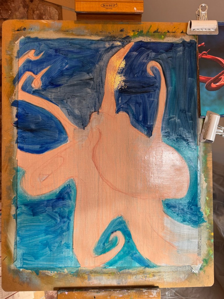
A lean layer of the sea was added:
Progress at one hour:
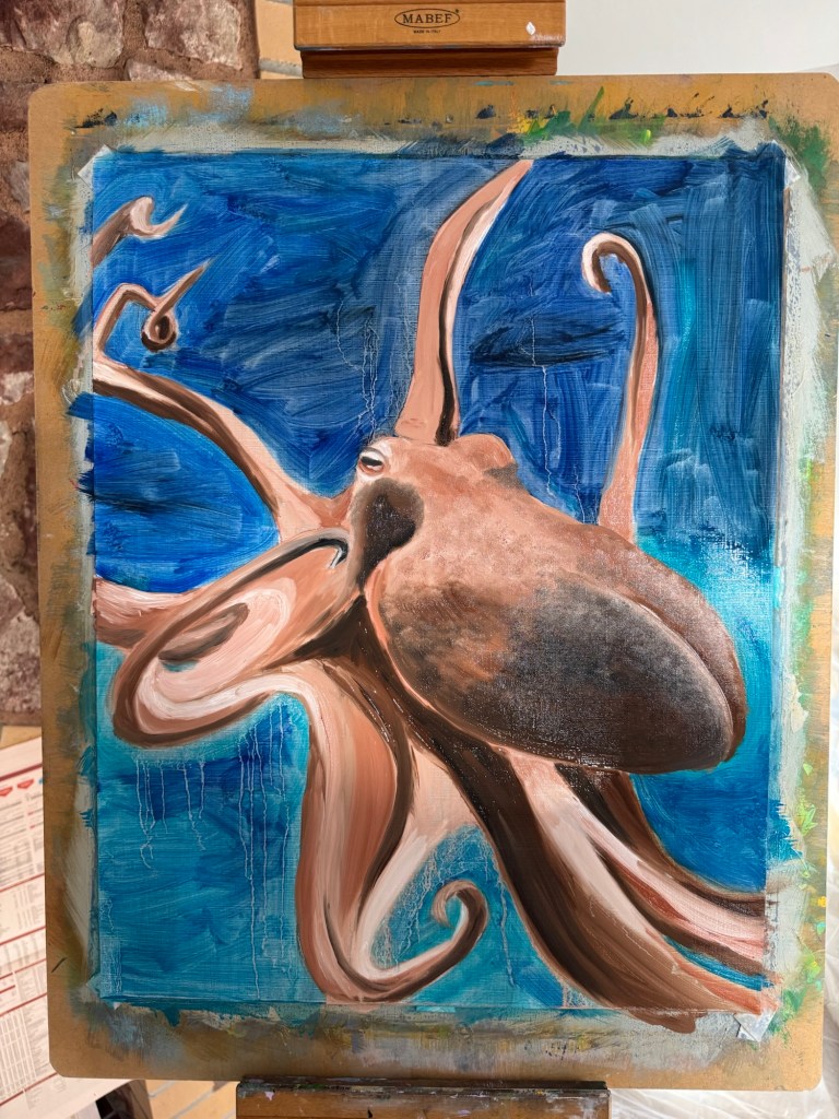
Progress at two hours:
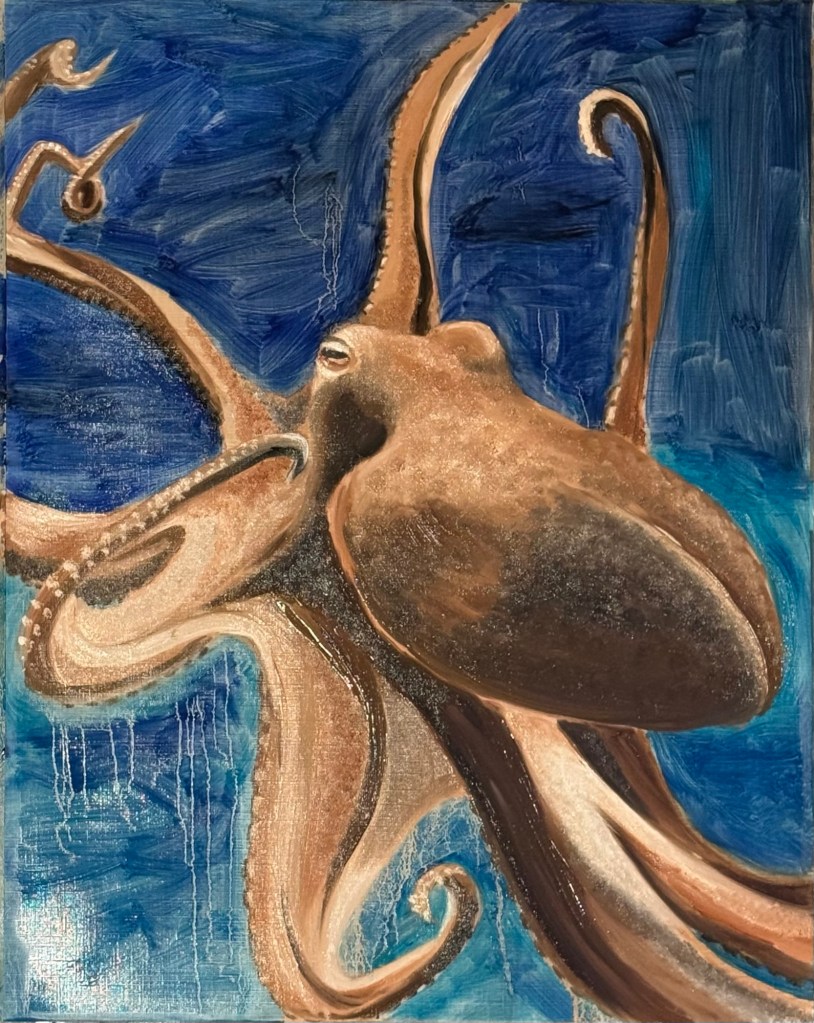
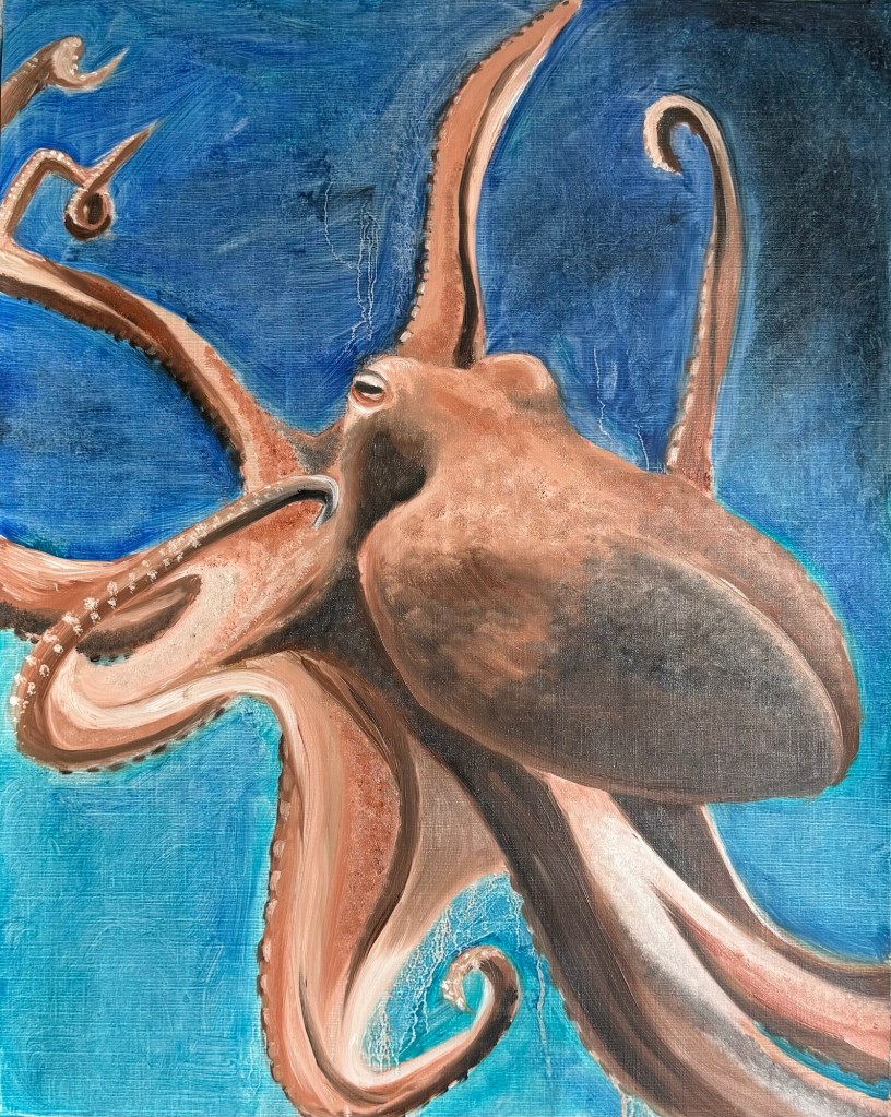
Then I worked on improving it for one more hour such as adding the suckers on the tentacles.
Kitchen paper was used to give the sea a more blended but slight ragging effect:
REFLECTIONS
I have enjoyed painting in oil again. I’m also excited by the possibility of using oil on newspapers just to see what happens. I think oil on newspapers gives opportunities to try different materials and perhaps large and heavier canvases.
The experiments with Liquin were successful in that I like using it; it helped the oil paint to flow but unlike linseed oil, it doesn’t ‘bleed’ even if large quantity is used. Also the quicker drying property suits the quick painting experiments that I’m doing at the moment.
The two hour painting was enjoyable but challenging. I felt rushed to start with, I needed to mark out the object which took time. Then blocking the octopus with a lean layer of oil took me to 15 mins in. I found myself at times drawn into details too soon, then I remembered it was a timed painting which pushed me onto the next part. I think if I wasn’t timed then I would have spent too much time on certain details. So the timing helped to move me on. I also make a mistake with mixing the paint for the sea as I added too much yellow and had to started again which wasted time.
As I painted, I started to remember fundamental oil painting techniques and processes that I had long forgotten – such as marking out shapes of the same tone systematically. Over the years, I had drifted into painting an object at a time, e.g. I would have approached each tentacle at a time, when I should have blocked out the same tone on the whole painting which is more efficient. So I switched to this way of working part way through.
I soon doubted if an octopus was a good subject because it is anatomically very complex. Eight is a lot of legs! So again I remembered the basic concept of just seeing shapes and paint according to those shapes. Also, squinting my eyes to see the shadows and shades better.
LEARNING
The timed painting surprised me by making me remember and refocus on the basic techniques of oil painting – many of those I had stopped using. So I think I need to refocus on the basics and make them default parts of the process. More timed painting practice needed!
NEXT STEPS
Do more timed paintings to hone the loosening approach and just more oil painting to improve my process.
I have been using crows as a metaphor to express how I have been feeling about the change in world order in recent months. I continue to find crows fascinating and many people have told me about how they feel about crows and how they relate to crows after seeing my work. I feel there is still much to explore about crows but I want to come away from painting for a while. I have been painting crows in Chinese ink on newspapers – although the research and set up can take some time, the actual painting process is quick (typically 10-20mins). As autumn approached, I wanted to do some slow-making and do something more physical to exert my energy, hence I explored other ways of making whilst remaining with the crow.
METHOD
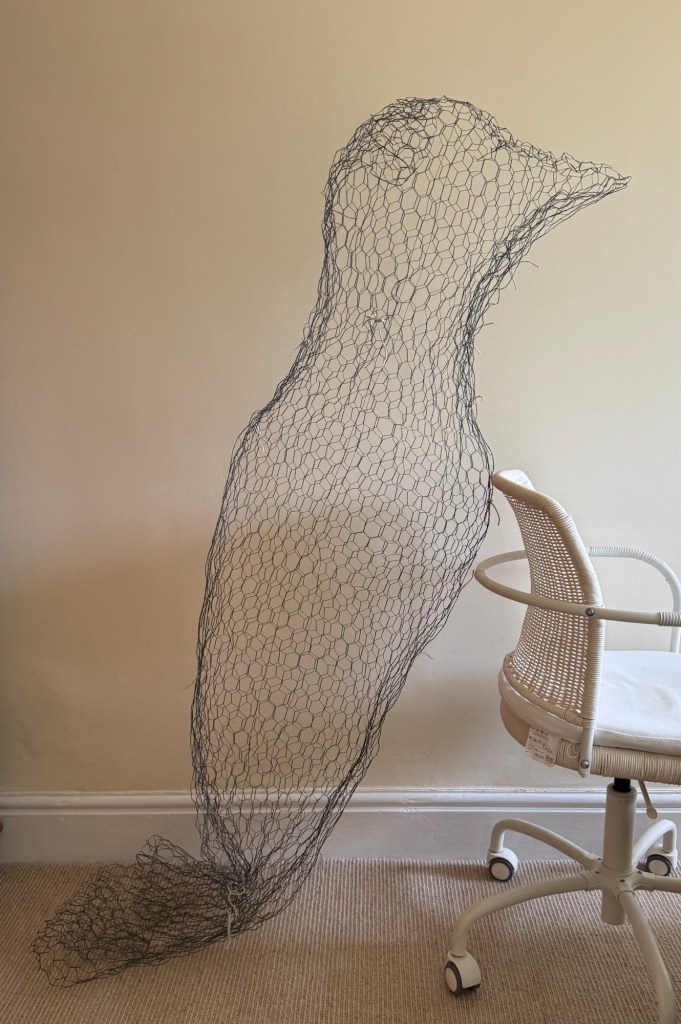
A few years ago, I attended a short course at CSM on making plaster sculptures. We used chicken wire to make the frame/armature before applying scrim and plaster. I thoroughly enjoyed the course and I made a few plaster sculptures after I got home. As a result, I still have some chicken wire in my studio and I decided to make a large crow in chicken wire. The idea was to then cover it with the FT newspaper to make a papier mache ‘News’ crow.
Works-in-progress chicken wire crow
I used all the chicken wire I had and made a crow of size:
Height 2m
Wing span 2.6m
Beak to tail length 2.5m
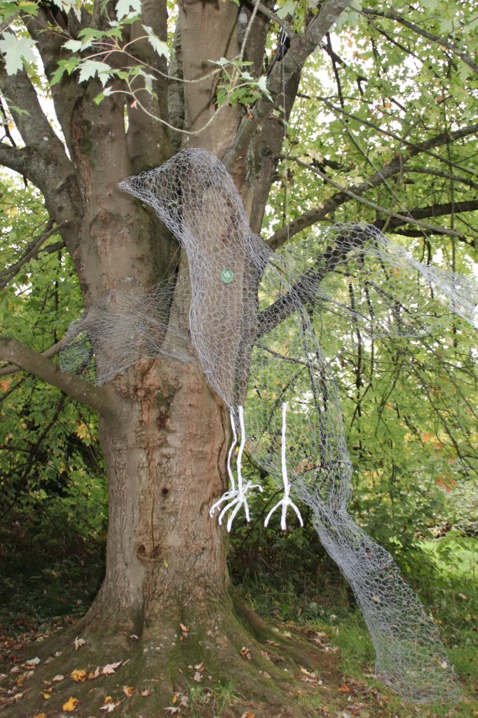
I felt a real connection with the crow. With such a large bird made in thin wire, although the chicken wire is robust, there was a vulnerability and gentleness about the bird that I connected with. At that moment, I felt I could not do papier mache because slapping on all that glue and making it rigid just felt too violent. I still wanted to do something with newspapers but not sure what yet.
I wondered if the sculpture could exist just as a wire sculpture. To develop that idea, I wanted to give the piece more meaning than just ‘a crow’. So I researched what the crow symbolised in my culture. I was fascinated to find that there was a famous three-legged crow in Chinese and East Asian mythology. (See below for Research info on the three-legged crow)
I summarised my research into this paragraph to express what I wanted to say with my three-legged crow:
In East Asian mythology, the three-legged crow is a revered symbol of divine power and celestial guidance, appearing in the folklore of China, Korea, and Japan. In Japan, this creature is known as ‘Yatagarasu’, said to have led the first emperor toward unity and purpose. The three legs are often interpreted as representing heaven, earth, and humanity – or past, present, and future – reminding us that true direction comes from balance.
This sculpture invites reflection: not just on where we’re going, but how we choose to get there.’
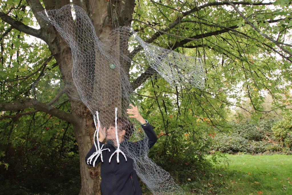
Before I did anything else to it, I took it outdoors for a photo shoot on The Downs nearby. I took some photos with it hanging from a tree and then I posed with my crow as a form of performance.
Three-legged crow
–
REFLECTIONS
I set out to make something physical to exert energy; something that would take time to make to give myself time for contemplation as autumn approached. Also, this was my first proper project after finishing my MA. Although I have been making art, they have been shorter work to fit in with a busy summer schedule of travelling and other commitments. So it felt great to be able to dedicate proper time to make something physical in the studio.
The outcome was a wire sculpture – the three-legged crow. I was pleasantly surprised by the outcome. I didn’t expect to have such connection and affinity with the work. I didn’t expect to feel protective over it to the extent of not wanting to papier mache as it felt too violent.
I have always valued the process of making, but most of the time I have not been too bothered about the work once it was made. The process was the key for me. However, on this occasion, I felt differently about the work, I wanted to take care of it.
For me, the work exudes gentleness; and softness somehow is also its strength. Perhaps it represents how I feel about the world right now… the vulnerability (the world’s or mine?).
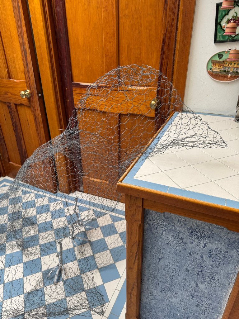
This photo was particularly poignant – I placed the crow in my porch after bringing it home from the photo shoot and it just looked sad and vulnerable…
LEARNING
-The research on the three-legged crow reminded me of the details of mythical stores that I heard when I was a child in HK – details that I had long forgotten. So it was good that I was able to connect it with a new piece of work.
-I was pleased to find a meaning with the three-legged crow that aligns with what I want to say right now about the state of the world. It’s not only about where we are heading, but about how we want to get there.
-I thoroughly enjoyed taking the crow out for a photo shoot, more than I expected as I was self-conscious. What would the neighbours say!? But I enjoyed it especially the performance aspect – I want to do more!
-This is an unfinished piece of work. I still want to incorporate newspapers into the work but its softness has to be maintained. So I’m considering weaving strips of cut up newspaper articles into the chicken wire, then perhaps painting on that. Possible lighting the piece from within like a lantern , maintaining the theme of rear-illumination as I have been doing with ‘News’.
NEXT STEPS
-Experiment with adding newspaper to the work such as weaving strips of cut up news articles and painting on top.
-Consider ways to incorporate more performance into my work.
–
RESEARCH– Three-legged crow
Below are CoPilot’s responses to my various questions that helped me to build up an understanding and a mental image of the three-legged crow:
The Legend of the Three-Legged Crow (金乌) –
In ancient Chinese mythology, the sun was not just a celestial body—it was alive, and it had a spirit. That spirit took the form of a three-legged crow, known as the Jinwu (金乌), or “Golden Crow.” This mystical bird lived in the sun and was said to have three legs, symbolizing cosmic harmony—often interpreted as heaven, earth, and humanity.
According to legend, there were ten suns, each represented by a three-legged crow. These suns lived in the Fusang tree, a divine mulberry tree located in the eastern sea. Every day, one of the crows would be carried across the sky in a chariot driven by the solar goddess Xihe, bringing light and warmth to the world. The ten crows took turns, one per day, in a ten-day cycle.
But one day, all ten suns grew restless and rose into the sky at once, scorching the earth with unbearable heat. Rivers dried up, crops withered, and people suffered terribly. The world was on the brink of destruction.
To save humanity, the legendary archer Hou Yi was summoned. With his divine bow and arrows, Hou Yi shot down nine of the ten suns, leaving only one to continue its daily journey across the sky. Peace and balance were restored.
The surviving three-legged crow remains in the sun to this day, watching over the world and maintaining the rhythm of day and night.
—
This myth not only explains the sun’s movement but also reflects ancient Chinese beliefs about cosmic order, divine intervention, and the balance between chaos and harmony. The image of the three-legged crow appears in Han dynasty tombs, bronze mirrors, and ancient murals, symbolizing power, immortality, and celestial authority.
Symbolism of the Three-Legged Crow in Chinese Culture –
– Solar Deity: The crow is believed to reside in the sun, acting as its spirit or charioteer. Ancient texts describe ten such crows living in the Fusang tree in the eastern sea, each taking turns to fly across the sky and illuminate the world.
– Cosmic Balance: The myth of the ten suns (ten three-legged crows) explains natural order and chaos. When all ten suns rose at once, scorching the earth, the archer Hou Yi shot down nine, restoring balance. This story emphasizes the importance of harmony in nature.
– Divine Messenger: The crow is often seen as a celestial creature, a messenger of the gods. It appears in myths involving deities like Xiwangmu (Queen Mother of the West) and solar goddess Xihe.
– Three Legs: The number three symbolizes completeness and cosmic unity—often interpreted as representing heaven, earth, and humanity. It may also reflect the sun’s three phases: dawn, noon, and dusk.
– Longevity and Mysticism: In Daoist texts, the crow is said to consume divine herbs and live eternally, linking it to immortality and spiritual transcendence.
– Imperial Power: During the Han dynasty, the three-legged crow was a symbol of imperial authority and divine right. It appeared in art, tombs, and ceremonial objects to signify the emperor’s connection to cosmic forces.
—
This mythical bird is not just a creature of legend—it’s a profound symbol of how ancient Chinese people understood the universe, time, and the divine.
Coming from an engineering background where accuracy and precision are essential and at times critical to the work, I have found it liberating to study and practice art. Liberating because ambiguity is valued in art and it is ok to not have an answer or to leave it open for interpretation. Whereas communication has to be literal in engineering. If you have built a bridge to take a maximum of 50 cars at a time, then that limit must be correct and adhered to. You cannot say to the users ‘Maybe 60 cars is ok, not sure, what do you think? Perhaps just try it.’ The consequences could be disastrous.
But liberating the mind takes immense effort, it requires the brain to relearn how to see, think and interpret. It is mind-bendingly hard. When I first saw ‘The Treachery of images’ (1929) by Magritte – an oil on canvas painting of a pipe with the caption (translated into English) ‘This is not a pipe’, I struggled. The art work is literal and ambiguous at the same time. The drawing is clearly of a pipe, but not a physical pipe. Therefore, the caption is accurate – it is literal from that perspective. However, if someone had asked me, ‘What is that?’ I would have reply, ‘That’s a pipe’ when it is clearly a painting of a pipe and not a pipe. For me, the ambiguity comes in the interpretation of the art work and in trying to understand the artist’s motivation.
Googling the meaning of this artwork yields many different interpretations. The interpretations vary from ‘representation vs reality’, ‘the authority of language vs visual representation’ to more philosophically, ‘the relationship between words, images, and objects is not as straightforward as we might assume’. I do not know if Magritte ever explained his work with a definitive explanation (I hope not) and his later work ‘The Treachery of images’ in 1952, an ink drawing of a pipe with the caption ‘This continues to not be a pipe’, was another effort to poke his viewers to continue the search for the meaning of this very literal artwork.
The persistent tension that Magritte maintained between truth and fiction, reality and surreality is one of the great achievements of his surrealist art; it will no doubt continue to cause us to scratch our heads in search of the meaning despite the literal message that has been plainly laid out before us. I am thankful that through my art learning I have come to understand that – it is ok to not know the answer.
Magritte – The Treachery of images (1952) Indian ink on paper 19 x 27cm
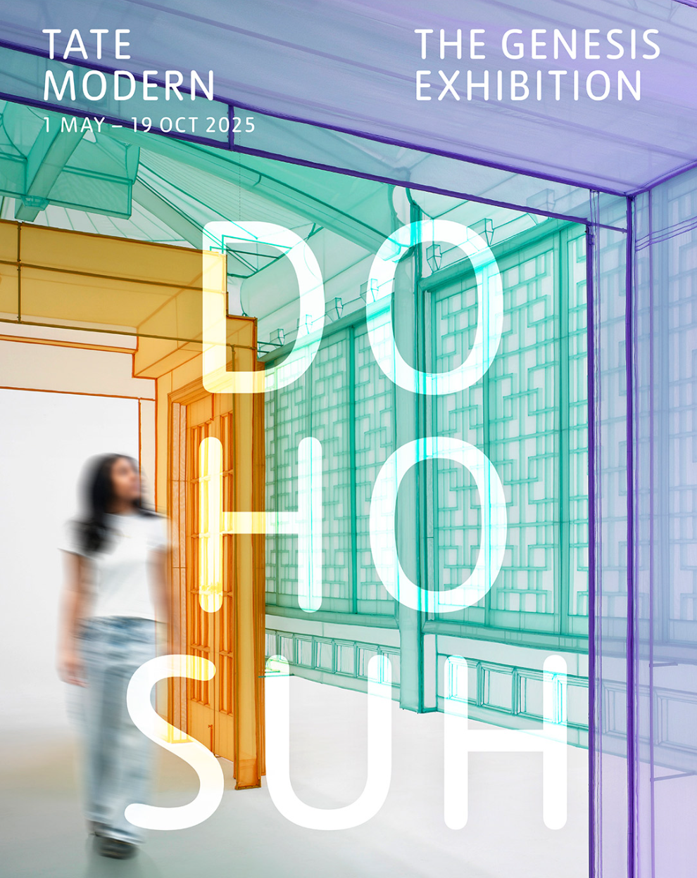
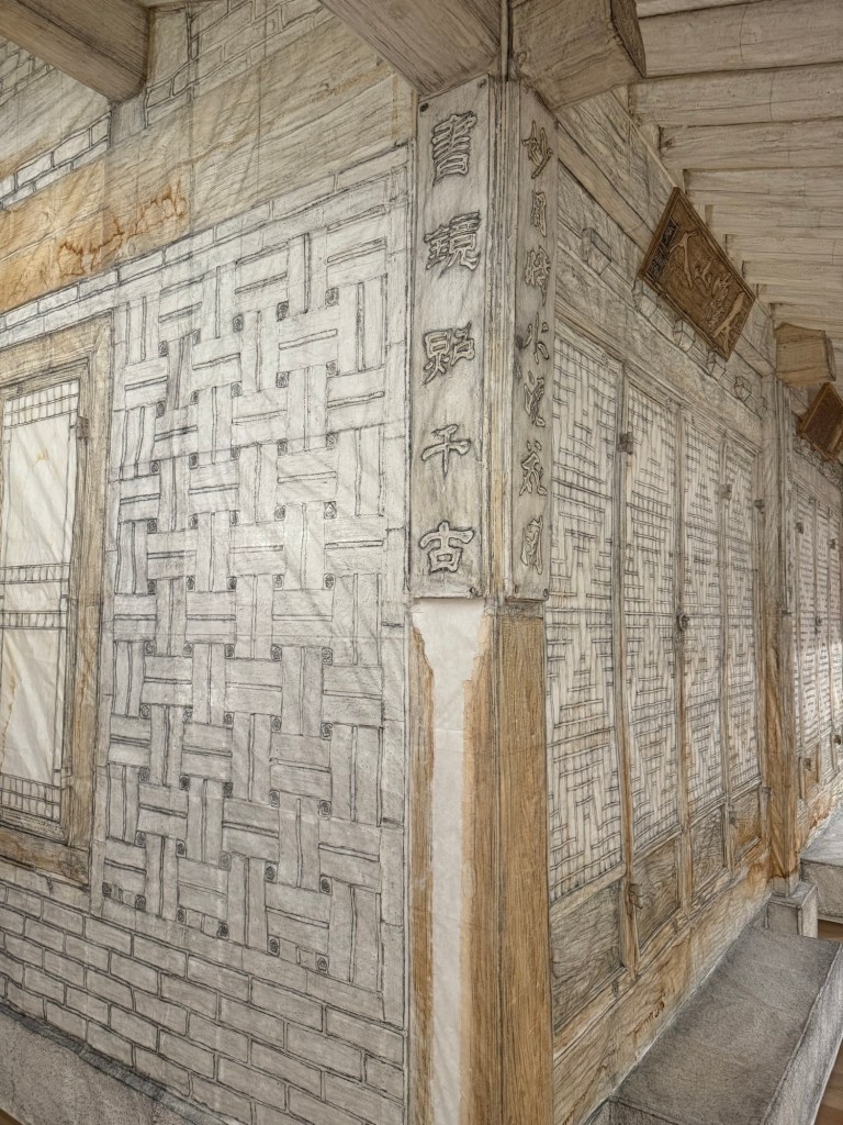
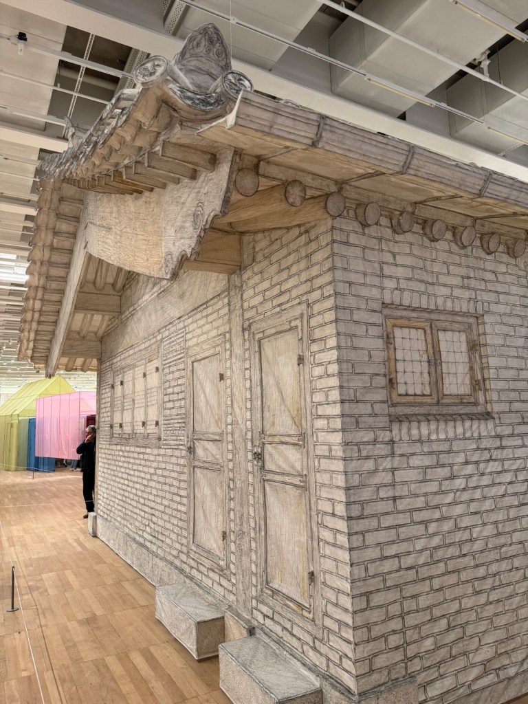
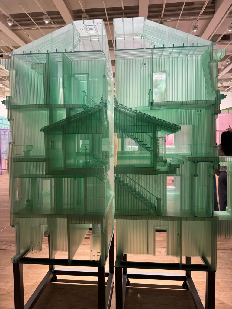
I was looking for an exhibition to go to with my daughter who lives abroad and was in London for the weekend. After reading a couple of reviews, I decided on ‘Do Ho Suh: Walk the House’ at Tate Modern.
The exhibition was very busy as it was the last weekend of the show after the end date was extended. As we walked between the monumental exhibits whilst navigating the crowd, I could hear frequent bleeping sounds. It was the threshold-wire sensors protecting the displays being triggered by keen viewers leaning too closely to examine the details.
A video playing on a small screen captured the artist working meticulously. A young couple standing next to me gave a running commentary in Cantonese about the intricate process and delicate materials used. It made me nostalgic because the artist’s hands reminded me of my brother’s when he worked on his wood board carving; they both use their slender but strong fingers with the same intensity. I was mesmerised by my own nostalgia.
A thin curtain separated a large area where a film was projected onto an entire wall. Two labels on the wall at the entrance to the area described the locations of the film. We couldn’t read the detailed descriptions as more people were pushing to come in. We gleamed the headlines and started watching. My daughter turned to me and said, ‘I’ve lived in places like that.’ I replied, ‘So have I.’ ‘Yeah, pretty universal,’ she muttered. I was not sure if she meant the experience or the place. Perhaps both.
We were drawn to a darker corner with intrigue. Looking through a gap between semi-transparent panels, I met eyes with another visitor. There was a momentary connection then we both looked away. My daughter called me over and said, ‘Look, Mum, there is a miniature toilet.’ We both laughed and took pictures of the toilet.
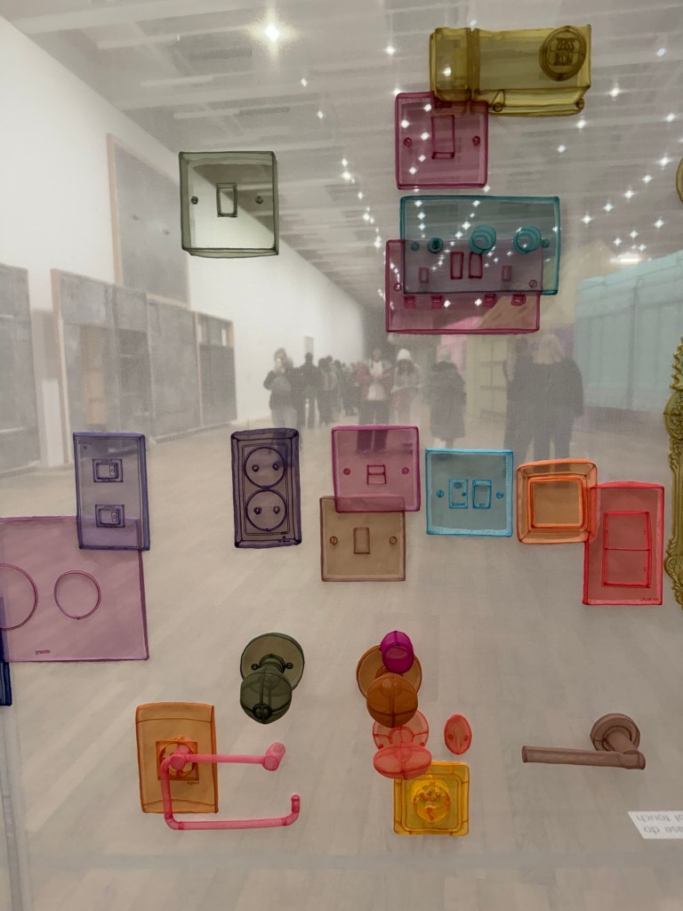
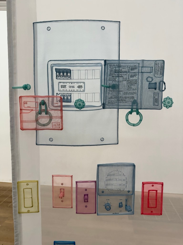
We returned to the exhibits in the main area. I felt my phone vibrate. It was my daughter posting a photo on the family chat of me staring intently at a display with the caption ‘When art meets electrical engineering. Rapt.’ We played who could name the country of origin of the pieces on display judging by the shape of the electric sockets. It then occurred to me that I moved away from home to another country when I was young and she has moved away from her home country, too. We now have that shared experience. I wonder where she calls home now.
Wading through a crowd watching another large film projection, some standing and some sitting on the floor, we reached the gift shop. The final few fridge magnets were half price. It’s the last weekend after all.
Detailed and visual descriptions to help reader visualise the entrance and the space setting the tone of what’s to come. Really helped me clearly to be in the space right from the start. Such clear visual description is consistent throughout the article which can be helpful if the viewer is not visiting the show.
The language is clear throughout and easy to understand.
The use of metaphors helped to make a point (e.g. readers like hanging bats).
Dislike:
After stating that the curators wanted to provide ambiguity, the writer was too detailed and delved just too deeply, leaving little room for readers to enjoy the intended ambiguity.
Picking arguments for the sake of it without understanding the meaning of the art work. Is it just to show off and rant for the sake of it? (Reference ‘space’ being ‘geopolitical’.)
It’s not always clear whether an interpretation is the curators’ views or the writer’s. E.g. Interpretations of the sonic metaphors (dissonance is productive, harmony through the broadcast of diverse voices, and so on) are they the curators’ intended meaning or the writer’s interpretation?
The last two paragraphs feel rushed and at a different pace to the rest of the article, reflecting the challenge of reviewing such a large show and the need to provide meaning without overwhelming the reader whilst trying to cover as much of the exhibits as possible
REFLECTIONS
The key for me is to strike the balance between giving enough details to place the reader in the space but not so much that the reader ends up feeling suffocated with details. Hence need to leave room for the reader to ponder, perhaps leave them wanting more. But more of what?
How to show passion or feelings in the writing without coming across as ranting, especially ranting for the sake of it?
Regarding whether a view/an opinion is the curator’s or the writer’s, that undefined boundary bothered me because – do I want my views to be influenced by such overt interpretations by another visitor (meaning that an art critic is just another visitor) before I see a show? Or is it in fact useful if I’m never going to see that show?
It’s challenging to review a large exhibition – the challenge being the need to strike a balance between providing meaning in the content whilst covering as much as possible without overwhelming the reader.
–
PART 2
An art review that I enjoyed reading:
Do Ho Suh: Walk the House at Tate Modern by Eddy Frankel in The Guardian
I enjoyed reading the review not because I liked it, but because it annoyed me, prompting my disagreement with the writer/reviewer which confirmed my decision to see the show despite it being awarded only 3 stars by the review.
Below are my notes about this review. I have quoted in italics the parts that I wanted to comment on, with my reasons for commenting, followed by my ‘Notes’ on what I learnt about good art writing for me. I have since visited the show and I have added further response to most of the points raised as part of my process of reflection.
Comment #1 –
‘It’s a bit like a vast portrait made in Homebase’. I feel this opening is belittling and condescending likening the art work to something in Homebase – is the writer showing his need to be seen as clever and therefore showing off too soon? It was disrespectful and off-putting for me. Or is it just so difficult to have an attention grabbing headline that anything goes including such tactics?
Note: Avoid using show-off statements to grab attention, this can put some people off and come across as egotistical or shallow.
Comment #2 –
‘Lots of contemporary art is about architecture and the lived environment’ – I do not agree so this statement alienated me as a reader.
Note: avoid sweeping statements especially when it is untrue, one could come across as ignorant or too lazy to fact-check. It’s ok to say that ‘much of the contemporary art that I have seen is…’ – that is stating one’s own experience without stating it as ‘fact’.
Comment #3 –
‘The works on paper can’t compete, and aren’t that great to begin with.’ – let me decide for myself whether they can compete or if they are great.
Note: don’t be over confident about your own opinion, it can come across as condescending which does not endear the reader or just lazy writing.
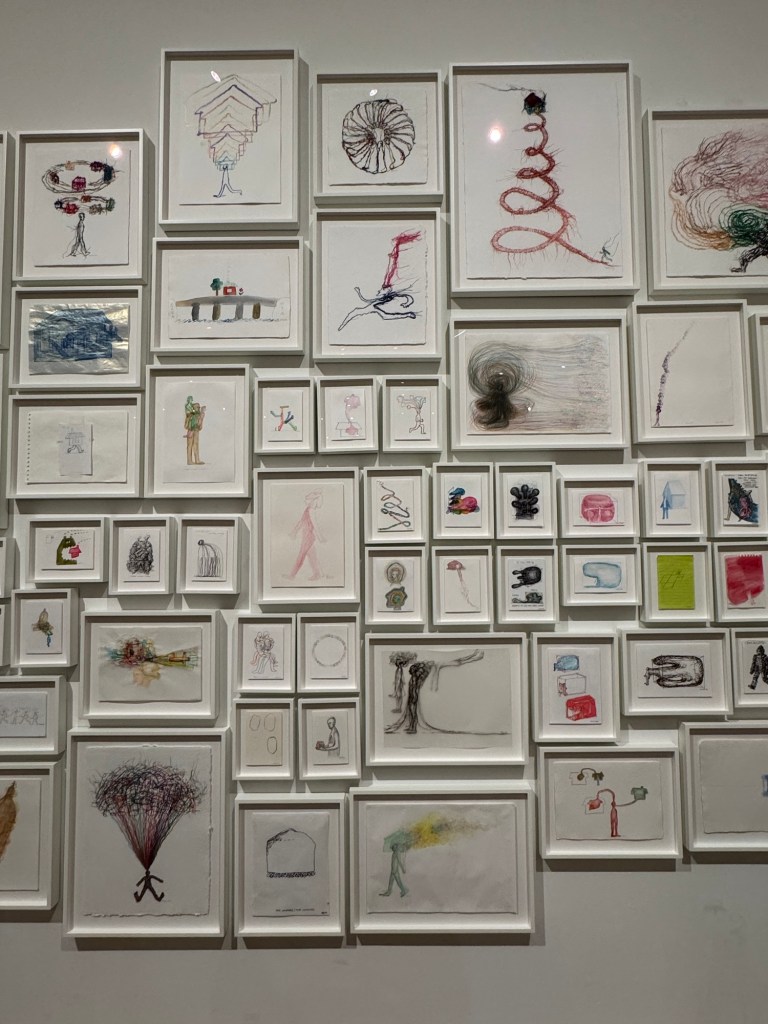
My response after seeing the show: the works on paper were amazing, very sensitive and beautifully executed in terms of aesthetic as well as process. The individual drawings were not that big but they were displayed as a collage that occupied a very large wall. Engagingly arranged.
Comment #4 –
‘The films – long, drawn-out, eerie portraits of dilapidated apartment blocks and an animation about building a home halfway between New York and Seoul – pass by unnoticed’ – well, the writer clearly noticed the film hence writing about it! Also, these are art films, not Hollywood blockbusters.
Note: don’t contradict oneself and be careful of the context of the work being viewed. E.g. the context of an art film may be different to a Hollywood blockbuster.
My response after seeing the show: the films were engaging and incredibly executed. There were clever details that clearly bypassed the reviewer. E.g. a film of a London flat where the main film was running at a certain speed while a view outside a window was showing a digger dismantling a building was seamlessly shown as a high speed stop-motion film – very cleverly executed to have a fast film framed within the main film and made it look like one film. The film about the empty flats prompted a conversation with my daughter as we have both lived in such flats when we were students. It resonated with both of us. Both films were busy with many viewers when I visited bursting out of the allocated space. So I would not agree that any of them were ‘passed by unnoticed’.
Comment #5 –
‘And there’s a part of me that thinks the work is too pretty for its own good’ – so the drawings earlier were great, now the writer says the work is too pretty. Which one is it?
Note: Be more intelligently critical in the writing or it could come across as incoherent and lazy in thinking deeply. If the reviewer is feeling undecided or conflicted – it’s ok to say so, don’t leave a contradiction unaddressed.
My response after seeing the show: the works were meticulously planned, aesthetically captivating and cleverly executed. Every piece was thoughtful and sensitive. I found the work mesmerising to look at. Every piece engaged me and I don’t always say that at an exhibition. I found resonance with the artist and his work.
Comment #6 –
‘Memories aren’t always pretty and pink, sometimes they’re horrible and filthy.’ – who are you to decide what our memories are like?
Note: be clear it’s your opinions rather than stating them as though they are facts – avoid wild claims as facts, it may annoy people like me that don’t want to be dictated to.
My response after seeing the show: Much of the work were not pretty and pink. There were different colour palettes and materials used to convey the artist’s memories. There were grubbier looking work – e.g. memory works that were entirely done in graphite – so how could they be ‘pretty and pink’? Once again, the writer is making untrue, broad and lazy observations.
Comment #7 –
‘But all this ceaseless excavation of often hyper-personal memory still works, largely because it manages to trigger your own memories. It makes you think of all the flat-shares you’ve lived in, all the houses of your childhood. Those rooms, buildings, spaces are symbols of past joy, love, laughter, tears and arguments, every grimy student flat is a container of memory, every childhood bedroom is a place of history. The difference here is that Suh hasn’t left any of it behind, he’s carried his past with him, refusing to let go, refusing to forget, and the results, at their best, are as beautiful as they are moving.’
Note: The writer has been rather negative using disputable and sweeping claims about the art work then returning at the end to credit the artist with some positive comments – the approach feels incoherent, coarse and lazy.
My response after seeing the show: This last paragraph seems to strike a different tone to the rest of the article. It is in fact a good summary and shows the writer/reviewer in fact understood the show. So why some of the earlier nonsense – were they just for effect to purposely provoke the reader? Is that approach just an art critic’s tactic?
ADDITIONAL RESEARCH & REFLECTIONS
My course tutor (rightly) challenged my thinking in what I have written above. Perhaps I was being too harsh on criticising The Guardian reviewer Eddy Frankel – perhaps he wasn’t being that negative and it was ok for him to express his opinions (of course it was). I acknowledge that I may have felt compelled to defend the artist, Suh, after seeing his show and I was touched by how beautifully and meticulously he approached his work. I felt that Frankel didn’t really understand the show or the artist hence was being lazy in his observations and use of language. By that, I mean some of his use of language was not considered enough or appropriate or the show – whether he was being critical or not. My tutor suggested that I read another review of the same exhibition to see how I feel.
I therefore read three other reviews. My notes are as follows.
1 – A reviewer and website that I do not know. It came up high on the ranking when I Googled for reviews:
Vocabulary used: tender, obsessive, and quietly radical, emotional imprint, staggering, sublime focus, not just an exhibition; it’s a gentle haunting, rendered in translucent fabric and delicate graphite, ethereal installations that blur the boundaries between architecture and memory, ghost-like, hand-stitched from diaphanous polyester in hues of rose, sea-green, and smoke-blue, incredible detail, painstakingly and lovingly reborn in thread and tulle, an embodied act of memory, obsessive and simultaneously moving acts of remembrance, preserving its textures like a fossil, it’s a love letter and a eulogy rolled into one, built on touch, labour and longing, map every inch of a memory before it disappears, soft, weightless houses, constructed using photogrammetry, deeply human, Spend time with it. Walk slowly. Let it in.
2 – A reviewer that I do not know from a website that I have come across before:
Vocabulary used: ghostly, painstakingly, every single nook and cranny, resemble an old sepia photograph, delightful sketches, coloured threads embedded in paper, reminiscent of Louis Bourgeois’ depiction, vulnerability, incredibly moving and beautiful work, like an archival display of exotic artefacts, architectural skins, they accumulate like the notes of a symphony, dwells on the desolation of the crumbling concrete blocks, a forgotten shirt trembling in the draft, clinging on in melancholy isolation, confers a ritualistic sense of dignity, unusual clarity and extreme pleasure.
3 – A magazine that I know well and would usually trust its content:
Vocabulary used: It’s a bit like a vast portrait made in Homebase, ghostly, beautiful facsimiles of the houses and apartments, fragile, wispy, delicate buildings, paper, carefully wrapped around the artist’s childhood home, a sort of memorial, the haunting power of memory, impenetrable and opaque, rooms made of wire and coloured semi-transparent polyester, re-created in wire and fabric, Some are grandiose and European in style, others are ornately Korean, Each space is a slice of the artist’s past, huge and transparent, gleaming white fabric, brightly coloured door handles, like a portrait made in Homebase, emotional focus and simple nostalgic obsessiveness, grey, grimy wall made of rubbings, works on paper can’t compete, and aren’t that great to begin with, long, drawn-out, eerie portraits of dilapidated apartment blocks, pass by unnoticed, too pretty for its own good, the trick of allowing you to walk through a transparent polyester house, Memories aren’t always pretty and pink, sometimes they’re horrible and filthy, ceaseless excavation of often hyper-personal memory, the results, at their best, are as beautiful as they are moving.
My thoughts after reading all three additional reviews:
Although I acknowledge that I was perhaps being harsh on Frankel, after reading the other three reviews, I maintain my view that Frankel’s use of language or vocabulary was lazy or lacked effort for such a sensitive show made with sophisticated artistic language and process. The other reviews, especially 1 and 2, made much more effort to accurately describe the art works and consistently used vocabulary that are aligned with the sentiments of the show throughout the article. It does not mean the review cannot be negative, but it needs to be expressed in a language that reflects or resonates with the show. Frankel’s language is not completely inappropriate but at times comes across as lacking consideration, hence I kept returning to the phrase ‘lazy in his use of language’ – they lack accuracy (compared to the other reviews) and sensitivity for a show with much delicacy. It feels like being served ketchup with a delicately flavoured consommé. That annoyed me because a writer of that reputation (writing for The Guardian) should know better.
–
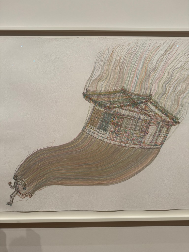
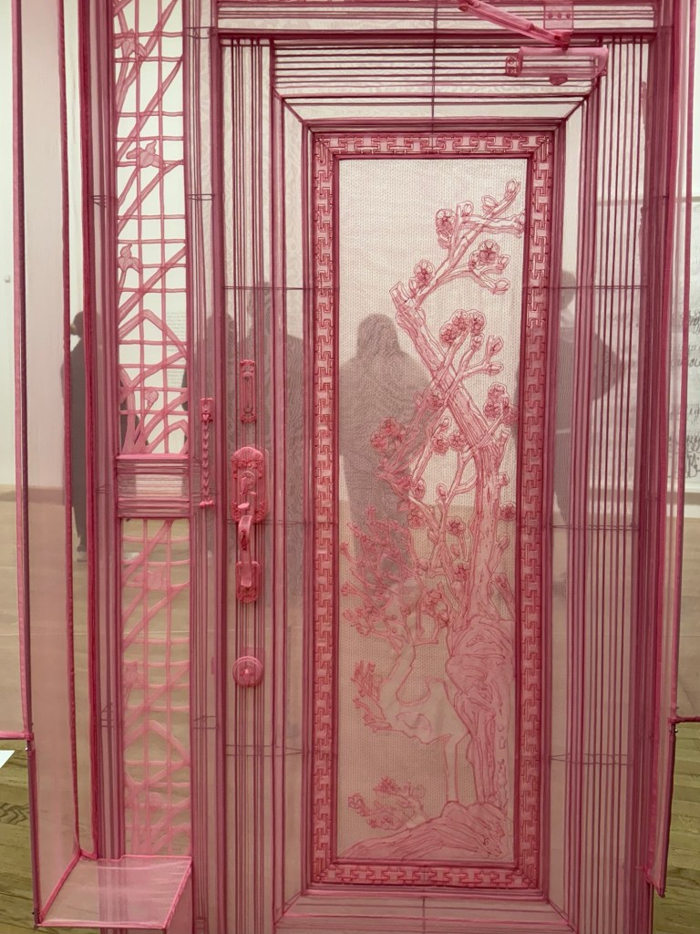
Some images that I took when I visited ‘Do Ho Suh: Walk the House’ at Tate Modern:
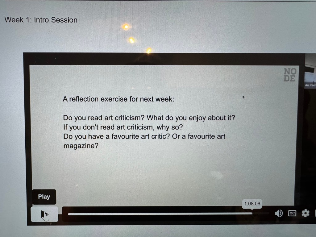
Does art exhibition reviews class as art criticism? If so, yes I do enjoy and actively seek out relevant content for shows that I’m interested in.
I don’t pay much attention to the author when I read art reviews. I will pay more attention from now on to see if I will have a favourite.
I listen to art podcasts a lot. As for reading, the only art magazine that I read regularly is the RA Magazine because I am a Friend of the RA and they send me a physical magazine every quarter which I enjoy reading. I like reading a physical magazine more than an online magazine.
As for art exhibition reviews, in addition to the RA Magazine, I mostly read those in The Guardian and BBC News.
I want to decide which show to see on my forthcoming day trip to London. I only have time for one show. Before reading the reviews, I was going to see the one by Kerry James Marshall and I was pleased to see the review gave it 5 stars. Then I read the Do Ho Suh review which although only had 3 stars, I found the review description very enticing and by the end of reading, I really wanted to see it!
REFLECTIONS
It was interesting that reading the reviews changed my mind about which show to visit, showing the power of such writing. It was also interesting that the star ratings did not influence my final choice of show to see. So I should ignore such star ratings in the future!
I introduced the idea of drawing or painting with my non-dominant hand whilst developing my body of work ‘News’. I did that as a way to challenge myself and to introduce uncertainty / vulnerability into the process to reflect how I felt about the state of the world at the time. Since then, I have become fascinated by the subject and I have been reading the book ‘The Master and his emissary’ by Iain McGilchrist on the divided brain. I read about Divergent Artistic Behaviour which states that:
Truly creative art can only result from divergent artistic behaviour – behaviour that was previously unknown or often unexpected and unexplored.
Divergent behaviour demands something from you that you have not been taught or that is not part of the suggested or normal steps in solving a problem.
That understanding has reinforced my desire to explore using my non-dominant hand to draw and paint as that has been unexplored up to now.
In this research experiment, I want to gain a deeper understanding of what the difference is between the work that is produced by my dominant hand right vs my non-dominant left hand.
METHOD
I have previously done an exercise with both hands drawing together simultaneously and one of the outcome of that was to consider whether I needed to have both hands drawing simultaneously and whether I had to have my eyes closed. My conclusion after some consideration was that no, I didn’t need to do either. If my objective is to research the difference between how the two sides of the brain produce work through my hands then there is no need to do it simultaneously or have my eyes closed. In a way, those parameters could confuse because there were too many variables introduced at the same time. Therefore, in this exercise, I’m going to just draw with each hand and compare the outcomes.
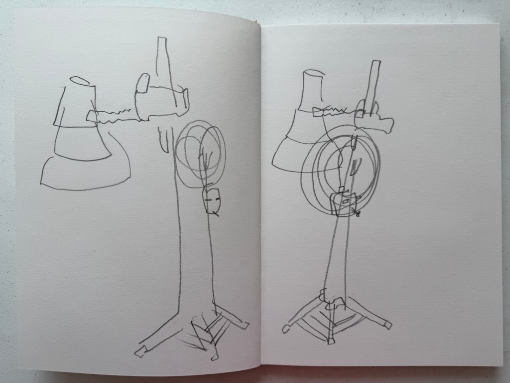
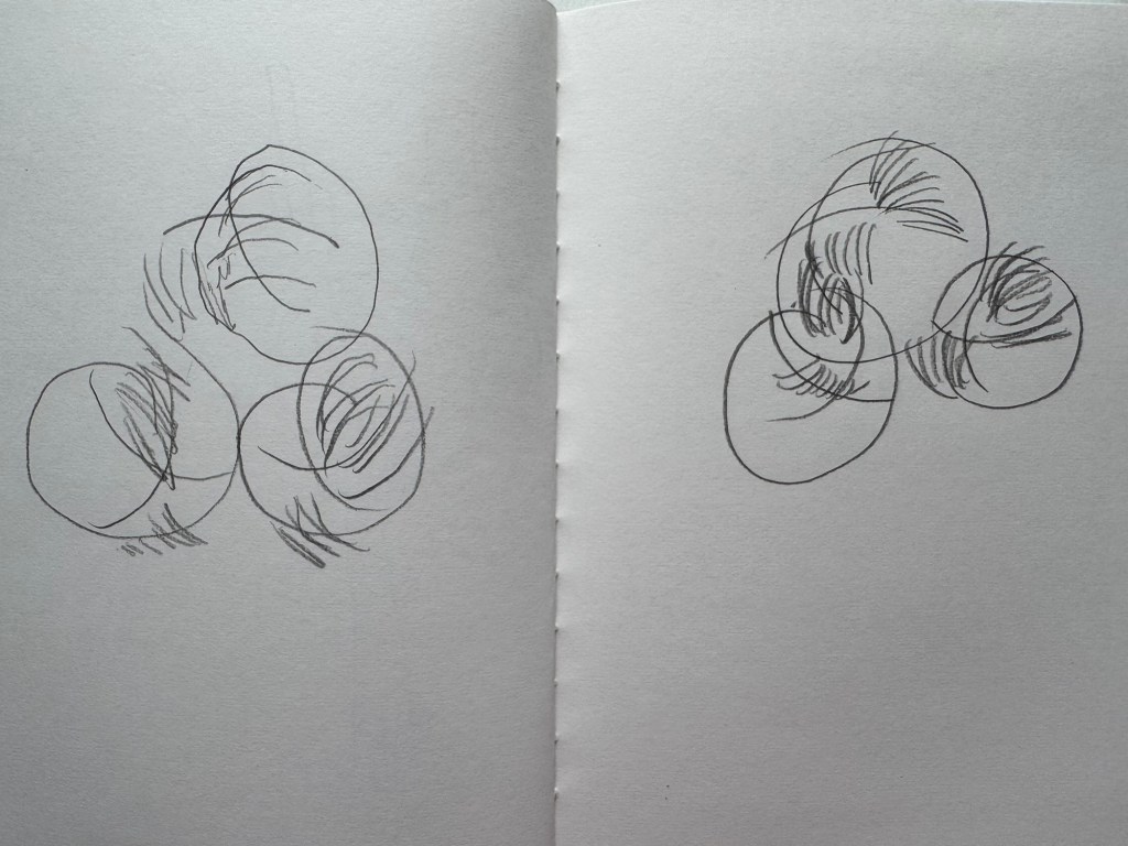
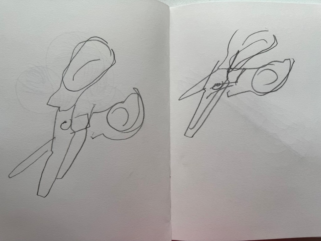
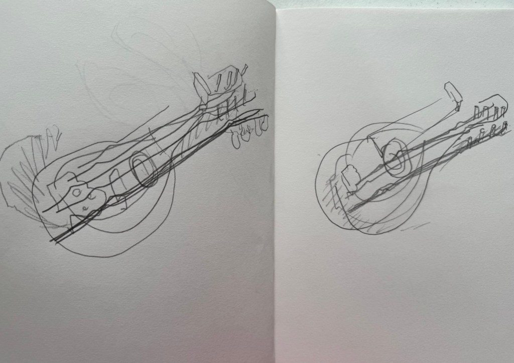
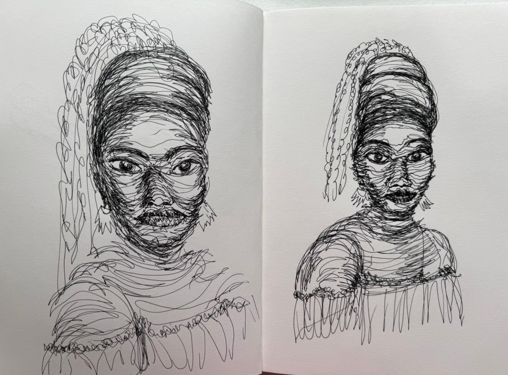
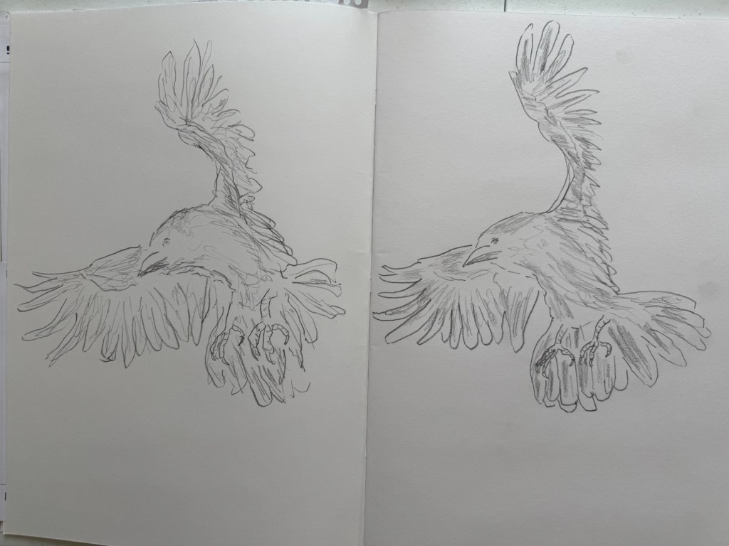
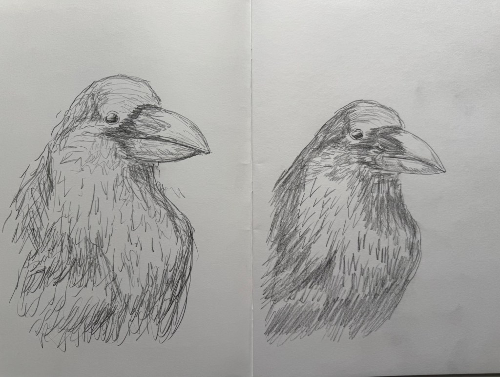
I used the method of ‘blind contour drawing’ – drawing with eyes looking at the object and not looking at all at the drawing. Below are some of the items I drew in my studio with the left page drawn by my left hand and the right by the right hand.
Studio lightJuggling ballsScissors Miniature Chinese lute – Pipa
Cross-contour drawing –
A woman’s face
REFLECTIONS
It has been an interesting exercise. Firstly, I feel that there was no need to draw simultaneous like I had done in the previous experiment. The key is to study the difference at this stage and not the difference when drawing simultaneously. One step at a time.
The images drawn with my left hand were consistently larger than those drawn with my right hand. I have observed this before in other similar experiments. I am able to be more loose when drawing with my left hand. The right hand seems to be naturally more tight, as though there are invisible boundaries on the page that I had to work within. Whereas with my left hand – I don’t feel the boundaries and therefore am not confined by it.
The left hand drawings are less accurate compared to the right hand, but there is sufficient likeness to be recognisable as the piece.
I am increasingly ‘addicted’ to drawing with my non-dominant left hand and increasingly less satisfied with my right hand because the latter is a constant reminder of my inability to push boundaries – I get pulled back into being too tight and constrained when making art with my right hand, it’s like muscle memory that I cannot erase. Whereas the lack of control in my left hand enables me to, or grants me permission to just make and not think too hard as there is no expectation for the outcome to be good. With my non-dominant hand, I am often pleasantly surprised whereas with my dominant hand I often feel disappointed.
LEARNING
I am more able to create freely with my non-dominant left hand because there is no expectation and the lack of control enables me to push myself, often ending in pleasant surprises. I enjoy this way of making with my left hand and would like to pursue it further. Perhaps even make it a key aspect of my practice.
NEXT STEPS
Keep creating and pushing boundaries with my non-dominant left hand.
Continue to explore the differences between making with my left and my right hands.
Try writing or calligraphy to see how the left hand performs on that.
At some point, I need to consider more deeply why I am drawn to this way of making. I must not ignore this point because I feel there is a link to who I am and how I am evolving. So I must come back to this point when I feel ready.
I have been painting with my non-dominant hand in my ‘News’ series of work. I became intrigued about the push and pull between the left and right sides of my brain. So I decided to experiment with drawing with both hands simultaneously.
METHOD
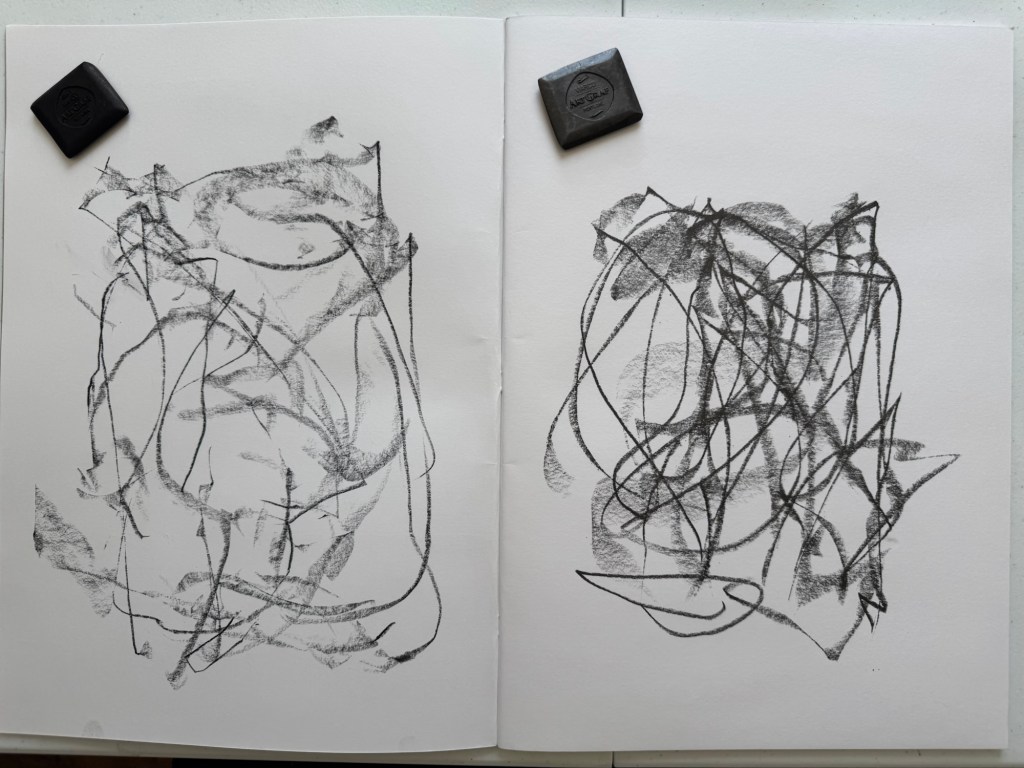
On an A2 sketchbook, I used my left (non dominant) hand to draw on the left page and my right (dominant) hand on the right page. I closed my eyes and drew simultaneously with graphite tabs. Below is the first drawing:
This is the second drawing done in the same way:
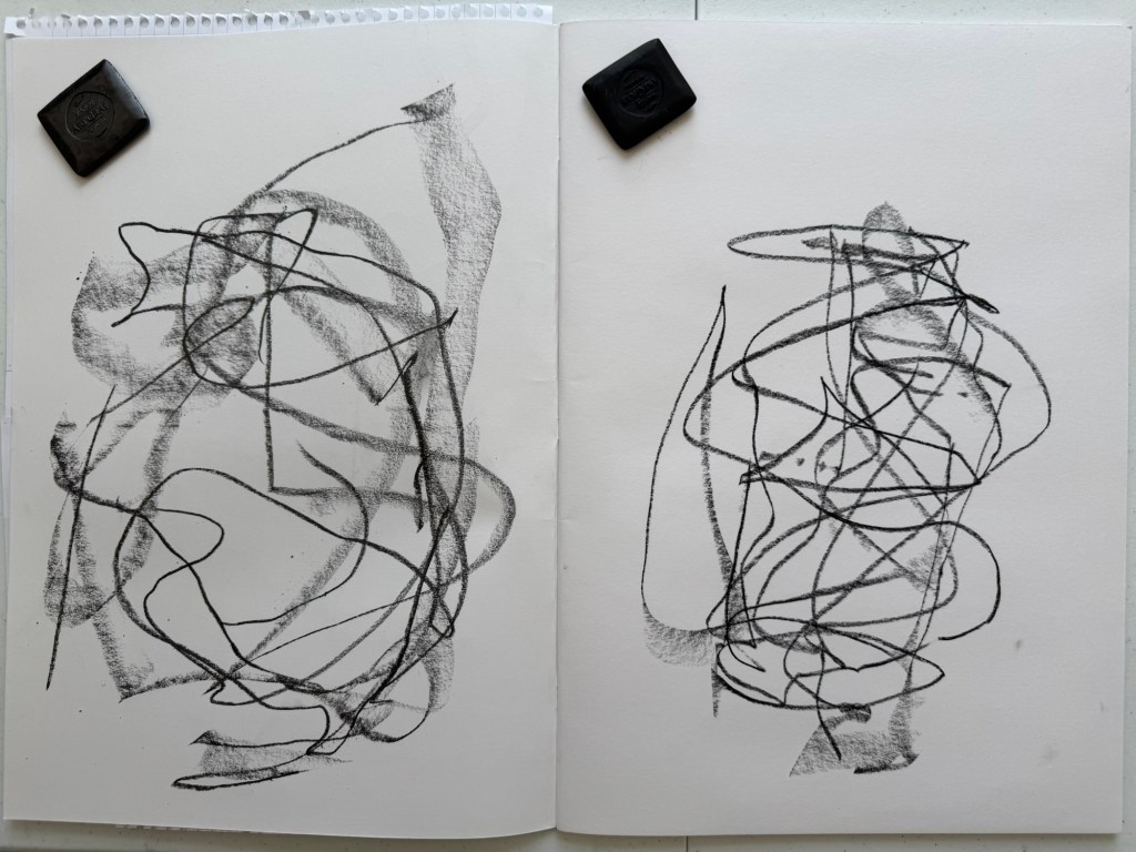
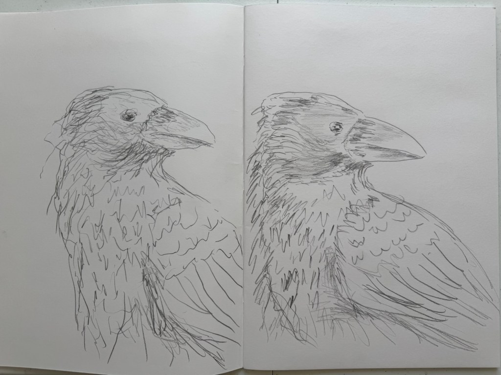
I then drew some crows with my eyes opened. Again, both hands drew simultaneously using 4B pencils. First drawing:
Second drawing:
Below is the third drawing. By the time of doing this drawing, my brain felt tired from the intense concentration that I finished these drawings separately:
–
REFLECTIONS
The first two drawings were abstract mark making with my eyes closed. I wanted to see if there would be any difference with a free and simple method like this. My initial observation was that the non-dominant hand drawings were larger and less restrained. There were similarities in composition but not identical. I purposely wanted to create different images to see if I could get both sides of the brain to do different things simultaneously. So from that point of view, I was not able to create independent images, not even simple ones.
I then drew the crows from photos. In these cases, I purposely created the same image but wanted to do it as a kind of brain training exercise to see if I could do more complex simultaneous drawings. The images were quite similar but the left hand being looser in its mark making, consistent with the abstract drawings.
I prefer the looser mark making from the left hand, but I think I have know this for some time, hence choosing to do the News paintings with my left non-dominant hand.
I have found the simultaneous drawings of the crows rather brain-aching. The intense concentration required to do the drawings was tiring, hence I had to finish the final pair of drawings separately. This makes me think that controlling both sides of the brain simultaneously is not a usual activity, hence so much concentration was needed.
I have also started researching the work of Iain McGilchrist and I am reading the book about the divided brain ‘The Master and his Emissary’. I have not read enough yet to be able to shed light on what I am experiencing with my simultaneous drawings. So I will need to continue with the book to find further insights.
LEARNING
I think it’s too early to extract learning from this exploration. I don’t know how much further I will take these experiments and how they would contribute to my practice. I think I would like to explore more the abstract mark making drawings and perhaps do some paintings with this approach to see what happens. As for the crow drawings, I know I can do them and I am unsure of what else I want out of them at this stage.
Studying Iain McGilchrist’s work will help me to progress this line of research.
NEXT STEPS
-Explore further abstract mark making with both hands. Do drawings as well as paintings.
-Consider if they have to be simultaneous and if I need to close my eyes – what am I trying to achieve with those imposed parameters?
-Consider what I am trying to find out, i.e. what are my objectives for this investigation?
-Continue to read the book ‘The Master and his emissary’ and see how the insight could contribute to my art practice.
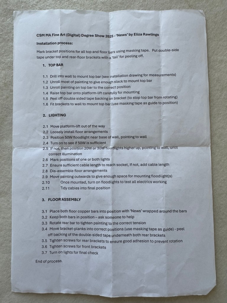
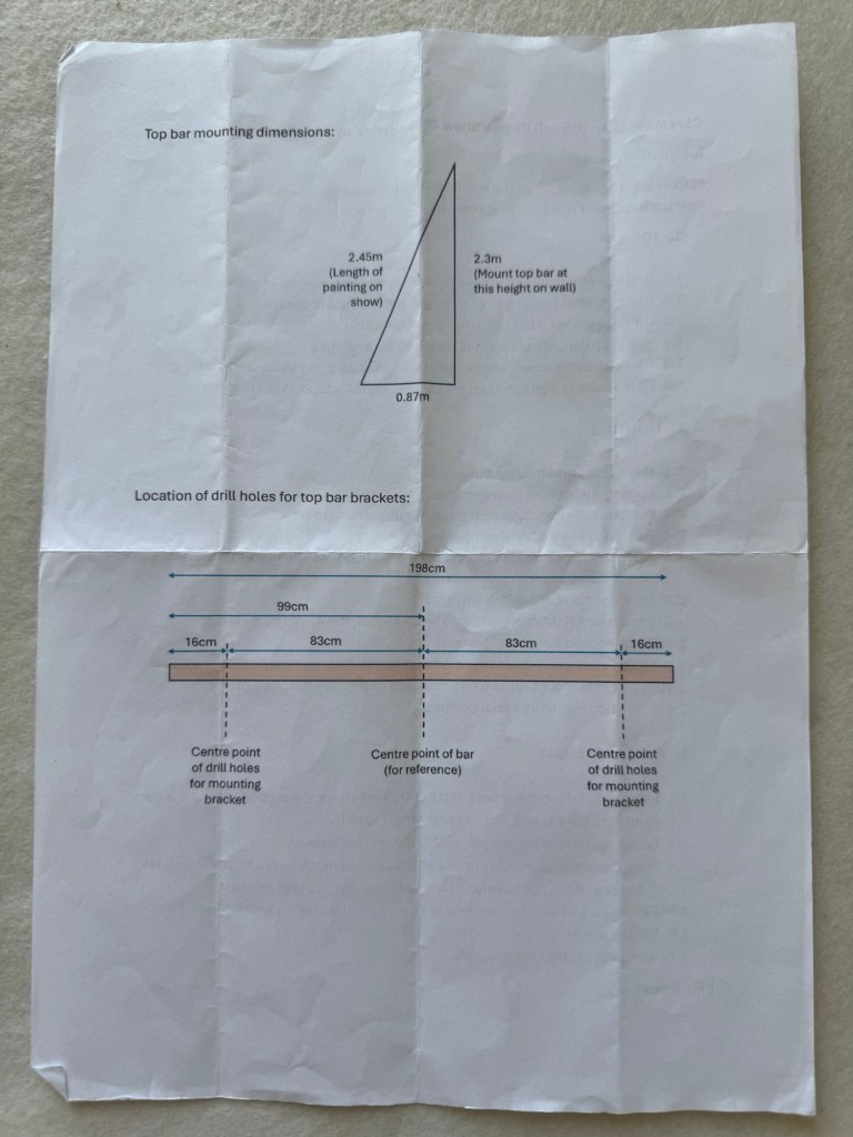
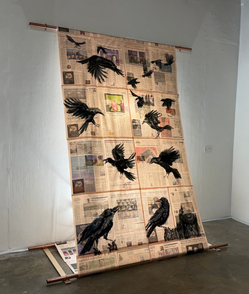
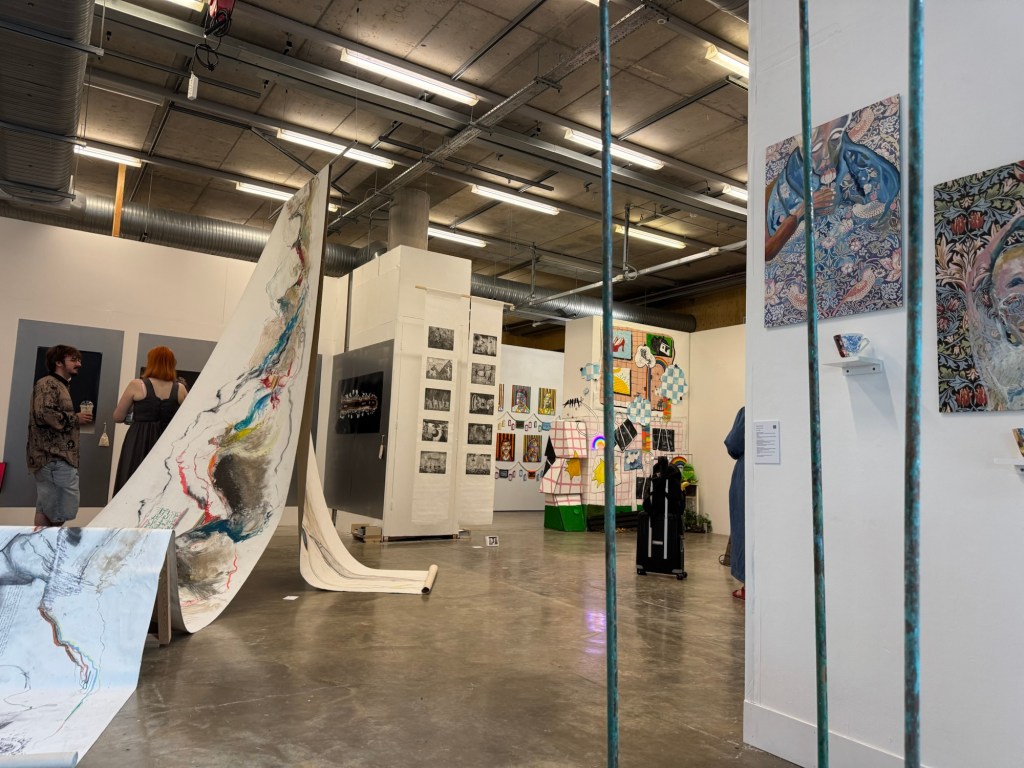
My MA Degree Show took place from 1-6 July 2025 at Central Saint Martins’ campus at Granary Square, Kings Cross, London. It was a fantastic experience and I want to capture my reflections and learning here.
METHOD
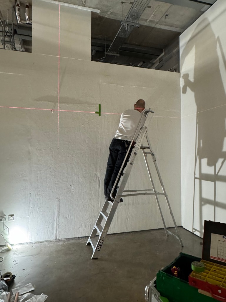
After planning what to show, creating the work and buying the parts, I wrote a list of installation instructions and a simple drawing to show the top-bar mounting. This is to ensure a smooth installation process especially where a technician’s help was required. The technicians are usually very busy, hence I wanted to use their time efficiently.
–
The technician used a laser levelling device to mark out the drill positions which made it a quick process:
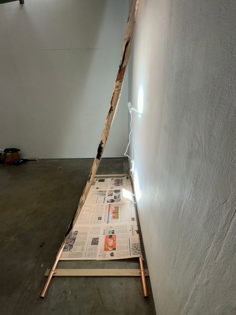
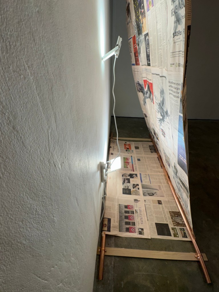
After mounting the top-bar, the two floor bars and planks were installed. That was straight forward. Then a key part was the back-lit using flood lights. I had to decide on the power rating and whether to use one or two units. After some trials I decided to use a 50w LED light near the bottom and a 20w light around half way up. This created a uniform spread of light onto the artwork and not patches of light.
–
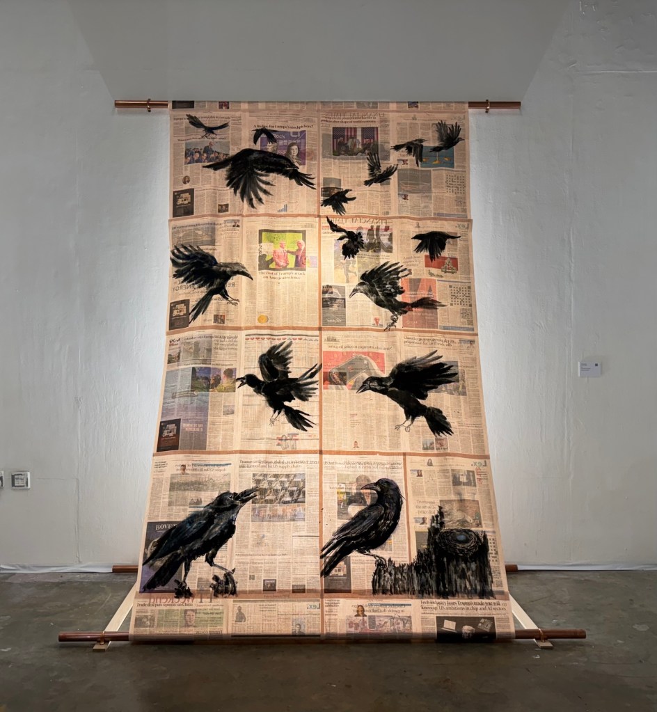
The completed installation:
––
The artwork label stated the name of the art work and that it was painted with my non-dominant hand because I received some feedback that the non-dominant hand element was lost in the piece and I should make that clearer. Hence I decided to state that on the label.
REFLECTIONS
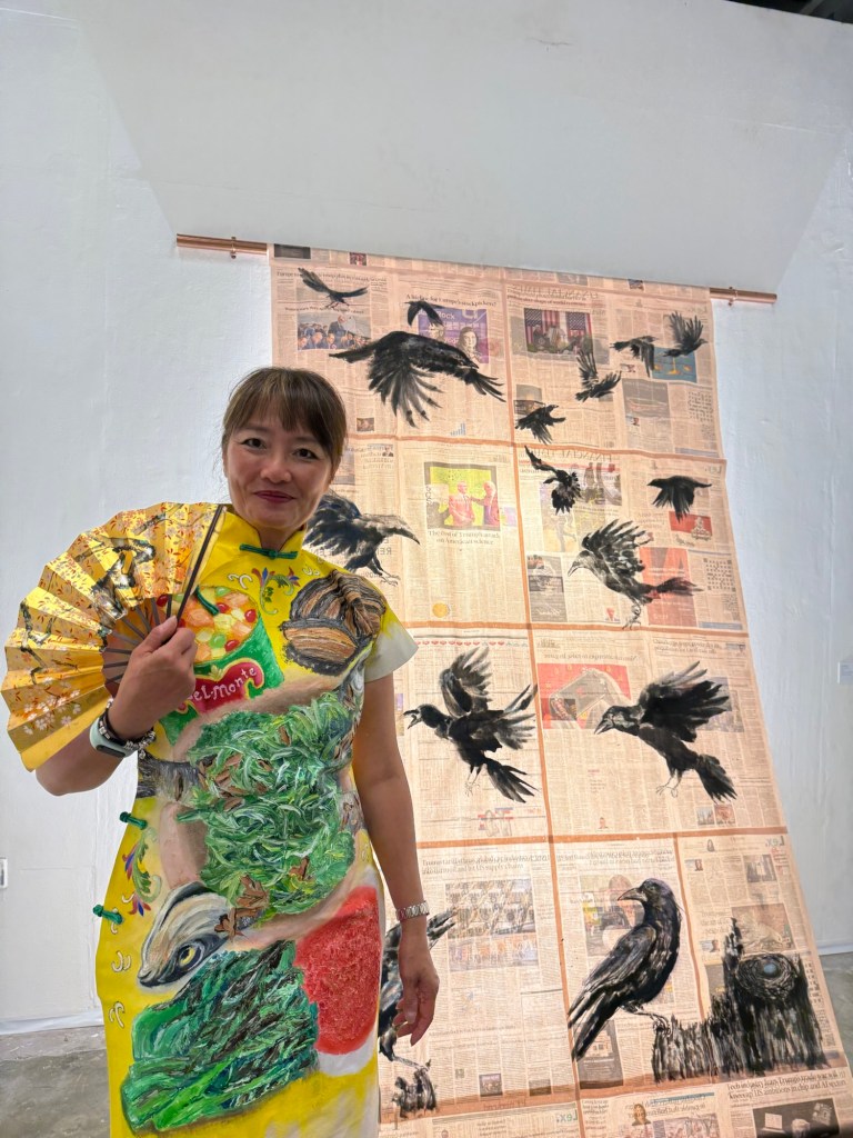
I have thoroughly enjoyed the show – both the install and the show. I wore my Family Dinner Cheongsam painting on the PV night and I enjoyed the compliments and the feedback. During the show, I have at times stood back from my News work and observed visitors looking at my work. It was satisfying when they stopped by, looked carefully and closely to the work. The experience confirmed to me that I enjoyed showing my work. Not necessary wanting people to say ‘it’s amazing’ but I wanted people to think it’s a thoughtful or clever idea, more so than ‘it’s a beautiful painting’ because it was never intended to be.
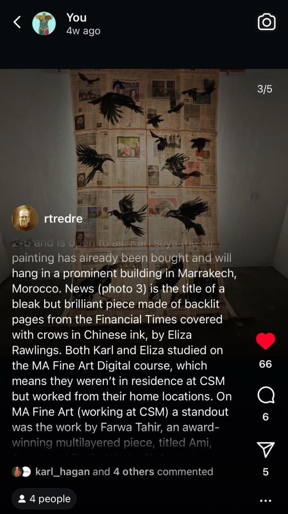
The most satisfying feedback I received was from this person ‘rtredre’ (a CSM MA course leader) on his Insta account. He described my piece as ‘bleak but brilliant’ and I was one of four pieces of work that he picked out from the show. I was delighted by this feedback and his description was exactly what I wanted – it was meant to be bleak and I was flattered that he thought it was brilliant.
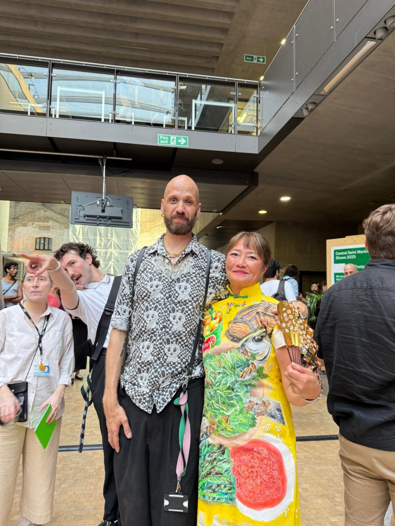
I had a few conversations with visitors, excluding friends and family, the following conversations were the most notable:
-A curator/culture manager who was working on his PhD in London. He had a good look at the piece then asked me to explain to him which I did. His feedback was that he got what I wanted to convey from the work itself and my explanation just reinforced it which was good to hear. He also advised me, as a curator, to spend time making work and be true to myself, I.e. not to let anyone (galleries etc.) to push me in specific directions.
-A management consultant who enjoyed arts and talking to artists. She liked my work and encouraged me to start collecting email addresses to form a database for circulating newsletters or inviting to future shows. She gave me her details for us to stay in touch.
-A CSM tutor who liked the way I painted with Chinese ink and she felt my use of the non-dominant hand was very interesting and worth further exploration.
-Another CSM tutor who talked to me about Iain McGilchrist’s work on the divided brain – again referring to my use of the non-dominant hand as an interesting area.
I feel that the overall show was a success and I was happy about how everything went. I was pleased with the preparation I did beforehand and minimised any last minute panics on site. I feel that many other artists were much more relaxed and left a lot of decisions till they were on site. I think in the short term, I would still work the way I have because not being completely prepared might cause me too much stress. Being prepared helped me to enjoy the experience and I guess that’s just who I am.
As for my work, I feel there is still much work to be done on ‘News’ and I have not reached the end of this project yet. With much of the world still in turmoil, I feel there is still more to say for me and I will continue. Perhaps think about a more ambitious way of showing the work from an installation perspective. I feel that my engineering and metal fabrication experience could enable me to do a more complex installation.
LEARNING
-I enjoy showing my work and talking to visitors about my work. I think I was at times still talking like a student or ‘beginner’ and didn’t convey the confidence that I should feel or that I actually felt deep down. I should find opportunities to talk about my art and develop a confident way of talking about my work.
-Some of the conversations with visitors were encouraging in that they talked about my future shows like it was a given that I would do more shows. That was very encouraging.
-My work was picked out by a CSM MA course leader among three others – two of them were winners of top awards from the show. That gave me a new level of confidence as an artist.
-With several people mentioning that my use of non-dominant hand was interesting from an academic research perspective, I felt excited by those conversations and I will explore the subject further as part of my practice research.
-I feel there is still much work to be done on my project ‘News’ – perhaps choose another topic to focus on for a change but remaining with the ‘News’ concept. Use my engineering knowledge to design more complex installations.
NEXT STEPS
-Create opportunities to talk about my work in a more professional way. Perhaps start with talking to artist friends. Or do more videos where I talk about my work. I have been used to talking professionally about my business in my ‘previous corporate life’. I would never have talked in an ‘uncertain or apologetic way’, so perhaps I could channel some of those skills for talking about my art. I am a professional artist now after all!
-Research about the use of my non-dominant hand – both in practice research and academic reading. Explore more non-dominant hand vs dominant hand making – study myself to see what I find. For academic reading – start with Iain McGilchrist’s work.
-Continue to make more ‘News’ work, explore other news topics.
-Explore more ambitious way to show the work in terms of installation – use my engineering skills.