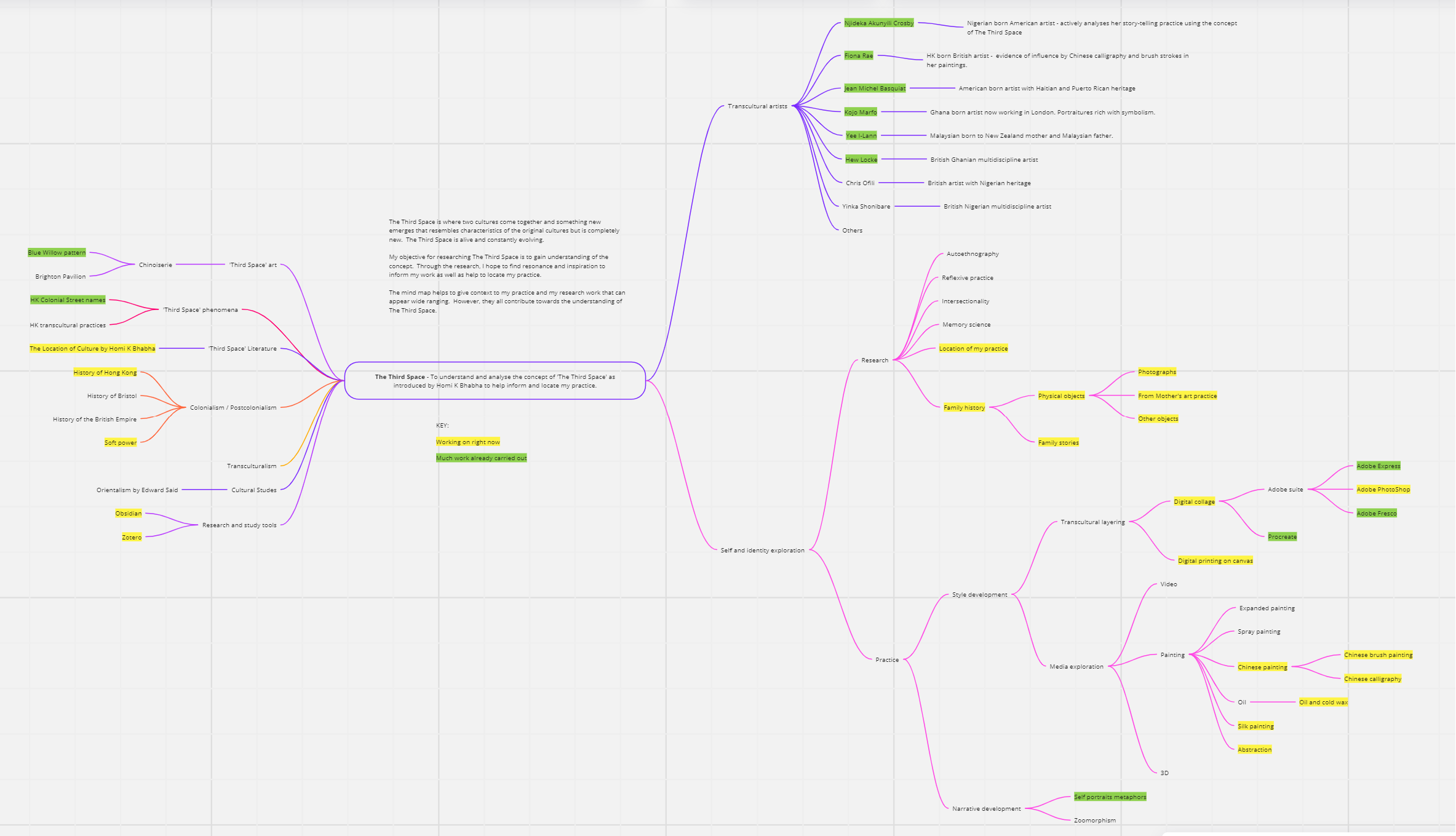
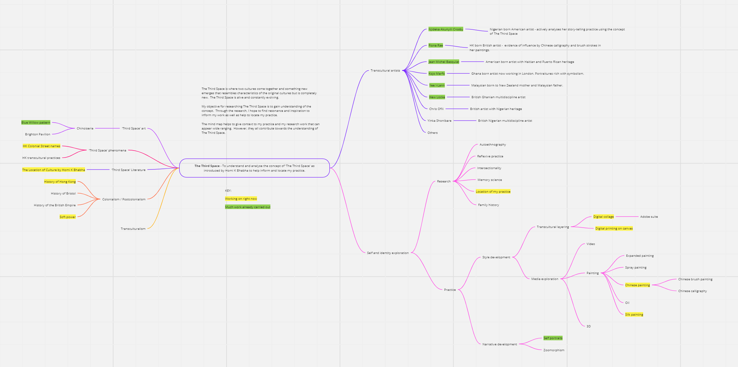
MA Y1 U1: Developing narrative – Bowling lawn incident

BACKGROUND

Following on from a previous piece of digital art work where I researched and experimented with Procreate and Adobe Fresco, I chose to use Adobe Fresco for this piece of work because I found using my MS Surface Pro with the MS Stylus worked well; it was an enjoyable way to create art that is new to me.

This is part of my narrative development work from memory, where I make work when thoughts or scenes come into mind. In this case, it was a childhood memory. The trigger for this memory came from researching into Homi K. Bhabha’s book, The Location of Culture, where he talked about ‘mimicry’. Bhabha asserts that the colonised people would try to mimic the behaviour and culture of the coloniser in order to be more accepted by those in authority. According to Bhabha, the coloniser wanted the colonised to mimic them because it was a form of imposing soft power making the colonised adopt the coloniser’s culture and habits as a higher standard. To reinforce the power structure, the coloniser would demonstrate their power by judging good and bad mimicry. The coloniser did not want the colonised to be great at mimicking because it was important to maintain a differentiation between the two to justify the act of colonising.

Understanding Bhabha’s explanation of ‘mimicry’ reminded me of an incident that happened in my childhood in Hong Kong on a bowling green… It was a case of bad mimicry and I got into trouble for it.

There was a pristine lawn bowling green in front of our apartment block where the British would bowl on sunny weekend afternoons. As local kids, we were not allowed to go onto the green – it was forbidden. However, it was too tempting so one day, my siblings and I (three of us) went to play on the lawn. We were soon shouted at by a white British man. We didn’t know what he was saying but he was clearly shouting for us to get off (shouting and waving his arms dismissively). Kids innocently playing on grass where they shouldn’t do was no big deal, it happened all the time everywhere in the world. But on this occasion, our father who worked for the British HK Government was angry when he heard about what we did. He wouldn’t usually get involved with discipline for us and certainly not for something so trivial, that side of parenting was left to our mother. But he personally told us off as soon as he was home from the office. The fact that he scolded us as soon as he got home meant that he was informed of the incident at work; the news somehow reached him through an official channel. Now in hindsight, I believe we made him look bad at work because we showed that his family were poor mimics, we didn’t respect the bowling green like good British people would. Our poor mimicry as kids must have undone the good mimicry work that my father was working so hard to portray at his work. We were bad kids and made him look bad in front of his superiors.

Researching into Bhabha’s idea on mimicry reminded me of that incident and I wanted to make a piece of work about it.
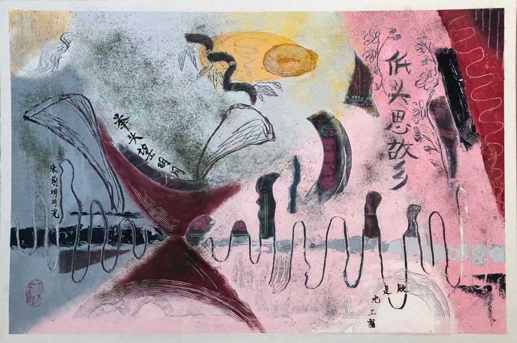
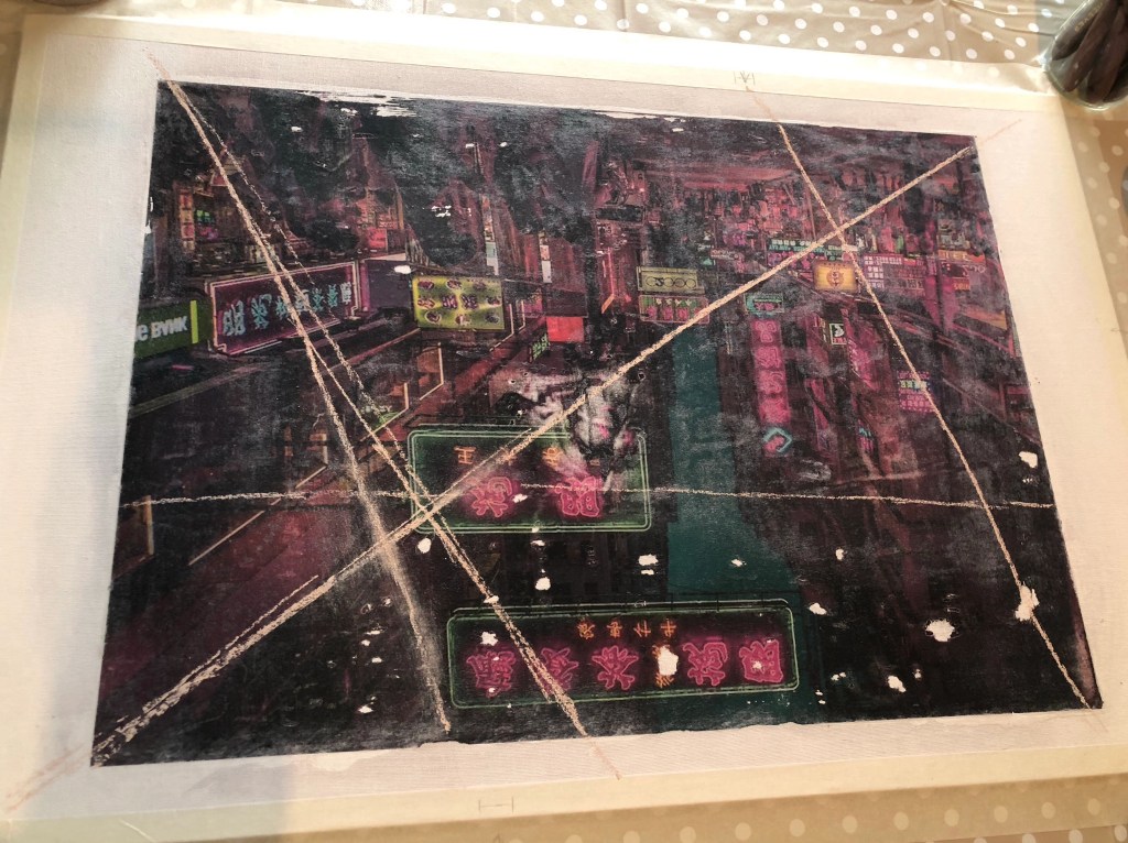
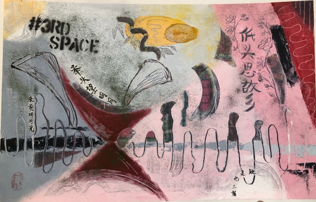
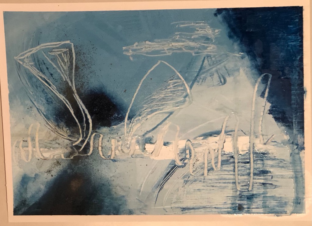
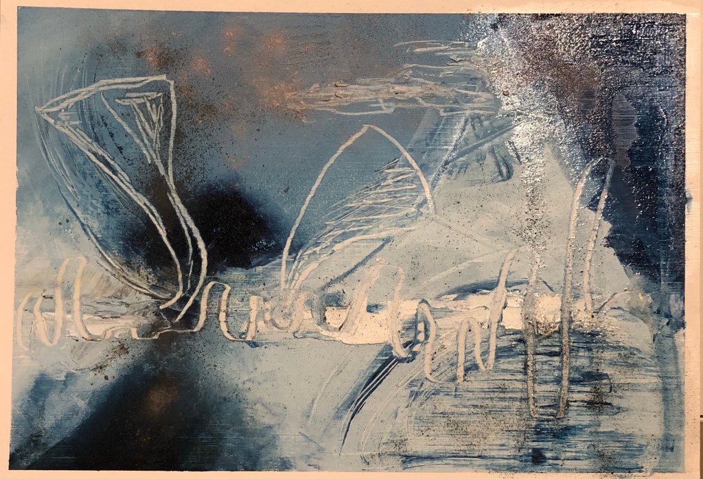
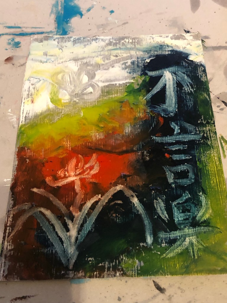
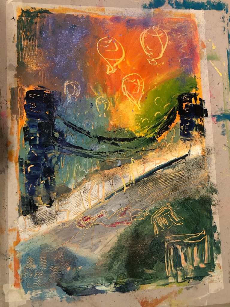
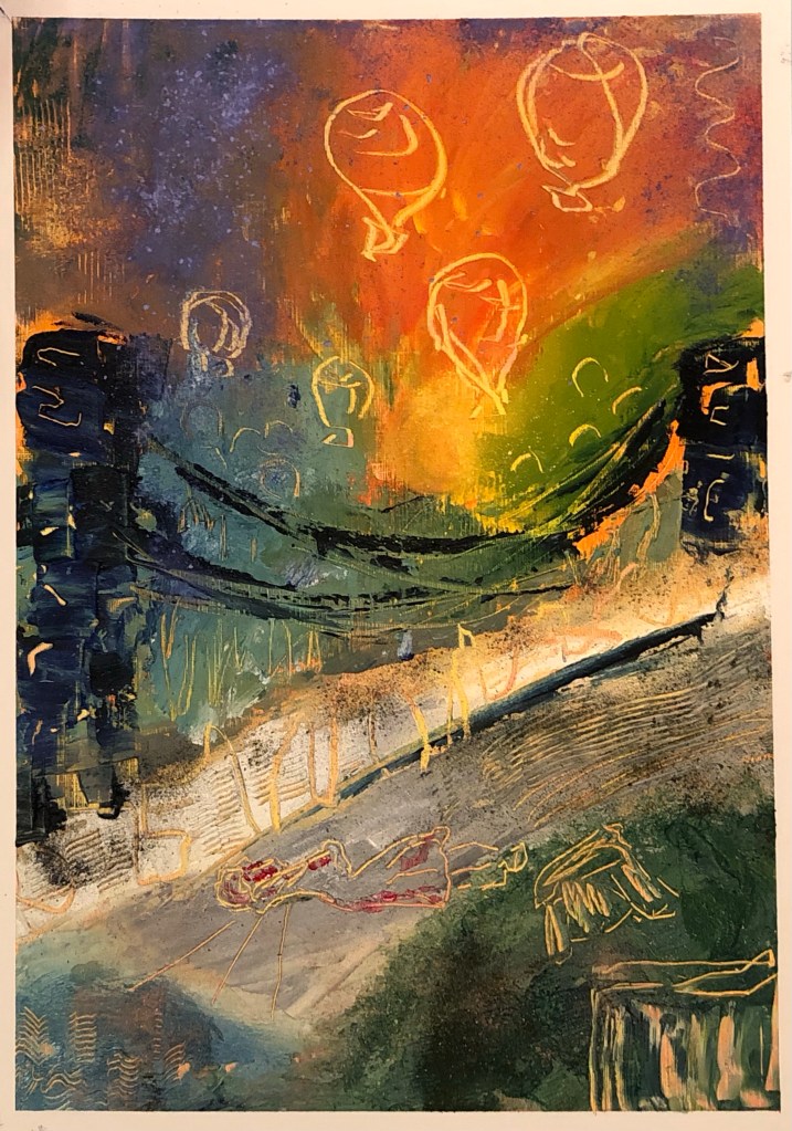
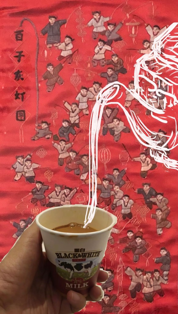
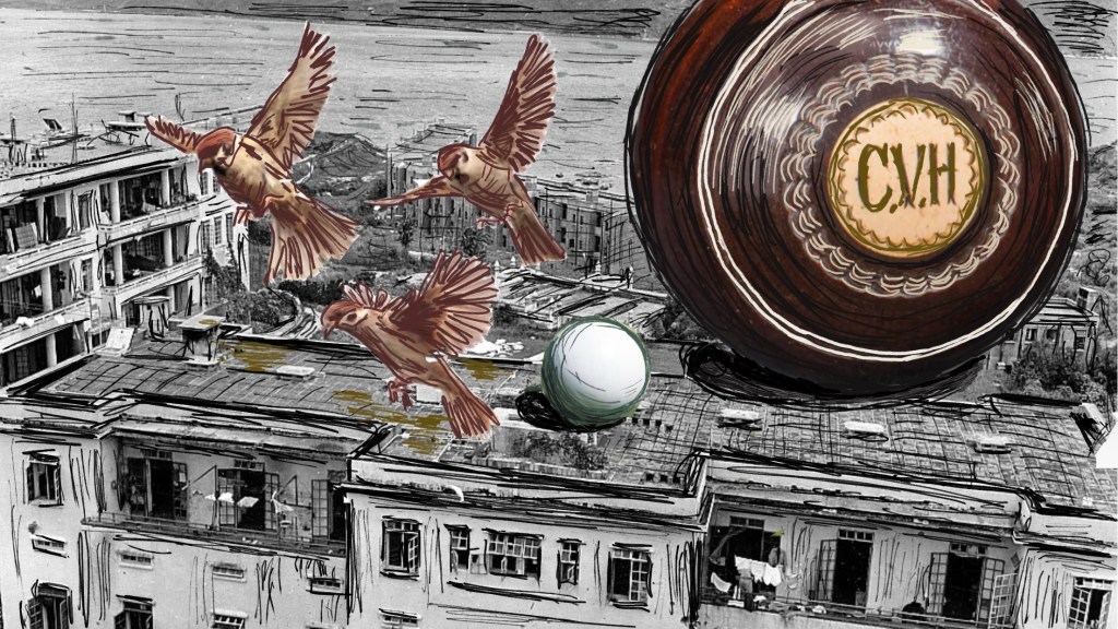
Finished work:

METHOD

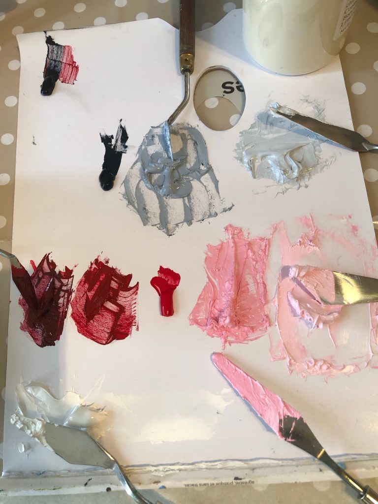
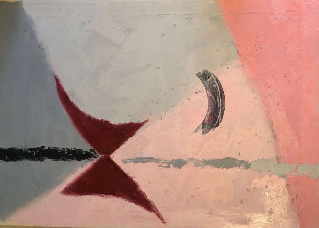
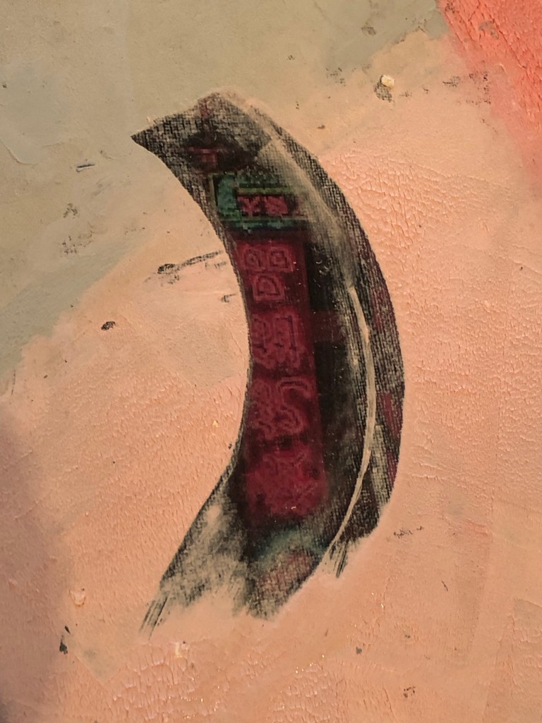
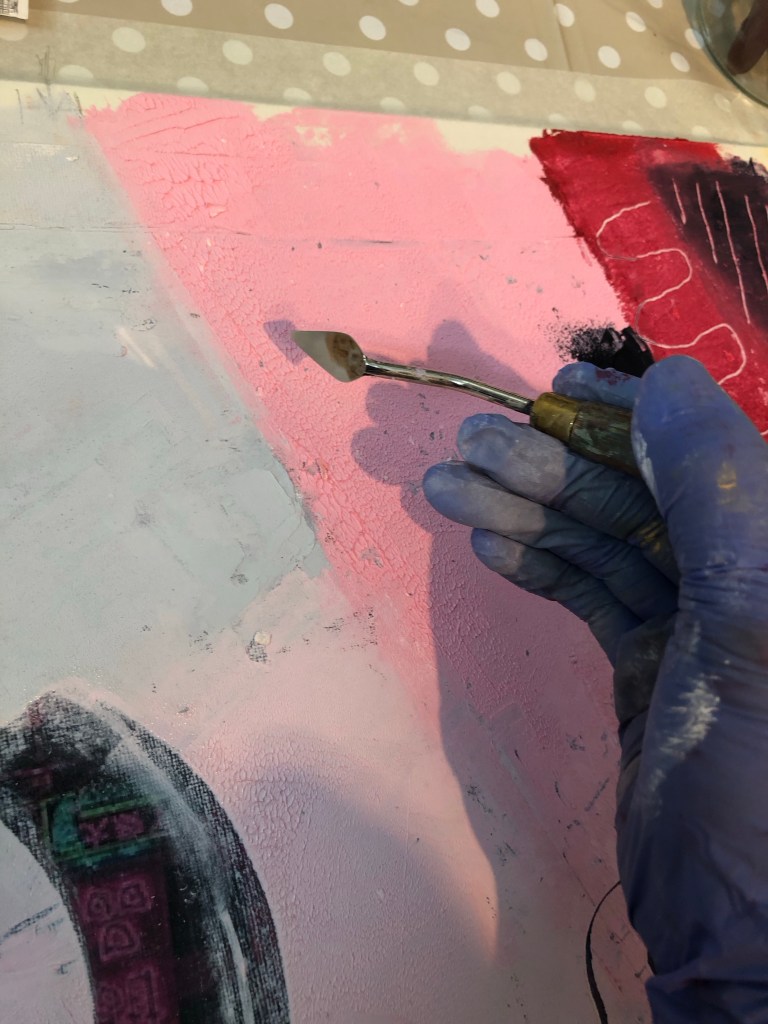
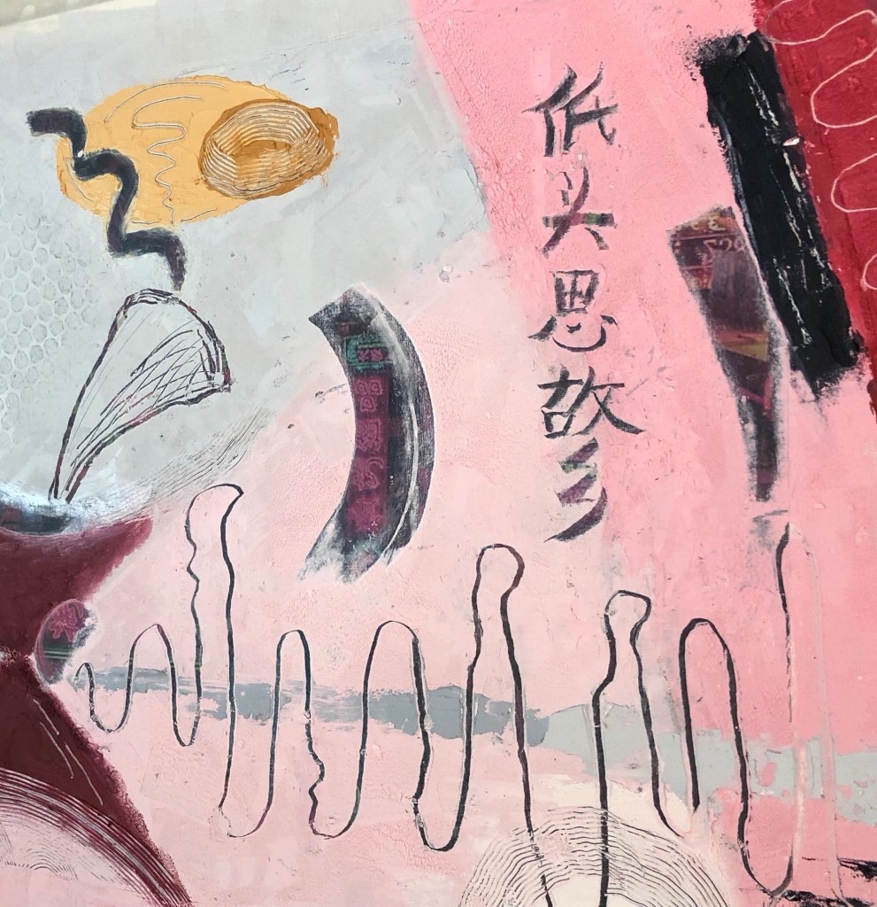
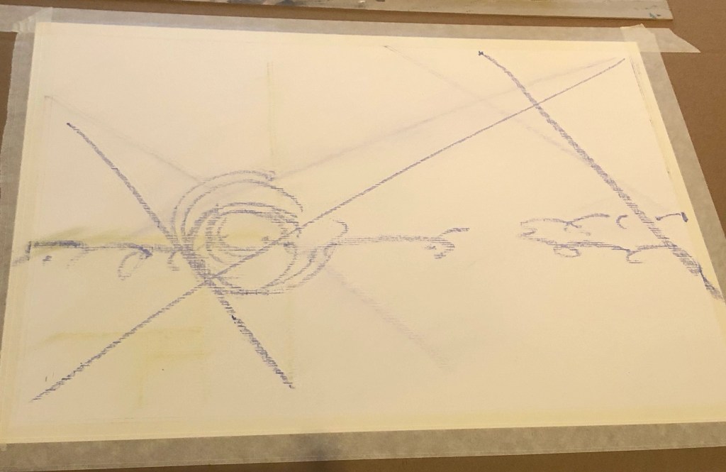
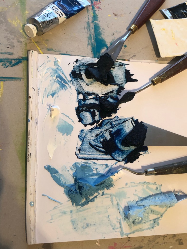
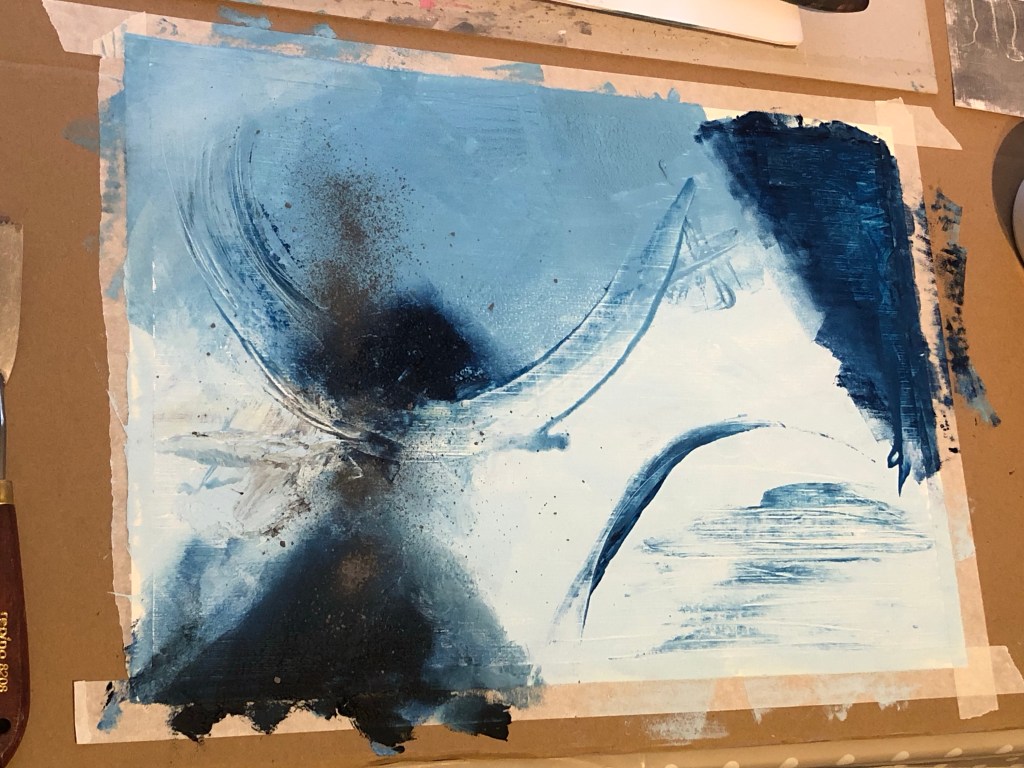
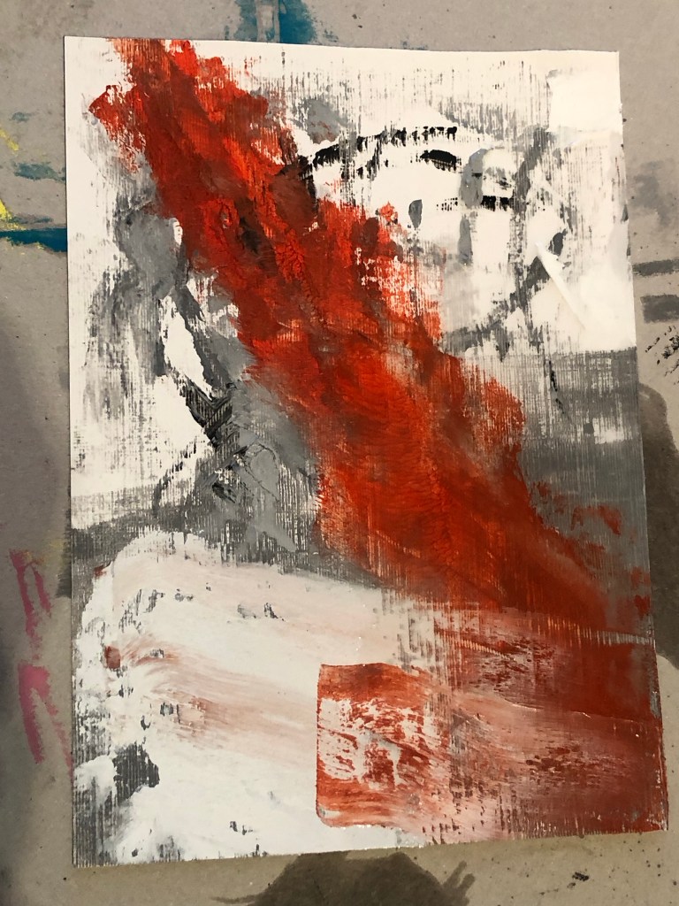
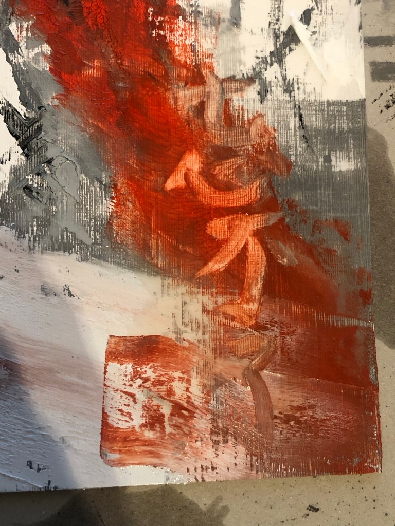
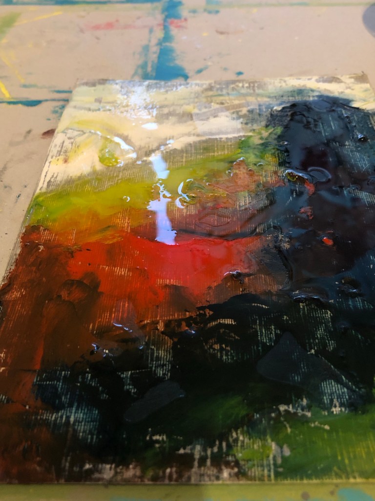
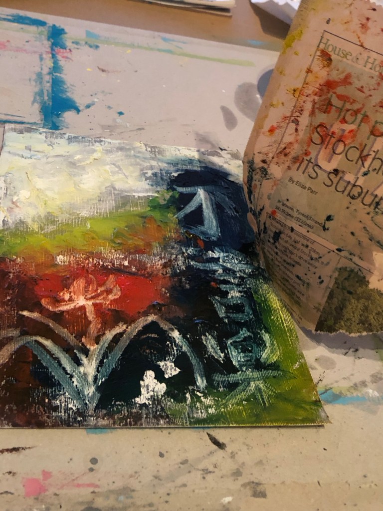
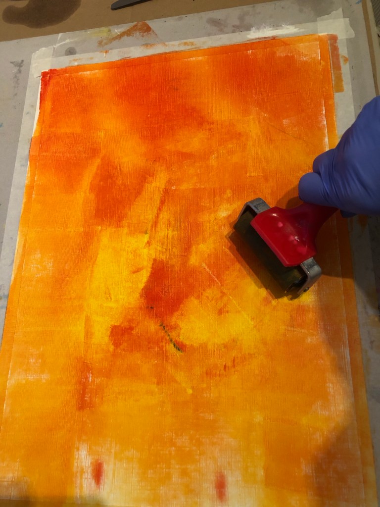
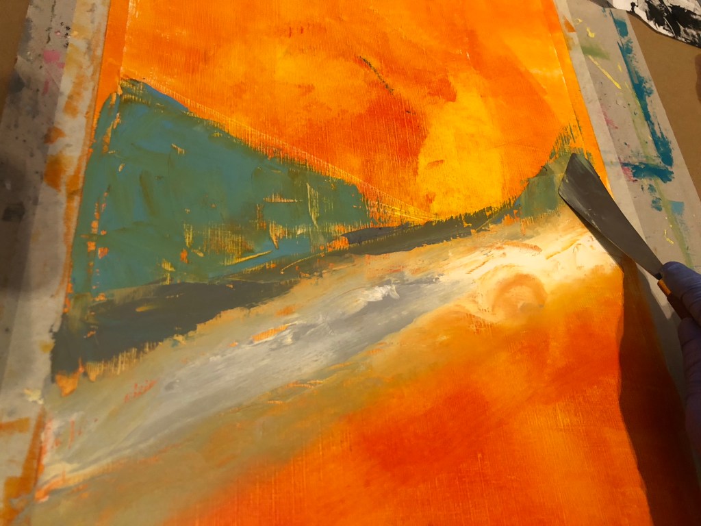
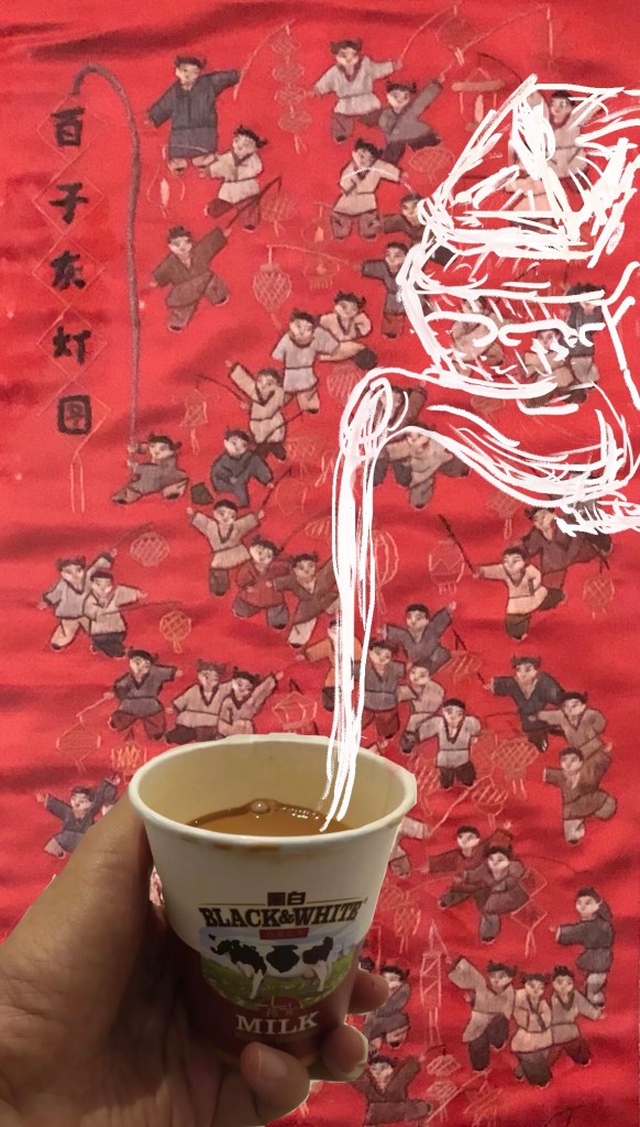
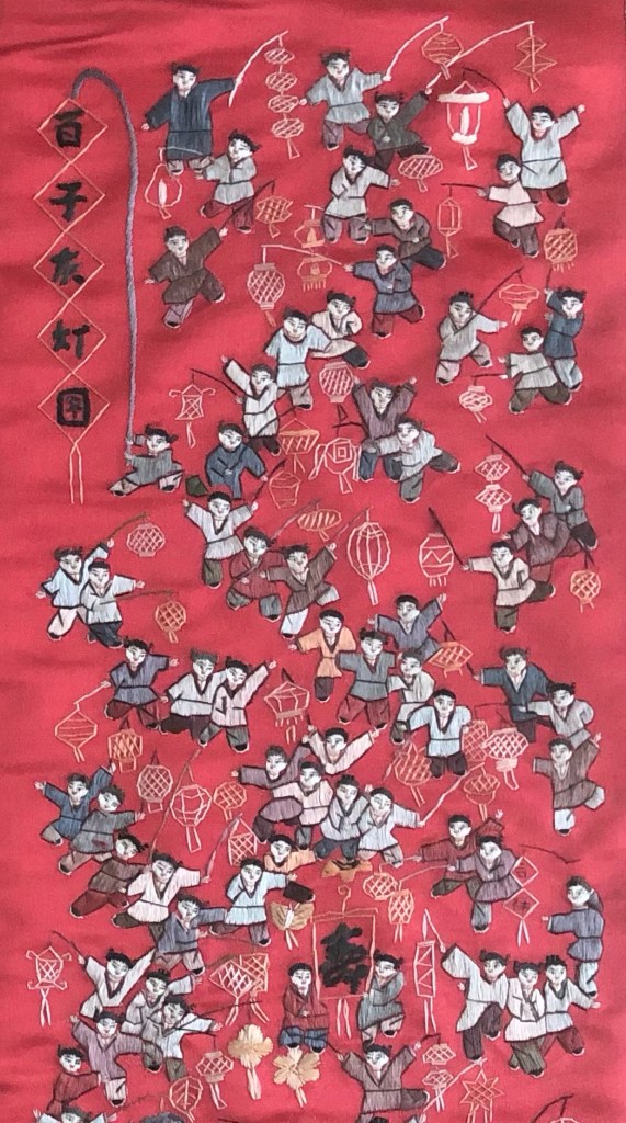
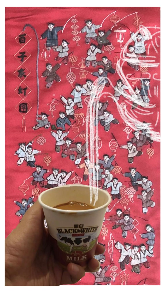
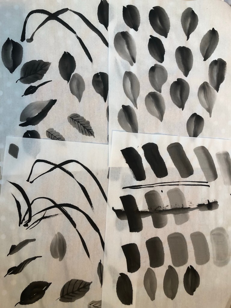
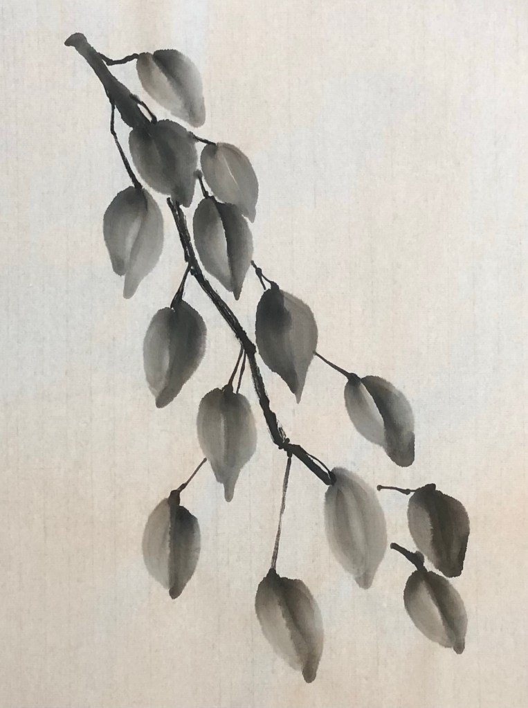
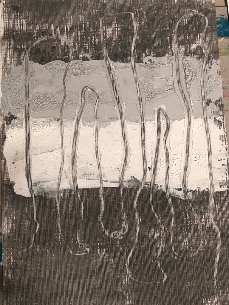
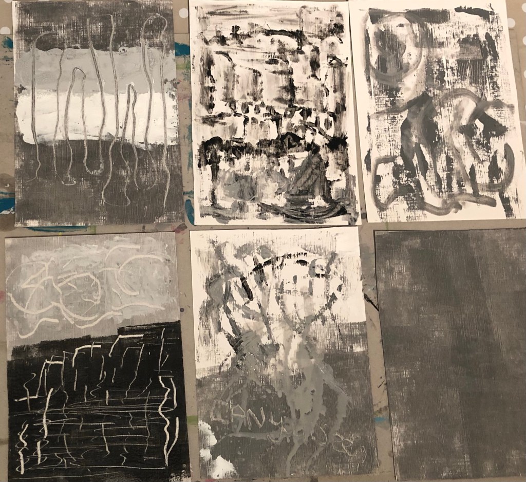
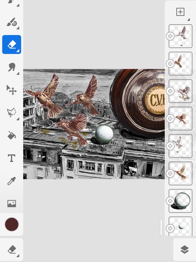
Adobe Fresco was used for this work. Below are images showing the layers that were created – some were imported images and others were painted or drawn using the software. The three little sparrows were metaphors for me and my siblings. There were always lots of small tree sparrows on our balcony when we were young and I like using that as a metaphor for me as a child in my narrative art work.

The base layer image was a scene I found online of the said bowling lawn dated back to WWII during the 1940s – the lawn in the image is mostly obscured by the Prison Officers’ Club house in the foreground. My father worked for the HK Crown Prison (Correctional) Service and the apartment block on the left was where we lived – it was called Block K. Out flat was on the middle floor on the left side of the block. Seeing the photo brought back so many memories of my childhood at Flat No. K3.

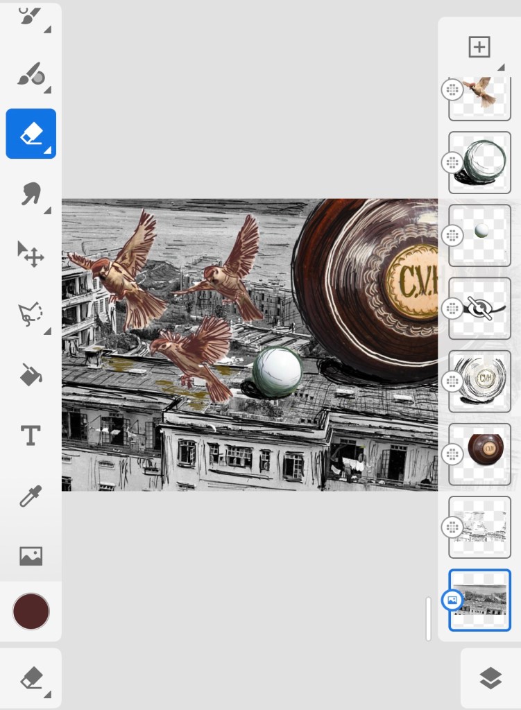
The base layer photo was found in this blog and the blog details some very interesting history about the area which was used as a POW camp during WWII and our Block K housed Dutch and Norwegian POWs.

http://battleforhongkong.blogspot.com/2016/12/december-2016-diary.html?m=1

REFLECTIONS

I have found Bhabha’s book, The Location of Culture, very insightful and I continue to enjoy using his theories to help me to make sense of my lived experiences as a transcultural person. This incident was an example of how this part of my learning worked.

I also enjoyed working with Adobe Fesco. I found the tool straight forward to use. I particularly like the fact that I can work on my phone on the go, then refine and build on my work when I’m at home with my Surface Pro. So I’ll continue to use Fesco as my go-to digital art tool.

Researching Bhabha’s theory of mimicry helped me to understand the incident and why my father was upset by what was a rather trivial act by his kids. A question I am asking myself is – how does doing narrative art work like this one help me? I do not have an answer yet but I want to note down this question as an ongoing enquiry.

LEARNING

Researching Bhabha’s work has inspired me to make work to develop my narrative. This is what I had hoped would happen so I’m happy with this progress and will continue this path of learning.

Adobe Fresco is a useful tool that I like, I should continue to explore its functionality.

I was unable to answer the question that I posed myself ‘How does my narrative work help me?’ – Why am I doing it? I need to give this more considered thoughts.

NEXT STEPS

– Keep going with research on The Location of Culture.

– Do another piece of work using Fresco, perhaps try the painting functions and not just drawing.

– Start to articulate my thoughts on how my narrative work helps me. I expect this to be a slow enquiry process…

UPDATE ON ENQUIRY

I have been thinking a lot about the above since posing those questions to myself ‘How does my narrative work help me?‘ and ‘Why am I doing it?’. In a recent Group Tutorial during our weekly MA online session, my group helped me to explore those questions. They also asked some additional useful questions, such as ‘Who am I doing it for?’ and ‘Has art ever solved any other problems for me?

Reflecting on the Group Tutorial, my latest thoughts are:

Firstly, ‘who am I doing it for?‘ My immediate answer was ‘for me, I am doing this for me’. 

Why am I doing it? My response was that the exploration helped me to understand more about myself, my behaviour and response to situations. 

How does my narrative work help me and has art ever solved any other problems for me? For this, my answer during the Group Tutorial was that art had never solved any problems for me but there have been cases where by exploring my narrative through my art practice, it had helped to crystalise or pinpoint a problem and brought better clarity. However, after the group discussion, I reflected further and felt that in fact on occasions, my art and practice research have helped me to find answers. Such as this case of the ‘bowling lawn incident’ – through my art making and research, I had a better insight into the colonial soft power structure that my father had to work in therefore giving me a better understanding of his environment and helped to explain some of his behaviour that impacted us all.  

Although I have made some progress, I am aware that these answers are still quite close to the surface and I want to take more time to continue this line of enquiry, hence it is still ongoing…

MA Y1 U1: Exploring media – Oil and cold wax – Part 5

BACKGROUND

Continuing from Part 4:

MA Y1 U1: Exploring oil and cold wax – Part 4

I watched the last session of the online course with St Ives Painting School on exploring oil and cold wax which was useful in giving me more ideas to try. I want to then respond to the ‘next steps’ from Part 4 in this research experiment.

Finished work:

METHOD

An A2 sized inkjet printed poster of a night time neon street signs scene of Hong Kong was chosen as the background of the piece. Dispersion liquid was used to transfer the image onto an A1 primed board canvas.

As the piece dried, I could see the canvas board was warped by the process – something to note.

Below is the transferred image. I turned it upside down because I wanted a specific sign to appear at the point shown by the yellow arrow indicated:

Axes were drawn in chalk to mark out the approximate plan for the composition. Also, some pencil marks were made on the edge of the canvas to indicate where a few of the specific neon signs were located that I planned to reveal later.

To complement the pink and dark colours of the background, I chose to use shades of grey and pink for the paint and cold wax coverage for the piece. So a palette of the different shades were mixed starting with red, black and white.

Since this was a practice research experiment on semi-abstraction with oil and cold wax, I started with various abstract shapes in the chosen colour palette. Then after using solvent to soften an area of paint and wax, I scraped off an area to reveal a specific neon sign according to the position marking that were made earlier:

Various tools were used to scrap off paint as mark making. Also, using a small palette knife with a pointed end, Chinese calligraphy characters (last line of a famous ancient Chinese poem) were scraped into the work – this was an experiment to simulate a Chinese paint brush using a pointed palette knife:

Various tools were used to add more marks. Shapes of the Bristol Harbour Horn Bridge were put in because I liked the effect from a previous experiment. Pigment powder were scraped from a pigment bar to create a dusting effect. More areas of paint were removed to reveal the neon signs underneath – the later ones were just scraped off with a card or palette knife without the need for solvent which was unnecessary. Other lines from the ancient Chinese poem were written in Chinese ink on Xuen (rice) paper, then cut out and pressed onto the paint and cold wax on various areas of the painting.

Finished work: Size A1, mixed media.

REFLECTIONS

I enjoyed the experiment and it was very helpful. Below are what I was and was not happy with.

I was happy with:

-The discovery that using Xuan paper to add Chinese brush painting or calligraphy worked very well. This is because the thinness of the Xuan paper was almost transparent when pressed onto the oil paint, so that it almost appears as though the calligraphy was on the oil surface. I would like to find more robust yet thinner materials (maybe silk or other paper of some kind) for this technique because the Xuan paper is delicate and could be prone to damage in the process. Since the paper is still partially visible and the temptation is to keep burying it into the paint and therefore risk damage. Hence an even thinner but more robust material would be better.

-Using the small palette knife to simulate a Chinese paint brush was successful but the effect is not as authentic as using the Xuan paper. However, I can see that the palette knife technique has its place if a semi-authentic effect was needed.

-Scarping the paint and wax off to reveal the background image worked well and the position markings on the side of the canvas were essential.

-I felt confident in manipulating the paint and cold wax materials, both in applying and mark making using tools. I continue to enjoy using these materials and can see more potential.

-The pigment powder sprinkling method worked well.

I was not happy with:

-The overall painting – I do not like it. 

-There are too many neatly laid out symbols, hence it feels twee. I need to be more gestural in the mark making if I want to use abstraction as a form of expression. This requires more experimentation.

-The pink and grey palette added to the tweeness. So not satisfied with that.

-The vibrant neon-signed background did not get exposed sufficiently hence losing the energy that I wanted to bring into the piece with that image. Scraping small areas to reveal the symbols worked technically, but I feel larger areas needed to be revealed to make the background a true part of the painting.

LEARNING

-Out of all the different experiments carried out in this practice-based research series of work to incorporate Chinese brush art into oil paint, I believe this (using Xuan paper) was the most successful and I was happy with the outcome. So I will explore using a collage technique rather than brush paint ink onto oil. The next step will be to find the optimum material which would perform even better than Xuan paper. Ideally to find a selection of materials so I have some options to choose from.

-Oil paint and cold wax are still materials that I want to explore further for developing my style because I feel it provides a good based for semi-abstraction work that I want to explore. I can make abstract gestural and textural marks as well as use tools to depict symbols. Also it forms a good base for any collage work.

-Expose larger areas of the background image if the background is meant to be a key part of the work.

-One area that I have not experimented with yet is to spray paint onto oil and cold wax to see how that performs. I want to have the option to add street art onto my work.

NEXT STEPS

-Try out more Chinese brush paint collage onto oil and cold wax to refine this part of the process.

-Try exposing a larger area of the background image to see if that can work with the abstraction approach on the top layer. Experiment to find the right balance between revealing the base layer image without losing the sense of abstraction on the top layer.

-Try spray painting on top of the oil and cold wax surface – try when wet and then when dried.

ADDITIONAL EXPERIMENT

After the painting has dried, I spray painted the phrase ‘#3RD SPACE’ using a stencil onto the dried oil paint and cold wax. It worked well and I’m pleased that spray paint is an additional material that I can use here.

MA Y1 U1: Exploring media – Oil and cold wax – Part 4

BACKGROUND

To improve my understanding of the oil and cold wax media, I started watching an online course by St Ives Painting School to learn techniques of painting with this chosen media. This is Part 4 of the series of material and media exploration. These experimental paintings were made with techniques that I learnt from the course, then adding other materials that I wanted to experiment with as I went along. Below is my favourite out of the work made during this part of the exploration.

The Horn Bridge, Bristol

METHOD

Experiment 1

Basic composition was drawn out taking ideas from a list of compositions shared on the online course.

Shades of Prussian blue was mixed with cold wax:

Abstraction approach was used for the painting:

A sharp scraping tool used for clay was used to scratch The Horn Bridge image:

Experiment 2

Experimenting with solvent on the oil and cold wax to loosen the paint then used a paint brush to do Chinese calligraphy so see if this effect would work to incorporate Chinese brush painting into the oil and cold wax medium:

Another experiment of using even more solvent to loosen the oil and cold wax to test the effect of Chinese brush art:

Using newspaper ‘tonking’ method to lift the excess paint off the canvas which is a process that I have always found to be effective:

Experiment 3

Applied oil and cold wax, then painted and scraped scenes of Bristol, my home town.

REFLECTIONS

I enjoyed the experiments. I don’t think the solvent method to loosen the paint for Chinese brush art worked very well, although one could see the Chinese calligraphy characters clearly, it was coarse and I was not satisfied with the result. So this part needs further experimentation.

I was very happy with the Prussian blue Horn Bridge painting – I believe that was the best one out of this batch of work. I liked the simplicity of the colour palette and the confident and defined lines depicting the bridge.

I was not satisfied at all with the last painting in Experiment 3 because there was too much going on and the images were too representational. It lacked the ‘edge’ and refinement of the abstraction as in the Prussian blue Horn Bridge painting.

Overall I enjoyed the exploration and felt that there is plenty to take forward to the next experiment.

LEARNING

– Need to try something different to incorporate the Chinese brush art into the oil based media. Using solvent here didn’t work satisfactorily.

– Abstraction or to be more precise, semi-abstraction with symbols, is a style that I want to explore more of because the abstraction part enables me to be more free in my gestural expression and the symbols help me to tell stories and communicate my narrative.

NEXT STEPS

– Watch the last part of the online session.

– Explore other ways to incorporate Chinese brush art into oil based media such as oil and cold wax which I enjoy working with.

– Continue to experiment with semi-abstraction with symbols.

MA Y1 U1: Developing narrative – Memory, children’s tapestry, tea and digital collage

BACKGROUND

In parallel to the work on developing my style, I work on my memory to help develop my narrative such as remembering and researching stories from my childhood. Work in this area often stems from triggers – it could be encounters that remind me of something from the past or thoughts that suddenly come to me. This blog captures a piece of work that I have done as a result of seeing an Instagram post by my brother. He was holding a cup of tea and seeing his hand reminded me of our time together as children. Sadly, we haven’t see each other for many years as we live in different countries. Despite that, I remember clearly the details of his slim artist’s hand, the shape of his finger nails etc.. Seeing his post brought back many memories.

Another purpose for this piece was to experiment with digital drawing tools. During a recent discussion with my fellow MA students, they were discussing the pros and cons of Procreate vs Adobe Photoshop. I have tried Procreate in a limited way some time ago and the discussion ignited my interest to try those tools again.

FINISHED WORK

METHOD

I wanted a vibrant image to use as background on the digital canvas for this piece. I have at my home a piece of Chinese tapestry that my brother gave me many years ago. It’s framed and hangs in my lounge. I took a photo of it and decided to use that as the background.

Background tapestry image

This is the image cut from my brother’s Instagram post with him holding a cup of tea that was a free giveaway from a shop and the was in the comment of his post.

I wanted to make a composite where there’s a tea pot topping up his cup of tea because if I were there then I would pour him a cup of tea.

First attempt using Procreate. The tea pot was too flat so I wasn’t happy with this:

Second attempt with Procreate with a better angle for the teapot for pouring:

I was not happy with the background image so took another photo with the tapestry in day light. I was happier with this image:

Since I purchased the Adobe Suite using my student discount from UAL, I tried for the first time using Adobe Fresco. Below was the first attempt, I wasn’t happy with the lightness of the brush stroke using ‘charcoal’ as the medium:

I played with the different setting for the brush selected and I was happy with this final version:

Finished work

REFLECTIONS

Out of the two digital tools I used, I was fairly happy with Procreate and I would still be happy to use it on the go, on my iPhone or iPad. However, I really like Adobe Fresco and prefer that as a digital painting tool. I like Fresco because I use it on my MS Surface Pro with a MS stylus and the response and control of that combination is excellent. The software is very flexible and intuitive to use. Procreate is even easier to use, but I feel even the Apple stylus (I borrowed one to try) didn’t give the control that the MS Stylus achieved for me. Also, since I do not own an Apple stylus, I am very happy to stay with my MS set up. I want to experiment a lot more with the tool in order to be competent with it.

I struggled to reflect on my feelings about this piece. I didn’t think too much while making the piece because my focus was on mastering the new digital tools. However, writing this blog has been a challenge for me because of the feeling of nostalgia and the sense of lost time. It took me several attempts to get this far in writing and I don’t think I’m ready to examine that too deeply yet. I hope I’ll be able to do that over time and I hope my art practice can help me with that journey of rediscovery.

LEARNING

The technical learning was about comparing the two digital drawing tools. I preferred Adobe Fresco and will continue to experiment. I plan to do a more ambitious piece of digital art next.

I have a long way to go in delving into my memory to develop my narrative. There is a lot of content buried and I will slowly dig through like an archaeologist – this was discussed with my tutor at the recent tutorial.

NEXT STEPS

As an immediate next step, I want to create another digital painting using Adobe Fresco on my MS Surface Pro with the MS Stylus.

MA Y1 U1: Gallery visit – JD Malat, London

EXPERIENCE

This was an impromptu visit as I walked past the gallery. I have previously looked at their exhibitions online because I was researching the work of an artist that they represent – Kojo Marfo, a Ghanaian artist who is now working in London. So I went in to have a look when I came walked past them by chance.

I only spent a short time there so I’ll capture some quick notes here on works that caught my attention and I’ll state the reasons for my interest.

Title of exhibition

Thoughts: I often use animal or bird faces on the characters that I depict in order to anonymise the story and not make them too personal. I really like the way this artist blanked the face, I think it’s a possible way for me to achieve the anonymity that I was looking for in my story telling. So I’ll consider this approach.

Thoughts: This was a close to photo realistic painting of a sculpture. I thought it was a digital image to start with then I saw that it was an oil painting on canvas. What I liked is the idea of making a sculpture or 3D work then making a painting of that. Something to bear in mind as an idea.

Thoughts: I liked the semi-abstract nature of this painting. There is chaos on the canvas but it’s also very well thought through. I want to make semi-abstract work but not in this way, nonetheless, this was an interesting example for me to ponder over.

There were two Kojo Marfo paintings, both large scale oil on canvas – sizes were not specified for one of them:

Estimated size 2m x 2m

Thoughts: I once did some research on this artist as part of an essay about transcultural artists. I like his use of colour, intrigue and the way he expresses his transculturalism and uses symbols in his work. Although it’s not the kind of work that I want to make, I have been inspired by his use of symbols and have at times incorporated that into my work.

Thoughts: Out of all the works in the gallery, I was most inspired by this one. It reminded me of once seeing a video of a Chinese artist using a very large paintbrush (the size of a floor mop) and painting on the floor in black in a highly charged way. Seeing this painting reminded me of that and I want to experiment with painting in that way.

Next steps: I’ll research what can be used as an extra large paint brush and what ink or paint I would use. Then I would either use a plain background or a digitally printed canvas with a digital collage and then use the large brush to do Chinese calligraphy on the the canvas, with just one or two large characters.

Chinese painting: Poinsettia and Sumi-e

EXPERIENCE – PART 1

I attend a Chinese painting class once a month. This month being December, the topic was Poinsettia. See below images. They were copied from worksheets. These are skills practice exercises so I will only do a brief reflection.

REFLECTIONS – PART 1

I have enjoyed these work sheets more than the owls from the month before because I found it easier to be free with my paint application with this topic. I think it’s because I feel more confident with the subject. So this is good learning for me, that when I do abstraction work, I do better when I feel confident. When I am hesitant then brush strokes seem too deliberate and also prone to becoming too illustrative.

EXPERIENCE – PART 2

Introduction to Sumi-e painting

I was introduced to a new topic, Sumi-e painting, which will last the next few months. Sumi-e (水墨 water ink) painting is painting with ink and water and focuses on the simplicity of form. For this first brief introduction, the tutor asked us to practice mixing five shades using only black ink and water. Then we practiced doing different types of leaves.

I picked out one type of leaves and made a painting using only that type as practice. Below is my first Sumi-e painting.

REFLECTIONS – PART 2

Sumi-e is very challenging! It will take a lot of practice to get to know the materials – the simplicity of materials makes it hard. Just water, ink and the performance of the brush and paper used all come into play. I have always found Chinese brush painting very unforgiving, it is not easy and most of the time not possible to correct any mistakes – in that sense, it is more like water colour than oil or acrylic (that I am used to) where mistakes can be rectified quite easily. Sumi-e’s unforgiving-ness is at an even higher level. I can imagine practicing for a long time and still not perfecting that leave that I have tried to paint.  

I enjoy this challenge and I would love to be competent at Sumi-e because I like a good challenge; its simplicity of form and potential for semi-abstraction is what I find appealing. I am looking forward to continuing my learning of Sumi-e painting.

MA Y1 U1: Exhibition visit – Ofelia Rodríguez, Spike Island

EXPERIENCE

I visited Ofelia Rodriguez’s exhibition Talking in Dreams at Spike Island, Bristol. Below is a video summary of the visit compiled using the iMotion App. I learnt to use this app at a CSM online workshop and I wanted to experiment summarising a gallery or exhibition visit in this way:

REFLECTIONS

– Rodriguez’s work has really inspired me because I can relate to her work as someone who makes art about her homeland while living far away. In particular, I like her work with the bright colours and her chosen palette gave me a sense of the place she was describing. I feel I should explore a colour palette that describes my childhood home city of Hong Kong, this might help me when I am stuck on ideas about work to make.

– I was also inspired by the textiles used and the stitching in her work. Stitching into my paintings is not something that I have considered before but I have often thought about using fabric in my work. So this is an area that I will explore.

– Another thought arising from the above point… I have in the past made expanded paintings where I had eradicated the traditional canvas. I could make paint-based fabric to incorporate into my work.

– Rodriguez used a lot of found objects in her work which is fascinating to look at. However, right now, it is not an area that I am interested in because I already have several strands of enquiries going on and I feel I should make some progress before adding more variables. But I wouldn’t rule it out and I may come back to this at a later stage.

LEARNING

– Technically, I am happy with using iMotion in this way because in the past I often ended up uploading many photos from a show making the blog unnecessarily long. So I’m happy with this new discovery. Things to remember are to export the file as a GIF from iMotion to my Photos app to minimise file size and to upload the GIF to WordPress as an image and not a video. Also to give it time to upload.

– Other learning have been captured above under reflections.

MA Y1 U1: Progress update – ongoing MindMap

I created a MindMap at the start of the course to chart the topics that I have been working on and intended to work on. I plan to periodically update the MindMap and this is a blog to quickly capture my progress over time. I expect the map to expand or change as my practice and research grow. I am mindful not to let such a structure confine my practice development – this point was discussed with my tutor at the first tutorial.

My reason for creating the map in the first place was to examine the central purpose of my practice. Then to ensure that all the topics I am working on do contribute towards the central purpose, rather than going off in random tangents. This is important to me because of who I am; I like to freely explore but I need to have an underlying structure that I can come back to and not feel too lost in wandering.

The maps are shown in reverse chronological order.

Date updated: 11th December 2023 (End of first term)

REFLECTION:

I feel that The Third Space is still valid as the central purpose of my practice and I will continue in that direction. I have updated the map with the colour code – some items have gone to yellow and some turned green which was reassuring to know that I have worked on what I had set out to focus on. I have also added some new sub-branches which are expansions of existing topics. The only new branch was ‘Research and study tools’ – an area that I was not expecting but I am very pleased that through the MA course, I am learning about new tools that will help me to organise my research work. Since I have previously mainly used Microsoft Office products, this new knowledge and area of learning are completely new to me hence I felt I should capture them as a new area on the map.

Date created: 23rd October 2023 (Soon after start of Unit 1)

RELATED BLOG

The blog below is a time and activity analysis detailing the time spent on various aspects of my practice development on an ongoing basis:

MA Y1 U1: Time and activity analysis – ongoing log

NOTE

The time and activity analyses show what I have been spending my time on and the MindMaps show where I am working on in my practice map.

MA Y1 U1: Exploring media – Oil and cold wax – Part 3

BACKGROUND

This is Part 3 of my blog series on exploring oil and cold wax. I’m exploring this combination of medium because I have always liked the effect this combination produces and I want to explore building it into my practice. Through this exploration, I want to find ways to examine my third space from my subconscious through abstraction.

METHOD

Despite doing various practical experiments as well as online research about working with oil and cold wax. I reached a stage where I was looking for some more formal guidance. So I attended a series of online webinars ran by St Ives School of Painting.

Session 1 was mainly to experiment with making marks with different tools using a limited palette of black, white and greys.

I made six small paintings and below is my favourite:

Paint palette with 50:50 mix of oil and cold wax:

I tried various tools such as palette knifes and pointed scrapers. The new ones for me were the tools typically used for scraping clay for ceramic work – they proved to be very effective at scraping oil and wax mix as one would expect.

The six images created during the session:

REFLECTIONS

I have enjoyed the session and I was pleased with what I have done so far. Nothing is really new but taking time to just focus on mark making with the medium was good ‘returning to basic’ work that I needed here. It gave me an opportunity to reset my thinking and to give myself time. Rather than feeling I had to produce a finished piece of work because I should be beyond the basics, it was good to just explore without giving myself pressure which was what I wanted to do.

Also, in the past, when I had wanted to experiment with oil and cold wax, I was advised against it by a previous painting tutor because it would change or flatten the oil paint luminosity. Then recently at a group crit when I was asked why I wanted to use oil and cold wax, I couldn’t really come up with a reason apart from ‘I like it; I like the texture and the effect it create’ which seemed inadequate. So I felt I couldn’t justify using the combined medium. But there’s something about it that kept drawing me back so right now I feel very excited that I’m continuing with the exploration and I am doing the webinars.

LEARNING

The technical learning so far is limited after just one session, I plan to expand on this after I have done more of the course.

From a personal learning perspective – I am just excited that I am doing this despite earlier discouragement and I no longer feel the need to justify it. I feel excited that this could be a way for me to use abstraction to express my transculturalism because of the layering and scraping then revealing nature of the medium – it appears I have just justified using this combined medium!

NEXT STEPS

Attend session 2 of the webinar series.