MA U3: ‘News’ – investigation into making newspaper archival and presenting the work

‘News’ in Chinese ink painted with chicken feather brush

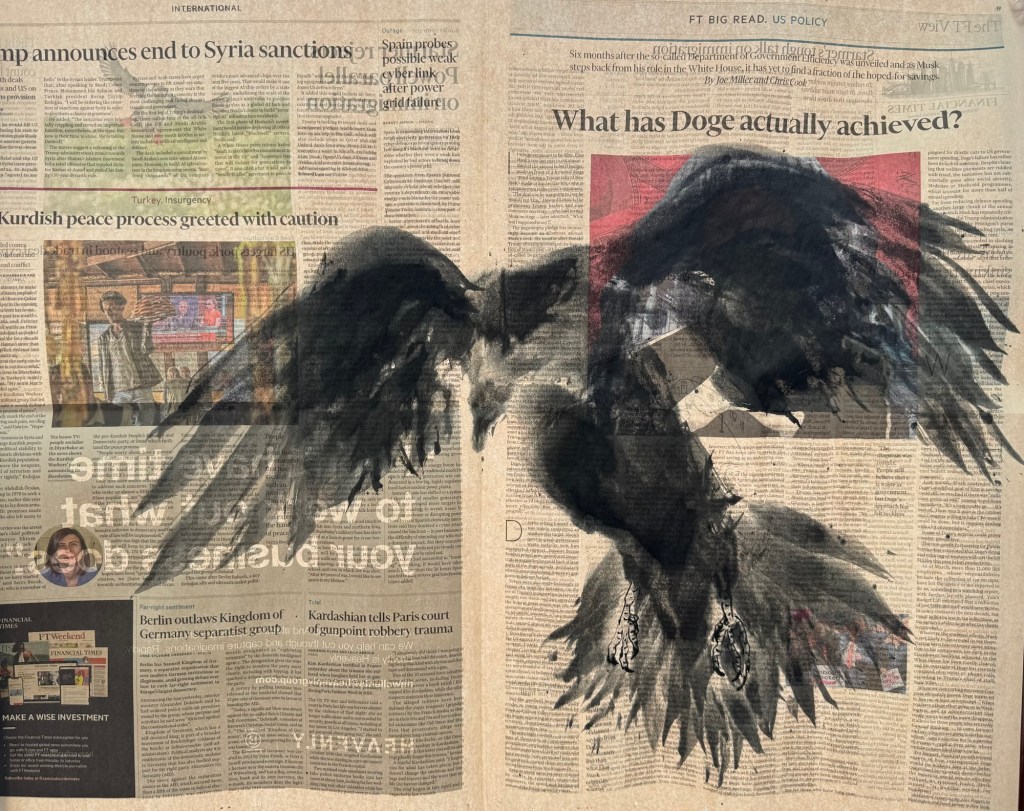
As I am making more and more paintings on The FT, I want to consider more carefully how to display the work and also making the newspaper art archival.

METHOD

1- Online research

I have been researching online for ideas. There have been all kinds of suggestions. I find this post useful as there are different suggestions to try.

https://www.wetcanvas.com/forums/topic/preserving-newsprint-is-it-possible/

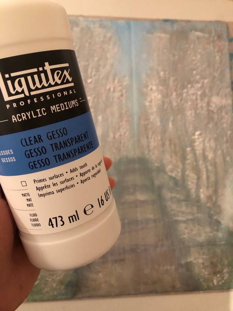
One person suggested this product, maybe worth investigating:

https://www.krylon.com/en/products/clear-coatings/crystal-clear-acrylic-coating#accordion-f0f399f26d-item-2a5184aed3

However, none of the suggested solutions are truly archival due to the nature of the newspaper material. One of the comments said that newspapers were a museum curator’s nightmare. I think that sums it up. The only suggestion that is truly archival is to make digital images and gyclee prints. That is something that I will consider.

2- Ask an expert

Another investigation route that I pursued was to ask a paper conservation specialist at UAL. His reply was as follows:

“Newsprint is made using mechanical wood pulp for the paper fibres.  These are naturally rich in a chemical called lignin.

Lignin is not particularly stable.  It breaks down with time with 2 effects:

  • Some breakdown products are strongly coloured, making the newsprint go increasingly yellow and eventually brown.
  • Some breakdown products are acidic, leading to the paper becoming increasingly fragile over time.

This breakdown will still happen in dark conditions, but the energy from light makes the breakdown progress much more quickly.  Ultraviolet has more energy than visible light, so can do damage more quickly.

It’s not possible to make newsprint archival. 

UV-proof glazing would be beneficial if the paper is to be displayed in a window where it’s subject to sunlight. 

If the artwork is illuminated using artificial light, UV exposure will be less.  Fluorescent lights and halogen spot lights emit some UV.  LED lights typically emit no UV.

Most acrylics will filter out some UV due to being made with UV-stabilisers to help make the acrylic last longer.  

Last time I checked (which was ages ago…) framers quality UV-filtering acrylics and glasses were similar in price.

For storage, I’d recommend keeping the papers between unbuffered, acid-free boards.  Many archival boards are calcium carbonate buffered, which helps neutralise the acids created as lignin breaks down, but alkaline conditions can also increase the yellowing of lignin (through a different mechanism than the breakdown route).

Sandwiching newsprint between glass/plastic offers some benefits in isolating the paper from various environmental effects, but might also lead to a surrounding microclimate rich in acidic breakdown products.”

– End of expert’s reply –

This was a very helpful reply and the sentence that I highlighted in bold again confirms that there is no way of making newspaper archival which is a pity.

REFLECTIONS

After doing this research, I have to accept that it is not possible to make newspaper archival. I feel rather sad about that and the engineer in me thinks ‘there must be a way, it just has not been found yet!’ However, I need to employ a solution now to manage or show the work that I have been creating while continuing to find a long term solution which may or may not be possible. If museums around the world have not found a solution then maybe I won’t be able to either – not in the short to medium term anyway.

Making digital images and then gyclee prints is a very good and viable solution. I will definitely pursue that and learn how to photograph my News paintings properly. As a start, I will need a light box frame that I can wall mount.

I have also considered sandwiching the News paintings between UV proof acrylic panels and mounting it away from the wall with spacers to let light in from behind – this solution also requires further experimentation.

The above are ways to present the paintings for photographing. Once I have found a way of photographing the work then I can consider making limited edition gyclee prints from them.

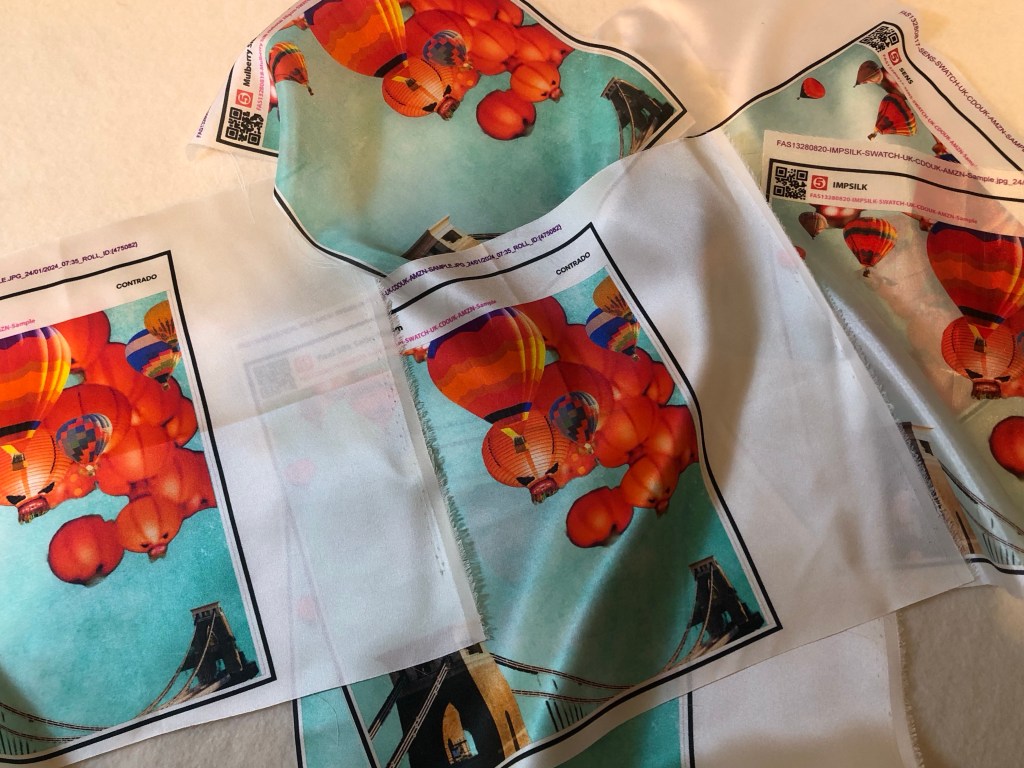
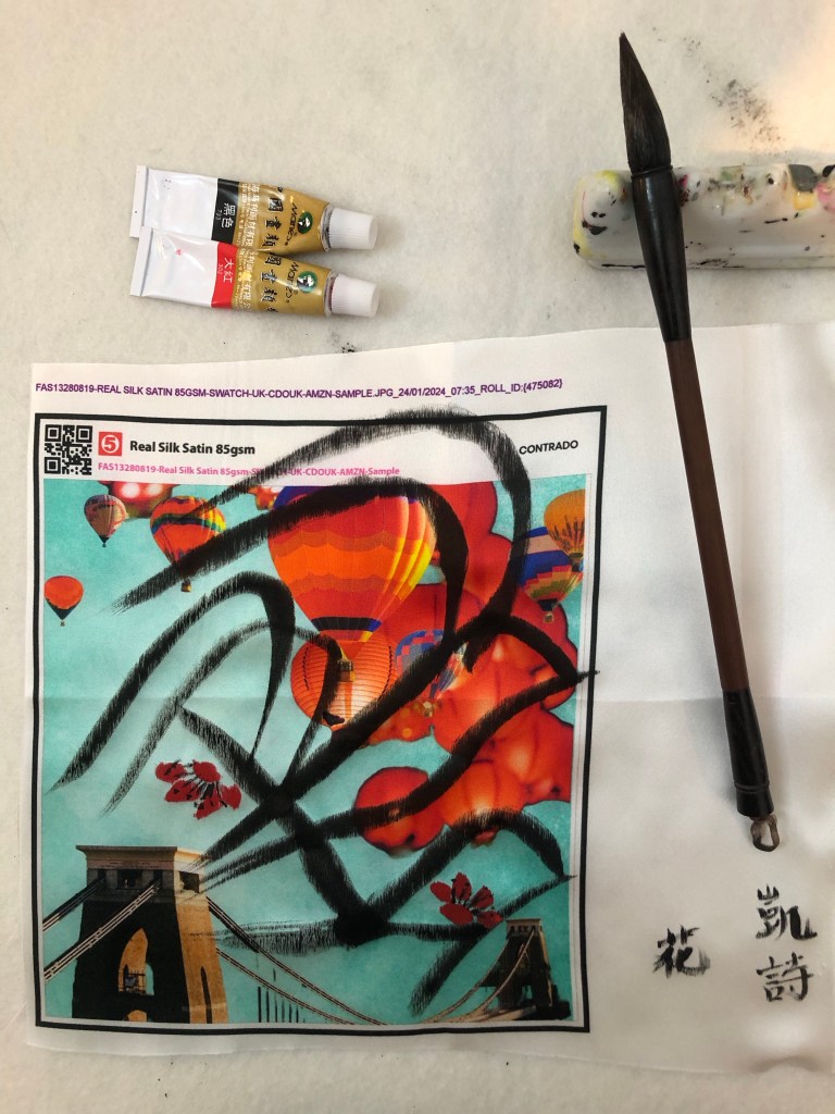
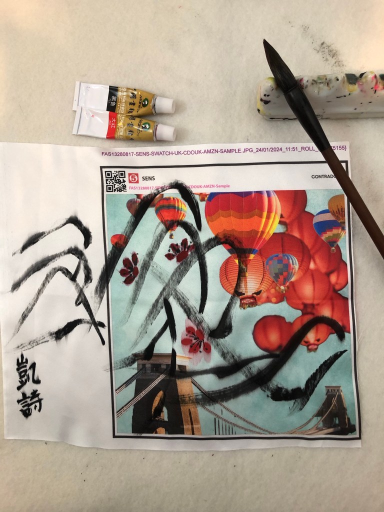
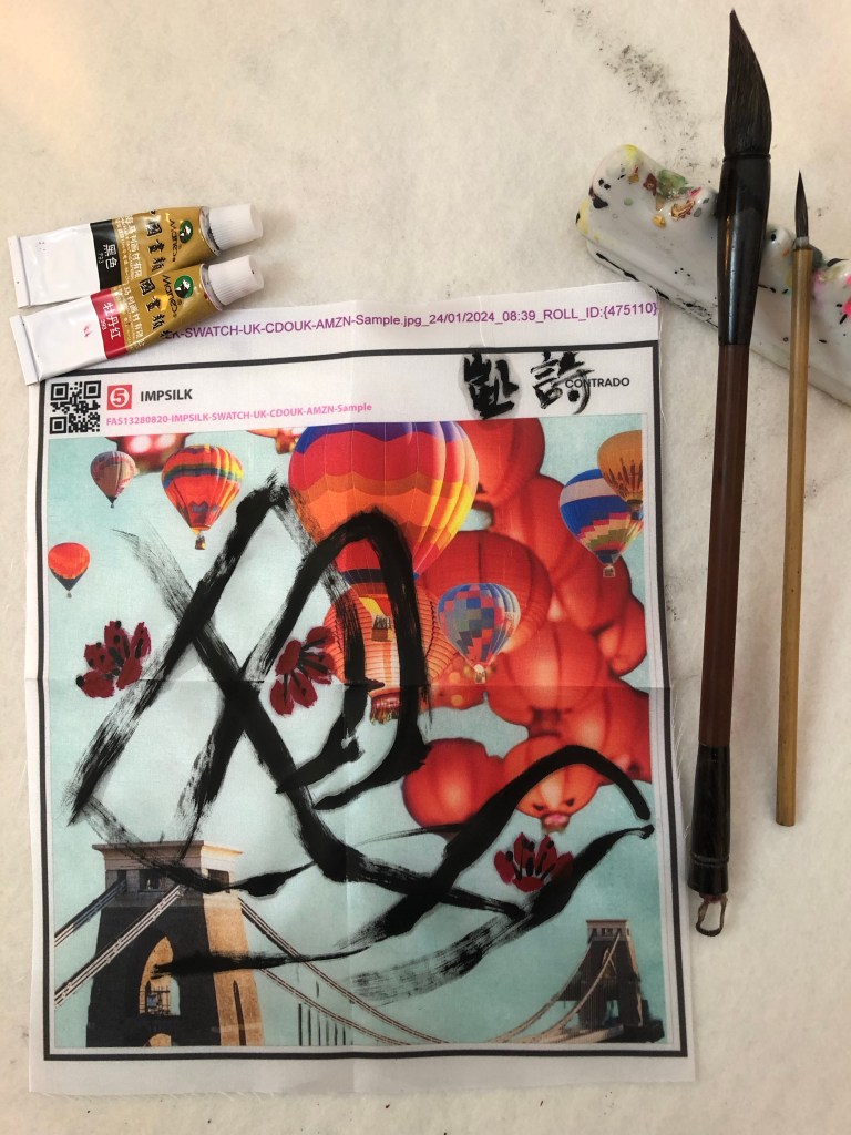
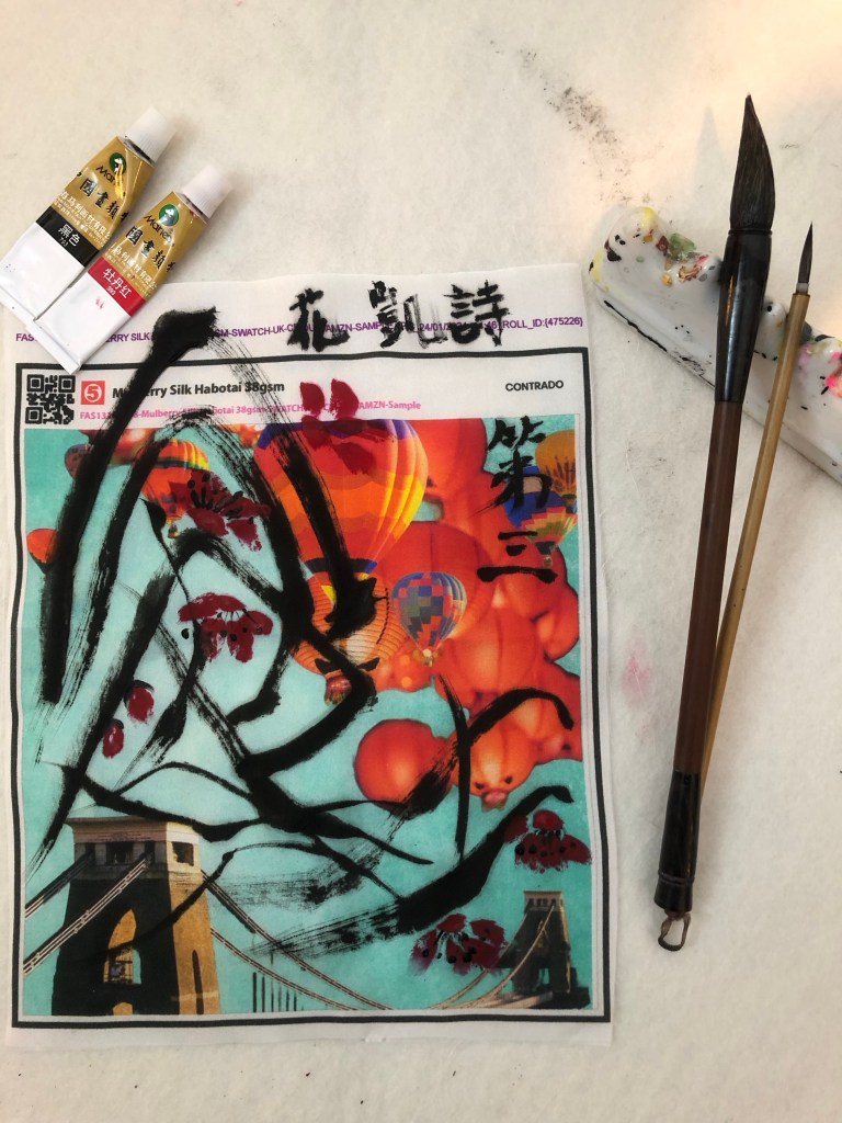
Other ideas that I have had are photographing the news page, then printing it on silk or other thin fabric, then painting or embroidering on the image.

LEARNING

The main learning was that there was no known way of making newspaper archival. I have to accept that and consider how to find ways to capture the image and reproduce in archival materials. Also, if I were to sell the original work on newspaper then what advice should accompany the sale? How should it be framed, mounted and what life time is to be expected? Perhaps letting the News painting degrade over time is one of its unique feature? As long as it can stay safely in a frame then what harm is there? It will go yellow or brown over time – perhaps that adds value like a vintage bottle of wine or whisky!

The key is to have clarity of how to manage the life of the paintings and offer archival alternatives to the originals. Not that I am planning to sell my work at the moment, but if someone were to enquire then I need to have prepared a professional response.

NEXT STEPS

Immediately:

Investigate ways to mount the prints for displaying and photographing. E.g. light box frames or ‘acrylic sandwich’ mounted on spacers.

Investigate ways to take good quality digital photographs of the mounted work.

Investigate ways to make archival gyclee prints of the photographs – what method of printing and what paper would be best? Best options for framing?

Consider what advice to give with any original art work – recommended ways to mount and likely life before degrading occurs. Think of ways to articulate the value of a degrading or degraded piece of News art. i.e. make the non-archival nature of the art a feature of the work.

Longer term:

Investigate options to print on fabric then paint on the fabric or embroider to create original art. Or print painted News images on silk as an alternative to paper – need to think why use silk or fabric though.

MA U3: ‘News’ art – Why The FT? Is it the right choice?

BACKGROUND

One of the key learning from my MA is to think carefully about our choice of materials and the content of our work. Especially if it is to be exhibited in public. We need to be sensitive to the audience and have reasons for the choices that we have made in our making. When I first started thinking about making work on newspapers, an important decision was which newspaper or newspapers to use. I have become very disillusioned with the news media in recent years so it was hard to choose. I have had a long relationship with The Financial Times (FT) because I always felt it was more balanced and factual than most media channels – it’s one of a few newspapers that I could bear to buy or read. I used to use The FT a lot for work when compiling economic reports about the UK for international meetings. I was happy to stand by its facts and figures as they were considered credible. I am increasingly tired of unsubstantiated claims by news media as well as those in public life, hence I crave a news channel that I feel I can trust. I wanted a non-controversial newspaper as I don’t want the choice of newspaper to dominate the conversation rather than the art.

Also, the salmon colour of the paper works very well with the Chinese black ink. I believe aesthetically it works better than the usual white newsprint paper. Hence I started to paint on The FT.

Now that the ‘News’ body of work is growing and I am committed to using The FT so much so that I have purchased a print-subscription, I feel I should do some more background research to ensure I have chosen the correct newspaper.

METHOD

I have become very aware that I should have a reason to choose certain materials in my making. Since the choice of newspaper is such a key part of this body of work, I feel I should retrospectively verify that my instinctive choice of The FT was correct.

I should start by considering what I would want from the newspaper in this body of art work:

Trusted: My aim is to express my grief for the lost world order in recent months and to share the grief of those close to me whose lives have been deeply affected. I do not intend to be overtly political – my art is not a political campaign in an activism-way. I want to look for news headlines that are to do with this topic and bring attention to them but I will leave the viewers to decide for themselves how they feel about it. To do this, I need news headlines and articles that I can trust to be as factual as possible as I just want to present facts and figures. I am not planning to influence the viewers’ judgement. That means quality journalism with substantiated facts. I cannot fact-check every article, so I need a journal that I can trust in general. I don’t want to be anyone else’s mouthpiece.

Uncontroversial / unbiased: I am despaired by the political polarisation that exists in our society and I do not want to contribute to that as it is not the aim of this body of work. Therefore, I want to choose a newspaper that is not too controversial, perhaps as politically-central and unbiased as possible accepting that it is not possible to be 100% unbiased when a newspaper has contributions from many people. The aim of the art work is to share what has caused my grief. If the newspaper has to have a leaning then a liberal leaning would be preferred especially regarding the topics in question.

To start my research, I did several Google searches – for the most trusted and unbiased news media channel in the UK. Below are screen captures of some of my findings.

Firstly a 2023 YouGov poll result:

Link to above webpage:

https://yougov.co.uk/politics/articles/45744-which-media-outlets-do-britons-trust-2023

I then researched the bias of the top three newspapers on the trustworthy chart (shown above by YouGov) for comparison using this website:

https://mediabiasfactcheck.com/

Results for The Financial Times:

Results for The Times and Sunday Times:

Results for The Guardian:

There are additional supplementary reports on The FT that largely reflect this finding and they are shown at the end of the blog.

From this quick online research, the findings showed that The FT was found to be the most trusted and unbiased UK newspaper relative to other newspapers (relative position as derived from the YouGov poll) with a central position politically.

REFLECTIONS

This research was done as a sense-check to ensure I have chosen the correct newspaper for the purpose of my art work – I believe I have because The FT findings showed that it addresses my requirements for a newspaper for this body of work.

However, as one of the reports said ‘central does not mean it is good’ and I feel that is an important point. It is not my intention to make this body of work overtly political, hence requiring a centrally positioned newspaper with a balanced view. One could argue that could contemporary art be truly central? I think my position on that point is that I am not ready to pick a political fight with the world – yet. I want to find my way into this part of the art world in a way that I feel I can manage especially given a lot of my ‘News’ art has been about my emotions and grieving – I need to process and make sense of that first. I am not ready for political debates. Hence remaining central is a stance that I want to adopt – for now. The most important thing is the trustworthiness and unbiased reporting of the newspaper which I believe I have with The FT.

Also, it is salmon colour. So I am relieved with my findings and satisfied with my choice. I will continue to use The FT whilst continuing to monitor its credibility.

LEARNING

I am glad I carried out the research. I believe that if I am going to show my art in a public place (Degree Show), I need to be doubly careful about the content and my reasons for choosing the materials. So this research has partly been to prepare me for the Show as I anticipate someone would ask me ‘Why The FT?’.

The main learning here is that researching all aspects of the materials used is essential. Especially when the subject matter could be sensitive, political or emotionally-triggering in any way. If I want to take my art practice onto addressing societal issues as I do, then I need to be more careful, considered, informed and mindful in these respects. I don’t want to rush into something that I am not ready to handle or my credibility as an artist could be called into question. Hence research and preparation is important. This is a key learning for me.

NEXT STEPS

– Continue to use The FT for my News art.

– Carefully consider all aspects of the materials I choose for my work and be thorough especially with exhibited work.

ADDITIONAL RESEARCH RESULTS

Below are additional reports found online on The FT.

Report #1:

https://adfontesmedia.com/financial-times-bias-and-reliability/

Report #2:

https://www.allsides.com/news-source/financial-times-media-bias

MA U3: Research on Qi Baishi’s Likeness and Unlikeness

RESEARCH

As part of my research to progress my painting practice, I am reading this book about Qi Baishi’s artwork and philosophy:

Below are some key points and notes I made from reading the text.

Poetry and soul in painting:

Within poetry there is painting; within painting, poetry.

A poet loves the moon and plum blossoms because his heart exists in moonlight and flower fragrance. Moon and plum blossoms are things on which he pins his heart and soul.

The mood of the painting comes from thinking which in turn comes from images.

The limited brush work in the painting evolves and extends continuously according to the logic of life and imaginative logic.

The artist’s mood cannot be fully expressed in the painting; only in part does it locate in the painting, and in part beyond it.

Rules of Chinese painting composition:

Concise, concise and concise – the characteristics of Chinese poetry and freehand brush painting.

Conciseness differs from simplicity. In conciseness, images are refined from complex and detailed phenomena.

Play of space and levels of meaning engage the imagination and intellect and stimulate them.

Conciseness is the law of composition in Chinese freehand brushwork.

Concise images are used to abstract and condense.

Omit irrelevant features and represent with a few strokes. Based on understanding of form.

Likeness and Unlikeness:

Traditional Chinese painting relies on painting from memory and feelings. Unlike western art that encourages sketching on site.

So the flowers in Qi’s works are flowers of both reality and imagination. They are flowers which have been assimilated by the painter’s heart and are permeated with emotional colours and the light of the painter’s ideal.

Qi’s motto: ‘The marvel of a good painting lies between likeness and unlikeness.’

Likeness means the concomitance of an actual object with the painter’s understanding of it. Unlikeness refers to the artist’s abstraction of the object in his treatment of it.

Unlikeness is a phenomenon of sight, likeness of the heart. [Note: I believe the translation of this has swapped the sentences. I think it should be ‘Likeness is a phenomenon of sight, unlikeness of the heart.’]

Concise composition depends on both sight and heart, and also on the combination of realism and romanticism.

Regarding the rendering of light – it is derived from the mind’s eye of the artist thus represent a synthesis. Whatever stands out is bright, obscured is dark.

More on composition:

The opposition and unity in contradictions.

Utilising contrasts.

Qi contrasts sparse and dense, a few scattered twigs on which appear an abundance of fruits and flowers.

Contrasting – large splashes of heavy black ink against large white spaces.

Sturdy pines contrast with tender, delicate grasses; quiet rocks with chirping birds. Wisterias spreading randomly with flowers in neat arrays.

Composition is the specific application of dialectics in its combination of images. Both opposite and complementary to each other. Each shining more brilliantly in the other’s company.

Qi’s motto in full with explanation:

‘The marvel of a good painting lies between likeness and unlikeness. If it is an exact likeness, it is catering to vulgar tastes, but no likeness is simply cheating.’

My analysis of some of the work from the book:

Composition – extensive use of negative space as a form of conciseness, removing the irrelevance.. Contrasting the lack of details (abstraction) of the lotus see pods to the detailed dragonfly.

The conciseness in the depiction of the tree especially the leaves. The chicks are also reduced to a few round shapes with soft edges but the insect is detailed. All other background has been eliminated.

Shrimps are one of Qi’s most famous images. There is no background depicted, water, plant life or sea/pond beds have all been eliminated. But there is no doubt that the shrimps are in water and in movement. The depiction of the shrimps’ pincers and tentacles gives the sense of movement. The clustering (3+1) and distribution of the shrimps give a sense of an ongoing story where his painting is a snapshot in time. Qi has spent hours observing shrimps and their movements then painted them from memory thereby adding his own interpretations.

The three paintings below all show highly abstract plant or fruit with more precisely depicted elements such as insects:

Neatly laid out flowers all point up among random branches.

Contrasts of neat streams of flowers among expressive and random branches:

REFLECTIONS

What has been useful is the confirmation that there is nothing ‘magical’ about painting; there isn’t some kind of concept on a higher level that only certain ‘blessed or gifted’ artists can achieve. As for talent, that is subjective – I believe. Like art, a ‘talented’ abstract artist may produce art that is undesirable in some people’s eyes yet totally desirable for others. Hence I believe talent is subjective.

But painting is difficult – this was said to me by one of my fellow MA students who is an experienced painter. I couldn’t agree more. That’s also why I like painting. It’s a challenge that can be rewarding or frustrating – both are equally energising. Thinking about painting and art making consumes my mind and that must be why I only allowed myself to get deep into it after retirement. Perhaps I knew it would become like this.

I recently started learning about photography, I thought about incorporating that into my practice or even developing that into a main part of my practice – photography is an artistic as well as scientific subject hence I thought it would appeal. I attended a six week course to learn digital photography. I enjoyed the learning very much but I wasn’t as ‘bothered’ as I thought I would be. I think it’s because creating an image was too easy – doesn’t mean the image was any good, it was just too ‘quick and easy’ to get an outcome. Especially with a good digital camera (I bought a used Canon EOS 77D for the ‘new hobby’). The photography tutor was excellent and we did some good walkabout photography exercises in town. Within 20 minutes of walking around, I could produce a large number of images to choose from and there would typically be a couple that felt satisfactory. That’s too quick for me. There was little agony, self doubt or deliberation involved. Perhaps it’s my rebellion against the instant gratification culture that so dominates modern life and I want to exclude myself from that culture. It’s not because I think that’s wrong or want to judge, I just need a slow and drawn out agony to feel alive! In writing this paragraph, I have just come to realise why I paint.

Having said all that, I was recently given my late father-in-law’s treasured Hasselblad medium format film camera. It is a work of art in itself and the quality of engineering (all mechanical) is beyond words. I feel so privileged to have it. I have written another blog to capture my first experience with using it. I think analogue film photography is a different game to digital photography and the slowness of the process feeds my need for the excitement from a ‘drawn out agony’. All the anticipation. I am captivated.

Back to painting and likeness and unlikeness… I learnt a lot about composition in Chinese painting. That was very helpful. However, I also work extensively with composition in western art which is a different approach. So once again there is conflict in how I would bring the two together. Another opportunity to explore the third space where two cultures come together to create something new…

Another key learning is the likeness coming from sight and unlikeness coming from the heart. The latter being the artist’s influence or interpretation of the reality – this I have not done so much of and I need to work on this aspect a lot more. I recognise that I often rush into a painting because I’m so excited about a new idea. I have learnt that I need to take time to think about what and how I feel about the subject, what I’m painting and let that feeling play out more on the canvas with the subject I’m painting being the ‘carrier’ of that sentiment. Whoa! Easy to say!

Perhaps I can do some free writing before starting a painting to get insight into my thinking and feelings about whatever I’m making.

LEARNING

– Use conciseness and negative space to create impact and tension on the canvas.

– As I approach a painting (or any artwork), think more about how I feel about the topic and less about the detail of the representation. Incorporate more the heart and less of the sight to achieve a better balance of likeness and unlikeness.

– I have learnt about why I paint through this research and my reflections.

– I have yet to resolve the conflict between the different approaches between Chinese and Western art composition. What does transcultural mean in terms of composition when they are so different?

NEXT STEPS

– Take my learning forward to my next painting especially the part of applying the heart more to create unlikeness.

MA U2: Cheongsam Series – Food as metaphor for cultural identity – Introduction

Further to my blog on the Cheongsam series where I introduced the idea of using food as metaphor for racial or cultural identity, I want to capture more of my thoughts, ideas and research on this subject to document the meaning behind this series of work. Here is my earlier blog with some background and where I had generated a preliminary design digitally:

MA U2: Cheongsam Series #5 – She’s a banana! – Part A

In the above blog, I referred to the Hollywood film Crazy Rich Asians where the American-born Chinese protagonist was referred to as ‘a banana’ by her best friend because the protagonist was perceived by her future mother-in-law (a traditional Chinese woman living in Asia) to be ‘yellow’ on the outside but ‘white’ on the inside.

Here is a clip of the scene:

‘Banana’ reference, clip time from 1:15 to 1:45:

https://youtu.be/QC8Fdx0OZYY?si=v0sOGeJKtGbUH4d2

In my earlier blog, I mentioned that I remember being called a banana, too, because I moved to the UK as a young teenager and have lived here for decades, hence I have inevitably adopted much of the British culture. As a result, I consider myself a transcultural person and have based my art practice on this subject. I personally do not consider the description of ‘banana’ an insult, it is very widely used within Chinese communities and its meaning is widely known. Also, there is the legacy of colonialism where being considered ‘westernised’ is not necessary a bad thing (reference The Location of Culture by Homi K Bhabha, chapter ‘Of mimicry and man: The ambivalence of colonial discourse’) if one wants to get on in ‘the west’ and avoid being treated as ‘an outsider’. This point deserves to be explored in a dedicated blog so it will not be covered here. All I will say here is that I feel neutral about the term ‘banana’. In fact, I think it is a clever metaphor and a good seeding idea for making art!

In my research, I also found this article which summarises how different types of food are used as metaphors in the context of race and culture identity:

https://www.npr.org/sections/codeswitch/2014/09/12/348008432/overthinking-it-using-food-as-a-racial-metaphor

Although I acknowledge that reducing a race or culture to a colour can be problematic as described at the end of the article, I remain undisturbed by the use of food metaphors for myself because it helps me to start a thinking process. The point about ‘overthinking’ in the article refers to ‘an egg’ which means a person that is yellow in the core but with a white outer layer. As someone who is prone to overthinking, I liked the egg metaphor immensely. Yes, I have a ‘yellow’ shell and much of my core has become ‘white’ due to living in Britain most of my life, but I was born in Hong Kong to Chinese parents and lived there until I was a teenager. The very rich culture and heritage in the Hong Kong Chinese society are deeply rooted within me and will always be part of my core. It is not something that can be erased and also not something that I want to change. So, after much overthinking, I have decided that my response would be, ‘No, I am an egg’ to anyone who thinks I am a banana. Of course, it would be a boiled egg to be precise, but that would be really over thinking it.

NEXT STEPS

In my earlier blog, I had planned to make a Cheongsam painting with bananas as part of the process to explore my transcultural identity. After this research, I want to make two paintings, one with bananas and one with eggs as a response to the former.

ADDITIONAL READING

Here is a list of interesting articles about the ‘banana’ metaphor for East Asians living in ‘the west’ with different points of view and lived experiences:

https://www.thedp.com/article/2016/10/amy-chan-asian-hyphen-american

https://www.rnz.co.nz/national/programmes/voices/audio/2018661528/bananas-split-over-their-cultural-identity

https://dchp.arts.ubc.ca/entries/banana

UPDATE (4th October 2024)

Since publishing this blog and making the Cheongsam paintings, there has been a trial where a teacher went to a protest march holding a placard referring to the then Prime Minister Sunak and Home Secretary Braverman as coconuts. The teacher was trialled and found not guilty.

Her lawyer told the court the placard was “a pictorial attempt” at “political criticism” of Mr Sunak and Ms Braverman.

After a two-day trial, the judge ruled that the placard was “part of the genre of political satire”.

BBC news article:

https://www.bbc.co.uk/news/articles/cx2x202v2ejo.amp

Using ‘coconut’ to describe a person who is ‘brown on the outside but white on the inside’ is equally common as using ‘banana’ to describe an East Asian person.

MA Y1 U1: Research – Digital printing on fabric

BACKGROUND

Further to this blog:

https://eliza-rawlings.com/2023/10/10/ma-y1-u1-project-one-investigation-of-techniques-for-digital-printing-on-canvas/

I went onto the CSM campus to visit the Digital Printing Lab in January 2024 and discussed my requirements with a very helpful technician. Although the lab had great facilities, the only printer that could print onto silk is a UV printer. The effect would be very interesting but the size of the printable area is limited to around 77x33cm. The size is too small for a piece of work that I want to do for the MA interim show, but for other work, I could potentially use the UV printer and stitch together pieces of fabric which could be interesting.

So I have to turn to commercial companies for fabric printing. My MA colleagues suggested Contrado which also offers 40% student discount:

https://www.contrado.co.uk

I looked at their website and was delighted with the products and services they offer. The type of printing on silk of satin fabric that they do is Sublimation Printing. Sublimation printing explained:

https://www.contrado.co.uk/sublimation-fabric-printing

I proceeded onto finding the right fabric for this research experiment.

METHOD

I started off by ordering a collection of samples of all their materials and the relevant colour charts. Fabric samples are listed here:

https://www.contrado.co.uk/poly-satin?optionValue=3768

A large quantity of fabric samples and colour charts arrived and I sorted through them all to pick out four fabrics to proceed for testing. 

I ordered two poly satin and two natural silk materials. For the first print run experiment, I used a digital collage image that I had created previously and recently updated. One that I hope to use for the MA Interim show if this experiment works. 

The samples arrived and Contrado gave me a couple of extra prints of one of the materials which was a bonus. They all looked good and useable:

The idea is to do a Chinese brush painting of plum blossoms onto the fabric with the digital printing. The result of each experiment is show below:

Real 100% silk satin 85gsm
Silk sensation (poly) 90 gsm
Silk impression (poly) 41gsm
Mulberry silk Habotai 38gsm

REFLECTIONS

Reflecting on the results – the best outcome for me was the Mulberry silk Habotai 38gsm because:

– The material absorbency was just right. It absorbed the ink and contained the liquid well within the brush stroke. Whereas materials such as the Silk Impression (poly) was overly ‘sensitive’ in terms of absorbency; by this I meant it held onto the pigment but let the water from the ink spread beyond the painted area. This sensitivity would make it challenging to paint on because one has to carefully balance the water and pigment in the ink towards minimising the water which would make the brush flow (or glide) across the fabric difficult.

– The smoothness of the material surface, or fineness of the weave, was excellent. Meaning that the brush strokes did not pick up the weave pattern too much. Whereas Silk Sensation and Real Silk Satin both tended to show the weave too much. This would affect how the ‘flying white’ part of the brush stroke show up. For Flying White effect – see the tail end of the brush strokes in the Mulberry silk experiment where the canvas is partly shown in the stroke. The Flying White technique is important in Chinese brush painting and calligraphy because it shows the dynamism of the brush strokes.

– Area to be careful – the Mulberry silk Habotai material is quite transparent at 38gsm, so need to consider how to hang the final piece. E.g. to let light shine through or not.

LEARNING

– The key learning of the experiment is that Mulberry silk performed best and is the chosen material. I was delighted that I could find a suitable material with Contrado as they seem a good company to work with.

– I also learned a lot about how to analyse the results of Chinese brush painting on fabric – an area that is new to me.

NEXT STEPS

– Decide on the size of the piece to work on for the MA interim show and order the fabric.

– Complete the digital collage using Adobe Express – consider using old family photos.

– Practice painting the plum blossom and decide the final composition to go onto the fabric.

– Research and consider how to hang the piece, especially considering the transparency.

Research notes on the last point:

Ways to hang silk paintings –

http://www.visibleinvisible.com/pages/media/silk-paintings/silk-display.php

How to Hang a Tapestry 8 Ways

MA Y1 U1: Exploring media – Chinese ink on oil experiment

BACKGROUND

In exploring transcultural art and my own style, I have been looking for ways to do Chinese brush painting with ink on top of oil paint. I am hoping that through these experiments, I can find ways to combine eastern and western art materials in my work whilst maintaining the characteristics of both genre.

Here is an earlier experiment and this blog is a response to it:

MA YI UI: Exploring oil and cold wax

METHOD

In this experiment, I took an old oil painting that had a range of textures and I applied a layer of clear gesso on top of the dried oil paint to creat a surface for Chinese brush painting to see if that would work.

A thick layer of clear gesso was applied to an oil painting.
It was left to dry overnight.

After the gesso has dried, I painted various images using a Chinese brush and ink on different parts of the canvas to test out how the brush and ink performed on different textures.

A Chinese orchid was painted in the least textured area of the painting. Here the outcome was compared to a similar exercise on dried oil without gesso (painting on the left):

Two birds were painted in the tree branches which was the most textured area on the painting:

An orchid was painted in the medium textured area in the mid ground of the painting:

Some Chinese calligraphy was tested using different size brushes:

REFLECTIONS

For me, a smooth surface such as silk or Xuan/rice paper is required for Chinese brush painting to be at its best. So that the brush strokes can glide across the page. I painted the Chinese orchids in the experiment because to paint the long and bendy leaves in one stroke required a continuous smooth movement whilst slightly lifting and turning the brush. Similar to calligraphy. In the heavily textured area in the tree branches, I painted two birds because I knew that long brush strokes wouldn’t stand a chance in that area, hence the short and relatively straight strokes for the simplified birds. Since this is mainly an experiment, the technical outcomes are captured under the LEARNING section.

I will note here my reflections about how I felt during the process. I felt excited that there was another avenue to explore as I really wanted to find a way to combine on the same painting the Chinese and western materials. However, this experiment showed that although I have made progress, I have not found the ideal way to achieve my objective of combining the two different materials. Perhaps the challenges I have had is also a metaphor for my lived experience in navigating the two cultures in daily lives.

Another thought was that I should definitely research more on other transcultural artists’ work as I expect someone else would have done this before me.

LEARNING

– As expected, the smoother texture area (the large orchid) performed the best. In comparison to the earlier experiment of painting on oil without the gesso layer – it was clear that the one with gesso performed much better enabling the Chinese paint brush to glide more easily.

– The heavier textured areas had too much ‘pitting’ and even with a brush heavily loaded with ink (like with the bird on the left), it was hard to achieve a smooth stroke. Hence I don’t believe this combination of material would work satisfactorily for me. If I wanted to do Chinese style brush strokes on such a texture then I’m better off using oil on a soft brush, the oil paint would fill the pits more effectively even if not completely.

– The two sets of calligraphy were done with brushes of different size, the lower set was with a thicker brush and that comes across better. The thinner brush did not have the strength to deposit sufficient ink on the oil surface.

– There is further refinement I could do to smooth the oil surface such as sanding and more layers of gesso.

NEXT STEPS

– Research other transcultural artists to see if anyone has achieved Chinese brush painting on top of an oil painting.

– Research further how Fiona Rae achieved her Chinese style brush strokes with oil paint on traditional canvas.

– Using the same oil painting here, sand an area and then apply further layers of gesso, then sand again if needed, to see if that would create a smooth enough surface without damaging the original image too much thereby achieving the desired results.

MA Y1 U1: Developing narrative – HK Street names Part 1

BACKGROUND

As part of my research on The Third Space (Ref. The location of culture by Homi K Bhabha), I have been seeking out ‘third space’ phenomena from my memory and surroundings in order to gain a deeper understanding of the concept. To this end, I decided to research and do a project on the street names of Hong Kong.

When HK was a British colony, many streets were named after British Governors or officials sent to manage HK. Their English names were converted into Chinese (Cantonese) using transliteration*. As a result, the street names when pronounced in Cantonese are meaningless and often nonsensical. Since street names are such a fundamental part of daily lives, those strange sounding streets names have become a natural part of the day-to-day language without anyone questioning their nonsensical nature.

This project is to highlight the transliteration of HK street names as an example of a third space phenomenon from a place that has deep personal relevance for me.

Finished painting – HK Street names 1 – oil and cold wax on inkjet printed paper, size 18.4 x 12.8 cm.

METHOD

This is the first step and an experiment to test out the idea and process.

I researched online images of street signs in HK and picked out those that were transliterated from British names. Since the HK street signs nowadays are of a new design that I am not familiar with, where possible, I have chosen images that were from the 1960s, 70s and 80s – the period when I lived in HK and when HK was still under colonial British rule.

A digital collage of the road signs was made using Adobe Express then inkjet printed onto paper.

Teal colour oil paint was mixed with cold wax in 50:50 ratio and the printed image was covered in a thick layer of the oil-wax mix.

My iPhone was set up in video capture mode to record – I gradually scraped off the paint revealing most of the street signs one by one as I read out in English then Cantonese each street name. The purpose of the voice over was to enable viewers to hear the Cantonese transliteration.

REFLECTIONS

This was an experiment to test out the concept on a small scale before taking it onto a large canvas to create a painting. The aim is to ultimately create two pieces of work – a painting as well as a video accompanied by a piece of writing explaining the background of the street names used as part of my research into colonialism.

I believe the way these streets were named in HK was an example of how soft power worked in a British colony where the names of the colonisers such as Governors and Royalty were permanently imprinted into the day-to-day lives of the local people, serving as a reminder of the colonial power structure. The fact that road and streets were named in this way served as a constant reminder of who was in charge of the the land.

I started this project with casual research online, however, my interest in the topic increased as I went deeper into the research as it became clear the extent of the soft power exercised in these examples. As I looked at the street signs and read out each name, I could hear my late parents saying those names on a daily basis in conversation – which road had bad traffic jams, what was the shortest route to get to a place or giving directions to a shop. As a child, I listened to my parents using the transliterated and nonsensical street names like it was just normal. Everyone used those names without giving it a second thought. I left HK when I was a young teenager and never lived there as an adult. I now wonder what it was like for my parents to live their whole lives in a colony, to live, work and bring up children as colonised subjects. Doing this project has caused me to think about that more deeply. I always feel conflicted when I think about this topic – HK was a British Colony with in-built structural injustices that came with being colonised, but HK also became successful globally partly due to the commercial, legal and justice systems that were put in place by the British bringing prosperity to the city and stability for the people. This is a conflicted feeling that I will continue to examine – just like the transliterated street names, what seemed natural or normal once upon a time, now no longer make sense and I am still trying to unpack that conflicted feeling.

Regarding the art work, I was pleased with the outcome of the project, especially as an initial experiment. Through my research, I have found many more interesting facts about the naming of streets in HK, I could potentially divide them into categories and make several art work to create a series.

LEARNING

In the context of my art practice, this research project has helped me to gain a deeper understanding of The Third Space as coined by Homi K Bhabha. The phenomenon of the street names researched here is unique and only came about as a result of the English and Chinese languages coming together through colonisation. There is also the underlying cultural influences from both sides, e.g. holding military personnel in high esteem for the British and in the case of Bedford Road, the Chinese name reflecting the entrepreneurial mindset of the locals.

I am been struggling to make art through examining my third space – one that is personal to my lived experience. I have struggled to create images that is a result of that third space, instead, I have been layering together distinct images from the two cultures that have influenced me. To expand on this point with an example from the HK street names:

Example – take Wood Road that was named after John Roskruge Wood, an acting chief justice during the colonial period. If it were translated into Chinese, the character 木 for wood (as in wood from trees) would have been used. Instead, the phonetic sound of Wood was used in the transliteration, hence the Chinese character 活 meaning alive or living was used to get the closest sound to Wood. The Third Space phenomenon gave rise to a very different outcome.

Analysing the HK street names was the first time I found a concrete example of the third space phenomenon that is relevant to me and my heritage. So I will continue to research this topic as well as look for other signs of the colonial era in HK that may help with my personal identity research.

Whenever I struggle with creating images for my third space, I come back to researching the work of the artist Fiona Rae because I feel she has captured the essence of the third space well with her British and Asian influences. I will continue to research her work.

NEXT STEPS

– Repeat this work on a larger scale using proper canvas material to make a painting and a video.

– Test the video on non-Chinese speaking people to see if the transliteration sounds were noticeable, i.e. is the video voice over meaningful.

– Complete the piece of writing to accompany the art work.

– Research deeper into the HK street names to potentially make a series of work on this theme.

– Research further the history of HK to look for other third space phenomena to inform my personal identity work.

– Research Fiona Rae’s work and find more transcultural British/East Asian artists to add my list for research.

ADDITIONAL RESEARCH INFORMATION

Below is a table showing the background of every street name revealed in this painting and video – whom they were named after as well as amusing mistakes in translation or transliteration.

* What is transliteration?

Below are blogs and extracts explaining the meaning of transliteration in the context of this project.

The Meaning of Transliteration – Blog (aussietranslations.com.au)

Extract:

Translation provides the meaning of words in a second language. Transliteration does not provide the words’ meaning but it makes it easier to pronounce them. Transliteration alters the letters from a language or alphabet into characters of a similar-sounding in a different alphabet. It is quite clear that there is frequently a demand for the transliteration of some languages, especially in this globalised world where people who do not share the same language can have some access to languages with a dissimilar alphabet.

What’s the difference between translation and transliteration? | Foreign Tongues

Extract:

A transliteration doesn’t tell you the meaning of the word, but it gives you an idea of how the word is pronounced in a foreign language. It makes a language a little more accessible to people who are unfamiliar with that language’s alphabet.

MA YI U1: Exploring media – Oil and cold wax – Part 1

Background

I have been wanting to experiment with oil and cold wax in abstraction because I find myself often drawn to other abstract artists’ work using these specific media. For example, a local artist from Bristol called Julia Maleeva. Below are examples of her work.

Julia Maleeva – Belfry 100x150cm. Oil and cold wax on canvas:

Julia Maleeva – Lemon shadow in love 100x150cm. Oil and cold wax on canvas:

METHOD

The objective of this exercise was just to experiment and try out how the oil and cold wax work together, applied using palette knives. I also wanted to add elements of collage to give additional texture.

Oil paint and cold wax mixed in 50/50 ratio, with a twisted paper strip to see if the paper would stick or if adhesive would be required:

More strips of paper was added:

More experimentation in different areas:

Each area explained (background is oil and cold wax mixed):

1 and 2: colour blocks of oil and cold wax mixed in 50/50 ratio.

3: pure oil paint was added to see how it appears on top of oil and wax background.

4: Blue area was oil, cold wax and solvent mixed to a thin and runny viscosity.

5: A twisted strip of paper stuck on the paint without requiring adhesive.

6: Strips of origami paper stuck on without adhesive.

7: Paper strips stuck on/half buried without adhesive.

I tried doing some Chinese style painting using oil paint as a top layer.

REFLECTIONS

I was pleased with the experiment of oil and cold wax. I felt at ease working with the medium and it was a pleasure applying it onto canvas. I noticed the colours remained true but the wax did make the paint more matt. The solvent worked well to thin the viscosity and I can imagine using this mixture if I wanted the paint to run down the canvas with a dripping effect.

The paper collage stuck well to the medium although I expect additional adhesive would be required for larger pieces.

I was not happy with the Chinese painting using oil paint. I couldn’t use ink on top of oil as the ink would pool rather than be absorbed. Hence I used oil and the finesse of the typical Chinese brush painting was completely lost and the depiction was poor. So this is an area that needs further investigation to achieve the desired effect if I wanted a Chinese style painting as the top layer on top of oil in my multimedia layering work.

In addition to trying out cold wax as a medium, I wanted to return to exploring abstraction as a way to be more expressive in my work. In exploring my style through multimedia layering, I find myself often being drawn into being too illustrative or repetitive in my expression and I wanted to investigate my deeper thoughts through abstraction and this is the first experiment in this series.

LEARNING

This initial experiment with oil and cold wax was positive and it is a medium that I want to explore further in addition to just using oil. The cold wax would enable me to give more texture and structure to my painting. Also it would allow me to scratch through the paint/wax as an effective way of mark making. Adding paper strips could add interest but I would use that only on a small scale; I can imagine it coming loose in the long term if larger pieces of collage were used in this way.

I am still searching for the ideal way to paint a Chinese style painting on top of oil to help me to express the transcultural nature of my style – the challenge is to find a medium that delivers the finesse whilst being compatible materially with my preferred western medium such as oil. I will revisit research that I have previously done on an artist who has successfully achieved similar to the style that I am looking for – Fiona Rae. She was able to achieve Chinese style brush strokes using oil.

NEXT STEPS

– Continue to explore oil and cold wax and do another painting to build experience in this style of abstraction.

– Research further into Fiona Rae’s work and see how she achieved her Chinese style brush strokes using oil.

– Keep experimenting with oil and cold wax.

– Keep searching for ways to paint with Chinese ink on oil paint.

MA Y1: Research – The Location of Culture by H Bhabha

Background

This blog captures my notes and reflections as I read this book. I found much resonance in Bhabha’s text and I hope this blog will be a treasure trove of inspiration for me to make work through exploring my Third Space.

This is an ongoing blog that I plan to update as I go along as I expect to take time digesting the text and is likely to involve much re-reading over time.

Notes and reflections:

Introduction refers to novels by VS Naipaul drawing out essence to position Bhabha’s notion of ‘vernacular cosmopolitanism’ which asserts measuring global progress from the minority perspective.

The right to difference in equality.

A dual economy is not a developed economy.

‘Symbolic citizenship’ (Avishai Margalit) – surveillance culture of security… how do we tell the good migrant from the bad migrant? Which cultures are safe and unsafe?

Minority affiliations or solidarities arise in response to the failures and limits of democratic representation, creating new modes of agency, new strategies of recognition.

Poem by Adrienne Rich – An Atlas of the Difficult World (1991) has powerful images. To do: research for images

Adrienne Rich struggles to find ways to establish narrative of what lies in-between the distinct moments that allows the characters to become affiliated in the spirit of ‘right to difference in equality’.

Rich places herself at the intersections of these narratives as a cultural re-visioning of a particular history ‘of one’s own’.

No name is yours until you speak it. Your personhood cannot be denied.

The borderline engagement of cultural differences may as often be consensual as conflictual. They have confound our definitions of tradition and modernity. Realign the customers boundaries between the private and the public.

Using architecture as a metaphor with stairwell connecting rooms – this interstitial passage between fixed identifications opens up the possibility of a cultural hybridity that entertains differences without an assumed or imposed hierarchy.

Useful links on Homi Bhabha’s work

Short lecture on Bhabha’s work:

Someone reviewing the book:

1.5 hours long lecture by Bhabha:

In-betweenness by Dr. Masood Raja

Chad A Haag review series on whole book:

Update 14th Dec 2023

At the Unit 1 tutorial, I was introduced to a note taking tool called Obsidian. It is based on the Zettelkasten method of note taking. I have since started using Obsidian and I have found it to be very useful and powerful. It will be very helpful for me because I was starting to struggle with just capturing my notes and thoughts on a list here. I needed to structure my thoughts and the data in a better way. So from now on, I will capture my notes on The Location of Culture in Obsidian instead of listing them in this blog.

Example of the graph view of notes so far taken with Obsidian:

I have also watched all five of the Chad A Haag study notes videos on YouTube – they are excellent and have helped me to quickly get a sense of the ideas by Homi K Bhabha. It is a book that requires time to study and digest. I will continue to read the book and will really take my time to understand it because it forms the foundation of my research in my art practice.