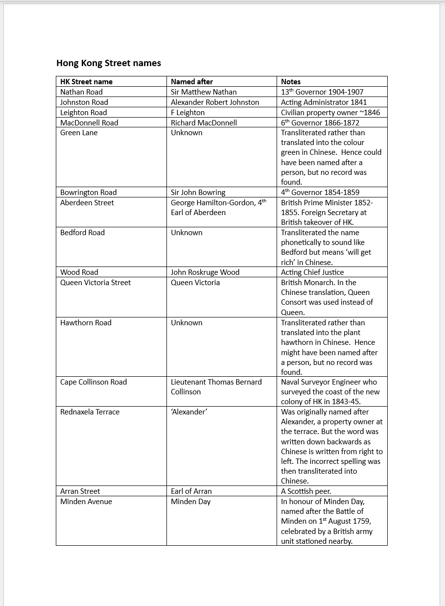
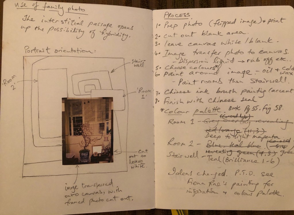
BACKGROUND
In the ‘developing style’ strand of my practice, I have been exploring how to create ‘transcultural’ images in my art through a process of transcultural layering. I have done some work in this area before starting my MA and I now want to return to it to continue my exploration of transcultural aesthetics as part of my practice.
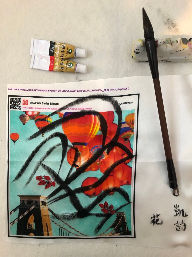
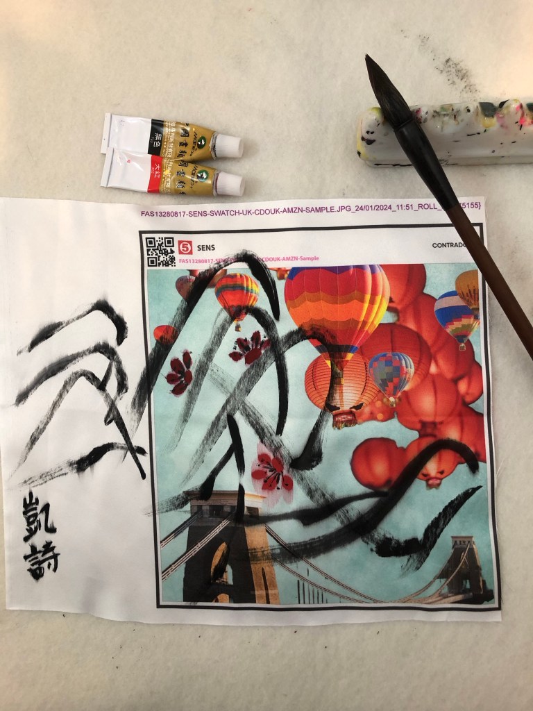
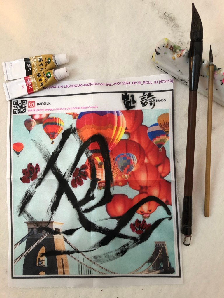
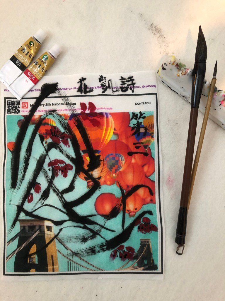
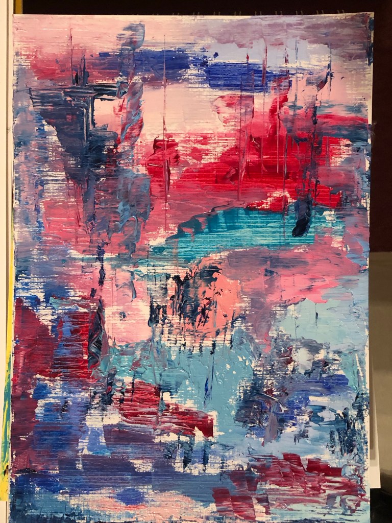
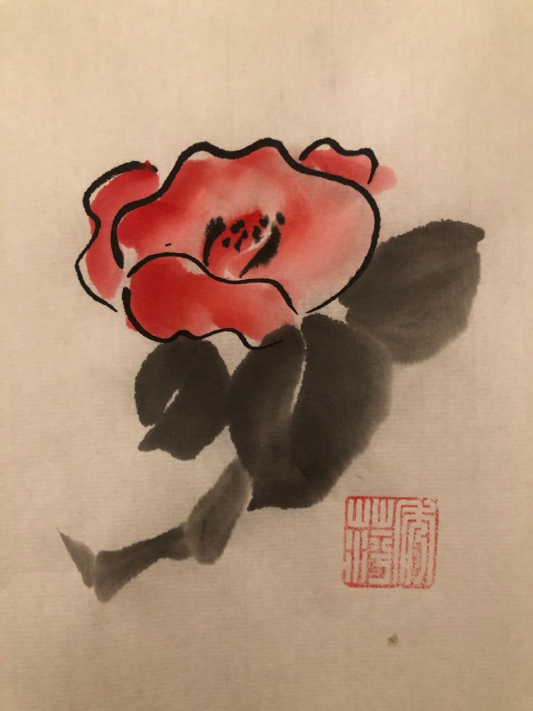
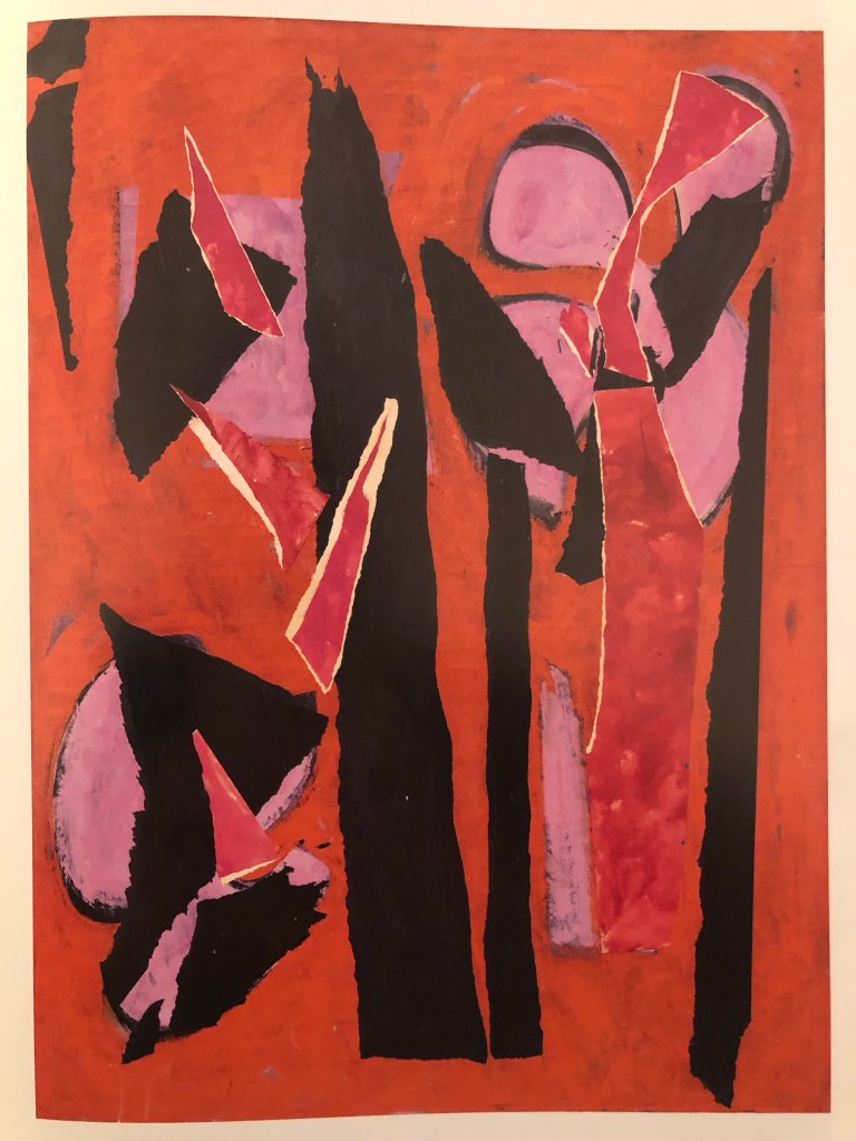
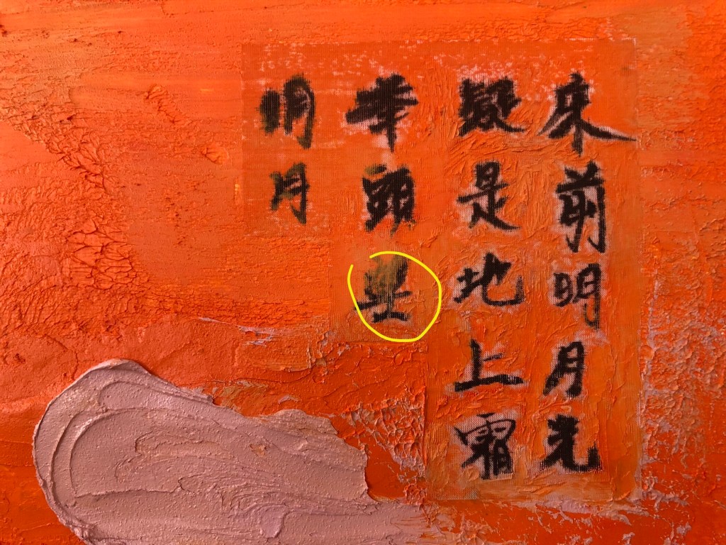
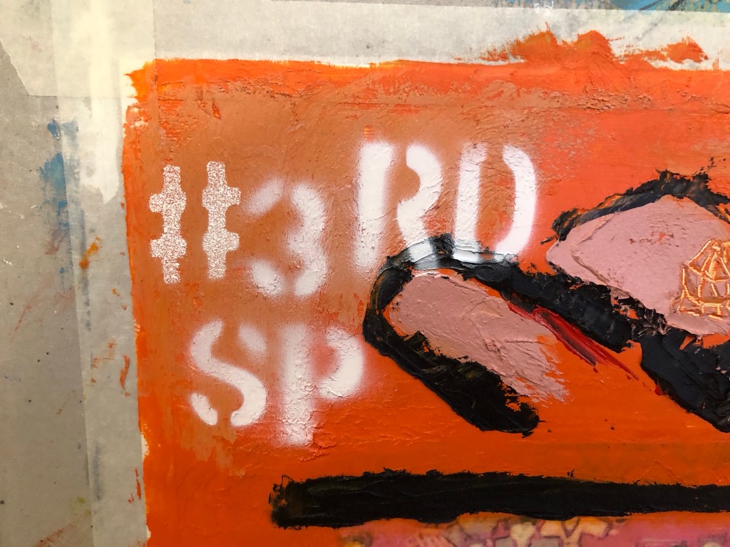
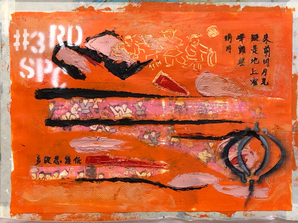
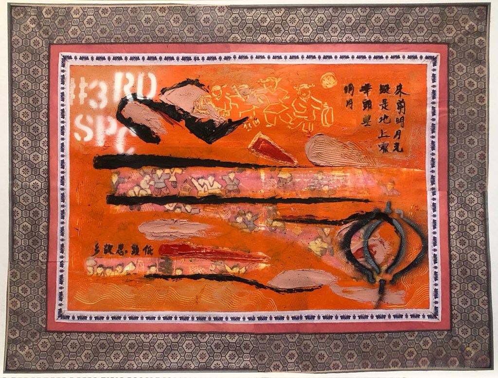
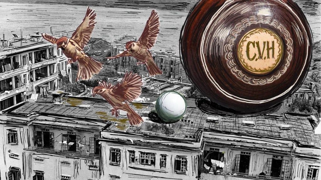
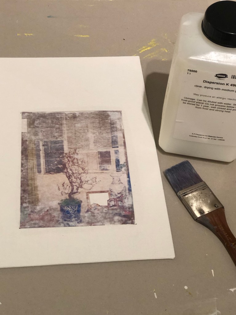
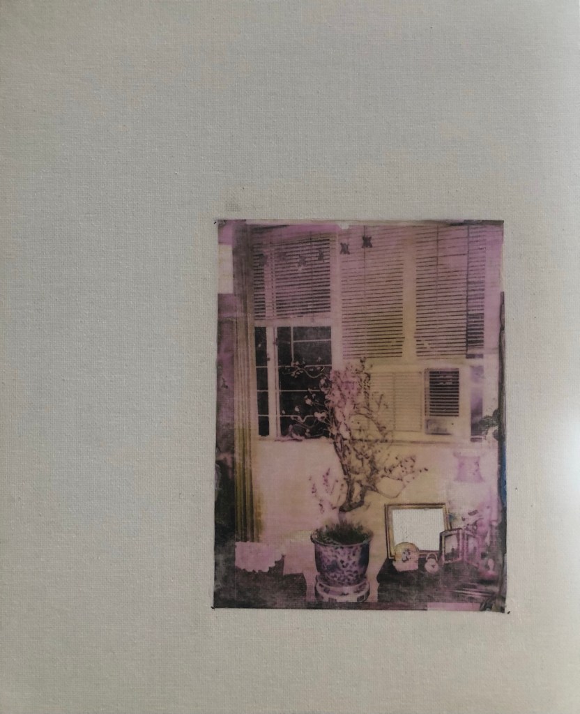
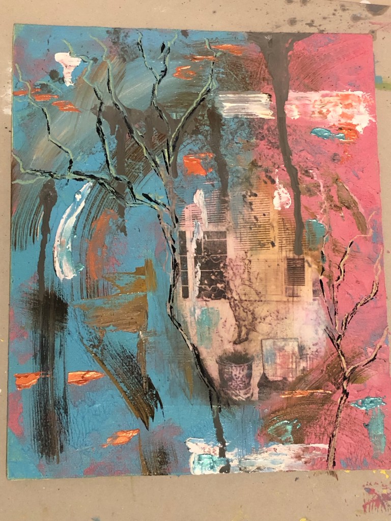
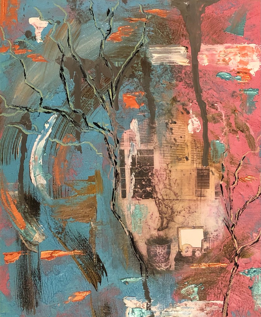
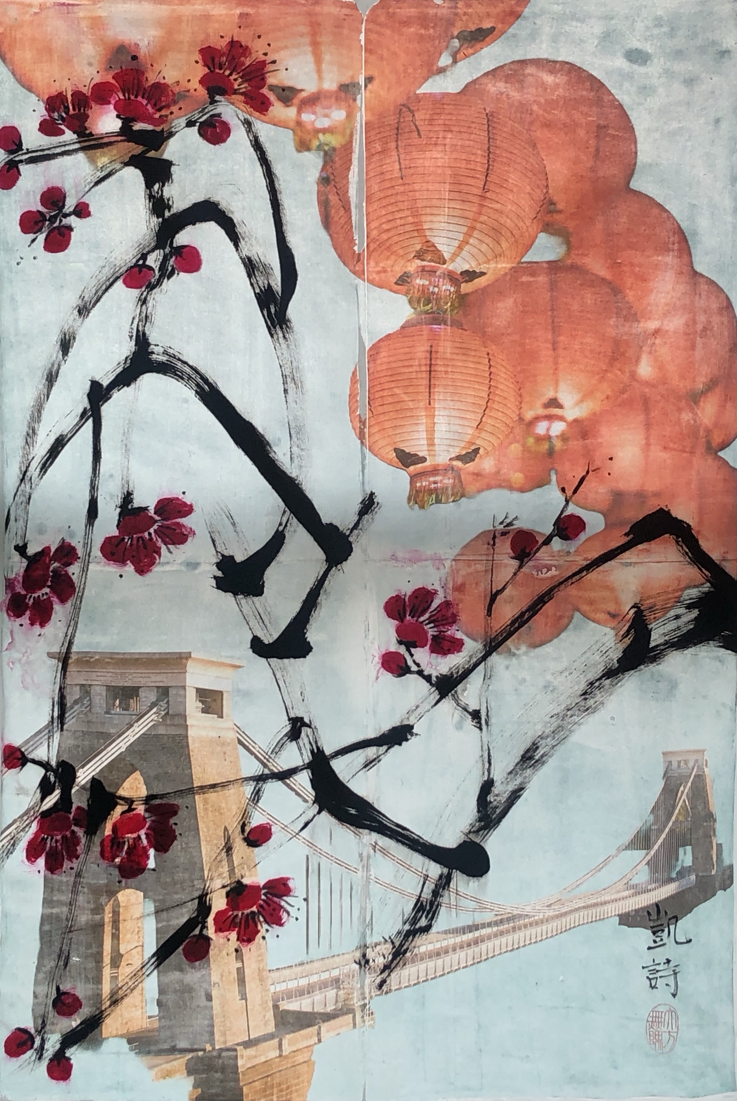
Below is a piece of work that I did a year ago and I now want to pick it up and develop the piece further with some new ideas, materials knowledge and techniques that I have learnt since starting the MA. The work was originally created using dispersion liquid to transfer a digital collage image from paper to a polyester satin canvas, then the Chinese brush painting was painted on top in ink.
–
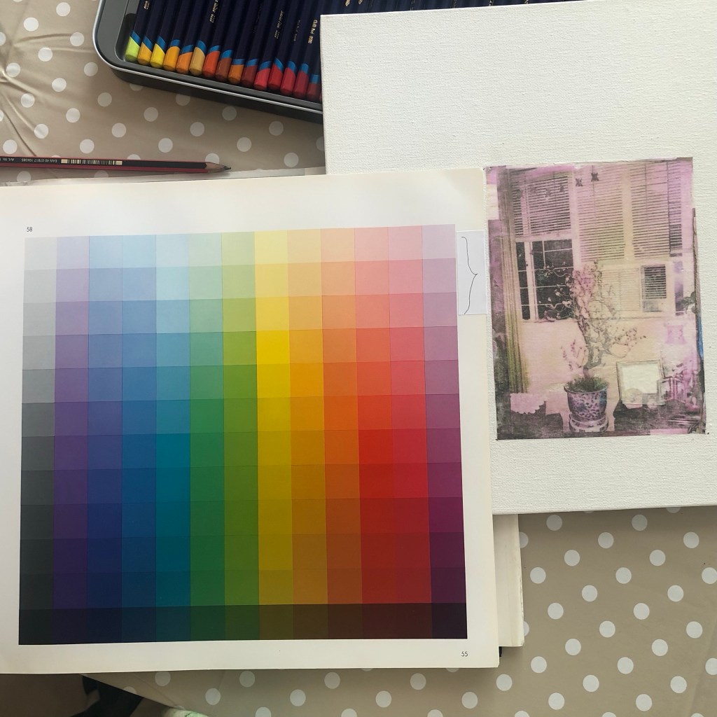
I have recently researched into using better quality fabric as the canvas for digital printing as well as for Chinese brush painting. The findings are documented here and the results will be used in this work:
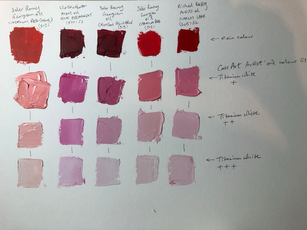
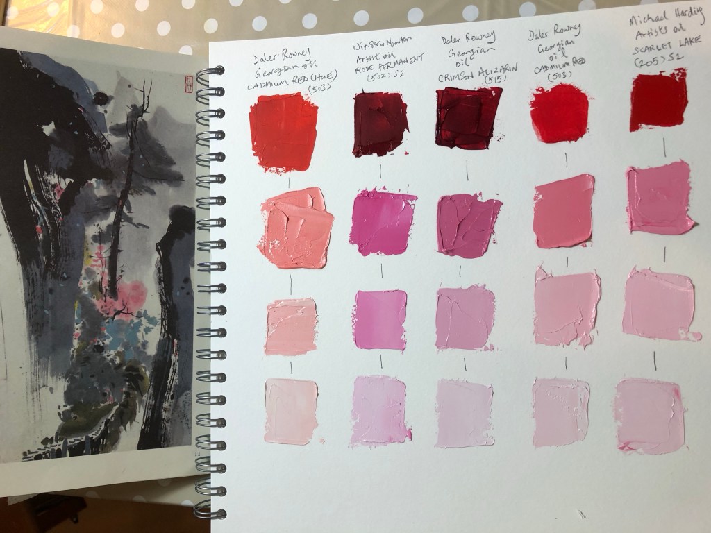
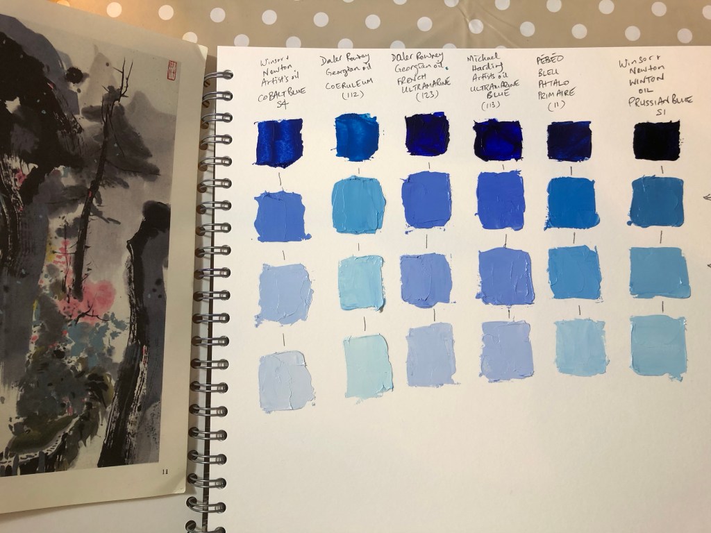
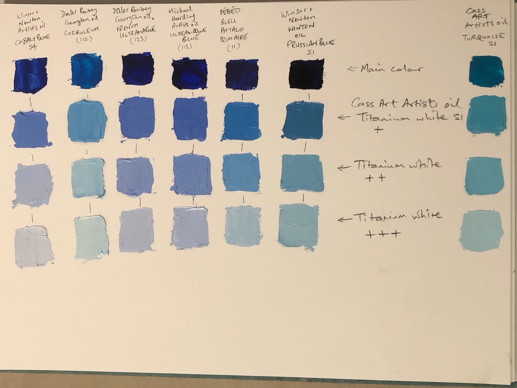
MA Y1 U1: Research – Digital printing on fabric
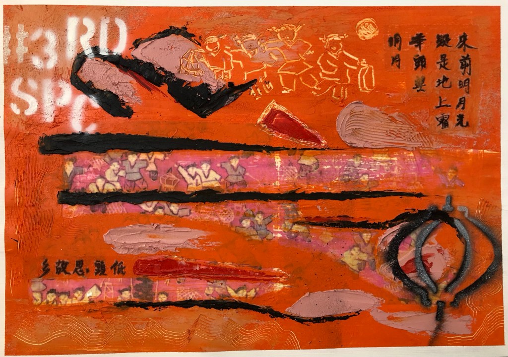
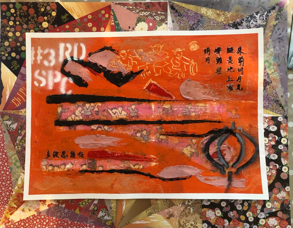
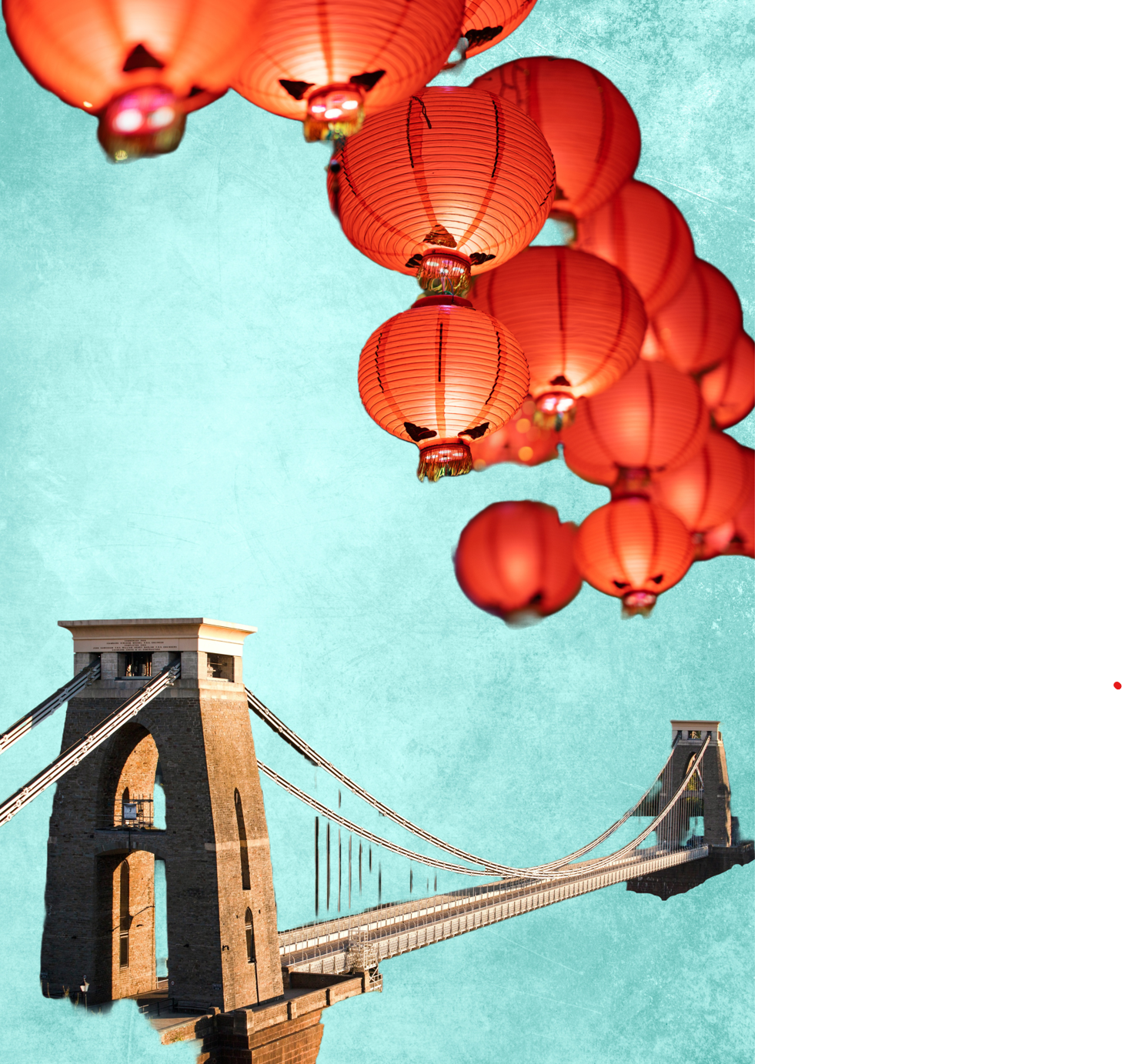
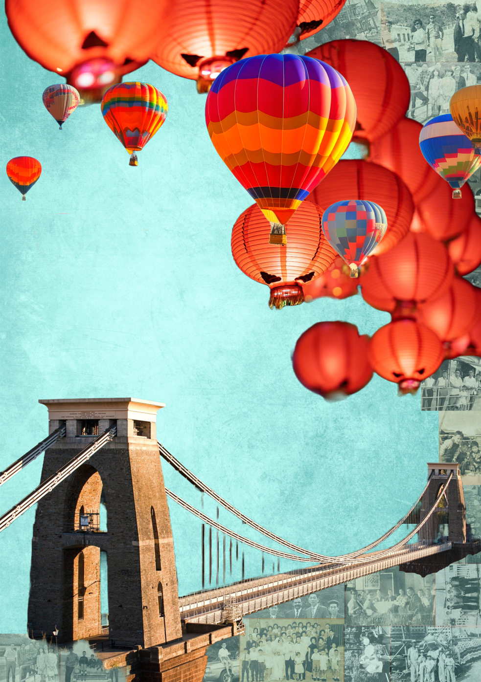
Below is the original digital collage created using Adobe Express. It has an image of the Bristol Clifton Suspension Bridge which is a famous iconic bridge in my home city of Bristol. I live very near the bridge and often drive or walk over it – it has meaning for me and is one of the images that means ‘home’ to me. Every August, there is a Bristol Balloon Fiesta and there are many images online with hot air balloons flying over the Clifton Suspension Bridge – again, those are iconic images for Bristol. When I made this original digital collage, I used Chinese lanterns instead of hot air balloons flying over the bridge as an attempt to create an overall effect that combined things from the different cultures that have been part of my life. The background teal colour and effect were purposely ambiguous – is the background image associated more with Chinese or Western culture? It’s up to the viewer to interpret.
–
METHOD
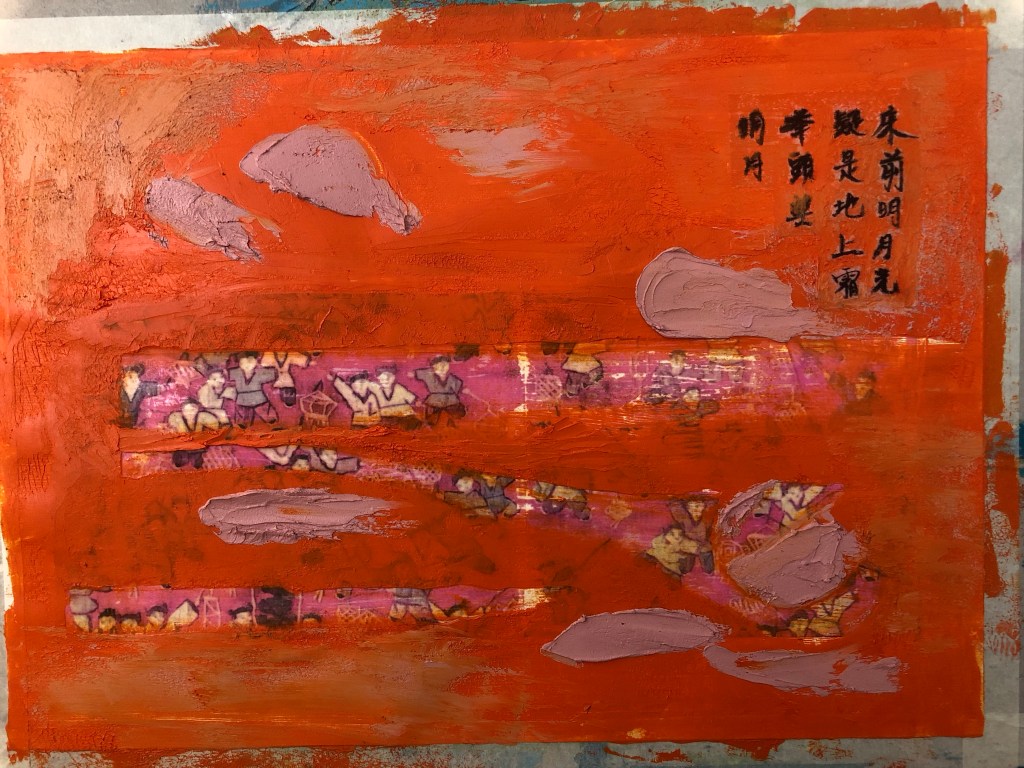
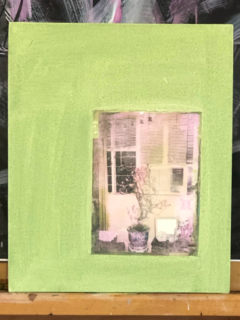
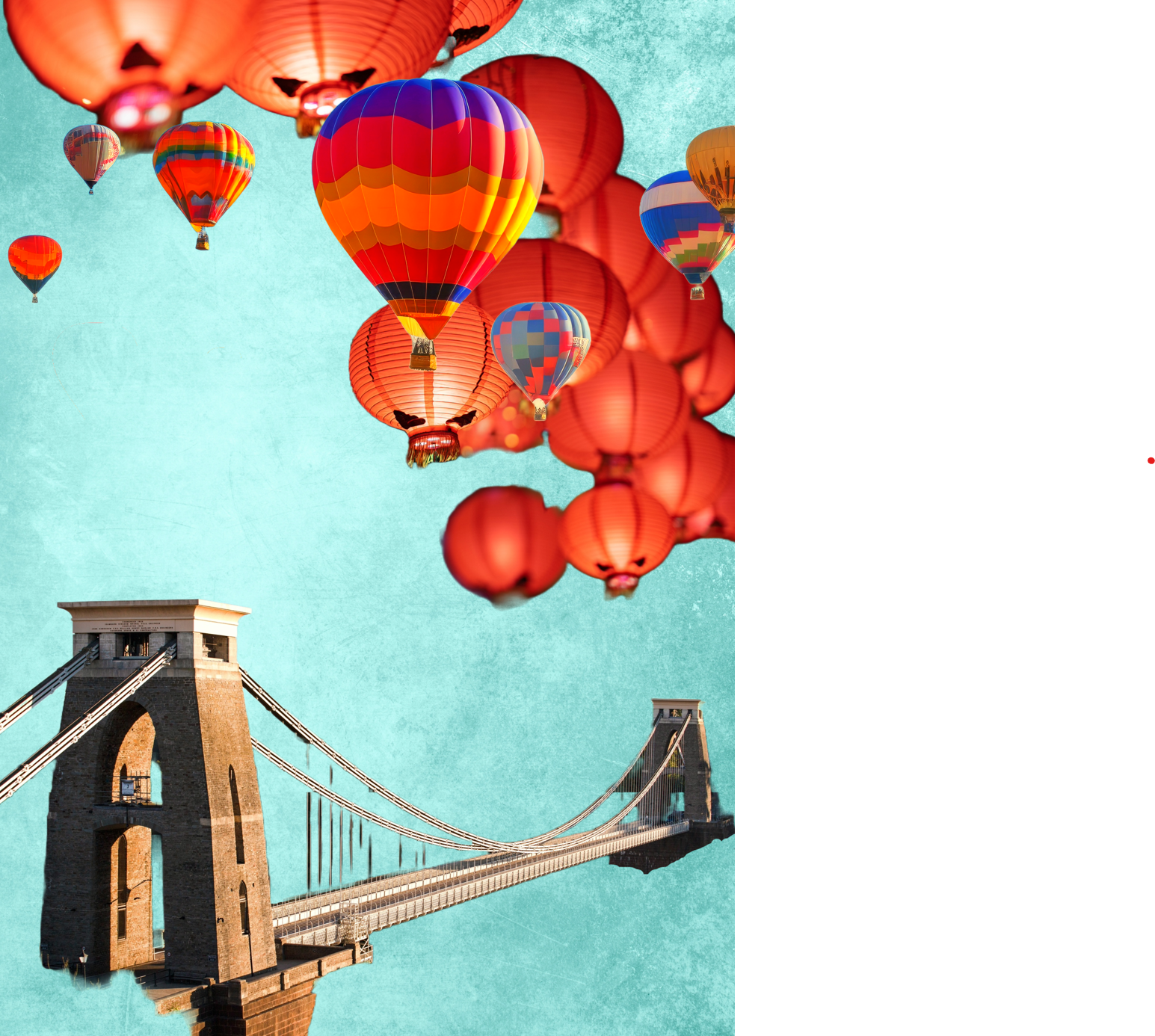
Taking the original image, I wanted to create more depth and interest in the sky. Therefore, a few hot air balloons were layered over the top in the foreground with the Chinese lanterns appearing to be further back giving a better feeling of depth. Different hot air balloon images were tried and this was the final version. The colours of the balloons were adjusted in the software to harmonise with the existing images. I was happy with the bridge image and no further changes were made to that.
–
As part of my narrative development work, I have been researching my family in Hong Kong and I have been given many old family photographs. I remember the photos very well because they were from the family photo albums at my childhood home. I have been wanting to use the photos in my work but I have been reluctant because I have not resolved my feelings towards them – I am not sure if I am ready to use them yet.
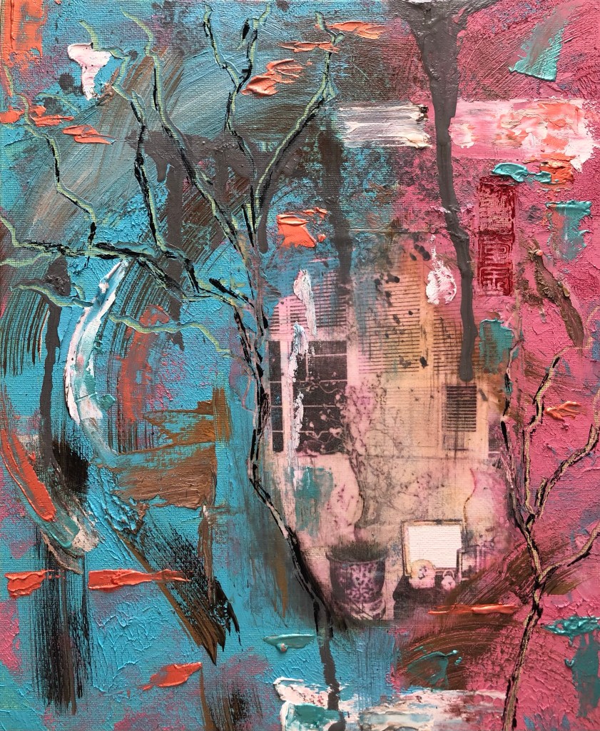
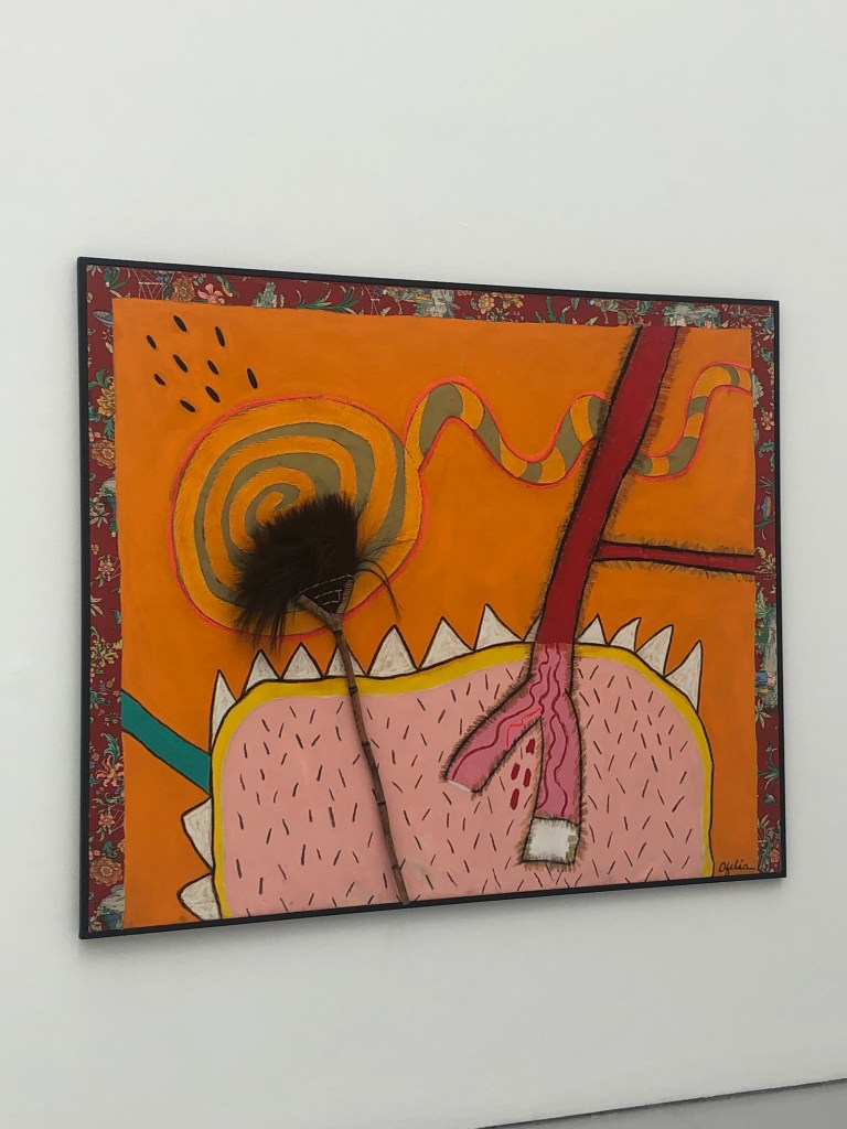
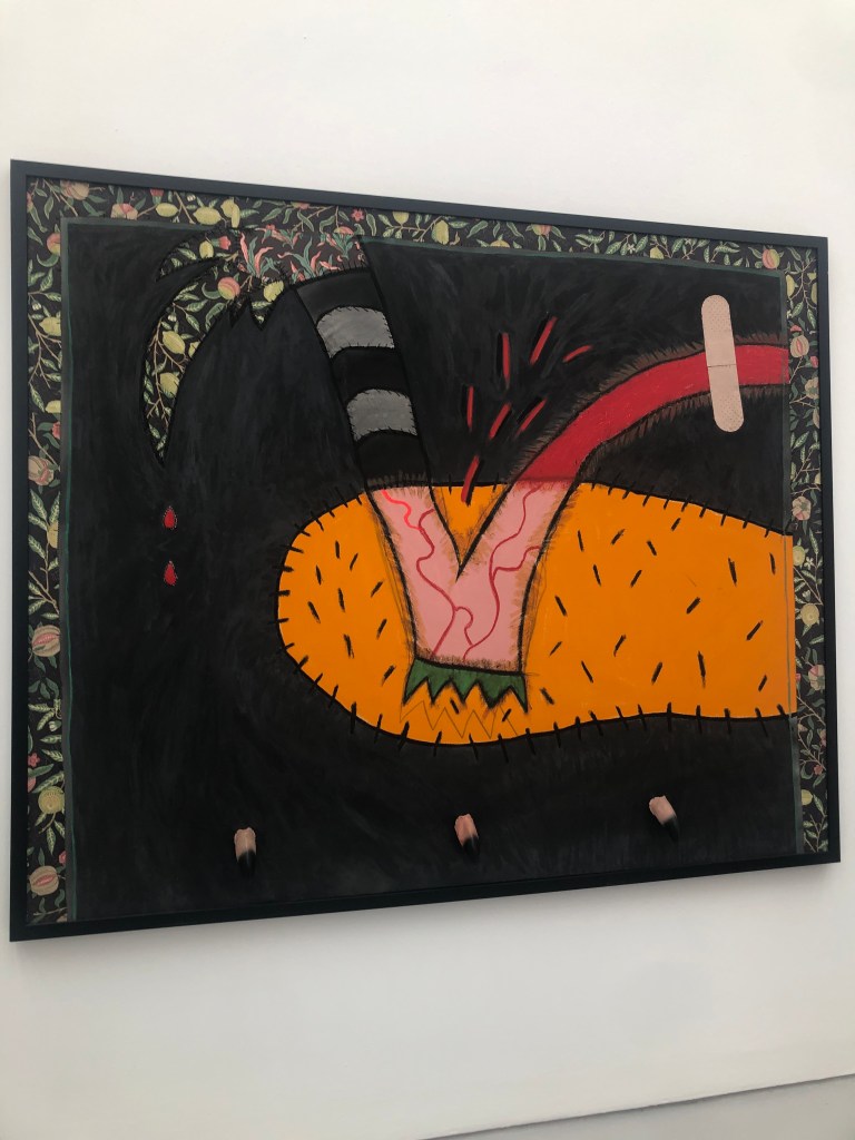
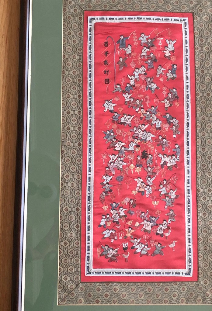
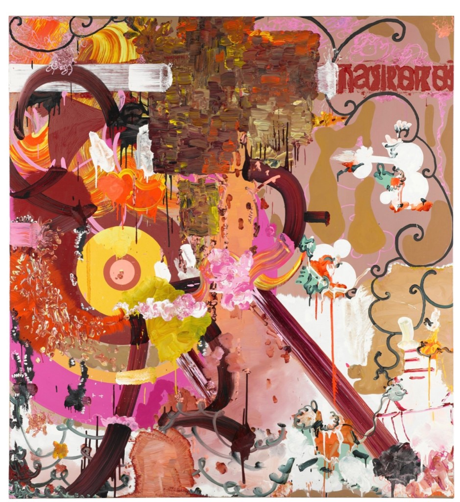
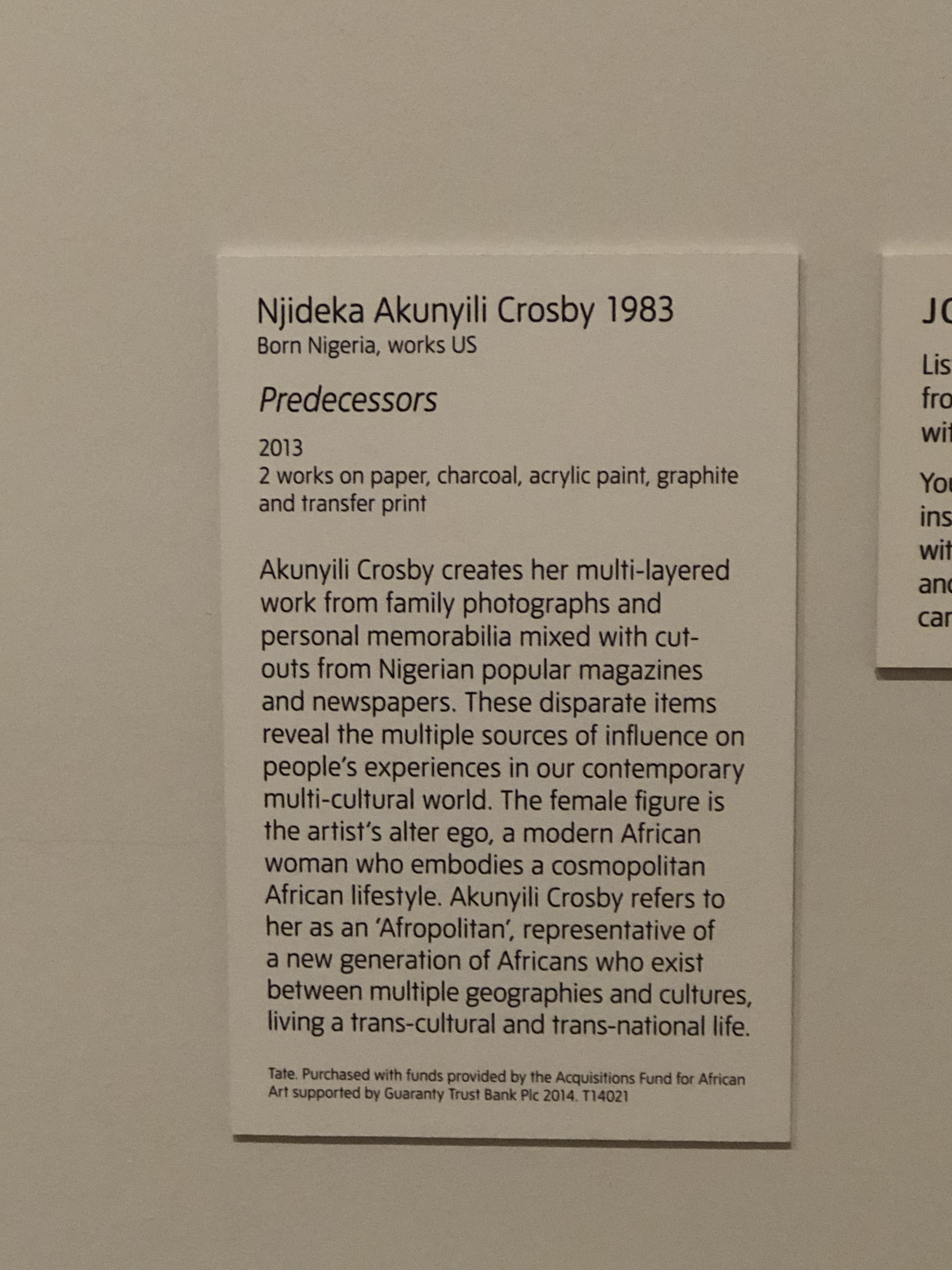
I have always taken much inspiration from the Nigerian-born American artist Njideka Akunyili Crosby and her use of personal photographs. Below is one of her paintings that I saw recently in an exhibition at Tate Modern. Her technique of using faded photo images in the background is often seen in her work. Her images are evocative and they resonate with me because of what my family photos represent for me.

.
–
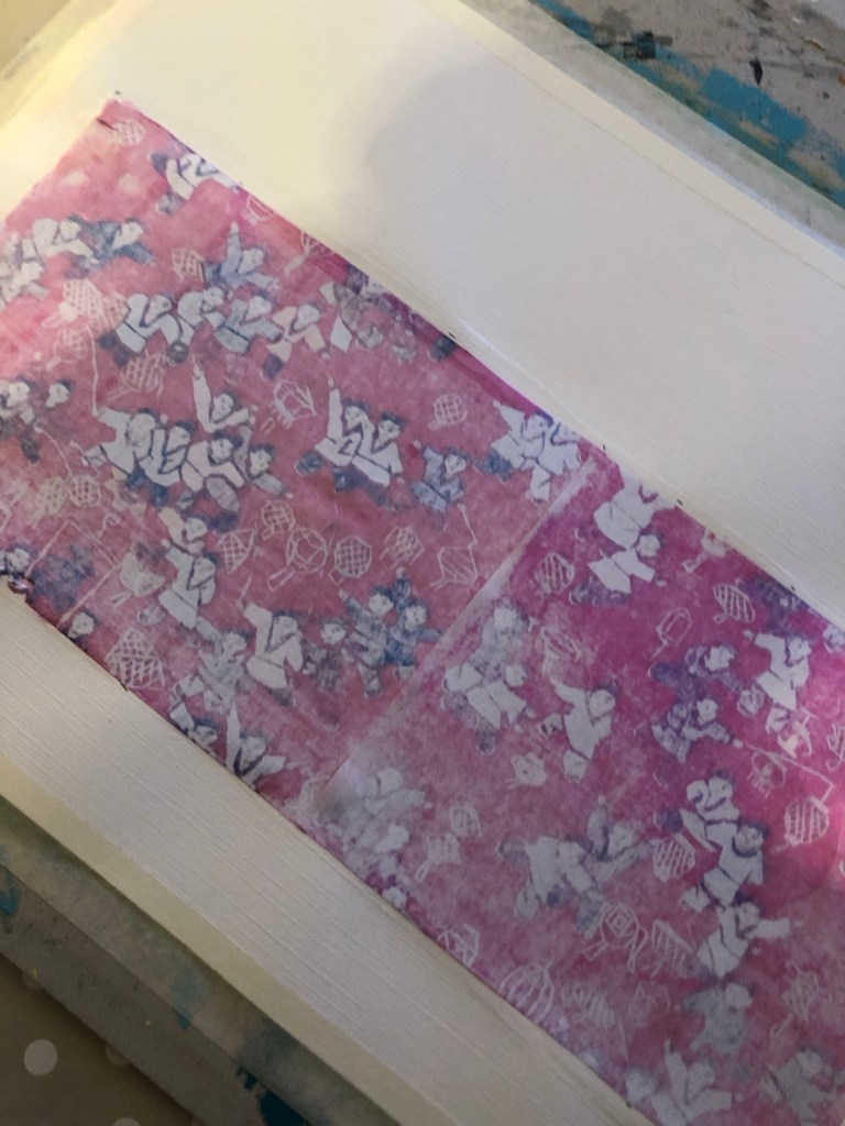
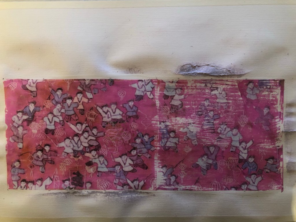
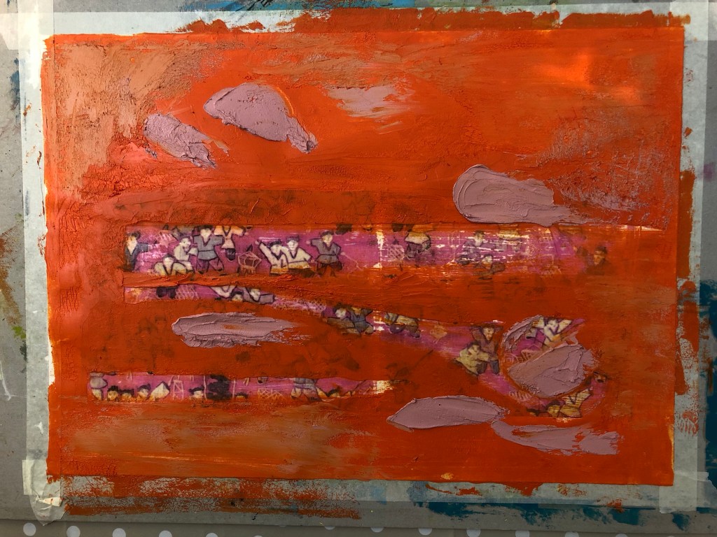
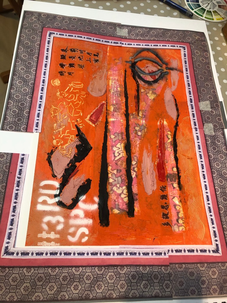
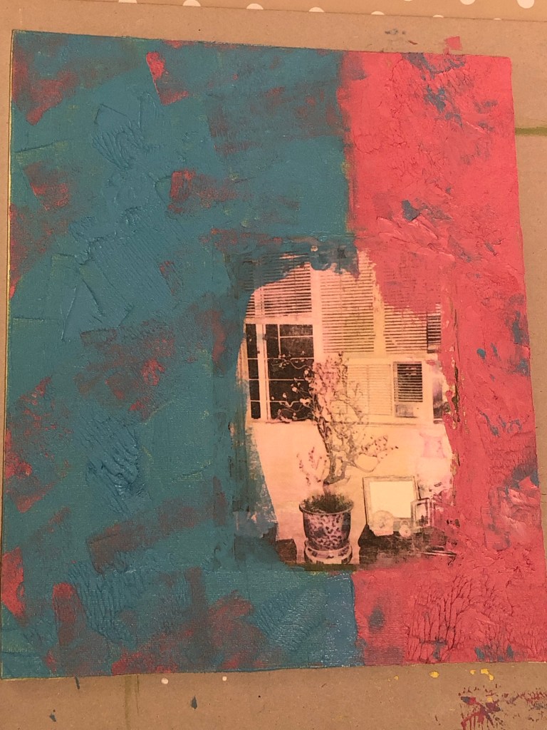
Furthermore, at my tutorial last year, I discussed my reluctance to use the family photos with my tutor and he suggested that I try to use a few, perhaps use the ones that were less meaningful to me as a trial. So I picked out a few that were of larger groups, many were family friends and not people that I had strong emotional bonds with. Nonetheless, they were wonderful photos that represented the place (Hong Kong) and a time period when my late parents were young. The photos still had meaning for me because I remember clearly seeing all of them in our family photo albums and many had images of my parents (who passed away some twenty years ago). The digital images of the chosen photos were imported into Adobe Express and arranged on the collage. The transparency of the images were increased so that the background colour of the collage came through partially giving a more faded and blended effect.
–
REFLECTIONS
– From a personal perspective, I am pleased with this experiment as I feel I have made progress in making use of the family photos. Getting started was a challenge because all the photo images seemed too precious to use even though they were all digitised. I stared at the images for a while before deciding to choose the less precious ones. It was a strange process in determining the ‘rating’ of how precious or personal a photograph felt to me when each one held a story. The process eased once I got started so I am happy that I did this experiment because I feel I have a way forward in using the treasure trove of all the old family photos – this part of my exploration will remain a slow process but I have made a start.
– From the technical and aesthetic perspectives, I am happy with the new learning gained in using the digital tool to manipulate the images especially with the photo transparency. The outcome was the effect that I was looking to create. My ‘aesthetic goal’ is to create a transcultural feel for the piece, meaning the work represents and originates from my ‘Third Space’ (as described in the book The Location of Culture by Homi K Bhabha). Akunyili Crosby talks a lot about making work from her Third Space, hence I find much resonance with her work.
– This work is an example of where the two strands of my practice (developing style and developing narrative) mutually inform and I hope they will eventually converge when I have developed a more definitive style.
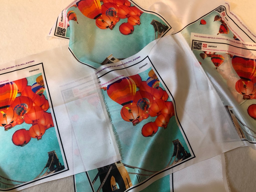
– I now have to source the fabric to print the image onto, then do a Chinese painting on top. I will source the printed fabric from Contrado as explained in this blog:
MA Y1 U1: Research – Digital printing on fabric
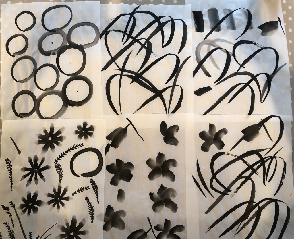
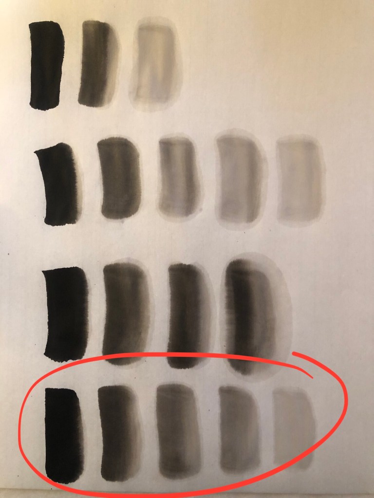
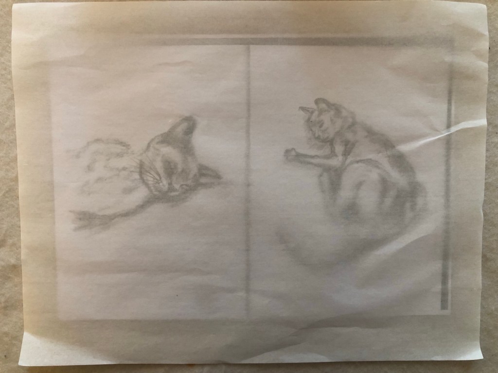
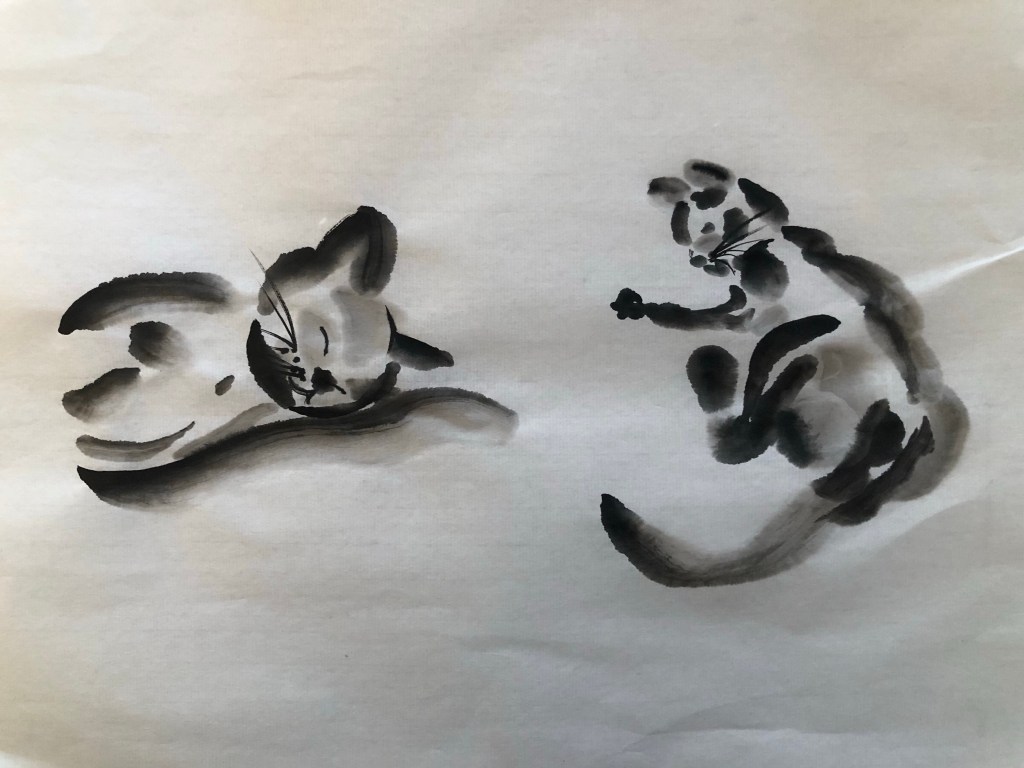
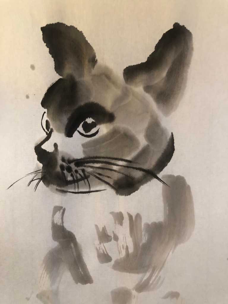
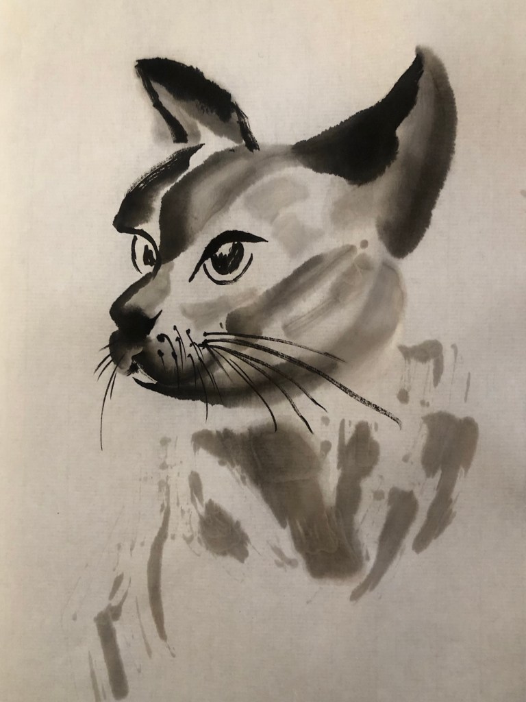
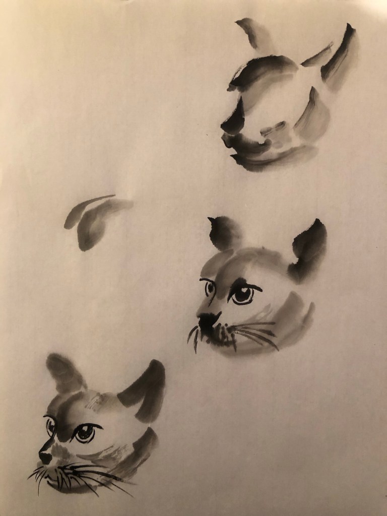
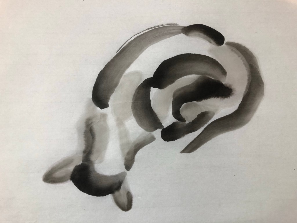
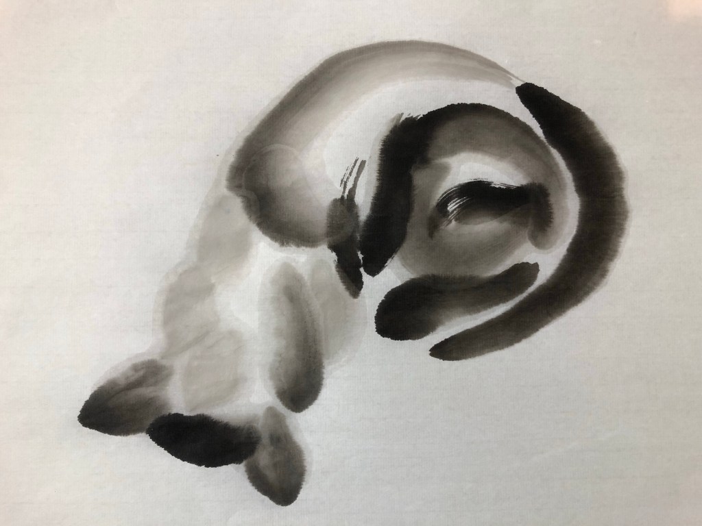
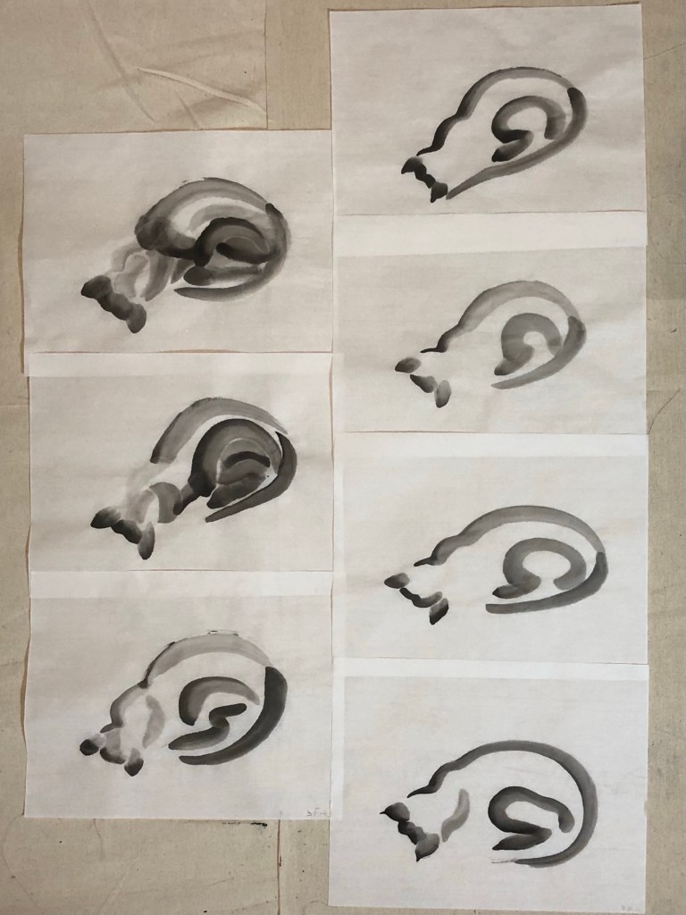
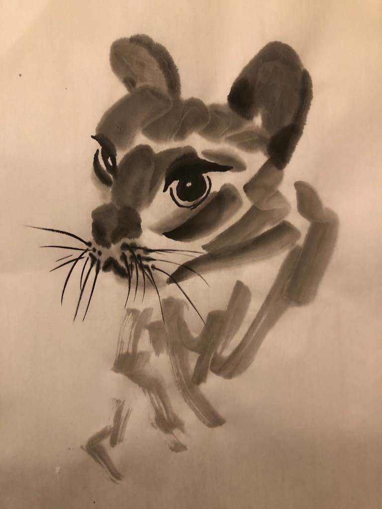
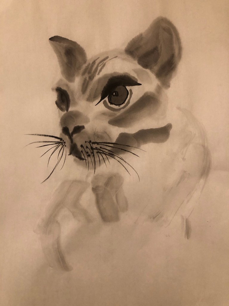
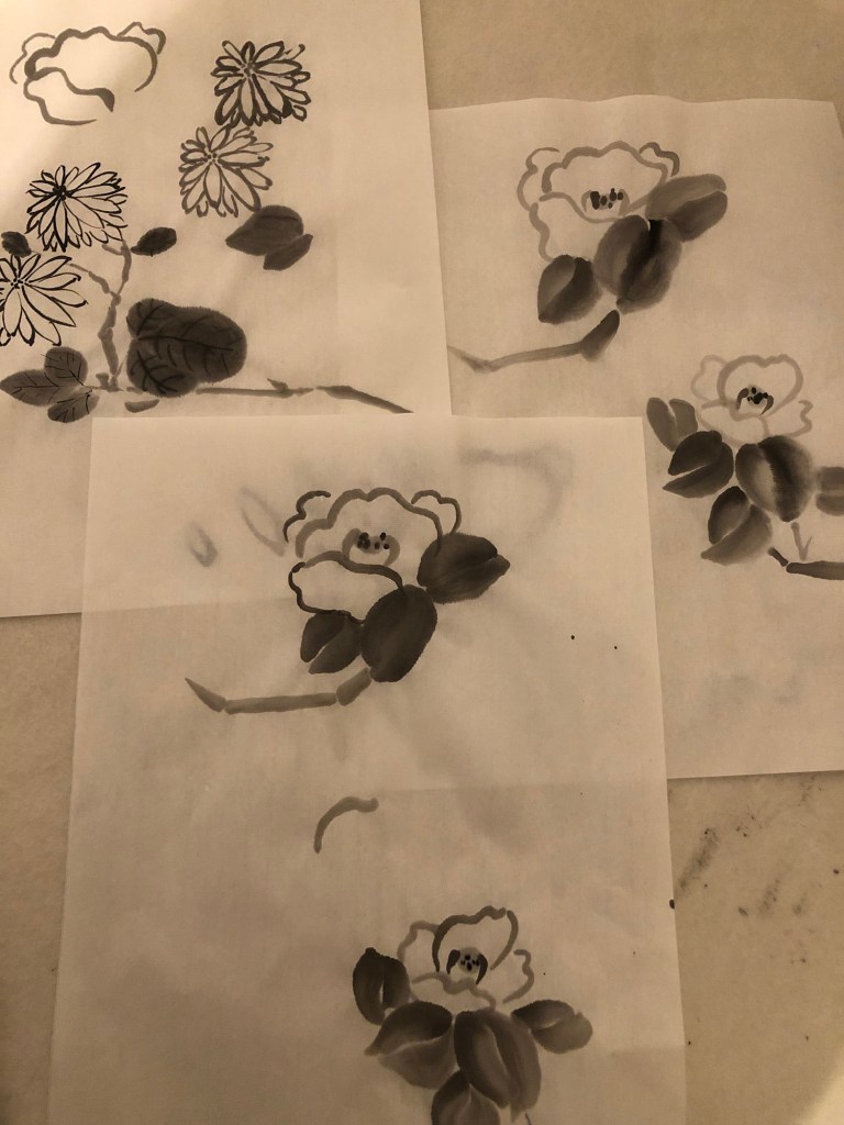
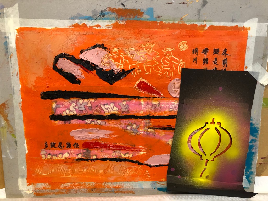
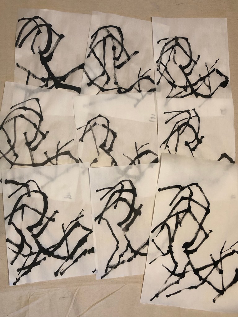
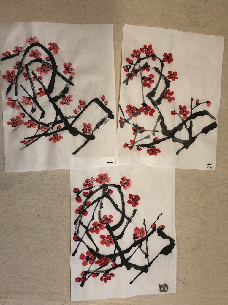
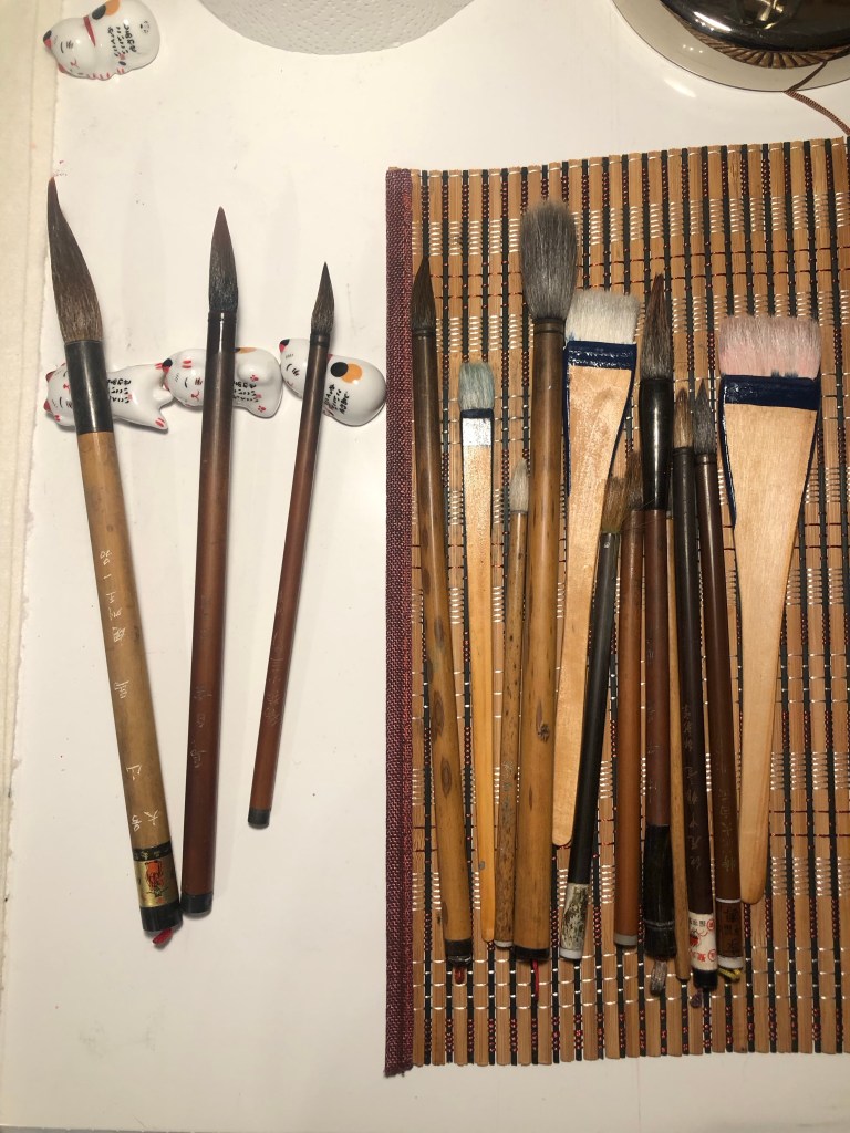
– I am considering making this work for the MA Interim Show in March 2024 if the rest of the process works according to plan. So I have been doing lots of practice Chinese brush paintings to test the techniques, composition and to choose the best paint brushes for the different parts of the intended painting – a plum blossom.
.
.
–
LEARNING
– I remain happy with the transcultural layering process that I started a year ago and I want to build on this line of enquiry with my latest learning to find the transcultural aesthetics that I have been searching for.
– Digital collages of a combination of found images and old family photos have a lot of potential for creating the transcultural aesthetics that I want. But I am looking for more than just a digital collage, so the collage can be the background on the canvas and then I can paint on top with Chinese brush painting (reflecting my heritage) and/or spray painting (reflecting my home city of Bristol which is famous for street art and there are plenty around for inspiration). Also, the oil and cold wax exploration that I have recently started can also be part of the layering process. I am mindful that the key is not to overdo the layers or overwhelm the image; I must remember to ‘leave room for the image to breathe’ creating tension on the canvas. My purpose for the different material explorations is to give myself options in my art making knowing what materials go together in order to create the desired aesthetical effects.
– I made a start in using my family photos and I feel I can do more with this approach, especially as the two strands of my practice start to mutually inform.
– I will proceed with this piece of work with the potential of using it in the MA Interim Show, so I need to think about how to hang the piece.
NEXT STEPS
– Order the chosen silk fabric and the printing of the digital collage.
– Decide on the final composition for the Chinese painting and practice on larger paper ready for the real thing.
– Think about ways to hang the piece.
– Make more work with using the family photos – a long term project.