Further to my blog on the Cheongsam series where I introduced the idea of using food as metaphor for racial or cultural identity, I want to capture more of my thoughts, ideas and research on this subject to document the meaning behind this series of work. Here is my earlier blog with some background and where I had generated a preliminary design digitally:
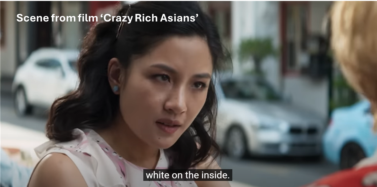
In the above blog, I referred to the Hollywood film Crazy Rich Asians where the American-born Chinese protagonist was referred to as ‘a banana’ by her best friend because the protagonist was perceived by her future mother-in-law (a traditional Chinese woman living in Asia) to be ‘yellow’ on the outside but ‘white’ on the inside.
In my earlier blog, I mentioned that I remember being called a banana, too, because I moved to the UK as a young teenager and have lived here for decades, hence I have inevitably adopted much of the British culture. As a result, I consider myself a transcultural person and have based my art practice on this subject. I personally do not consider the description of ‘banana’ an insult, it is very widely used within Chinese communities and its meaning is widely known. Also, there is the legacy of colonialism where being considered ‘westernised’ is not necessary a bad thing (reference The Location of Culture by Homi K Bhabha, chapter ‘Of mimicry and man: The ambivalence of colonial discourse’) if one wants to get on in ‘the west’ and avoid being treated as ‘an outsider’. This point deserves to be explored in a dedicated blog so it will not be covered here. All I will say here is that I feel neutral about the term ‘banana’. In fact, I think it is a clever metaphor and a good seeding idea for making art!
In my research, I also found this article which summarises how different types of food are used as metaphors in the context of race and culture identity:
Although I acknowledge that reducing a race or culture to a colour can be problematic as described at the end of the article, I remain undisturbed by the use of food metaphors for myself because it helps me to start a thinking process. The point about ‘overthinking’ in the article refers to ‘an egg’ which means a person that is yellow in the core but with a white outer layer. As someone who is prone to overthinking, I liked the egg metaphor immensely. Yes, I have a ‘yellow’ shell and much of my core has become ‘white’ due to living in Britain most of my life, but I was born in Hong Kong to Chinese parents and lived there until I was a teenager. The very rich culture and heritage in the Hong Kong Chinese society are deeply rooted within me and will always be part of my core. It is not something that can be erased and also not something that I want to change. So, after much overthinking, I have decided that my response would be, ‘No, I am an egg’ to anyone who thinks I am a banana. Of course, it would be a boiled egg to be precise, but that would be really over thinking it.
NEXT STEPS
In my earlier blog, I had planned to make a Cheongsam painting with bananas as part of the process to explore my transcultural identity. After this research, I want to make two paintings, one with bananas and one with eggs as a response to the former.
ADDITIONAL READING
Here is a list of interesting articles about the ‘banana’ metaphor for East Asians living in ‘the west’ with different points of view and lived experiences:
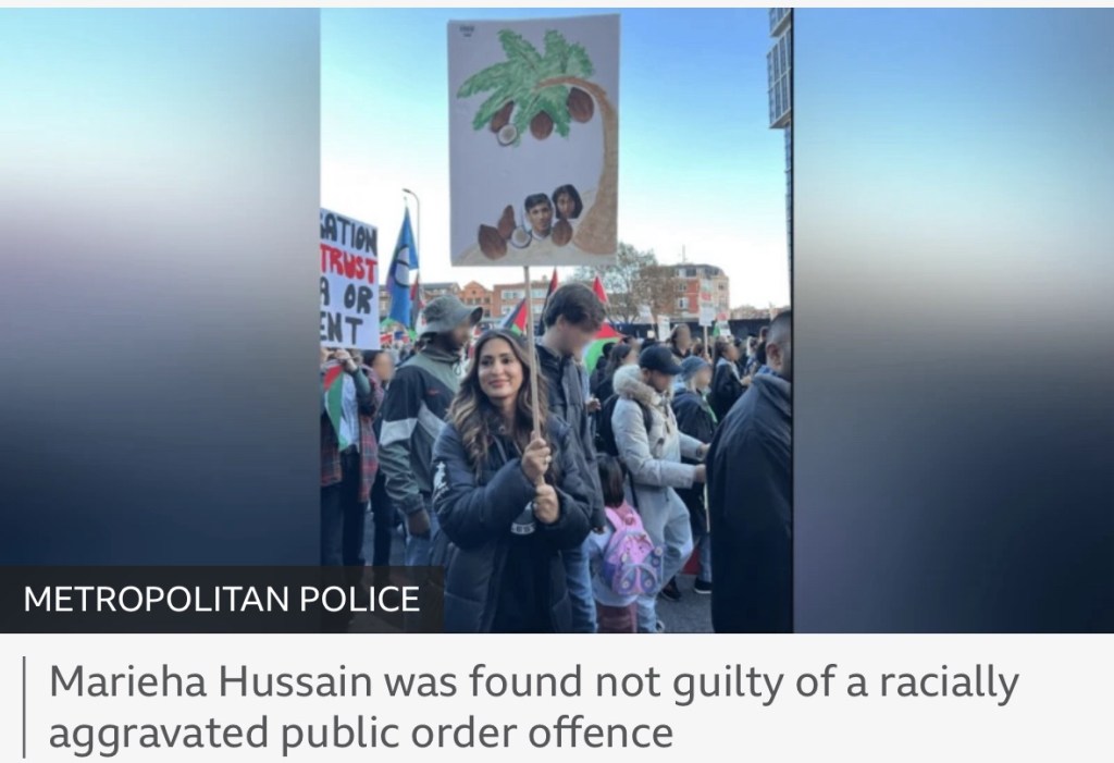
Since publishing this blog and making the Cheongsam paintings, there has been a trial where a teacher went to a protest march holding a placard referring to the then Prime Minister Sunak and Home Secretary Braverman as coconuts. The teacher was trialled and found not guilty.
Her lawyer told the court the placard was “a pictorial attempt” at “political criticism” of Mr Sunak and Ms Braverman.
After a two-day trial, the judge ruled that the placard was “part of the genre of political satire”.
Using ‘coconut’ to describe a person who is ‘brown on the outside but white on the inside’ is equally common as using ‘banana’ to describe an East Asian person.
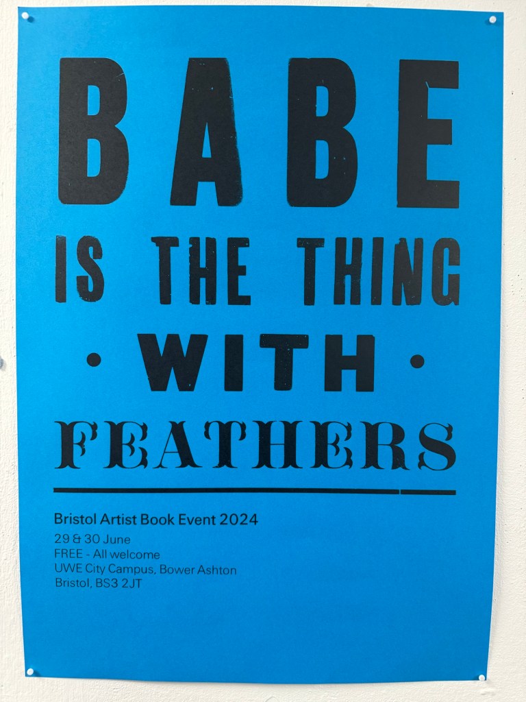
During the MA low residency at CSM in March 2024, we had a book art workshop where we learnt to make zines and some simple book. The artist hosting the session mentioned a book art event that takes place in Bristol once every few years. I was delighted to find that it was on this year and I attended the fair.
–
There were nearly 100 stands; it was a great opportunity to talk to and learn from experienced book artists. I came away feeling enthusiastic to try this beautiful art form.
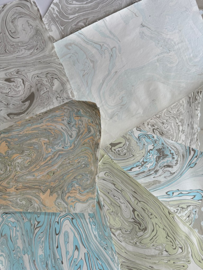
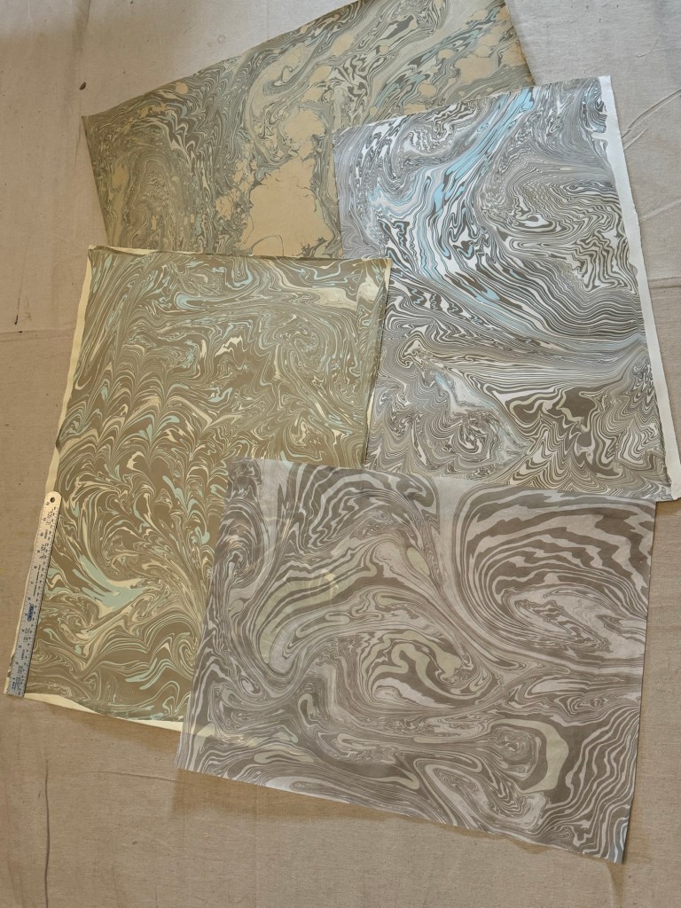
Another reason for my enthusiasm was that I recently attended a Suminagashi workshop. Suminagashi is an ancient Japanese technique of making handmade marble paper and washi by floating water-based inks on water, then laying the paper on top to absorb the ink and water pattern. See post:
Here are some of the Suminagashi paper that I made during the workshop:
Small A4 size sheetsLarger A2 size sheets
METHOD
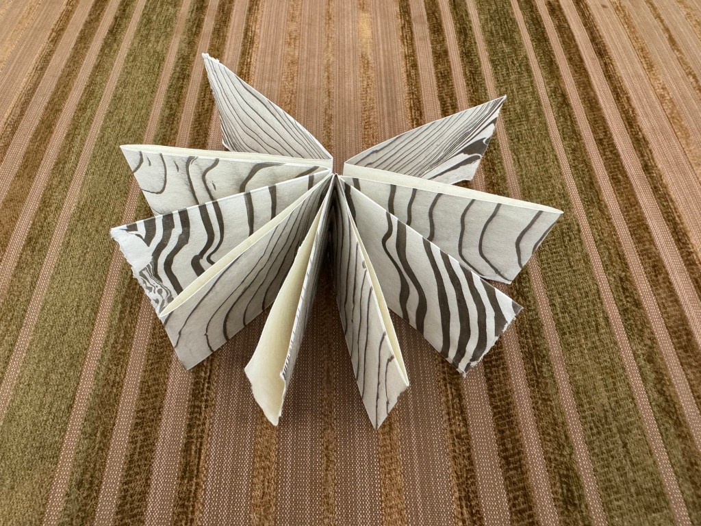
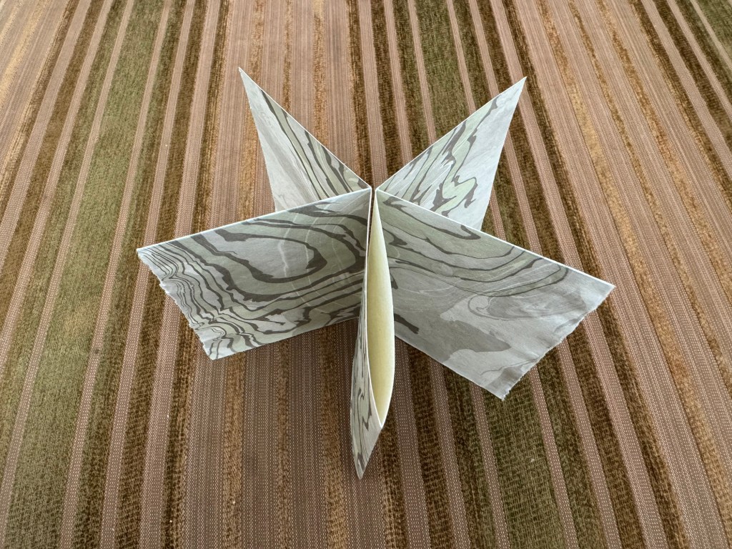
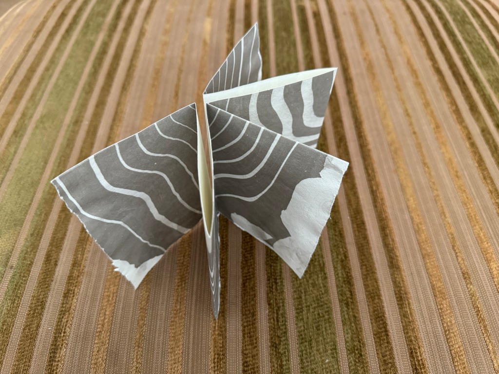
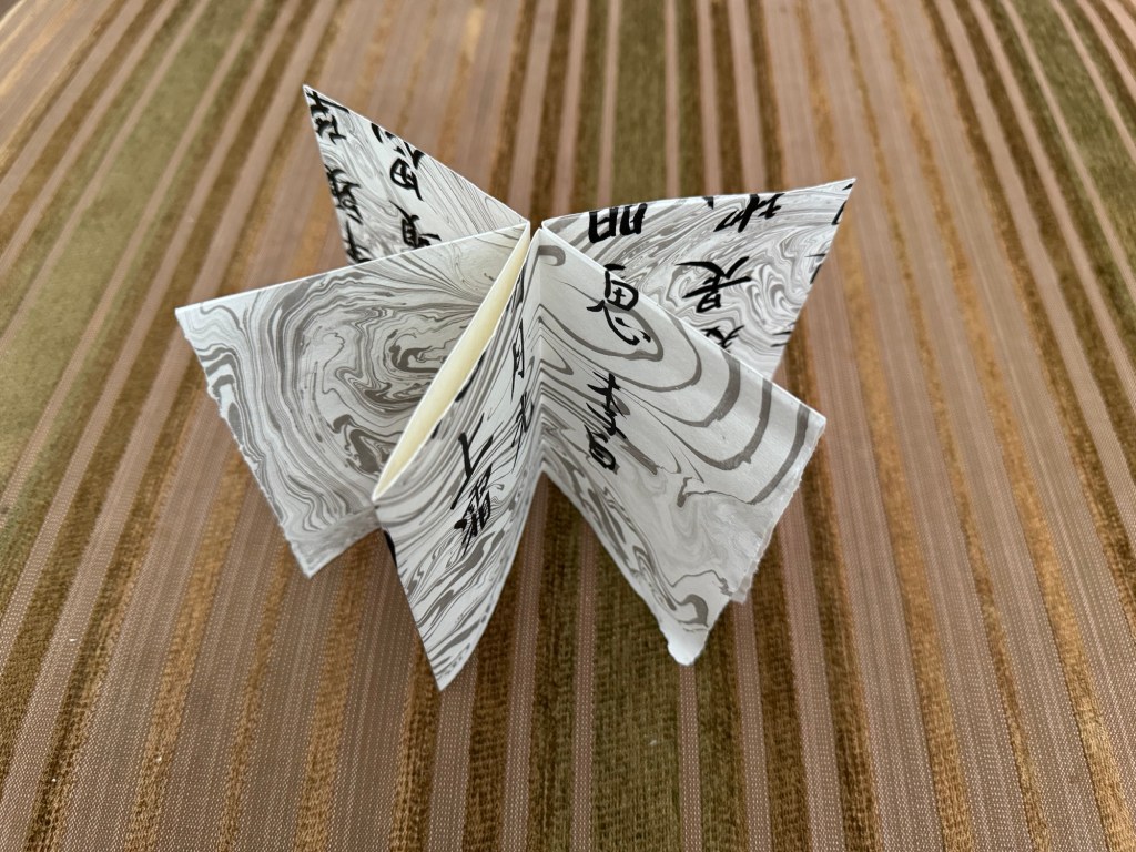
From the techniques learnt during the low residency workshop at CSM, I made a few different types of simple books using the smaller sheets of Suminagashi paper:
–
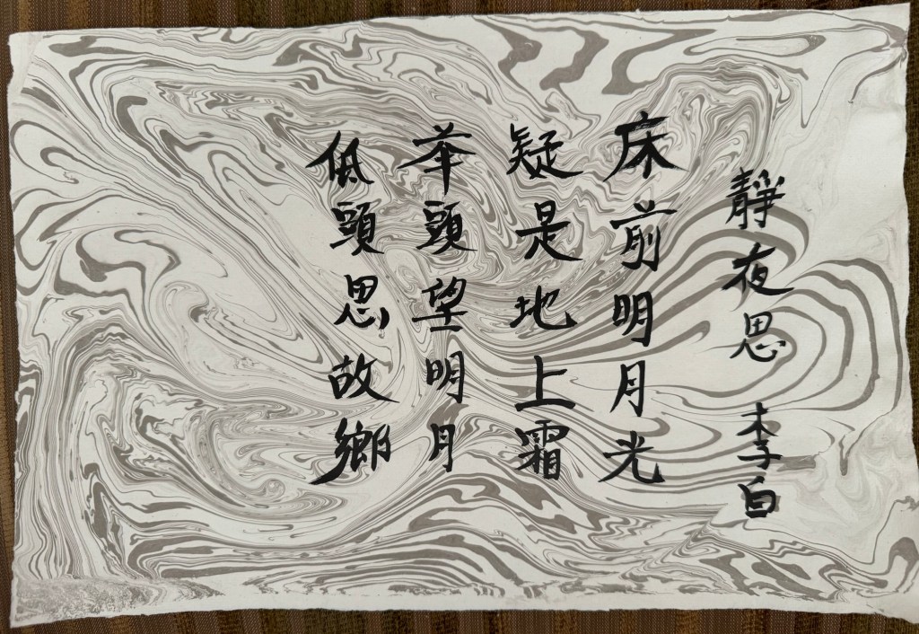
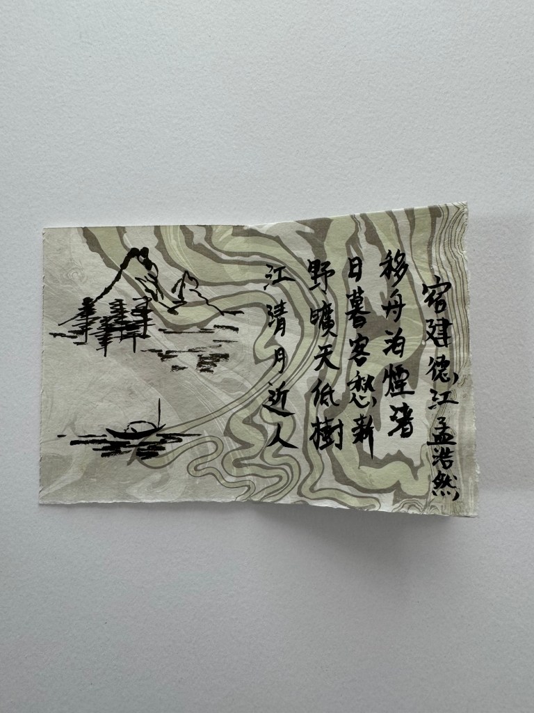
I experimented with some Chinese ink calligraphy on one sheet of paper, then folded it into a simple book:
–
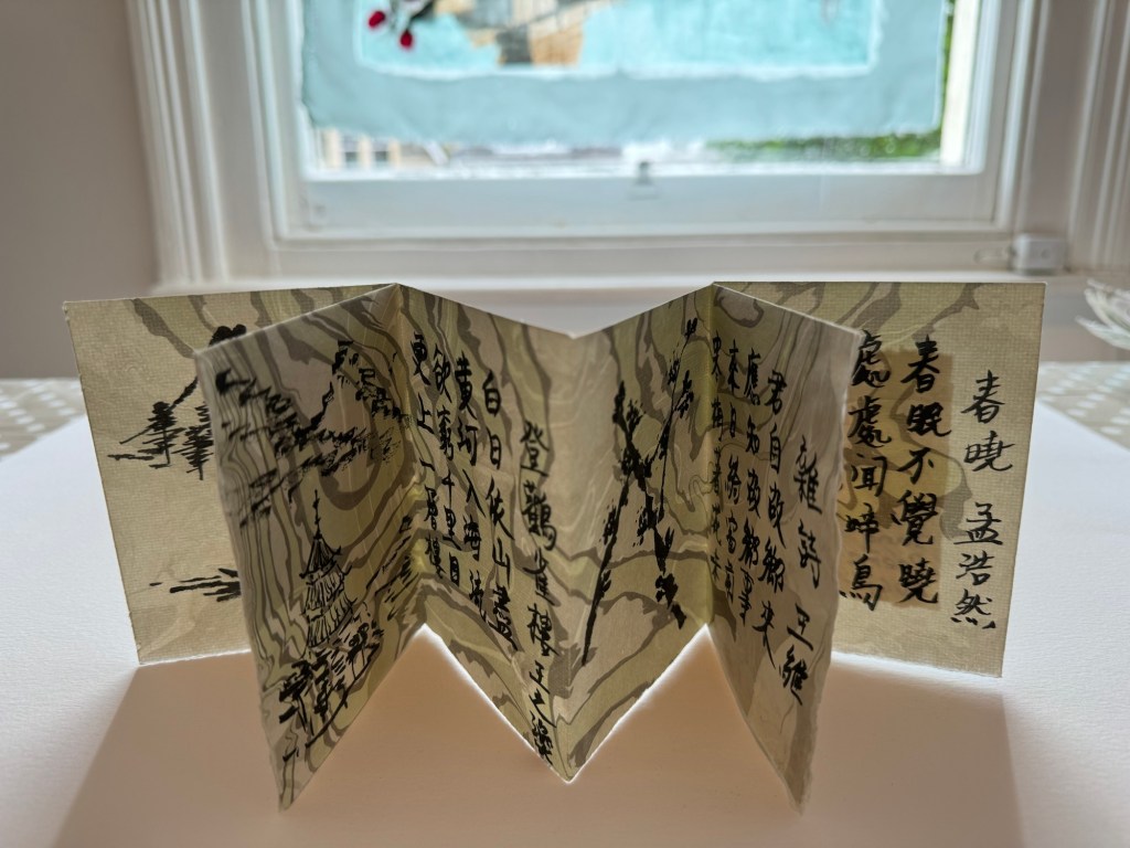
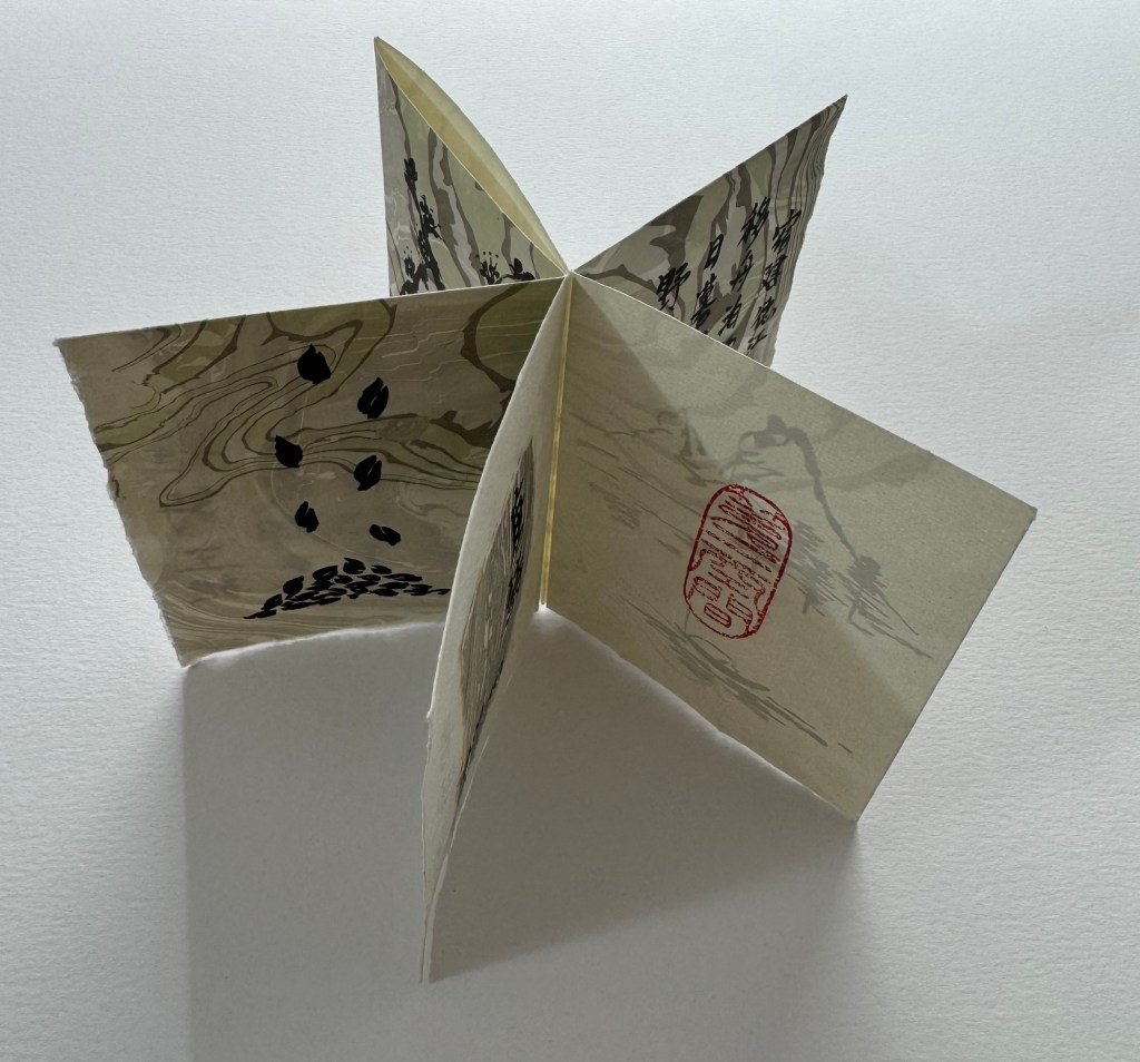
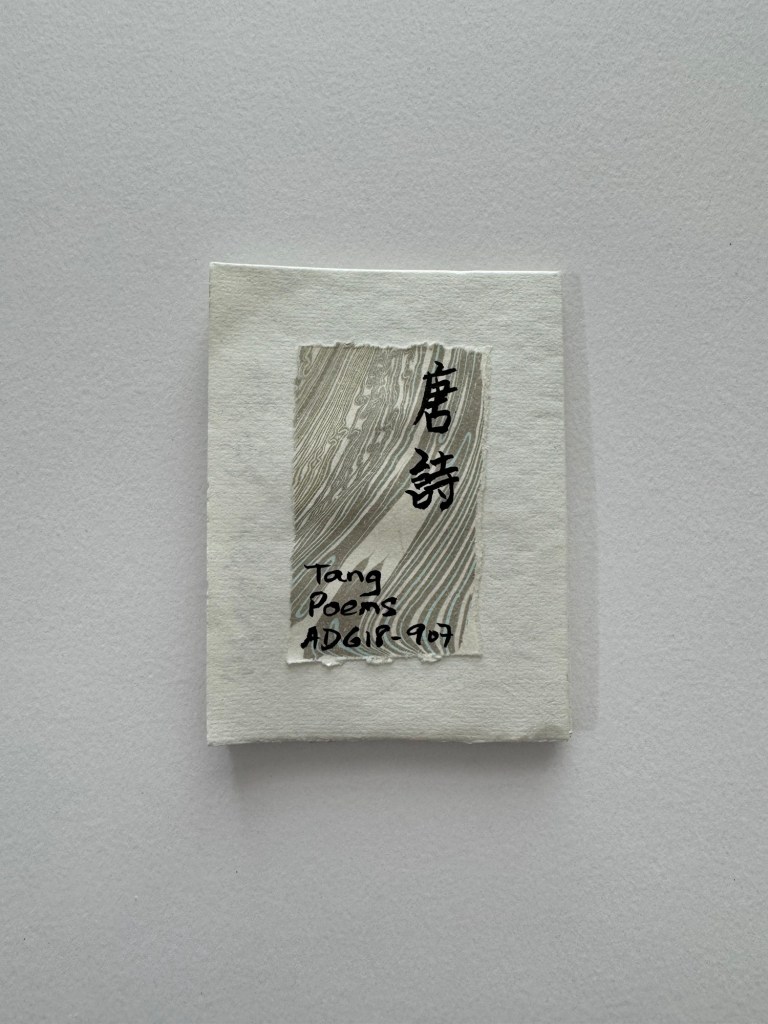
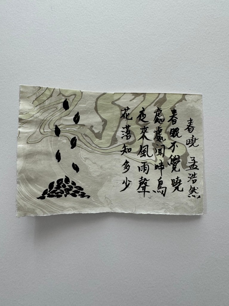
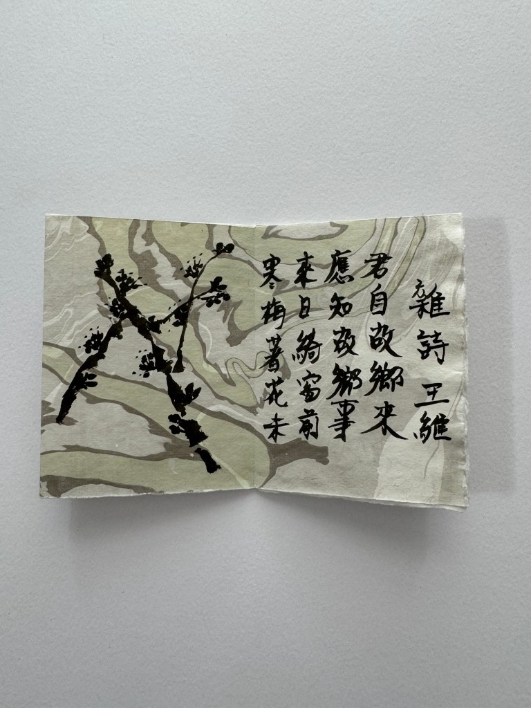
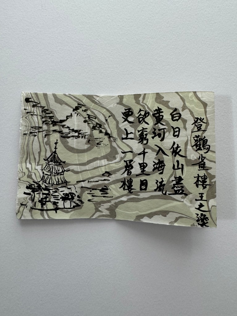
On another Suminagashi book that I made, I chose four Tang Dynasty poems and wrote them in the book using Chinese ink calligraphy, each paired with a small painting:
–
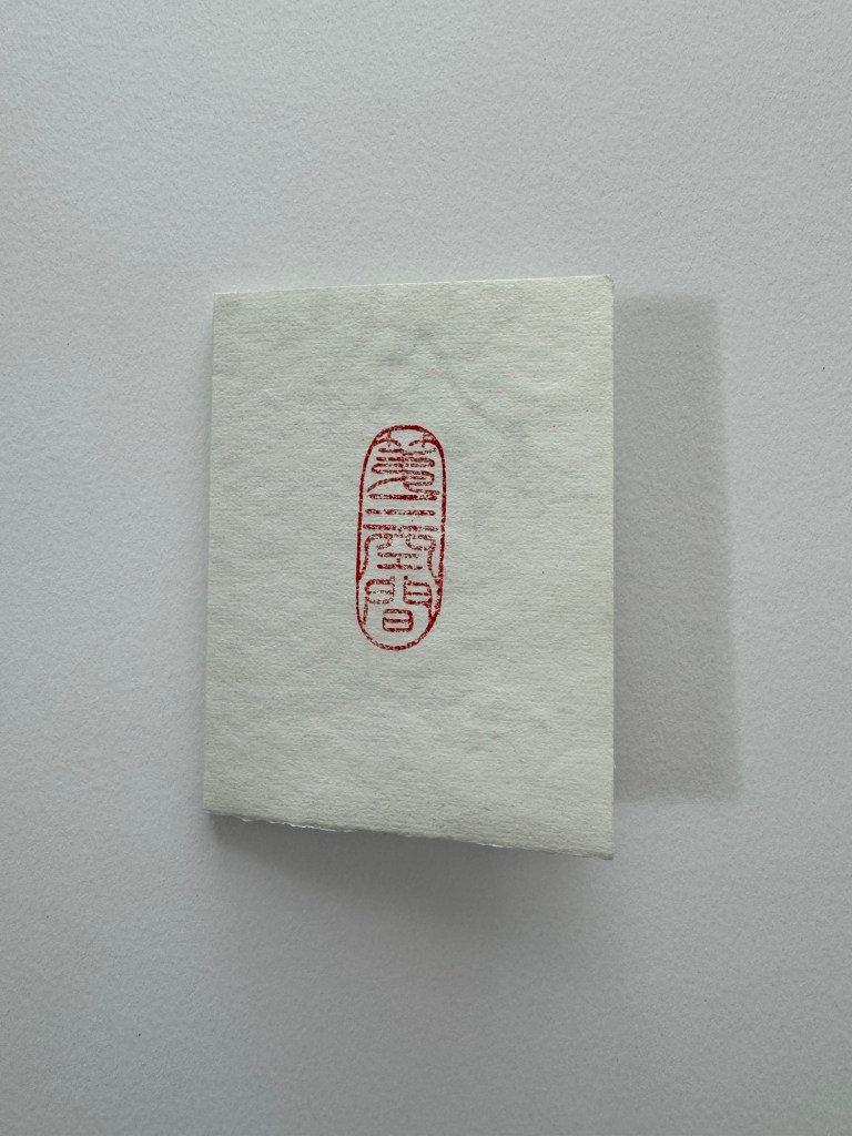
The seal on the last page of the book is a new Chinese stone seal that I designed. I managed to have it carved in Hong Kong and brought back to the UK by my Chinese painting tutor. The phrase on the seal means ‘The Third Space’, a concept that my art practice is based on so I will use it like my artist’s signature. The seal is carved in an ancient Chinese font.
Below is a video with my narration, reading out the English translation of the poems. Note that traditional Chinese books open from the opposite direction to English, Romance or Germanic language books:
–
REFLECTIONS
I was really inspired by the visit to the book art fair. It helped me to understand how broad the scope of this art form can be. I knew very little about book art until the low res workshop earlier this year and I am excited by it. I enjoyed making the simple books in this exploration, especially using the Suminagashi paper. Here is a summary of what I enjoyed about this exploration:
– I enjoyed the quiet pleasure in the act of folding paper carefully, especially with beautiful paper such as the Suminagashi paper. The feel of the material surface, the edges and creases all added to the meditative effect that this art form has to offer.
– I enjoyed learning a new skill in making books. Although I am only making very simple ones at the moment, I am excited by the potential complexity and scope that book making can offer. It is new knowledge and a new challenge for me.
– Once a book is made, it is like having a new canvas calling out for creativity that requires a new way of thinking compared to my other work.
For me, it is a two stage process: (1) Think about how I want ‘the canvas’ to be and realising that idea through physical making; then (2) express my art on the made canvas. The stages are similar to the Cheongsam (Chinese dress) canvases that I have been making for painting. That approach also requires creating a 3D canvas first through a step-by-step ‘technical’ process before any drawing or painting can take place.
The similarities between my book-making and dress-making to create canvases only occurred to me during the writing of the above reflections. I was beginning to feel concerned that I might be going from one thing to another too soon in my practice. I am not dropping the dress-making work, in fact, far from it – I have planned many other projects based on Cheongsam canvases. But I also want to explore book art and I now realise the similarities between the two in the context of my practice. I believe it can be explained as follows:
– The book-making or dress-making processes start by my following some guided steps, this way of making gives me a structured approach to starting a project. Meaning, it is unlike just getting out a plain sheet of paper or a pre-made blank canvas where you are immediately faced with having to decide what to paint. Through the structural and systematic start of the creative process (i.e. making a book or a dress), I can proceed to create ‘productively’ and while I am making the ‘complex canvas’, I can think about what to paint on the canvas or to finalise the ideas in my head. The process of making the canvas (which in the case of a dress can take several days) gives me quality thinking time whilst doing something productive and not just sat in front of a blank canvas feeling bad that nothing was happening.
LEARNING
Attending the book art fair taught me a lot about the scope that this art form can offer. In my own experiments, I have learnt more about the art of making books from a technical perspective – I am at a very early stage right now but I definitely want to learn more to make more complex or larger books.
My reflections above made me realise that the process of making the canvas myself (e.g. a book or a dress) has been a key part to my enjoyment in making art recently because I have been using the canvas making time and process to aid my thinking and to finalise my creative ideas. I have been doing this without consciously knowing it. I value the fact that making items such as a book or a dress are established processes and therefore give me a secure and stable route to start each piece of work. On the contrary, if I were to create a completely free-form assemblage from found items as a starting point, I would be inhibited by such an open and abstract process at the beginning of a piece of work – I would not know where to start and therefore it would be like sitting in front of a blank canvas again. This realisation is very important and useful for me because I can now think about other potential canvases that I can make from an established method in order to expand my practice.
NEXT STEPS
– Continue to make books and learn about book making to expand my knowledge.
– Think about other canvases that I can create in addition to books and dresses that would enable me to have the quality thinking time as part of my creative process and to avoid the ‘starring at a blank canvas’ problem.
UPDATE:
I made another book using a piece of Suminagashi paper folded into a small long book. In it, I wrote four short Tang Dynasty poems in Chinese calligraphy and coloured some areas using Chinese painting colour.
It has been a while since I last posted about my Chinese brush painting. I continue to attend my monthly Chinese painting class. After completing the Sumi-e classes, we have returned to meticulous style work. I prefer freestyle and would not usually do meticulous style by choice. However, the tutor is rightly insisting on starting a new topic with meticulous style work so that we pay close attention to the anatomy of the subject.
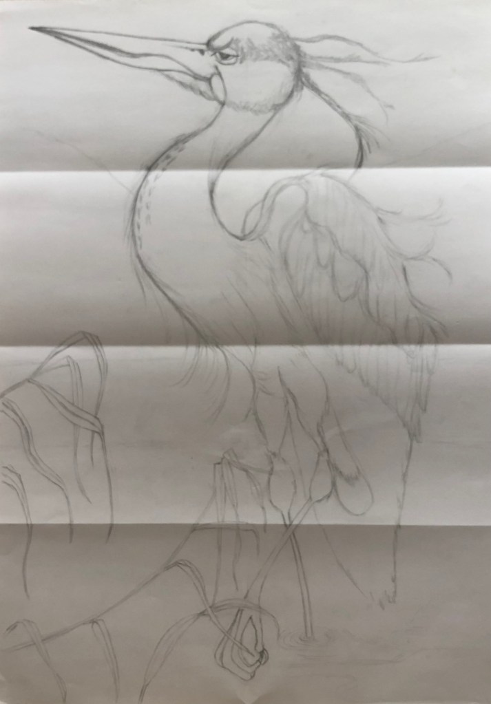
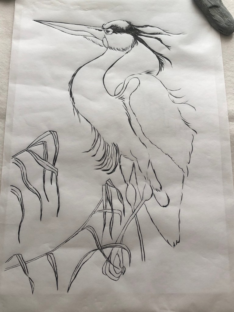
The subject this month is the heron – a beautiful stylish bird that is often depicted in Chinese paintings. The homework was a rather detailed image and we were asked to ‘go big’.
METHOD
To go big, I did a large pencil drawing of the heron so I can use it as a template for the painting. The tutor said that this method of making a template is not ‘cheating’ as long as the template drawing is done by ourselves, i.e. not just using a photocopy of an image for tracing.
Below is my A2 size pencil drawing:
–
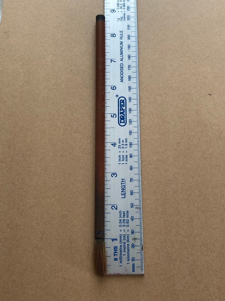
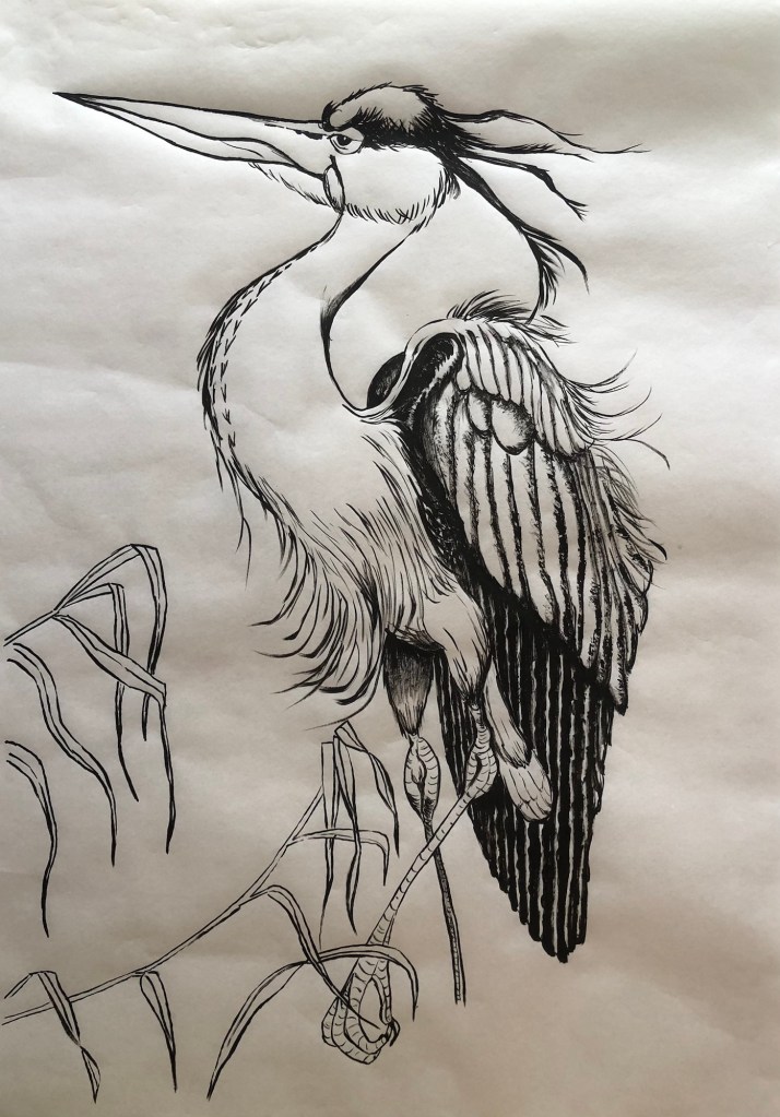
I chose to use Moon Palace paper for this drawing because it was the widest width Chinese painting paper that I have. The paper was laid over the pencil drawing and the outline of the bird was painted using Chinese ink and brush. The brush here was used in drawing mode for the outline, meaning that only the very tip of the Chinese brush was used like a pencil. This stage requires a very steady hand!
A 30 year old wolf hair brush that belonged to my mother was used for this painting:
Work in progress:
Painting completed with outlines and dark areas ready for colour painting:
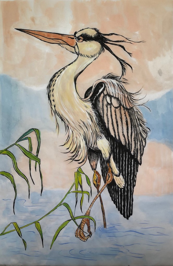
Finished work:
Heron – Chinese ink on Moon Palace paper. Size H68cm x W45.5cm.
–
REFLECTIONS
This is a meticulous style figurative painting. There is technique involved especially in understanding the materials behaviour and working out the optimum process could be challenging. However for me, I feel the illustrative nature of this type of work does not demand the level of thinking or inquiry like making a piece of contemporary art would. So what can I reflect on?
The thought that kept coming to my mind during the making process was – the image seems ‘universal’, so what makes this a Chinese painting? I used Chinese materials (Chinese ink, moon palace paper and my mother’s Chinese wolf hair brush), but the composition in this case seems universal to me. So I posed a question to myself – what makes a painting a Chinese painting? Is it just the materials or does it have to ‘look Chinese’, meaning does it have to possess certain aesthetic qualities? What makes a piece of art ‘Chinese art’? I am puzzled by this and I don’t have an answer yet. It is something that I’ll continue to think about. I may pose this question at my next Chinese painting class and see what others think.
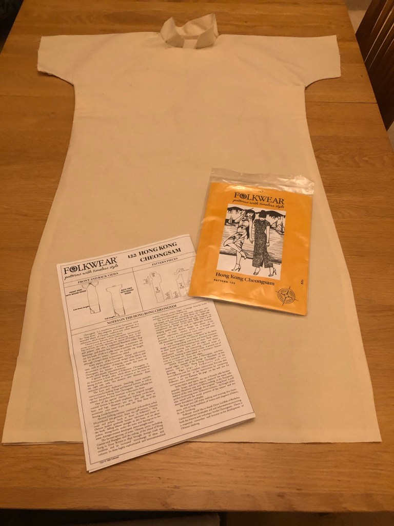
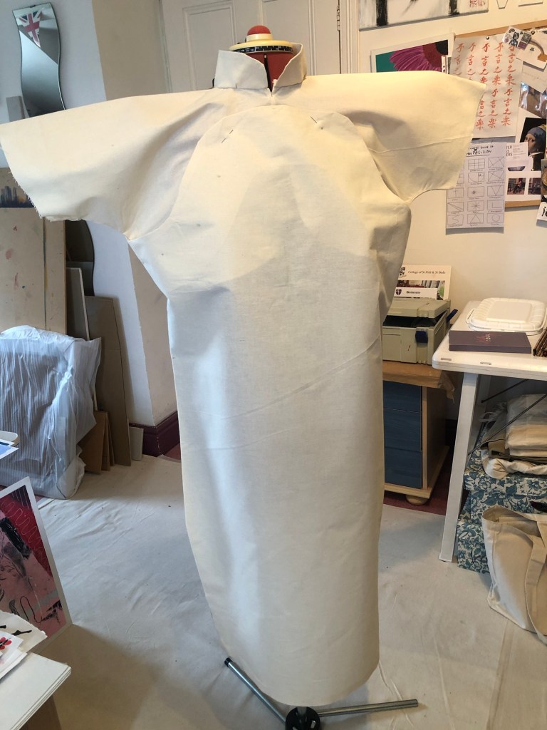
Following on from Cheongsam Series #2, the plan was to create a wearable painting in the form of a Cheongsam. I have little experience in dressmaking but I remember watching my mother make dresses when I was young. She was a very talented dressmaker and I used to enjoy watching her work. I vaguely remember my grandmother being a dressmaker, too, so I guess my mother must have been inspired by her mother. I also learnt sewing at school so I have some knowledge of the process. I started to research how to make a Cheongsam.
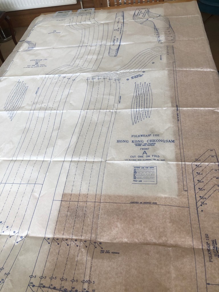
I researched different sewing patterns online looking for one that’s not too complicated and I managed to find one. The reviews of the pattern suggested it was easy to make and I ordered one.
METHOD
–
The pattern seemed straightforward and simple which was a great way for me to learn to make a Cheongsam. I measured myself and chose a size on the pattern.
–
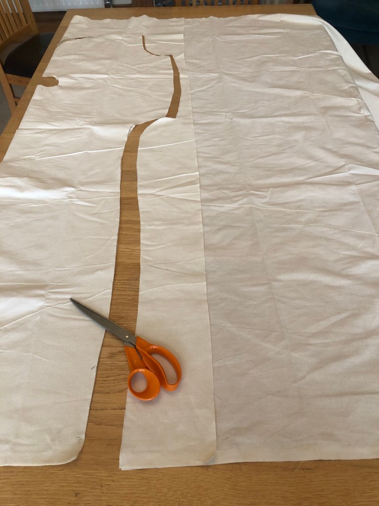
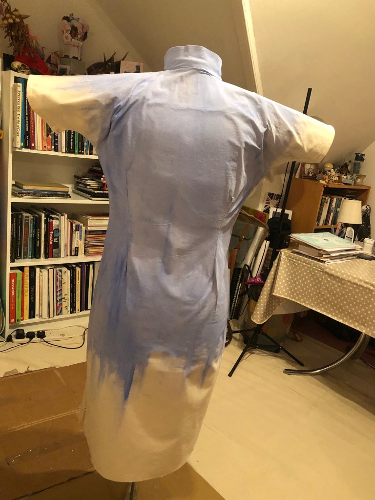
The fabric I used was a light weight calico cotton canvas material. I felt the light weight yet tough texture of the fabric was suitable for a wearable painting.
–
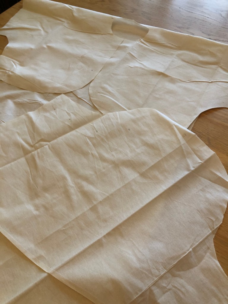
Pieces of canvas material was cut according to the pattern.
–
My 40 year old sewing machine which has not been used for many years refused to work due to years of neglect. So I had to hand sew the dress.
–
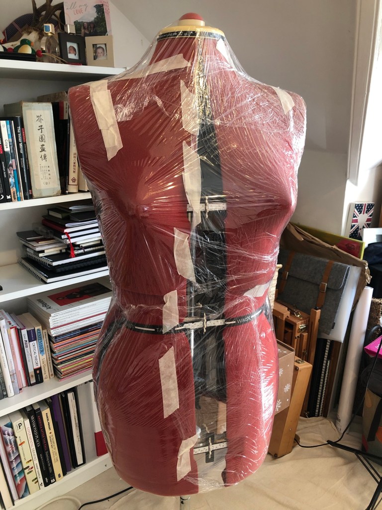
The canvas dress was put onto a dress maker’s mannequin for finishing.
–
I was overly generous in my fabric cutting so the dress felt very large. The sewing pattern had provision for darts for a tighter fit. So I marked those out and sewn darts onto the front and back.
–
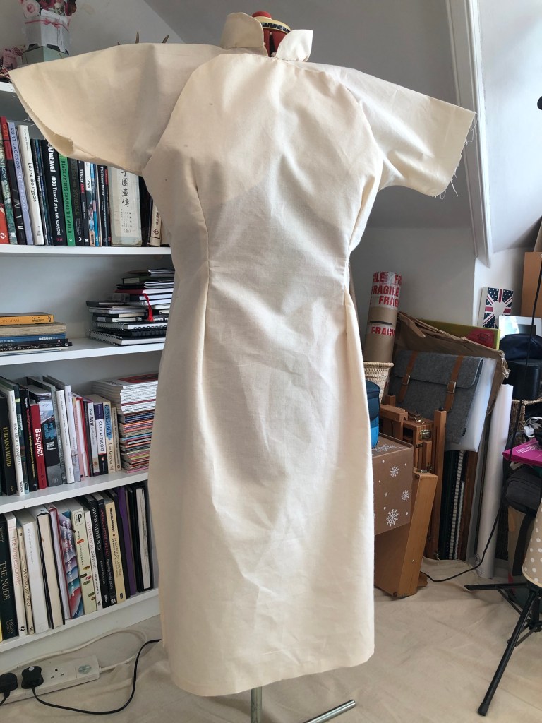
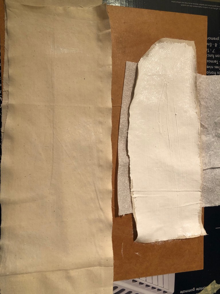
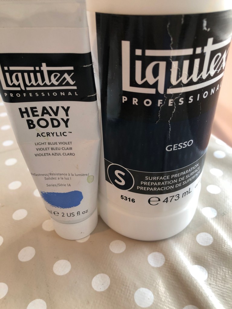
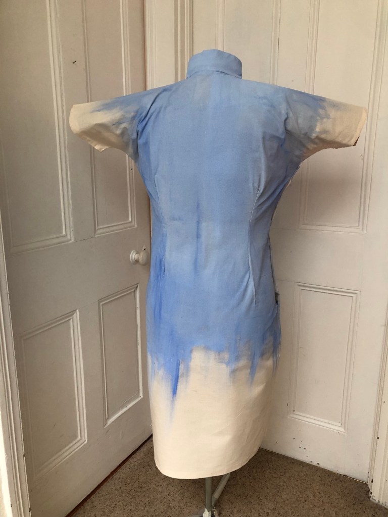
To decide on a primer for the canvas dress, both gesso and diluted white acrylic paint were painted onto fabric samples as experiments.
–
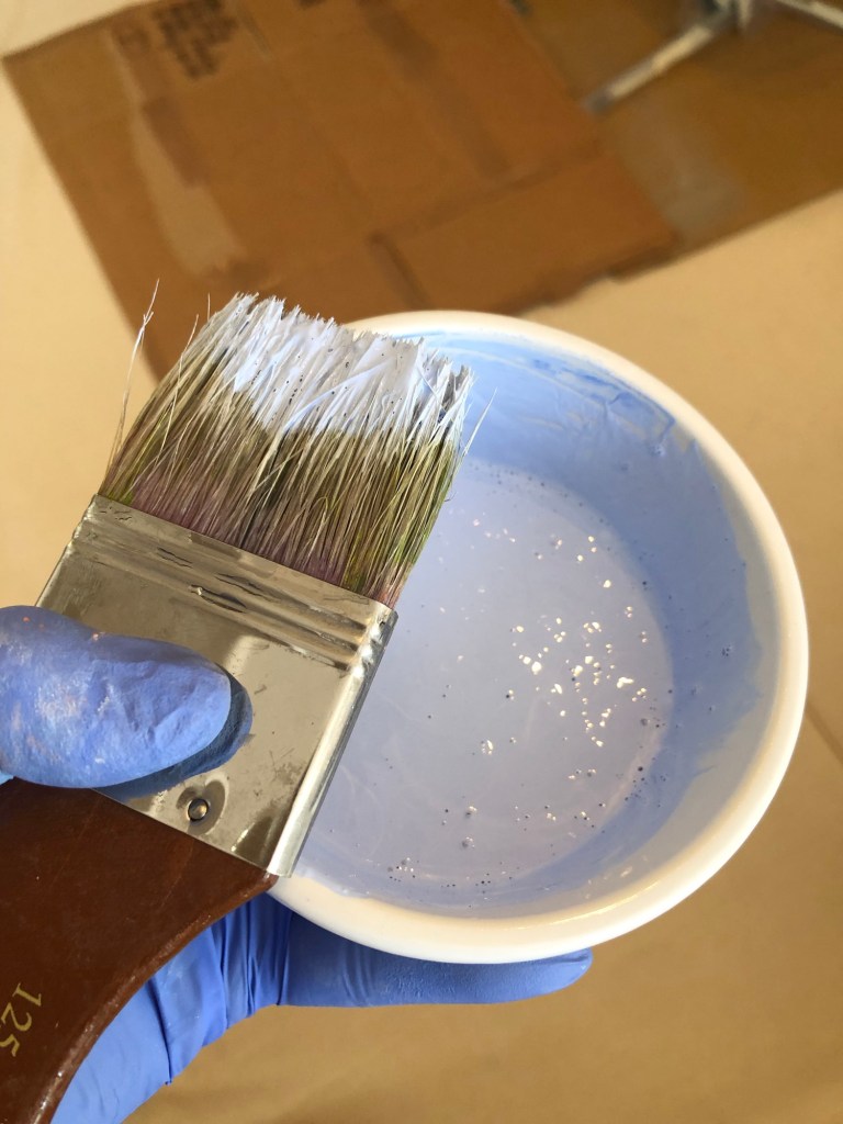
Once dried, acrylic paint was applied to both surfaces to see which would perform better. The gesso was preferred because it provided a smoother surface.
–
Since the fabric was light weight, the mannequin was wrapped in clingfilm for protection from the painting process.
–
White gesso with acrylic blue tint were diluted as primer.
–
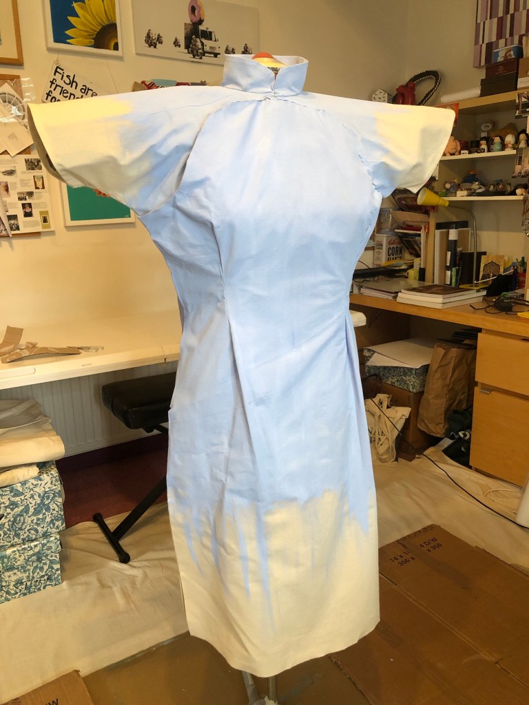
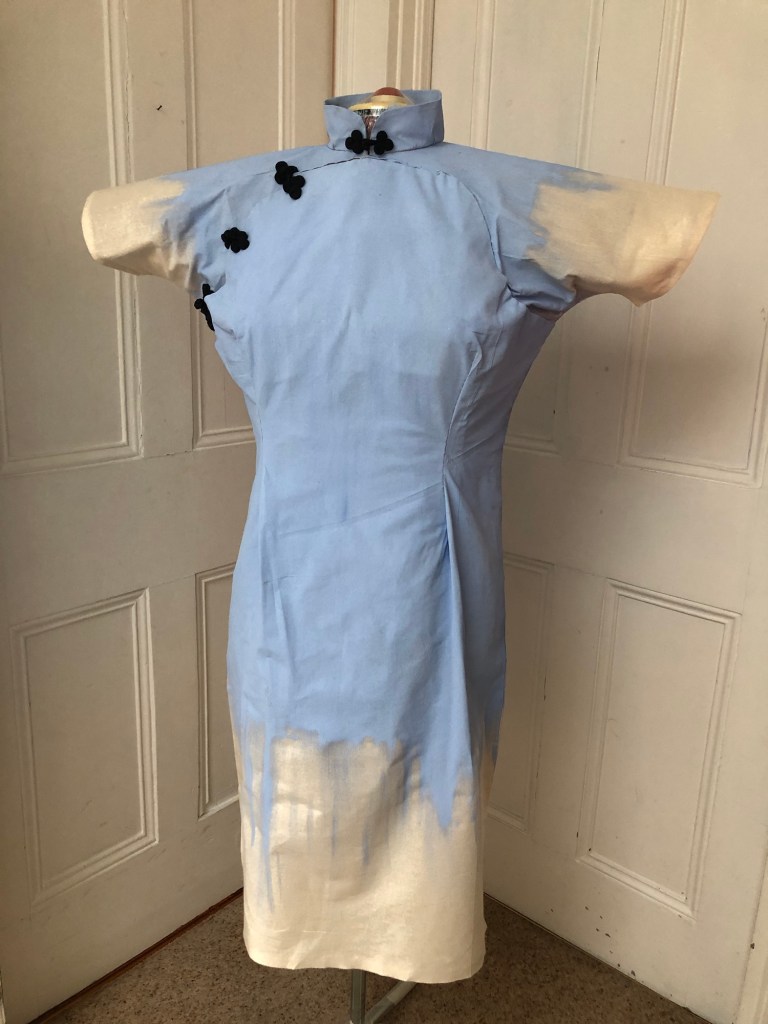
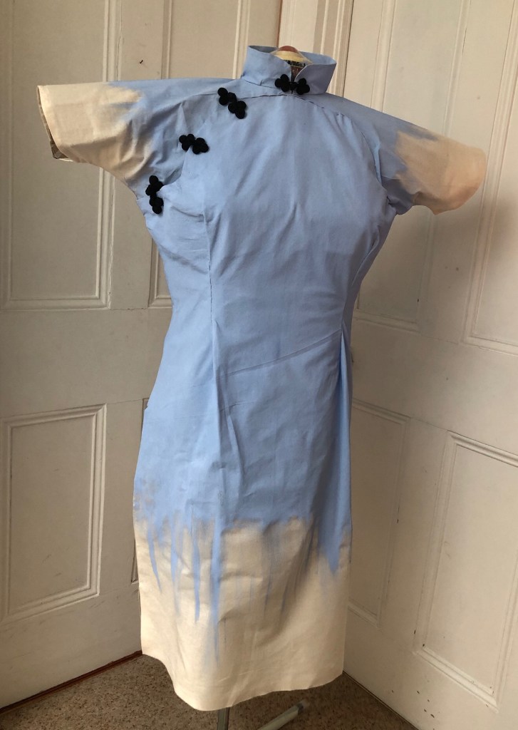
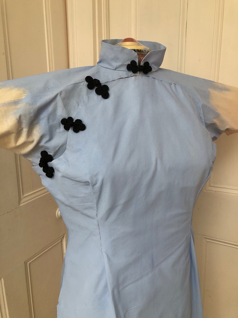
The canvas dress was primed on both sides. The tint worked well and I could use that as the background for the painting.
The final finishing step was to add the frogs (tradition fabric buttons or fasteners).
–
REFLECTIONS
I am pleased with the fact that I managed to make a canvas dress using a bought sewing pattern. This experience has given me confidence to take on other sewing or textile projects which will provide an addition dimension to my practice which I feel excited about. For now, I have made a 3D canvas in the shape of a Cheongsam and primed it. Although the painting was not yet finished, I wanted to pause and reflect on the progress so far and take time to consider what to paint on the dress.
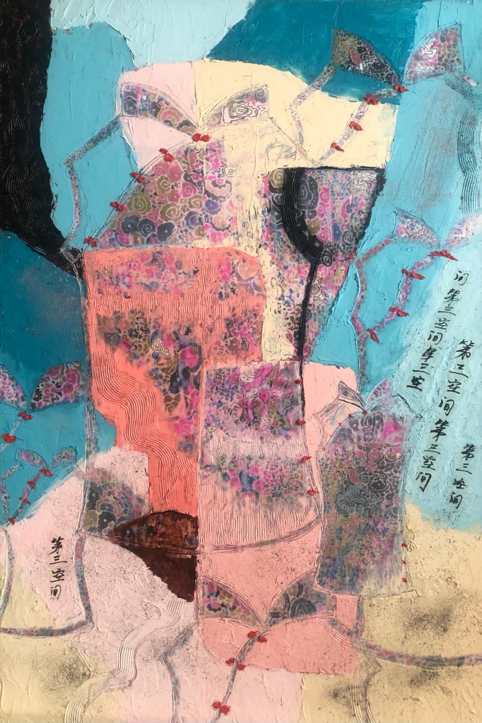
The Cheongsam series started as a result of me finding my mother’s old Cheongsams in my loft, which triggered intrigue and inspiration for me to make work on the Cheongsam subject. I know little about the Cheongsam and I am starting to research about its history especially its evolution and how the style changed over time partly due to influences from the West. E.g. the Cheongsam started off as a loose fitting garment, however, as European designers such as Christian Dior marketed more figure-hugging dresses that were pinched at the waist, the Cheongsam started to evolve as Chinese women wanted to emulate European fashion. From around mid-20th century, the Cheongsam started to evolve as a result of the two cultures coming together and the new figure-hugging silhouette emerged which lasted till today. To this end, I believe the modern Cheongsam is a form of a Third Space phenomenon which fits in well with my overall research topic based on Homi K Bhabha’s book, The Location of Culture. My knowledge on the Cheongsam is very limited and I will be borrowing several books on the subject from CSM library. I look forward to finding out more to inform my Cheongsam series of work.
Having established that the modern Cheongsam is potentially a Third Space phenomenon, I would like to use the 3D canvas dress made here for a painting to show something about the Third Space, perhaps another Third Space phenomenon. I am considering making a series of Cheongsam canvases, each painted with a Third Space phenomenon and all as wearable paintings. I want to make them wearable so that they are metaphors for the uniform that transcultural people wear and the roles that they play as they navigate the different cultures in their environment. This work can help to inform my transcultural identity and heritage research.
LEARNING
I have learnt various techniques while making the dress and the experience will be useful as I go onto making other garments to feed into my practice.
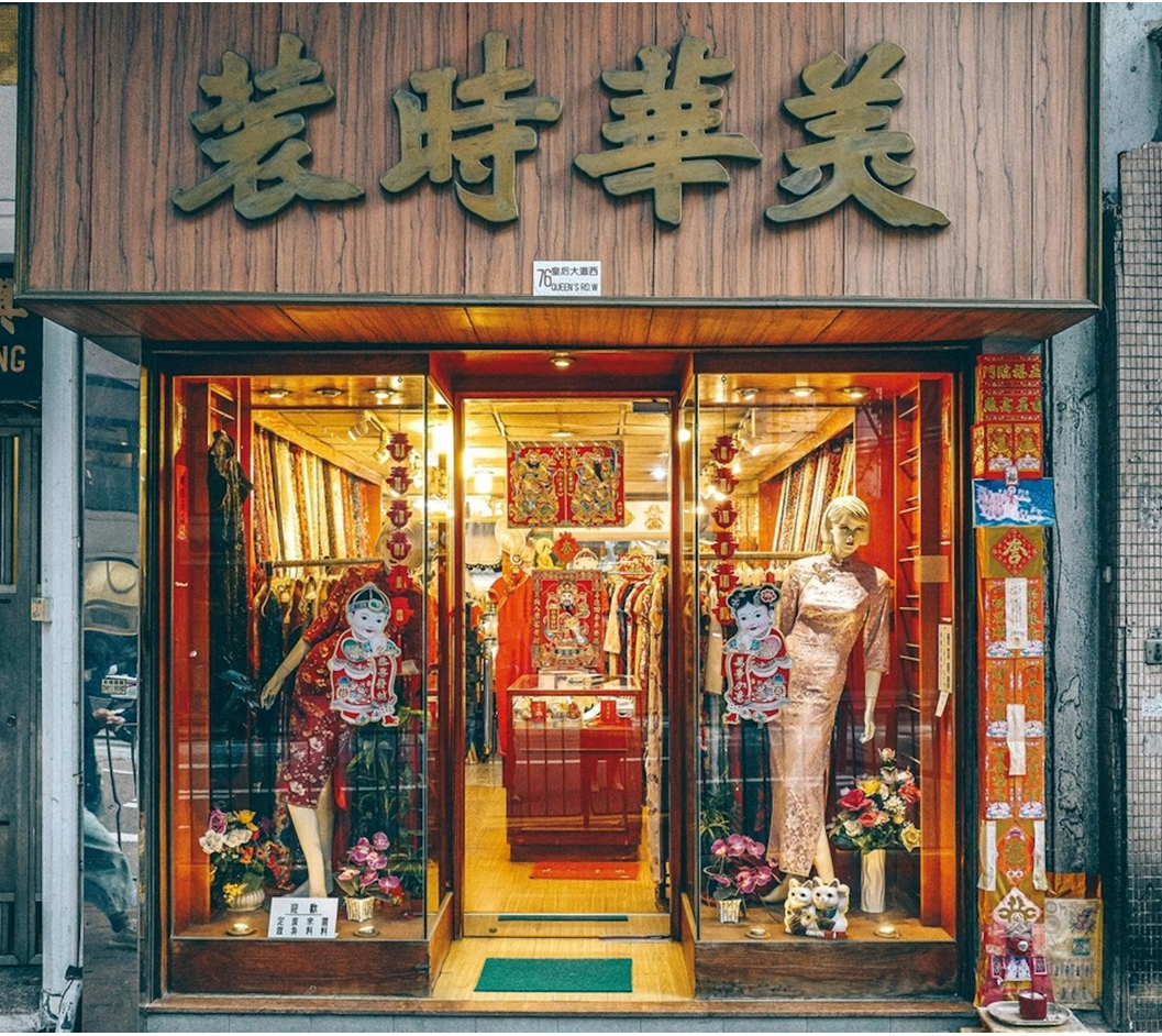
I need to learn more about the history of the Cheongsam because it intrigues me and is an interesting part of the Hong Kong heritage that will help inform my art practice. Especially with my late mother being a skilful dressmaker and I remember clearly the dress that I found being in her wardrobe for many years. My older sister remembers visiting the tailor’s shop with my mother to order the dress. In fact, she has recently found the history of the shop for me – it still exists in Hong Kong.
–
NEXT STEPS
Decide what to paint on the canvas and do the painting.
Research about Cheongsam to build on the series of work.
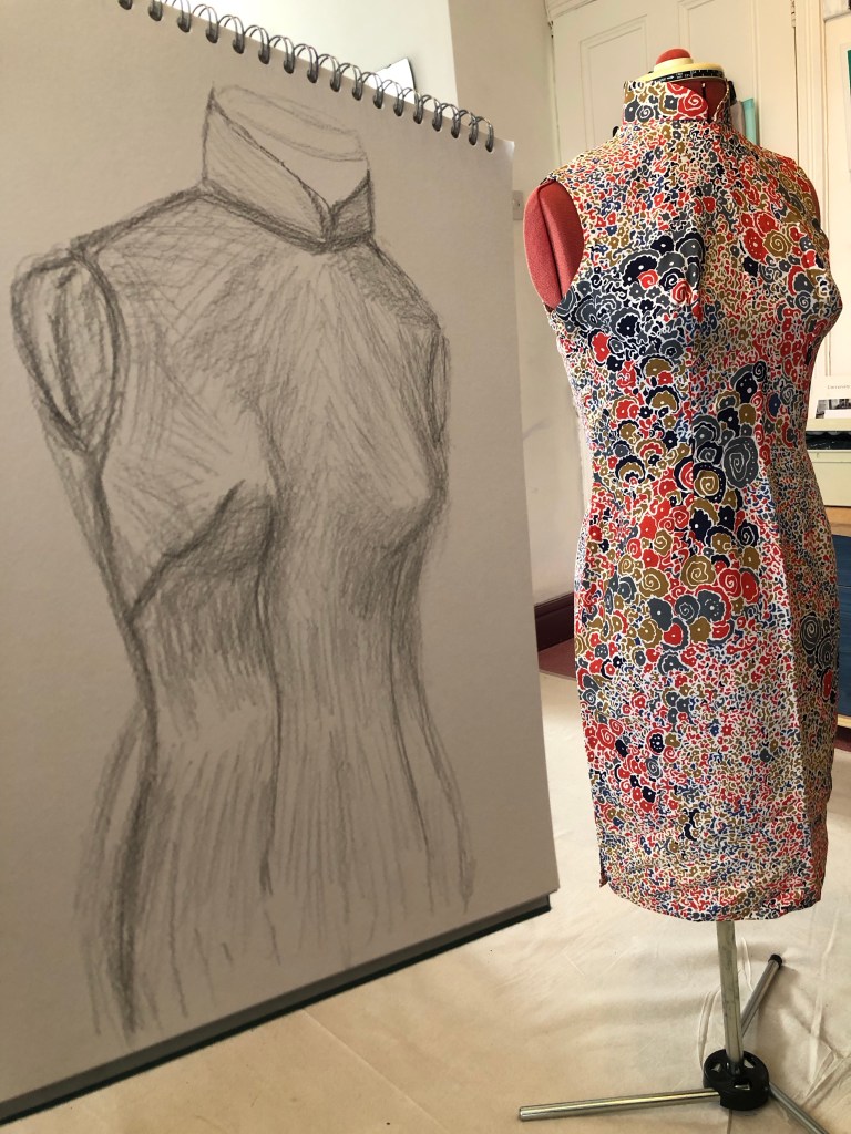
where I had made an abstract painting after finding my late mother’s Cheongsam in my loft, I was unsure of where to go from there. I enjoyed the making process in series #1 but didn’t feel like building on that particular piece of work. At the end of series #1, I said that I would make some informal work and have a play in my sketchbook. I studied the dress again to get inspiration. When nothing came to mind, I decided to do some drawings and use that time and the act of drawing to facilitate my thinking.
METHOD
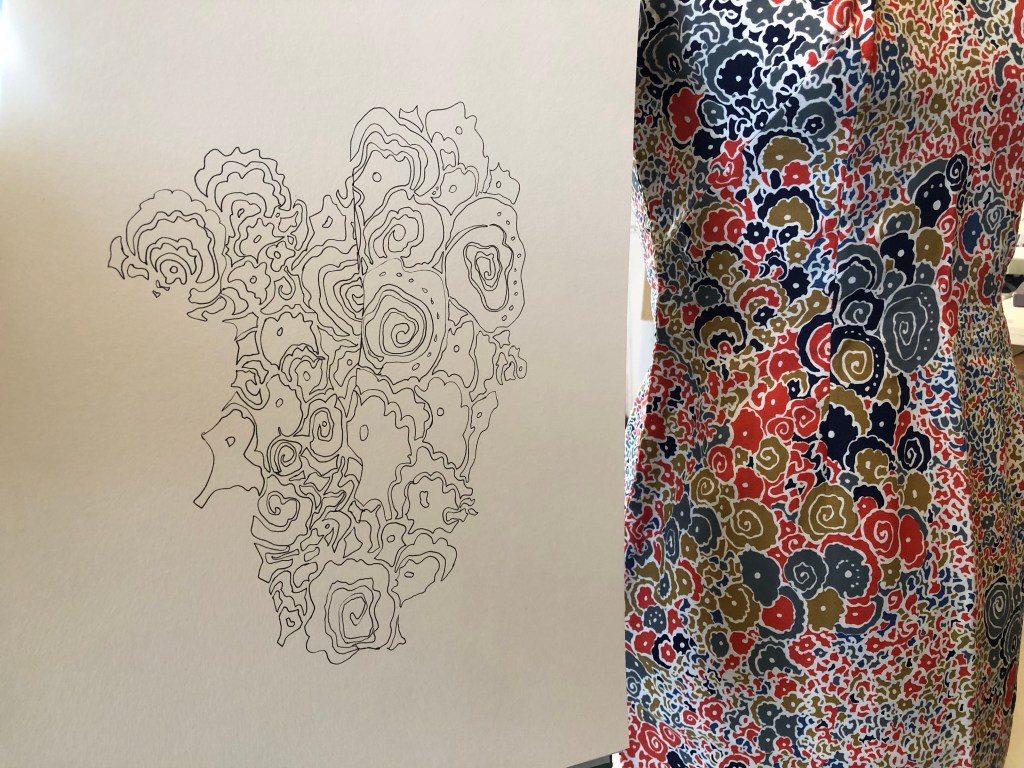
A pencil drawing studying the unique shape of the Cheongsam was made as a first exercise:
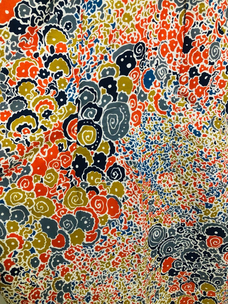
I have always been mesmerised by the pattern of this particular Cheongsam of my mother’s:
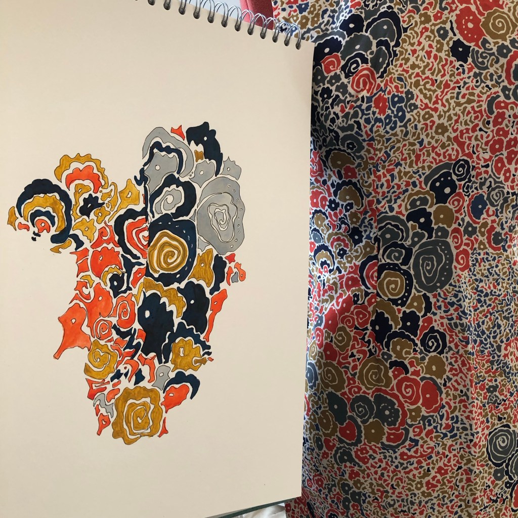
So I made a colour study of the most memorable part of the pattern. This area of the pattern has been imprinted on my mind since I was a little girl.
–
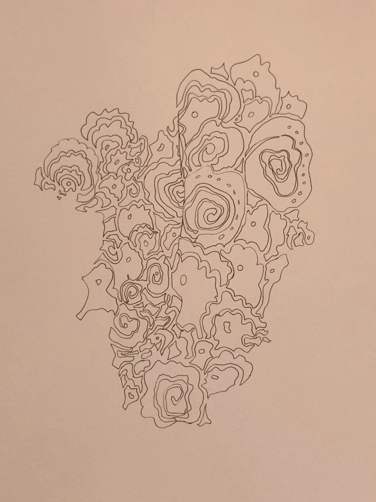
Since the fabric and the dress are so delicate, I wanted to use ink for the colour study. Any paint such as oil or acrylic would seem overly heavy.
–
The initial blue ink was too bright, so a darker blue ink (Quink) was used to complete the study.
A study of an abstract pattern on a mid-20th century Hong Kong cheongsam. Ink and pen drawing
REFLECTIONS
I was pleased that I managed to follow through on the plan I had set myself after the last painting – to make some informal work, hence the sketches. Also, I kept thinking about my tutor’s advice – just keep making, make anything – objects, images etc. I have not done much drawing since starting my MA and it was good to play in my sketchbook again.
During the drawing, my mind wandered onto what work to make next. I was so mesmerised by the cheongsam and the fabric pattern that I wanted to make one – to make a cheongsam. I didn’t just want to make a dress, I wanted to make a wearable painting cheongsam. I thought about making a cheongsam using a canvas material then painting on the 3D canvas dress. I have had many ideas about making wearable paintings in the past and that thought has just occurred to me again. So I think it’s time to do it.
Making a cheongsam is not easy and I’m not an experienced dress maker. So I researched online to find easy to make dress patterns. Also, I researched online the books available at UAL to find out more about the history of the cheongsam. I have reserved four books at CSM and also purchased one online. I’m looking forward to properly embarking on this research project to inform my cheongsam series of work.
LEARNING
– The drawing exercise was very useful and enjoyable. Since it was not a highly challenging piece of work, I was able to let my mind wander and came up with ideas of making wearable cheongsam paintings. I should use drawing more as a way to explore and think. I know it does work, I just need to do it more.
– I bought a book on the history of cheongsam online and realised I should have looked at the UAL library first. I was delighted by the library’s materials on the cheongsam and the facility to borrow books from other UAL college libraries was very useful. UAL also had a copy of the book I bought, so I could have saved some money – must remember to search the library first next time.
– I am excited about starting the next project on making a wearable painting with opportunities to research the dress’ history as well as the materials for this application.
NEXT STEPS
– Make a wearable cheongsam painting based on the ideas that came to mind during my sketching.
– Research the history of the cheongsam so I can be more informed in my making.
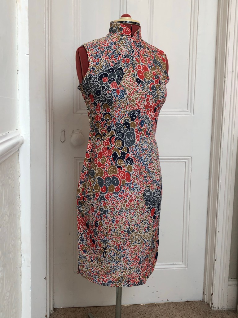
During one of my visits to Hong Kong some 30 years ago when my mother was still alive, she gave me four dresses as keepsakes – two hand tailor-made silk Cheongsams (traditional Chinese dress) from when she was a young woman and two evening dresses that she made herself for dinner balls that she went to with my father. One of the cheongsams was my favourite, it had a distinctive and memorable pattern. I remember very clearly that I used to open her wardrobe as a little girl to admire it and I was mesmerised by the pattern. Everything about it said ‘my mum’ to me. So I was very happy when she gave it to me to keep as it was very precious and had so much history.
Then in 2001 when I moved house (in Bristol, UK), I cleared lots of old things into a skip. As the skip was driven away, I remembered a small suitcase containing the precious dresses was accidentally thrown into the skip but it was too late. It was one of the things that I have regretted all these years.
That was some 22 years ago. Then earlier this year, I was clearing out the loft and found a box containing some old items, inside which was a plastic carrier bag contain the four dresses. It was as close to a miracle as I could image. I hadn’t thrown away those dresses after all! To find them again after all these years was an emotional moment for me.
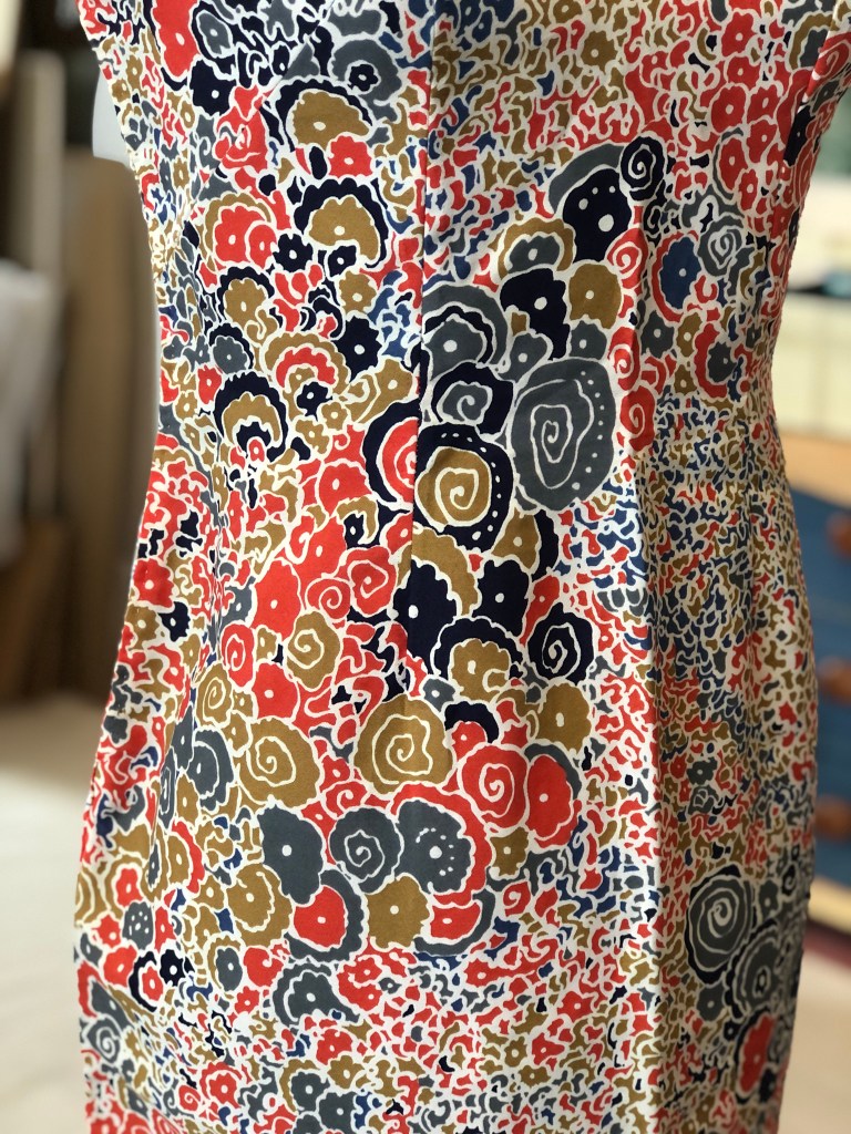
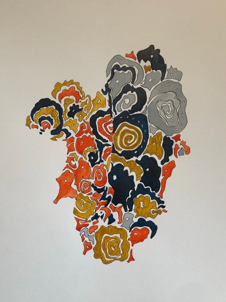
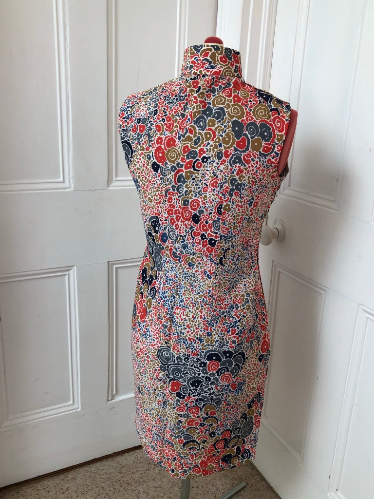
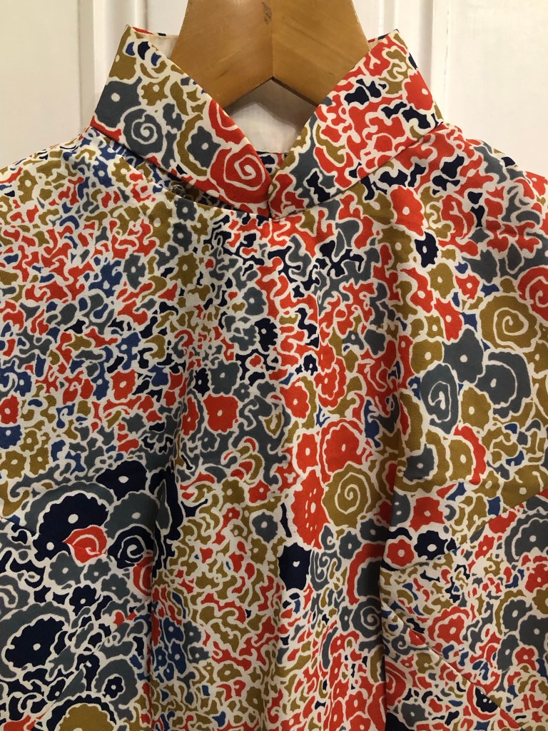
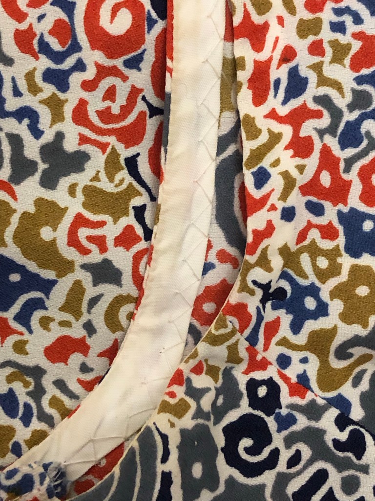
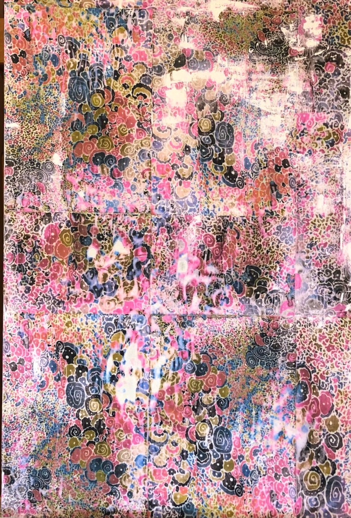
Here is the distinctive Cheongsam that I adored. It is a traditional Chinese dress made with a contemporary western style abstract patterned fabric of the time (late 1960s). It is a good example of a piece of transcultural garment. It has some deep creases from being folded for so many years but I am unsure of how best to iron or care for it, so until I find out, I decided to refold it for safe keeping. Below are some photos I took before putting it away.
Front viewBack viewClose up of the Madarin collar design Close up of the abstract pattern that fascinated me as a child Close up of the details of hand made stitches along a seam
There is so much history to this interesting dress, its rich features and heritage make it very precious and can provide inspiration for my art making. However, I was unsure of what to do and where to start.
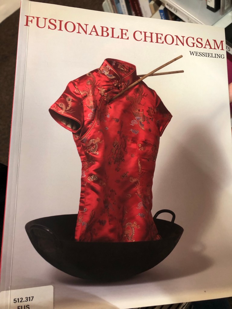
When I recently visited the Stuart Hall Library in London as part of my MA Fine Art course Low Residency at CSM, I saw the book called Fusionable Cheongsam. I was unable to spend too much time there because we were on a tight schedule for the day and I hope to return soon to have a good read of the book. However, I had seen enough to convince me that the Cheongsam could be a good focus for my art making. I decided to start with a painting.
METHOD
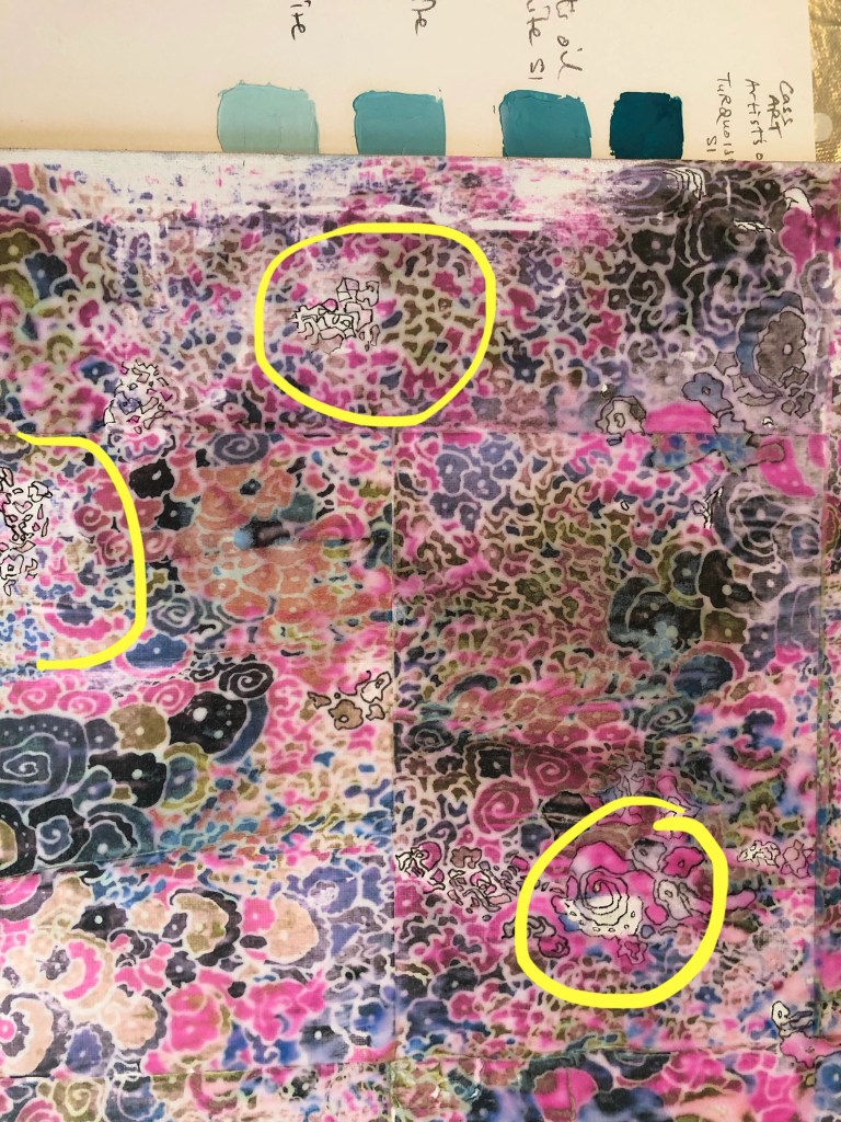
Photographs of various parts of the Cheongsam fabric pattern were taken and printed on an EPSON EcoTank ET2860 inkjet printer.
Images were selected to fully cover a 30×20 inch canvas board. Dispersion liquid was used to transfer the printed images onto the canvas and left to dry overnight.
The paper was rubbed off leaving the transferred image on the canvas. As expected, the process usually leaves blank patches as it had done here:
Where there were blank spaces, the outline of the abstract shapes were drawn in using a 0.2mm black fine liner pen.
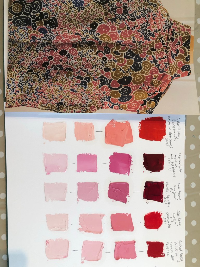
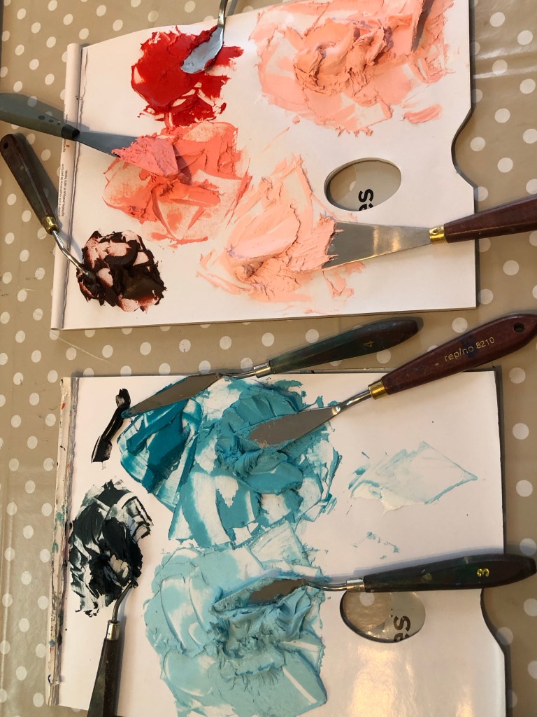
Using the colour charts I prepared a few weeks ago, various colour shades were chosen for the top layer oil and cold wax painting. The oil and cold wax were mixed in 50/50 ratio.
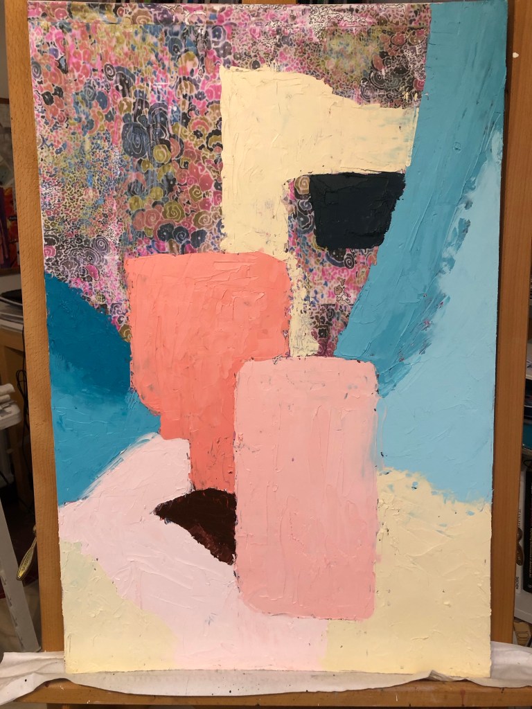
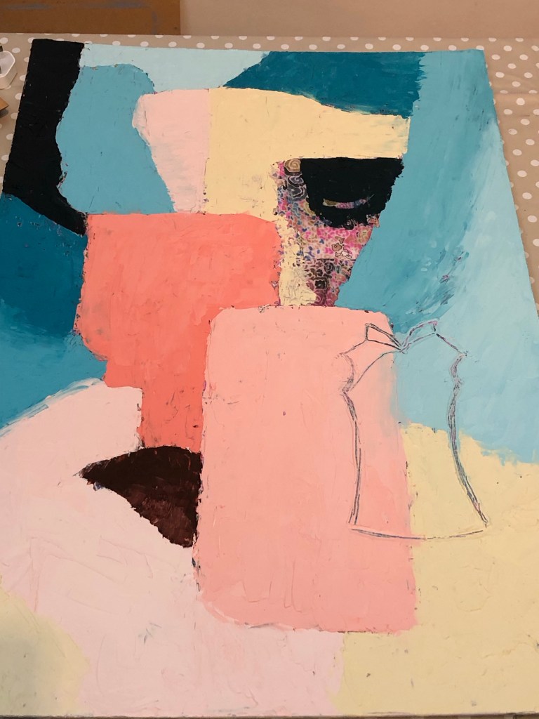
Blocks of colour were painted onto the canvas. The approach was abstract and without pre-planning, I was just responding to the canvas. Towards the bottom centre area, I wanted to paint a dark red triangle, what came out was part of a mouth or lips. The lips led me to start painting an abstract face:
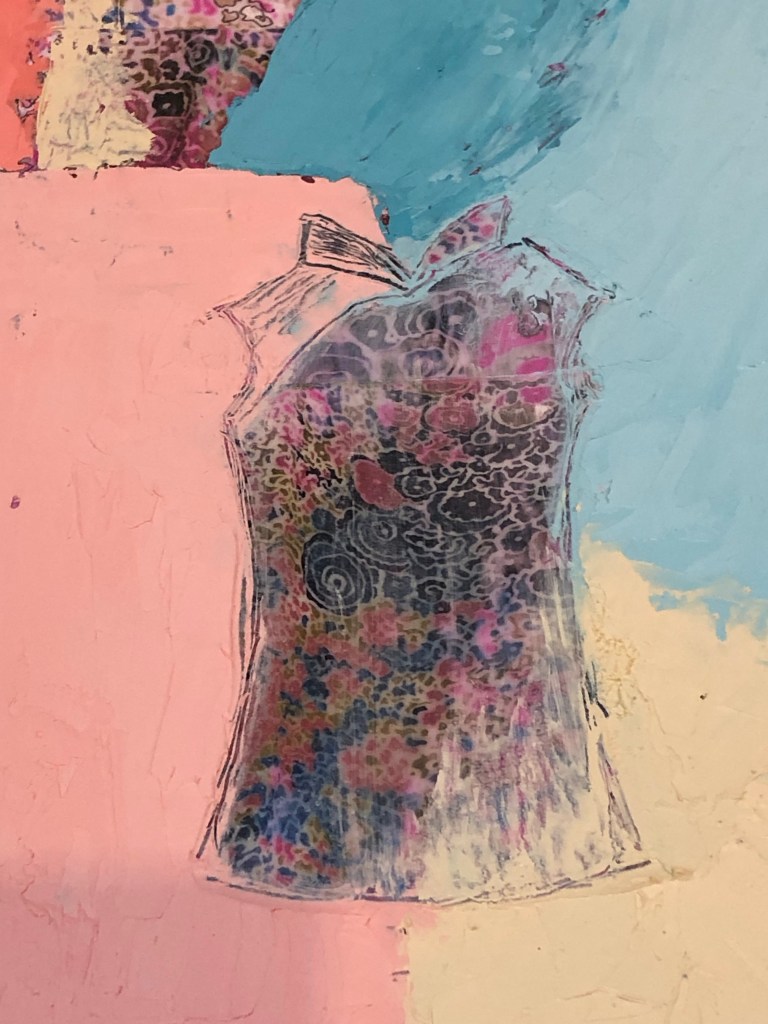
Once the top layer painting was completed, I started to scratch off the paint, firstly in the shape of a small cheongsam.
Then the paint was scraped off and the area cleaned with environmentally friendly solvent:
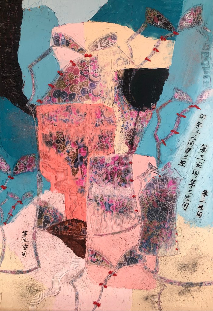
I liked the image and I then responded to it by making marks of several other cheongsams of various sizes. Bright red paint was used to depict the traditional Chinese buttons used on garments. Strips of Chinese calligraphy with the phrase ‘third space’ was layered onto the paint then pigment was sprinkled to add texture.
I felt troubled by the face, especially the dark eye, it looked too sinister. So I scraped off most of the dark eye to give it a kinder look.
Finished work below – Cheongsam #1. Oil and cold wax on canvas with image transfer. Size 20×30 in.
REFLECTIONS
What I am happy with:
– The colour palette
– The fabric pattern that came through
– The Cheongsam shaped mark making
– The little red buttons as a colour pop
– The inlaying of Chinese calligraphy
– Enjoyed working with oil and cold wax media
What I’m not happy with:
– The composition, the ‘lips’ accidentally appearing led me to subconsciously start creating a face-like composition. I’m not sure if it worked. When the ‘eye’ was completely filled in black, it became a strange and eerie creature. It was too distracting hence I scraped off most of the black to reduce the impact.
– Due to the strange face, it doesn’t sit comfortably with me which perhaps is a good thing. Better than being forgettable.
Other thoughts:
– I wanted to use the cheongsam series to help me to delve into my thoughts about my family, especially my mother, our relationship and my heritage. I am not sure if I achieved this in just this painting because I was overly focusing on making the work and trying to get the composition right. But I am keen to continue the Cheongsam series and feel that I am at the beginning of something.
– I am intrigued by the history of the Cheongsam and want to find out more.
– The fact that such a traditional Chinese garment of my mother’s was made with a western style abstract pattern was intriguing – this is what the Third Space is about and I have accidentally stumbled upon this excellent example – my mother, a Chinese woman from colonised Hong Kong, chose this dress with this fabric. I have not fully processed this finding yet, but I wanted to acknowledge it here and will slowly delve into what I think and how I feel about this.
LEARNING
– Various symbols have emerged from this piece. I am inspired by Fiona Rae’s work where she often uses playful symbols. I can try a playful approach with e.g. lips or butterflies. The collars of the Cheongsam remind me of butterflies, they could be turned into a signature symbol that I use in my work.
– Other symbols such as the distinctive buttons that are used in Cheongsam and traditional Chinese garments, I loved playing with them when I was a child – I can investigate those further.
– I am intrigued by the Cheongsam and I want to research about its history and other related art such as in the book ‘Fusion of Cheongsam’ to get inspiration for making.
– As I was painting, I felt that I was trying too hard especially in the composition of the oil and cold wax layer. It felt deliberate rather than a free response to the canvas. I could use my sketchbook more to plan composition for my work, do more quick trial and error exploration.
NEXT STEPS
– Continue the Cheongsam exploration because I feel excited by the subject – research into its history and related art to get inspiration.
– Keep making, do some informal work. Not every piece has to be a finished painting.
– Play in my sketchbook.
– Relax and enjoy the making process. Take time and don’t try too hard.
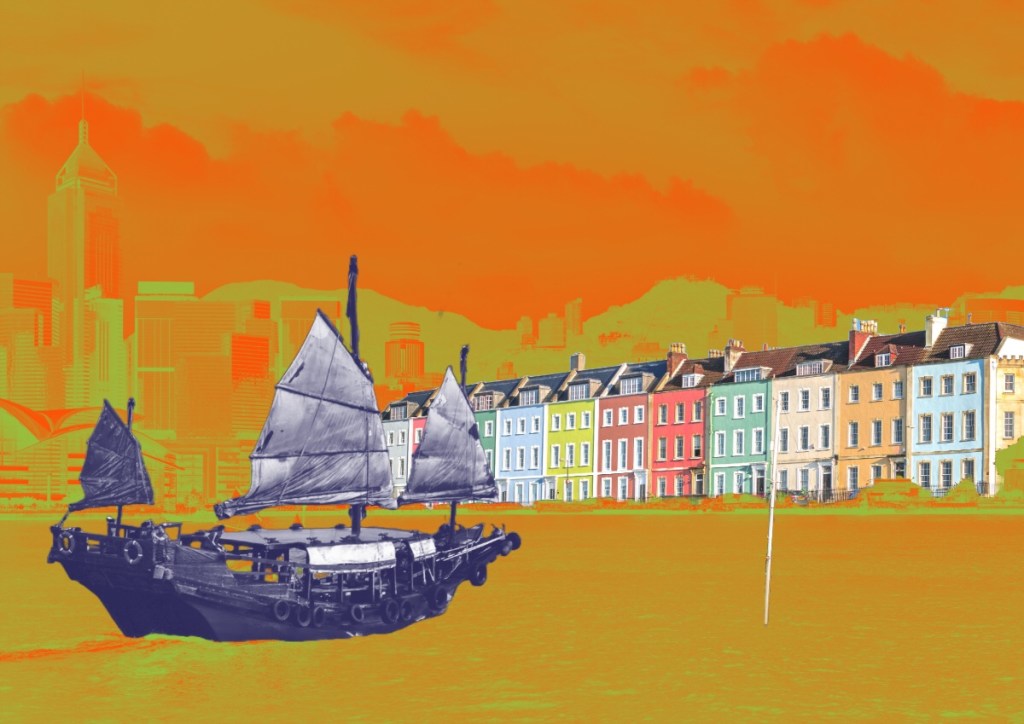
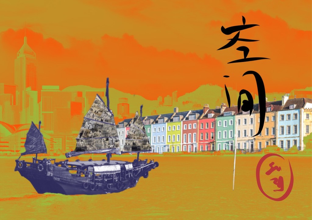
This piece of work was a continuation of my exploration of how to express the third space through aesthetics. It started with a digital collage in a similar way to the piece I did for the MA Interim Show in Part 2:
However, after I started this piece, my thinking took me to reflecting on how I felt about my work in the third space so far. My thoughts are captured in this blog:
Although this work did not start as the abstraction approach that I concluded on in my thinking, I have altered part of the image to be less illustrative and more suggestive as a start of this new exploration.
METHOD
A digital collage was created using Adobe Express comprising an image of present time Victoria Harbour in Hong Kong, a row of colourful Victorian houses at Bristol Harbour and a traditional Chinese junk. The images were manipulated so that the buildings forming the skyline of the two harbours were combined forming a continuous shoreline with the HK Harbour image changed to a subtle but bright two-tone effect whilst the Bristol houses remained vibrant and unchanged. Various colour effect experiments were carried out to achieve this final image:
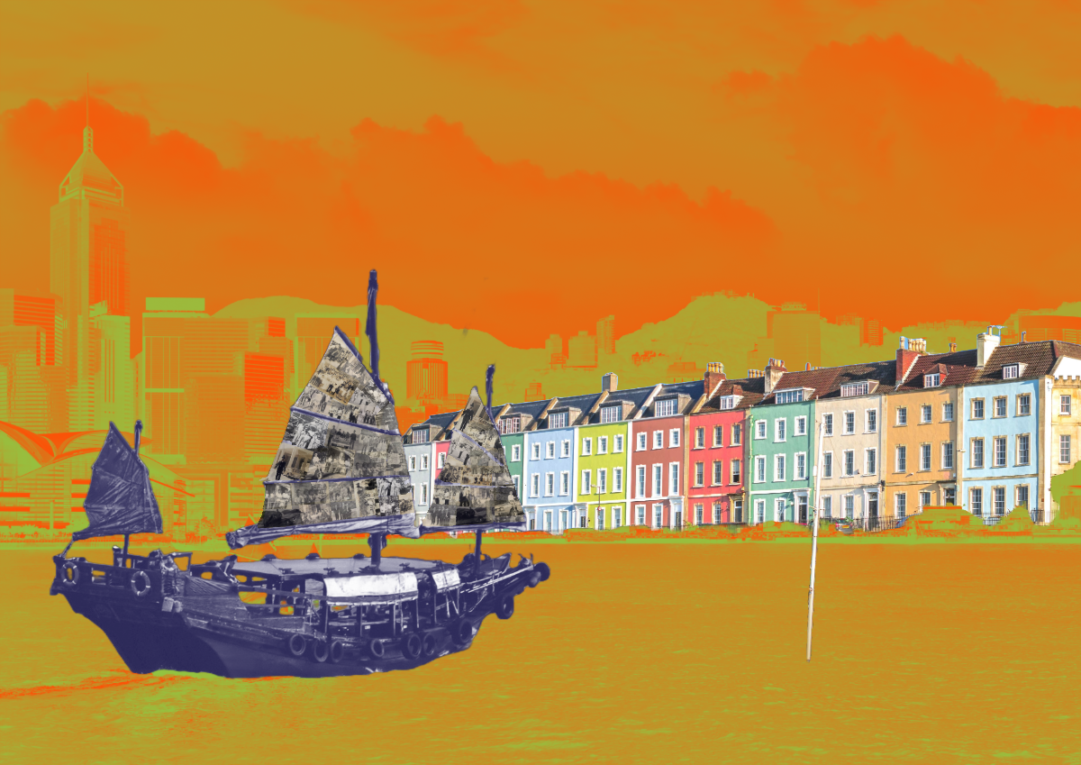
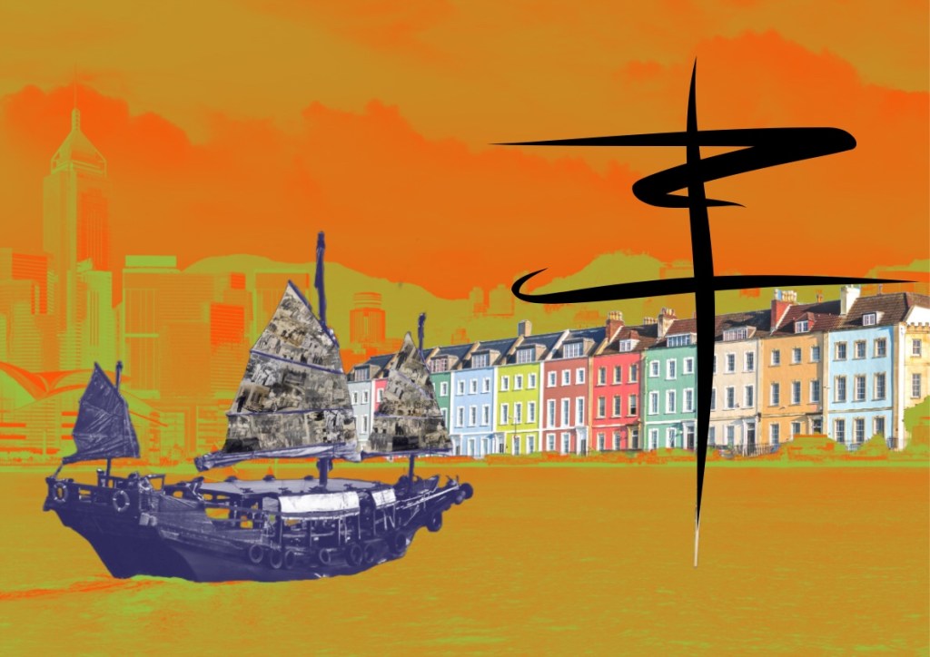
I recently started to experiment with using old black and white family photos in my digital collages. For this piece of work, the photos formed a collage on the sails of the junk:
Whilst the previous work for the MA show was printed on silk, I feel this image would suit a woven canvas (e.g. a traditional cotton woven canvas). So my plan is to have this printed on canvas then add brush strokes in the style of Chinese calligraphy. The digital collage was exported to Adobe Freso where I used the painting function to try out different compositions. Below are two examples.
Example 1 – using an abstract image done in Chinese calligraphy style:
–
Example 2 – using Chinese characters that meant ‘space’ (as in third space) with a red seal stamp drawn in:
–
This is work-in-progress and I will order several printed canvases to try out the calligraphy experiments.
REFLECTIONS
I am happy with the progress so far. I like the way the two harbours came together as one continuous shoreline representing the different parts of my life coming together as a continuum. After my reflections on my third space work so far, my aim here is to create images that are more ambiguous so that both the viewers and I have to think deeper to see what’s there. I am not sure if I have managed to achieve it with this work. I will reserve judgment until the work is complete.
What I am also pleased about is that I am becoming less sensitive about using my family photos. I have always felt that they were too precious to be used, like mining a fragile archeological site. Although I have not used the very precious photos of my close family yet, I am feeling more able to consider the idea.
LEARNING
Since this is still work-in-progress, I’ll leave the full consideration of my learning until the end when the work is finished.
NEXT STEPS
– To order a minimum of four canvases printed with the image to experiment with adding Chinese calligraphy style brush strokes to complete the painting.
– I will go for A1 size to start with; it gives a reasonable area for expression without having to commit too much costs or materials. If I like the outcome then I might consider printing more canvases on a larger scale.
– Other experiments to consider are:
a. Covering the image with a top layer of oil and cold wax abstract painting then complete the painting by scraping off areas to reveal the image underneath.
b. Spray painting in street art style to show further Bristol heritage.
–
ADDITIONAL REFLECTIONS
After publishing this blog and giving more thoughts about my blog on the elusive third space, I decided not to take this piece of work further. This is because I feel this image is still rather illustrative with images of only ‘A and B’ (as explained in ‘The Elusive Third Space’ blog). So I’m going to leave this for now and focus on the Cheongsam series which may give me more exploration opportunities. I may come back to this later but I’ll leave it here for now.
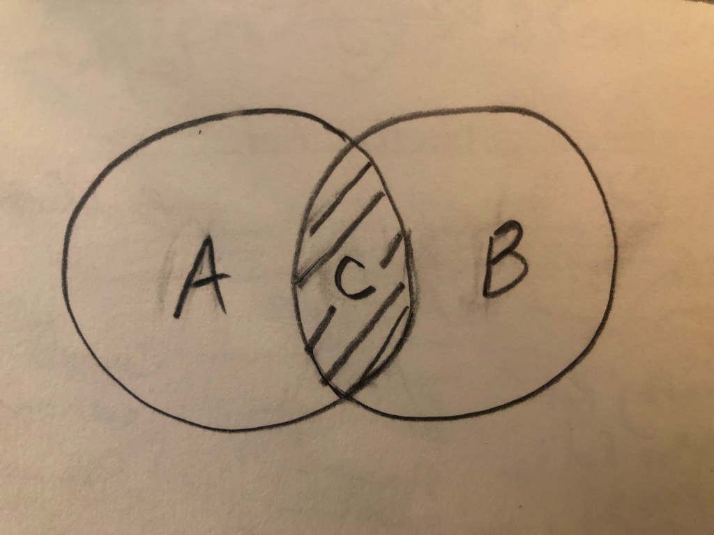
I talk and think about The Third Space a lot. From the first moment I came across this concept in a lecture by Nigerian-born American visual artist Njideka Akunyili Crosby, I found resonance and understood exactly what she meant. Then I started to research the original text about The Third Space in The Location of Culture by Homi K Bhabha. My understanding was further cemented. It is straightforward on the surface. When two cultures (let’s call them A and B) come together like in a Venn diagram, the overlap (let’s call it C) is The Third Space where something completely new emerges. It is neither one nor the other but has the characteristics of both of the original cultures. It is also alive and constantly evolving according to Bhabha.
Here is the Venn diagram:
–
Alternatively, if we use a mathematical formula to represent the concept, it will be:
A + B -> C
Meaning A and B giving rise to or leading to C. Not to be confused with:
A + B = C
because it is not a straightforward linear summation, it is a fluid concept. It is Art after all and not Maths. Maths would have been easy… In my experience, once a Mathematical problem is solved, you could sleep at night. But problems in art are rarely ‘neatly’ solved, or an answer often leads to the next question and I have spent many sleepless hours thinking about this. I get the Third Space concept in theory, but how do I locate myself in this context and express it in my art? This has been keeping me awake, a lot!
EXPERIENCE
I recently exhibited at the MA Interim Show at Central Saint Martins, the making of my work was captured in this blog:
Making the work presented certain challenges. E.g. it was the largest Chinese brush painting that I have ever done (in A0) and painting on silk was very challenging (without a proper stretcher frame). Overall I was pleased with the outcome and it was an example of my transcultural layering work, however, I knew there was something lacking. I wanted it to represent something about my third space; but I have only created layers of A and B components, there was no C.
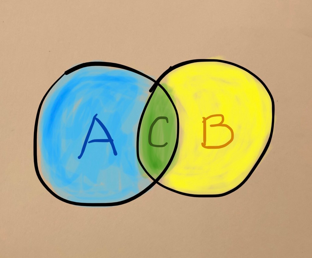
To explain this further, I have to introduce colours… If A is blue and B is yellow, then mixing the two gives green. Meaning C is green in this analogy.
–
What I had created in my silk piece for the show was equivalent to patches of blue and yellow, there was no green.
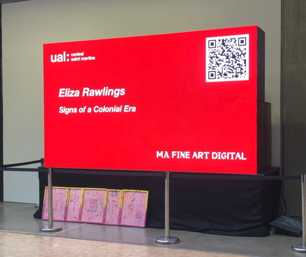
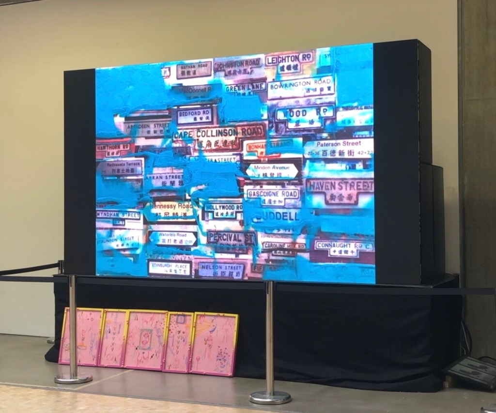
I always knew pinpointing my third space was going to be challenging and I have studied various transcultural artists’ work to learn from them – this is part of my ongoing research. I also tried to find other third space phenomena to help me in my understanding. The strongest example I have found so far was the street names in Hong Kong. It is explained in this blog and the video of me making the painting was also shown at the MA Interim Show:
I still have not managed to find how to truly express my C/green/third space… so where do I go from here?
I recently received some feedback from my tutor at the end of my MA Unit One, which followed by a discussion with him on this topic and my reflections are as follows:
– Some of my images are prone to being too illustrative. Meaning they are obvious elements of A and B; I know that just putting them together doesn’t automatically make C. I had hoped that layering those images might gradually yield C for me but it hasn’t happened yet and I haven’t found a way of making it happen.
– I was advised to just make work. Don’t overthink it, just keep making – images, painting, objects, anything. It’s ok to leave it vague and unresolved.
– I wonder – does ‘just make work’ actually work? If I don’t think it through in advance, would it work out? I acknowledge that years of institutionalised corporate strategic thinking means that I am programmed to always ‘start something with the end goal in mind’, then just keep working towards that goal with absolute focus. I know this approach is counterproductive in my art practice to the extent that it can be a barrier for creativity. Therefore I need to try harder to free myself to ‘just make’.
LEARNING
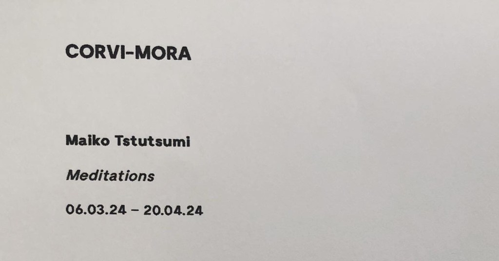
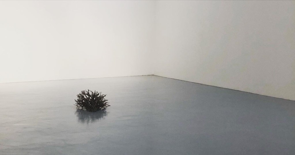
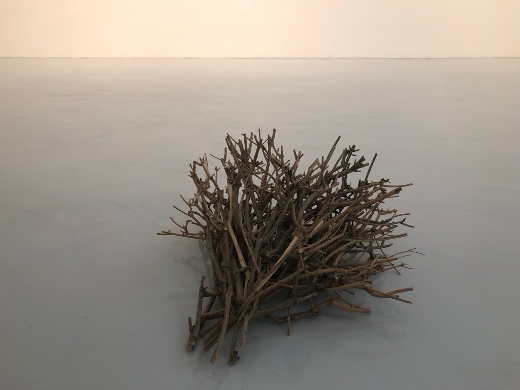
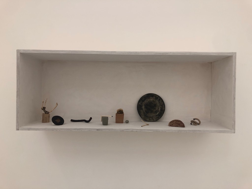
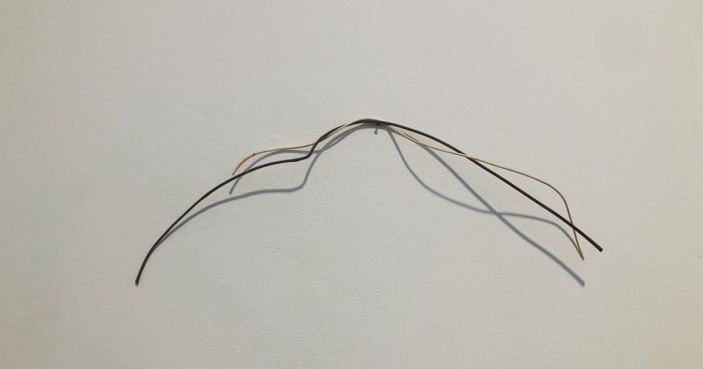
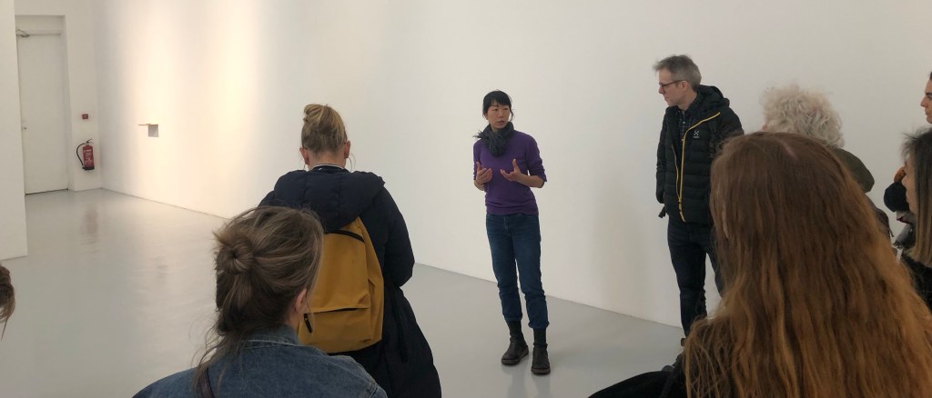
– I need to learn to trust myself to ‘just make’. My faith in this approach was reinforced by a gallery visit as part of the recent Low Residency week, where we visited an exhibition by the artist Maiko Tstutsumi:
–
We were very fortunate to meet the artist where she explained her practice. Having listened to her to understand her background and way of working, I started to see ‘her’ clearly in all her work. It was the strongest sense of the artist that I have felt in their work for some time. The last time I felt so strongly was at Paula Rego’s exhibition at Tate Britain in 2021. Rego’s work was vibrant, energetic and sometimes even violent (e.g. depicting victims of structural violence) which is a complete contrast to Tstutsumi’s serene exhibition. Despite the contrast, I could sense the artists in their work equally strongly. I believe that is because their work was ‘them’. To learn from these great artists, I need to make my work more ‘me’. I am the transcultural being, if I can work out how to make my work ‘me’ then I will have a better chance of locating C and creating my colour ‘green’.
– Prior to the show, I had started to explore a more abstract approach combined with symbols (inspired by Fiona Rae) to express my third space. I believe abstraction could help me to avoid being overly illustrative. Now that the interim show and the Low Residency is over, I am going to return to pick up that strand of exploration.
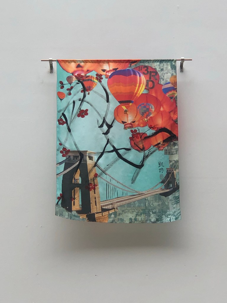
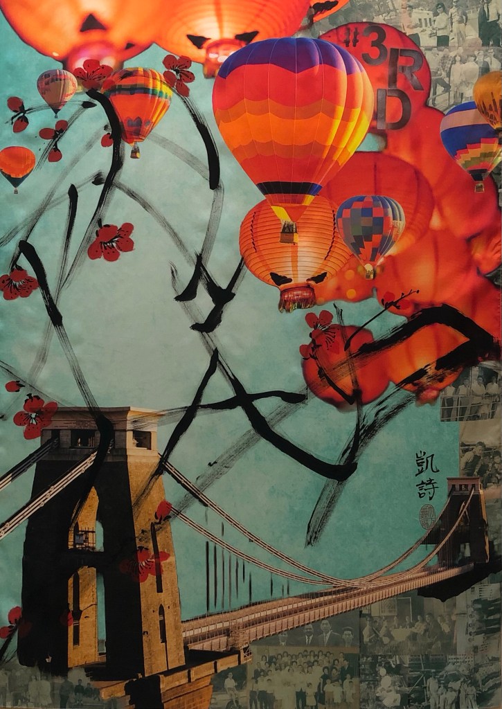
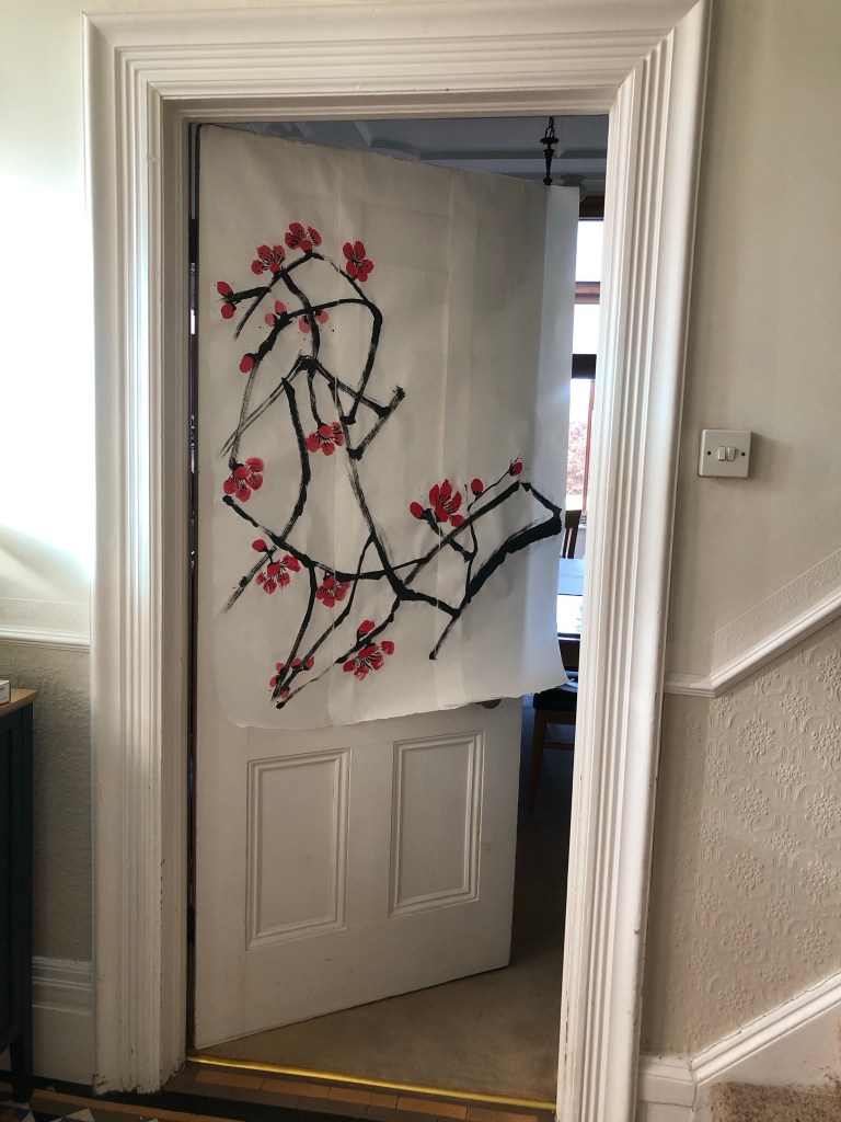
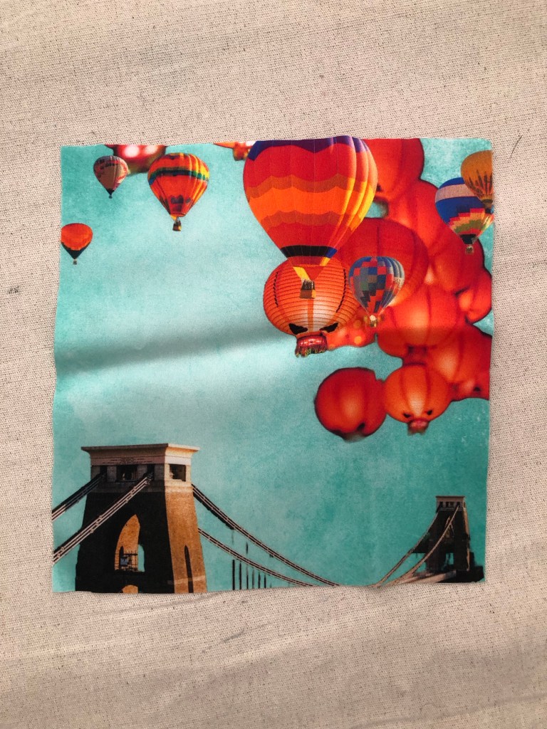
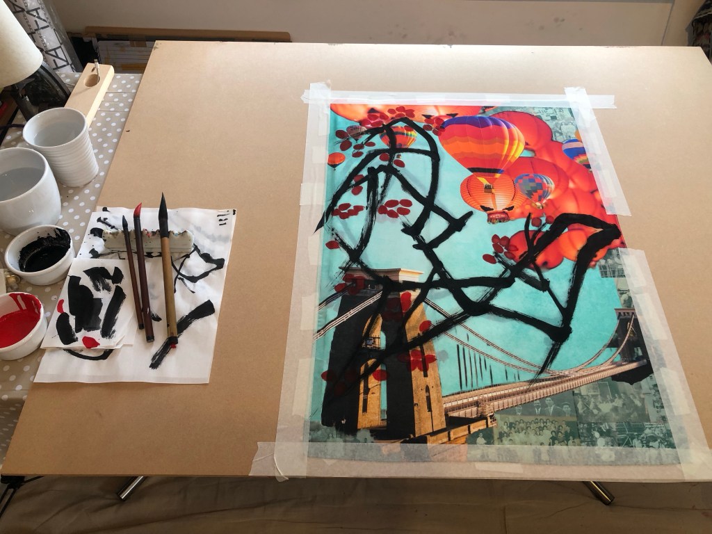
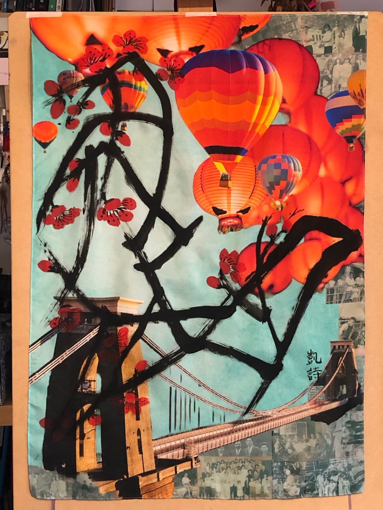
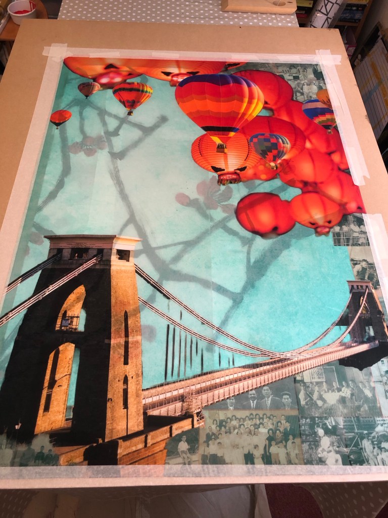
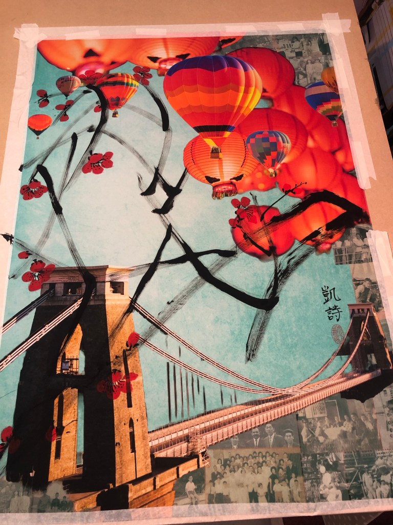
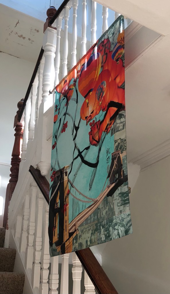
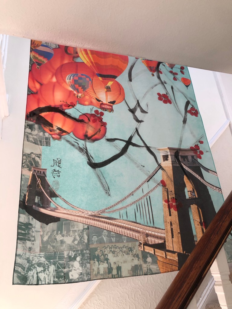
I ordered the silk printing from Contrado who provided an excellent service. The image I used was the final outcome from Part 1 – the Clifton suspension bridge, hot air balloons, Chinese lanterns and family photos collage. This blog describes the process I went through to do the Chinese painting on the printed silk. The largest Chinese painting I have done up to now had been A1 size and I ordered 1xA1 and 1xA0 for this experiment. The A0 piece was therefore by far the largest Chinese painting that I have attempted. The plan was to use this piece of work for the MA Interim show if it worked out.
Here is the finished painting and I will use it for the MA show:
METHOD
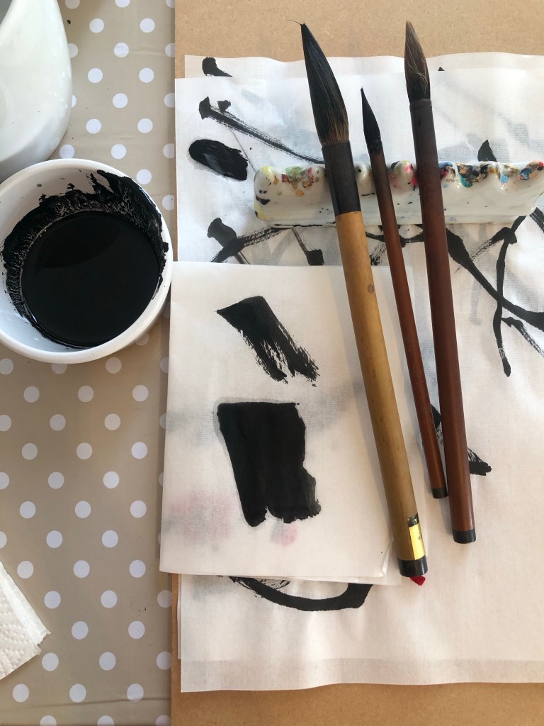
Since I have not done a Chinese painting of A0 size, I wanted to practice on paper before doing it on the silk. As mentioned in some of my Chinese painting blogs, Chinese brush painting is very unforgiving, you only get one go at doing a stroke, hence practicing was important.
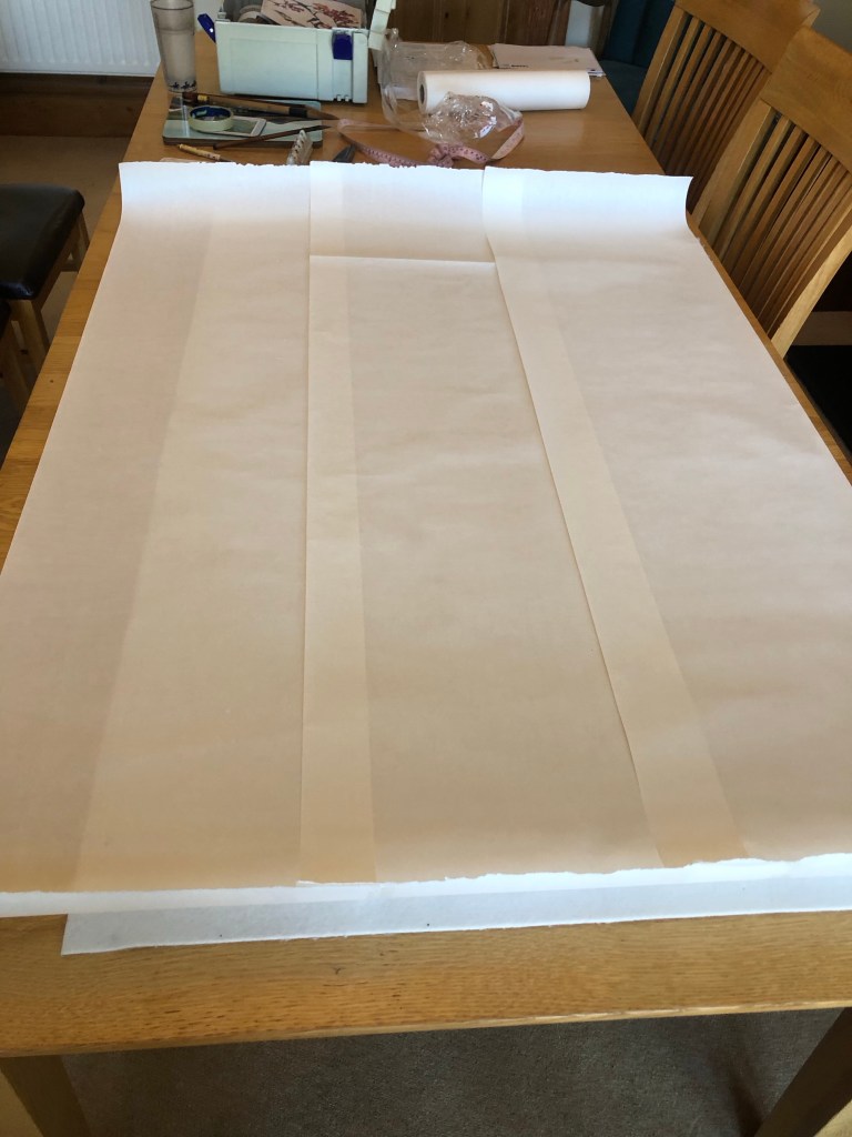
Here is the set up with scrolls of Xuan paper stuck together to form a large sheet:
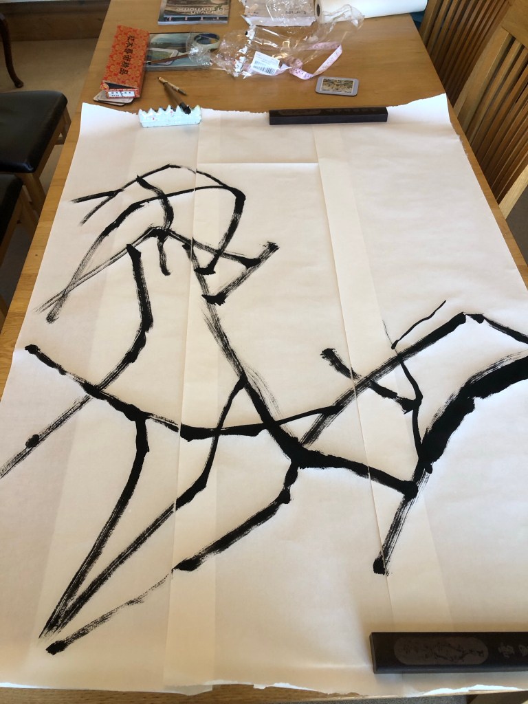
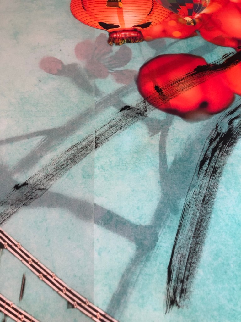
Using the brushes I selected in Part 1 and the composition that I practiced on A4, here is the attempt on A0 size after completing the wild plum tree branches:
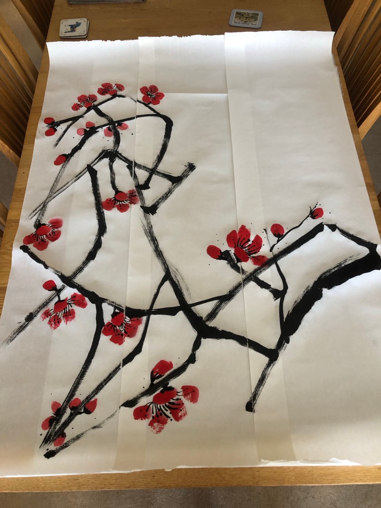
Then the plum blossoms were added:
Finished trial painting on paper:
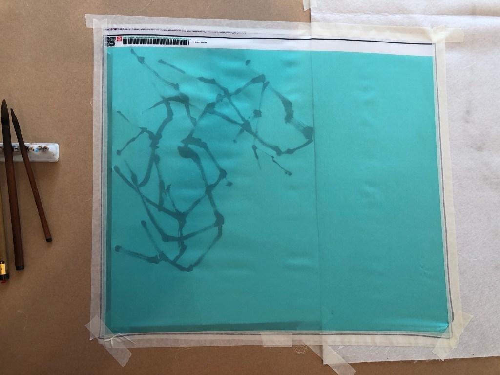
When ordering the printed silk, I had to decide whether to print a border. So I trimmed one of the printed samples to see what a borderless image would look like. I was happy with it and the prints were ordered without border, i.e. printing the image right up to the edge. I also ordered the option of hemmed edges.
Sample image cut without border
In addition, I ordered a small piece of printed silk to test what backing should be used (a piece of felt which is typically used as a backing for Xuan paper painting or just use Xuan paper). Also to test the amount of brush loading and how the brush glided along the surface.
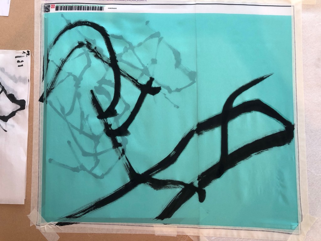
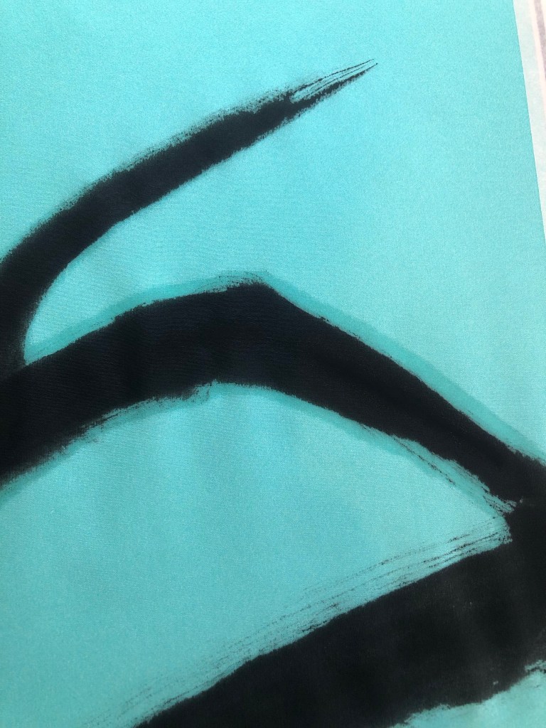
I was not happy with the felt backing because the moisture was not being absorbed fast enough and the silk therefore retained the moisture for too long and started to spread – as can be seen in the close up photo:
So the decision was to use Xuan paper as the backing material for painting on the silk. I started with the A1 piece as practice. Since I do not have a stretching frame for silk painting, I taped the whole piece onto a large board to stretch the fabric.
Below is the finished A1 painting. I was not happy with the painting because the brush loading was too heavy for the branches and as a result, the painting overly dominated the piece. I was disappointed in this but was pleased that I learnt this before doing the A0 piece.
I used the ‘stuck together scrolls’ of Xuan paper from the earlier practice as the backing for painting the A0 piece. It also gave me some rough positions of the composition. The edges of the silk was taped down to ensure the material was sufficiently stretched.
After doing two strokes, I could see the ink picking up the seams of the paper underneath which was not good at all. Once I started painting I was reluctant to stop because it would interrupt my ‘energy flow’, however, I had no choice but to put down my brush and lift up the tapes partially to pull out all the Xuan paper underneath. This was not ideal but had to be done.
With all the backing paper removed, the painting process could resume but with no backing paper to help absorb the ink, there was only the MDF board underneath which was a risk because I hadn’t experimented on MDF before.
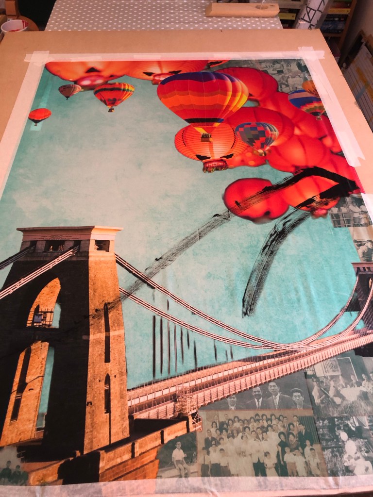
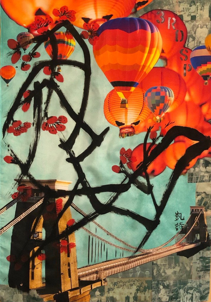
It worked fine and I reduced the brush loading as well as the number of branches planned for the composition because I didn’t want to overwhelm the overall image with too dark brush strokes.
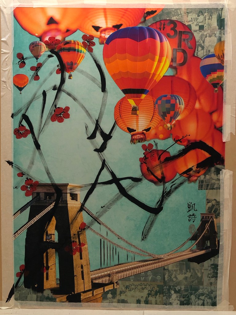
The plum blossoms were then added. I also reduced the number of blossoms and tucked some between the balloons and lanterns. I wanted to leave sufficient negative space on the left of the painting to create tension on the canvas juxtaposing the busy right hand side of the image.
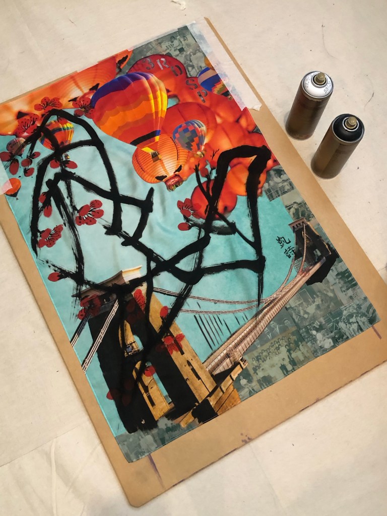
After completing the Chinese brush painting, I had the choice of finishing it there, or adding some spray painting. I like adding street art style spray painting to my work because of my home city of Bristol being home to many great street artists and the city is full of beautiful street art. Hence street art is a big part of my heritage.
I was mindful that the canvas is already filled with images and I didn’t want to overdo it. Also I didn’t know how my spray paints would perform on silk. So I experimented with the A1 piece first:
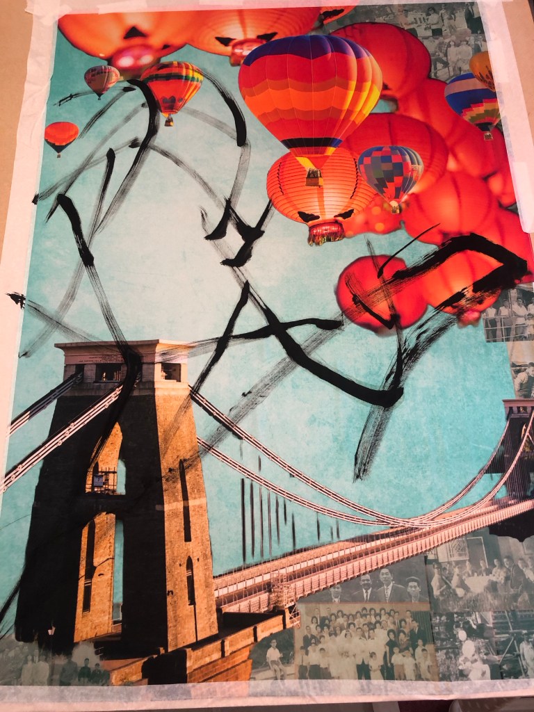
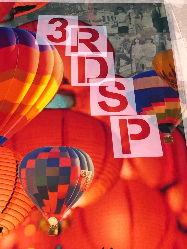
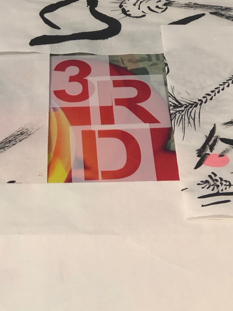
I sprayed some two tone black and white stencilled letters on two lanterns saying ‘3RD SP’ for Third Space:
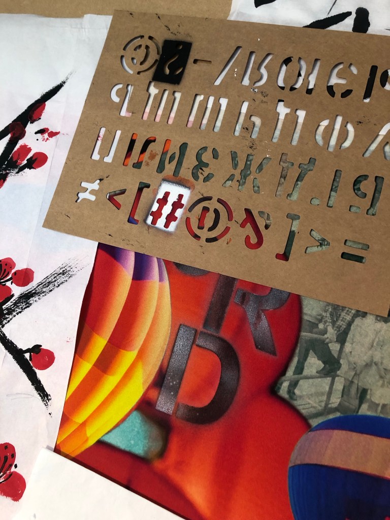
I was happy with the outcome so I started to lay larger stencils on the A0 piece:
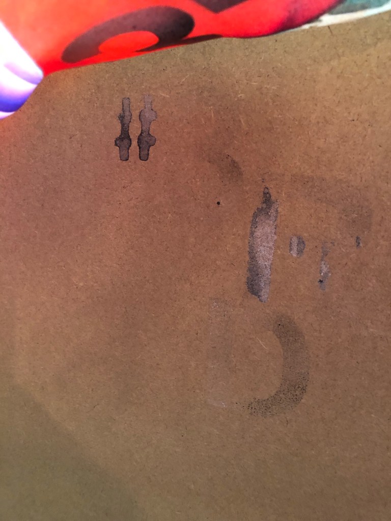
‘3RD SP’ was too much, so I went with just ‘3RD’. I masked off the area and proceeded to spray one letter at a time.
It worked out fine and to take further risk, I added a ‘#’ to proceed the lettering to add a contemporary feel.
After spraying, I found that for some parts, the spray paint seeped through the thin silk and nearly glued the material to the MDF underneath. The silk was rescued in time and was safely lifted off the board.
The finally finished work:
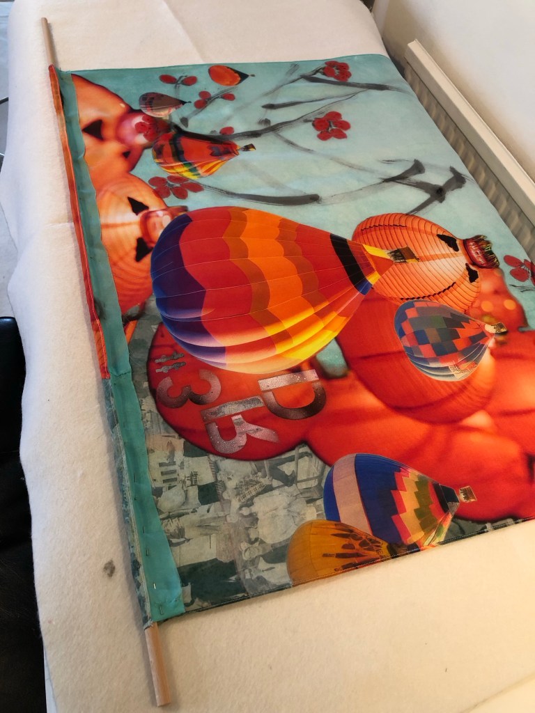
Since I have decided to use this piece for the MA interim show, I had to work out how to hang it.
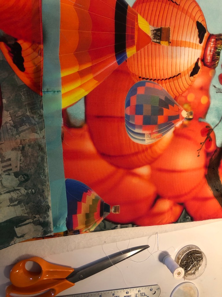
I have chosen to hang it off a piece of 1 metre x 10mm diameter wooden dowel. this means I had to sew the header of the silk to make provision for the hang. I wanted to minimise losing the images at the top especially to avoid losing my father’s face on the top right photo, I added a piece of silk material ‘tape’ at the top as follows:
The sewing was complete and the silk painting was hung off two metal brackets to simulate how it would hang at the show:
One of the reasons for choosing a thin 38gsm silk material was that I wanted the image to be visible from both sides if it was hung in free air. This is how it looks from behind and I am happy that the image is still visible:
REFLECTIONS
This whole piece of work has turned out to be a much larger undertaking than I imagined because of:
– Using family photos in my digital collage: aside from the emotions involved (which I have not fully resolved yet), there was much work involved in ensuring the resolution was good enough for printing on A0. The print company Contrado was excellent in checking through my design before I placed the order.
– Using new materials: I learnt a lot from choosing the right kind of silk material but it was also very risky because I had not worked with silk before and the thinness of the fabric made it very fragile to work with. The whole process was new to me and I had to make it up as I went along. Due to the costs and lead time involved in purchasing the printed silk, I had to take extra care in the experimental process to minimise wastage of materials as well as time.
– Going large: I wanted to challenge myself to create something new for the MA interim show, hence I went for A0. I found it very challenging because I am still very new to Chinese brush painting and that lack of experience made the process much more stressful than if I had gone for medium that I’m familiar with such as oil paint or acrylic.
What I was happy with:
– I learnt a lot in making this piece of work, documented here and in Part 1. I learnt about new methods, materials and processes. All the practices and trials were essential.
– Starting to use old photos in my digital collage. I still have many photos in my archive that I could use when I feel ready and able to. I have to manage the emotions and fragility involved in using such precious materials. But I have made a start.
– I was happy with the final outcome and was relieved that I have something for the MA interim show.
What I was not happy with:
– I should have anticipated some of the mistakes along the way, it was all useful learning despite being stressful at the time.
– Since the A1 silk experiment didn’t go well with the branches being too dark (overloading of the brush), I was overly cautious with the subsequent A0 piece. Also, my paint brush was not quite large enough. It was one of my mother’s brushes. There was a larger one but it would have been far too large, also, its bristles were starting to fall out and I didn’t want to damage it further since I want to preserve my mother’s brushes as much as possible. So I made do with the smaller sized brush. I would have wanted thicker branches for the A0 piece. Additionally, I could have loaded the brush a little more but I was worried that it would turn out like the A1 piece. Hence I was being overly cautious. It all comes down to my inexperience with Chinese brush painting. I hope this will improve over time with more practice.
Further reflections:
I have spent much of my MA first term developing methods to work with oil and cold wax, however, when it came to the MA show, I went back to an earlier method of transcultural layering where digital collages were printed onto a thin fabric then a Chinese brush painting was layered on top. I thought I would be more familiar with this latter approach but the change of fabric to thin silk and going large made it more challenging than I expected. I am pleased I went with this because it has renewed my enthusiasm for this transcultural layering method and now I have several other ideas in mind to try. I want to continue to pursue both ways of transcultural layering for my practice, namely:
1. Western medium as the lead with oil or oil and cold wax as the top layer, scraped back to reveal images pre-printed on the canvas. The canvas here would be robust such as woven linen/cotton or board.
2. Chinese medium as the lead with digital collages printed on silk and Chinese brush painting or calligraphy layered on top.
Which one to use will depend on the context and the kind of painting I want to make. My current plan is to continue to work on both methods.
LEARNING
– I learnt a lot about working with silk and will continue to use this material. I need to look into buying or making a silk stretching / painting frame that can accommodate large pieces of silk, A0 or larger.
– I gained confidence with my Chinese brush painting and there are no short cuts there – practice and planning are key.
– From the aesthetics exploration perspective, I learnt a lot from the mistakes in the A1 painting. It’s easy to overwhelm an image and it showed once again for me that negative space is so important. Often less is more and leaving space on the canvas creates tension that engages the viewer. I was hesitant in adding the spray paint but I really wanted to do it to bring in that aspect of my Bristol heritage. I am pleased that I did it and managed to reign it in.
NEXT STEPS
– Look into a better set up for painting on silk such as a large stretcher frame.
– Source a few larger good quality Chinese paint brushes for larger scale work.
– Do a new piece of transcultural layering work with a new digital collage of family photos for use with another silk painting or oil and cold wax.