BACKGROUND
I want to use this experiment to explore the Next Steps that were identified in Exploring Media – Oil and Cold Wax Part 5.
https://eliza-rawlings.com/2023/12/24/ma-y1-u1-exploring-oil-and-cold-wax-part-5/
The actions were to:
-Try out more Chinese brush paint collage onto oil and cold wax to refine this part of the process.
-Try exposing a larger area of the background image to see if that can work with the abstraction approach on the top layer. Experiment to find the right balance between revealing the base layer image without losing the sense of abstraction on the top layer.
-Try spray painting on top of the oil and cold wax surface – try when wet and then when dried.
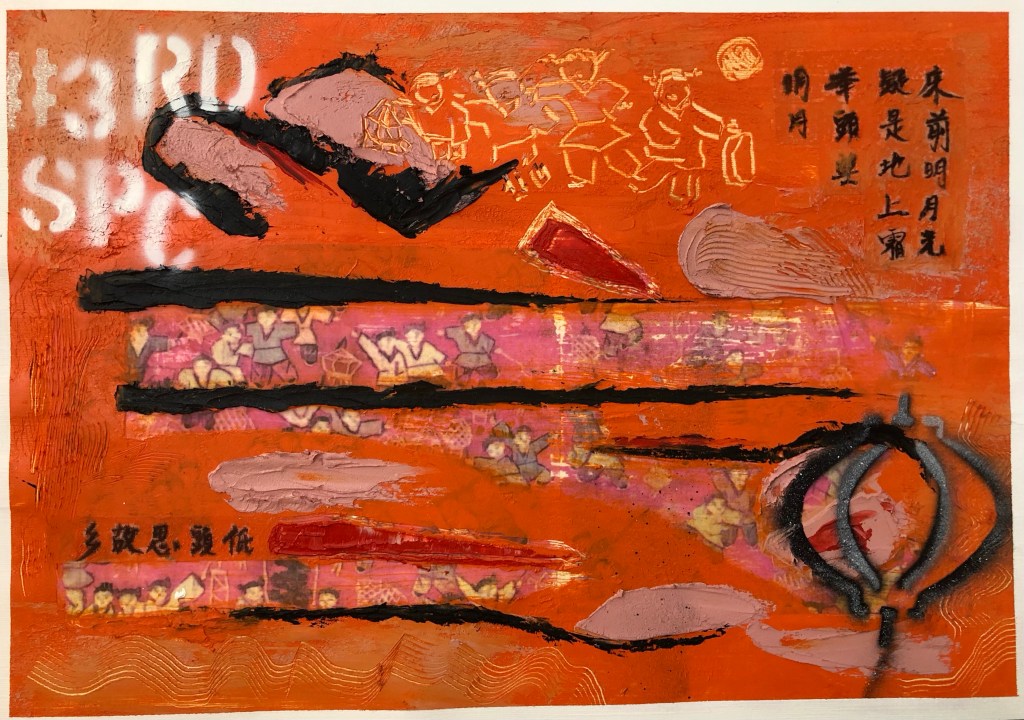
Finished work for Part 6:
METHOD
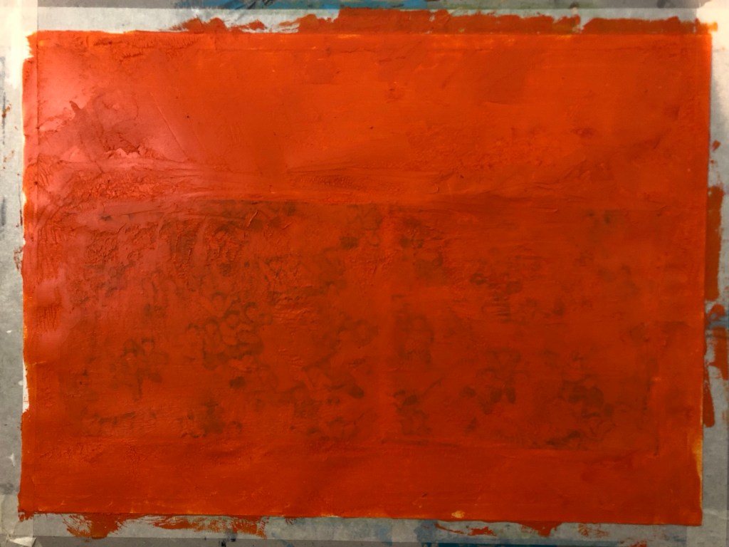
A printed photo image of a tapestry that was gifted to me by my brother many years ago was used as the based image for this piece. The image was transferred onto a paper canvas using dispersion liquid. The paper used was 250 gsm oil paper.
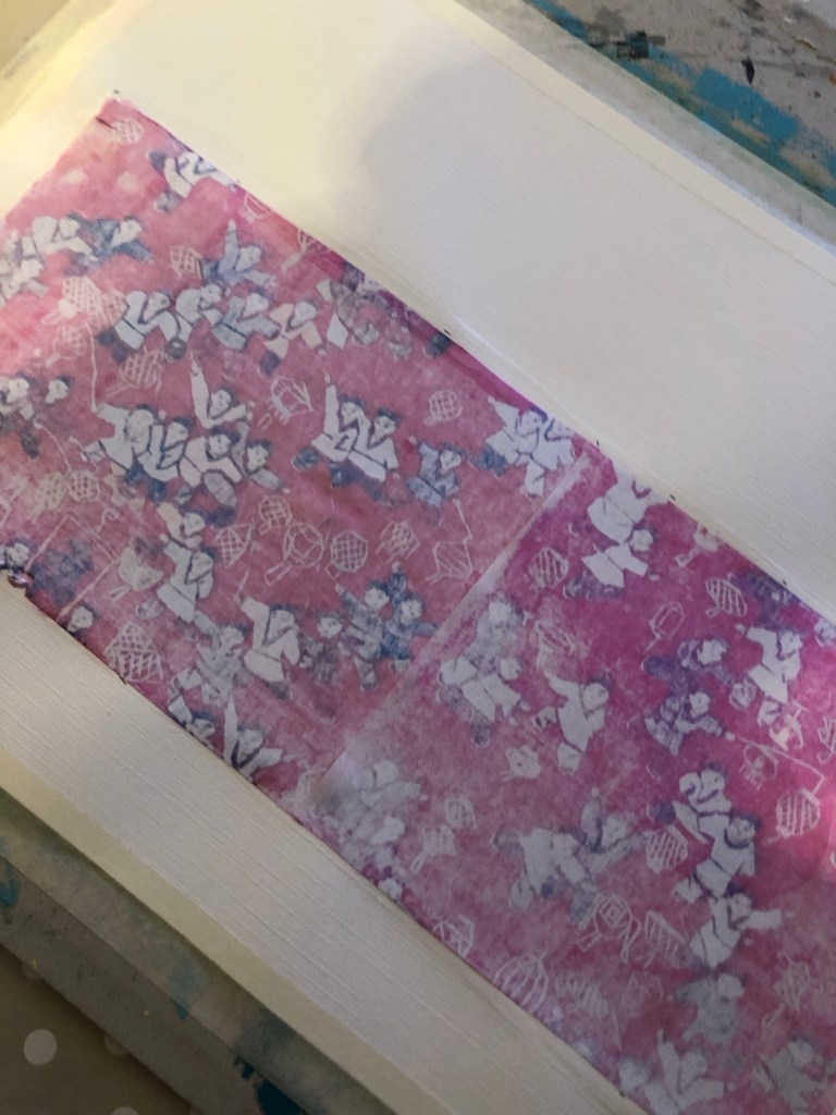
After the dispersion liquid dried, the printed image was rubbed off with a wet sponge to reveal the transferred image on the canvas. This was the first time a paper canvas (as opposed to a cotton canvas) was used in this series of experiments and it was clear that the paper canvas was not robust enough for the process. See below image for damage to paper. However, there was sufficient integrity in the paper canvas to continue the piece. I was hoping that a thick layer of oil and cold wax would hide the damaged areas. There was also excessive buckling on the paper canvas.
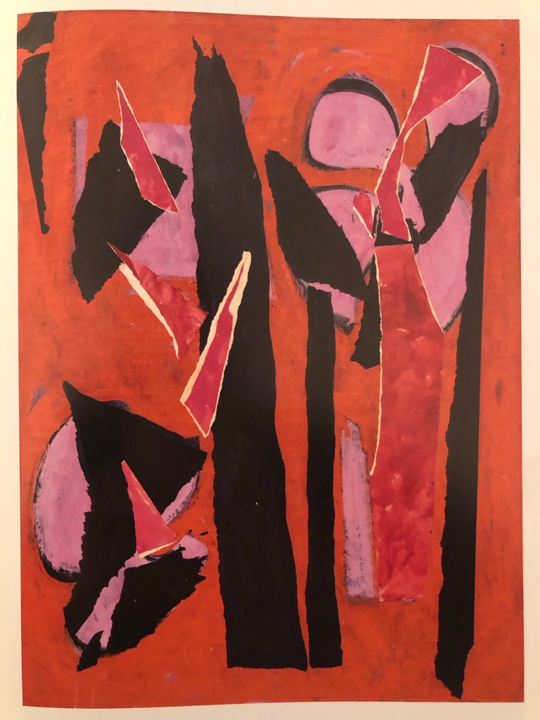
Recalling my disappointment with the colour palette that I chose for Part 5 (pink and grey), I decided to research into abstract paintings that I like to learn from the colours used. One of my favourite abstract artists is Lee Krasner and below is the painting that I decided to study and learn from in terms of the colour palette used.
Desert Moon (1955):
A layer of oil and cold wax was then applied to the canvas:
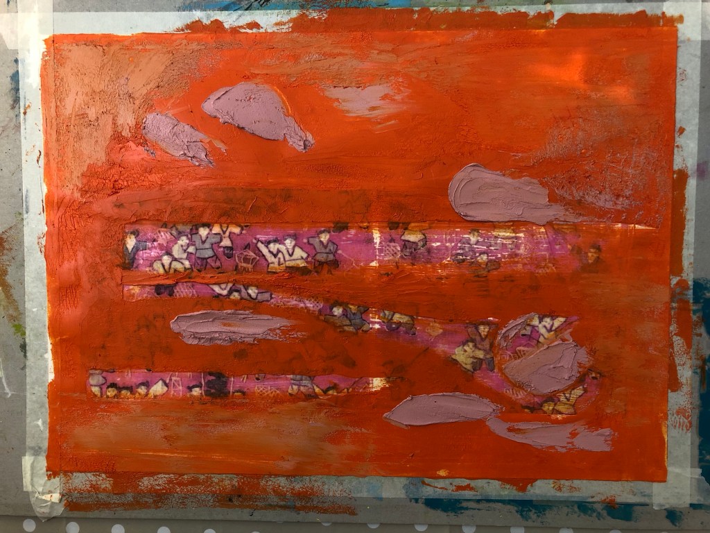
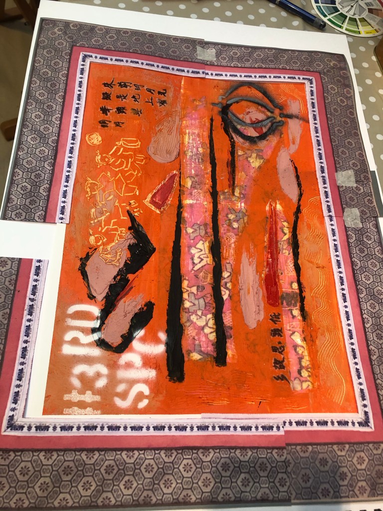
Areas were scraped off to reveal the base tapestry image. Learning from Part 5, I wanted to reveal a larger area so that it was clear what the base image was about. Then additional oil and cold wax colours were added:
For the Chinese brush calligraphy, I chose a delicate silk fabric as a substrate that was almost transparent because I wanted the substrate to become as invisible as possible.

After writing the Chinese calligraphy onto silk, it was cut out and carefully pressed onto the oil and cold wax layer.
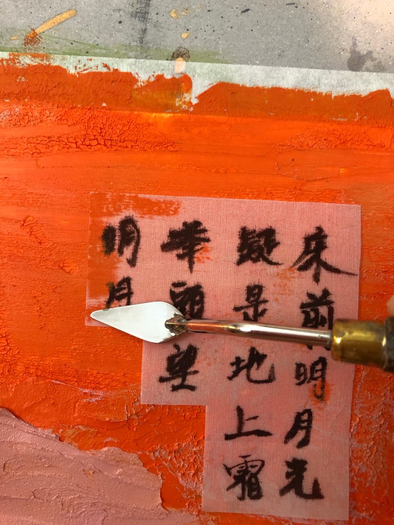
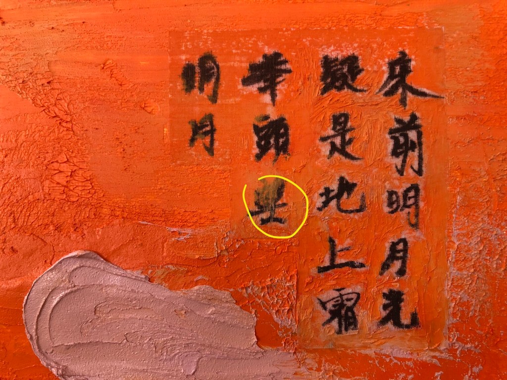
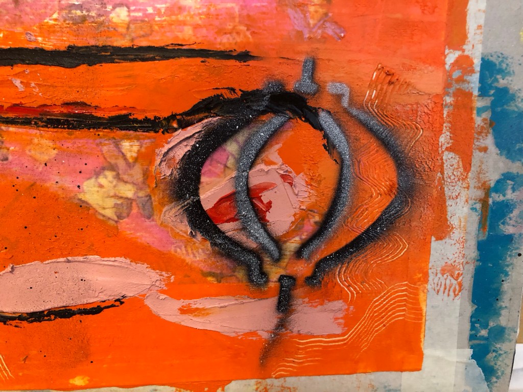
A small palette knife was used to press the silk into the oil and cold wax, taking care to avoid pressing the areas of the calligraphy characters which was challenging due to the complex shape of the characters. The yellow circle shows where part of the character was pressed into the oil and cold wax, partly obscuring the writing.
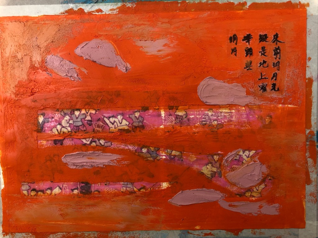
Additional marks were made – some were painted on and some were scratched off. The tapestry image was about children playing with lanterns and I have a lantern stencil that was made for previous work. So I wanted to experiment with spray painting onto wet oil and cold wax to see the effect.
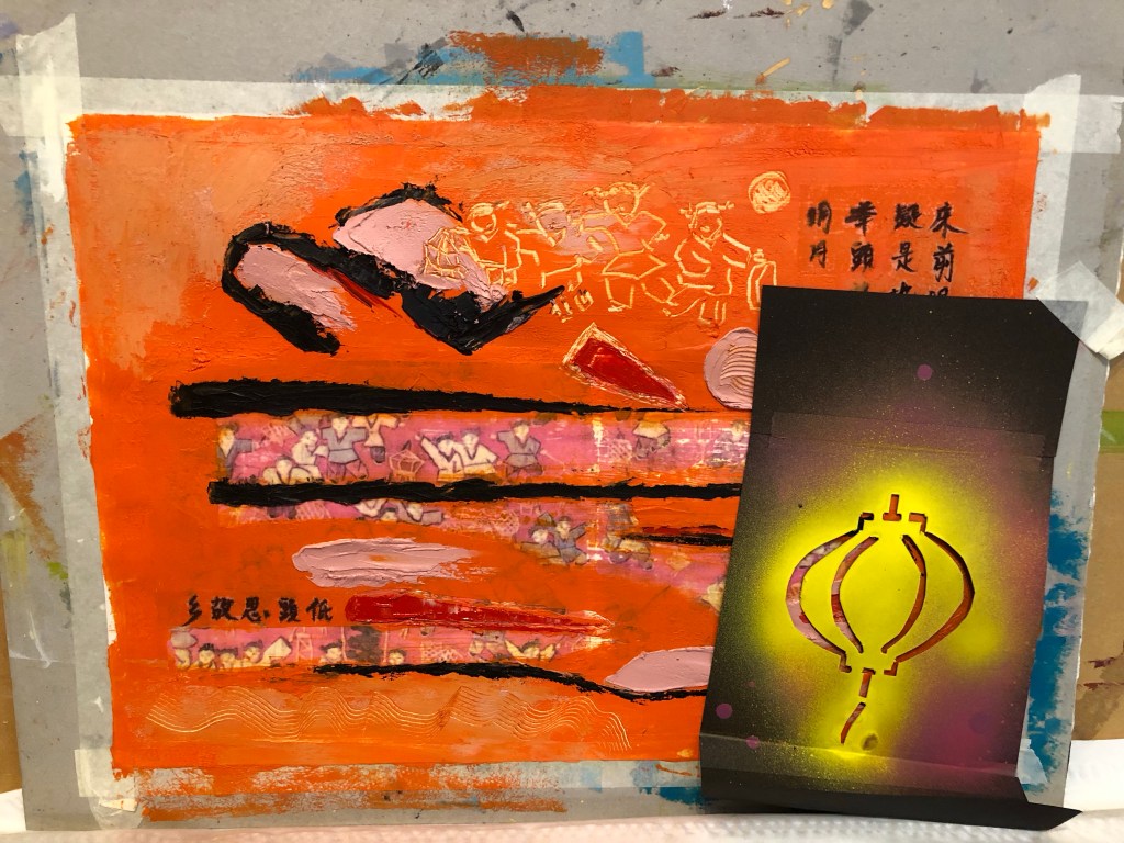
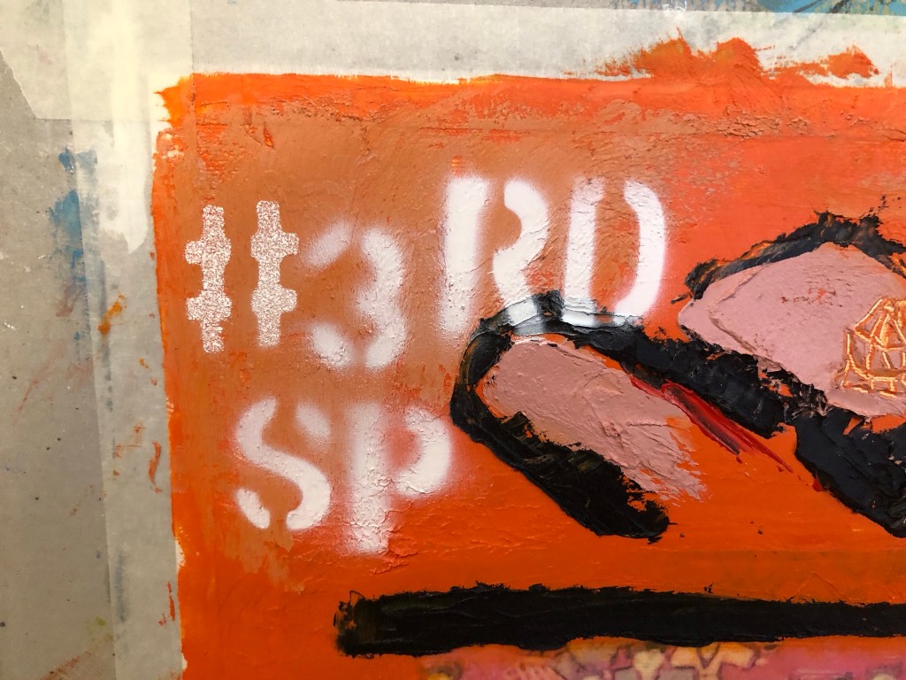
Further spray painting was done – the phrase #3RD SP (for third space) was sprayed onto a dryer corner of the painting. All spray paint used were Montana GOLD 312g aerosol cans as popularly used by street artists:
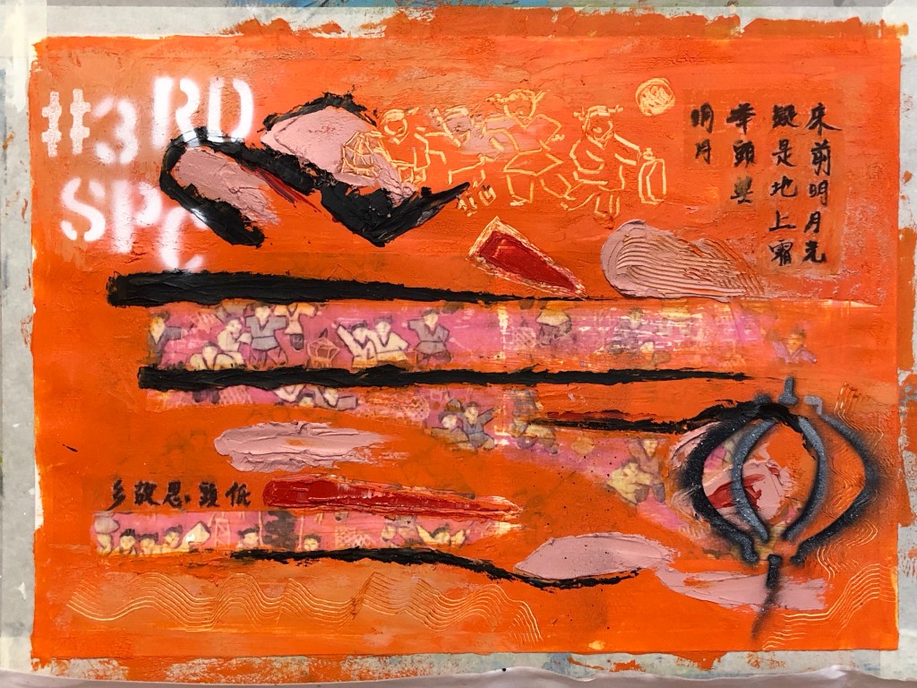
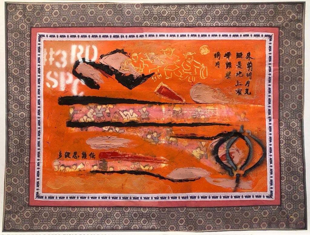
Finished work with border tidied up:

…
REFLECTIONS
I am happy with:
– The colour palette. I am much happier with this painting than the previous one in Part 5. A more considered approach in selecting the colour palette paid off here.
– The experiment with using an almost transparent substrate for the Chinese brush art worked well. The pieces (there were two in total) adhered well to the painted surface. Although the substrate was not completely invisible, it was acceptable as a solution.
– The scratched mark making especially the part at the top to echo the revealed based image of the children playing with lanterns.
– The overall look of the spray painting, especially the words – they added a contemporary feel to the piece which was what I was looking for.
– Feeling more confident using oil and cold wax as a medium.
I am not so happy with:
– The paper canvas, it was not robust enough. Although the damage by the image transfer process was covered up with oil and cold wax, it was clear that this would be the wrong material to use for this process.
– The spray painting of the lantern – it was sprayed onto very wet oil and cold wax. The outcome was not satisfactory – it felt and looked ‘gooey’ and not the intended effect. I believe this was partly due to my reluctance to place the stencil close to the wet oil paint as I didn’t want the back of the stencil to pick up the oil paint, causing the spray paint to loosely disperse around the stencilled image.
– Although I was happier with the colour palette, I felt there was more that could be done to add more complexity to the palette to increase depth to the piece.
General comment: the Chinese calligraphy is a famous ancient Chinese poem about being homesick. It is one of the few Chinese poems that I know as most children growing up in Hong Kong in my era were made to learn it, partly because it is a good poem and very easy to remember. Going forward, I feel that if I were to use more Chinese calligraphy then I should learn more about Chinese poetry so that I can use a wider variety of content in this respect. It will also help me to understand more about my Chinese heritage.
Other thoughts that came to me some time after completing this painting:
– Throughout the making process, my mind kept going back to celebrating the Mid Autumn Festival when I was a child in Hong Kong. The highlight as children was to be given a lantern each to play with. The choosing and buying of the lantern in preparation was always a source of excitement. The lanterns were lit with small candles. The children would use a long stick as handle for the lantern and go around the neighbourhood exploring with their lanterns, just like the children in my painting. The Mid Autumn Festival celebrated the fullest moon of the year and celebrations would only begin after dark when the full moon came out. Since we were not usually allowed out at night, it made the Festival especially popular with children. At times a lantern would catch fire which added much excitement. There would be lots of fruit and snacks laid out that were specific for the festival. I remember one year when we were older children (over ten years old), my brother and I went to a local park, sat on the swings and chatted all evening. It was when my family was going through a difficult period and to share that moment with him was very special, especially when we ended up spending most of the rest of our lives living in different countries. He gave me the children’s tapestry that I used for this painting which evoked all those memories while making this piece of work.
LEARNING
– More work is required to develop my sense in choosing an appropriate colour palette for the piece. This is increasingly important because my work is about storytelling as well as narrative and I believe having an appropriate colour palette helps to tell a story. So more research and experiments should be done in this respect.
– The silk substrate worked well for the Chinese calligraphy. However, I know there is a wide range of other delicate Chinese substrates and I will experiment with different materials to find the optimum.
– Layering the Chinese substrate onto oil is a risky process – as seen in the image with the yellow circle highlighting the part obscuring of the brush painting if pressed too much into the oil. To help with this, further experiments are required to improve this process. E.g. paint a barrier layer, such as a masking fluid that dries clear, onto the back of the Chinese brush painting or calligraphy to shield the image from the oil seeping in from underneath.
– Spray painting, especially words, adds a contemporary feel to the image which is a style that I want to incorporate into my work. This is relevant to me because I take much inspiration from the extensive street art scene in my home city of Bristol where many famous street artists work or have worked.
– Using the tapestry image evoked many memories, perhaps I could explore that more.
NEXT STEPS
– Research into colour palettes for the type of stories that I want to tell. Build confidence in this area.
– Continue to build experience and explore using oil and cold wax.
– Experiment with other transparent Chinese substrate materials to find one that is as close to invisible as possible when layered onto oil.
– Experiment with a barrier or masking fluid to prevent the oil from seeping into the Chinese brush painting images.
– Experiment with more spray painting – be bold and push boundaries.
– Ongoing learning – research into Chinese poetry to find more poems that resonate with me to use in future work.
– Explore the evoked memories.
ADDITIONAL WORK
After visiting the exhibition of Ofelia Rodriguez again at Spike Island in Bristol, I was inspired by the way she used fabric as a border to her paintings.
This gave me the idea to try that with my work, especially to use Chinese imagery border for a recent piece of work to add to the transcultural narrative.
I started with some patterned paper that I had to make a collage frame. But I was not happy with the effect. It seemed too busy and rather random as an idea.
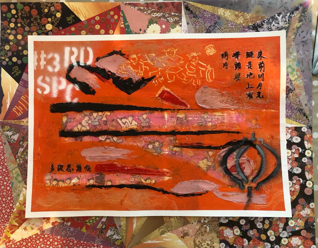
I then returned to the original tapestry that I used as the base image for the painting. It was a tapestry that was gifted to me by my brother many years ago.
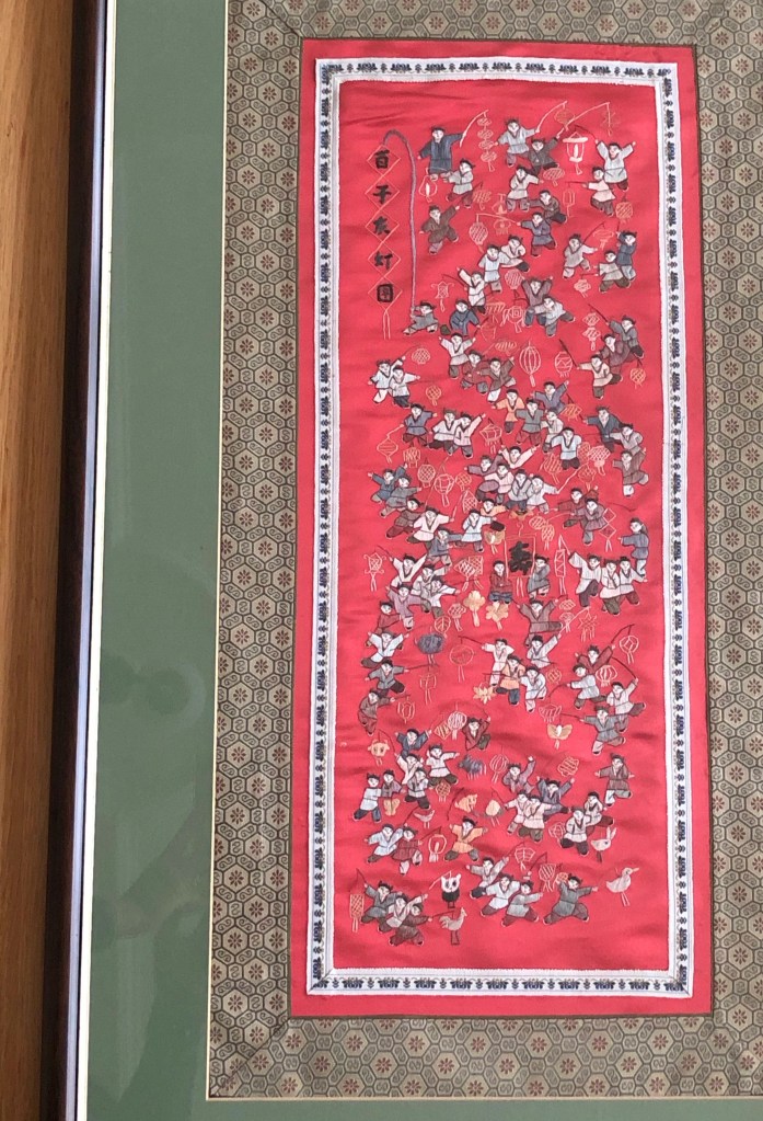
It is a typical border for small scale tapestries of this type. Then images of the border were printed and cut out to create a collage border for the painting:
Final finished work:
Mixed media on paper, 54 x 41.5 cm.
REFLECTIONS
I am very happy with the outcome of this experiment inspired by Rodrigues. It has completed the painting for me and added a more transcultural feel alongside the painted images such as the spray painted words.
To improve this approach, I would spray paint the # words to partly cover the tapestry image frame. I think that would increase the contemporary feel for the piece juxtaposing the traditional Chinese tapestry border.
