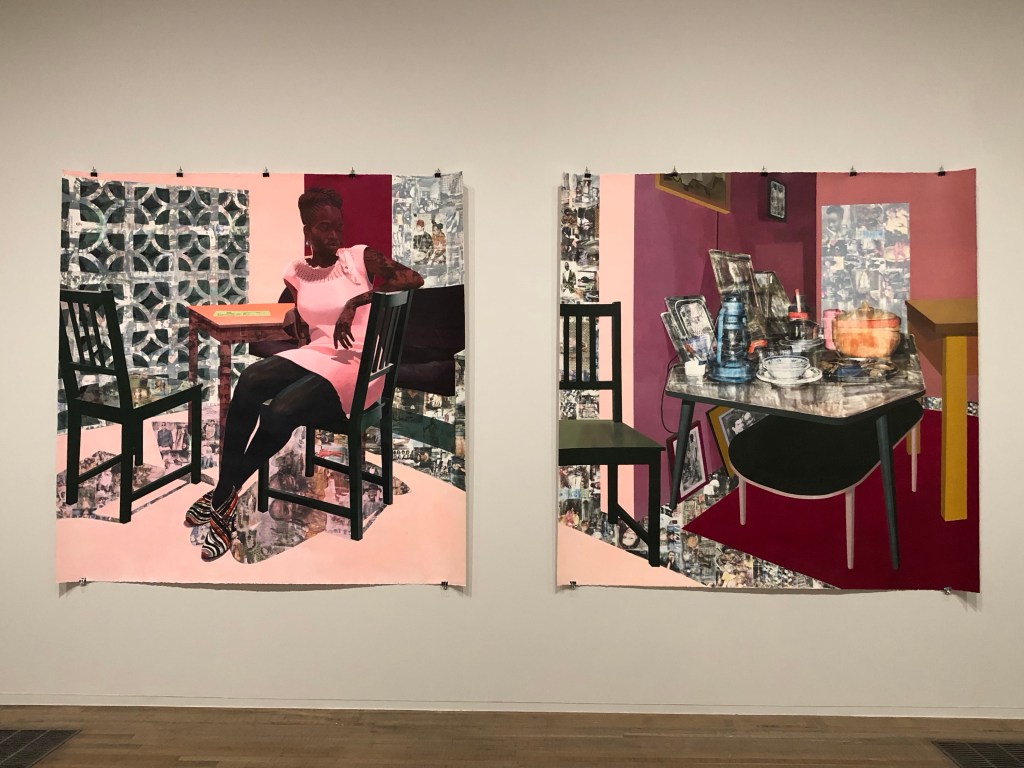
I had a tutorial with an Academic Support tutor from CSM and we discussed painting. I talked about one of my favourite transcultural artists Njideka Akunyili Crosby. I talked about how in awe I felt when I saw her large diptych at Tate Modern last year. The tutor suggested that I made a painting to respond to the work.
Akunyili Crosby’s work at Tate:
–
METHOD
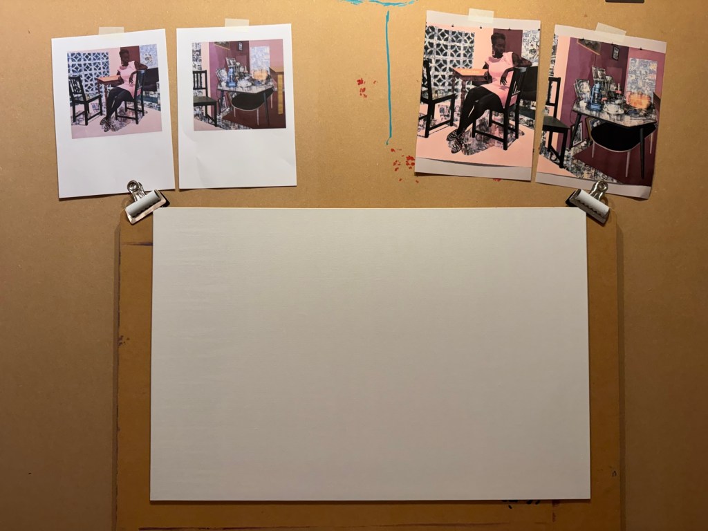
I printed out Akunyili Crosby’s work to give me inspiration. A board canvas was chosen.
–
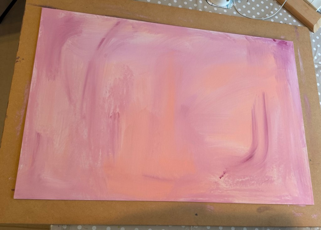
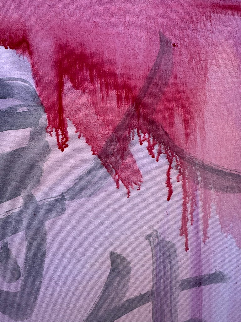
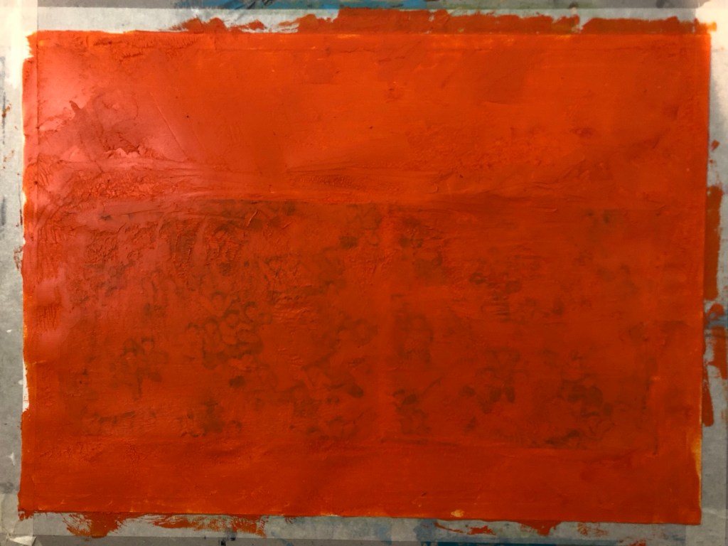
A thin acrylic wash of mixed colours was applied to cover the canvas.
–
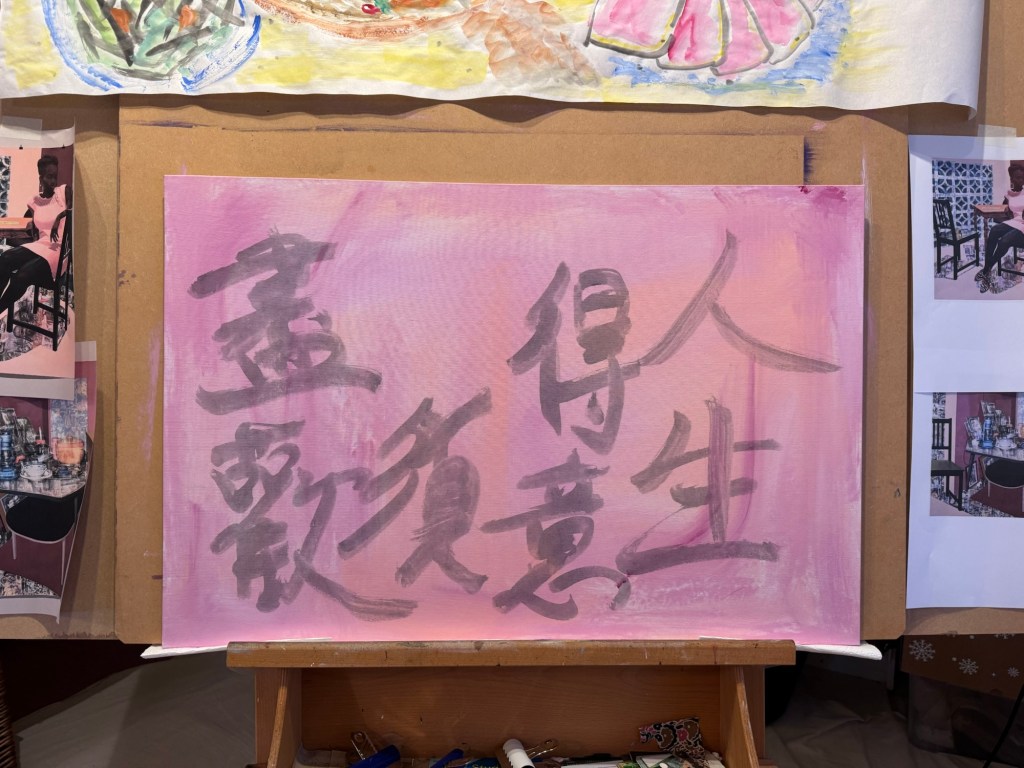
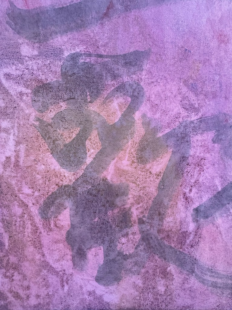
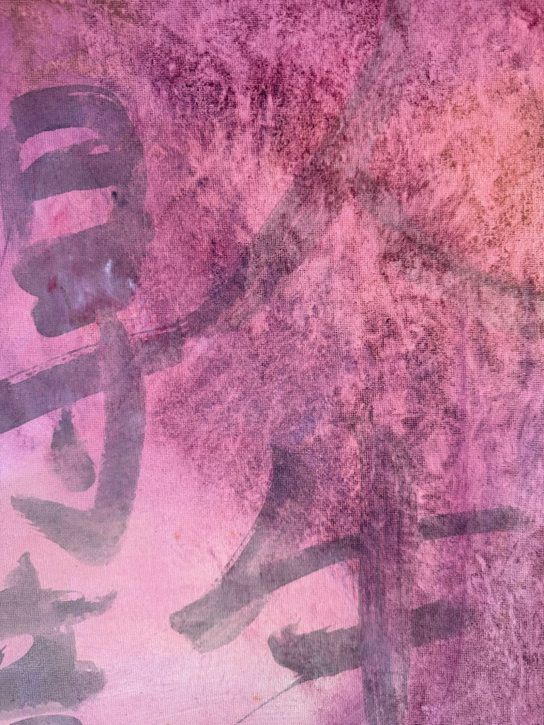
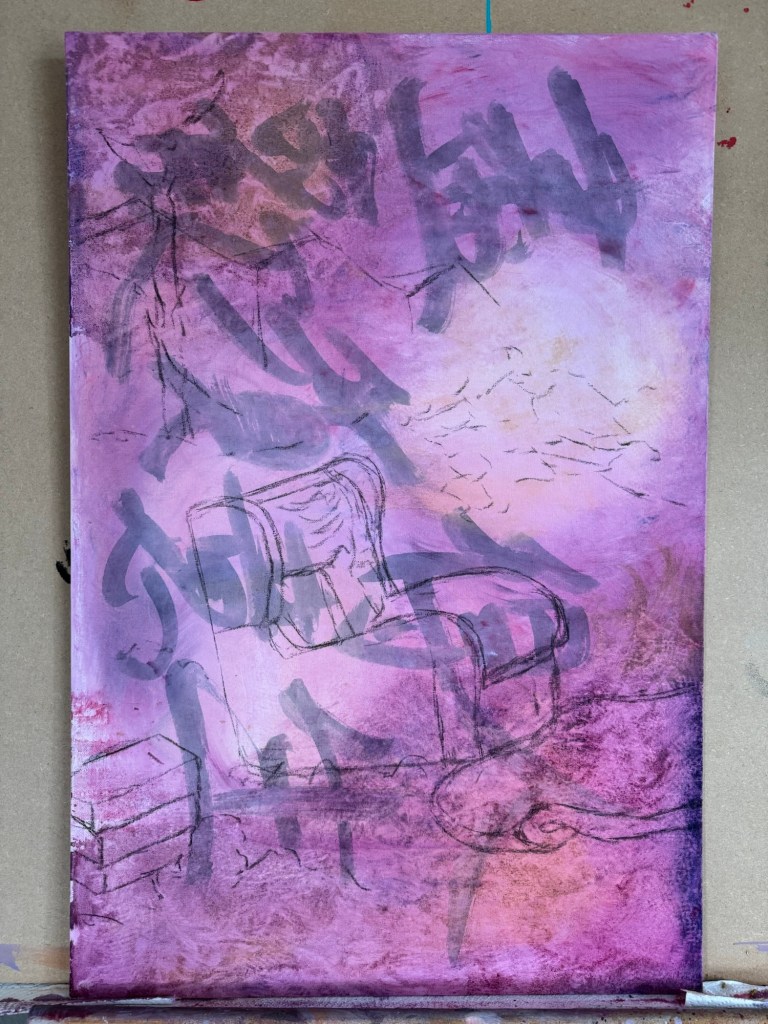
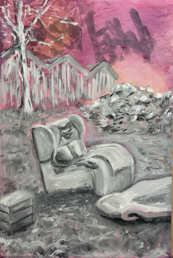
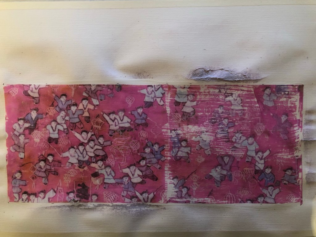
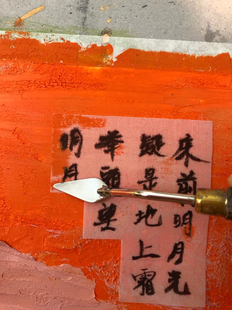
A line from a Chinese Tang Dynasty poem was chosen and written onto the canvas in Chinese ink to add some extra images onto the background. The line translates as – in life, when times are good, really celebrate.
–
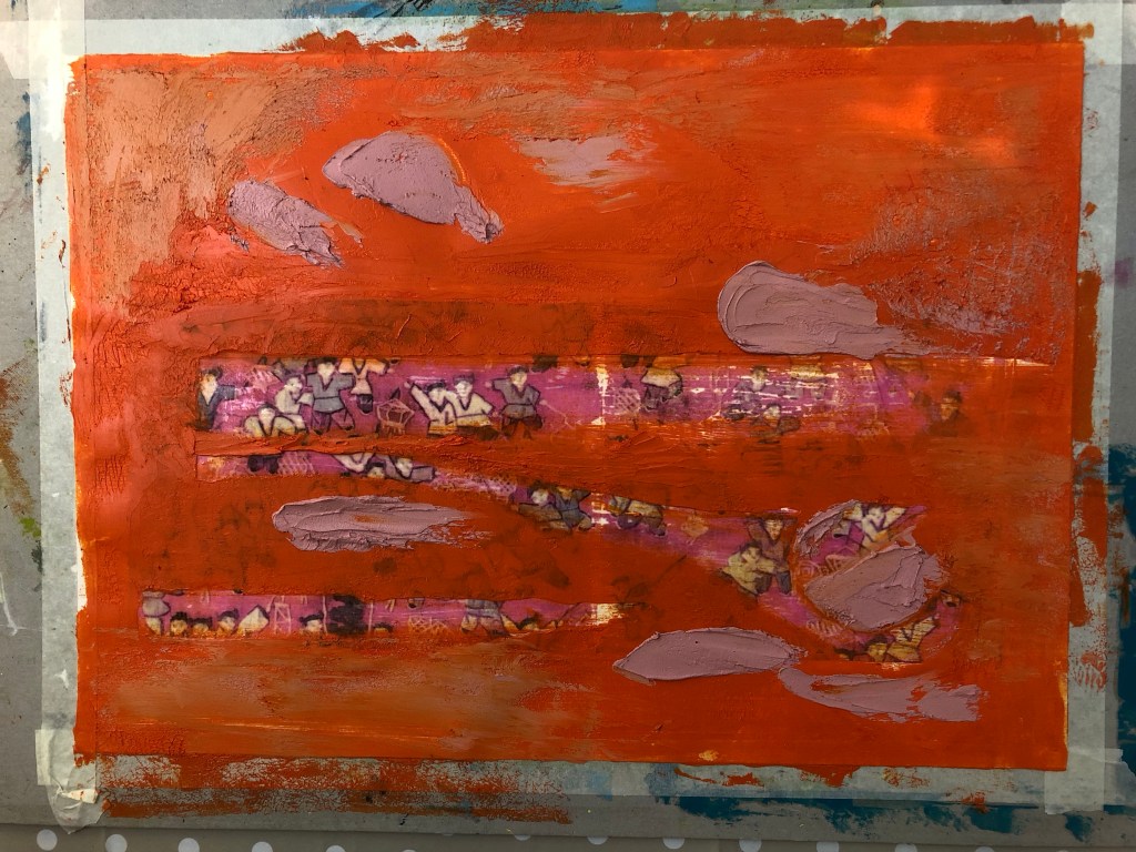
Then very thin layers of oil paint were applied loosely with brushes. The canvas was kept vertically for the paint to run down.
–
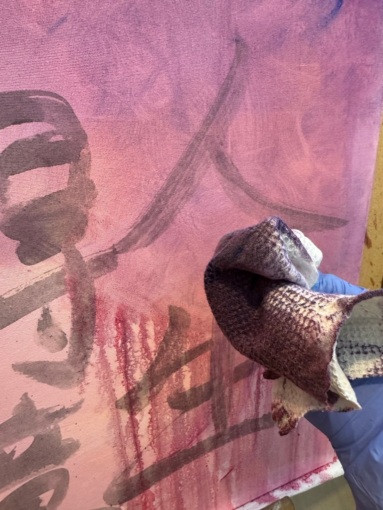
A piece of textured rag was used to experiment with creating patterns:
–
Work in progress, playing:
–
Playing some more:
–
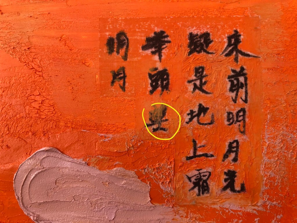
Close up images to show the ragging effect. The oil was so thin that the background images were still coming through:
–
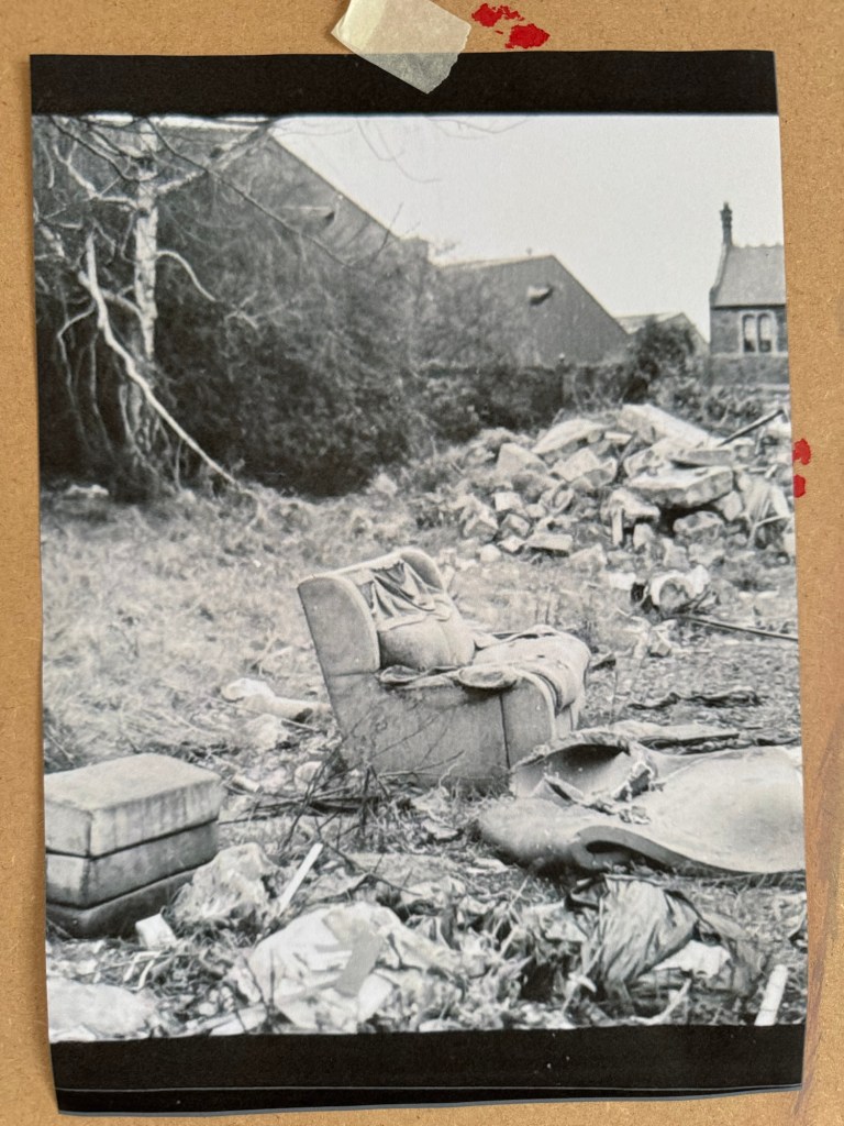
But what to paint?
I decided to paint the ‘lone sofa’ photograph that I took when I went on a photography walk-about in Bristol. That was my favourite photo of the trip.
–
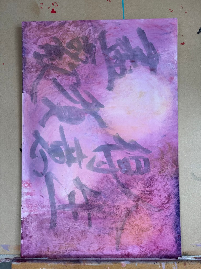
The canvas was put into portrait orientation.
–
Charcoal was used to layout the composition, choosing what to keep and what to leave out from the photo image.
–
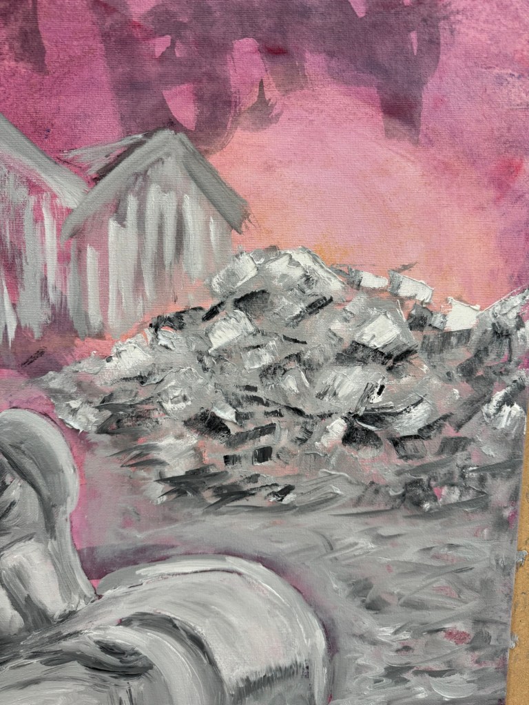
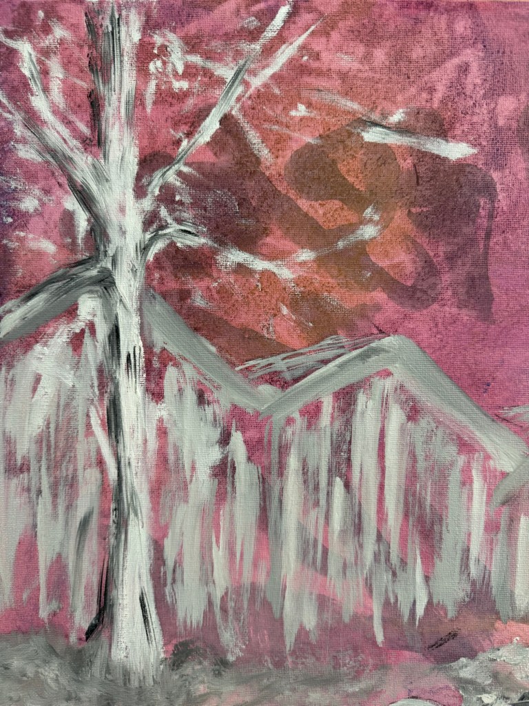
Close-up of areas of the finished painting:
A pile of rubbleA tree in winter
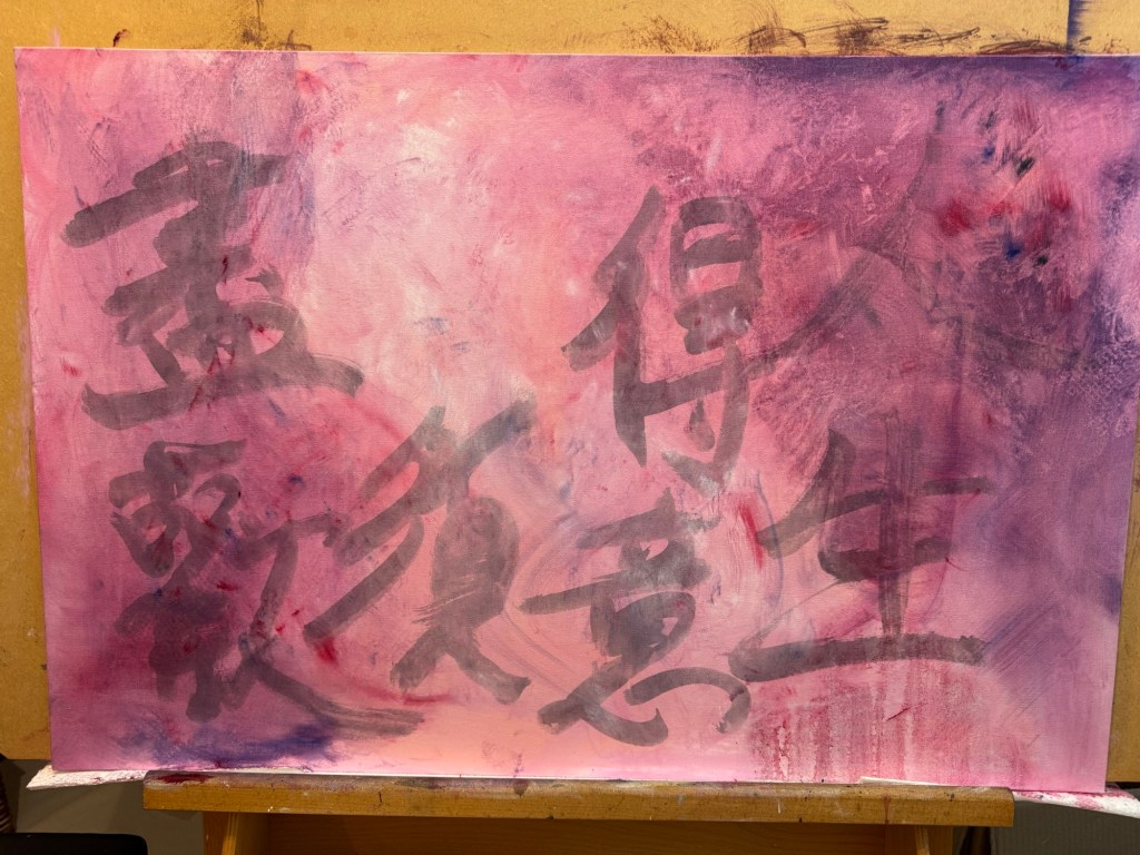
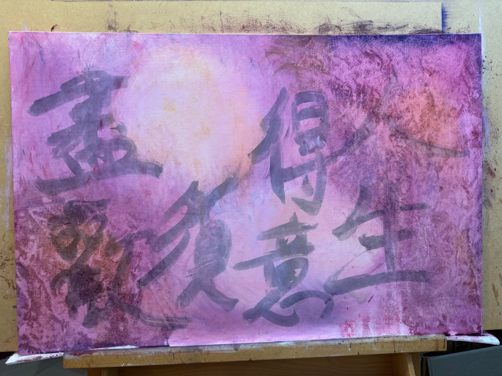
Finished painting:
–
REFLECTIONS
The oil experiments were not as useful as I had wanted – the outcomes were pretty much as expected and I can’t say I made much new discovery. So I need to do more research on this rather than just play.
The Chinese characters in the background were mostly hidden in the end. Again I could have used thinner oil. Or in this case, I feel it’s fine to obscure the background and use the Chinese characters as abstract patterns rather than to convey specific meaning.
The sofa scene – I mentioned in the last blog that I wasn’t feeling colourful so I opted for muted grey tones. That feels appropriate for this scene especially given the original photo was monochrome. I enjoyed the painting process which I tend to do most of the time. It was useful to focus on what to take out from the image composition, trying the less is more approach.
The piece of folded torn foam mattress on the floor was quite successful and also the pile of rubble. I think what was going through my mind was a dystopian scene and I wanted to create a dystopian effect to reflect my despair about the rapid change in world order, not sure if I really got that effect.
Although I started with wanting to do a response to Akunyili Crosby’s work. The outcome was quite far from that original intention. I think it’s because I made this painting over several weeks and my state of mind changed over that period and what I started off wanting to do didn’t seem relevant in the end. So I am comfortable with the change in direction.
LEARNING
To get more out of my exploration of oil, I need to do some research work, either online (YouTube) or books to gain new knowledge so I can take my experimentation to the next level.
It was only when I reflected afterwards that I was going for a dystopian theme. Perhaps if I had thought of that at the start then I could have created more of a dystopian atmosphere. I can research more about dystopian art. But how does that fit in with my transcultural practice? Should I go off on this tangent right now to risk having an incoherent body of work?
NEXT STEPS
Do research on oil painting techniques to learn new ways to use oil.
Do research on dystopian artists to see if that’s the vibe that I want to reflect my state of mind right now.
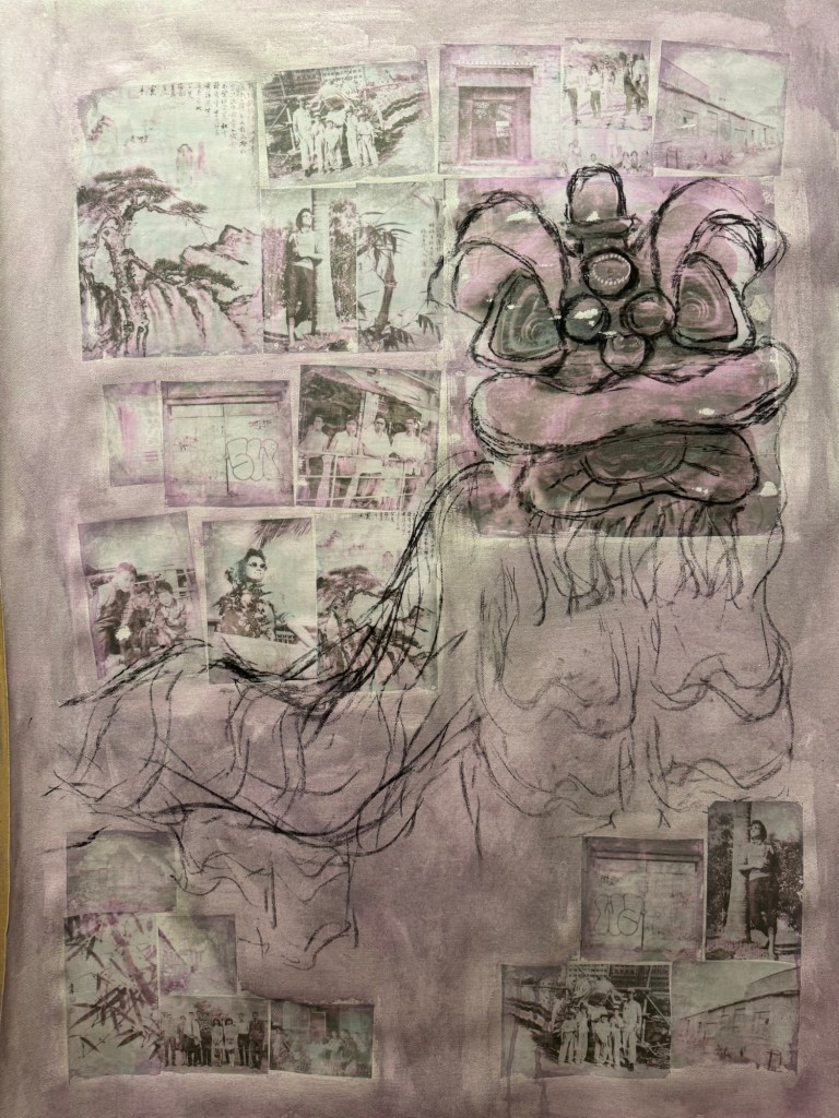
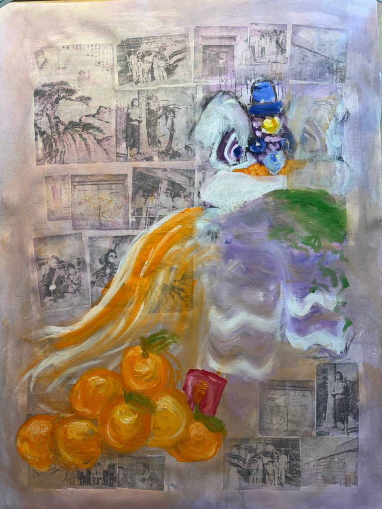
Following on from my Unit 2 feedback, I wanted to explore more ways of using oil. Also, from some photography work, I wanted to incorporate more photos into my work. So I started a new piece of work without knowing what I was going to do.
METHOD
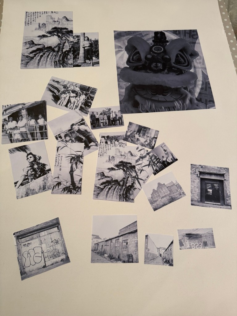
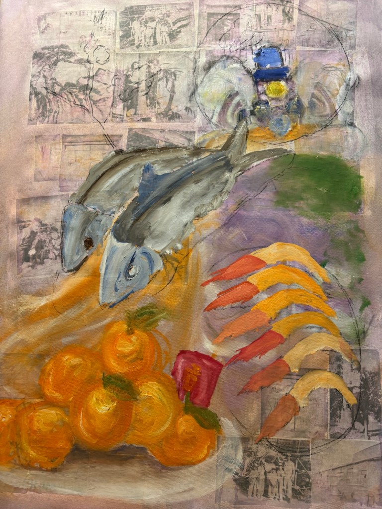
I made some black and white inkjet prints of various photos, some old family photos from Hong Kong and some recent Bristol streetscapes that I took with a medium format camera. Since it was around Chinese New Year time, I put in an image of a traditional Chinese Lion used for festive lion dance. I wanted to make that a dominant feature of the composition for the new year.
–
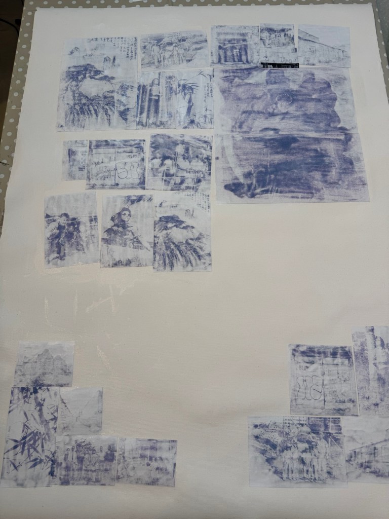
I used dispersion liquid to transfer the images onto a primed canvas:
Prints being stuck down using dispersion liquid
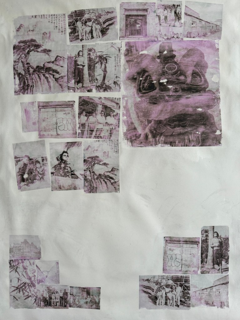
Printed images transferred onto the canvas. Due to the inkjet printer image, there was a pink / magenta tint to the transferred images.
–
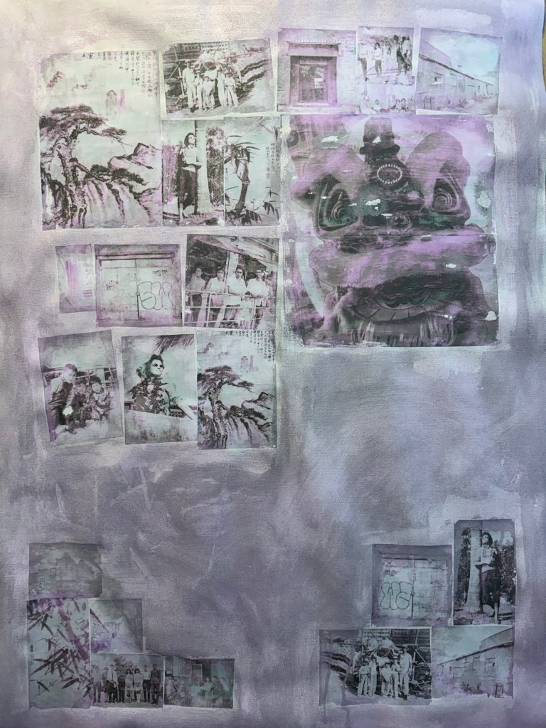
The canvas was covered in a thinned down acrylic wash:
–
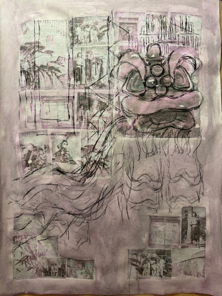
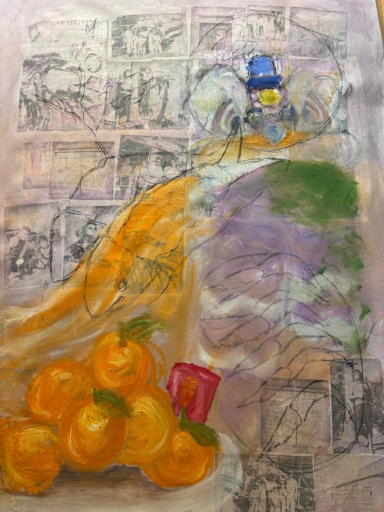
Charcoal was used to mark out the composition with the Lion being prominent.
–
Some iconic buildings from my childhood Hong Kong were added to the background.
–
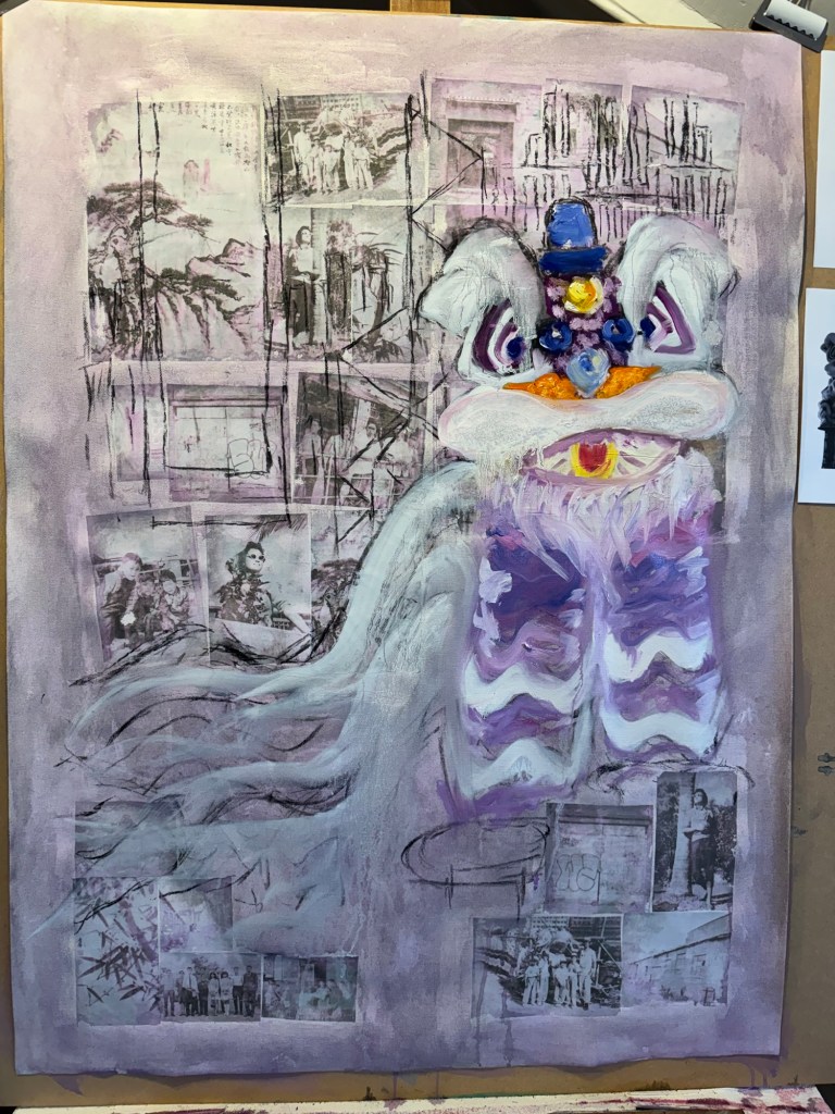
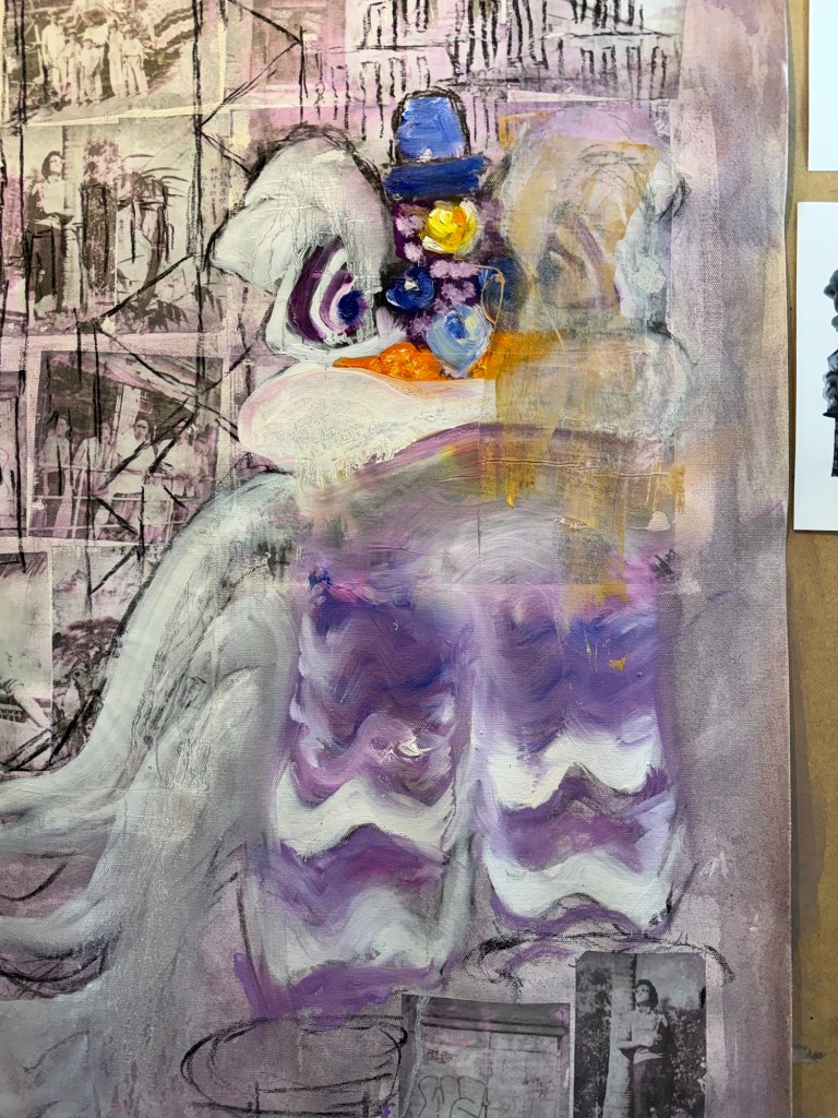
The lion head was painted in oil. But I was not happy with it, it looked too ‘cute’.
–
Since this was an experiment in oil, I started to wipe off parts of the image to create different effects.
–
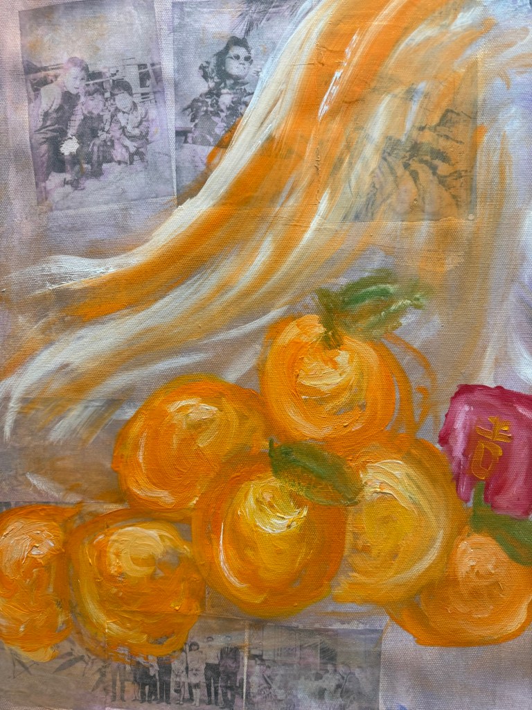
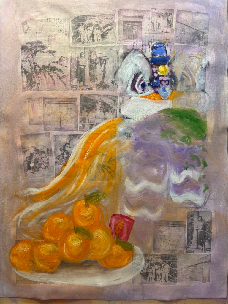
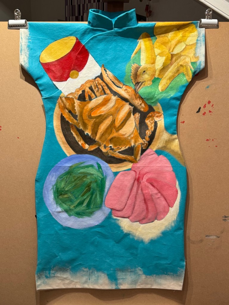
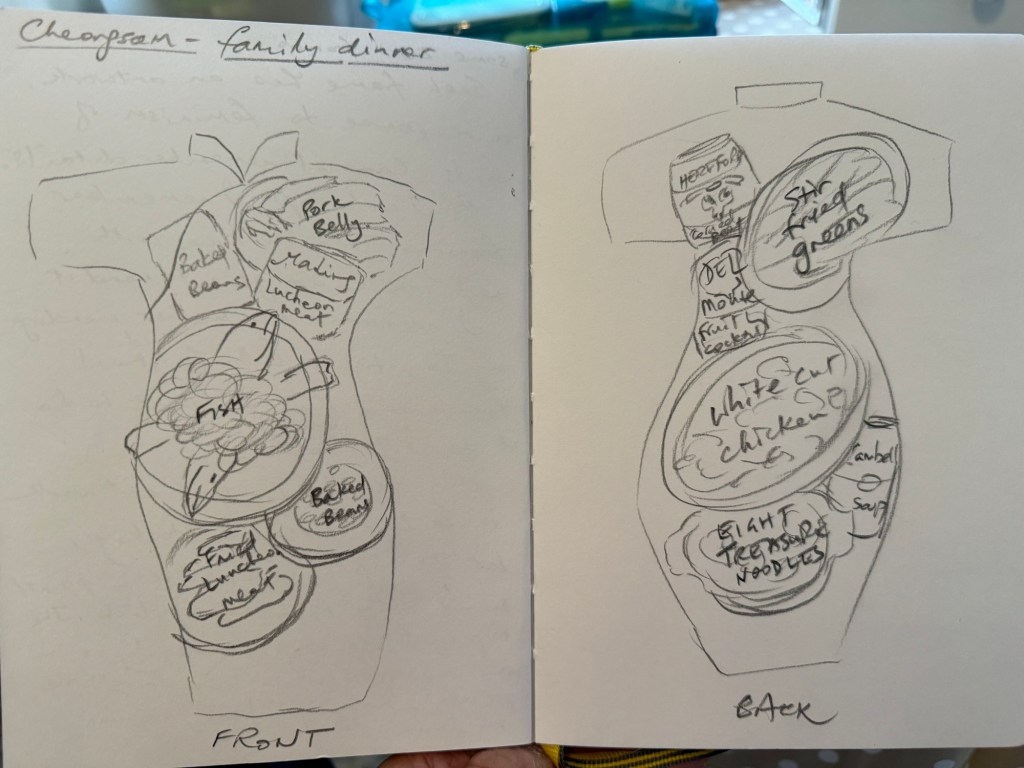
A pile of mandarin oranges were added as a traditional Chinese custom during New Year. I wanted to add typical Chinese New Year food to the composition in response to my decision after the Cheongsam series to do some Chinese food painting on a ‘normal’ 2D canvas:
–
I experimented with using looser brushstrokes and some thinned oil for the oranges:
––
I was still very unhappy with the lion and decided to replace it with a complete family dinner with symbolic dishes for Chinese New Year.
Charcoal marks for New Year food dishes
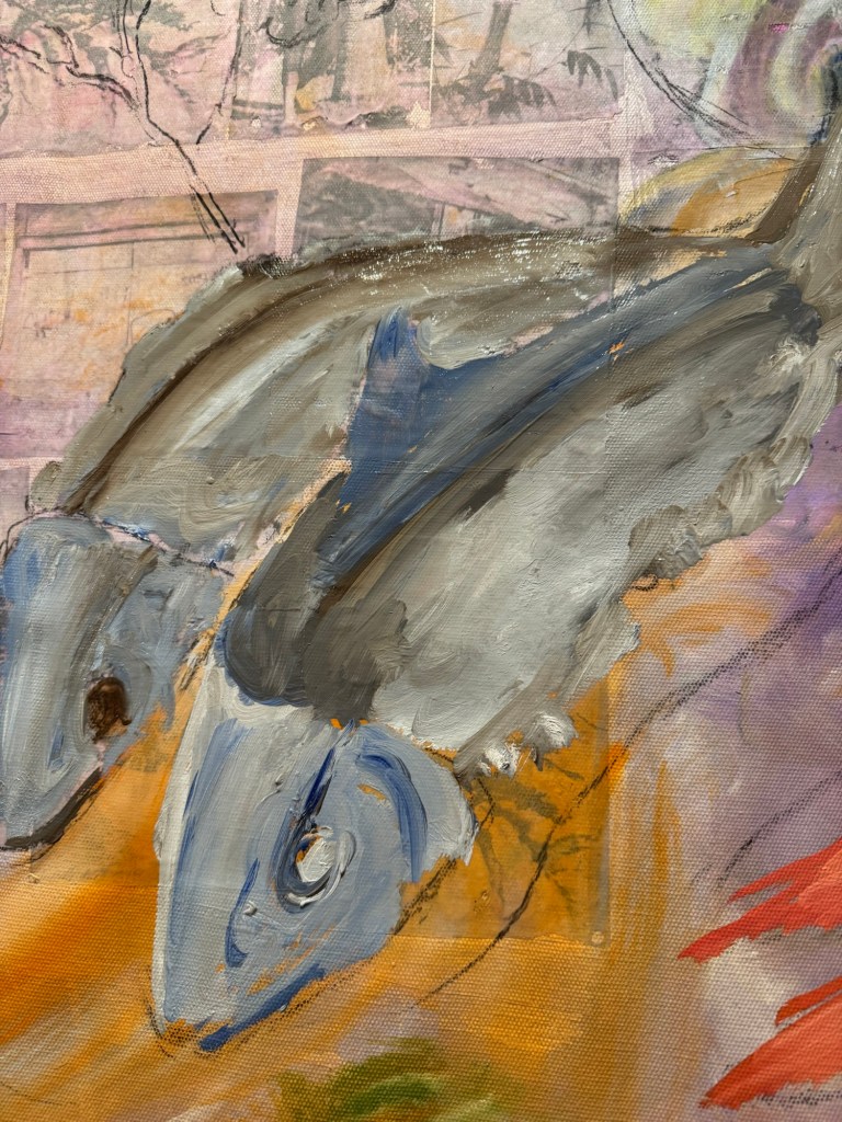
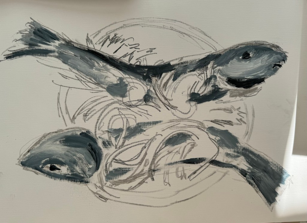
Thinned oil paint was used to mark out the shapes of the various dishes. Then more details were added to the fish first:
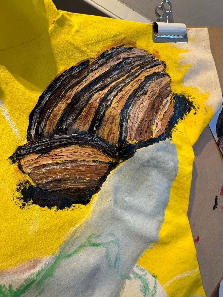
–Close up of fish (stuffed dace fish)
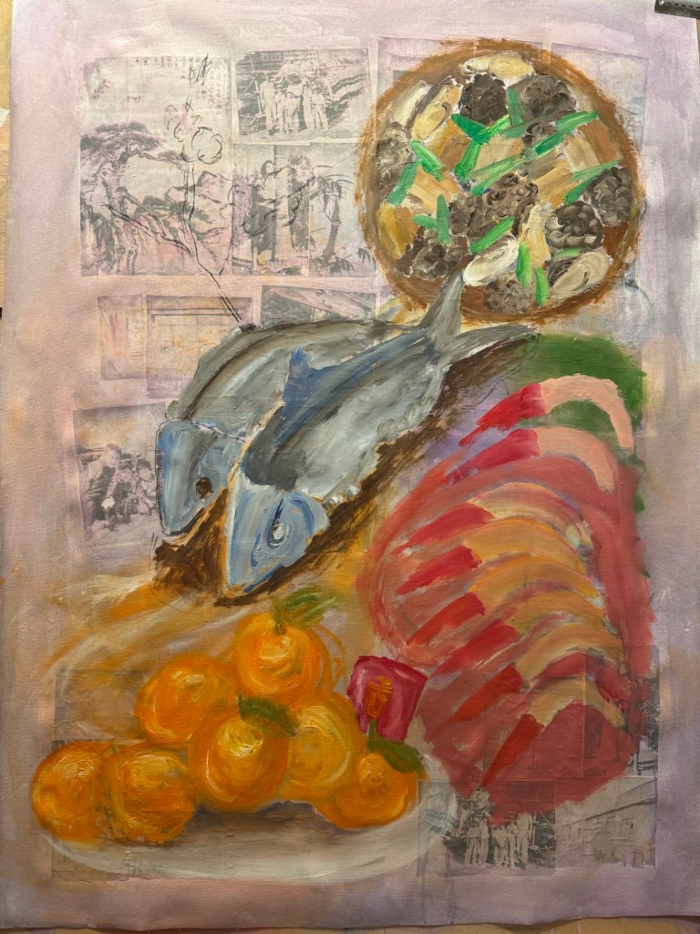
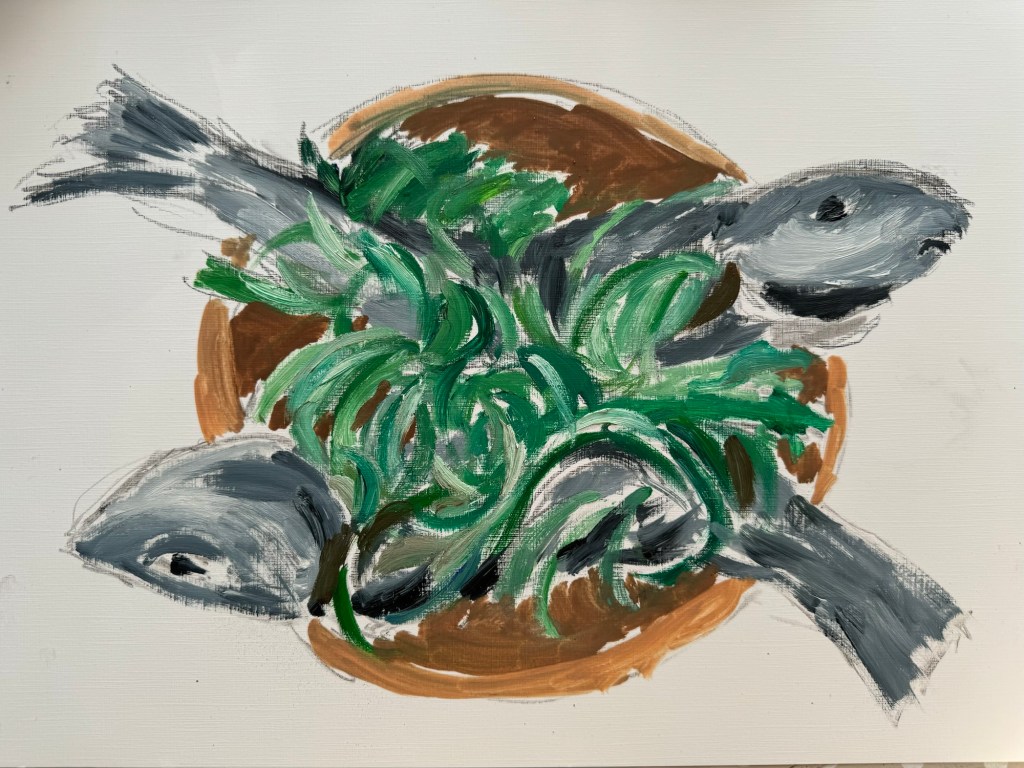
Other dishes were added:
–
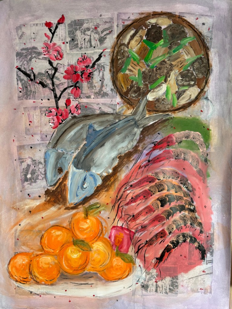
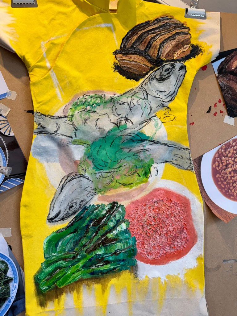
The prawns’ details were finished with Chinese ink and a peach blossom branch was added (also in Chinese ink) as it was traditional to have this plant at every home in Chinese New Year.
Finished painting – Chinese New Year dinner:
Mixed media on canvas. Size 102×75 cm
Menu:
Centre – stuffed dace fish. Symbol for having surplus meaning never falling short (of money). The word ‘fish’ sounds like surplus.
Top right – stew of shiitake mushrooms, dried oysters, pork belly and spring onions in fermented bean sauce. A traditional new year dish, a large pot is usually made and eaten over several days. ‘Dried oyster’ sounds like ‘good things’ meaning good things will happen.
Bottom right – prawns. Symbol for happiness. ‘Prawn’ sounds like laughter.
Bottom left – mountain of mandarin oranges with a red money packet (lai see), the phrase sounds like ‘gold mountain’ meaning good fortune.
Top left – peach blossoms, the blossoms opening signifies good luck and good fortune.
REFLECTIONS
I am glad I didn’t continue with the lion. It was not how I wanted as it was too detailed and cute. I was happier when the Chinese dinner idea started to develop. I was mindful that I wanted to experiment with Qi Baishi’s idea of painting between likeness and unlikeness. I was hoping the thinner paint and looser brushstrokes would give me more scope to express the unlikeness. I think I made some progress compared to the Family Dinners on the Cheongsam canvases, but there’s still some way to go.
I experimented with incorporating photographs but I think in the end they didn’t really add anything as most of the images were covered up. Perhaps even thinner oil would have left the photo images still partially visible.
I have never managed to combine oil and Chinese ink satisfactorily, I think using the combination on the prawns worked out well. I believe the thinned down oil helped the combination to work so worth bearing this in mind.
LEARNING
Try experimenting with even thinner oil paint and other techniques to apply paint.
Think more about what I want the photos to do (e.g. how much to be revealed) if incorporating photo images, then dilute the paint accordingly to achieve the effect. The experiment here was not fully thought through as I was just playing, but it provided good insight into how easily it was to fully obscure the photos.
Overall the painting was looser and less organised compared to Cheongsam Family Dinners, but I need to be more courageous about achieving unlikeness. Add more of myself to it and think about what feelings and intentions I have – not intentions regarding the composition, but what I’m trying to say.
NEXT STEPS
Experiment more with oil and different applications.
After making Family Dinner #1 (image below), I proceeded to make #2 with the learning.
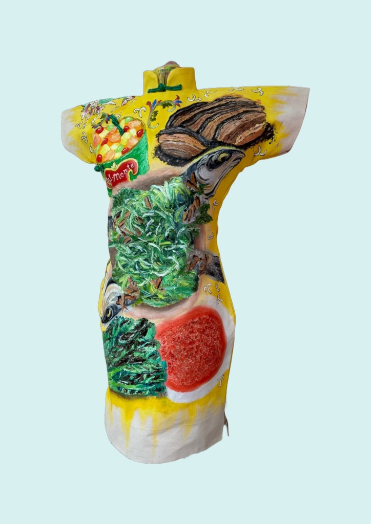
Family Dinner #1
METHOD
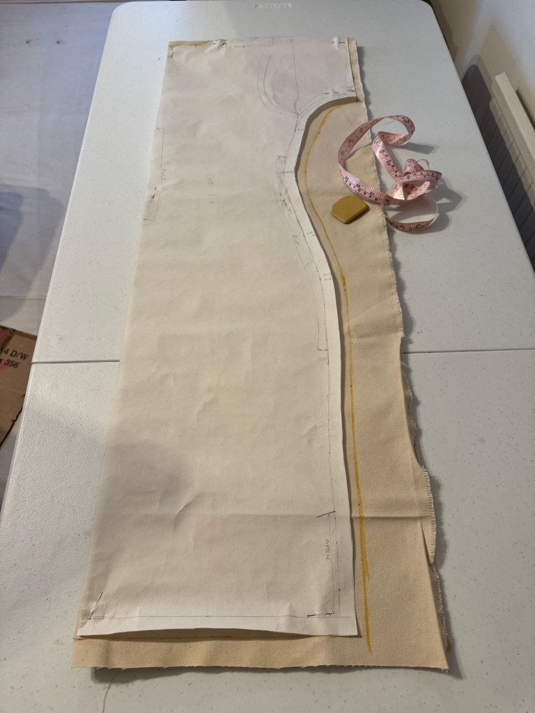
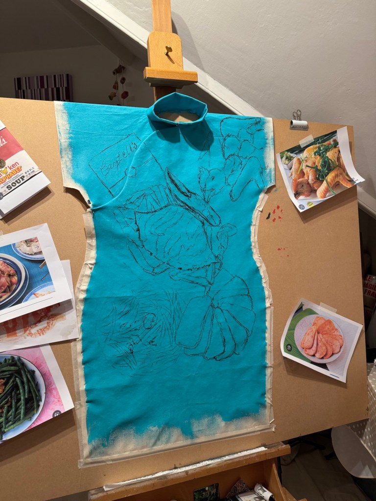
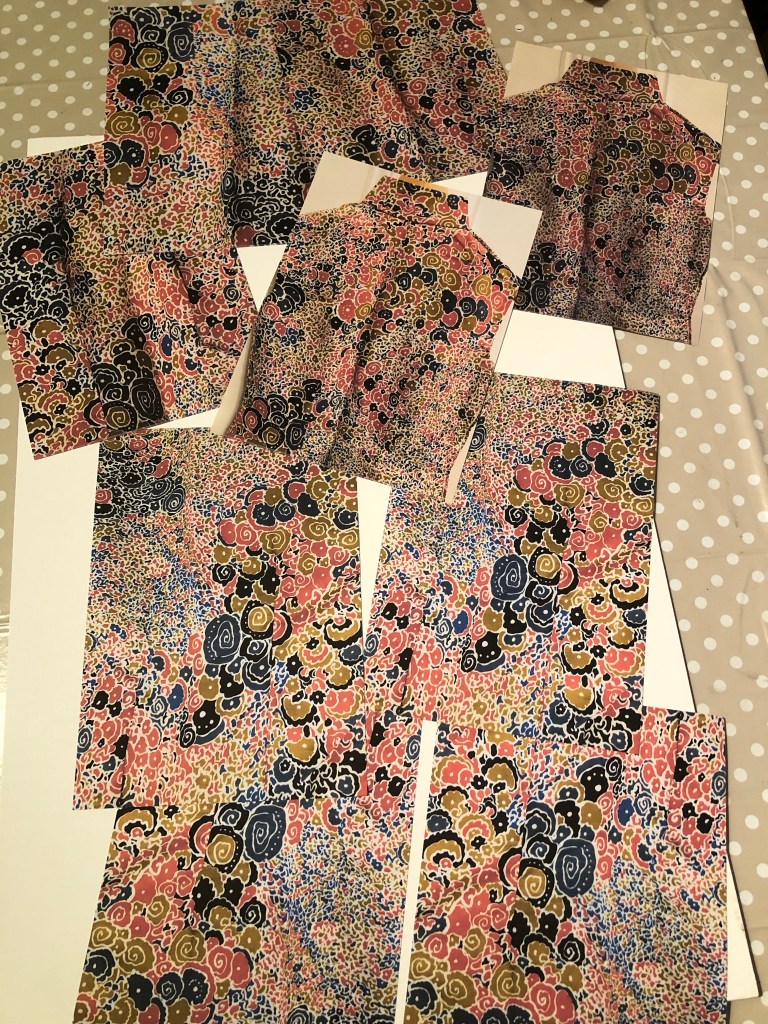
I was overall satisfied with how the new Cheongsam pattern worked out. But I felt the measurements needed to be more generous if I were to wear the canvas because of the stiffness of the material. If it were too tight then it would be difficult to put on. Hence I modified the pattern to make it wider.
Pattern ready for cutting
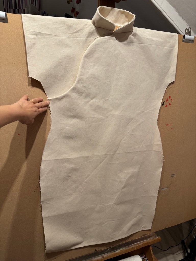
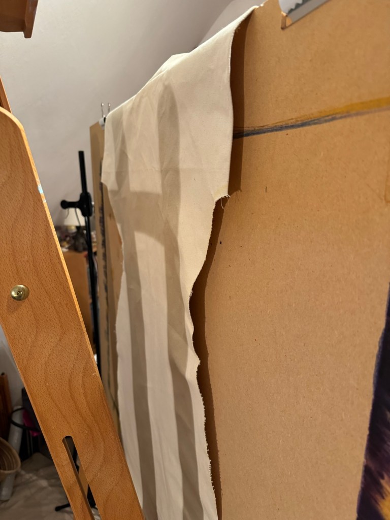
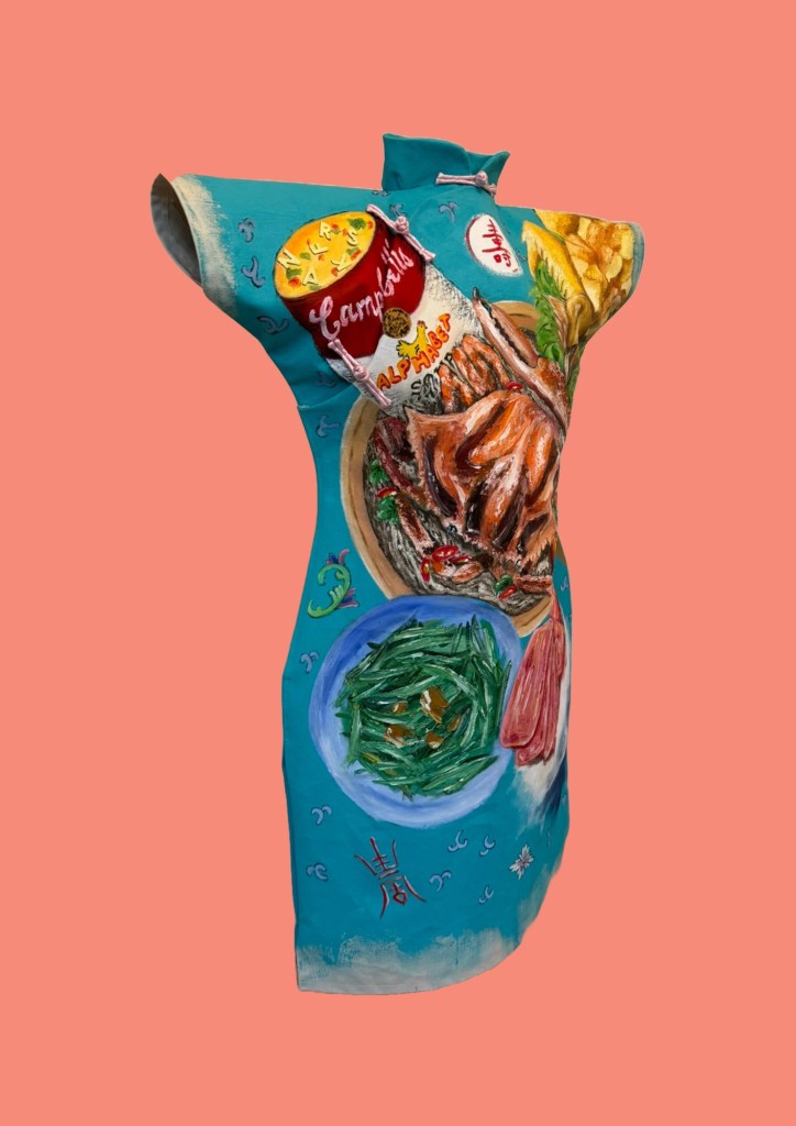
I also learnt from the last dress painting that it was difficult to paint the back of the dress if the dress was fully sewn up and placed on the canvas – it was impossible to access the back while the oil on the front was drying for weeks.
Therefore I experimented in this case with not sewing up the sides and draping the dress with the back part of the canvas hanging off the back of the easel. The plan is to paint the front then turn the board to paint the back.
Back of the dress draped over the board
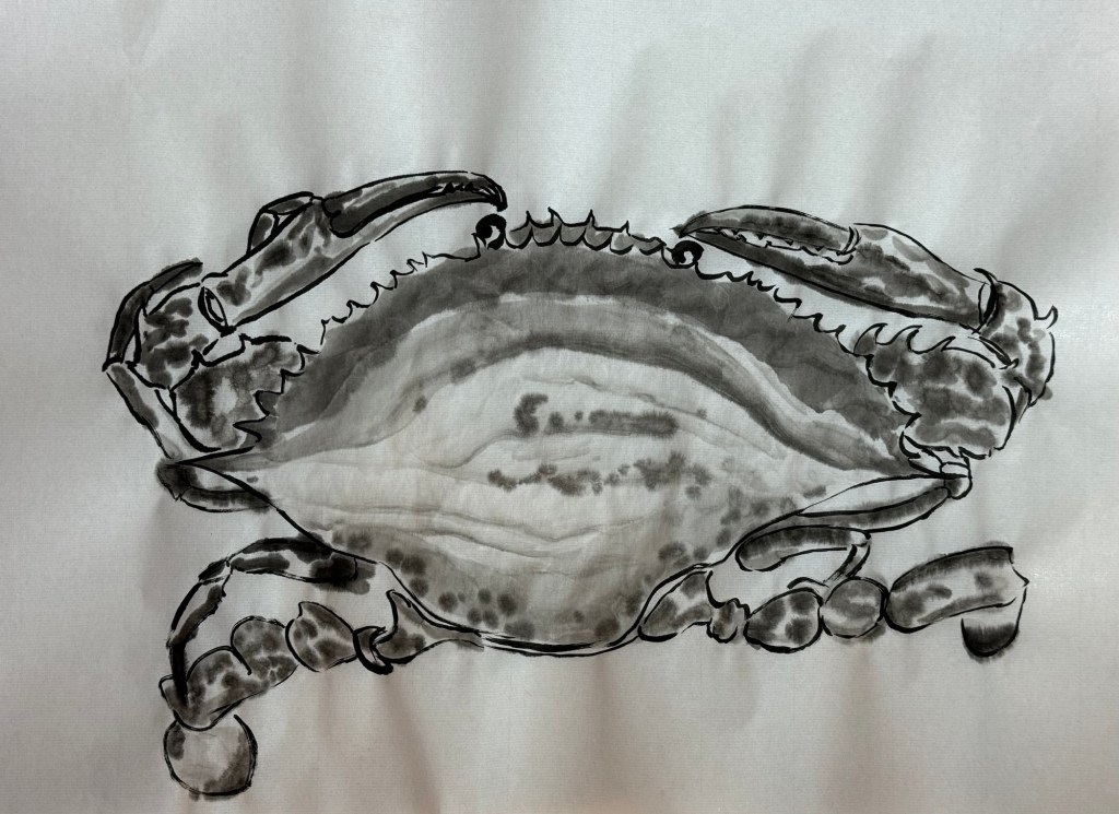
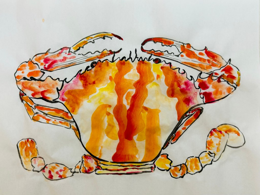
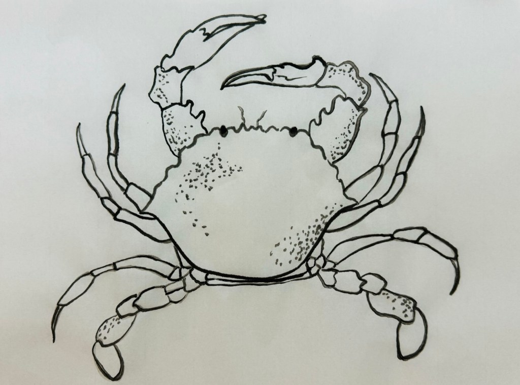
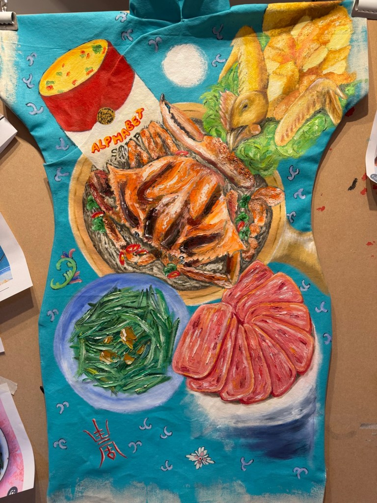
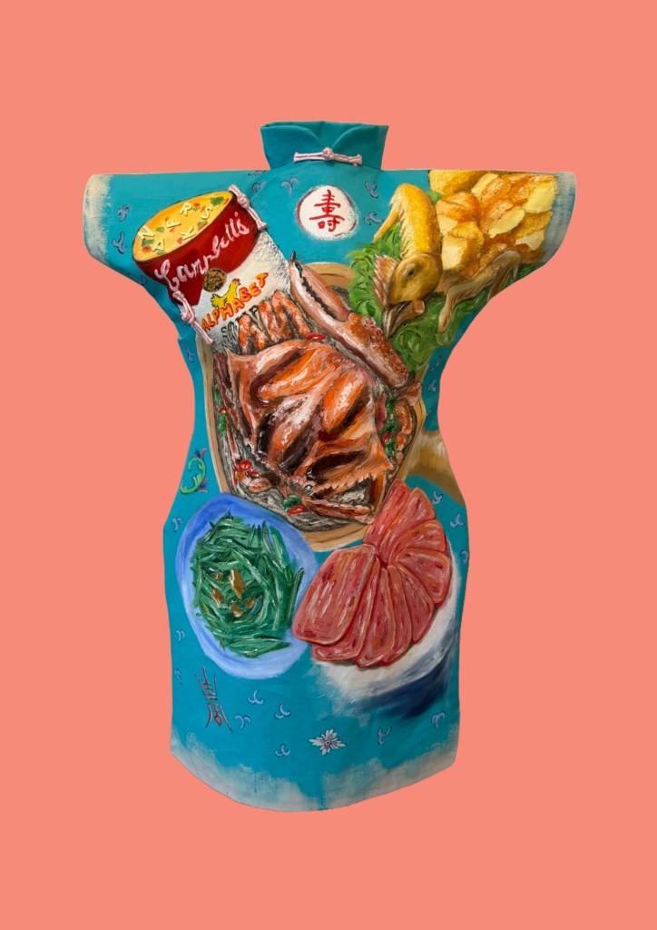
This family dinner has a main dish of ‘flower crab cooked in a clay pot’. So learning from my Chinese painting class – I studied the anatomy first and did a few ink drawings of crabs:
–
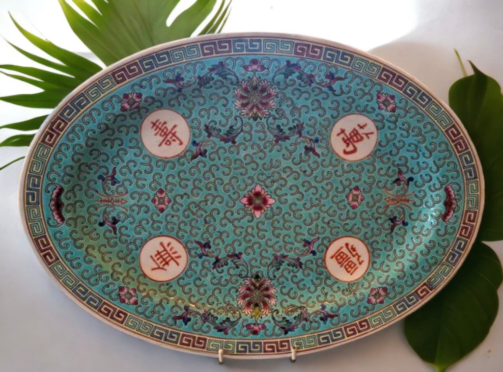
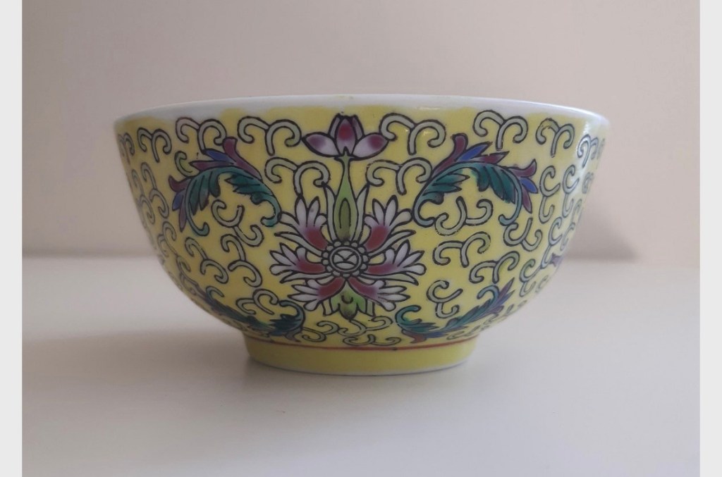
Then I chose the colour of the background based on another Chinese dinner service. It’s the same pattern of the yellow one I used on Family Dinner #1, but of a turquoise colour:
I experimented with different level of tinting to get the right colour and not too dark:
The composition was developed on my sketchbook then marked out using black willow charcoal on the canvas:
Composition drawings
Then I decided that I would sew up the sides of the dress because I felt it would be too difficult to turn the canvas inside-out to sew once it has been painted with oil. So I reverted back to the process I used previously after much consideration. I also used Velcro much more extensively along the complete opening of the right chest and side instead of using a zip or buttons because it would be hard to sew a zip or hand-sew fasteners due to the thick canvas. Hot glue was used to fix the Velcro in addition to the Velcro tape adhesive to ensure it was firmly in place.
Sides of the dress were sewn up
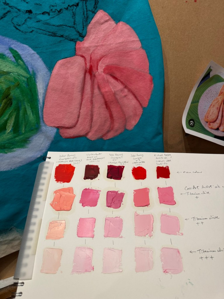
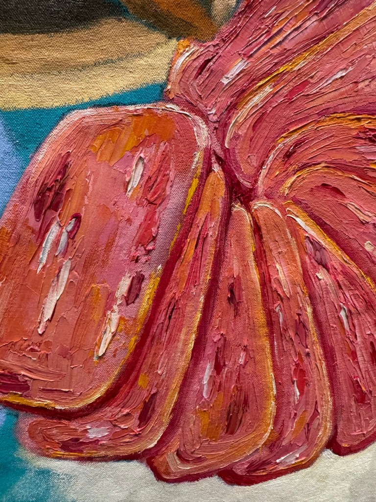
I started with the ‘pan fried sliced luncheon meat’. I once did a tinting paint chart of the different red oil paints I had. It was very useful to choose the colour of luncheon meat from the chart. I chose the shade according to my childhood memory – the colour of artificially-pink meat is difficult to forget!
Then I proceeded to loosely paint and mark out the rest of the composition.
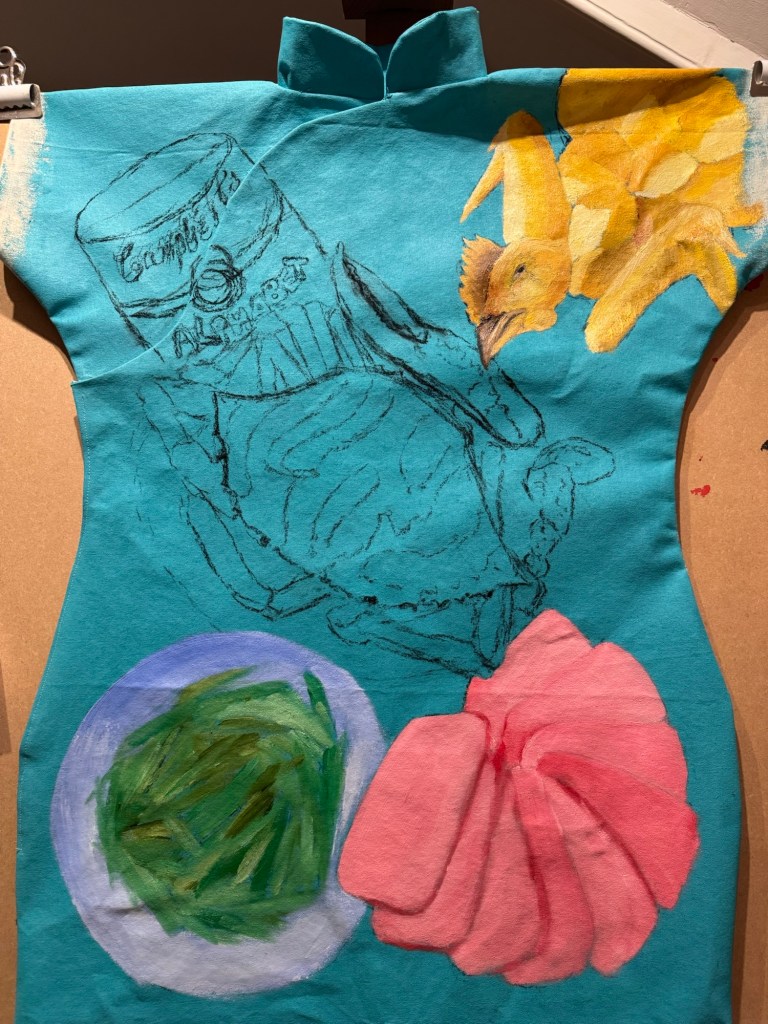
Adding chicken and green beansAdding clay pot flower crab and Campbell’s
Then more detail painting of the luncheon meat with some yellow edges for the oil used for pan frying:
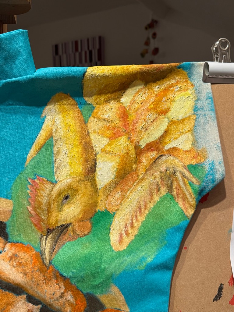
Adding details to the whole salt baked chicken:
Around this time I received my Unit 2 feedback from my tutor with comments that made me reflect on how I apply the oil paint. So I experimented with some looser strokes on the crab shell.
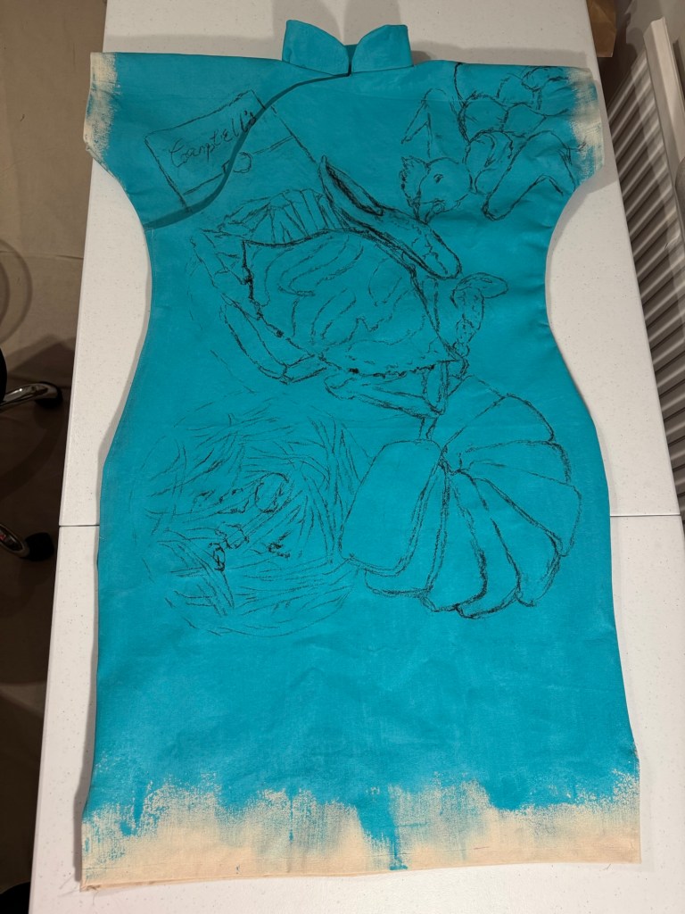
The painting was finished by completing the Campbell’s alphabet soup and adding pattern details from the dinner service around the dishes. Pink satin fastening frogs were added as finishing touch.
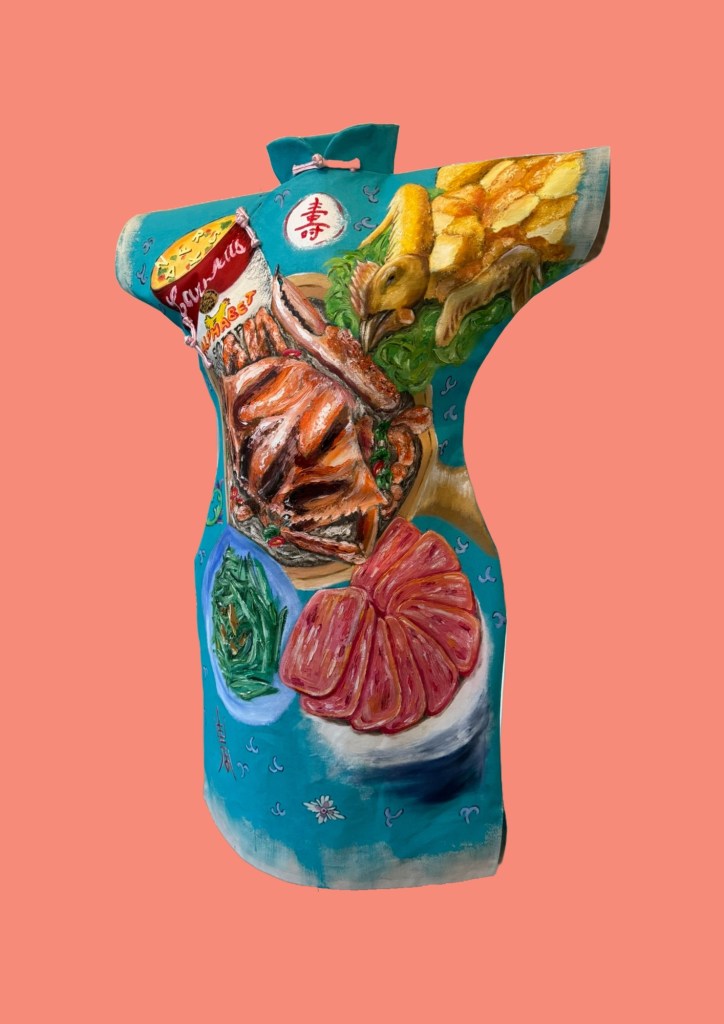
Finished work – Family Dinner #2:
–
REFLECTIONS
I really enjoyed making this painting. Food is such a key part of Chinese and Hong Kong culture that appreciating food is deep in my DNA. The more I paint these dinners, the more I realise that it’s not just the eating that I enjoy, but the painting of food as well. Working from memory has been great, thinking back to all the meals where these dishes were eating – at home as well as at restaurants.
Some of the unhappy experiences from our family dinners that I talked about in the reflections for Family Dinner #1 did not enter my consciousness for some reason. I realised that some of those experiences were dish dependent. Perhaps the dishes depicted here were ‘safe’ dishes without chances to go wrong. Dinner #1 featured a steamed fish – that was always challenging…
Part way through making this painting I received my Unit 2 feedback and it has been very thought-provoking. It made me immediately reevaluate how I applied oil painting – perhaps I have been too ‘one-dimensional’. Always applying the same (fairly thick) way. I tried a looser approach on the crab shell and was happy with the outcome. I have been thinking about that constantly and I need to experiment much more. How to use paint in a way to depict my distant and fading memory?
The Unit 2 feedback also made me think more deeply about why I am painting on Cheongsam dresses. Why dresses? Why Cheongsam and is the time well-spent in making dress-canvases? There is a lot to think about and reflect on from the Unit 2 feedback and I will write a dedicated blog for that.
I was going to make another cheongsam dress painting after this one, but I think I will make this decision after fully reflecting on my Unit 2 feedback.
LEARNING
– Be more flexible and creative in using oil. Try different thick- and thinness to create impact, to tell the story.
– Doing something just because I enjoy it is not enough a reason to do it. Need to consider more deeply about why – I believe I do this and reflect already but perhaps need to go deeper to examine my reasons.
– In terms of the Cheongsam making process, the increased use of Velcro as fasteners was a success and should be used in future dresses. Using hot glue to fix the Velcro was also a good idea.
– Overall, the pattern development has gone well and I believe I have a well tested and suitable method of producing a Cheongsam painting canvas.
NEXT STEPS
– Experiment with thinning oil and layering.
– Explore ways to depict fading memory without being overly detailed.
– Complete and capture my reflections from Unit 2 feedback. Write a dedicated blog for that and determine next steps to develop my practice. What to do if not Cheongsam paintings?
– Finish the back of the Cheongsam when the front is dried.
After finishing three other Cheongsam paintings, I started this work with a new Cheongsam canvas design and thicker gauge canvas as described in this blog:
I then explored the possible subjects for this painting and decided to focus on food. In the last two ‘food’ Cheongsam paintings, food was used as a racial identity metaphor. Food in the context of this new painting is about memories of family dinners in the 1970s when I was growing up in Hong Kong. Food was and still is a very important part of the Hong Kong culture. Family dinners are very important and day-to-day life often centres around family dinners. The Hong Kong society is a fusion of many cultures and this is strongly reflected in its food. I want to make a series of paintings to explore my childhood memories and tell my transcultural stories through my family dinners.
METHOD
The idea of making paintings about my family dinners came to me when I visited my sister and she cooked a dish of steamed whole seabass with ginger, spring onions, shiitake mushrooms and coriander in soy sauce. She reminded me this was exactly the same recipe that our late mother used to cook for our family dinners. Seeing the dish and her description triggered many deeply buried memories. I started to remember all the different dishes that my mother use to cook – all those memories that I have long forgotten. I took a photo of my sister’s steamed fish as I wanted to incorporate that into my painting.
As soon as I returned home, I started to research images of dishes that I have had and worked on the composition. Below are some examples created using Adobe Fresco:
Here is a video of the Fresco creation process:
I also used my sketchbook to experiment with different compositions.
–
The previous Cheongsam paintings were in acrylic on calico canvas and I wanted to paint in oil for this work because I enjoy painting in oil and I wanted to return to oil after not doing so for some time. Also, I had in mind that the toppings for the fish would be ‘piled up’ and I felt that oil paint would give me more freedom and time to play with getting the right texture. I usually just start painting straight away on the canvas, but on this occasion, something was holding me back and I had the urge to do some study drawings first to give me time to think about the details and composition. Below is the study drawing for the fish dish:
–
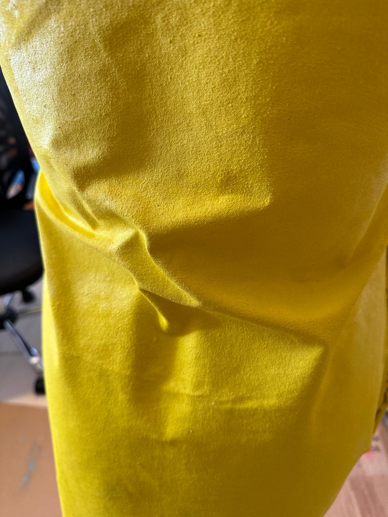
At the top of this blog, I listed an earlier blog about using a new design for the Cheongsam with thicker canvas material. This latest dress design and material combination caused the waist area to crease on the mannequin. So far, I have painted all the previous Cheongsams on a mannequin. However, for this one, I felt that it needed to be painted flat to eliminate the creases during the painting process. So I moved the canvas from the mannequin to the easel.
–
Painting moved to the easel so that I could paint on a flat surface:
–
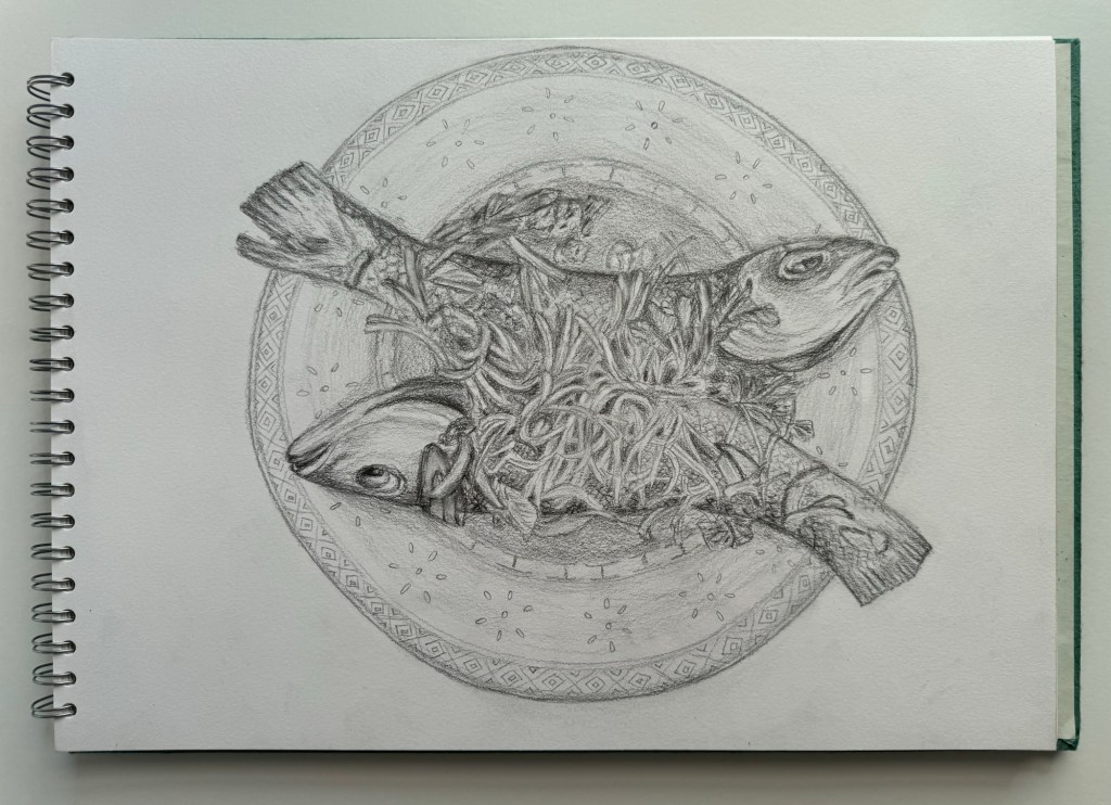
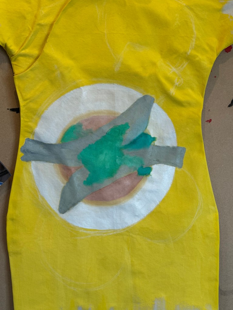
I proceeded to mark out the composition starting with the centre piece – the steamed fish. The placement of the fish dish is reflective of a Chinese family dinner where the steamed fish (if on the menu) would typically be placed in the centre as the signature dish.
–
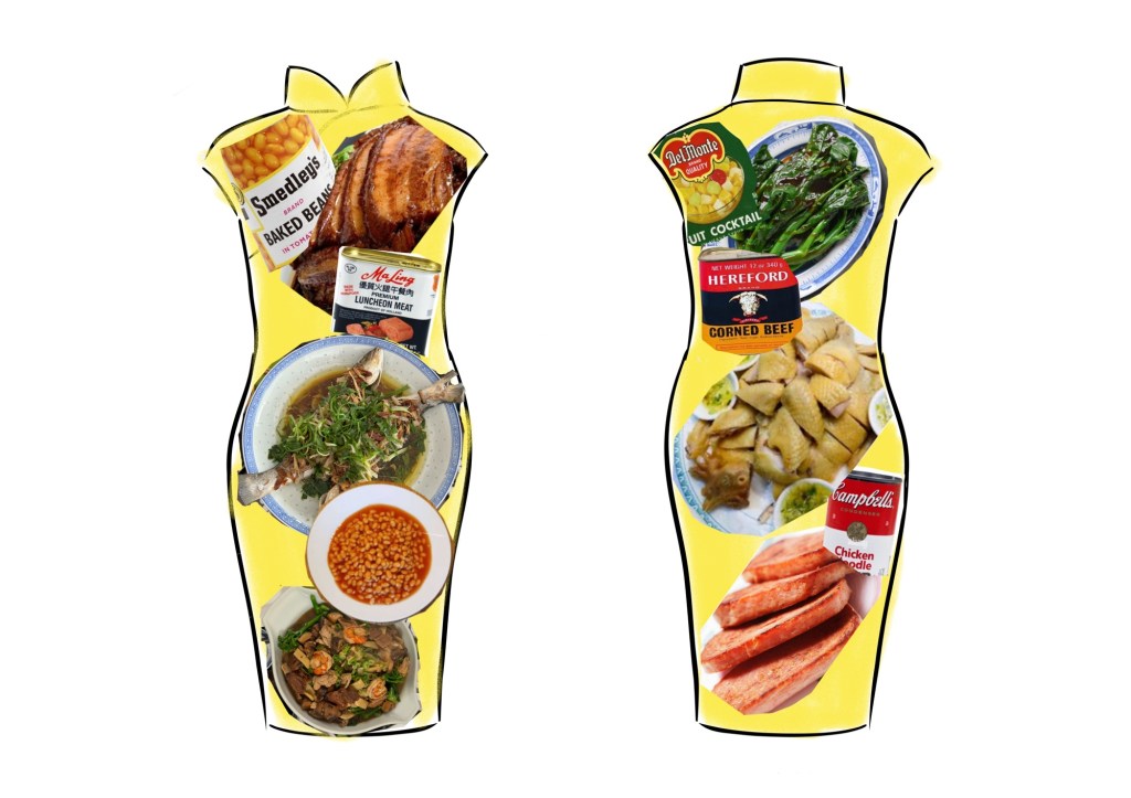
Having roughly marked out the fish dish, I added a plate of steamed baked beans. Since Hong Kong is/was such a fusion of different cultures and heavily influenced by the British due to colonialism, it was not unusual to have imported tinned food served alongside traditional Chinese dishes in my family. In hindsight, it sounds strange and funny to serve these two very different dishes together; but at the time it was the most natural thing – food was just food especially for a child. I never thought about their origins or the reasons that caused these two dishes to came to be served next to each other. I remember my mother calling baked beans ‘pork beans’ at the time and I remember at times there were small pieces of pork fat among the beans. I researched this and found that manufacturers did put pieces of pork in with the beans but removed them due to World War II meat rationing. I am not sure if they reintroduced pork in the 1970s or if what we ate were left over from the old pre-war stock!
–
Other dishes were gradually added to the menu, each dish having their individual significance in the role they played in our family dinner. I also enlarged the two fish to give them more prominence and I wanted a tight composition as from memory, dinner tables in Hong Kong were always crowded with food.
–––
I tried using charcoal with oil which I had never done before and below are photos of the initial experiment on oil-paper:
––
The experiment was not satisfactory because the charcoal did not work well on oil-paper, so I returned to experimenting on the canvas:
–
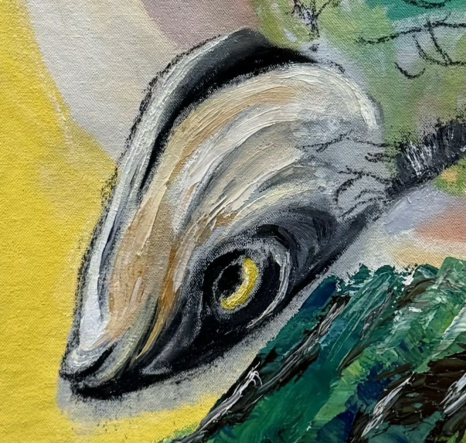
I was pleased with the charcoal effect and proceeded to paint the fish:
––
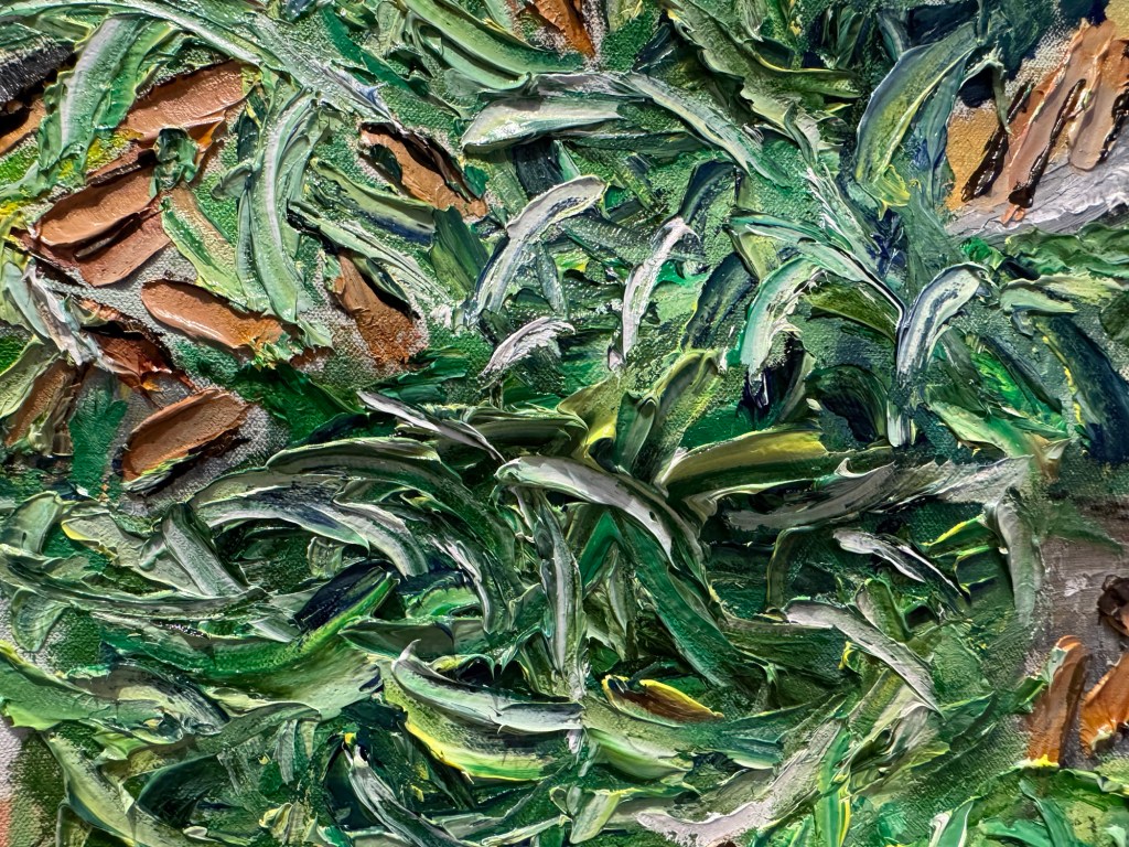
Toppings of spring onions, shiitake mushrooms etc. were added in thick layers of oil paint:
–
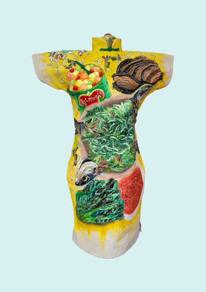
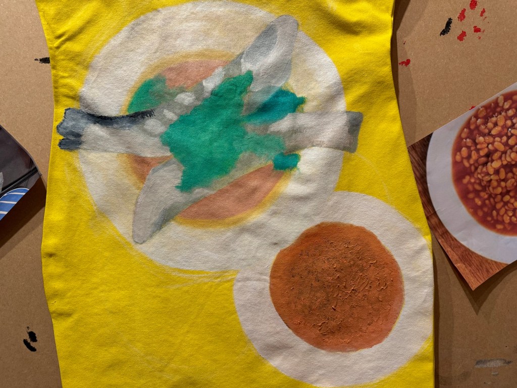
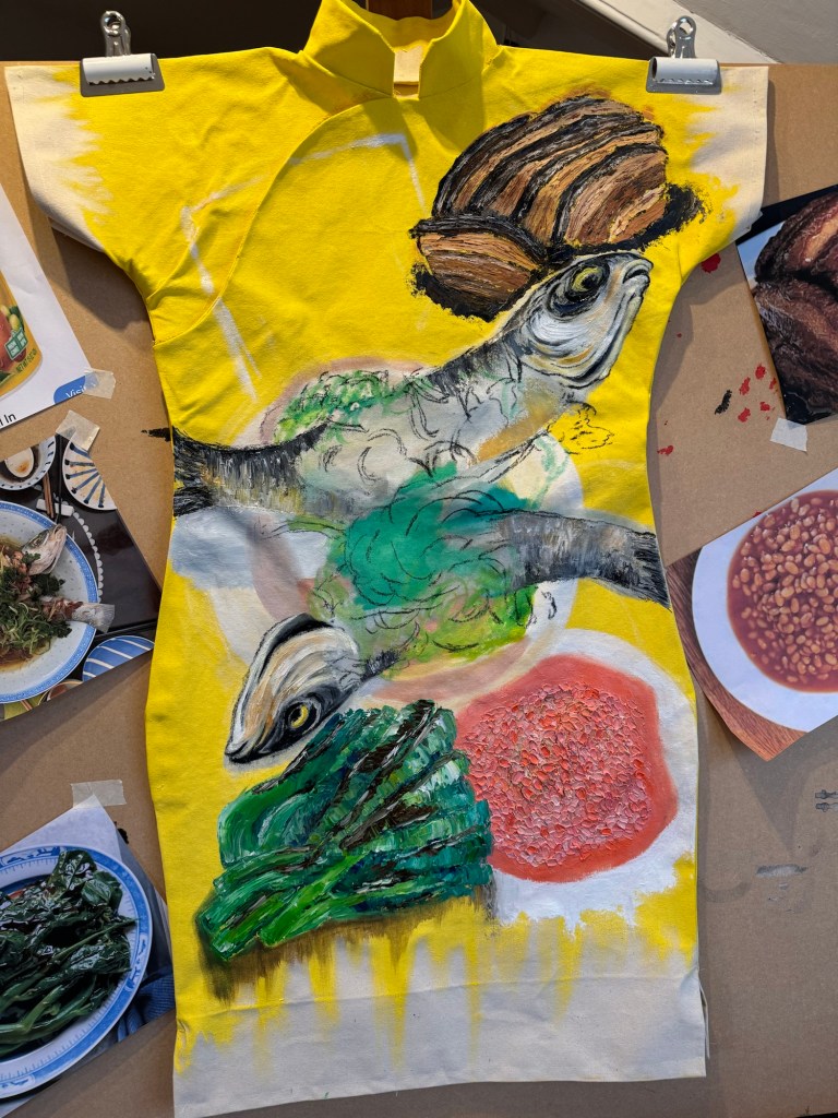
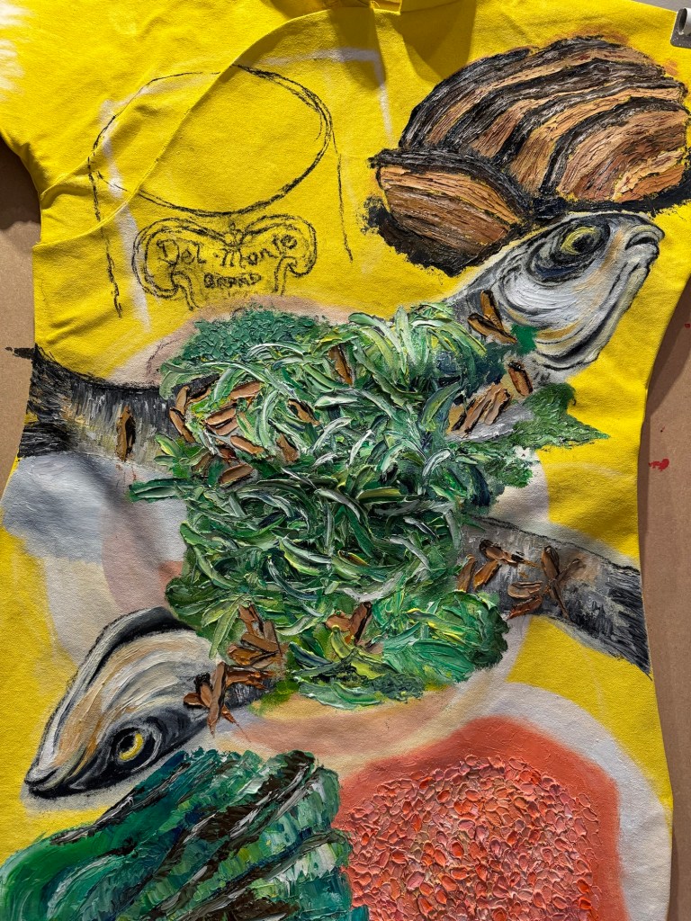
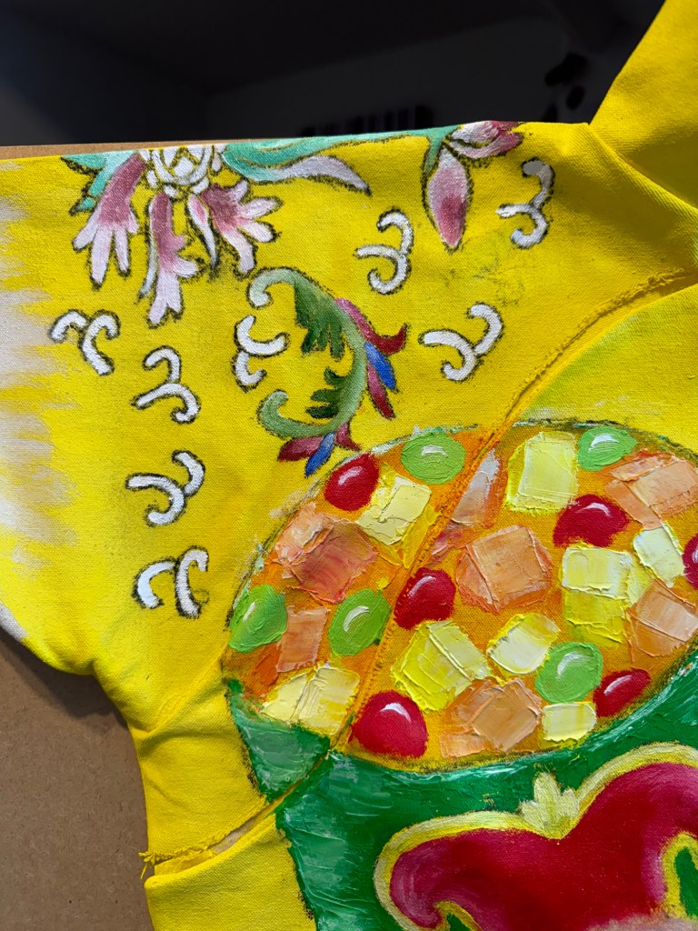
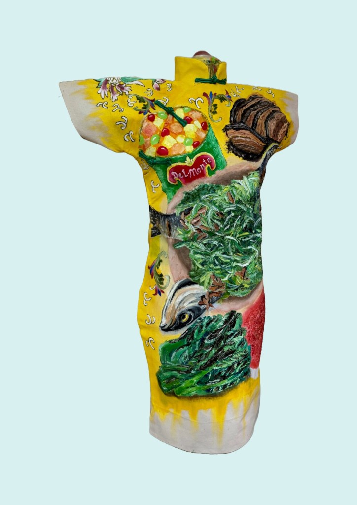
Time to add the dessert – Del Monte fruit cocktail.
––
To complete the composition, I added pattern details from the Chinese dinner set that my parents used at the time around the various dishes on the painting.
–––
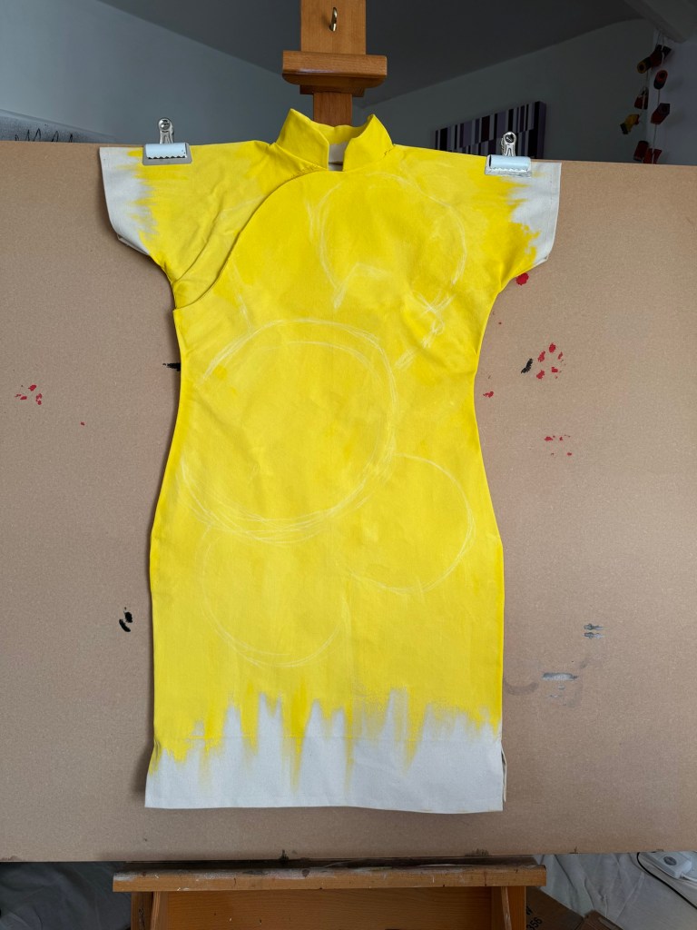
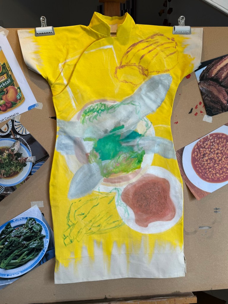
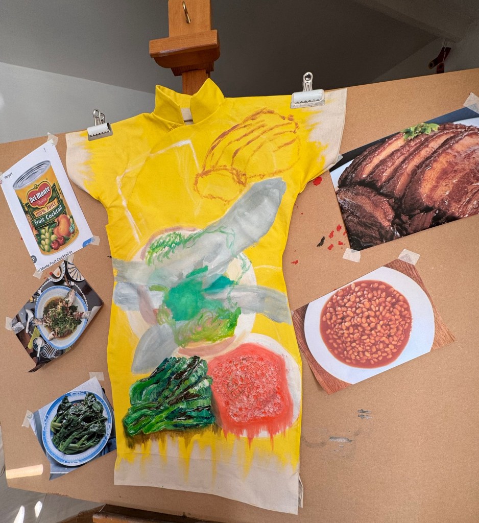
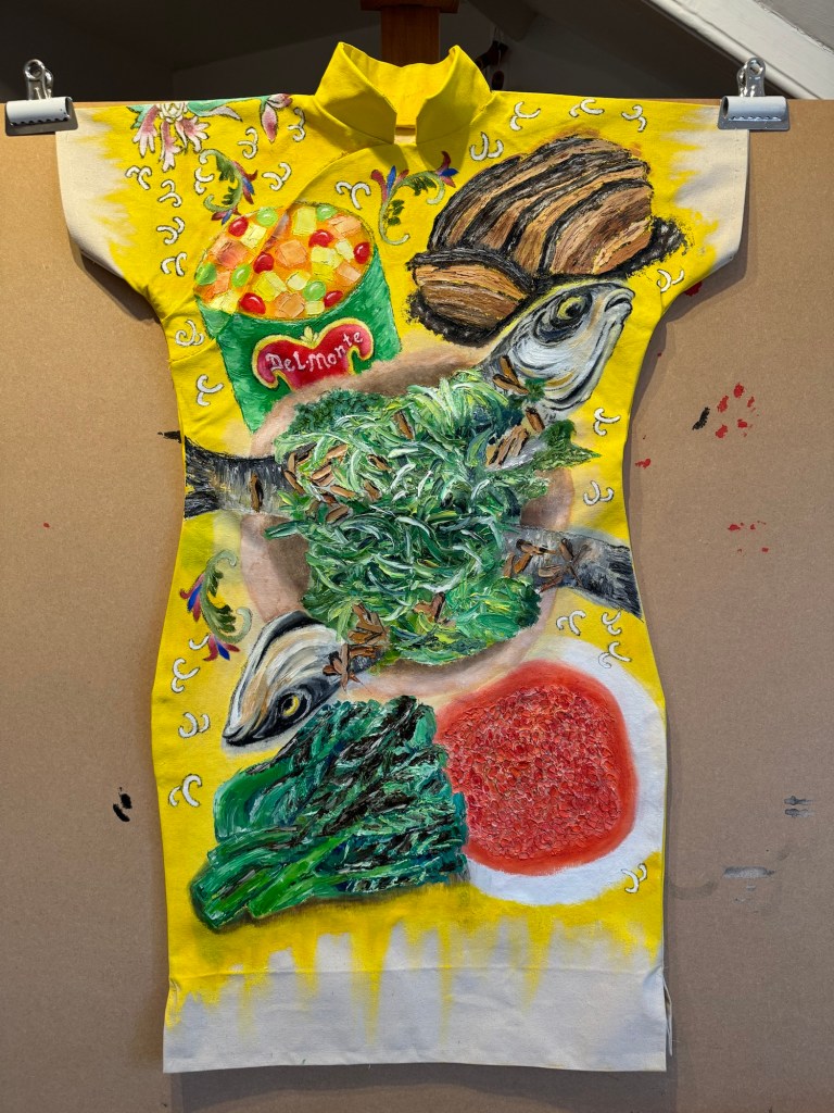
The completed front part of the Cheongsam painting:
–
The painting was put back onto a mannequin as I wanted the oil paint to cure according to the shape that it would eventually be displayed in. Then green satin ‘frog’ fasteners were added to complete the Cheongsam look.
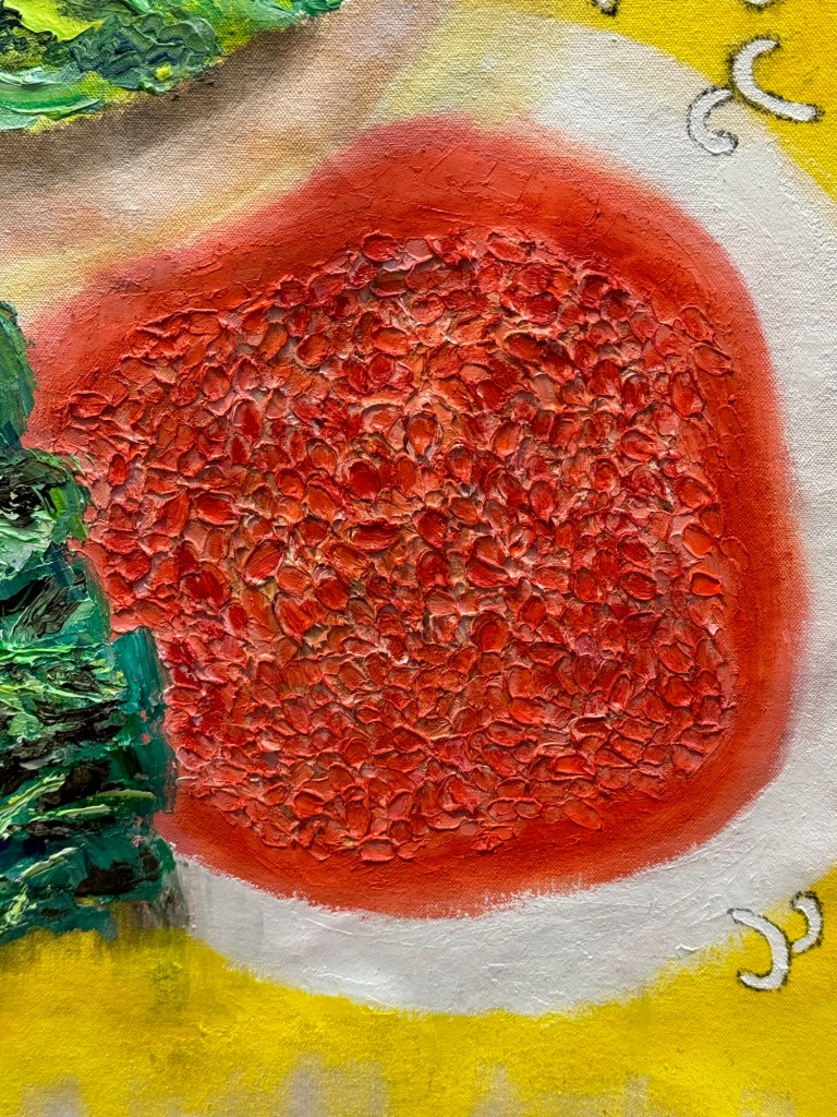
Below are images of the finished front half of the painting with –
-Steamed whole fish with spring onions, ginger, coriander and sliced shiitake mushrooms in soy sauce;
-Braised pork belly with preserved mustard greens;
-Gai Lan (greens) with oyster sauce;
-Steamed baked beans (imported) and
-Del Monte fruit cocktail (imported).
‘Family dinner #1‘, oil and charcoal on 240gsm cotton canvas. Size: 98 x 68 x 28cm.
–––
REFLECTIONS
So many thoughts and memories went through my mind while making this painting, it is hard to know where to start for my reflections. Like I have done before, I will use ‘free writing’ to capture them as they come into my consciousness as I write.
– Only in hindsight when I am doing this painting did I realise what a strange fusion of cuisine we experienced growing up in Hong Kong. Not only because imported tinned food like ‘pork beans’ (now known as baked beans) were served alongside carefully prepared Cantonese dishes, but the fact that the beans were steamed in a wok to heat up was rather amusing. Since my mother would not have known how baked beans were meant to be served, so steaming in a wok was her default method. As children, we loved mixing the baked beans with our boiled rice in our bowls because of the sugar and salt in the beans. Like many children all over the world, we (sadly) appreciated the processed food more than the poor mother’s fresh cooking!
– My father was the patriarch. He expected a well cooked meal twice a day (he used to come home for lunch). If the meal was not up to standard then there would be consequences. He was not physically violent but there would be a ‘dark cloud’ over our dinner, eaten in silence with the children exchanging glances but no one dared utter a word. The rejected dishes would be sent back to the kitchen to be remedied if possible (if overcooked then not possible).
– So my mother had to deliver two perfect cooking performances per day, everyday. Chinese cooking can be challenging, to get the taste balance, texture, freshness, aesthetics (just to name a few requirements) correct for every dish is very demanding. Especially when the ‘judge’ had high expectations. For example, for a steamed whole fish, the fish had to be cooked just right, not overcooked or undercooked – this is challenging even for restaurant chefs. If there was steamed fish then as soon as my father sat down at the table, he would split the fish open along the spine bone with his chopsticks and examine the ‘colour’ of the flesh, if there was any hint of pink along the spine ( meaning undercooking) then the chopsticks would be slammed down as a gesture of disapproval, no words needed to be said and the dish would be taken back to be remedied. It is no wonder my mother sometimes used Western tinned food to make up the number of dishes to get by. Since my father worked for the Hong Kong Government and was a life-long civil servant to the ‘Colonial Crown Service’, he was very accepting of Western tinned food because we (the colonised) were led to believe that anything from the West was superior. So in this context, colonialism in fact brought with it some occasional relief for my mother in her job of family meals planning.
– I think I chose a bright yellow background for my Cheongsam dinner because I love food and enjoying good food makes me happy as it is such a key part of my heritage. I always wanted family dinners to be fun, bright and cheerful. Although there were often ‘dark clouds’ that loomed over our family dinners, as kids, we would find reasons to giggle at the dinner table – it was our way of responding to the situation through kids’ humour.
– The background yellow is also similar to one of the dinner sets that my parents had hence I incorporated some of its design onto the dress. I will elaborate about the dinner set design on the back of the dress as it has an interesting history.
– There were other back stories to the dishes on the painting and on how ‘the family dinner’ was often where the dynamics of my parents’ relationship played out. I am reluctant to detail all of them because it would be unfair to my parents who are not around to say whether they wanted their stories to be told. Also, I am not sure if I am ready to express everything yet.
– I wonder, how does one find out if the dead would want their stories told and how does one decide whether to tell them anyway? Also, I can only tell a story through my lens, so whose story would I be telling?
– Recently, I have been thinking a lot about ‘process vs outcome’ in my practice. I have thought more deeply about this since I started to make Cheongsam paintings. I think it is because the work takes longer and involves more complexity, so the extensive creative process gives me time to think more deeply. Especially with this Family Dinner painting – the composition is more complex than the previous ones and painting in oil takes longer which is part of why I love to paint in oil – the process and materiality force me to take my time. The surrendering of agency to the process elates me. My thinking during my making process comes in many forms, such as reflections and memory recalls that I would often incorporate into my painting, or ‘put aside’ in my ideas bank for future paintings. All these thoughts go towards the sense-making of my journey, my identity and the world around me. It is right now at this very moment in time while writing this set of reflections that I have come to truly understand what ‘sense-making’ means – to me. I wish I could bottle this moment before the thought eludes me.
– I wrote in my research paper about two transcultural artists and their sense-making that takes place on the canvas. For the paper, I researched about sense-making and how that process fundamentally supports the human survival. In the context of migration, people displacement or in a transcultural setting, where the environment is new or constantly changing – I believe the opportunity to reflect and make sense of one’s experience is essential to survival in a meaningful way; to feel belonged in the world and not merely to exist. Unfortunately for many, the quest for physical survival can be overwhelming therefore depriving them of the opportunity for the much needed sense-making.
LEARNING
When I first started planning the structure of my blogs at the start of my MA programme, I had planned for the REFLECTIONS section to be free-thinking and free-flowing, capturing whatever came to mind related to the work or during the making process. The LEARNING section is there to bring the thinking back to the context of my practice to extract any practice-related learning and plan the next steps. This structure has helped me to develop my practice so far and is becoming even more important as my reflections become more extensive and ‘free’. So I will now try to extract some learning from the this piece of work and the above reflections.
– Referring to my thoughts on ‘process vs outcome’, there is increasing clarity for me as to why I am not always bothered about the work once it is finished. For me, the work is a way to provide a process – the process is more precious to me. The process gives me quality thinking time and it ‘walks with me’. I enjoy making very much, but it is the making while thinking or reflecting that is the most valuable for me.
– So what am I going to do with this realisation, or confirmation of what is valuable for me in my practice? I don’t know yet, maybe I don’t need to do anything to bring these thoughts to a conclusion, perhaps it is just a beginning with no end – that feels exciting. So I will go with ‘it’ and try not to over think ‘it’.
– I have thought a lot about how I could capture some of the more abstract elements that came out during the making process, perhaps onto a piece of physical work – could be painting, writing, 3D etc.. I remember in a much earlier blog, I talked about wanting to find ways to express my thoughts through abstraction as that might liberate me to express more freely without the confinement of physical preconceptions. A specific image that has been recurring in my mind since finishing the Family Dinner painting was the pink tinge (of blood) that would sometimes be visible along the fish’s spine as my father parted the flesh of an undercooked fish with his chopsticks. For me, that tinge of pink symbolised innocence and trouble at the same time. I need to do something with that pink to get it out of my head.
– As I was making this painting, many memories of other interesting family dishes and stories came to mind and I am bursting to paint more dinners to capture them.
– I also need to complete the back of this dress. I had originally thought about painting a second dinner on the back, but I have decided to not do this because I want to save some of the dishes for other dresses as I want to make a series of several ‘Family Dinner’ paintings. Also, I want to paint the design of the dinner set that my parents had because it has an interesting history.
– As for the new Cheongsam sewing pattern that I used for this painting canvas – I am very pleased with the new design because it does not have any darts so the canvas can be painted flat which means I can use thicker canvases and paint in oil which is my preferred medium for this current series of painting.
– The new Cheongsam canvas design also means I have reduced the making time of the canvas from two days down to around half a day. This improvement was due to a simpler design and my experience gained in making these canvases – I am now more confident in sewing with my machine and quicker in trouble-shooting. This means I have more time for the other parts of the creative process.
– A key learning in making Family Dinner #1 was to take time in my making. I have in the past rushed my work, for no specific reason but to just ‘get things done’. The study drawing of the steamed fish was invaluable for me and gave me the confidence to experiment and take chances when painting on the canvas because of my enhanced observations. I now appreciate why artists make study drawings!
NEXT STEPS
– Paint the back of Family Dinner #1 with the family dinner set design.
– Start to research and make Family Dinner #2.
– Continue to take time in my making, e.g. allow time to make study drawings and appreciate materiality.
– Experiment and play: do some abstract paintings of ‘the pink tinge’ to explore how to capture some of the ‘magic’ that I have felt during my making process.
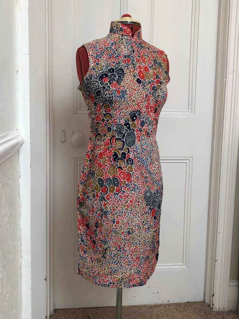
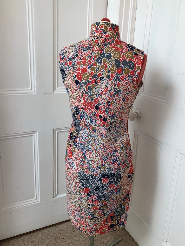
During one of my visits to Hong Kong some 30 years ago when my mother was still alive, she gave me four dresses as keepsakes – two hand tailor-made silk Cheongsams (traditional Chinese dress) from when she was a young woman and two evening dresses that she made herself for dinner balls that she went to with my father. One of the cheongsams was my favourite, it had a distinctive and memorable pattern. I remember very clearly that I used to open her wardrobe as a little girl to admire it and I was mesmerised by the pattern. Everything about it said ‘my mum’ to me. So I was very happy when she gave it to me to keep as it was very precious and had so much history.
Then in 2001 when I moved house (in Bristol, UK), I cleared lots of old things into a skip. As the skip was driven away, I remembered a small suitcase containing the precious dresses was accidentally thrown into the skip but it was too late. It was one of the things that I have regretted all these years.
That was some 22 years ago. Then earlier this year, I was clearing out the loft and found a box containing some old items, inside which was a plastic carrier bag contain the four dresses. It was as close to a miracle as I could image. I hadn’t thrown away those dresses after all! To find them again after all these years was an emotional moment for me.
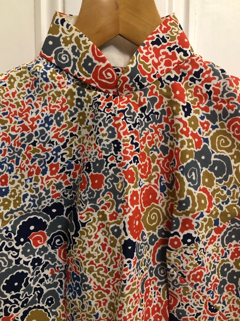
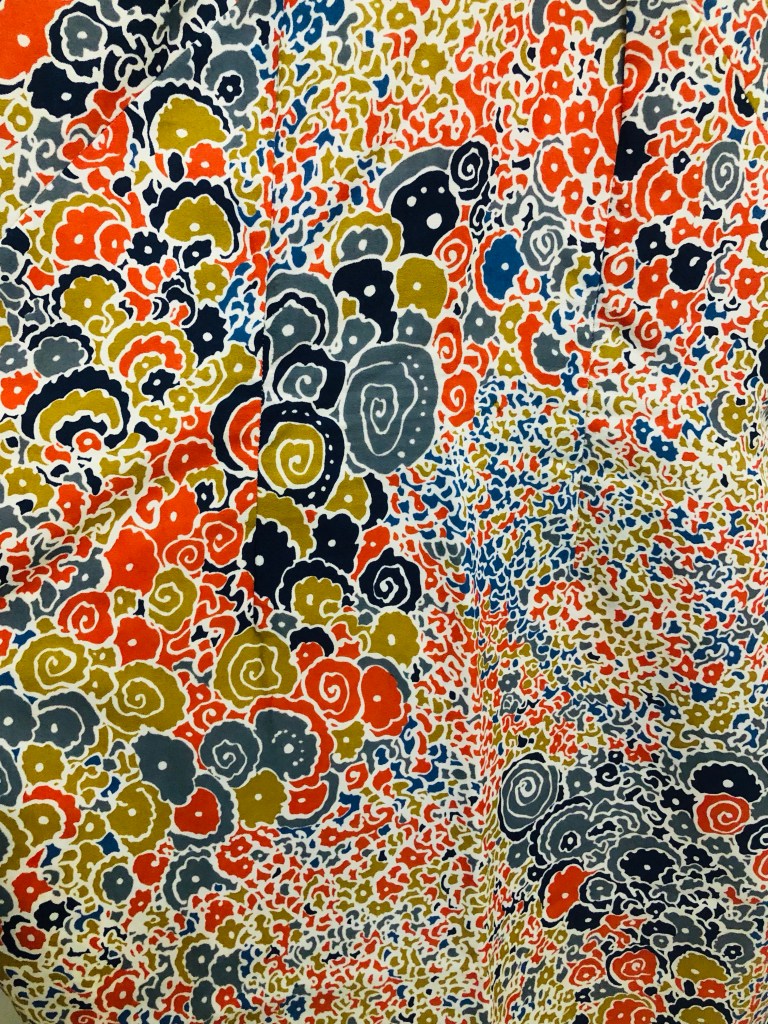
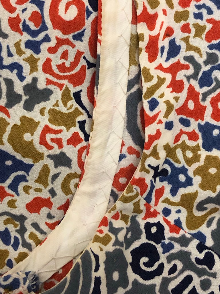
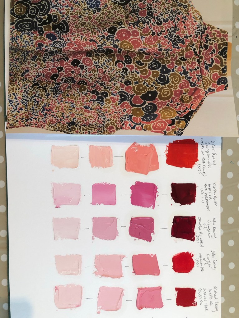
Here is the distinctive Cheongsam that I adored. It is a traditional Chinese dress made with a contemporary western style abstract patterned fabric of the time (late 1960s). It is a good example of a piece of transcultural garment. It has some deep creases from being folded for so many years but I am unsure of how best to iron or care for it, so until I find out, I decided to refold it for safe keeping. Below are some photos I took before putting it away.
Front viewBack viewClose up of the Madarin collar design Close up of the abstract pattern that fascinated me as a child Close up of the details of hand made stitches along a seam
There is so much history to this interesting dress, its rich features and heritage make it very precious and can provide inspiration for my art making. However, I was unsure of what to do and where to start.
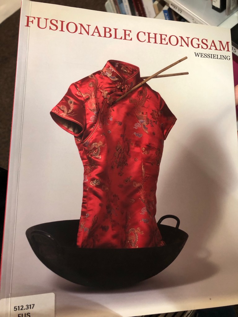
When I recently visited the Stuart Hall Library in London as part of my MA Fine Art course Low Residency at CSM, I saw the book called Fusionable Cheongsam. I was unable to spend too much time there because we were on a tight schedule for the day and I hope to return soon to have a good read of the book. However, I had seen enough to convince me that the Cheongsam could be a good focus for my art making. I decided to start with a painting.
METHOD
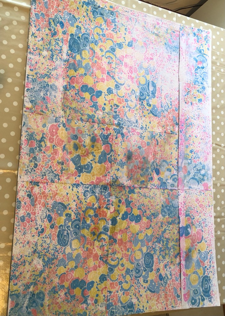
Photographs of various parts of the Cheongsam fabric pattern were taken and printed on an EPSON EcoTank ET2860 inkjet printer.
Images were selected to fully cover a 30×20 inch canvas board. Dispersion liquid was used to transfer the printed images onto the canvas and left to dry overnight.
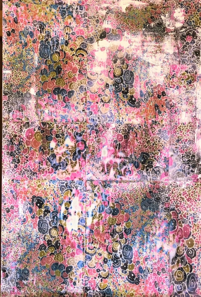
The paper was rubbed off leaving the transferred image on the canvas. As expected, the process usually leaves blank patches as it had done here:
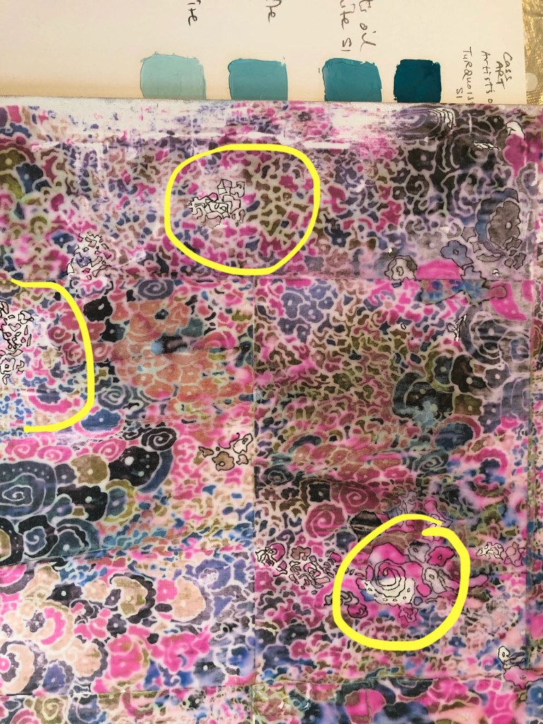
Where there were blank spaces, the outline of the abstract shapes were drawn in using a 0.2mm black fine liner pen.
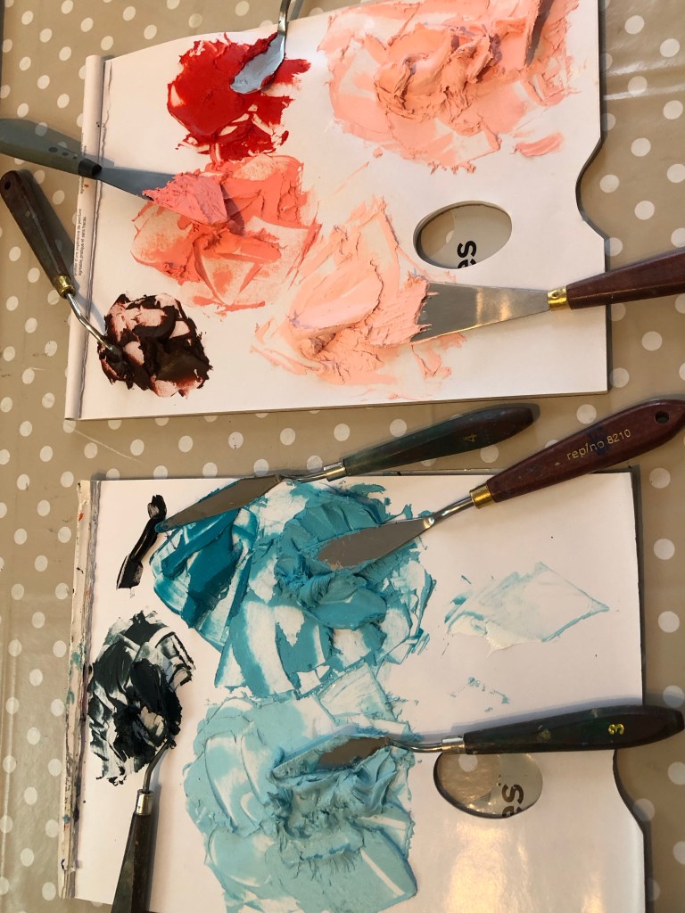
Using the colour charts I prepared a few weeks ago, various colour shades were chosen for the top layer oil and cold wax painting. The oil and cold wax were mixed in 50/50 ratio.
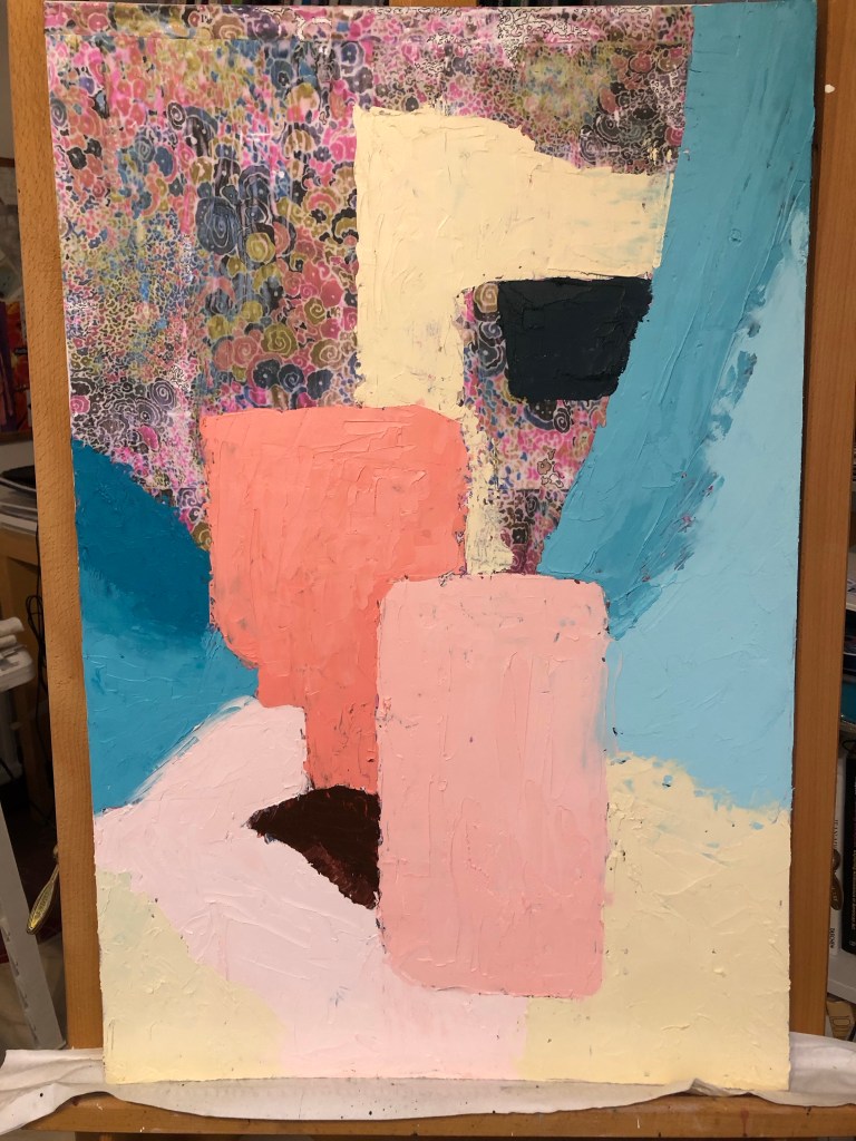
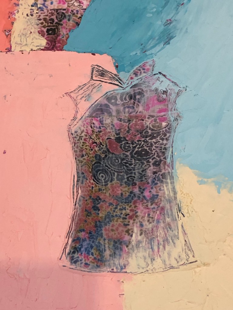
Blocks of colour were painted onto the canvas. The approach was abstract and without pre-planning, I was just responding to the canvas. Towards the bottom centre area, I wanted to paint a dark red triangle, what came out was part of a mouth or lips. The lips led me to start painting an abstract face:
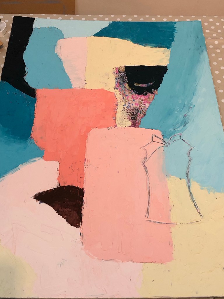
Once the top layer painting was completed, I started to scratch off the paint, firstly in the shape of a small cheongsam.
Then the paint was scraped off and the area cleaned with environmentally friendly solvent:
I liked the image and I then responded to it by making marks of several other cheongsams of various sizes. Bright red paint was used to depict the traditional Chinese buttons used on garments. Strips of Chinese calligraphy with the phrase ‘third space’ was layered onto the paint then pigment was sprinkled to add texture.
I felt troubled by the face, especially the dark eye, it looked too sinister. So I scraped off most of the dark eye to give it a kinder look.
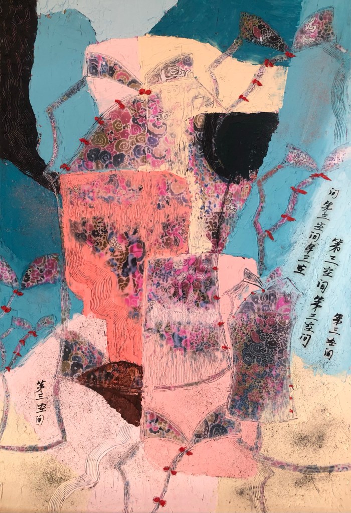
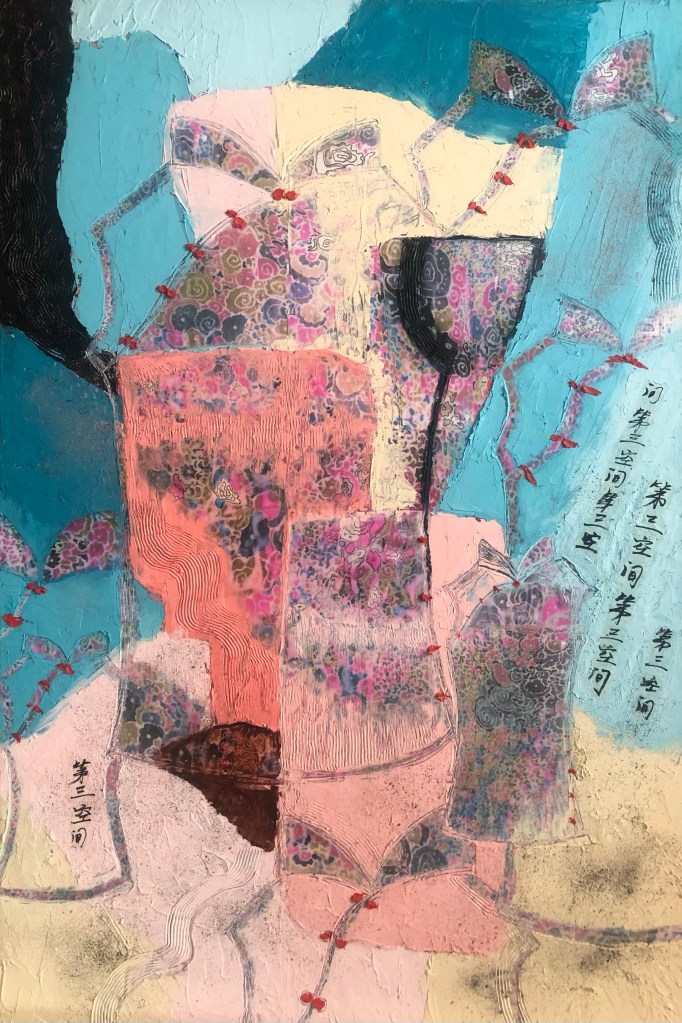
Finished work below – Cheongsam #1. Oil and cold wax on canvas with image transfer. Size 20×30 in.
REFLECTIONS
What I am happy with:
– The colour palette
– The fabric pattern that came through
– The Cheongsam shaped mark making
– The little red buttons as a colour pop
– The inlaying of Chinese calligraphy
– Enjoyed working with oil and cold wax media
What I’m not happy with:
– The composition, the ‘lips’ accidentally appearing led me to subconsciously start creating a face-like composition. I’m not sure if it worked. When the ‘eye’ was completely filled in black, it became a strange and eerie creature. It was too distracting hence I scraped off most of the black to reduce the impact.
– Due to the strange face, it doesn’t sit comfortably with me which perhaps is a good thing. Better than being forgettable.
Other thoughts:
– I wanted to use the cheongsam series to help me to delve into my thoughts about my family, especially my mother, our relationship and my heritage. I am not sure if I achieved this in just this painting because I was overly focusing on making the work and trying to get the composition right. But I am keen to continue the Cheongsam series and feel that I am at the beginning of something.
– I am intrigued by the history of the Cheongsam and want to find out more.
– The fact that such a traditional Chinese garment of my mother’s was made with a western style abstract pattern was intriguing – this is what the Third Space is about and I have accidentally stumbled upon this excellent example – my mother, a Chinese woman from colonised Hong Kong, chose this dress with this fabric. I have not fully processed this finding yet, but I wanted to acknowledge it here and will slowly delve into what I think and how I feel about this.
LEARNING
– Various symbols have emerged from this piece. I am inspired by Fiona Rae’s work where she often uses playful symbols. I can try a playful approach with e.g. lips or butterflies. The collars of the Cheongsam remind me of butterflies, they could be turned into a signature symbol that I use in my work.
– Other symbols such as the distinctive buttons that are used in Cheongsam and traditional Chinese garments, I loved playing with them when I was a child – I can investigate those further.
– I am intrigued by the Cheongsam and I want to research about its history and other related art such as in the book ‘Fusion of Cheongsam’ to get inspiration for making.
– As I was painting, I felt that I was trying too hard especially in the composition of the oil and cold wax layer. It felt deliberate rather than a free response to the canvas. I could use my sketchbook more to plan composition for my work, do more quick trial and error exploration.
NEXT STEPS
– Continue the Cheongsam exploration because I feel excited by the subject – research into its history and related art to get inspiration.
– Keep making, do some informal work. Not every piece has to be a finished painting.
– Play in my sketchbook.
– Relax and enjoy the making process. Take time and don’t try too hard.
As part of my style development work, I have just completed a series of media exploration where I experimented with combining oil and cold wax with various ways of overlaying Chinese brush paintings on top without compromising either medium. I now want to progress onto exploring aesthetics starting with colours.
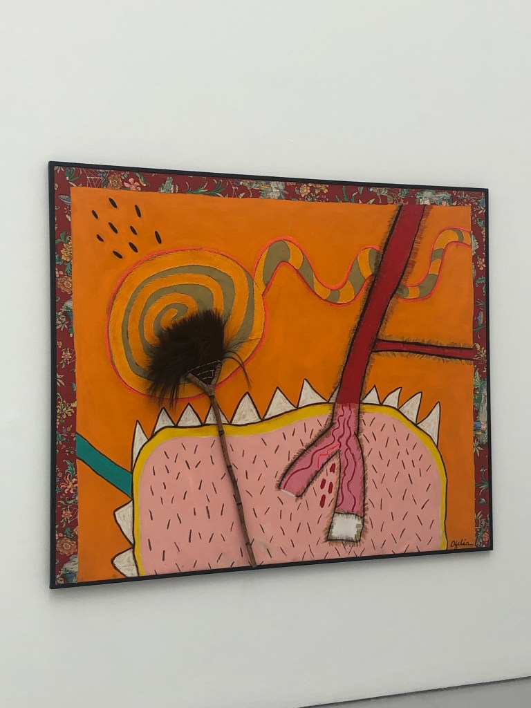
Despite having attended workshops on colour mixing over the years and researched how colours work together, I have always used colours intuitively in my paintings rather than follow any strict rules. However, I often feel that I should be more considered when using colours for my work. I attended an exhibition of London based Columbian artist, Ofelia Rodrigues, where I was inspired by her use of colours and images to express her culture giving a strong sense of place for her narrative.
For my art practice, I have reached a point where I want to re-evaluate and hone how I use colours, especially when my aim is to express my stories and narrative through my work. Also, my wish is to go towards semi-abstraction for my narrative work and I believe the use of colour is key. This is the first blog of the series on exploring the use of colour to express a sense of place for my transcultural narrative.
METHOD
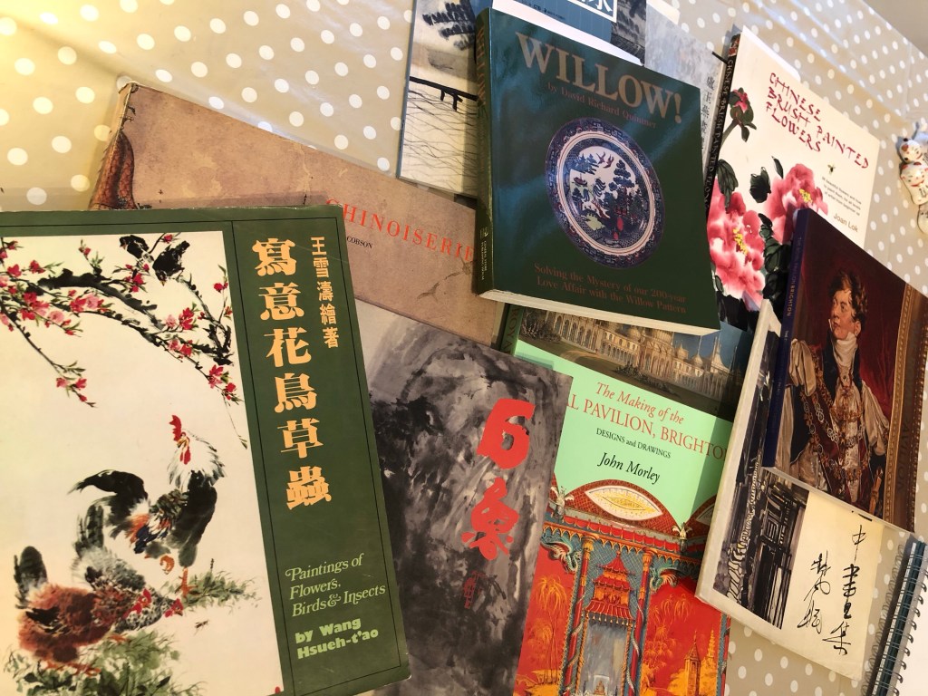
To begin with, I needed some visual inspiration. I started by gathering books that I have on contemporary Chinese artists as well as chinoiserie style art. Although chinoiserie art has deep roots in political historical, its origin is not part of the research here. In my view, chinoiserie is an example of art in the ‘Third Space’ – where two cultures come together and something new emerges that has characteristics of the original cultures. Although the chinoiserie style of art does not appeal to or resonate with me, their use of colours is worth examining for my research purpose.
My aim here is to look through images in the books and choose one that resonates. Then mix the colours and explore similar colours as a ‘back to basics’ exercise to get my thought process going and to see where it takes me.
Books that I gathered:
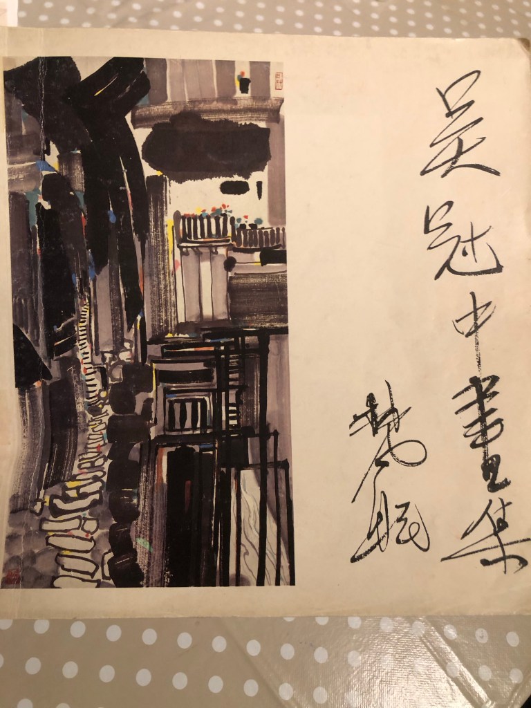
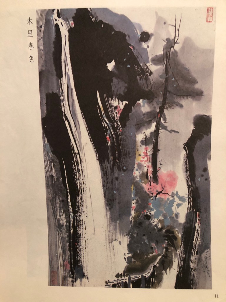
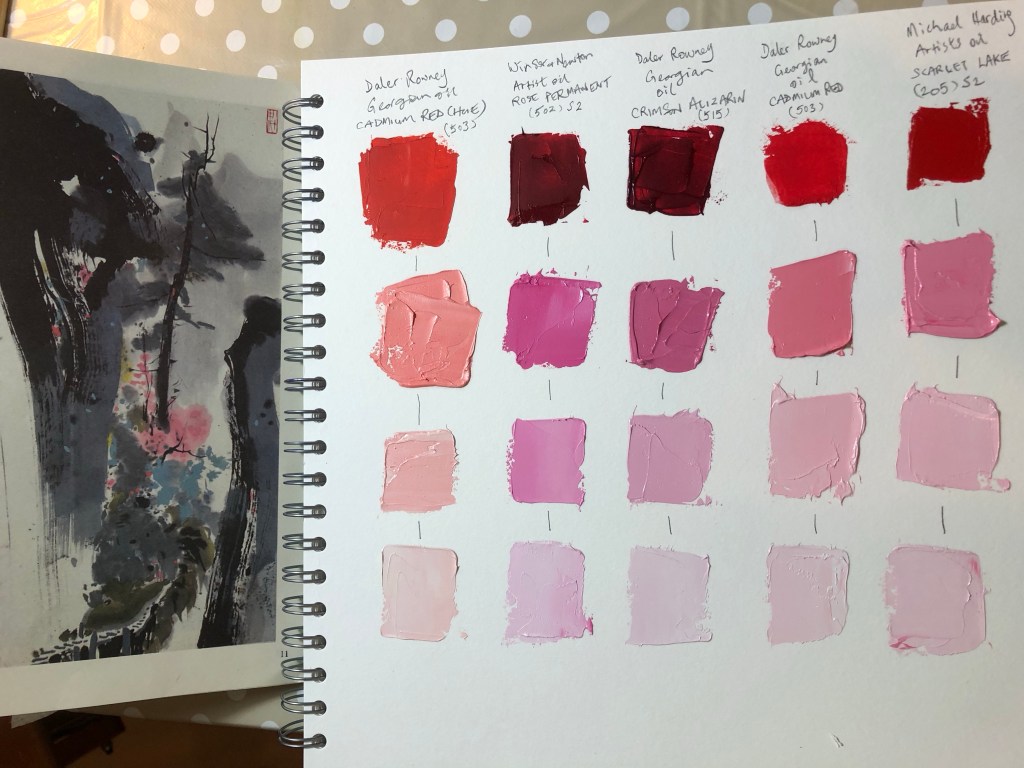
The book that I have chosen for this exercise is by a contemporary Chinese artist, Wu Guan Zhong. The link below gives a good summary about the artist:
The painting that I have chosen to kick start my colour exploration:
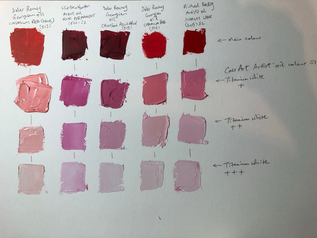
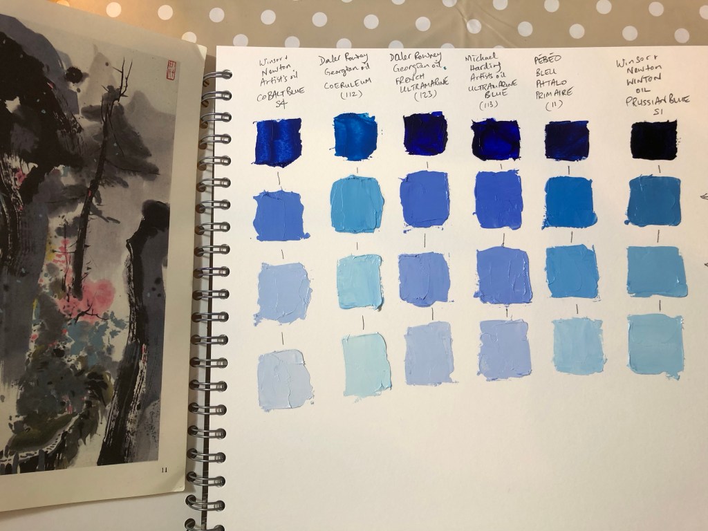
I got out all my various red oil paints and increased the lightness of each by tinting with titanium white:
Several matching possibilities came up in my ‘red’ chart:
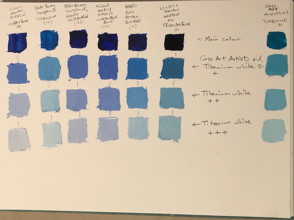
Then the same exercise was repeated with all my blue oil paints:
Various matching possibilities came up:
I added a new turquoise paint that I bought recently to the chart:
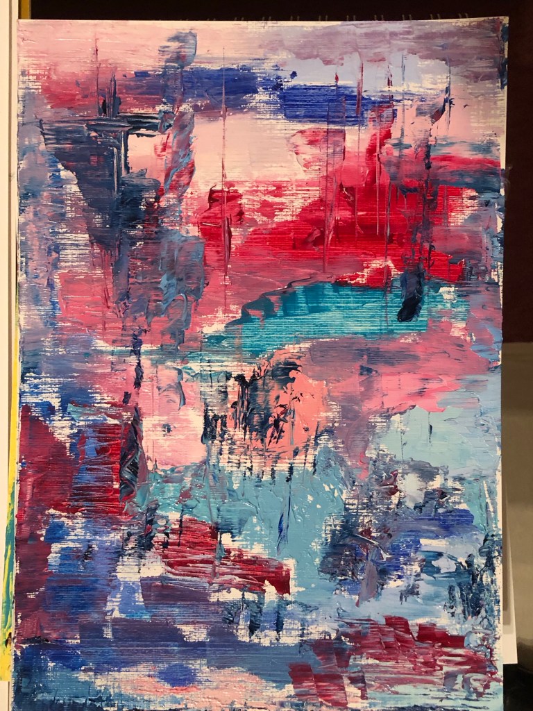
An abstract painting was made with all the left over paint:
–
REFLECTIONS
– Although it was not the intention, it turned out to be a useful inventory exercise for my oil paint. Since I often default to certain favourites, I have neglected others that have turned out to be ‘gems’ in the tinting process.
– There were also new findings about the different brands. I want to capture my thoughts here as a reminder for the future:
1. Michael Harding oil paint is always my favourite and this exercise reminded me that they deserve that top spot with the buttery consistency, pigment quality and load concentration.
2. Winsor and Newton artists oil was once a favourite before I went onto Michael Harding. This exercise reminded me of the quality of their pigment load, colour and how well they mixed. A solid product that I should not have neglected.
3. Daler Rowney Georgian oil was a brand that I used when I first started learning to paint in oil. It was sold to me as student grade oil. However, I recently read some reviews by artists saying they use it as their go-to oil so I decided to try them again. They are good value and I recently bought a batch ready for some larger scale oil experiments and they are just right for that. Pigment load is not as good as the above two but definitely good enough for some of my experiments where I plan to use a lot of oil. The ones I used for this exercise stood up well enough in the tinting process and produced some interesting colours.
4. I was introduced to Cass Art artist’s oil when I was in their shop. It’s a range that I have not tried before. It was sold as good value artist grade oil and better quality than the Daler Rowney Georgian oil that I was buying at the time. So I bought some to try, e.g. the turquoise in the last column of the blue tinting exercise. I was somewhat disappointed because the consistency was not as good as the other brand’s artist grade or even the DR Georgian oil performed better in this respect. I was also disappointed with the pigment colour and load. So I don’t think I will buy this brand again.
5. I have had a set of PEBEO oil for years and rarely use them despite the good range of vibrant colours. I got them out for this exercise and was pleasantly surprised. I always considered them as student grade quality and although it didn’t compare well to Nos. 1 and 2 above, it performed well in mixing and pigment load. The paint appeared more flat and matt compared to the other oils but it is certainly good enough for day-to-day projects. The wide variety of colours in the PEBEO set is a bonus that I have been neglecting.
– This was a good back-to-basics exercise that I needed to do to restart my colour exploration. I don’t know exactly what I’m looking for but I want to continue this with other colours.
– It occurred to me at the end of the exercise that I recently made a painting using similar colours to those in Wu’s painting. My painting was started by finding an old photograph of my parents’ lounge during one Chinese New Year when they were both alive many years ago. I don’t know why these two colours speak to me whenever I want to make narrative work. I also remember that I showed this painting at a crit session and I struggled to explain it. I need to think more about this…
–
LEARNING
– Some good discoveries of tinted reds and blues for me to consider using when determining colour palette for future narrative work.
– The colours in Wu’s painting and some of the tints in this exercise clearly speak to me but I don’t know why yet. Interrogating this might reveal more clues and help to develop more depth for my narrative.
– I have not studied Wu’s work before and researching his work showed that he also worked with oil and Chinese ink. This is a useful finding as that’s what I am trying to do as well. Since Wu is a European (French) trained artist (painter) of Chinese origin, we have some common backgrounds and I will add Wu to my list of artists to research, especially about his chosen media and process.
NEXT STEPS
– Do another tinting or colour mixing exercise – find another painting for inspiration.
– Think more about why the colours in Wu’s painting speak to me.
This is an experiment to complete one of the actions from an earlier blog – Exploring media – oil and cold wax Part 6. The action was to:
– Experiment with a barrier or masking fluid to prevent the oil from seeping into the Chinese brush painting images.
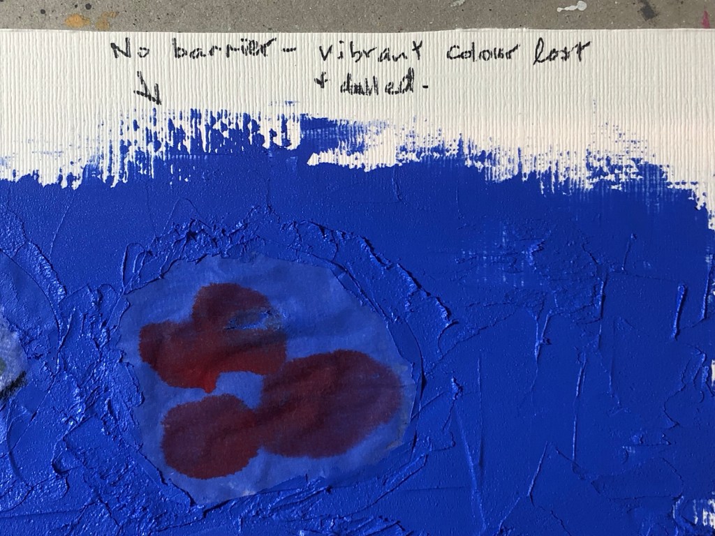
This experiment is required because the Xuan paper (rice paper) used for Chinese brush painting is very thin and absorbent, therefore if the paper was laid over materials such as oil in my transcultural layering work, the oil paint underneath would seep through and ruin the Chinese brush painting image as happened in Part 6 of this blog series.
METHOD:
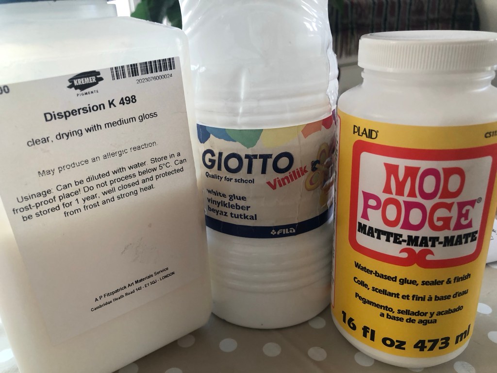
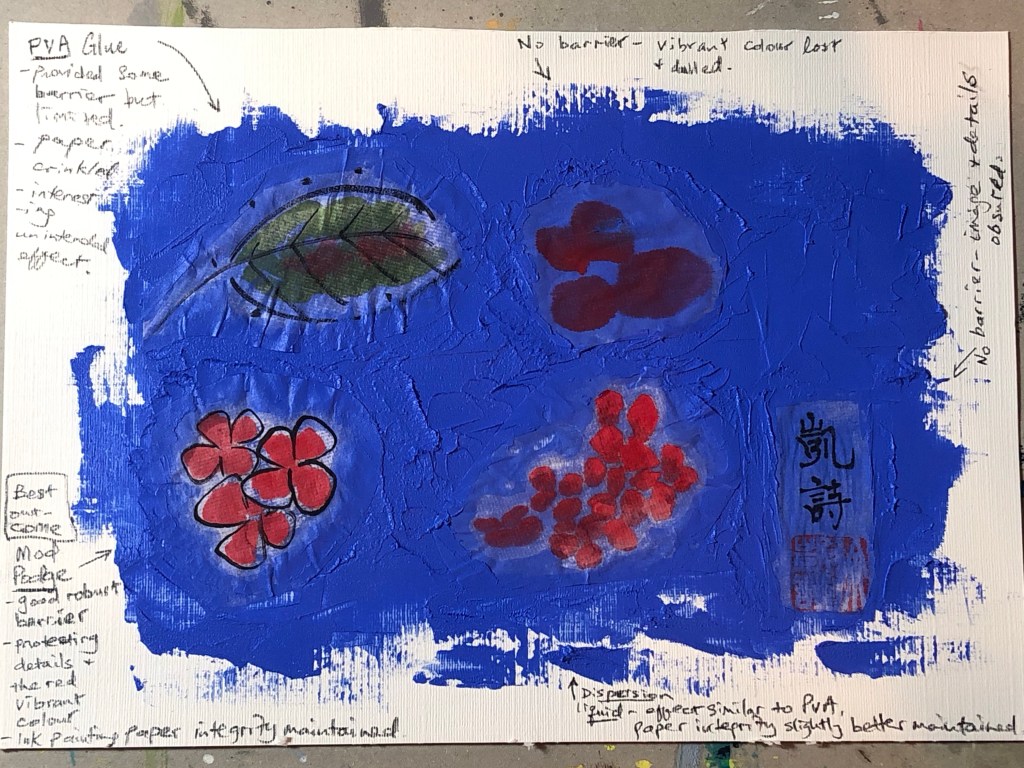
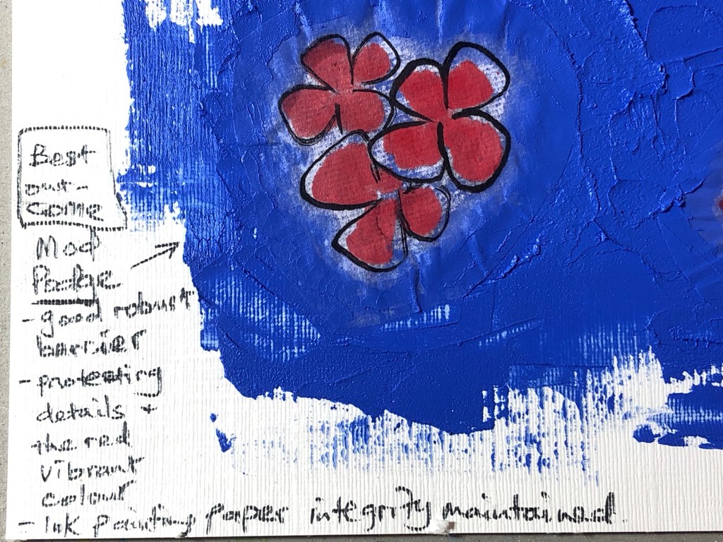
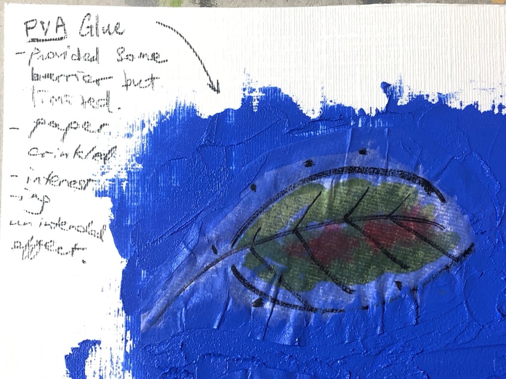
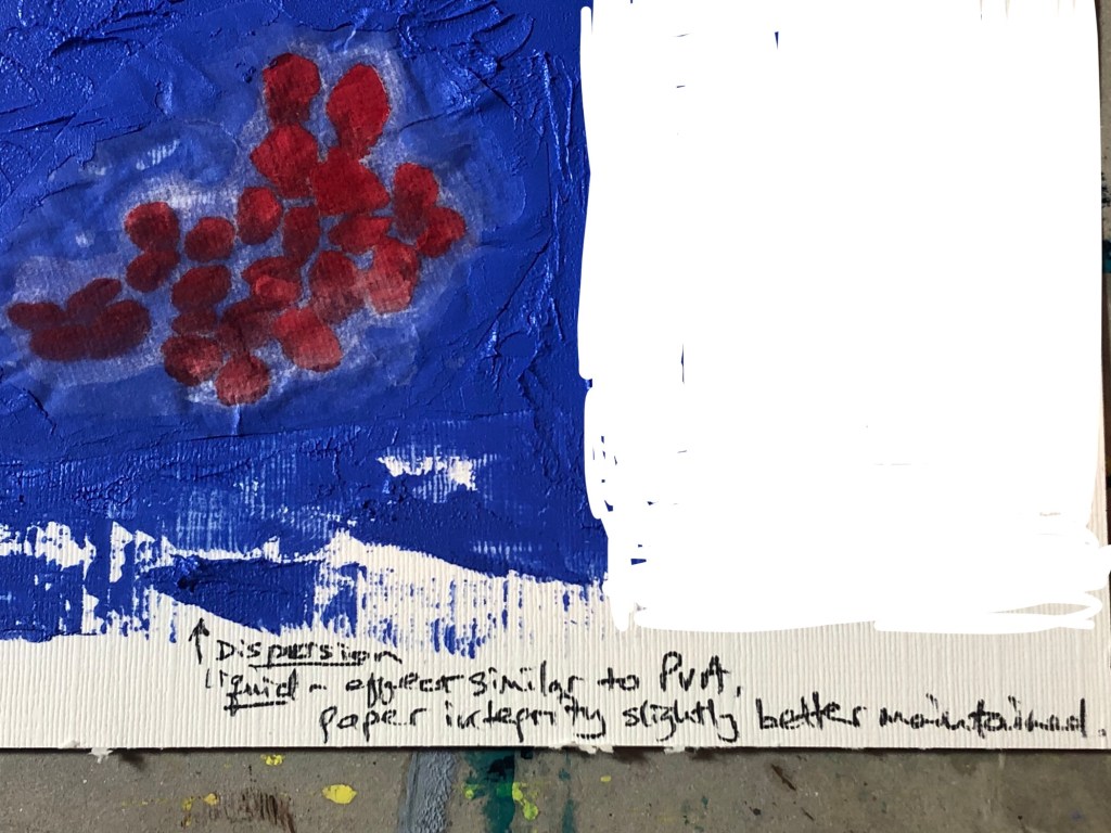
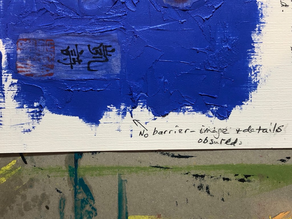
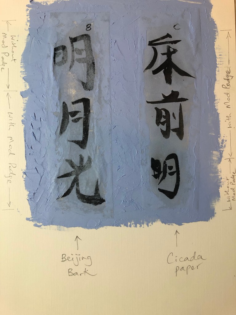
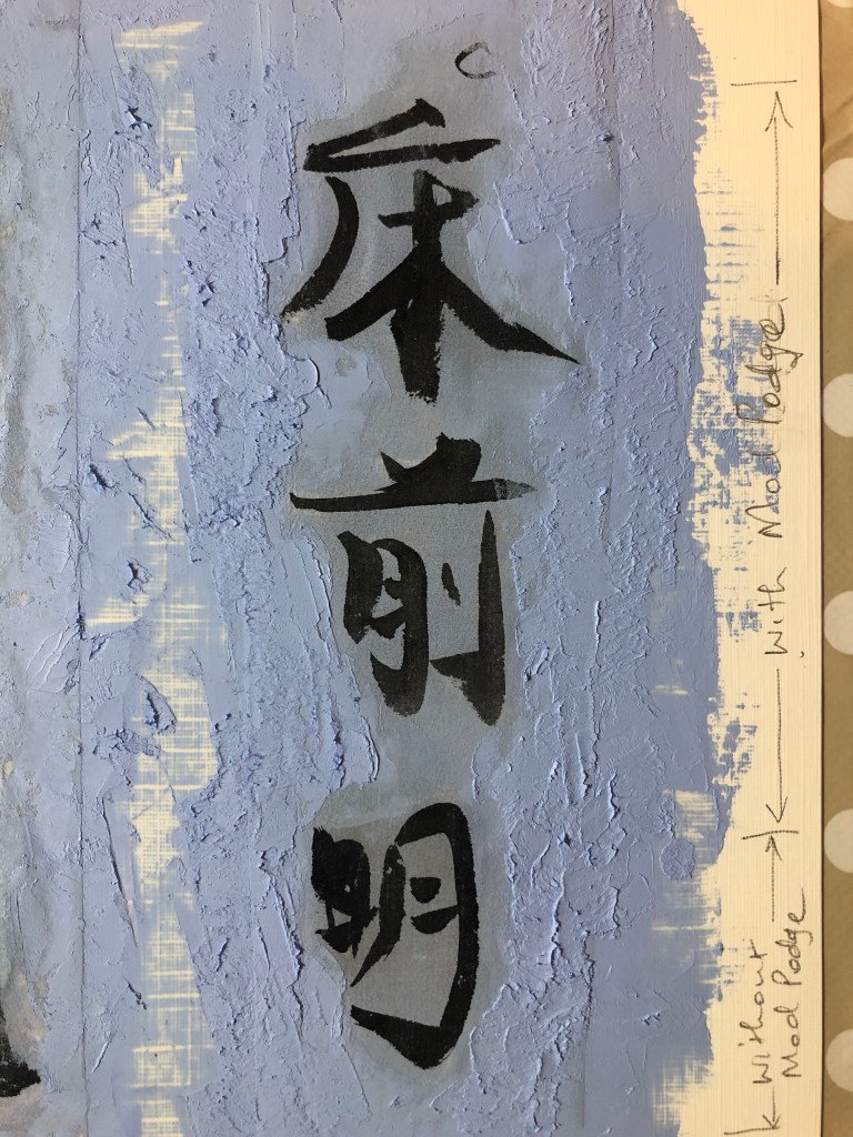
The three barrier fluids chosen for this experiment were: Dispersion liquid; PVA glue and matte Mod Podge.
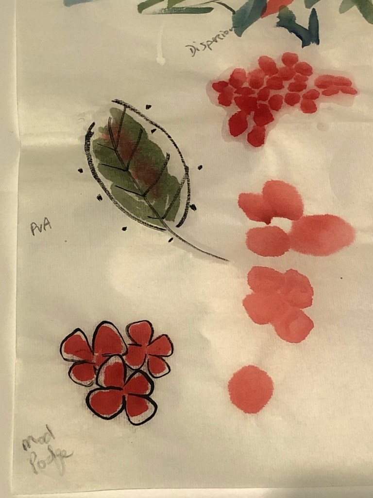
Some small images painted using Chinese ink were used for this experiment. The back of each image was painted with one type of the barrier fluids with one image left bare as ‘control’ for the experiment.
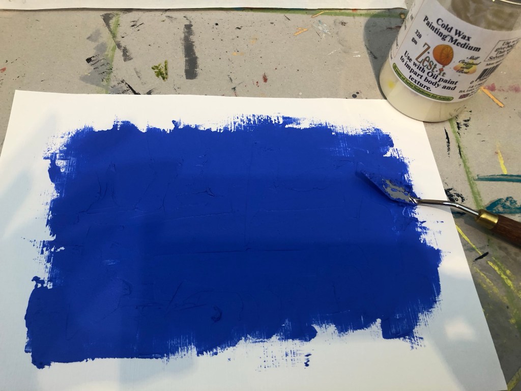
A paper canvas was painted with a mix of oil paint and cold wax:
The Chinese painted images were cut out and pressed onto the oil and cold wax. The images were pressed hard onto the painted canvas using a palette knife to robustly test the barrier performance.
Below is the result – an overall image followed by close-ups of each test area.
–
Result: The best outcome was the Mod Podge.
REFLECTIONS
I am happy with the outcome of this experiment. This was a quick experiment but a very important one because, as shown in this blog series, it has been challenging to incorporate Chinese brush painting onto oil or oil and cold wax – the latter being my chosen ‘Western’ medium for my current series of transcultural style development work. The outcome of this experiment has helped me to find a viable way forward and I can now move onto developing colour palettes and aesthetics for my style knowing that I have found a way to combine the materials from different cultural origins without losing any material integrity.
LEARNING
The learning here is a straight forward one. Mod Podge worked well as a barrier fluid to protect the Chinese ink work before incorporating it into the oil and cold wax ‘collage’.
NEXT STEPS
Pick up from the previous post (Part 6) and resume the next actions from there. The immediate next action will be to research and develop colour palettes that can help to communicate my transcultural narrative.
–
ADDITIONAL EXPERIMENT
I was given two pieces of specialist Chinese painting paper by my Chinese art teacher. They are:
– Beijing bark paper, and
– Cicada wing paper (because it’s so thin that it resembles the wings of cicadas).
Both types of paper are of beautiful quality and feel very delicate. They are both very thin which would be ideal for what I’m looking for in my transcultural layering work. I.e. overlaying Chinese brush painting onto a more viscous medium such as oil.
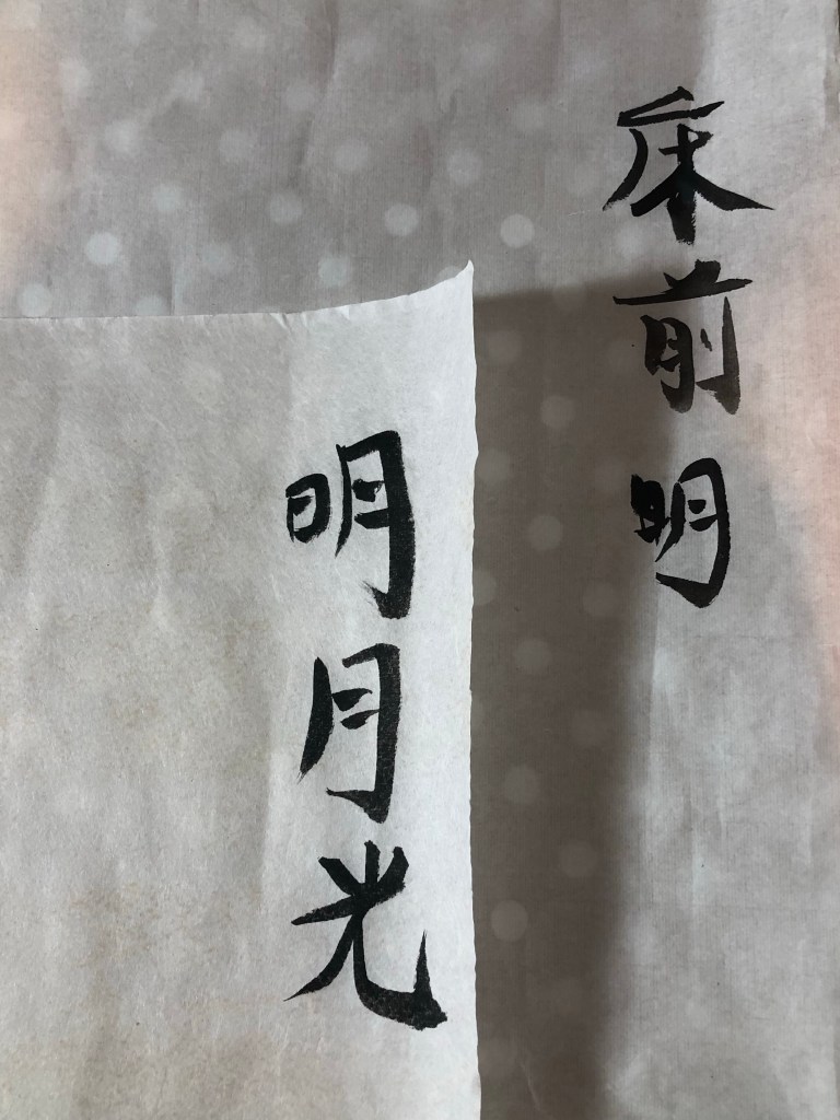
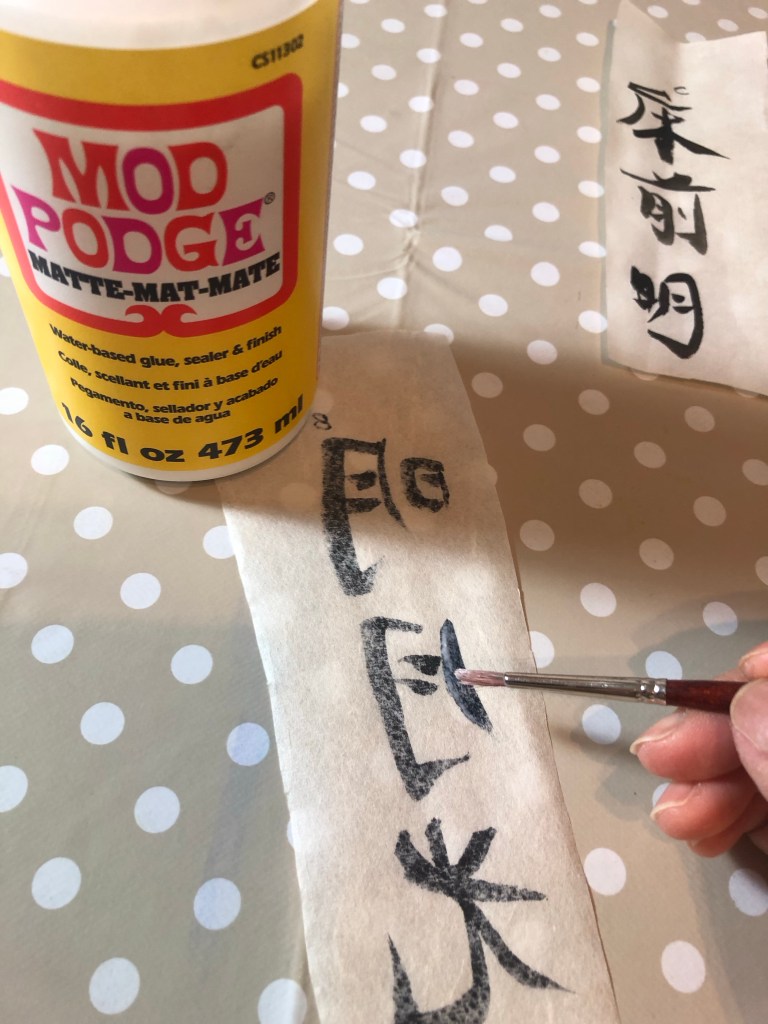
I repeated the above experiment with these papers. I wrote some Chinese calligraphy characters on each sheet:
Then painted part of the image on the reverse side with Mod Podge as a barrier and leaving part of the image bare to compare:
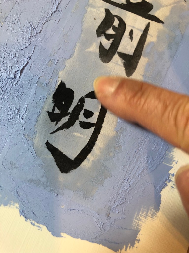
Once the Mod Podge was dried. The two sheets were pressed onto a base layer of oil and cold wax. A palette knife was used for the edges, blending the paper with the oil paint to bury the edges. Then I used my finger to press the image into the oil:
Below is the outcome with the cicada paper performing well compared to the Beijing bark. The cicada paper appears to have an inbuilt barrier to protect the image, meaning that a barrier liquid would not be required as there was no perceivable difference whether Mod Podge was used.
Then more oil and cold wax was applied on top to blend in the image whilst avoiding the characters. Final result:
–
REFLECTIONS / LEARNING
Out of all the Chinese painting papers that I have tested in this series of exploration, the cicada paper was the best material for the purpose of my transcultural layering work involving Chinese brush painting and oil based medium.
Additionally, it was useful to discover that a barrier liquid (e.g. Mod Podge) would not be required with the cicada wing paper. This will help to reduce the process complexity.
NEXT STEPS
– Create a new piece of work that uses the new discovery with the cicada paper to refine the process and to learn more about the material.
– Source more cicada paper and find a long term supplier for this paper.
.
This experiment ends the series of blogs on ‘Exploring media – Oil and cold wax’.
-Try out more Chinese brush paint collage onto oil and cold wax to refine this part of the process.
-Try exposing a larger area of the background image to see if that can work with the abstraction approach on the top layer. Experiment to find the right balance between revealing the base layer image without losing the sense of abstraction on the top layer.
-Try spray painting on top of the oil and cold wax surface – try when wet and then when dried.
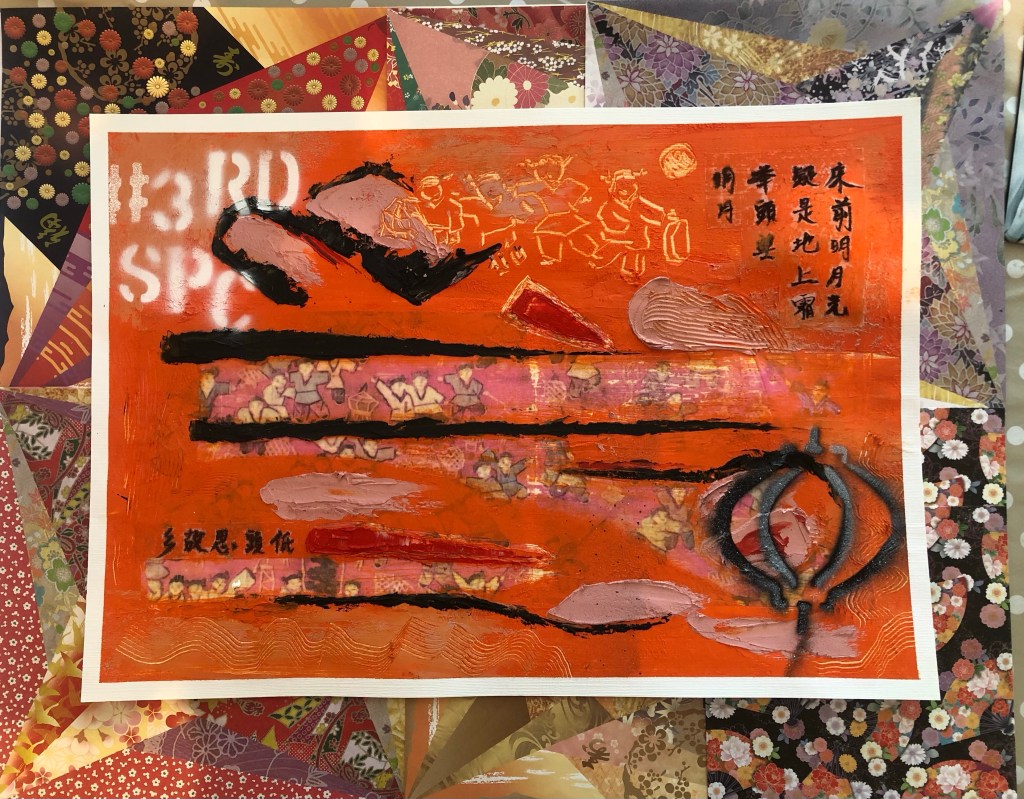
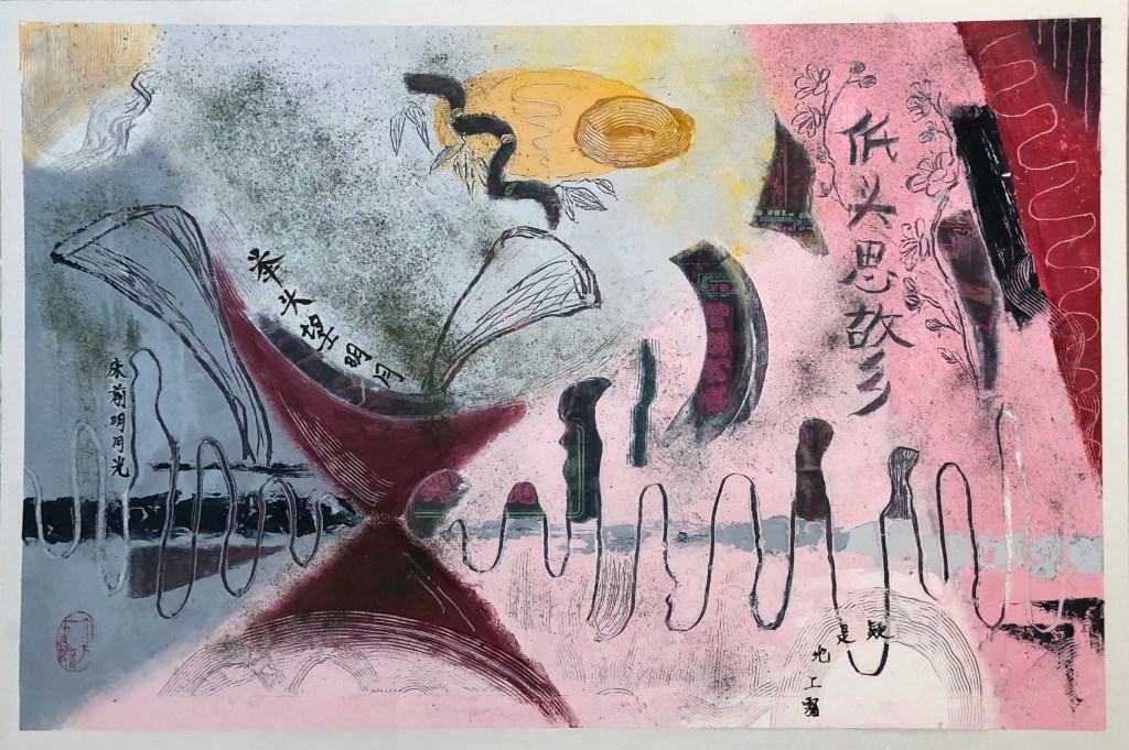
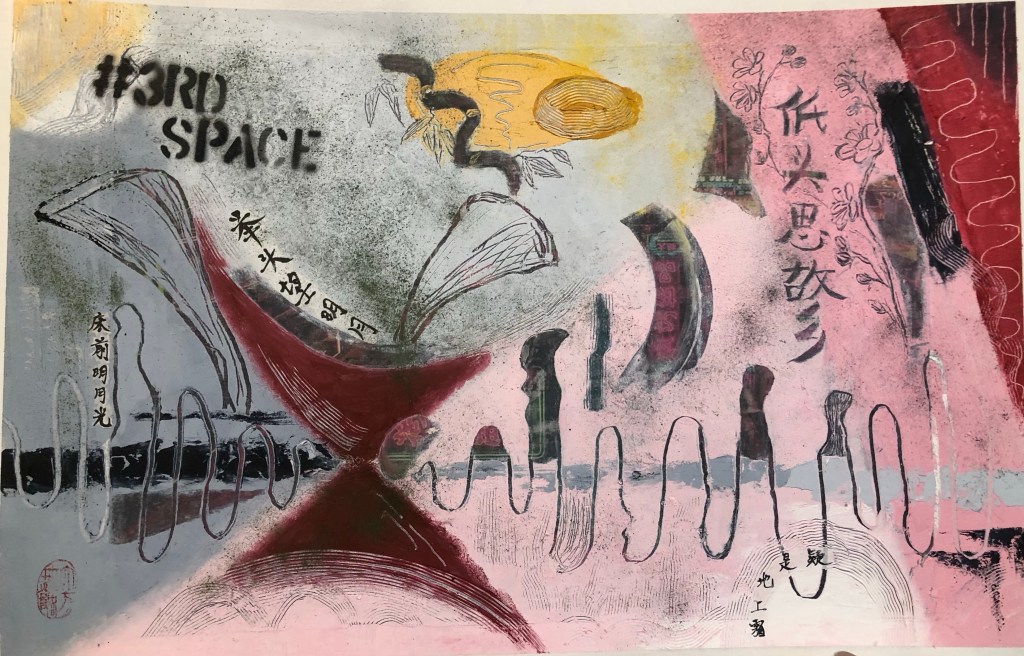
Finished work for Part 6:
Mixed media on paper, A3
METHOD
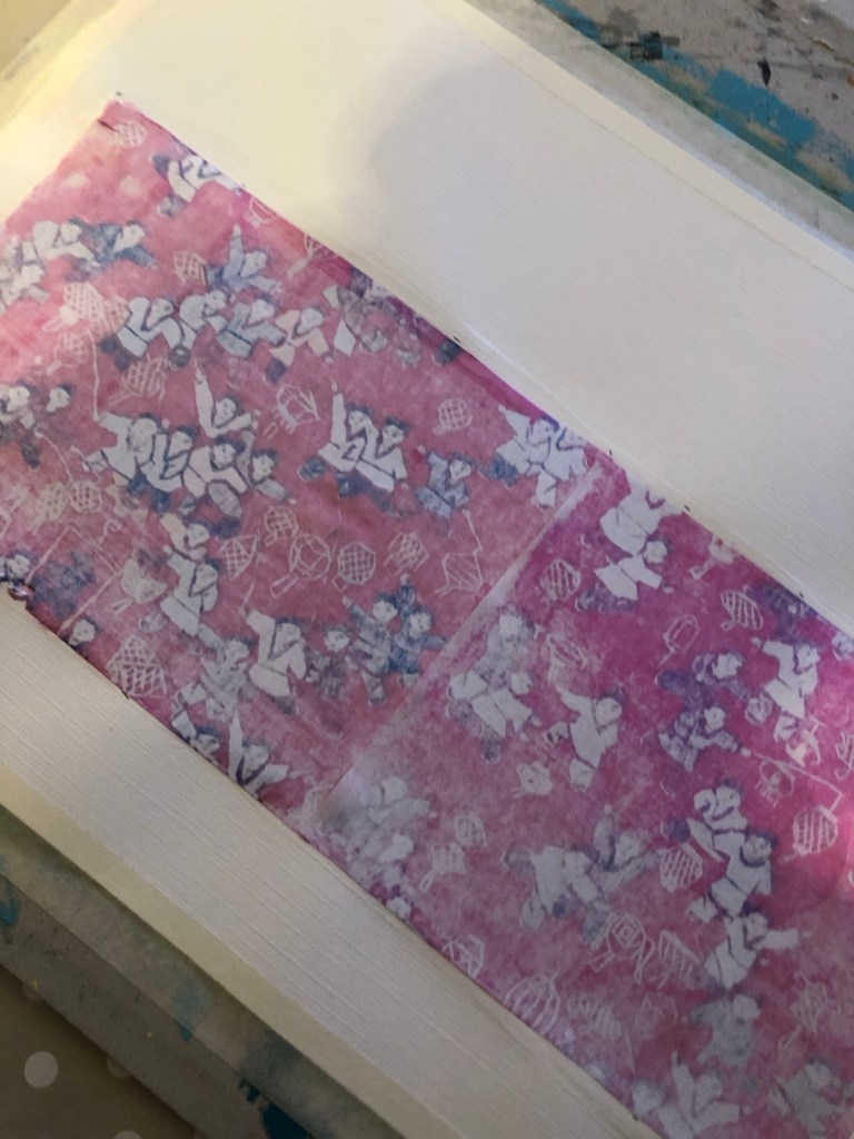
A printed photo image of a tapestry that was gifted to me by my brother many years ago was used as the based image for this piece. The image was transferred onto a paper canvas using dispersion liquid. The paper used was 250 gsm oil paper.
After the dispersion liquid dried, the printed image was rubbed off with a wet sponge to reveal the transferred image on the canvas. This was the first time a paper canvas (as opposed to a cotton canvas) was used in this series of experiments and it was clear that the paper canvas was not robust enough for the process. See below image for damage to paper. However, there was sufficient integrity in the paper canvas to continue the piece. I was hoping that a thick layer of oil and cold wax would hide the damaged areas. There was also excessive buckling on the paper canvas.
Recalling my disappointment with the colour palette that I chose for Part 5 (pink and grey), I decided to research into abstract paintings that I like to learn from the colours used. One of my favourite abstract artists is Lee Krasner and below is the painting that I decided to study and learn from in terms of the colour palette used.
Desert Moon (1955):
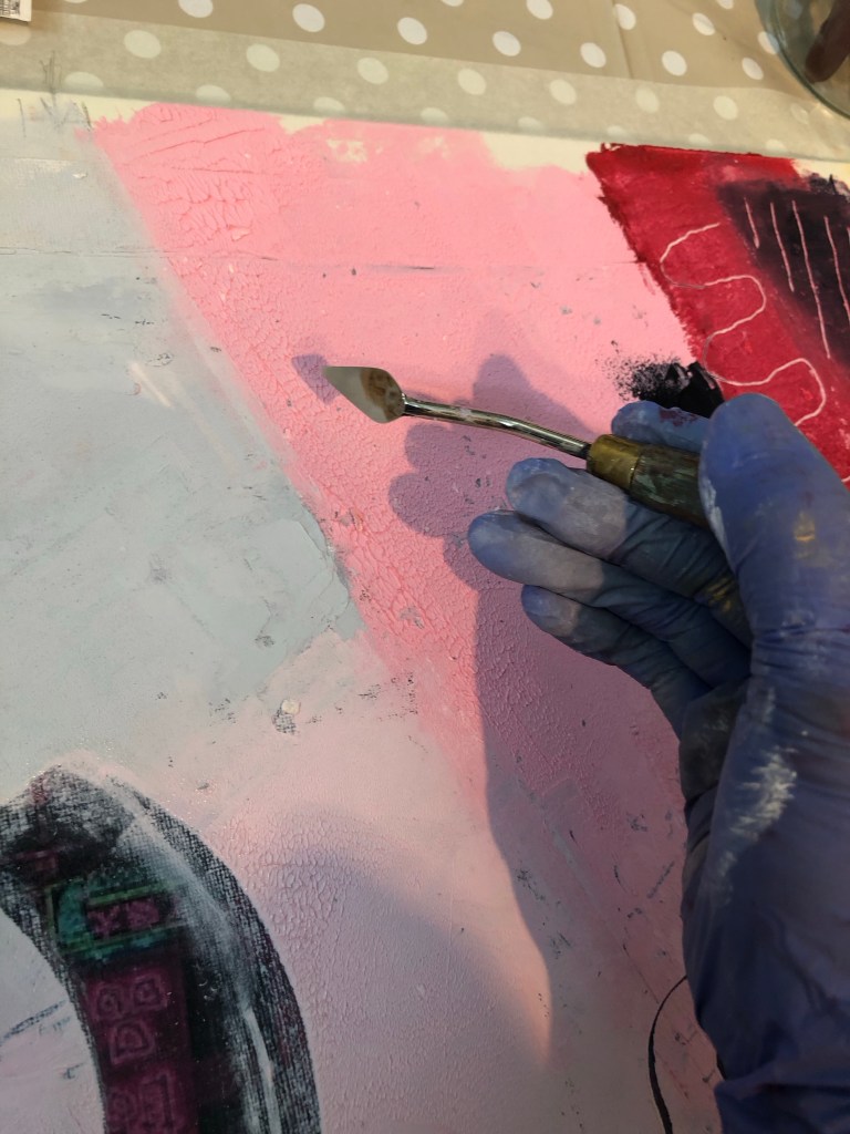
A layer of oil and cold wax was then applied to the canvas:
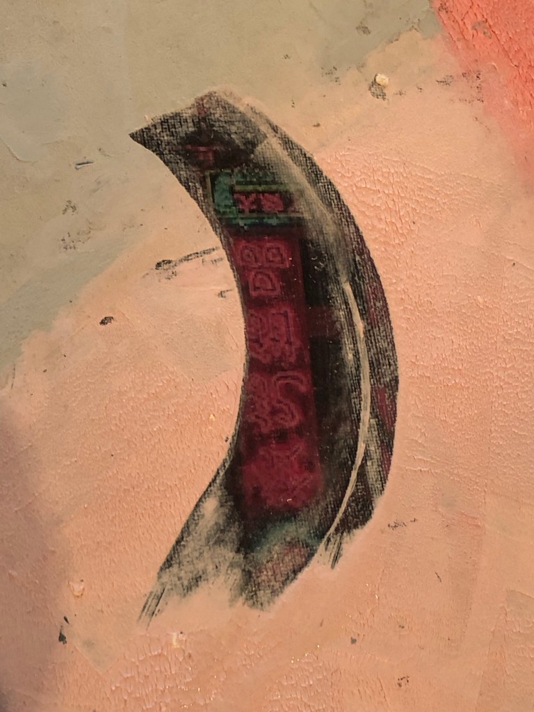
Areas were scraped off to reveal the base tapestry image. Learning from Part 5, I wanted to reveal a larger area so that it was clear what the base image was about. Then additional oil and cold wax colours were added:
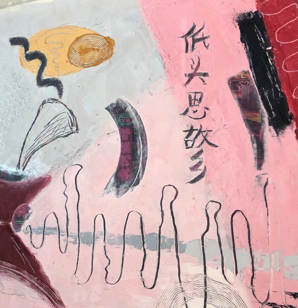
For the Chinese brush calligraphy, I chose a delicate silk fabric as a substrate that was almost transparent because I wanted the substrate to become as invisible as possible.
After writing the Chinese calligraphy onto silk, it was cut out and carefully pressed onto the oil and cold wax layer.
A small palette knife was used to press the silk into the oil and cold wax, taking care to avoid pressing the areas of the calligraphy characters which was challenging due to the complex shape of the characters. The yellow circle shows where part of the character was pressed into the oil and cold wax, partly obscuring the writing.
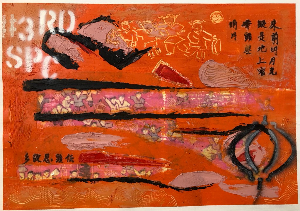
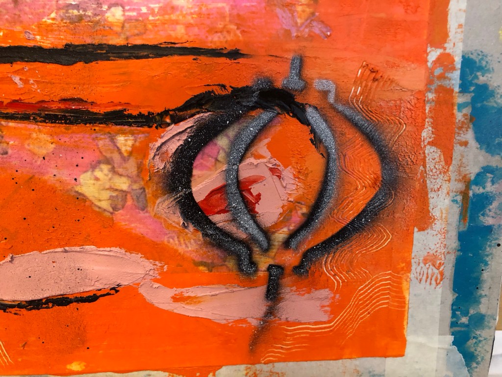
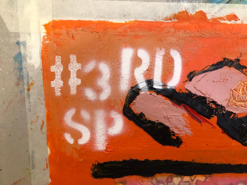
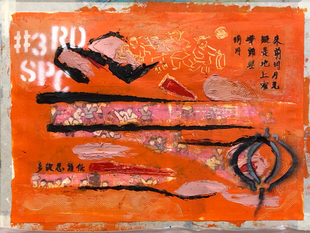
Additional marks were made – some were painted on and some were scratched off. The tapestry image was about children playing with lanterns and I have a lantern stencil that was made for previous work. So I wanted to experiment with spray painting onto wet oil and cold wax to see the effect.
Further spray painting was done – the phrase #3RD SP (for third space) was sprayed onto a dryer corner of the painting. All spray paint used were Montana GOLD 312g aerosol cans as popularly used by street artists:
Finished work with border tidied up:
…
REFLECTIONS
I am happy with:
– The colour palette. I am much happier with this painting than the previous one in Part 5. A more considered approach in selecting the colour palette paid off here.
– The experiment with using an almost transparent substrate for the Chinese brush art worked well. The pieces (there were two in total) adhered well to the painted surface. Although the substrate was not completely invisible, it was acceptable as a solution.
– The scratched mark making especially the part at the top to echo the revealed based image of the children playing with lanterns.
– The overall look of the spray painting, especially the words – they added a contemporary feel to the piece which was what I was looking for.
– Feeling more confident using oil and cold wax as a medium.
I am not so happy with:
– The paper canvas, it was not robust enough. Although the damage by the image transfer process was covered up with oil and cold wax, it was clear that this would be the wrong material to use for this process.
– The spray painting of the lantern – it was sprayed onto very wet oil and cold wax. The outcome was not satisfactory – it felt and looked ‘gooey’ and not the intended effect. I believe this was partly due to my reluctance to place the stencil close to the wet oil paint as I didn’t want the back of the stencil to pick up the oil paint, causing the spray paint to loosely disperse around the stencilled image.
– Although I was happier with the colour palette, I felt there was more that could be done to add more complexity to the palette to increase depth to the piece.
General comment: the Chinese calligraphy is a famous ancient Chinese poem about being homesick. It is one of the few Chinese poems that I know as most children growing up in Hong Kong in my era were made to learn it, partly because it is a good poem and very easy to remember. Going forward, I feel that if I were to use more Chinese calligraphy then I should learn more about Chinese poetry so that I can use a wider variety of content in this respect. It will also help me to understand more about my Chinese heritage.
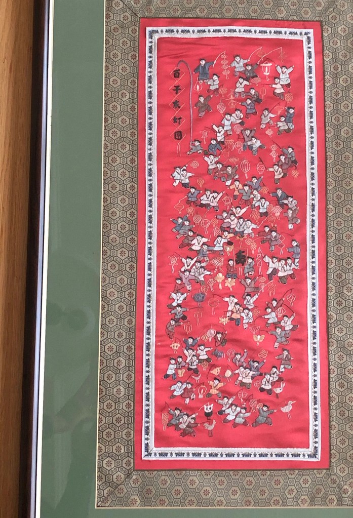
Other thoughts that came to me some time after completing this painting:
– Throughout the making process, my mind kept going back to celebrating the Mid Autumn Festival when I was a child in Hong Kong. The highlight as children was to be given a lantern each to play with. The choosing and buying of the lantern in preparation was always a source of excitement. The lanterns were lit with small candles. The children would use a long stick as handle for the lantern and go around the neighbourhood exploring with their lanterns, just like the children in my painting. The Mid Autumn Festival celebrated the fullest moon of the year and celebrations would only begin after dark when the full moon came out. Since we were not usually allowed out at night, it made the Festival especially popular with children. At times a lantern would catch fire which added much excitement. There would be lots of fruit and snacks laid out that were specific for the festival. I remember one year when we were older children (over ten years old), my brother and I went to a local park, sat on the swings and chatted all evening. It was when my family was going through a difficult period and to share that moment with him was very special, especially when we ended up spending most of the rest of our lives living in different countries. He gave me the children’s tapestry that I used for this painting which evoked all those memories while making this piece of work.
LEARNING
– More work is required to develop my sense in choosing an appropriate colour palette for the piece. This is increasingly important because my work is about storytelling as well as narrative and I believe having an appropriate colour palette helps to tell a story. So more research and experiments should be done in this respect.
– The silk substrate worked well for the Chinese calligraphy. However, I know there is a wide range of other delicate Chinese substrates and I will experiment with different materials to find the optimum.
– Layering the Chinese substrate onto oil is a risky process – as seen in the image with the yellow circle highlighting the part obscuring of the brush painting if pressed too much into the oil. To help with this, further experiments are required to improve this process. E.g. paint a barrier layer, such as a masking fluid that dries clear, onto the back of the Chinese brush painting or calligraphy to shield the image from the oil seeping in from underneath.
– Spray painting, especially words, adds a contemporary feel to the image which is a style that I want to incorporate into my work. This is relevant to me because I take much inspiration from the extensive street art scene in my home city of Bristol where many famous street artists work or have worked.
– Using the tapestry image evoked many memories, perhaps I could explore that more.
NEXT STEPS
– Research into colour palettes for the type of stories that I want to tell. Build confidence in this area.
– Continue to build experience and explore using oil and cold wax.
– Experiment with other transparent Chinese substrate materials to find one that is as close to invisible as possible when layered onto oil.
– Experiment with a barrier or masking fluid to prevent the oil from seeping into the Chinese brush painting images.
– Experiment with more spray painting – be bold and push boundaries.
– Ongoing learning – research into Chinese poetry to find more poems that resonate with me to use in future work.
– Explore the evoked memories.
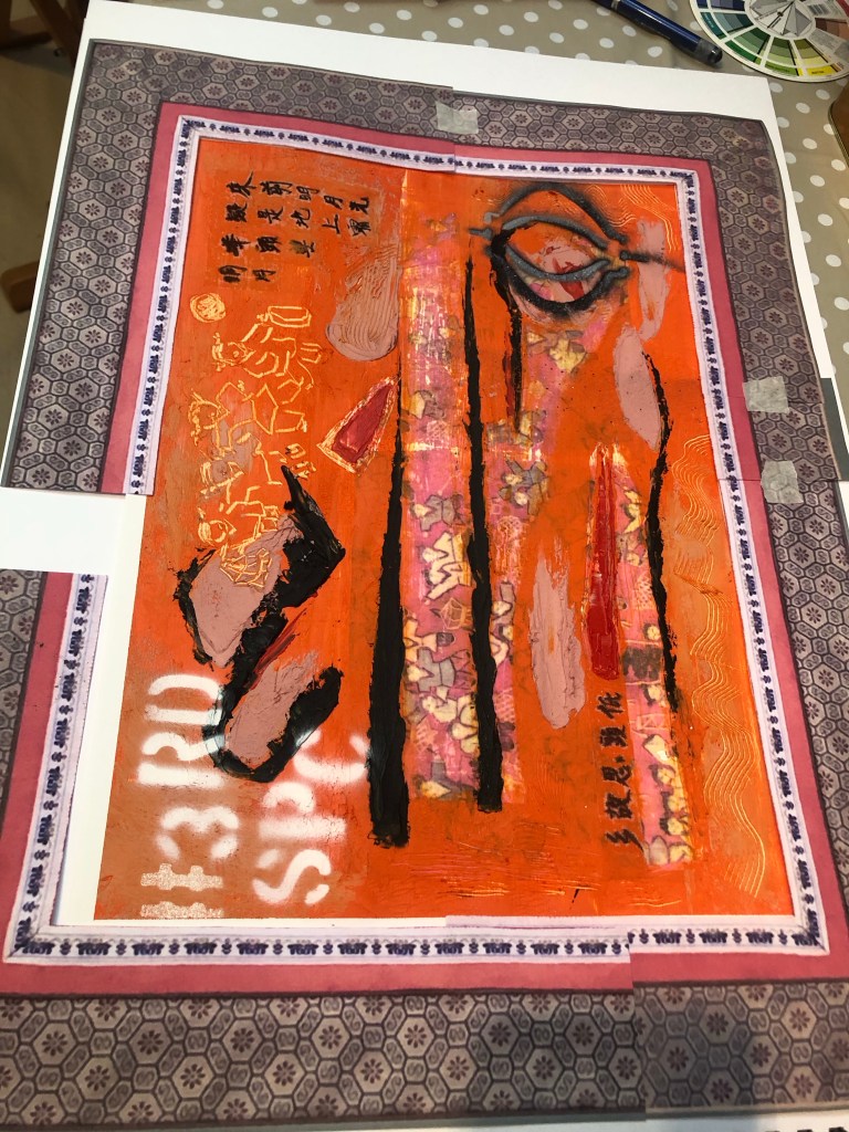
ADDITIONAL WORK
After visiting the exhibition of Ofelia Rodriguez again at Spike Island in Bristol, I was inspired by the way she used fabric as a border to her paintings.
This gave me the idea to try that with my work, especially to use Chinese imagery border for a recent piece of work to add to the transcultural narrative.
I started with some patterned paper that I had to make a collage frame. But I was not happy with the effect. It seemed too busy and rather random as an idea.
I then returned to the original tapestry that I used as the base image for the painting. It was a tapestry that was gifted to me by my brother many years ago.
Image to show the border of the tapestry
It is a typical border for small scale tapestries of this type. Then images of the border were printed and cut out to create a collage border for the painting:
Final finished work:
Mixed media on paper, 54 x 41.5 cm.
REFLECTIONS
I am very happy with the outcome of this experiment inspired by Rodrigues. It has completed the painting for me and added a more transcultural feel alongside the painted images such as the spray painted words.
To improve this approach, I would spray paint the # words to partly cover the tapestry image frame. I think that would increase the contemporary feel for the piece juxtaposing the traditional Chinese tapestry border.
I watched the last session of the online course with St Ives Painting School on exploring oil and cold wax which was useful in giving me more ideas to try. I want to then respond to the ‘next steps’ from Part 4 in this research experiment.
Finished work:
–
METHOD
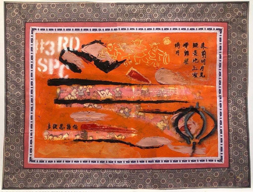
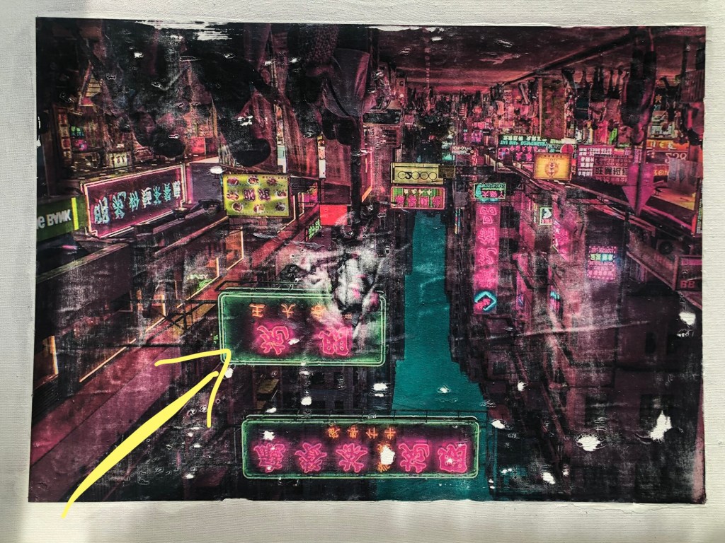
An A2 sized inkjet printed poster of a night time neon street signs scene of Hong Kong was chosen as the background of the piece. Dispersion liquid was used to transfer the image onto an A1 primed board canvas.
As the piece dried, I could see the canvas board was warped by the process – something to note.
Below is the transferred image. I turned it upside down because I wanted a specific sign to appear at the point shown by the yellow arrow indicated:
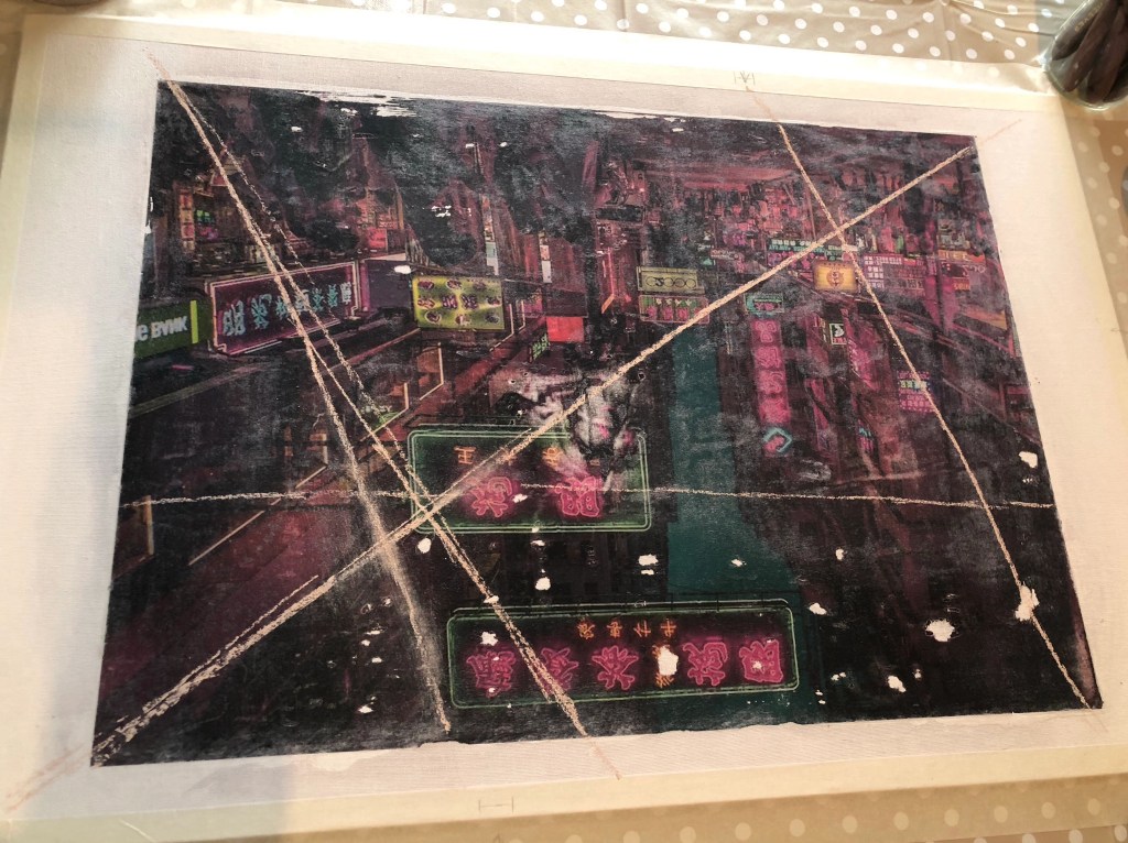
Axes were drawn in chalk to mark out the approximate plan for the composition. Also, some pencil marks were made on the edge of the canvas to indicate where a few of the specific neon signs were located that I planned to reveal later.
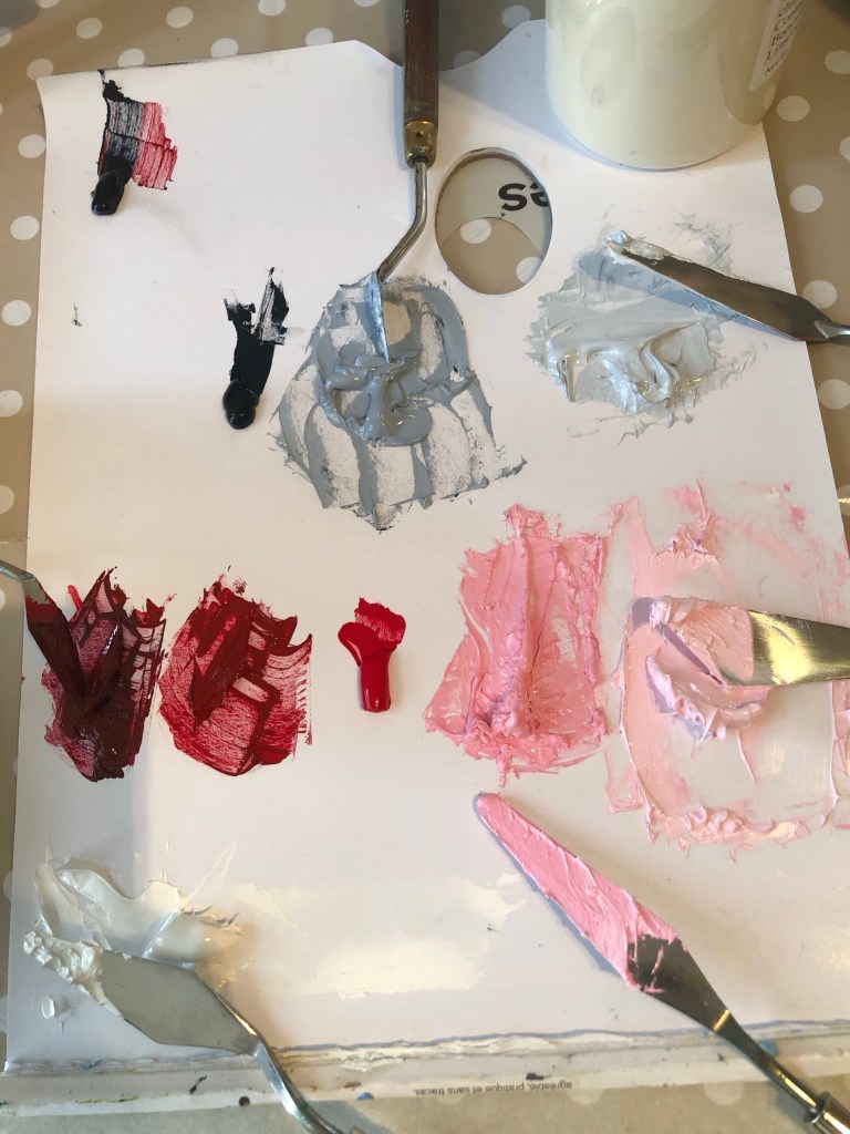
To complement the pink and dark colours of the background, I chose to use shades of grey and pink for the paint and cold wax coverage for the piece. So a palette of the different shades were mixed starting with red, black and white.
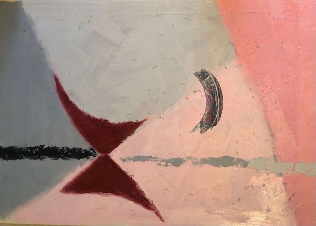
Since this was a practice research experiment on semi-abstraction with oil and cold wax, I started with various abstract shapes in the chosen colour palette. Then after using solvent to soften an area of paint and wax, I scraped off an area to reveal a specific neon sign according to the position marking that were made earlier:
Various tools were used to scrap off paint as mark making. Also, using a small palette knife with a pointed end, Chinese calligraphy characters (last line of a famous ancient Chinese poem) were scraped into the work – this was an experiment to simulate a Chinese paint brush using a pointed palette knife:
Various tools were used to add more marks. Shapes of the Bristol Harbour Horn Bridge were put in because I liked the effect from a previous experiment. Pigment powder were scraped from a pigment bar to create a dusting effect. More areas of paint were removed to reveal the neon signs underneath – the later ones were just scraped off with a card or palette knife without the need for solvent which was unnecessary. Other lines from the ancient Chinese poem were written in Chinese ink on Xuen (rice) paper, then cut out and pressed onto the paint and cold wax on various areas of the painting.
Finished work: Size A1, mixed media.
–
REFLECTIONS
I enjoyed the experiment and it was very helpful. Below are what I was and was not happy with.
I was happy with:
-The discovery that using Xuan paper to add Chinese brush painting or calligraphy worked very well. This is because the thinness of the Xuan paper was almost transparent when pressed onto the oil paint, so that it almost appears as though the calligraphy was on the oil surface. I would like to find more robust yet thinner materials (maybe silk or other paper of some kind) for this technique because the Xuan paper is delicate and could be prone to damage in the process. Since the paper is still partially visible and the temptation is to keep burying it into the paint and therefore risk damage. Hence an even thinner but more robust material would be better.
-Using the small palette knife to simulate a Chinese paint brush was successful but the effect is not as authentic as using the Xuan paper. However, I can see that the palette knife technique has its place if a semi-authentic effect was needed.
-Scarping the paint and wax off to reveal the background image worked well and the position markings on the side of the canvas were essential.
-I felt confident in manipulating the paint and cold wax materials, both in applying and mark making using tools. I continue to enjoy using these materials and can see more potential.
-The pigment powder sprinkling method worked well.
I was not happy with:
-The overall painting – I do not like it.
-There are too many neatly laid out symbols, hence it feels twee. I need to be more gestural in the mark making if I want to use abstraction as a form of expression. This requires more experimentation.
-The pink and grey palette added to the tweeness. So not satisfied with that.
-The vibrant neon-signed background did not get exposed sufficiently hence losing the energy that I wanted to bring into the piece with that image. Scraping small areas to reveal the symbols worked technically, but I feel larger areas needed to be revealed to make the background a true part of the painting.
LEARNING
-Out of all the different experiments carried out in this practice-based research series of work to incorporate Chinese brush art into oil paint, I believe this (using Xuan paper) was the most successful and I was happy with the outcome. So I will explore using a collage technique rather than brush paint ink onto oil. The next step will be to find the optimum material which would perform even better than Xuan paper. Ideally to find a selection of materials so I have some options to choose from.
-Oil paint and cold wax are still materials that I want to explore further for developing my style because I feel it provides a good based for semi-abstraction work that I want to explore. I can make abstract gestural and textural marks as well as use tools to depict symbols. Also it forms a good base for any collage work.
-Expose larger areas of the background image if the background is meant to be a key part of the work.
-One area that I have not experimented with yet is to spray paint onto oil and cold wax to see how that performs. I want to have the option to add street art onto my work.
NEXT STEPS
-Try out more Chinese brush paint collage onto oil and cold wax to refine this part of the process.
-Try exposing a larger area of the background image to see if that can work with the abstraction approach on the top layer. Experiment to find the right balance between revealing the base layer image without losing the sense of abstraction on the top layer.
-Try spray painting on top of the oil and cold wax surface – try when wet and then when dried.
ADDITIONAL EXPERIMENT
After the painting has dried, I spray painted the phrase ‘#3RD SPACE’ using a stencil onto the dried oil paint and cold wax. It worked well and I’m pleased that spray paint is an additional material that I can use here.