During my recent presentation on my research paper to my fellow students, I was asked why I talked about being transcultural and not intercultural. I talk about my transculturalism because I see it as a fusion process (as borrowed from physics) where two cultures come together and something completely new emerges (as per the definition by Homi K Bhabha). However, interculturalism is also applicable where I believe is when different cultures come together and intersect. It’s a process of weaving together rather than a fusion. I have not explored much about weaving cultures together although that is very much what I also do to navigate life. So I decided to investigate ways to weave my art to explore the idea of intercultural vs transcultural.
METHOD
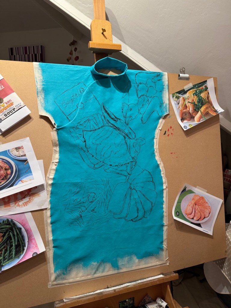
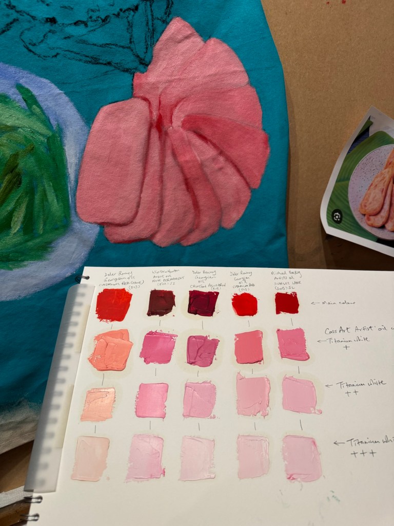
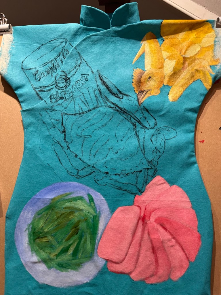
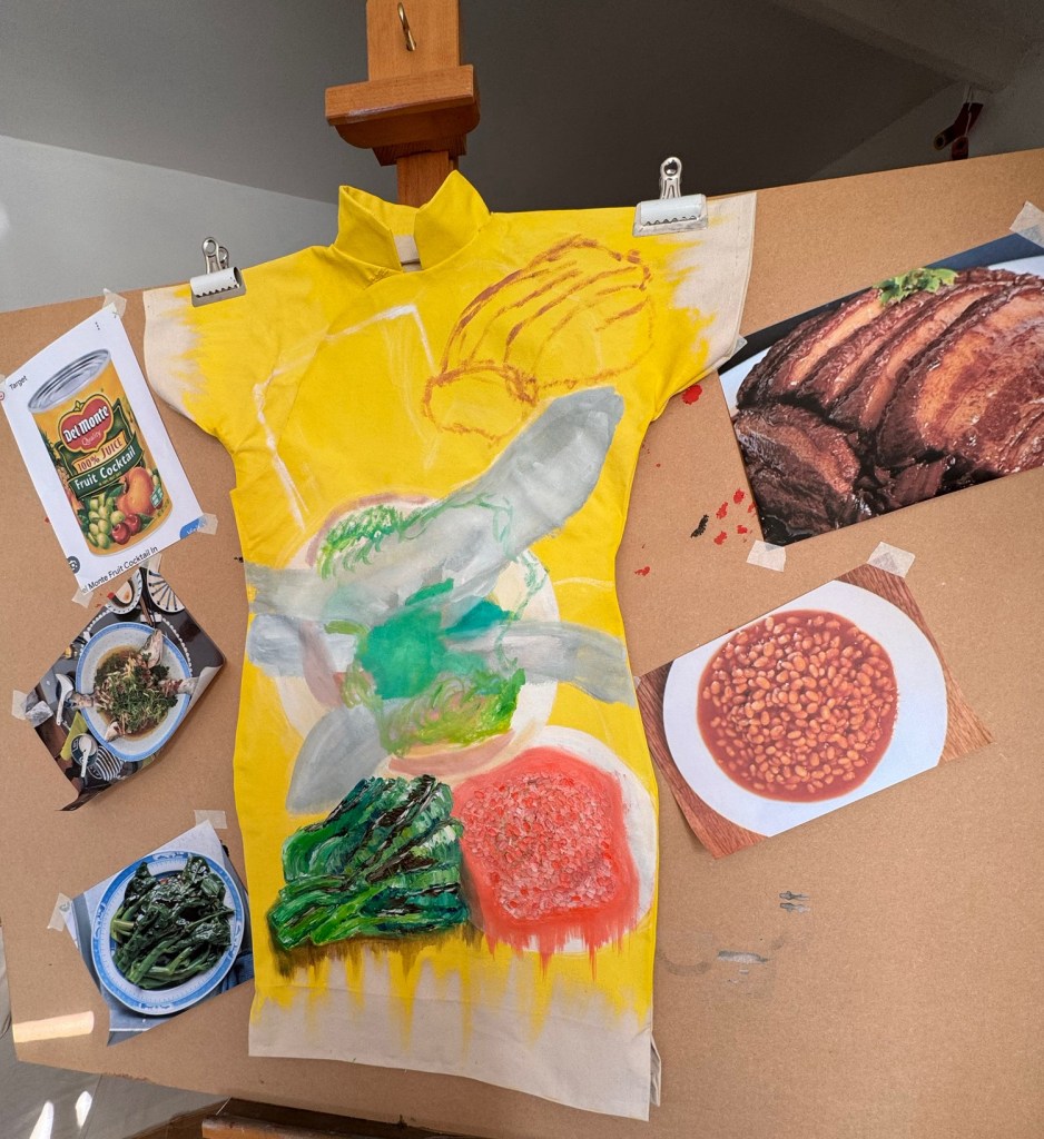
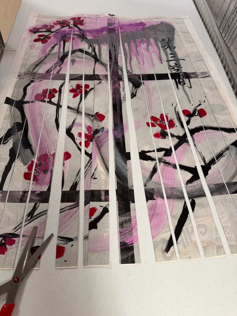
I chose two of my existing paintings for this project. To weave them together, I would need to cut them up first.
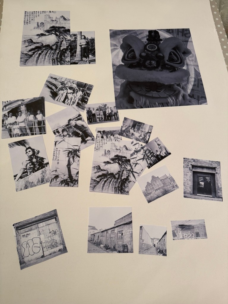
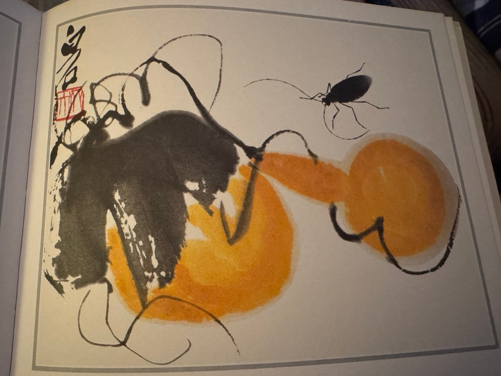
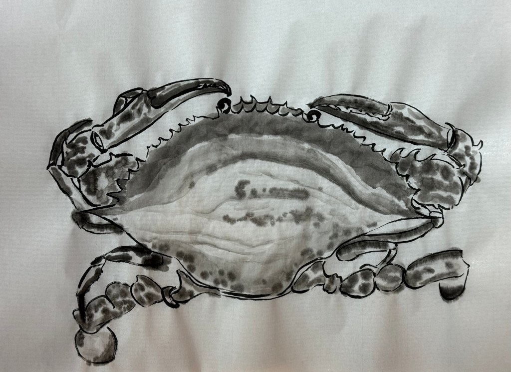
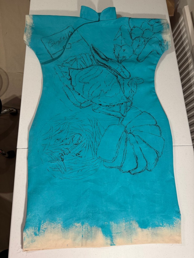
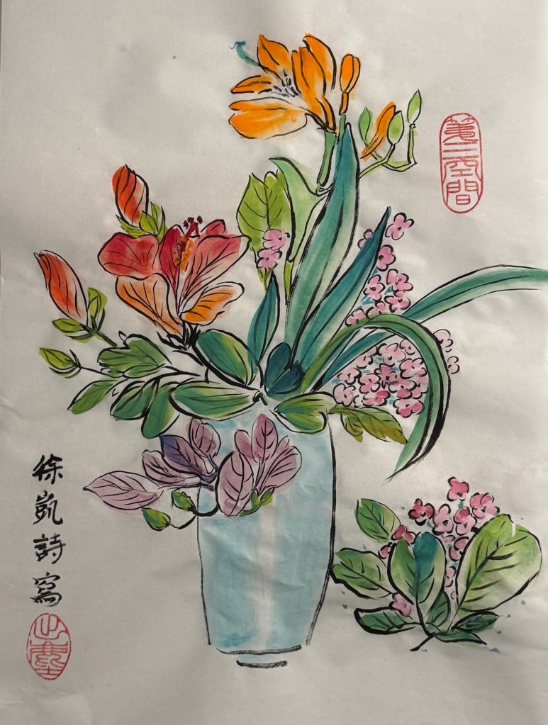
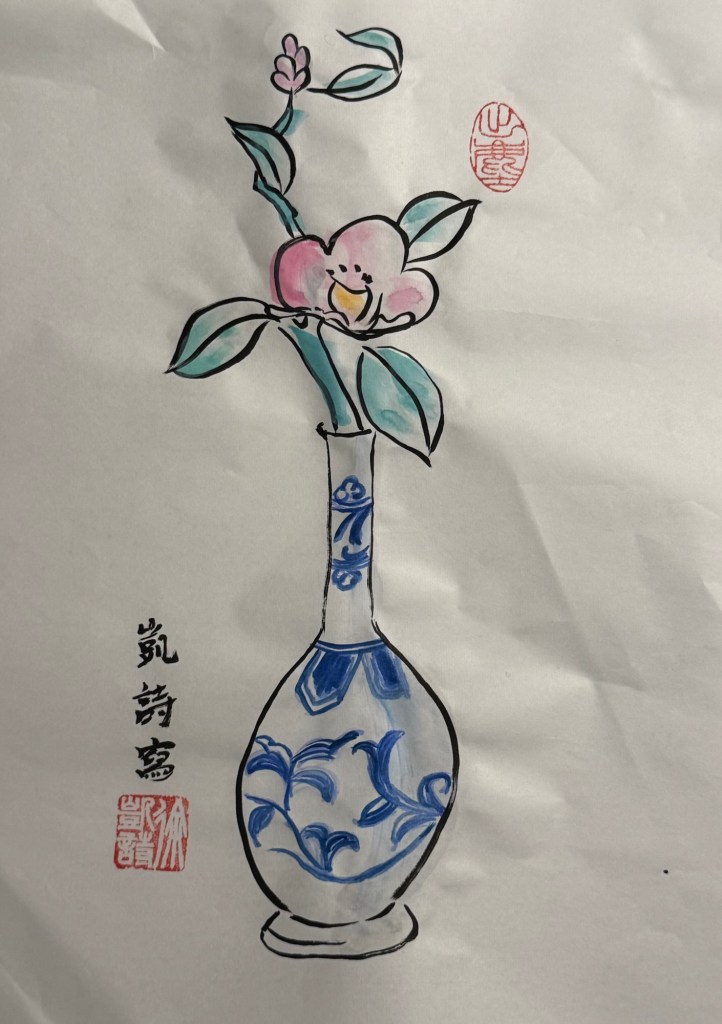
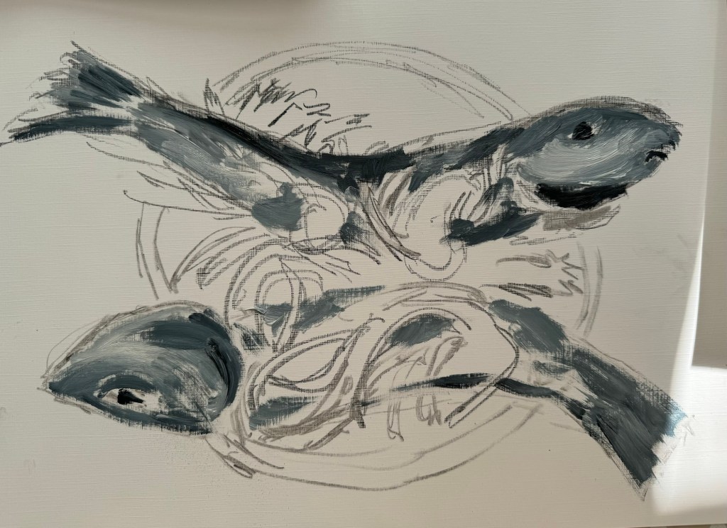
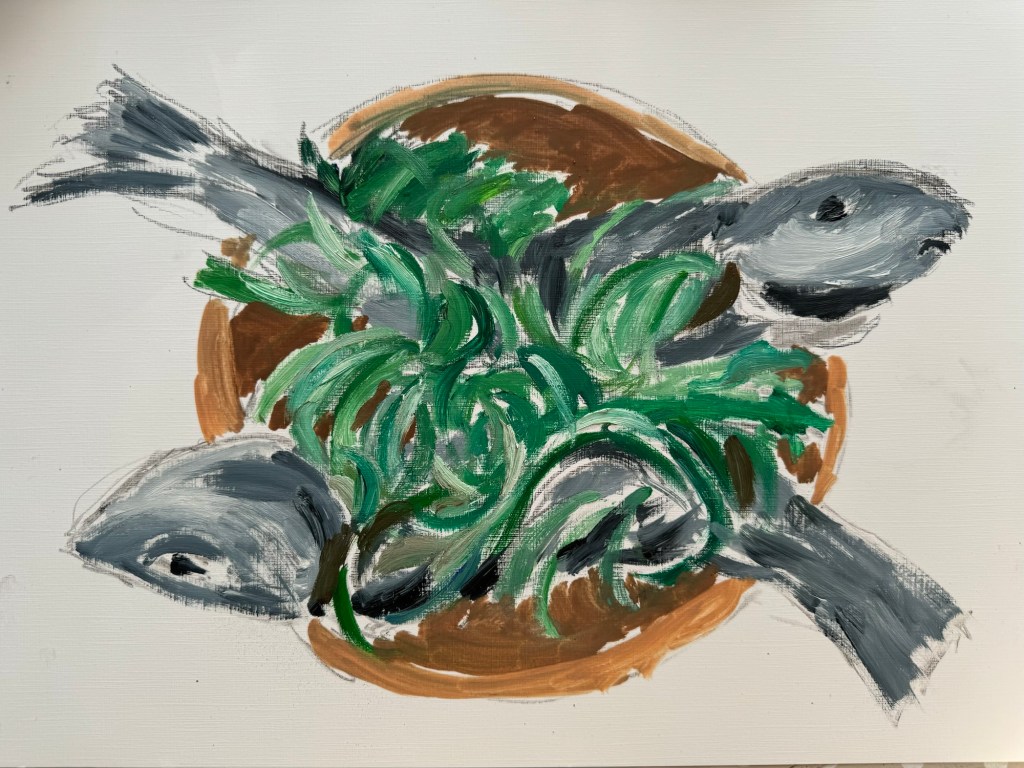
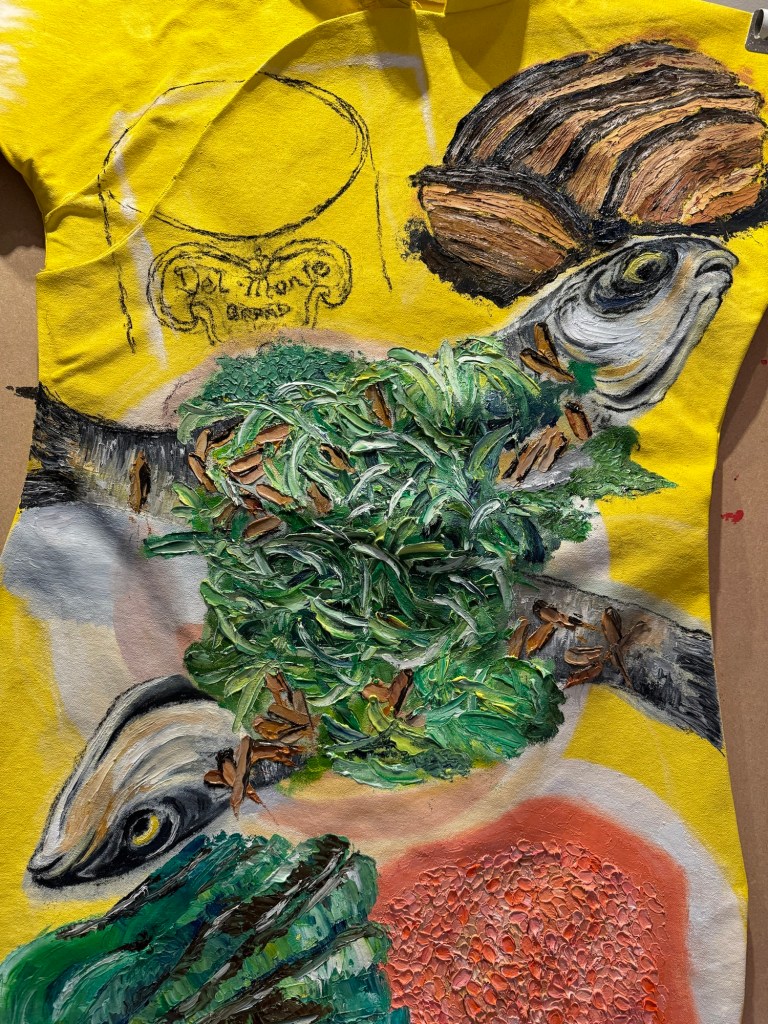
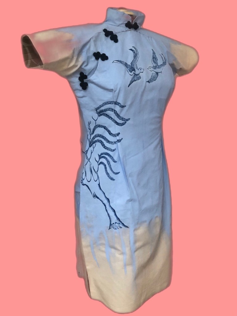
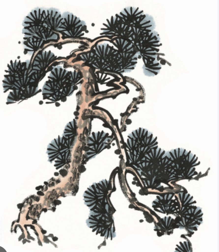
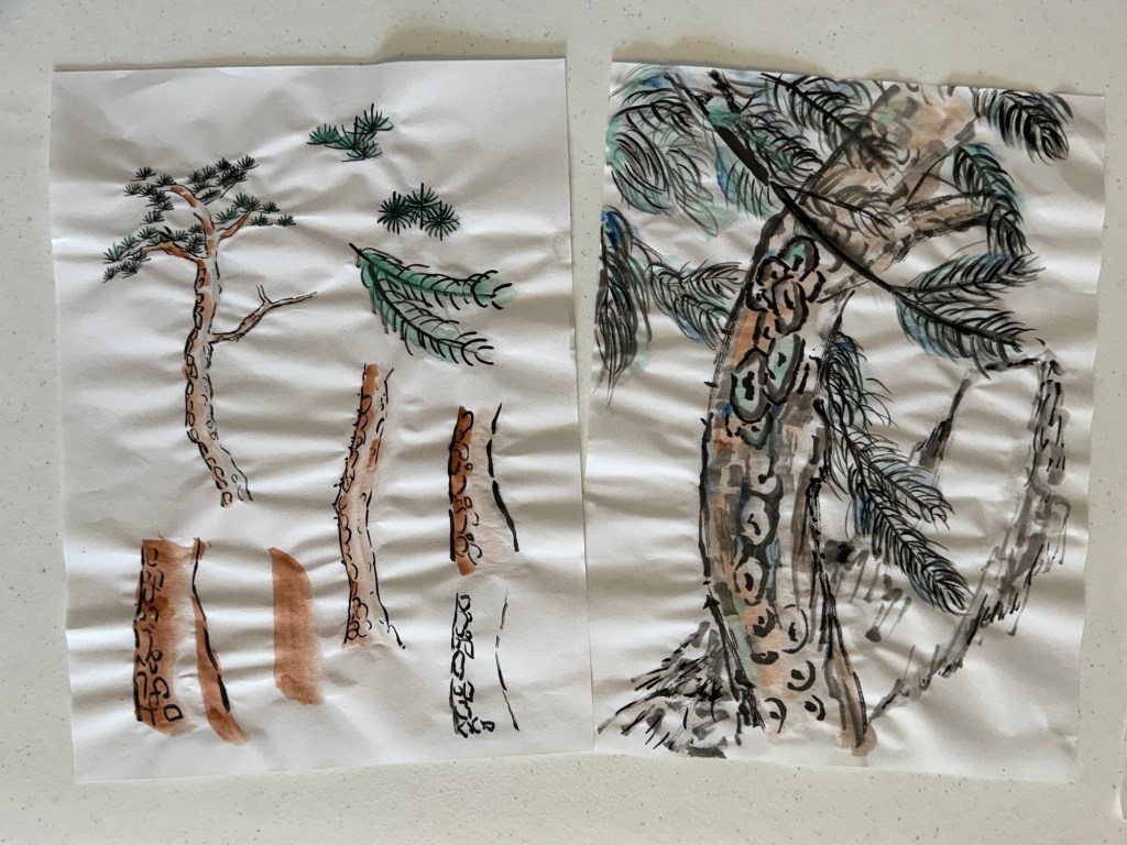
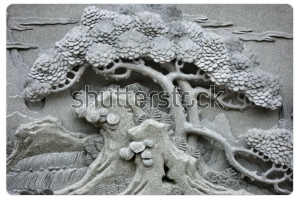
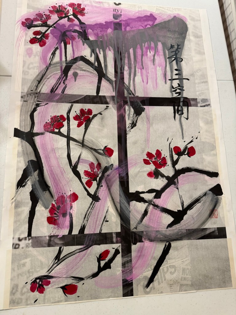
First chosen painting for cutting up – a piece of work from three years ago, Chinese ink on rice paper on inkjet printed paper:
A video I made capturing the cutting up process:
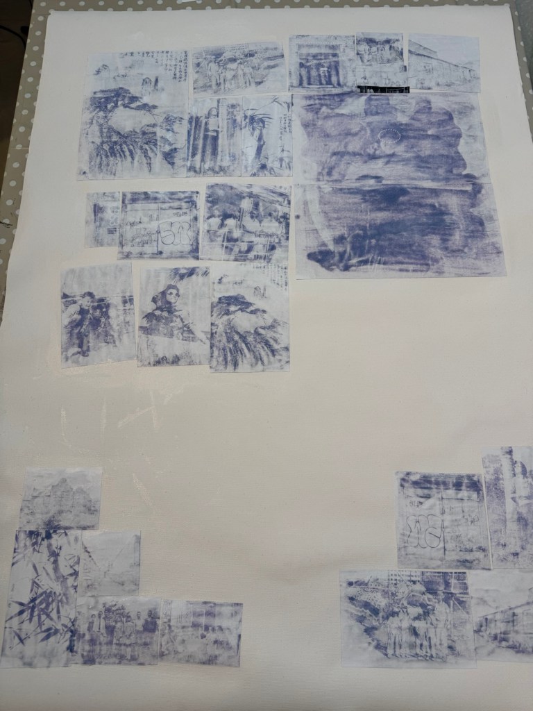
The cut-up painting:
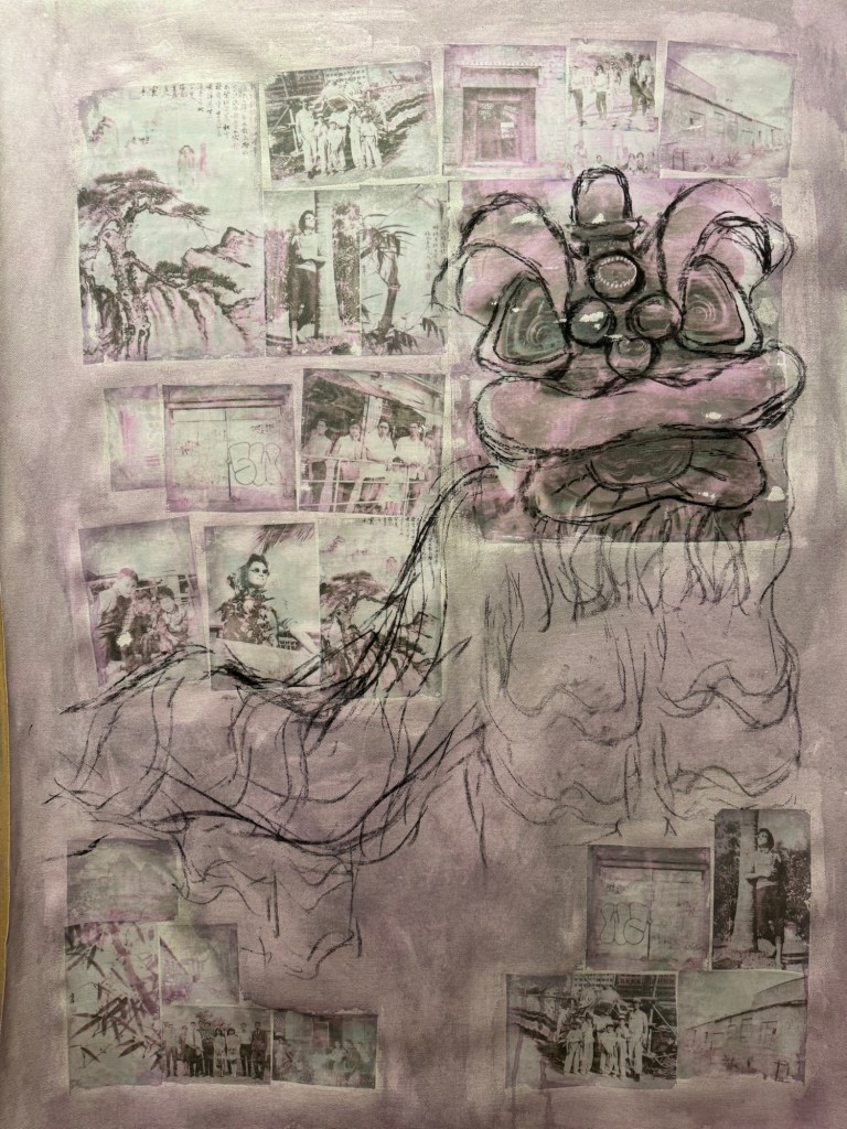
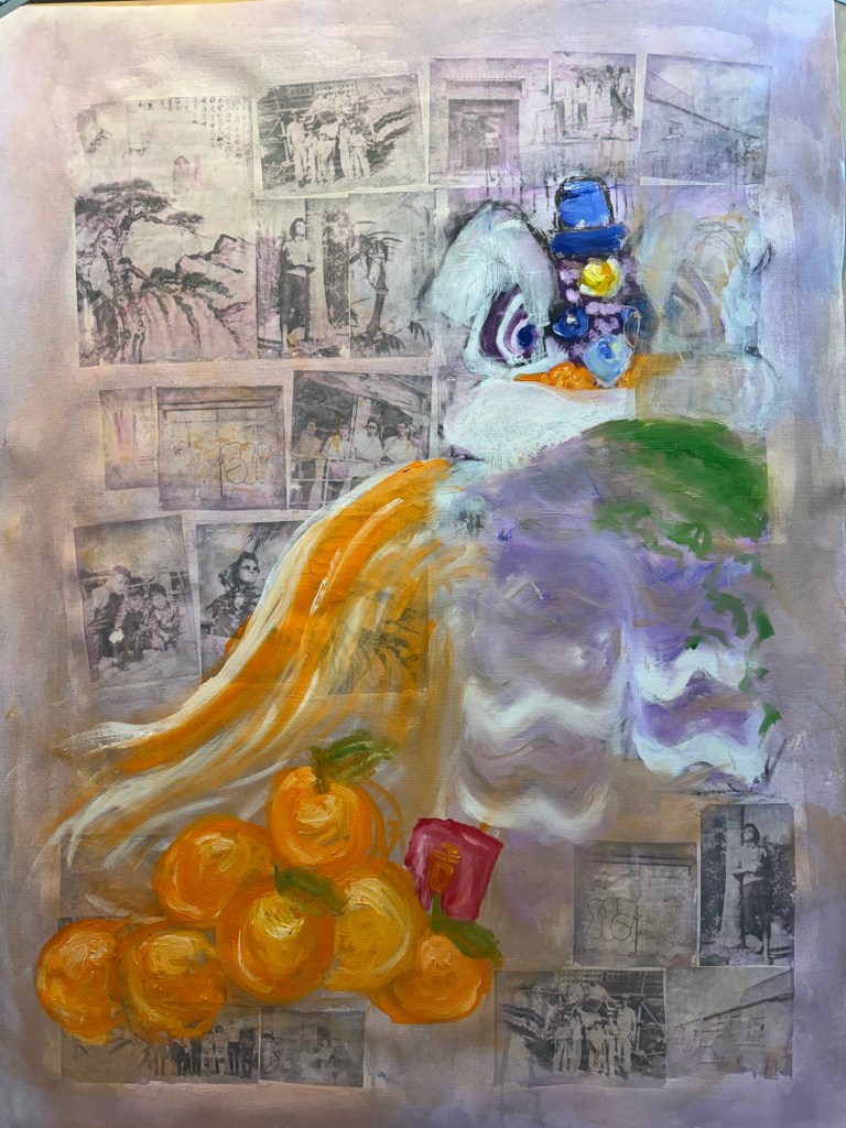
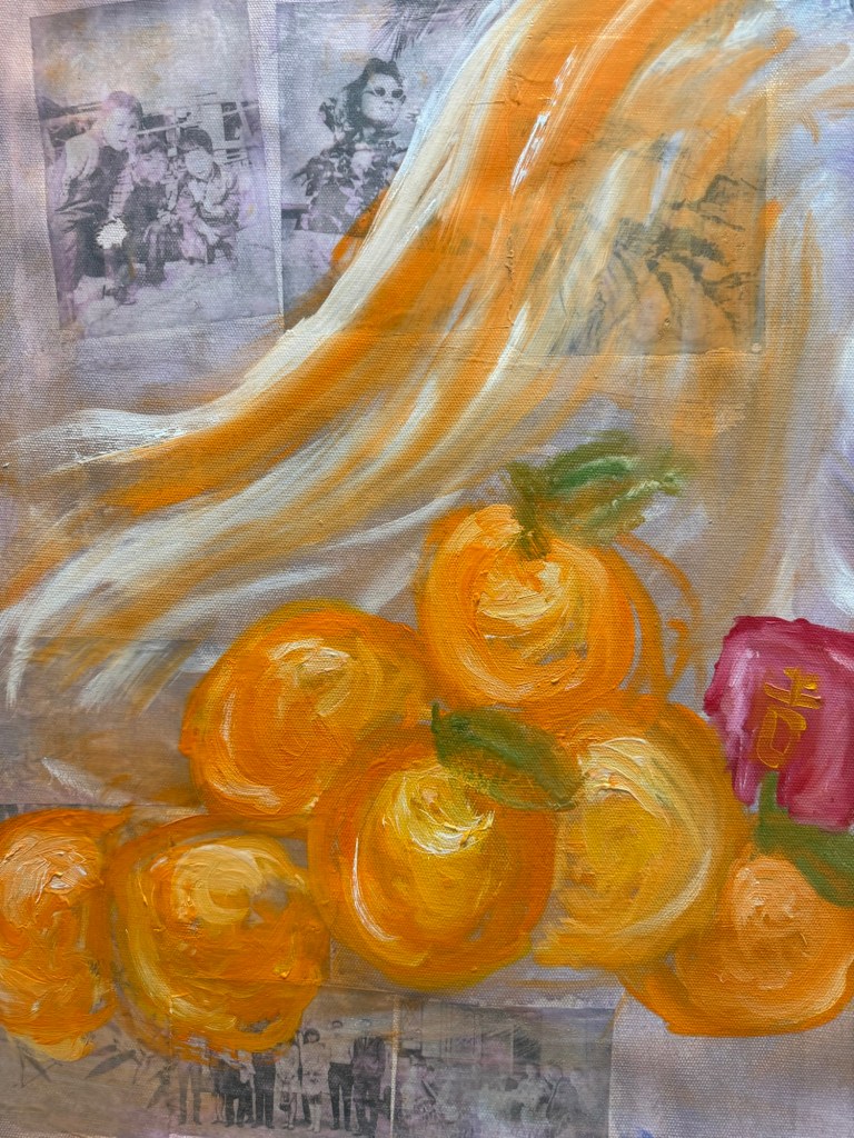
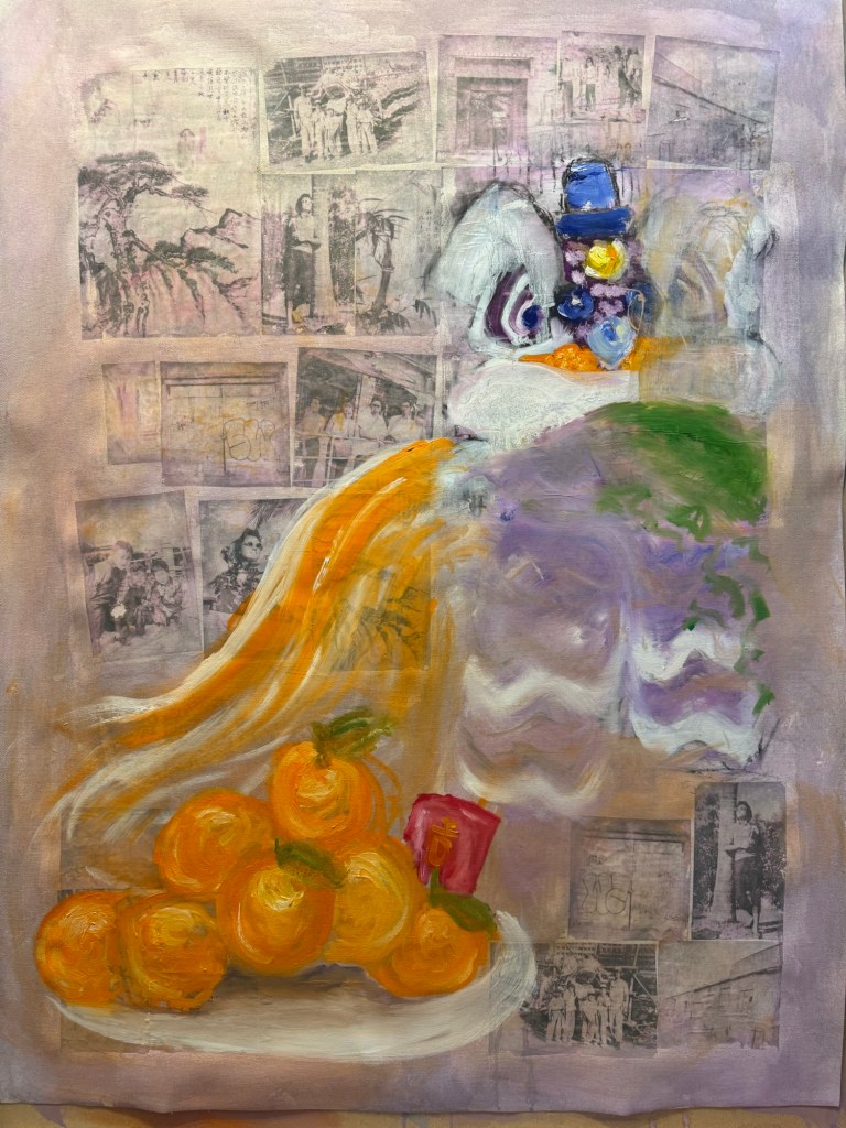
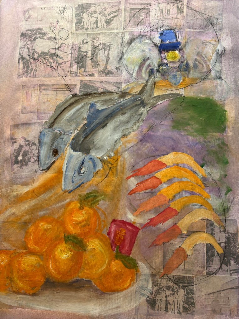
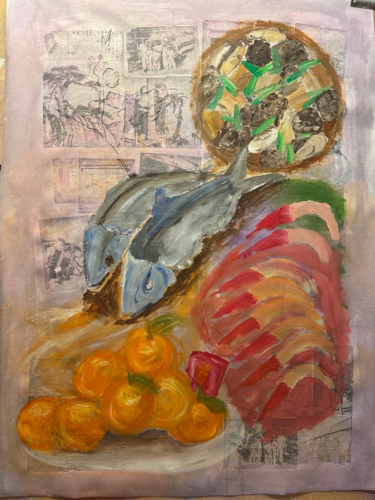
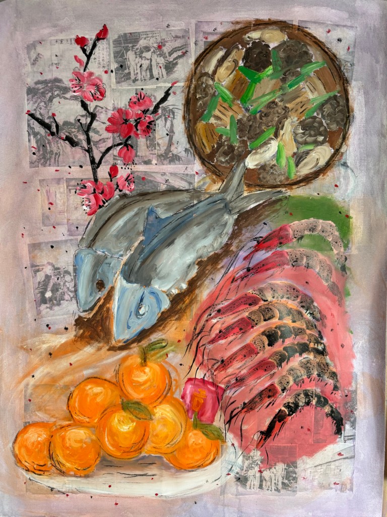
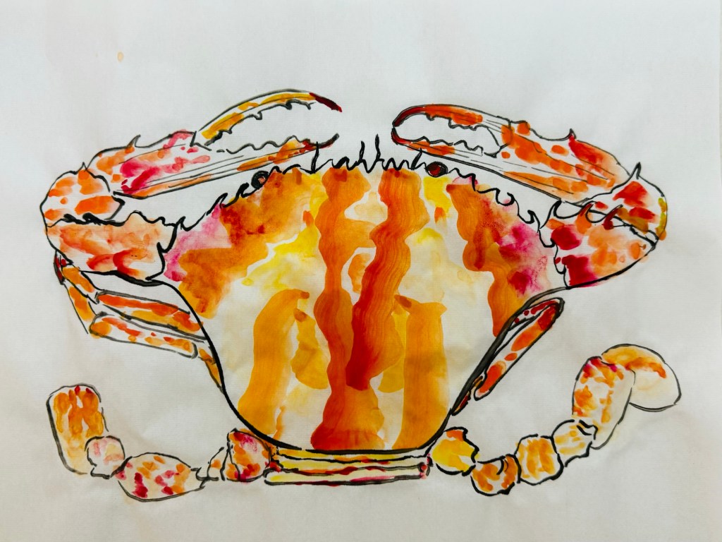
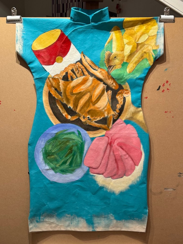
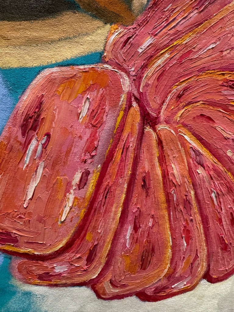
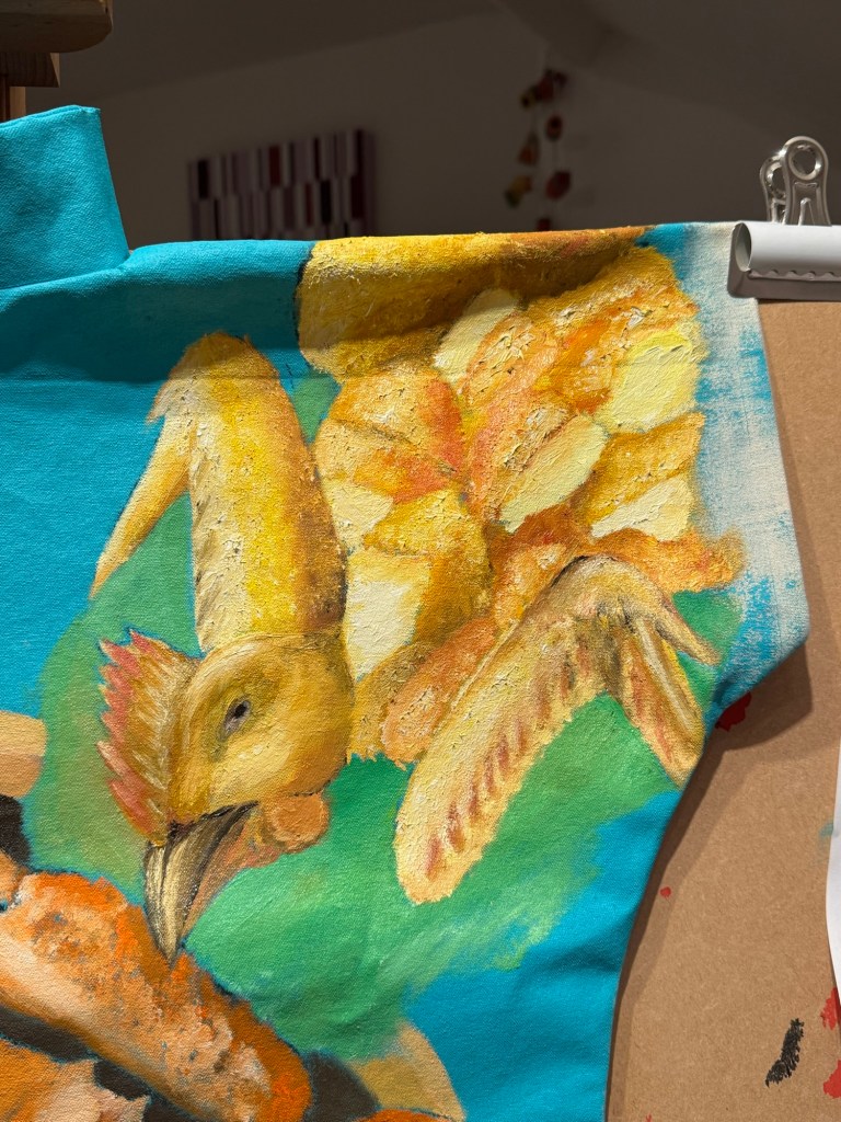
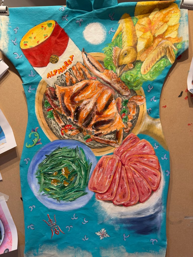
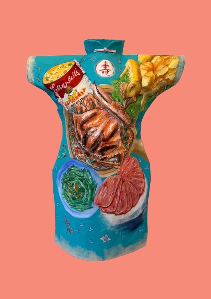
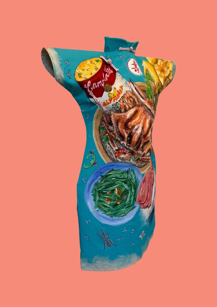
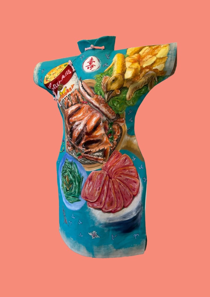
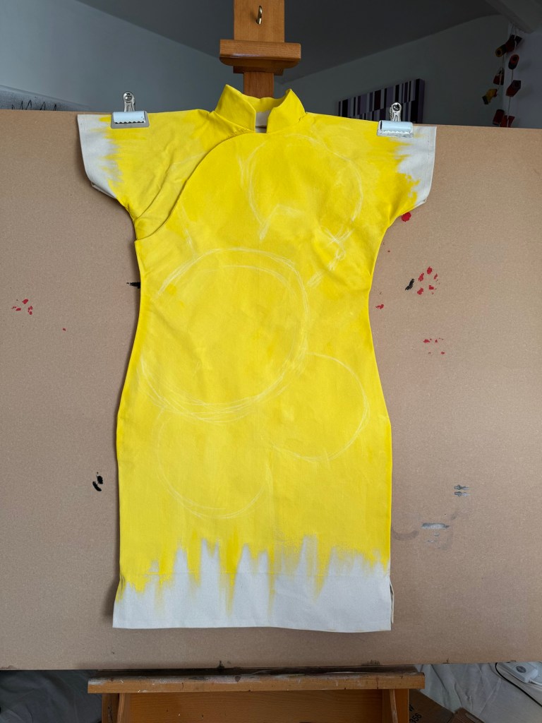
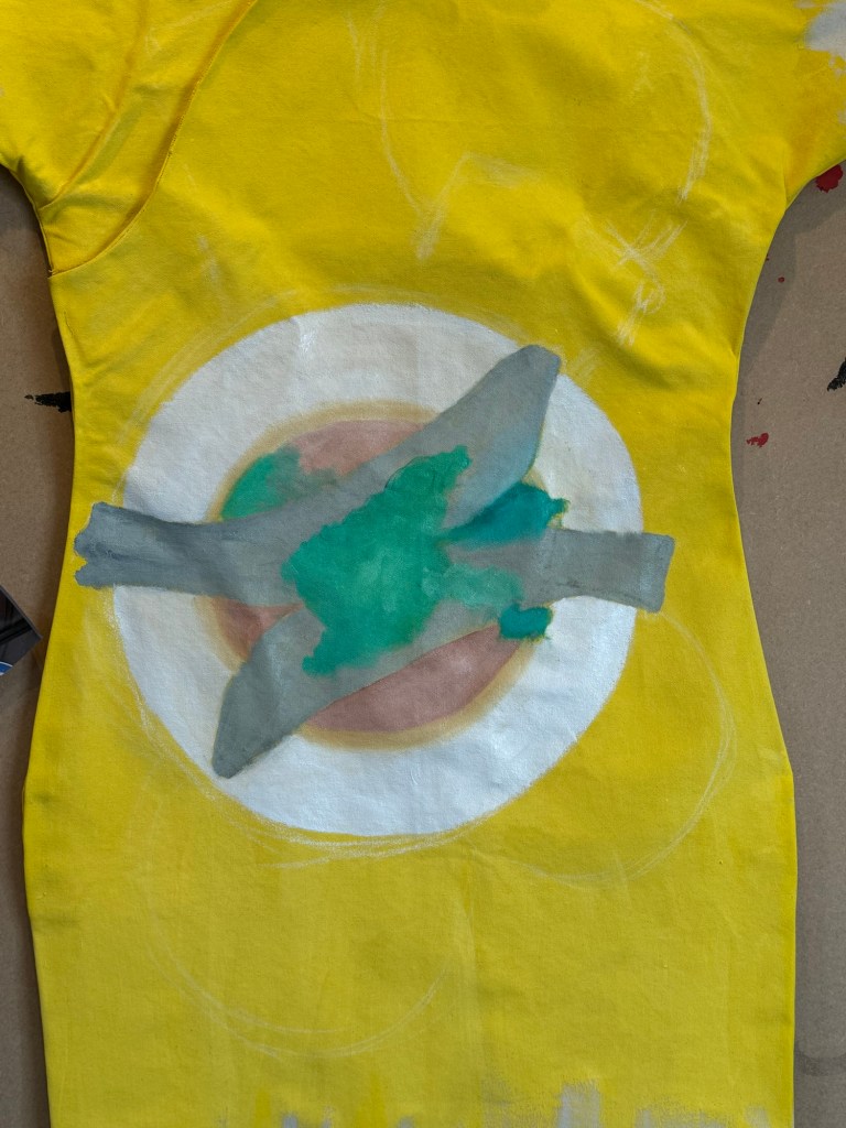
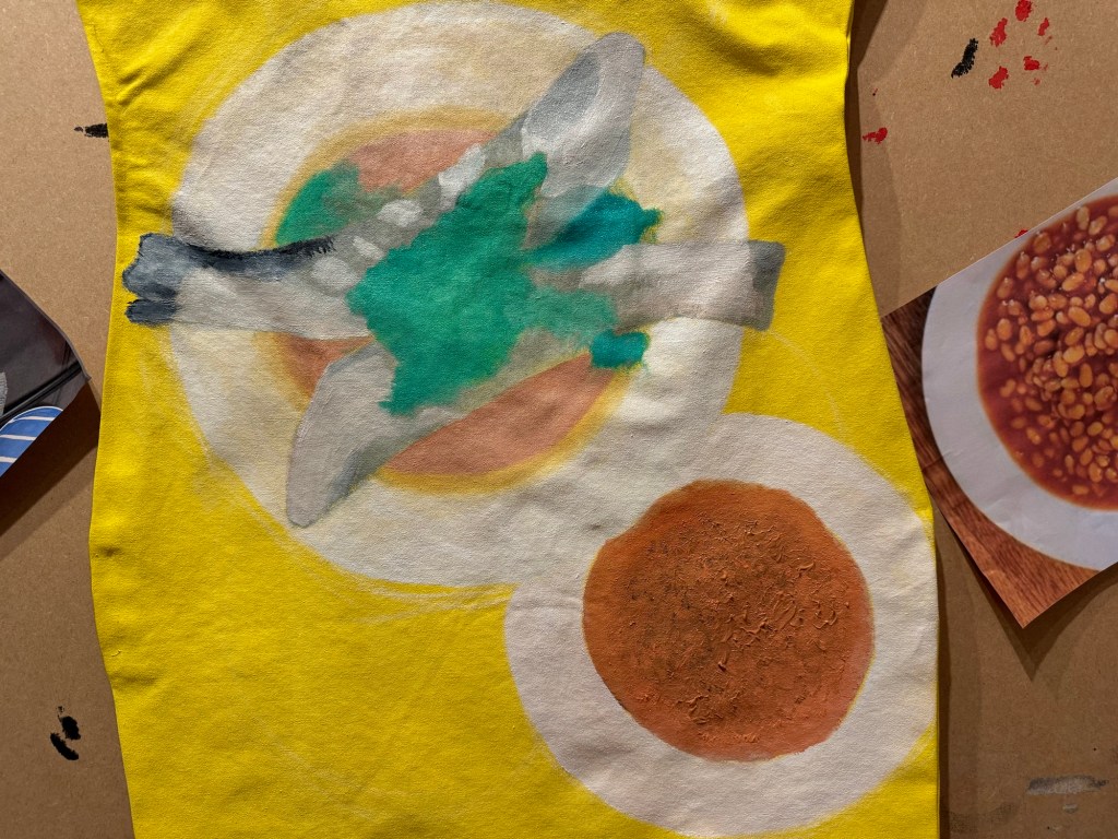
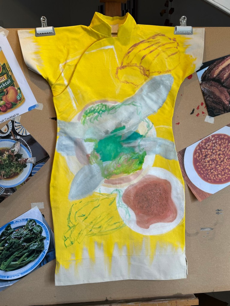
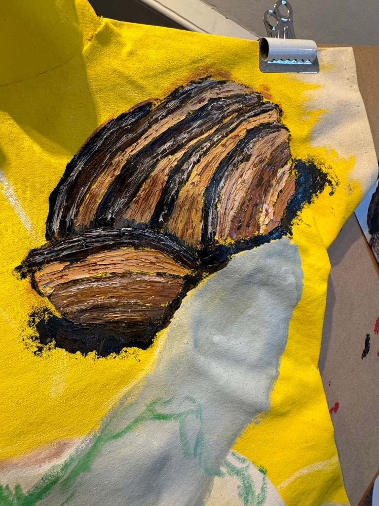
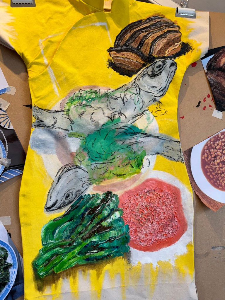
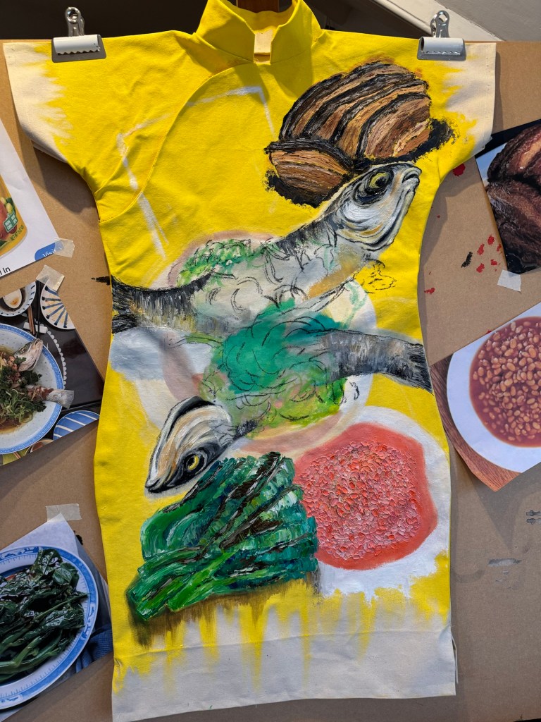
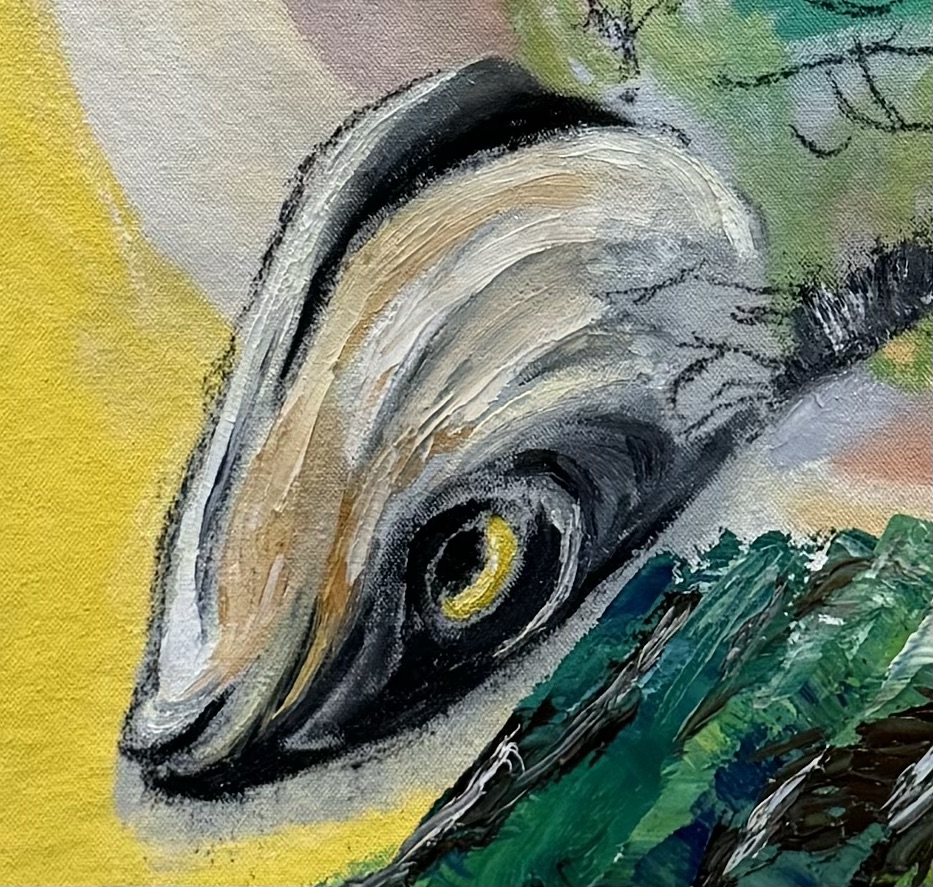
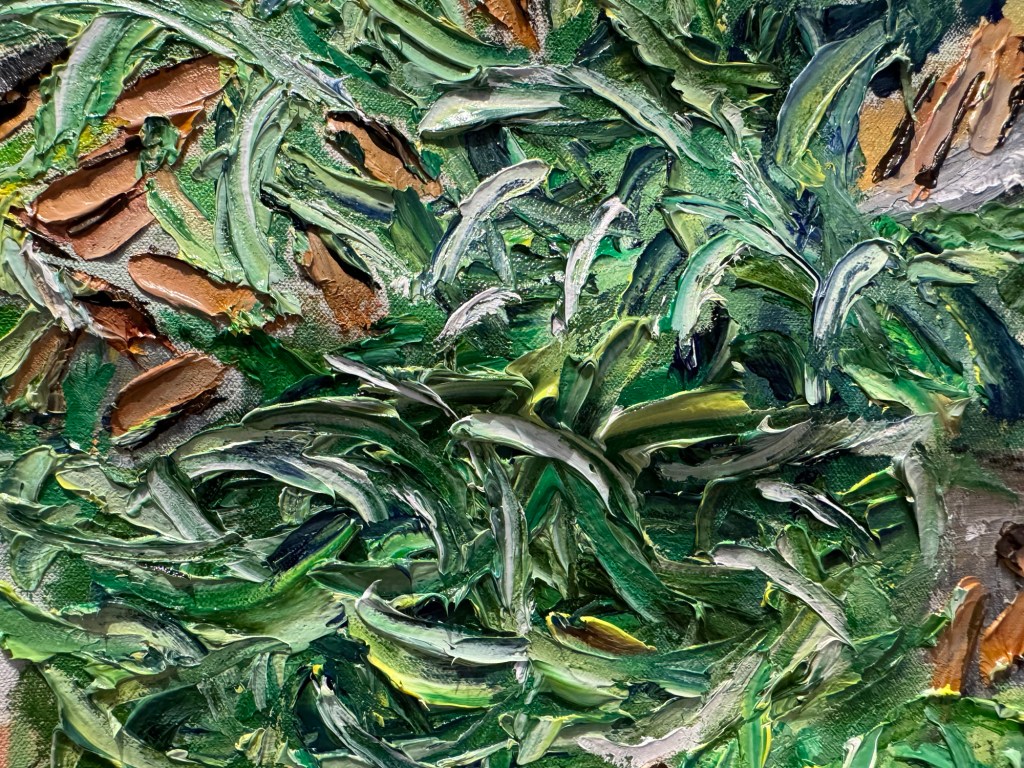
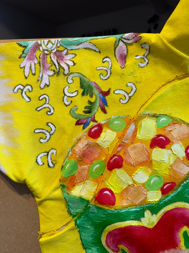
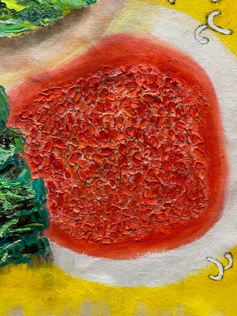
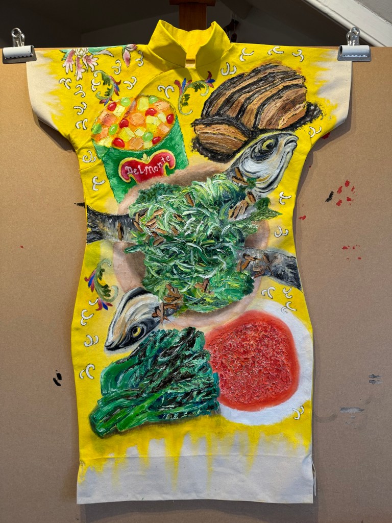
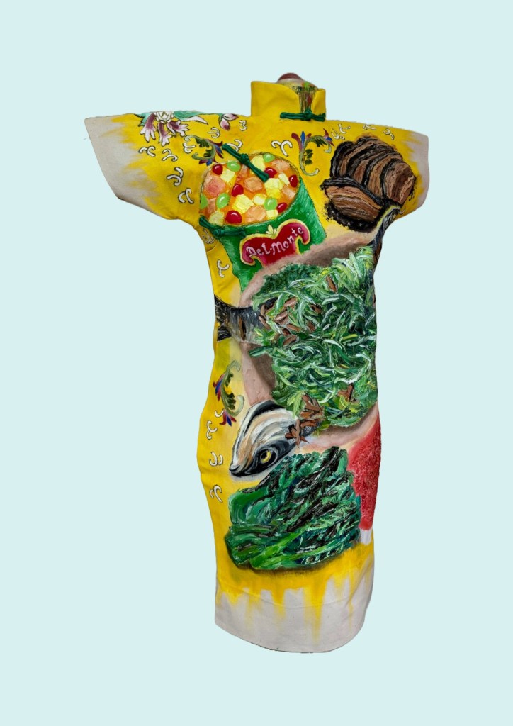
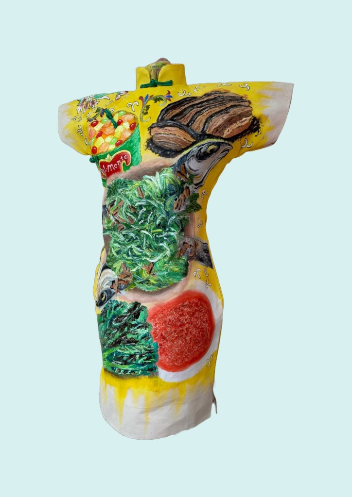
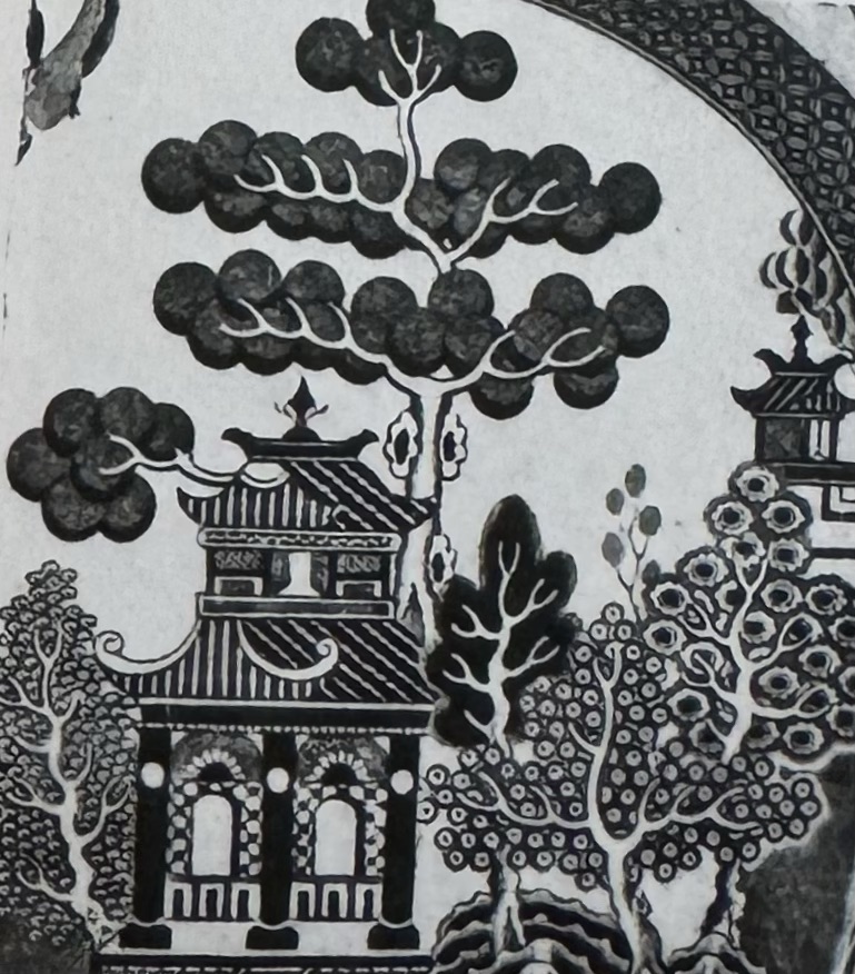
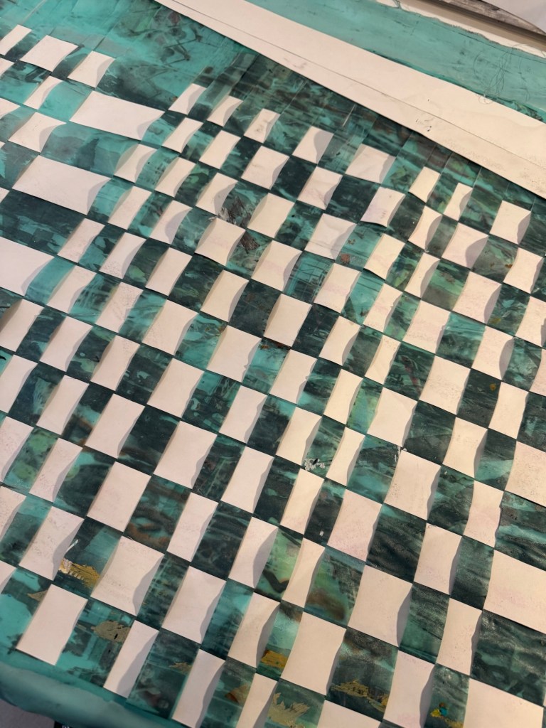
Second painting chosen for cutting up – a piece of work from three years ago, mixed media on satin canvas:
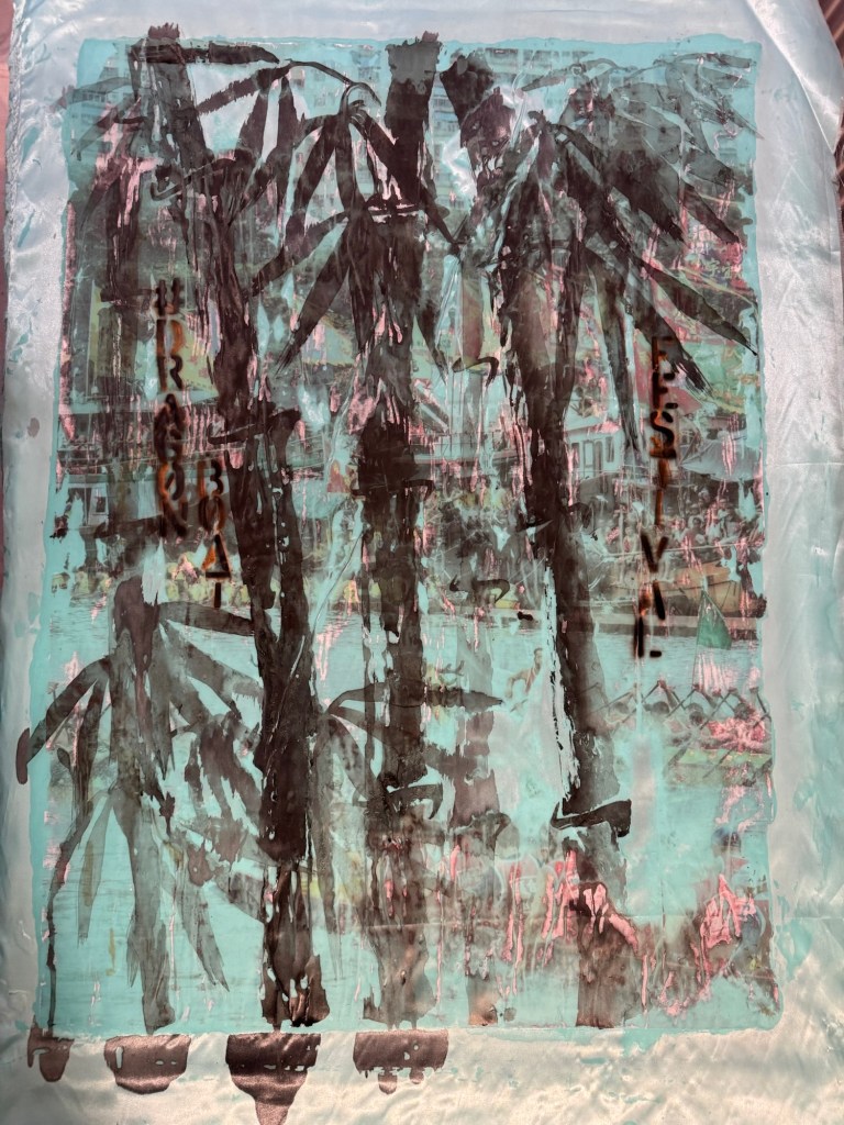
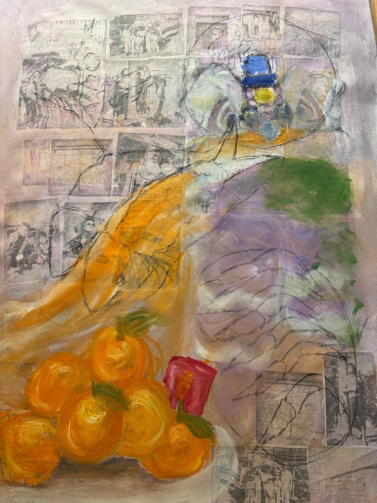
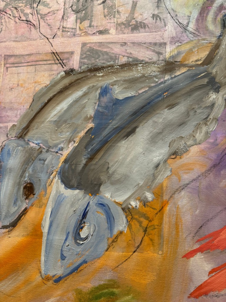
Cutting up of satin canvas:
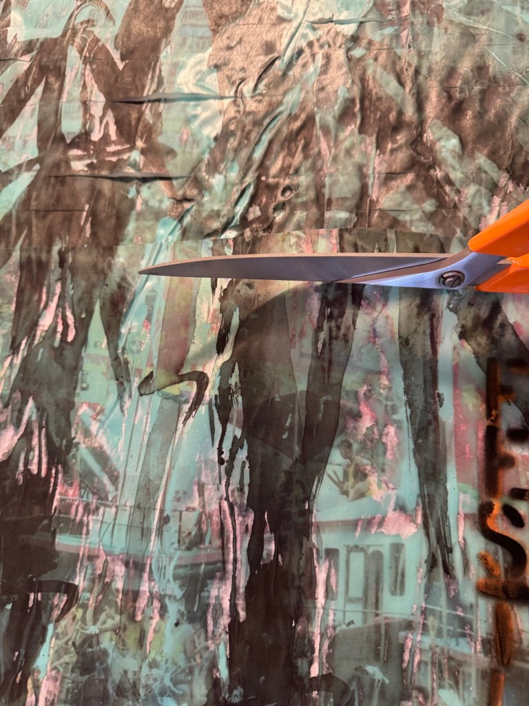
A video of the cutting up process:
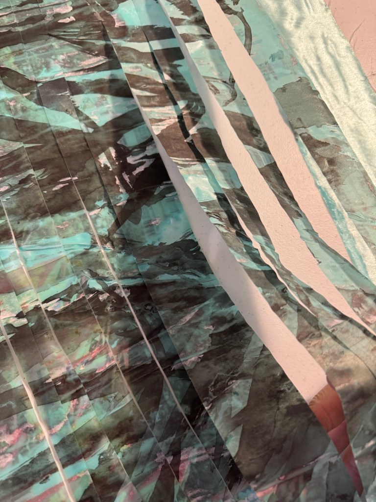
The cut-up painting:
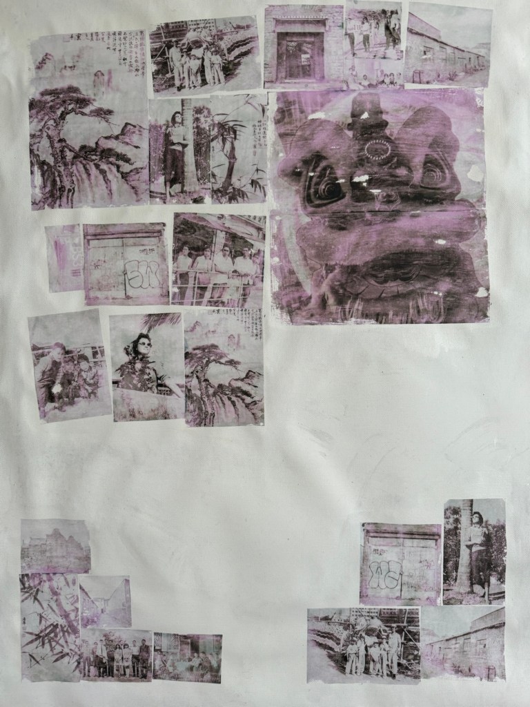
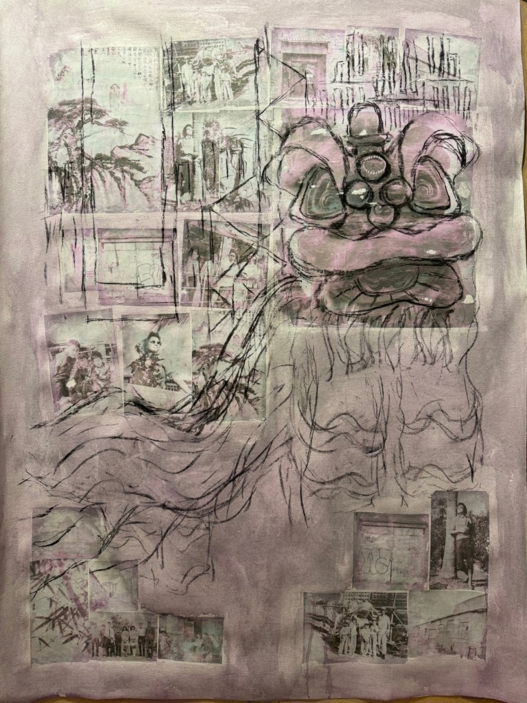
The weaving together by hand of the two cut-up paintings:
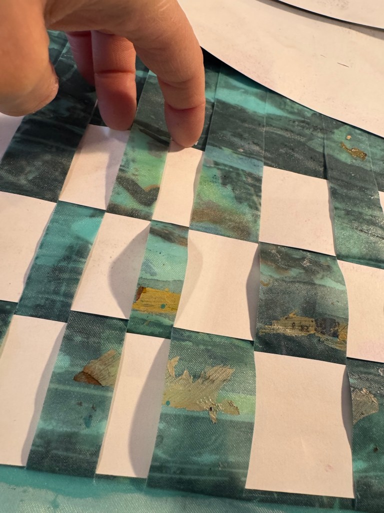
Woven tigether
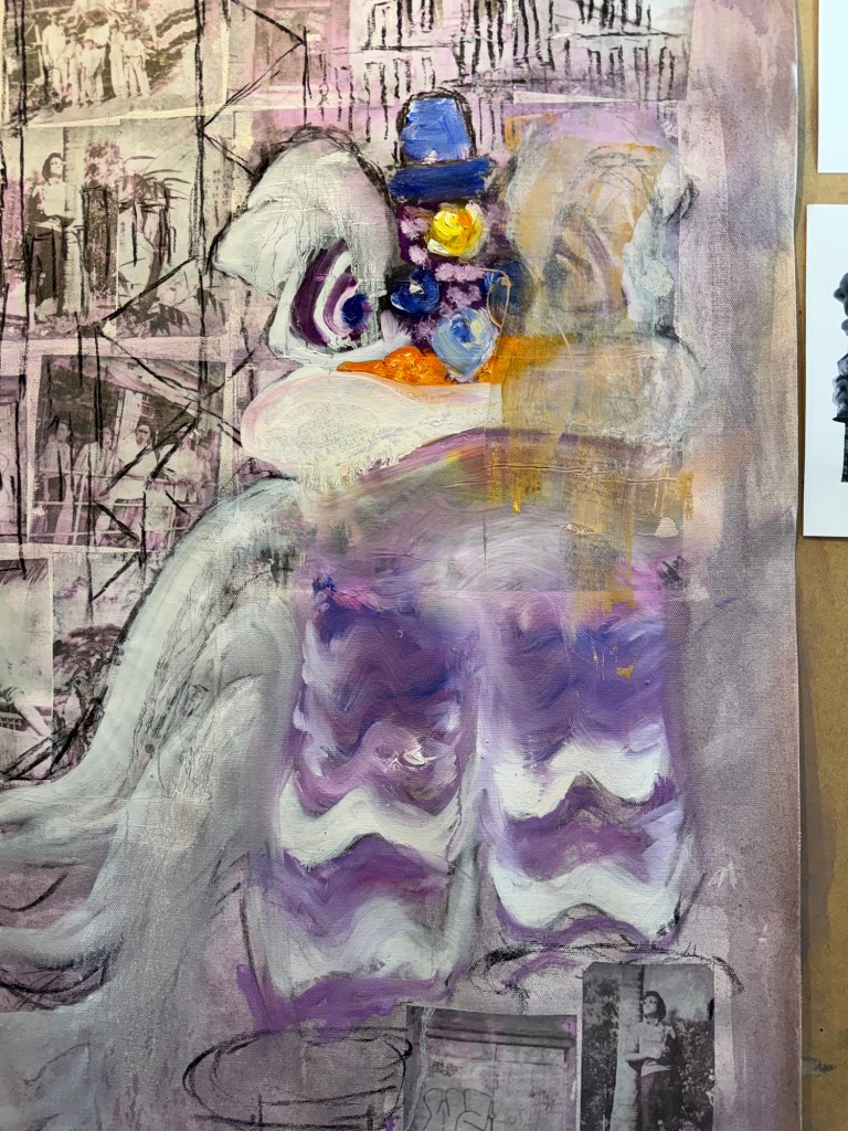
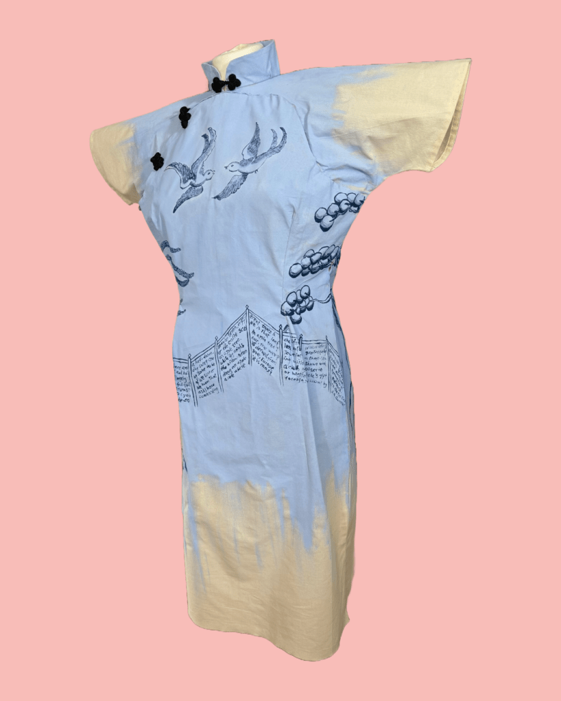
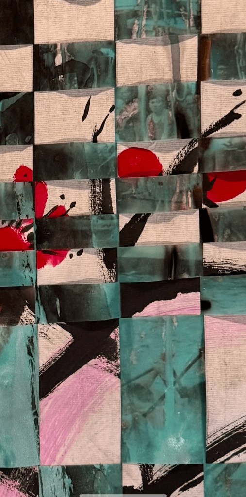
Close up of woven painting:
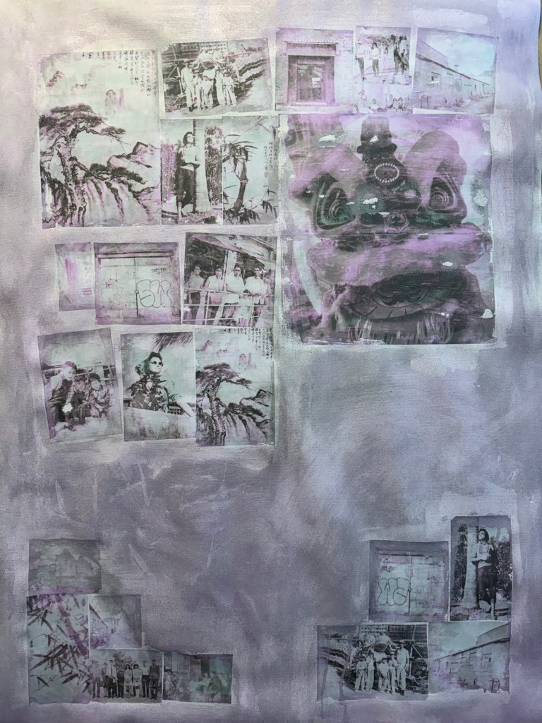
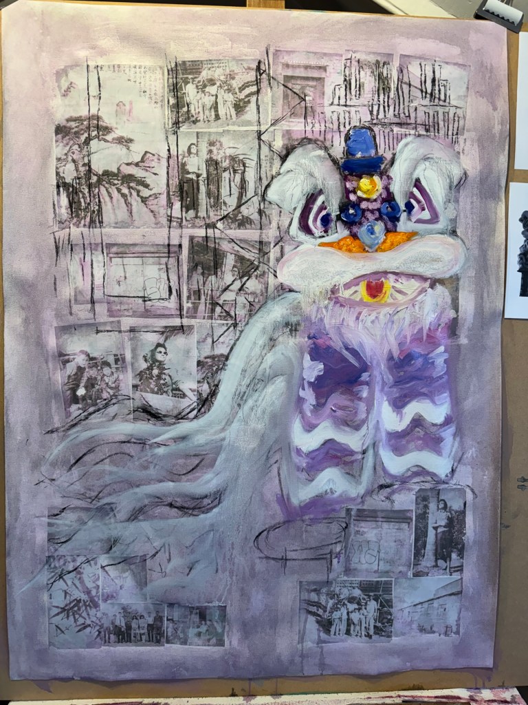
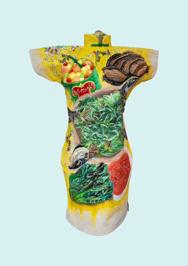
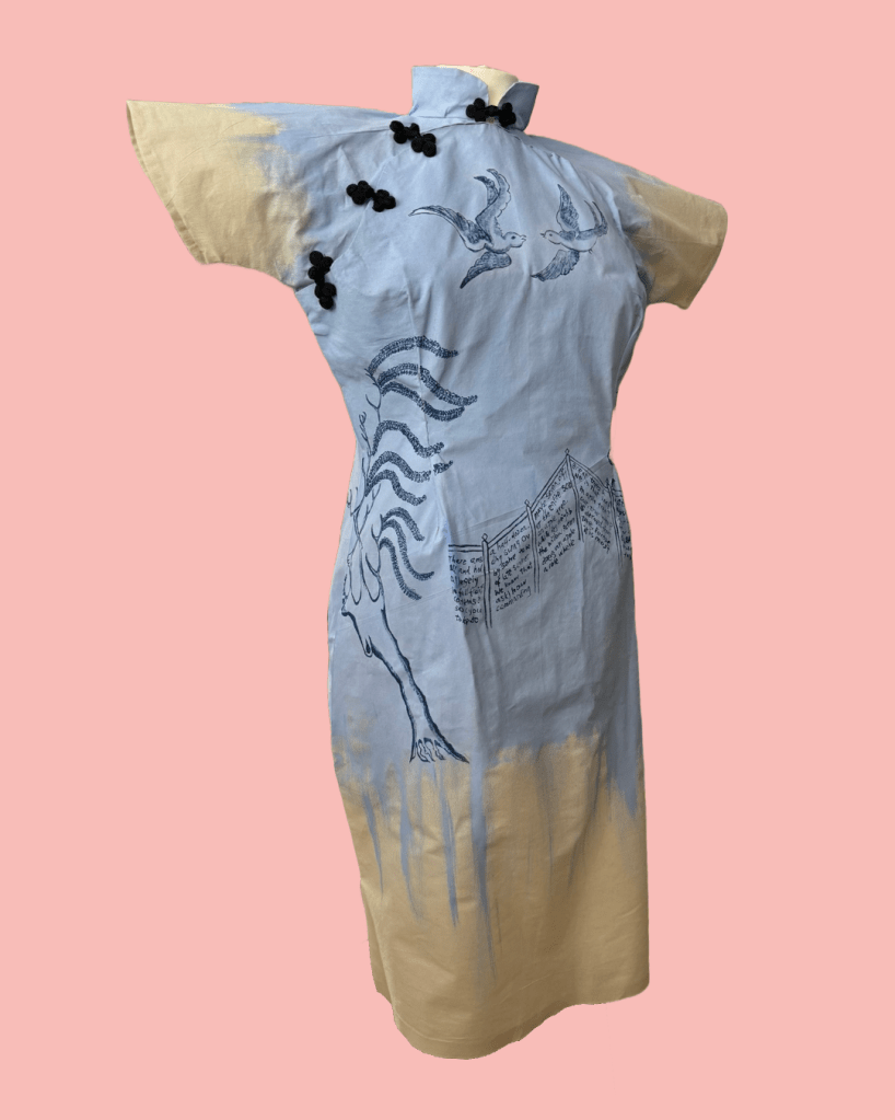
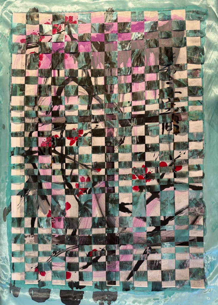
The completed woven painting, size A0.
Video with close up of completed woven painting:
RESEARCH AND THOUGHTS ON INTERCULTURAL
I did some quick research on the definition of intercultural. The Spring Institute said, ‘Intercultural describes communities in which there is a deep understanding and respect for all cultures. Intercultural communication focuses on the mutual exchange of ideas and cultural norms and the development of deep relationships.’ Many definitions describe intercultural as the coming together of a group of people of different cultures. From the quick research, I did not find any reference to the intercultural experience occurring within one person. I.e. when one person experiences and navigates different cultures within their daily existence.
To help explain my thinking about intercultural vs transcultural, I need to borrow an analogy from A Level chemistry – the definition of a mixture vs a compound.
Below are extracts from a website:
Mixtures are heterogeneous forms of matter. The composition of a mixture is variable with each components retaining its characteristic properties. Its components are easily separated. Examples of Mixtures: soil, ocean water, air, the cytosol of a cell.
In contrast, compounds are homogeneous forms of matter. The components of a compound do not retain their individual properties. E.g. both sodium and chlorine are poisonous; their compound, table salt (NaCl) is absolutely safe and essential to life. Another example of compounds is water (H2O).
It takes large inputs of energy to separate the components of a compound. Similarly, I have previously used the fusion concept from physics to explain the forming of transcultural characteristics. Fusion takes an immense amount of energy to take place. So learning from the analogies from science, I believe that for a transcultural person to go through the cultural transmutation process, it takes much energy and also time for the process to take place. Whereas I do believe that one can start to adapt to an intercultural life more readily. For example, an immigrant child moving to the UK with her family from say, Asia, could be adopting a full British style life at school during the day, then go home after school and be immersed back in her original culture in the home environment. That in my opinion is a form of an intercultural life.
REFLECTIONS
So where am I going with this?
Although I’m using science as analogies to explain intercultural vs transcultural, I am not asserting those thoughts as a definitive explanation, that would be grossly generalising and reductive. They are just ways of sense-making for me and to help me to think through the different cultural concepts. I could do more in depth academic research on the subject and I may well do so later. But for now, I am enjoying the thinking process based on my own experiences as I make art. I don’t believe I am anywhere near having answers, but I have started the thinking process on the subject.
How about the weaving? What did I get out of it?
My weaving experiment here was more of a technical exploration to see what happens when two paintings were woven together with a view of taking the learning to future works. Some questions that I asked myself in reflection were:
– How was the weaving process? It was quite easy and straightforward to execute, but that was because the width of each strip was fairly wide so quite easy to handle. I would like to try and weave with narrower or more irregular strips to challenge the process and create a less uniform pattern.
– What did I think of the outcome aesthetically? I wanted to see if the individual painting images would still be present but more ambiguous. I think I could say yes to this – I could make out the two original images but with missing details adding intrigue.
– How about the cutting process? That was very interesting! The cutting up of my paintings felt brutal but liberating. To not feel too precious about one’s work was definitely liberating. In previous blogs I’ve talk about how I valued the process of making more than the outcome. Once a piece of work is made, I usually feel quite detached about the piece of work. So I hope I will be prepared to cut up more paintings to investigate the weaving of work. Also, the cutting process helped me to release some of the anger and despair that has been building up for me regarding certain global issues going on right now.
– What am I really trying to achieve by the weaving process? I have struggled for some time to express my transculturality through my art. I have written about this before calling it the elusive ‘green’. I kept painting with blue and yellow (metaphorically) but couldn’t yield a satisfactory green. Meaning that I couldn’t come up with something that represented my transcultural / fusion process. When I was asked by my classmate ‘why not intercultural ?’, it occurred to me that interculturalism is also applicable to me, perhaps if I start with that, I might get more insight into the transculturality that I want to express. Imagine if the width of the cut-up painting strips were so narrow that the two images eventually became one, then that would be like a fusion process, or a ‘chemical compound’ would have been created where it’s no longer easy to separate or decipher the two original images. Hence like something new emerging in the third space.
Taking this idea further, I have in the last two years explored much about my transculturality, however, that is only a part of my identity. I consider myself a Hong Kong born British Chinese engineer artist woman business-leader and mother. In examining my identity as a transcultural person, I have not yet explored the dynamics between the engineer and the artist; or the experience of a woman and mother; or my voice as a business-leader vs that as an artist. In an earlier blog, I talked about wanting to re-explore an area that I have found comfort in the past (new objectivity industrial art). How do I combine that desire/need with my ongoing transcultural practice? They seem very different but are all part of me and my identity.
LEARNING
Since I exist in the intersection of multiple aspects of my life, I need to consider how I broaden my identity exploration beyond the current transcultural perspective. I cannot think of how I can express the different identity elements whilst remaining coherent. Perhaps I can make paintings about the different elements and then weave them together to see what images emerge. E.g. weaving together a Bristol streetscape with a Chinese ink painting, or an oil painting of my childhood family dinner with my expression of womanhood. What would that look like? This means instead of creating one image that embodies the different aspects of my intersectionality (like in Akunyili Crosby’s work as described in my research paper) which I have struggled to create satisfactorily, I can create multiple images and weave them together to see what comes out. This doesn’t mean I will adopt the weaving of paintings as a main process for my practice, but it might give me ideas and inspiration to create images (more abstract and ambiguous images) to express my overall identity. Importantly, it gives me a way forward when I’m feeling somewhat stuck with the complexity of too many ideas.
NEXT STEPS
– Cut up two more paintings with narrower strips then weave them together to see how the overall image develops. Use smaller size paintings like A4 so the experimental process can be quicker.
– If the above experiment is successful, then think about what to paint to really explore the different aspects of my identity and then weave the works together to see what comes out.