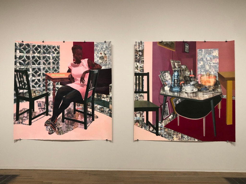
I had a tutorial with an Academic Support tutor from CSM and we discussed painting. I talked about one of my favourite transcultural artists Njideka Akunyili Crosby. I talked about how in awe I felt when I saw her large diptych at Tate Modern last year. The tutor suggested that I made a painting to respond to the work.
Akunyili Crosby’s work at Tate:
–
METHOD
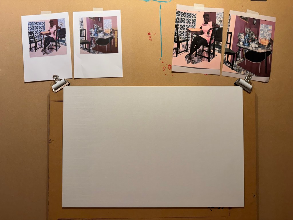
I printed out Akunyili Crosby’s work to give me inspiration. A board canvas was chosen.
–
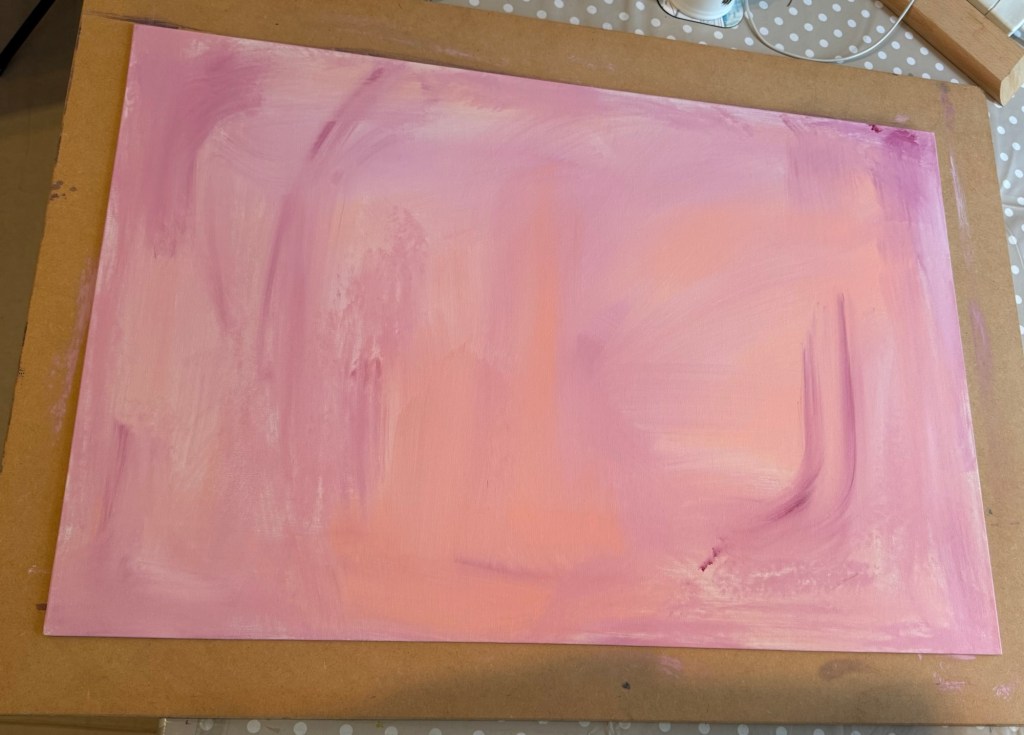
A thin acrylic wash of mixed colours was applied to cover the canvas.
–
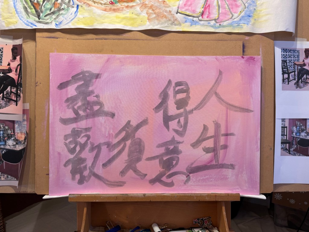
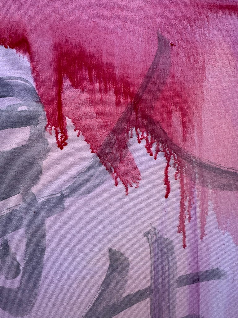
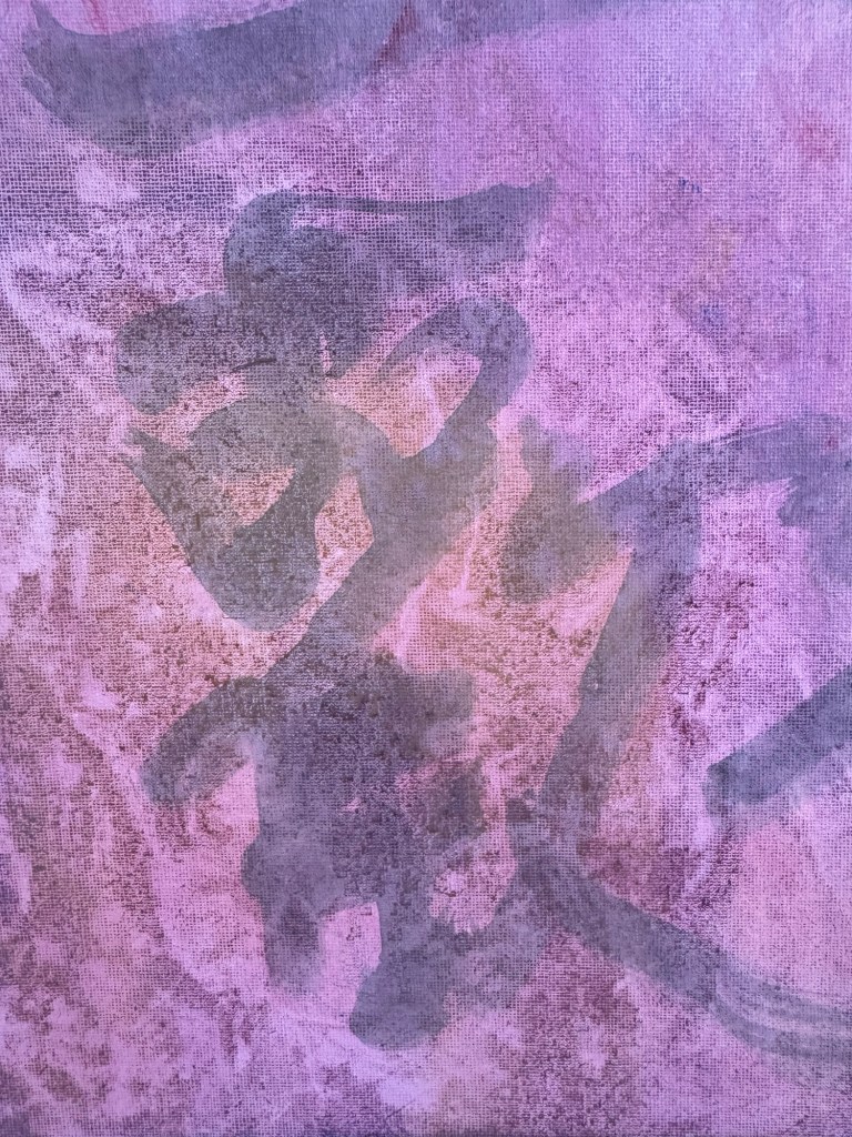
A line from a Chinese Tang Dynasty poem was chosen and written onto the canvas in Chinese ink to add some extra images onto the background. The line translates as – in life, when times are good, really celebrate.
–
Then very thin layers of oil paint were applied loosely with brushes. The canvas was kept vertically for the paint to run down.
–
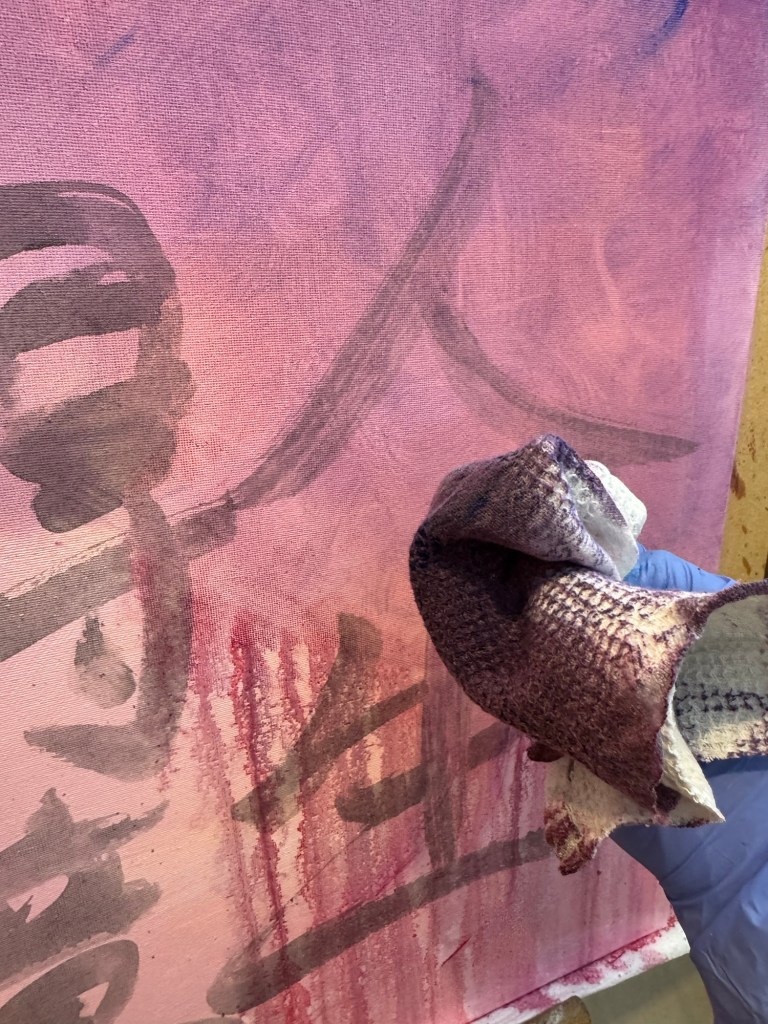
A piece of textured rag was used to experiment with creating patterns:
–
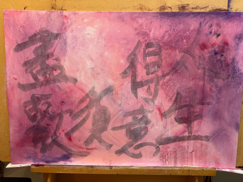
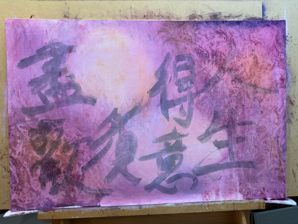
Work in progress, playing:
–
Playing some more:
–
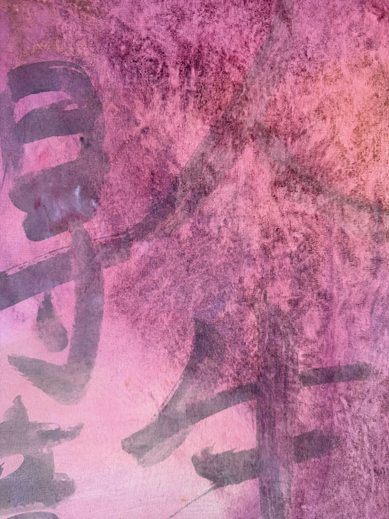
Close up images to show the ragging effect. The oil was so thin that the background images were still coming through:
–
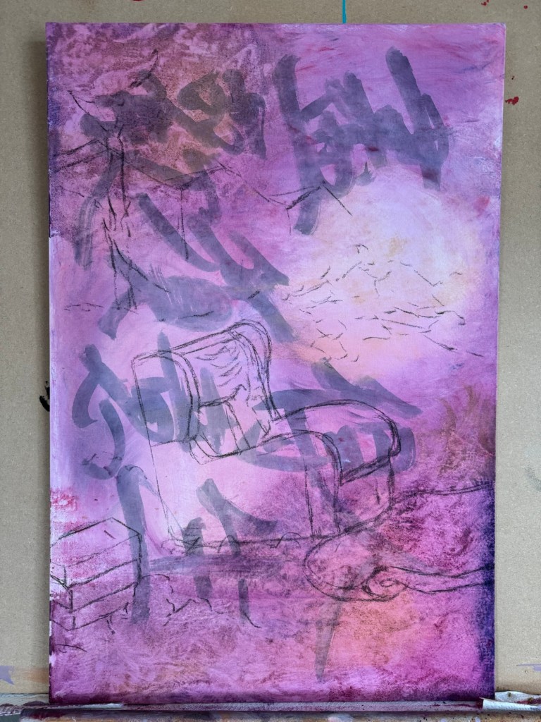
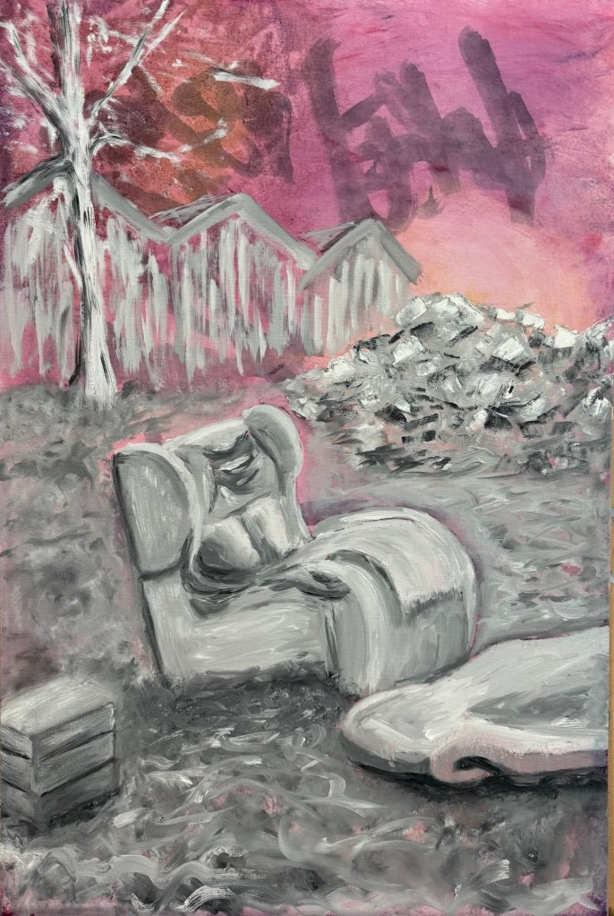
But what to paint?
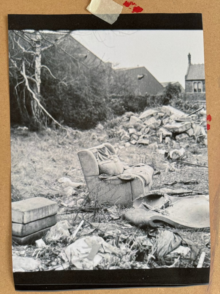
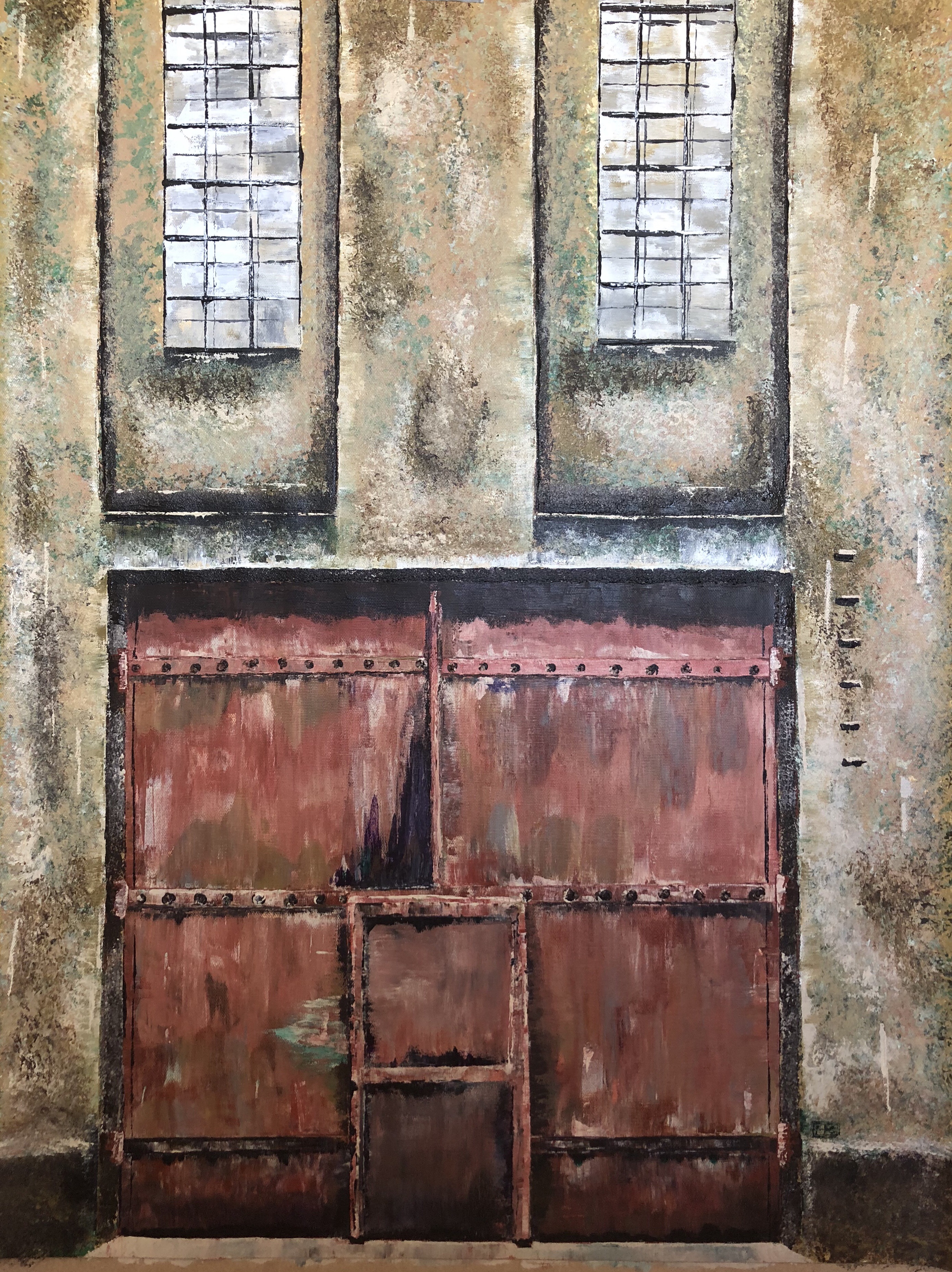
I decided to paint the ‘lone sofa’ photograph that I took when I went on a photography walk-about in Bristol. That was my favourite photo of the trip.
–
The canvas was put into portrait orientation.
–
Charcoal was used to layout the composition, choosing what to keep and what to leave out from the photo image.
–
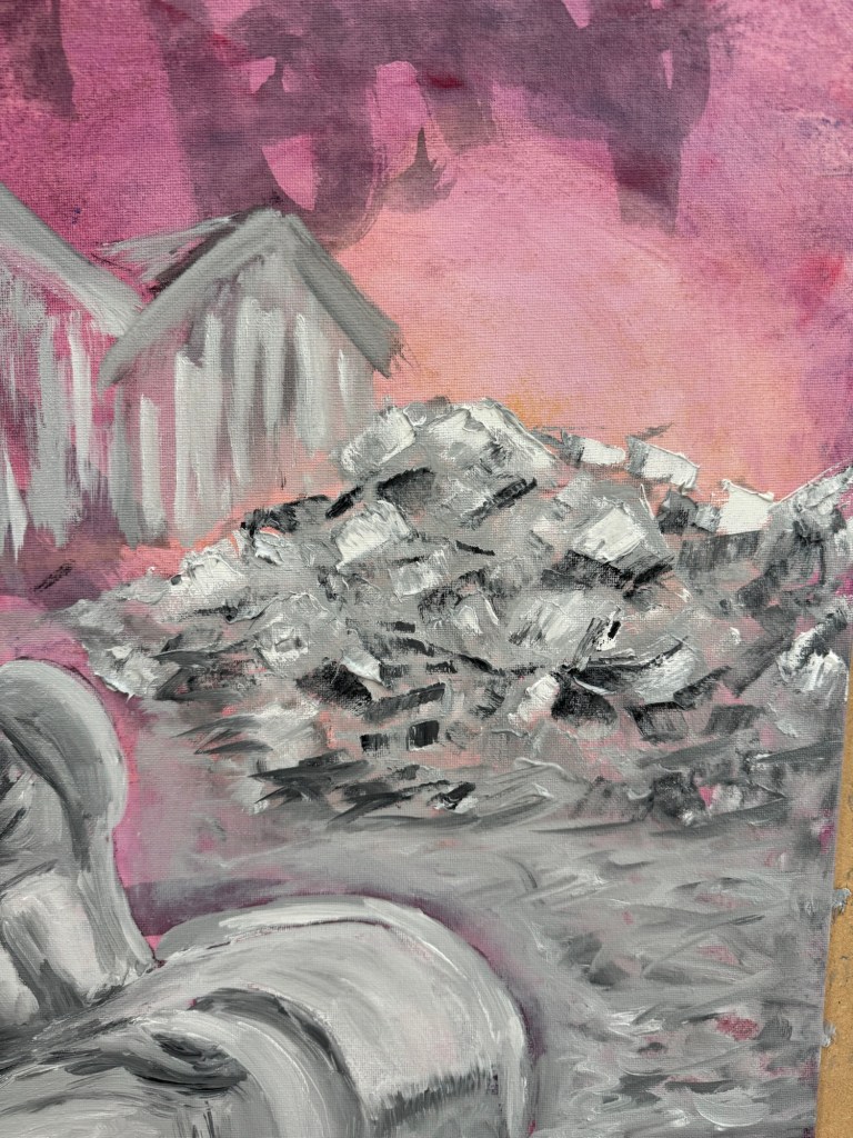
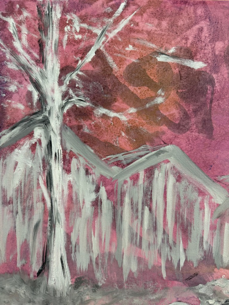
Close-up of areas of the finished painting:
A pile of rubbleA tree in winter
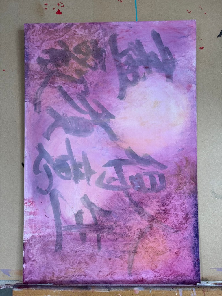
Finished painting:
–
REFLECTIONS
The oil experiments were not as useful as I had wanted – the outcomes were pretty much as expected and I can’t say I made much new discovery. So I need to do more research on this rather than just play.
The Chinese characters in the background were mostly hidden in the end. Again I could have used thinner oil. Or in this case, I feel it’s fine to obscure the background and use the Chinese characters as abstract patterns rather than to convey specific meaning.
The sofa scene – I mentioned in the last blog that I wasn’t feeling colourful so I opted for muted grey tones. That feels appropriate for this scene especially given the original photo was monochrome. I enjoyed the painting process which I tend to do most of the time. It was useful to focus on what to take out from the image composition, trying the less is more approach.
The piece of folded torn foam mattress on the floor was quite successful and also the pile of rubble. I think what was going through my mind was a dystopian scene and I wanted to create a dystopian effect to reflect my despair about the rapid change in world order, not sure if I really got that effect.
Although I started with wanting to do a response to Akunyili Crosby’s work. The outcome was quite far from that original intention. I think it’s because I made this painting over several weeks and my state of mind changed over that period and what I started off wanting to do didn’t seem relevant in the end. So I am comfortable with the change in direction.
LEARNING
To get more out of my exploration of oil, I need to do some research work, either online (YouTube) or books to gain new knowledge so I can take my experimentation to the next level.
It was only when I reflected afterwards that I was going for a dystopian theme. Perhaps if I had thought of that at the start then I could have created more of a dystopian atmosphere. I can research more about dystopian art. But how does that fit in with my transcultural practice? Should I go off on this tangent right now to risk having an incoherent body of work?
NEXT STEPS
Do research on oil painting techniques to learn new ways to use oil.
Do research on dystopian artists to see if that’s the vibe that I want to reflect my state of mind right now.
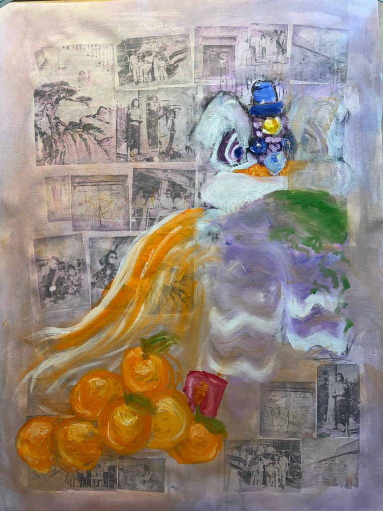
Following on from my Unit 2 feedback, I wanted to explore more ways of using oil. Also, from some photography work, I wanted to incorporate more photos into my work. So I started a new piece of work without knowing what I was going to do.
METHOD
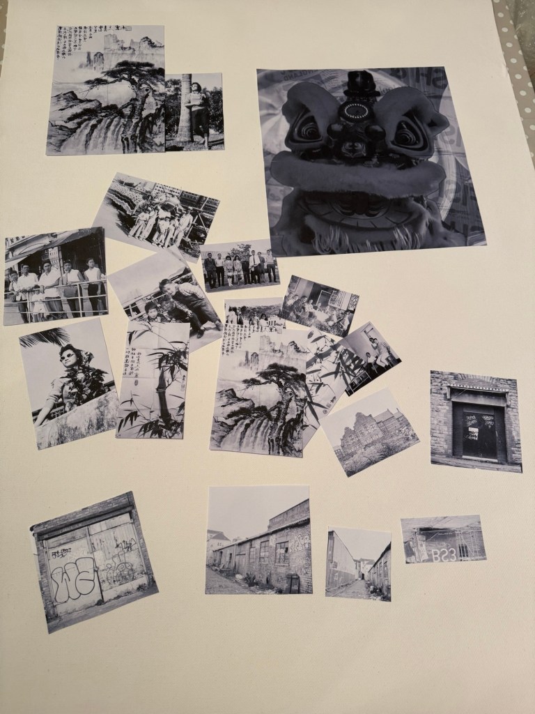
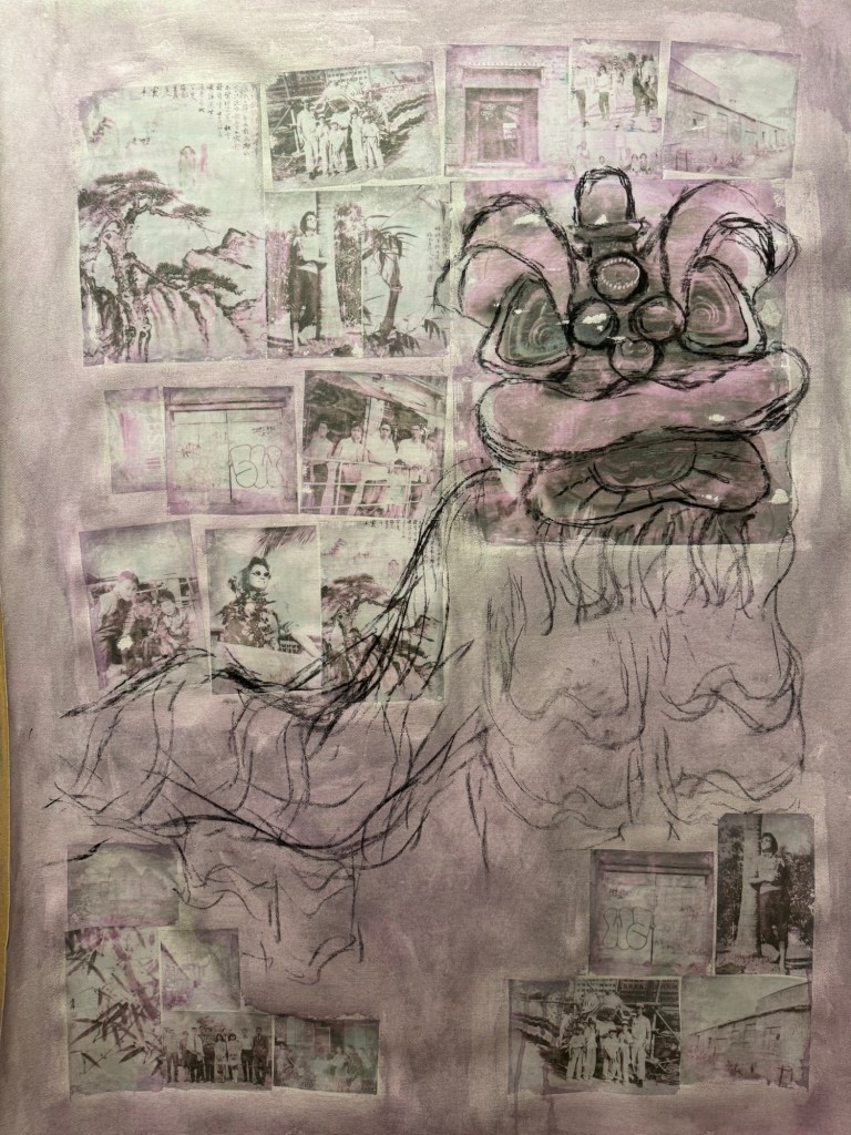
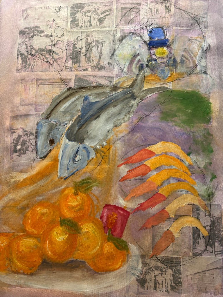
I made some black and white inkjet prints of various photos, some old family photos from Hong Kong and some recent Bristol streetscapes that I took with a medium format camera. Since it was around Chinese New Year time, I put in an image of a traditional Chinese Lion used for festive lion dance. I wanted to make that a dominant feature of the composition for the new year.
–
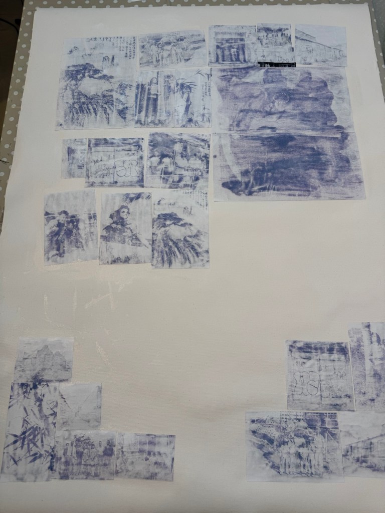
I used dispersion liquid to transfer the images onto a primed canvas:
Prints being stuck down using dispersion liquid
Printed images transferred onto the canvas. Due to the inkjet printer image, there was a pink / magenta tint to the transferred images.
–
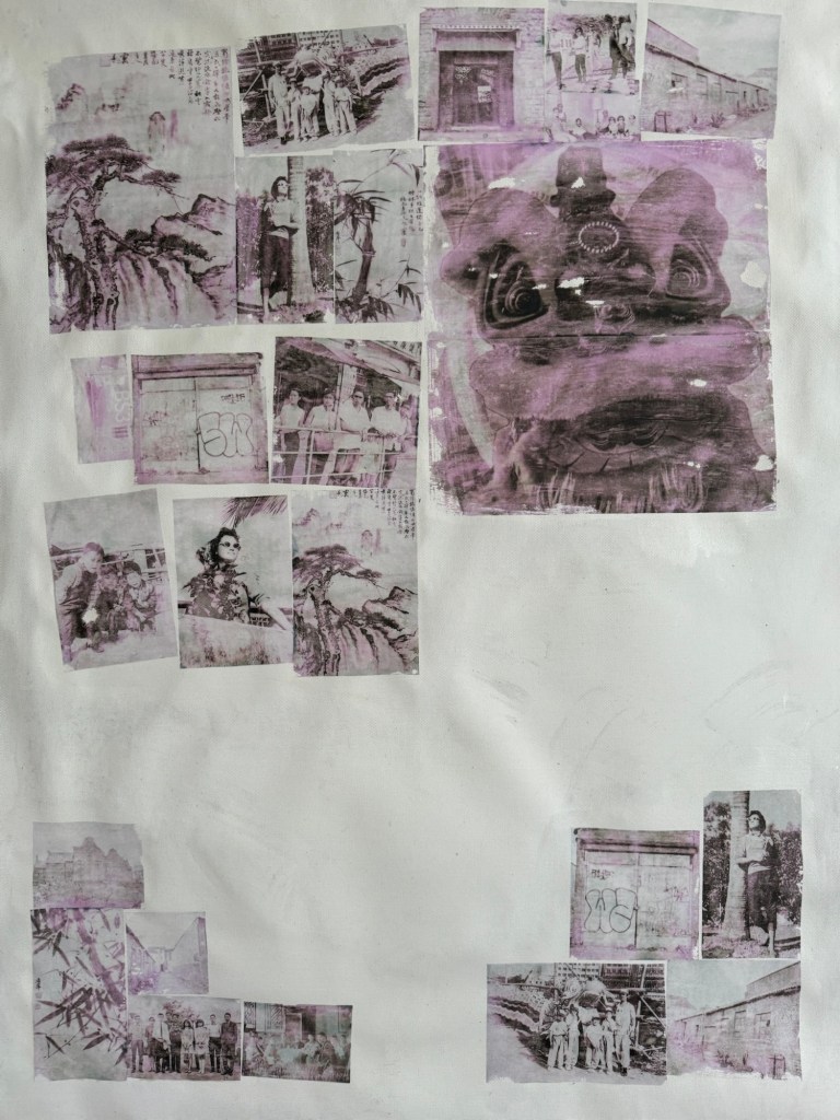
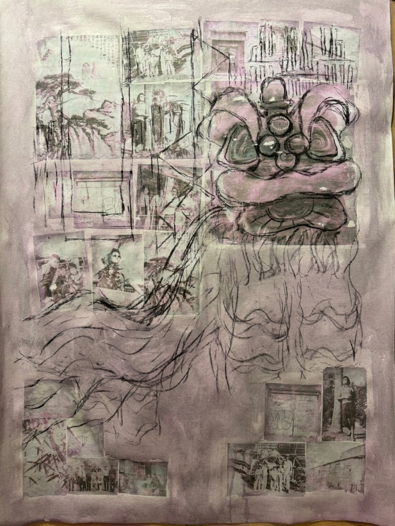
The canvas was covered in a thinned down acrylic wash:
–
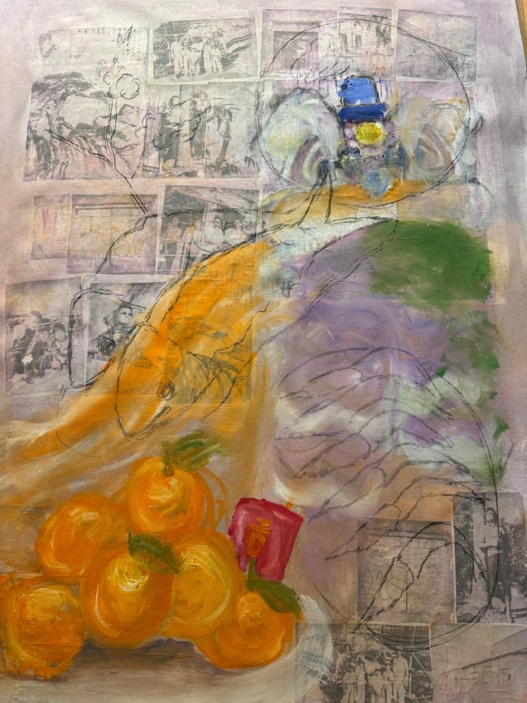
Charcoal was used to mark out the composition with the Lion being prominent.
–
Some iconic buildings from my childhood Hong Kong were added to the background.
–
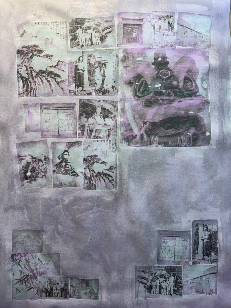
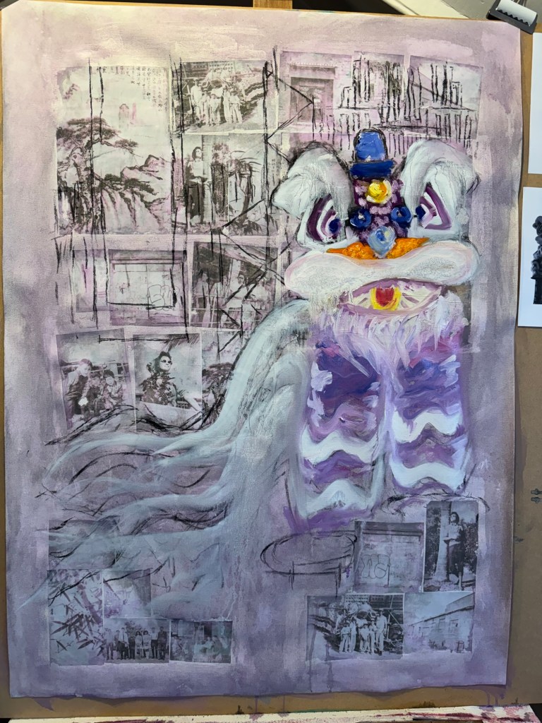
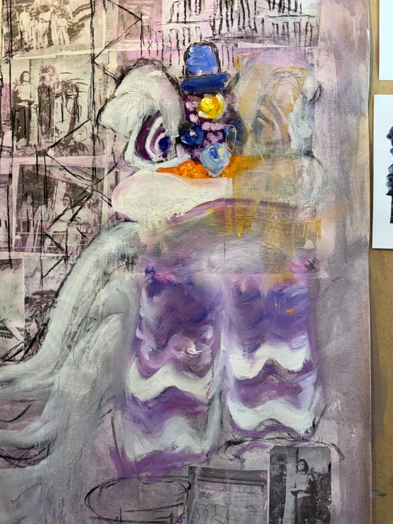
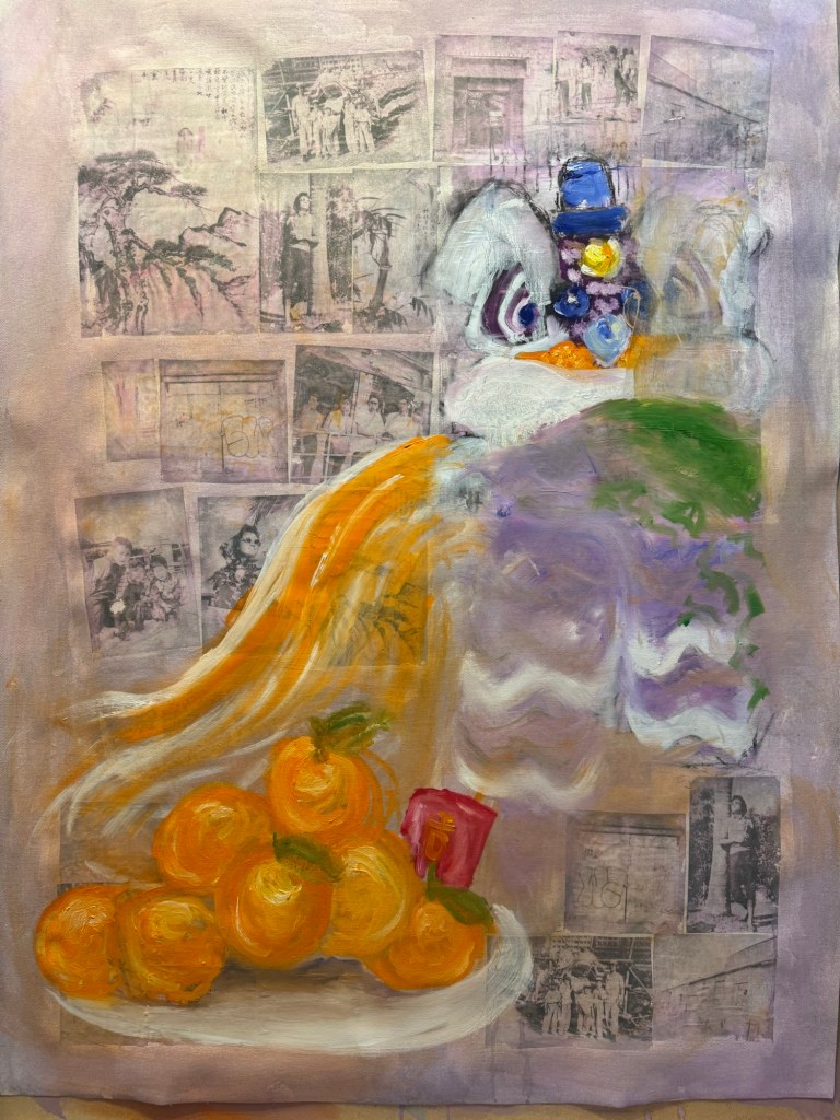
The lion head was painted in oil. But I was not happy with it, it looked too ‘cute’.
–
Since this was an experiment in oil, I started to wipe off parts of the image to create different effects.
–
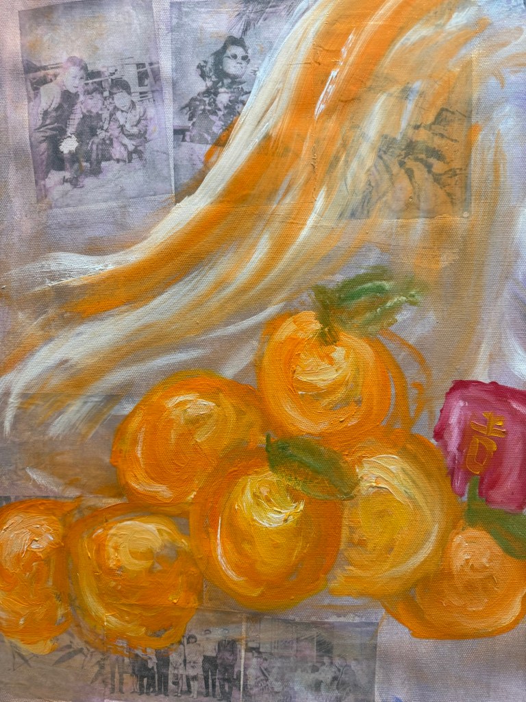
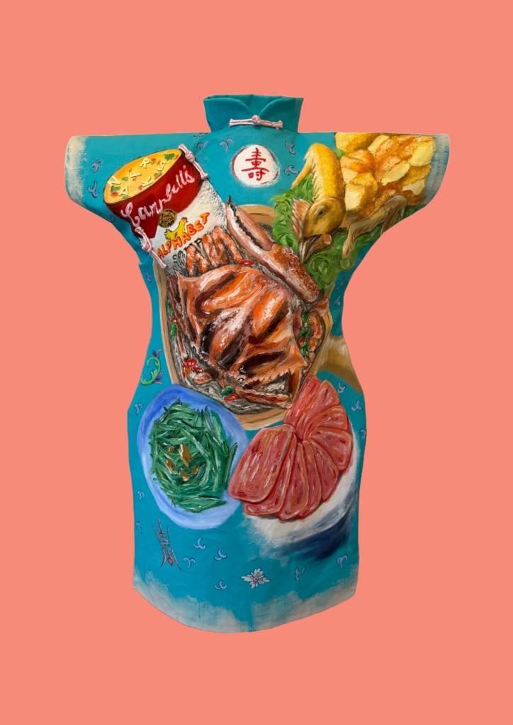
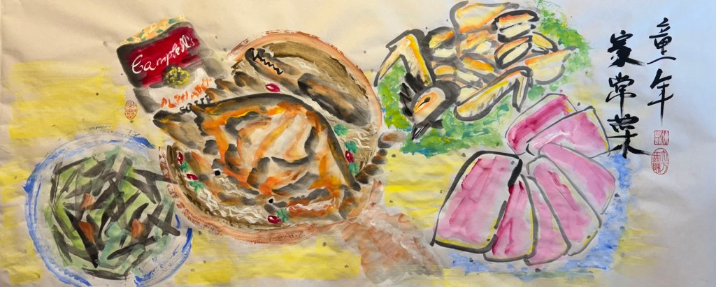
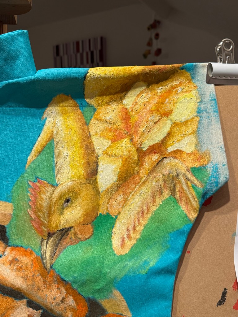
A pile of mandarin oranges were added as a traditional Chinese custom during New Year. I wanted to add typical Chinese New Year food to the composition in response to my decision after the Cheongsam series to do some Chinese food painting on a ‘normal’ 2D canvas:
–
I experimented with using looser brushstrokes and some thinned oil for the oranges:
––
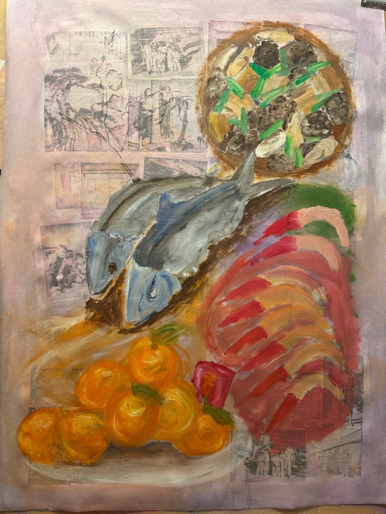
I was still very unhappy with the lion and decided to replace it with a complete family dinner with symbolic dishes for Chinese New Year.
Charcoal marks for New Year food dishes
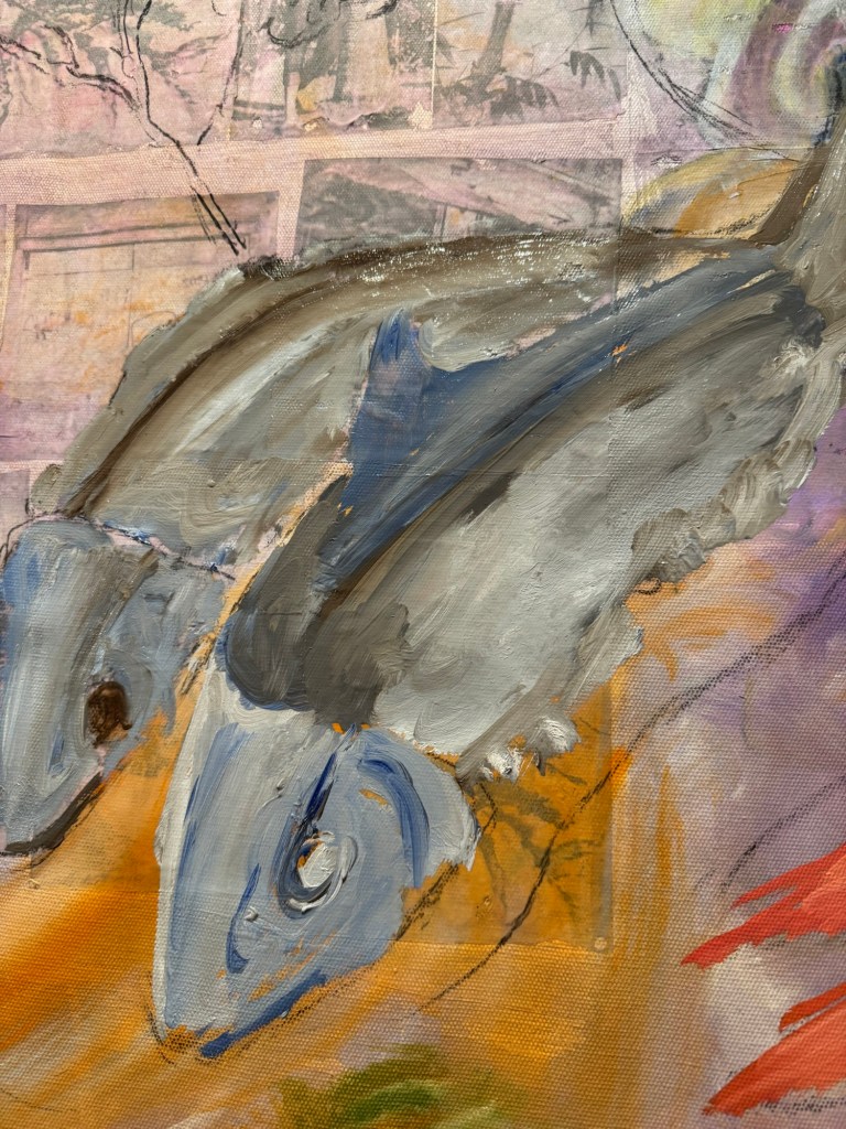
Thinned oil paint was used to mark out the shapes of the various dishes. Then more details were added to the fish first:
–Close up of fish (stuffed dace fish)
Other dishes were added:
–
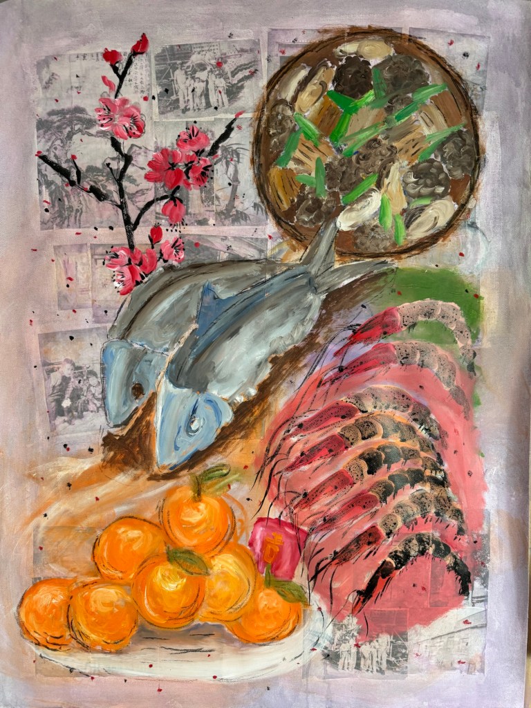
The prawns’ details were finished with Chinese ink and a peach blossom branch was added (also in Chinese ink) as it was traditional to have this plant at every home in Chinese New Year.
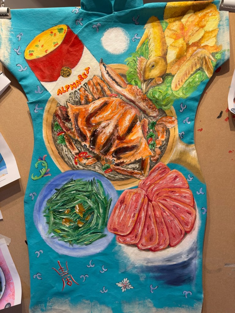
Finished painting – Chinese New Year dinner:
Mixed media on canvas. Size 102×75 cm
Menu:
Centre – stuffed dace fish. Symbol for having surplus meaning never falling short (of money). The word ‘fish’ sounds like surplus.
Top right – stew of shiitake mushrooms, dried oysters, pork belly and spring onions in fermented bean sauce. A traditional new year dish, a large pot is usually made and eaten over several days. ‘Dried oyster’ sounds like ‘good things’ meaning good things will happen.
Bottom right – prawns. Symbol for happiness. ‘Prawn’ sounds like laughter.
Bottom left – mountain of mandarin oranges with a red money packet (lai see), the phrase sounds like ‘gold mountain’ meaning good fortune.
Top left – peach blossoms, the blossoms opening signifies good luck and good fortune.
REFLECTIONS
I am glad I didn’t continue with the lion. It was not how I wanted as it was too detailed and cute. I was happier when the Chinese dinner idea started to develop. I was mindful that I wanted to experiment with Qi Baishi’s idea of painting between likeness and unlikeness. I was hoping the thinner paint and looser brushstrokes would give me more scope to express the unlikeness. I think I made some progress compared to the Family Dinners on the Cheongsam canvases, but there’s still some way to go.
I experimented with incorporating photographs but I think in the end they didn’t really add anything as most of the images were covered up. Perhaps even thinner oil would have left the photo images still partially visible.
I have never managed to combine oil and Chinese ink satisfactorily, I think using the combination on the prawns worked out well. I believe the thinned down oil helped the combination to work so worth bearing this in mind.
LEARNING
Try experimenting with even thinner oil paint and other techniques to apply paint.
Think more about what I want the photos to do (e.g. how much to be revealed) if incorporating photo images, then dilute the paint accordingly to achieve the effect. The experiment here was not fully thought through as I was just playing, but it provided good insight into how easily it was to fully obscure the photos.
Overall the painting was looser and less organised compared to Cheongsam Family Dinners, but I need to be more courageous about achieving unlikeness. Add more of myself to it and think about what feelings and intentions I have – not intentions regarding the composition, but what I’m trying to say.
NEXT STEPS
Experiment more with oil and different applications.
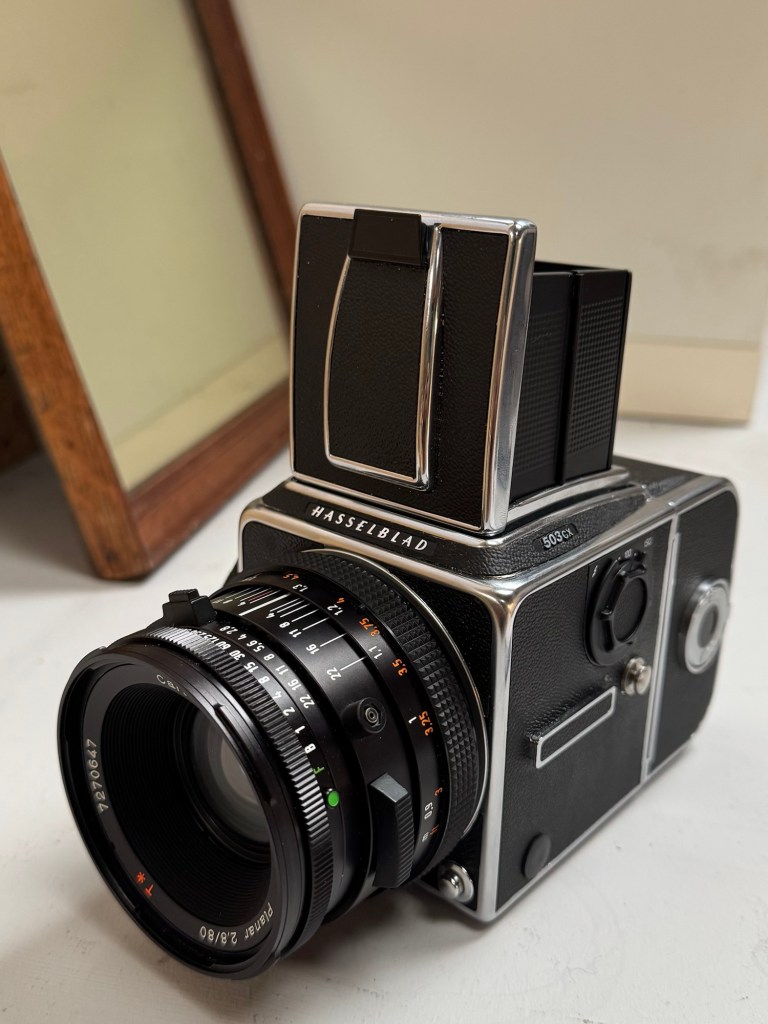
A few months ago, I was given a Hasselblad 503CW medium format camera by my late father-in-law. He was a keen photographer and this camera was his pride and joy. So it is very meaningful for me to have this beautiful and iconic camera. I have recently started to explore incorporating photography into my practice, hence I decided to attend a one day workshop in Bristol to learn how to use this camera properly to make the most of it.
EXPERIENCE
This is the Hasselblad 503CW film camera:
–
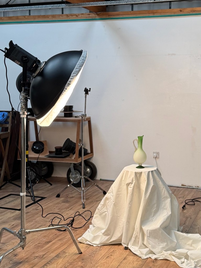
The workshop started with some indoor still life work in the studio.
–
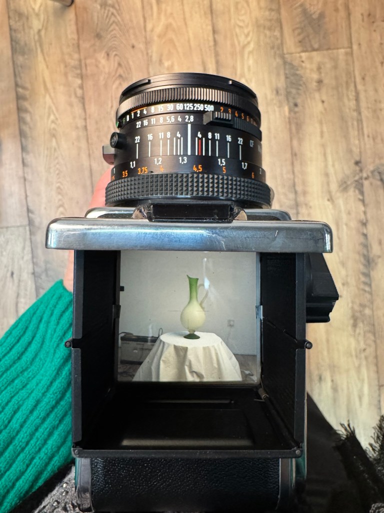
The camera has a default waist level view finder. It also came with an eye view finder and I experimented with both. I was very interested in the waist level view finding approach as it’s unique to this type of cameras.
–
Learning to load the film was very important because I have not loaded a film for decades since I started using digital cameras.
–
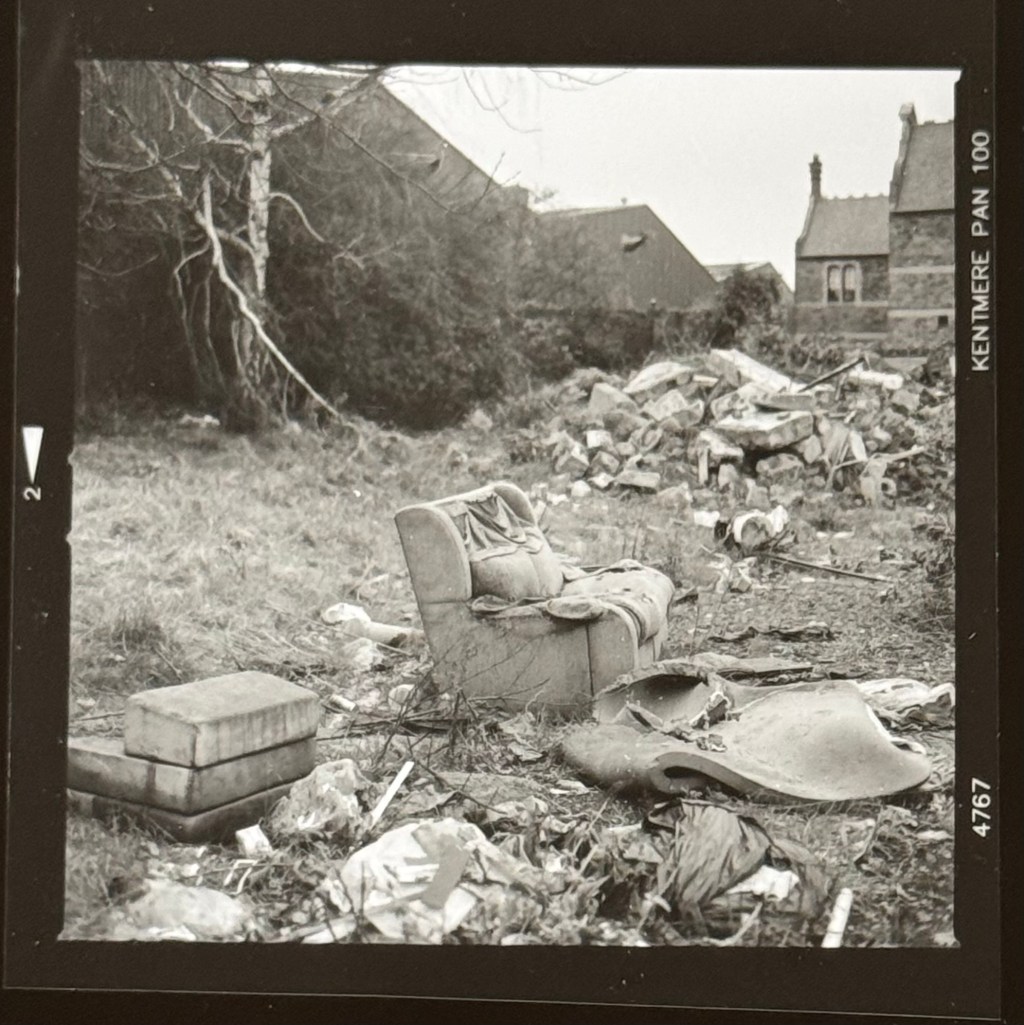
The afternoon started with a walk about in the nearby area to take some outdoor streetscape photos. The studio was in the backstreet of an industrial area. The kind of ‘forgotten’ streetscape that really appeals to me. I took 12 photos (the film was a 120 with 12 exposures per film). Below are a few photos and a video showing all 12 that I compiled paired with a soundtrack ‘London calling’ by The Clash that particularly resonates with me at the moment with what’s going on in the world.
The first shot was an abandoned sofa. The studio is based in a warehouse that was previously a large furniture shop/warehouse and I have been there many years ago looking for a low cost sofa when my husband and I were young. So I was excited to see this sofa and I had to take a shot. Was it a left over from the warehouse or just coincidence that it’s there? Was someone trying to make a home there?
–
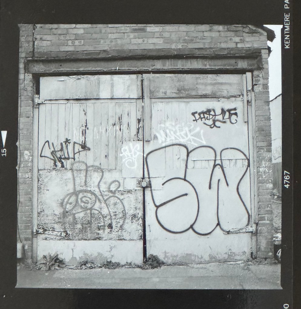
Graffiti on a door. Graffiti is such a large part of the Bristol street culture and I have always had a thing about doors, I love doors:
–
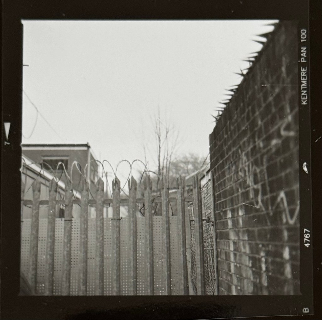
There are three different types of barb wire in this shot. What kind of world needs three types of barb wire in one place?
I was very happy with the workshop and felt confident to use the camera as a result. It was a great studio run by an enthusiastic couple and there are excellent dark room facilities that I can use in the future for developing and printing photos. I can also print photos onto canvas there which is great.
I loved going around the industrial area in Bristol. It reminded me of my love for industrial heritage landscapes – that was my passion before I started exploring transcultural art. I think it relates to my engineering background. I have lived my life in industry and engineering for 30+ years and my history is equally deeply rooted in industry as it is in my transculturality.
Doing the ‘forgotten’ streetscape photography reminded me of projects that I had done in 2018 when I first started learning to paint. I particularly like and am fascinated by late 19th/early 20th century disused power stations – for me, they are monumental industrial cathedrals. Seeing them or any industrial sites especially power stations make my heart sing.
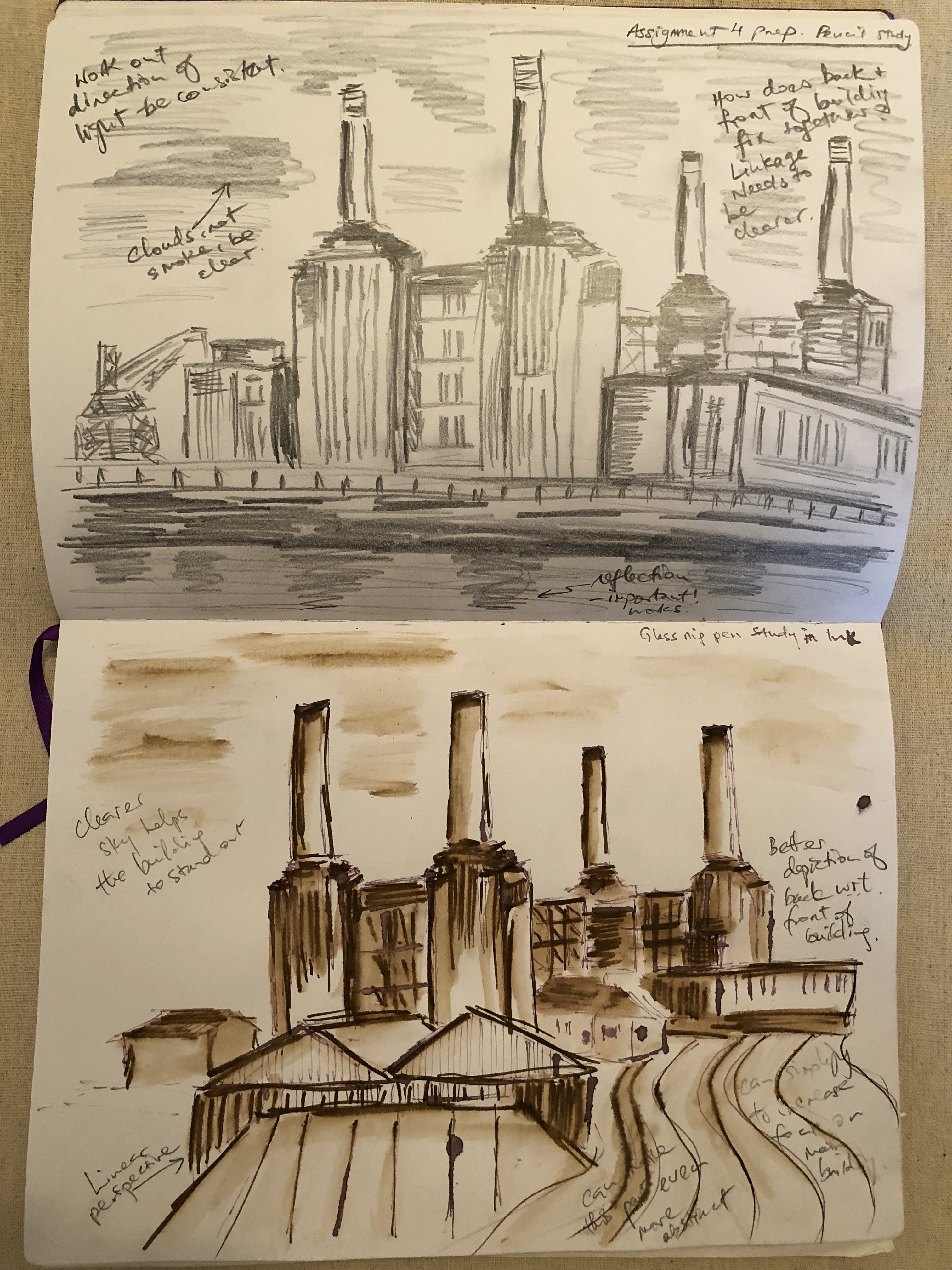
My 2018 drawings study of Battersea Power station:
–
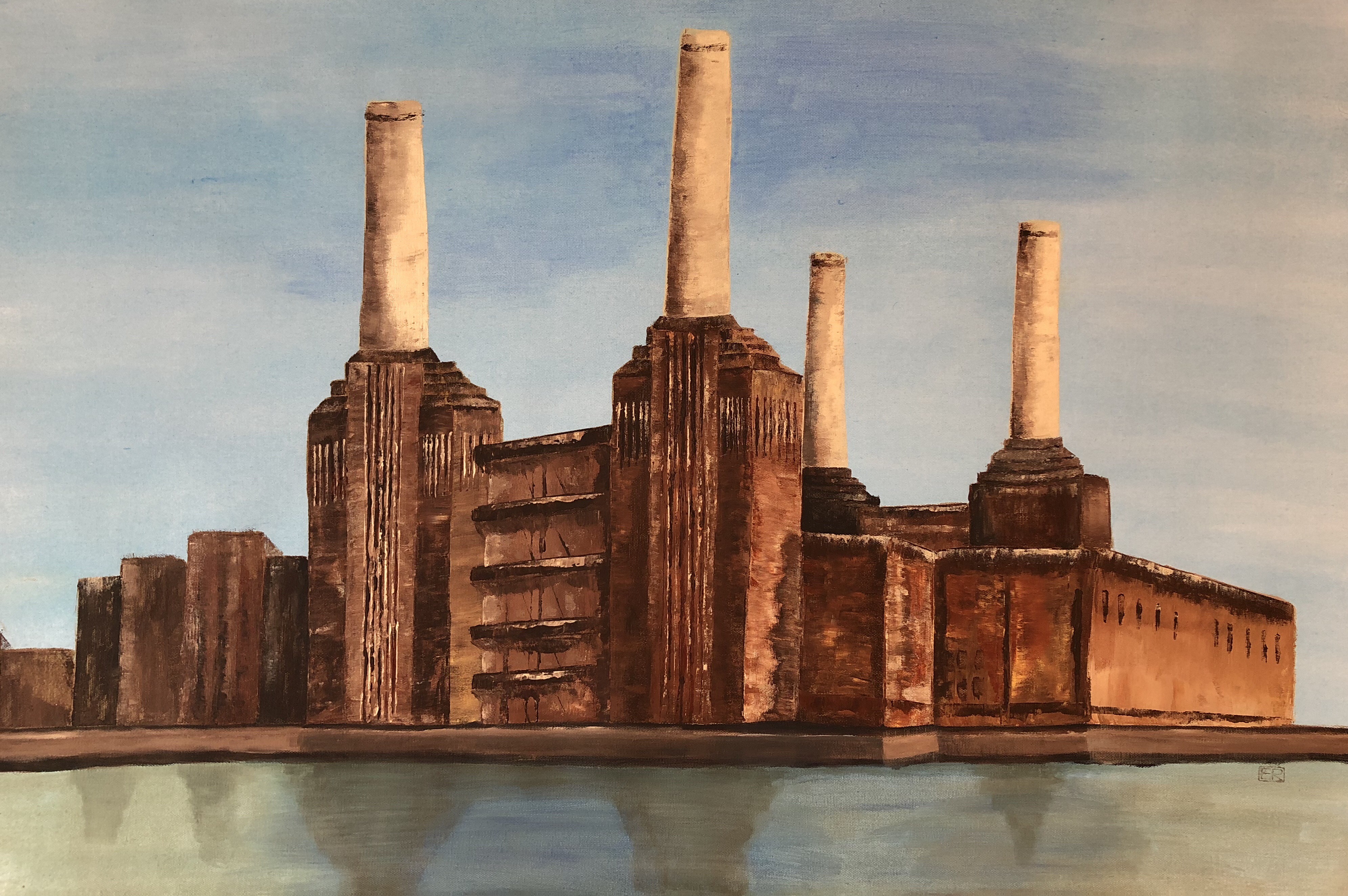
A study of Battersea Power Station (before all the recent year’s’ development). Acrylic on canvas:
Battersea Power Station (2018)
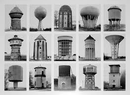
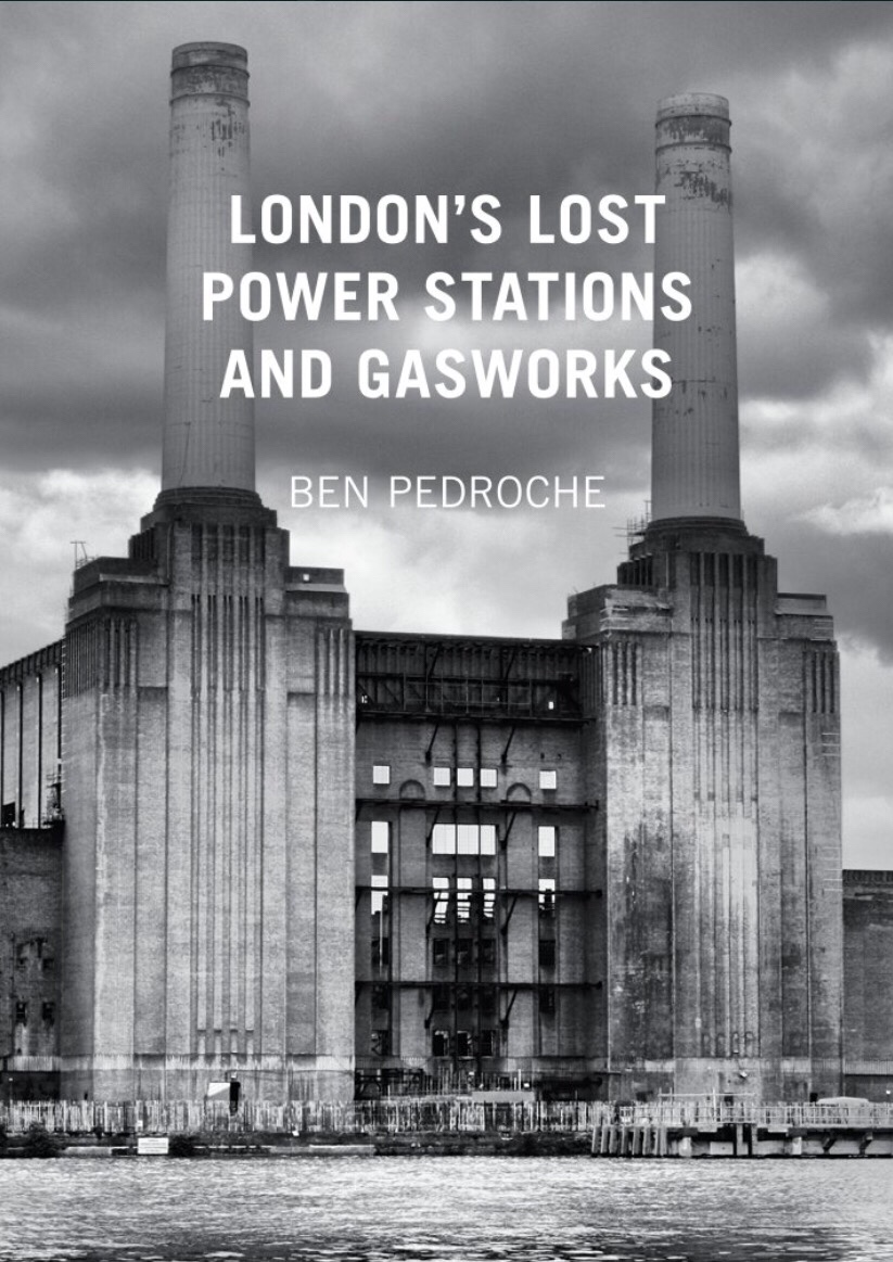
My work in this area was inspired by two German photographers, Bernd and Hilla Becher, of the Düsseldorf photography school. I admire their New Objectivity style:
This book was also very useful to help me in historical insights and locating sites in the UK:
–
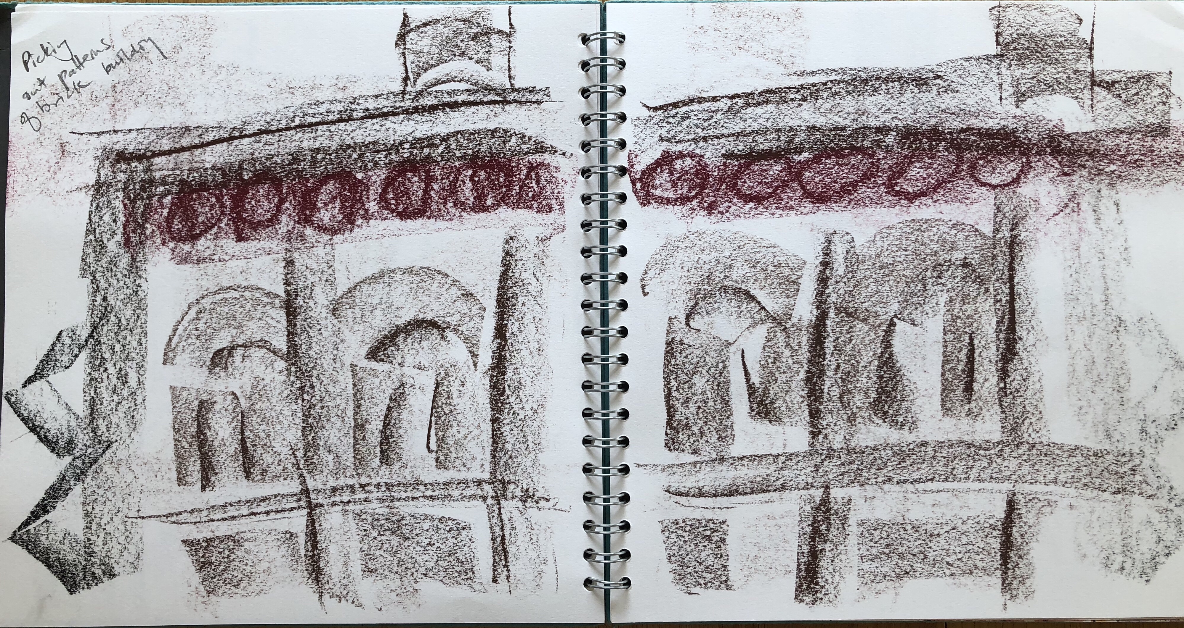
After reading the book, I visited Lots Road Power Station in Chelsea, London. It was originally built to power the whole of the London Underground and subsequently decommissioned. My on site study drawings:
–
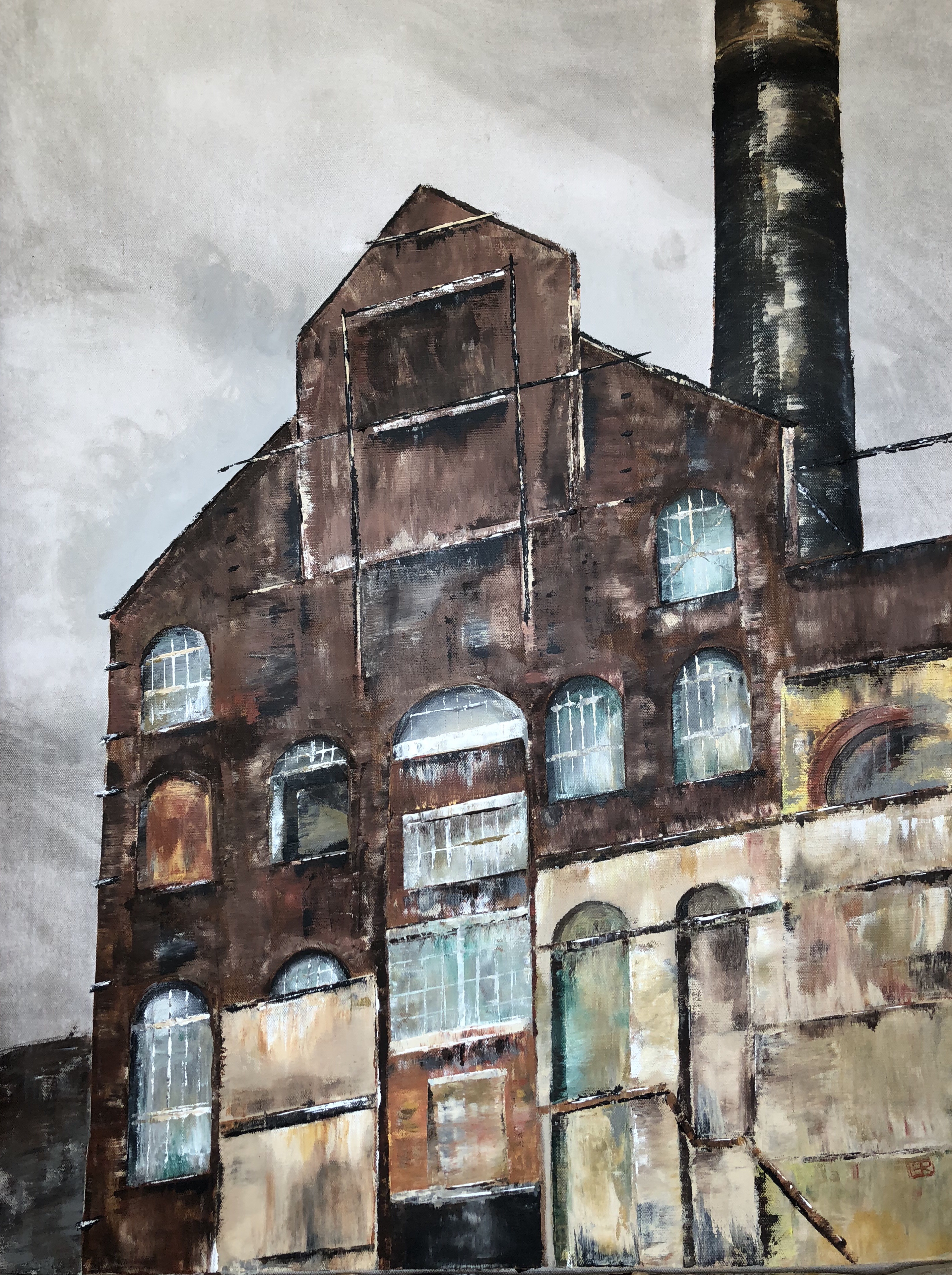
My 2018 painting of a partly boarded up frontage of the Lots Road power station:
London Lots Road Power Station (2018)
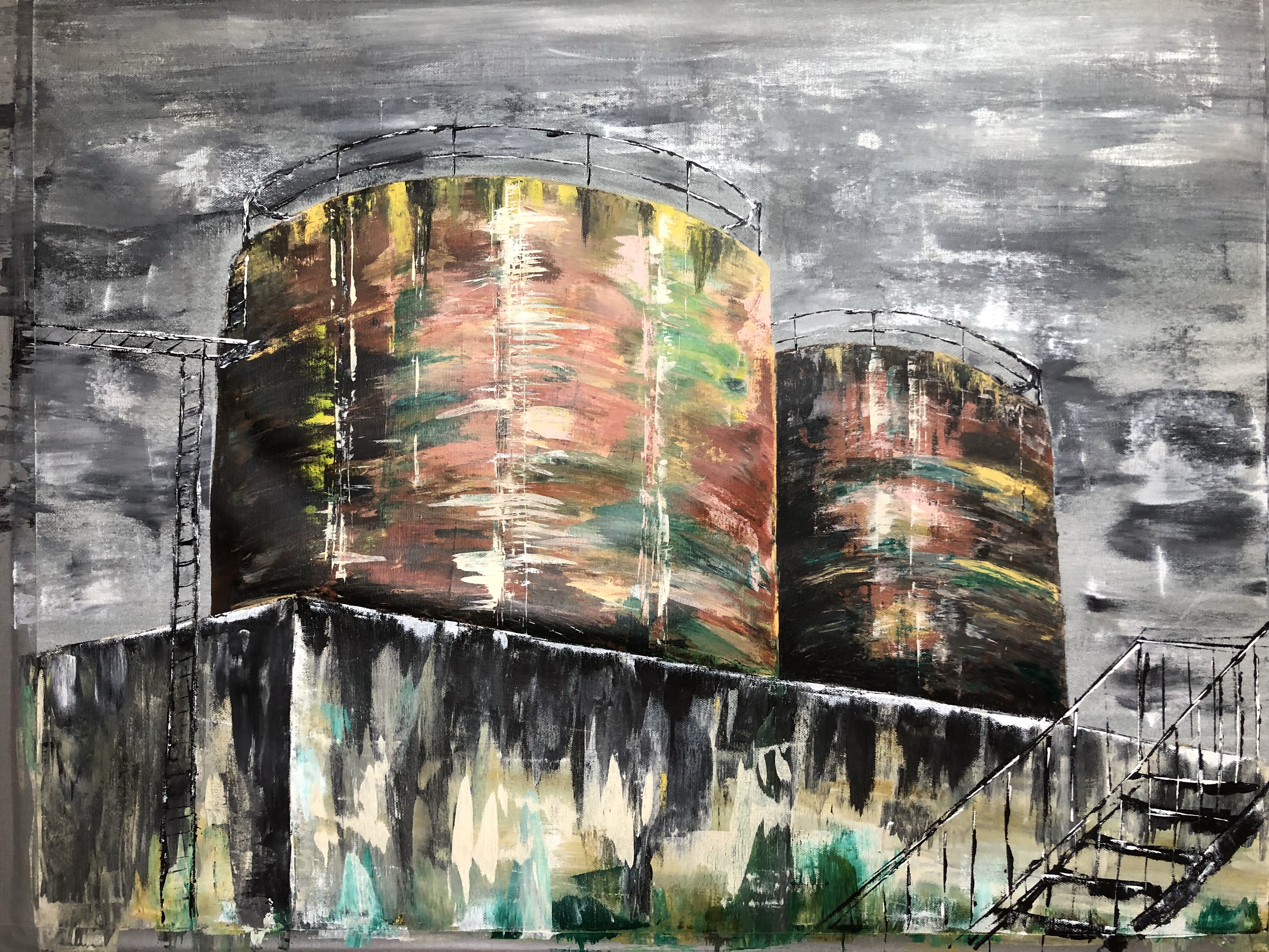
Through a work trip, I had the chance to visit the Rotweil power station in southern Germany. It powered the gun powder manufacturing locally.
Here is an acrylic painting of a door at Rotweil:
Rotweil Power Station (2018)
This painting was subsequently part of a group exhibition:
–
The tanks at Rotweil power station:
Rotweil Power Station (2018)
FURTHER REFLECTIONS
I have been reflecting on what made me reconnect with my ‘forgotten’ industrial landscapes work. I think it’s because:
– Having done several Cheongsam paintings where I have used bright colours to depict food as cultural metaphors and childhood family dinners based on memory, I am right now not feeling in the right state of mind to paint more colourful paintings. They seem frivolous given what’s happening in the world.
– I have been enjoying painting in bright colours – not sure whether I naturally have a preference or I purposely chose bright colours to mask unpleasant childhood memories. Bright colours and humour are great ways to put a certain slant to the story and perhaps it’s my way of taking control of the narrative. However, exercising that control and the way of storytelling take a lot of energy. It can be energising and draining at the same time. Perhaps it’s a form of renewal like a snake shedding its skin.
– However, I have recently been feeling angry and despair with global politics drastically changing our world order and I don’t think I can do cheerfully bright colours right now.
– Perhaps forgotten and industrial streetscapes somehow make me feel secure. There is no pretending – it is what it is, there is nothing to hide. The anti-aesthetic approach really appeals – just like the photos from the Düsseldorf photography school of New Objectivity. I find those images comforting. Bernd and Hilla Becher’s work are described as ‘focusing on precise, methodical documentation of industrial structures, often using a detached and objective approach’.
– Perhaps I am right now looking for detachment and objectivity. I can’t take anymore unsubstantiated claims, confusion and uncertainties – I need facts. The world needs facts.
– I am ranting.
LEARNING
I appear to be at another junction in my practice. This one I hadn’t planned for as I believe it has arisen due to recent world events. I don’t know exactly how or where I want to take my thinking here. I want to somehow incorporate this ‘no frills’ approach with my transcultural work, but how? I definitely want to do more with the film photography and I need to think how to incorporate that into my practice.
I need to discuss this with my tutor.
NEXT STEPS
Continue to think about where to go from here for my practice. Discuss with my tutor.
Do more streetscapes with the Hasselblad camera and think about how to incorporate photography into my practice to expand my visual arts ‘tool kit’.
As part of my research to progress my painting practice, I am reading this book about Qi Baishi’s artwork and philosophy:
–
Below are some key points and notes I made from reading the text.
Poetry and soul in painting:
Within poetry there is painting; within painting, poetry.
A poet loves the moon and plum blossoms because his heart exists in moonlight and flower fragrance. Moon and plum blossoms are things on which he pins his heart and soul.
The mood of the painting comes from thinking which in turn comes from images.
The limited brush work in the painting evolves and extends continuously according to the logic of life and imaginative logic.
The artist’s mood cannot be fully expressed in the painting; only in part does it locate in the painting, and in part beyond it.
Rules of Chinese painting composition:
Concise, concise and concise – the characteristics of Chinese poetry and freehand brush painting.
Conciseness differs from simplicity. In conciseness, images are refined from complex and detailed phenomena.
Play of space and levels of meaning engage the imagination and intellect and stimulate them.
Conciseness is the law of composition in Chinese freehand brushwork.
Concise images are used to abstract and condense.
Omit irrelevant features and represent with a few strokes. Based on understanding of form.
Likeness and Unlikeness:
Traditional Chinese painting relies on painting from memory and feelings. Unlike western art that encourages sketching on site.
So the flowers in Qi’s works are flowers of both reality and imagination. They are flowers which have been assimilated by the painter’s heart and are permeated with emotional colours and the light of the painter’s ideal.
Qi’s motto: ‘The marvel of a good painting lies between likeness and unlikeness.’
Likeness means the concomitance of an actual object with the painter’s understanding of it. Unlikeness refers to the artist’s abstraction of the object in his treatment of it.
Unlikeness is a phenomenon of sight, likeness of the heart. [Note: I believe the translation of this has swapped the sentences. I think it should be ‘Likeness is a phenomenon of sight, unlikeness of the heart.’]
Concise composition depends on both sight and heart, and also on the combination of realism and romanticism.
Regarding the rendering of light – it is derived from the mind’s eye of the artist thus represent a synthesis. Whatever stands out is bright, obscured is dark.
More on composition:
The opposition and unity in contradictions.
Utilising contrasts.
Qi contrasts sparse and dense, a few scattered twigs on which appear an abundance of fruits and flowers.
Contrasting – large splashes of heavy black ink against large white spaces.
Sturdy pines contrast with tender, delicate grasses; quiet rocks with chirping birds. Wisterias spreading randomly with flowers in neat arrays.
Composition is the specific application of dialectics in its combination of images. Both opposite and complementary to each other. Each shining more brilliantly in the other’s company.
Qi’s motto in fullwith explanation:
‘The marvel of a good painting lies between likeness and unlikeness. If it is an exact likeness, it is catering to vulgar tastes, but no likeness is simply cheating.’
My analysis of some of the work from the book:
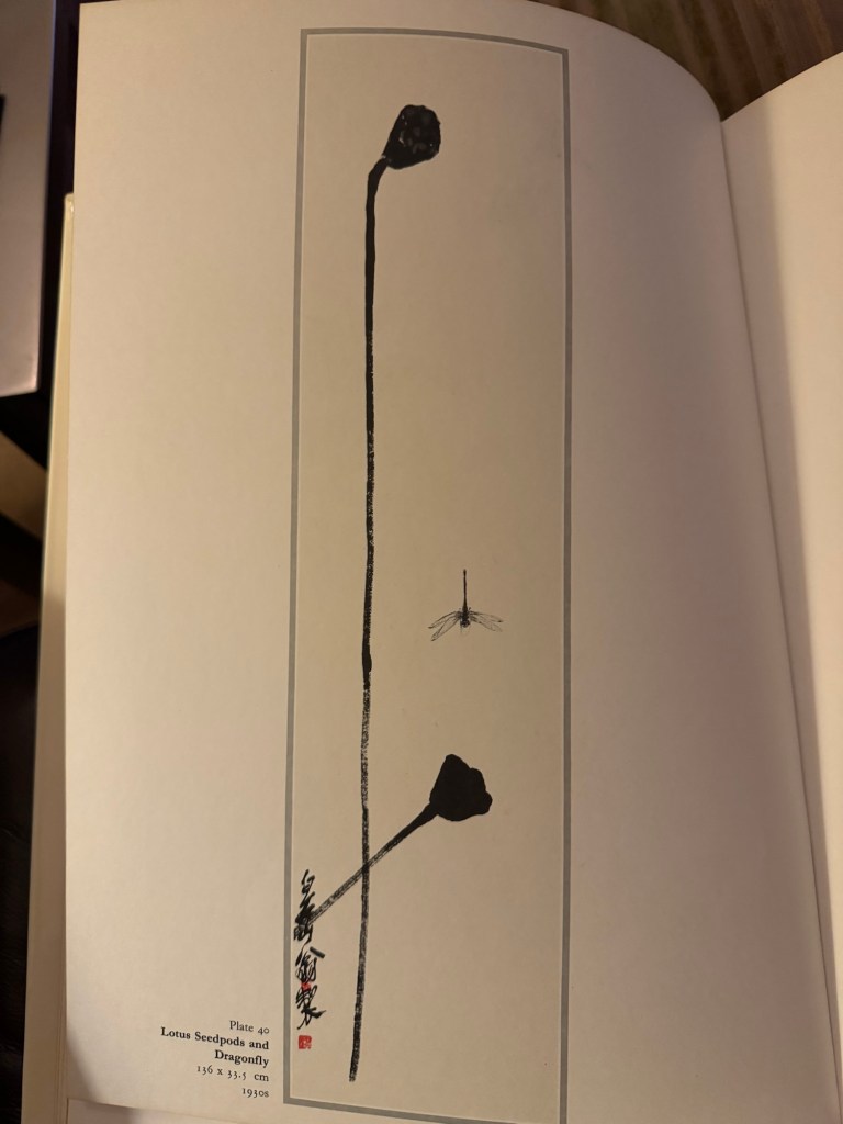
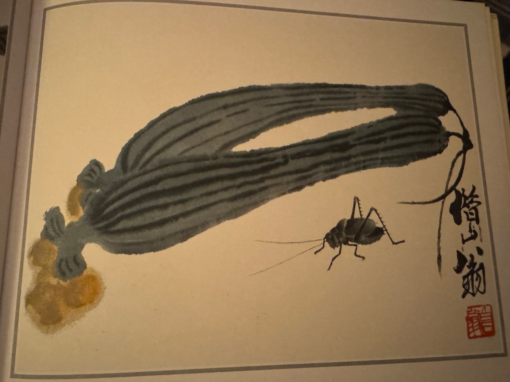
Composition – extensive use of negative space as a form of conciseness, removing the irrelevance.. Contrasting the lack of details (abstraction) of the lotus see pods to the detailed dragonfly.
–
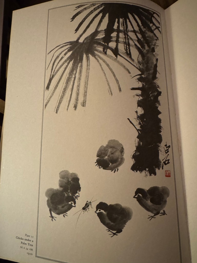
The conciseness in the depiction of the tree especially the leaves. The chicks are also reduced to a few round shapes with soft edges but the insect is detailed. All other background has been eliminated.
–
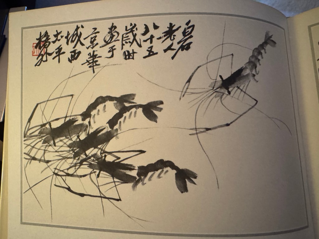
Shrimps are one of Qi’s most famous images. There is no background depicted, water, plant life or sea/pond beds have all been eliminated. But there is no doubt that the shrimps are in water and in movement. The depiction of the shrimps’ pincers and tentacles gives the sense of movement. The clustering (3+1) and distribution of the shrimps give a sense of an ongoing story where his painting is a snapshot in time. Qi has spent hours observing shrimps and their movements then painted them from memory thereby adding his own interpretations.
–
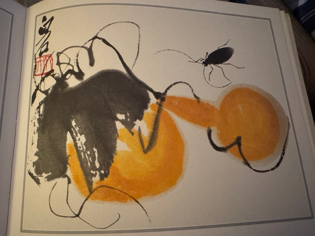
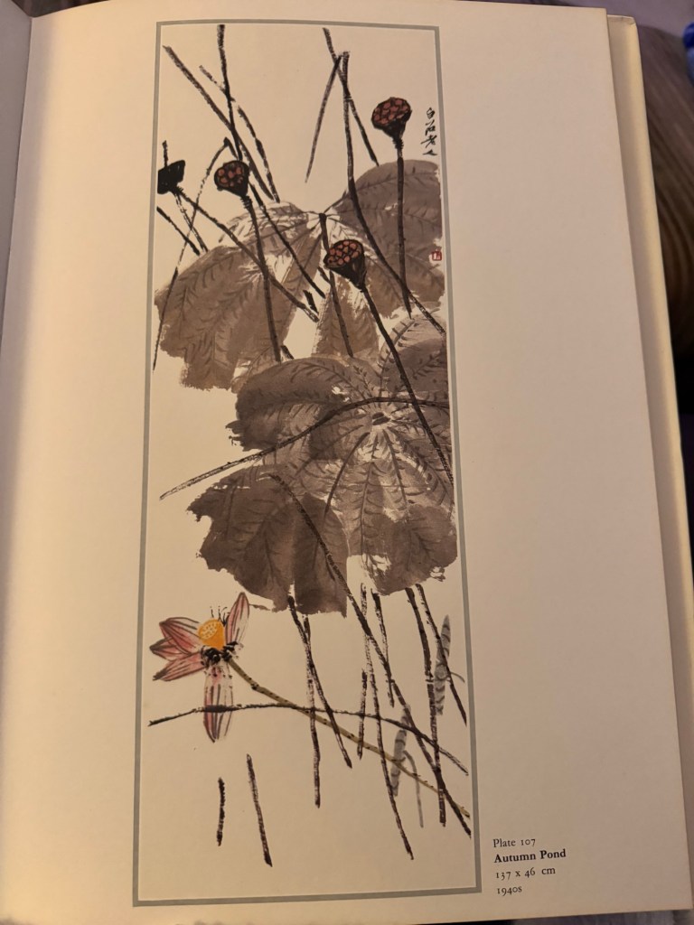
The three paintings below all show highly abstract plant or fruit with more precisely depicted elements such as insects:
–
Neatly laid out flowers all point up among random branches.
–
Contrasts of neat streams of flowers among expressive and random branches:
–
REFLECTIONS
What has been useful is the confirmation that there is nothing ‘magical’ about painting; there isn’t some kind of concept on a higher level that only certain ‘blessed or gifted’ artists can achieve. As for talent, that is subjective – I believe. Like art, a ‘talented’ abstract artist may produce art that is undesirable in some people’s eyes yet totally desirable for others. Hence I believe talent is subjective.
But painting is difficult – this was said to me by one of my fellow MA students who is an experienced painter. I couldn’t agree more. That’s also why I like painting. It’s a challenge that can be rewarding or frustrating – both are equally energising. Thinking about painting and art making consumes my mind and that must be why I only allowed myself to get deep into it after retirement. Perhaps I knew it would become like this.
I recently started learning about photography, I thought about incorporating that into my practice or even developing that into a main part of my practice – photography is an artistic as well as scientific subject hence I thought it would appeal. I attended a six week course to learn digital photography. I enjoyed the learning very much but I wasn’t as ‘bothered’ as I thought I would be. I think it’s because creating an image was too easy – doesn’t mean the image was any good, it was just too ‘quick and easy’ to get an outcome. Especially with a good digital camera (I bought a used Canon EOS 77D for the ‘new hobby’). The photography tutor was excellent and we did some good walkabout photography exercises in town. Within 20 minutes of walking around, I could produce a large number of images to choose from and there would typically be a couple that felt satisfactory. That’s too quick for me. There was little agony, self doubt or deliberation involved. Perhaps it’s my rebellion against the instant gratification culture that so dominates modern life and I want to exclude myself from that culture. It’s not because I think that’s wrong or want to judge, I just need a slow and drawn out agony to feel alive! In writing this paragraph, I have just come to realise why I paint.
Having said all that, I was recently given my late father-in-law’s treasured Hasselblad medium format film camera. It is a work of art in itself and the quality of engineering (all mechanical) is beyond words. I feel so privileged to have it. I have written another blog to capture my first experience with using it. I think analogue film photography is a different game to digital photography and the slowness of the process feeds my need for the excitement from a ‘drawn out agony’. All the anticipation. I am captivated.
Back to painting and likeness and unlikeness… I learnt a lot about composition in Chinese painting. That was very helpful. However, I also work extensively with composition in western art which is a different approach. So once again there is conflict in how I would bring the two together. Another opportunity to explore the third space where two cultures come together to create something new…
Another key learning is the likeness coming from sight and unlikeness coming from the heart. The latter being the artist’s influence or interpretation of the reality – this I have not done so much of and I need to work on this aspect a lot more. I recognise that I often rush into a painting because I’m so excited about a new idea. I have learnt that I need to take time to think about what and how I feel about the subject, what I’m painting and let that feeling play out more on the canvas with the subject I’m painting being the ‘carrier’ of that sentiment. Whoa! Easy to say!
Perhaps I can do some free writing before starting a painting to get insight into my thinking and feelings about whatever I’m making.
LEARNING
– Use conciseness and negative space to create impact and tension on the canvas.
– As I approach a painting (or any artwork), think more about how I feel about the topic and less about the detail of the representation. Incorporate more the heart and less of the sight to achieve a better balance of likeness and unlikeness.
– I have learnt about why I paint through this research and my reflections.
– I have yet to resolve the conflict between the different approaches between Chinese and Western art composition. What does transcultural mean in terms of composition when they are so different?
NEXT STEPS
– Take my learning forward to my next painting especially the part of applying the heart more to create unlikeness.
In my search and contemplation about ways of painting, I turned to a Chinese artists that I admire – Qi Baishi. His famous saying, ‘Painting must be something between likeness and unlikeness’ inspired me to experiment with different ways to paint my Family Dinner #2. Here is an image of my original painting in oil on Cheongsam shaped canvas:
–
METHOD
I started by doing some quick paintings of the individual dishes using Chinese painting materials: Chinese paint brushes, ink and rice paper.
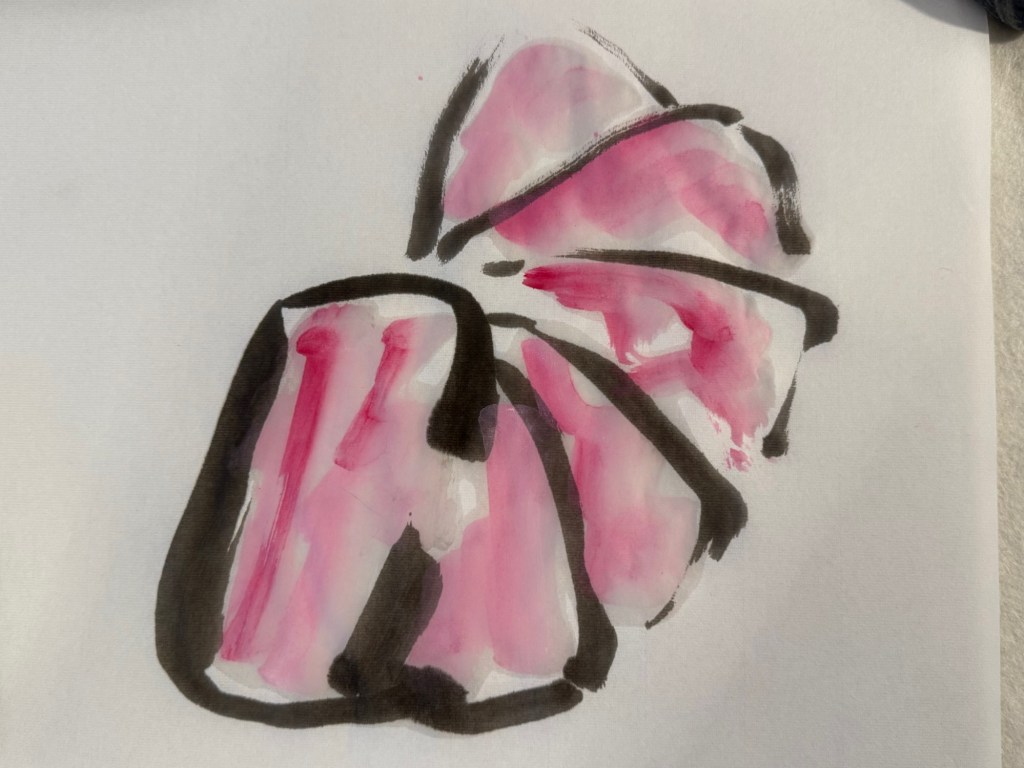
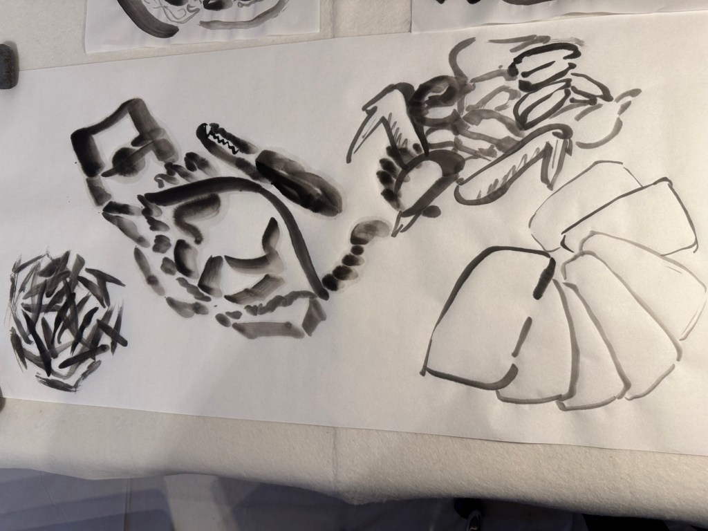
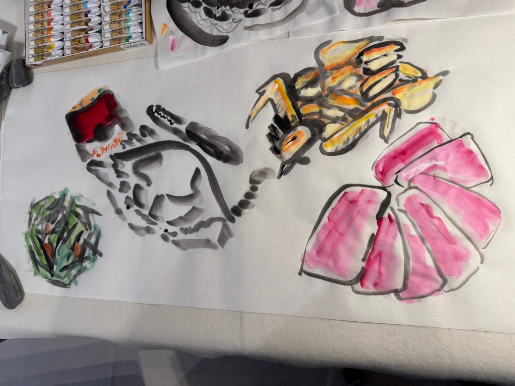
Flower crabPan fried sliced luncheon meat
Here is the overall composition marked out on a long Chinese scroll of rice paper:
–
Work in progress:
–
Completed painting – Chinese ink on Japanese Moon Palace (rice) paper, 114x46cm.
–
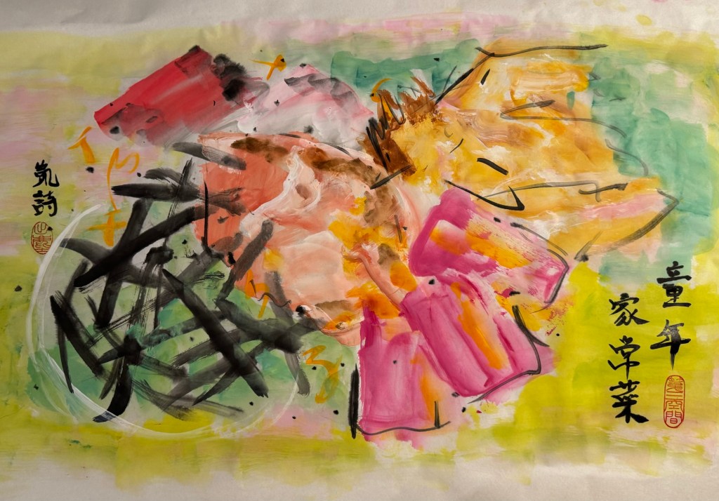
I felt the composition was too uniform and too neatly laid out. Hence I attempted another version with further abstraction to explore ‘unlikeness’:
–
REFLECTIONS
I enjoy painting in oil very much. I like the feel of the material, the viscosity when undiluted, the way it pushes against my palette knife or brush when painting impasto and then the luminosity when diluted. But painting in oil takes time (for me anyway) and I enjoy taking that time. I also like coming back to ‘play’ with the painting over several days.
Painting in Chinese brush and ink is a much quicker process. I can do several paintings in a day. Something about the materials make me want to paint fast with vigour. So I was pleased to do the Family Dinner explorations here using Chinese painting materials, it helps me to loosen up – both in my brush strokes and in my thinking.
One of the points I took away from my Unit 2 feedback was to paint more, and more. There was a question in the feedback asking if it was necessary to spend time making the Cheongsam canvases; I think that was a good question and perhaps I should spend more time painting and improve on that. Although I want to expand my practice to incorporate 3D, film and photography, I envisage my practice to always be rooted in painting – mainly because I enjoy it and I like the challenge. So I need to paint more to take it to the next level. I don’t know what ‘next level’ means, but I just feel the need to push my current boundaries – wherever that may take me!
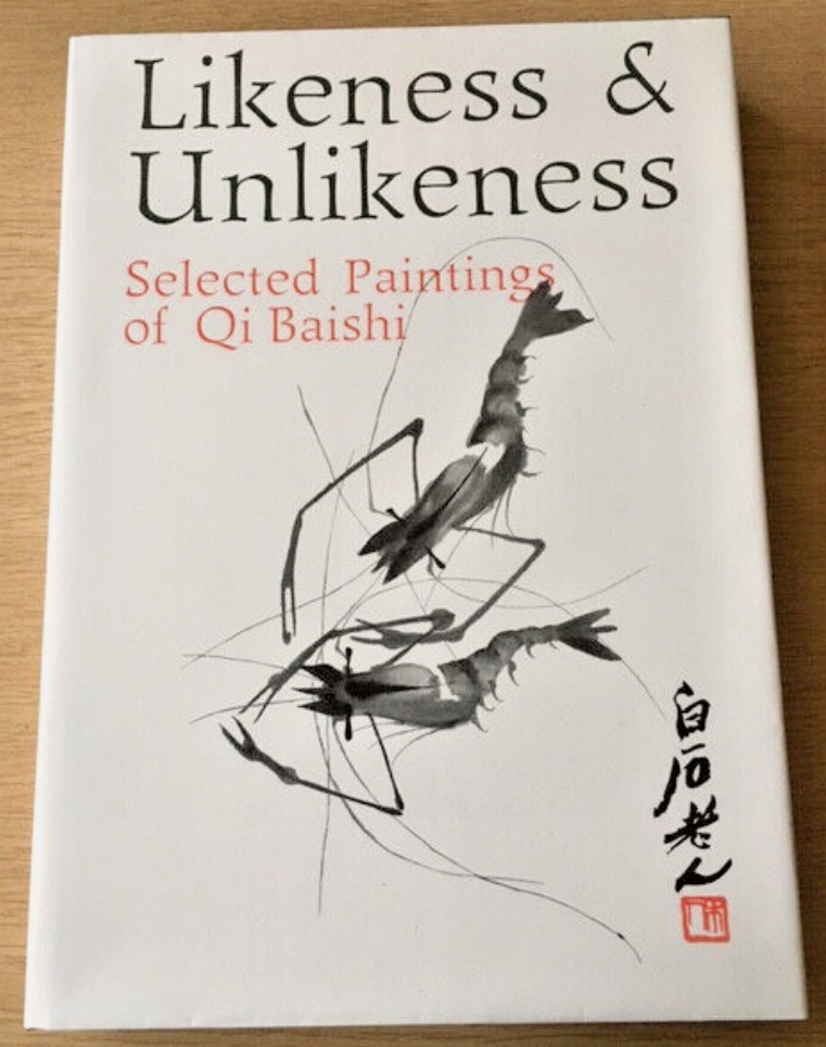
I managed to source the following book ‘Likeness and Unlikeness’ abour Qi Baishi’s work:
–
I need to do more research about what he really meant by his saying. Perhaps that would give me inspiration and new ideas to explore. I had thought that ‘between likeness and unlikeness’ meant a way towards abstraction. But when I look at his paintings, there was always good likeness (a shrimp looked like a shrimp). So I discussed with my Chinese art tutor what Qi meant – it appeared to be not about abstraction. She believed it was about the artists putting themselves into the work. I need to research this some more to really understand. I will start by reading the book.
I feel excited about the research between likeness and unlikeness…
LEARNING
I want to take my painting to the next level but I have not been able to decide how. The reflections above have helped me. I think I will return to painting on 2D canvas for now while I’m experimenting. I would like to return to 3D canvases such as the Cheongsam dress at some point because I have really enjoyed those paintings.
NEXT STEPS
I want to continue to build on my painting practice in the following way:
– Really explore oil as a material. I am used to using oil undiluted to create thick impasto layers, so I will experiment with thinner layers to give me more ways to express myself. Especially to find ways to create ambiguity, about distant memories.
– Research and understand the meaning of ‘between likeness and unlikeness’, start with experimenting in my Chinese art practices with ink on rice paper. Then maybe transfer the learning and understanding to painting with oil if it feels right.
There were two sets of feedback at the end of Unit 2 that I want to capture here, then I will reflect on both sets together at the end. The two sets are (1) Group feedback on my 3 minute video and (2) Unit assessment feedback.
1. Group feedback on my 3 minute video
At the end of Unit 2, we each made a 3 minute video about our art practice. Then the videos were shown to the class and we gave each other feedback. I am very grateful for the thoughtfulness of the feedback I received and I would like to capture them here.
Firstly, my fellow MA students each completed a note on Miro after seeing the video and below are the notes they wrote for me, captured from the Miro board in no particular order:
Ashton I feel… ‘wow’ed by the consistent high standard of your work, 2!; amused that you described it as a pick and mix!! I also feel shocked to learn why the banana has been used in regards to racial slurs, I did not know that until now, and I feel impressed at the way you responded to that using humour when it’s a hard hitting subject. I wonder …how this will continue to develop as there’s lots of paths combined to create these pieces – current/hidtorical racial prejudices and how they occur, cultural symbolisms, food connotations etc. I think… the fact that you can split your work into what continues your narrative vs develops your style / technique is a very good understanding to have, and not something I’ve considered before. That you can still be developing your art practice even if not confronting heavy subjects, that it doesn’t have to pause in times you feel able to continue the narrative.
Sara I feel… a lot of joy in your textiles work and curious about where it may lead to I wonder … how this may link to other current affairs such as the example of the coconuts. I think…your work appears well thought and considered with lots of interesting connections and a great use of metaphors.
Karl I feel… excited about your exploration of memory within your new painting I wonder … how you can connect the culturally appropriated objects and your genuine experience in the work. I think… that the process of making the dress and the painting on it is a great metaphor for perceptions of cultural identity and the space between the pictorial image and the duality of the dresses.
Roz I feel…engaged with richness and quirky imagery, drawn into a powerful metaphor I wonder… whether the dress will hold more opportunities or what 3rd element is needed now in this 3rd space to take you further along your journey I think you have been very successful in your ordering of the complex that you offer clarity, but are sassy in your delivery. And that you are owning, controlling the defining of your status
Chelsea I feel… that the pieces are funny which makes them more accessible because you don’t feel that you are at first glance engaging in a weighty subject. I wonder… where this will all go next. I think… its all very colorful and eye catching and offers a way in to learning about how we talk about people, it re-humanises that which others have tried to dehumanise, especially with the use of clothing.
Bethany I feel… nostalgia and familiarity, the 3rd Space idea, albeit from a different standpoint. I feel curious about your family history in HK, which was an odd colony. I wonder… whether the metonymies might be handled more provocatively, more personally, as a feminist? I think… I am drawn to the gritty, personal stories, the oddity of Cantonese steamed fish served with Spam.
Catherine I feel I want more. I like the element of surprise with your work, ….what will she do next…. You definitely have my attention Eliza. And you are so eloquent – Bravo. I wonder if you will use other clothes items in the future – the dress is so strong and powerful and a perfect vehicle for the way you express yourself and your research.
Tom I feel… educated in a nice way I wonder … what she has discovered about process vs outcome I think… the work deals with potentially emotive topics in a sensitive and restrained way
Ben I feel… I wonder… making paint and making food have a great deal of crossover could they be brought together I think… some lovely colour and ideas – looking forward to seeing how far it could be taken
Oi Fah I feel… well informed I wonder… good metaphor I think… well organized
Daniel I feel… the work is provoking – in a good way – to seeking I wonder… where else could you take this work and how it could be expanded I think…your aproach worked
Lais I feel seen and understood through your video and practice, especially because of how you approach it and colonialism I wonder what comes next for you, and if you will keep exploring textiles I think this is beautiful work and it reaches me on a deeper level.
Madeleina I feel… informed and inspired I wonder… what other items of inspiration are hidden in Eliza’s attic which she could start painting on! I think… Eliza is making a very important and insightful social commentary through her joyful creative work
Karen I feel… a great balance of research and lived experience. I hear a voice. I wonder… how the dress images would translate in other media…. I think…the food is a great metaphor and I love the titles of the work.
Holly I feel… delighted by some of your images especially on the “family dinner” cheongsam dress I wonder… how you view the differences or similarities between “narrative” and “style”, I wonder what would happen if you worked with actual food in your practice I think… it’s interesting how you thought you had lost your mother’s dress but then found it after many years, sort of a metaphor there around identity and fluctuations in connection and expression with/of identity, I think you have quite a bit of clarity about what you’re interested in exploring there appeared to me to be a lot of coherence in the work despite your view that it lacked coherence
Martina I feel… intrigued and amused. I want to see more I wonder… if the dress-paintings are thought to be worn I think…you should reconsider the relation between your narrative and stylistic work. The two seem beautifully integrated to me!
Terrye I feel… inspired by your dresses – playful and colourful interpretations of your identity and a link to your past I wonder… what happens if a European dress is used as an alternative identity – you mention hybrid identity I think…your process towards using materials is a way to create intrigue and excitement in viewing your work.
Jonathan I feel… connected to your story – the narrative is important to you I wonder… if we the audience only need to see small parts of this – eg the food – do we need to see it on a dress I think… the narrative and style are connecting, maybe you can be brave a try just the food paints for a while?
Lucy I feel… lucky to hear Eliza, invited to a personal world that reflects moments in time that are not just culturally important but personally I wonder… how do you feel in the dresses I think…the way you use the dresses to respond to one another is exciting, how in response to the banana you made the egg to reflect you
Dee I feel… transported to my mothers world of dress making I wonder… What a catwalk fashion show of your art would look like I think… The development of your style/narrative is an excellently engineered solution… the next development for me is the latest painting and I am excited to see what happens next
Victoria I feel… inspired by colours and emotional I wonder… inspiration background, ideas for research. If inner dialog is involved and what’s next I think…interesting process, great ability to create deep emotional art. Very complex and simple at the same time, i really like that concept
Inna I feel… I feel that bright colors are a source of energy and inspiration. They bring life to a work, drawing attention and sparking thought. Behind each vibrant hue, there’s a depth of carefully considered ideas, symbols, and stories. It’s not just about the visual impact but about how every detail communicates its own emotion and meaning. I wonder… What stories and carefully considered ideas lie behind each vibrant hue? I think… I also think the allure of bright colors lies in their universality—they resonate with people across cultures and contexts, carrying both personal and collective significance. They can symbolize hope, energy, or transformation, making them a vibrant language that transcends words.
Then we ran a video session where people chipped in with comments on what worked for them about my work. Summary of the video feedback on ‘what worked…’
– Connection to topical discussions
– Dresses
– Fitting my personal narrative
– Use of colour
– Clarity of thoughts and processes
– Metaphor of food
– Playful
– Wanted to look into it to see the stories
– Detail of the food and fish
– Balance of research and lived experiences
– Metaphor of wearing cultural identity
– Confidence in communicating narrative and views
– Dresses – sculpture as well as painting
– Oddness of the food combo
– Making tinned food appealing
– Strangeness of food is brilliant
–
2. Unit Assessment Feedback
At the end of Unit 2, I received some invaluable feedback from my course tutor. There was feedback on my practice and my research paper. I agree with much of the feedback and I will not list everything here. I will extract the key points that have caused me to think more deeply about specific elements of my practice. I want to use this blog to further explore my thinking and consider my response in order to develop my practice.
The specific points that I want to respond to are:
1. Is there a risk that the terms “banana” and “egg” can feel reductive, even when reclaimed, how do you (do you need to) account for the multidimensional experiences of diasporic individuals? Could these inadvertently reinforce the stereotypes they seek to critique, without offering sufficient nuance or alternative narratives? How might someone from the Chinese diaspora interpret these works? How do you want them to engage with the works?
2. …your HK family dinners bring a nuance and context to your broader theme. … Does this painting need to be on a cheongsam? What does the cheongsam canvas add or takeaway from the image?
3. …we encourage you to continue experimenting with different techniques, layering methods, transparencies, marks etc. E.g. how might you use thin transparent layers in your work? If you spend time looking at a variety of oil paintings in real life, what effects might you incorporate into your own work?
4. We also encourage you to go back to the documentation of the painting progression – some of us thought the fish dish was stronger at the earlier more “sketchy” stage, experiment with how “finished” elements of the painting need to be. How might this relate to memory? The sketchiness of remembering? The gaps in between the memories, the ‘flying white’.
REFLECTIONS
I really valued the group sessions. I feel blessed that I am in such a supportive community where everyone is thoughtful, kind and genuinely wanting to help each other to progress. I treasure their feedback, it is more than a gift. I started to make and paint on Cheongsam canvases in the last few months, I am still at an early stage with this exploration and I am constantly questioning if it is the right way to go. My group’s feedback gave me the confidence to continue as they seem to enjoy seeing the colourful dresses. Some of the comments have helped to reinforce my decision. However, my tutor feedback has caused me to rethink this point – does it need to be on a Cheongsam? What does it add or take away from the image?
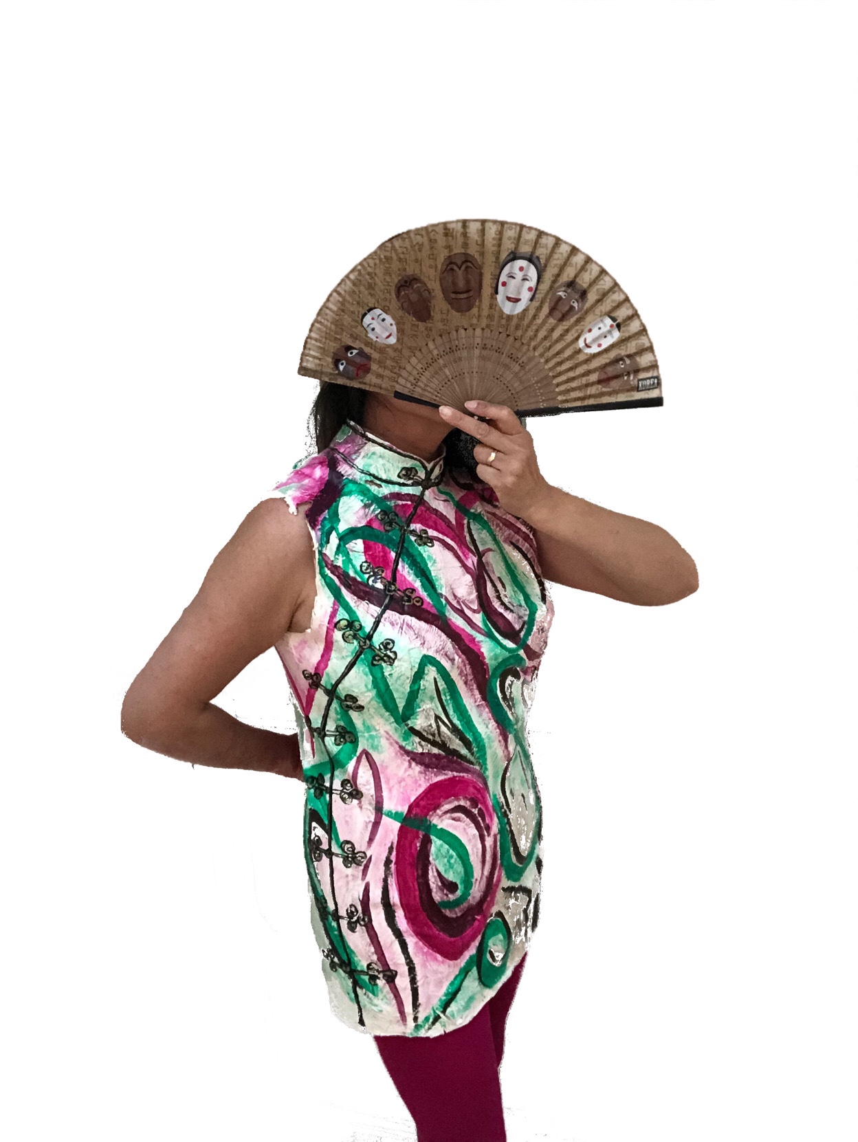
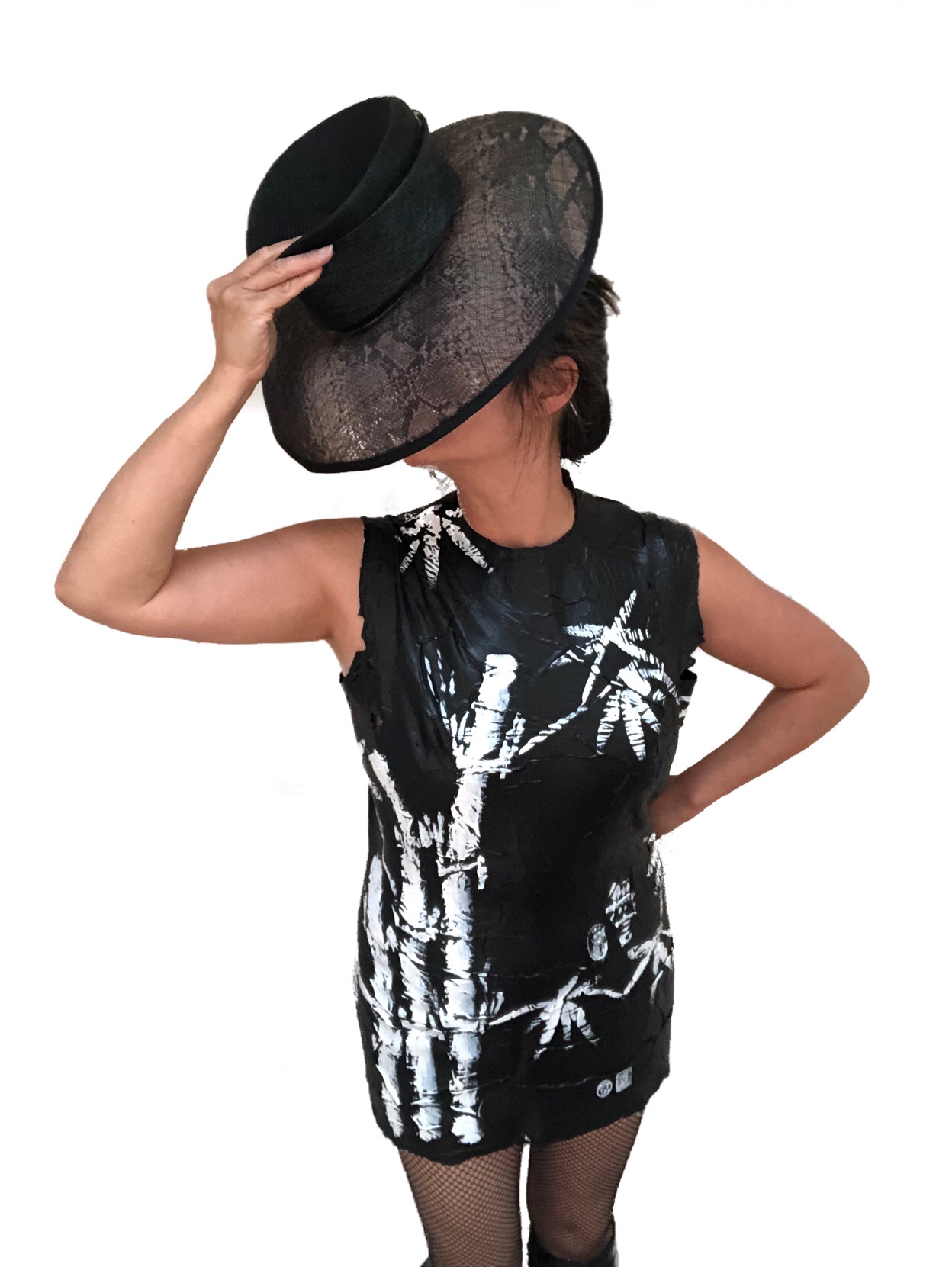
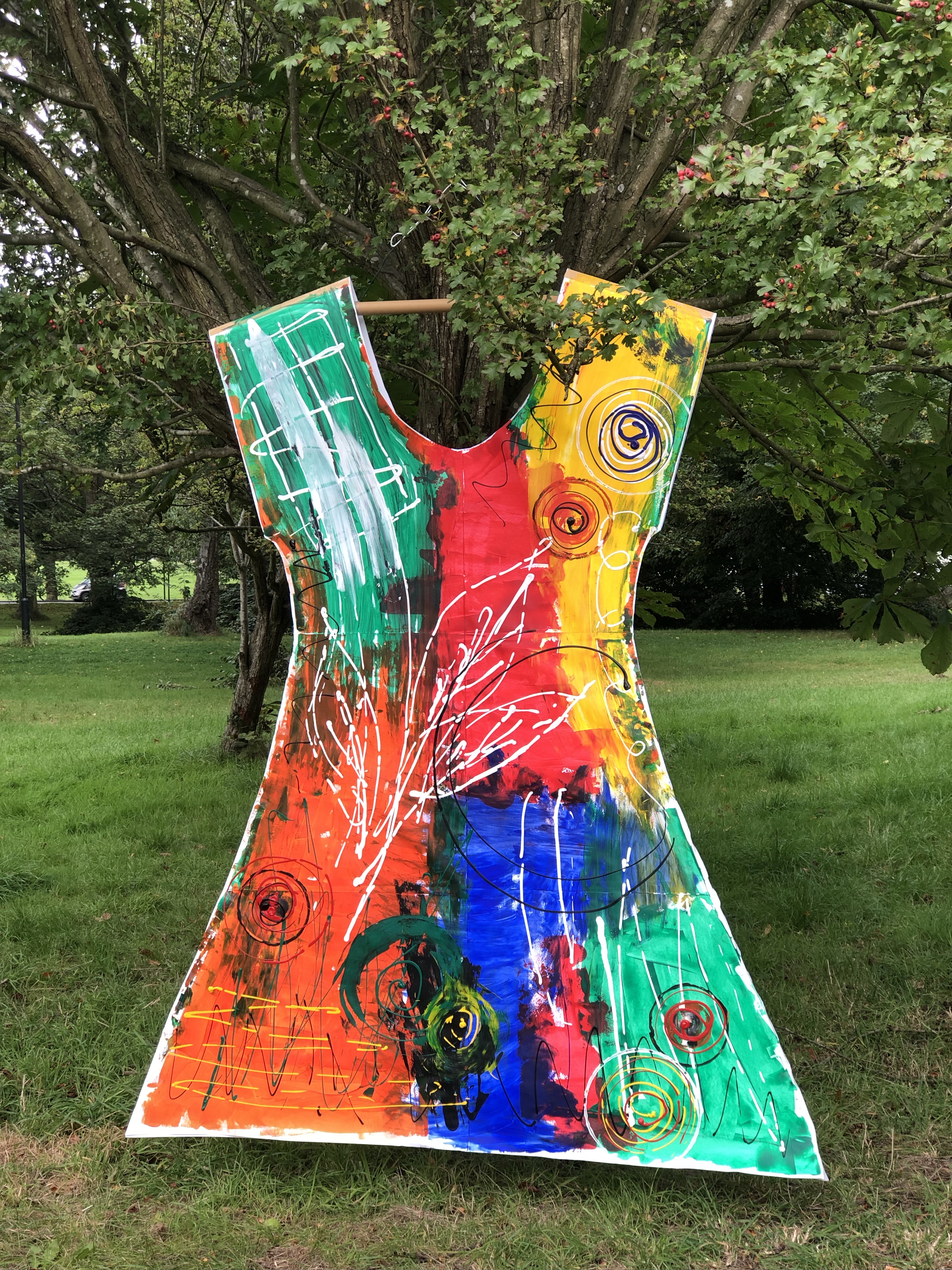
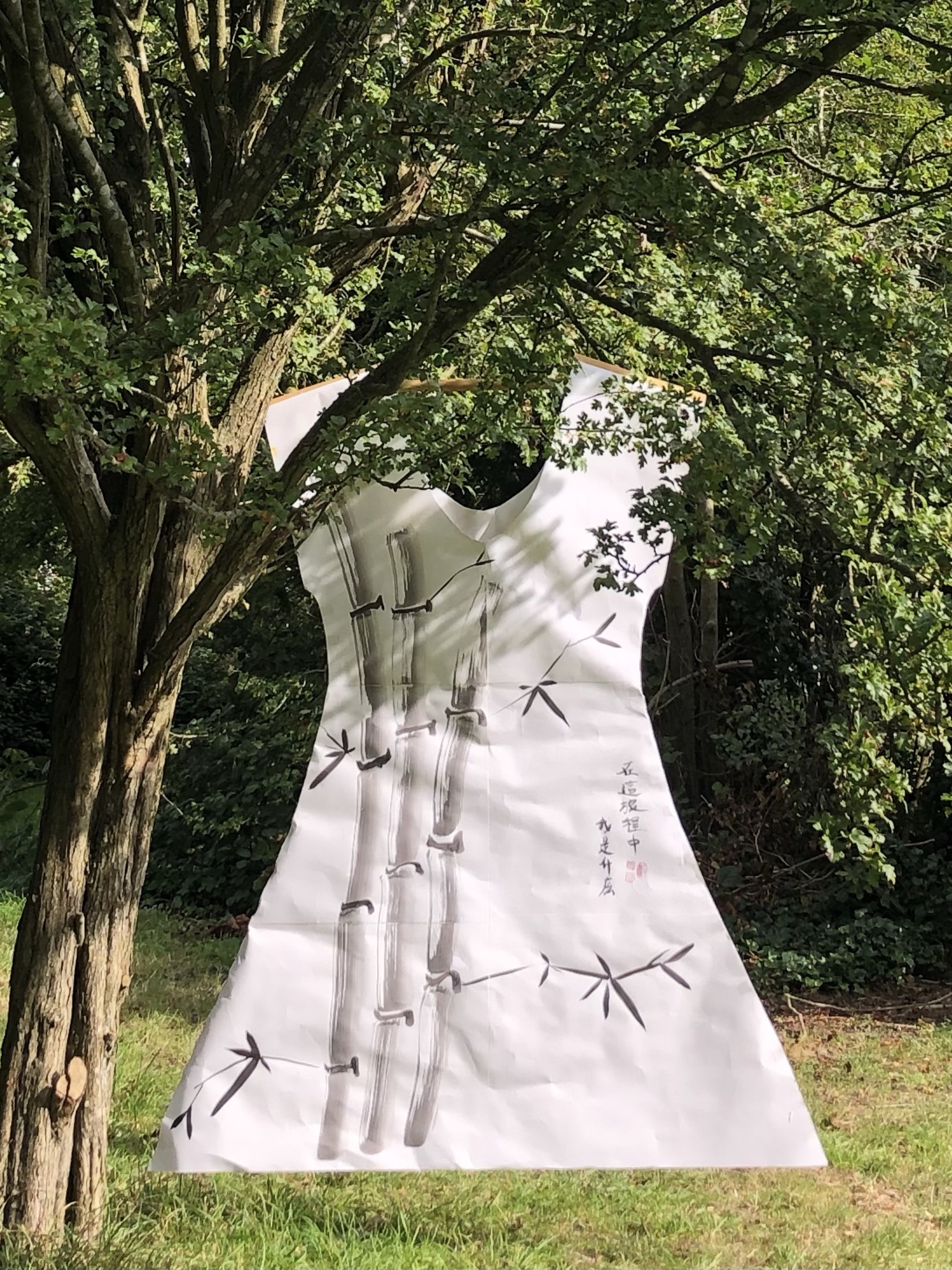
I have been thinking a lot about this since receiving the feedback. Making a Cheongsam painting is a special process in that it makes me feel that I have created something special (to me) when it’s finished. It’s not a judgement of whether it’s good or bad, it just means more to me because of the complexity of the creative process. I set out in my MA Study Statement to find a way to create something that is unique and recognisably mine and I thought I had found that when I started making Cheongsam canvases, hence I referred to it as my turning point. Also, looking back at my earlier work before joining the MA course, I have had attempts at making dress canvases. This was from a period when I was investigating the concept of Expanded Painting and ways to eradicate the traditional canvas. Below are images of the dresses I had made at the time (one of which was also a Cheongsam):
Acrylic ‘canvas-less’ Cheongsam paintingAcrylic ‘canvas-less’ little black dressFront of large paper dress paintingBack of large paper dress painting
I like the way the Cheongsam or dress paintings are 3D paintings, a hybrid between painting and sculpture. I think showing them as 2D photos does take away from the image especially in my latest Cheongsam series as the curved sides of the dress obscure part of the image. Perhaps a film may help to convey the image better.
I believe the Cheongsam shaped canvas adds to the story and narrative that I am trying to convey about my journey and how we ‘wear’ our identity. Here is a past UAL exhibition about wearing our identity which I found interesting:
However, I wonder if my Cheongsam canvases can seem rather ‘gimmicky’. I think I understand the question from my tutor asking if I have the courage to make just a painting without having to paint it on a Cheongsam (I interpret that as ‘without the use of any gimmick’). My response would be – I’m not sure if I’m there yet, but I should try.
My response here also ties in with the feedback about exploring oil in more ways and trying different techniques. I think that is valid as I am aware that I have been using oil in a limited or single-dimensional way (undiluted and impasto). This can have the effect of over-saturation and I should broaden my approach to utilise all that the oil paint has to offer. By exploring thinner transparent layers and producing less finished images, that would add ambiguity and help me to convey my narrative of working from patchy memories.
On the other points regarding whether ‘banana’ or ‘egg’ are too reductive as metaphors – I plan to respond in a separate blog after completing some research.
LEARNING
I enjoy doing the Cheongsam paintings and I feel that I would like to maintain that element in my practice. However, not all my work need to be on a dress or 3D canvas. My priority now should be to explore more painting techniques and widen my ‘painting vocabulary’ so I can be more creative in expressing complex narratives. To do this, I will pause the making of the dress canvases and spend more of my studio time on painting.
NEXT STEPS
– Explore different techniques of using oil paint so I can be more creative and multi dimensional in my expressions.
– Explore different approaches to painting and ways of thinking about painting.
– Pause the making of Cheongsam canvases for now to release time and return to it at a later time.
– Respond to the ‘banana’ and ‘egg’ feedback with a separate blog.
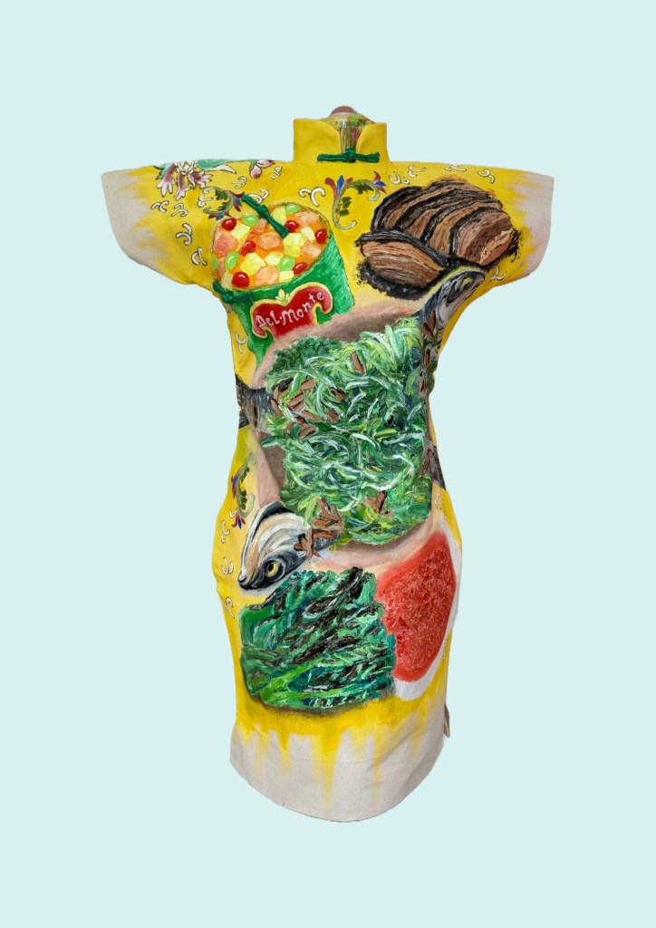
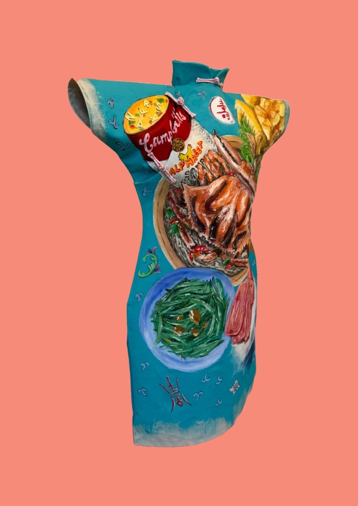
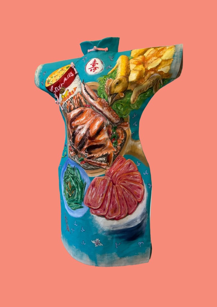
After making Family Dinner #1 (image below), I proceeded to make #2 with the learning.
Family Dinner #1
METHOD
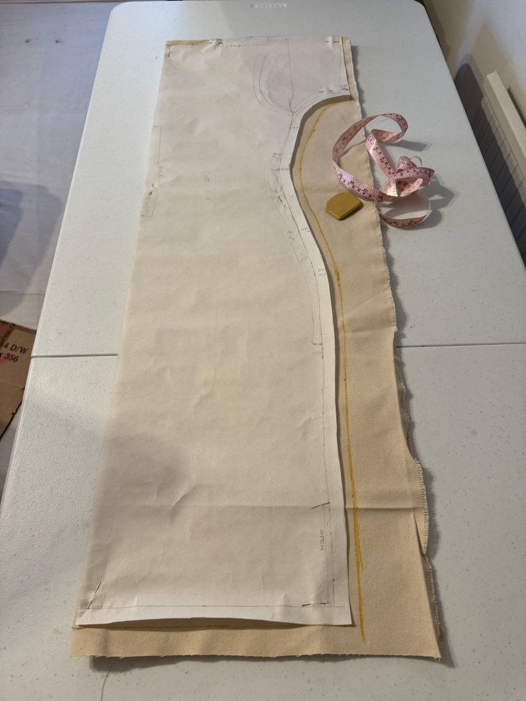
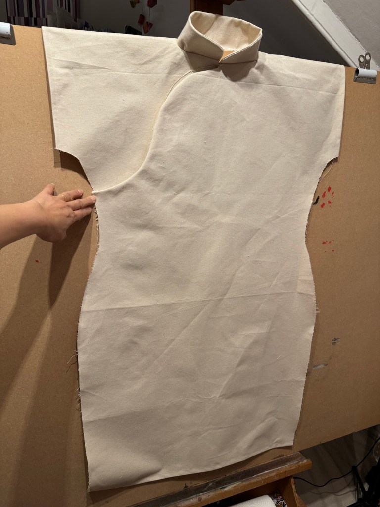
I was overall satisfied with how the new Cheongsam pattern worked out. But I felt the measurements needed to be more generous if I were to wear the canvas because of the stiffness of the material. If it were too tight then it would be difficult to put on. Hence I modified the pattern to make it wider.
Pattern ready for cutting
I also learnt from the last dress painting that it was difficult to paint the back of the dress if the dress was fully sewn up and placed on the canvas – it was impossible to access the back while the oil on the front was drying for weeks.
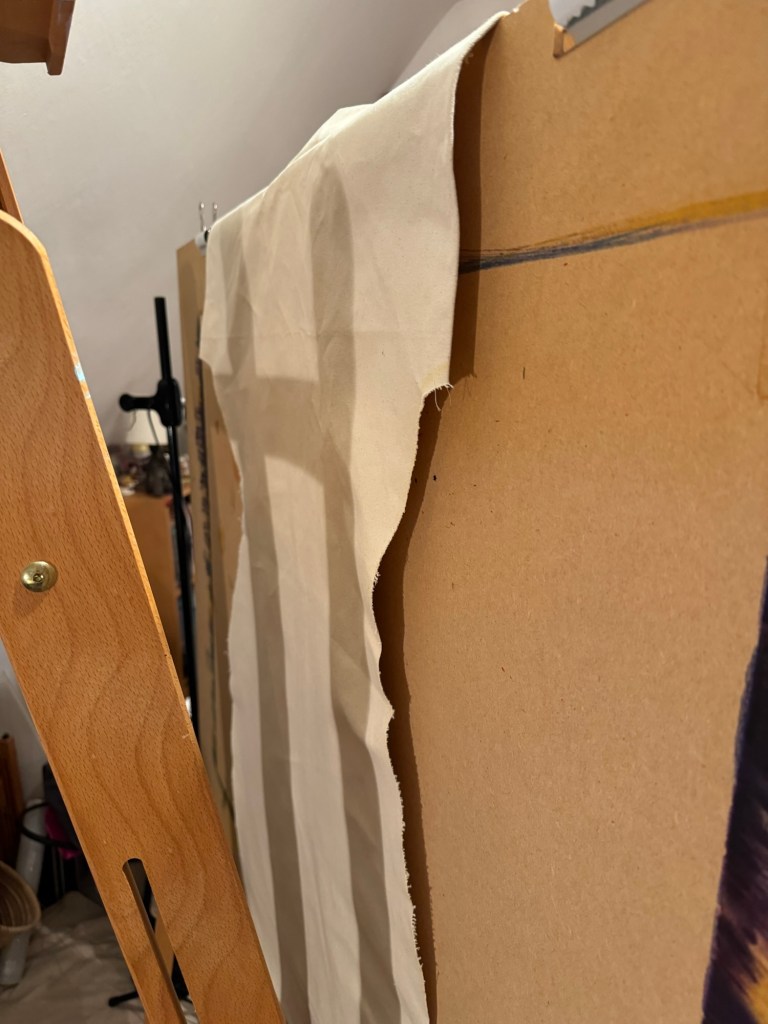
Therefore I experimented in this case with not sewing up the sides and draping the dress with the back part of the canvas hanging off the back of the easel. The plan is to paint the front then turn the board to paint the back.
Back of the dress draped over the board
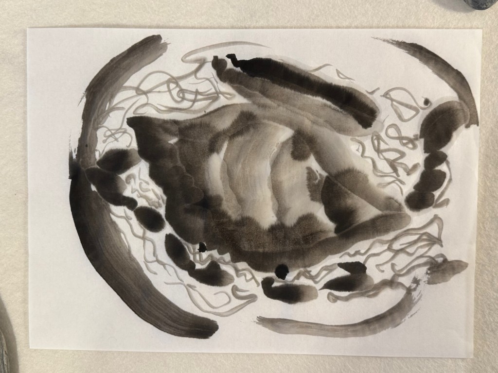
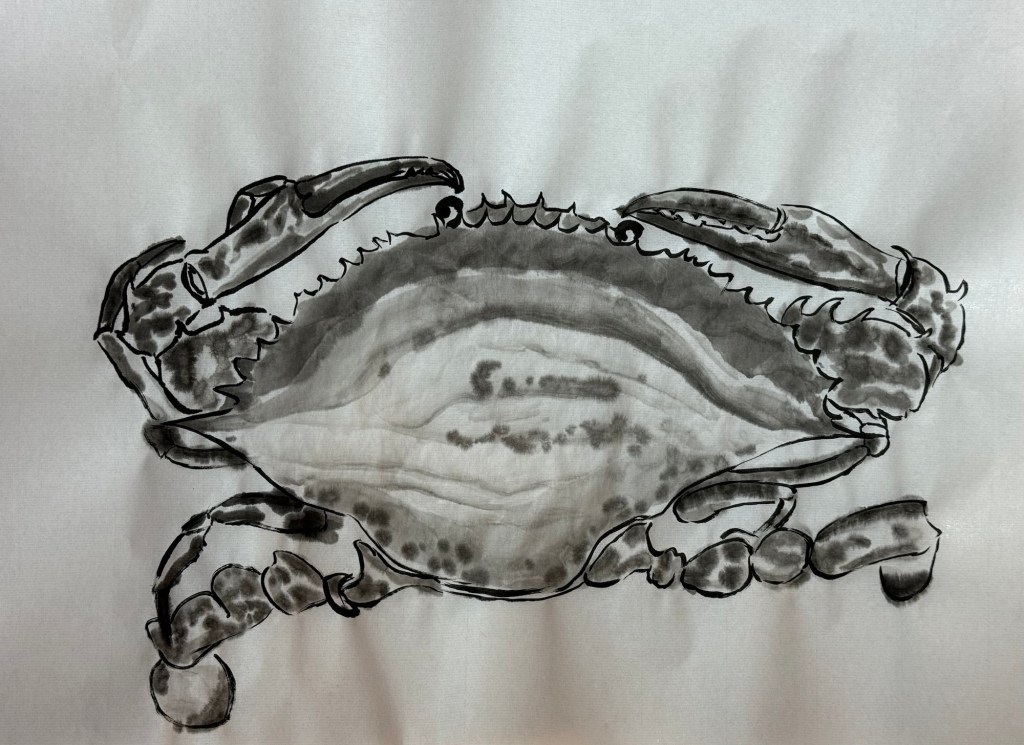
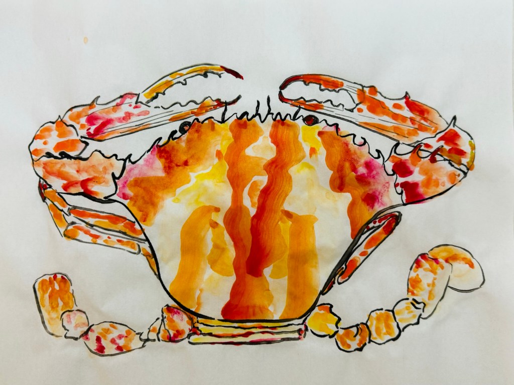
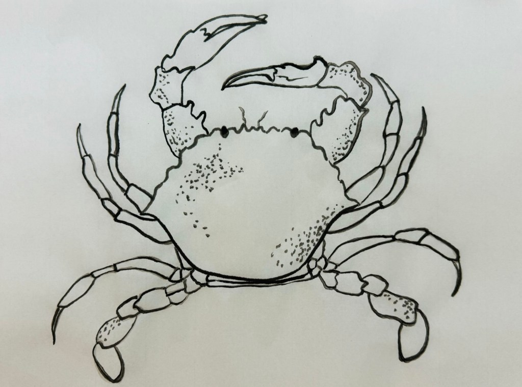
This family dinner has a main dish of ‘flower crab cooked in a clay pot’. So learning from my Chinese painting class – I studied the anatomy first and did a few ink drawings of crabs:
–
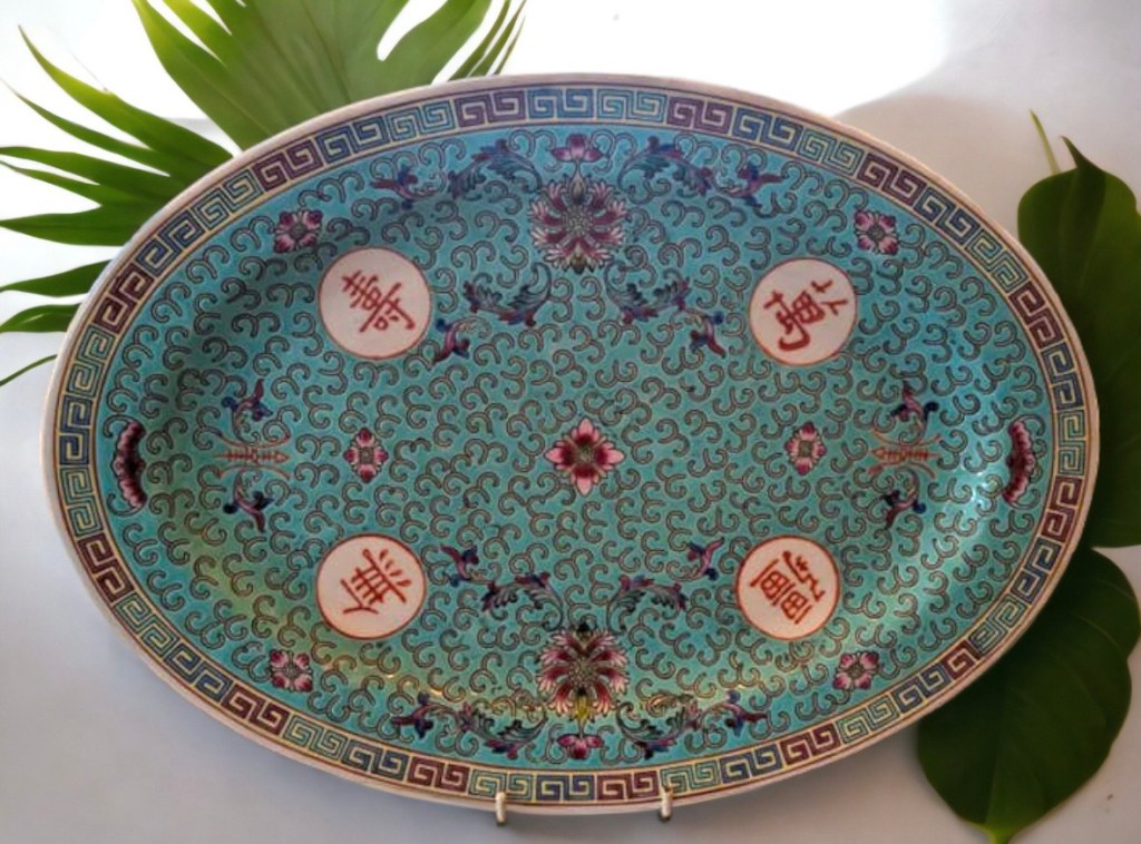
Then I chose the colour of the background based on another Chinese dinner service. It’s the same pattern of the yellow one I used on Family Dinner #1, but of a turquoise colour:
I experimented with different level of tinting to get the right colour and not too dark:
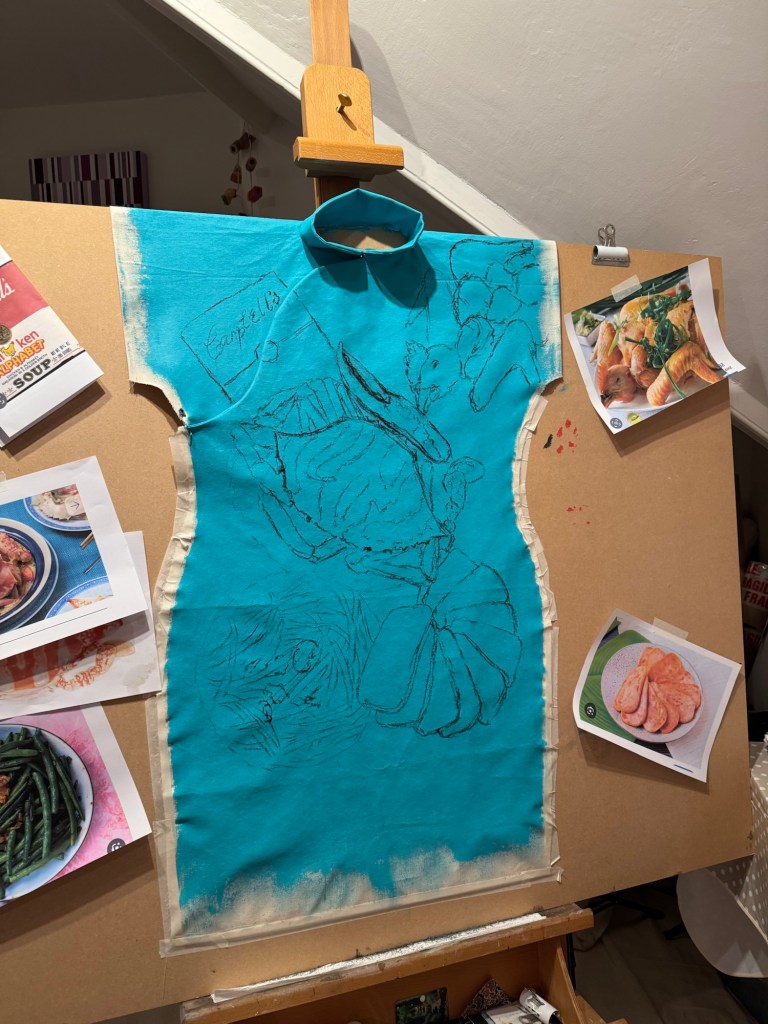
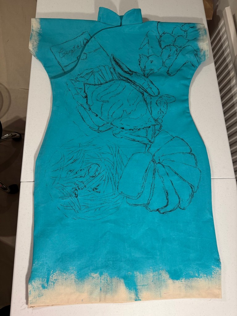
The composition was developed on my sketchbook then marked out using black willow charcoal on the canvas:
Composition drawings
Then I decided that I would sew up the sides of the dress because I felt it would be too difficult to turn the canvas inside-out to sew once it has been painted with oil. So I reverted back to the process I used previously after much consideration. I also used Velcro much more extensively along the complete opening of the right chest and side instead of using a zip or buttons because it would be hard to sew a zip or hand-sew fasteners due to the thick canvas. Hot glue was used to fix the Velcro in addition to the Velcro tape adhesive to ensure it was firmly in place.
Sides of the dress were sewn up
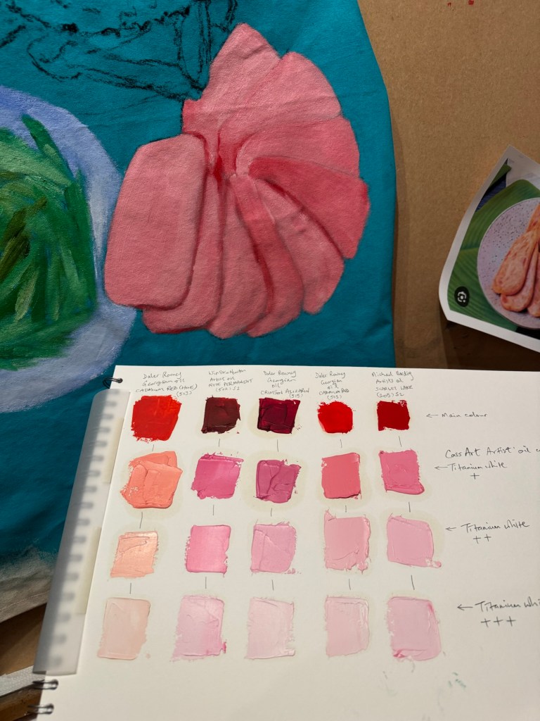
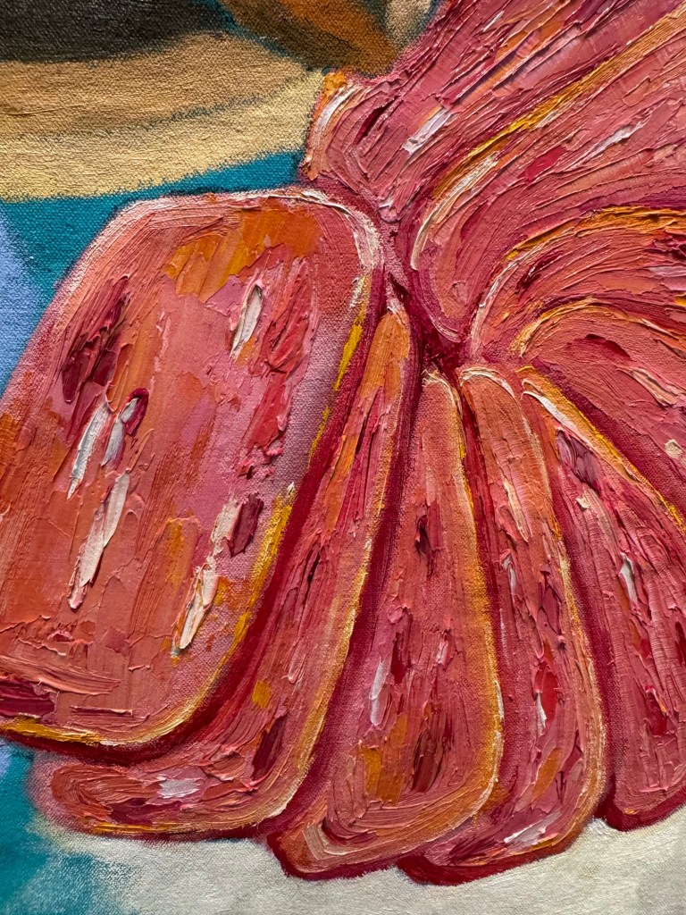
I started with the ‘pan fried sliced luncheon meat’. I once did a tinting paint chart of the different red oil paints I had. It was very useful to choose the colour of luncheon meat from the chart. I chose the shade according to my childhood memory – the colour of artificially-pink meat is difficult to forget!
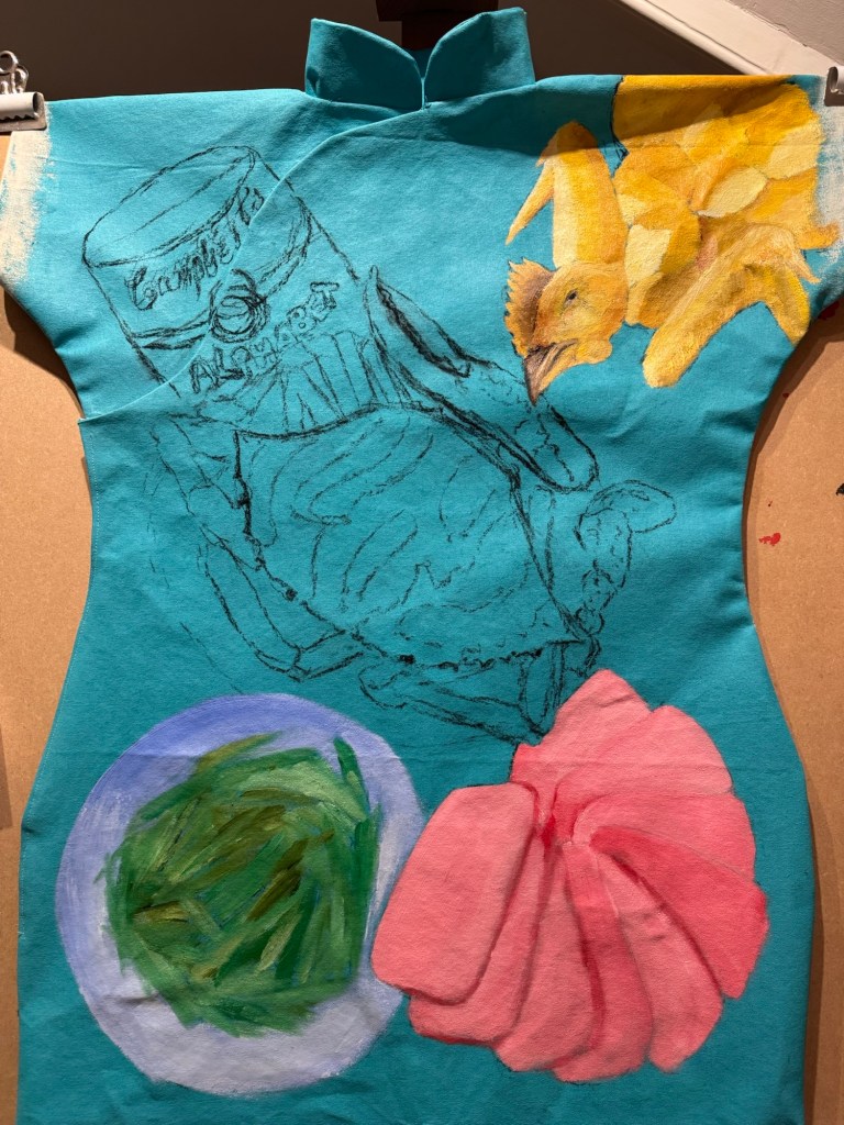
Then I proceeded to loosely paint and mark out the rest of the composition.
Adding chicken and green beansAdding clay pot flower crab and Campbell’s
Then more detail painting of the luncheon meat with some yellow edges for the oil used for pan frying:
Adding details to the whole salt baked chicken:
Around this time I received my Unit 2 feedback from my tutor with comments that made me reflect on how I apply the oil paint. So I experimented with some looser strokes on the crab shell.
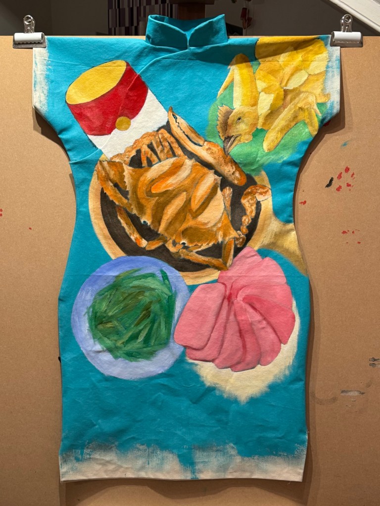
The painting was finished by completing the Campbell’s alphabet soup and adding pattern details from the dinner service around the dishes. Pink satin fastening frogs were added as finishing touch.
Finished work – Family Dinner #2:
–
REFLECTIONS
I really enjoyed making this painting. Food is such a key part of Chinese and Hong Kong culture that appreciating food is deep in my DNA. The more I paint these dinners, the more I realise that it’s not just the eating that I enjoy, but the painting of food as well. Working from memory has been great, thinking back to all the meals where these dishes were eating – at home as well as at restaurants.
Some of the unhappy experiences from our family dinners that I talked about in the reflections for Family Dinner #1 did not enter my consciousness for some reason. I realised that some of those experiences were dish dependent. Perhaps the dishes depicted here were ‘safe’ dishes without chances to go wrong. Dinner #1 featured a steamed fish – that was always challenging…
Part way through making this painting I received my Unit 2 feedback and it has been very thought-provoking. It made me immediately reevaluate how I applied oil painting – perhaps I have been too ‘one-dimensional’. Always applying the same (fairly thick) way. I tried a looser approach on the crab shell and was happy with the outcome. I have been thinking about that constantly and I need to experiment much more. How to use paint in a way to depict my distant and fading memory?
The Unit 2 feedback also made me think more deeply about why I am painting on Cheongsam dresses. Why dresses? Why Cheongsam and is the time well-spent in making dress-canvases? There is a lot to think about and reflect on from the Unit 2 feedback and I will write a dedicated blog for that.
I was going to make another cheongsam dress painting after this one, but I think I will make this decision after fully reflecting on my Unit 2 feedback.
LEARNING
– Be more flexible and creative in using oil. Try different thick- and thinness to create impact, to tell the story.
– Doing something just because I enjoy it is not enough a reason to do it. Need to consider more deeply about why – I believe I do this and reflect already but perhaps need to go deeper to examine my reasons.
– In terms of the Cheongsam making process, the increased use of Velcro as fasteners was a success and should be used in future dresses. Using hot glue to fix the Velcro was also a good idea.
– Overall, the pattern development has gone well and I believe I have a well tested and suitable method of producing a Cheongsam painting canvas.
NEXT STEPS
– Experiment with thinning oil and layering.
– Explore ways to depict fading memory without being overly detailed.
– Complete and capture my reflections from Unit 2 feedback. Write a dedicated blog for that and determine next steps to develop my practice. What to do if not Cheongsam paintings?
– Finish the back of the Cheongsam when the front is dried.
I have been learning Chinese painting for three years in parallel to my other courses such as the MA Fine Art programme at Central Saint Martins. Collectively, they help me to develop my transcultural art practice.
My latest learning was about the use of seals. Here is some information from the Hong Kong Art Museum about the use of seals on painting and calligraphy:
The seal is applied at the end of the painting process. Since the seal paste is usually a permanent colour of Vermillion (cinnabar red), it cannot be erased hence its placement has to be considered and applied carefully. Otherwise, it could ruin the painting composition.
For Chinese artists, they can use different types of seals. They typically have one or more name-seals and other optional mood-seals. My late mother left behind several of her seals that I have been studying and using for my paintings. I asked my Chinese painting tutor whether it was appropriate for me to use another artist’s (i.e. my mother’s) seals. My tutor said, ‘she was your mum, I don’t think she would mind. Anyway, who is going to check?’ Since my mother was an established painter, her seals were beautifully carved from quality stones. I have enjoyed discovering them and playing with them.
Since my last lesson, I have been practicing signing my name in Chinese calligraphy and then putting two seals on paintings. These experiments have been challenging in a fun way.
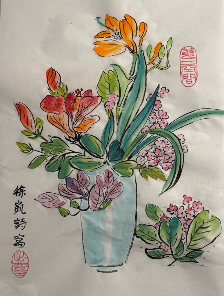
1. A vase of flowers in Chinese ink on Xuan (rice) paper. The calligraphy says it is by me (my full name with surname) and there are two seals:
– The seal at the bottom left corner belonged to my mother. It is a mood-seal with the meaning of ‘transcendence’ – a spiritual state of moving beyond physical needs and realities.
– The seal at the top right is my new mood seal that I ordered from Hong Kong through my tutor. It means ‘third space’ and is a fundamental element of my art practice – exploring the ‘third space’ which describes my existence. Third space here is as described by Homi K. Bhabha in his book ‘The Location of Culture’.
–
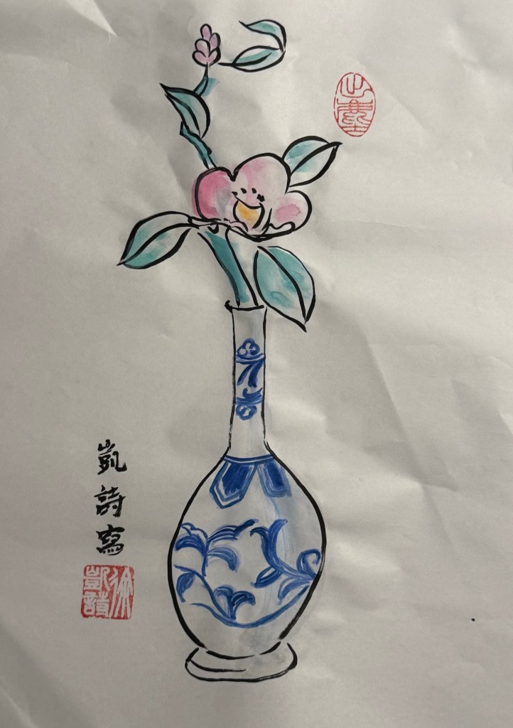
2. A simple painting of a flower branch in a small vase. The calligraphy says it is by me (name only, no surname) with two seals:
– bottom left: my full name seal with surname.
– Top right: ‘Transcendence’.
–
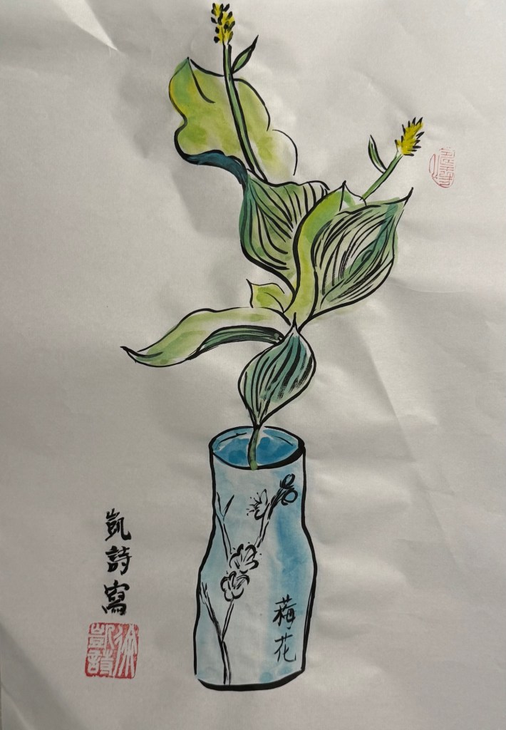
3. A small vase with a branch and leaves. My name in calligraphy with two seals:
– Bottom left: my full name.
– Top right: one my of mother’s seals but I do no know what it says! It is of an ancient script and beyond my knowledge. I will keep researching to see if I can find out. I have subsequently found out by seeing on one my mother’s paintings that I have put it upside down!
–
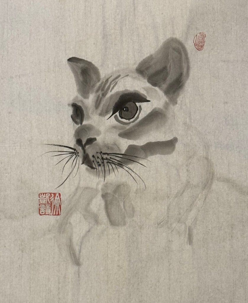
4. My cat Tom who is sadly not with us anymore. No calligraphy with two seals:
– My full name and the upside down seal!
–
LEARNING
Using the seal properly is an art form that requires skills which comes with experience. The placement of the seal as well as how it is applied are both important. Too much paste would ‘flood’ the carving giving a red mess, too little paste would make part of the seal invisible, i.e. an incomplete image. So it needs to be just right.
The placement is even more challenging. The use of negative space is critical in Chinese painting – my Chinese painting tutor said the extensive use of negative space was a key differentiation between Chinese and ‘Western’ art. Placing the seal after the painting is completed means the seal interrupts the negative space hence it needs to be done in a way that maintains the harmony of the composition whilst enhancing the composition. While writing this I realise it is impossible to articulate how to do it! What I have learnt from the above paintings are that if I am using two seals then place them diagonally on the composition and use one large and one smaller seal, i.e. do not use two seals of the same size. The non-uniformity makes the composition more interesting.
My tutor said the only way to learn was to keep doing it, keep practicing, then eventually it would come naturally. I have to take her words for it as I don’t have any other options! I used to only put seals on paintings that I was happy with, but my tutor said I should do it on every painting in order to practice. So that is what I will do!
NEXT STEPS:
– Keep practicing using seals on all my Chinese paintings.
– Pay more attention to how other Chinese artists use their seals – study my mother’s paintings and my painting books more carefully.