MA U2: The elusive Third Space – Reflections from MA interim show and feedback

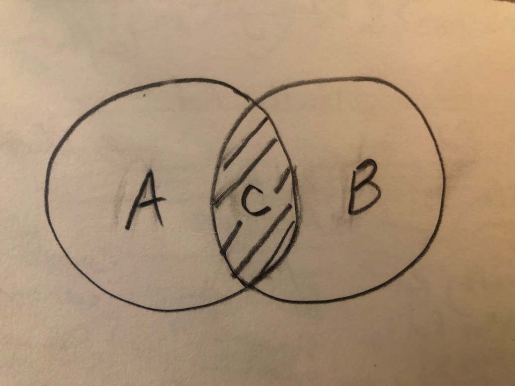
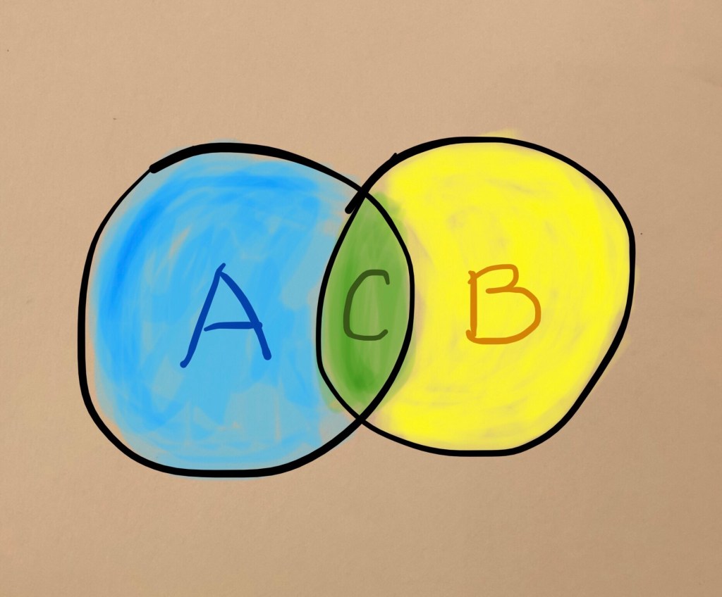
I talk and think about The Third Space a lot. From the first moment I came across this concept in a lecture by Nigerian-born American visual artist Njideka Akunyili Crosby, I found resonance and understood exactly what she meant. Then I started to research the original text about The Third Space in The Location of Culture by Homi K Bhabha. My understanding was further cemented. It is straightforward on the surface. When two cultures (let’s call them A and B) come together like in a Venn diagram, the overlap (let’s call it C) is The Third Space where something completely new emerges. It is neither one nor the other but has the characteristics of both of the original cultures. It is also alive and constantly evolving according to Bhabha.

Here is the Venn diagram:

Alternatively, if we use a mathematical formula to represent the concept, it will be:

A + B -> C

Meaning A and B giving rise to or leading to C. Not to be confused with:

A + B = C

because it is not a straightforward linear summation, it is a fluid concept. It is Art after all and not Maths. Maths would have been easy… In my experience, once a Mathematical problem is solved, you could sleep at night. But problems in art are rarely ‘neatly’ solved, or an answer often leads to the next question and I have spent many sleepless hours thinking about this. I get the Third Space concept in theory, but how do I locate myself in this context and express it in my art? This has been keeping me awake, a lot!

EXPERIENCE

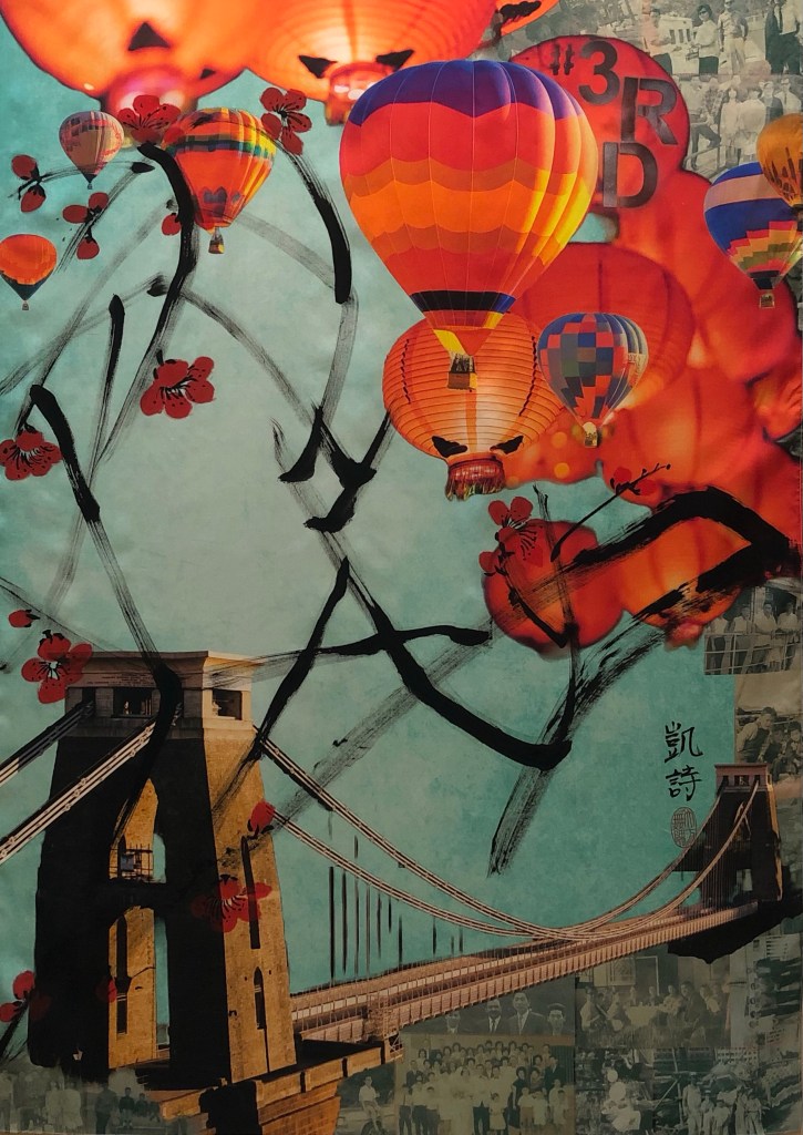
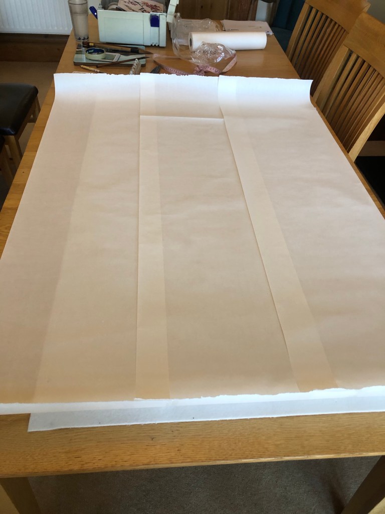
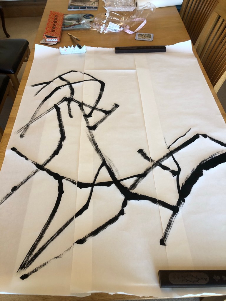
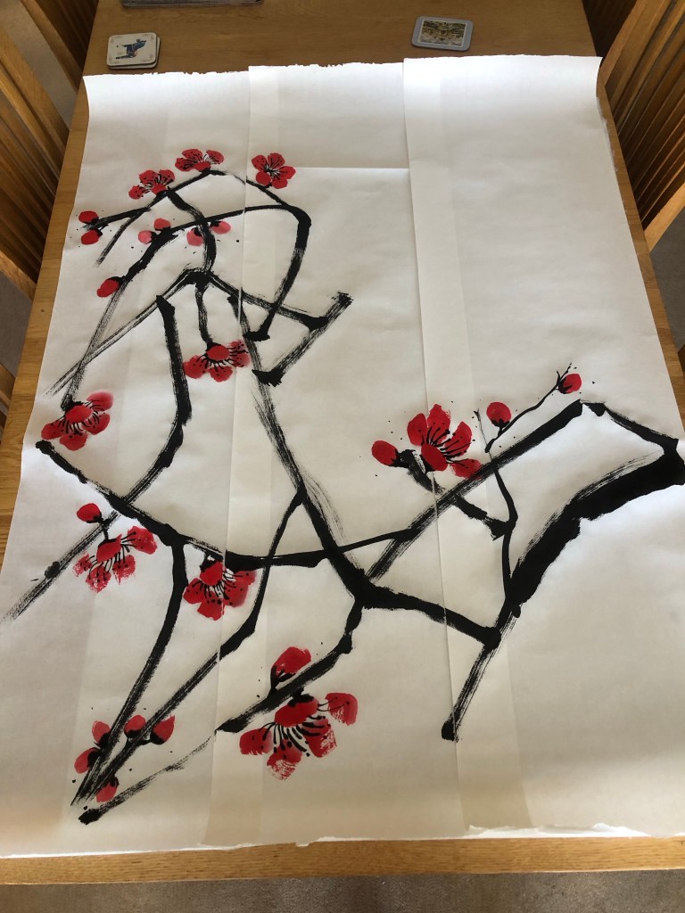
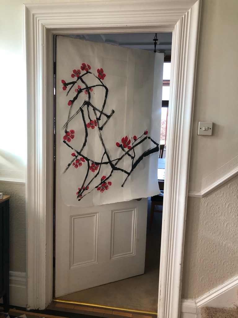
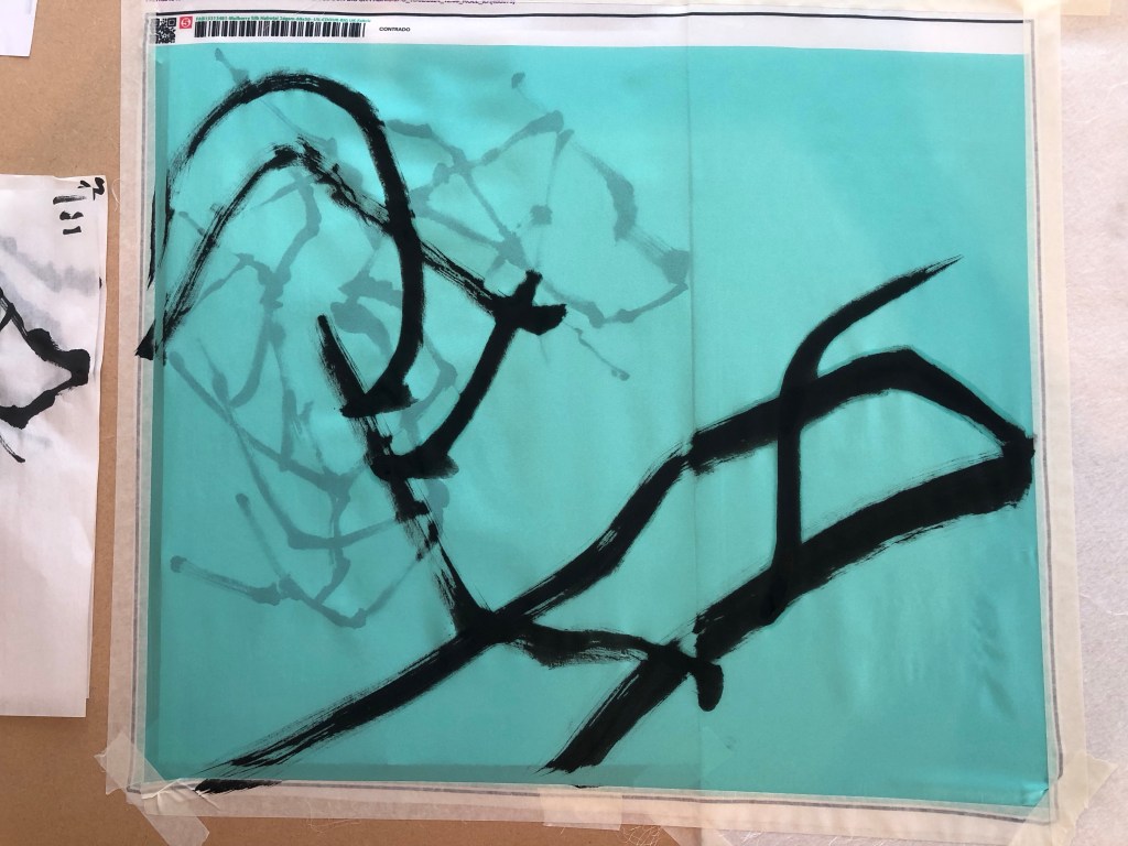
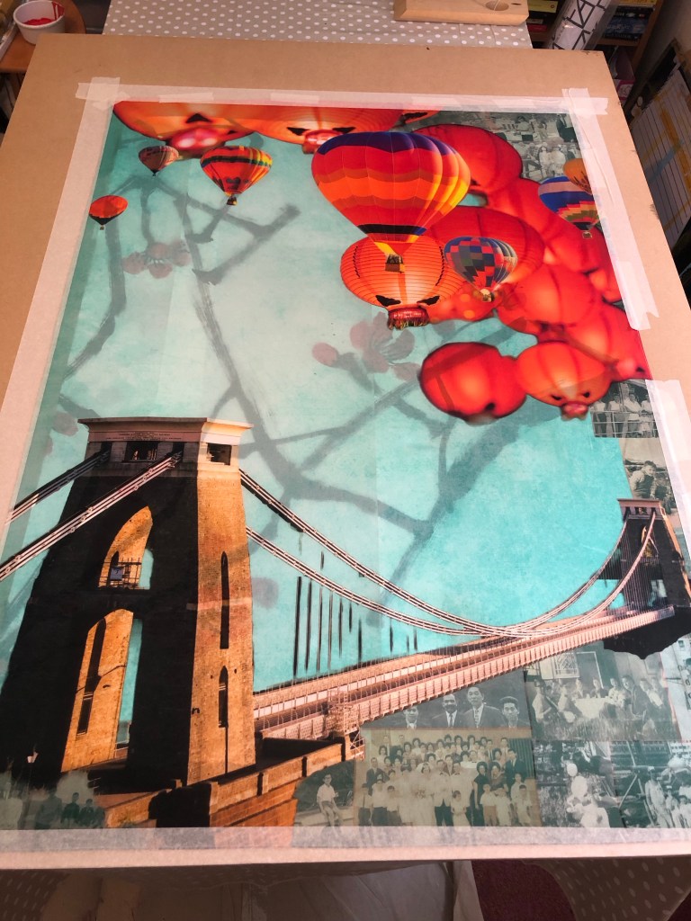
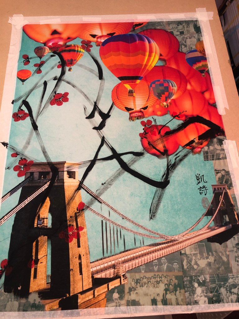
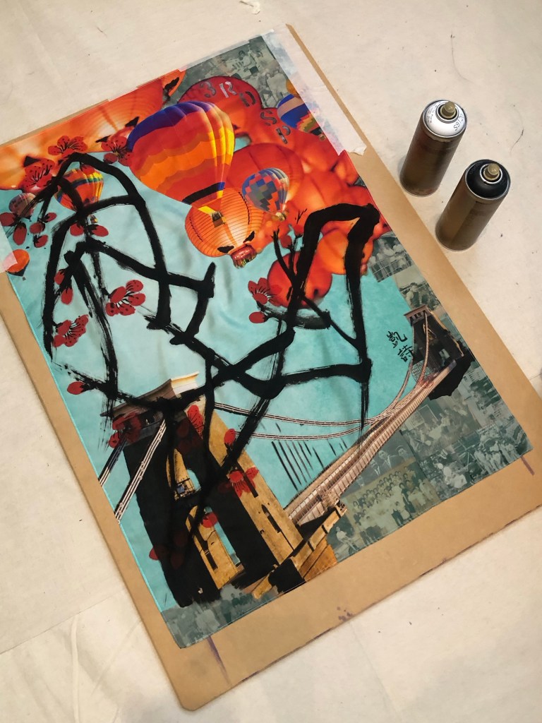
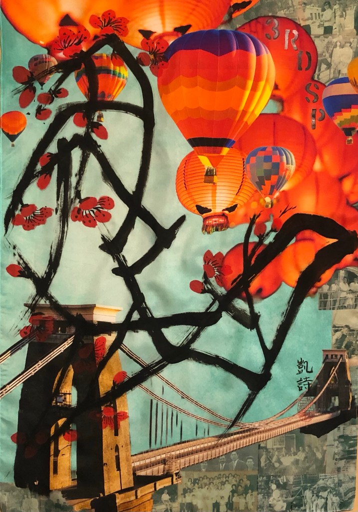
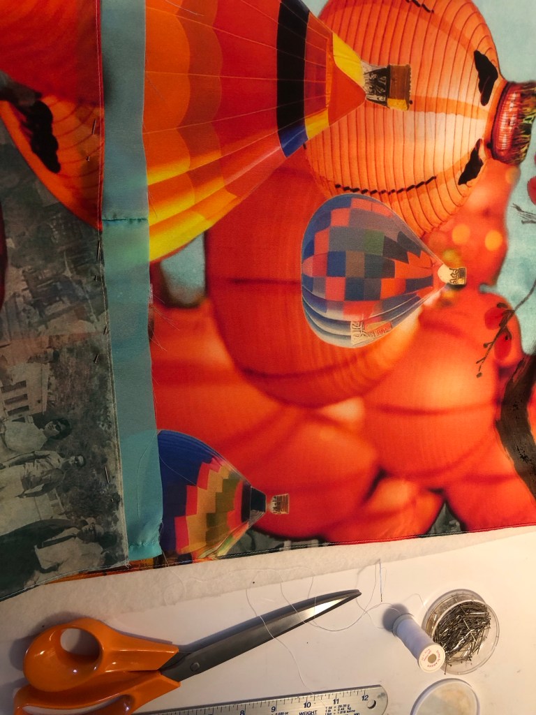
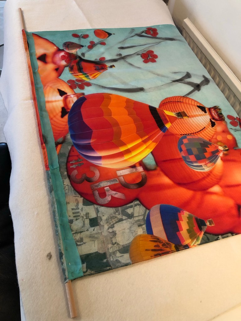
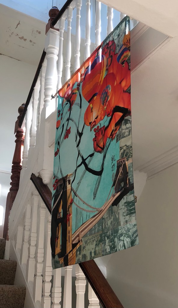
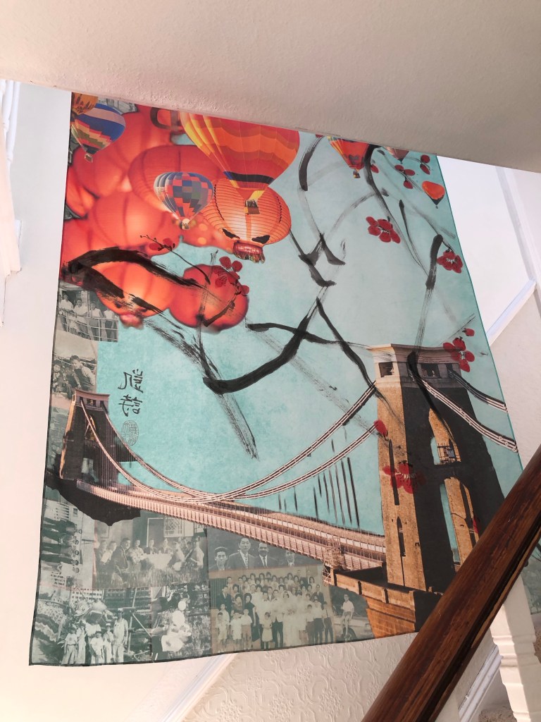
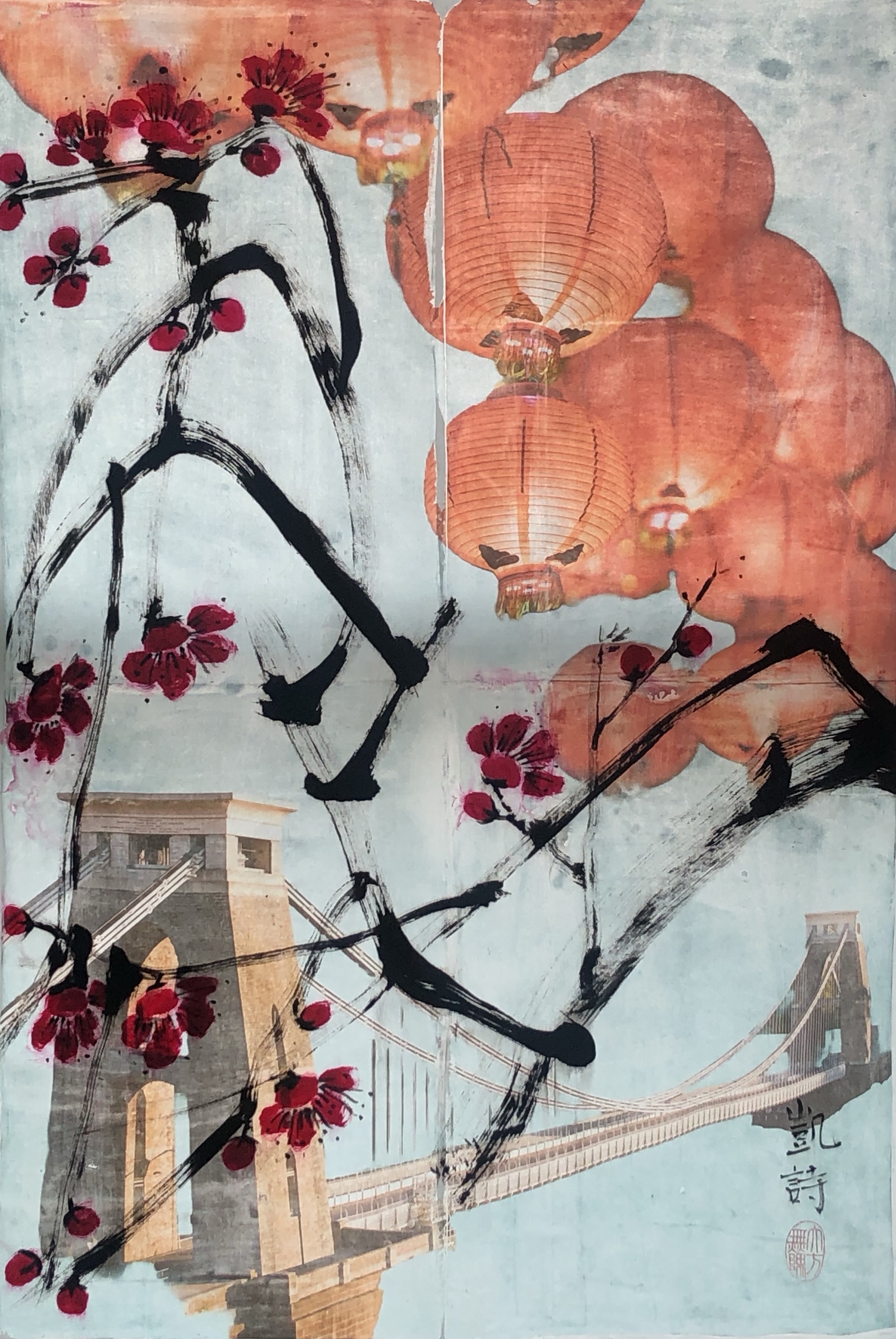
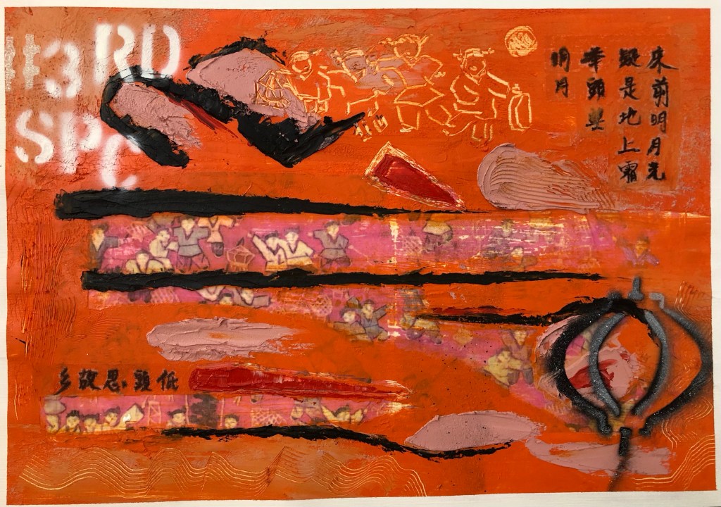
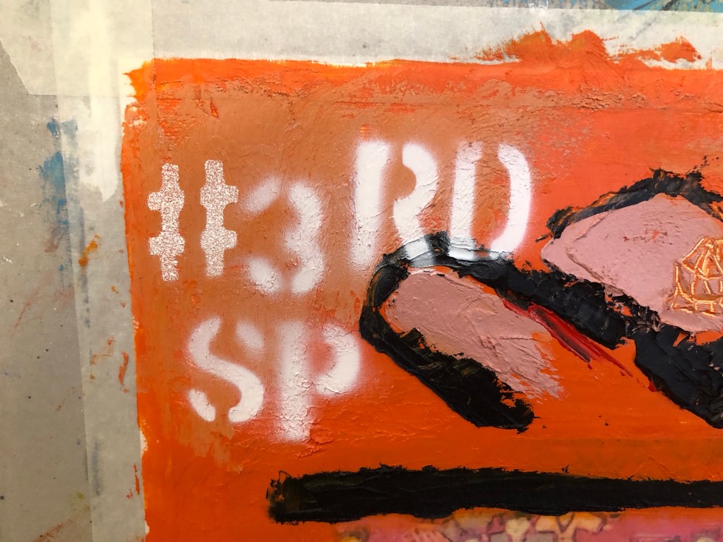
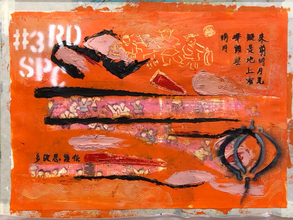
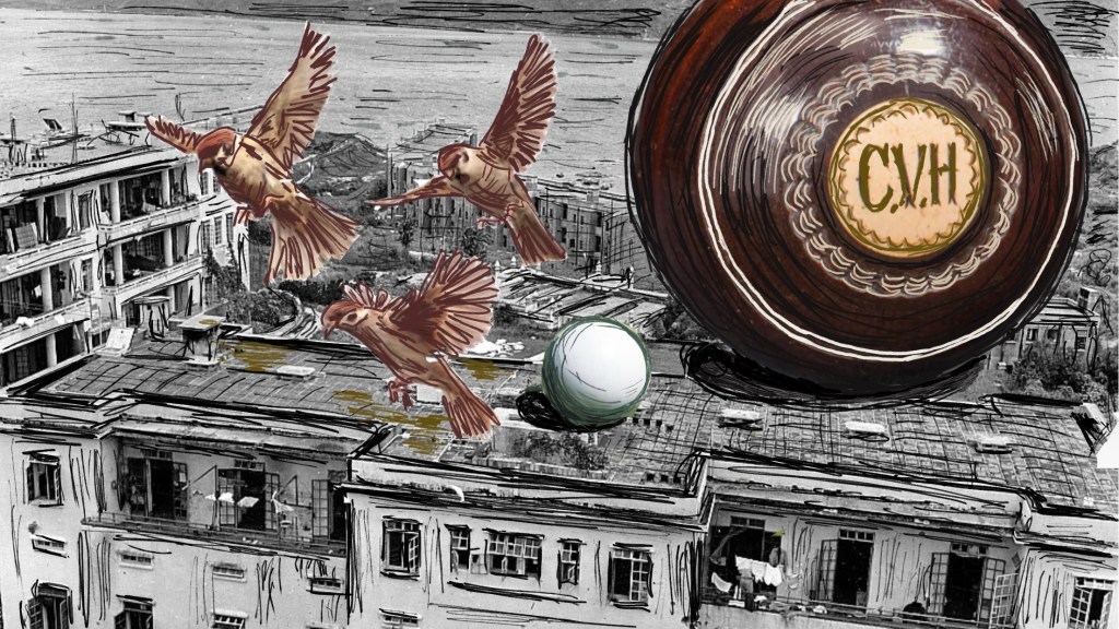
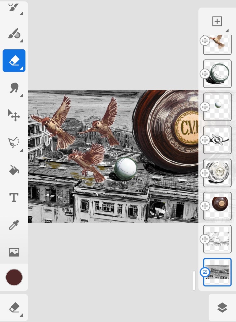
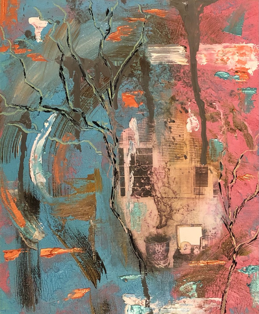
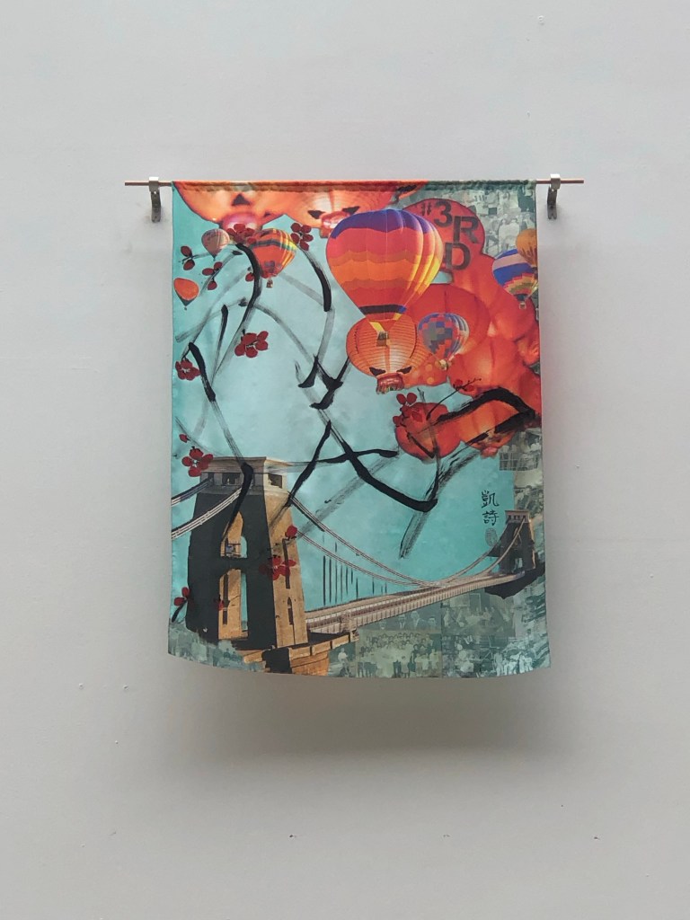
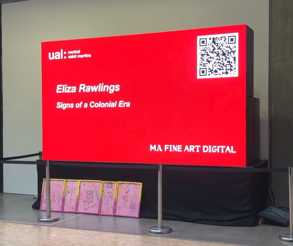
I recently exhibited at the MA Interim Show at Central Saint Martins, the making of my work was captured in this blog:

https://eliza-rawlings.com/2024/02/27/ma-y1-u1-exploring-aesthetics-part-2-painting-on-silk-for-ma-interim-show/

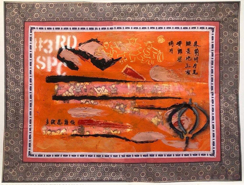
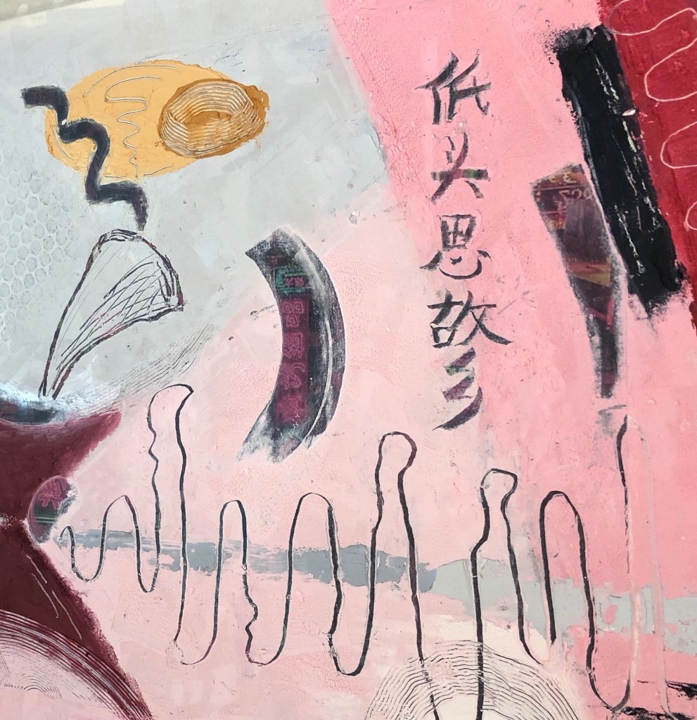
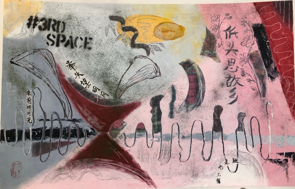
Here is the work on show at CSM:

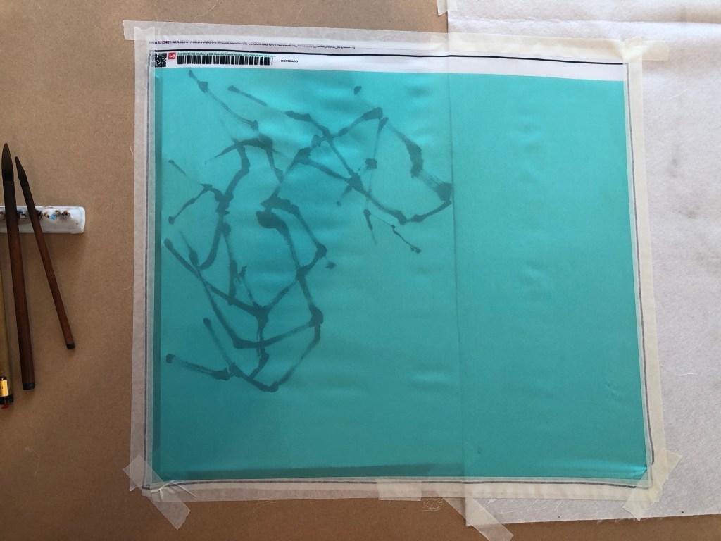
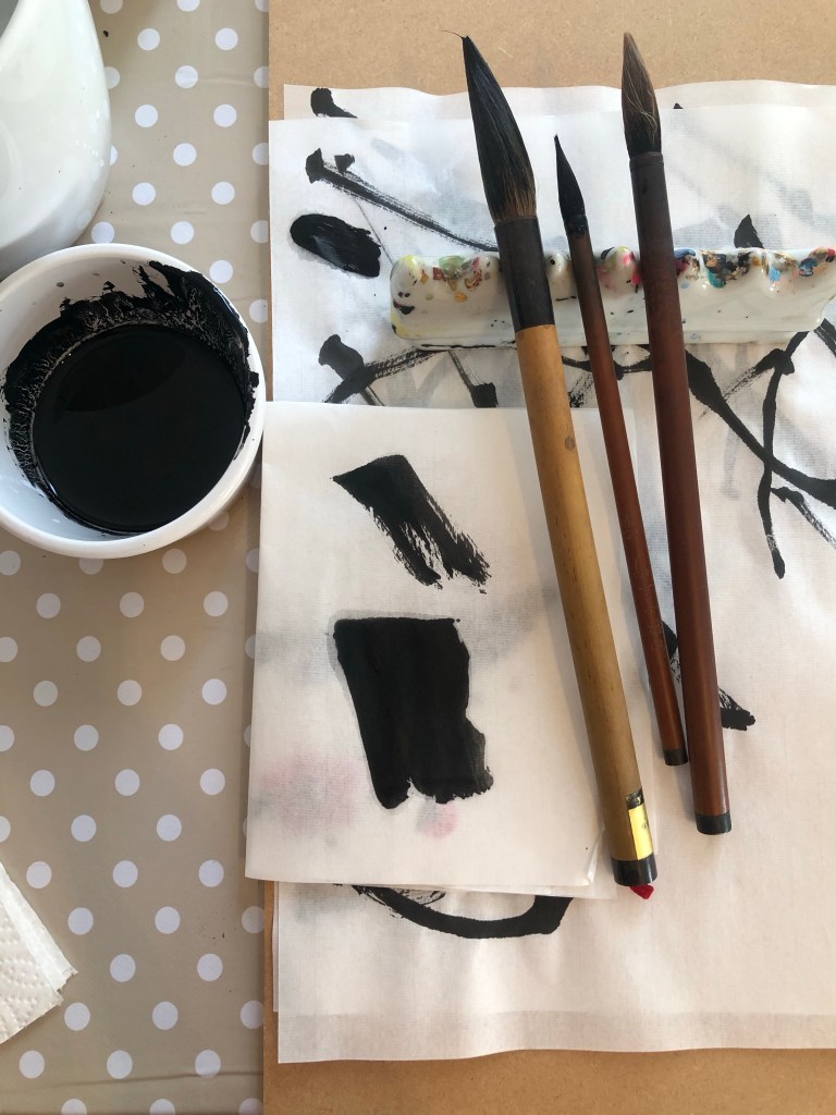
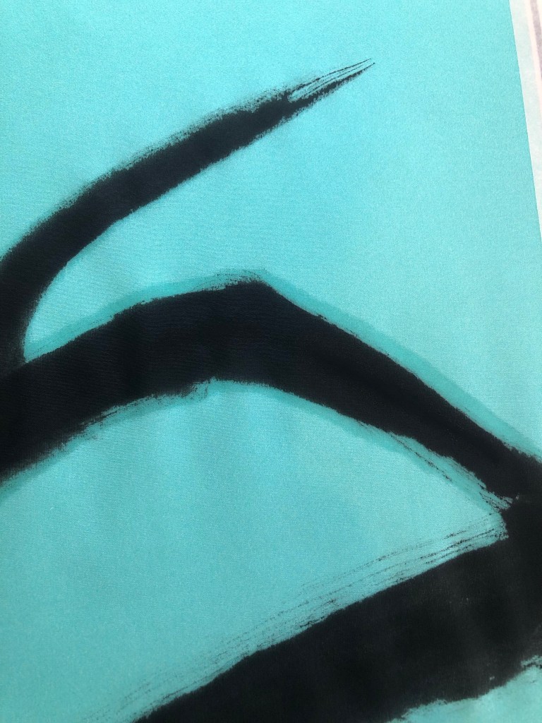
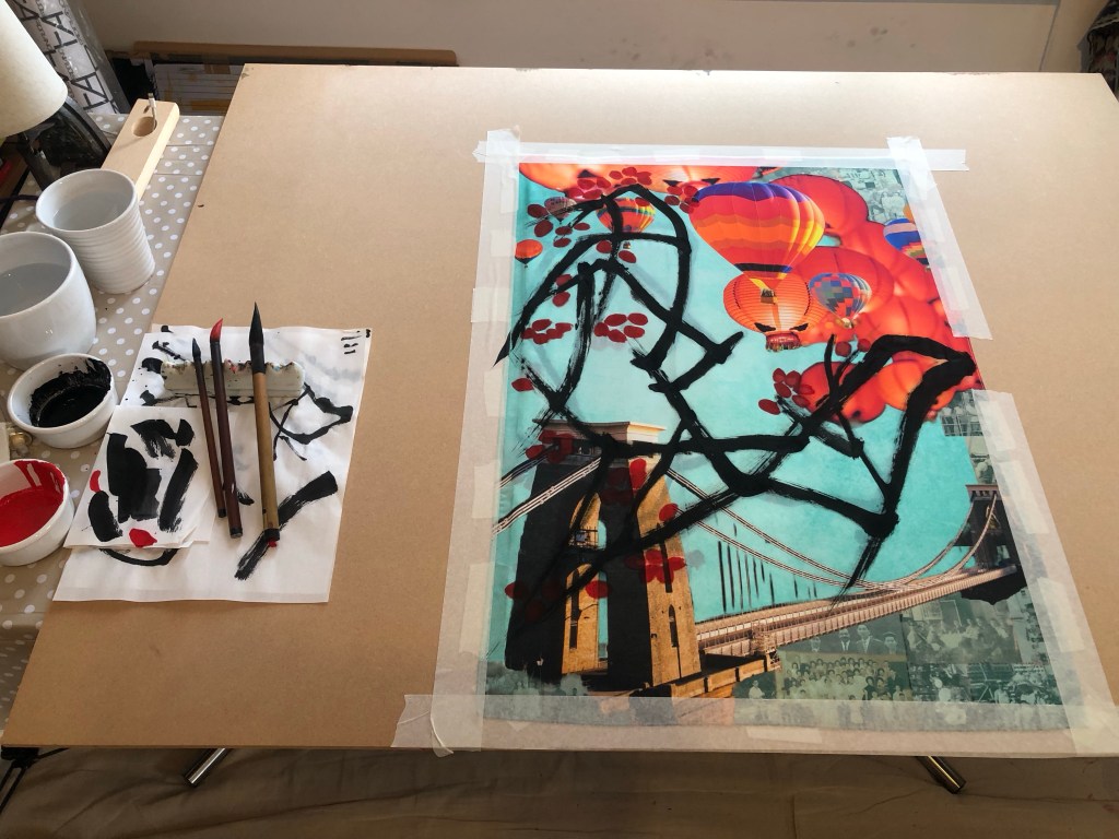
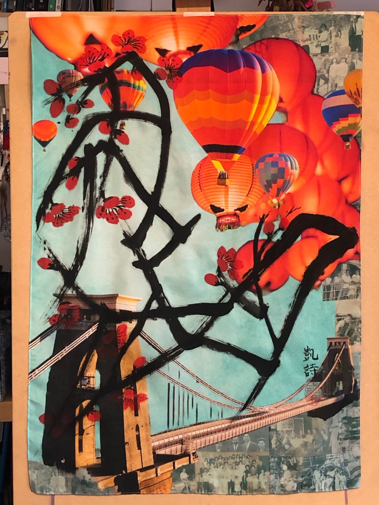
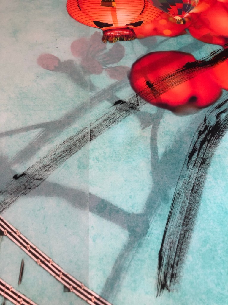
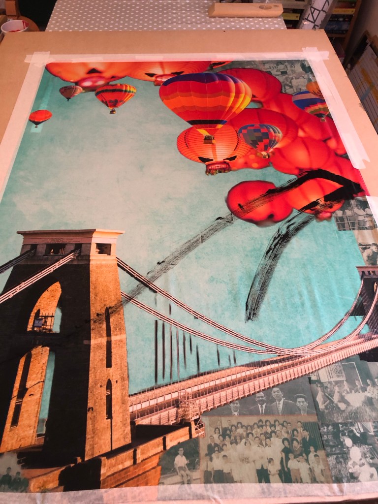
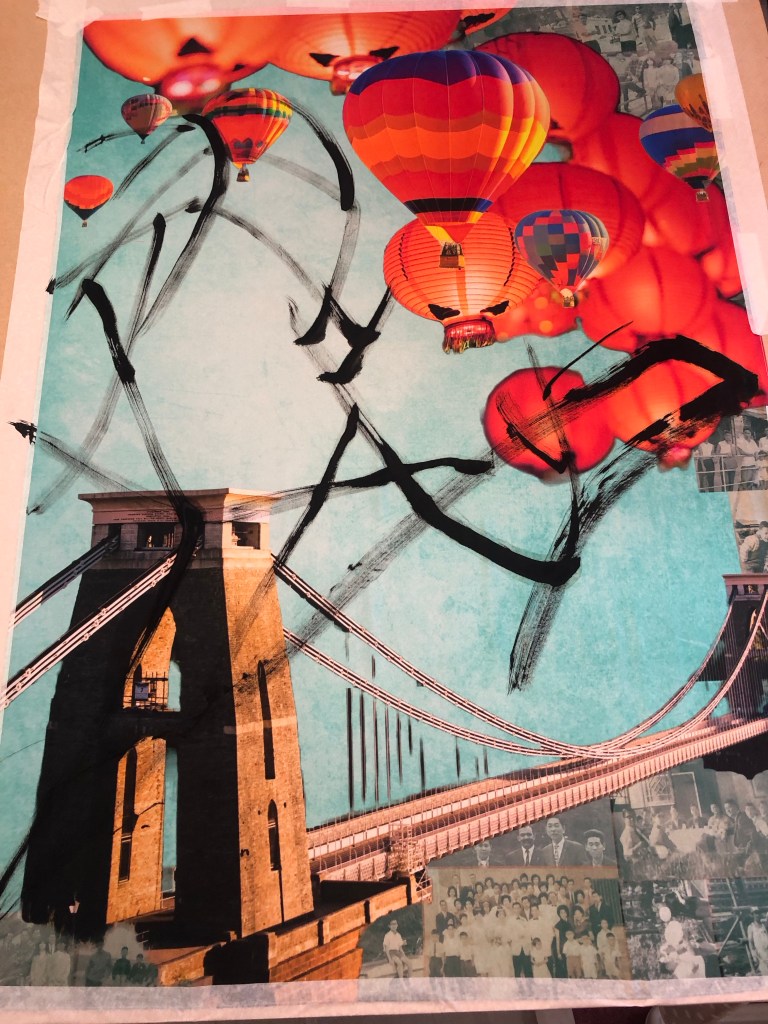
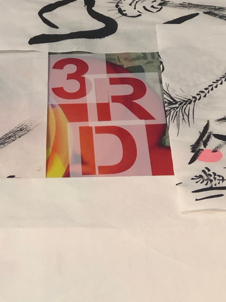
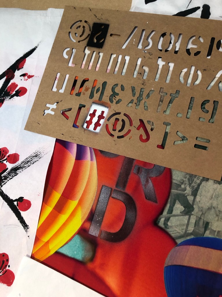
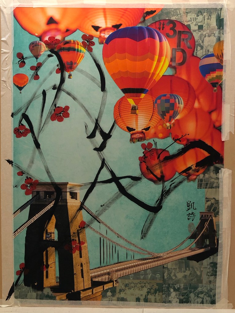
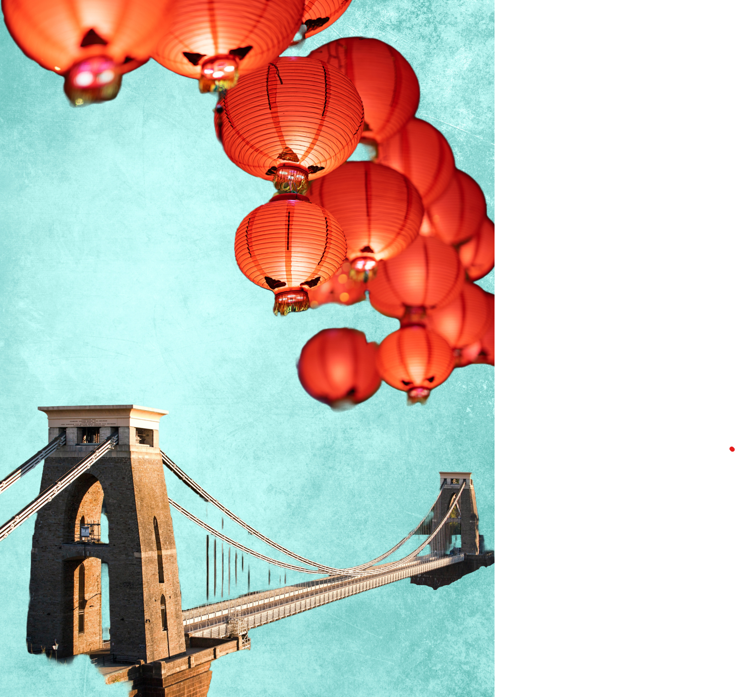
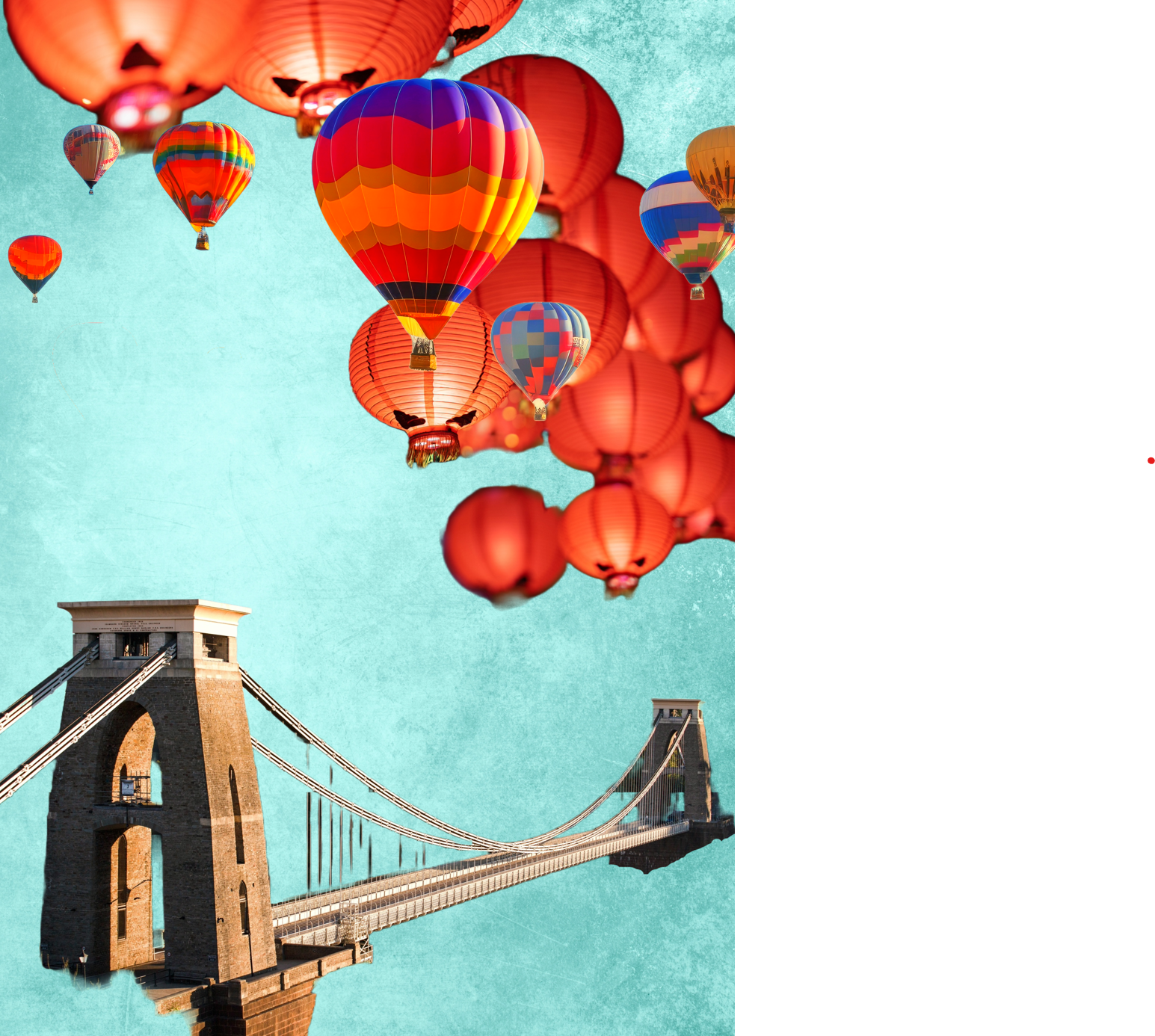
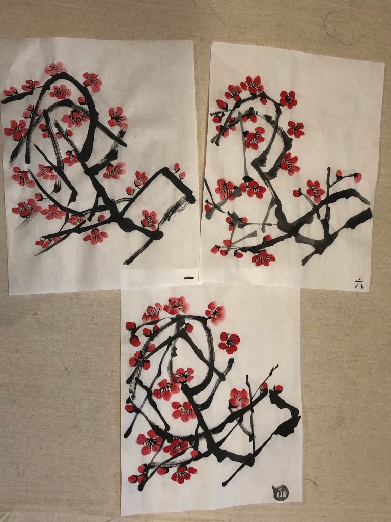
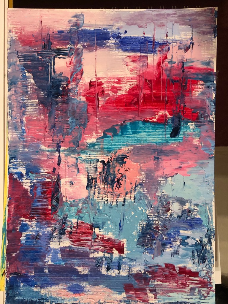
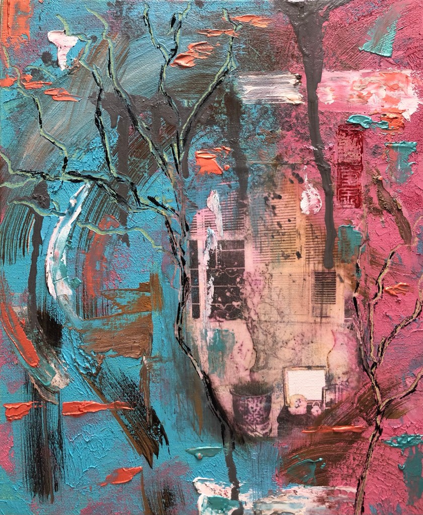
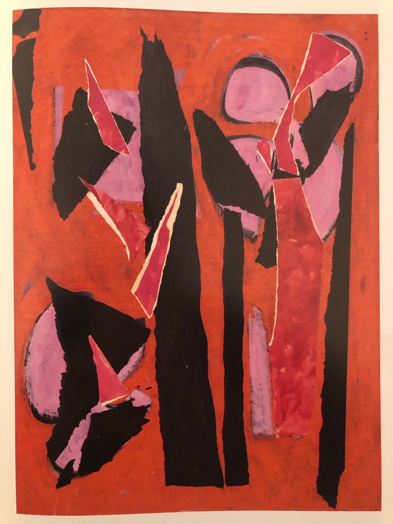
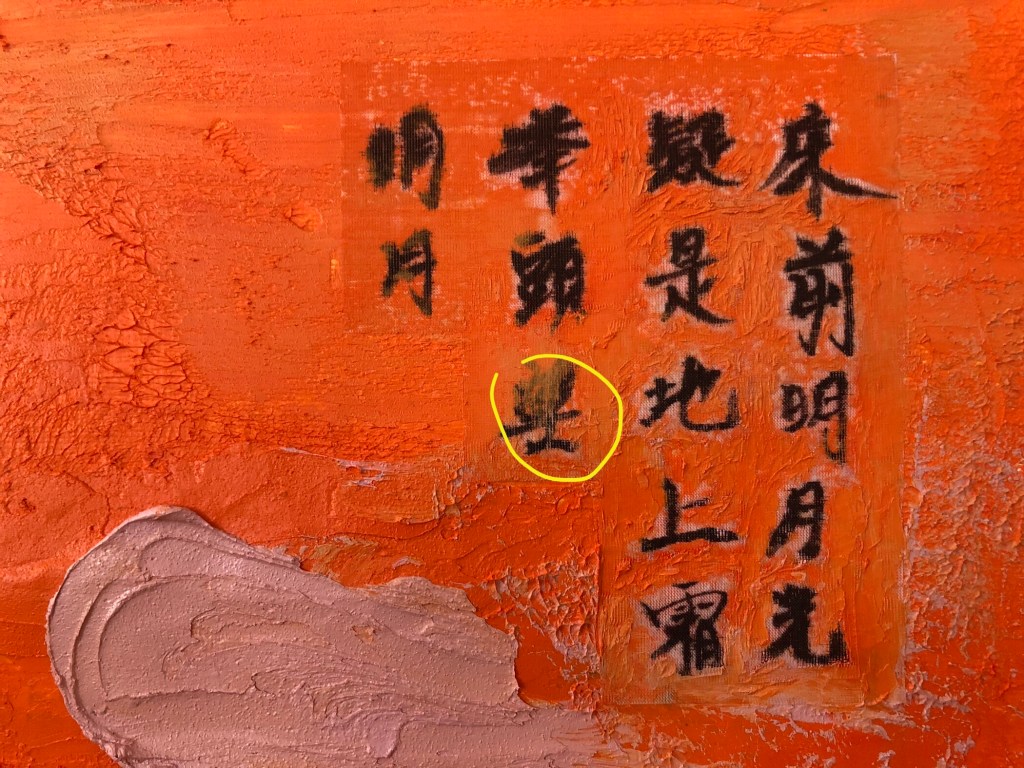
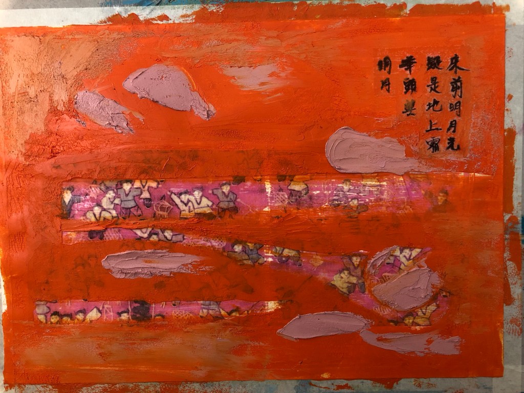
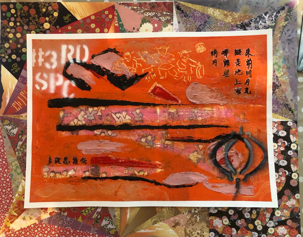
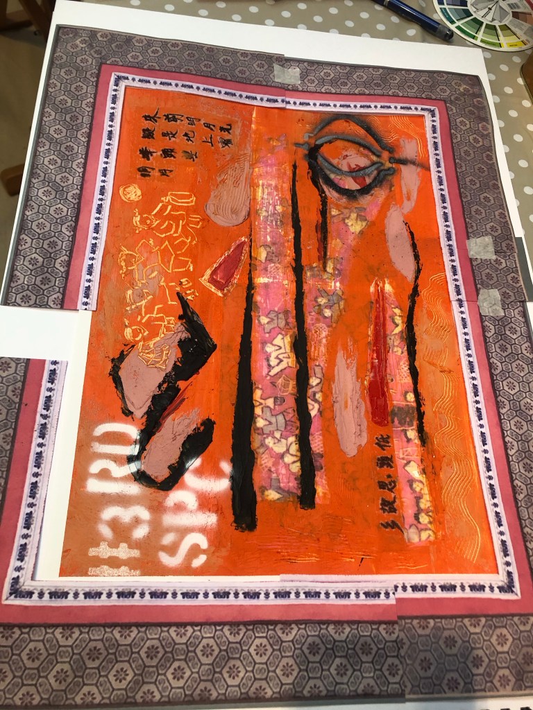
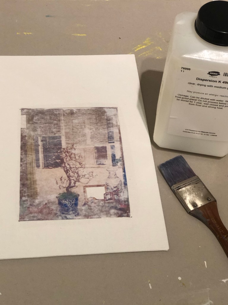
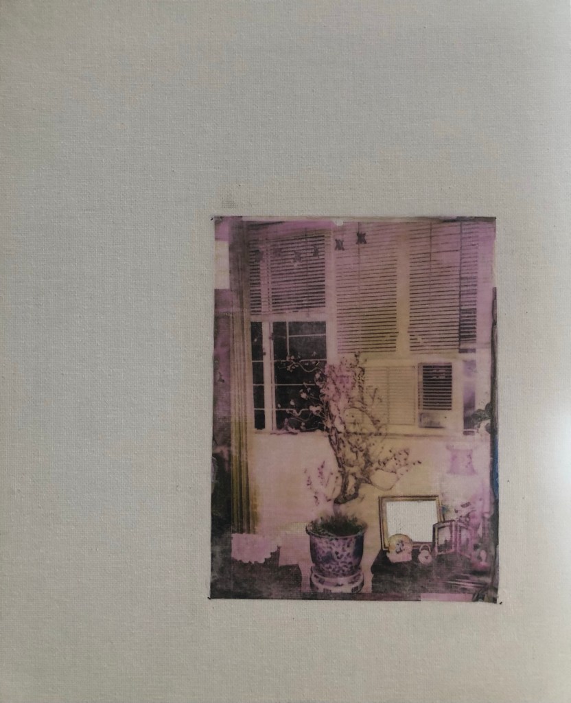
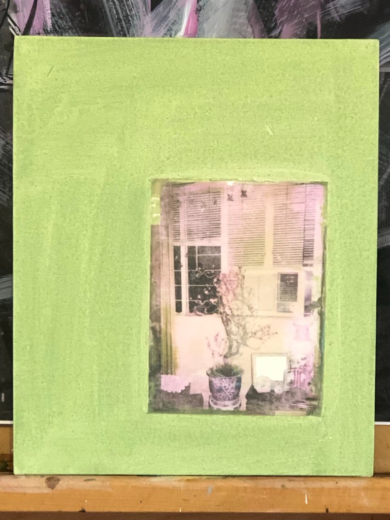
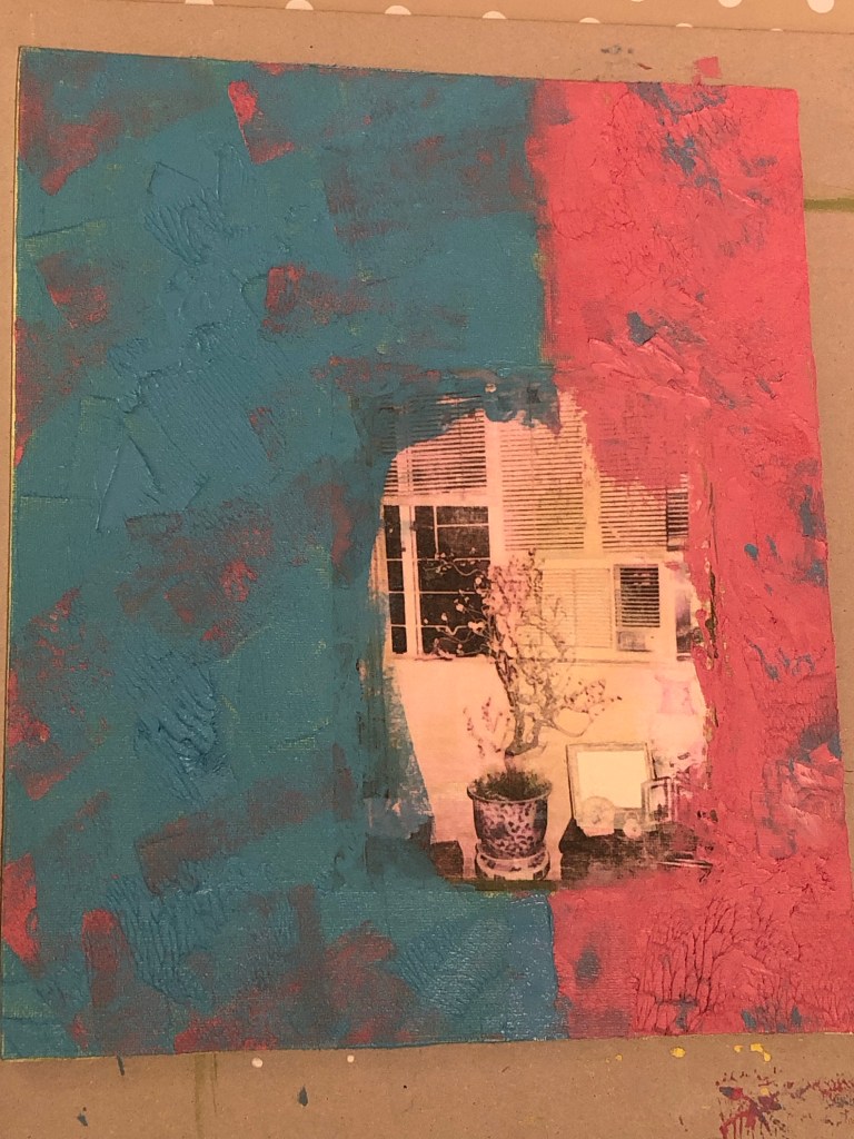
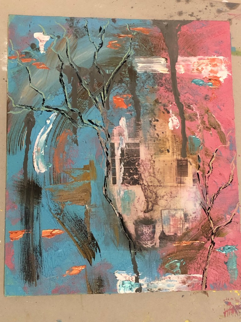
Making the work presented certain challenges. E.g. it was the largest Chinese brush painting that I have ever done (in A0) and painting on silk was very challenging (without a proper stretcher frame). Overall I was pleased with the outcome and it was an example of my transcultural layering work, however, I knew there was something lacking. I wanted it to represent something about my third space; but I have only created layers of A and B components, there was no C.

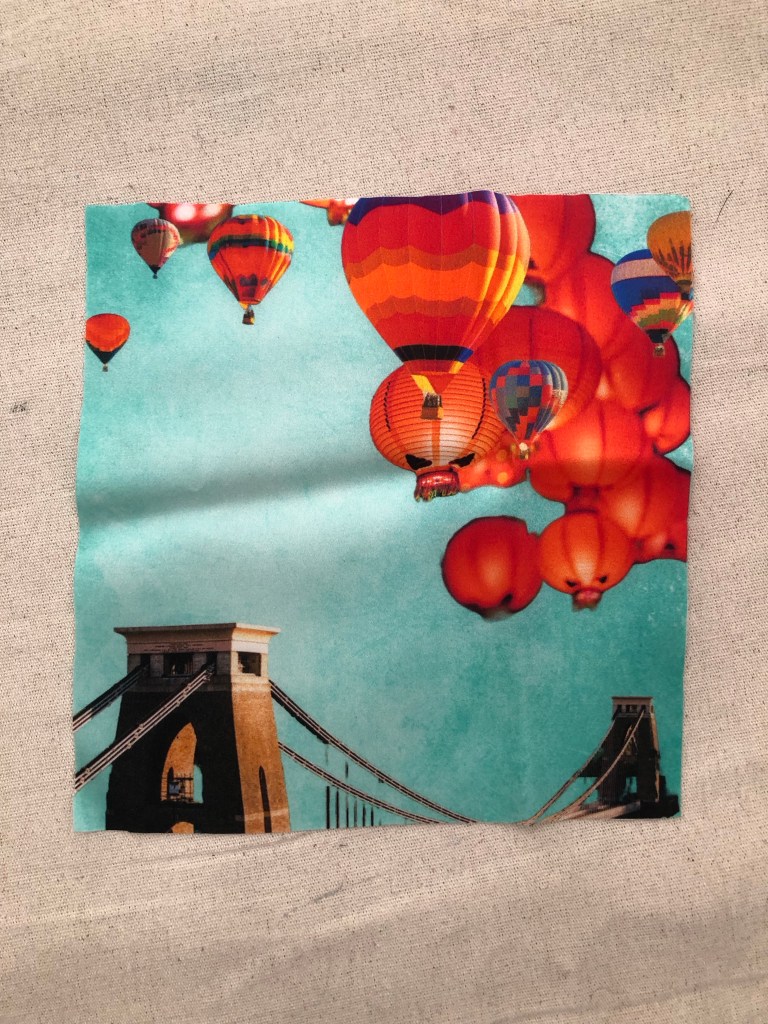
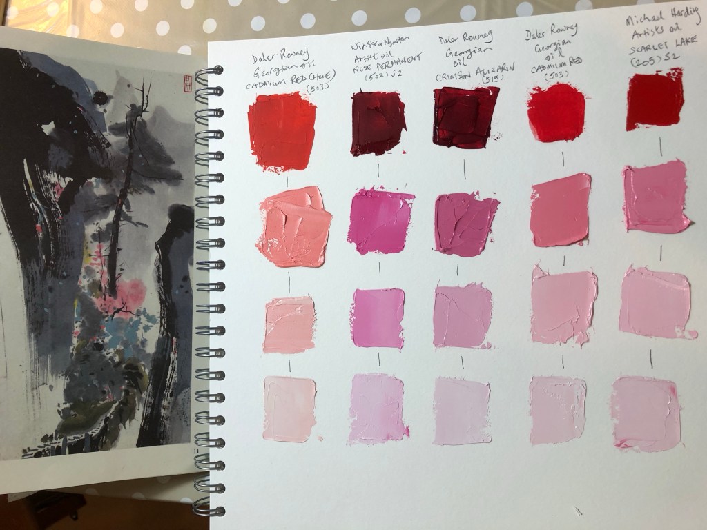
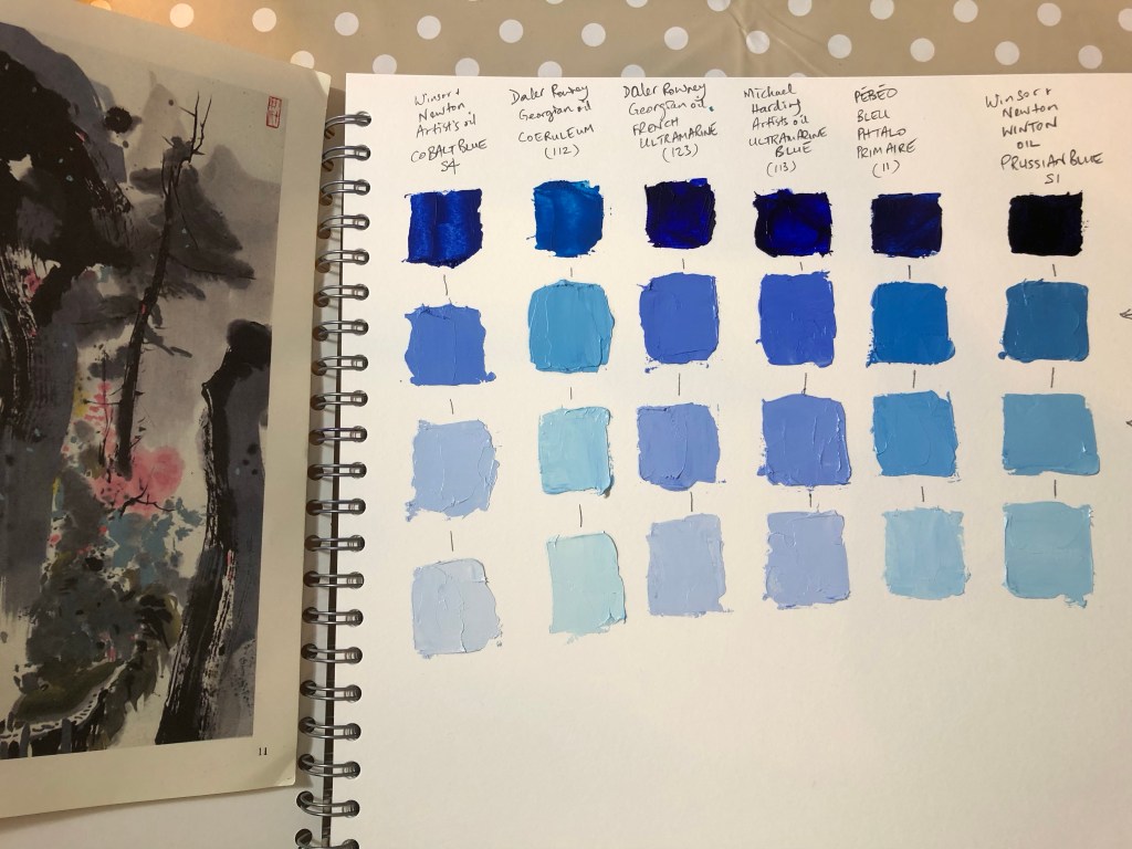
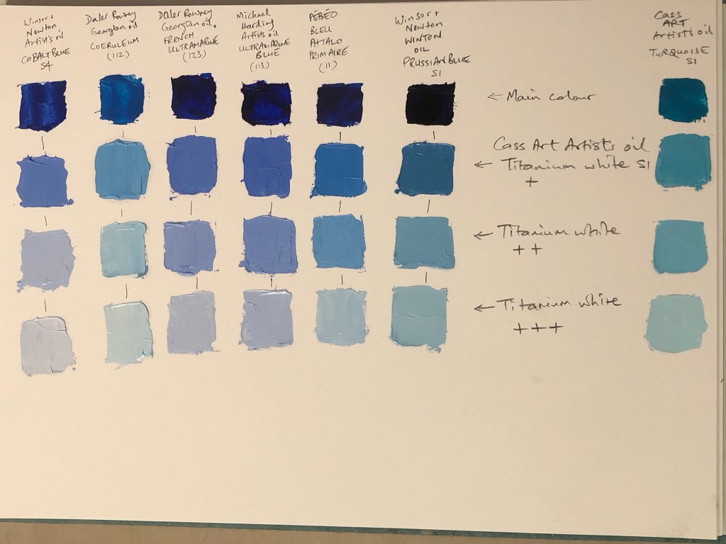
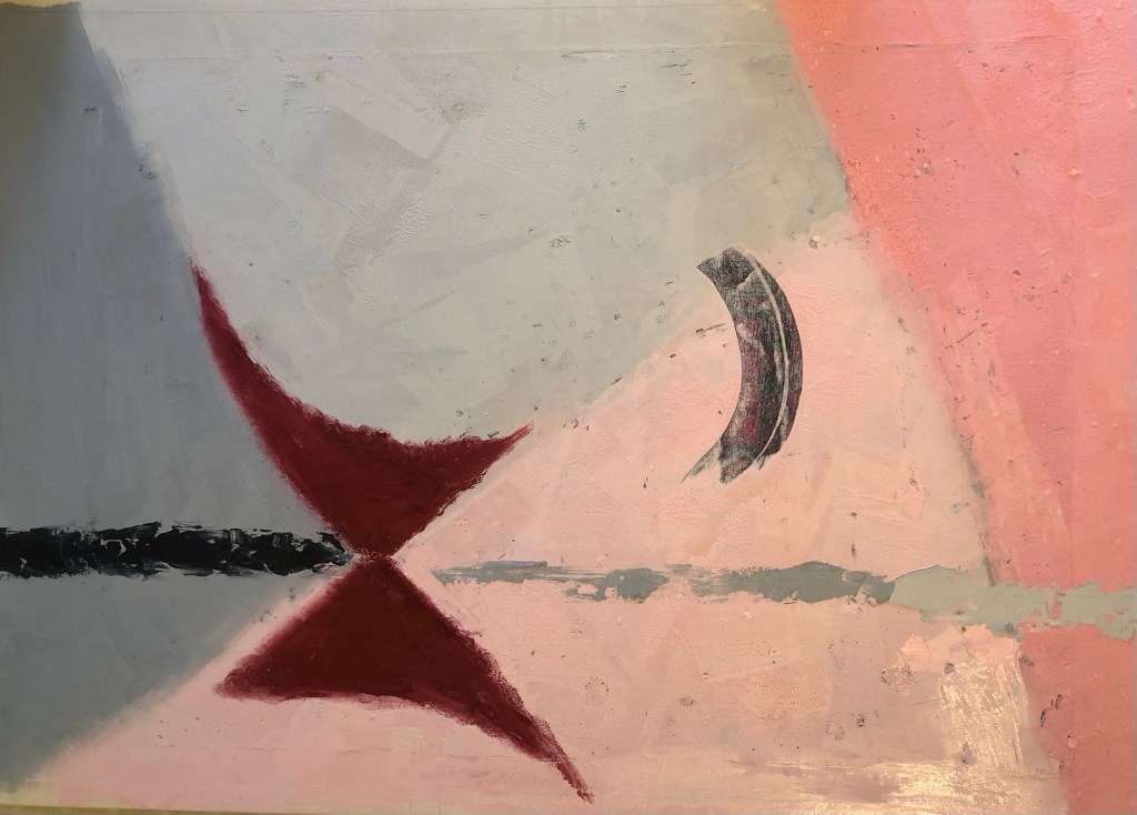
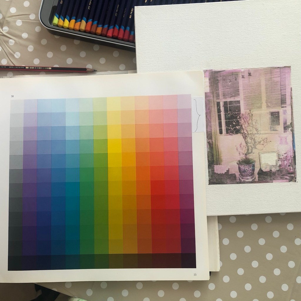
To explain this further, I have to introduce colours… If A is blue and B is yellow, then mixing the two gives green. Meaning C is green in this analogy.

What I had created in my silk piece for the show was equivalent to patches of blue and yellow, there was no green.

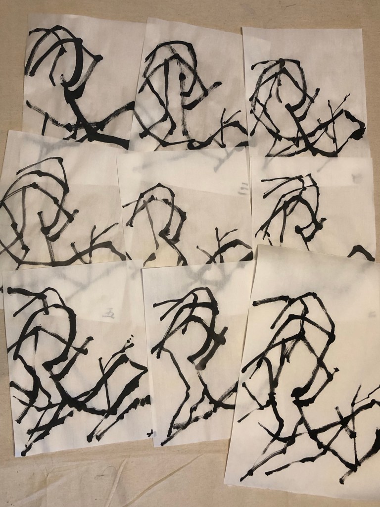
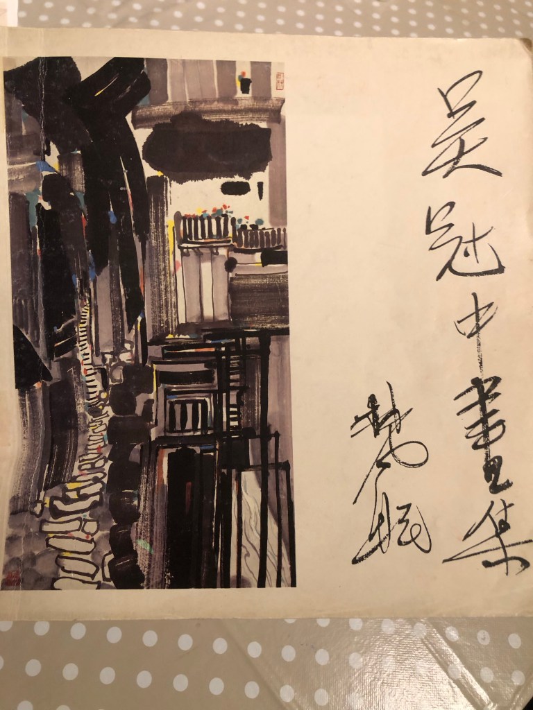
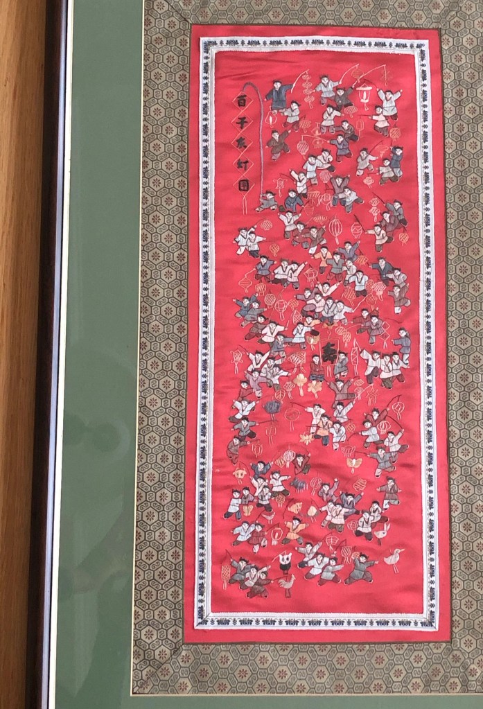
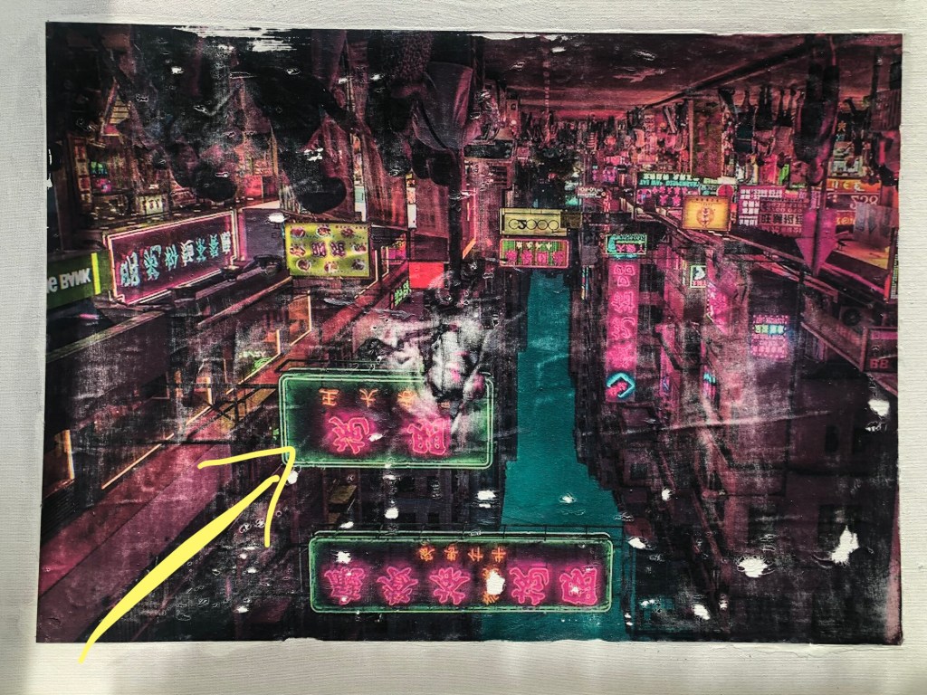
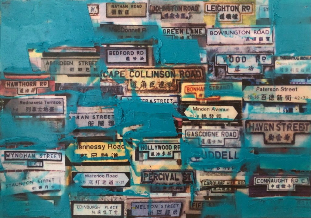
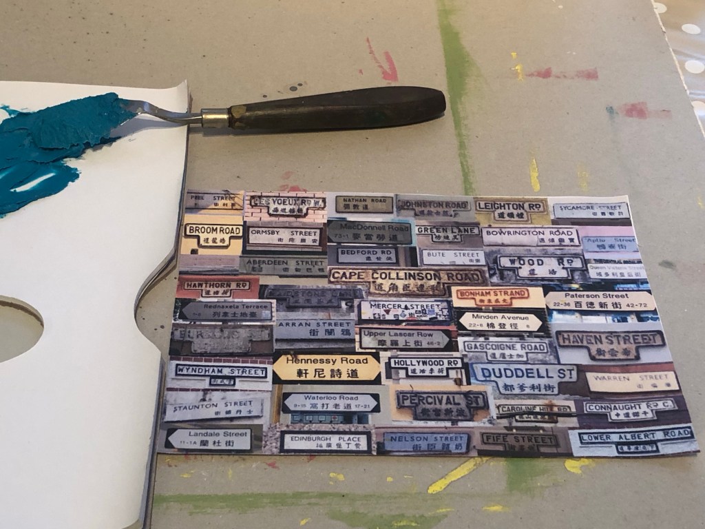
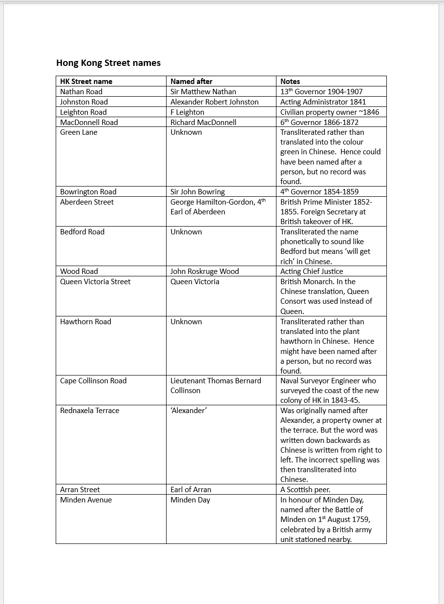
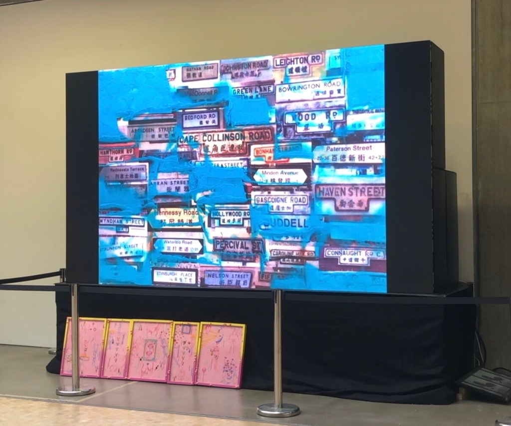
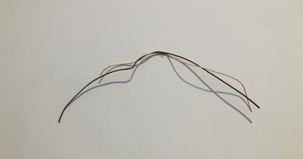
I always knew pinpointing my third space was going to be challenging and I have studied various transcultural artists’ work to learn from them – this is part of my ongoing research. I also tried to find other third space phenomena to help me in my understanding. The strongest example I have found so far was the street names in Hong Kong. It is explained in this blog and the video of me making the painting was also shown at the MA Interim Show:

https://eliza-rawlings.com/2023/11/26/ma-y1-u1-hk-street-names-part-1/

REFLECTIONS

I still have not managed to find how to truly express my C/green/third space… so where do I go from here?

I recently received some feedback from my tutor at the end of my MA Unit One, which followed by a discussion with him on this topic and my reflections are as follows:

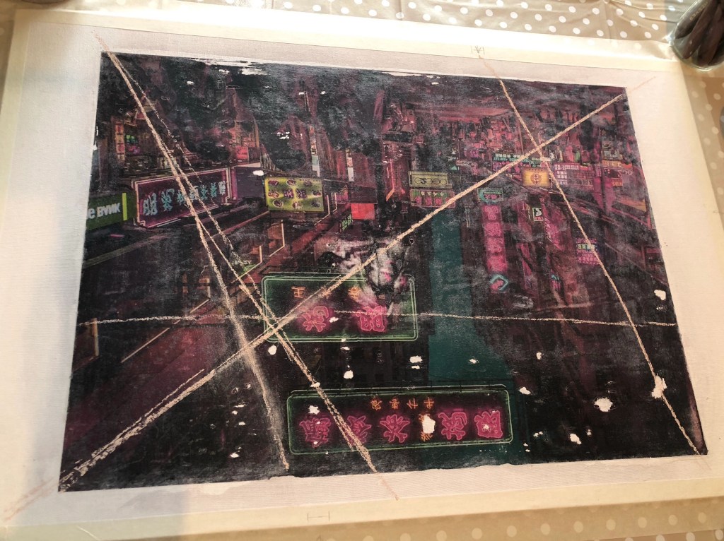
– Some of my images are prone to being too illustrative. Meaning they are obvious elements of A and B; I know that just putting them together doesn’t automatically make C. I had hoped that layering those images might gradually yield C for me but it hasn’t happened yet and I haven’t found a way of making it happen.

– I was advised to just make work. Don’t overthink it, just keep making – images, painting, objects, anything. It’s ok to leave it vague and unresolved.

– I wonder – does ‘just make work’ actually work? If I don’t think it through in advance, would it work out? I acknowledge that years of institutionalised corporate strategic thinking means that I am programmed to always ‘start something with the end goal in mind’, then just keep working towards that goal with absolute focus. I know this approach is counterproductive in my art practice to the extent that it can be a barrier for creativity. Therefore I need to try harder to free myself to ‘just make’.

LEARNING

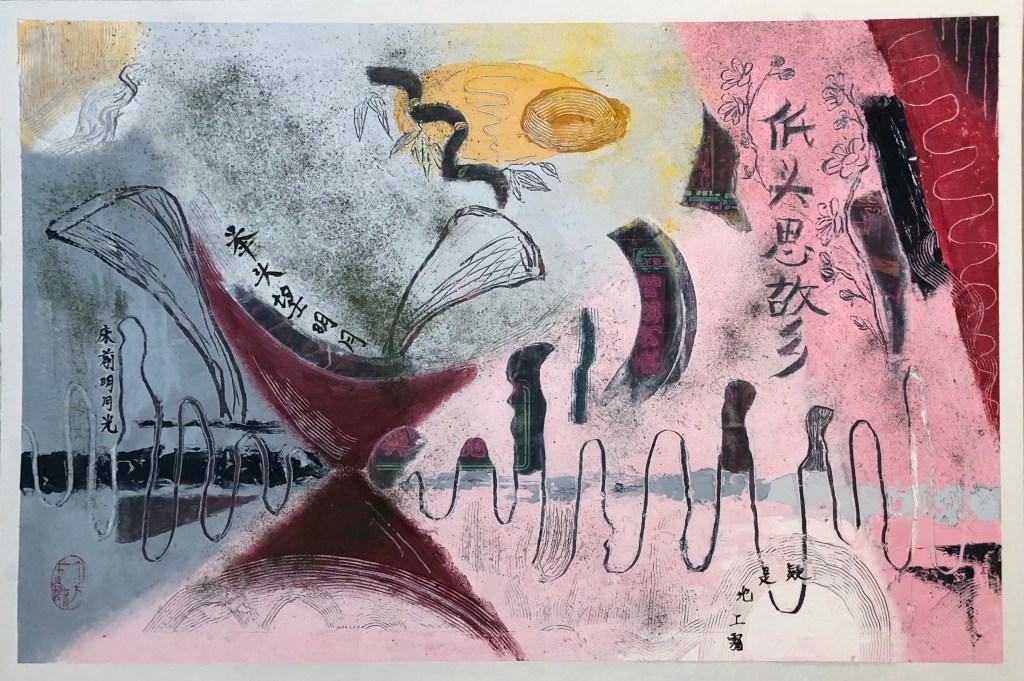
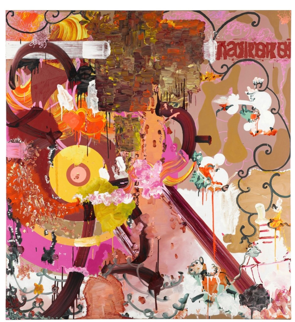
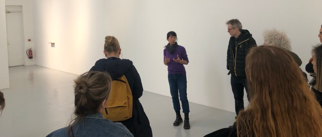
– I need to learn to trust myself to ‘just make’. My faith in this approach was reinforced by a gallery visit as part of the recent Low Residency week, where we visited an exhibition by the artist Maiko Tstutsumi:
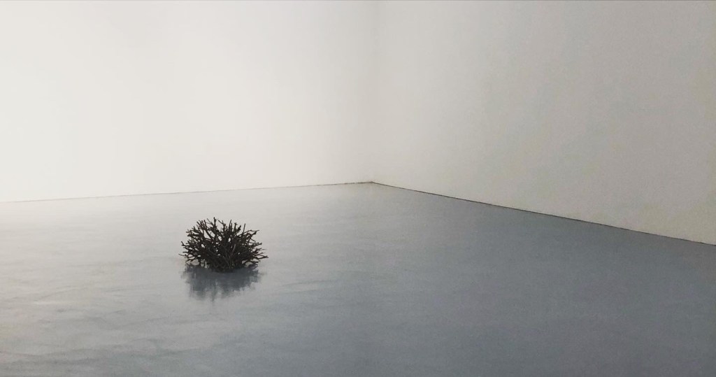
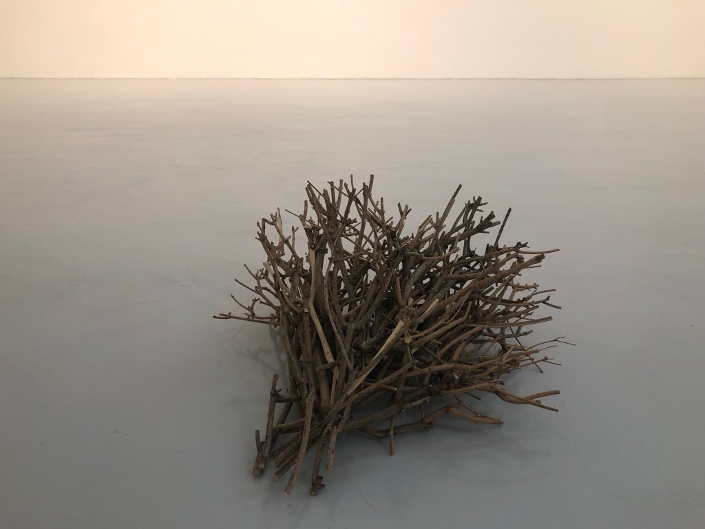
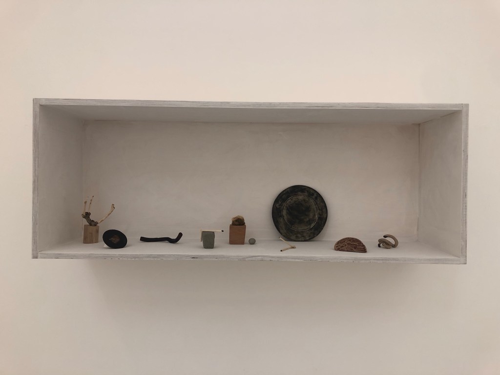
We were very fortunate to meet the artist where she explained her practice. Having listened to her to understand her background and way of working, I started to see ‘her’ clearly in all her work. It was the strongest sense of the artist that I have felt in their work for some time. The last time I felt so strongly was at Paula Rego’s exhibition at Tate Britain in 2021. Rego’s work was vibrant, energetic and sometimes even violent (e.g. depicting victims of structural violence) which is a complete contrast to Tstutsumi’s serene exhibition. Despite the contrast, I could sense the artists in their work equally strongly. I believe that is because their work was ‘them’. To learn from these great artists, I need to make my work more ‘me’. I am the transcultural being, if I can work out how to make my work ‘me’ then I will have a better chance of locating C and creating my colour ‘green’.

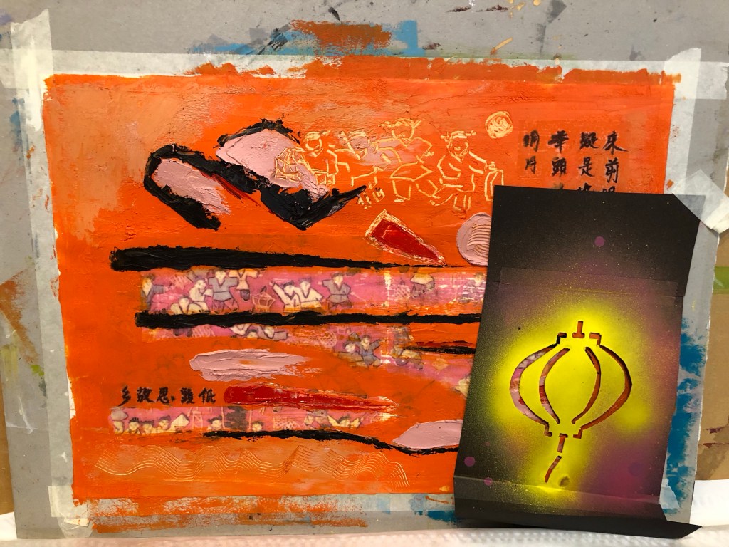
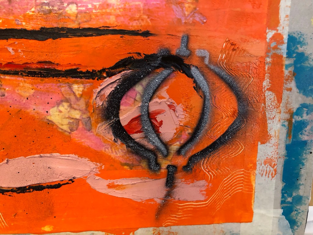
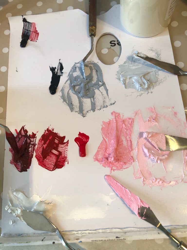
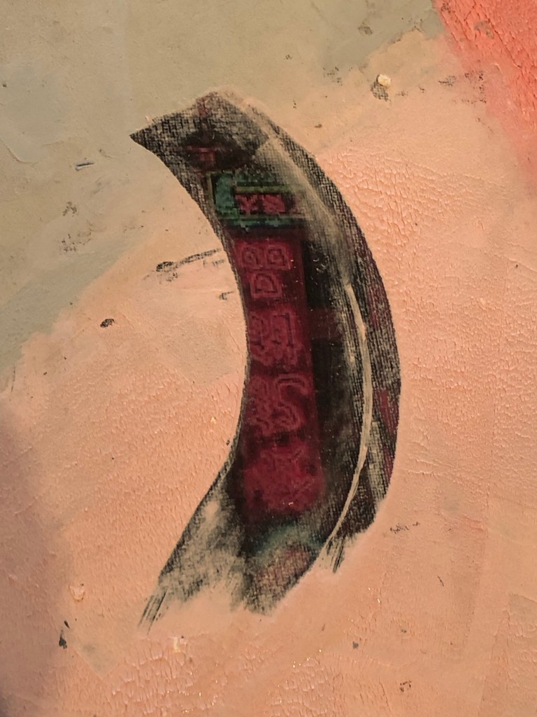
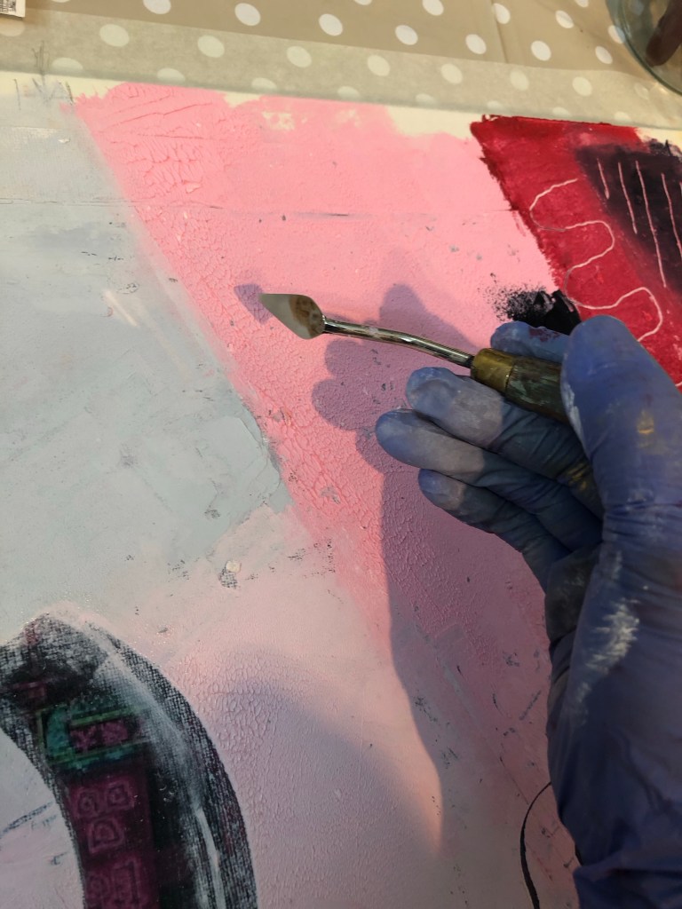
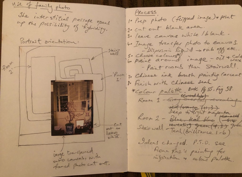
– Prior to the show, I had started to explore a more abstract approach combined with symbols (inspired by Fiona Rae) to express my third space. I believe abstraction could help me to avoid being overly illustrative. Now that the interim show and the Low Residency is over, I am going to return to pick up that strand of exploration.

NEXT STEPS

Just make.

MA Y1 U1: Exploring Aesthetics – Part 2 – Painting on silk for MA Interim Show

BACKGROUND

Following on from Part 1:

MA Y1 U1: Exploring Aesthetics – Part 1 – Using photos

I ordered the silk printing from Contrado who provided an excellent service. The image I used was the final outcome from Part 1 – the Clifton suspension bridge, hot air balloons, Chinese lanterns and family photos collage. This blog describes the process I went through to do the Chinese painting on the printed silk. The largest Chinese painting I have done up to now had been A1 size and I ordered 1xA1 and 1xA0 for this experiment. The A0 piece was therefore by far the largest Chinese painting that I have attempted. The plan was to use this piece of work for the MA Interim show if it worked out.

Here is the finished painting and I will use it for the MA show:

METHOD

Since I have not done a Chinese painting of A0 size, I wanted to practice on paper before doing it on the silk. As mentioned in some of my Chinese painting blogs, Chinese brush painting is very unforgiving, you only get one go at doing a stroke, hence practicing was important.

Here is the set up with scrolls of Xuan paper stuck together to form a large sheet:

Using the brushes I selected in Part 1 and the composition that I practiced on A4, here is the attempt on A0 size after completing the wild plum tree branches:

Then the plum blossoms were added:

Finished trial painting on paper:

When ordering the printed silk, I had to decide whether to print a border. So I trimmed one of the printed samples to see what a borderless image would look like. I was happy with it and the prints were ordered without border, i.e. printing the image right up to the edge. I also ordered the option of hemmed edges.

Sample image cut without border

In addition, I ordered a small piece of printed silk to test what backing should be used (a piece of felt which is typically used as a backing for Xuan paper painting or just use Xuan paper). Also to test the amount of brush loading and how the brush glided along the surface.

I was not happy with the felt backing because the moisture was not being absorbed fast enough and the silk therefore retained the moisture for too long and started to spread – as can be seen in the close up photo:

So the decision was to use Xuan paper as the backing material for painting on the silk. I started with the A1 piece as practice. Since I do not have a stretching frame for silk painting, I taped the whole piece onto a large board to stretch the fabric.

Below is the finished A1 painting. I was not happy with the painting because the brush loading was too heavy for the branches and as a result, the painting overly dominated the piece. I was disappointed in this but was pleased that I learnt this before doing the A0 piece.

I used the ‘stuck together scrolls’ of Xuan paper from the earlier practice as the backing for painting the A0 piece. It also gave me some rough positions of the composition. The edges of the silk was taped down to ensure the material was sufficiently stretched.

After doing two strokes, I could see the ink picking up the seams of the paper underneath which was not good at all. Once I started painting I was reluctant to stop because it would interrupt my ‘energy flow’, however, I had no choice but to put down my brush and lift up the tapes partially to pull out all the Xuan paper underneath. This was not ideal but had to be done.

With all the backing paper removed, the painting process could resume but with no backing paper to help absorb the ink, there was only the MDF board underneath which was a risk because I hadn’t experimented on MDF before.

It worked fine and I reduced the brush loading as well as the number of branches planned for the composition because I didn’t want to overwhelm the overall image with too dark brush strokes.

The plum blossoms were then added. I also reduced the number of blossoms and tucked some between the balloons and lanterns. I wanted to leave sufficient negative space on the left of the painting to create tension on the canvas juxtaposing the busy right hand side of the image.

After completing the Chinese brush painting, I had the choice of finishing it there, or adding some spray painting. I like adding street art style spray painting to my work because of my home city of Bristol being home to many great street artists and the city is full of beautiful street art. Hence street art is a big part of my heritage.

I was mindful that the canvas is already filled with images and I didn’t want to overdo it. Also I didn’t know how my spray paints would perform on silk. So I experimented with the A1 piece first:

I sprayed some two tone black and white stencilled letters on two lanterns saying ‘3RD SP’ for Third Space:

I was happy with the outcome so I started to lay larger stencils on the A0 piece:

‘3RD SP’ was too much, so I went with just ‘3RD’. I masked off the area and proceeded to spray one letter at a time.

It worked out fine and to take further risk, I added a ‘#’ to proceed the lettering to add a contemporary feel.

After spraying, I found that for some parts, the spray paint seeped through the thin silk and nearly glued the material to the MDF underneath. The silk was rescued in time and was safely lifted off the board.

The finally finished work:

Since I have decided to use this piece for the MA interim show, I had to work out how to hang it.

I have chosen to hang it off a piece of 1 metre x 10mm diameter wooden dowel. this means I had to sew the header of the silk to make provision for the hang. I wanted to minimise losing the images at the top especially to avoid losing my father’s face on the top right photo, I added a piece of silk material ‘tape’ at the top as follows:

The sewing was complete and the silk painting was hung off two metal brackets to simulate how it would hang at the show:

One of the reasons for choosing a thin 38gsm silk material was that I wanted the image to be visible from both sides if it was hung in free air. This is how it looks from behind and I am happy that the image is still visible:

REFLECTIONS

This whole piece of work has turned out to be a much larger undertaking than I imagined because of:

– Using family photos in my digital collage: aside from the emotions involved (which I have not fully resolved yet), there was much work involved in ensuring the resolution was good enough for printing on A0. The print company Contrado was excellent in checking through my design before I placed the order.

– Using new materials: I learnt a lot from choosing the right kind of silk material but it was also very risky because I had not worked with silk before and the thinness of the fabric made it very fragile to work with. The whole process was new to me and I had to make it up as I went along. Due to the costs and lead time involved in purchasing the printed silk, I had to take extra care in the experimental process to minimise wastage of materials as well as time.

– Going large: I wanted to challenge myself to create something new for the MA interim show, hence I went for A0. I found it very challenging because I am still very new to Chinese brush painting and that lack of experience made the process much more stressful than if I had gone for medium that I’m familiar with such as oil paint or acrylic.

What I was happy with:

– I learnt a lot in making this piece of work, documented here and in Part 1. I learnt about new methods, materials and processes. All the practices and trials were essential.

– Starting to use old photos in my digital collage. I still have many photos in my archive that I could use when I feel ready and able to. I have to manage the emotions and fragility involved in using such precious materials. But I have made a start.

– I was happy with the final outcome and was relieved that I have something for the MA interim show.

What I was not happy with:

– I should have anticipated some of the mistakes along the way, it was all useful learning despite being stressful at the time.

– Since the A1 silk experiment didn’t go well with the branches being too dark (overloading of the brush), I was overly cautious with the subsequent A0 piece. Also, my paint brush was not quite large enough. It was one of my mother’s brushes. There was a larger one but it would have been far too large, also, its bristles were starting to fall out and I didn’t want to damage it further since I want to preserve my mother’s brushes as much as possible. So I made do with the smaller sized brush. I would have wanted thicker branches for the A0 piece. Additionally, I could have loaded the brush a little more but I was worried that it would turn out like the A1 piece. Hence I was being overly cautious. It all comes down to my inexperience with Chinese brush painting. I hope this will improve over time with more practice.

Further reflections:

I have spent much of my MA first term developing methods to work with oil and cold wax, however, when it came to the MA show, I went back to an earlier method of transcultural layering where digital collages were printed onto a thin fabric then a Chinese brush painting was layered on top. I thought I would be more familiar with this latter approach but the change of fabric to thin silk and going large made it more challenging than I expected. I am pleased I went with this because it has renewed my enthusiasm for this transcultural layering method and now I have several other ideas in mind to try. I want to continue to pursue both ways of transcultural layering for my practice, namely:

1. Western medium as the lead with oil or oil and cold wax as the top layer, scraped back to reveal images pre-printed on the canvas. The canvas here would be robust such as woven linen/cotton or board.

2. Chinese medium as the lead with digital collages printed on silk and Chinese brush painting or calligraphy layered on top.

Which one to use will depend on the context and the kind of painting I want to make. My current plan is to continue to work on both methods.

LEARNING

– I learnt a lot about working with silk and will continue to use this material. I need to look into buying or making a silk stretching / painting frame that can accommodate large pieces of silk, A0 or larger.

– I gained confidence with my Chinese brush painting and there are no short cuts there – practice and planning are key.

– From the aesthetics exploration perspective, I learnt a lot from the mistakes in the A1 painting. It’s easy to overwhelm an image and it showed once again for me that negative space is so important. Often less is more and leaving space on the canvas creates tension that engages the viewer. I was hesitant in adding the spray paint but I really wanted to do it to bring in that aspect of my Bristol heritage. I am pleased that I did it and managed to reign it in.

NEXT STEPS

– Look into a better set up for painting on silk such as a large stretcher frame.

– Source a few larger good quality Chinese paint brushes for larger scale work.

– Do a new piece of transcultural layering work with a new digital collage of family photos for use with another silk painting or oil and cold wax.

MA Y1 U1: Exploring Aesthetics – Part 1 – Using photos

BACKGROUND

In the ‘developing style’ strand of my practice, I have been exploring how to create ‘transcultural’ images in my art through a process of transcultural layering. I have done some work in this area before starting my MA and I now want to return to it to continue my exploration of transcultural aesthetics as part of my practice.

Below is a piece of work that I did a year ago and I now want to pick it up and develop the piece further with some new ideas, materials knowledge and techniques that I have learnt since starting the MA. The work was originally created using dispersion liquid to transfer a digital collage image from paper to a polyester satin canvas, then the Chinese brush painting was painted on top in ink. 

I have recently researched into using better quality fabric as the canvas for digital printing as well as for Chinese brush painting. The findings are documented here and the results will be used in this work:

MA Y1 U1: Research – Digital printing on fabric

Below is the original digital collage created using Adobe Express. It has an image of the Bristol Clifton Suspension Bridge which is a famous iconic bridge in my home city of Bristol. I live very near the bridge and often drive or walk over it – it has meaning for me and is one of the images that means ‘home’ to me. Every August, there is a Bristol Balloon Fiesta and there are many images online with hot air balloons flying over the Clifton Suspension Bridge – again, those are iconic images for Bristol. When I made this original digital collage, I used Chinese lanterns instead of hot air balloons flying over the bridge as an attempt to create an overall effect that combined things from the different cultures that have been part of my life. The background teal colour and effect were purposely ambiguous – is the background image associated more with Chinese or Western culture? It’s up to the viewer to interpret.

METHOD

Taking the original image, I wanted to create more depth and interest in the sky. Therefore, a few hot air balloons were layered over the top in the foreground with the Chinese lanterns appearing to be further back giving a better feeling of depth. Different hot air balloon images were tried and this was the final version. The colours of the balloons were adjusted in the software to harmonise with the existing images. I was happy with the bridge image and no further changes were made to that.

As part of my narrative development work, I have been researching my family in Hong Kong and I have been given many old family photographs. I remember the photos very well because they were from the family photo albums at my childhood home. I have been wanting to use the photos in my work but I have been reluctant because I have not resolved my feelings towards them – I am not sure if I am ready to use them yet. 

I have always taken much inspiration from the Nigerian-born American artist Njideka Akunyili Crosby and her use of personal photographs. Below is one of her paintings that I saw recently in an exhibition at Tate Modern. Her technique of using faded photo images in the background is often seen in her work. Her images are evocative and they resonate with me because of what my family photos represent for me. 

.

Furthermore, at my tutorial last year, I discussed my reluctance to use the family photos with my tutor and he suggested that I try to use a few, perhaps use the ones that were less meaningful to me as a trial. So I picked out a few that were of larger groups, many were family friends and not people that I had strong emotional bonds with. Nonetheless, they were wonderful photos that represented the place (Hong Kong) and a time period when my late parents were young. The photos still had meaning for me because I remember clearly seeing all of them in our family photo albums and many had images of my parents (who passed away some twenty years ago). The digital images of the chosen photos were imported into Adobe Express and arranged on the collage. The transparency of the images were increased so that the background colour of the collage came through partially giving a more faded and blended effect.

REFLECTIONS

– From a personal perspective, I am pleased with this experiment as I feel I have made progress in making use of the family photos. Getting started was a challenge because all the photo images seemed too precious to use even though they were all digitised. I stared at the images for a while before deciding to choose the less precious ones. It was a strange process in determining the ‘rating’ of how precious or personal a photograph felt to me when each one held a story. The process eased once I got started so I am happy that I did this experiment because I feel I have a way forward in using the treasure trove of all the old family photos – this part of my exploration will remain a slow process but I have made a start.

– From the technical and aesthetic perspectives, I am happy with the new learning gained in using the digital tool to manipulate the images especially with the photo transparency. The outcome was the effect that I was looking to create. My ‘aesthetic goal’ is to create a transcultural feel for the piece, meaning the work represents and originates from my ‘Third Space’ (as described in the book The Location of Culture by Homi K Bhabha). Akunyili Crosby talks a lot about making work from her Third Space, hence I find much resonance with her work.

– This work is an example of where the two strands of my practice (developing style and developing narrative) mutually inform and I hope they will eventually converge when I have developed a more definitive style.

– I now have to source the fabric to print the image onto, then do a Chinese painting on top. I will source the printed fabric from Contrado as explained in this blog:

MA Y1 U1: Research – Digital printing on fabric

– I am considering making this work for the MA Interim Show in March 2024 if the rest of the process works according to plan. So I have been doing lots of practice Chinese brush paintings to test the techniques, composition and to choose the best paint brushes for the different parts of the intended painting – a plum blossom.  

.

.

LEARNING

– I remain happy with the transcultural layering process that I started a year ago and I want to build on this line of enquiry with my latest learning to find the transcultural aesthetics that I have been searching for.

– Digital collages of a combination of found images and old family photos have a lot of potential for creating the transcultural aesthetics that I want. But I am looking for more than just a digital collage, so the collage can be the background on the canvas and then I can paint on top with Chinese brush painting (reflecting my heritage) and/or spray painting (reflecting my home city of Bristol which is famous for street art and there are plenty around for inspiration). Also, the oil and cold wax exploration that I have recently started can also be part of the layering process. I am mindful that the key is not to overdo the layers or overwhelm the image; I must remember to ‘leave room for the image to breathe’ creating tension on the canvas. My purpose for the different material explorations is to give myself options in my art making knowing what materials go together in order to create the desired aesthetical effects.

– I made a start in using my family photos and I feel I can do more with this approach, especially as the two strands of my practice start to mutually inform.

– I will proceed with this piece of work with the potential of using it in the MA Interim Show, so I need to think about how to hang the piece.

NEXT STEPS

– Order the chosen silk fabric and the printing of the digital collage.

– Decide on the final composition for the Chinese painting and practice on larger paper ready for the real thing.

– Think about ways to hang the piece.

– Make more work with using the family photos – a long term project.

MA Y1 U1: Exploring colours – Part 1 – red and blue

BACKGROUND

As part of my style development work, I have just completed a series of media exploration where I experimented with combining oil and cold wax with various ways of overlaying Chinese brush paintings on top without compromising either medium. I now want to progress onto exploring aesthetics starting with colours.

Despite having attended workshops on colour mixing over the years and researched how colours work together, I have always used colours intuitively in my paintings rather than follow any strict rules. However, I often feel that I should be more considered when using colours for my work. I attended an exhibition of London based Columbian artist, Ofelia Rodrigues, where I was inspired by her use of colours and images to express her culture giving a strong sense of place for her narrative.

For my art practice, I have reached a point where I want to re-evaluate and hone how I use colours, especially when my aim is to express my stories and narrative through my work. Also, my wish is to go towards semi-abstraction for my narrative work and I believe the use of colour is key. This is the first blog of the series on exploring the use of colour to express a sense of place for my transcultural narrative.

METHOD

To begin with, I needed some visual inspiration. I started by gathering books that I have on contemporary Chinese artists as well as chinoiserie style art. Although chinoiserie art has deep roots in political historical, its origin is not part of the research here. In my view, chinoiserie is an example of art in the ‘Third Space’ – where two cultures come together and something new emerges that has characteristics of the original cultures. Although the chinoiserie style of art does not appeal to or resonate with me, their use of colours is worth examining for my research purpose.

My aim here is to look through images in the books and choose one that resonates. Then mix the colours and explore similar colours as a ‘back to basics’ exercise to get my thought process going and to see where it takes me.

Books that I gathered:

The book that I have chosen for this exercise is by a contemporary Chinese artist, Wu Guan Zhong. The link below gives a good summary about the artist:

https://www.christies.com/en/stories/wu-guanzhong-an-artist-of-feeling-rather-than-fact-dd97ec0d995d47eb9c56753e3c280e41

The painting that I have chosen to kick start my colour exploration:

I got out all my various red oil paints and increased the lightness of each by tinting with titanium white:

Several matching possibilities came up in my ‘red’ chart:

Then the same exercise was repeated with all my blue oil paints:

Various matching possibilities came up:

I added a new turquoise paint that I bought recently to the chart:

An abstract painting was made with all the left over paint:

REFLECTIONS

– Although it was not the intention, it turned out to be a useful inventory exercise for my oil paint. Since I often default to certain favourites, I have neglected others that have turned out to be ‘gems’ in the tinting process.

– There were also new findings about the different brands. I want to capture my thoughts here as a reminder for the future:

1. Michael Harding oil paint is always my favourite and this exercise reminded me that they deserve that top spot with the buttery consistency, pigment quality and load concentration.

2. Winsor and Newton artists oil was once a favourite before I went onto Michael Harding. This exercise reminded me of the quality of their pigment load, colour and how well they mixed. A solid product that I should not have neglected.

3. Daler Rowney Georgian oil was a brand that I used when I first started learning to paint in oil. It was sold to me as student grade oil. However, I recently read some reviews by artists saying they use it as their go-to oil so I decided to try them again. They are good value and I recently bought a batch ready for some larger scale oil experiments and they are just right for that. Pigment load is not as good as the above two but definitely good enough for some of my experiments where I plan to use a lot of oil. The ones I used for this exercise stood up well enough in the tinting process and produced some interesting colours.

4. I was introduced to Cass Art artist’s oil when I was in their shop. It’s a range that I have not tried before. It was sold as good value artist grade oil and better quality than the Daler Rowney Georgian oil that I was buying at the time. So I bought some to try, e.g. the turquoise in the last column of the blue tinting exercise. I was somewhat disappointed because the consistency was not as good as the other brand’s artist grade or even the DR Georgian oil performed better in this respect. I was also disappointed with the pigment colour and load. So I don’t think I will buy this brand again.

5. I have had a set of PEBEO oil for years and rarely use them despite the good range of vibrant colours. I got them out for this exercise and was pleasantly surprised. I always considered them as student grade quality and although it didn’t compare well to Nos. 1 and 2 above, it performed well in mixing and pigment load. The paint appeared more flat and matt compared to the other oils but it is certainly good enough for day-to-day projects. The wide variety of colours in the PEBEO set is a bonus that I have been neglecting.

– This was a good back-to-basics exercise that I needed to do to restart my colour exploration. I don’t know exactly what I’m looking for but I want to continue this with other colours.

– It occurred to me at the end of the exercise that I recently made a painting using similar colours to those in Wu’s painting. My painting was started by finding an old photograph of my parents’ lounge during one Chinese New Year when they were both alive many years ago. I don’t know why these two colours speak to me whenever I want to make narrative work. I also remember that I showed this painting at a crit session and I struggled to explain it. I need to think more about this…

LEARNING

– Some good discoveries of tinted reds and blues for me to consider using when determining colour palette for future narrative work.

– The colours in Wu’s painting and some of the tints in this exercise clearly speak to me but I don’t know why yet. Interrogating this might reveal more clues and help to develop more depth for my narrative.

– I have not studied Wu’s work before and researching his work showed that he also worked with oil and Chinese ink. This is a useful finding as that’s what I am trying to do as well. Since Wu is a European (French) trained artist (painter) of Chinese origin, we have some common backgrounds and I will add Wu to my list of artists to research, especially about his chosen media and process.

NEXT STEPS

– Do another tinting or colour mixing exercise – find another painting for inspiration.

– Think more about why the colours in Wu’s painting speak to me.

– Add Wu to my list of artists to research.

MA Y1 U1: Exploring media – Oil and cold wax – Part 6

BACKGROUND

I want to use this experiment to explore the Next Steps that were identified in Exploring Media – Oil and Cold Wax Part 5.

https://eliza-rawlings.com/2023/12/24/ma-y1-u1-exploring-oil-and-cold-wax-part-5/

The actions were to:

-Try out more Chinese brush paint collage onto oil and cold wax to refine this part of the process.

-Try exposing a larger area of the background image to see if that can work with the abstraction approach on the top layer. Experiment to find the right balance between revealing the base layer image without losing the sense of abstraction on the top layer.

-Try spray painting on top of the oil and cold wax surface – try when wet and then when dried.

Finished work for Part 6:

Mixed media on paper, A3

METHOD

A printed photo image of a tapestry that was gifted to me by my brother many years ago was used as the based image for this piece. The image was transferred onto a paper canvas using dispersion liquid. The paper used was 250 gsm oil paper.

After the dispersion liquid dried, the printed image was rubbed off with a wet sponge to reveal the transferred image on the canvas. This was the first time a paper canvas (as opposed to a cotton canvas) was used in this series of experiments and it was clear that the paper canvas was not robust enough for the process. See below image for damage to paper. However, there was sufficient integrity in the paper canvas to continue the piece. I was hoping that a thick layer of oil and cold wax would hide the damaged areas. There was also excessive buckling on the paper canvas.

Recalling my disappointment with the colour palette that I chose for Part 5 (pink and grey), I decided to research into abstract paintings that I like to learn from the colours used. One of my favourite abstract artists is Lee Krasner and below is the painting that I decided to study and learn from in terms of the colour palette used.

Desert Moon (1955):

A layer of oil and cold wax was then applied to the canvas:

Areas were scraped off to reveal the base tapestry image. Learning from Part 5, I wanted to reveal a larger area so that it was clear what the base image was about. Then additional oil and cold wax colours were added:

For the Chinese brush calligraphy, I chose a delicate silk fabric as a substrate that was almost transparent because I wanted the substrate to become as invisible as possible.

After writing the Chinese calligraphy onto silk, it was cut out and carefully pressed onto the oil and cold wax layer.

A small palette knife was used to press the silk into the oil and cold wax, taking care to avoid pressing the areas of the calligraphy characters which was challenging due to the complex shape of the characters. The yellow circle shows where part of the character was pressed into the oil and cold wax, partly obscuring the writing.

Additional marks were made – some were painted on and some were scratched off. The tapestry image was about children playing with lanterns and I have a lantern stencil that was made for previous work. So I wanted to experiment with spray painting onto wet oil and cold wax to see the effect.

Further spray painting was done – the phrase #3RD SP (for third space) was sprayed onto a dryer corner of the painting. All spray paint used were Montana GOLD 312g aerosol cans as popularly used by street artists:

Finished work with border tidied up:

REFLECTIONS

I am happy with:

– The colour palette. I am much happier with this painting than the previous one in Part 5. A more considered approach in selecting the colour palette paid off here.

– The experiment with using an almost transparent substrate for the Chinese brush art worked well. The pieces (there were two in total) adhered well to the painted surface. Although the substrate was not completely invisible, it was acceptable as a solution.

– The scratched mark making especially the part at the top to echo the revealed based image of the children playing with lanterns.

– The overall look of the spray painting, especially the words – they added a contemporary feel to the piece which was what I was looking for.

– Feeling more confident using oil and cold wax as a medium.

I am not so happy with:

– The paper canvas, it was not robust enough. Although the damage by the image transfer process was covered up with oil and cold wax, it was clear that this would be the wrong material to use for this process.

– The spray painting of the lantern – it was sprayed onto very wet oil and cold wax. The outcome was not satisfactory – it felt and looked ‘gooey’ and not the intended effect. I believe this was partly due to my reluctance to place the stencil close to the wet oil paint as I didn’t want the back of the stencil to pick up the oil paint, causing the spray paint to loosely disperse around the stencilled image.

– Although I was happier with the colour palette, I felt there was more that could be done to add more complexity to the palette to increase depth to the piece.

General comment: the Chinese calligraphy is a famous ancient Chinese poem about being homesick. It is one of the few Chinese poems that I know as most children growing up in Hong Kong in my era were made to learn it, partly because it is a good poem and very easy to remember. Going forward, I feel that if I were to use more Chinese calligraphy then I should learn more about Chinese poetry so that I can use a wider variety of content in this respect. It will also help me to understand more about my Chinese heritage.

Other thoughts that came to me some time after completing this painting:

– Throughout the making process, my mind kept going back to celebrating the Mid Autumn Festival when I was a child in Hong Kong. The highlight as children was to be given a lantern each to play with. The choosing and buying of the lantern in preparation was always a source of excitement. The lanterns were lit with small candles. The children would use a long stick as handle for the lantern and go around the neighbourhood exploring with their lanterns, just like the children in my painting. The Mid Autumn Festival celebrated the fullest moon of the year and celebrations would only begin after dark when the full moon came out. Since we were not usually allowed out at night, it made the Festival especially popular with children. At times a lantern would catch fire which added much excitement. There would be lots of fruit and snacks laid out that were specific for the festival. I remember one year when we were older children (over ten years old), my brother and I went to a local park, sat on the swings and chatted all evening. It was when my family was going through a difficult period and to share that moment with him was very special, especially when we ended up spending most of the rest of our lives living in different countries. He gave me the children’s tapestry that I used for this painting which evoked all those memories while making this piece of work.

LEARNING

– More work is required to develop my sense in choosing an appropriate colour palette for the piece. This is increasingly important because my work is about storytelling as well as narrative and I believe having an appropriate colour palette helps to tell a story. So more research and experiments should be done in this respect.

– The silk substrate worked well for the Chinese calligraphy. However, I know there is a wide range of other delicate Chinese substrates and I will experiment with different materials to find the optimum.

– Layering the Chinese substrate onto oil is a risky process – as seen in the image with the yellow circle highlighting the part obscuring of the brush painting if pressed too much into the oil. To help with this, further experiments are required to improve this process. E.g. paint a barrier layer, such as a masking fluid that dries clear, onto the back of the Chinese brush painting or calligraphy to shield the image from the oil seeping in from underneath.

– Spray painting, especially words, adds a contemporary feel to the image which is a style that I want to incorporate into my work. This is relevant to me because I take much inspiration from the extensive street art scene in my home city of Bristol where many famous street artists work or have worked.

– Using the tapestry image evoked many memories, perhaps I could explore that more.

NEXT STEPS

– Research into colour palettes for the type of stories that I want to tell. Build confidence in this area.

– Continue to build experience and explore using oil and cold wax.

– Experiment with other transparent Chinese substrate materials to find one that is as close to invisible as possible when layered onto oil.

– Experiment with a barrier or masking fluid to prevent the oil from seeping into the Chinese brush painting images.

– Experiment with more spray painting – be bold and push boundaries.

– Ongoing learning – research into Chinese poetry to find more poems that resonate with me to use in future work.

– Explore the evoked memories.

ADDITIONAL WORK

After visiting the exhibition of Ofelia Rodriguez again at Spike Island in Bristol, I was inspired by the way she used fabric as a border to her paintings.

This gave me the idea to try that with my work, especially to use Chinese imagery border for a recent piece of work to add to the transcultural narrative.

I started with some patterned paper that I had to make a collage frame. But I was not happy with the effect. It seemed too busy and rather random as an idea.

I then returned to the original tapestry that I used as the base image for the painting. It was a tapestry that was gifted to me by my brother many years ago.

Image to show the border of the tapestry

It is a typical border for small scale tapestries of this type. Then images of the border were printed and cut out to create a collage border for the painting:

Final finished work:

Mixed media on paper, 54 x 41.5 cm.

REFLECTIONS

I am very happy with the outcome of this experiment inspired by Rodrigues. It has completed the painting for me and added a more transcultural feel alongside the painted images such as the spray painted words.

To improve this approach, I would spray paint the # words to partly cover the tapestry image frame. I think that would increase the contemporary feel for the piece juxtaposing the traditional Chinese tapestry border.

MA Y1 U1: Developing narrative – Bowling lawn incident

BACKGROUND

Following on from a previous piece of digital art work where I researched and experimented with Procreate and Adobe Fresco, I chose to use Adobe Fresco for this piece of work because I found using my MS Surface Pro with the MS Stylus worked well; it was an enjoyable way to create art that is new to me.

This is part of my narrative development work from memory, where I make work when thoughts or scenes come into mind. In this case, it was a childhood memory. The trigger for this memory came from researching into Homi K. Bhabha’s book, The Location of Culture, where he talked about ‘mimicry’. Bhabha asserts that the colonised people would try to mimic the behaviour and culture of the coloniser in order to be more accepted by those in authority. According to Bhabha, the coloniser wanted the colonised to mimic them because it was a form of imposing soft power making the colonised adopt the coloniser’s culture and habits as a higher standard. To reinforce the power structure, the coloniser would demonstrate their power by judging good and bad mimicry. The coloniser did not want the colonised to be great at mimicking because it was important to maintain a differentiation between the two to justify the act of colonising.

Understanding Bhabha’s explanation of ‘mimicry’ reminded me of an incident that happened in my childhood in Hong Kong on a bowling green… It was a case of bad mimicry and I got into trouble for it.

There was a pristine lawn bowling green in front of our apartment block where the British would bowl on sunny weekend afternoons. As local kids, we were not allowed to go onto the green – it was forbidden. However, it was too tempting so one day, my siblings and I (three of us) went to play on the lawn. We were soon shouted at by a white British man. We didn’t know what he was saying but he was clearly shouting for us to get off (shouting and waving his arms dismissively). Kids innocently playing on grass where they shouldn’t do was no big deal, it happened all the time everywhere in the world. But on this occasion, our father who worked for the British HK Government was angry when he heard about what we did. He wouldn’t usually get involved with discipline for us and certainly not for something so trivial, that side of parenting was left to our mother. But he personally told us off as soon as he was home from the office. The fact that he scolded us as soon as he got home meant that he was informed of the incident at work; the news somehow reached him through an official channel. Now in hindsight, I believe we made him look bad at work because we showed that his family were poor mimics, we didn’t respect the bowling green like good British people would. Our poor mimicry as kids must have undone the good mimicry work that my father was working so hard to portray at his work. We were bad kids and made him look bad in front of his superiors.

Researching into Bhabha’s idea on mimicry reminded me of that incident and I wanted to make a piece of work about it.

Finished work:

METHOD

Adobe Fresco was used for this work. Below are images showing the layers that were created – some were imported images and others were painted or drawn using the software. The three little sparrows were metaphors for me and my siblings. There were always lots of small tree sparrows on our balcony when we were young and I like using that as a metaphor for me as a child in my narrative art work.

The base layer image was a scene I found online of the said bowling lawn dated back to WWII during the 1940s – the lawn in the image is mostly obscured by the Prison Officers’ Club house in the foreground. My father worked for the HK Crown Prison (Correctional) Service and the apartment block on the left was where we lived – it was called Block K. Out flat was on the middle floor on the left side of the block. Seeing the photo brought back so many memories of my childhood at Flat No. K3.

The base layer photo was found in this blog and the blog details some very interesting history about the area which was used as a POW camp during WWII and our Block K housed Dutch and Norwegian POWs.

http://battleforhongkong.blogspot.com/2016/12/december-2016-diary.html?m=1

REFLECTIONS

I have found Bhabha’s book, The Location of Culture, very insightful and I continue to enjoy using his theories to help me to make sense of my lived experiences as a transcultural person. This incident was an example of how this part of my learning worked.

I also enjoyed working with Adobe Fesco. I found the tool straight forward to use. I particularly like the fact that I can work on my phone on the go, then refine and build on my work when I’m at home with my Surface Pro. So I’ll continue to use Fesco as my go-to digital art tool.

Researching Bhabha’s theory of mimicry helped me to understand the incident and why my father was upset by what was a rather trivial act by his kids. A question I am asking myself is – how does doing narrative art work like this one help me? I do not have an answer yet but I want to note down this question as an ongoing enquiry.

LEARNING

Researching Bhabha’s work has inspired me to make work to develop my narrative. This is what I had hoped would happen so I’m happy with this progress and will continue this path of learning.

Adobe Fresco is a useful tool that I like, I should continue to explore its functionality.

I was unable to answer the question that I posed myself ‘How does my narrative work help me?’ – Why am I doing it? I need to give this more considered thoughts.

NEXT STEPS

– Keep going with research on The Location of Culture.

– Do another piece of work using Fresco, perhaps try the painting functions and not just drawing.

– Start to articulate my thoughts on how my narrative work helps me. I expect this to be a slow enquiry process…

UPDATE ON ENQUIRY

I have been thinking a lot about the above since posing those questions to myself ‘How does my narrative work help me?‘ and ‘Why am I doing it?’. In a recent Group Tutorial during our weekly MA online session, my group helped me to explore those questions. They also asked some additional useful questions, such as ‘Who am I doing it for?’ and ‘Has art ever solved any other problems for me?

Reflecting on the Group Tutorial, my latest thoughts are:

Firstly, ‘who am I doing it for?‘ My immediate answer was ‘for me, I am doing this for me’. 

Why am I doing it? My response was that the exploration helped me to understand more about myself, my behaviour and response to situations. 

How does my narrative work help me and has art ever solved any other problems for me? For this, my answer during the Group Tutorial was that art had never solved any problems for me but there have been cases where by exploring my narrative through my art practice, it had helped to crystalise or pinpoint a problem and brought better clarity. However, after the group discussion, I reflected further and felt that in fact on occasions, my art and practice research have helped me to find answers. Such as this case of the ‘bowling lawn incident’ – through my art making and research, I had a better insight into the colonial soft power structure that my father had to work in therefore giving me a better understanding of his environment and helped to explain some of his behaviour that impacted us all.  

Although I have made some progress, I am aware that these answers are still quite close to the surface and I want to take more time to continue this line of enquiry, hence it is still ongoing…

MA Y1 U1: Exploring media – Oil and cold wax – Part 5

BACKGROUND

Continuing from Part 4:

MA Y1 U1: Exploring oil and cold wax – Part 4

I watched the last session of the online course with St Ives Painting School on exploring oil and cold wax which was useful in giving me more ideas to try. I want to then respond to the ‘next steps’ from Part 4 in this research experiment.

Finished work:

METHOD

An A2 sized inkjet printed poster of a night time neon street signs scene of Hong Kong was chosen as the background of the piece. Dispersion liquid was used to transfer the image onto an A1 primed board canvas.

As the piece dried, I could see the canvas board was warped by the process – something to note.

Below is the transferred image. I turned it upside down because I wanted a specific sign to appear at the point shown by the yellow arrow indicated:

Axes were drawn in chalk to mark out the approximate plan for the composition. Also, some pencil marks were made on the edge of the canvas to indicate where a few of the specific neon signs were located that I planned to reveal later.

To complement the pink and dark colours of the background, I chose to use shades of grey and pink for the paint and cold wax coverage for the piece. So a palette of the different shades were mixed starting with red, black and white.

Since this was a practice research experiment on semi-abstraction with oil and cold wax, I started with various abstract shapes in the chosen colour palette. Then after using solvent to soften an area of paint and wax, I scraped off an area to reveal a specific neon sign according to the position marking that were made earlier:

Various tools were used to scrap off paint as mark making. Also, using a small palette knife with a pointed end, Chinese calligraphy characters (last line of a famous ancient Chinese poem) were scraped into the work – this was an experiment to simulate a Chinese paint brush using a pointed palette knife:

Various tools were used to add more marks. Shapes of the Bristol Harbour Horn Bridge were put in because I liked the effect from a previous experiment. Pigment powder were scraped from a pigment bar to create a dusting effect. More areas of paint were removed to reveal the neon signs underneath – the later ones were just scraped off with a card or palette knife without the need for solvent which was unnecessary. Other lines from the ancient Chinese poem were written in Chinese ink on Xuen (rice) paper, then cut out and pressed onto the paint and cold wax on various areas of the painting.

Finished work: Size A1, mixed media.

REFLECTIONS

I enjoyed the experiment and it was very helpful. Below are what I was and was not happy with.

I was happy with:

-The discovery that using Xuan paper to add Chinese brush painting or calligraphy worked very well. This is because the thinness of the Xuan paper was almost transparent when pressed onto the oil paint, so that it almost appears as though the calligraphy was on the oil surface. I would like to find more robust yet thinner materials (maybe silk or other paper of some kind) for this technique because the Xuan paper is delicate and could be prone to damage in the process. Since the paper is still partially visible and the temptation is to keep burying it into the paint and therefore risk damage. Hence an even thinner but more robust material would be better.

-Using the small palette knife to simulate a Chinese paint brush was successful but the effect is not as authentic as using the Xuan paper. However, I can see that the palette knife technique has its place if a semi-authentic effect was needed.

-Scarping the paint and wax off to reveal the background image worked well and the position markings on the side of the canvas were essential.

-I felt confident in manipulating the paint and cold wax materials, both in applying and mark making using tools. I continue to enjoy using these materials and can see more potential.

-The pigment powder sprinkling method worked well.

I was not happy with:

-The overall painting – I do not like it. 

-There are too many neatly laid out symbols, hence it feels twee. I need to be more gestural in the mark making if I want to use abstraction as a form of expression. This requires more experimentation.

-The pink and grey palette added to the tweeness. So not satisfied with that.

-The vibrant neon-signed background did not get exposed sufficiently hence losing the energy that I wanted to bring into the piece with that image. Scraping small areas to reveal the symbols worked technically, but I feel larger areas needed to be revealed to make the background a true part of the painting.

LEARNING

-Out of all the different experiments carried out in this practice-based research series of work to incorporate Chinese brush art into oil paint, I believe this (using Xuan paper) was the most successful and I was happy with the outcome. So I will explore using a collage technique rather than brush paint ink onto oil. The next step will be to find the optimum material which would perform even better than Xuan paper. Ideally to find a selection of materials so I have some options to choose from.

-Oil paint and cold wax are still materials that I want to explore further for developing my style because I feel it provides a good based for semi-abstraction work that I want to explore. I can make abstract gestural and textural marks as well as use tools to depict symbols. Also it forms a good base for any collage work.

-Expose larger areas of the background image if the background is meant to be a key part of the work.

-One area that I have not experimented with yet is to spray paint onto oil and cold wax to see how that performs. I want to have the option to add street art onto my work.

NEXT STEPS

-Try out more Chinese brush paint collage onto oil and cold wax to refine this part of the process.

-Try exposing a larger area of the background image to see if that can work with the abstraction approach on the top layer. Experiment to find the right balance between revealing the base layer image without losing the sense of abstraction on the top layer.

-Try spray painting on top of the oil and cold wax surface – try when wet and then when dried.

ADDITIONAL EXPERIMENT

After the painting has dried, I spray painted the phrase ‘#3RD SPACE’ using a stencil onto the dried oil paint and cold wax. It worked well and I’m pleased that spray paint is an additional material that I can use here.

MA Y1 U1: Developing narrative – HK Street names Part 1

BACKGROUND

As part of my research on The Third Space (Ref. The location of culture by Homi K Bhabha), I have been seeking out ‘third space’ phenomena from my memory and surroundings in order to gain a deeper understanding of the concept. To this end, I decided to research and do a project on the street names of Hong Kong.

When HK was a British colony, many streets were named after British Governors or officials sent to manage HK. Their English names were converted into Chinese (Cantonese) using transliteration*. As a result, the street names when pronounced in Cantonese are meaningless and often nonsensical. Since street names are such a fundamental part of daily lives, those strange sounding streets names have become a natural part of the day-to-day language without anyone questioning their nonsensical nature.

This project is to highlight the transliteration of HK street names as an example of a third space phenomenon from a place that has deep personal relevance for me.

Finished painting – HK Street names 1 – oil and cold wax on inkjet printed paper, size 18.4 x 12.8 cm.

METHOD

This is the first step and an experiment to test out the idea and process.

I researched online images of street signs in HK and picked out those that were transliterated from British names. Since the HK street signs nowadays are of a new design that I am not familiar with, where possible, I have chosen images that were from the 1960s, 70s and 80s – the period when I lived in HK and when HK was still under colonial British rule.

A digital collage of the road signs was made using Adobe Express then inkjet printed onto paper.

Teal colour oil paint was mixed with cold wax in 50:50 ratio and the printed image was covered in a thick layer of the oil-wax mix.

My iPhone was set up in video capture mode to record – I gradually scraped off the paint revealing most of the street signs one by one as I read out in English then Cantonese each street name. The purpose of the voice over was to enable viewers to hear the Cantonese transliteration.

REFLECTIONS

This was an experiment to test out the concept on a small scale before taking it onto a large canvas to create a painting. The aim is to ultimately create two pieces of work – a painting as well as a video accompanied by a piece of writing explaining the background of the street names used as part of my research into colonialism.

I believe the way these streets were named in HK was an example of how soft power worked in a British colony where the names of the colonisers such as Governors and Royalty were permanently imprinted into the day-to-day lives of the local people, serving as a reminder of the colonial power structure. The fact that road and streets were named in this way served as a constant reminder of who was in charge of the the land.

I started this project with casual research online, however, my interest in the topic increased as I went deeper into the research as it became clear the extent of the soft power exercised in these examples. As I looked at the street signs and read out each name, I could hear my late parents saying those names on a daily basis in conversation – which road had bad traffic jams, what was the shortest route to get to a place or giving directions to a shop. As a child, I listened to my parents using the transliterated and nonsensical street names like it was just normal. Everyone used those names without giving it a second thought. I left HK when I was a young teenager and never lived there as an adult. I now wonder what it was like for my parents to live their whole lives in a colony, to live, work and bring up children as colonised subjects. Doing this project has caused me to think about that more deeply. I always feel conflicted when I think about this topic – HK was a British Colony with in-built structural injustices that came with being colonised, but HK also became successful globally partly due to the commercial, legal and justice systems that were put in place by the British bringing prosperity to the city and stability for the people. This is a conflicted feeling that I will continue to examine – just like the transliterated street names, what seemed natural or normal once upon a time, now no longer make sense and I am still trying to unpack that conflicted feeling.

Regarding the art work, I was pleased with the outcome of the project, especially as an initial experiment. Through my research, I have found many more interesting facts about the naming of streets in HK, I could potentially divide them into categories and make several art work to create a series.

LEARNING

In the context of my art practice, this research project has helped me to gain a deeper understanding of The Third Space as coined by Homi K Bhabha. The phenomenon of the street names researched here is unique and only came about as a result of the English and Chinese languages coming together through colonisation. There is also the underlying cultural influences from both sides, e.g. holding military personnel in high esteem for the British and in the case of Bedford Road, the Chinese name reflecting the entrepreneurial mindset of the locals.

I am been struggling to make art through examining my third space – one that is personal to my lived experience. I have struggled to create images that is a result of that third space, instead, I have been layering together distinct images from the two cultures that have influenced me. To expand on this point with an example from the HK street names:

Example – take Wood Road that was named after John Roskruge Wood, an acting chief justice during the colonial period. If it were translated into Chinese, the character 木 for wood (as in wood from trees) would have been used. Instead, the phonetic sound of Wood was used in the transliteration, hence the Chinese character 活 meaning alive or living was used to get the closest sound to Wood. The Third Space phenomenon gave rise to a very different outcome.

Analysing the HK street names was the first time I found a concrete example of the third space phenomenon that is relevant to me and my heritage. So I will continue to research this topic as well as look for other signs of the colonial era in HK that may help with my personal identity research.

Whenever I struggle with creating images for my third space, I come back to researching the work of the artist Fiona Rae because I feel she has captured the essence of the third space well with her British and Asian influences. I will continue to research her work.

NEXT STEPS

– Repeat this work on a larger scale using proper canvas material to make a painting and a video.

– Test the video on non-Chinese speaking people to see if the transliteration sounds were noticeable, i.e. is the video voice over meaningful.

– Complete the piece of writing to accompany the art work.

– Research deeper into the HK street names to potentially make a series of work on this theme.

– Research further the history of HK to look for other third space phenomena to inform my personal identity work.

– Research Fiona Rae’s work and find more transcultural British/East Asian artists to add my list for research.

ADDITIONAL RESEARCH INFORMATION

Below is a table showing the background of every street name revealed in this painting and video – whom they were named after as well as amusing mistakes in translation or transliteration.

* What is transliteration?

Below are blogs and extracts explaining the meaning of transliteration in the context of this project.

The Meaning of Transliteration – Blog (aussietranslations.com.au)

Extract:

Translation provides the meaning of words in a second language. Transliteration does not provide the words’ meaning but it makes it easier to pronounce them. Transliteration alters the letters from a language or alphabet into characters of a similar-sounding in a different alphabet. It is quite clear that there is frequently a demand for the transliteration of some languages, especially in this globalised world where people who do not share the same language can have some access to languages with a dissimilar alphabet.

What’s the difference between translation and transliteration? | Foreign Tongues

Extract:

A transliteration doesn’t tell you the meaning of the word, but it gives you an idea of how the word is pronounced in a foreign language. It makes a language a little more accessible to people who are unfamiliar with that language’s alphabet.

MA Y1 U1: Exploring media – Oil and cold wax – Part 2 with a personal photo

Finished painting:

Oil and cold wax on canvas, size 12×16 inch

BACKGROUND

After experimenting with oil and cold wax, I wanted to do a painting with that medium. As for the subject of this work – I wanted to start with an old photograph of my parents’ home.

METHOD

After watching a video about sketchbooks recently, I decided to return to using my sketchbook to develop ideas. Here is what I came up with for this painting.

I took a digital copy of an old photo from my parents’ home, printed it out and transferred the image onto a 12×16 inch canvas board using dispersion liquid. One of the framed photos in the image was of me at my graduation with my parents from years earlier – I didn’t want to include that hence I cut it out to leave a blank space with the aim of raising questions or intrigue for the viewer.

Image being transferred onto canvas board

Below is a bare canvas board with the transferred photo image:

I would usually apply paint instinctively in response to the image on the canvas, however, I wanted to be more considered in my approach hence referring to The Art of Colour book to do some research and plan the colour palette for the work.

I picked out a green shade from the photo and did an acrylic wash to cover the canvas:

I was feeling lost despite faced with a very informative book. So I did some artist research to look at the colour palette on this painting by Fiona Rae – an artist that I admire and researching into her work was part of my intention from the last experiment:

That gave me the inspiration to start painting. I tried to stay with the idea developed in my sketchbook with blocks of colours in oil and cold wax reflecting the different cultural areas that I operate in.

I wanted to add connections between the two blocks to represent the stairwell connecting ‘the two rooms’ as in the analogy used by Homi K Bhabha in his book The Location of Culture about people living in different cultures simultaneously – one ends up running back and forth. I then scratched the oil and wax medium to create branches like those on the peach tree in the photo.

I masked the cut-out of my photo while painting. Below is with the mask removed after I finished painting:

I wanted to put a seal stamp on the painting from my late mother to connect her with this work. Here is one of her seals (she was a Chinese artist):

The seal was stamped on the top right of the photo image to complete the painting.

REFLECTIONS

In The Location of Culture, Homi K Bhabha talks about the negotiation of cultures and where that takes place. He uses the analogy of a stairwell connecting different rooms and a transcultural person is constantly running in between those rooms. That analogy resonated with me and I wanted to build my image around this concept as captured in my sketchbook.

Regarding the use of a family photo – this idea came about when I was recently shown four photo albums that belonged to my family. I was asked to take them but I didn’t feel ready to take them yet. I wasn’t ready to start delving into my memory although working from memory is a key part of my narrative work. My deeper memory felt fragile hence I wanted to ease into the process. My tutor suggested that perhaps I could try working with one or two old photos to see how I got on. I chose one photo that was taken at Chinese New Year with the traditional new year peach blossoms surrounded by some framed family photos. It was taken many years after I left home and I didn’t feel a connection to my parents’ home even though I felt I should do. Hence I cut out the photo of me from the scene as I felt out of place there. The cutting out of part of an image from a photo was something that I wanted to try to see if it would convey that sense of ‘absence’ or ‘not belonging’. I was pleased with how it worked out on the image transfer and the masking process.

Despite the research into colour palettes and tone brilliance, I ended up doing it rather instinctively – this was a disappointment because I wanted to be more scientific and considered in my use of colours – so this remains an area of development.

I enjoyed using oil and cold wax and found that I had many options of mark making. I was pleased with how the scratched tree branches came out and the black thin marks helped to enhance the tree. I would have wanted to paint the tree in Chinese painting style but I have not worked out how to paint that delicately onto oil – ink doesn’t work on oil (materially incompatible) and oil is too viscous to achieve the delicate aesthetic – this remains an area that needs further investigation.

I presented the painting at a group crit. I didn’t mention the cut out photo and wanted to see if anyone would ask about it. No one did which made me think perhaps it was not an effective way to provoke a response.

At the crit, I was also asked by the facilitator if it would matter to me if no one understood my work. My instinctive answer was ‘no, it wouldn’t bother me’ although it’s always good if someone understood the work or found a connection with it. My take away was that perhaps this painting was aesthetically too confusing and hence people didn’t get it.

LEARNING

There were practical learning points such as to continue to work on colour theory and find ways to satisfactorily depict delicate Chinese brush painting onto a ‘western’ medium such as oil because I want to explore ways to bring different cultural genres together to convey my transcultural lived experience. This continues to be a key area of exploration for me.

On a personal point, although I liked this painting, I learnt that I still have some way to go to express myself in an abstract manner that connects with the viewer. My two colour zones with connections for the ‘stairwell’ didn’t really come across as I intended and the viewers seemed indifferent to the photo image. These made me think that what I wanted to say was not sufficiently thought-through, so I need to revisit what I wanted to say and not to rush in trying to say too much in one painting because all the messages and symbolic meanings would just get lost within the image. I have been advised before to avoid trying to say everything or too much in one painting – I must remember that.

NEXT STEPS

– Continue to learn and experiment with colours as I want to use colours appropriately to help me to convey my story.

– Do experiments: dig out some old oil painting exercises, cover with clear gesso and see if I can use Chinese ink on top of that.

– Revisit my style development. Do more research into the third space to really understand what that means to me and what it could look like aesthetically in order to develop a language that I can use. For this point, I want to develop my abstraction skills and will continue to explore oil and cold wax in this development.

– I want to continue to explore the cut-out photo technique to play with the notion of absence in my narrative. Although no one asked about it in this case, I remain excited about the possibilities.