At my monthly Chinese painting class, we have started to learn Sumi-e painting. Sumi-e means ‘water ink’ and water ink painting originated in China around 300AD. Zen Buddhist monks from China introduced this style of ink art to Japan in the 14th century where over time the brush strokes were reduced in number and simplified forming the Japanese Sumi-e style painting of today.
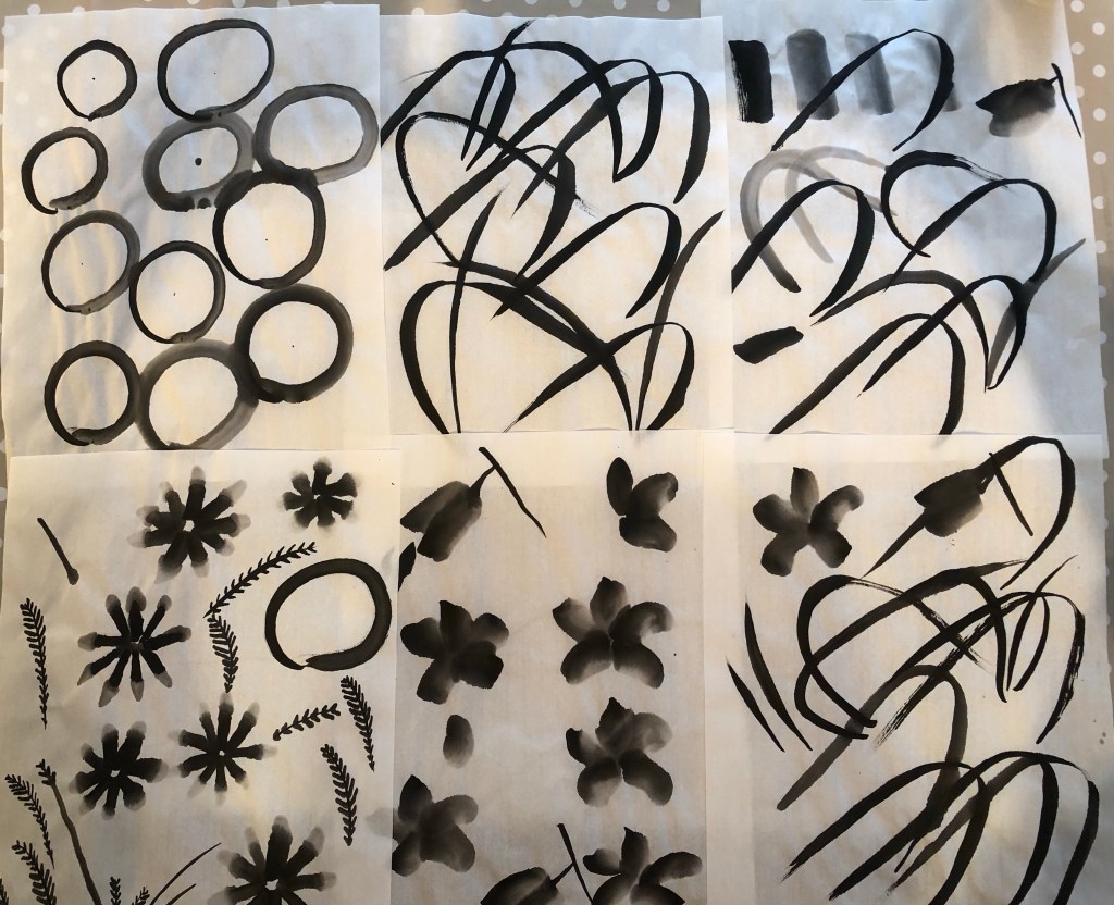
At a previous lesson, we started to paint leaves by copying from worksheets and this lesson we practiced some more.
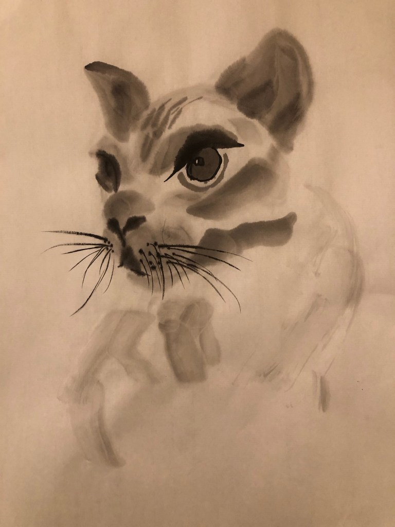
The homework this month was to paint an animal such as our pet. No worksheets were given and we had to work out how to create our simplified style Sumi-e animal painting (without looking online for hints). This blog records the method I used for the homework.
METHOD
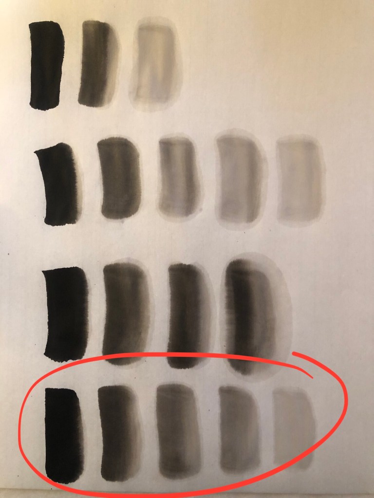
As a warm up exercise, I mixed the Chinese ink with water to ‘find’ the five shades that would be needed to depict tone in the painting. It took a few attempts to get the right result.
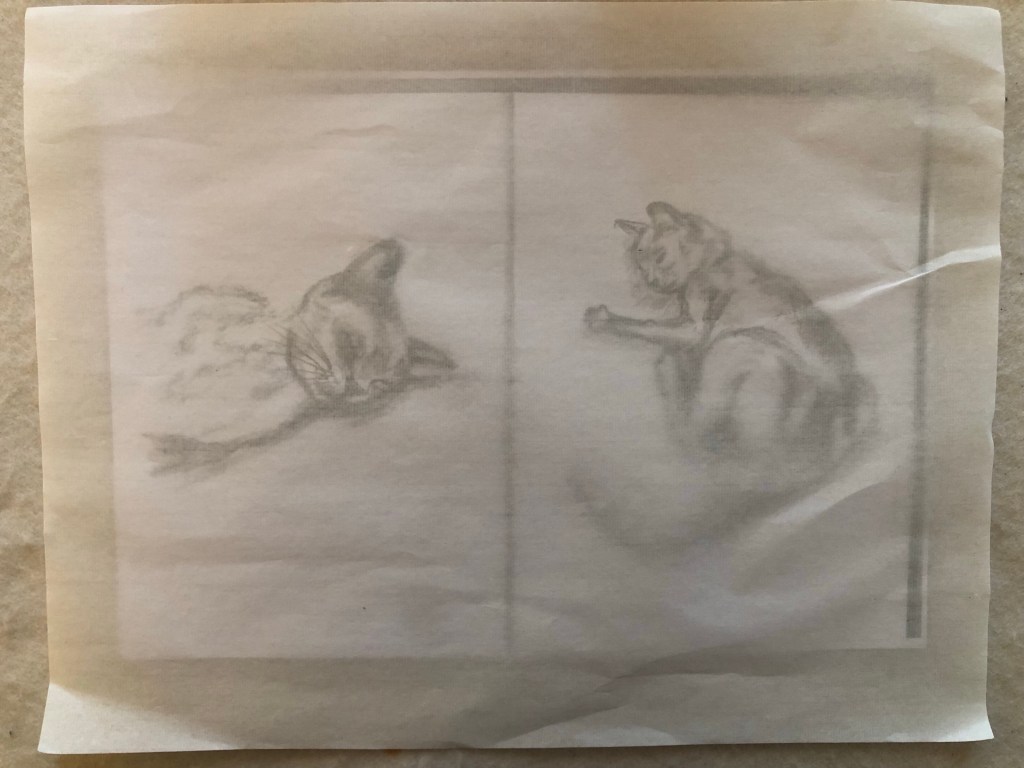
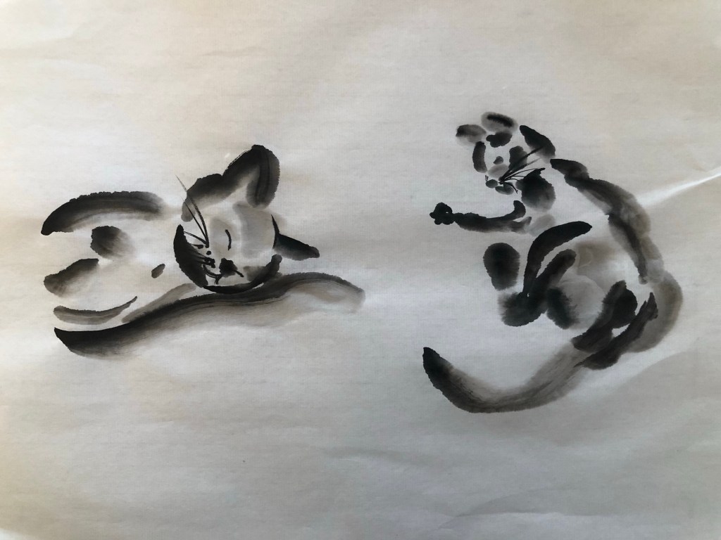
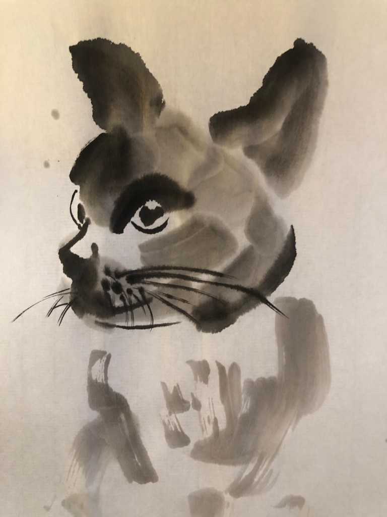
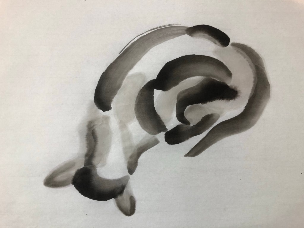
I made some pencil tonal sketches from photos of my sadly departed cats. Then overlaid the Xuan (rice) paper on top for painting.
Result:
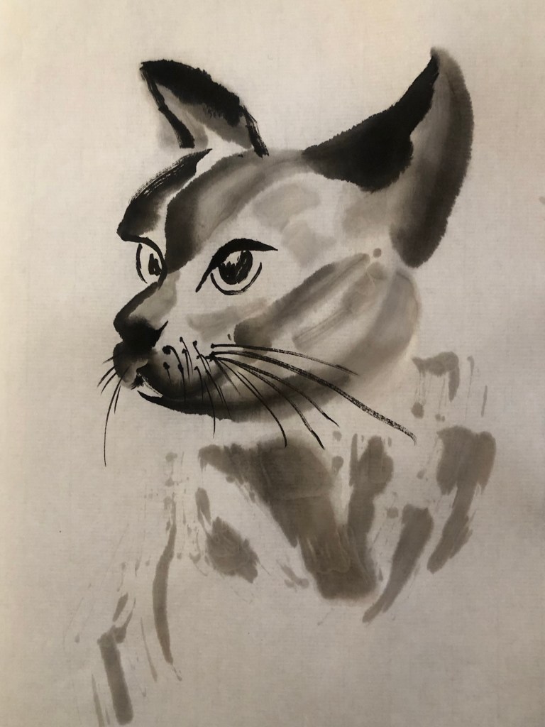
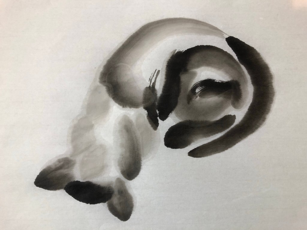
Using the same method, a few close up portraits were painted:
Then I used a photograph and overlaid the Xuan paper on top to paint/trace the tonal areas:
First attempt of ‘tracing’Second attempt of ‘tracing’
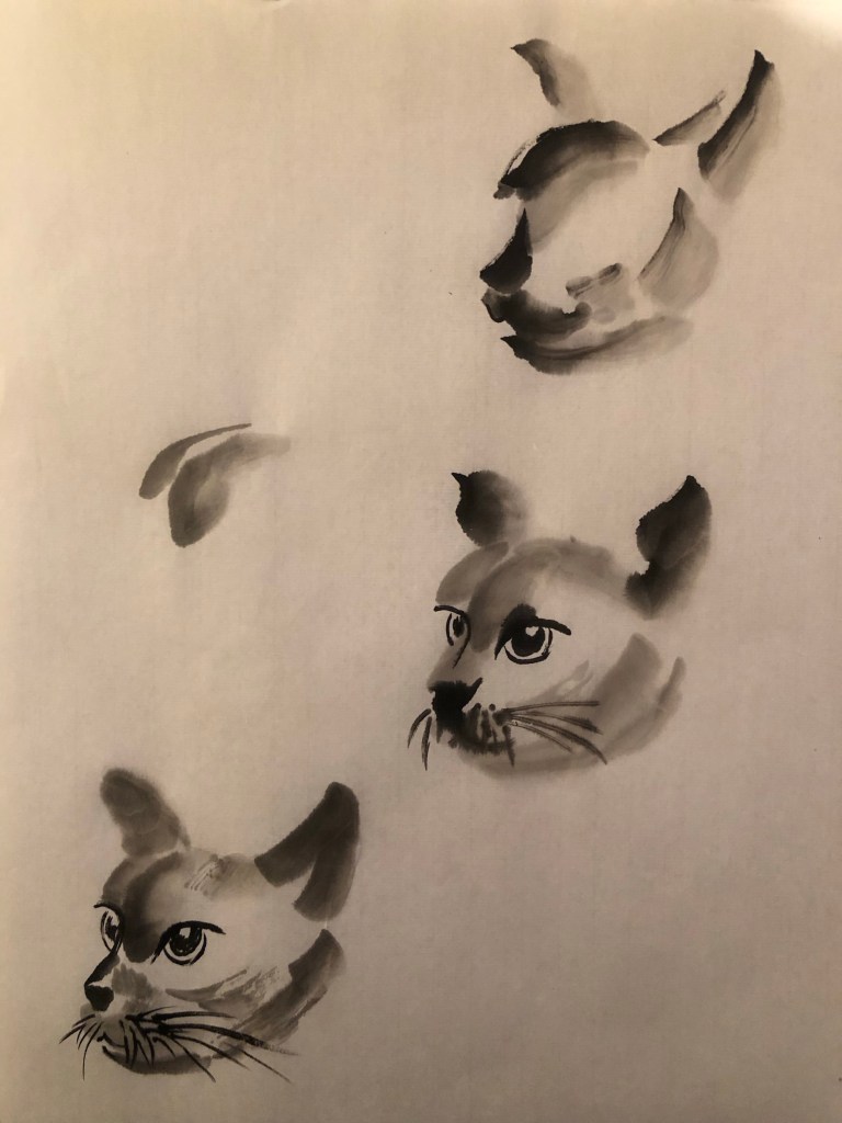
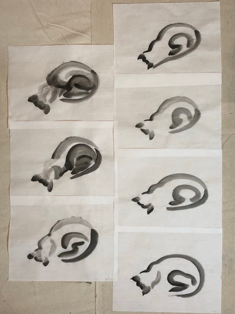
Then I started painting freehand without tracing. I had seven attempts and each time reducing the number of brushstrokes and simplifying the image.
Seven attempts at freehand painting
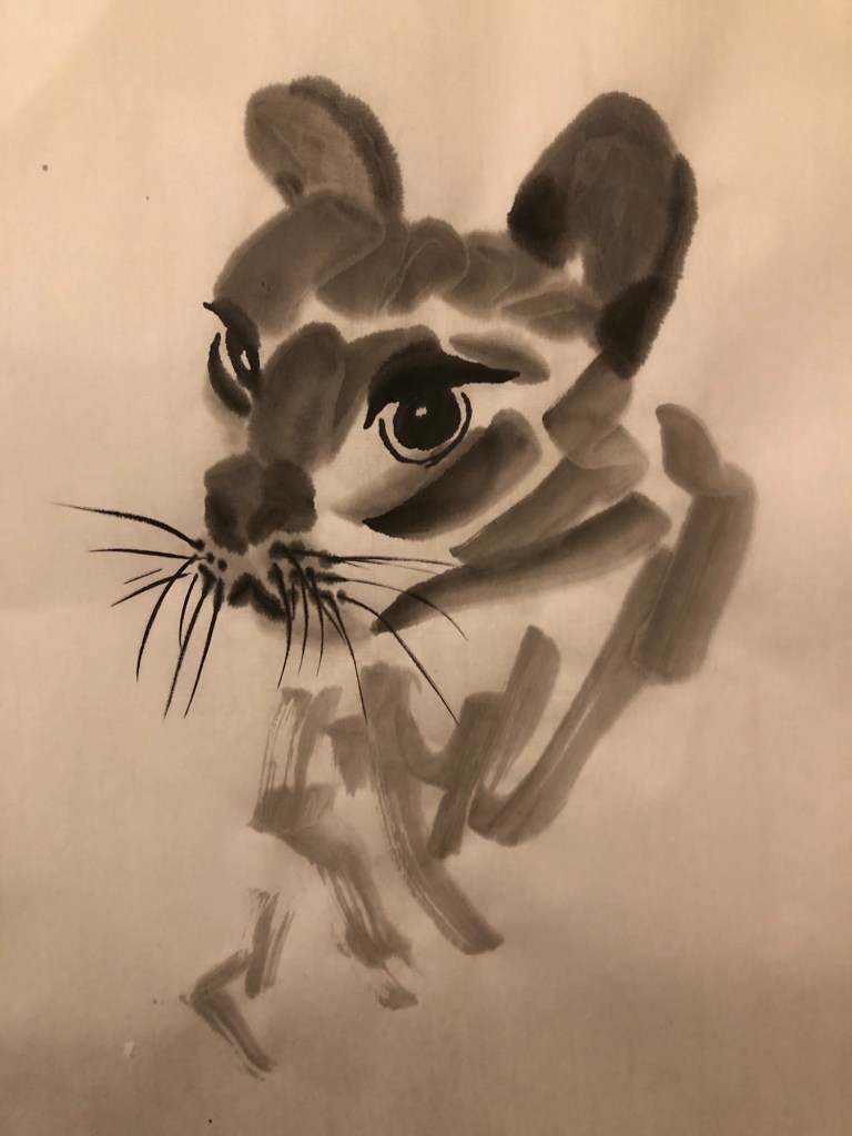
Close up of the seventh and final attempt:
–
REFLECTIONS
I have been wanting to learn Sumi-e painting because I see it as a way towards semi-abstraction in Chinese brush painting which is something that I’m interested in. I enjoy the thinking that is involved in this making process.
I enjoyed the exercise and was pleased with the outcomes as early attempts. I do find Chinese water-ink or Sumi-e painting very challenging. It is the most unforgiving style and painting medium that I have used. With oil and acrylic, one can correct mistakes by wiping off or painting over. Even watercolour can be corrected to a certain extent. Since the depiction in Sumi-e is done by one stroke and going over a stroke makes it look clumsy, therefore everything has to be as perfect as possible for each stroke, such as:
– Water/ink pigment balance for the tone.
– Amount of water/ink on the brush (and depending on the type of hair for the brush) to match the absorbency of the type of Xuan paper used for each stroke. The paper or silk is usually highly absorbent which makes it challenging.
– Placement of each stroke and the pressure along the travel.
It is very challenging and I love it. I feel the tension within myself in a way that is unlike any other painting media. I expect it’s also because I am so new to this and I need a lot more practice. The process of simplifying was also challenging like solving a puzzle which added to the pleasure of this way of making.
LEARNING
– Mixing the five tonal shades at the start and having plenty of ink of each shade made up really helped. However, I still find myself mixing as I went along especially for the ‘double loading’ technique.
– Tracing over tonal drawings or photos helped to give confidence at the practicing stage. Practicing in this way helped me to progress onto freestyle painting.
– Understanding the structure or anatomy of the subject is essential for the simplification process to work.
NEXT STEPS
– Keep practicing to build knowledge of the materials and process.
– Try other animals or objects.
– Start to think about how to incorporate this approach into my transcultural style development work.
UPDATE
Below is an update on Sumi-e painting progress since the session detailed above.
My tutor asked me to do a free-hand cat portrait without using any pencil drawings as guide under the Xuan paper. Below are the outcomes:
–
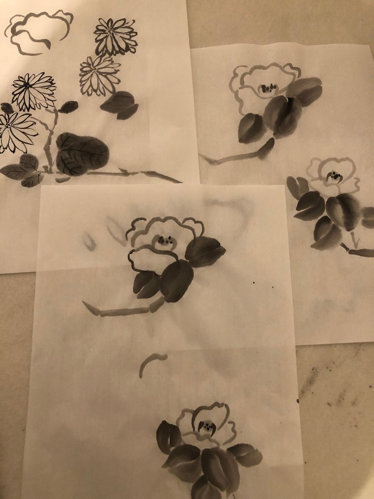
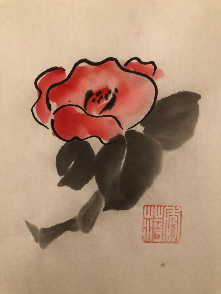
The following lesson was on Sumi-e flowers:
–
REFLECTIONS
I have enjoyed Sumi-e painting because I am more interested in free style Chinese painting (techniques are akin to Sumi-e) than the meticulous style. So these paintings have been good practice for me. The key is to keep practicing in order to master the skills required in applying paint having understood how the materials work together with the painter.
This is an experiment to complete one of the actions from an earlier blog – Exploring media – oil and cold wax Part 6. The action was to:
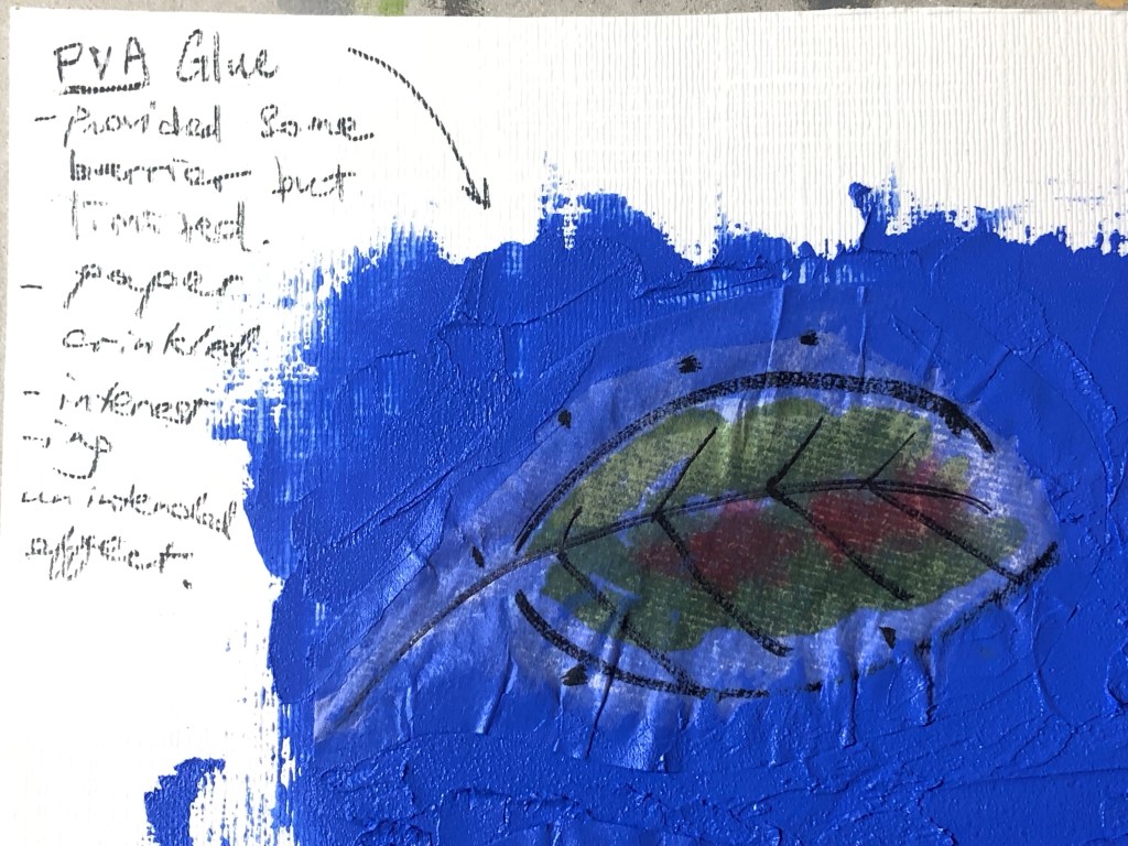
– Experiment with a barrier or masking fluid to prevent the oil from seeping into the Chinese brush painting images.
This experiment is required because the Xuan paper (rice paper) used for Chinese brush painting is very thin and absorbent, therefore if the paper was laid over materials such as oil in my transcultural layering work, the oil paint underneath would seep through and ruin the Chinese brush painting image as happened in Part 6 of this blog series.
METHOD:
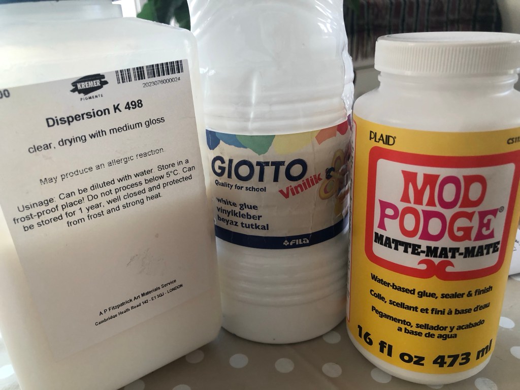
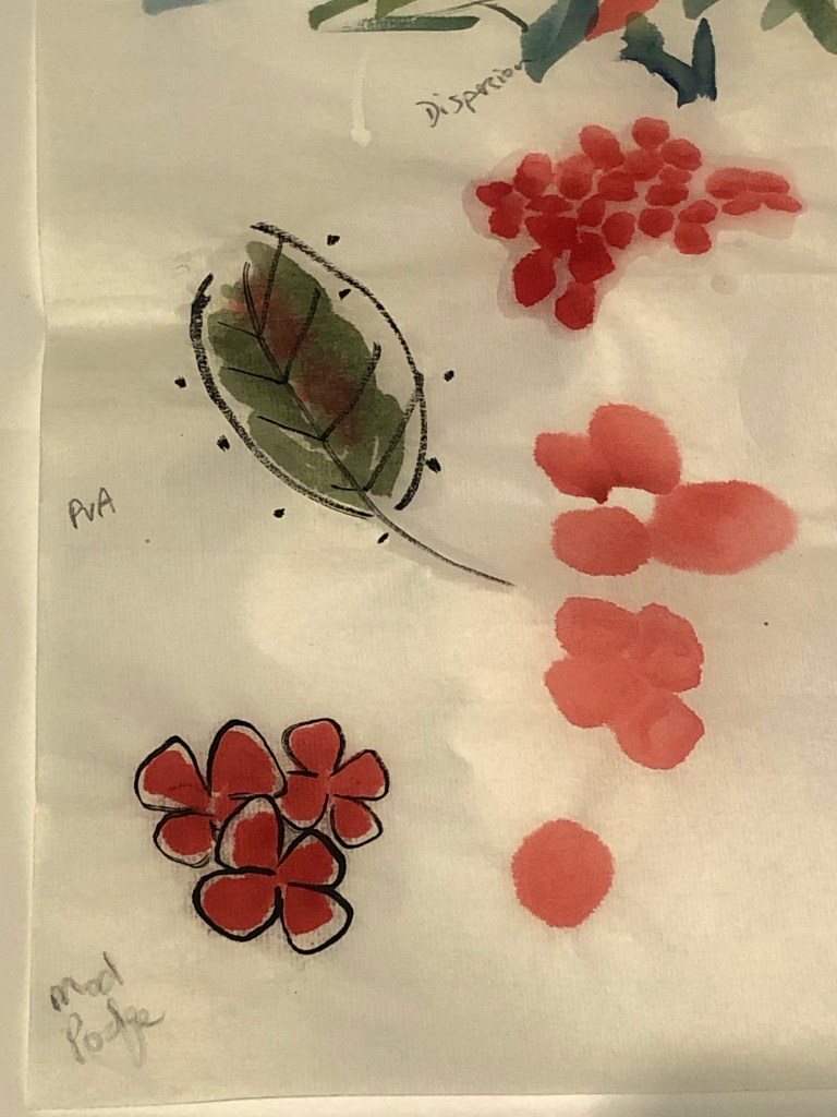
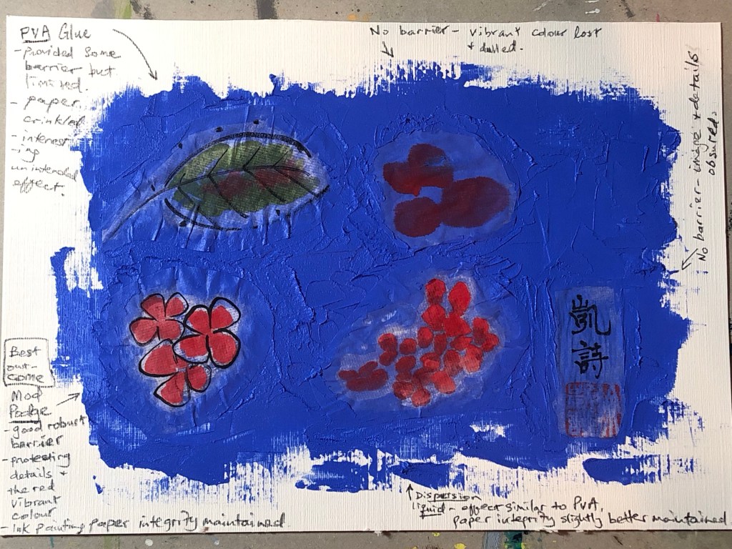
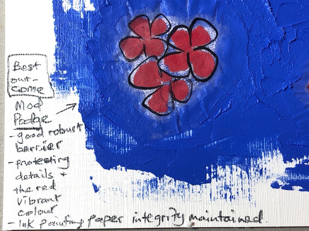
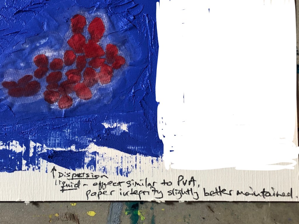
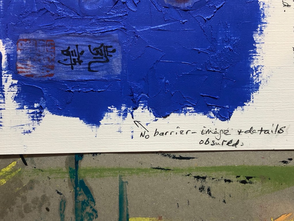
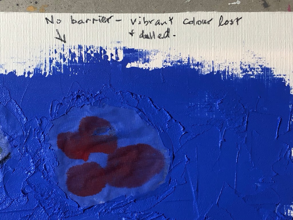
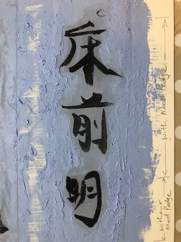
The three barrier fluids chosen for this experiment were: Dispersion liquid; PVA glue and matte Mod Podge.
Some small images painted using Chinese ink were used for this experiment. The back of each image was painted with one type of the barrier fluids with one image left bare as ‘control’ for the experiment.
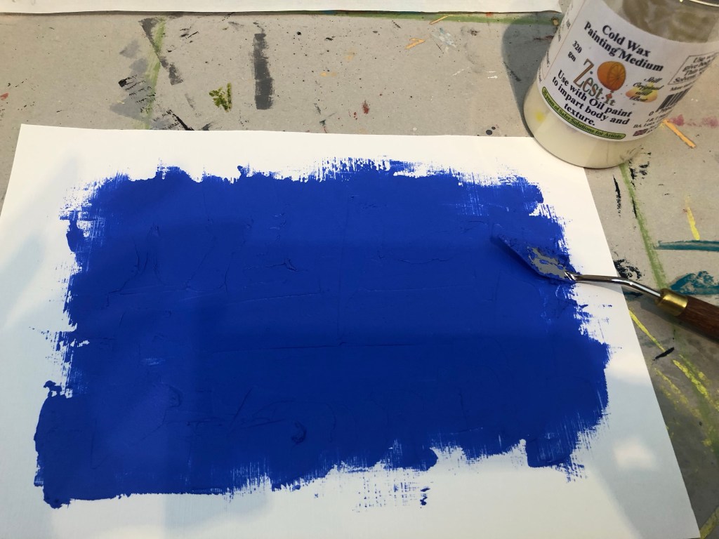
A paper canvas was painted with a mix of oil paint and cold wax:
The Chinese painted images were cut out and pressed onto the oil and cold wax. The images were pressed hard onto the painted canvas using a palette knife to robustly test the barrier performance.
Below is the result – an overall image followed by close-ups of each test area.
–
Result: The best outcome was the Mod Podge.
REFLECTIONS
I am happy with the outcome of this experiment. This was a quick experiment but a very important one because, as shown in this blog series, it has been challenging to incorporate Chinese brush painting onto oil or oil and cold wax – the latter being my chosen ‘Western’ medium for my current series of transcultural style development work. The outcome of this experiment has helped me to find a viable way forward and I can now move onto developing colour palettes and aesthetics for my style knowing that I have found a way to combine the materials from different cultural origins without losing any material integrity.
LEARNING
The learning here is a straight forward one. Mod Podge worked well as a barrier fluid to protect the Chinese ink work before incorporating it into the oil and cold wax ‘collage’.
NEXT STEPS
Pick up from the previous post (Part 6) and resume the next actions from there. The immediate next action will be to research and develop colour palettes that can help to communicate my transcultural narrative.
–
ADDITIONAL EXPERIMENT
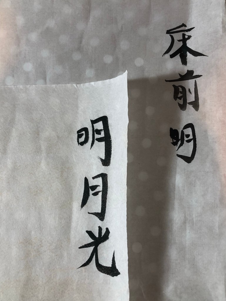
I was given two pieces of specialist Chinese painting paper by my Chinese art teacher. They are:
– Beijing bark paper, and
– Cicada wing paper (because it’s so thin that it resembles the wings of cicadas).
Both types of paper are of beautiful quality and feel very delicate. They are both very thin which would be ideal for what I’m looking for in my transcultural layering work. I.e. overlaying Chinese brush painting onto a more viscous medium such as oil.
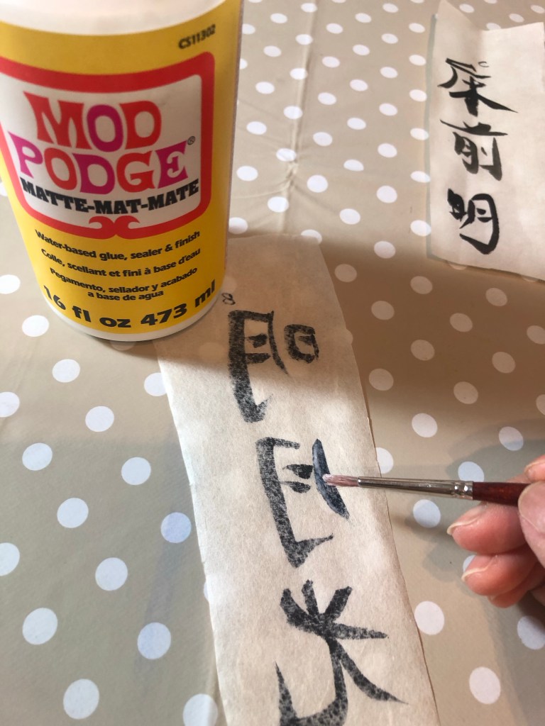
I repeated the above experiment with these papers. I wrote some Chinese calligraphy characters on each sheet:
Then painted part of the image on the reverse side with Mod Podge as a barrier and leaving part of the image bare to compare:
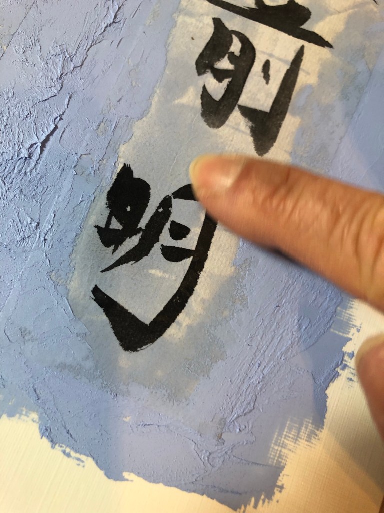
Once the Mod Podge was dried. The two sheets were pressed onto a base layer of oil and cold wax. A palette knife was used for the edges, blending the paper with the oil paint to bury the edges. Then I used my finger to press the image into the oil:
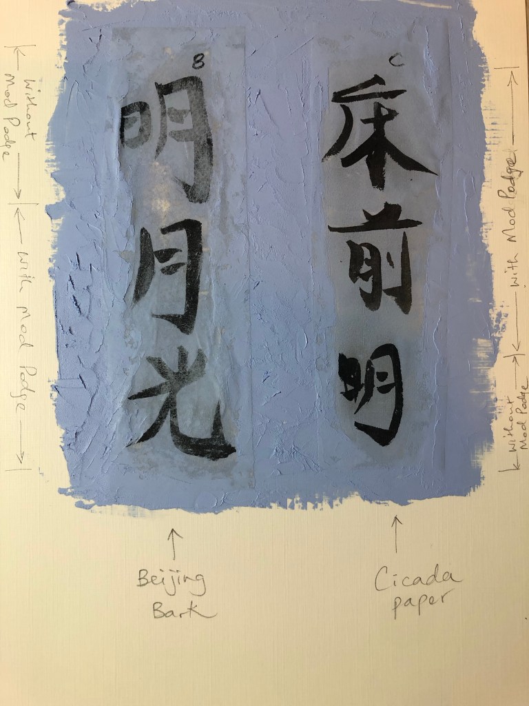
Below is the outcome with the cicada paper performing well compared to the Beijing bark. The cicada paper appears to have an inbuilt barrier to protect the image, meaning that a barrier liquid would not be required as there was no perceivable difference whether Mod Podge was used.
Then more oil and cold wax was applied on top to blend in the image whilst avoiding the characters. Final result:
–
REFLECTIONS / LEARNING
Out of all the Chinese painting papers that I have tested in this series of exploration, the cicada paper was the best material for the purpose of my transcultural layering work involving Chinese brush painting and oil based medium.
Additionally, it was useful to discover that a barrier liquid (e.g. Mod Podge) would not be required with the cicada wing paper. This will help to reduce the process complexity.
NEXT STEPS
– Create a new piece of work that uses the new discovery with the cicada paper to refine the process and to learn more about the material.
– Source more cicada paper and find a long term supplier for this paper.
.
This experiment ends the series of blogs on ‘Exploring media – Oil and cold wax’.
-Try out more Chinese brush paint collage onto oil and cold wax to refine this part of the process.
-Try exposing a larger area of the background image to see if that can work with the abstraction approach on the top layer. Experiment to find the right balance between revealing the base layer image without losing the sense of abstraction on the top layer.
-Try spray painting on top of the oil and cold wax surface – try when wet and then when dried.
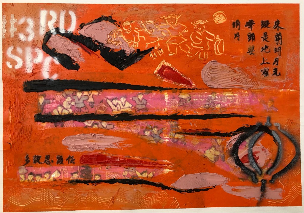
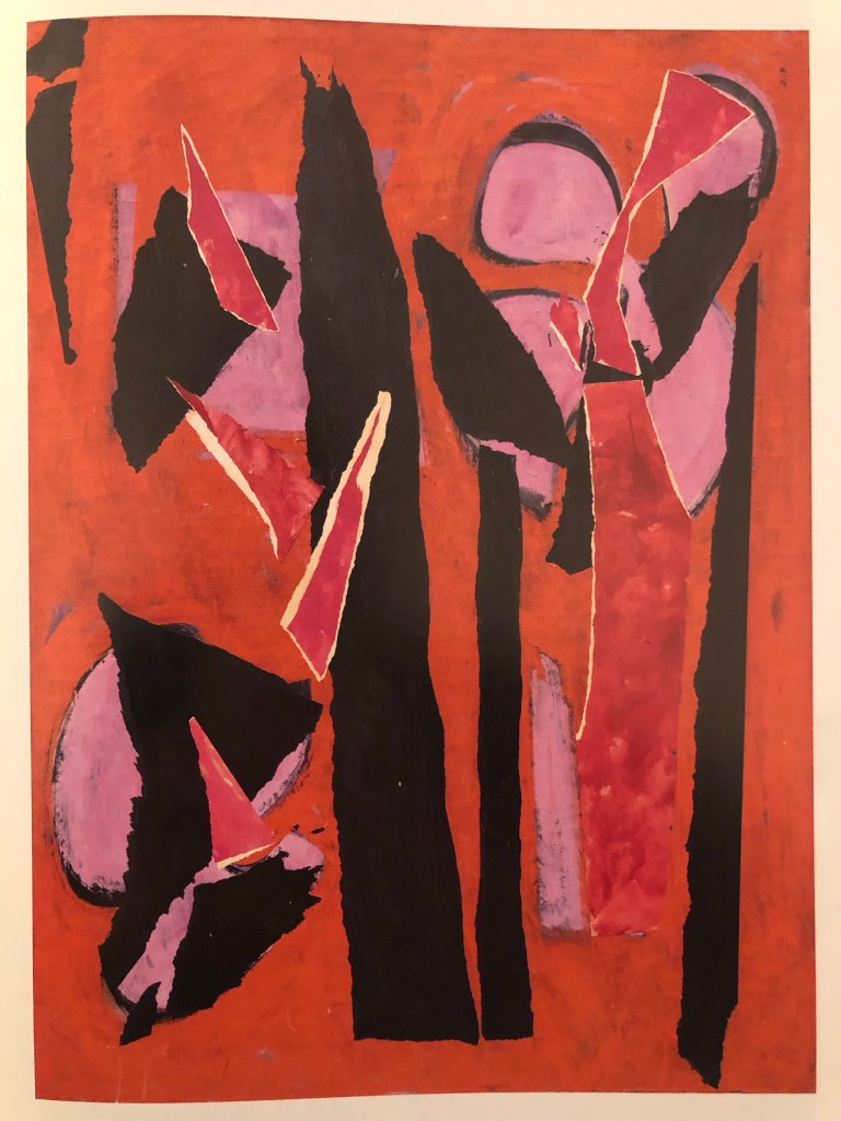
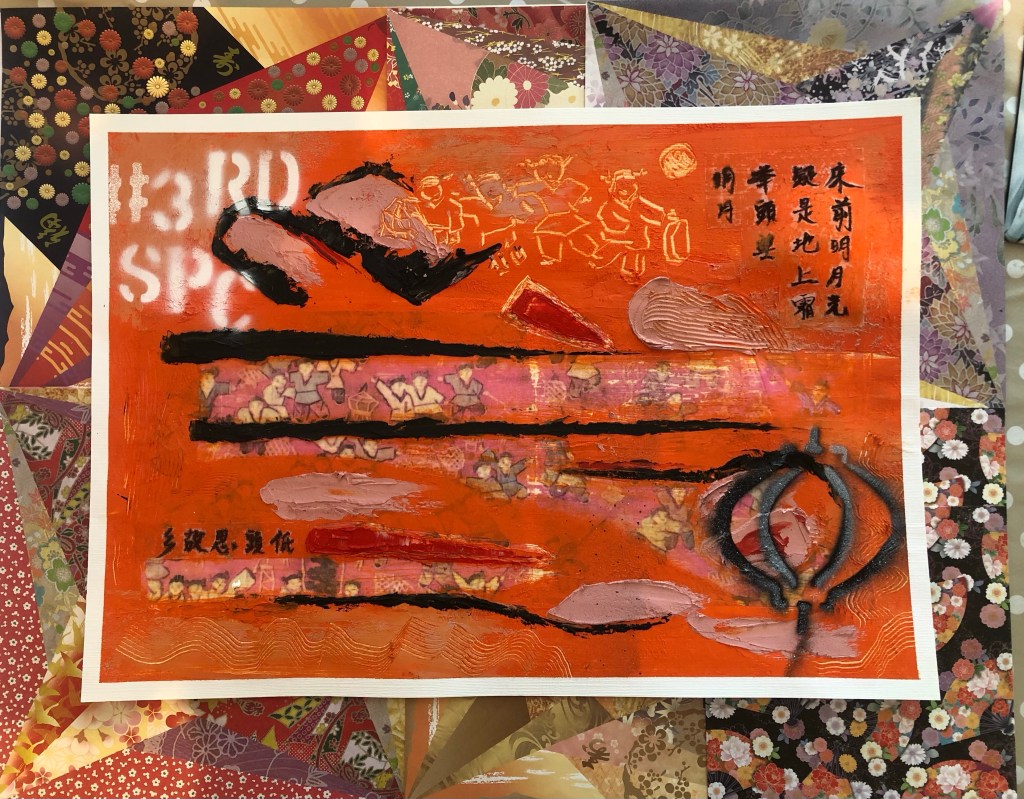
Finished work for Part 6:
Mixed media on paper, A3
METHOD
A printed photo image of a tapestry that was gifted to me by my brother many years ago was used as the based image for this piece. The image was transferred onto a paper canvas using dispersion liquid. The paper used was 250 gsm oil paper.
After the dispersion liquid dried, the printed image was rubbed off with a wet sponge to reveal the transferred image on the canvas. This was the first time a paper canvas (as opposed to a cotton canvas) was used in this series of experiments and it was clear that the paper canvas was not robust enough for the process. See below image for damage to paper. However, there was sufficient integrity in the paper canvas to continue the piece. I was hoping that a thick layer of oil and cold wax would hide the damaged areas. There was also excessive buckling on the paper canvas.
Recalling my disappointment with the colour palette that I chose for Part 5 (pink and grey), I decided to research into abstract paintings that I like to learn from the colours used. One of my favourite abstract artists is Lee Krasner and below is the painting that I decided to study and learn from in terms of the colour palette used.
Desert Moon (1955):
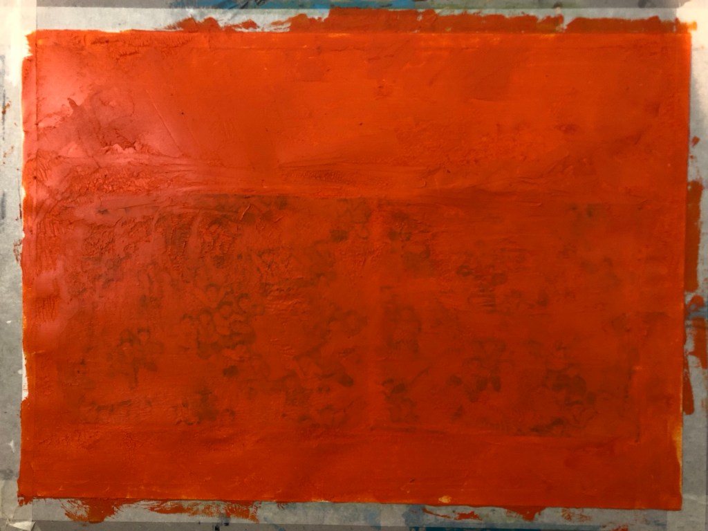
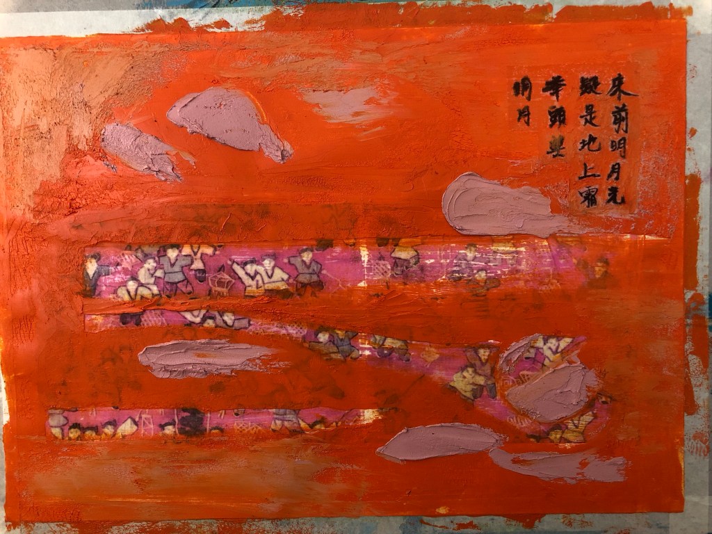
A layer of oil and cold wax was then applied to the canvas:
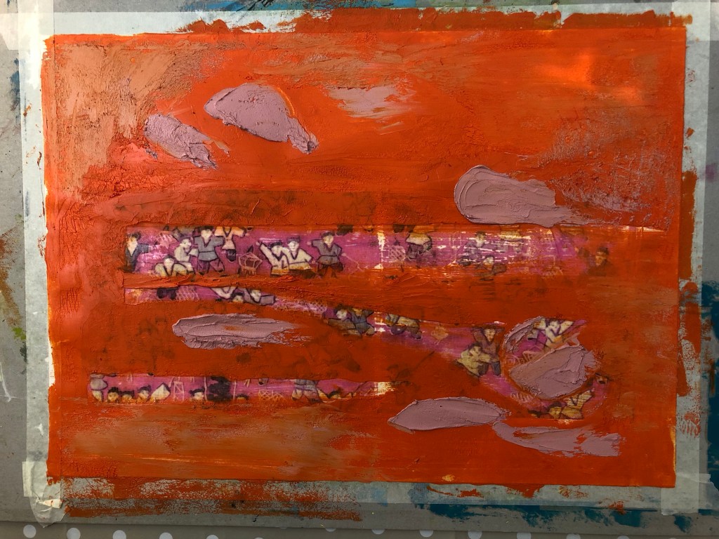
Areas were scraped off to reveal the base tapestry image. Learning from Part 5, I wanted to reveal a larger area so that it was clear what the base image was about. Then additional oil and cold wax colours were added:
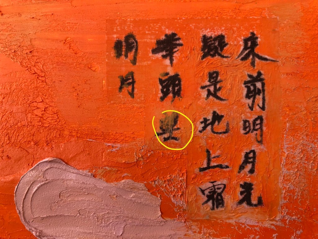
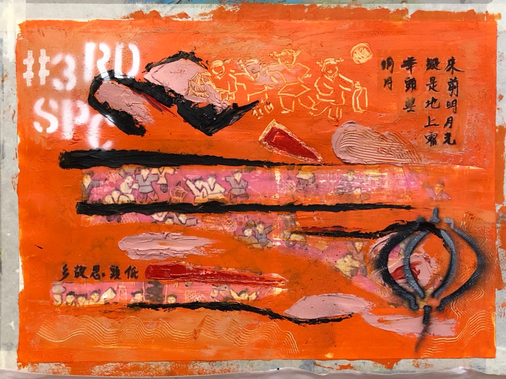
For the Chinese brush calligraphy, I chose a delicate silk fabric as a substrate that was almost transparent because I wanted the substrate to become as invisible as possible.
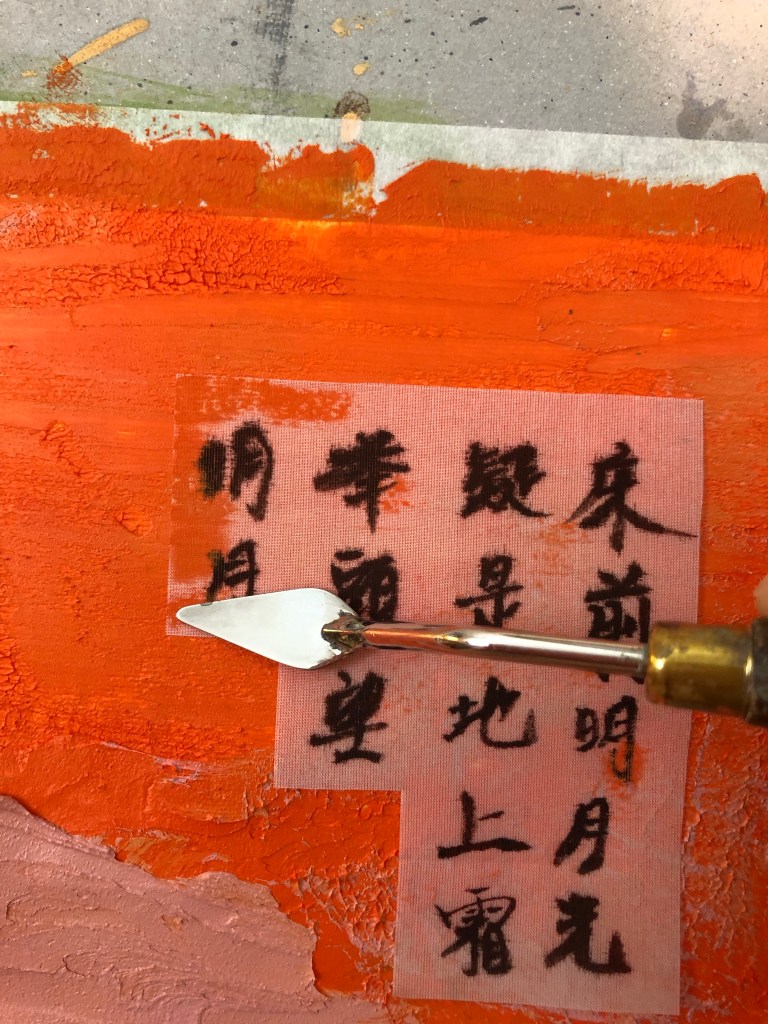
After writing the Chinese calligraphy onto silk, it was cut out and carefully pressed onto the oil and cold wax layer.
A small palette knife was used to press the silk into the oil and cold wax, taking care to avoid pressing the areas of the calligraphy characters which was challenging due to the complex shape of the characters. The yellow circle shows where part of the character was pressed into the oil and cold wax, partly obscuring the writing.
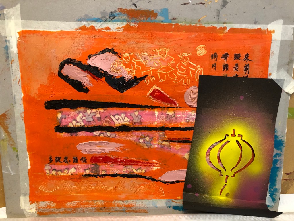
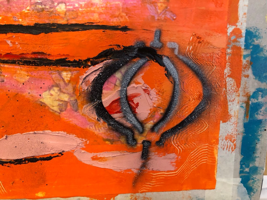
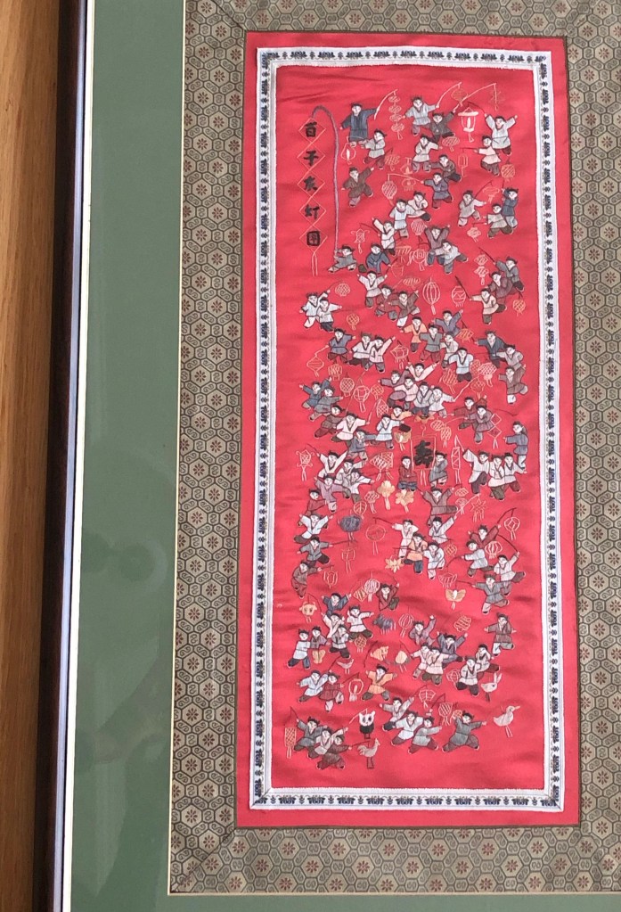
Additional marks were made – some were painted on and some were scratched off. The tapestry image was about children playing with lanterns and I have a lantern stencil that was made for previous work. So I wanted to experiment with spray painting onto wet oil and cold wax to see the effect.
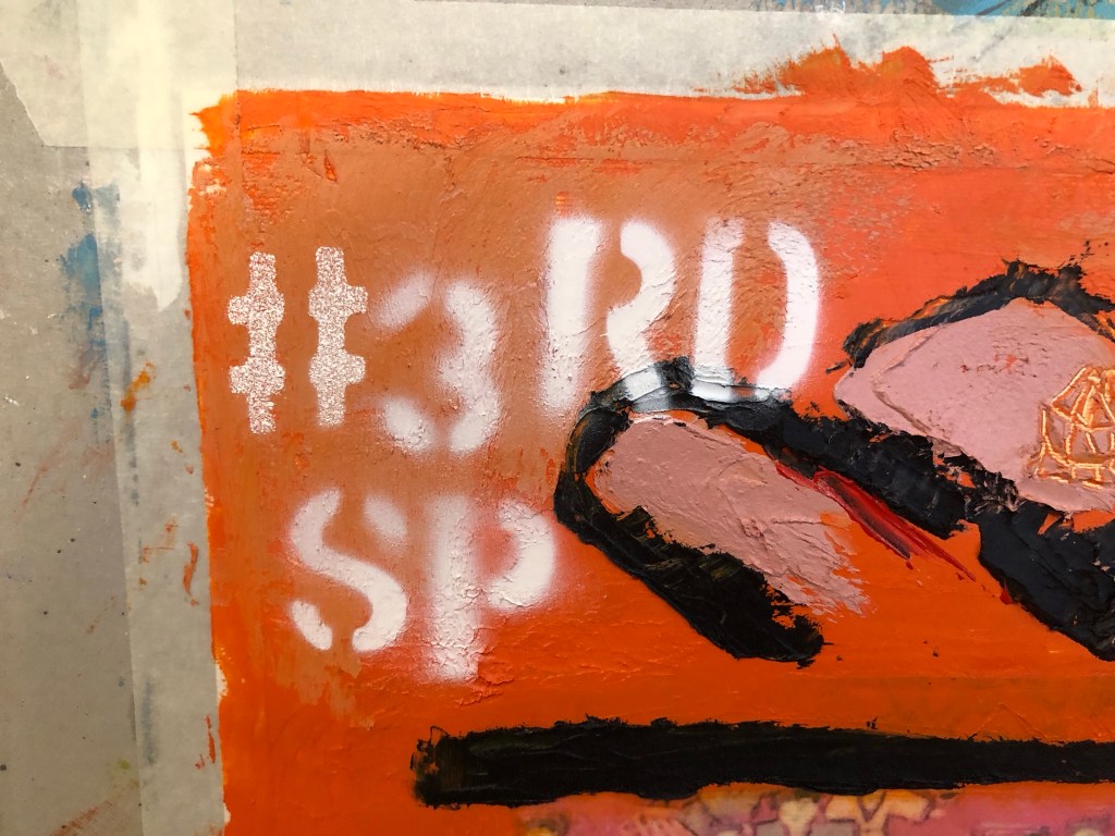
Further spray painting was done – the phrase #3RD SP (for third space) was sprayed onto a dryer corner of the painting. All spray paint used were Montana GOLD 312g aerosol cans as popularly used by street artists:
Finished work with border tidied up:
…
REFLECTIONS
I am happy with:
– The colour palette. I am much happier with this painting than the previous one in Part 5. A more considered approach in selecting the colour palette paid off here.
– The experiment with using an almost transparent substrate for the Chinese brush art worked well. The pieces (there were two in total) adhered well to the painted surface. Although the substrate was not completely invisible, it was acceptable as a solution.
– The scratched mark making especially the part at the top to echo the revealed based image of the children playing with lanterns.
– The overall look of the spray painting, especially the words – they added a contemporary feel to the piece which was what I was looking for.
– Feeling more confident using oil and cold wax as a medium.
I am not so happy with:
– The paper canvas, it was not robust enough. Although the damage by the image transfer process was covered up with oil and cold wax, it was clear that this would be the wrong material to use for this process.
– The spray painting of the lantern – it was sprayed onto very wet oil and cold wax. The outcome was not satisfactory – it felt and looked ‘gooey’ and not the intended effect. I believe this was partly due to my reluctance to place the stencil close to the wet oil paint as I didn’t want the back of the stencil to pick up the oil paint, causing the spray paint to loosely disperse around the stencilled image.
– Although I was happier with the colour palette, I felt there was more that could be done to add more complexity to the palette to increase depth to the piece.
General comment: the Chinese calligraphy is a famous ancient Chinese poem about being homesick. It is one of the few Chinese poems that I know as most children growing up in Hong Kong in my era were made to learn it, partly because it is a good poem and very easy to remember. Going forward, I feel that if I were to use more Chinese calligraphy then I should learn more about Chinese poetry so that I can use a wider variety of content in this respect. It will also help me to understand more about my Chinese heritage.
Other thoughts that came to me some time after completing this painting:
– Throughout the making process, my mind kept going back to celebrating the Mid Autumn Festival when I was a child in Hong Kong. The highlight as children was to be given a lantern each to play with. The choosing and buying of the lantern in preparation was always a source of excitement. The lanterns were lit with small candles. The children would use a long stick as handle for the lantern and go around the neighbourhood exploring with their lanterns, just like the children in my painting. The Mid Autumn Festival celebrated the fullest moon of the year and celebrations would only begin after dark when the full moon came out. Since we were not usually allowed out at night, it made the Festival especially popular with children. At times a lantern would catch fire which added much excitement. There would be lots of fruit and snacks laid out that were specific for the festival. I remember one year when we were older children (over ten years old), my brother and I went to a local park, sat on the swings and chatted all evening. It was when my family was going through a difficult period and to share that moment with him was very special, especially when we ended up spending most of the rest of our lives living in different countries. He gave me the children’s tapestry that I used for this painting which evoked all those memories while making this piece of work.
LEARNING
– More work is required to develop my sense in choosing an appropriate colour palette for the piece. This is increasingly important because my work is about storytelling as well as narrative and I believe having an appropriate colour palette helps to tell a story. So more research and experiments should be done in this respect.
– The silk substrate worked well for the Chinese calligraphy. However, I know there is a wide range of other delicate Chinese substrates and I will experiment with different materials to find the optimum.
– Layering the Chinese substrate onto oil is a risky process – as seen in the image with the yellow circle highlighting the part obscuring of the brush painting if pressed too much into the oil. To help with this, further experiments are required to improve this process. E.g. paint a barrier layer, such as a masking fluid that dries clear, onto the back of the Chinese brush painting or calligraphy to shield the image from the oil seeping in from underneath.
– Spray painting, especially words, adds a contemporary feel to the image which is a style that I want to incorporate into my work. This is relevant to me because I take much inspiration from the extensive street art scene in my home city of Bristol where many famous street artists work or have worked.
– Using the tapestry image evoked many memories, perhaps I could explore that more.
NEXT STEPS
– Research into colour palettes for the type of stories that I want to tell. Build confidence in this area.
– Continue to build experience and explore using oil and cold wax.
– Experiment with other transparent Chinese substrate materials to find one that is as close to invisible as possible when layered onto oil.
– Experiment with a barrier or masking fluid to prevent the oil from seeping into the Chinese brush painting images.
– Experiment with more spray painting – be bold and push boundaries.
– Ongoing learning – research into Chinese poetry to find more poems that resonate with me to use in future work.
– Explore the evoked memories.
ADDITIONAL WORK
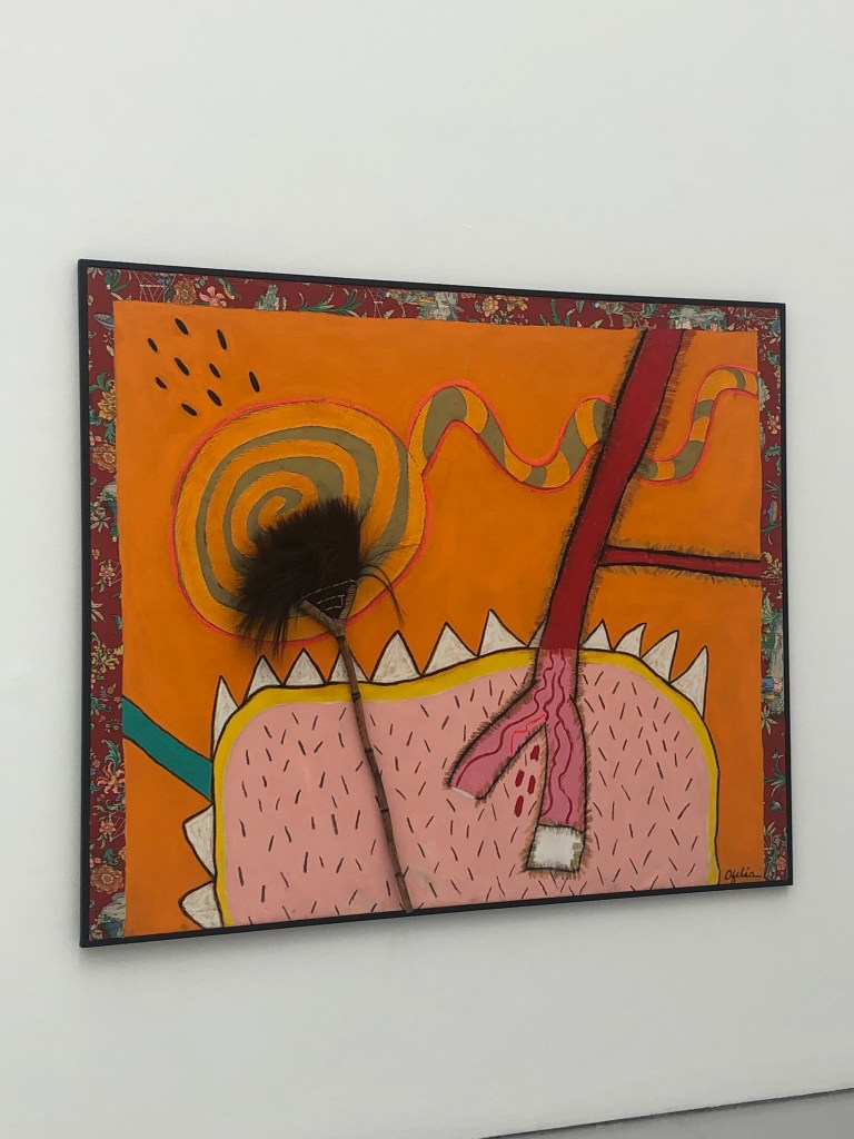
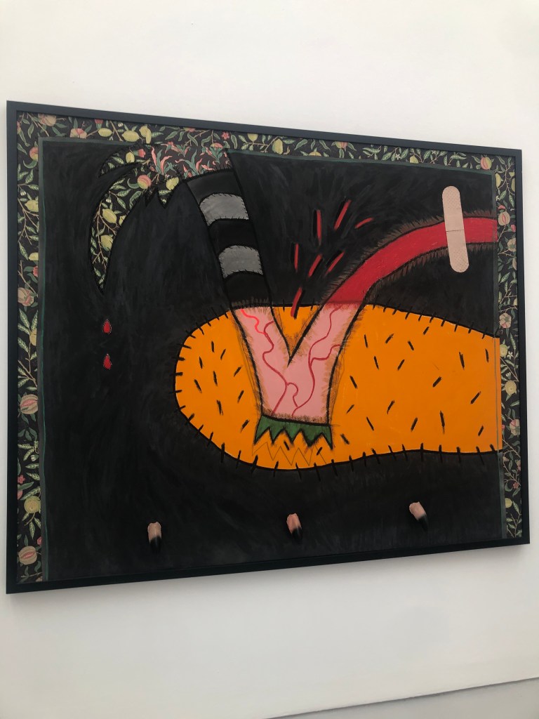
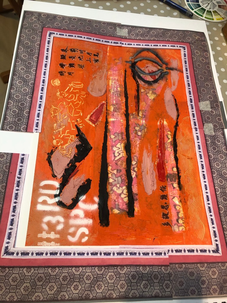
After visiting the exhibition of Ofelia Rodriguez again at Spike Island in Bristol, I was inspired by the way she used fabric as a border to her paintings.
This gave me the idea to try that with my work, especially to use Chinese imagery border for a recent piece of work to add to the transcultural narrative.
I started with some patterned paper that I had to make a collage frame. But I was not happy with the effect. It seemed too busy and rather random as an idea.
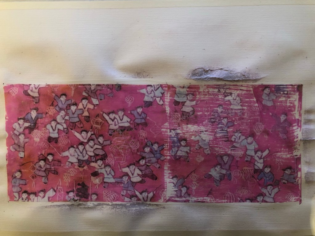
I then returned to the original tapestry that I used as the base image for the painting. It was a tapestry that was gifted to me by my brother many years ago.
Image to show the border of the tapestry
It is a typical border for small scale tapestries of this type. Then images of the border were printed and cut out to create a collage border for the painting:
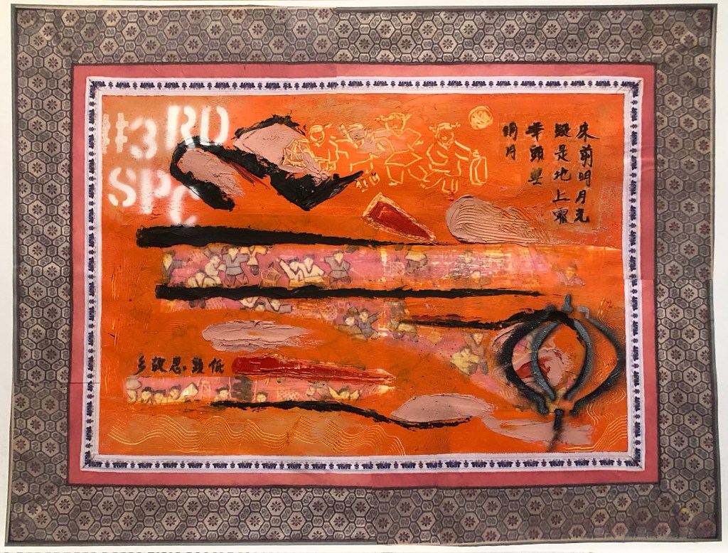
Final finished work:
Mixed media on paper, 54 x 41.5 cm.
REFLECTIONS
I am very happy with the outcome of this experiment inspired by Rodrigues. It has completed the painting for me and added a more transcultural feel alongside the painted images such as the spray painted words.
To improve this approach, I would spray paint the # words to partly cover the tapestry image frame. I think that would increase the contemporary feel for the piece juxtaposing the traditional Chinese tapestry border.
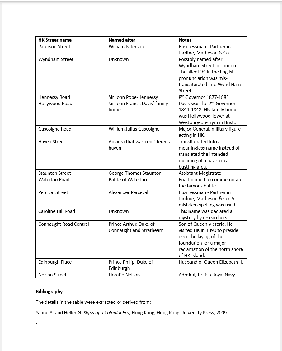
As part of my research on The Third Space (Ref. The location of culture by Homi K Bhabha), I have been seeking out ‘third space’ phenomena from my memory and surroundings in order to gain a deeper understanding of the concept. To this end, I decided to research and do a project on the street names of Hong Kong.
When HK was a British colony, many streets were named after British Governors or officials sent to manage HK. Their English names were converted into Chinese (Cantonese) using transliteration*. As a result, the street names when pronounced in Cantonese are meaningless and often nonsensical. Since street names are such a fundamental part of daily lives, those strange sounding streets names have become a natural part of the day-to-day language without anyone questioning their nonsensical nature.
This project is to highlight the transliteration of HK street names as an example of a third space phenomenon from a place that has deep personal relevance for me.
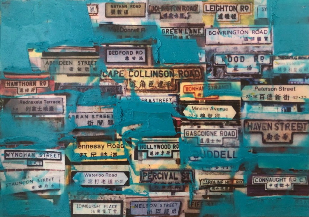
Finished painting – HK Street names 1 – oil and cold wax on inkjet printed paper, size 18.4 x 12.8 cm.
METHOD
This is the first step and an experiment to test out the idea and process.
I researched online images of street signs in HK and picked out those that were transliterated from British names. Since the HK street signs nowadays are of a new design that I am not familiar with, where possible, I have chosen images that were from the 1960s, 70s and 80s – the period when I lived in HK and when HK was still under colonial British rule.
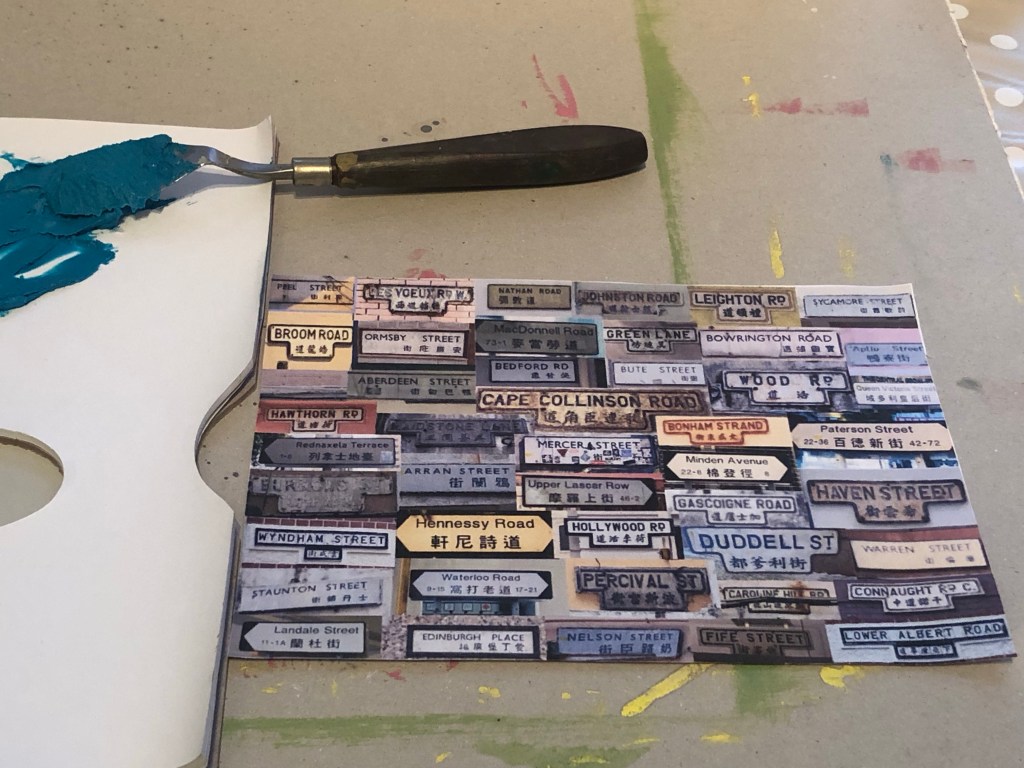
A digital collage of the road signs was made using Adobe Express then inkjet printed onto paper.
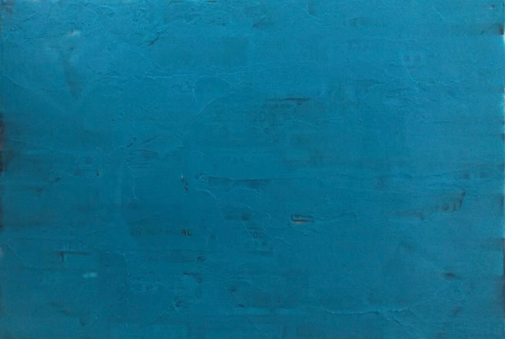
Teal colour oil paint was mixed with cold wax in 50:50 ratio and the printed image was covered in a thick layer of the oil-wax mix.
My iPhone was set up in video capture mode to record – I gradually scraped off the paint revealing most of the street signs one by one as I read out in English then Cantonese each street name. The purpose of the voice over was to enable viewers to hear the Cantonese transliteration.
–
REFLECTIONS
This was an experiment to test out the concept on a small scale before taking it onto a large canvas to create a painting. The aim is to ultimately create two pieces of work – a painting as well as a video accompanied by a piece of writing explaining the background of the street names used as part of my research into colonialism.
I believe the way these streets were named in HK was an example of how soft power worked in a British colony where the names of the colonisers such as Governors and Royalty were permanently imprinted into the day-to-day lives of the local people, serving as a reminder of the colonial power structure. The fact that road and streets were named in this way served as a constant reminder of who was in charge of the the land.
I started this project with casual research online, however, my interest in the topic increased as I went deeper into the research as it became clear the extent of the soft power exercised in these examples. As I looked at the street signs and read out each name, I could hear my late parents saying those names on a daily basis in conversation – which road had bad traffic jams, what was the shortest route to get to a place or giving directions to a shop. As a child, I listened to my parents using the transliterated and nonsensical street names like it was just normal. Everyone used those names without giving it a second thought. I left HK when I was a young teenager and never lived there as an adult. I now wonder what it was like for my parents to live their whole lives in a colony, to live, work and bring up children as colonised subjects. Doing this project has caused me to think about that more deeply. I always feel conflicted when I think about this topic – HK was a British Colony with in-built structural injustices that came with being colonised, but HK also became successful globally partly due to the commercial, legal and justice systems that were put in place by the British bringing prosperity to the city and stability for the people. This is a conflicted feeling that I will continue to examine – just like the transliterated street names, what seemed natural or normal once upon a time, now no longer make sense and I am still trying to unpack that conflicted feeling.
Regarding the art work, I was pleased with the outcome of the project, especially as an initial experiment. Through my research, I have found many more interesting facts about the naming of streets in HK, I could potentially divide them into categories and make several art work to create a series.
LEARNING
In the context of my art practice, this research project has helped me to gain a deeper understanding of The Third Space as coined by Homi K Bhabha. The phenomenon of the street names researched here is unique and only came about as a result of the English and Chinese languages coming together through colonisation. There is also the underlying cultural influences from both sides, e.g. holding military personnel in high esteem for the British and in the case of Bedford Road, the Chinese name reflecting the entrepreneurial mindset of the locals.
I am been struggling to make art through examining my third space – one that is personal to my lived experience. I have struggled to create images that is a result of that third space, instead, I have been layering together distinct images from the two cultures that have influenced me. To expand on this point with an example from the HK street names:
Example – take Wood Road that was named after John Roskruge Wood, an acting chief justice during the colonial period. If it were translated into Chinese, the character 木 for wood (as in wood from trees) would have been used. Instead, the phonetic sound of Wood was used in the transliteration, hence the Chinese character 活 meaning alive or living was used to get the closest sound to Wood. The Third Space phenomenon gave rise to a very different outcome.
Analysing the HK street names was the first time I found a concrete example of the third space phenomenon that is relevant to me and my heritage. So I will continue to research this topic as well as look for other signs of the colonial era in HK that may help with my personal identity research.
Whenever I struggle with creating images for my third space, I come back to researching the work of the artist Fiona Rae because I feel she has captured the essence of the third space well with her British and Asian influences. I will continue to research her work.
NEXT STEPS
– Repeat this work on a larger scale using proper canvas material to make a painting and a video.
– Test the video on non-Chinese speaking people to see if the transliteration sounds were noticeable, i.e. is the video voice over meaningful.
– Complete the piece of writing to accompany the art work.
– Research deeper into the HK street names to potentially make a series of work on this theme.
– Research further the history of HK to look for other third space phenomena to inform my personal identity work.
– Research Fiona Rae’s work and find more transcultural British/East Asian artists to add my list for research.
ADDITIONAL RESEARCH INFORMATION
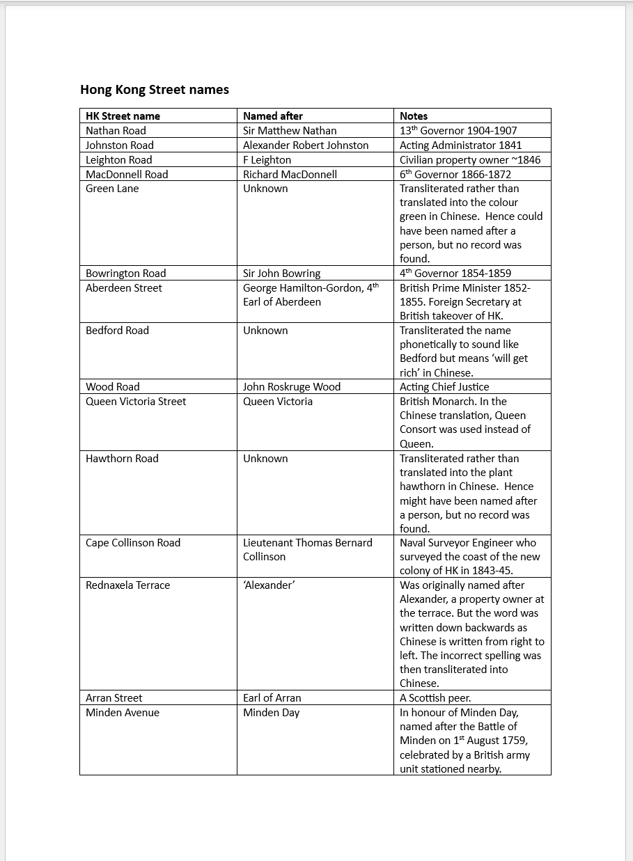
Below is a table showing the background of every street name revealed in this painting and video – whom they were named after as well as amusing mistakes in translation or transliteration.
* What is transliteration?
Below are blogs and extracts explaining the meaning of transliteration in the context of this project.
Translation provides the meaning of words in a second language. Transliteration does not provide the words’ meaning but it makes it easier to pronounce them. Transliteration alters the letters from a language or alphabet into characters of a similar-sounding in a different alphabet. It is quite clear that there is frequently a demand for the transliteration of some languages, especially in this globalised world where people who do not share the same language can have some access to languages with a dissimilar alphabet.
A transliteration doesn’t tell you the meaning of the word, but it gives you an idea of how the word is pronounced in a foreign language. It makes a language a little more accessible to people who are unfamiliar with that language’s alphabet.
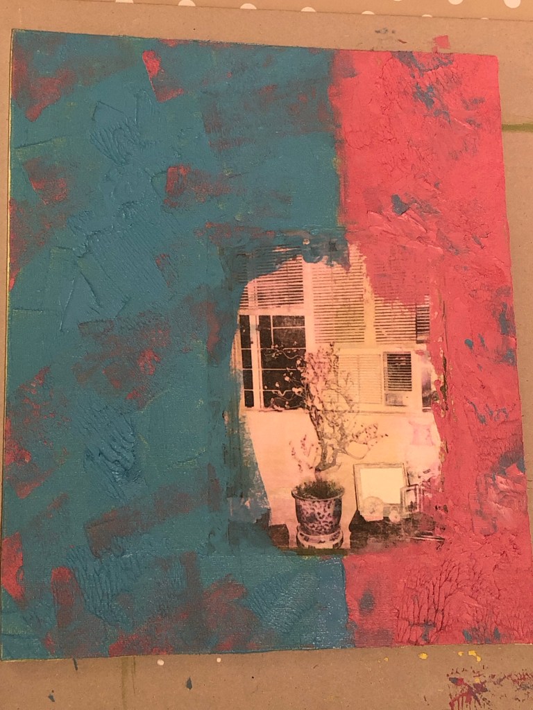
After experimenting with oil and cold wax, I wanted to do a painting with that medium. As for the subject of this work – I wanted to start with an old photograph of my parents’ home.
METHOD
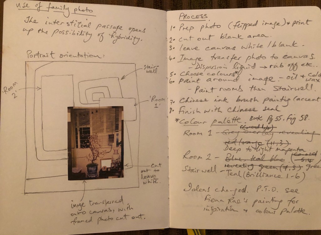
After watching a video about sketchbooks recently, I decided to return to using my sketchbook to develop ideas. Here is what I came up with for this painting.
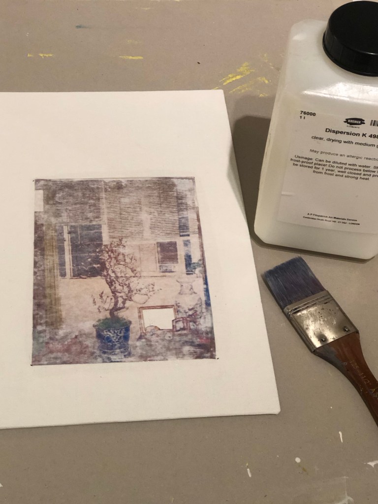
I took a digital copy of an old photo from my parents’ home, printed it out and transferred the image onto a 12×16 inch canvas board using dispersion liquid. One of the framed photos in the image was of me at my graduation with my parents from years earlier – I didn’t want to include that hence I cut it out to leave a blank space with the aim of raising questions or intrigue for the viewer.
Image being transferred onto canvas board
Below is a bare canvas board with the transferred photo image:
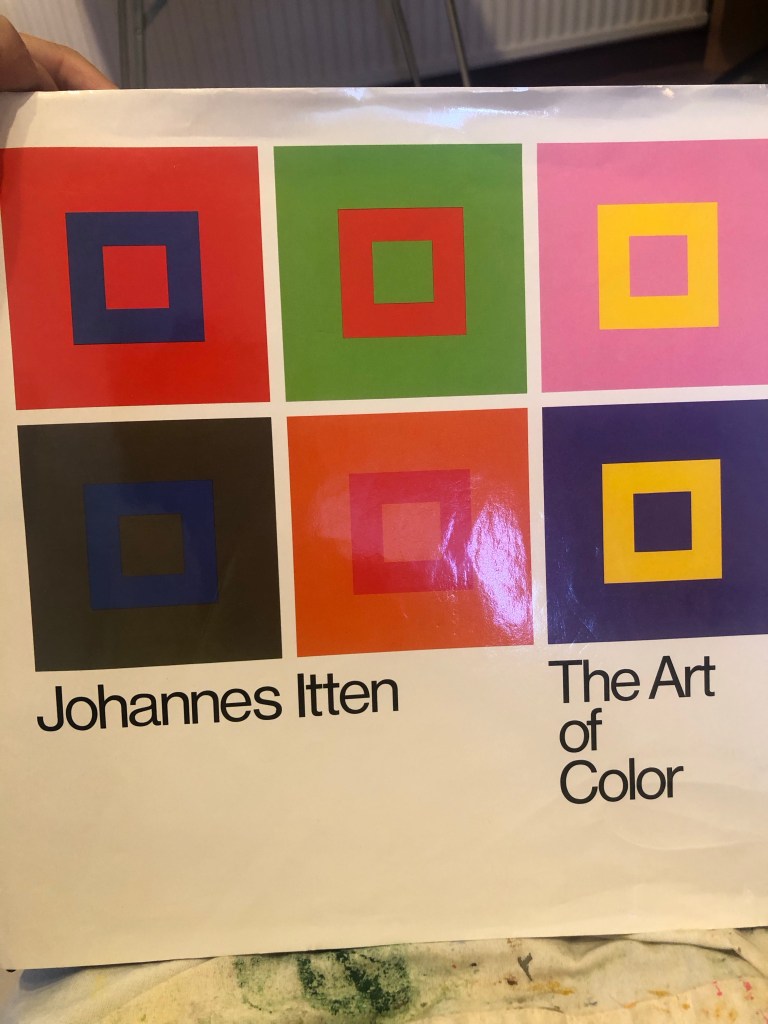
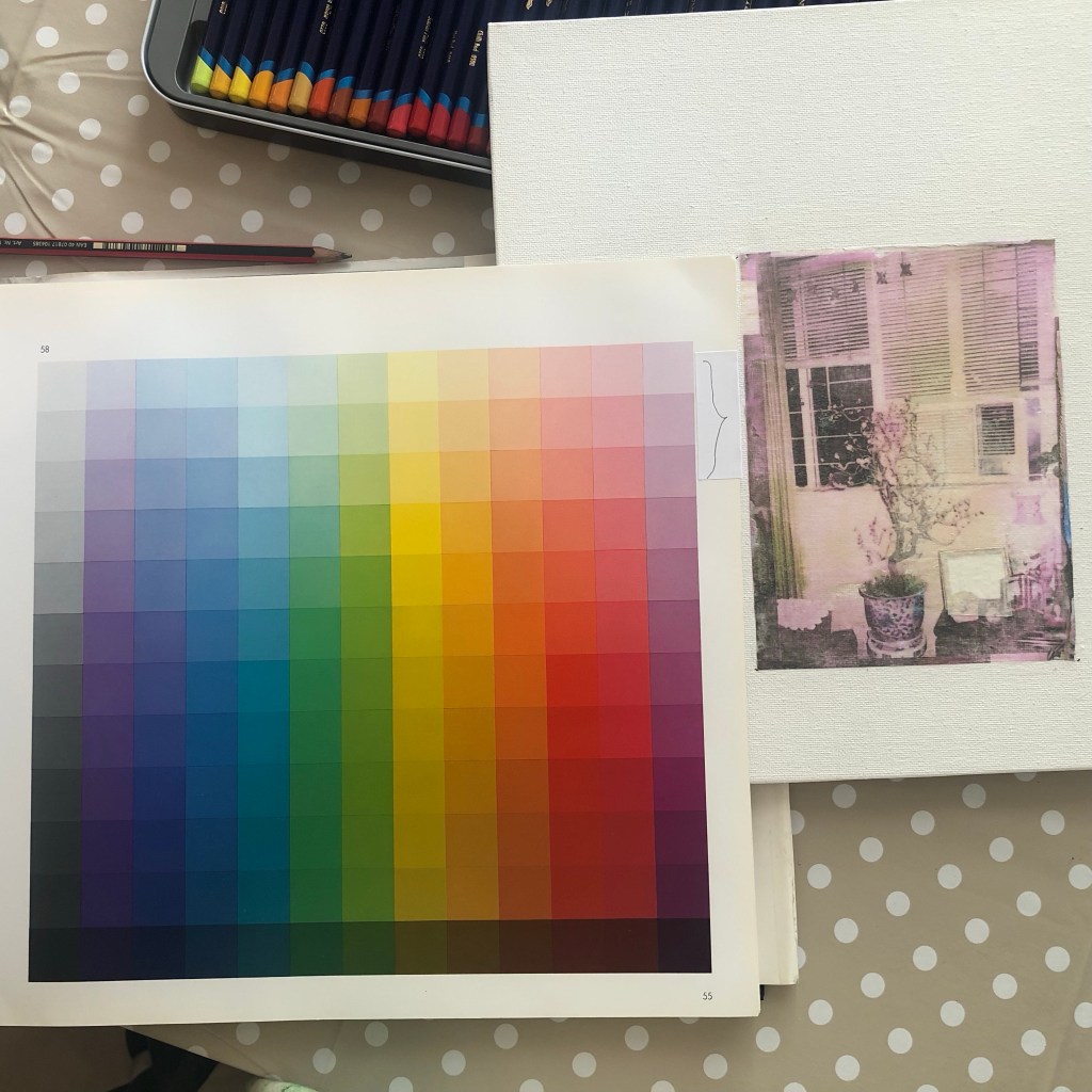
I would usually apply paint instinctively in response to the image on the canvas, however, I wanted to be more considered in my approach hence referring to The Art of Colour book to do some research and plan the colour palette for the work.
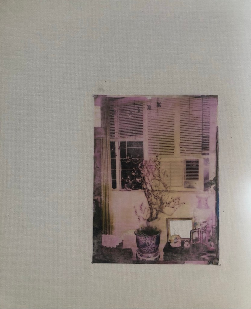
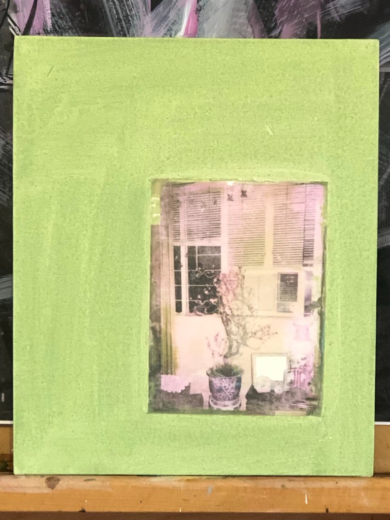
I picked out a green shade from the photo and did an acrylic wash to cover the canvas:
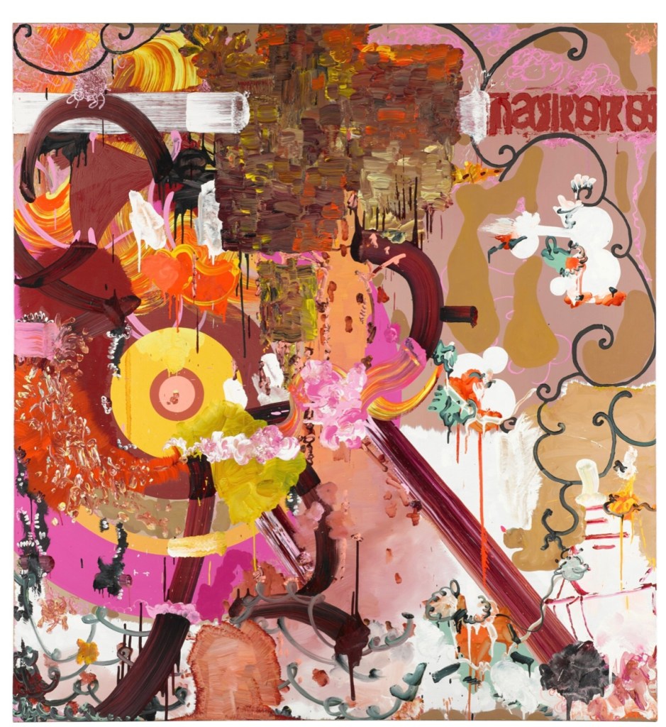
I was feeling lost despite faced with a very informative book. So I did some artist research to look at the colour palette on this painting by Fiona Rae – an artist that I admire and researching into her work was part of my intention from the last experiment:
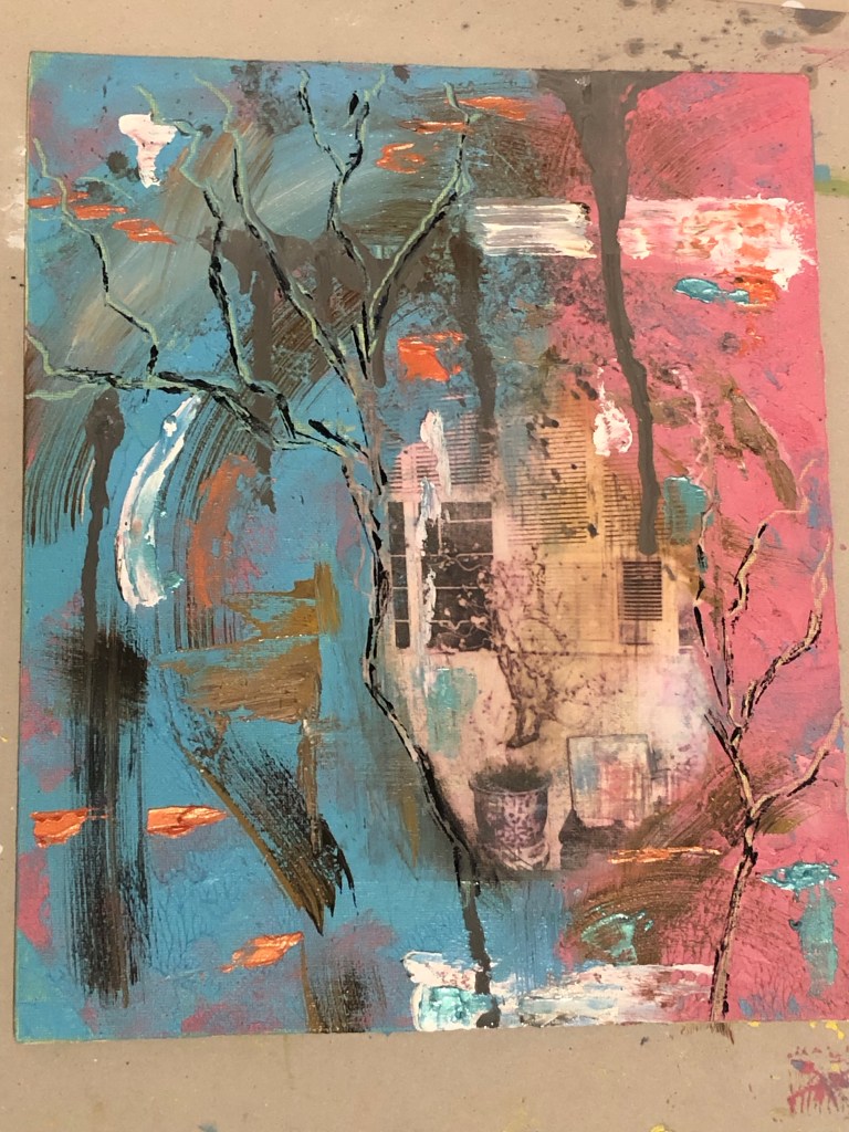
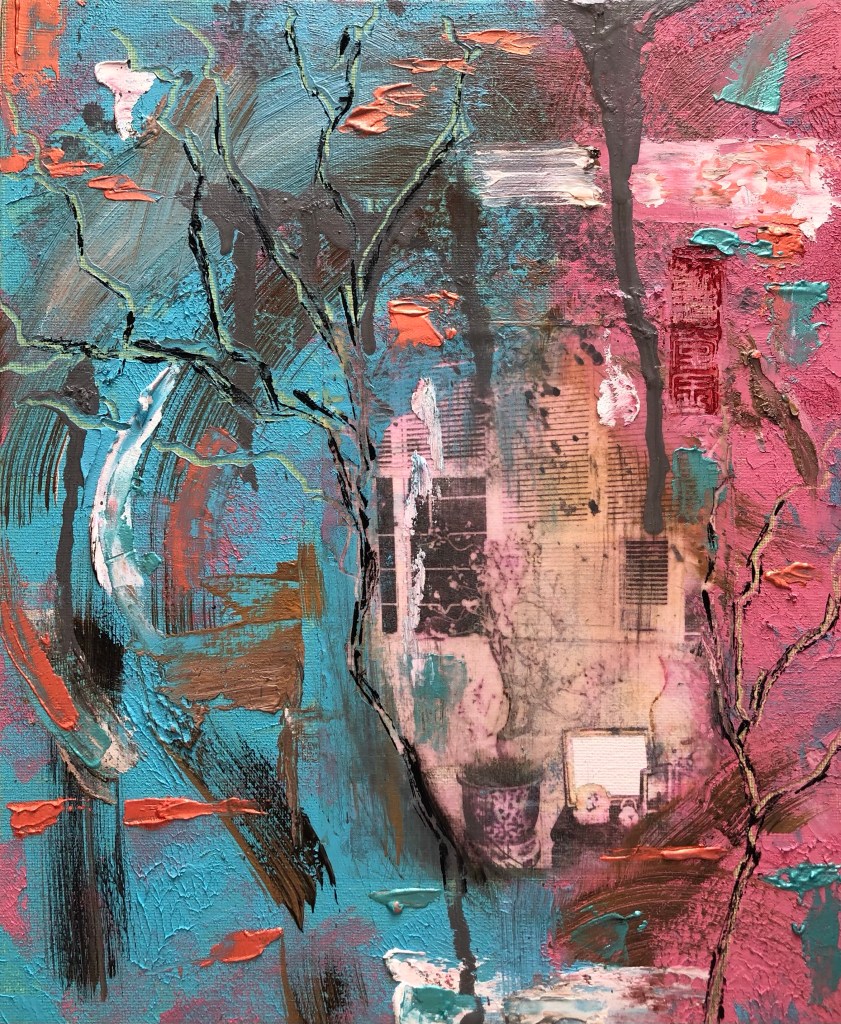
That gave me the inspiration to start painting. I tried to stay with the idea developed in my sketchbook with blocks of colours in oil and cold wax reflecting the different cultural areas that I operate in.
I wanted to add connections between the two blocks to represent the stairwell connecting ‘the two rooms’ as in the analogy used by Homi K Bhabha in his book The Location of Culture about people living in different cultures simultaneously – one ends up running back and forth. I then scratched the oil and wax medium to create branches like those on the peach tree in the photo.
I masked the cut-out of my photo while painting. Below is with the mask removed after I finished painting:
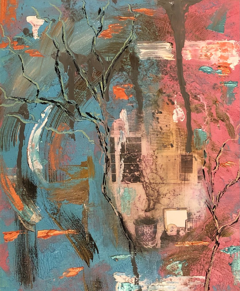
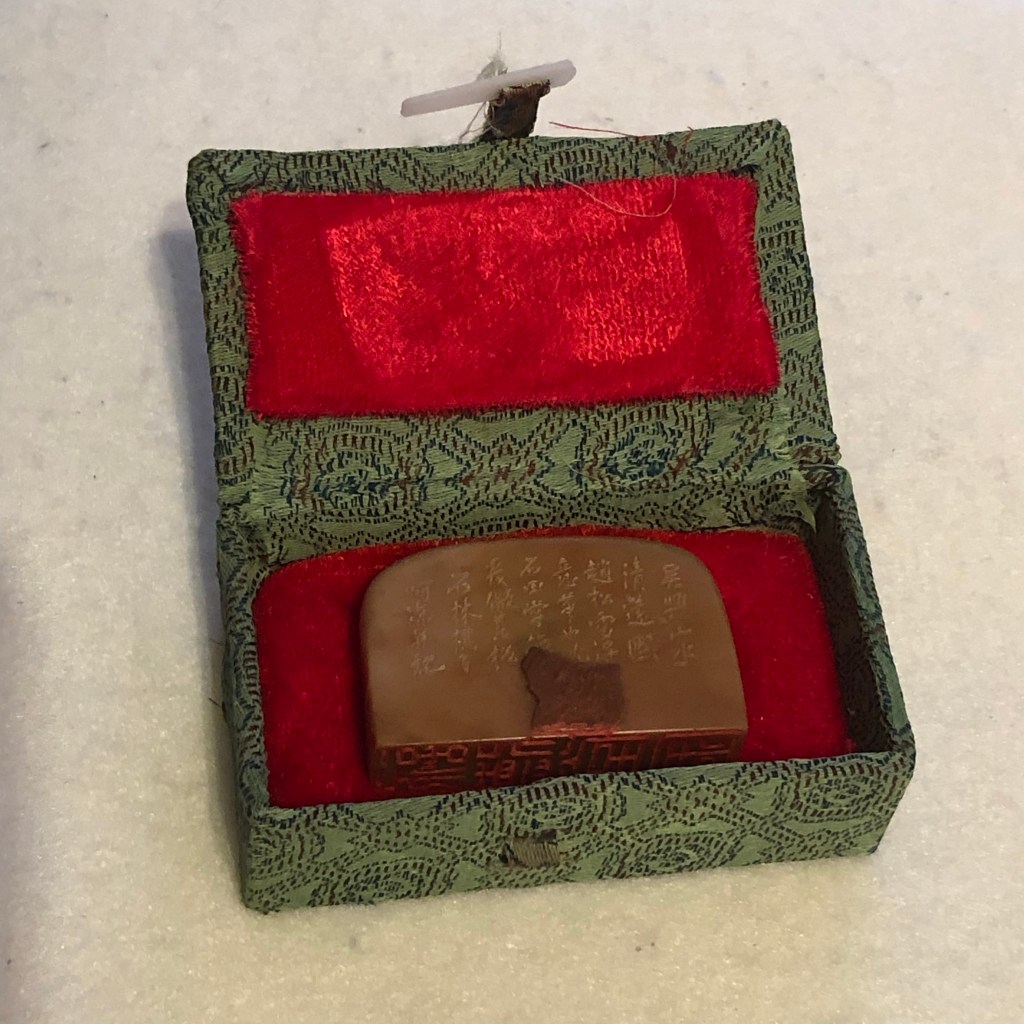
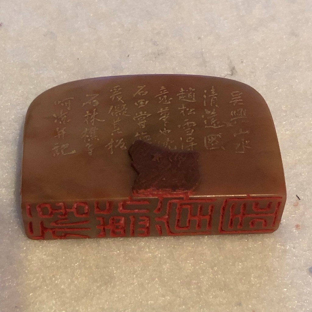
I wanted to put a seal stamp on the painting from my late mother to connect her with this work. Here is one of her seals (she was a Chinese artist):
The seal was stamped on the top right of the photo image to complete the painting.
–
REFLECTIONS
In The Location of Culture, Homi K Bhabha talks about the negotiation of cultures and where that takes place. He uses the analogy of a stairwell connecting different rooms and a transcultural person is constantly running in between those rooms. That analogy resonated with me and I wanted to build my image around this concept as captured in my sketchbook.
Regarding the use of a family photo – this idea came about when I was recently shown four photo albums that belonged to my family. I was asked to take them but I didn’t feel ready to take them yet. I wasn’t ready to start delving into my memory although working from memory is a key part of my narrative work. My deeper memory felt fragile hence I wanted to ease into the process. My tutor suggested that perhaps I could try working with one or two old photos to see how I got on. I chose one photo that was taken at Chinese New Year with the traditional new year peach blossoms surrounded by some framed family photos. It was taken many years after I left home and I didn’t feel a connection to my parents’ home even though I felt I should do. Hence I cut out the photo of me from the scene as I felt out of place there. The cutting out of part of an image from a photo was something that I wanted to try to see if it would convey that sense of ‘absence’ or ‘not belonging’. I was pleased with how it worked out on the image transfer and the masking process.
Despite the research into colour palettes and tone brilliance, I ended up doing it rather instinctively – this was a disappointment because I wanted to be more scientific and considered in my use of colours – so this remains an area of development.
I enjoyed using oil and cold wax and found that I had many options of mark making. I was pleased with how the scratched tree branches came out and the black thin marks helped to enhance the tree. I would have wanted to paint the tree in Chinese painting style but I have not worked out how to paint that delicately onto oil – ink doesn’t work on oil (materially incompatible) and oil is too viscous to achieve the delicate aesthetic – this remains an area that needs further investigation.
I presented the painting at a group crit. I didn’t mention the cut out photo and wanted to see if anyone would ask about it. No one did which made me think perhaps it was not an effective way to provoke a response.
At the crit, I was also asked by the facilitator if it would matter to me if no one understood my work. My instinctive answer was ‘no, it wouldn’t bother me’ although it’s always good if someone understood the work or found a connection with it. My take away was that perhaps this painting was aesthetically too confusing and hence people didn’t get it.
LEARNING
There were practical learning points such as to continue to work on colour theory and find ways to satisfactorily depict delicate Chinese brush painting onto a ‘western’ medium such as oil because I want to explore ways to bring different cultural genres together to convey my transcultural lived experience. This continues to be a key area of exploration for me.
On a personal point, although I liked this painting, I learnt that I still have some way to go to express myself in an abstract manner that connects with the viewer. My two colour zones with connections for the ‘stairwell’ didn’t really come across as I intended and the viewers seemed indifferent to the photo image. These made me think that what I wanted to say was not sufficiently thought-through, so I need to revisit what I wanted to say and not to rush in trying to say too much in one painting because all the messages and symbolic meanings would just get lost within the image. I have been advised before to avoid trying to say everything or too much in one painting – I must remember that.
NEXT STEPS
– Continue to learn and experiment with colours as I want to use colours appropriately to help me to convey my story.
– Do experiments: dig out some old oil painting exercises, cover with clear gesso and see if I can use Chinese ink on top of that.
– Revisit my style development. Do more research into the third space to really understand what that means to me and what it could look like aesthetically in order to develop a language that I can use. For this point, I want to develop my abstraction skills and will continue to explore oil and cold wax in this development.
– I want to continue to explore the cut-out photo technique to play with the notion of absence in my narrative. Although no one asked about it in this case, I remain excited about the possibilities.
This blog captures my notes and reflections as I read this book. I found much resonance in Bhabha’s text and I hope this blog will be a treasure trove of inspiration for me to make work through exploring my Third Space.
This is an ongoing blog that I plan to update as I go along as I expect to take time digesting the text and is likely to involve much re-reading over time.
Notes and reflections:
Introduction refers to novels by VS Naipaul drawing out essence to position Bhabha’s notion of ‘vernacular cosmopolitanism’ which asserts measuring global progress from the minority perspective.
The right to difference in equality.
A dual economy is not a developed economy.
‘Symbolic citizenship’ (Avishai Margalit) – surveillance culture of security… how do we tell the good migrant from the bad migrant? Which cultures are safe and unsafe?
Minority affiliations or solidarities arise in response to the failures and limits of democratic representation, creating new modes of agency, new strategies of recognition.
Poem by Adrienne Rich – An Atlas of the Difficult World (1991) has powerful images. To do: research for images
Adrienne Rich struggles to find ways to establish narrative of what lies in-between the distinct moments that allows the characters to become affiliated in the spirit of ‘right to difference in equality’.
Rich places herself at the intersections of these narratives as a cultural re-visioning of a particular history ‘of one’s own’.
No name is yours until you speak it. Your personhood cannot be denied.
The borderline engagement of cultural differences may as often be consensual as conflictual. They have confound our definitions of tradition and modernity. Realign the customers boundaries between the private and the public.
Using architecture as a metaphor with stairwell connecting rooms – this interstitial passage between fixed identifications opens up the possibility of a cultural hybridity that entertains differences without an assumed or imposed hierarchy.
Useful links on Homi Bhabha’s work
Short lecture on Bhabha’s work:
Someone reviewing the book:
1.5 hours long lecture by Bhabha:
In-betweenness by Dr. Masood Raja
Chad A Haag review series on whole book:
Update 14th Dec 2023
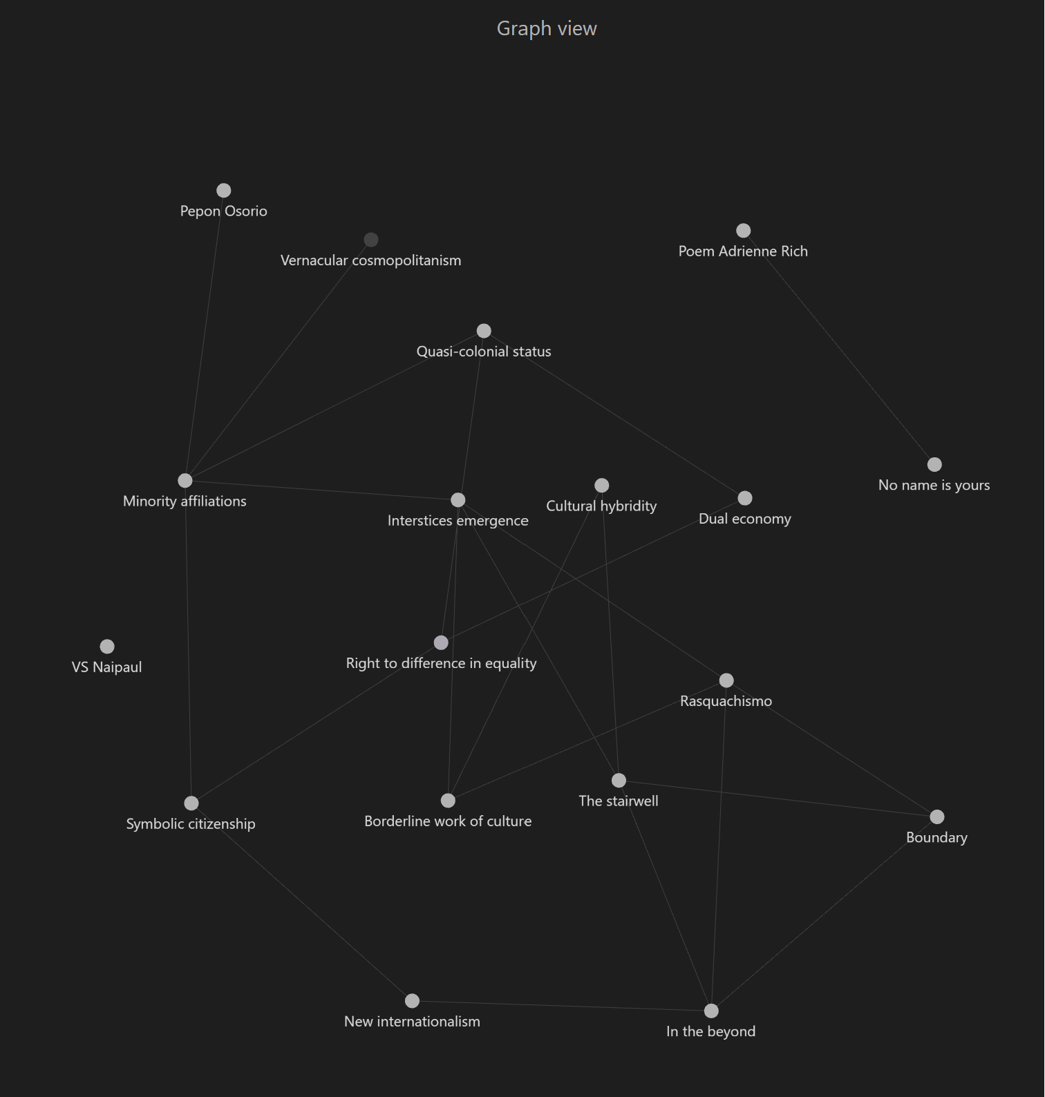
At the Unit 1 tutorial, I was introduced to a note taking tool called Obsidian. It is based on the Zettelkasten method of note taking. I have since started using Obsidian and I have found it to be very useful and powerful. It will be very helpful for me because I was starting to struggle with just capturing my notes and thoughts on a list here. I needed to structure my thoughts and the data in a better way. So from now on, I will capture my notes on The Location of Culture in Obsidian instead of listing them in this blog.
Example of the graph view of notes so far taken with Obsidian:
I have also watched all five of the Chad A Haag study notes videos on YouTube – they are excellent and have helped me to quickly get a sense of the ideas by Homi K Bhabha. It is a book that requires time to study and digest. I will continue to read the book and will really take my time to understand it because it forms the foundation of my research in my art practice.