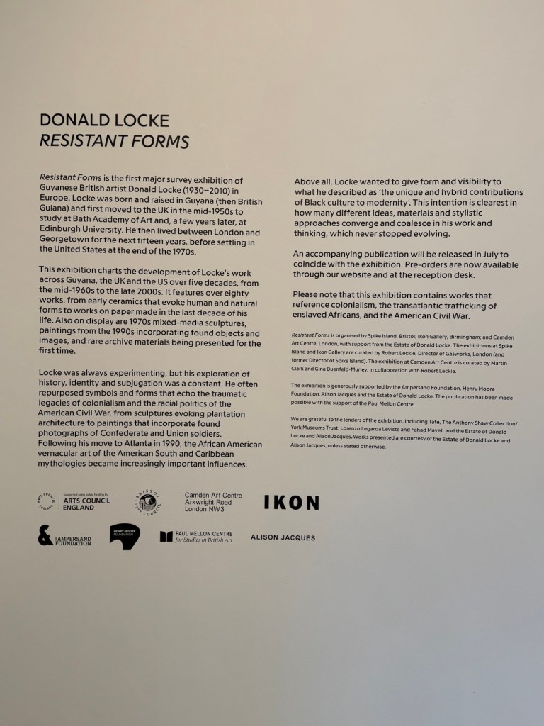
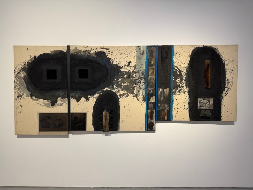
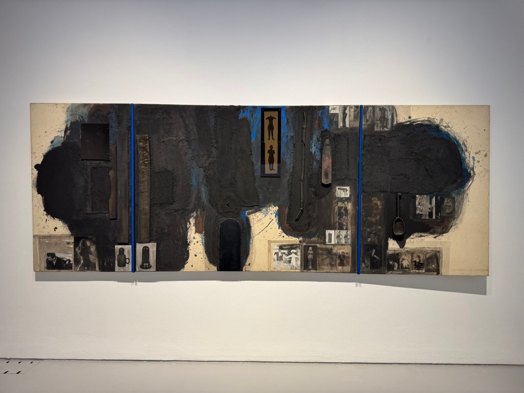
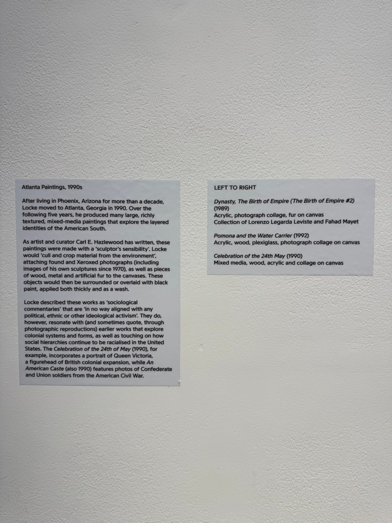
Today I visited Donald Locke’s exhibition Resistant Forms’ at Spike Island Bristol. Below are some of the photos I took to remind me of the work that I found particular resonance with.
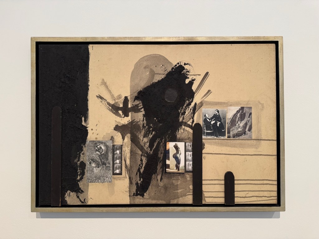
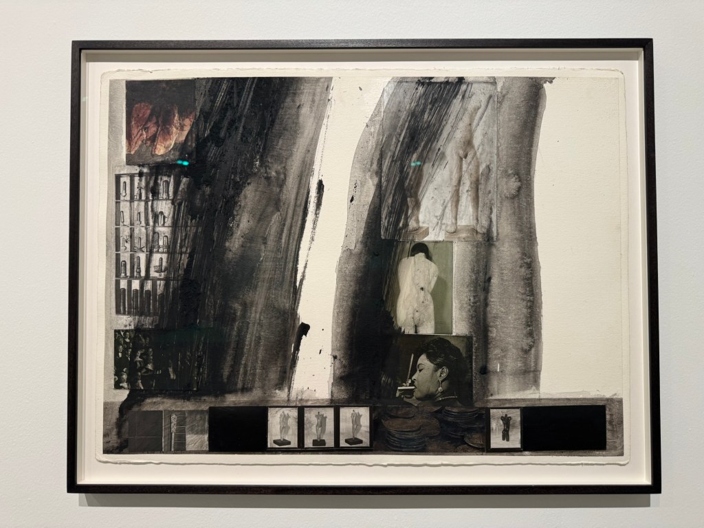
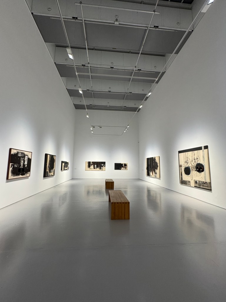
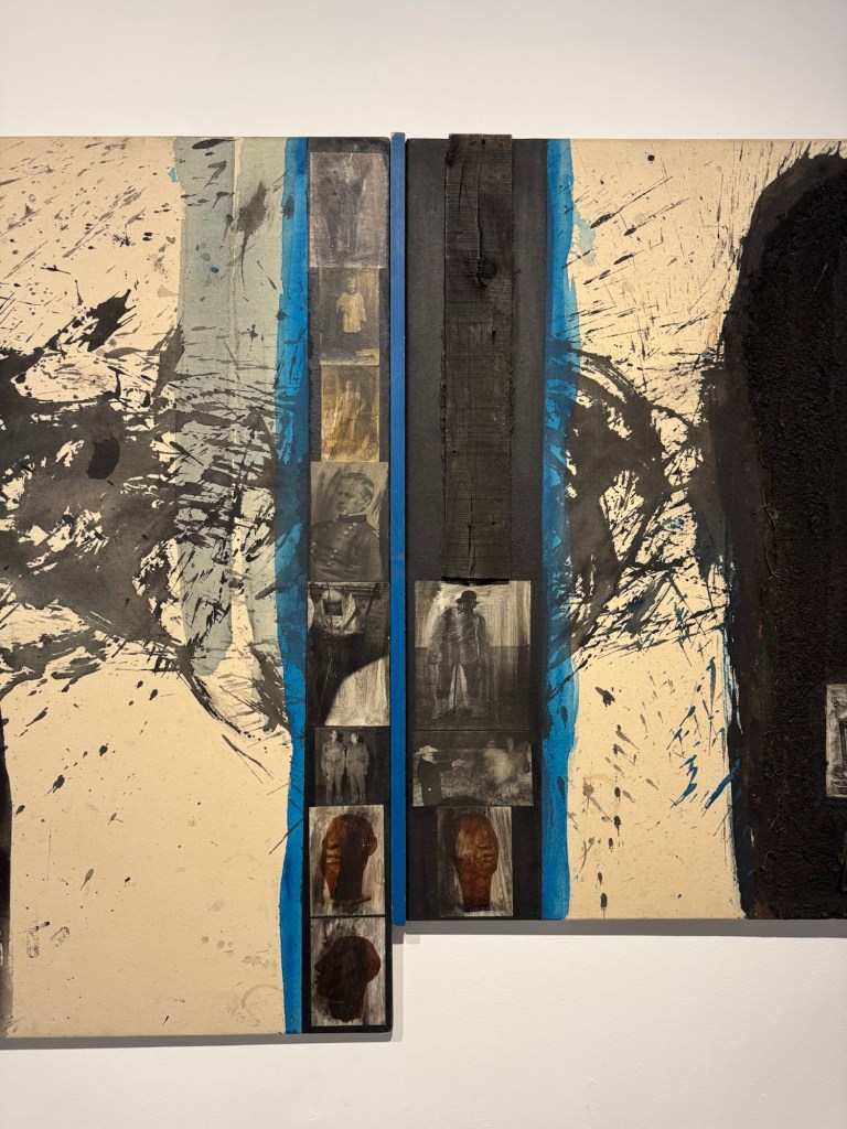
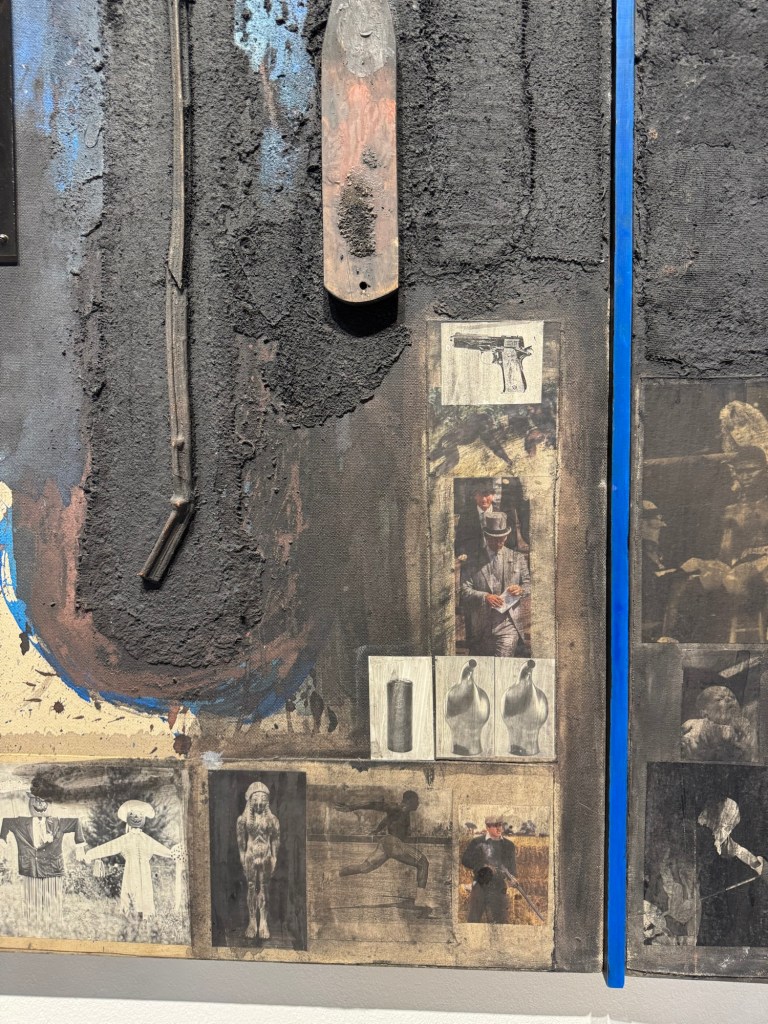
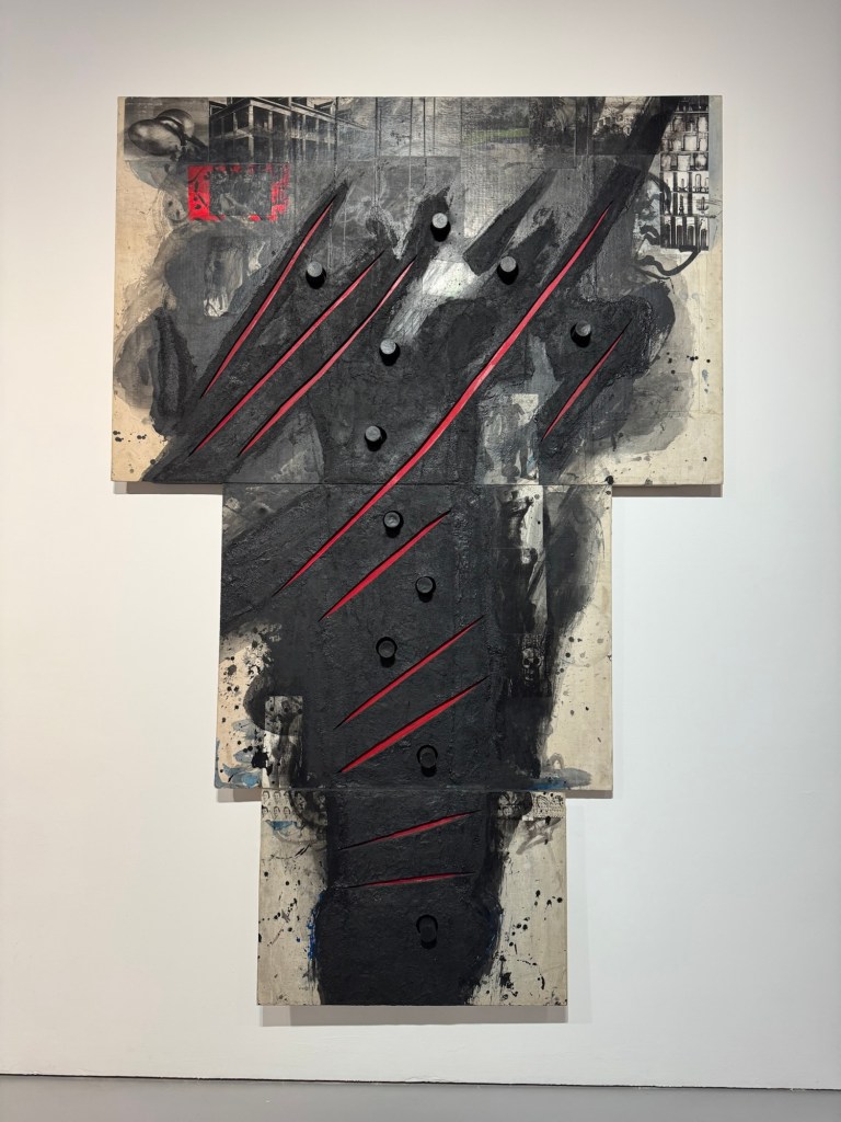
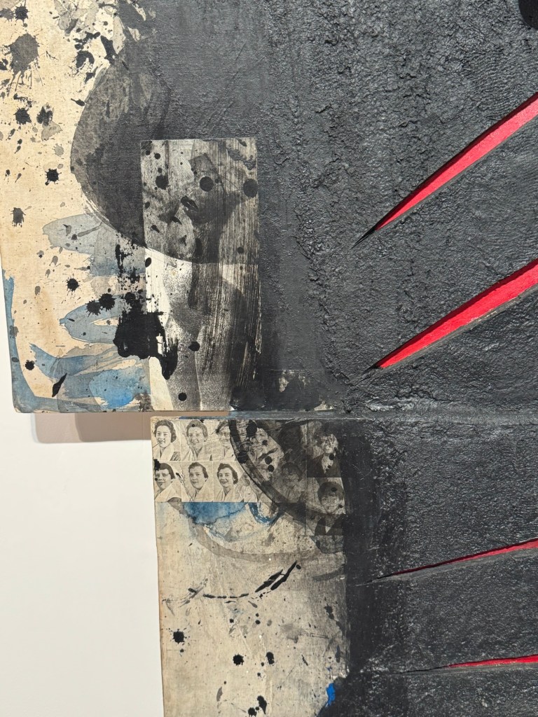
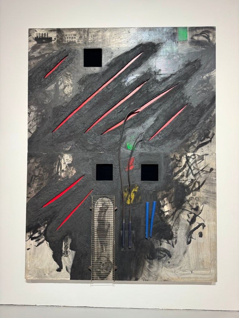
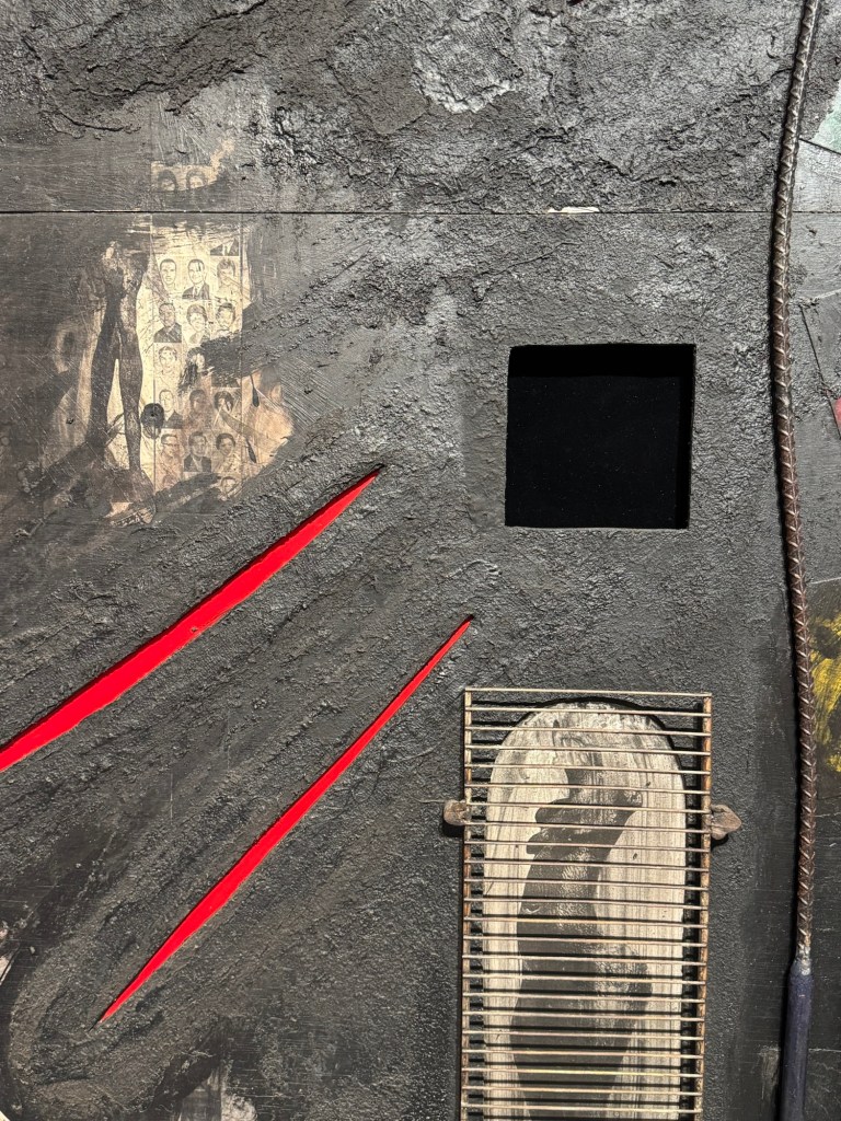
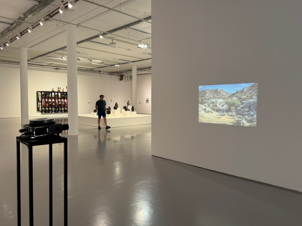
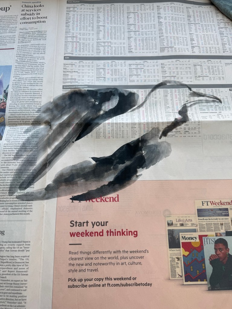
Use of collage, image looks like a crowUse of acrylic in a way that resembles inkAmbiguous use of photosLarge scale paintings with presence and energyClose up of the above showing photos collageUse of mixed media including metal grill mounted onto painting Placement of projector and understated size of projected image
REFLECTIONS
I want to capture ideas that came to me during the visit that made me think about how I could learn from Locke and build on my practice.
Use of mix media techniques:
On some of his paintings, the use of acrylic paint with ‘dry brushing’ to create the flying white effect like in Chinese painting energised the painting. It gave me the idea of trying my crow paintings in other medium, such as dilute oil, to see how that works. The use of different materials to create collage was also interesting. I could use ripped up newspapers to create collage effect on a canvas then paint on top. Locke also used items like metal grills to good effect. I can consider what objects, metal or otherwise, that could be incorporated to add meaning and texture to the work.
Use of photos:
Some old photos were used in the collage. I have many old family photos that I have been considering how to incorporate into my work. The way Locke used the photos were more random – a few here and there. Whereas I have tried too hard in the past; I could just use small images in a few places – I don’t need to tell the whole story in one painting. I must remember this. Also, he had just pasted / stuck the photos (copies of) onto the canvas. I always felt that I should photo-transfer the images onto the canvas – this is not necessary. Locke also used images or photos of his own work (sculptures) in his paintings – those images (e.g. female nude) appeared on multiple paintings and acted as a link to join the works together.
Use of projector understatedly
The projector was projecting at waist height with a not too large image. It was understated and effective. I often feel that projection has to be big and has to fill a wall. It clearly doesn’t have to at all. The projection was also placed in a way that you have to walk through the beam to get past. It was an interesting positioning which makes the viewer interact with it.
LEARNING
There are no major learning from the visit and mainly just ideas that came to me as I studied Locke’s work. The main take away for me was to think about experimenting beyond just painting on the whole piece of newspaper. The news headlines remain important to the body of work (News), but through the use of collages, the newspapers could be incorporated to maintain the theme while opening up the materials that I can use. Locke’s extensive use of black was very effective which resonated with me.
NEXT STEPS
Start to think about how I can start to make more complex and ambitious work with multi media materials yet remaining connected to the topic of News.
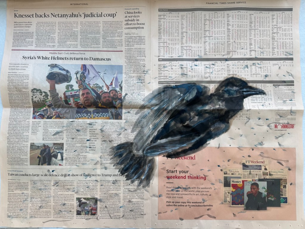
I have been continuing my experiments with making art on newspapers as a way to respond to what’s happening in the world. In previous blogs, I have talked about using crows to express the grief and the sense of loss that I have been feeling.
This blog captures the experiments where I have responded more directly to the news with the painted images. I have also tried to think more carefully about the process of this way of making. Through trial and error, I believe I have developed a more systematic process of producing these paintings which I have documented below.
METHOD
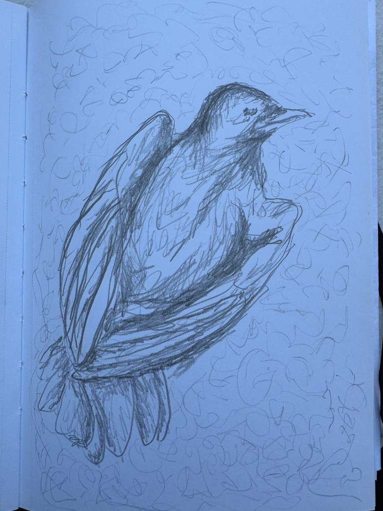
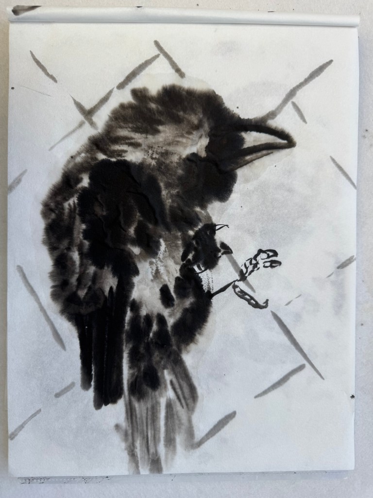
My response to some recent news about innocent people being killed in a war was to explore painting dead crows. I have often seen dead birds on the road or pavement, but I have never studied them closely. So the start of the making process was to research online images of dead crows.
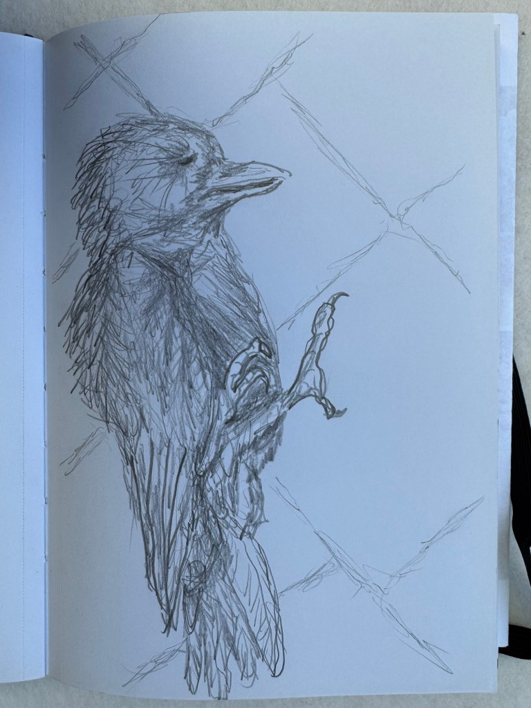
Once I found a desired image, I would do a drawing in my sketchbook with my non-dominant hand. I have previously documented my wish and need to use my non-dominant hand to be more expressive while experiencing that feeling of not having complete control of what was happening.
Drawing of dead crow lying on its back
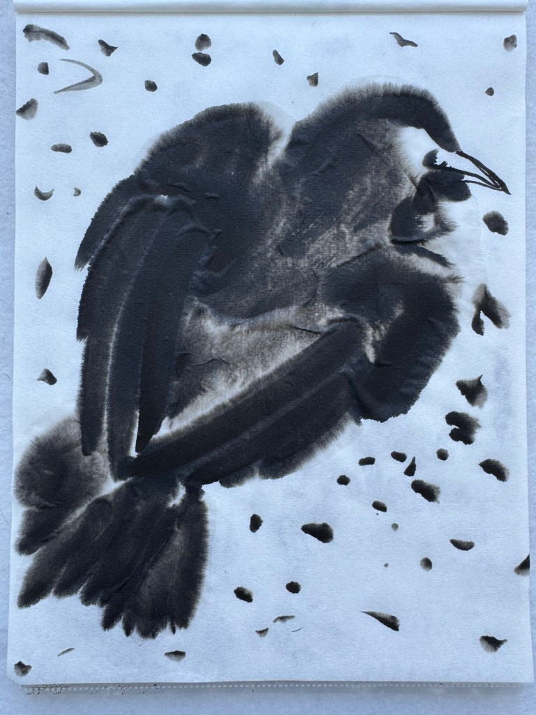
I then did a Chinese ink study of the same dead crow composition on a piece of A4 rice paper:
Chinese ink study of crow composition – A4
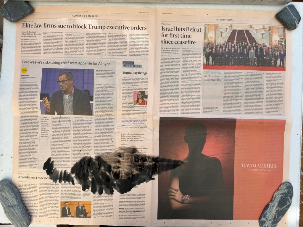
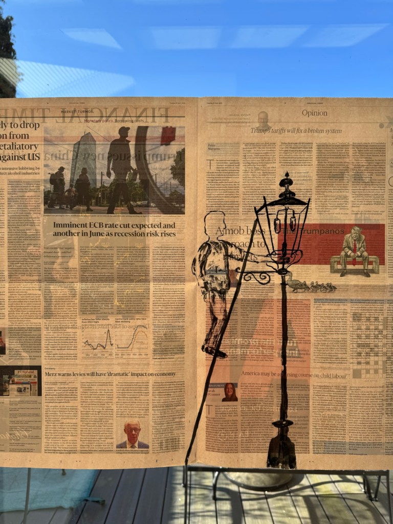
I then choose the newspaper and started to paint the chosen composition:
Finished dead crow:
–
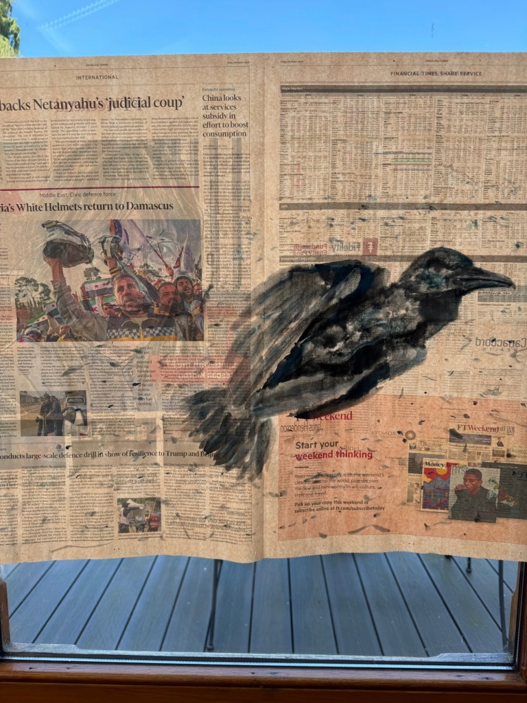
Painting held up to the light, taped to a glass window:
Finished painting – dead crow
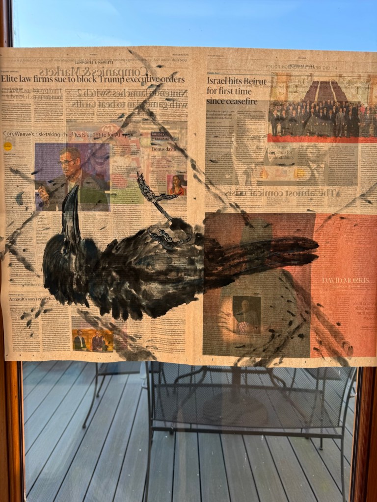
A second experiment with a different dead crow was done following the same process, but with an added step of making a faint charcoal outline sketch on the newspaper of the crow before painting. This step was added because brush painting with ink on paper is unforgiving, hence having a sketch of the shape helps to ensure the composition is largely in the right place.
Sketchbook drawing of the second dead crow:
Sketchbook pencil drawing
Chinese brush painting study of crow body:
Chinese ink on rice paper – A4
Charcoal outline was drawn prior to painting to mark out the composition:
–
Completed painting of dead crow lying on its side on pavement, held up to the light.
Painted dead crow on The FT
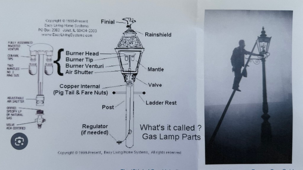
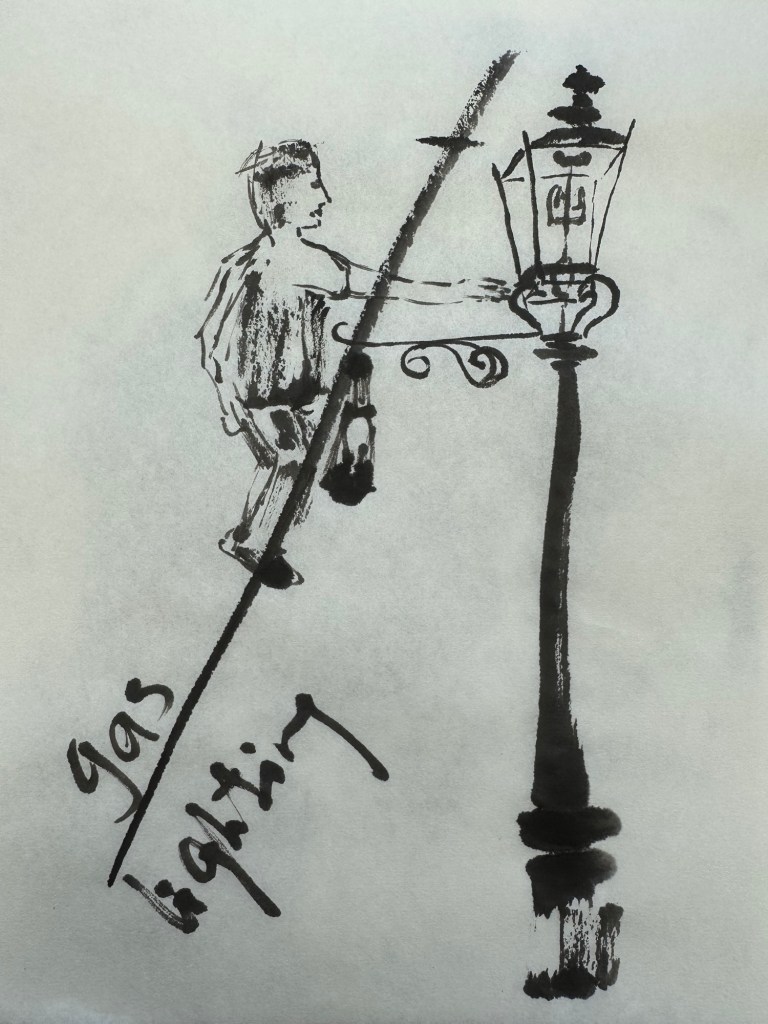
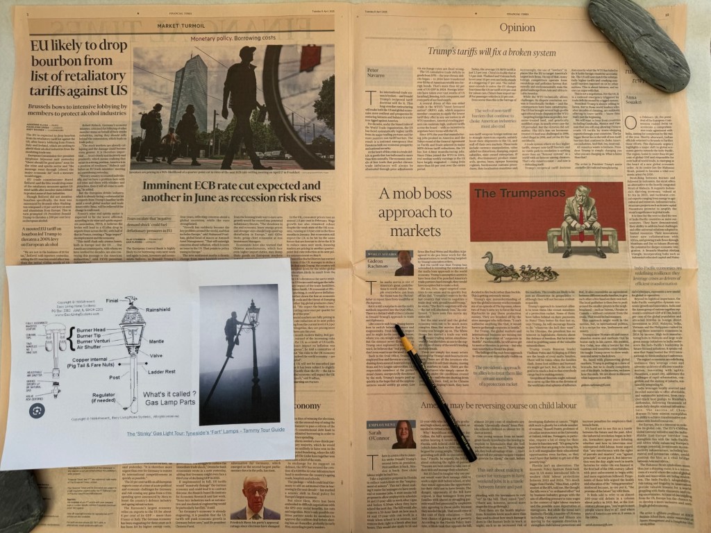
The last experiment on responding to the news involved an image of a man lighting a gas lamp. It was important for me to research how a street gas lamp worked so that I knew what I was drawing. The diagram below was very helpful.
–
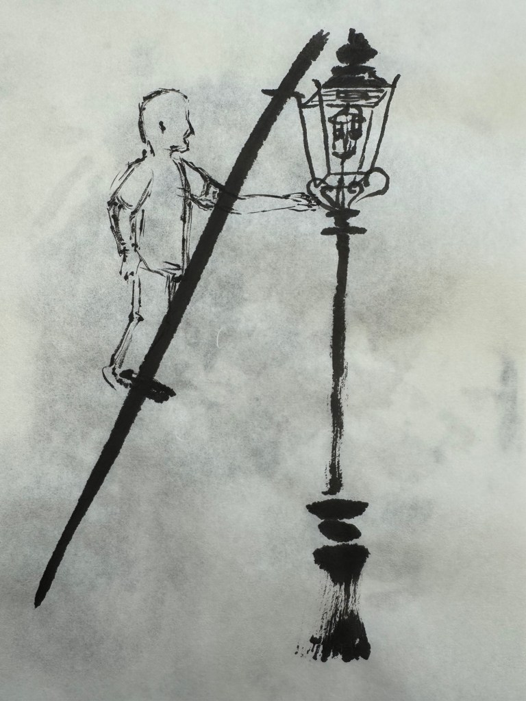
This time, I did two ink sketches as initial study to test the composition:
–
The chosen newspaper page that I wanted to respond to was laid flat and a rough charcoal drawing of the composition was made:
–
Then the painting was done and held up to the light. Gaslighting – Chinese ink on newspaper:
–
REFLECTIONS
It was cathartic to directly respond to the news. So I enjoyed making these pieces of work. However, looking at them now, they feel rather literal and obvious. Dead crows to respond to innocent paramedics being killed and a man lighting a gas street lamp to respond to the gaslighting going on in many places. All seemed too obvious.
These paintings were made using my dominant hand – I think it was because these composition ideas were very new and I wanted to be more confident in my depiction. However, I believe the outcomes are less satisfactory than the previous ones where I used my non-dominant hand. The mark making here seemed too deliberate and lacking the energy that I had achieved previously.
Although the artistic outcome was not completely satisfactory, the process of responding to the news by directly calling it out was satisfying. It was like ranting without actually ranting. Also, I gained clarity and tested out the process in a more conscious way. So all was not lost.
LEARNING
The initial drawing and sketching step was helpful for new compositions. But I don’t feel it’s an essential step, depending on how familiar I am with the subject.
Using charcoal to mark out the composition on the newspaper was very useful and is an essential step that I should use.
Responding directly with images may end up being too literal or obvious. So use with care.
NEXT STEPS
Try different approaches to composition and images. Experiment with more abstract images.
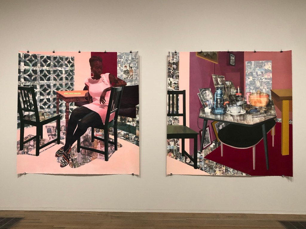
I had a tutorial with an Academic Support tutor from CSM and we discussed painting. I talked about one of my favourite transcultural artists Njideka Akunyili Crosby. I talked about how in awe I felt when I saw her large diptych at Tate Modern last year. The tutor suggested that I made a painting to respond to the work.
Akunyili Crosby’s work at Tate:
–
METHOD
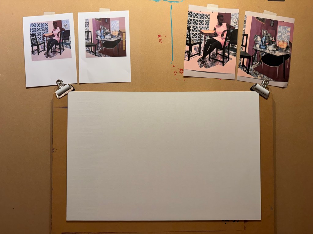
I printed out Akunyili Crosby’s work to give me inspiration. A board canvas was chosen.
–
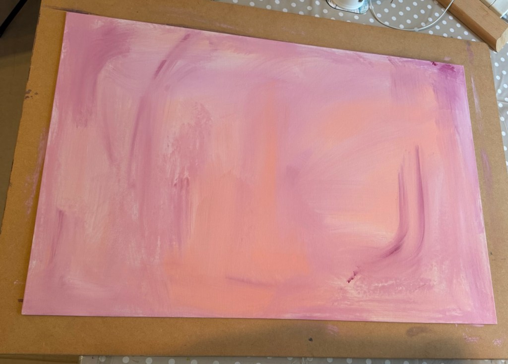
A thin acrylic wash of mixed colours was applied to cover the canvas.
–
A line from a Chinese Tang Dynasty poem was chosen and written onto the canvas in Chinese ink to add some extra images onto the background. The line translates as – in life, when times are good, really celebrate.
–
Then very thin layers of oil paint were applied loosely with brushes. The canvas was kept vertically for the paint to run down.
–
A piece of textured rag was used to experiment with creating patterns:
–
Work in progress, playing:
–
Playing some more:
–
Close up images to show the ragging effect. The oil was so thin that the background images were still coming through:
–
But what to paint?
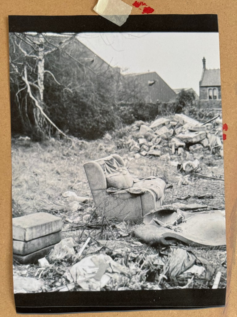
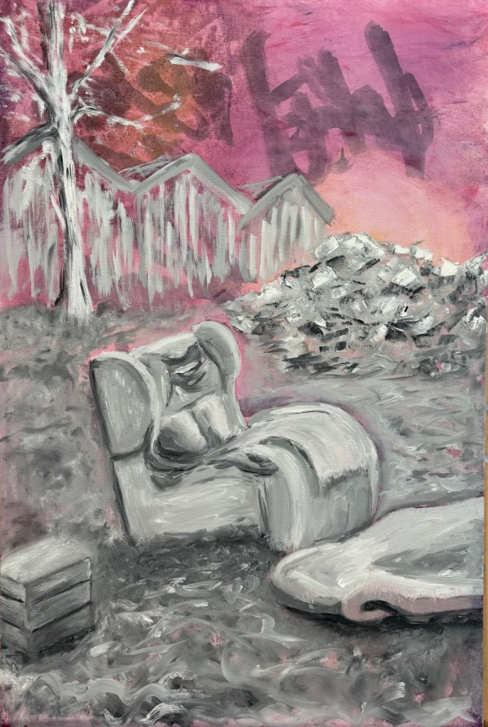
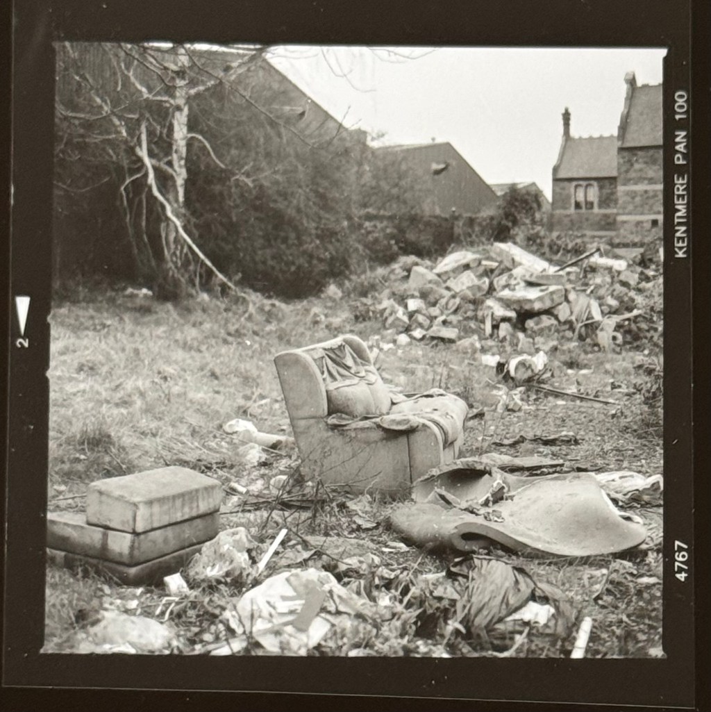
I decided to paint the ‘lone sofa’ photograph that I took when I went on a photography walk-about in Bristol. That was my favourite photo of the trip.
–
The canvas was put into portrait orientation.
–
Charcoal was used to layout the composition, choosing what to keep and what to leave out from the photo image.
–
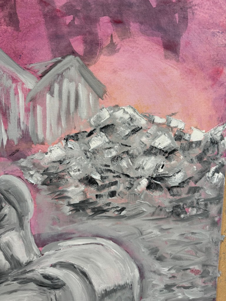
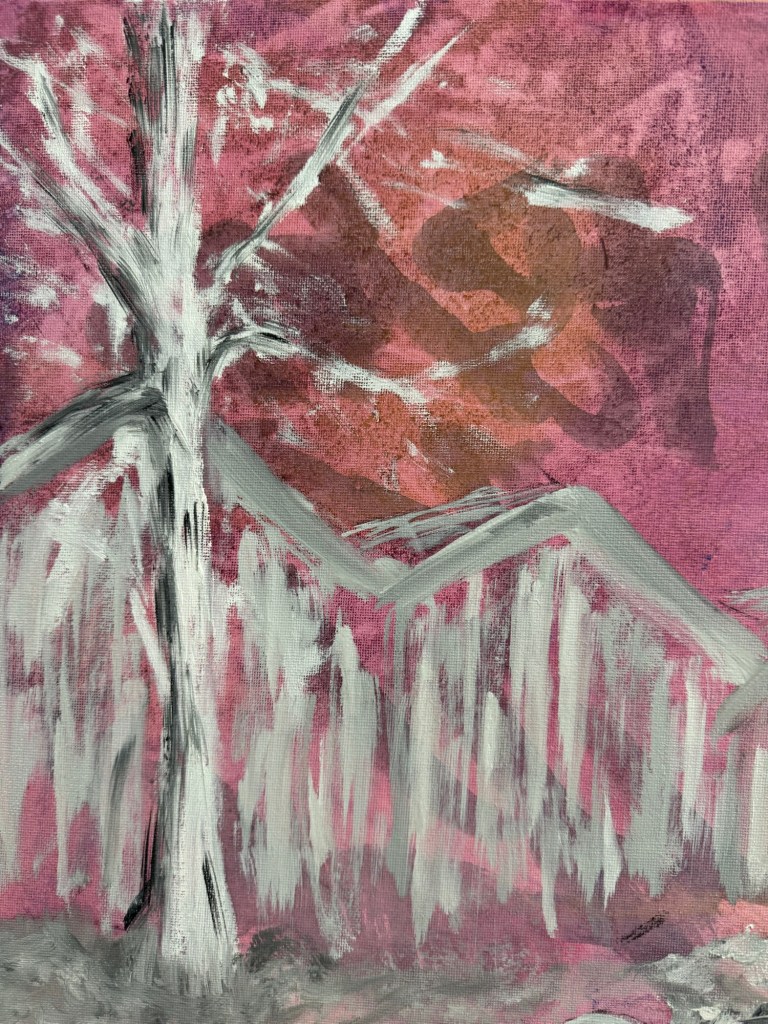
Close-up of areas of the finished painting:
A pile of rubbleA tree in winter
Finished painting:
–
REFLECTIONS
The oil experiments were not as useful as I had wanted – the outcomes were pretty much as expected and I can’t say I made much new discovery. So I need to do more research on this rather than just play.
The Chinese characters in the background were mostly hidden in the end. Again I could have used thinner oil. Or in this case, I feel it’s fine to obscure the background and use the Chinese characters as abstract patterns rather than to convey specific meaning.
The sofa scene – I mentioned in the last blog that I wasn’t feeling colourful so I opted for muted grey tones. That feels appropriate for this scene especially given the original photo was monochrome. I enjoyed the painting process which I tend to do most of the time. It was useful to focus on what to take out from the image composition, trying the less is more approach.
The piece of folded torn foam mattress on the floor was quite successful and also the pile of rubble. I think what was going through my mind was a dystopian scene and I wanted to create a dystopian effect to reflect my despair about the rapid change in world order, not sure if I really got that effect.
Although I started with wanting to do a response to Akunyili Crosby’s work. The outcome was quite far from that original intention. I think it’s because I made this painting over several weeks and my state of mind changed over that period and what I started off wanting to do didn’t seem relevant in the end. So I am comfortable with the change in direction.
LEARNING
To get more out of my exploration of oil, I need to do some research work, either online (YouTube) or books to gain new knowledge so I can take my experimentation to the next level.
It was only when I reflected afterwards that I was going for a dystopian theme. Perhaps if I had thought of that at the start then I could have created more of a dystopian atmosphere. I can research more about dystopian art. But how does that fit in with my transcultural practice? Should I go off on this tangent right now to risk having an incoherent body of work?
NEXT STEPS
Do research on oil painting techniques to learn new ways to use oil.
Do research on dystopian artists to see if that’s the vibe that I want to reflect my state of mind right now.
Following on from my Unit 2 feedback, I wanted to explore more ways of using oil. Also, from some photography work, I wanted to incorporate more photos into my work. So I started a new piece of work without knowing what I was going to do.
METHOD
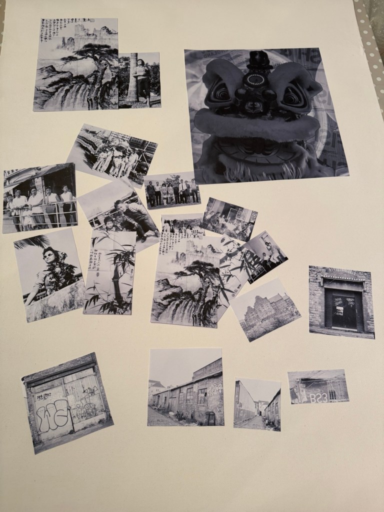
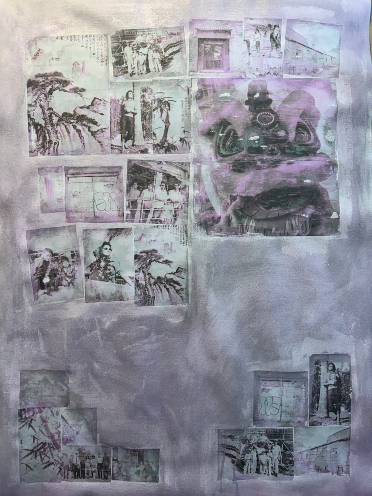
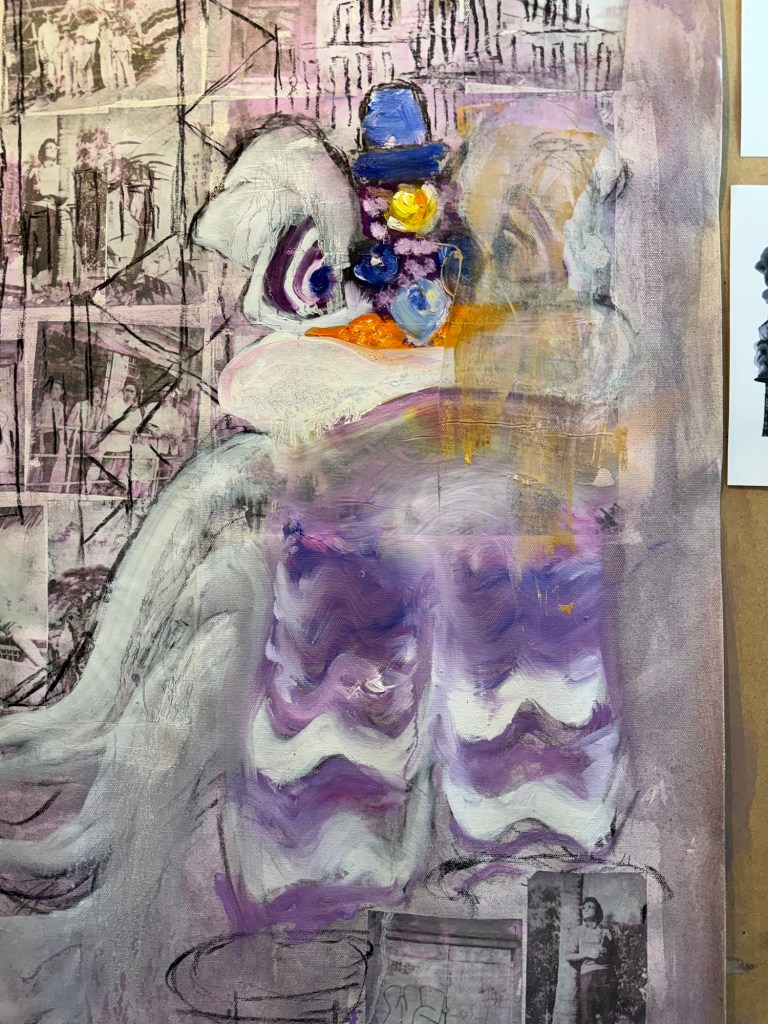
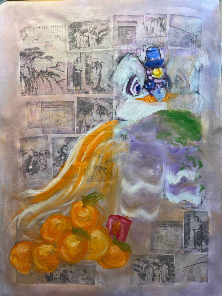
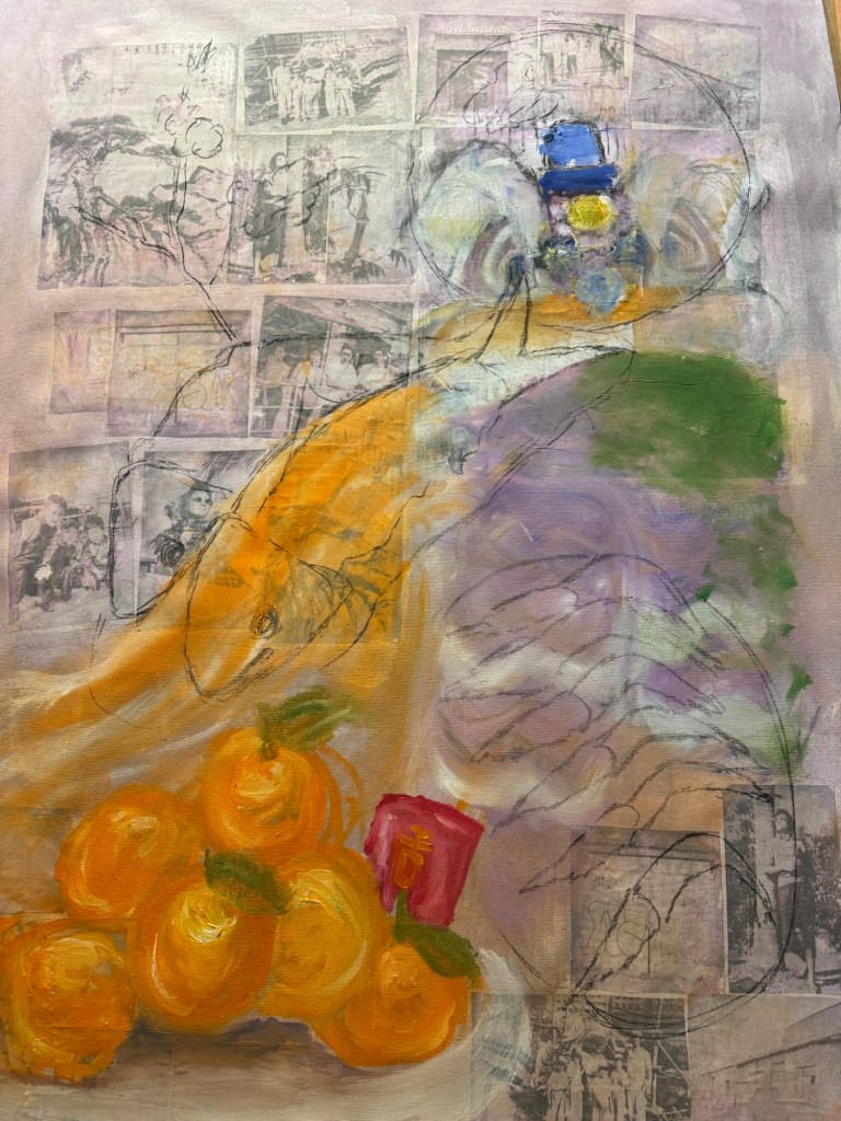
I made some black and white inkjet prints of various photos, some old family photos from Hong Kong and some recent Bristol streetscapes that I took with a medium format camera. Since it was around Chinese New Year time, I put in an image of a traditional Chinese Lion used for festive lion dance. I wanted to make that a dominant feature of the composition for the new year.
–
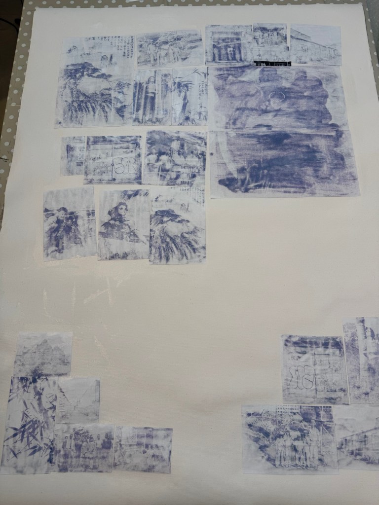
I used dispersion liquid to transfer the images onto a primed canvas:
Prints being stuck down using dispersion liquid
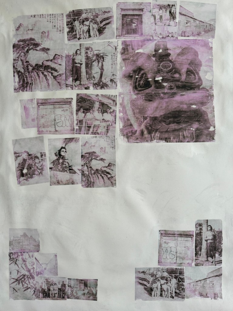
Printed images transferred onto the canvas. Due to the inkjet printer image, there was a pink / magenta tint to the transferred images.
–
The canvas was covered in a thinned down acrylic wash:
–
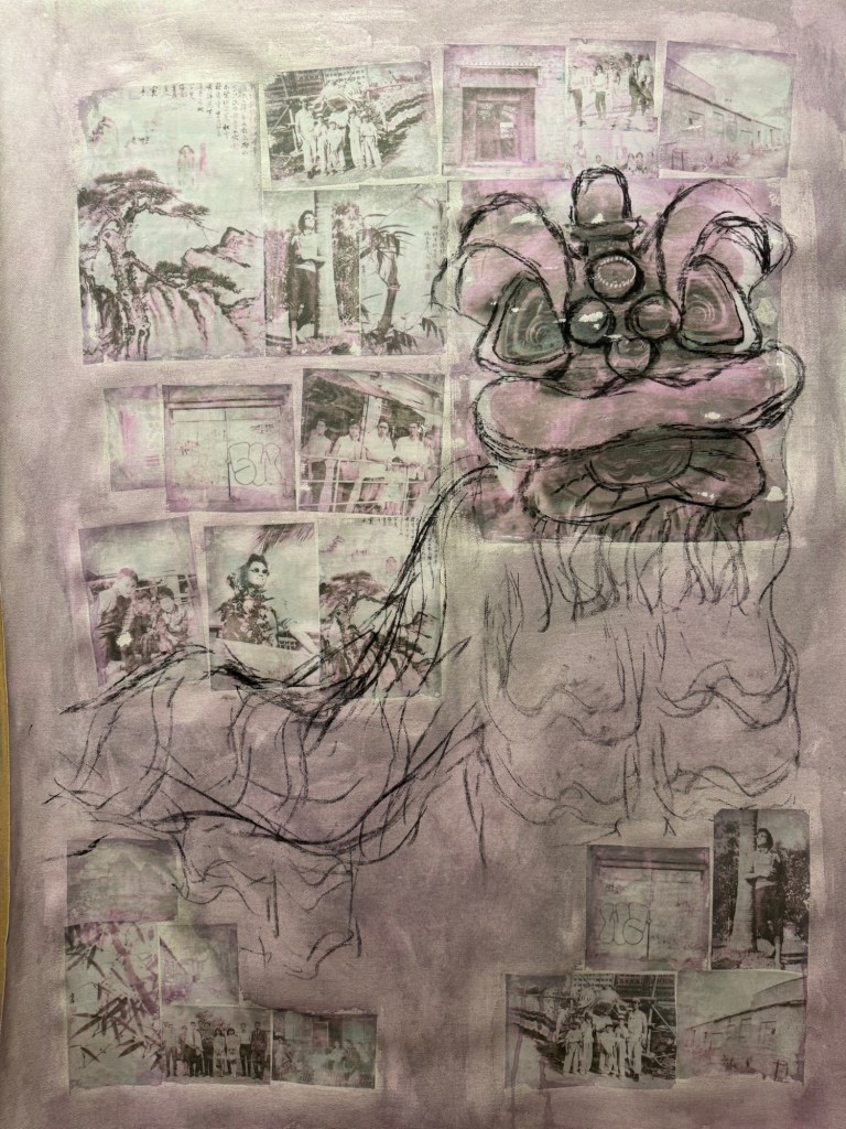
Charcoal was used to mark out the composition with the Lion being prominent.
–
Some iconic buildings from my childhood Hong Kong were added to the background.
–
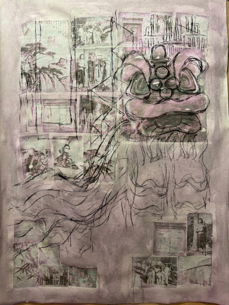
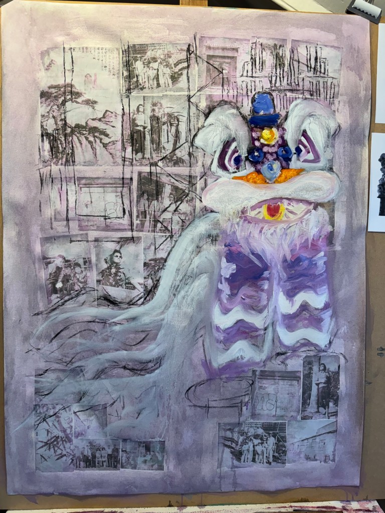
The lion head was painted in oil. But I was not happy with it, it looked too ‘cute’.
–
Since this was an experiment in oil, I started to wipe off parts of the image to create different effects.
–
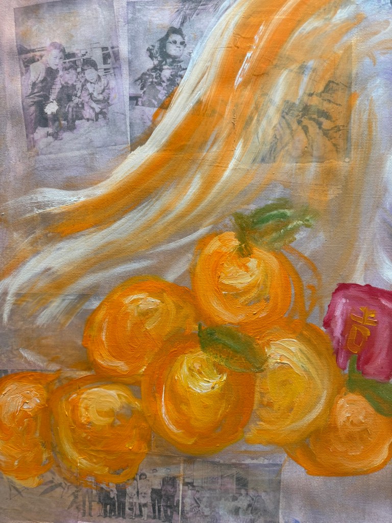
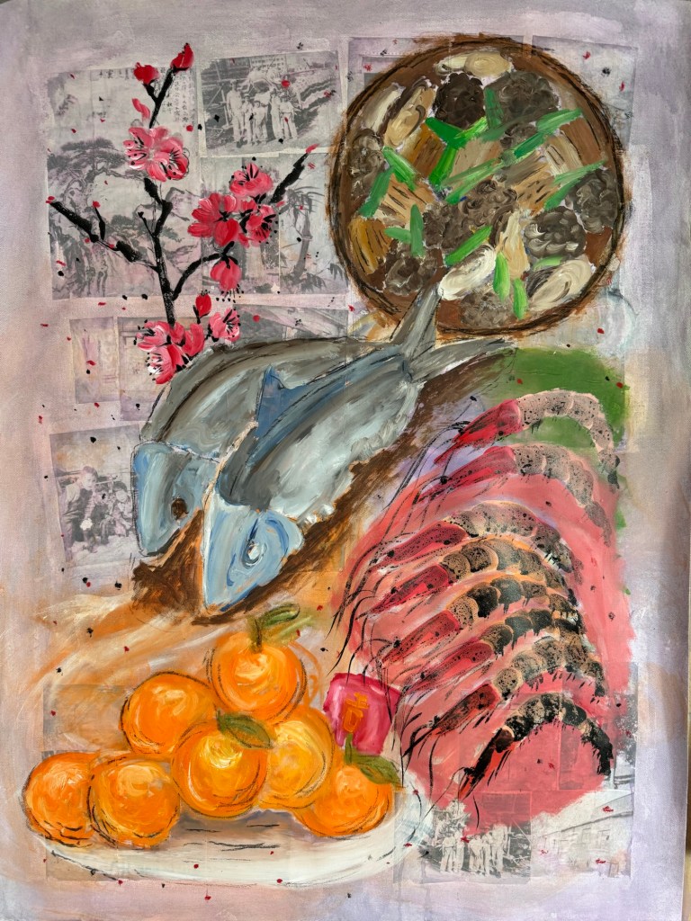
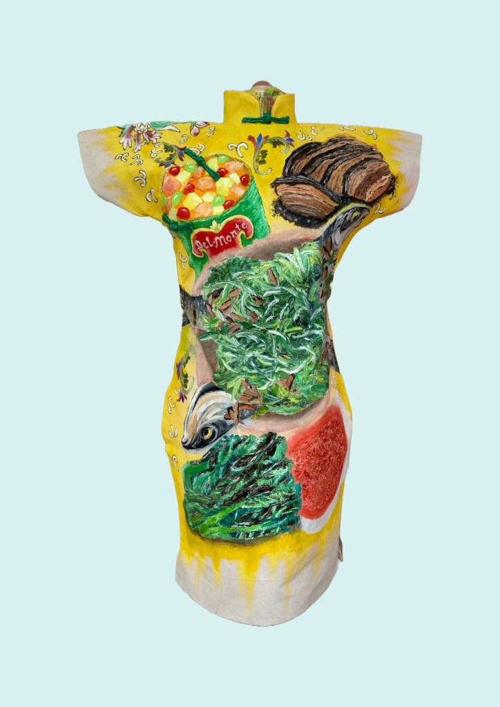
A pile of mandarin oranges were added as a traditional Chinese custom during New Year. I wanted to add typical Chinese New Year food to the composition in response to my decision after the Cheongsam series to do some Chinese food painting on a ‘normal’ 2D canvas:
–
I experimented with using looser brushstrokes and some thinned oil for the oranges:
––
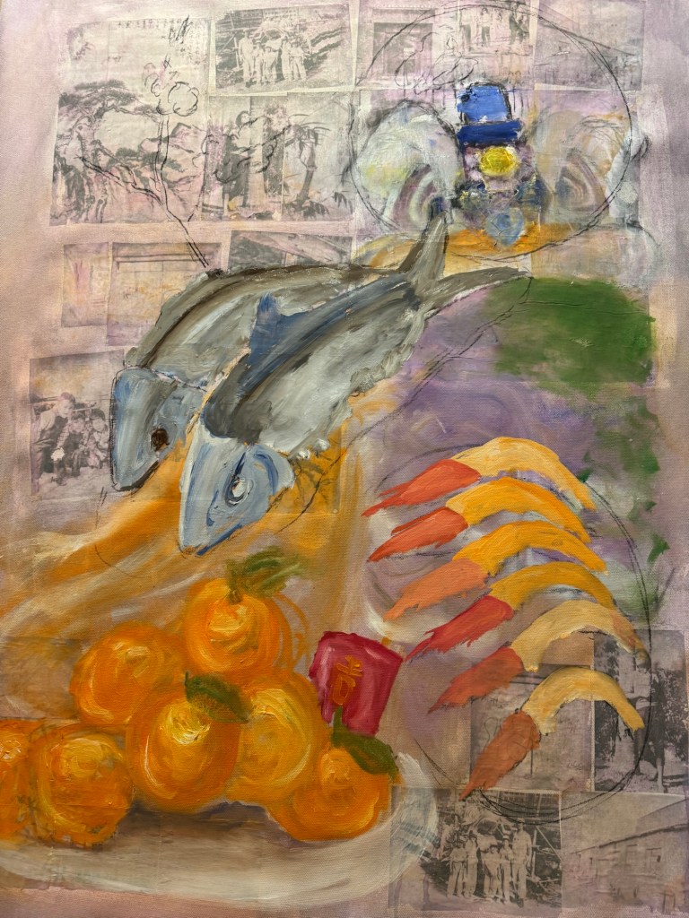
I was still very unhappy with the lion and decided to replace it with a complete family dinner with symbolic dishes for Chinese New Year.
Charcoal marks for New Year food dishes
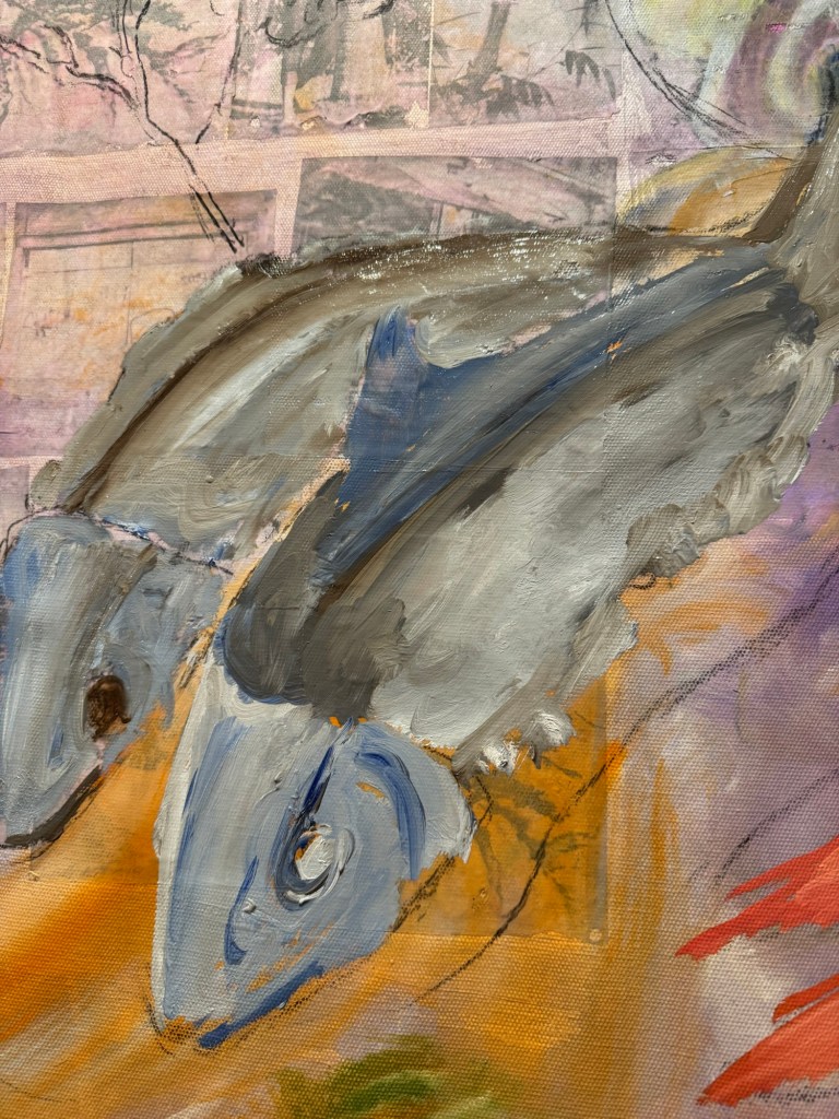
Thinned oil paint was used to mark out the shapes of the various dishes. Then more details were added to the fish first:
–Close up of fish (stuffed dace fish)
Other dishes were added:
–
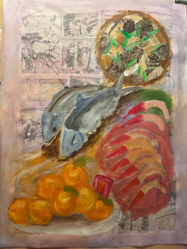
The prawns’ details were finished with Chinese ink and a peach blossom branch was added (also in Chinese ink) as it was traditional to have this plant at every home in Chinese New Year.
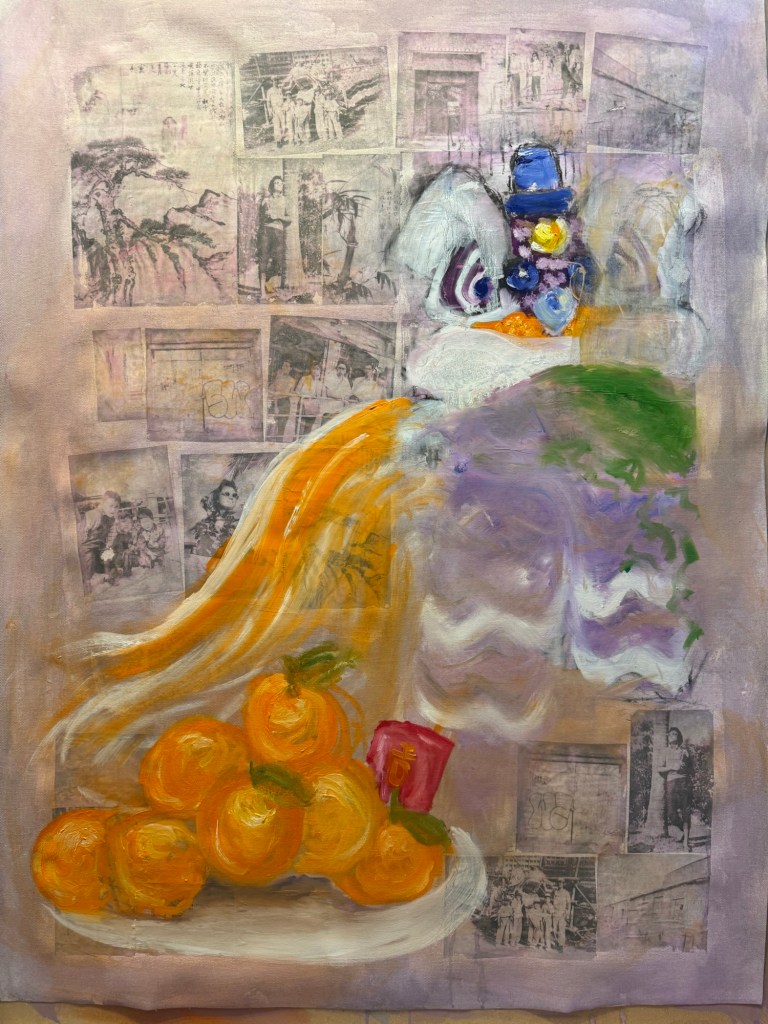
Finished painting – Chinese New Year dinner:
Mixed media on canvas. Size 102×75 cm
Menu:
Centre – stuffed dace fish. Symbol for having surplus meaning never falling short (of money). The word ‘fish’ sounds like surplus.
Top right – stew of shiitake mushrooms, dried oysters, pork belly and spring onions in fermented bean sauce. A traditional new year dish, a large pot is usually made and eaten over several days. ‘Dried oyster’ sounds like ‘good things’ meaning good things will happen.
Bottom right – prawns. Symbol for happiness. ‘Prawn’ sounds like laughter.
Bottom left – mountain of mandarin oranges with a red money packet (lai see), the phrase sounds like ‘gold mountain’ meaning good fortune.
Top left – peach blossoms, the blossoms opening signifies good luck and good fortune.
REFLECTIONS
I am glad I didn’t continue with the lion. It was not how I wanted as it was too detailed and cute. I was happier when the Chinese dinner idea started to develop. I was mindful that I wanted to experiment with Qi Baishi’s idea of painting between likeness and unlikeness. I was hoping the thinner paint and looser brushstrokes would give me more scope to express the unlikeness. I think I made some progress compared to the Family Dinners on the Cheongsam canvases, but there’s still some way to go.
I experimented with incorporating photographs but I think in the end they didn’t really add anything as most of the images were covered up. Perhaps even thinner oil would have left the photo images still partially visible.
I have never managed to combine oil and Chinese ink satisfactorily, I think using the combination on the prawns worked out well. I believe the thinned down oil helped the combination to work so worth bearing this in mind.
LEARNING
Try experimenting with even thinner oil paint and other techniques to apply paint.
Think more about what I want the photos to do (e.g. how much to be revealed) if incorporating photo images, then dilute the paint accordingly to achieve the effect. The experiment here was not fully thought through as I was just playing, but it provided good insight into how easily it was to fully obscure the photos.
Overall the painting was looser and less organised compared to Cheongsam Family Dinners, but I need to be more courageous about achieving unlikeness. Add more of myself to it and think about what feelings and intentions I have – not intentions regarding the composition, but what I’m trying to say.
NEXT STEPS
Experiment more with oil and different applications.
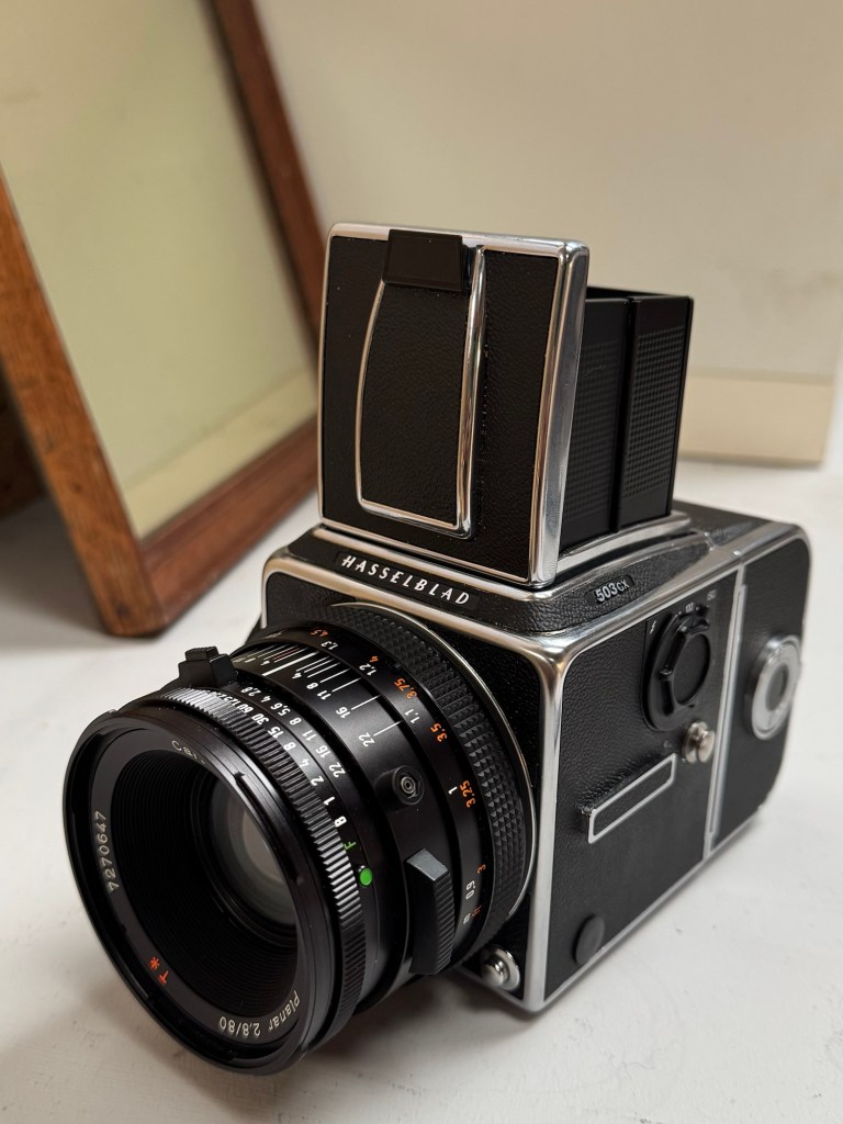
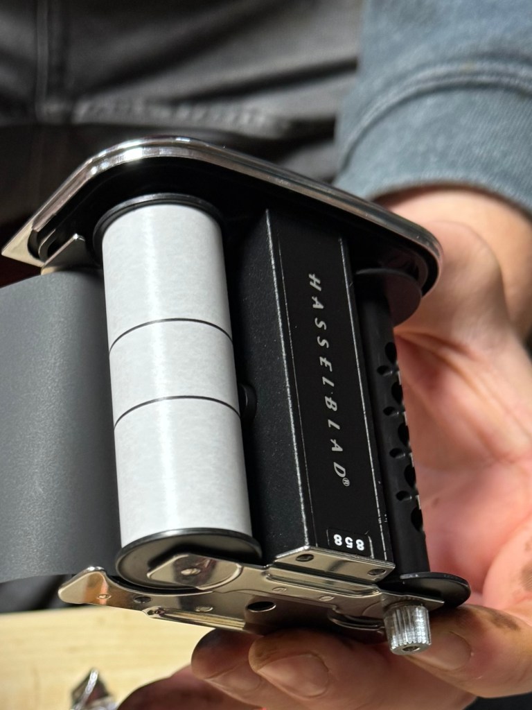
A few months ago, I was given a Hasselblad 503CW medium format camera by my late father-in-law. He was a keen photographer and this camera was his pride and joy. So it is very meaningful for me to have this beautiful and iconic camera. I have recently started to explore incorporating photography into my practice, hence I decided to attend a one day workshop in Bristol to learn how to use this camera properly to make the most of it.
EXPERIENCE
This is the Hasselblad 503CW film camera:
–
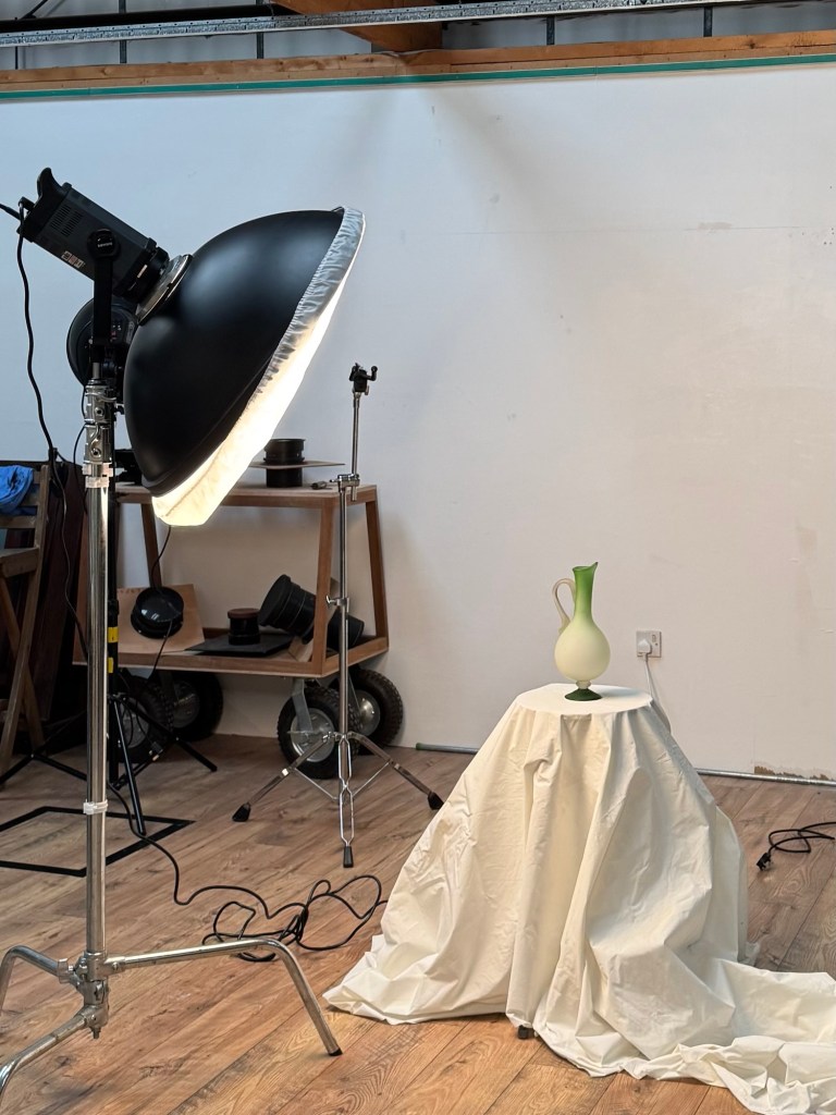
The workshop started with some indoor still life work in the studio.
–
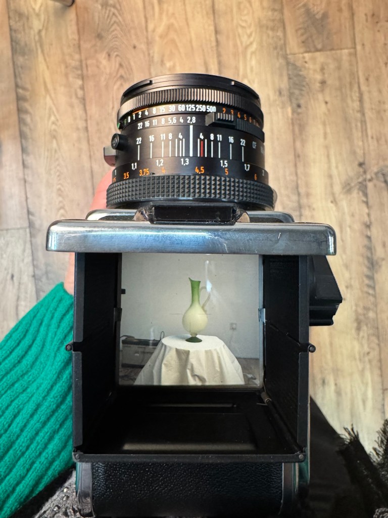
The camera has a default waist level view finder. It also came with an eye view finder and I experimented with both. I was very interested in the waist level view finding approach as it’s unique to this type of cameras.
–
Learning to load the film was very important because I have not loaded a film for decades since I started using digital cameras.
–
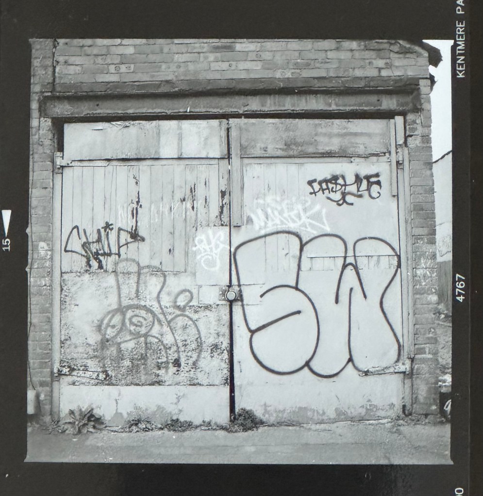
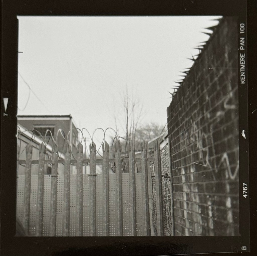
The afternoon started with a walk about in the nearby area to take some outdoor streetscape photos. The studio was in the backstreet of an industrial area. The kind of ‘forgotten’ streetscape that really appeals to me. I took 12 photos (the film was a 120 with 12 exposures per film). Below are a few photos and a video showing all 12 that I compiled paired with a soundtrack ‘London calling’ by The Clash that particularly resonates with me at the moment with what’s going on in the world.
The first shot was an abandoned sofa. The studio is based in a warehouse that was previously a large furniture shop/warehouse and I have been there many years ago looking for a low cost sofa when my husband and I were young. So I was excited to see this sofa and I had to take a shot. Was it a left over from the warehouse or just coincidence that it’s there? Was someone trying to make a home there?
–
Graffiti on a door. Graffiti is such a large part of the Bristol street culture and I have always had a thing about doors, I love doors:
–
There are three different types of barb wire in this shot. What kind of world needs three types of barb wire in one place?
I was very happy with the workshop and felt confident to use the camera as a result. It was a great studio run by an enthusiastic couple and there are excellent dark room facilities that I can use in the future for developing and printing photos. I can also print photos onto canvas there which is great.
I loved going around the industrial area in Bristol. It reminded me of my love for industrial heritage landscapes – that was my passion before I started exploring transcultural art. I think it relates to my engineering background. I have lived my life in industry and engineering for 30+ years and my history is equally deeply rooted in industry as it is in my transculturality.
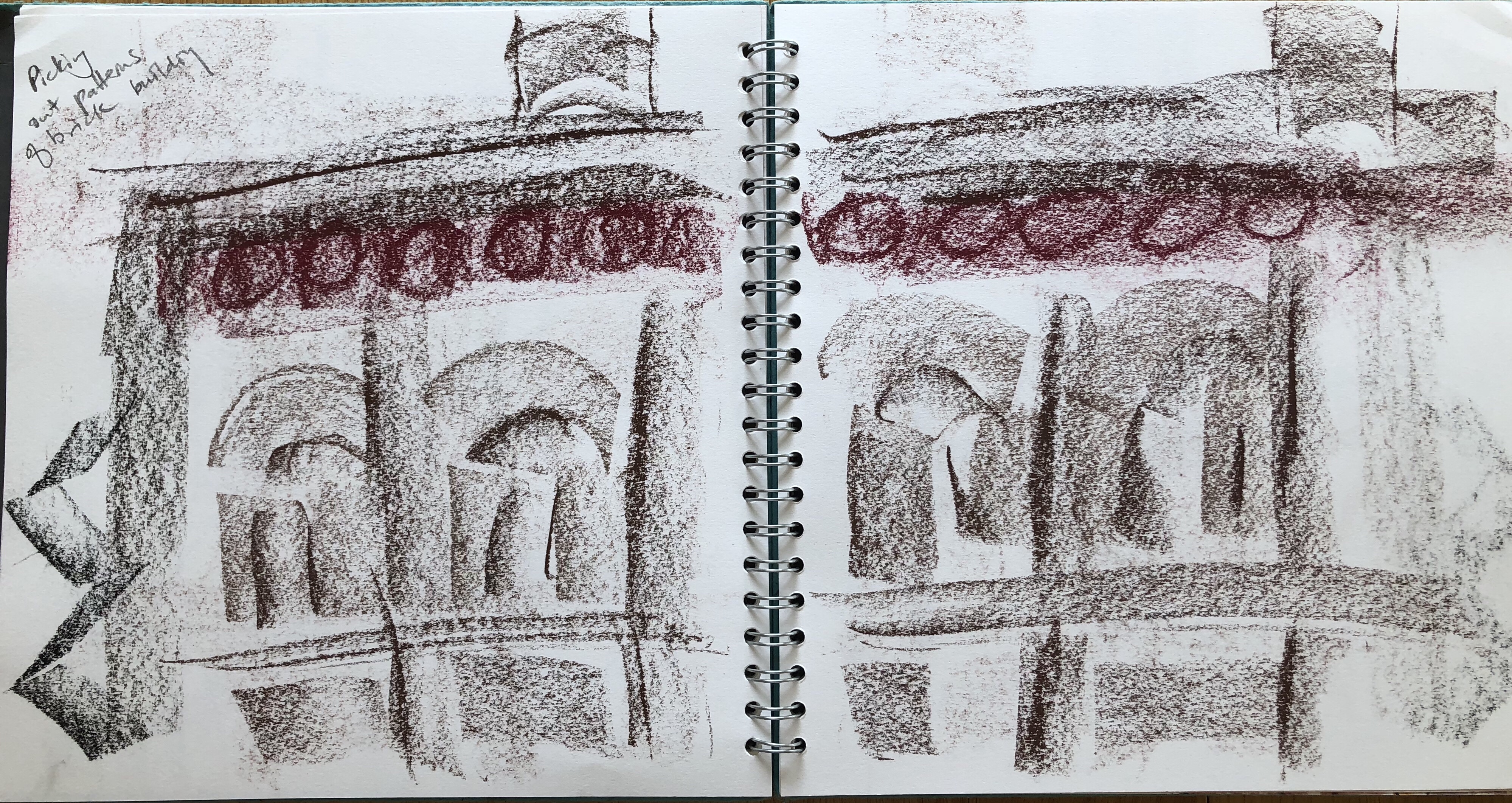
Doing the ‘forgotten’ streetscape photography reminded me of projects that I had done in 2018 when I first started learning to paint. I particularly like and am fascinated by late 19th/early 20th century disused power stations – for me, they are monumental industrial cathedrals. Seeing them or any industrial sites especially power stations make my heart sing.
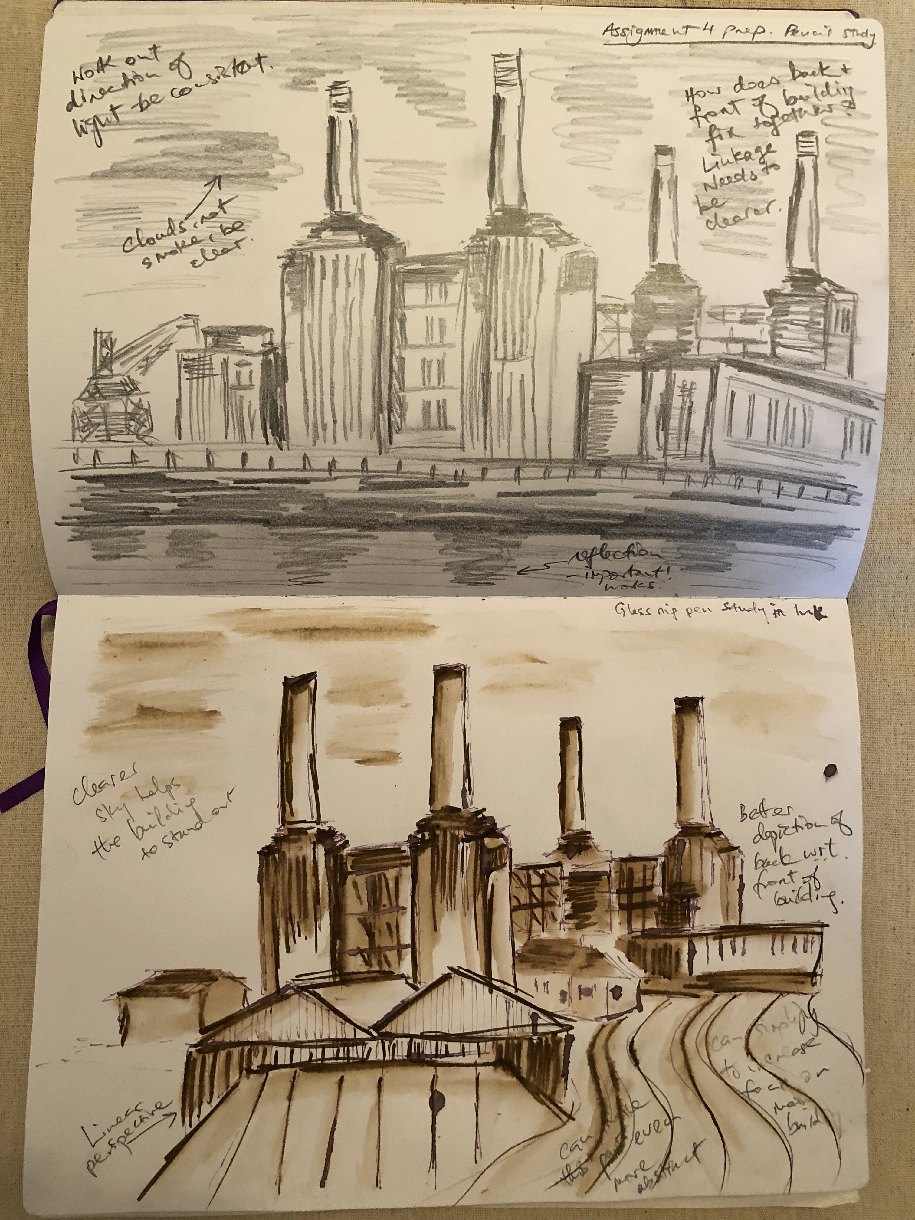
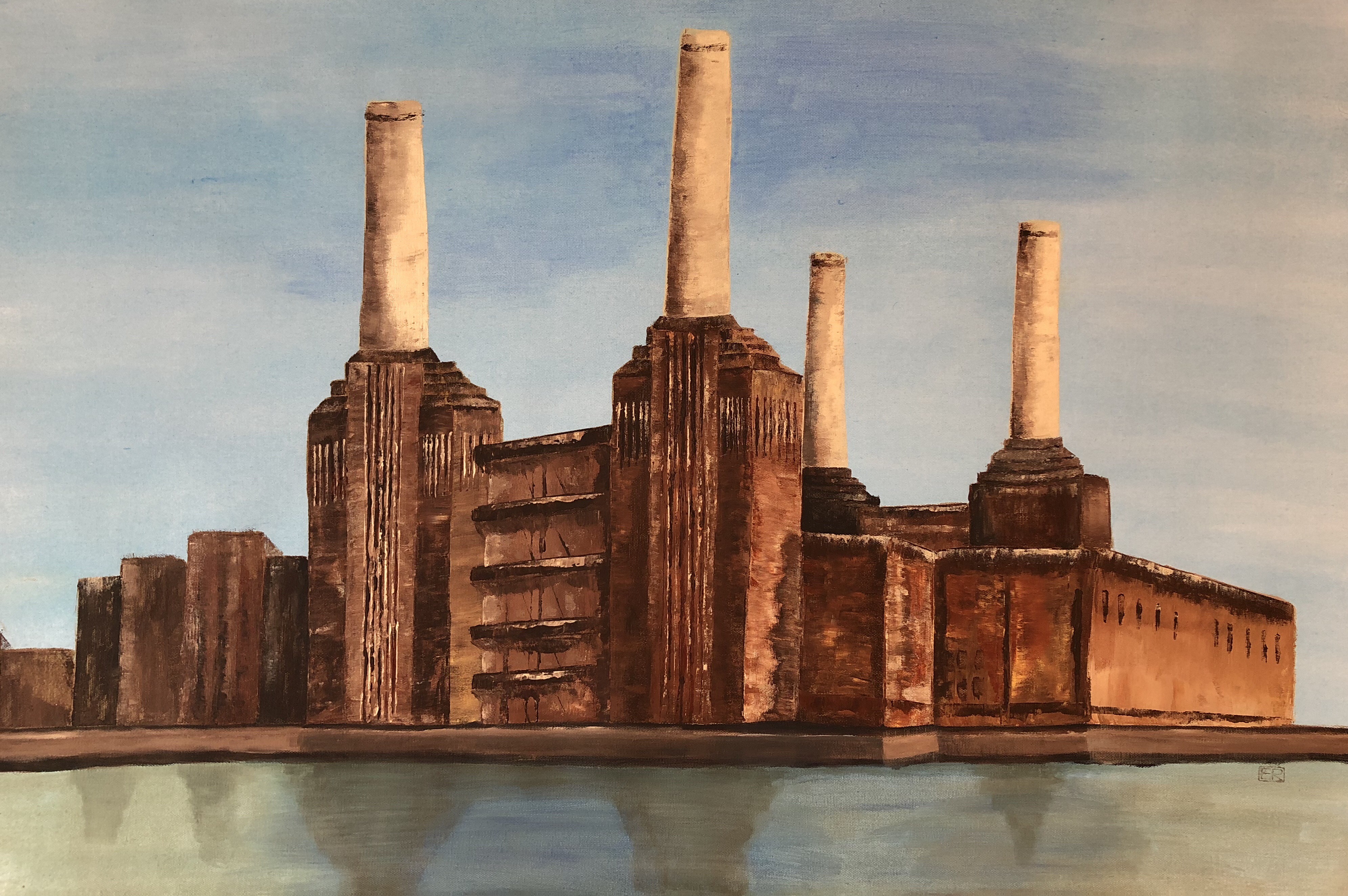
My 2018 drawings study of Battersea Power station:
–
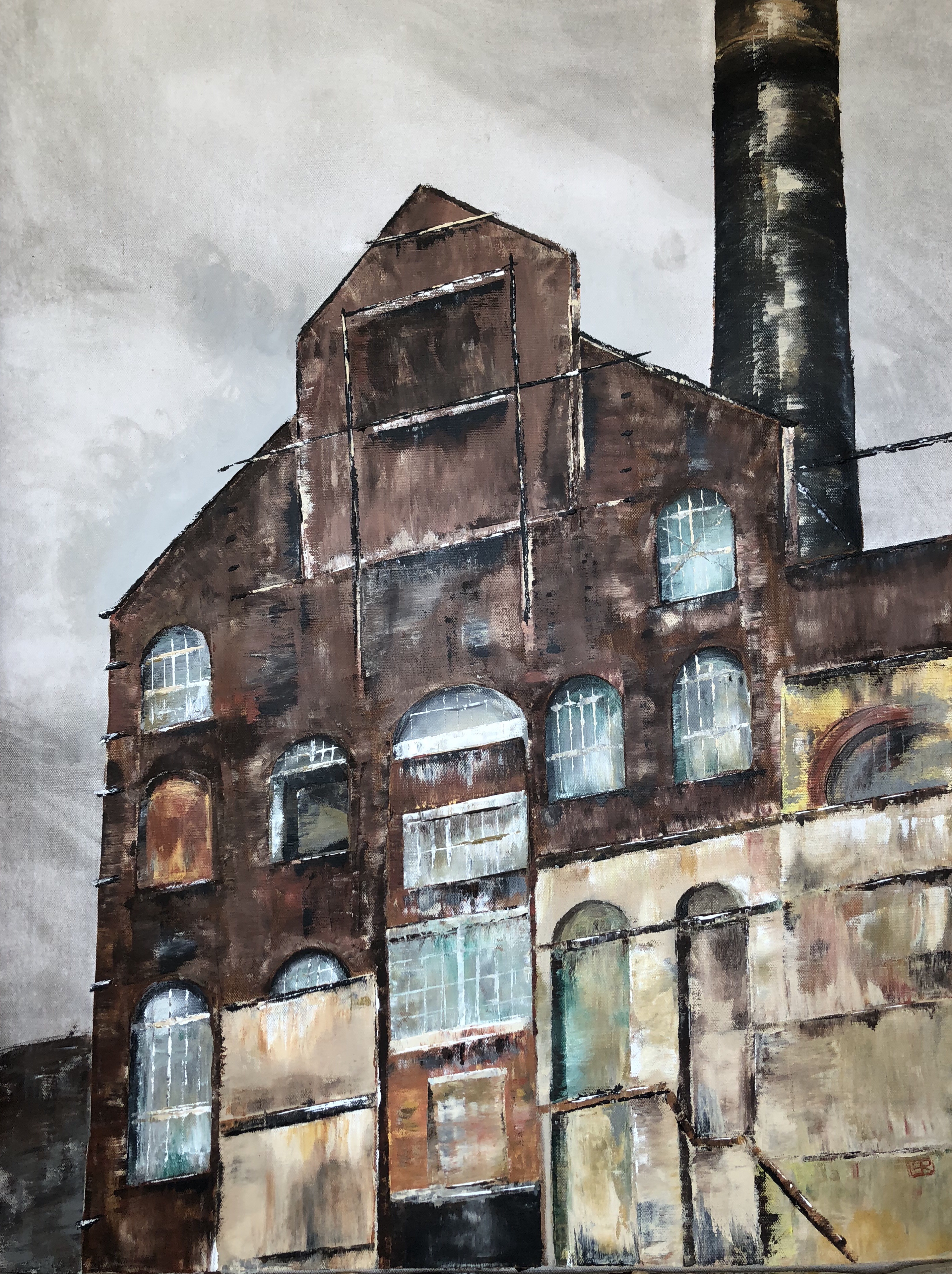
A study of Battersea Power Station (before all the recent year’s’ development). Acrylic on canvas:
Battersea Power Station (2018)
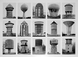
My work in this area was inspired by two German photographers, Bernd and Hilla Becher, of the Düsseldorf photography school. I admire their New Objectivity style:
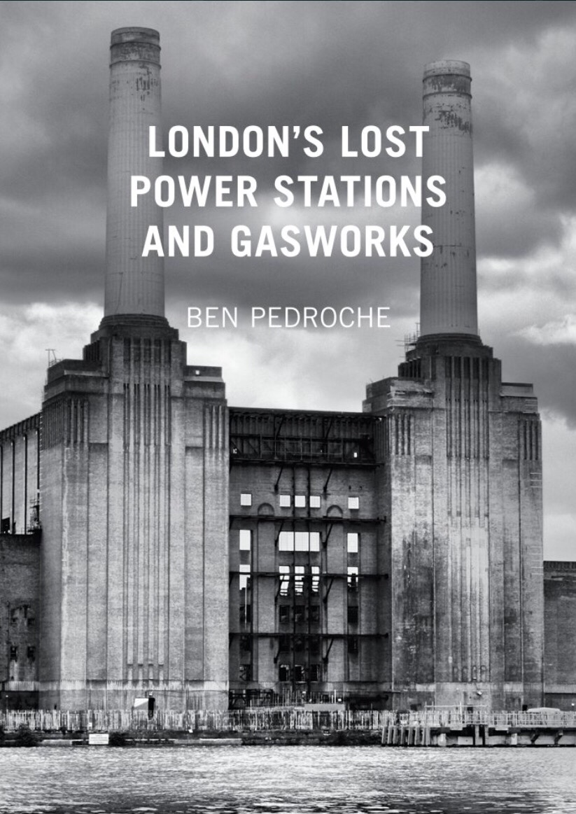
This book was also very useful to help me in historical insights and locating sites in the UK:
–
After reading the book, I visited Lots Road Power Station in Chelsea, London. It was originally built to power the whole of the London Underground and subsequently decommissioned. My on site study drawings:
–
My 2018 painting of a partly boarded up frontage of the Lots Road power station:
London Lots Road Power Station (2018)
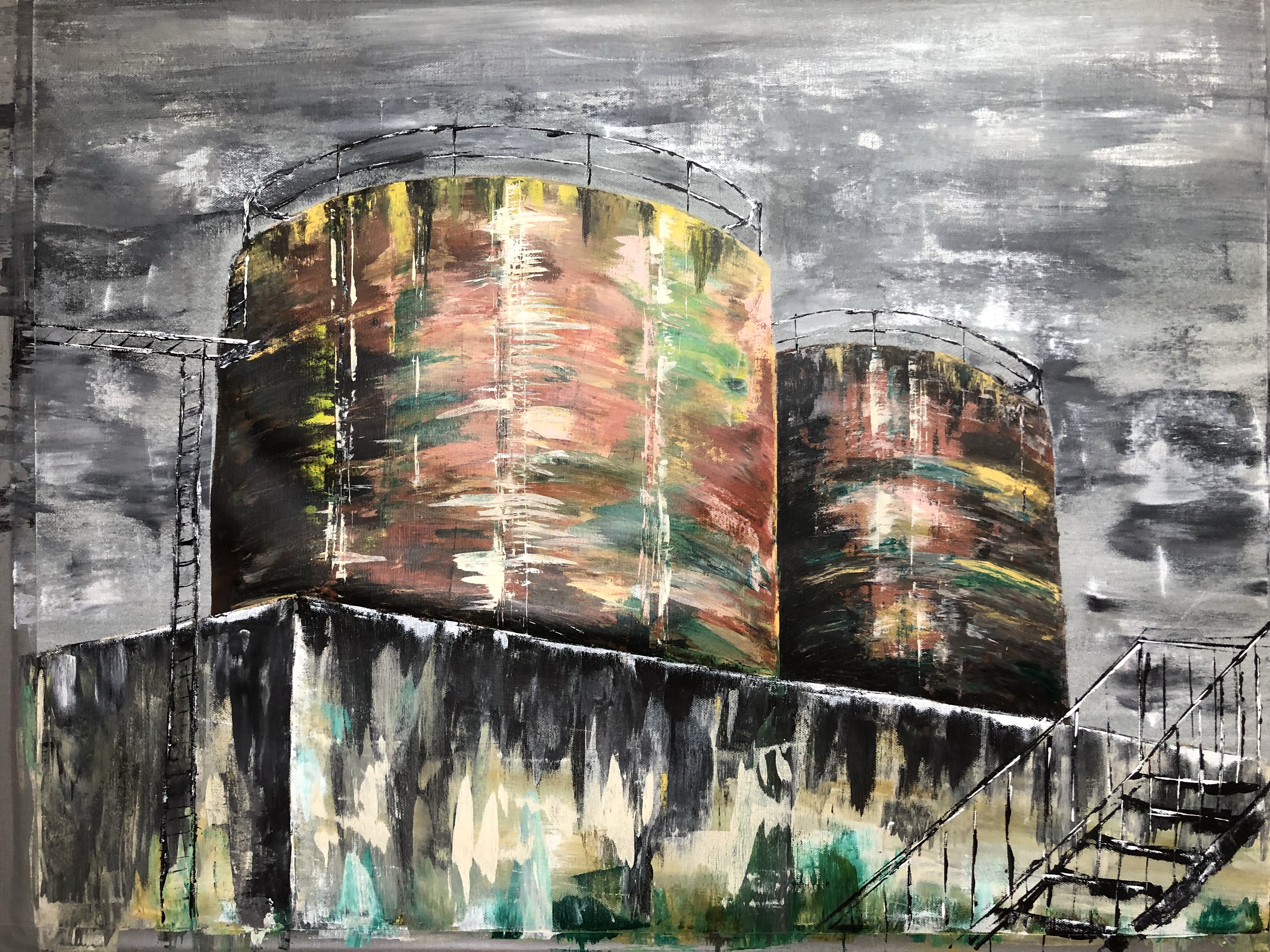
Through a work trip, I had the chance to visit the Rotweil power station in southern Germany. It powered the gun powder manufacturing locally.
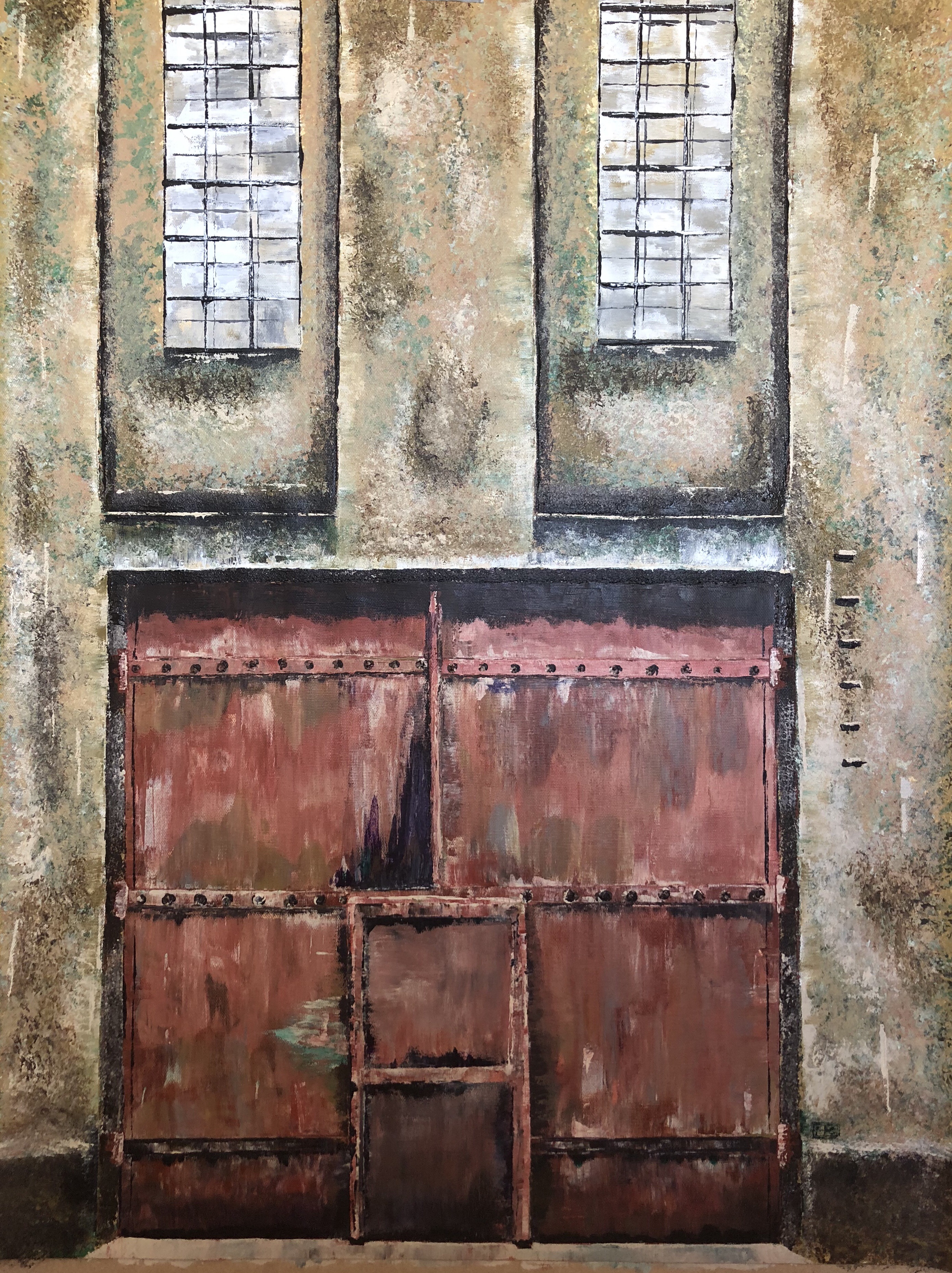
Here is an acrylic painting of a door at Rotweil:
Rotweil Power Station (2018)
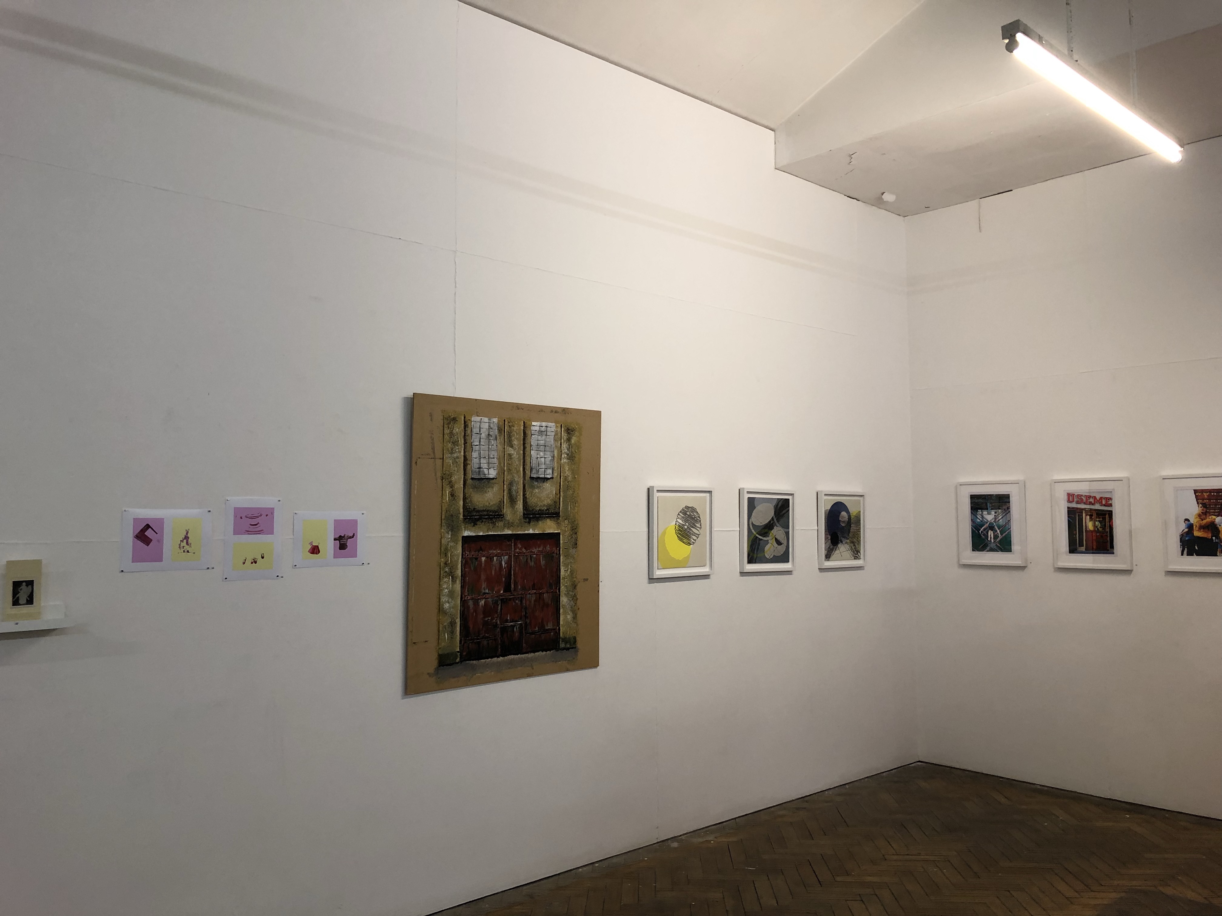
This painting was subsequently part of a group exhibition:
–
The tanks at Rotweil power station:
Rotweil Power Station (2018)
FURTHER REFLECTIONS
I have been reflecting on what made me reconnect with my ‘forgotten’ industrial landscapes work. I think it’s because:
– Having done several Cheongsam paintings where I have used bright colours to depict food as cultural metaphors and childhood family dinners based on memory, I am right now not feeling in the right state of mind to paint more colourful paintings. They seem frivolous given what’s happening in the world.
– I have been enjoying painting in bright colours – not sure whether I naturally have a preference or I purposely chose bright colours to mask unpleasant childhood memories. Bright colours and humour are great ways to put a certain slant to the story and perhaps it’s my way of taking control of the narrative. However, exercising that control and the way of storytelling take a lot of energy. It can be energising and draining at the same time. Perhaps it’s a form of renewal like a snake shedding its skin.
– However, I have recently been feeling angry and despair with global politics drastically changing our world order and I don’t think I can do cheerfully bright colours right now.
– Perhaps forgotten and industrial streetscapes somehow make me feel secure. There is no pretending – it is what it is, there is nothing to hide. The anti-aesthetic approach really appeals – just like the photos from the Düsseldorf photography school of New Objectivity. I find those images comforting. Bernd and Hilla Becher’s work are described as ‘focusing on precise, methodical documentation of industrial structures, often using a detached and objective approach’.
– Perhaps I am right now looking for detachment and objectivity. I can’t take anymore unsubstantiated claims, confusion and uncertainties – I need facts. The world needs facts.
– I am ranting.
LEARNING
I appear to be at another junction in my practice. This one I hadn’t planned for as I believe it has arisen due to recent world events. I don’t know exactly how or where I want to take my thinking here. I want to somehow incorporate this ‘no frills’ approach with my transcultural work, but how? I definitely want to do more with the film photography and I need to think how to incorporate that into my practice.
I need to discuss this with my tutor.
NEXT STEPS
Continue to think about where to go from here for my practice. Discuss with my tutor.
Do more streetscapes with the Hasselblad camera and think about how to incorporate photography into my practice to expand my visual arts ‘tool kit’.
After making Family Dinner #1 (image below), I proceeded to make #2 with the learning.
Family Dinner #1
METHOD
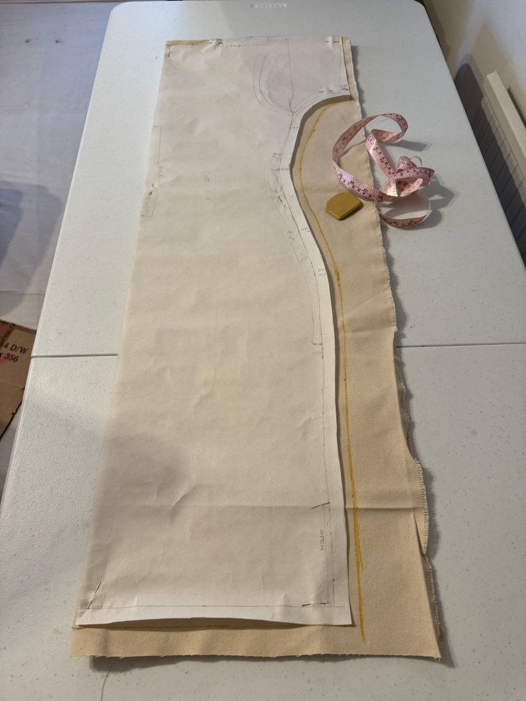
I was overall satisfied with how the new Cheongsam pattern worked out. But I felt the measurements needed to be more generous if I were to wear the canvas because of the stiffness of the material. If it were too tight then it would be difficult to put on. Hence I modified the pattern to make it wider.
Pattern ready for cutting
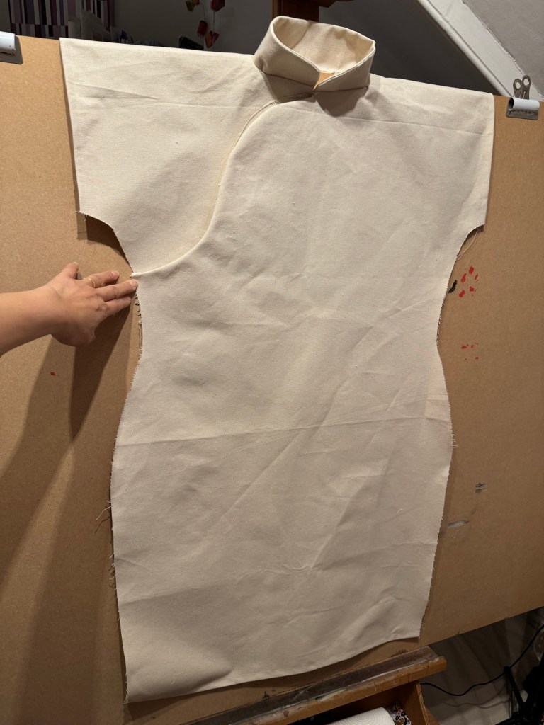
I also learnt from the last dress painting that it was difficult to paint the back of the dress if the dress was fully sewn up and placed on the canvas – it was impossible to access the back while the oil on the front was drying for weeks.
Therefore I experimented in this case with not sewing up the sides and draping the dress with the back part of the canvas hanging off the back of the easel. The plan is to paint the front then turn the board to paint the back.
Back of the dress draped over the board
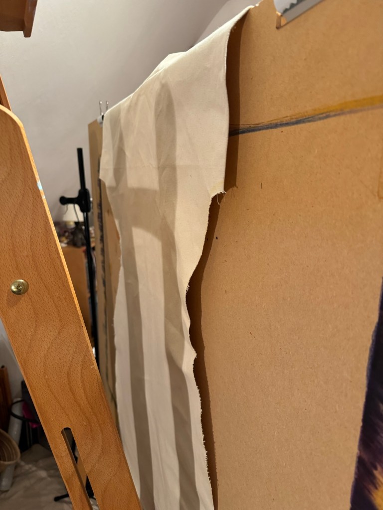
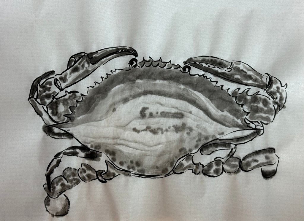
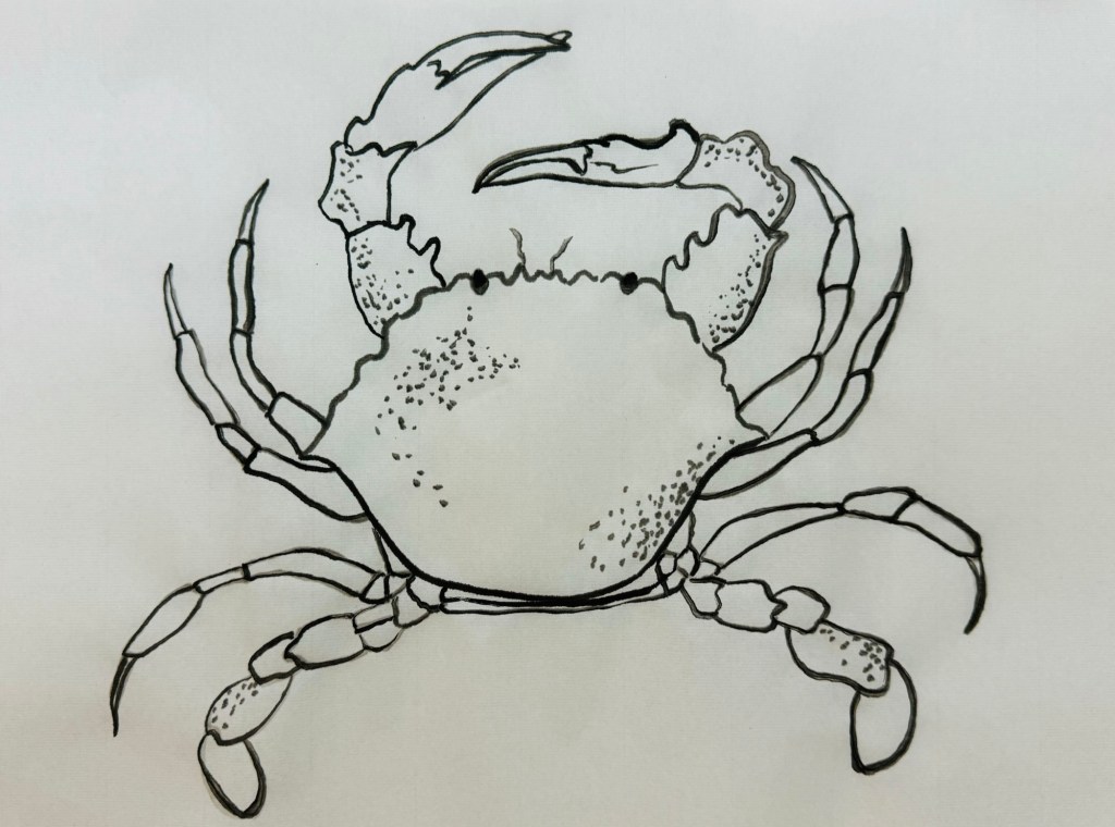
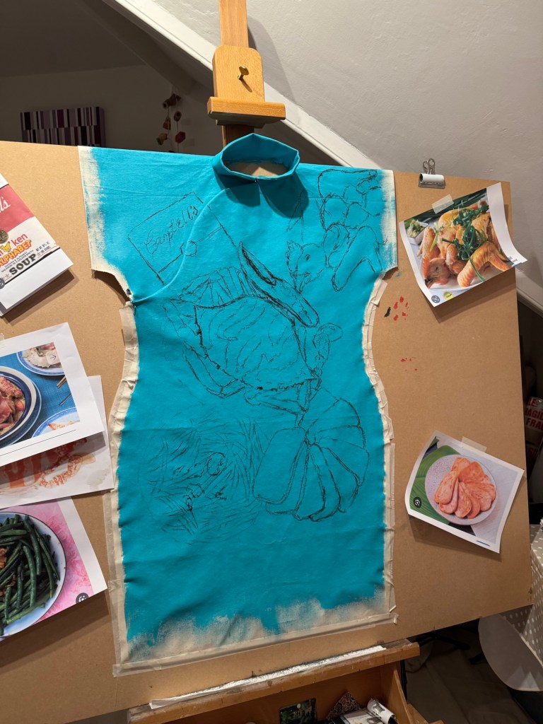
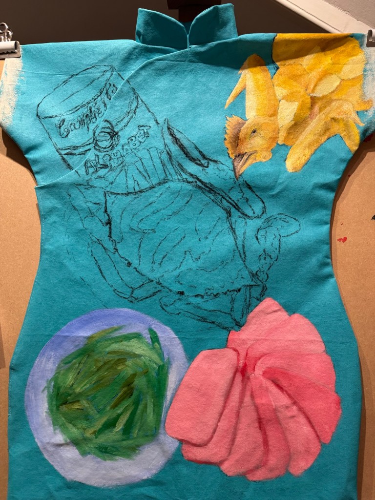
This family dinner has a main dish of ‘flower crab cooked in a clay pot’. So learning from my Chinese painting class – I studied the anatomy first and did a few ink drawings of crabs:
–
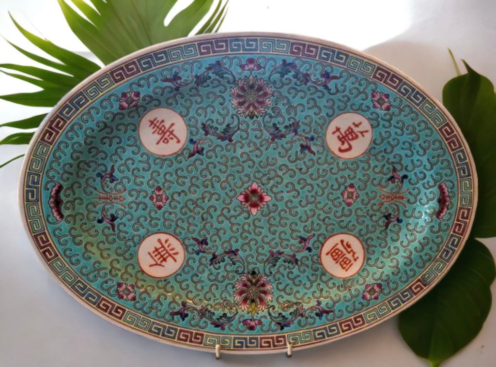
Then I chose the colour of the background based on another Chinese dinner service. It’s the same pattern of the yellow one I used on Family Dinner #1, but of a turquoise colour:
I experimented with different level of tinting to get the right colour and not too dark:
The composition was developed on my sketchbook then marked out using black willow charcoal on the canvas:
Composition drawings
Then I decided that I would sew up the sides of the dress because I felt it would be too difficult to turn the canvas inside-out to sew once it has been painted with oil. So I reverted back to the process I used previously after much consideration. I also used Velcro much more extensively along the complete opening of the right chest and side instead of using a zip or buttons because it would be hard to sew a zip or hand-sew fasteners due to the thick canvas. Hot glue was used to fix the Velcro in addition to the Velcro tape adhesive to ensure it was firmly in place.
Sides of the dress were sewn up
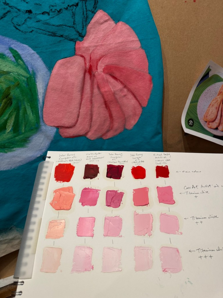
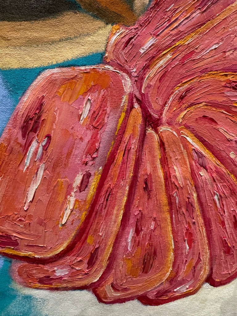
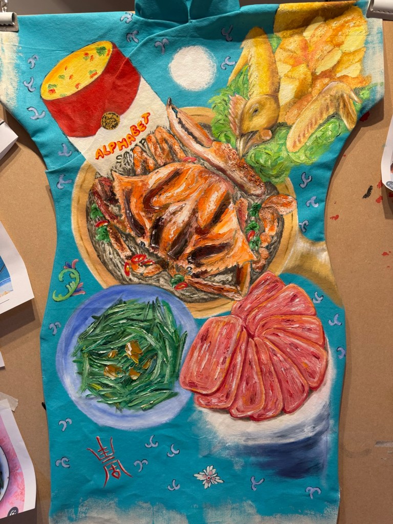
I started with the ‘pan fried sliced luncheon meat’. I once did a tinting paint chart of the different red oil paints I had. It was very useful to choose the colour of luncheon meat from the chart. I chose the shade according to my childhood memory – the colour of artificially-pink meat is difficult to forget!
Then I proceeded to loosely paint and mark out the rest of the composition.
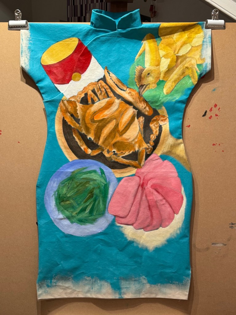
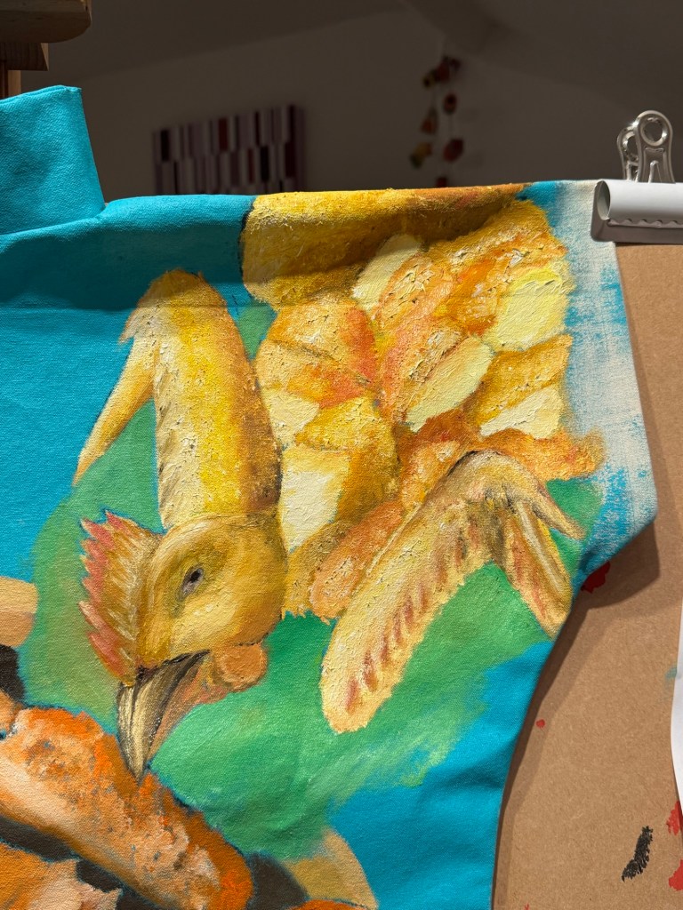
Adding chicken and green beansAdding clay pot flower crab and Campbell’s
Then more detail painting of the luncheon meat with some yellow edges for the oil used for pan frying:
Adding details to the whole salt baked chicken:
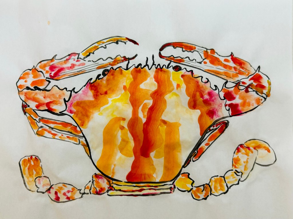
Around this time I received my Unit 2 feedback from my tutor with comments that made me reflect on how I apply the oil paint. So I experimented with some looser strokes on the crab shell.
The painting was finished by completing the Campbell’s alphabet soup and adding pattern details from the dinner service around the dishes. Pink satin fastening frogs were added as finishing touch.
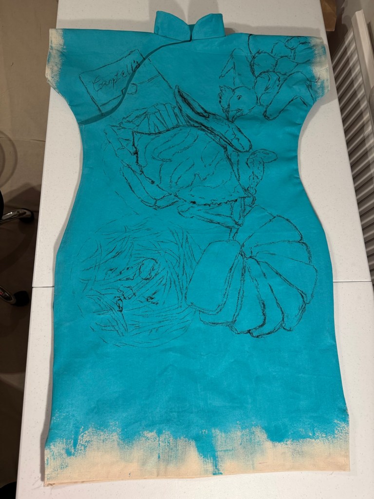
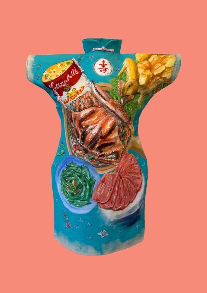
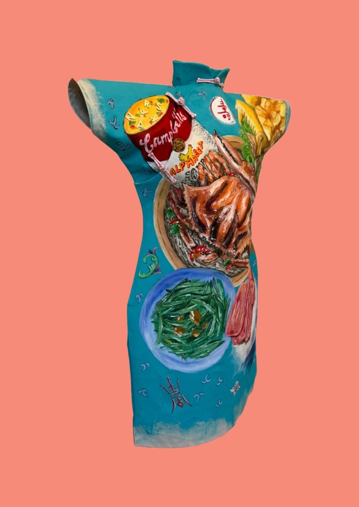
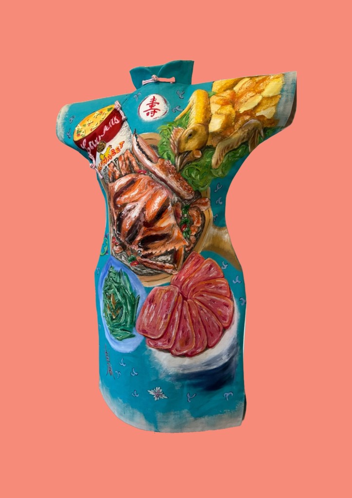
Finished work – Family Dinner #2:
–
REFLECTIONS
I really enjoyed making this painting. Food is such a key part of Chinese and Hong Kong culture that appreciating food is deep in my DNA. The more I paint these dinners, the more I realise that it’s not just the eating that I enjoy, but the painting of food as well. Working from memory has been great, thinking back to all the meals where these dishes were eating – at home as well as at restaurants.
Some of the unhappy experiences from our family dinners that I talked about in the reflections for Family Dinner #1 did not enter my consciousness for some reason. I realised that some of those experiences were dish dependent. Perhaps the dishes depicted here were ‘safe’ dishes without chances to go wrong. Dinner #1 featured a steamed fish – that was always challenging…
Part way through making this painting I received my Unit 2 feedback and it has been very thought-provoking. It made me immediately reevaluate how I applied oil painting – perhaps I have been too ‘one-dimensional’. Always applying the same (fairly thick) way. I tried a looser approach on the crab shell and was happy with the outcome. I have been thinking about that constantly and I need to experiment much more. How to use paint in a way to depict my distant and fading memory?
The Unit 2 feedback also made me think more deeply about why I am painting on Cheongsam dresses. Why dresses? Why Cheongsam and is the time well-spent in making dress-canvases? There is a lot to think about and reflect on from the Unit 2 feedback and I will write a dedicated blog for that.
I was going to make another cheongsam dress painting after this one, but I think I will make this decision after fully reflecting on my Unit 2 feedback.
LEARNING
– Be more flexible and creative in using oil. Try different thick- and thinness to create impact, to tell the story.
– Doing something just because I enjoy it is not enough a reason to do it. Need to consider more deeply about why – I believe I do this and reflect already but perhaps need to go deeper to examine my reasons.
– In terms of the Cheongsam making process, the increased use of Velcro as fasteners was a success and should be used in future dresses. Using hot glue to fix the Velcro was also a good idea.
– Overall, the pattern development has gone well and I believe I have a well tested and suitable method of producing a Cheongsam painting canvas.
NEXT STEPS
– Experiment with thinning oil and layering.
– Explore ways to depict fading memory without being overly detailed.
– Complete and capture my reflections from Unit 2 feedback. Write a dedicated blog for that and determine next steps to develop my practice. What to do if not Cheongsam paintings?
– Finish the back of the Cheongsam when the front is dried.
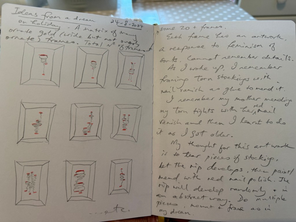
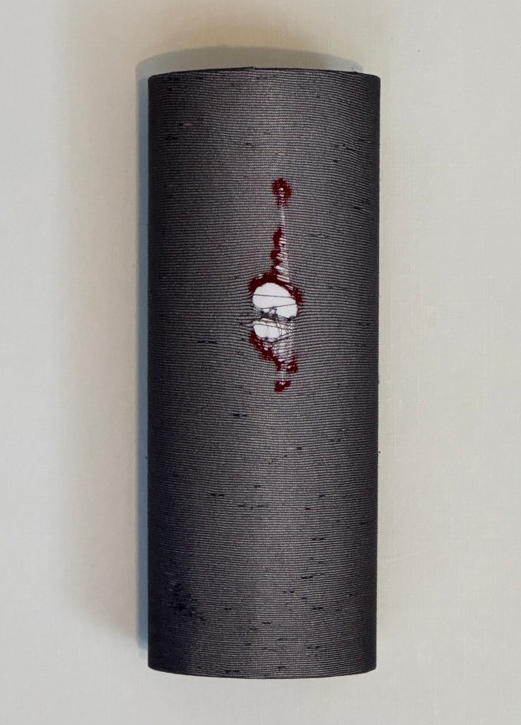
While I was on holiday in Scotland during summer 2024, I had a dream one night about making a piece of art work with pieces of laddered (torn) stockings or tights. The ladders were ‘repaired’ using nail varnish. Then each piece was framed individually in an ornate thick gold frame. It was such an unusual dream that as soon as I woke up, I captured the dream in my sketchbook in case I forgot the details as I often struggle to remember my dreams.
Mending stockings or tights with nail varnish was a technique that I learnt from my mother when I was little. If I laddered my school tights then she would mend it with her nail varnish. If the tear was small or in an area under my dress then it was fine to repair in this way without having to buy new tights all the time. Otherwise it would have been costly with an active child. In hindsight, it was ridiculous to make small children (girls) wear tights as school uniform, it was most impractical!
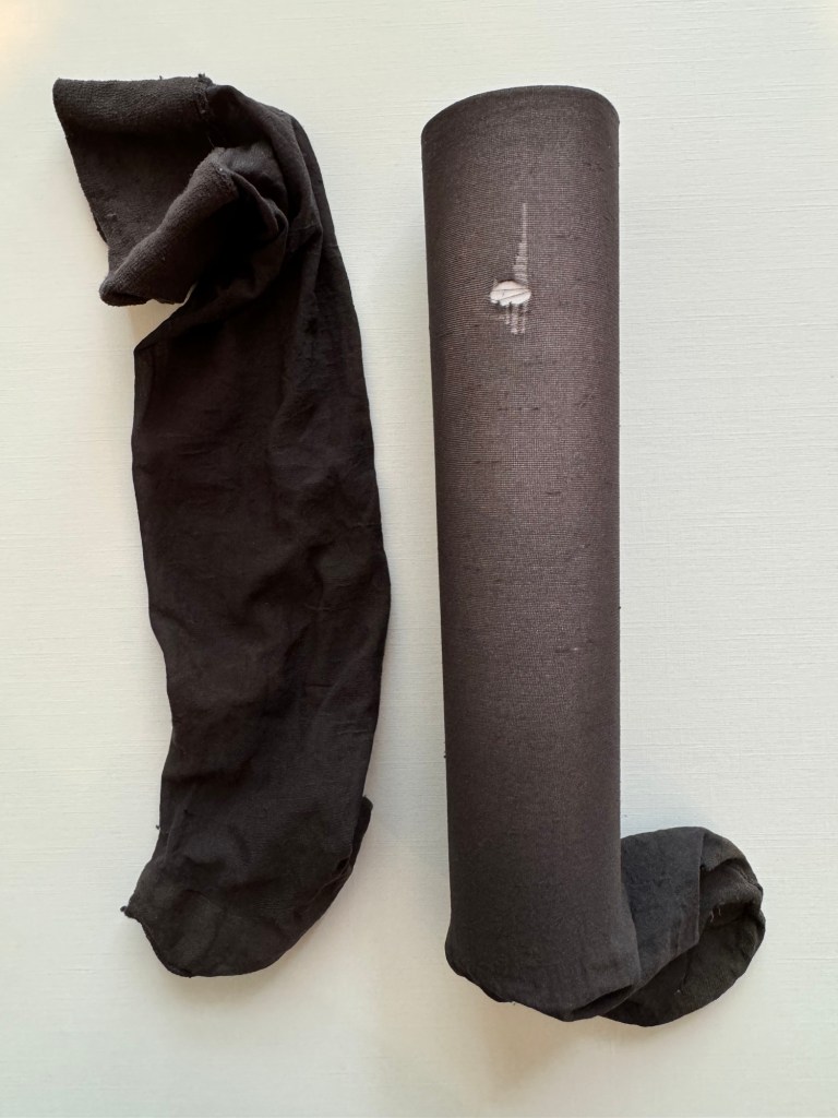
When I returned home after the holiday, I decided to realise my dream to make some art by mending a stocking.
METHOD
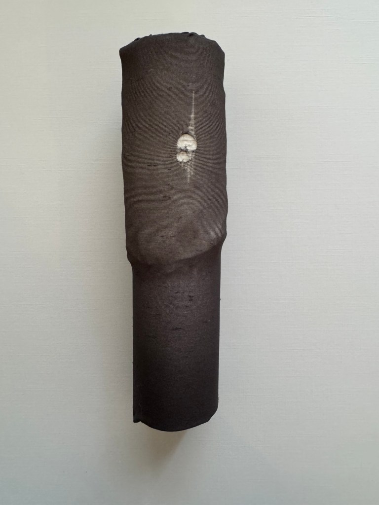
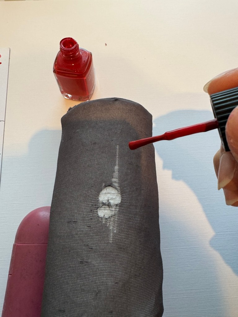
The first challenge was that tights and stockings nowadays are usually made of ladder-resistant materials which means they don’t ladder!! I had to dig out some old socks in order to find materials that would ladder. After laddering the material, a piece of white card was rolled up and inserted into the sock.
Some tissue was placed behind the ladder then red nail polish was applied at various points to stop further laddering.
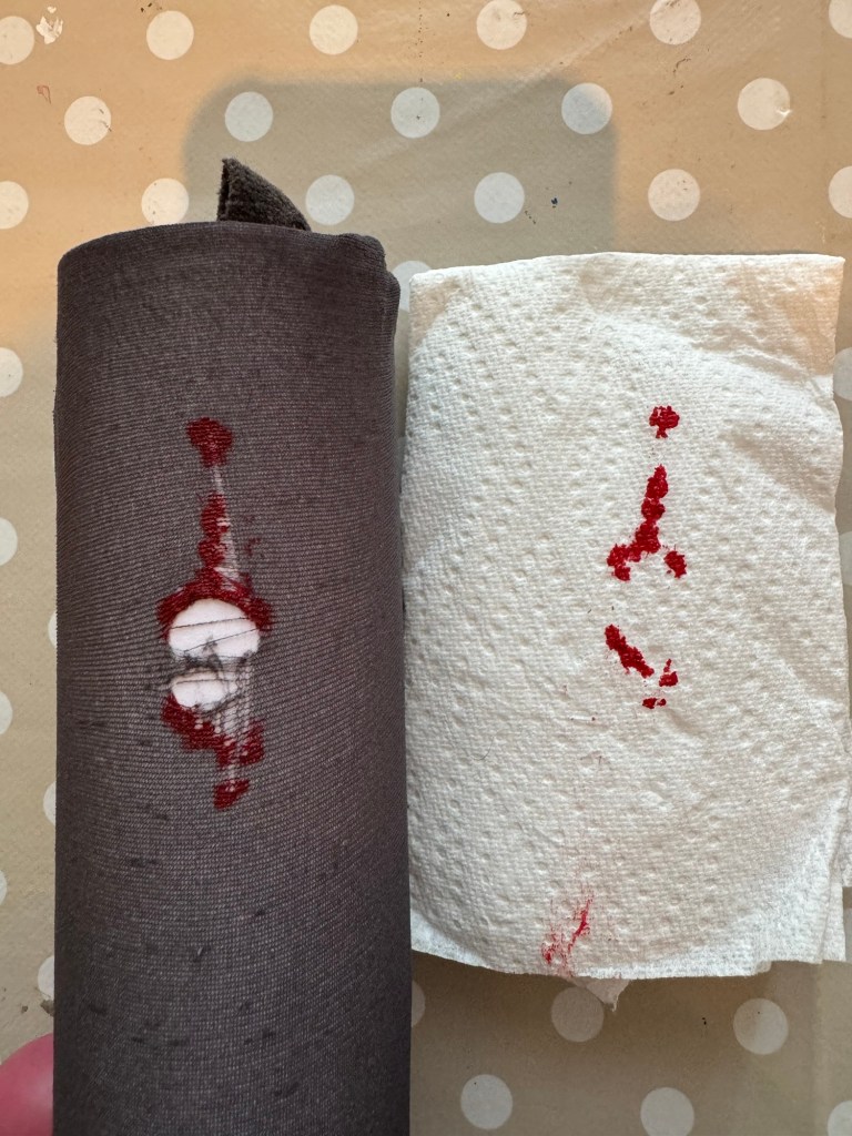
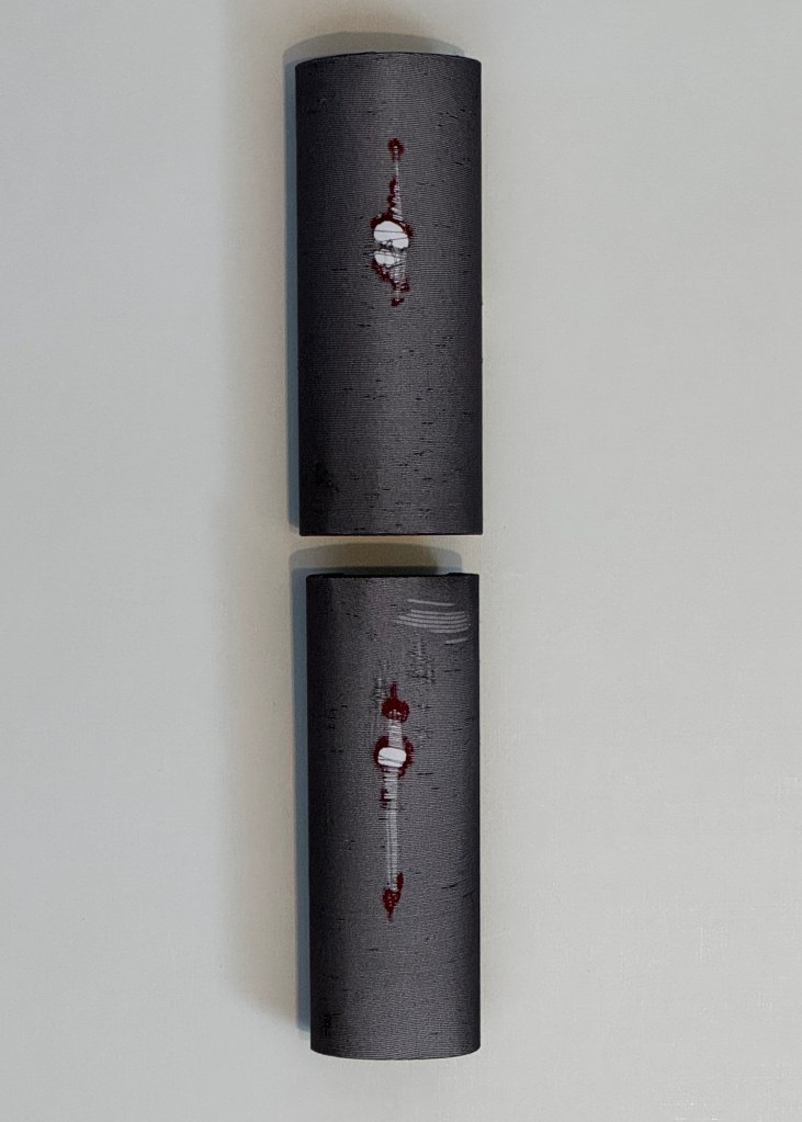
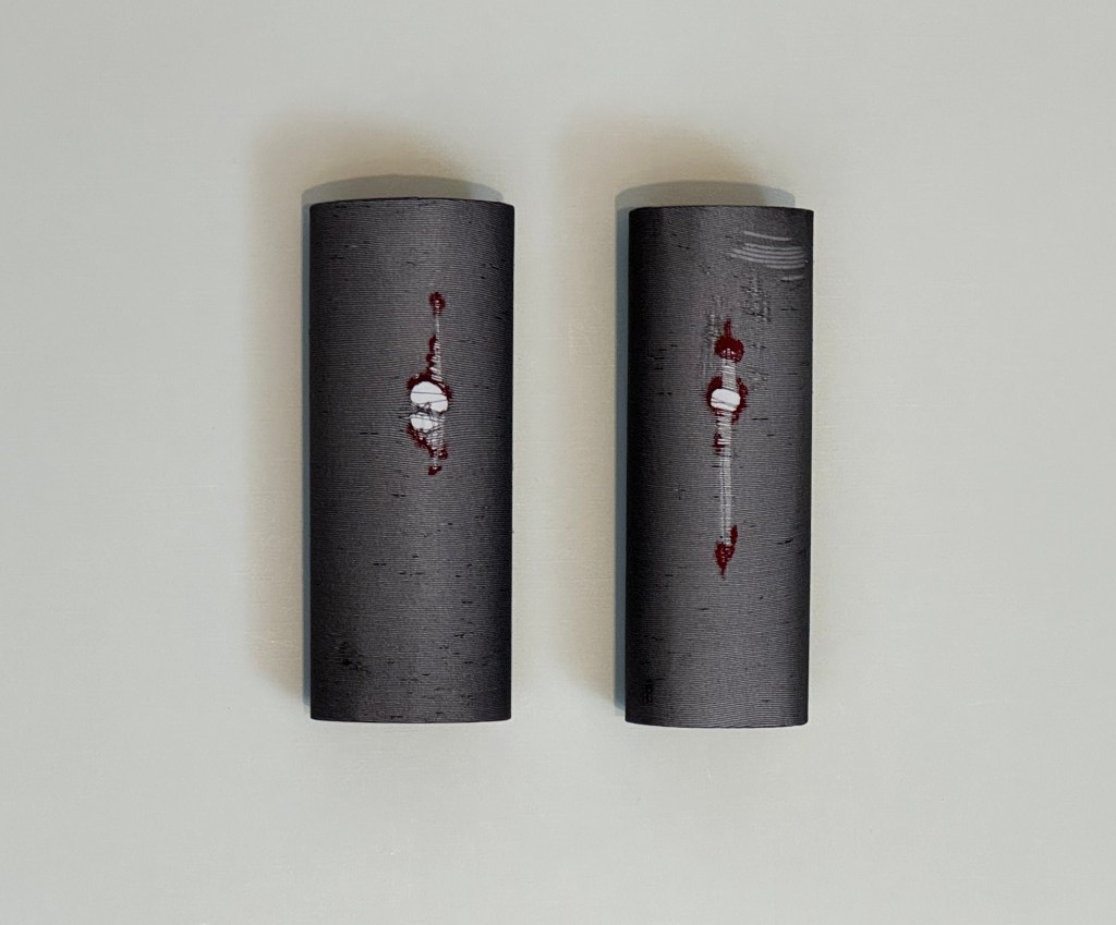
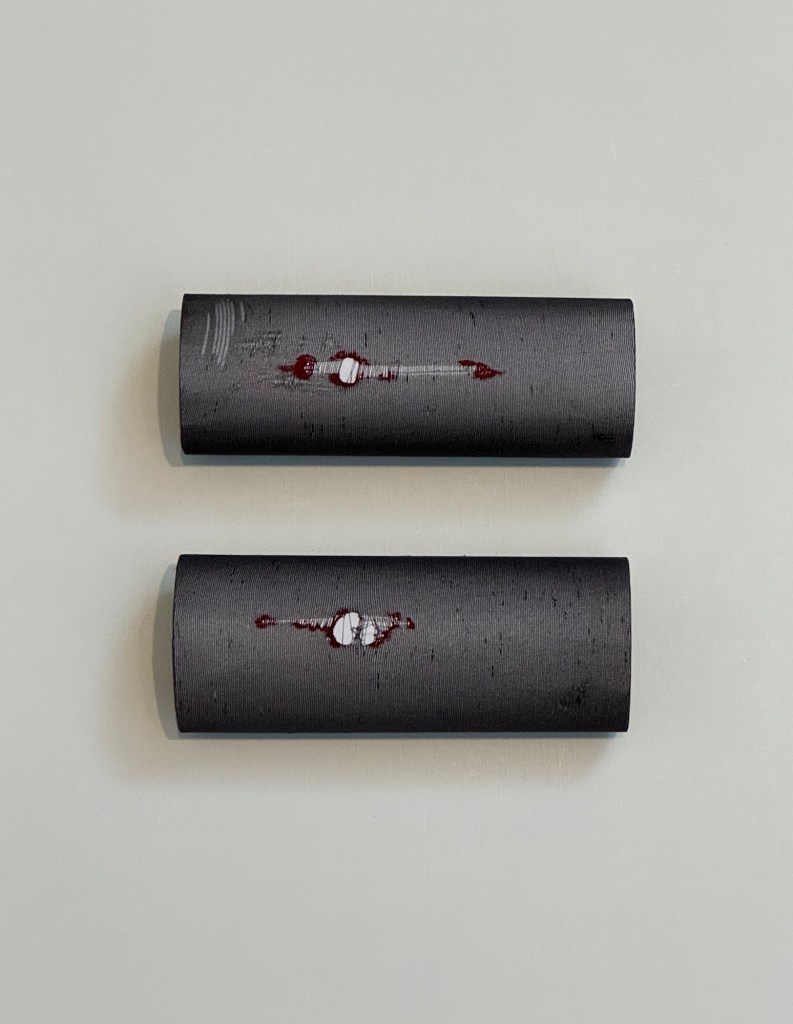
This process was repeated with a second piece to create two pieces in total:
–
–
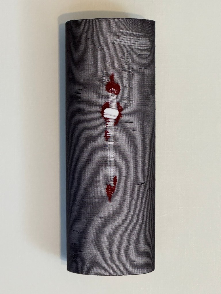
The two pieces were placed on a large piece of white card, in different arrangements, to experiment with composition:
–
–
–
REFLECTIONS
It was such a strange dream that I could not think of what would have triggered such a memory during a holiday in Scotland. Throughout the planning and making process, I thought about all the things that we learn from our parents. My mother didn’t actively teach me to mend my tights, I just watched her and that technique was cemented in my subconscious.
During the last year when I have been making Chinese Cheongsam dresses as painting canvases, I have been thinking a lot about watching my mother dressmaking when I was little and how much I learnt from her without being conscious of it.
Thinking more about it – a week before I had the dream, I was looking at some old family photographs shown to me by a family member. Many of the photos of my parents that I had not seen for years. Perhaps seeing those images somehow unlocked the memory of mending my school tights. The act of mending tights is uniquely personal and it only happens between mother and daughter because boys do not wear school tights and it’s unlikely that fathers have nail varnish to hand. Also, a mended pair of tights hidden under a dress is a secret between mother and daughter, or between women when such techniques are passed from one to another. Those moments are precious.
It is usually at this point of reflection that I start to feel sad because I left home so young (14) and I must have missed out on so much learning from my mother, or just time with her to enjoy that unique bond, sharing secrets that only we knew about and that united us from the world. As always in life, we don’t appreciate how precious those moments are until much later.
I decided to stop after making two pieces and didn’t realise the whole dream of making multiple pieces into an installation. I may come back to it at a later stage. For now, I feel that this experiment has served its purpose in testing out the process and triggering reflections that will keep me thinking for some time. Overall, I am happy with how this quick experiment went and pleased with some of the images I produced.
LEARNING
I usually make work after lots of thinking and planning. This piece of work came from ‘left field’ (a dream) and the making was quick and experimental. I enjoyed the diversion from my main project and to get some results so quickly was enjoyable. A large painting often takes so long that having some quick work in between can help to feed my need for results as well as interrupt the agony of painting. I recently heard an artist on TV saying that painting has the word ‘pain’ in it – too true!
Also, I have become increasingly aware of the importance of my thinking during making. Before I start making work, I think a lot about how to make it. But during making, the work takes my mind to many places that I have either long forgotten about or didn’t know existed. Hence I am becoming aware of the quality thinking time that ‘happens’ when I am making art. In a recent discussion during one of our MA online sessions, we talked about process vs product. That was very helpful as I feel excited about my discovery of how important the process is for me, much more important than the product. In fact, I am usually not so bothered about the product as it is secondary to the process for me. Perhaps for me, the purpose of the product is merely to provide a process.
NEXT STEPS
– Continue to enjoy the thinking and reflecting time during my making process.
– Do not feel guilty about taking diversions from my main projects; quick diversions like this one has provided invaluable insight from my subconscious. I should value it.
This blog details my overall reflections for the Cheongsam Series – Food as metaphor for cultural identity. I made two paintings on this topic and they are captured in the two blogs below:
The finished paintings are intended to be displayed as a pair because they respond to each other.
–
REFLECTIONS
It has taken me some time to write this blog as I am not sure where to start. My reflections on the making process, composition and technical learning are captured within the individual painting blogs. This blog is meant for reflecting more deeply on what making these paintings has meant for me. I shall capture my thoughts as they come into my mind as a form of free writing.
The dressmaking part:
– Throughout the making of the Cheongsam dresses, I thought a lot about watching my mother dressmaking when I was a child. The way she designed the clothes, for herself and for her children; measuring us, making her patterns on waxy paper, chalking the cloth aided by her special yellow wooden rulers and cutting the fabric with the long sharp scissors. Then sewing using her manual Singer sewing machine with a leather belt that turned the wheel as she pedalled. I remember having fitting sessions with part-finished garments and then she would do the final finishing off. Every button was chosen with care. It’s not until I made these canvas dresses for my paintings that I realised how very clever she was. Although dressmaking is not difficult, making it well requires talents and skills just like any craft. She made evening gowns, tailored jackets and trousers! Those are very difficult items!
– One could ask, so what? Many people made and still make clothes. What’s the big deal? I reflected much about her life while making my canvas dresses because the process of dressmaking is largely unchanged therefore I could clearly visualise my mother going through all the steps that I am now replicating decades later. My mother married at 17 years old and became a mother at 19. Hong Kong in the 1950s and 60s was a very patriarchal society and she as a Chinese woman was confined to her role – wife, mother, cook, cleaner, homemaker etc.. However, it is clear on reflection that she had ambitions that were not fulfilled by her role ‘assigned’ by society. There were few avenues for a woman of her time to express herself and she chose to do it through her dressmaking. She later went onto Chinese painting and became an accomplished artist with many students. Two weeks ago I was shown the various awards that she was given as an artist by cultural institutions in Hong Kong and China – I hope to explore more about her journey as a painter at a later stage.
– As my father’s career advanced in the Colonial Hong Kong Government, my mother would accompany him to official white-tie dinner balls (British style). She would always design and make her own evening dresses. She was the only woman who made her own dresses at those events. She always sought to be different and I believe in those days, her dress design and making was where she found a channel of expression as well as solace. It gave her an escape from the shackles of societal expectations of a traditional Chinese woman.
– I left home when I was a young teenager to boarding school in England and never lived with my parents since. Sadly they both passed before I really had the time or inclination to get to know them properly. So in a way I’m reflecting on her as a stranger with fragmented information from my patchy memory. Despite that, how did I end up picking up art in later life and in a strange way walking her path? I don’t think I have the answers yet but my own artistic journey has given me insight into what she was seeking as a person, as herself.
The painting part:
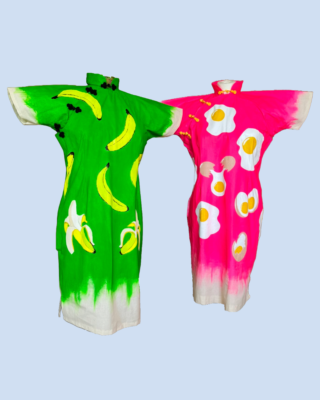
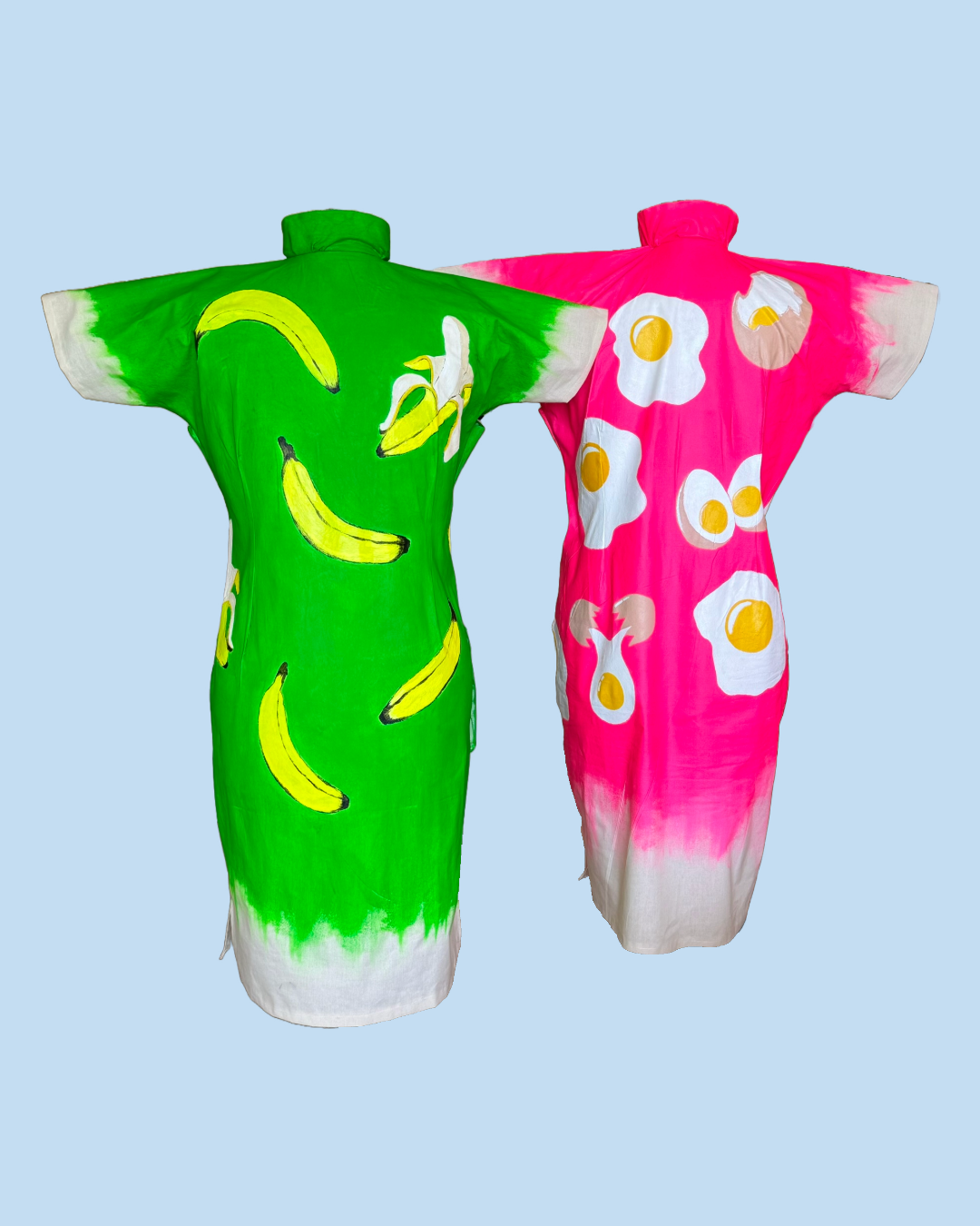
– It took me a while to decide what to paint. I like using metaphors in my work and when I stumbled across an image of Warhol’s banana, it gave me the idea to paint something in pop art theme as a contrast to the traditional Chinese dress canvas – I like making work that has an undertone of incongruity because that is afterall the metaphor for myself. Furthermore, a banana was the perfect subject as a cultural metaphor – yellow on the outside and white on the inside.
– I researched the use of the word ‘banana’ to describe a westernised East Asian person and I was delighted to find many insightful and humourous articles that resonated with me. The highlight was finding the film clip from the Hollywood movie Crazy Rich Asians talking about the protagonist being a banana – it was for me an endorsement of the phrase and bringing it into contemporary popular culture.
– As I got older and started to take time to look into my heritage, I felt that ‘banana’ alone was an insufficient metaphor for me. Growing up as a child in Hong Kong, a British influenced Chinese society, it was (and still is) so culturally rich that my core is deeply rooted in that heritage. Hence when I read an article about an egg with the yellow core as a cultural metaphor, I was hooked by the idea and felt it was a good response to the ‘banana’ metaphor.
– As I was painting both dresses, I was keen to adhere to the pop art theme painted on the Chinese dress canvas to capture the incongruity, or perhaps the fusion of the different cultures that I seek to represent in my work. At the end, I felt I have largely achieved what I intended despite much time spent on getting the right ‘green’ for the banana dress.
– The most poignant moment came when I was mixing and remixing to search for the correct shade of yellow and white colours to use for the eggs and bananas. I kept asking myself – ‘Is the white ‘white’ enough?’ or ‘Is the yellow too ‘yellow’?’ The constant search for the right shade of colour to use was a good metaphor for my attempt to fit in especially in my early years as a youngster in a new culture. Like many young people in a new environment, one was always working out how to behave, how to dress, how to do the makeup, what jewellery to wear etc. in order to fit in and be an insider. Or not to be treated as an outsider. It was a mutation process over time.
– The making of the two paintings here has turned out to be a better metaphor for my cultural transmutation journey than I ever expected.
LEARNING
I believe this blog concludes the ‘Cheongsam – food as metaphor’ series of work. I want to continue to make more Cheongsam paintings including looking for a more efficient way to make the dress canvas – it is time consuming but I want to continue with the idea so I need to find better ways of making the canvas.
I will continue to use the Cheongsam canvases to explore my identity which is a fundamental part of my practice. I feel using a Cheongsam canvas is a turning point in my practice, the idea came to me just as I was struggling to find a way forward to bring my ideas together. These two paintings are just the beginning of something, not sure exactly what yet, but I feel it’s a beginning.
Since much effort goes into making these canvases, I want to revisit the first Cheongsam painting that I made with the ‘Blue Willow pattern’ to see if I could make more of it so as not to waste the piece because I was not that satisfied with the outcome at the time.
NEXT STEPS
Revisit the Blue Willow pattern painting dress to give it more meaning.
Explore more efficient ways to make the Cheongsam dress canvas.
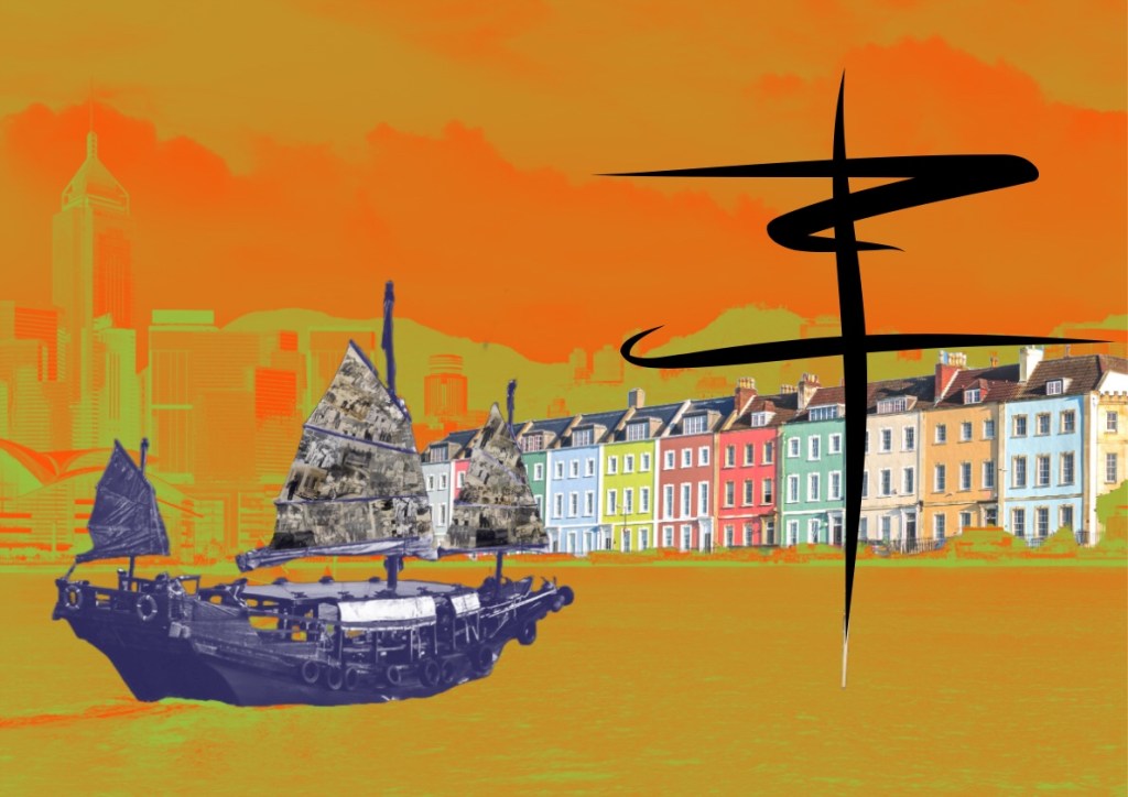
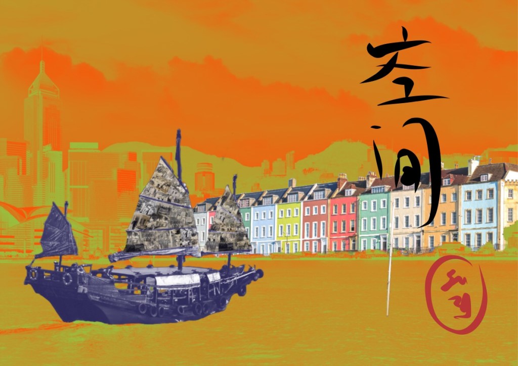
This piece of work was a continuation of my exploration of how to express the third space through aesthetics. It started with a digital collage in a similar way to the piece I did for the MA Interim Show in Part 2:
However, after I started this piece, my thinking took me to reflecting on how I felt about my work in the third space so far. My thoughts are captured in this blog:
Although this work did not start as the abstraction approach that I concluded on in my thinking, I have altered part of the image to be less illustrative and more suggestive as a start of this new exploration.
METHOD
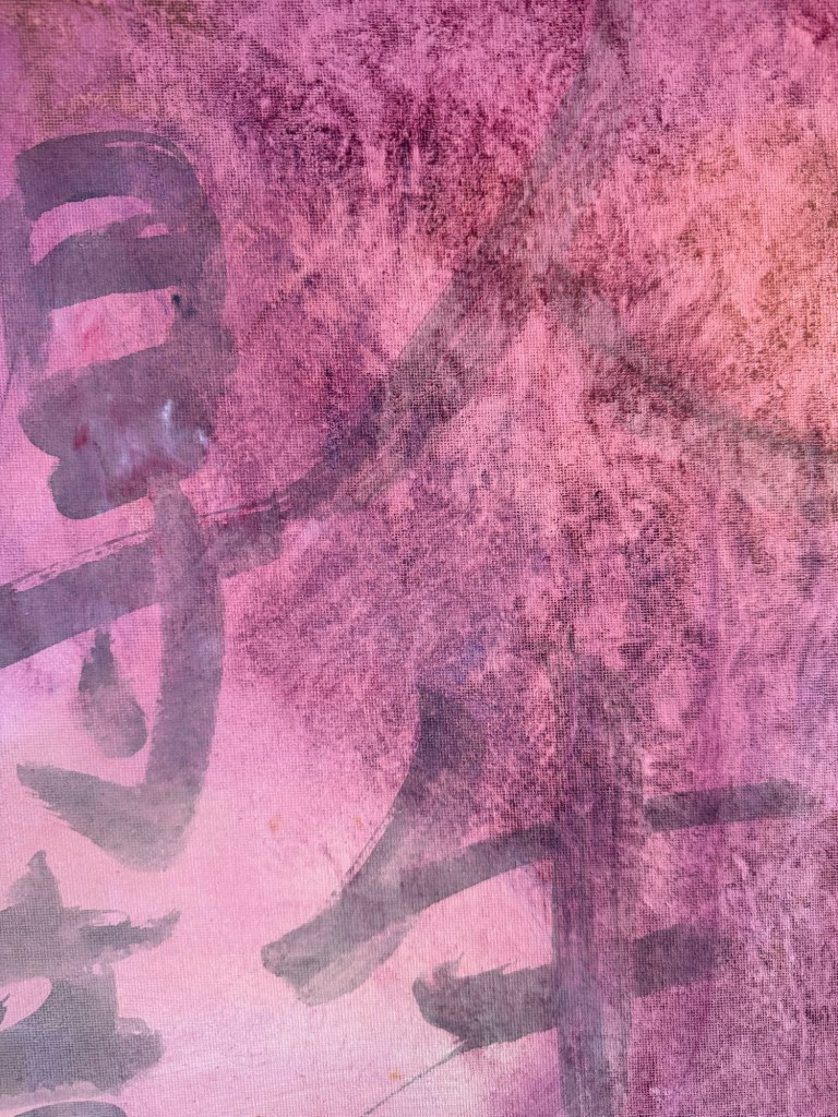
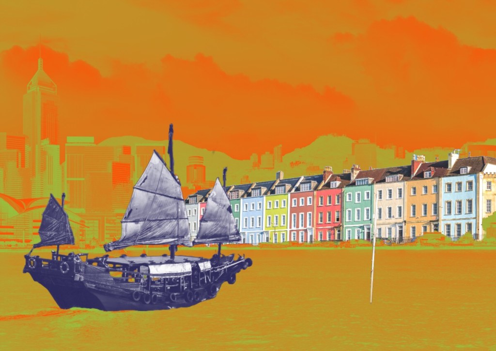
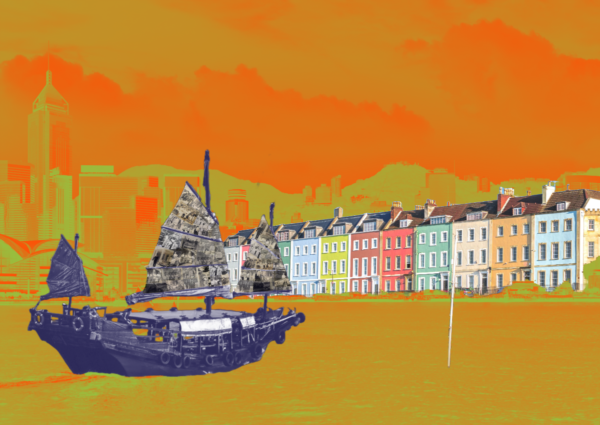
A digital collage was created using Adobe Express comprising an image of present time Victoria Harbour in Hong Kong, a row of colourful Victorian houses at Bristol Harbour and a traditional Chinese junk. The images were manipulated so that the buildings forming the skyline of the two harbours were combined forming a continuous shoreline with the HK Harbour image changed to a subtle but bright two-tone effect whilst the Bristol houses remained vibrant and unchanged. Various colour effect experiments were carried out to achieve this final image:
I recently started to experiment with using old black and white family photos in my digital collages. For this piece of work, the photos formed a collage on the sails of the junk:
Whilst the previous work for the MA show was printed on silk, I feel this image would suit a woven canvas (e.g. a traditional cotton woven canvas). So my plan is to have this printed on canvas then add brush strokes in the style of Chinese calligraphy. The digital collage was exported to Adobe Freso where I used the painting function to try out different compositions. Below are two examples.
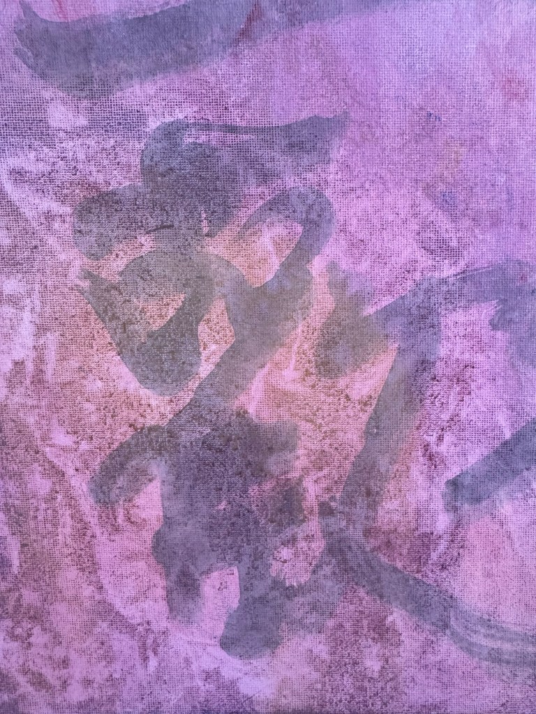
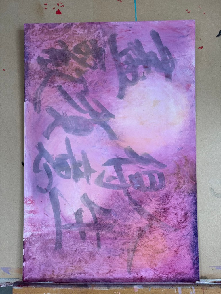
Example 1 – using an abstract image done in Chinese calligraphy style:
–
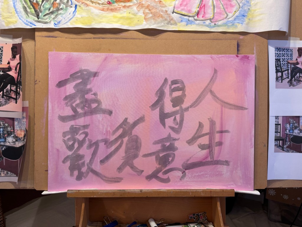
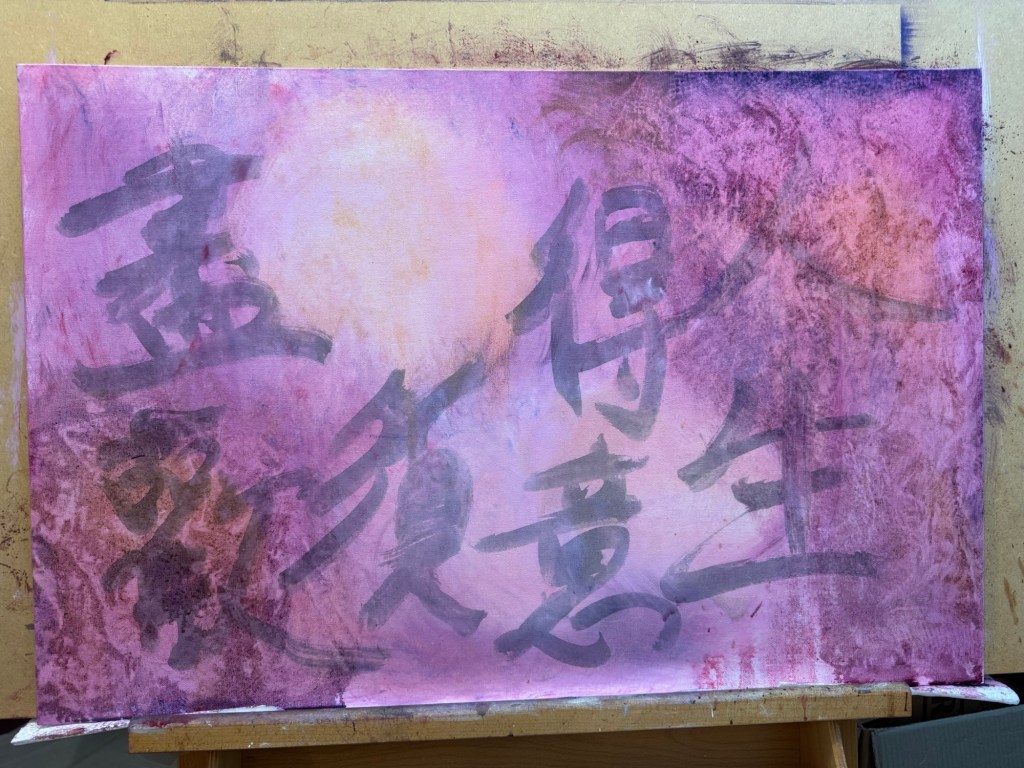
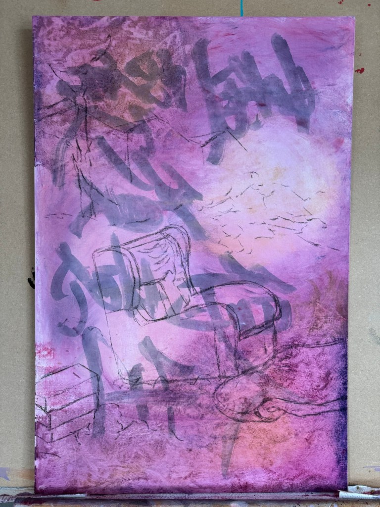
Example 2 – using Chinese characters that meant ‘space’ (as in third space) with a red seal stamp drawn in:
–
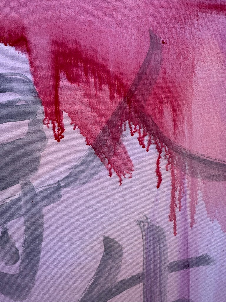
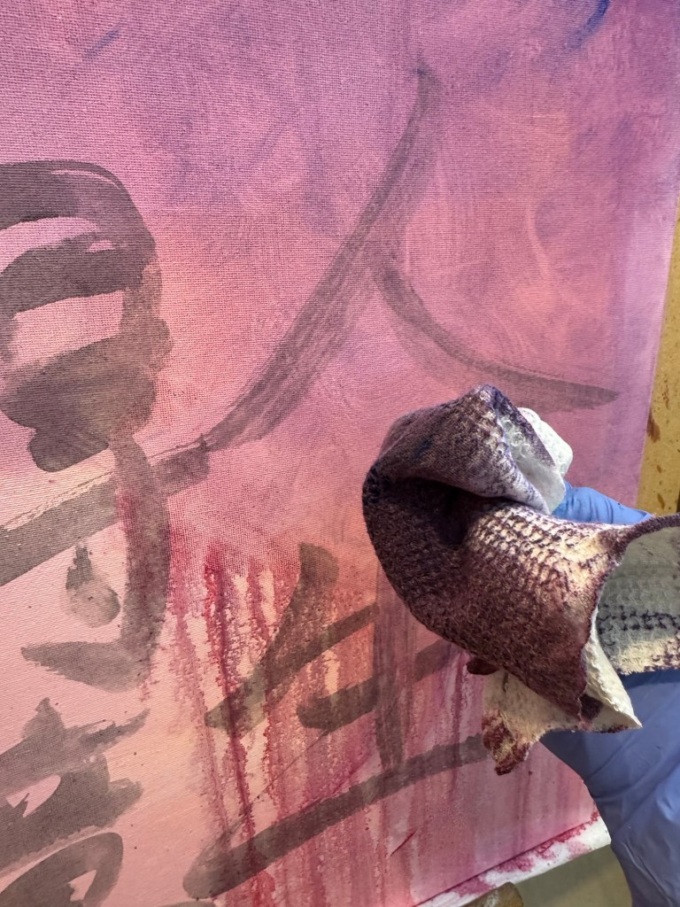
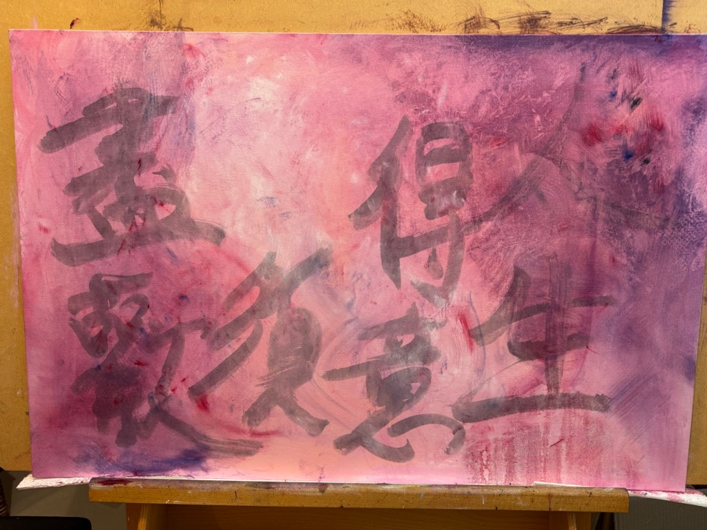
This is work-in-progress and I will order several printed canvases to try out the calligraphy experiments.
REFLECTIONS
I am happy with the progress so far. I like the way the two harbours came together as one continuous shoreline representing the different parts of my life coming together as a continuum. After my reflections on my third space work so far, my aim here is to create images that are more ambiguous so that both the viewers and I have to think deeper to see what’s there. I am not sure if I have managed to achieve it with this work. I will reserve judgment until the work is complete.
What I am also pleased about is that I am becoming less sensitive about using my family photos. I have always felt that they were too precious to be used, like mining a fragile archeological site. Although I have not used the very precious photos of my close family yet, I am feeling more able to consider the idea.
LEARNING
Since this is still work-in-progress, I’ll leave the full consideration of my learning until the end when the work is finished.
NEXT STEPS
– To order a minimum of four canvases printed with the image to experiment with adding Chinese calligraphy style brush strokes to complete the painting.
– I will go for A1 size to start with; it gives a reasonable area for expression without having to commit too much costs or materials. If I like the outcome then I might consider printing more canvases on a larger scale.
– Other experiments to consider are:
a. Covering the image with a top layer of oil and cold wax abstract painting then complete the painting by scraping off areas to reveal the image underneath.
b. Spray painting in street art style to show further Bristol heritage.
–
ADDITIONAL REFLECTIONS
After publishing this blog and giving more thoughts about my blog on the elusive third space, I decided not to take this piece of work further. This is because I feel this image is still rather illustrative with images of only ‘A and B’ (as explained in ‘The Elusive Third Space’ blog). So I’m going to leave this for now and focus on the Cheongsam series which may give me more exploration opportunities. I may come back to this later but I’ll leave it here for now.