MA Y1 U1: Exploring Aesthetics – Part 2 – Painting on silk for MA Interim Show

BACKGROUND

Following on from Part 1:

MA Y1 U1: Exploring Aesthetics – Part 1 – Using photos

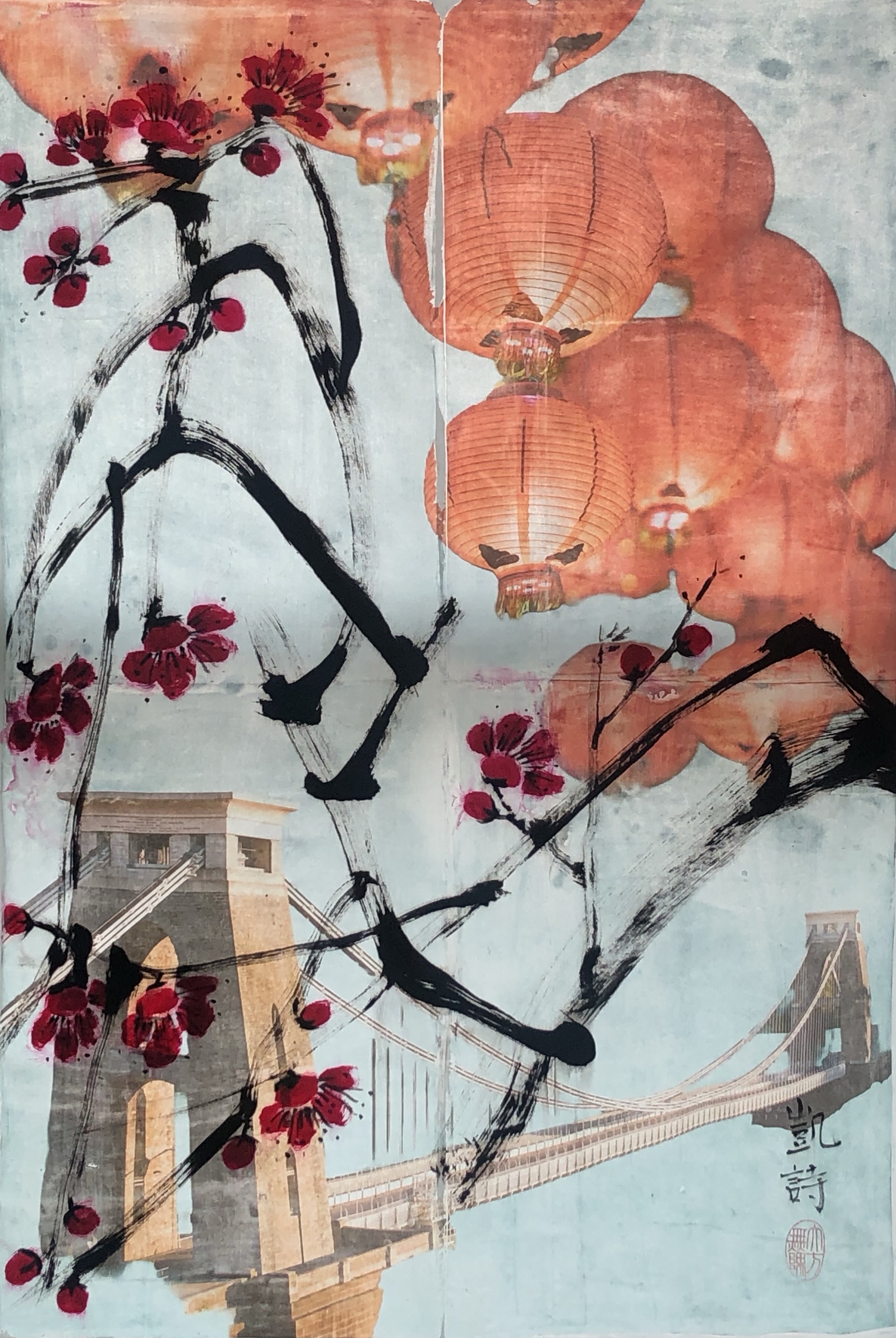
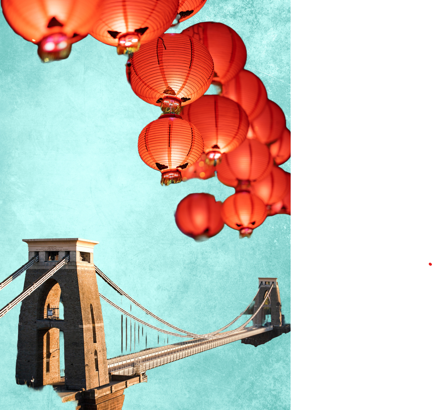
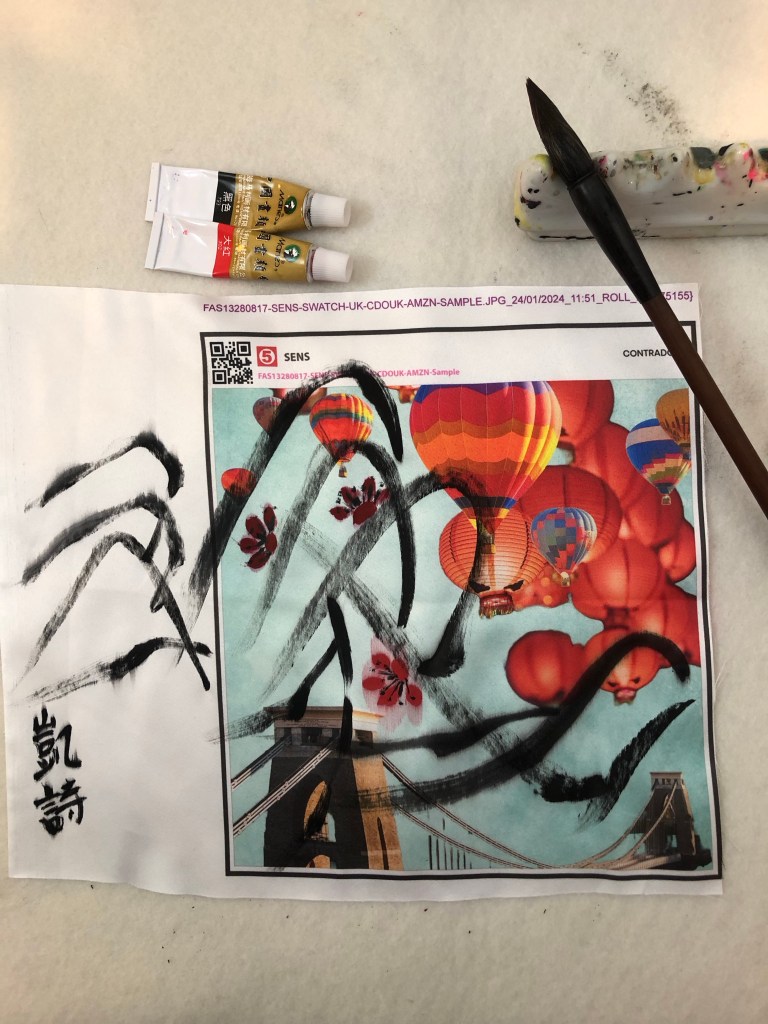
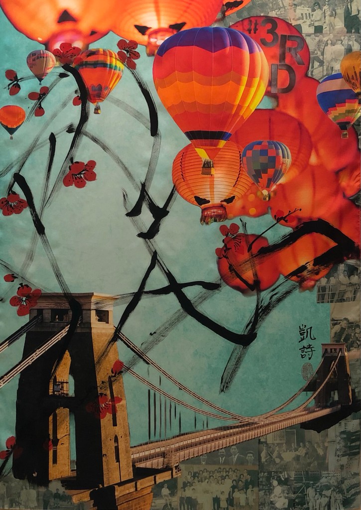
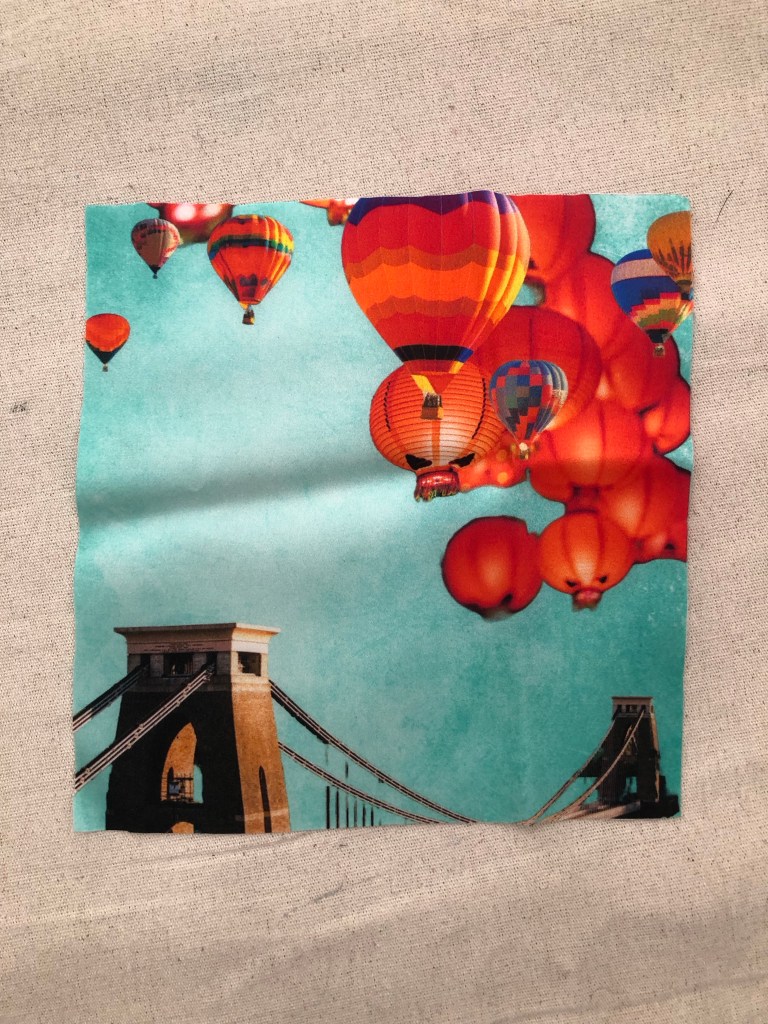
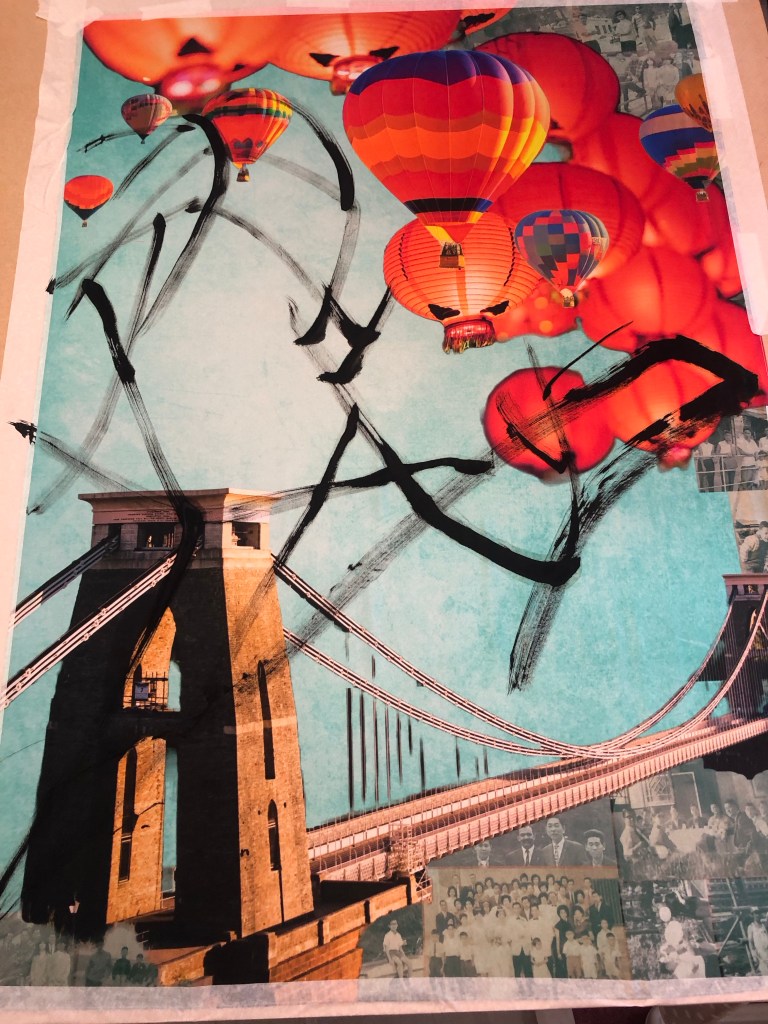
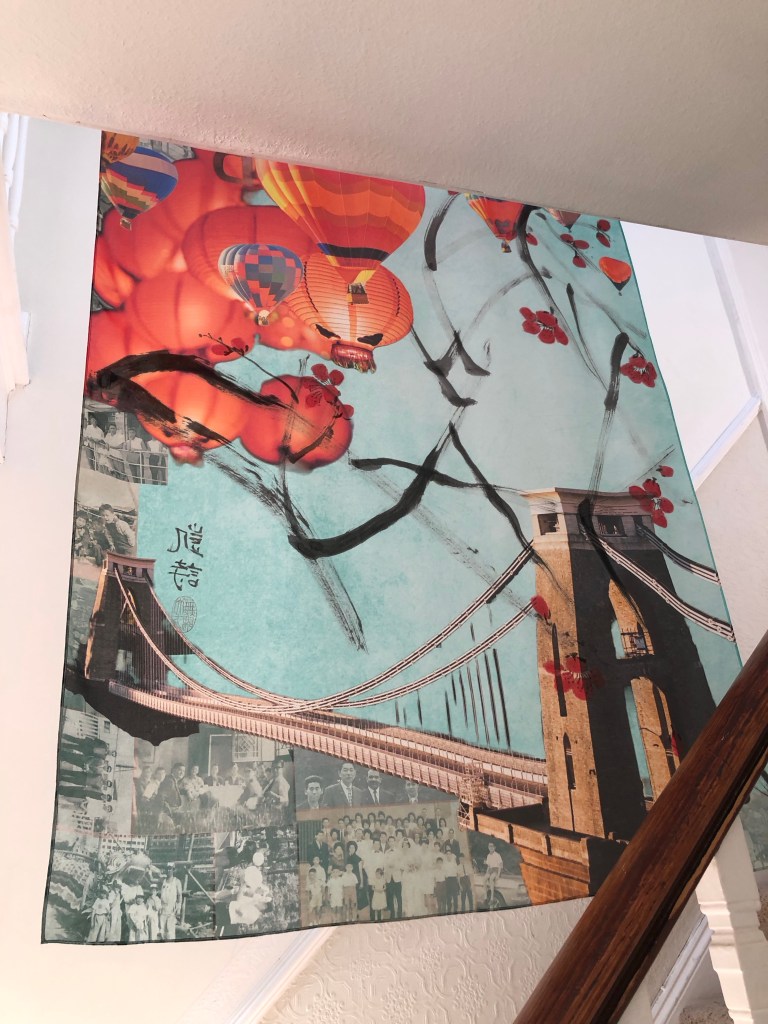
I ordered the silk printing from Contrado who provided an excellent service. The image I used was the final outcome from Part 1 – the Clifton suspension bridge, hot air balloons, Chinese lanterns and family photos collage. This blog describes the process I went through to do the Chinese painting on the printed silk. The largest Chinese painting I have done up to now had been A1 size and I ordered 1xA1 and 1xA0 for this experiment. The A0 piece was therefore by far the largest Chinese painting that I have attempted. The plan was to use this piece of work for the MA Interim show if it worked out.

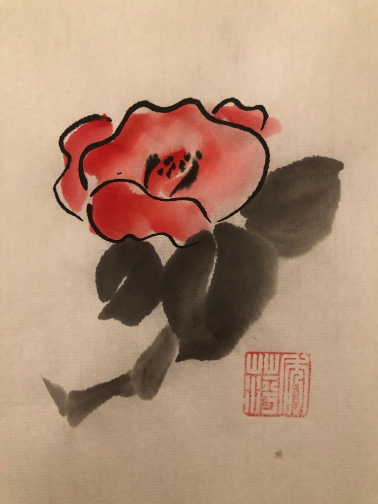
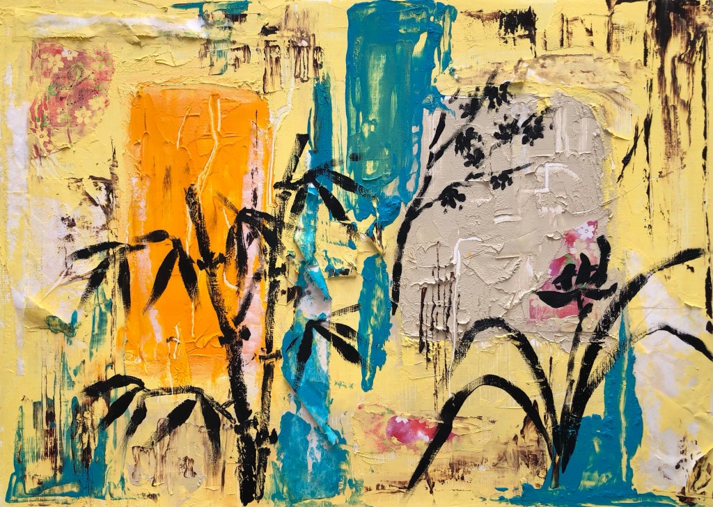
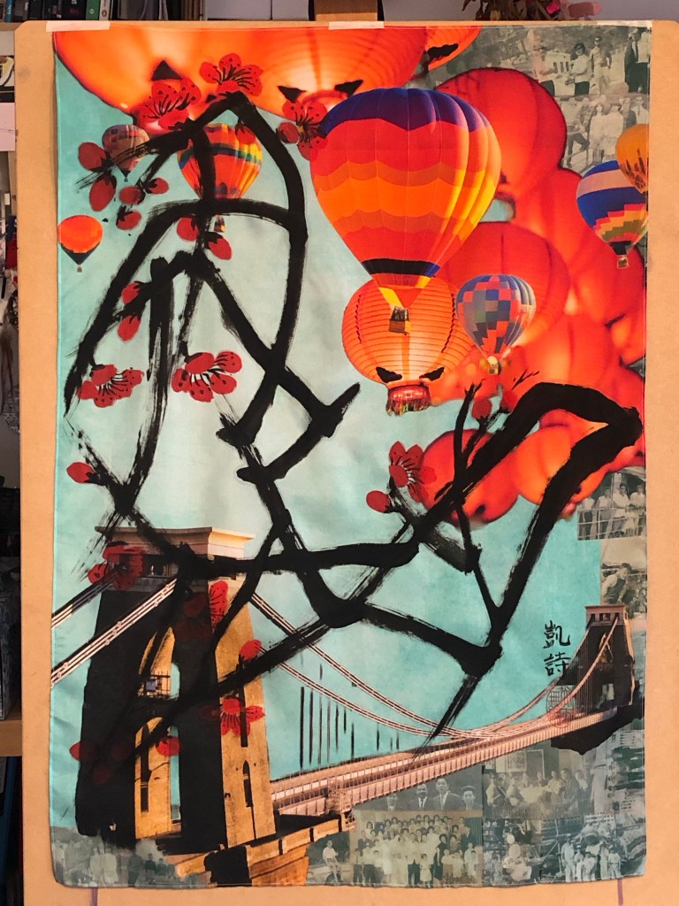
Here is the finished painting and I will use it for the MA show:

METHOD

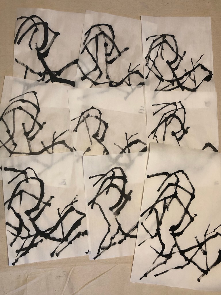
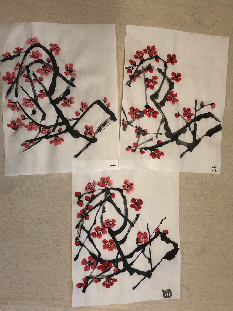
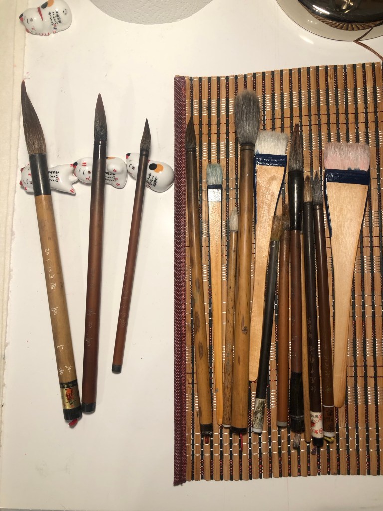
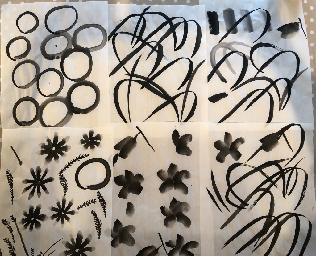
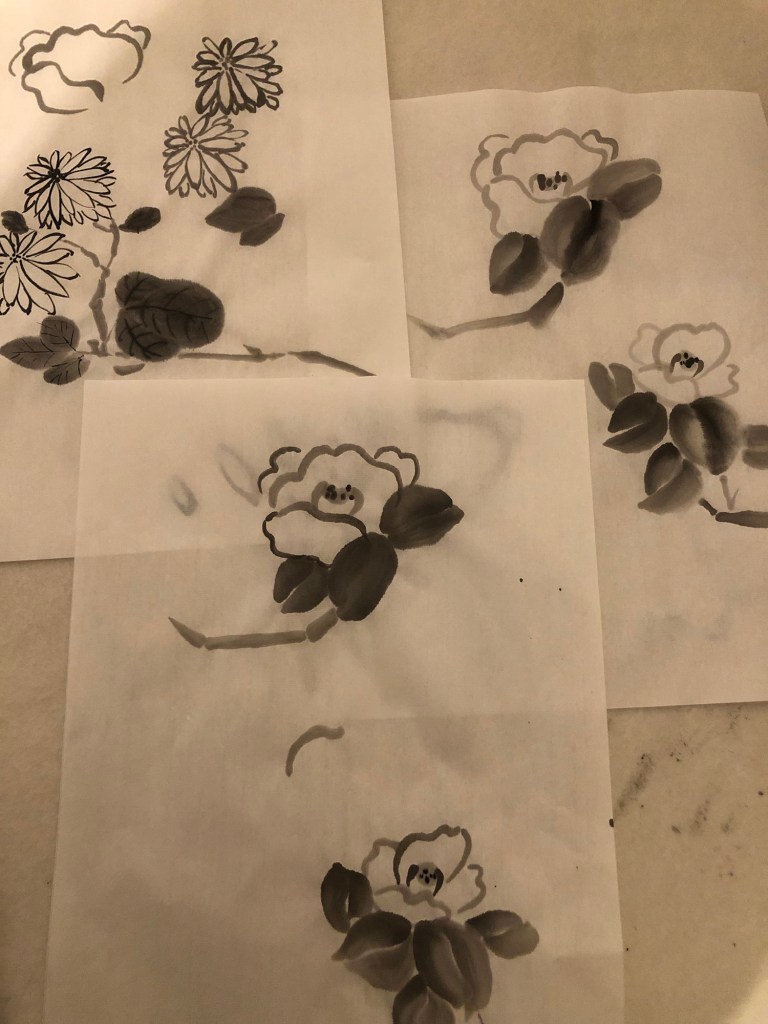
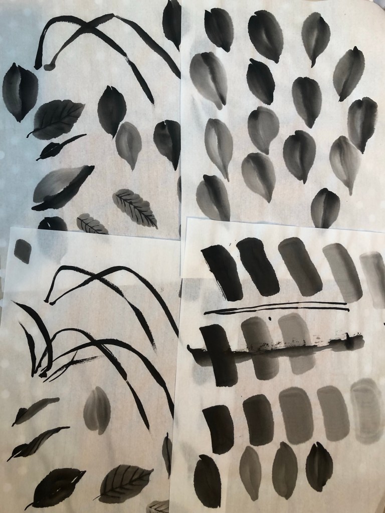
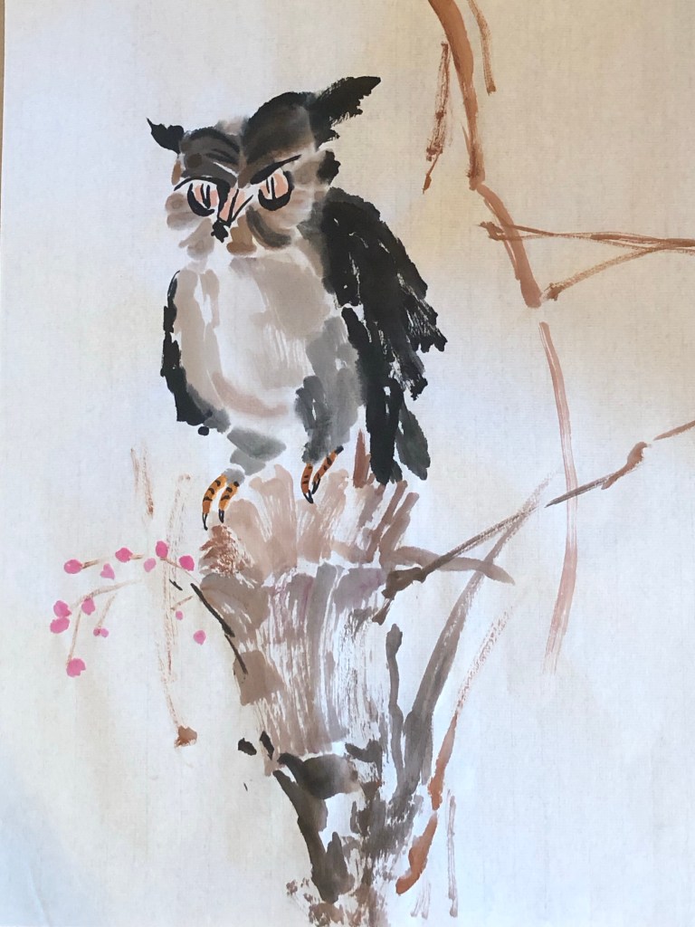
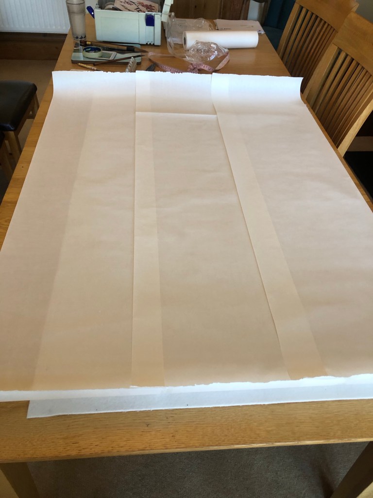
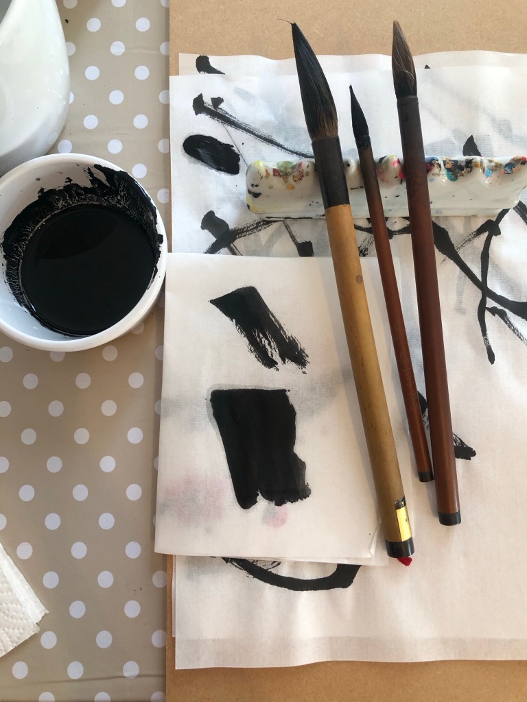
Since I have not done a Chinese painting of A0 size, I wanted to practice on paper before doing it on the silk. As mentioned in some of my Chinese painting blogs, Chinese brush painting is very unforgiving, you only get one go at doing a stroke, hence practicing was important.

Here is the set up with scrolls of Xuan paper stuck together to form a large sheet:

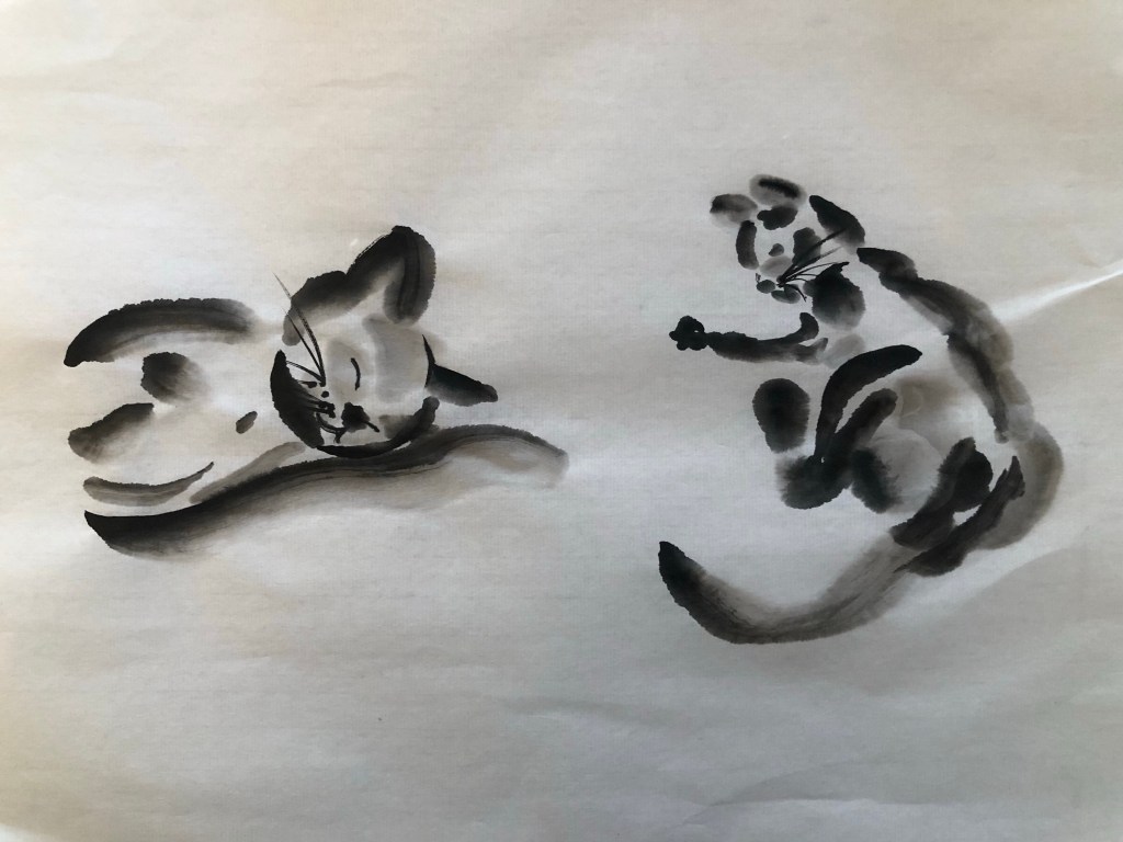
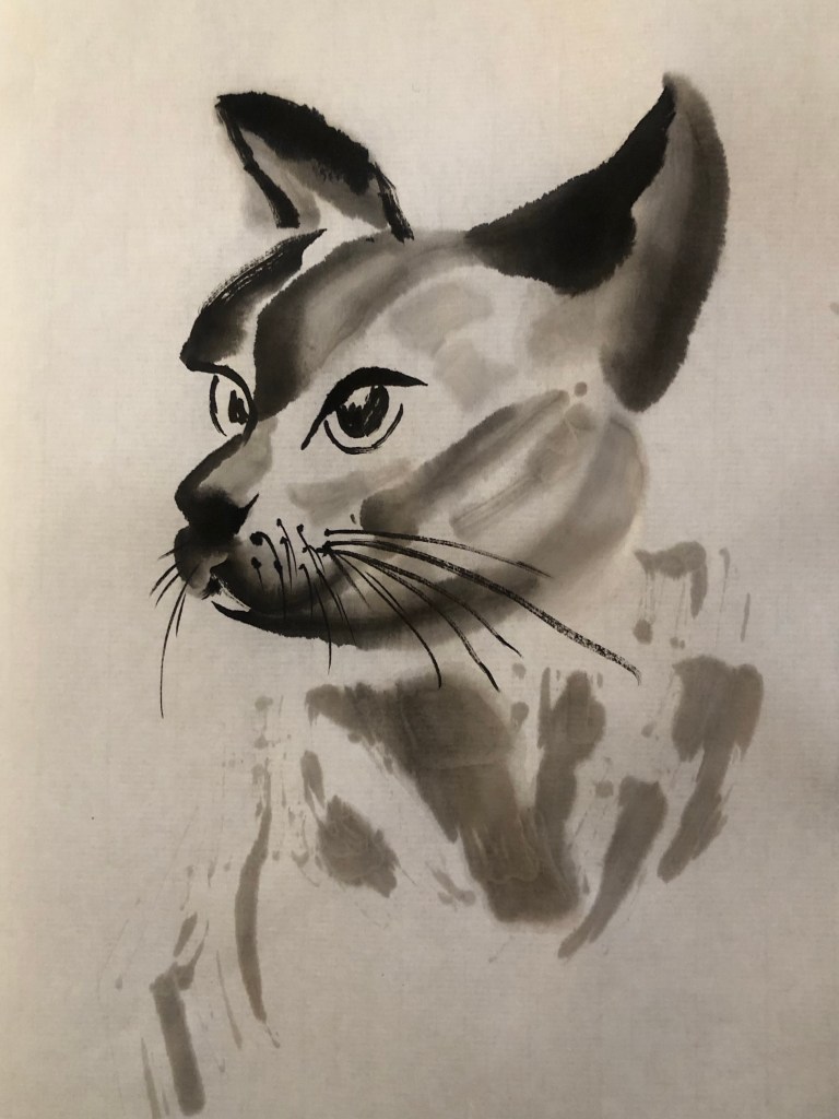
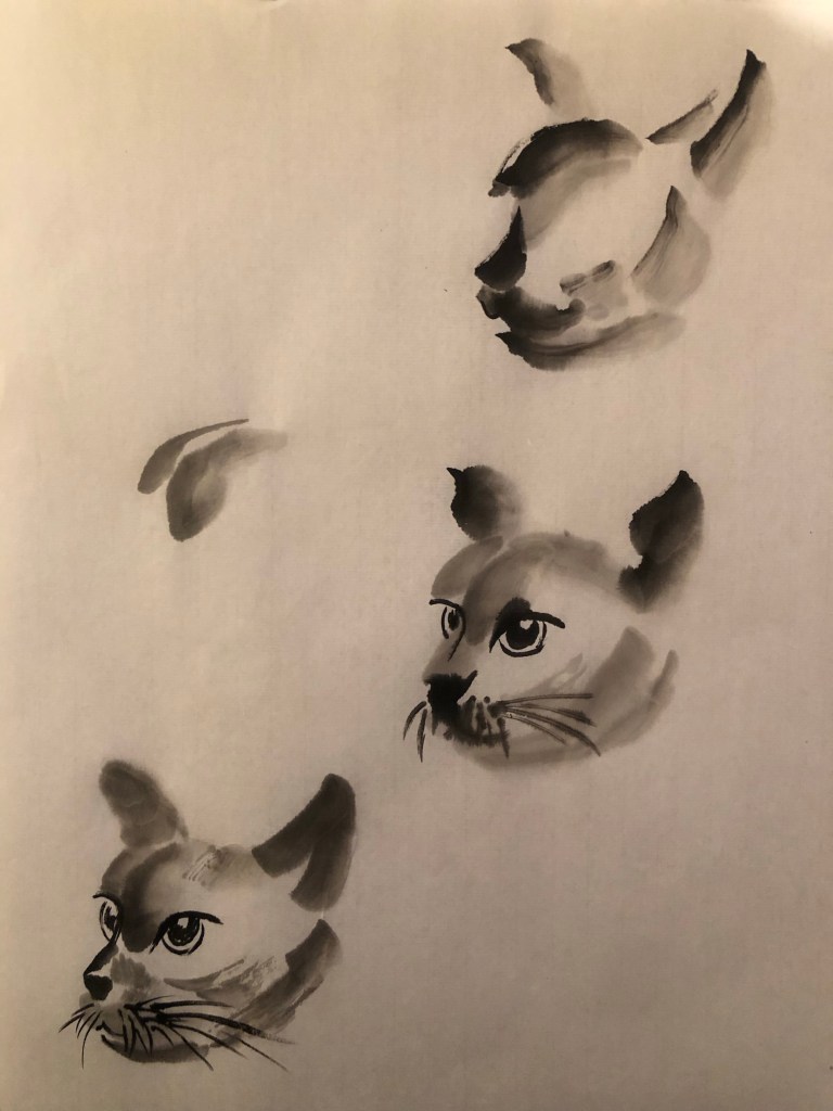
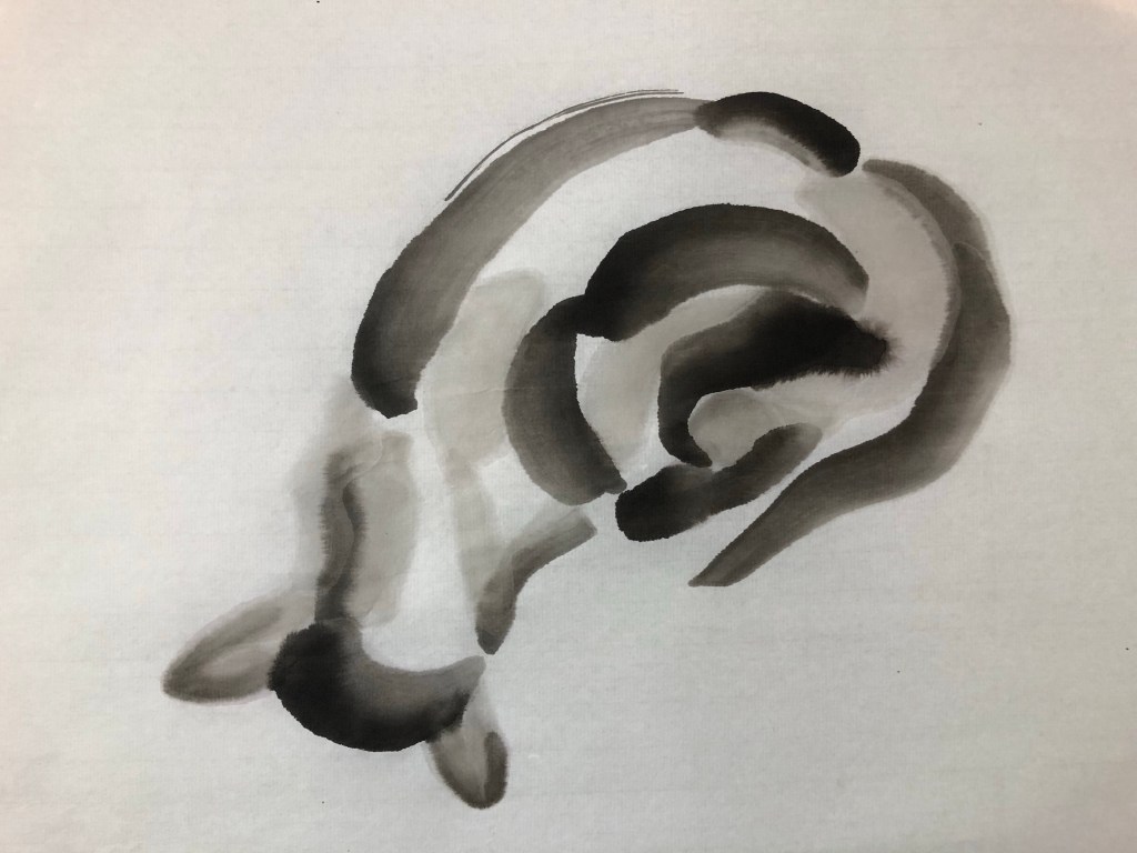
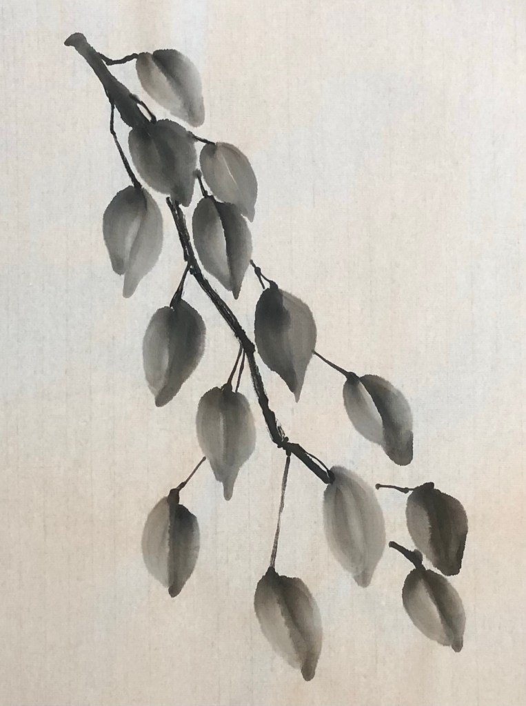
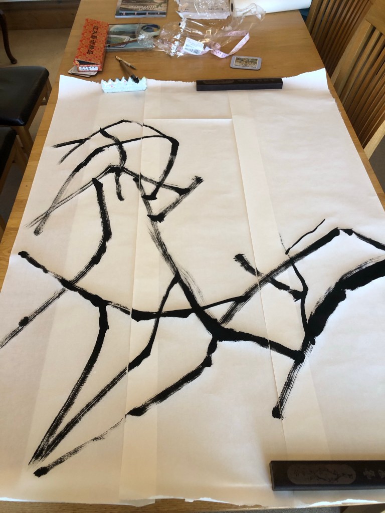
Using the brushes I selected in Part 1 and the composition that I practiced on A4, here is the attempt on A0 size after completing the wild plum tree branches:

Then the plum blossoms were added:

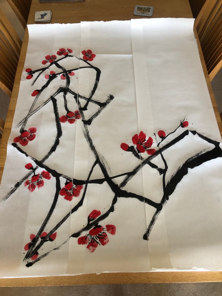
Finished trial painting on paper:

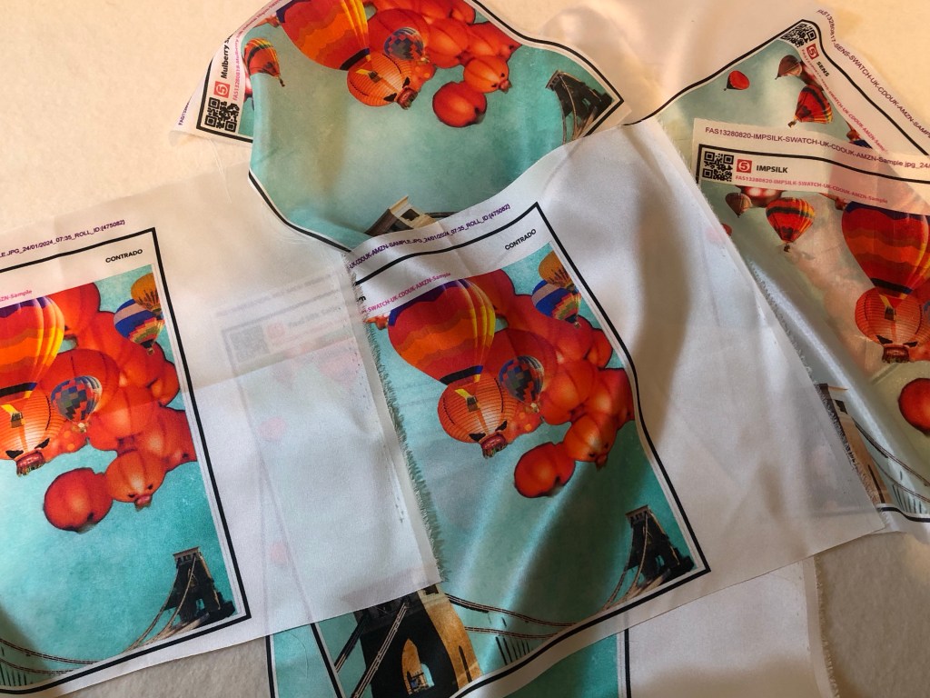
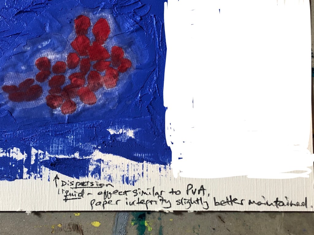
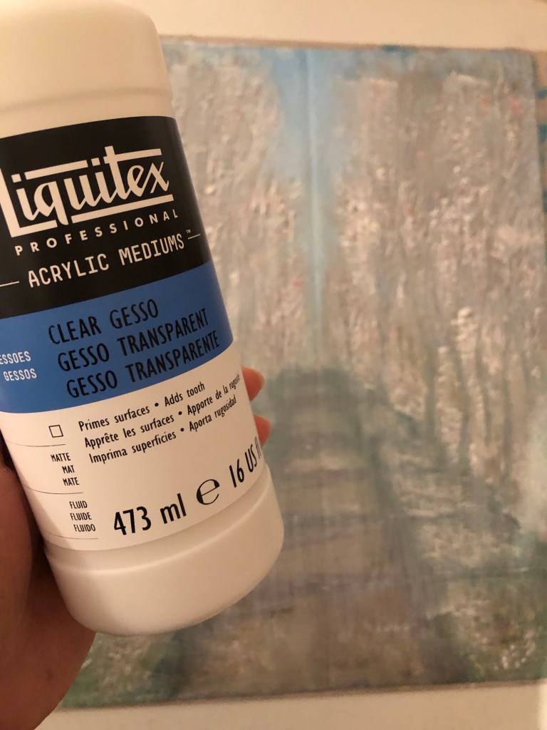
When ordering the printed silk, I had to decide whether to print a border. So I trimmed one of the printed samples to see what a borderless image would look like. I was happy with it and the prints were ordered without border, i.e. printing the image right up to the edge. I also ordered the option of hemmed edges.

Sample image cut without border

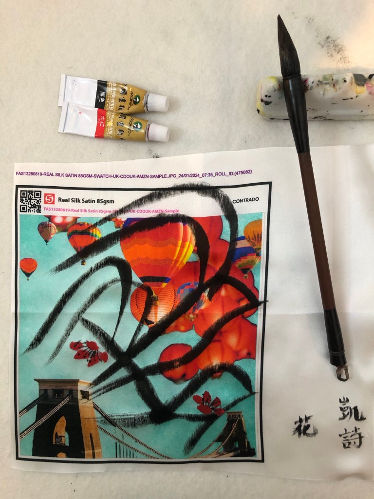
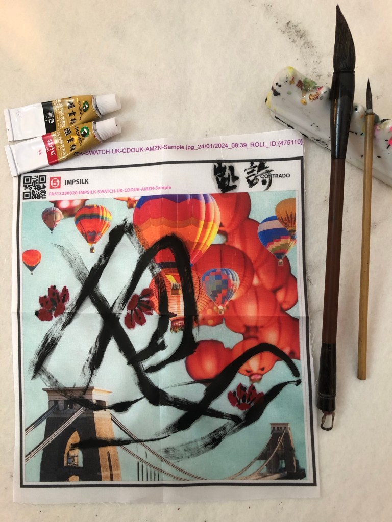
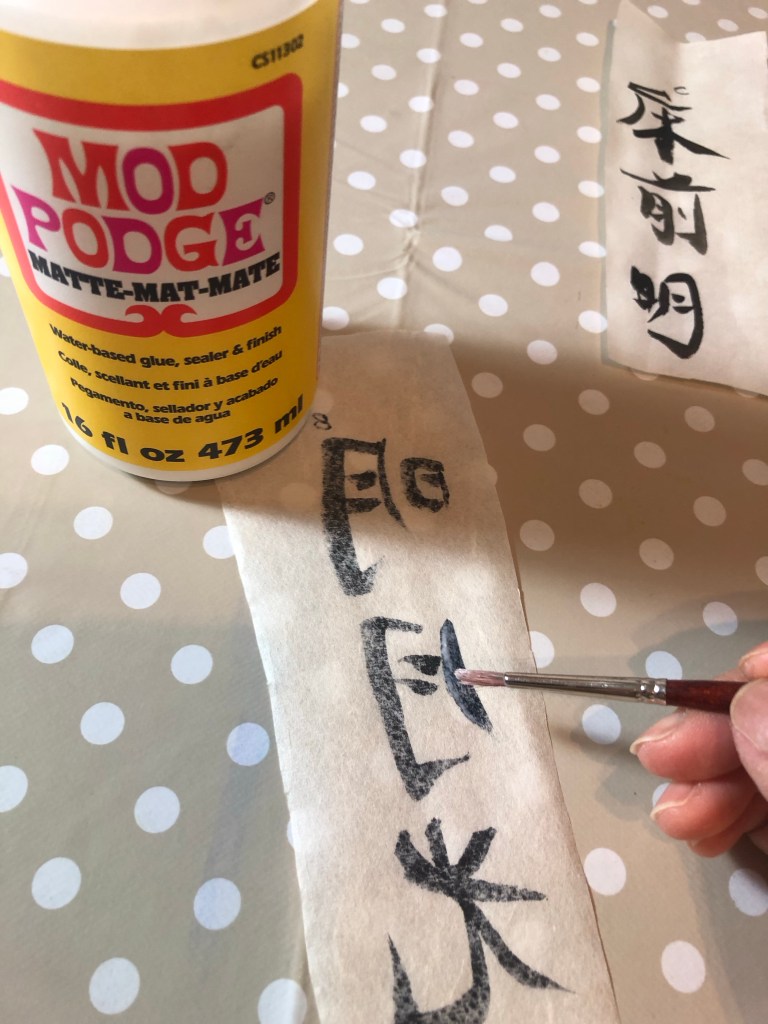
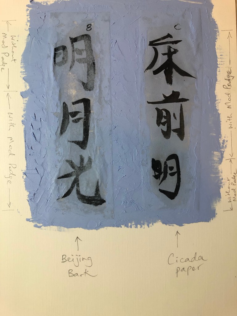
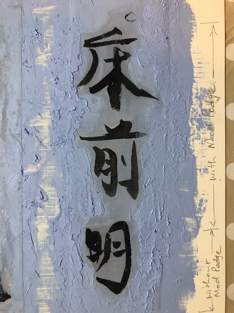
In addition, I ordered a small piece of printed silk to test what backing should be used (a piece of felt which is typically used as a backing for Xuan paper painting or just use Xuan paper). Also to test the amount of brush loading and how the brush glided along the surface.

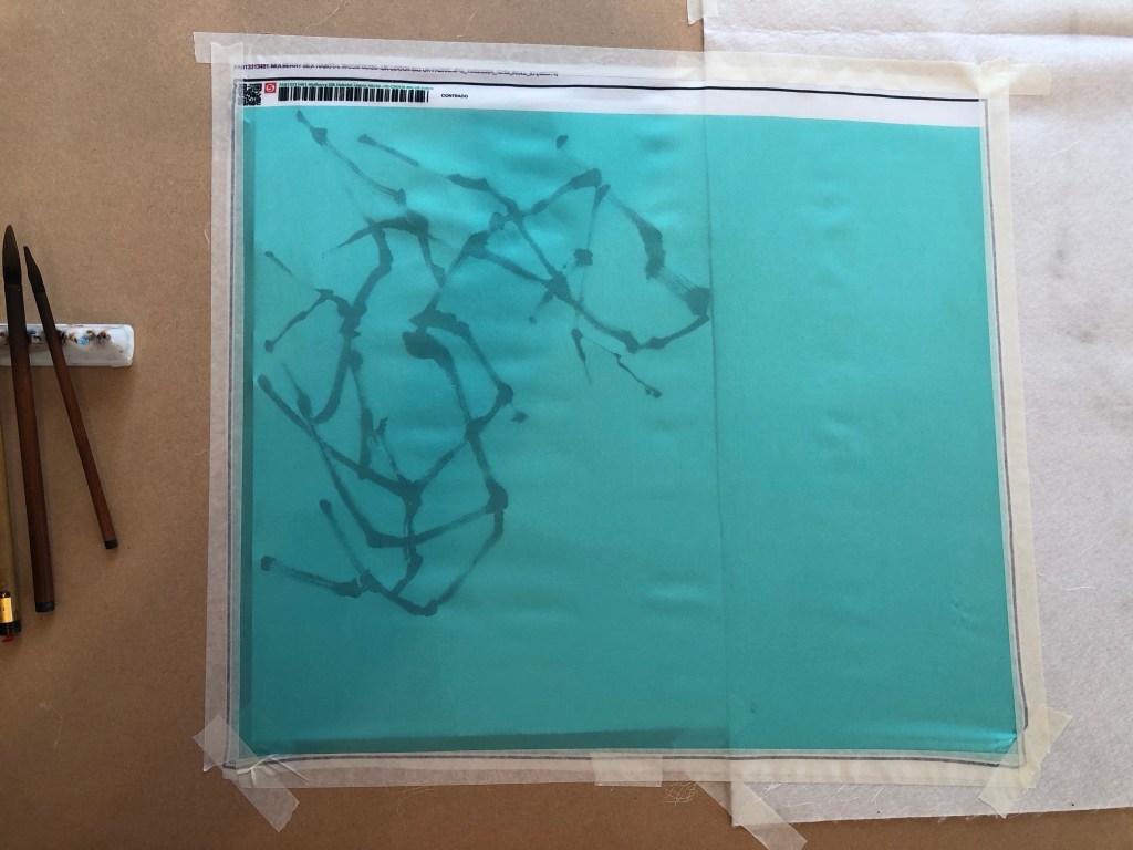
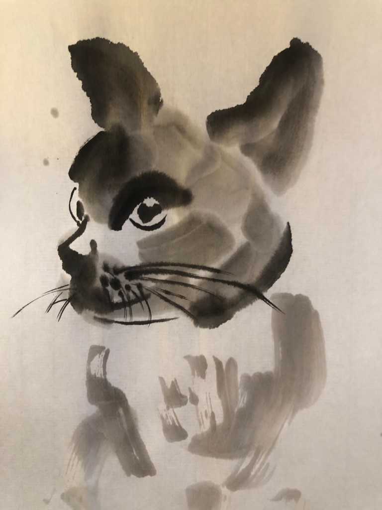
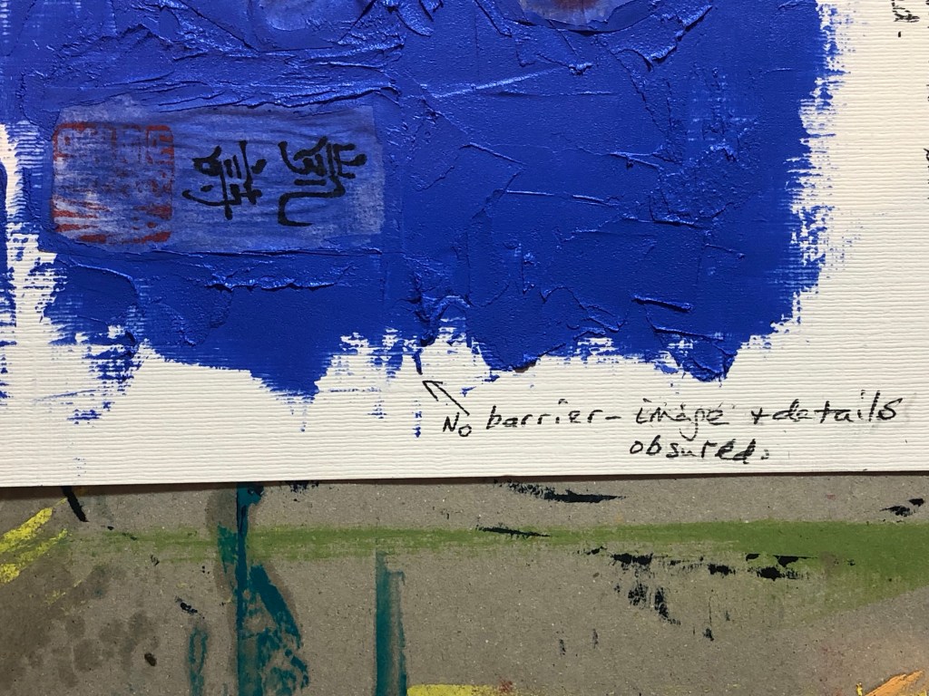
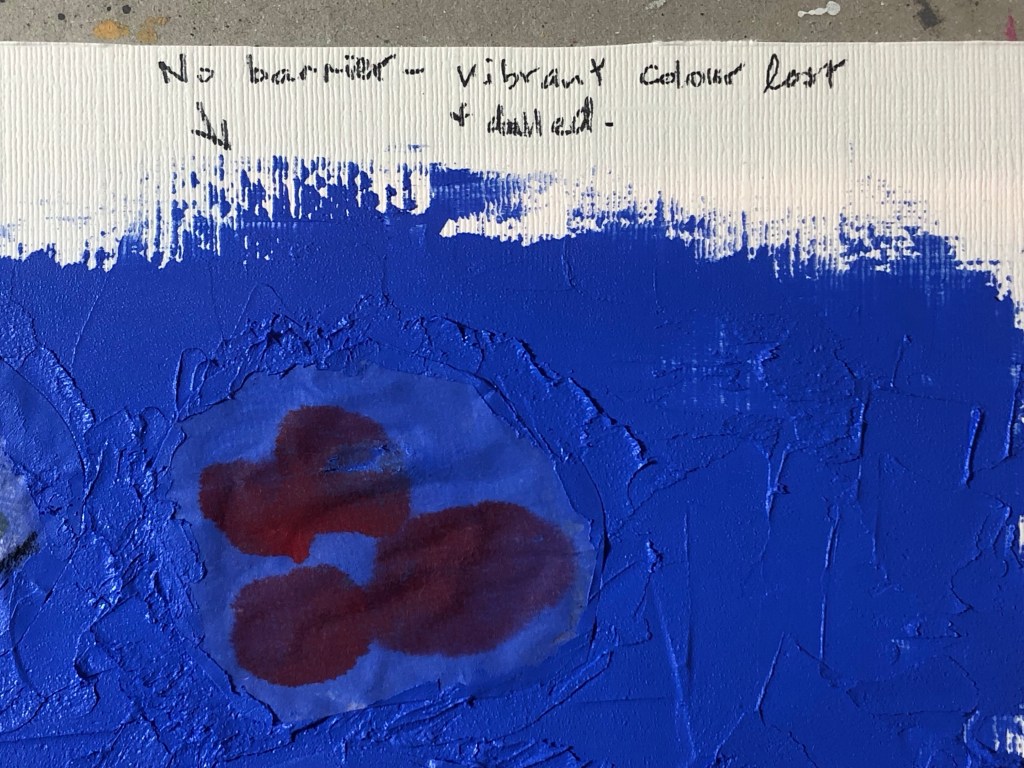
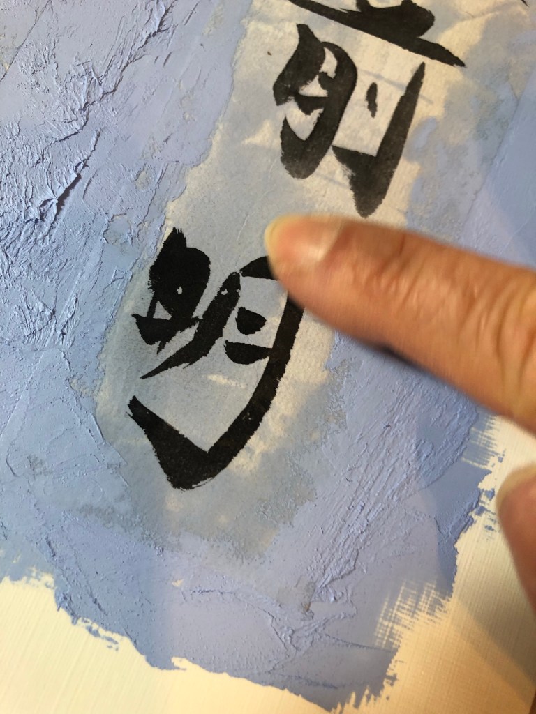
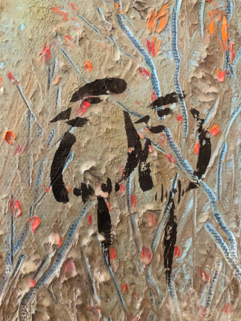
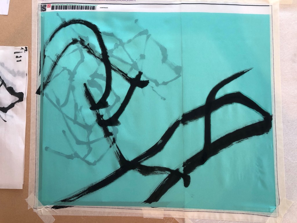
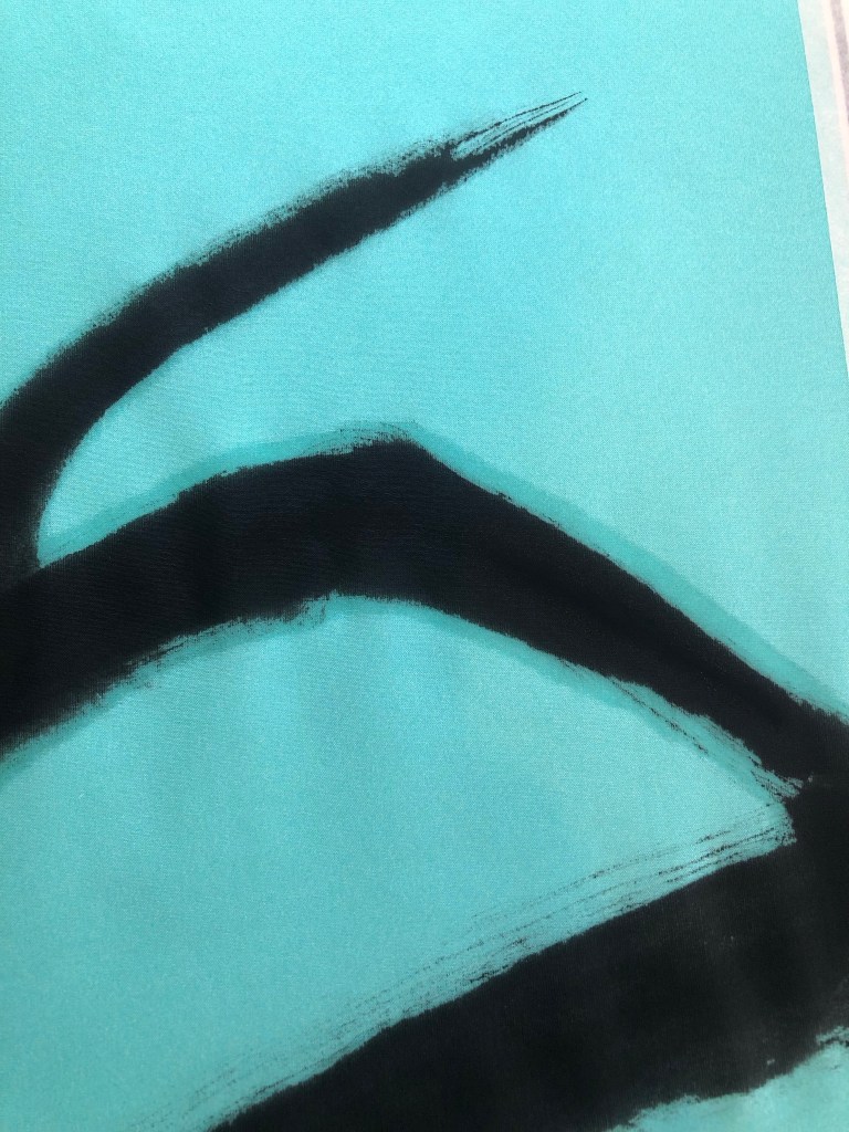
I was not happy with the felt backing because the moisture was not being absorbed fast enough and the silk therefore retained the moisture for too long and started to spread – as can be seen in the close up photo:

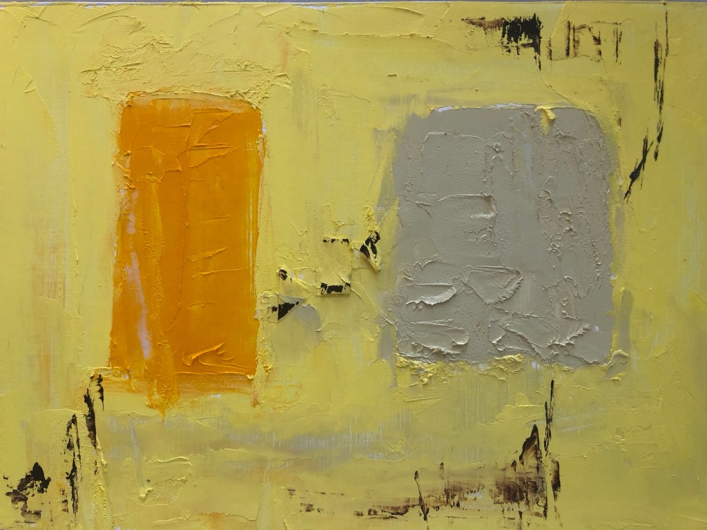
So the decision was to use Xuan paper as the backing material for painting on the silk. I started with the A1 piece as practice. Since I do not have a stretching frame for silk painting, I taped the whole piece onto a large board to stretch the fabric.

Below is the finished A1 painting. I was not happy with the painting because the brush loading was too heavy for the branches and as a result, the painting overly dominated the piece. I was disappointed in this but was pleased that I learnt this before doing the A0 piece.

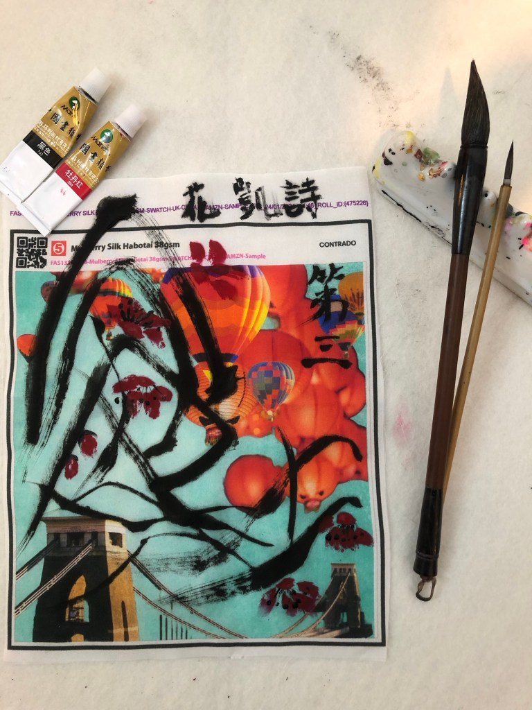
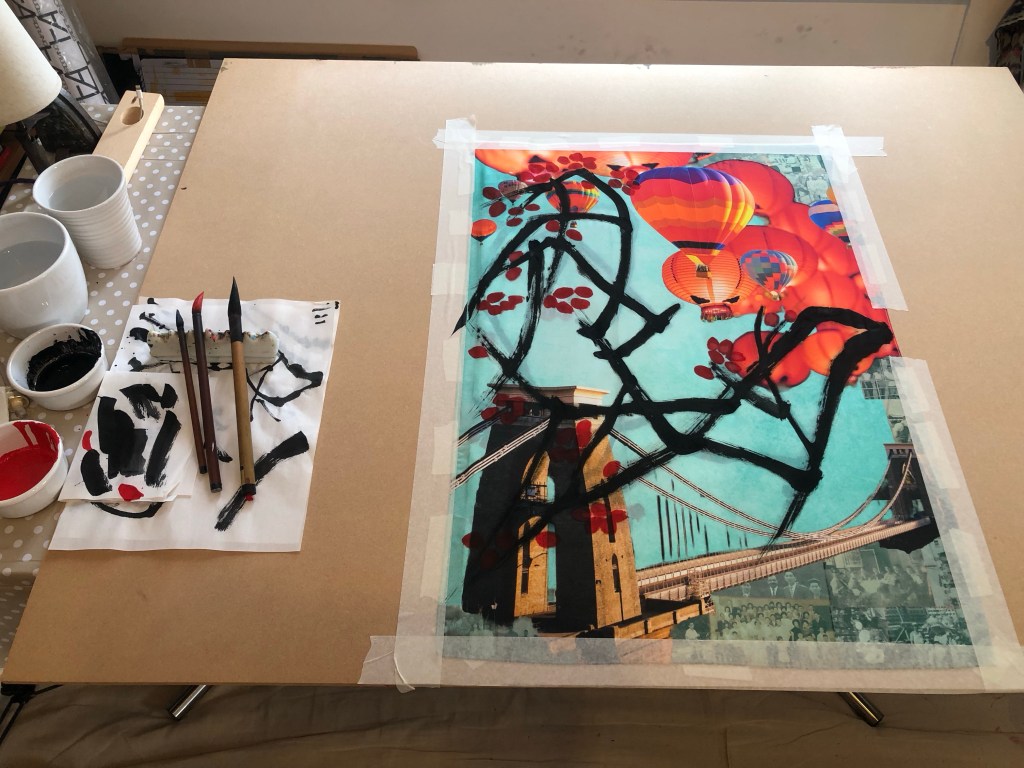
I used the ‘stuck together scrolls’ of Xuan paper from the earlier practice as the backing for painting the A0 piece. It also gave me some rough positions of the composition. The edges of the silk was taped down to ensure the material was sufficiently stretched.

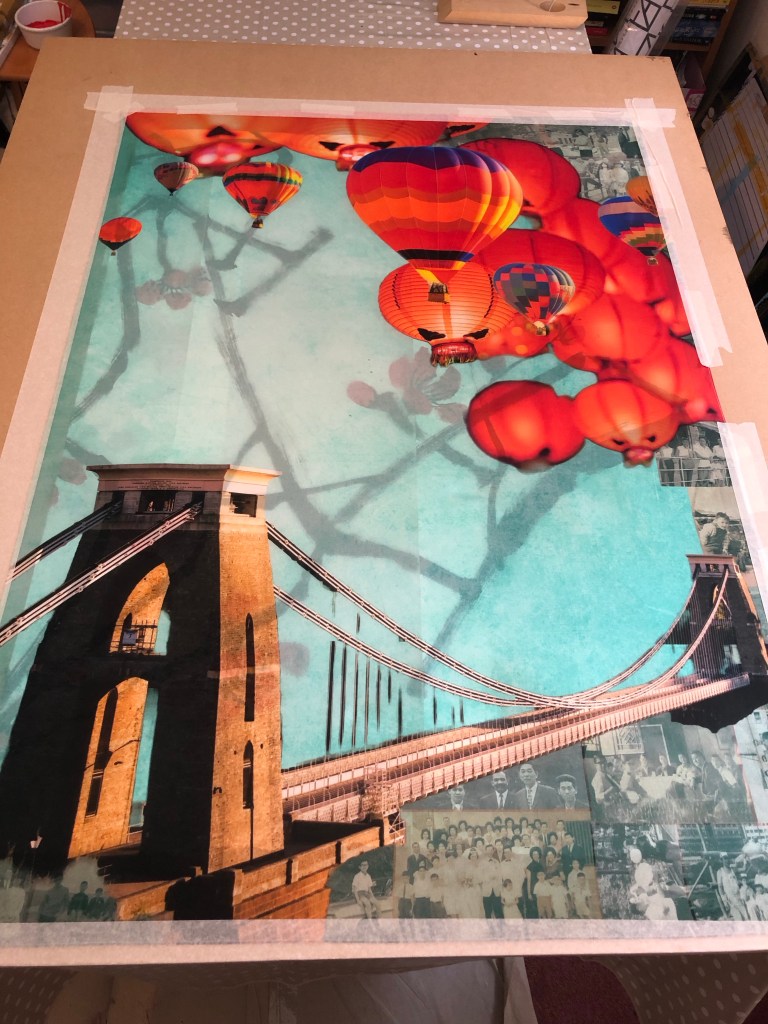
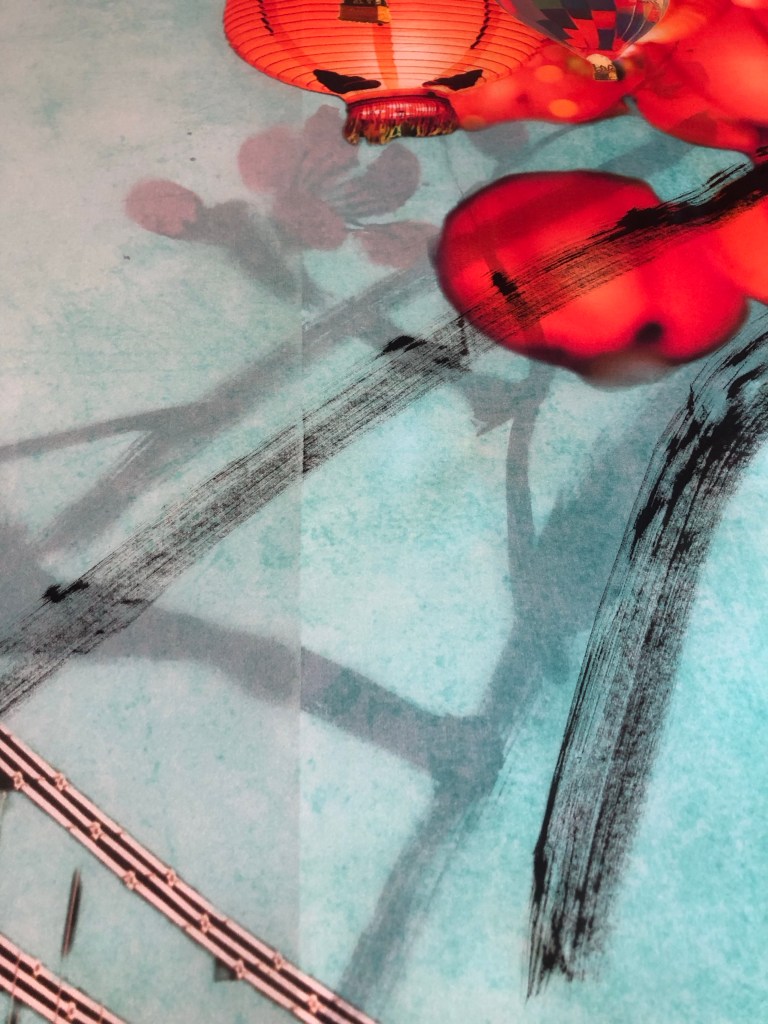
After doing two strokes, I could see the ink picking up the seams of the paper underneath which was not good at all. Once I started painting I was reluctant to stop because it would interrupt my ‘energy flow’, however, I had no choice but to put down my brush and lift up the tapes partially to pull out all the Xuan paper underneath. This was not ideal but had to be done.

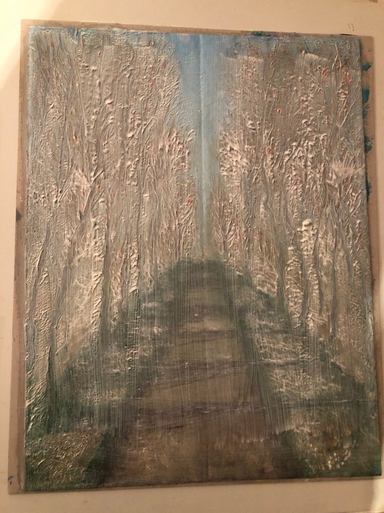
With all the backing paper removed, the painting process could resume but with no backing paper to help absorb the ink, there was only the MDF board underneath which was a risk because I hadn’t experimented on MDF before.

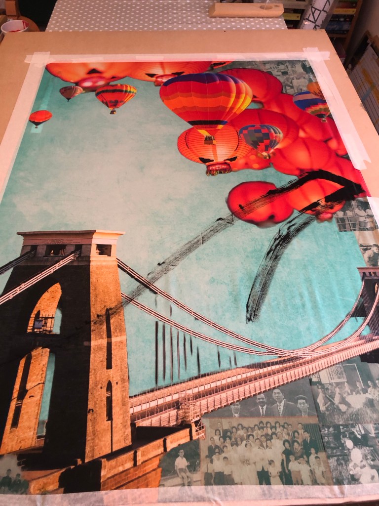
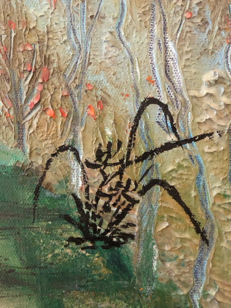
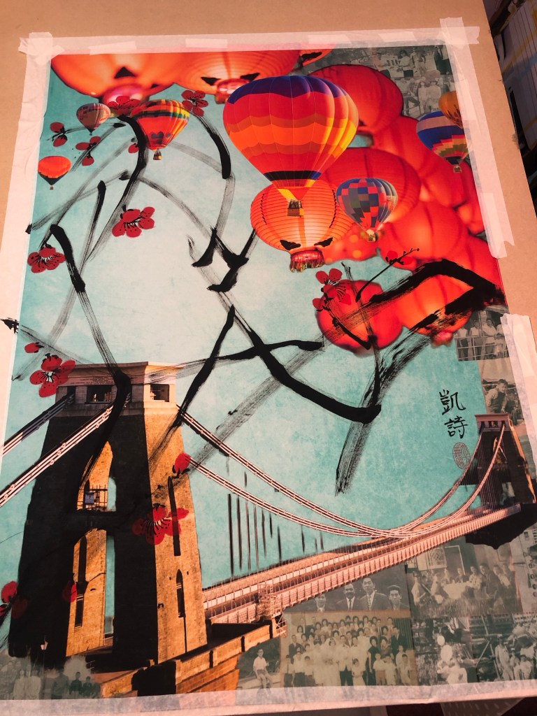
It worked fine and I reduced the brush loading as well as the number of branches planned for the composition because I didn’t want to overwhelm the overall image with too dark brush strokes.

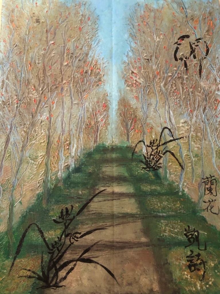
The plum blossoms were then added. I also reduced the number of blossoms and tucked some between the balloons and lanterns. I wanted to leave sufficient negative space on the left of the painting to create tension on the canvas juxtaposing the busy right hand side of the image.

After completing the Chinese brush painting, I had the choice of finishing it there, or adding some spray painting. I like adding street art style spray painting to my work because of my home city of Bristol being home to many great street artists and the city is full of beautiful street art. Hence street art is a big part of my heritage.

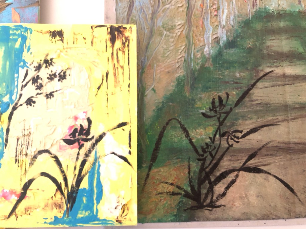
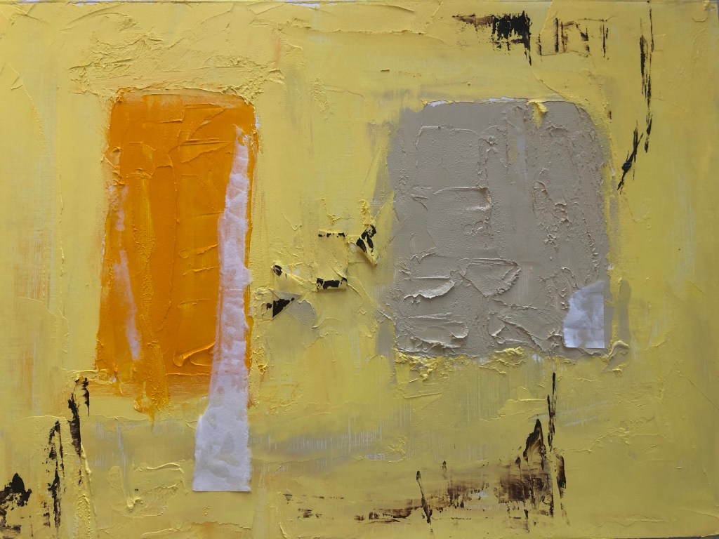
I was mindful that the canvas is already filled with images and I didn’t want to overdo it. Also I didn’t know how my spray paints would perform on silk. So I experimented with the A1 piece first:

I sprayed some two tone black and white stencilled letters on two lanterns saying ‘3RD SP’ for Third Space:

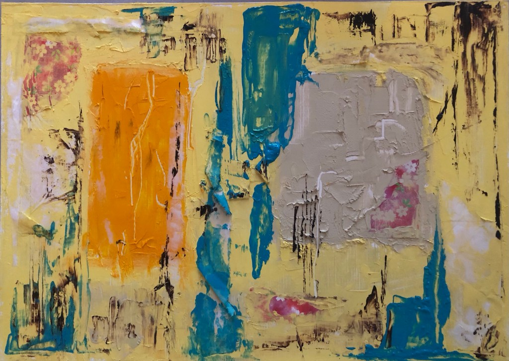
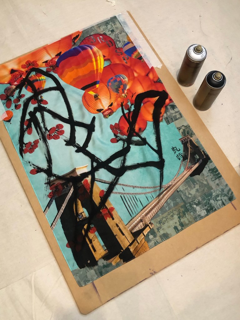
I was happy with the outcome so I started to lay larger stencils on the A0 piece:

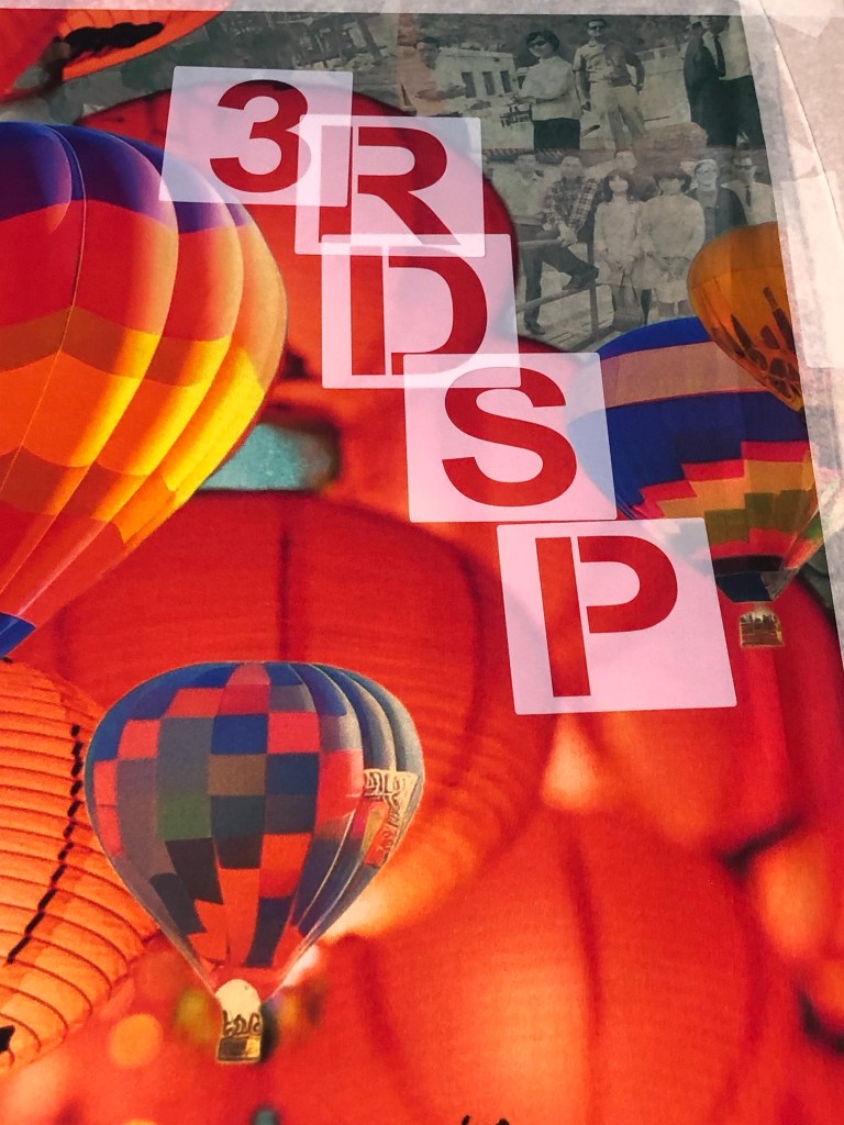
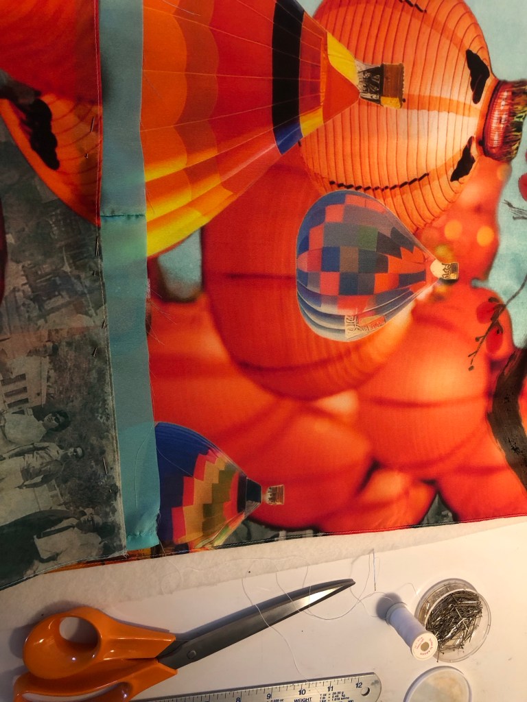
‘3RD SP’ was too much, so I went with just ‘3RD’. I masked off the area and proceeded to spray one letter at a time.

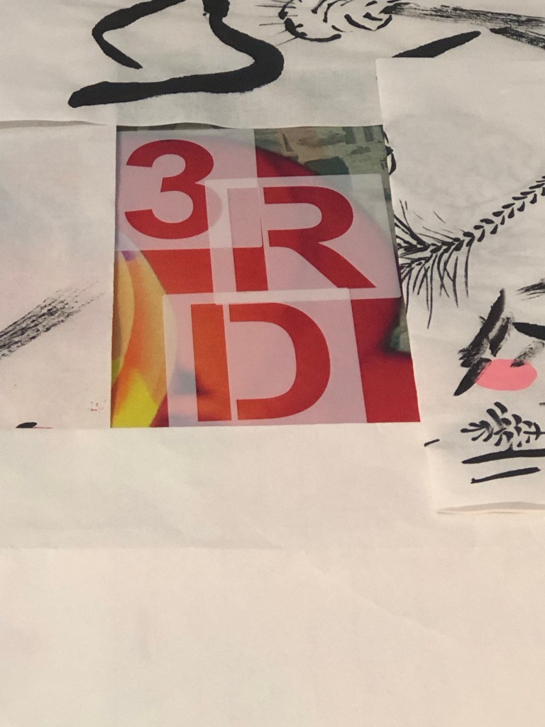
It worked out fine and to take further risk, I added a ‘#’ to proceed the lettering to add a contemporary feel.

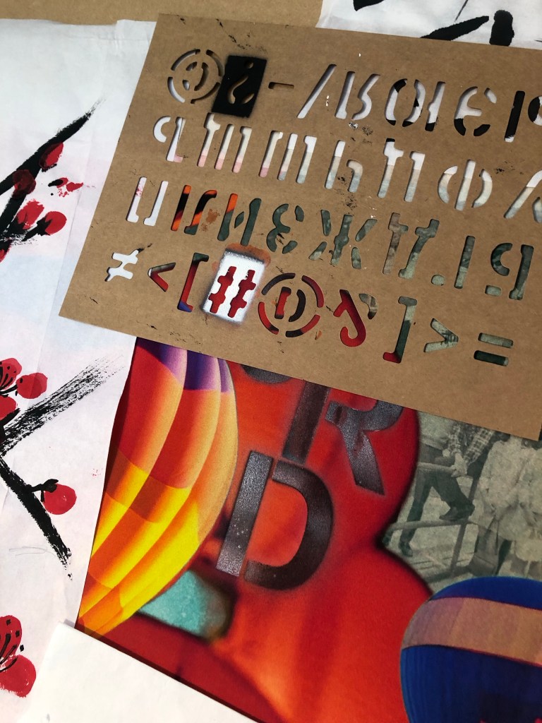
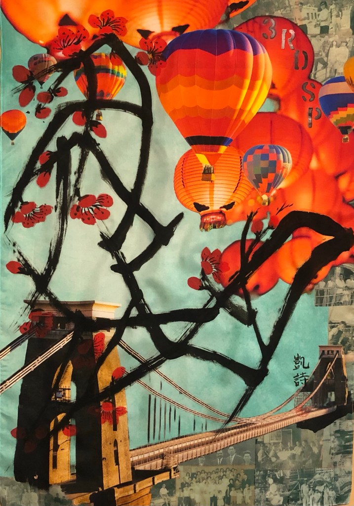
After spraying, I found that for some parts, the spray paint seeped through the thin silk and nearly glued the material to the MDF underneath. The silk was rescued in time and was safely lifted off the board.

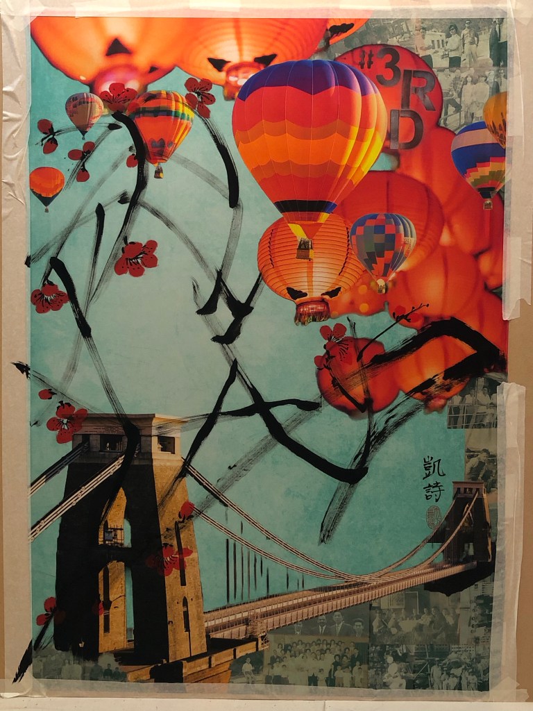
The finally finished work:

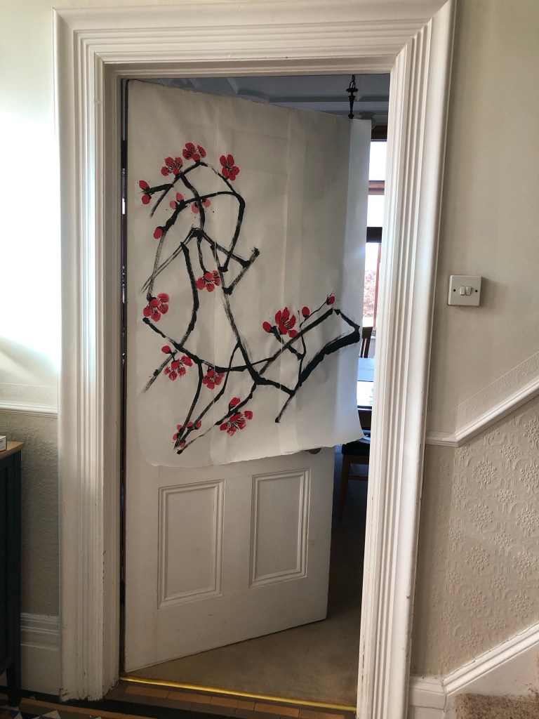
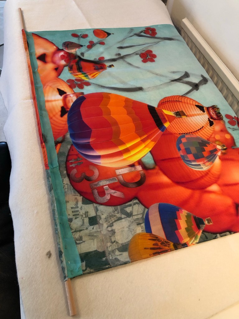
Since I have decided to use this piece for the MA interim show, I had to work out how to hang it.

I have chosen to hang it off a piece of 1 metre x 10mm diameter wooden dowel. this means I had to sew the header of the silk to make provision for the hang. I wanted to minimise losing the images at the top especially to avoid losing my father’s face on the top right photo, I added a piece of silk material ‘tape’ at the top as follows:

The sewing was complete and the silk painting was hung off two metal brackets to simulate how it would hang at the show:

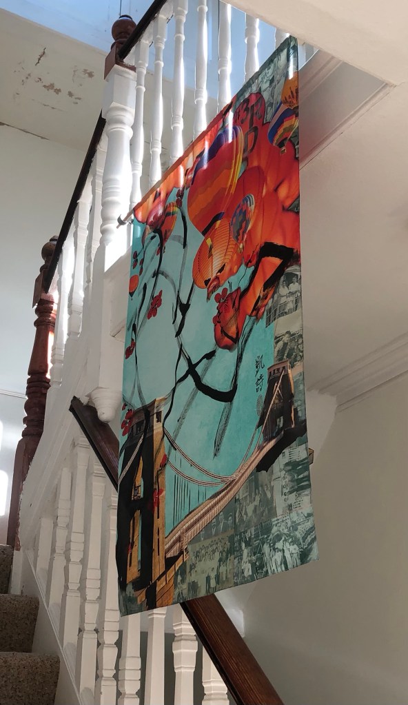
One of the reasons for choosing a thin 38gsm silk material was that I wanted the image to be visible from both sides if it was hung in free air. This is how it looks from behind and I am happy that the image is still visible:

REFLECTIONS

This whole piece of work has turned out to be a much larger undertaking than I imagined because of:

– Using family photos in my digital collage: aside from the emotions involved (which I have not fully resolved yet), there was much work involved in ensuring the resolution was good enough for printing on A0. The print company Contrado was excellent in checking through my design before I placed the order.

– Using new materials: I learnt a lot from choosing the right kind of silk material but it was also very risky because I had not worked with silk before and the thinness of the fabric made it very fragile to work with. The whole process was new to me and I had to make it up as I went along. Due to the costs and lead time involved in purchasing the printed silk, I had to take extra care in the experimental process to minimise wastage of materials as well as time.

– Going large: I wanted to challenge myself to create something new for the MA interim show, hence I went for A0. I found it very challenging because I am still very new to Chinese brush painting and that lack of experience made the process much more stressful than if I had gone for medium that I’m familiar with such as oil paint or acrylic.

What I was happy with:

– I learnt a lot in making this piece of work, documented here and in Part 1. I learnt about new methods, materials and processes. All the practices and trials were essential.

– Starting to use old photos in my digital collage. I still have many photos in my archive that I could use when I feel ready and able to. I have to manage the emotions and fragility involved in using such precious materials. But I have made a start.

– I was happy with the final outcome and was relieved that I have something for the MA interim show.

What I was not happy with:

– I should have anticipated some of the mistakes along the way, it was all useful learning despite being stressful at the time.

– Since the A1 silk experiment didn’t go well with the branches being too dark (overloading of the brush), I was overly cautious with the subsequent A0 piece. Also, my paint brush was not quite large enough. It was one of my mother’s brushes. There was a larger one but it would have been far too large, also, its bristles were starting to fall out and I didn’t want to damage it further since I want to preserve my mother’s brushes as much as possible. So I made do with the smaller sized brush. I would have wanted thicker branches for the A0 piece. Additionally, I could have loaded the brush a little more but I was worried that it would turn out like the A1 piece. Hence I was being overly cautious. It all comes down to my inexperience with Chinese brush painting. I hope this will improve over time with more practice.

Further reflections:

I have spent much of my MA first term developing methods to work with oil and cold wax, however, when it came to the MA show, I went back to an earlier method of transcultural layering where digital collages were printed onto a thin fabric then a Chinese brush painting was layered on top. I thought I would be more familiar with this latter approach but the change of fabric to thin silk and going large made it more challenging than I expected. I am pleased I went with this because it has renewed my enthusiasm for this transcultural layering method and now I have several other ideas in mind to try. I want to continue to pursue both ways of transcultural layering for my practice, namely:

1. Western medium as the lead with oil or oil and cold wax as the top layer, scraped back to reveal images pre-printed on the canvas. The canvas here would be robust such as woven linen/cotton or board.

2. Chinese medium as the lead with digital collages printed on silk and Chinese brush painting or calligraphy layered on top.

Which one to use will depend on the context and the kind of painting I want to make. My current plan is to continue to work on both methods.

LEARNING

– I learnt a lot about working with silk and will continue to use this material. I need to look into buying or making a silk stretching / painting frame that can accommodate large pieces of silk, A0 or larger.

– I gained confidence with my Chinese brush painting and there are no short cuts there – practice and planning are key.

– From the aesthetics exploration perspective, I learnt a lot from the mistakes in the A1 painting. It’s easy to overwhelm an image and it showed once again for me that negative space is so important. Often less is more and leaving space on the canvas creates tension that engages the viewer. I was hesitant in adding the spray paint but I really wanted to do it to bring in that aspect of my Bristol heritage. I am pleased that I did it and managed to reign it in.

NEXT STEPS

– Look into a better set up for painting on silk such as a large stretcher frame.

– Source a few larger good quality Chinese paint brushes for larger scale work.

– Do a new piece of transcultural layering work with a new digital collage of family photos for use with another silk painting or oil and cold wax.

MA Y1 U1: Exploring Aesthetics – Part 1 – Using photos

BACKGROUND

In the ‘developing style’ strand of my practice, I have been exploring how to create ‘transcultural’ images in my art through a process of transcultural layering. I have done some work in this area before starting my MA and I now want to return to it to continue my exploration of transcultural aesthetics as part of my practice.

Below is a piece of work that I did a year ago and I now want to pick it up and develop the piece further with some new ideas, materials knowledge and techniques that I have learnt since starting the MA. The work was originally created using dispersion liquid to transfer a digital collage image from paper to a polyester satin canvas, then the Chinese brush painting was painted on top in ink. 

I have recently researched into using better quality fabric as the canvas for digital printing as well as for Chinese brush painting. The findings are documented here and the results will be used in this work:

MA Y1 U1: Research – Digital printing on fabric

Below is the original digital collage created using Adobe Express. It has an image of the Bristol Clifton Suspension Bridge which is a famous iconic bridge in my home city of Bristol. I live very near the bridge and often drive or walk over it – it has meaning for me and is one of the images that means ‘home’ to me. Every August, there is a Bristol Balloon Fiesta and there are many images online with hot air balloons flying over the Clifton Suspension Bridge – again, those are iconic images for Bristol. When I made this original digital collage, I used Chinese lanterns instead of hot air balloons flying over the bridge as an attempt to create an overall effect that combined things from the different cultures that have been part of my life. The background teal colour and effect were purposely ambiguous – is the background image associated more with Chinese or Western culture? It’s up to the viewer to interpret.

METHOD

Taking the original image, I wanted to create more depth and interest in the sky. Therefore, a few hot air balloons were layered over the top in the foreground with the Chinese lanterns appearing to be further back giving a better feeling of depth. Different hot air balloon images were tried and this was the final version. The colours of the balloons were adjusted in the software to harmonise with the existing images. I was happy with the bridge image and no further changes were made to that.

As part of my narrative development work, I have been researching my family in Hong Kong and I have been given many old family photographs. I remember the photos very well because they were from the family photo albums at my childhood home. I have been wanting to use the photos in my work but I have been reluctant because I have not resolved my feelings towards them – I am not sure if I am ready to use them yet. 

I have always taken much inspiration from the Nigerian-born American artist Njideka Akunyili Crosby and her use of personal photographs. Below is one of her paintings that I saw recently in an exhibition at Tate Modern. Her technique of using faded photo images in the background is often seen in her work. Her images are evocative and they resonate with me because of what my family photos represent for me. 

.

Furthermore, at my tutorial last year, I discussed my reluctance to use the family photos with my tutor and he suggested that I try to use a few, perhaps use the ones that were less meaningful to me as a trial. So I picked out a few that were of larger groups, many were family friends and not people that I had strong emotional bonds with. Nonetheless, they were wonderful photos that represented the place (Hong Kong) and a time period when my late parents were young. The photos still had meaning for me because I remember clearly seeing all of them in our family photo albums and many had images of my parents (who passed away some twenty years ago). The digital images of the chosen photos were imported into Adobe Express and arranged on the collage. The transparency of the images were increased so that the background colour of the collage came through partially giving a more faded and blended effect.

REFLECTIONS

– From a personal perspective, I am pleased with this experiment as I feel I have made progress in making use of the family photos. Getting started was a challenge because all the photo images seemed too precious to use even though they were all digitised. I stared at the images for a while before deciding to choose the less precious ones. It was a strange process in determining the ‘rating’ of how precious or personal a photograph felt to me when each one held a story. The process eased once I got started so I am happy that I did this experiment because I feel I have a way forward in using the treasure trove of all the old family photos – this part of my exploration will remain a slow process but I have made a start.

– From the technical and aesthetic perspectives, I am happy with the new learning gained in using the digital tool to manipulate the images especially with the photo transparency. The outcome was the effect that I was looking to create. My ‘aesthetic goal’ is to create a transcultural feel for the piece, meaning the work represents and originates from my ‘Third Space’ (as described in the book The Location of Culture by Homi K Bhabha). Akunyili Crosby talks a lot about making work from her Third Space, hence I find much resonance with her work.

– This work is an example of where the two strands of my practice (developing style and developing narrative) mutually inform and I hope they will eventually converge when I have developed a more definitive style.

– I now have to source the fabric to print the image onto, then do a Chinese painting on top. I will source the printed fabric from Contrado as explained in this blog:

MA Y1 U1: Research – Digital printing on fabric

– I am considering making this work for the MA Interim Show in March 2024 if the rest of the process works according to plan. So I have been doing lots of practice Chinese brush paintings to test the techniques, composition and to choose the best paint brushes for the different parts of the intended painting – a plum blossom.  

.

.

LEARNING

– I remain happy with the transcultural layering process that I started a year ago and I want to build on this line of enquiry with my latest learning to find the transcultural aesthetics that I have been searching for.

– Digital collages of a combination of found images and old family photos have a lot of potential for creating the transcultural aesthetics that I want. But I am looking for more than just a digital collage, so the collage can be the background on the canvas and then I can paint on top with Chinese brush painting (reflecting my heritage) and/or spray painting (reflecting my home city of Bristol which is famous for street art and there are plenty around for inspiration). Also, the oil and cold wax exploration that I have recently started can also be part of the layering process. I am mindful that the key is not to overdo the layers or overwhelm the image; I must remember to ‘leave room for the image to breathe’ creating tension on the canvas. My purpose for the different material explorations is to give myself options in my art making knowing what materials go together in order to create the desired aesthetical effects.

– I made a start in using my family photos and I feel I can do more with this approach, especially as the two strands of my practice start to mutually inform.

– I will proceed with this piece of work with the potential of using it in the MA Interim Show, so I need to think about how to hang the piece.

NEXT STEPS

– Order the chosen silk fabric and the printing of the digital collage.

– Decide on the final composition for the Chinese painting and practice on larger paper ready for the real thing.

– Think about ways to hang the piece.

– Make more work with using the family photos – a long term project.

MA Y1 U1: Research – Digital printing on fabric

BACKGROUND

Further to this blog:

https://eliza-rawlings.com/2023/10/10/ma-y1-u1-project-one-investigation-of-techniques-for-digital-printing-on-canvas/

I went onto the CSM campus to visit the Digital Printing Lab in January 2024 and discussed my requirements with a very helpful technician. Although the lab had great facilities, the only printer that could print onto silk is a UV printer. The effect would be very interesting but the size of the printable area is limited to around 77x33cm. The size is too small for a piece of work that I want to do for the MA interim show, but for other work, I could potentially use the UV printer and stitch together pieces of fabric which could be interesting.

So I have to turn to commercial companies for fabric printing. My MA colleagues suggested Contrado which also offers 40% student discount:

https://www.contrado.co.uk

I looked at their website and was delighted with the products and services they offer. The type of printing on silk of satin fabric that they do is Sublimation Printing. Sublimation printing explained:

https://www.contrado.co.uk/sublimation-fabric-printing

I proceeded onto finding the right fabric for this research experiment.

METHOD

I started off by ordering a collection of samples of all their materials and the relevant colour charts. Fabric samples are listed here:

https://www.contrado.co.uk/poly-satin?optionValue=3768

A large quantity of fabric samples and colour charts arrived and I sorted through them all to pick out four fabrics to proceed for testing. 

I ordered two poly satin and two natural silk materials. For the first print run experiment, I used a digital collage image that I had created previously and recently updated. One that I hope to use for the MA Interim show if this experiment works. 

The samples arrived and Contrado gave me a couple of extra prints of one of the materials which was a bonus. They all looked good and useable:

The idea is to do a Chinese brush painting of plum blossoms onto the fabric with the digital printing. The result of each experiment is show below:

Real 100% silk satin 85gsm
Silk sensation (poly) 90 gsm
Silk impression (poly) 41gsm
Mulberry silk Habotai 38gsm

REFLECTIONS

Reflecting on the results – the best outcome for me was the Mulberry silk Habotai 38gsm because:

– The material absorbency was just right. It absorbed the ink and contained the liquid well within the brush stroke. Whereas materials such as the Silk Impression (poly) was overly ‘sensitive’ in terms of absorbency; by this I meant it held onto the pigment but let the water from the ink spread beyond the painted area. This sensitivity would make it challenging to paint on because one has to carefully balance the water and pigment in the ink towards minimising the water which would make the brush flow (or glide) across the fabric difficult.

– The smoothness of the material surface, or fineness of the weave, was excellent. Meaning that the brush strokes did not pick up the weave pattern too much. Whereas Silk Sensation and Real Silk Satin both tended to show the weave too much. This would affect how the ‘flying white’ part of the brush stroke show up. For Flying White effect – see the tail end of the brush strokes in the Mulberry silk experiment where the canvas is partly shown in the stroke. The Flying White technique is important in Chinese brush painting and calligraphy because it shows the dynamism of the brush strokes.

– Area to be careful – the Mulberry silk Habotai material is quite transparent at 38gsm, so need to consider how to hang the final piece. E.g. to let light shine through or not.

LEARNING

– The key learning of the experiment is that Mulberry silk performed best and is the chosen material. I was delighted that I could find a suitable material with Contrado as they seem a good company to work with.

– I also learned a lot about how to analyse the results of Chinese brush painting on fabric – an area that is new to me.

NEXT STEPS

– Decide on the size of the piece to work on for the MA interim show and order the fabric.

– Complete the digital collage using Adobe Express – consider using old family photos.

– Practice painting the plum blossom and decide the final composition to go onto the fabric.

– Research and consider how to hang the piece, especially considering the transparency.

Research notes on the last point:

Ways to hang silk paintings –

http://www.visibleinvisible.com/pages/media/silk-paintings/silk-display.php

How to Hang a Tapestry 8 Ways

Chinese painting: Sumi-e painting – animal

BACKGROUND

At my monthly Chinese painting class, we have started to learn Sumi-e painting. Sumi-e means ‘water ink’ and water ink painting originated in China around 300AD. Zen Buddhist monks from China introduced this style of ink art to Japan in the 14th century where over time the brush strokes were reduced in number and simplified forming the Japanese Sumi-e style painting of today.

At a previous lesson, we started to paint leaves by copying from worksheets and this lesson we practiced some more.

The homework this month was to paint an animal such as our pet. No worksheets were given and we had to work out how to create our simplified style Sumi-e animal painting (without looking online for hints). This blog records the method I used for the homework.

METHOD

As a warm up exercise, I mixed the Chinese ink with water to ‘find’ the five shades that would be needed to depict tone in the painting. It took a few attempts to get the right result.

I made some pencil tonal sketches from photos of my sadly departed cats. Then overlaid the Xuan (rice) paper on top for painting.

Result:

Using the same method, a few close up portraits were painted:

Then I used a photograph and overlaid the Xuan paper on top to paint/trace the tonal areas:

First attempt of ‘tracing’
Second attempt of ‘tracing’

Then I started painting freehand without tracing. I had seven attempts and each time reducing the number of brushstrokes and simplifying the image.

Seven attempts at freehand painting

Close up of the seventh and final attempt:

REFLECTIONS

I have been wanting to learn Sumi-e painting because I see it as a way towards semi-abstraction in Chinese brush painting which is something that I’m interested in. I enjoy the thinking that is involved in this making process.

I enjoyed the exercise and was pleased with the outcomes as early attempts. I do find Chinese water-ink or Sumi-e painting very challenging. It is the most unforgiving style and painting medium that I have used. With oil and acrylic, one can correct mistakes by wiping off or painting over. Even watercolour can be corrected to a certain extent. Since the depiction in Sumi-e is done by one stroke and going over a stroke makes it look clumsy, therefore everything has to be as perfect as possible for each stroke, such as:

– Water/ink pigment balance for the tone.

– Amount of water/ink on the brush (and depending on the type of hair for the brush) to match the absorbency of the type of Xuan paper used for each stroke. The paper or silk is usually highly absorbent which makes it challenging.

– Placement of each stroke and the pressure along the travel.

It is very challenging and I love it. I feel the tension within myself in a way that is unlike any other painting media. I expect it’s also because I am so new to this and I need a lot more practice. The process of simplifying was also challenging like solving a puzzle which added to the pleasure of this way of making.

LEARNING

– Mixing the five tonal shades at the start and having plenty of ink of each shade made up really helped. However, I still find myself mixing as I went along especially for the ‘double loading’ technique.

– Tracing over tonal drawings or photos helped to give confidence at the practicing stage. Practicing in this way helped me to progress onto freestyle painting.

– Understanding the structure or anatomy of the subject is essential for the simplification process to work.

NEXT STEPS

– Keep practicing to build knowledge of the materials and process.

– Try other animals or objects.

– Start to think about how to incorporate this approach into my transcultural style development work.

UPDATE

Below is an update on Sumi-e painting progress since the session detailed above.

My tutor asked me to do a free-hand cat portrait without using any pencil drawings as guide under the Xuan paper. Below are the outcomes:

The following lesson was on Sumi-e flowers:

REFLECTIONS

I have enjoyed Sumi-e painting because I am more interested in free style Chinese painting (techniques are akin to Sumi-e) than the meticulous style. So these paintings have been good practice for me. The key is to keep practicing in order to master the skills required in applying paint having understood how the materials work together with the painter.

MA Y1 U1: Exploring media – Oil and cold wax – Part 7

BACKGROUND:

This is an experiment to complete one of the actions from an earlier blog – Exploring media – oil and cold wax Part 6. The action was to:

– Experiment with a barrier or masking fluid to prevent the oil from seeping into the Chinese brush painting images.

This experiment is required because the Xuan paper (rice paper) used for Chinese brush painting is very thin and absorbent, therefore if the paper was laid over materials such as oil in my transcultural layering work, the oil paint underneath would seep through and ruin the Chinese brush painting image as happened in Part 6 of this blog series.

METHOD:

The three barrier fluids chosen for this experiment were: Dispersion liquid; PVA glue and matte Mod Podge.

Some small images painted using Chinese ink were used for this experiment. The back of each image was painted with one type of the barrier fluids with one image left bare as ‘control’ for the experiment.

A paper canvas was painted with a mix of oil paint and cold wax:

The Chinese painted images were cut out and pressed onto the oil and cold wax. The images were pressed hard onto the painted canvas using a palette knife to robustly test the barrier performance.

Below is the result – an overall image followed by close-ups of each test area. 

Result: The best outcome was the Mod Podge.

REFLECTIONS

I am happy with the outcome of this experiment. This was a quick experiment but a very important one because, as shown in this blog series, it has been challenging to incorporate Chinese brush painting onto oil or oil and cold wax – the latter being my chosen ‘Western’ medium for my current series of transcultural style development work. The outcome of this experiment has helped me to find a viable way forward and I can now move onto developing colour palettes and aesthetics for my style knowing that I have found a way to combine the materials from different cultural origins without losing any material integrity.

LEARNING

The learning here is a straight forward one. Mod Podge worked well as a barrier fluid to protect the Chinese ink work before incorporating it into the oil and cold wax ‘collage’.

NEXT STEPS

Pick up from the previous post (Part 6) and resume the next actions from there. The immediate next action will be to research and develop colour palettes that can help to communicate my transcultural narrative.

ADDITIONAL EXPERIMENT

I was given two pieces of specialist Chinese painting paper by my Chinese art teacher. They are:

– Beijing bark paper, and

– Cicada wing paper (because it’s so thin that it resembles the wings of cicadas).

Both types of paper are of beautiful quality and feel very delicate. They are both very thin which would be ideal for what I’m looking for in my transcultural layering work. I.e. overlaying Chinese brush painting onto a more viscous medium such as oil.

I repeated the above experiment with these papers. I wrote some Chinese calligraphy characters on each sheet:

Then painted part of the image on the reverse side with Mod Podge as a barrier and leaving part of the image bare to compare:

Once the Mod Podge was dried. The two sheets were pressed onto a base layer of oil and cold wax. A palette knife was used for the edges, blending the paper with the oil paint to bury the edges. Then I used my finger to press the image into the oil:

Below is the outcome with the cicada paper performing well compared to the Beijing bark. The cicada paper appears to have an inbuilt barrier to protect the image, meaning that a barrier liquid would not be required as there was no perceivable difference whether Mod Podge was used.

Then more oil and cold wax was applied on top to blend in the image whilst avoiding the characters. Final result:

REFLECTIONS / LEARNING

Out of all the Chinese painting papers that I have tested in this series of exploration, the cicada paper was the best material for the purpose of my transcultural layering work involving Chinese brush painting and oil based medium.

Additionally, it was useful to discover that a barrier liquid (e.g. Mod Podge) would not be required with the cicada wing paper. This will help to reduce the process complexity.

NEXT STEPS

– Create a new piece of work that uses the new discovery with the cicada paper to refine the process and to learn more about the material.

– Source more cicada paper and find a long term supplier for this paper.

.

This experiment ends the series of blogs on ‘Exploring media – Oil and cold wax’.

Chinese painting: Poinsettia and Sumi-e

EXPERIENCE – PART 1

I attend a Chinese painting class once a month. This month being December, the topic was Poinsettia. See below images. They were copied from worksheets. These are skills practice exercises so I will only do a brief reflection.

REFLECTIONS – PART 1

I have enjoyed these work sheets more than the owls from the month before because I found it easier to be free with my paint application with this topic. I think it’s because I feel more confident with the subject. So this is good learning for me, that when I do abstraction work, I do better when I feel confident. When I am hesitant then brush strokes seem too deliberate and also prone to becoming too illustrative.

EXPERIENCE – PART 2

Introduction to Sumi-e painting

I was introduced to a new topic, Sumi-e painting, which will last the next few months. Sumi-e (水墨 water ink) painting is painting with ink and water and focuses on the simplicity of form. For this first brief introduction, the tutor asked us to practice mixing five shades using only black ink and water. Then we practiced doing different types of leaves.

I picked out one type of leaves and made a painting using only that type as practice. Below is my first Sumi-e painting.

REFLECTIONS – PART 2

Sumi-e is very challenging! It will take a lot of practice to get to know the materials – the simplicity of materials makes it hard. Just water, ink and the performance of the brush and paper used all come into play. I have always found Chinese brush painting very unforgiving, it is not easy and most of the time not possible to correct any mistakes – in that sense, it is more like water colour than oil or acrylic (that I am used to) where mistakes can be rectified quite easily. Sumi-e’s unforgiving-ness is at an even higher level. I can imagine practicing for a long time and still not perfecting that leave that I have tried to paint.  

I enjoy this challenge and I would love to be competent at Sumi-e because I like a good challenge; its simplicity of form and potential for semi-abstraction is what I find appealing. I am looking forward to continuing my learning of Sumi-e painting.

MA Y1 U1: Exploring media – Chinese ink on oil experiment

BACKGROUND

In exploring transcultural art and my own style, I have been looking for ways to do Chinese brush painting with ink on top of oil paint. I am hoping that through these experiments, I can find ways to combine eastern and western art materials in my work whilst maintaining the characteristics of both genre.

Here is an earlier experiment and this blog is a response to it:

MA YI UI: Exploring oil and cold wax

METHOD

In this experiment, I took an old oil painting that had a range of textures and I applied a layer of clear gesso on top of the dried oil paint to creat a surface for Chinese brush painting to see if that would work.

A thick layer of clear gesso was applied to an oil painting.
It was left to dry overnight.

After the gesso has dried, I painted various images using a Chinese brush and ink on different parts of the canvas to test out how the brush and ink performed on different textures.

A Chinese orchid was painted in the least textured area of the painting. Here the outcome was compared to a similar exercise on dried oil without gesso (painting on the left):

Two birds were painted in the tree branches which was the most textured area on the painting:

An orchid was painted in the medium textured area in the mid ground of the painting:

Some Chinese calligraphy was tested using different size brushes:

REFLECTIONS

For me, a smooth surface such as silk or Xuan/rice paper is required for Chinese brush painting to be at its best. So that the brush strokes can glide across the page. I painted the Chinese orchids in the experiment because to paint the long and bendy leaves in one stroke required a continuous smooth movement whilst slightly lifting and turning the brush. Similar to calligraphy. In the heavily textured area in the tree branches, I painted two birds because I knew that long brush strokes wouldn’t stand a chance in that area, hence the short and relatively straight strokes for the simplified birds. Since this is mainly an experiment, the technical outcomes are captured under the LEARNING section.

I will note here my reflections about how I felt during the process. I felt excited that there was another avenue to explore as I really wanted to find a way to combine on the same painting the Chinese and western materials. However, this experiment showed that although I have made progress, I have not found the ideal way to achieve my objective of combining the two different materials. Perhaps the challenges I have had is also a metaphor for my lived experience in navigating the two cultures in daily lives.

Another thought was that I should definitely research more on other transcultural artists’ work as I expect someone else would have done this before me.

LEARNING

– As expected, the smoother texture area (the large orchid) performed the best. In comparison to the earlier experiment of painting on oil without the gesso layer – it was clear that the one with gesso performed much better enabling the Chinese paint brush to glide more easily.

– The heavier textured areas had too much ‘pitting’ and even with a brush heavily loaded with ink (like with the bird on the left), it was hard to achieve a smooth stroke. Hence I don’t believe this combination of material would work satisfactorily for me. If I wanted to do Chinese style brush strokes on such a texture then I’m better off using oil on a soft brush, the oil paint would fill the pits more effectively even if not completely.

– The two sets of calligraphy were done with brushes of different size, the lower set was with a thicker brush and that comes across better. The thinner brush did not have the strength to deposit sufficient ink on the oil surface.

– There is further refinement I could do to smooth the oil surface such as sanding and more layers of gesso.

NEXT STEPS

– Research other transcultural artists to see if anyone has achieved Chinese brush painting on top of an oil painting.

– Research further how Fiona Rae achieved her Chinese style brush strokes with oil paint on traditional canvas.

– Using the same oil painting here, sand an area and then apply further layers of gesso, then sand again if needed, to see if that would create a smooth enough surface without damaging the original image too much thereby achieving the desired results.

Chinese painting: Owl

At this month’s Chinese painting class, we learnt to paint owls as part two of the feathered creatures series after painting the rooster last month. I enjoyed last month’s work on the rooster very much and preferred it to the owl.

Since these paintings are just copies of worksheets from class, I will not be reflecting on this work and this blog is merely a record of this month’s lesson.

MA YI U1: Exploring media – Oil and cold wax – Part 1

Background

I have been wanting to experiment with oil and cold wax in abstraction because I find myself often drawn to other abstract artists’ work using these specific media. For example, a local artist from Bristol called Julia Maleeva. Below are examples of her work.

Julia Maleeva – Belfry 100x150cm. Oil and cold wax on canvas:

Julia Maleeva – Lemon shadow in love 100x150cm. Oil and cold wax on canvas:

METHOD

The objective of this exercise was just to experiment and try out how the oil and cold wax work together, applied using palette knives. I also wanted to add elements of collage to give additional texture.

Oil paint and cold wax mixed in 50/50 ratio, with a twisted paper strip to see if the paper would stick or if adhesive would be required:

More strips of paper was added:

More experimentation in different areas:

Each area explained (background is oil and cold wax mixed):

1 and 2: colour blocks of oil and cold wax mixed in 50/50 ratio.

3: pure oil paint was added to see how it appears on top of oil and wax background.

4: Blue area was oil, cold wax and solvent mixed to a thin and runny viscosity.

5: A twisted strip of paper stuck on the paint without requiring adhesive.

6: Strips of origami paper stuck on without adhesive.

7: Paper strips stuck on/half buried without adhesive.

I tried doing some Chinese style painting using oil paint as a top layer.

REFLECTIONS

I was pleased with the experiment of oil and cold wax. I felt at ease working with the medium and it was a pleasure applying it onto canvas. I noticed the colours remained true but the wax did make the paint more matt. The solvent worked well to thin the viscosity and I can imagine using this mixture if I wanted the paint to run down the canvas with a dripping effect.

The paper collage stuck well to the medium although I expect additional adhesive would be required for larger pieces.

I was not happy with the Chinese painting using oil paint. I couldn’t use ink on top of oil as the ink would pool rather than be absorbed. Hence I used oil and the finesse of the typical Chinese brush painting was completely lost and the depiction was poor. So this is an area that needs further investigation to achieve the desired effect if I wanted a Chinese style painting as the top layer on top of oil in my multimedia layering work.

In addition to trying out cold wax as a medium, I wanted to return to exploring abstraction as a way to be more expressive in my work. In exploring my style through multimedia layering, I find myself often being drawn into being too illustrative or repetitive in my expression and I wanted to investigate my deeper thoughts through abstraction and this is the first experiment in this series.

LEARNING

This initial experiment with oil and cold wax was positive and it is a medium that I want to explore further in addition to just using oil. The cold wax would enable me to give more texture and structure to my painting. Also it would allow me to scratch through the paint/wax as an effective way of mark making. Adding paper strips could add interest but I would use that only on a small scale; I can imagine it coming loose in the long term if larger pieces of collage were used in this way.

I am still searching for the ideal way to paint a Chinese style painting on top of oil to help me to express the transcultural nature of my style – the challenge is to find a medium that delivers the finesse whilst being compatible materially with my preferred western medium such as oil. I will revisit research that I have previously done on an artist who has successfully achieved similar to the style that I am looking for – Fiona Rae. She was able to achieve Chinese style brush strokes using oil.

NEXT STEPS

– Continue to explore oil and cold wax and do another painting to build experience in this style of abstraction.

– Research further into Fiona Rae’s work and see how she achieved her Chinese style brush strokes using oil.

– Keep experimenting with oil and cold wax.

– Keep searching for ways to paint with Chinese ink on oil paint.