MY THOUGHTS ON THE BLUE WILLOW PATTERN
In my last Chinese painting blog where I painted a heron, I questioned what makes a piece of art ‘Chinese art’. Is it about the materials used or does it have to possess certain stylistic or aesthetic characteristics to be considered ‘Chinese art’? Thinking about this reminded me of how I find the Blue Willow pattern irritating. I don’t find it appealing and it irritates me that many people consider it ‘Chinese’. The Blue Willow pattern technically comes under the category of Chinoiserie art which is an European interpretation and imitation of Chinese and other East Asian artistic traditions. It started in 17th century and became popular in the 18th century. As the British Empire and its naval prowess went from strength to strength during that period, the demand for Asian and East Asian artefacts back in Britain grew rapidly giving rise to the popular Blue Willow China. I do not intend to go into the details of that part of Empire history in this blog, what I plan to capture here is my personal feelings towards the Blue Willow pattern.
For me, the Blue Willow is a poor form of appropriation. It was originally designed by English designers Thomas Turner and Thomas Minton, they both worked for the Caughly factory. Spode was believed to be the first factory to mass produce Blue Willow China around 1790. So it was an English design that was meant to look Chinese. Over the years, I have had numerous people (non-Chinese) telling me that they love Chinese art and they love Blue Willow China. It is hard to explain my ambivalence. On the one hand, it is good that someone is interested in your culture, but to quote something that does not represent said culture can be irritating. I am not irritated by those who expressed such views, but irritated by the fact that Chinese culture (I consider that partly my cultural heritage) is so widely associated for so long with an unattractive and poor quality design, especially given the concept of orientalism and the related history.
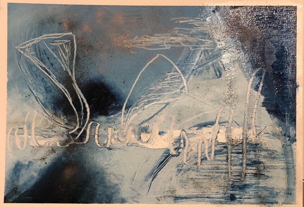
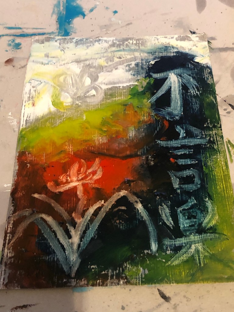
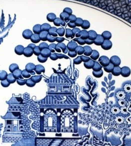
As a result of my ongoing ambivalence, I have became fascinated by the Blue Willow pattern. The more I research into its history, the more I feel amused by it. For example, a fictional story based in China was made up and marketed as the background history to the Blue Willow pattern in order to drive sales. It was apparently a successful campaign which was a clever marketing concept even in those days. I had never heard of such a story so I downloaded an e-copy to read because I was intrigued. It was not a particularly good story but it cleverly tied together all the elements of a typical Blue Willow pattern – good effort. Since starting my Blue Willow research, I have started to look out for Blue Willow China and have acquired some pieces to study from charity shops and street markets. The part that I find most amusing is the largest tree on the design bearing some large round shapes on its branches:
–
There are many theories published about what kind of tree this is – it is twice the height of a two storey pagoda, so too large for a fruit tree yet the round shapes look like fruit – so what is it? There are articles that claim it was possibly an apple, orange, pomegranate, peach or persimmon tree. None of those was really possible due to the size of the tree depicted unless it was a surrealist design which I don’t think it was. I believe it was in fact a Chinese pine tree which can grow up to 80 feet tall and were commonly depicted in Chinese paintings. The round shapes were meant to be clusters of pine needles that collectively can form a round or oval shaped silhouette. Often in Chinese paintings or carvings, pine needle clusters are done with a round or oval shadow then some individual needles are depicted to suggest their presence. It is possible that the designers of the original blue willow pattern either ignored the needles because they were so fine hence difficult to depict on porcelain, or someone who has travelled back from China having seen a similar design then described it and the original tree details got lost in translation (like a form of Chinese whispers ironically). It could also be that the tree design evolved over the years with the round shadows becoming the main form as simplification of the pine tree happened over time. As a result, the original pine tree details were lost. This is my opinion and I remain irritated that this design claiming association with Chinese art yet not much effort was made to get such basic details right. Hence my opinion that the Blue Willow design is a poor effort in appropriation; it is a case of an inferior product gaining success as a result of effective marketing to satisfy the demand for East Asian art during that period in history.
APPROPRIATION. APPROPRIATION.
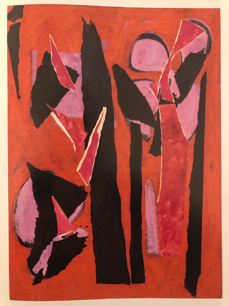
As a result of my irritation as well as ambivalence towards the Blue Willow pattern and its history, I have been wanting to make a piece of work about it to explore my thoughts further. I also felt it would be ironic for me to appropriate the appropriation.
METHOD
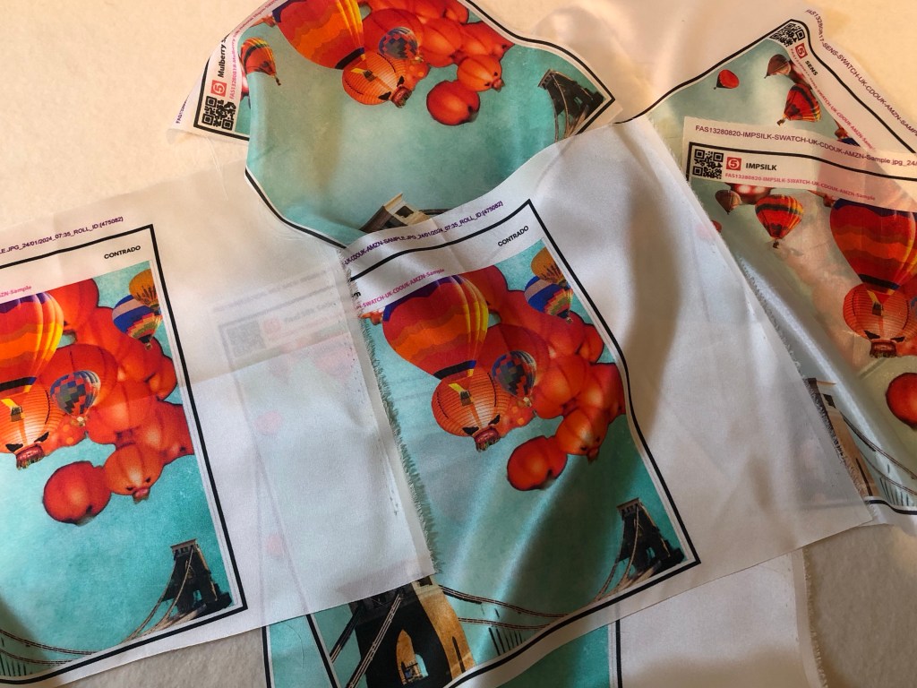
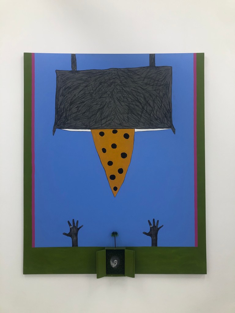
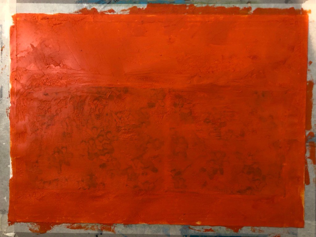
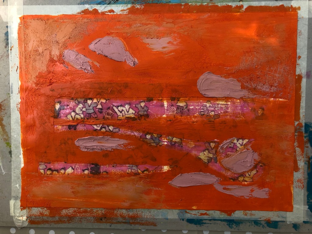
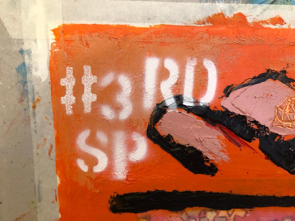
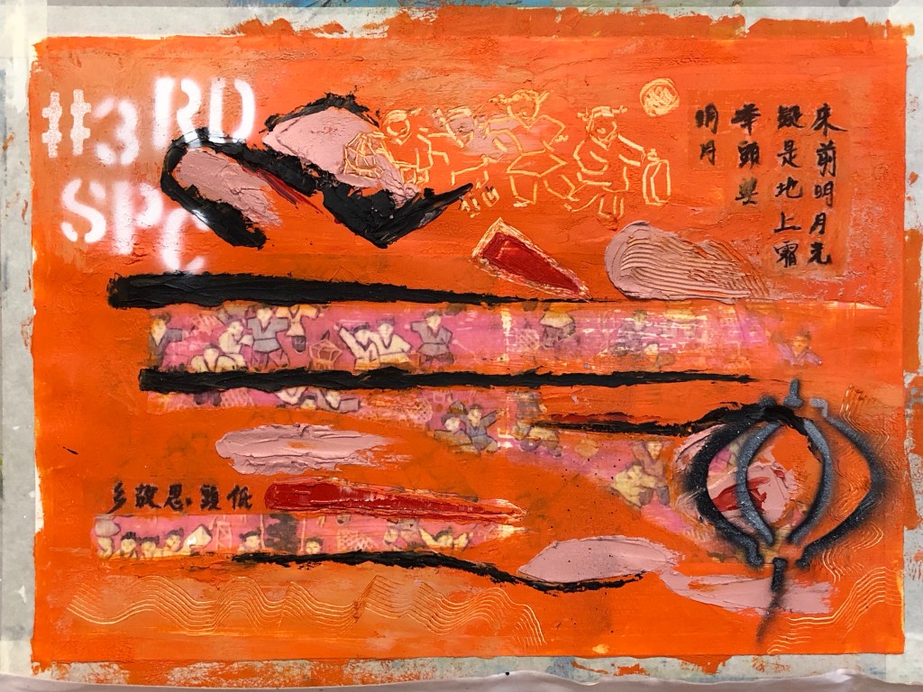
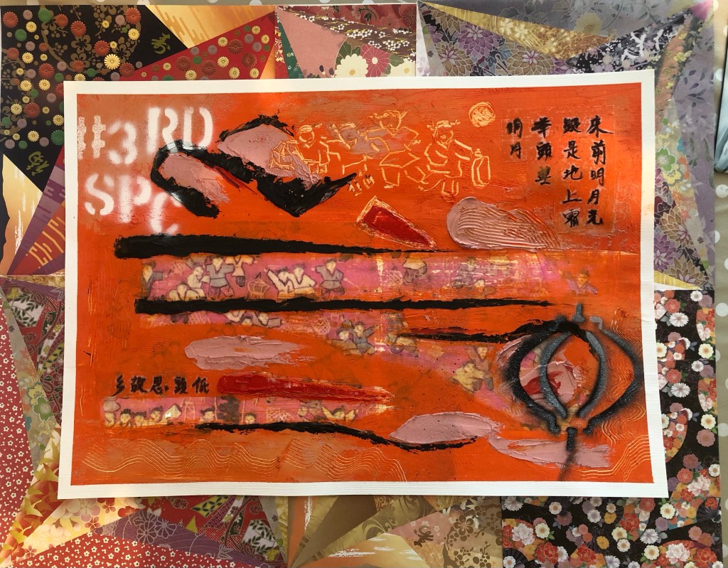
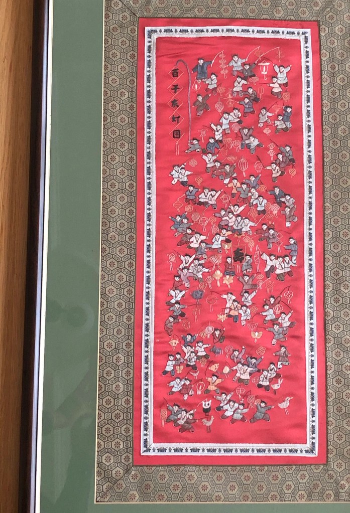
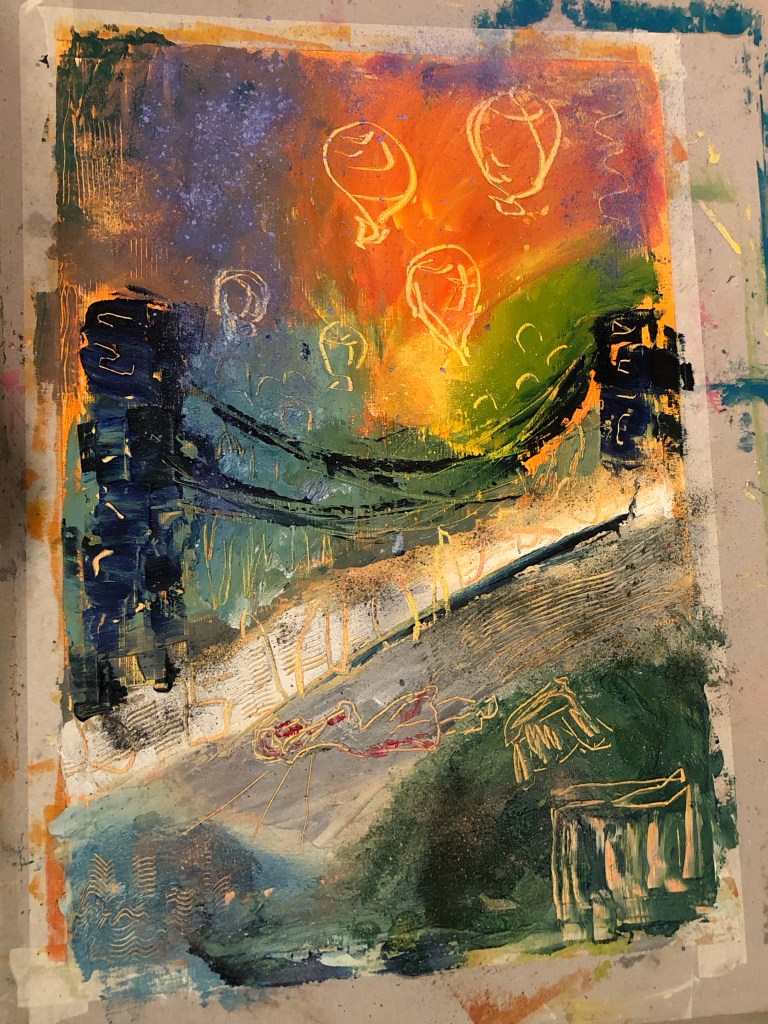
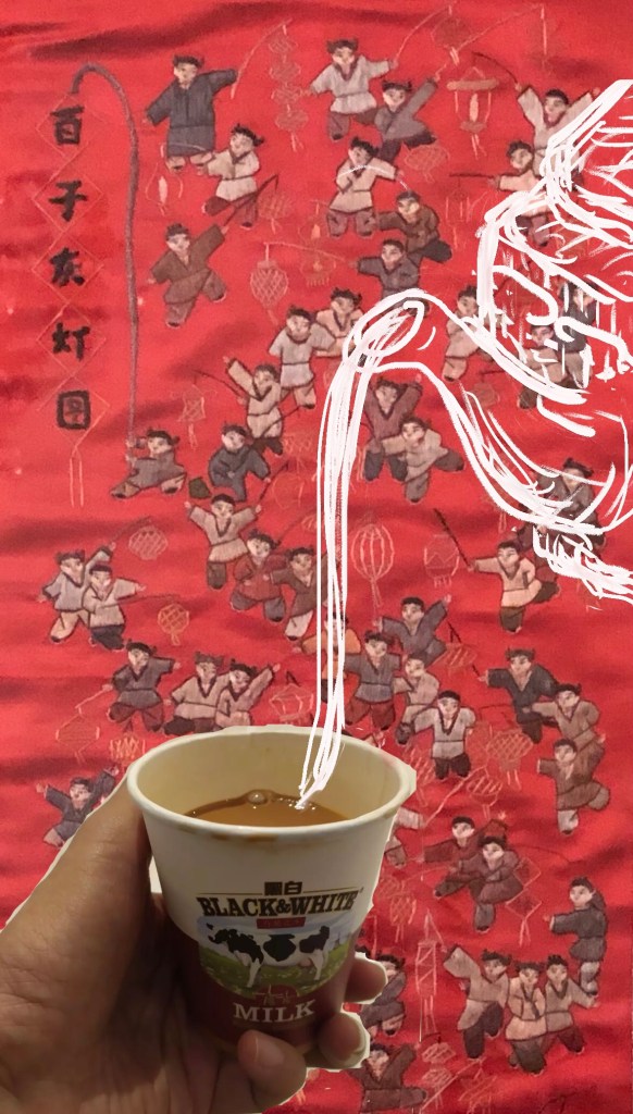
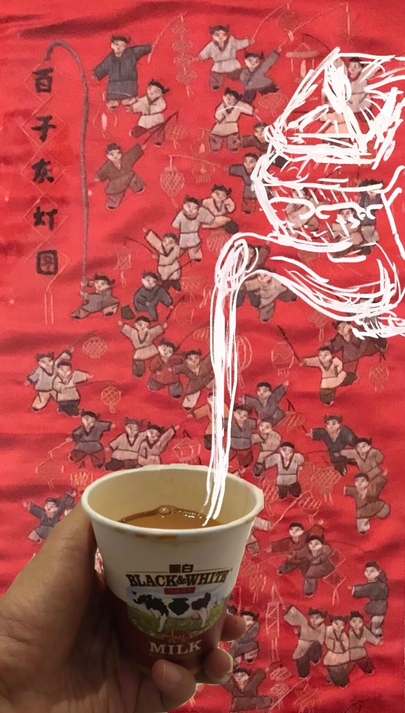
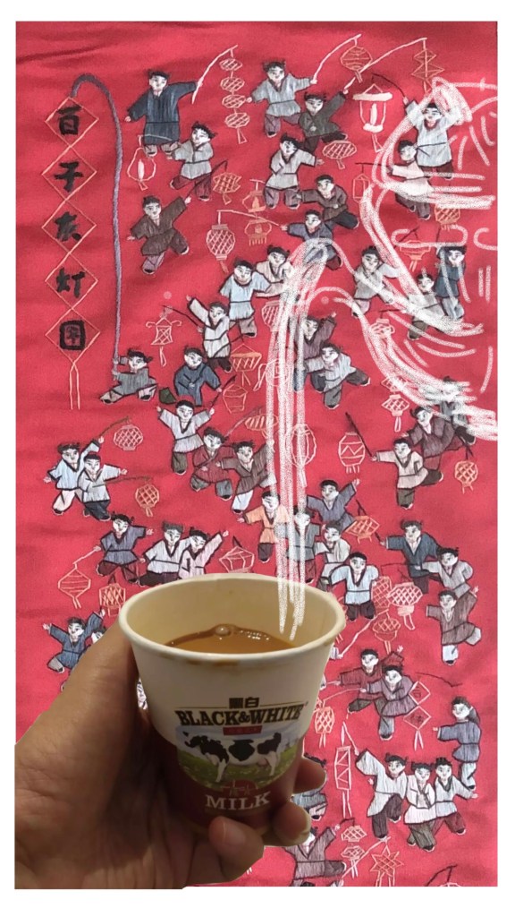
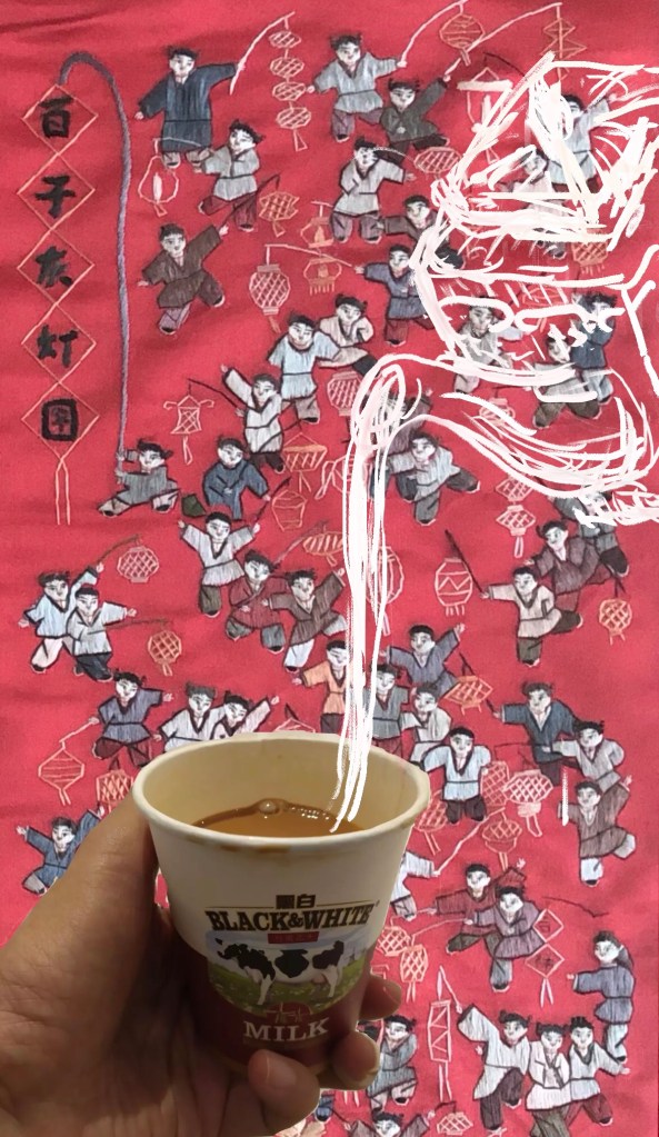
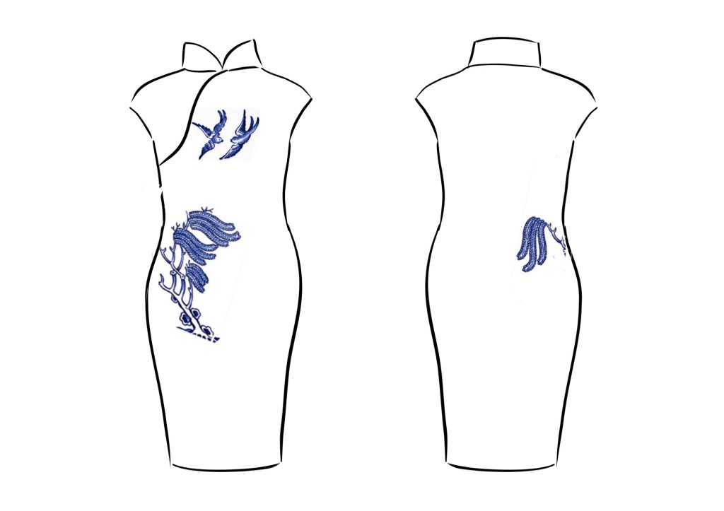
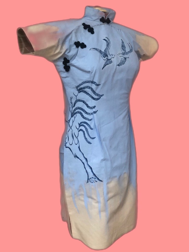
Following on from Cheongsam Series #3 where I had made a 3D canvas in the form of a wearable painting, I have decided to paint part of the Blue Willow pattern onto this canvas:

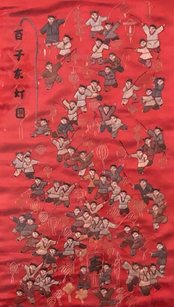
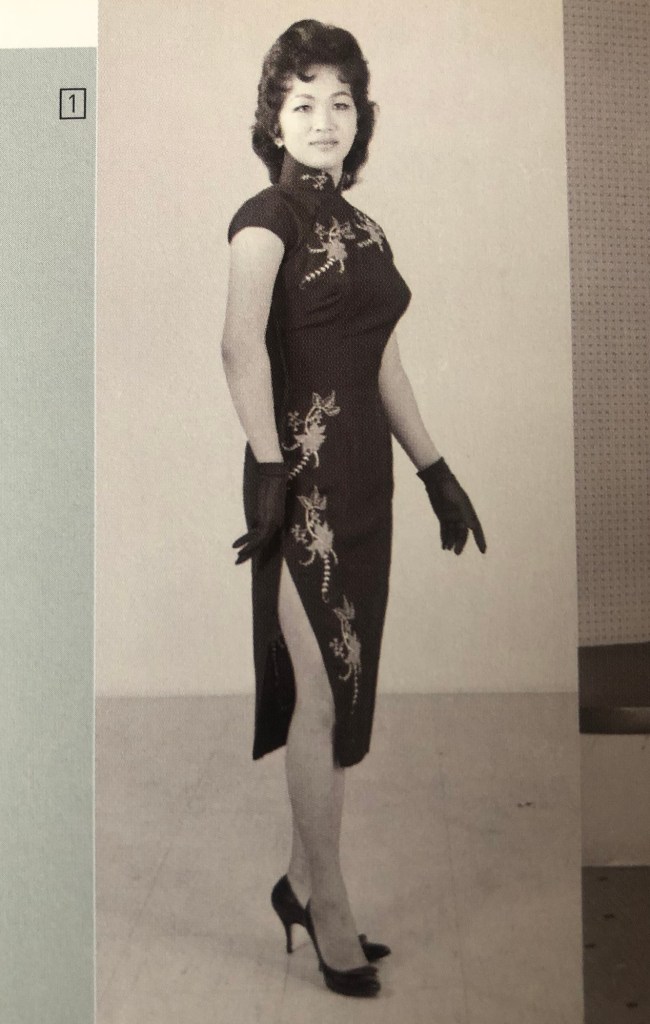
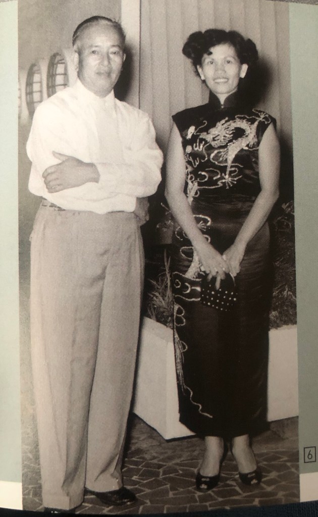
To decide where to place the images, I researched traditional Cheongsam designs and found the following images from the book In the mood for Cheongsam by Lee Chor Lin and Chung May Khuen, published by National Museum of Singapore. I particularly like these images where there are motifs on the chest and then the design runs down the right hand side of the wearer. I remember seeing such dresses when I was a child and thought the asymmetrical design was very elegant. So I want to create a similar design with this piece of work.
–
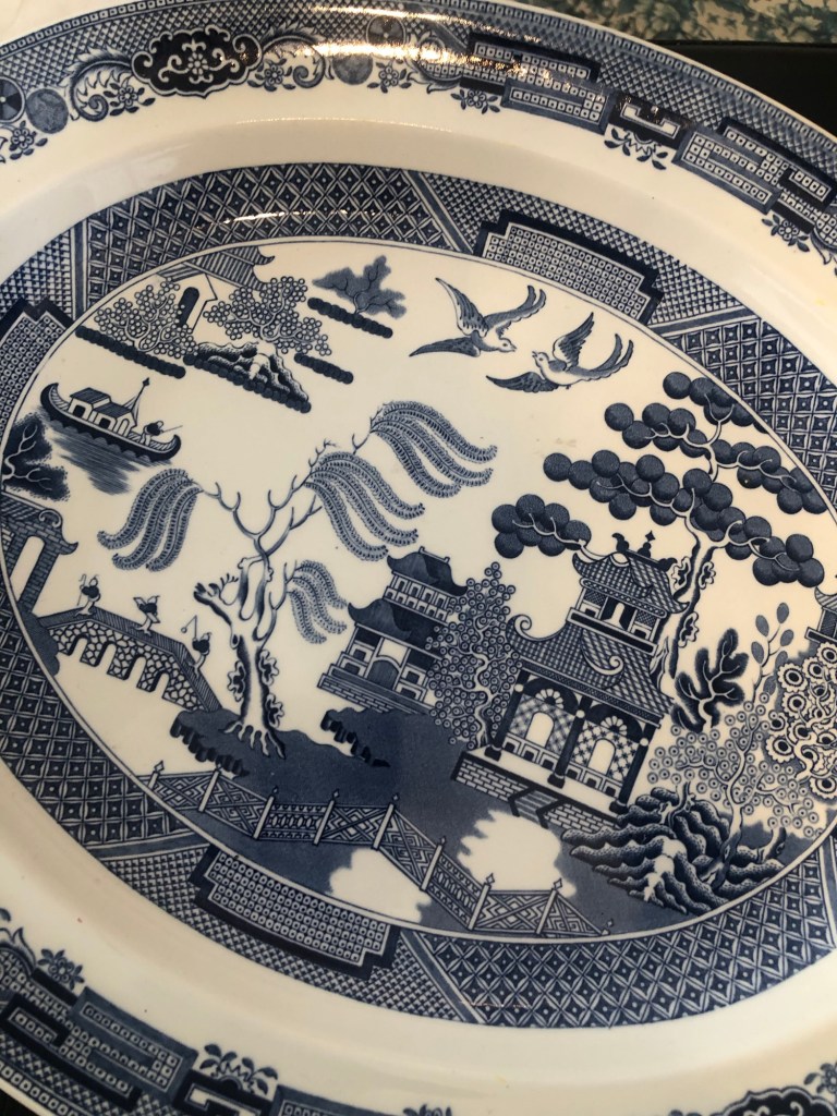
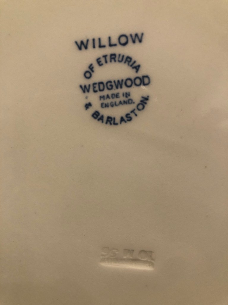
There are many variants to the Blue Willow pattern, I decided to use the one on an oval platter that I had bought at a London street market. The piece was made by Wedgewood and date stamped 1956.
–
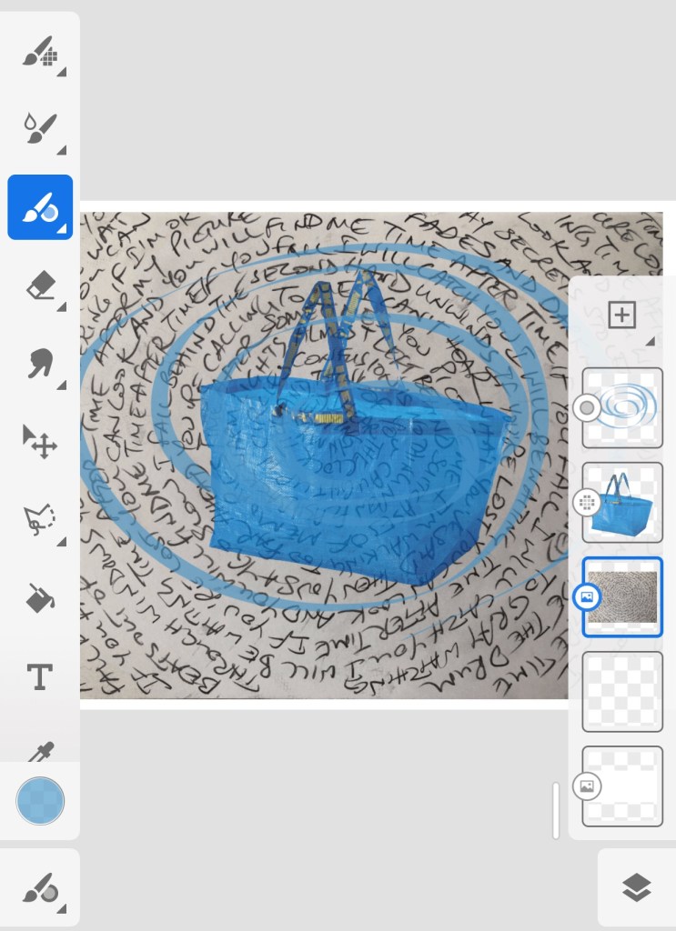
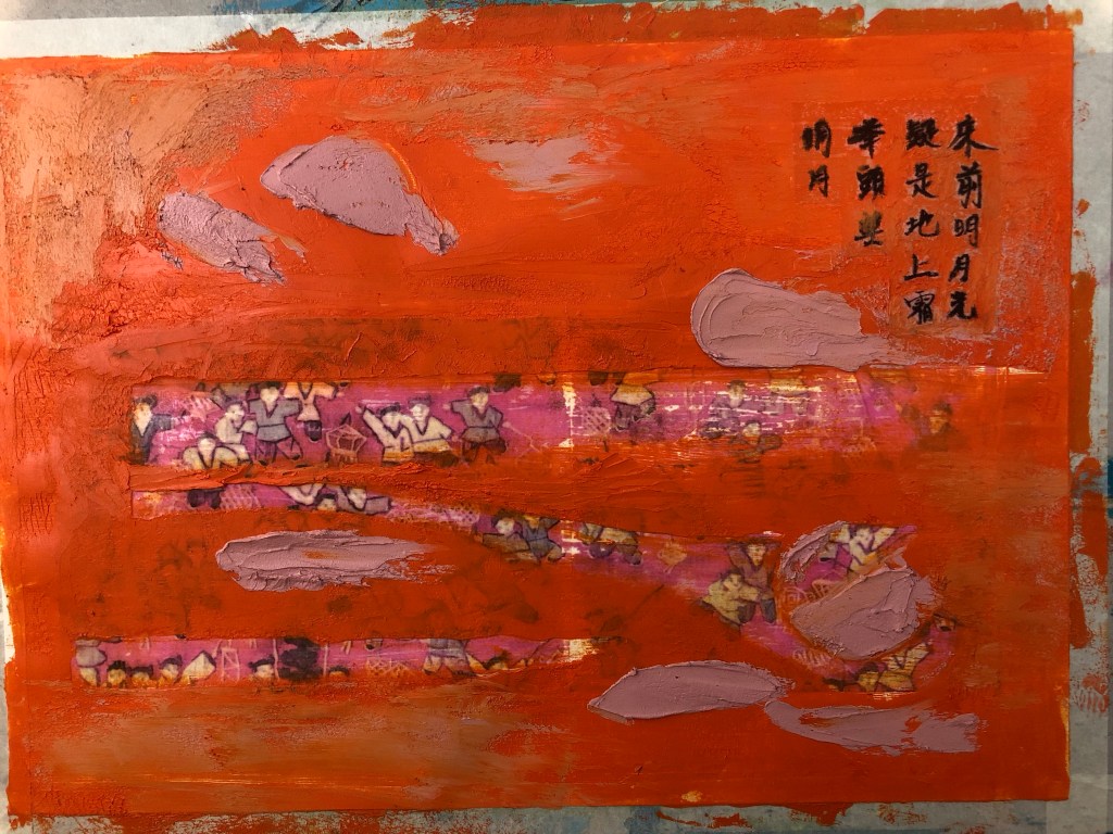
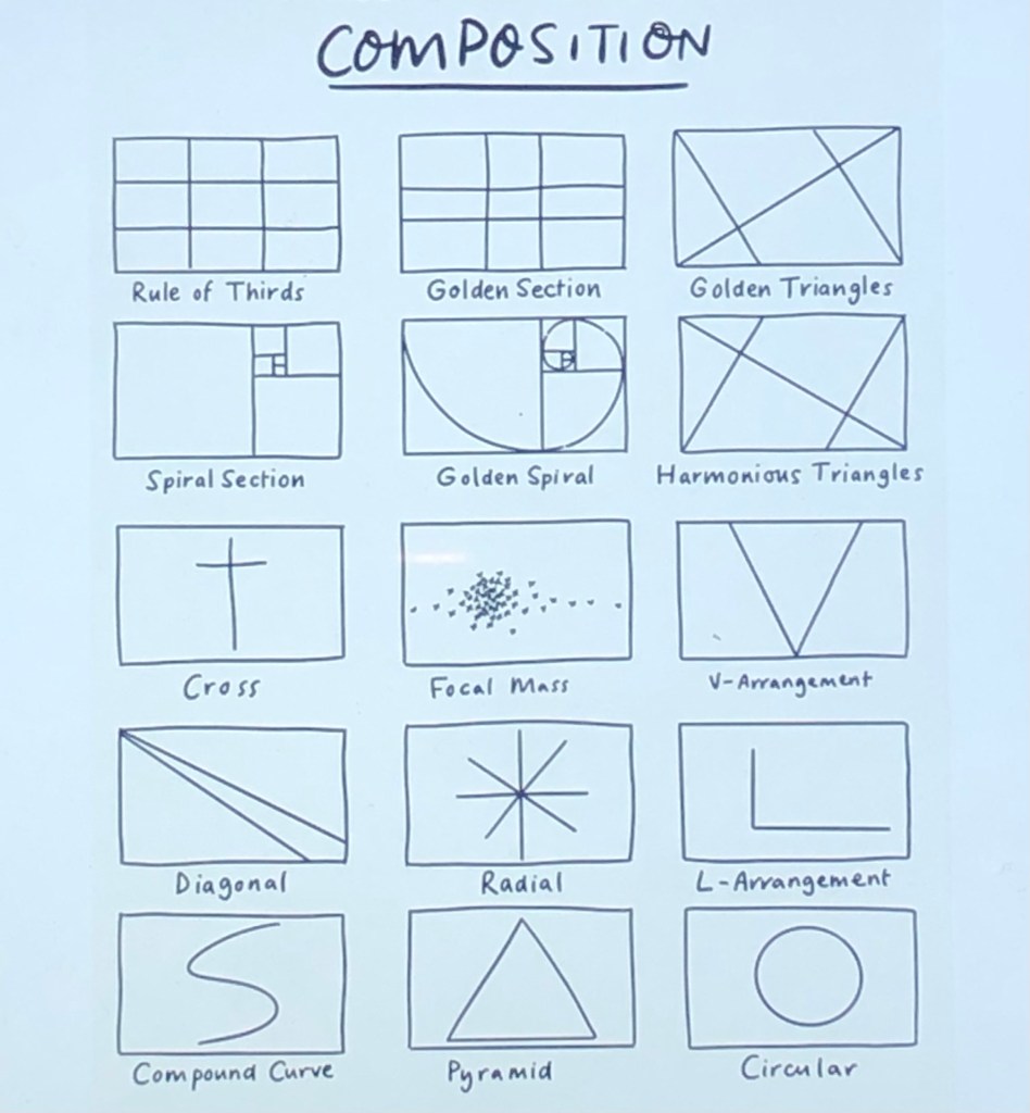
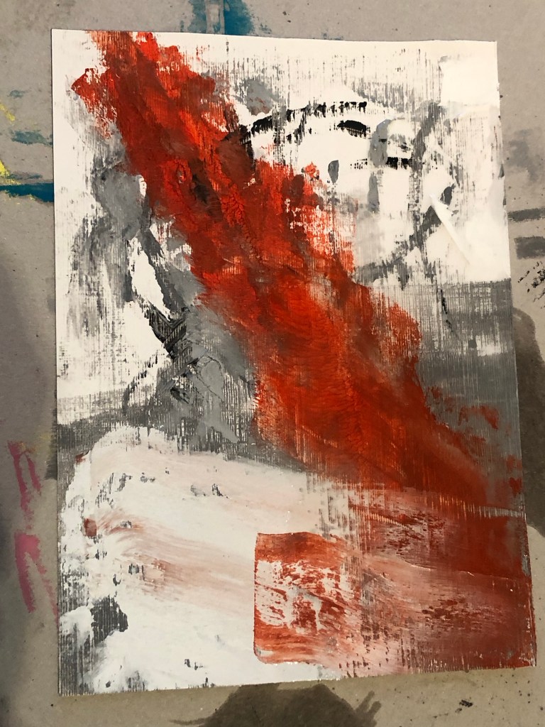
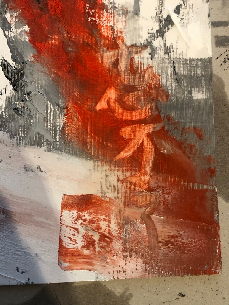
Adobe Fresco was used to explore the composition and the design below was chosen:
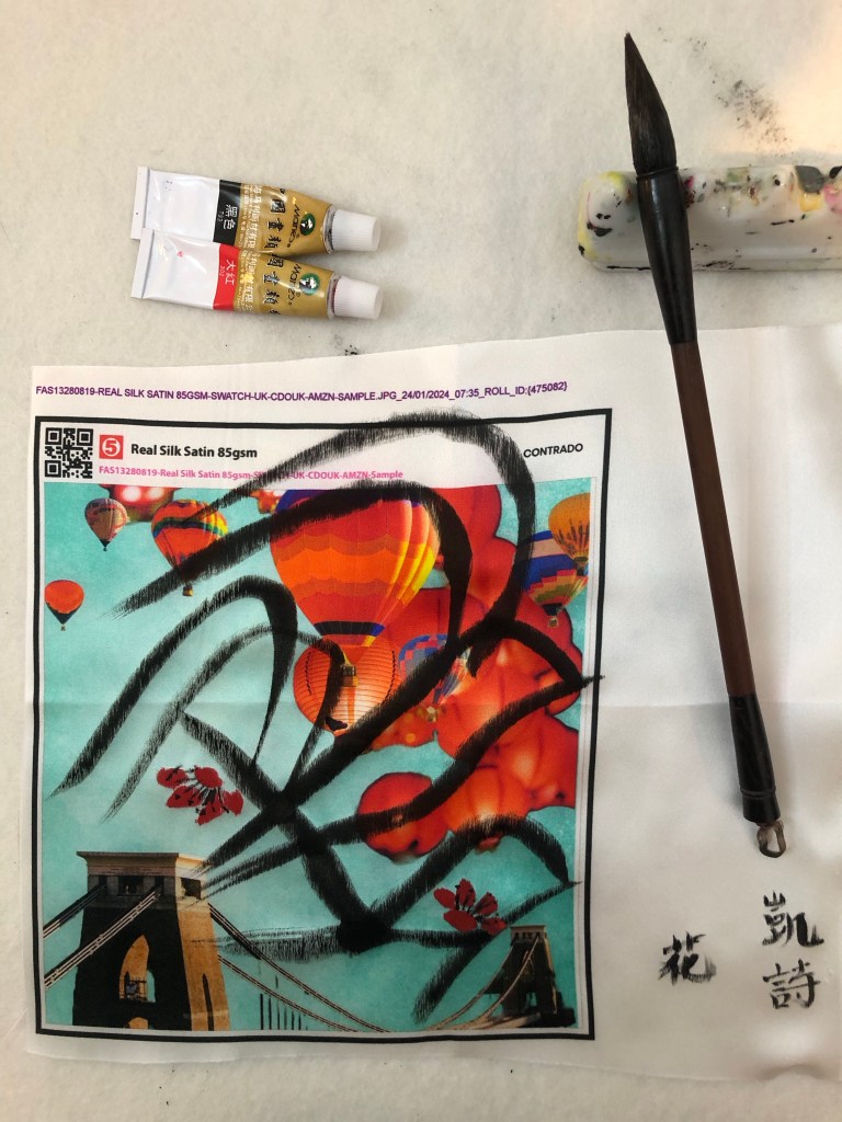
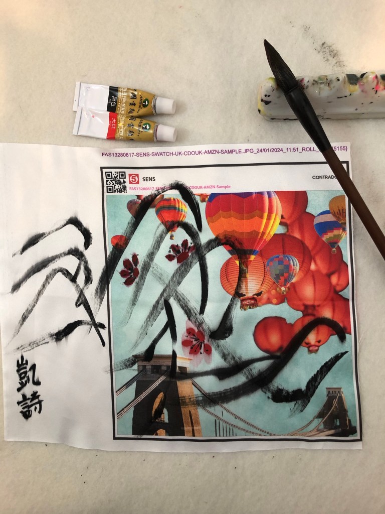
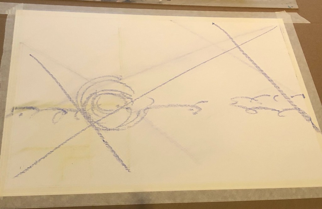
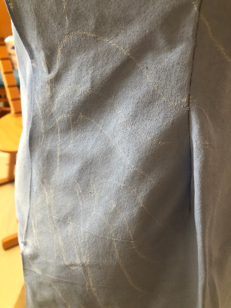
White chalk was used to mark out the design on the canvas:
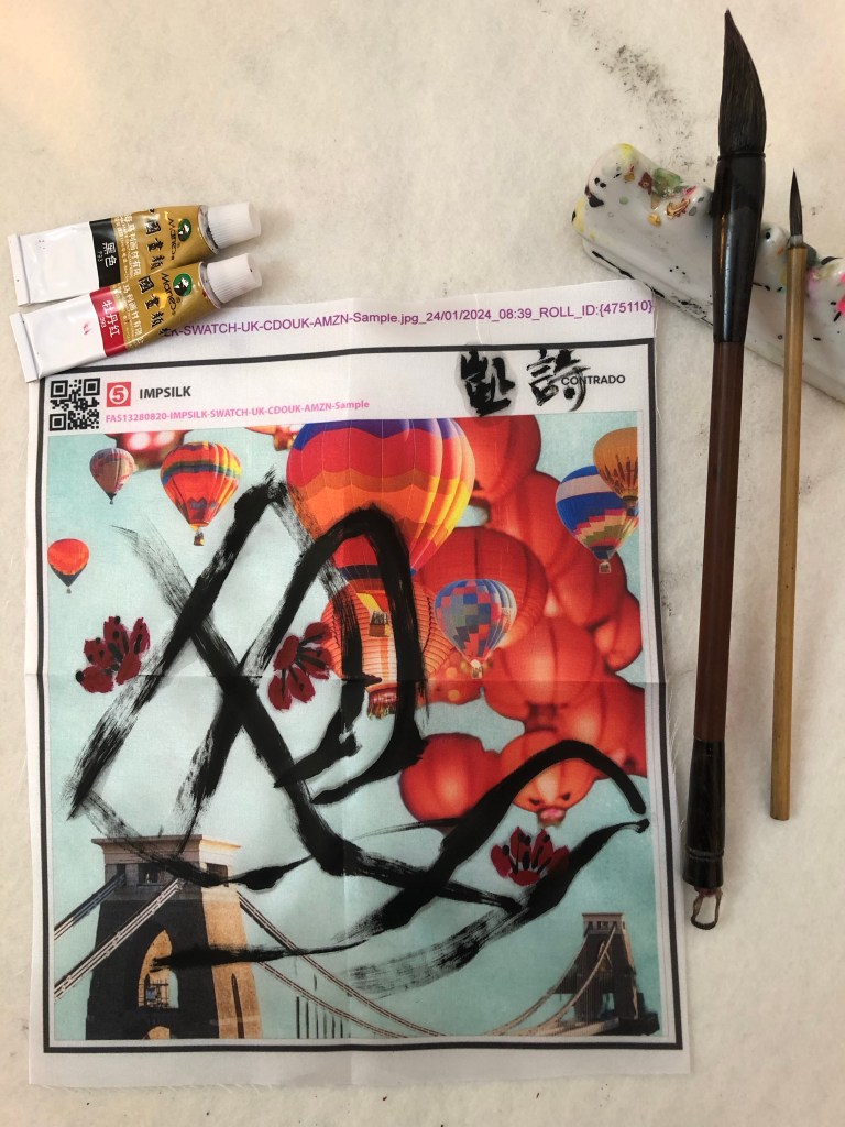
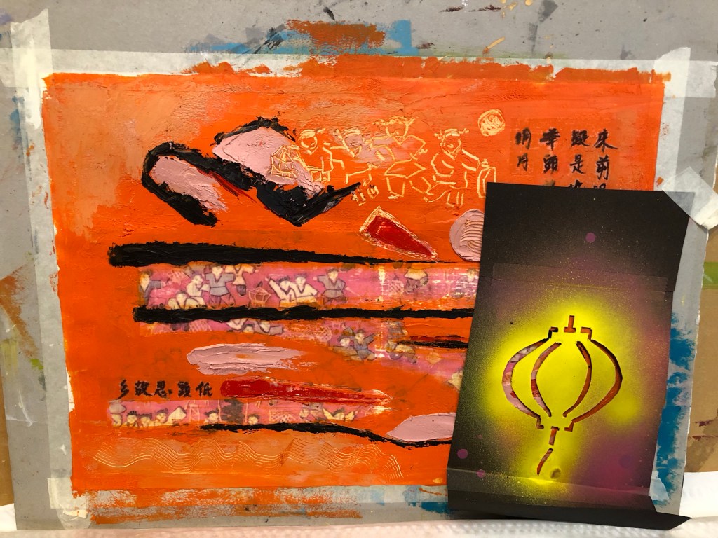
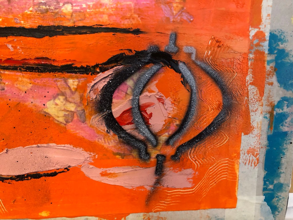
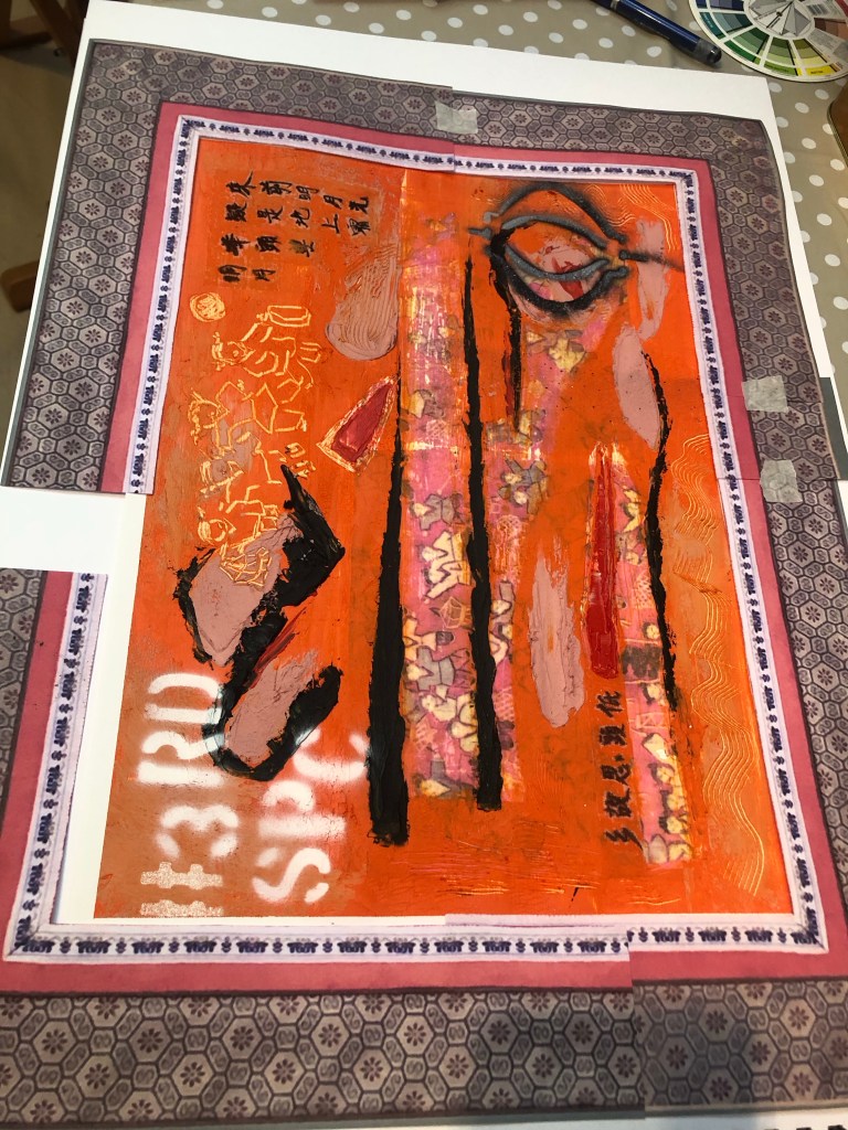
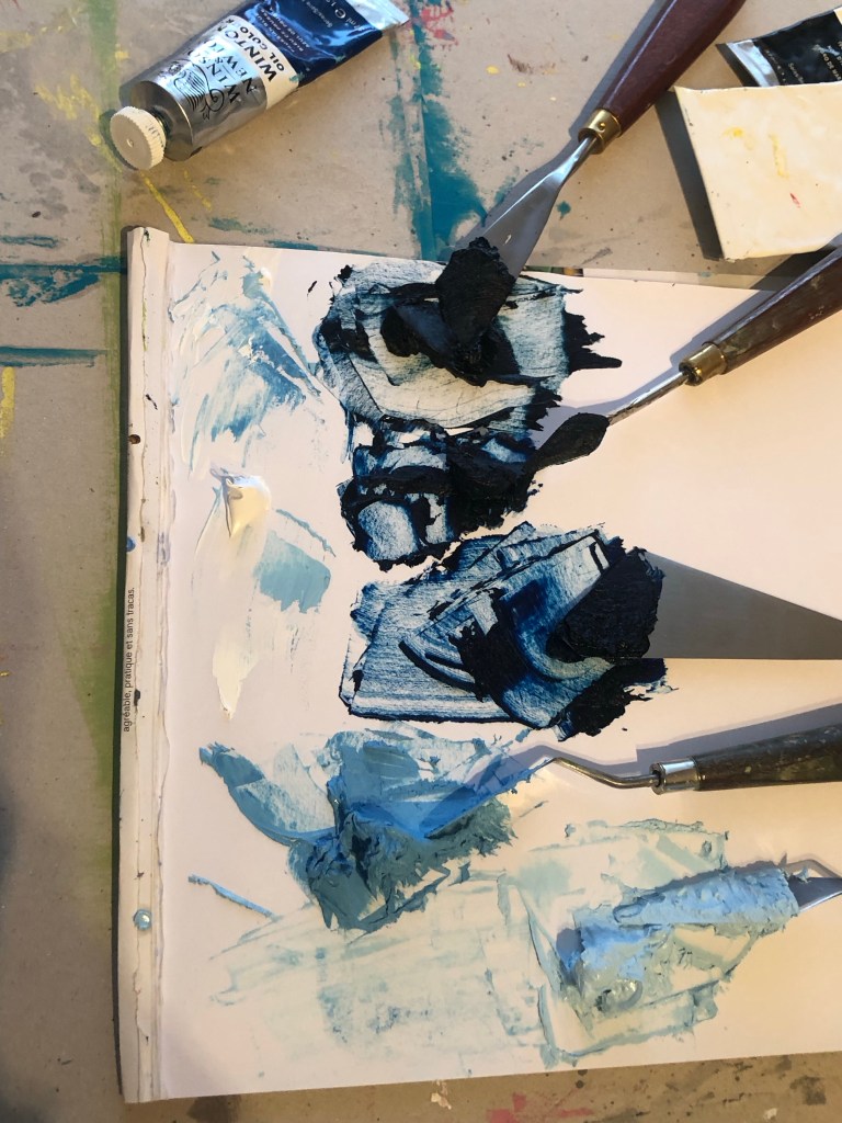
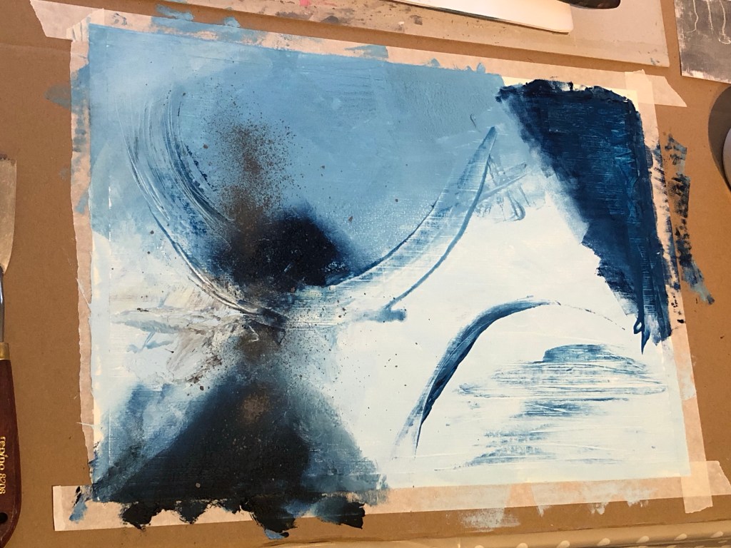
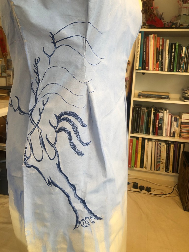
Partly through this project, I contacted the CSM paint and materials lab for advice on what paint and canvas materials to use for a wearable painting. The details of the advice is recorded at the end of this blog. Based on the advice, the design was painted with Pebeo fabric paint:
–
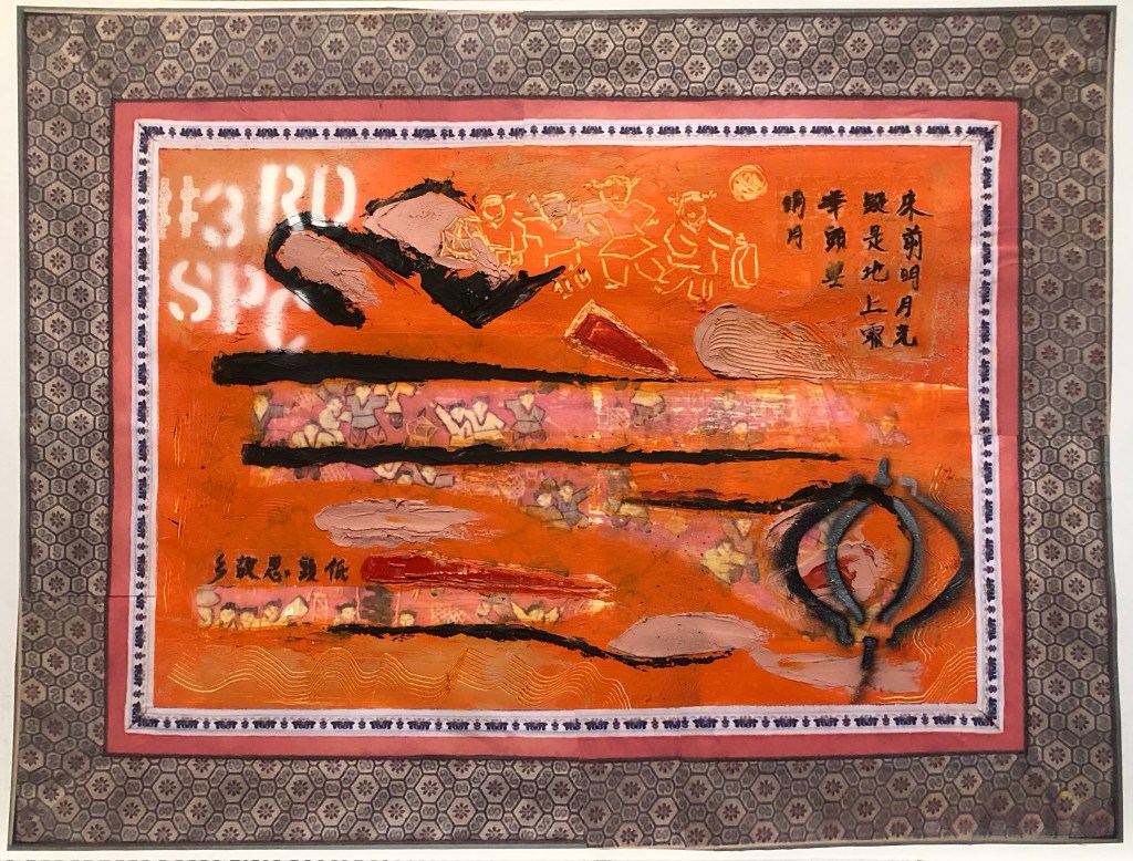
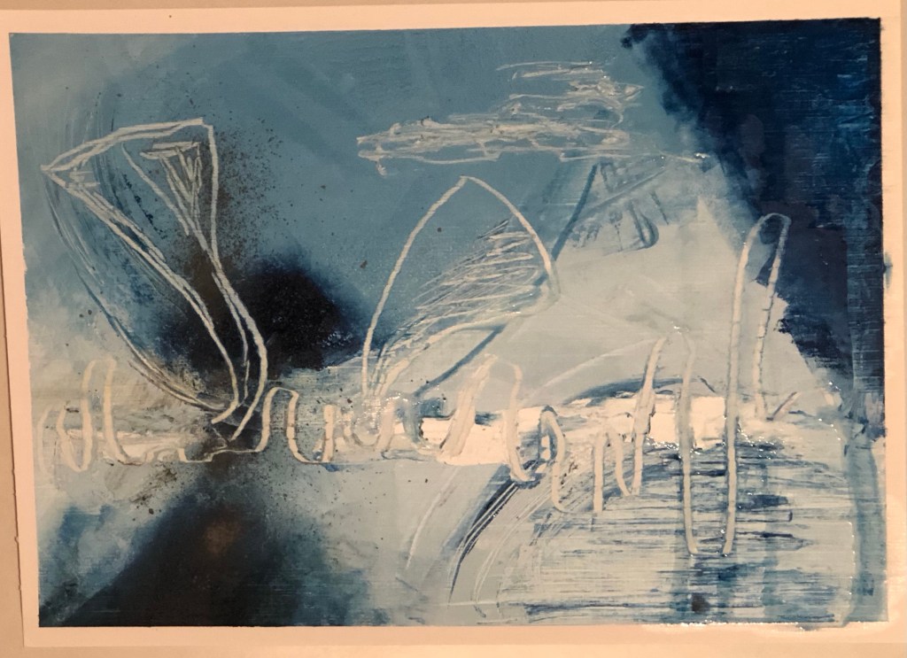
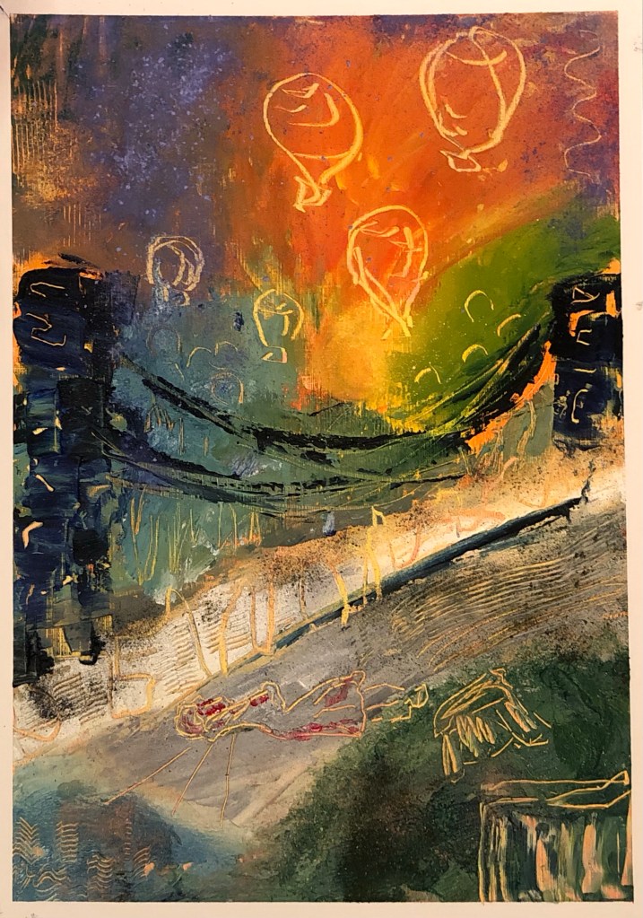
Finished painting:
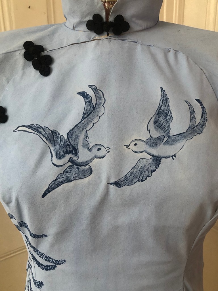
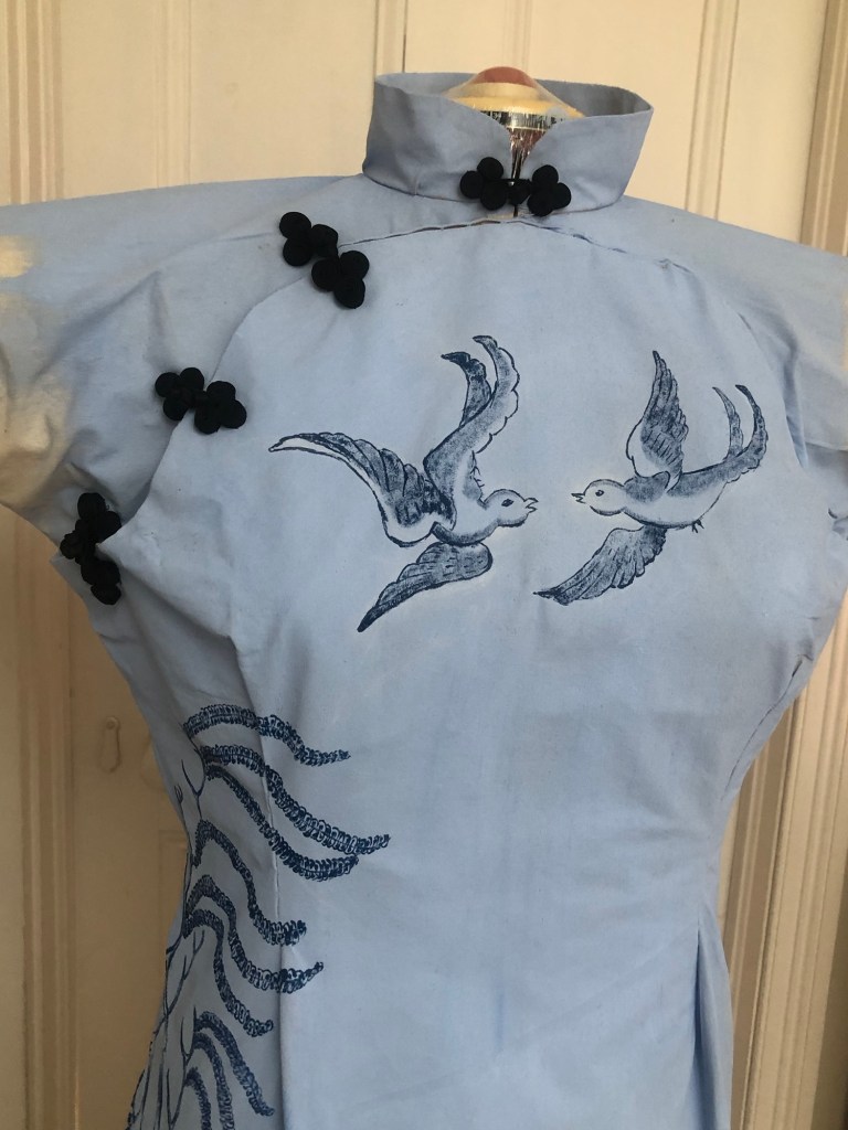
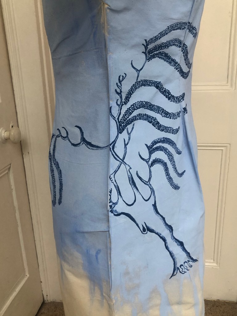
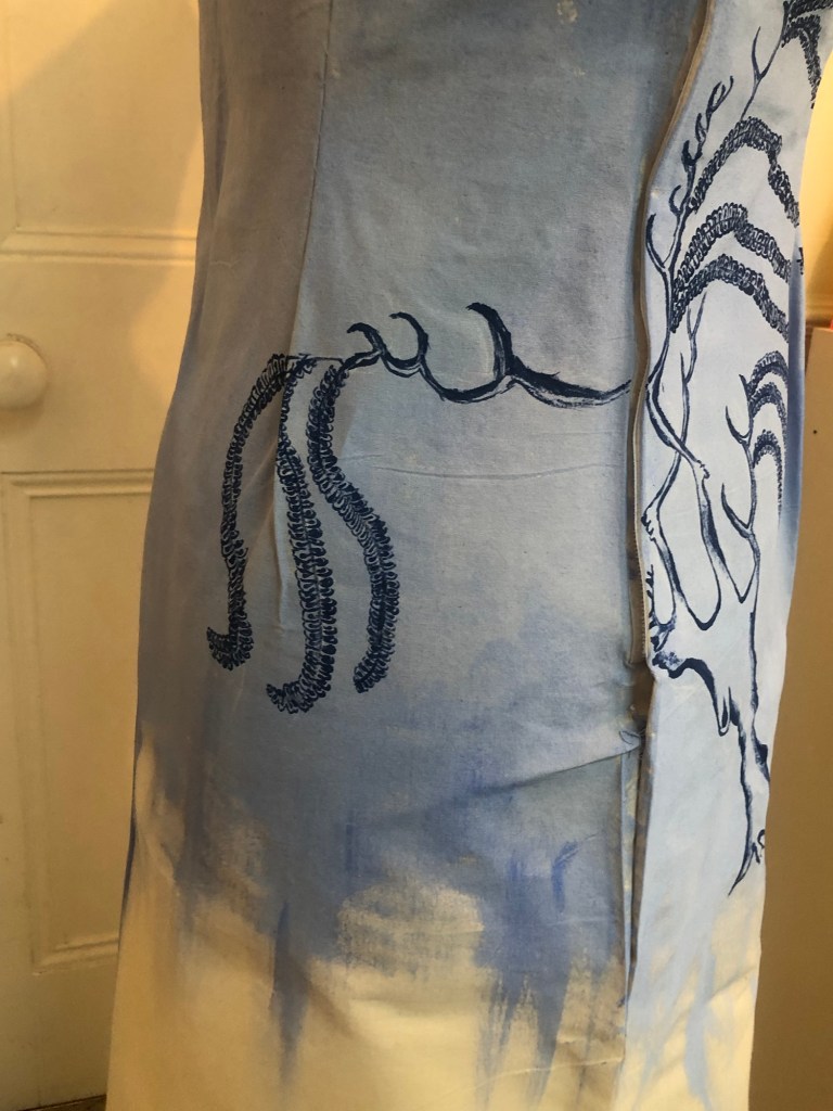
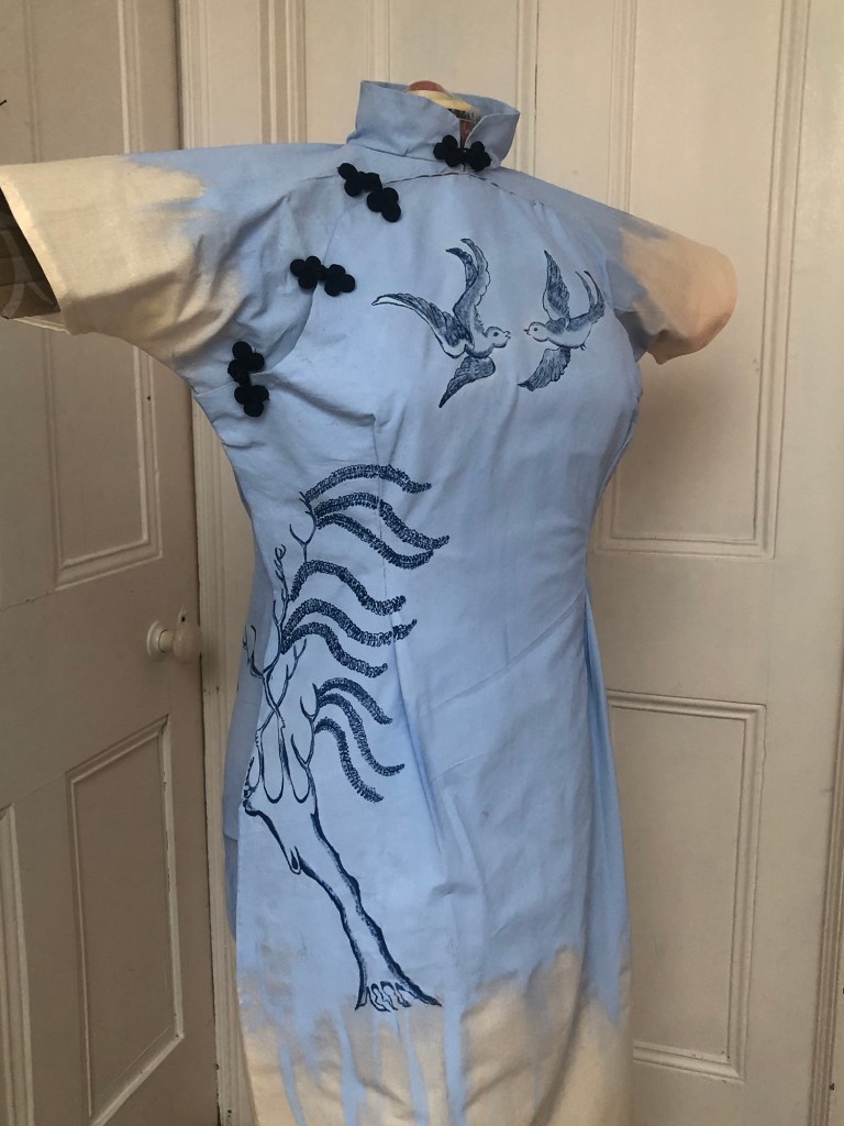
Finished work – Appropriation. Appropriation. H110 x W75 x D30cm
–
REFLECTIONS
I believe the Blue Willow pattern is a Third Space phenomenon because it is the combination of two cultures but it is neither one culture nor the other, i.e. neither English or Chinese, but resembling characteristics of both of the originating cultures. This realisation made it even more relevant as a topic for my work.
I considered adding the pagoda and pine tree to the back of the dress as an additional feature, but instead of painting the big round ‘fruits’, I wanted to correct them and paint a proper Chinese pine tree instead. However, after completing the willow tree and the birds, I felt I had done enough on the painting and wanted to move on – either further research about the cheongsam or make another canvas because I had thought of other designs that I wanted to do.
Overall, I have enjoyed making this painting and felt that I have learnt a lot especially about dressmaking.
For this painting – what I was happy with:
– Making a dress from scratch from a sewing pattern. I enjoyed the process because dressmaking is both a technical and an artistic endeavour. I found the creative process satisfying.
– While I was making the dress, I recalled watching my mother designing and making clothes for the family when I was young. Through the sewing, I felt I was living her experience in a way. I wonder what she would say if she were here. I expect she would be giving me advice patiently. She was always patient when she was making and when teaching us. Thinking back, I can remember how she enjoyed designing and dressmaking when she was younger, then when she went onto painting in later life.
– I can see that incorporating sewing and costume making into my practice would give me an additional dimension to explore.
– I enjoyed painting the Blue Willow design onto a 3D canvas and exploring new materials such as the new fabric paint.
What I was not-so-happy with:
– The dressmaking was a bit rough-and-ready. It was a first attempt and I have learnt a lot, so I hope to do a better job for the next one.
– Although I enjoyed the process of painting the design onto the canvas, I felt rather indifferent about the Blue Willow pattern. I didn’t care as much as I had expected; nor did I get as much out of it as I wanted. I found myself asking ‘so what?’ I expect it’s because ultimately, my feelings towards the design and its back-sorry was not that strong. My feelings towards making the cheongsam was much stronger than towards the Blue Willow pattern. Having said that, I did enjoy researching and was amused by the history of the design.
LEARNING
Since this was a first attempt of this new idea, I was keen to get feedback so I put this work in for the group crit. The group was very supportive, gave me some advice and posed good questions. My takeaway from the crit were:
– Is it really a wearable painting if I haven’t used fabric paint throughout? Meaning that if it cannot be washed then can it be called wearable? This was a valid point. My idea was that it’s an item that could be worn but really only briefly for showing or photographing. It is not really a piece of garment as such. So I need to rethink what to call this type of work, either make it truly wearable and washable or just call it a 3D dress canvas.
– Think more about how to show this work. Such as how to present the piece and in what setting.
NEXT STEPS
– Make the next cheongsam canvas and develop the process further. Consider whether to make the paintings truly wearable or not.
– Research more about different cheongsam designs.
– Think more carefully about the subject and context of the painting. Something that is relevant to my research and thought provoking enough to sustain my interest beyond the making process to give me further scope for reflection. Also something to take onto the next piece of work.
– Think about how to present such type of work.
NOTES
I sought advice from the CSM paint and materials lab on what to use for a wearable painting. Their reply is captured here –
The calico or a lightweight canvas such as 8oz , 9oz or 10oz. Is a good flexible cloth to use, it Is a lighter weight cotton duck .
If you were using the painting workshop at Kings cross, I would recommend spraying the acrylic paint with a gravity gun and mixing your acrylic with an acrylic fabric medium, this makes the paint more flexible and permanent if washed .
Also paint that is thinner but highly pigmented can be more flexible, rather than using thick tube paint. I would recommend golden fluid acrylic and
Pébéo – Fabric Paints Starter Set – 6 x 20 ml https://amzn.eu/d/dpjj9e7
If you use a white primer use a flexible primer which is not too thick like liquitex . Cheaper primers can crack .
Always dilute paint to a single cream consistency due to thinker paint cracking . Also a flexible canvas sealer can be used if you do not want a white ground .