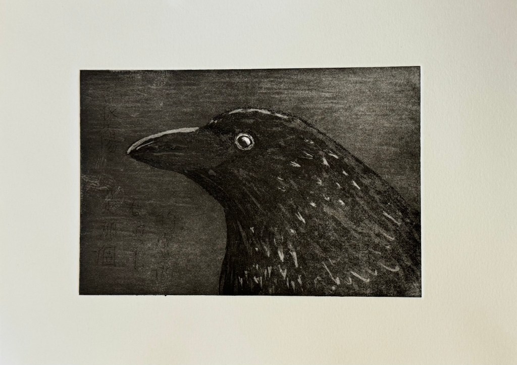
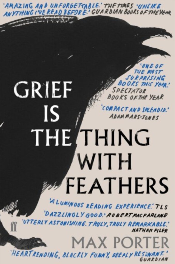
After reflecting on the News Art that I made in response to news headlines directly, I decided to be more subtle in the way I respond to the headlines. I decided to explore a more abstract way to express my feelings. What started my creating of News Art was the grief that I felt for the state of the world and my choice of using crows, inspired by the book ‘Grief is the thing with feathers’. So I returned to just painting some crow images as ideas came to me and not to overthink or be too deliberate.
METHOD
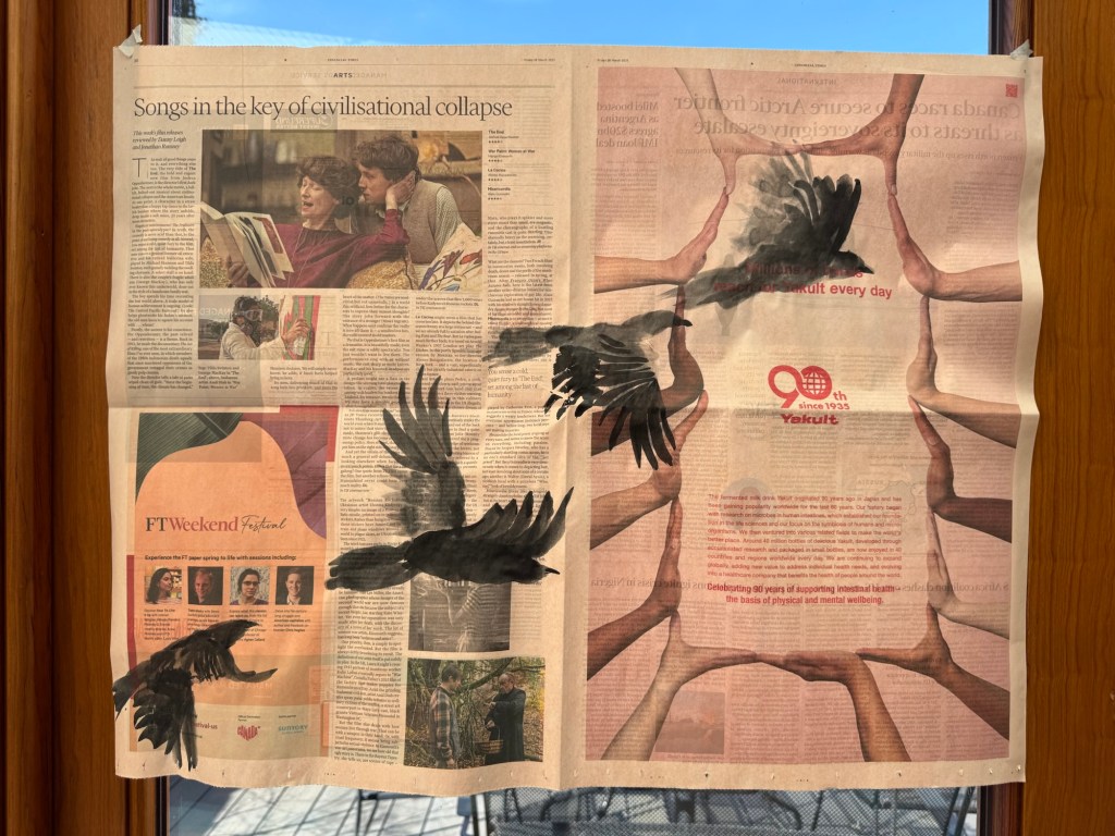
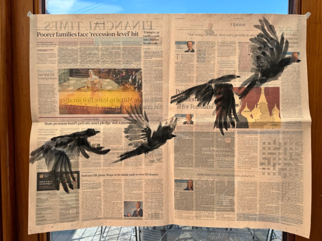
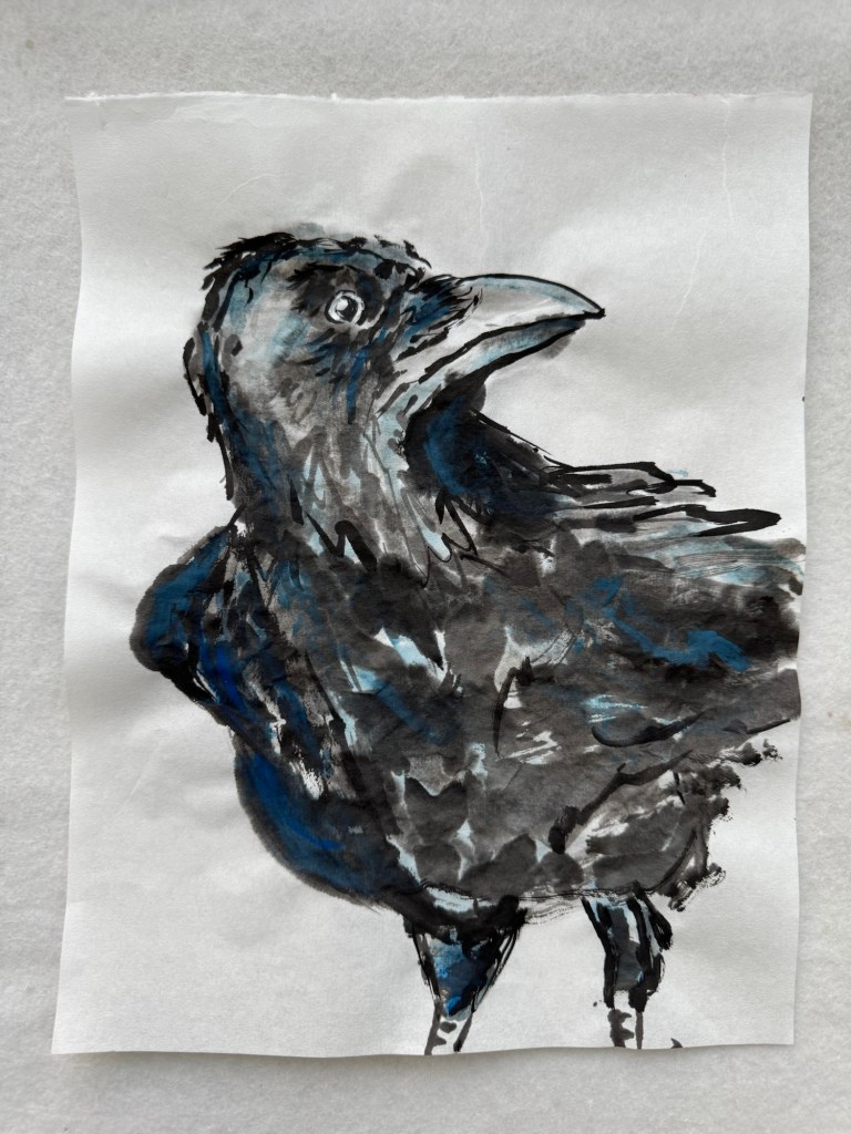
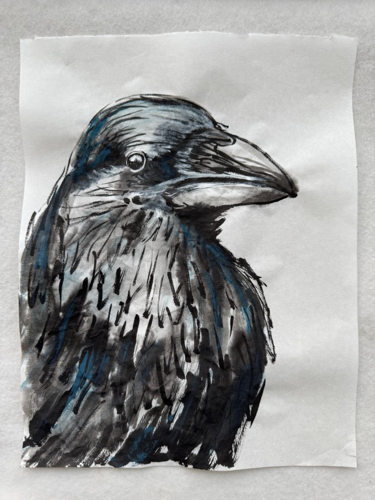
Without too much planning or thinking, I painted a few crows in flight using Chinese brush and ink in a free style Chinese painting approach. Then I held the painting up to the light:
–
Another painting done in the same way with a similar composition:
–
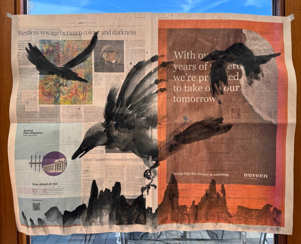
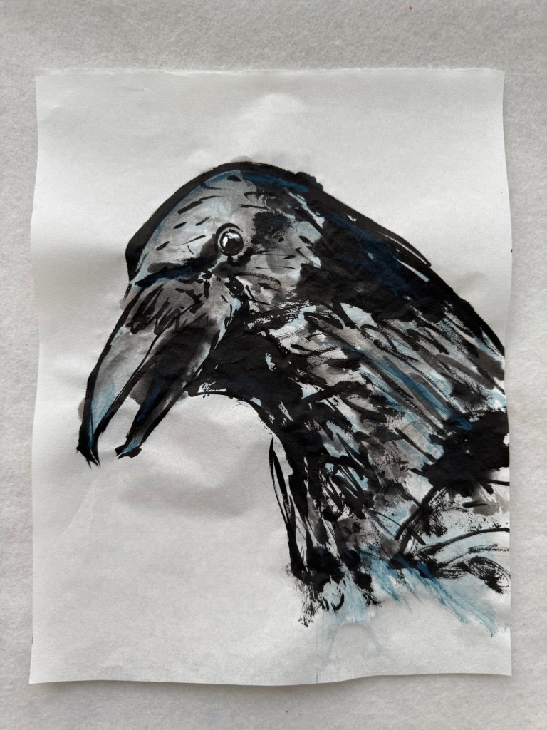
A more close-up view of a crow coming down for its prey with two others in the sky:
–
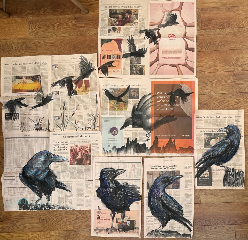
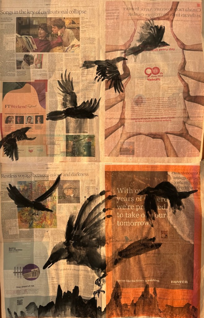
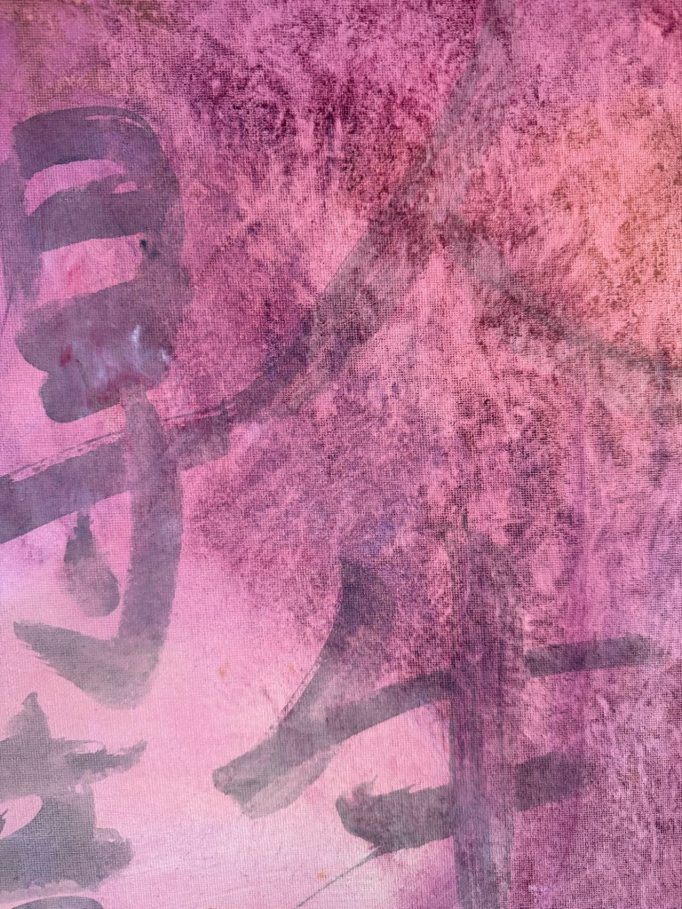
Since I had done quite a few of the crow paintings, I laid them out to see how they would look as a larger composition to get ideas on how to install these paintings as a group:
–
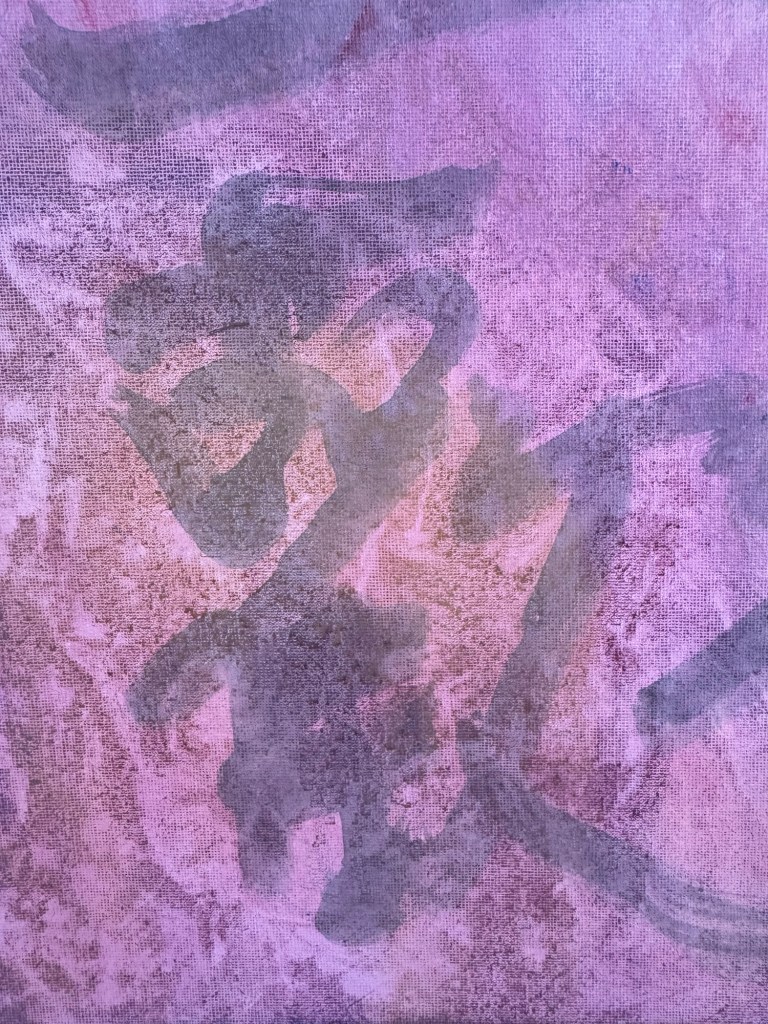
I finished by selecting two silhouette paintings that went well together and held them up to the light as one composition:
–
REFLECTIONS
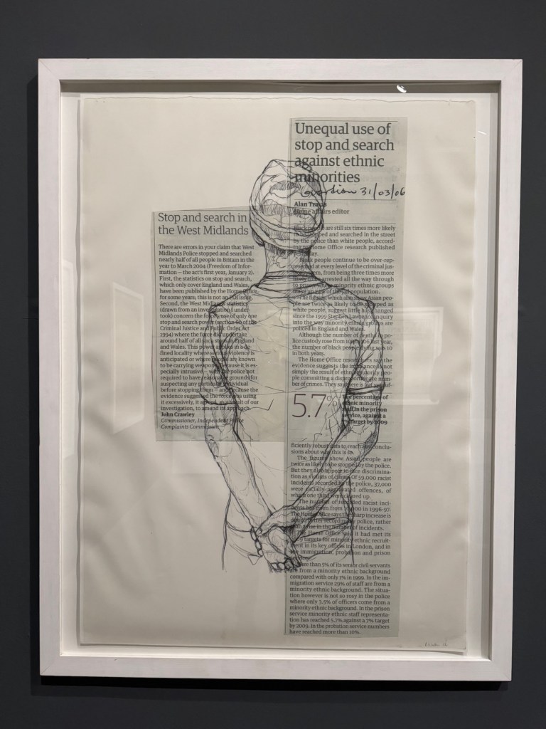
I am pleased with the silhouette paintings. I like painting in Chinese free style. Some of the crow bodies were not quite right but overall the wings have worked out well. I feel they do give a sense of movement in flight. I am also happier with the more subtle and abstract approach to the news headlines selected. I also purposely chose the ‘ring of hands’ for the crows to fly through, like an escape route for them. We all need one of those at the moment!
Doing my newly discovered News Art has given me a reason to read the newspaper when I have felt inclined to avoid the news. Looking through the newspaper to pick out headlines to respond to has given me courage to face what’s happening in the world in a way that I didn’t expect.
LEARNING
I feel excited by my new discovery of making art in this way. I am gradually developing a process and as I get to know more about the newsprint material, I feel able to push things further such as how wet I could make it (very wet, surprisingly). I really like painting on the newspaper because it is not a blank canvas and the contents and images on each page give me so many ideas which is great.
One thing to bear in mind is that newsprint is not archival. This would be a problem if I continue to pursue this way of making. I need to look into ways to preserve the artwork especially if I’m thinking about showing these work at some point. Proper research is needed including asking specialists at CSM.
Overall, the main learning is to just keep making more work to explore this way of making. Ideas flood in as I make.
I have been continuing my experiments with making art on newspapers as a way to respond to what’s happening in the world. In previous blogs, I have talked about using crows to express the grief and the sense of loss that I have been feeling.
This blog captures the experiments where I have responded more directly to the news with the painted images. I have also tried to think more carefully about the process of this way of making. Through trial and error, I believe I have developed a more systematic process of producing these paintings which I have documented below.
METHOD
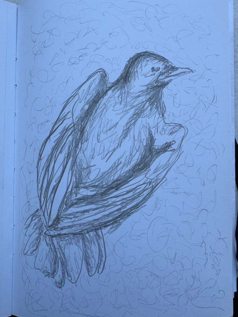
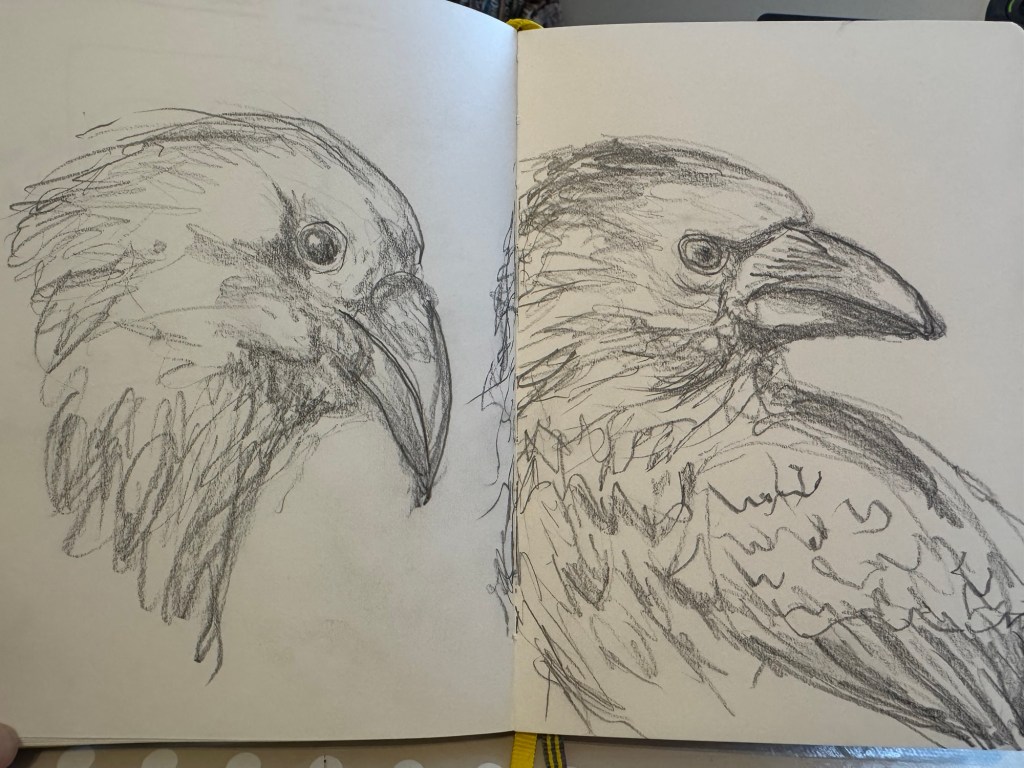
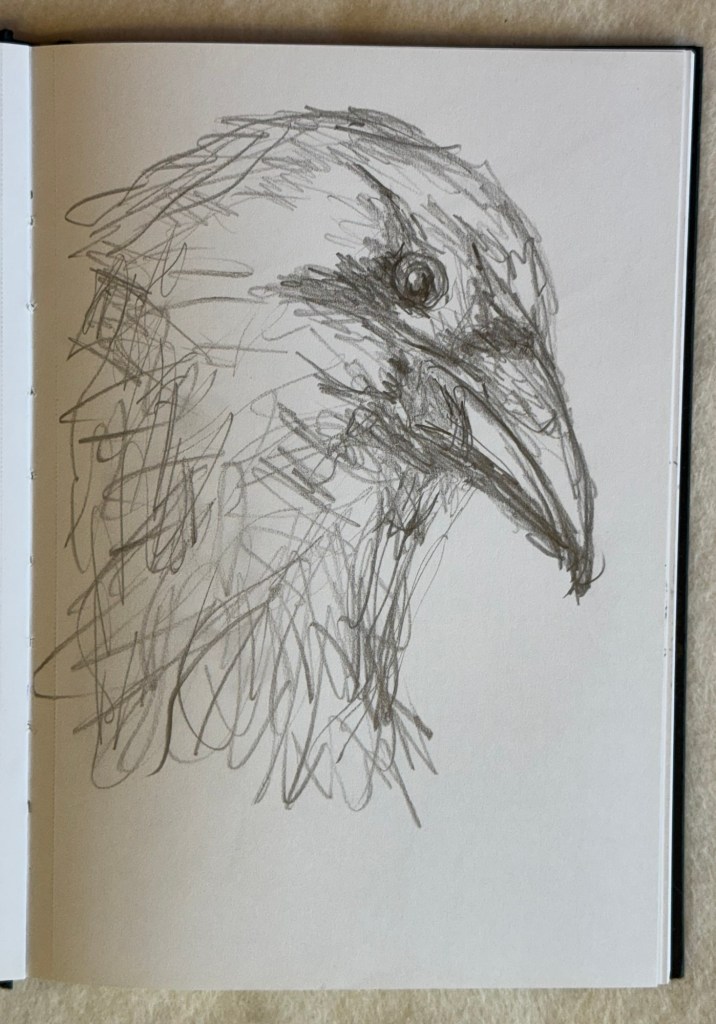
My response to some recent news about innocent people being killed in a war was to explore painting dead crows. I have often seen dead birds on the road or pavement, but I have never studied them closely. So the start of the making process was to research online images of dead crows.
Once I found a desired image, I would do a drawing in my sketchbook with my non-dominant hand. I have previously documented my wish and need to use my non-dominant hand to be more expressive while experiencing that feeling of not having complete control of what was happening.
Drawing of dead crow lying on its back
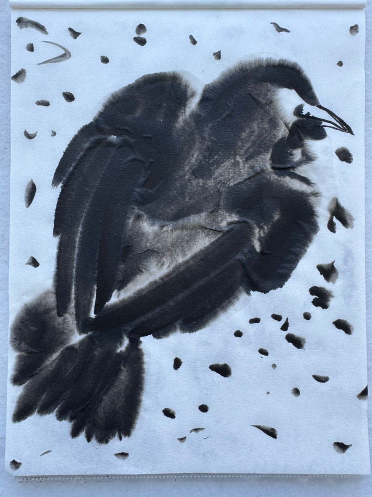
I then did a Chinese ink study of the same dead crow composition on a piece of A4 rice paper:
Chinese ink study of crow composition – A4
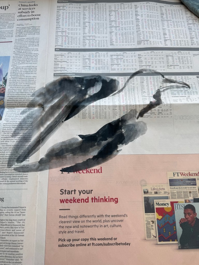
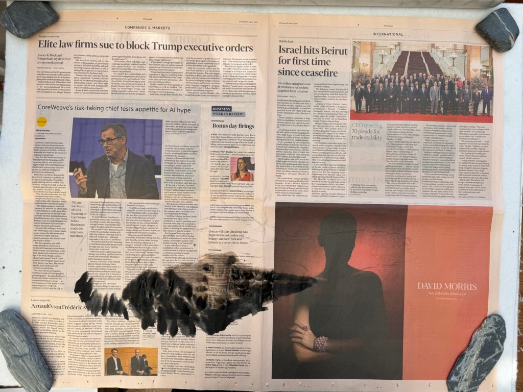
I then choose the newspaper and started to paint the chosen composition:
Finished dead crow:
–
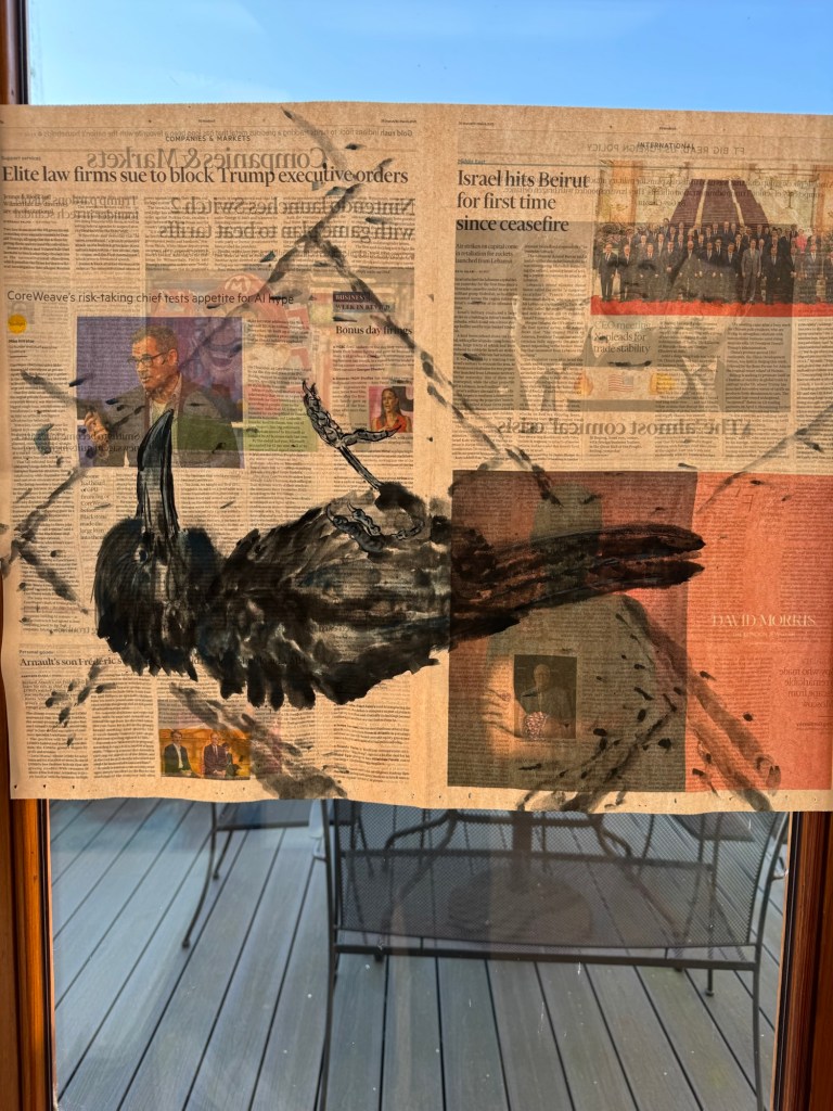
Painting held up to the light, taped to a glass window:
Finished painting – dead crow
A second experiment with a different dead crow was done following the same process, but with an added step of making a faint charcoal outline sketch on the newspaper of the crow before painting. This step was added because brush painting with ink on paper is unforgiving, hence having a sketch of the shape helps to ensure the composition is largely in the right place.
Sketchbook drawing of the second dead crow:
Sketchbook pencil drawing
Chinese brush painting study of crow body:
Chinese ink on rice paper – A4
Charcoal outline was drawn prior to painting to mark out the composition:
–
Completed painting of dead crow lying on its side on pavement, held up to the light.
Painted dead crow on The FT
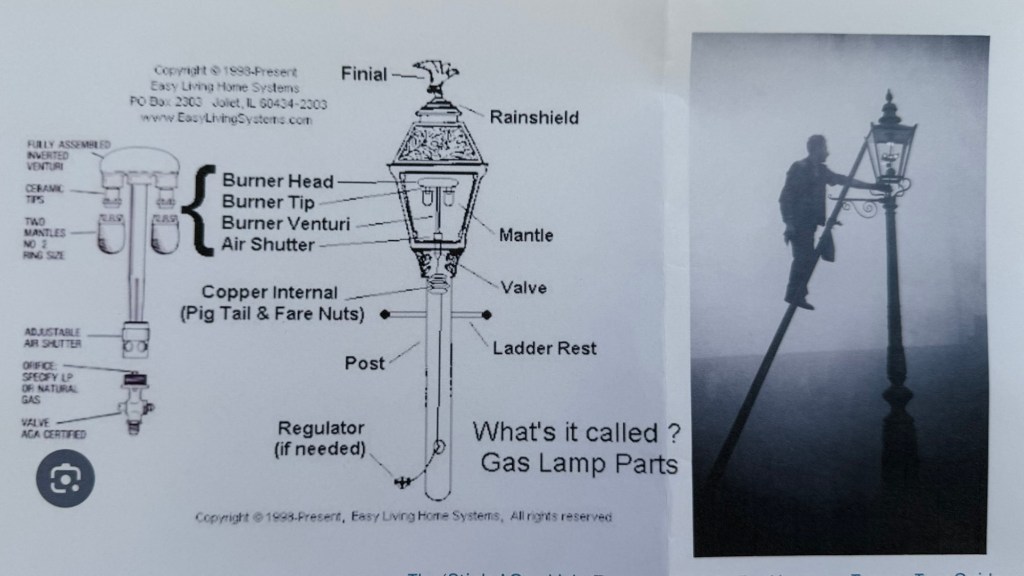
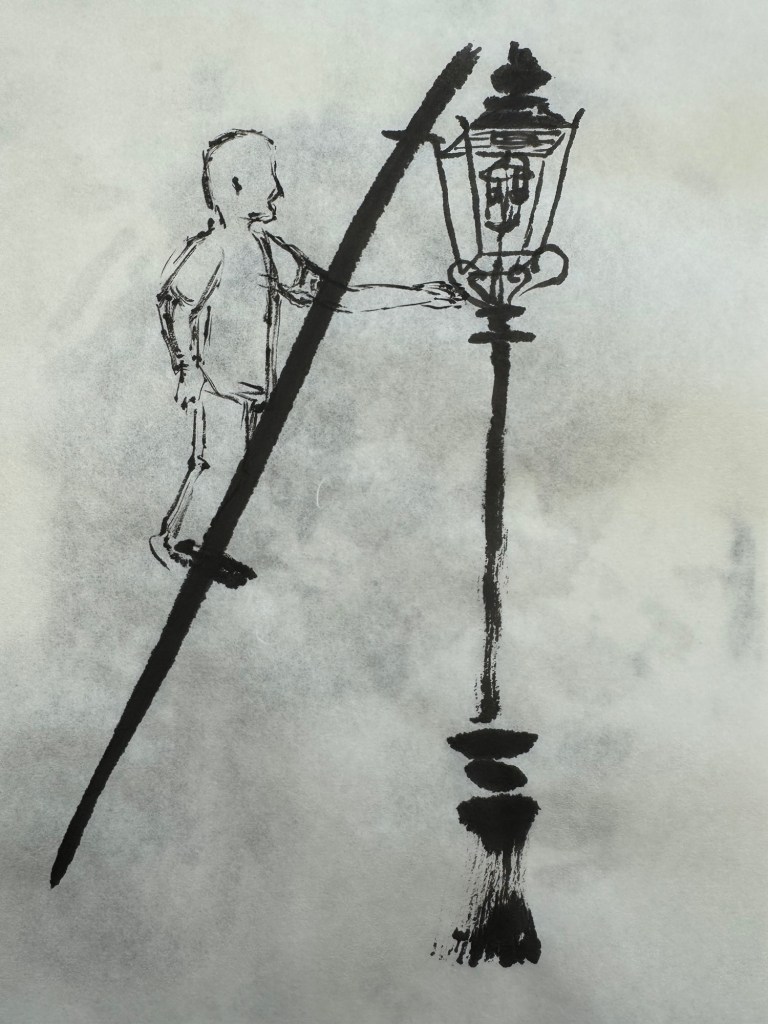
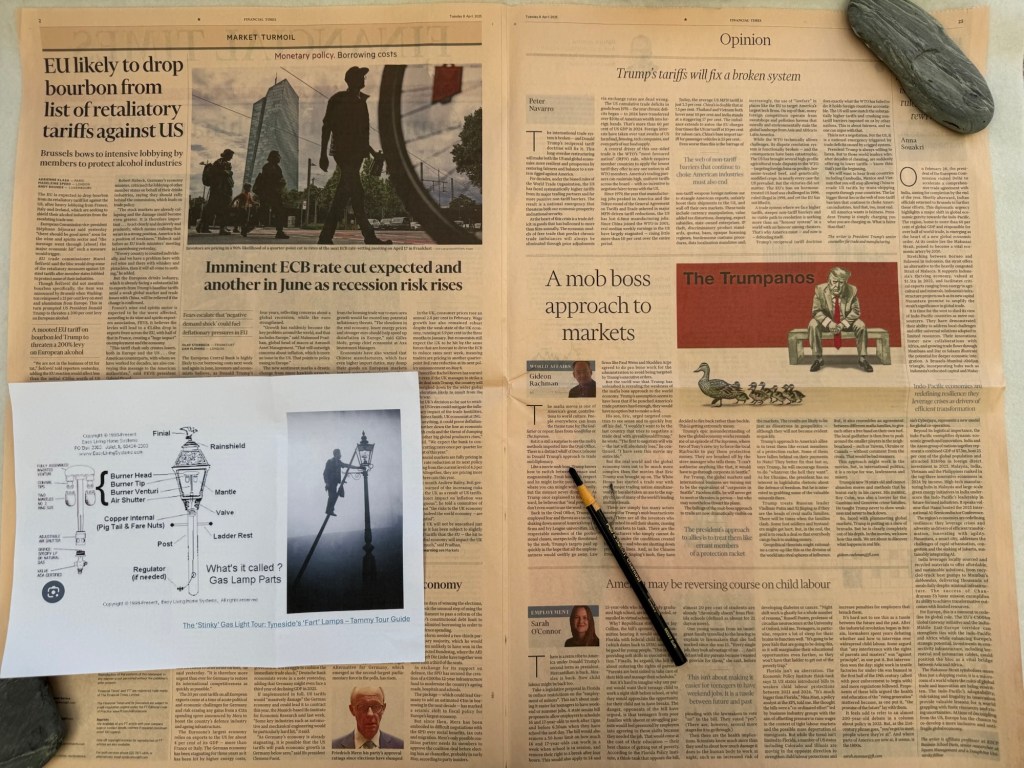
The last experiment on responding to the news involved an image of a man lighting a gas lamp. It was important for me to research how a street gas lamp worked so that I knew what I was drawing. The diagram below was very helpful.
–
This time, I did two ink sketches as initial study to test the composition:
–
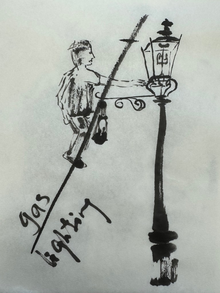
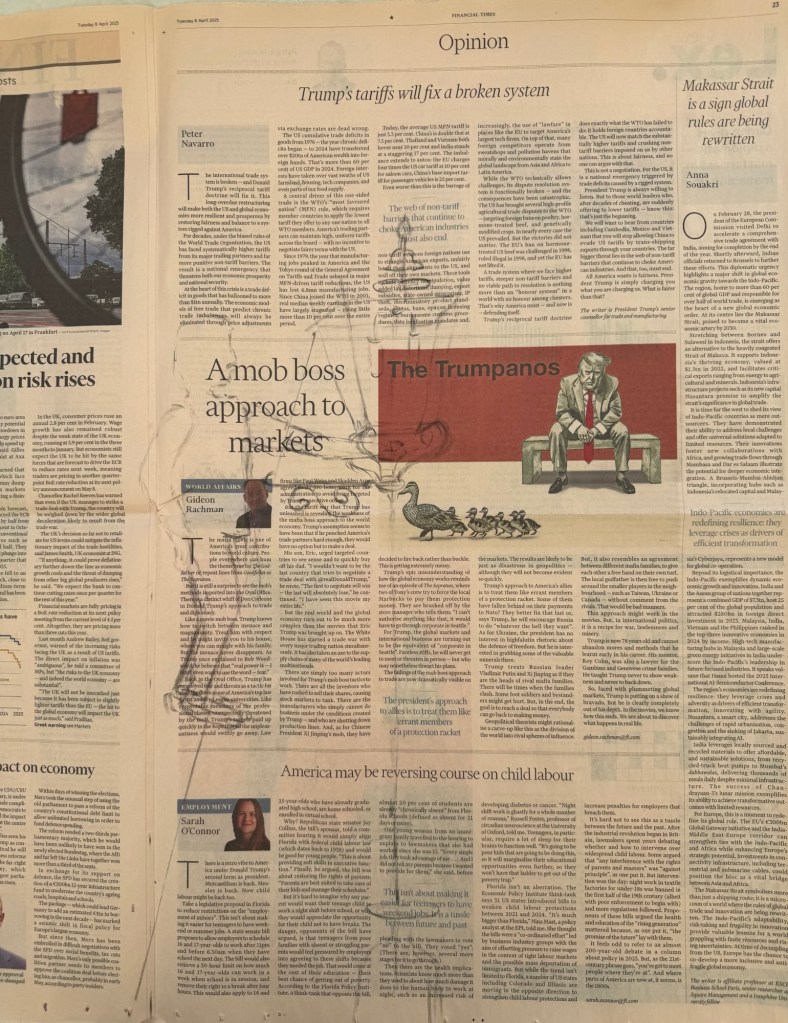
The chosen newspaper page that I wanted to respond to was laid flat and a rough charcoal drawing of the composition was made:
–
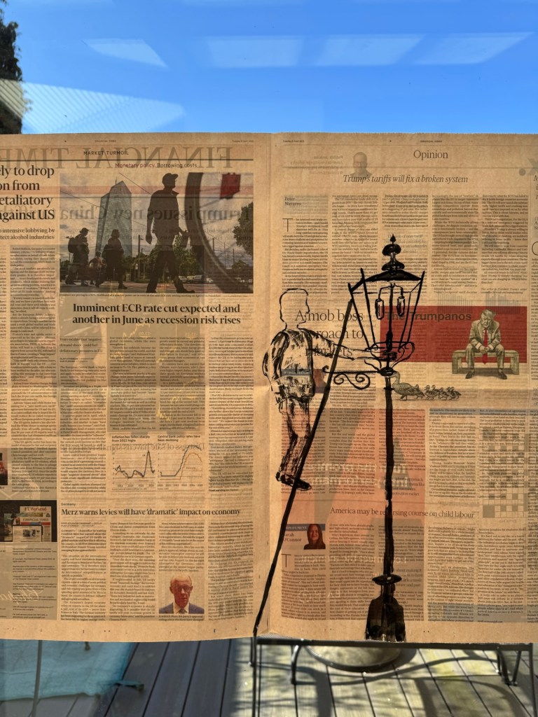
Then the painting was done and held up to the light. Gaslighting – Chinese ink on newspaper:
–
REFLECTIONS
It was cathartic to directly respond to the news. So I enjoyed making these pieces of work. However, looking at them now, they feel rather literal and obvious. Dead crows to respond to innocent paramedics being killed and a man lighting a gas street lamp to respond to the gaslighting going on in many places. All seemed too obvious.
These paintings were made using my dominant hand – I think it was because these composition ideas were very new and I wanted to be more confident in my depiction. However, I believe the outcomes are less satisfactory than the previous ones where I used my non-dominant hand. The mark making here seemed too deliberate and lacking the energy that I had achieved previously.
Although the artistic outcome was not completely satisfactory, the process of responding to the news by directly calling it out was satisfying. It was like ranting without actually ranting. Also, I gained clarity and tested out the process in a more conscious way. So all was not lost.
LEARNING
The initial drawing and sketching step was helpful for new compositions. But I don’t feel it’s an essential step, depending on how familiar I am with the subject.
Using charcoal to mark out the composition on the newspaper was very useful and is an essential step that I should use.
Responding directly with images may end up being too literal or obvious. So use with care.
NEXT STEPS
Try different approaches to composition and images. Experiment with more abstract images.
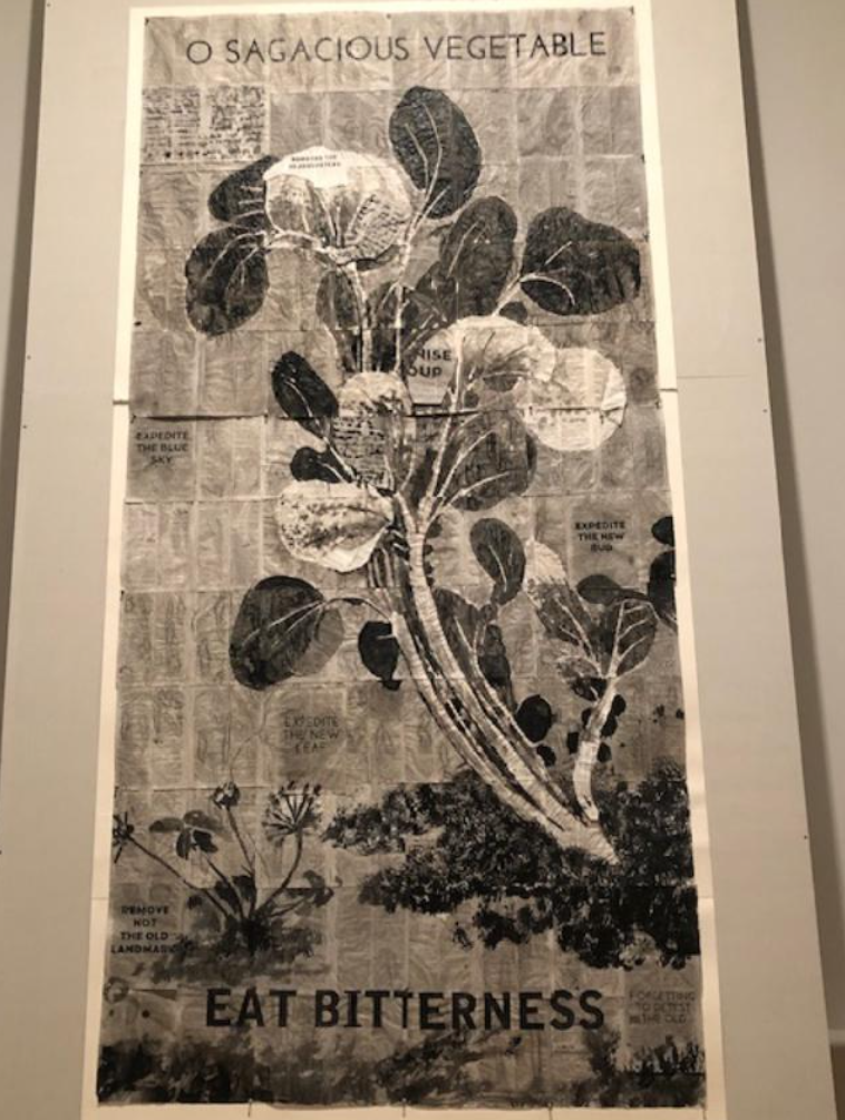
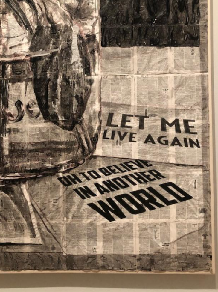
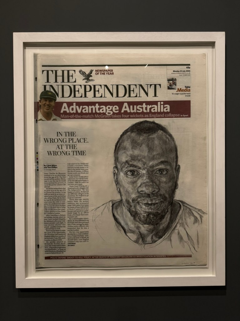
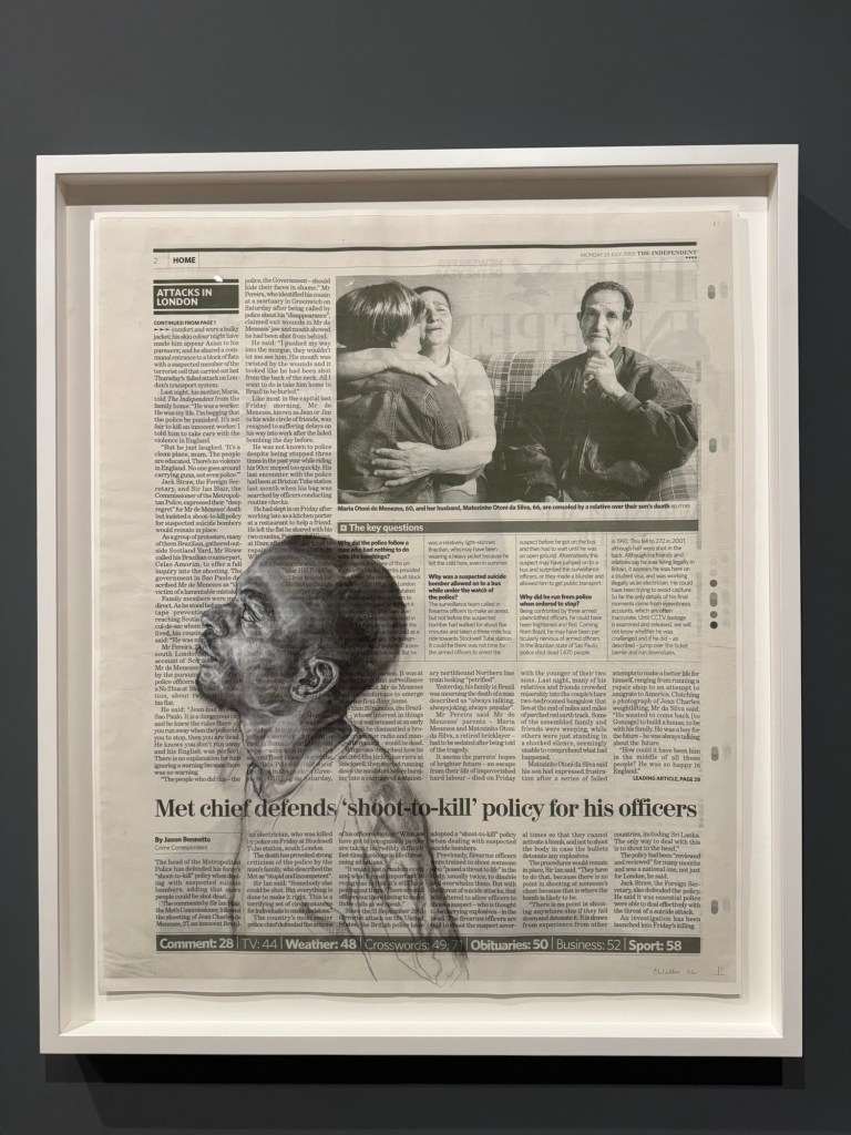
Continuing with my exploration of the grief and sense of loss that I feel about the change in world order, I have decided to make some paintings with crows inspired by the book ‘Grief is the thing with feathers’ by Max Porter. The use of newspaper as a canvas for painting as I have done here was first inspired by William Kentridge’s work that I saw at his exhibition at the RA in 2022, where he made some monumental drawings on printed materials. Some examples below:
–
I have recently seen an exhibition by Barbara Walker where she used printed documents extensively in her work. Below are some examples of her use of newspapers:
–
Walker uses newspapers with content that directly links to her subject matter of social injustices whereas Kentridge is more subtle and often you cannot easily read the printed text in his work although I have read in the description of his work that there is always relevance in the text.
METHOD
Since my studio is out-of-action at the moment due to building work, I have set up a temporary studio in a different room and I am using Chinese ink on paper instead of my usual oil paint on canvas because of the limited facility that I have.
Learning from the crow drawings that I did with my non-dominant hand, I decided to use my non-dominant hand for the paintings here. Below are the paintings on Chinese rice paper, all A4 size done with my non-dominant hand except the one with the crow sticking out its tongue – that was done with my dominant hand for comparison.
––
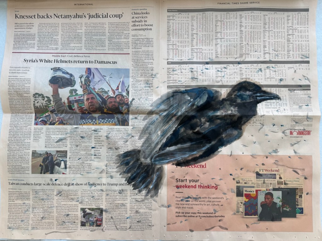
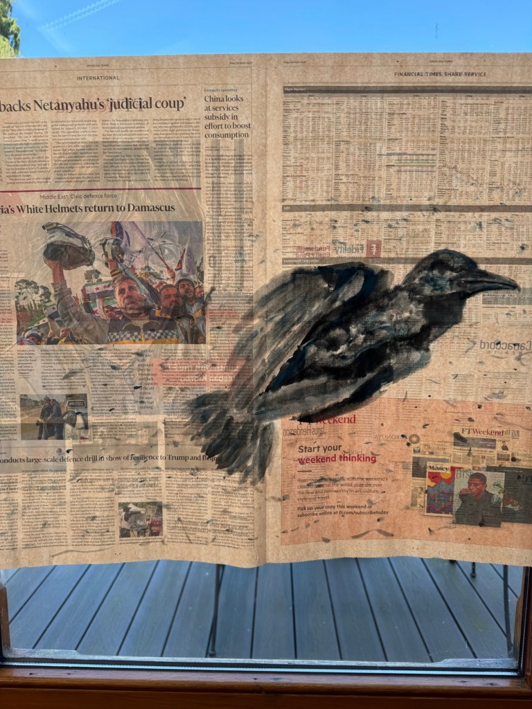
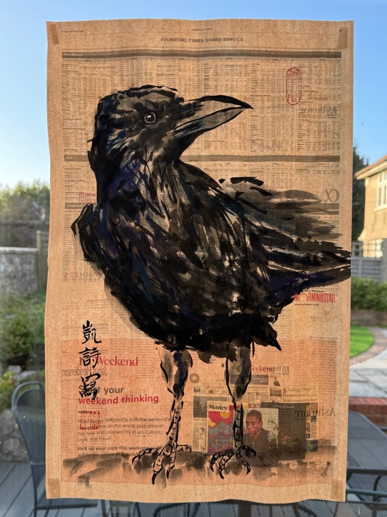
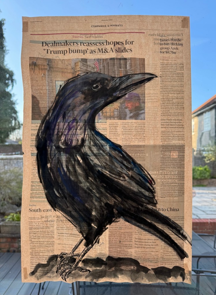
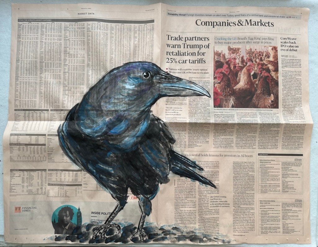
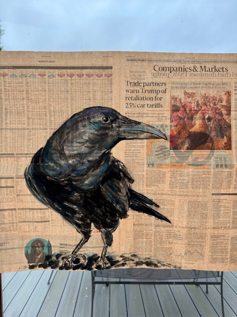
Then I decided to paint on a newspaper and I chose The Financial Times because it is one of the few newspapers that I can bear to read given my general frustrations with the biases in the news media. I have painted on the FT in the past and found the ’45 gsm salmon newsprint’ paper absorbency to be at a level that responded well to Chinese ink. I also like the salmon colour against the black Chinese ink. All three paintings below were mostly done with my non-dominant hand with some details such as the shape of the beak and the claws done with my dominant hand.
–
Below is a video clip that I made using Instagram:
–
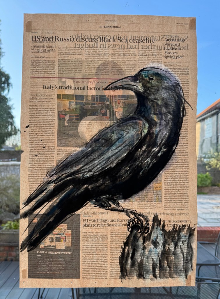
Below is a crow painting on a double page spread of the newspaper where the previous ones were on a single page. The page here was chosen for the photograph of the chickens (about egg prices in the USA) with the painted crow looking in and one of the chickens staring back:
Below is the painting held up to the light:
REFLECTIONS
I have enjoyed developing a new process for painting on the newspapers. I find the paper works well with the Chinese ink, not overly absorbent and has enough material integrity to stay intact even if it gets very wet.
I have continued to enjoy painting with my non-dominant hand as the brush strokes were more expressive with less control. During the painting process, I constantly asked myself which hand I should use, e.g. with the more detailed work such as the curvature of the beak where more control was required, or highlighting the white in the eyeball, then I switch to my dominant hand for those details. I wanted to use as much of my non-dominant hand as possible because I prefer the marks made and it was a good metaphor for the helplessness I and many people feel about the world events at the moment.
Part of the process of this way of making involves buying a newspaper, something that I haven’t done for a long time since I mostly read the news online/on my phone nowadays. I enjoy the physicality of opening and turning the news pages, then reading the printed text and selecting the pages with headlines that stir me in some way.
Examining the newspaper so closely also reminded me of my early engineering career when I worked extensively on automating newspaper printing presses for Fleet Street as well as local newspapers with ‘cutting edge technology’ for that time period of the early 1990s using fibre optic based digitally synchronised ‘electronic line shaft’ control systems. The presses were enormous and ran at very high speed. It was exhilarating to work on those projects and machines especially as a young engineer. Decades later, I am now studying newsprint closely again for a different purpose – I used to scrutinise the print registration of the colours (poor registration would cause ghosting) and I would respond to the results by varying the control parameters for correction. Now I scrutinise the news content and respond by painting on the newspaper. I can say that the former was a lot easier – I felt completely in control of what was happening. Whereas I rarely feel in control of my painting process and I continue to feel zero control over what is happening in the world – all I can do is to read about them in the newspapers. This has become an interesting juxtaposition of my relationship with newspapers over the decades.
As I work more and more on these newspaper paintings, I have become calmer compared to when I first started as I have documented in some of my earlier blogs about voicelessness and going through the grief curve. I wonder if this is because the world situation has improved (no), or I have become desensitised by the constant revelations of world disasters (possibly) or having a way to respond to and express myself through paintings on the newspapers has given me a route to release my anger therefore making me feel that I am doing something about it. I think definitely ‘yes’ to the latter point, the painting process has certainly helped me to channel my thoughts and feelings.
LEARNING
I have developed a new process of painting on newspapers as a way to respond to what’s happening in the world. I have continued to use crows as a symbol of the grief that I feel about the loss of or change in world order. Working with newspapers reminded me of how my relationship with newspapers has changed over the decades since I was a young engineer. I feel this is the beginning of an exploration and I want to continue and do more because it gives me a way to respond to the world at the moment.
One point that I discussed with my tutor was how I ‘held the newspaper up to the light’ as an accidental discovery when I stuck the newspaper paintings to the glass window for photographing. It is a good metaphor for ‘exposing’ the news and also the light shining through the other side of the print revealed additional images therefore making the overall composition more ambiguous.
NEXT STEPS
Continue to make more paintings in this way to explore, to develop my ideas and the process.
Experiment with holding the painted newspaper to a light or lamp to see how it could work as an indoor installation.
Continuing with my exploration of the grief and the sense of loss that I feel for the drastic change in world order, I did some printmaking during my low residency week at CSM in London and I continued with the theme of crows as inspired by the book ‘Grief is the thing with feathers’ by Max Porter.
METHOD
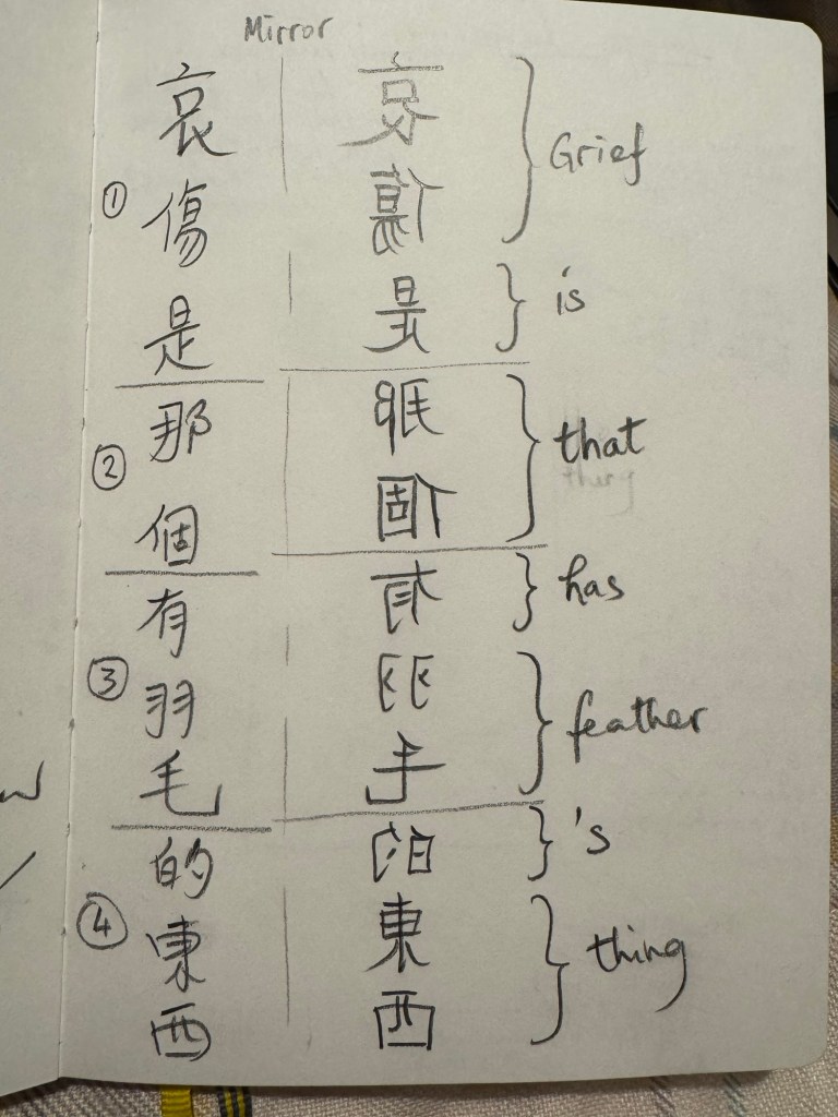
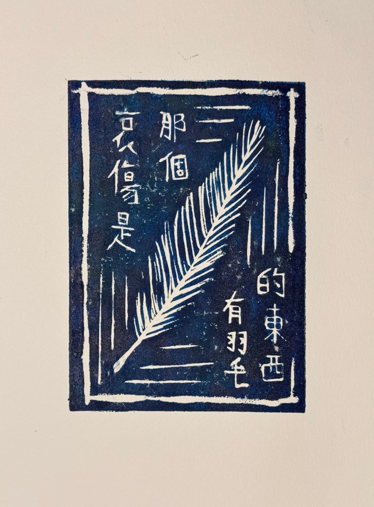
During the low residency at CSM in London, we had a lino printing workshop. I created an image with a feather and translated ‘Grief is the thing with feathers’ into Chinese. I then had to write out the mirror-image of the characters for the printmaking process:
–
We made prints in different colours and the blue one came out best for me:
–
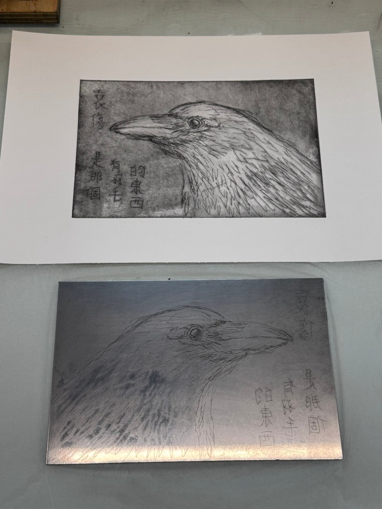
I then attended another printmaking workshop where we made some etched prints. I did the etched drawing of the crow with my non-dominant hand, but did the mirror-image Chinese writing with my dominant hand as writing Chinese backwards required the utmost control!
–
First trial print to test the etching on the plate:
–
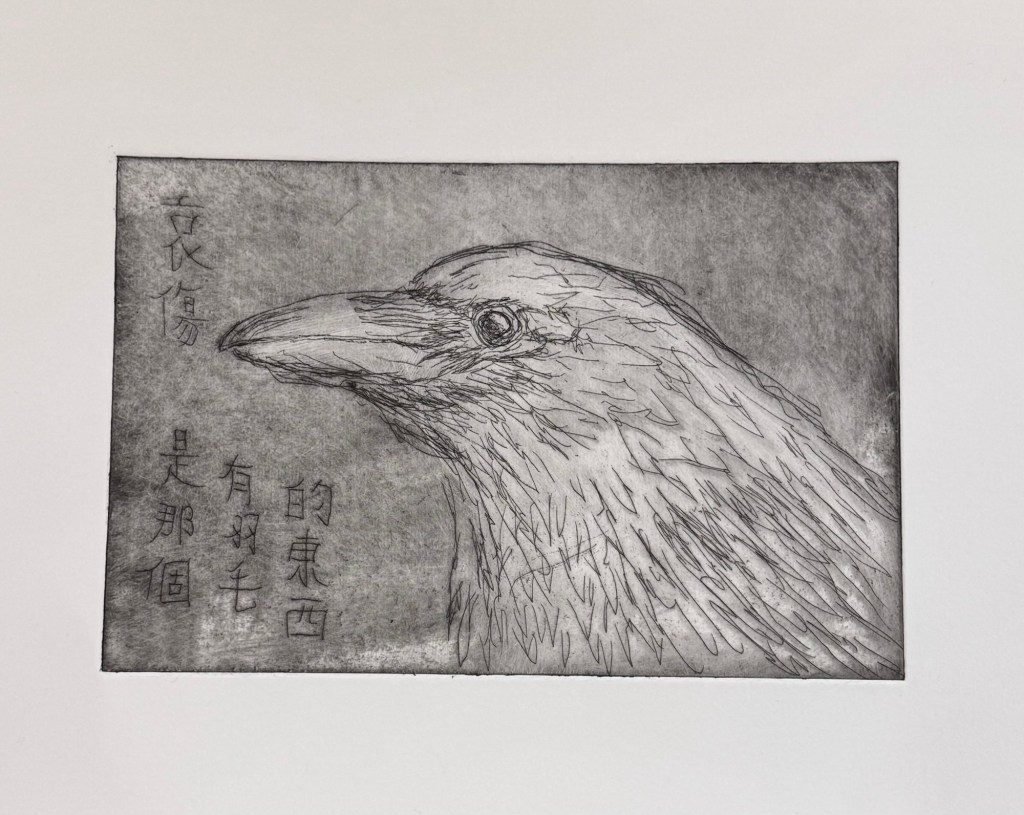
Then I tried the aquatint process to add tone to the print:
–
REFLECTIONS
I have enjoyed both workshops very much and I mostly learnt that printmaking is not easy! The lino print was easier as I am familiar with the process so I mostly knew what I was doing. The fact that it was a simpler process also helped for a printmaking novice.
The etching process was much more complex for me. It was my first time. The tutor was very patient with all of us and very helpful. The etching of the plate was fine, but the aquatint process was much more involved and clearly required good experience to create the desired effect. I thoroughly enjoyed the workshop but I don’t think I will be rushing to make more prints because I like to make art intuitively and that requires a good understanding of the process and the materials. For me to achieve that and make prints intuitively would require a lot of time investment to make it part of my practice. So I think I will leave it for now and may be investigate printmaking after I finish my MA when I have more time. Printmaking is something that I have often thought about because of the good facilities at the print studio locally at Spike Island in Bristol and they run courses for beginners.
Out of the prints made, I was happier with the image of the lino print. The etched crow turned out too cute like a plush toy and not really reflective of the grief that I wanted to portray. Also, the Chinese writing mostly disappeared in the aquatint process. I should have thought more about how to ‘protect’ that part of the plate in the process. Something to bear in mind in the future.
LEARNING
I have often admired printmaking artists’ prints and wondered about how the process works. Now I have gained more of an insight into the complexity involved and I very much respect what they do! For me, since I am still developing my practice and I often feel self-conscious that I am wanting to include more different disciplines (e.g. photography and film making), it is therefore useful to know that I don’t want to pursue printmaking (not in the near future anyway) because of the time investment required and I don’t think the process ‘speaks to me’ yet due to my lack of experience. I am equally inexperienced in photography and film making, but I find it easier to get to grips with those processes.
Overall, they were very enjoyable workshops and I learnt a lot. I may still do some lino prints for fun and I may treat myself to a printmaking course one day at Spike Island.
After reflecting on my practice and how I am feeling about the world at the moment, I have decided to express my grief through my art. I was very touched by the book ‘Grief is the thing with feathers’ and the author describes a crow that comes to visit as a metaphor for grief. So for the time being, I am going to work with crows and feathers.
–
METHOD
When rethinking and reflecting on my practice, I realised that drawing was a comforting process for me so I started with some drawings of crows. I decided to draw with my left/non-dominant hand because:
– I enjoy it because I feel energised by the feeling of not being fully in control in my making;
– I want the mark making to be more loose and expressive which I find easier to achieve with my non-dominant hand;
– The feeling of not being in control is a good metaphor for how I feel about the change in world order at the moment.
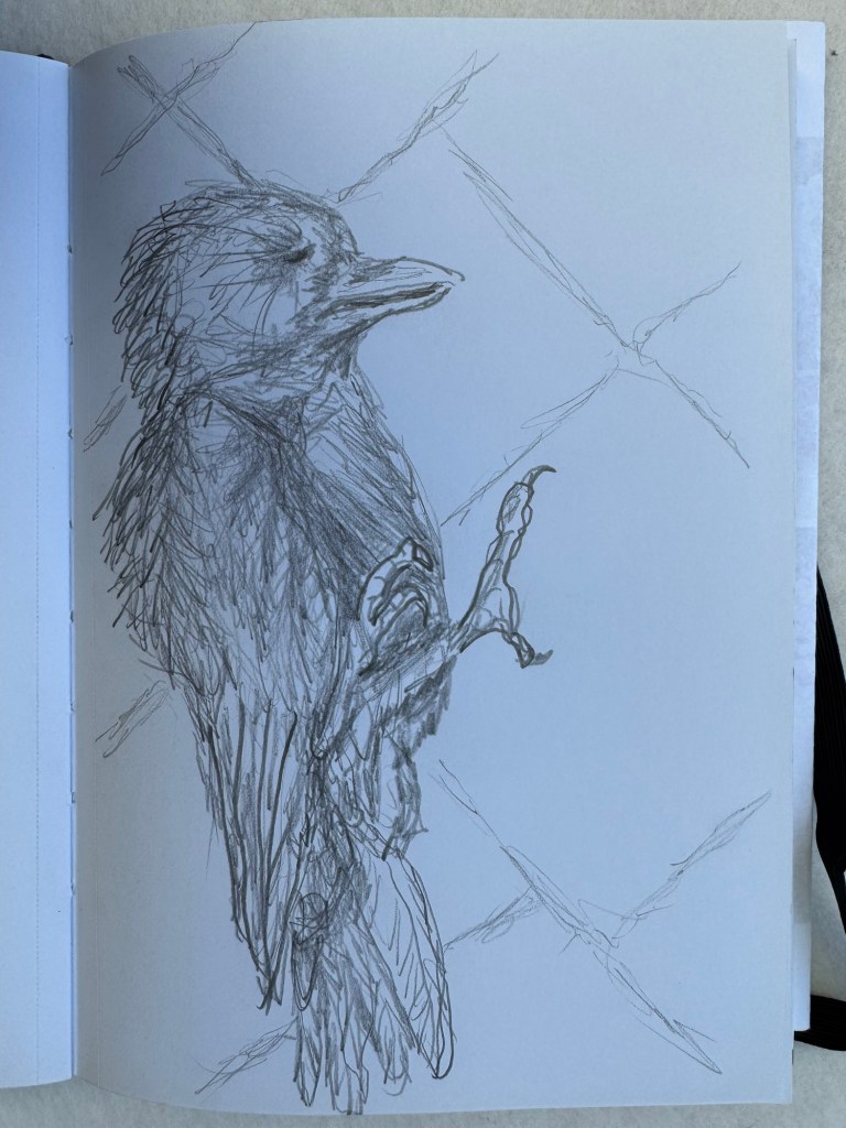
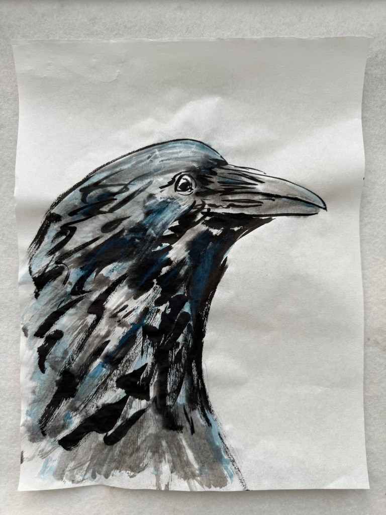
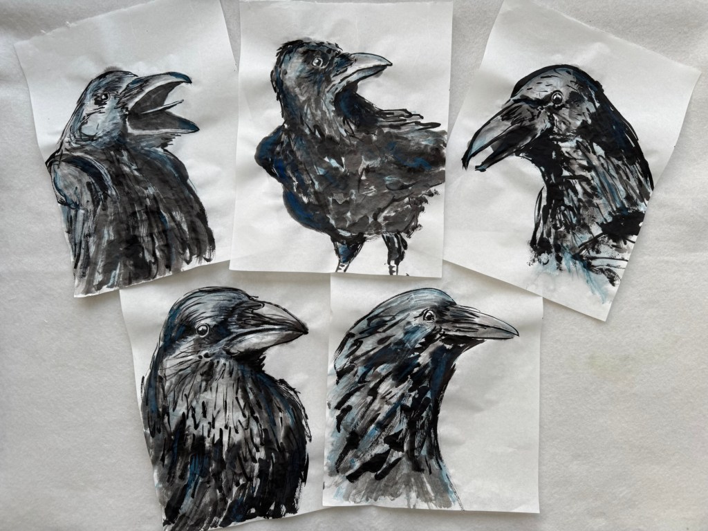
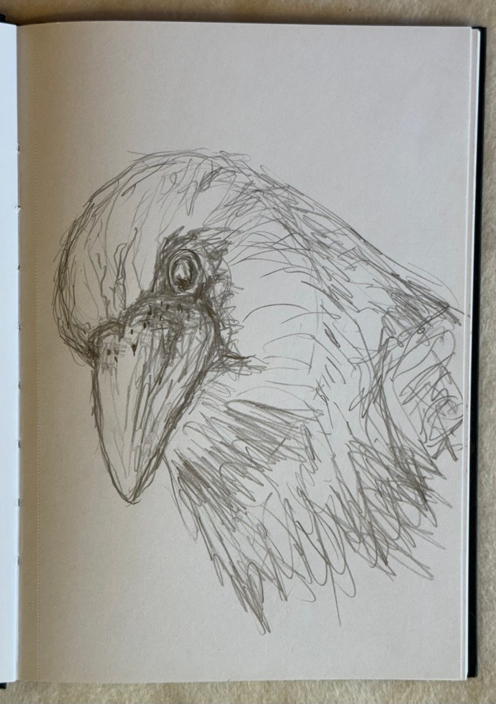
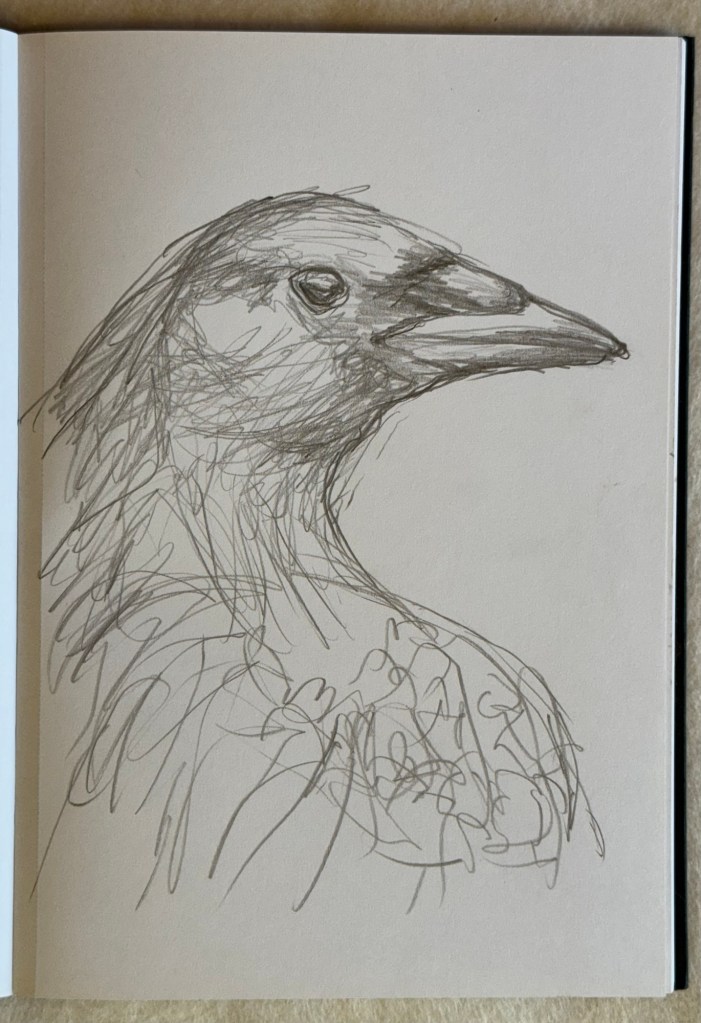
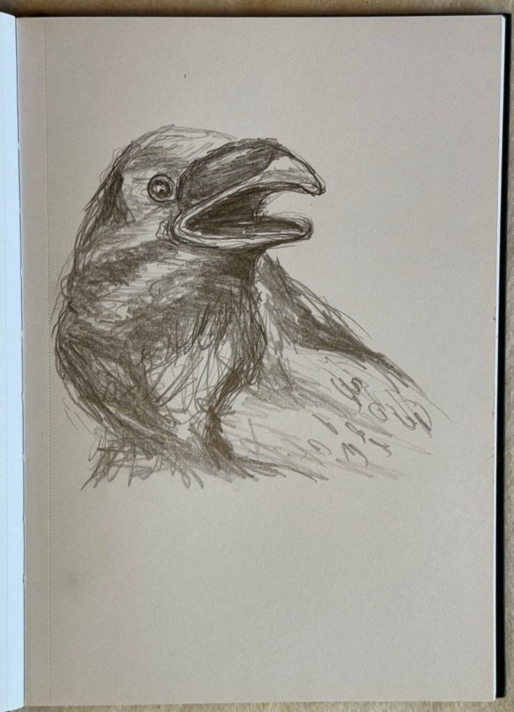
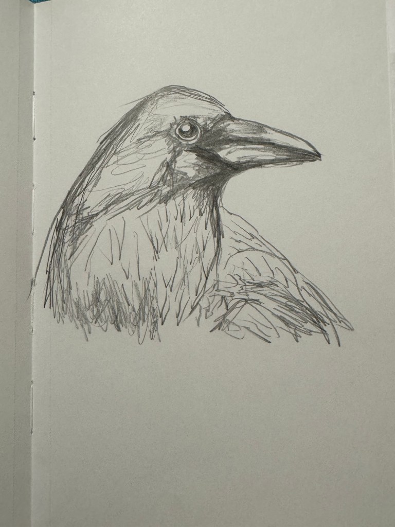
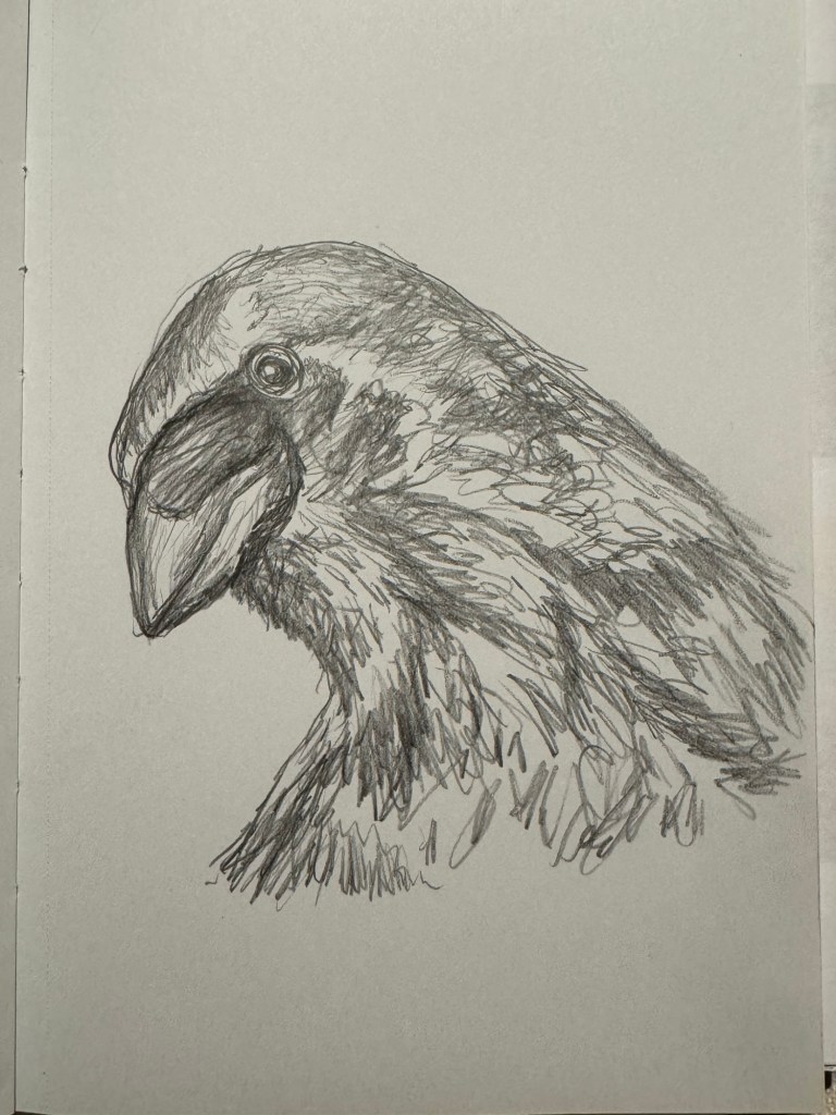
Another reason for drawing crows was to study their faces and anatomy as preparation for future work. Below are some crow drawings made with my non-dominant hand:
–
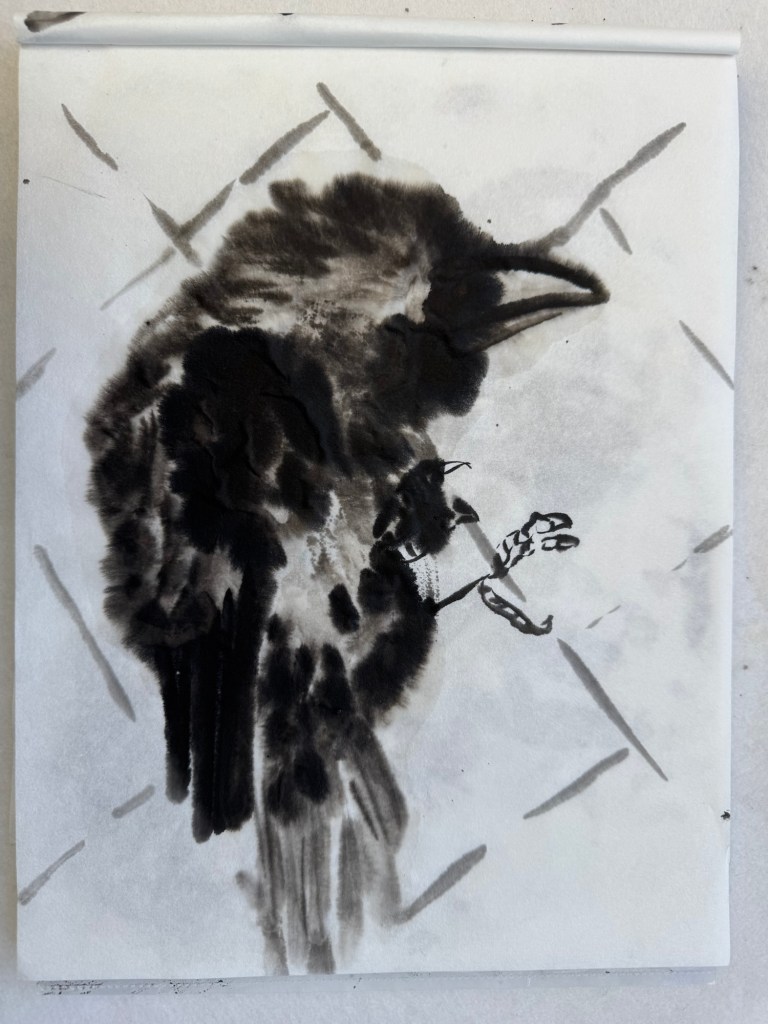
I then made one in Chinese ink but with my right/dominant hand:
–
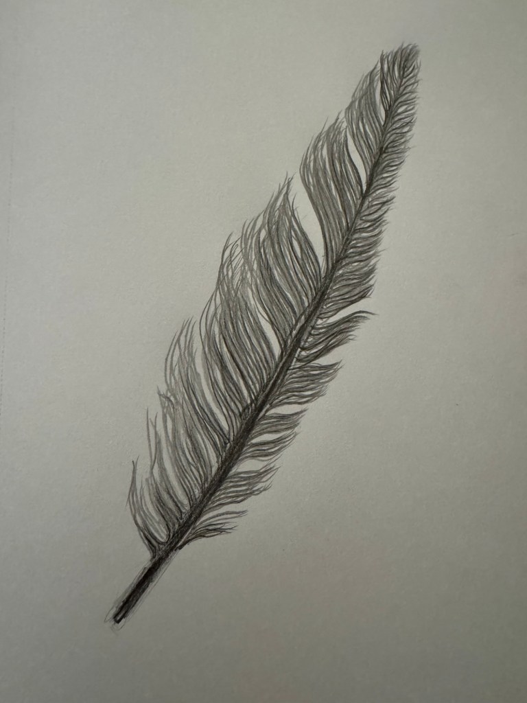
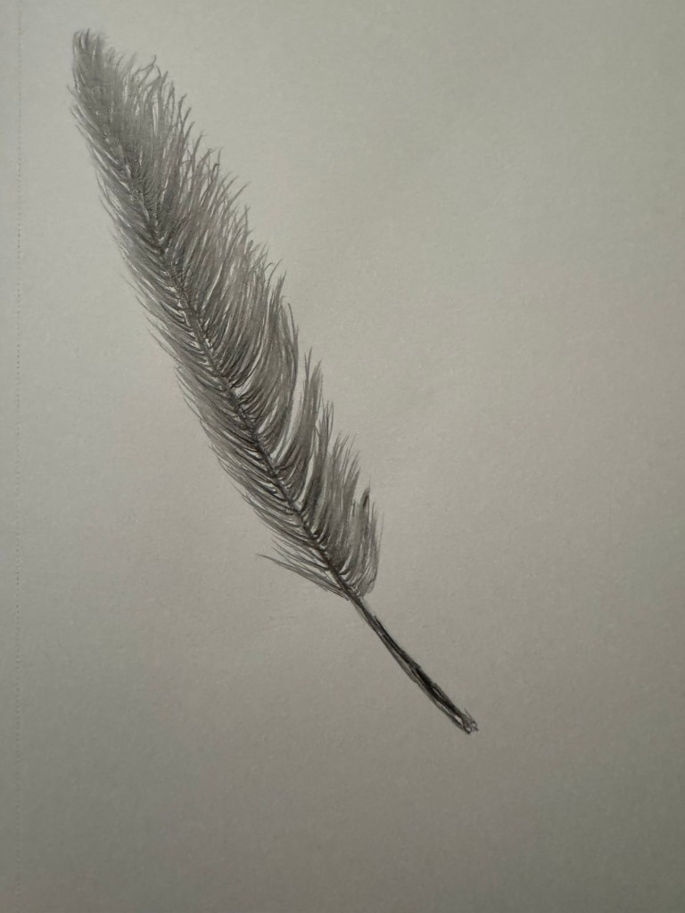
Two study drawings of crow feathers with my dominant hand:
–
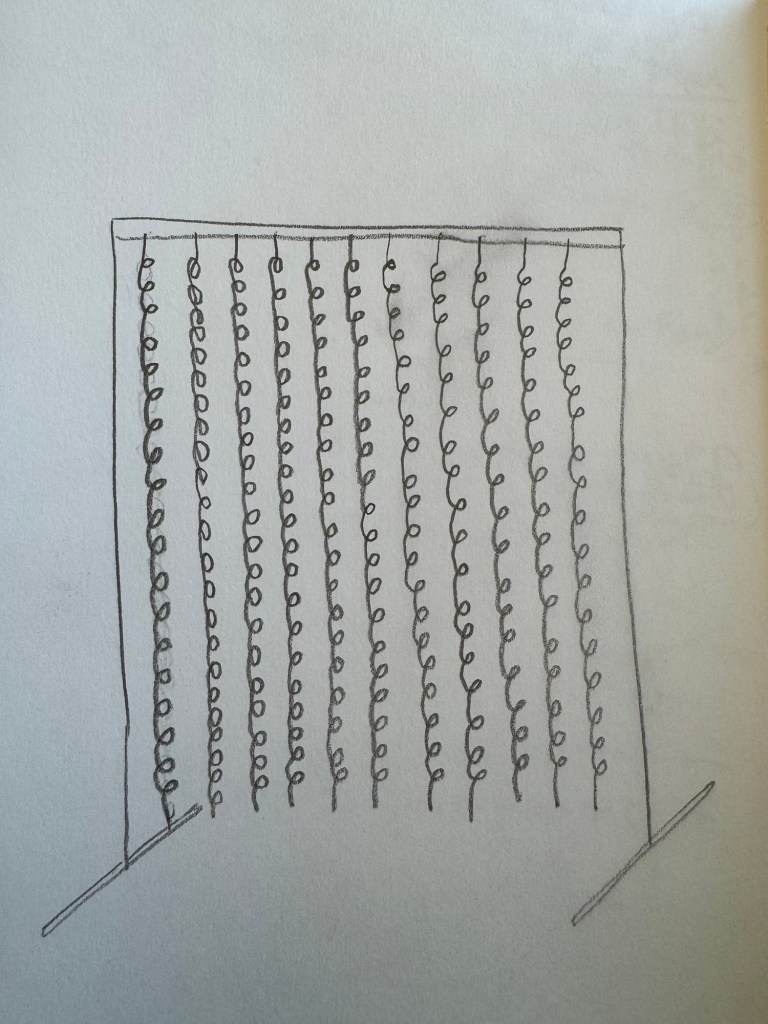
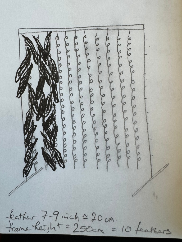
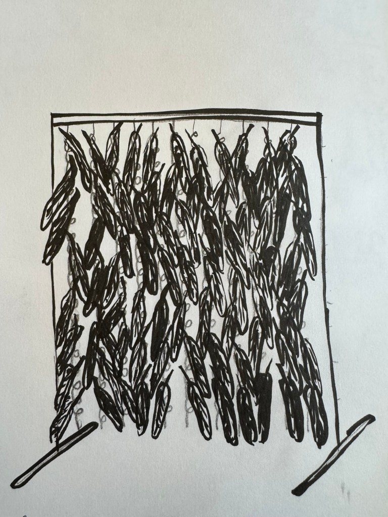
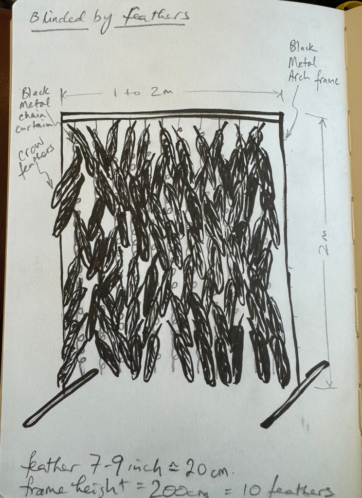
As I was drawing the feathers, I thought about making an installation with feathers. I thought of a crow feathers curtain reflecting my obscured view as a result of the grief I feel at the moment. Below are my sketches about this idea:
–
Then I returned to more crow drawings:
–
REFLECTIONS
I have enjoyed the drawings and indeed found the process comforting. I liked the outcome of the non-dominant hand drawings but was not so happy with the Chinese ink painting made with my dominant hand. The latter came out too neat and didn’t have the energy of the non-dominant hand drawings. This was an outcome that I expected and remain deeply frustrated about – I just cannot seem to achieve the same looseness with my dominant hand. I think I have to accept that and consider how I use both of my hands in different situations to create different effects. But I am concerned that as my non-dominant hand becomes dominant through practice then it would lose that ‘magic’. I know I am overthinking now and I shall deal with it as I go along.
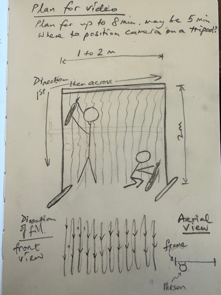
I have thought a lot about the idea of the ‘grief curtain’ installation. I have researched the materials to be used, such as a chain curtain, a walk-through frame to hand the curtain and also where to source crow feathers. The latter in particular is an area that I am not familiar with at all. During the low residency week, one of my course mates suggested an artist for me to look at:
MccGwire is well known for her sculptures made of feathers. I will take more time to research and study her work.
LEARNING
This is the start of a set of new work as a result of rethinking my practice after my recent tutorial where we discussed how I was feeling about the drastic change in world order. I have chosen grief as a topic to reflect the sense of loss that I feel. I have chosen crows and feathers as a way to express the grief inspired by the book ‘Grief is the thing with feathers’. I started with drawings as a form of comfort as I ‘ease’ into this new exploration for my practice.
The drawings have confirmed that I prefer the expressive mark making done by my left hand and remain frustrated with the neatness of my right hand! Thinking about which hand to use for which part of my making adds complexity but it’s a new way of thinking and making that I think I will enjoy.
This is a start and I will continue to explore the topic. I am still interested in the ‘grief curtain’ concept and will keep it in my ‘ideas bank’ for now.
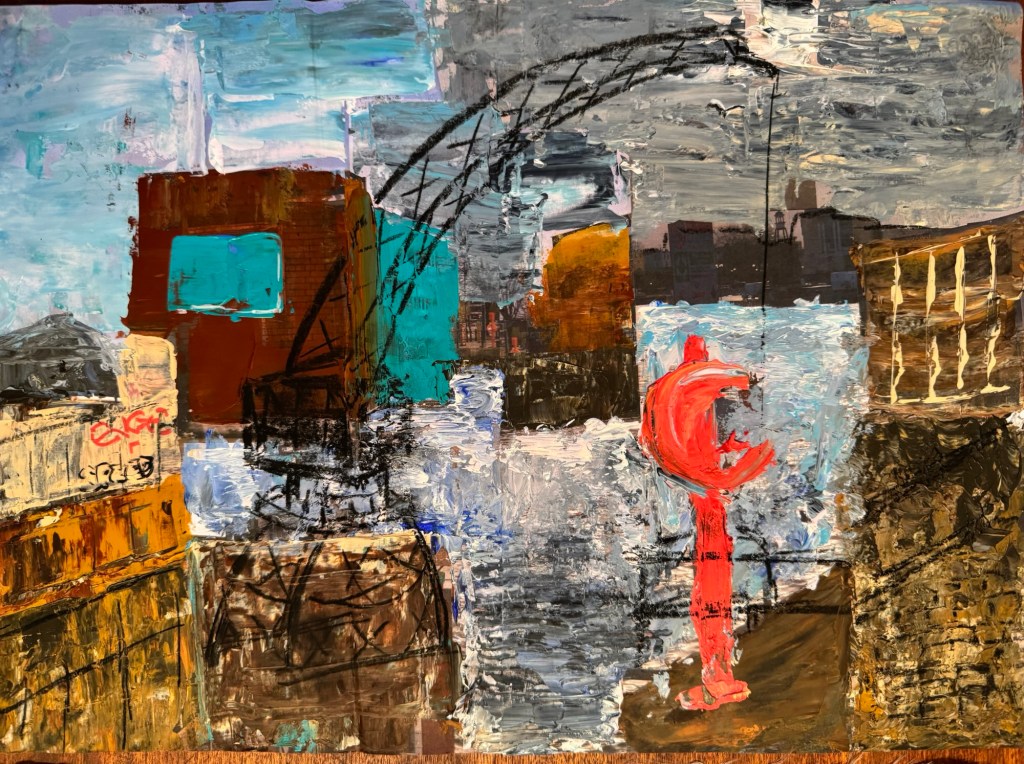
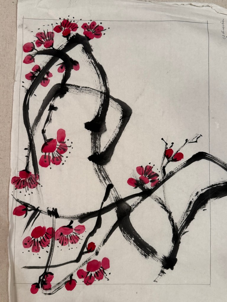
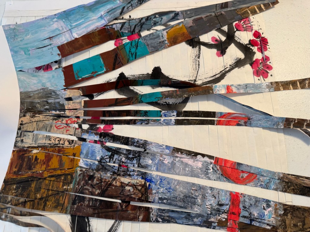
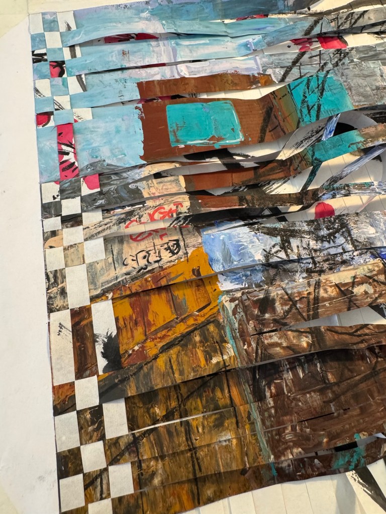
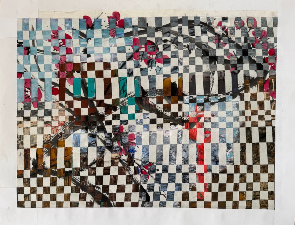
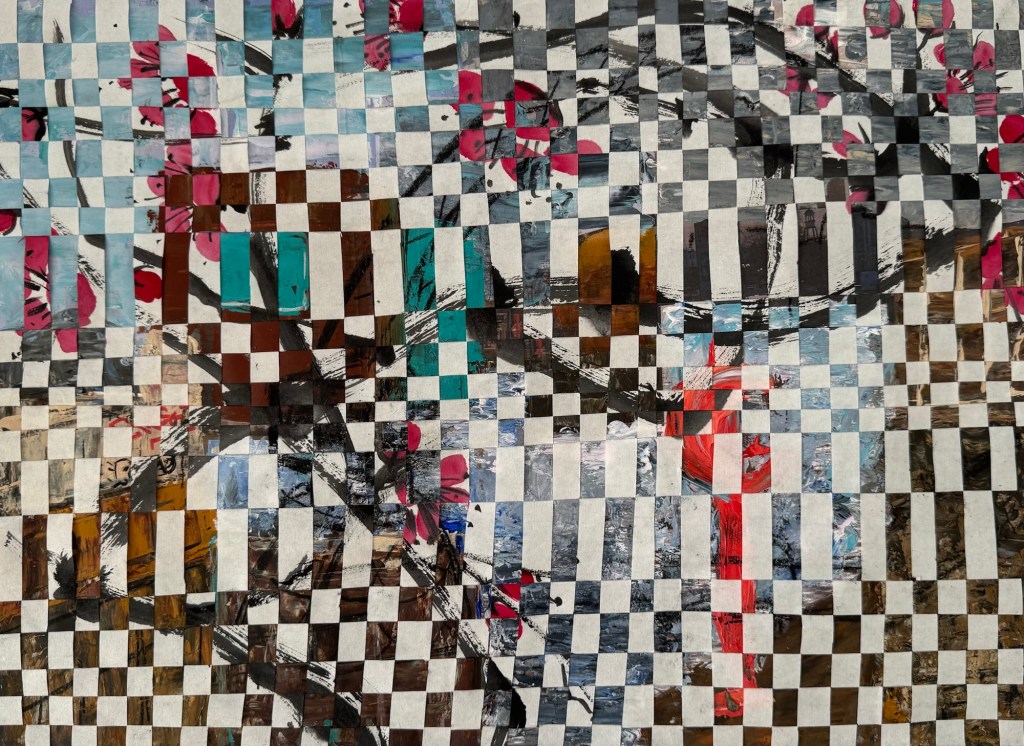
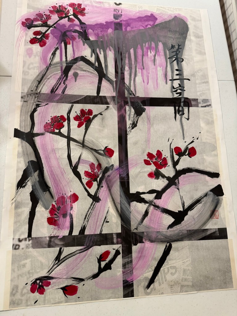
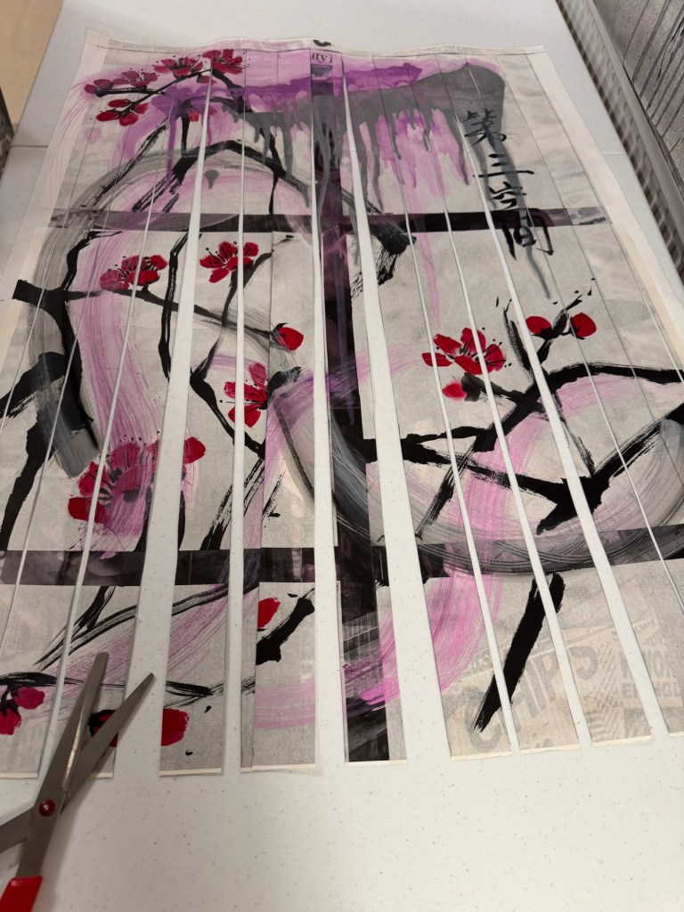
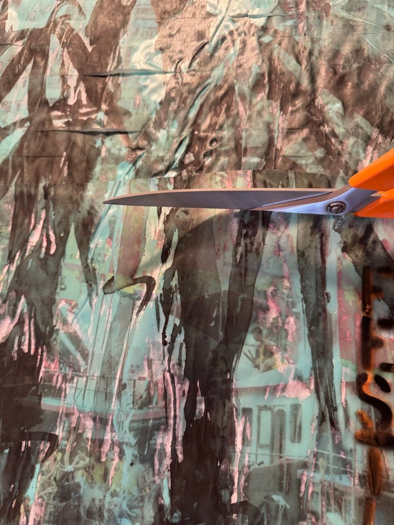
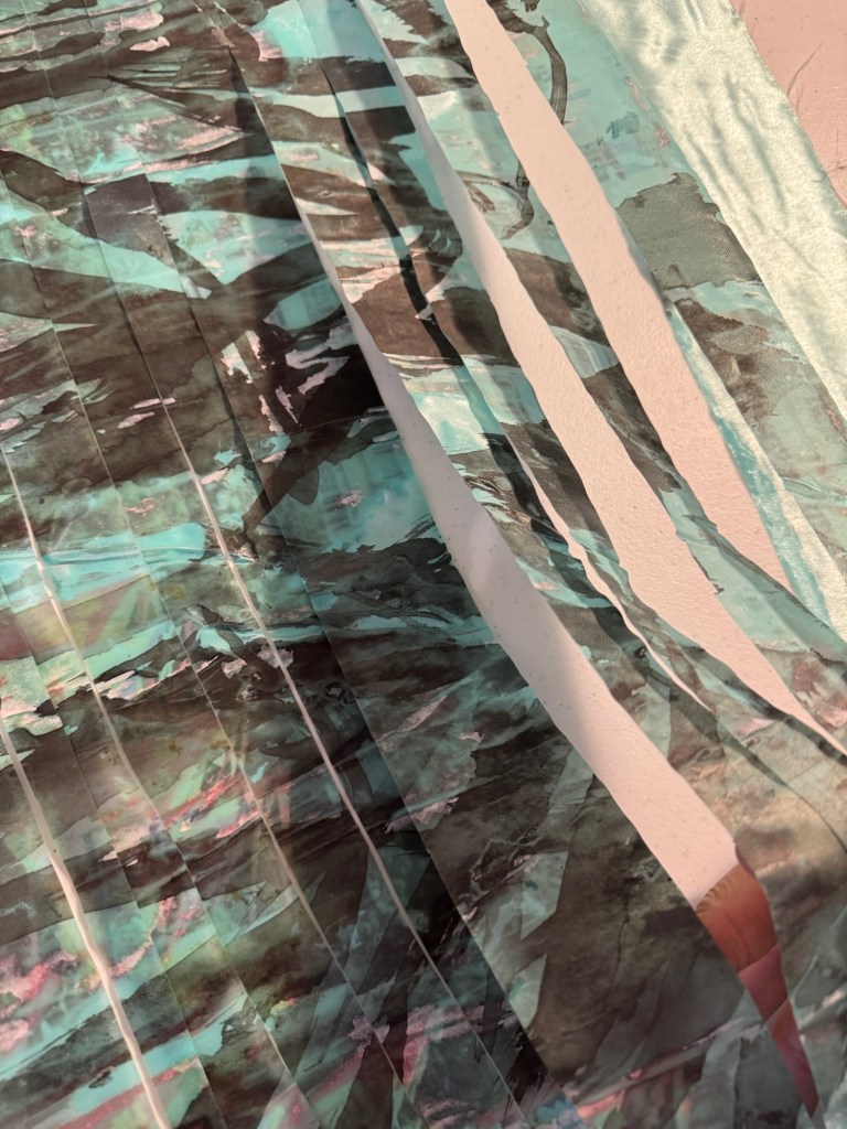
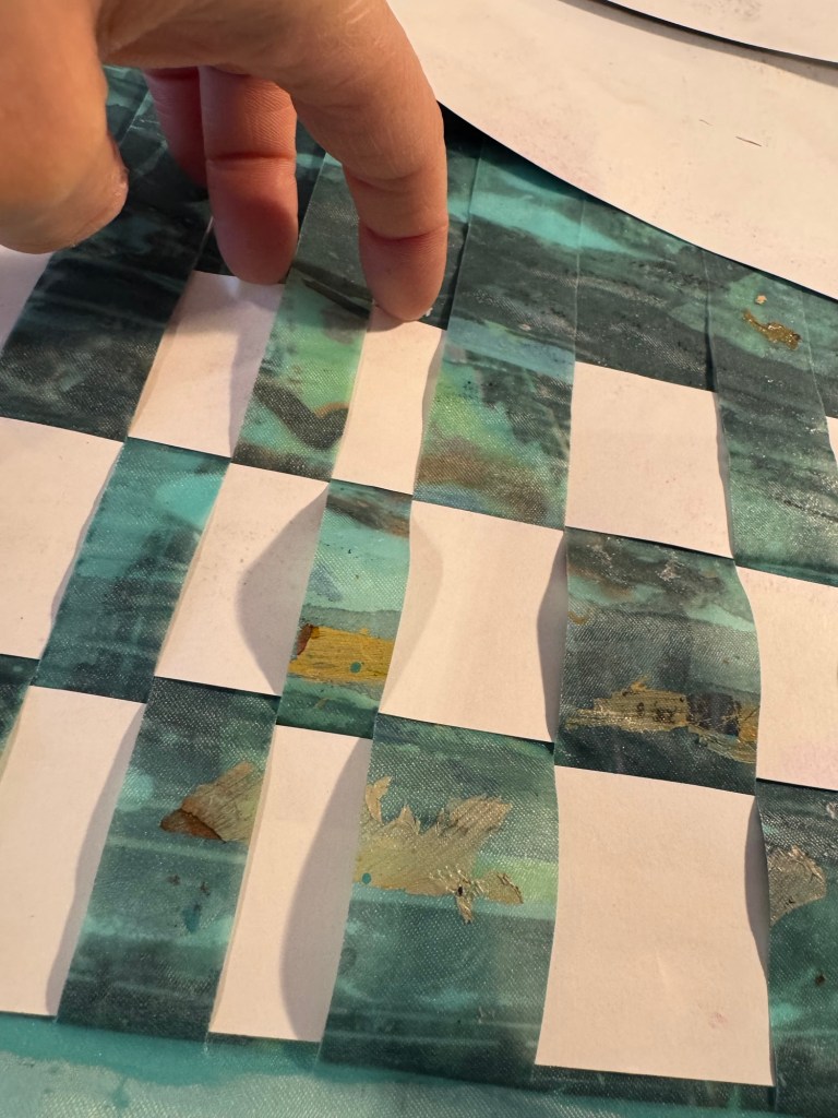
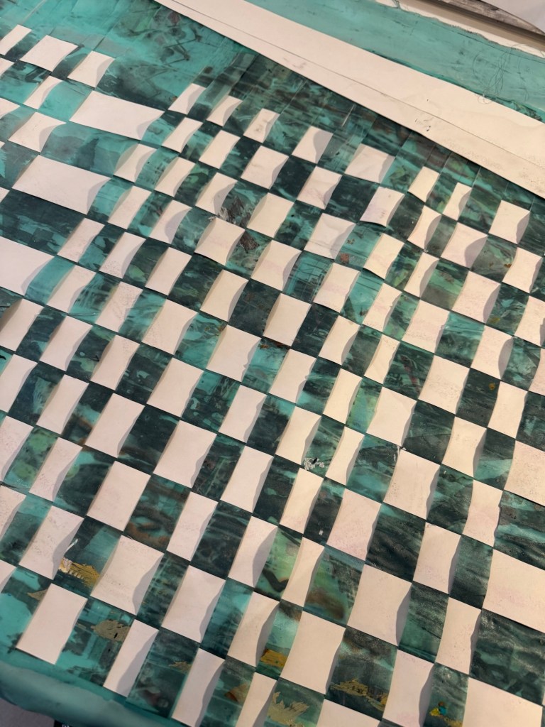
After the first experiment on weaving narratives (see link below), I decided to do a second experiment, this time with two paintings that were more representative of the different cultural narratives that I want to weave together and also very different style of work just to see what happens. Also, an action from the last experiment was to choose smaller paintings to speed up the experiment.
Plum blossoms, Chinese brush painting – ink on rice paper, cut to size A3.
Paper edges were added to both paintings so that the cuts could be made up to the edge of the image whilst keeping all the strips together at one end in a neat order. This makes the weaving process easier.
Video of cutting the acrylic painting which seemed to have attracted more views on my social media than other work. Also, four times more non-followers seemed to have engaged with this clip than usual.
I enjoyed the cutting process very much. It felt brutal but energising, liberating and renewing. The weaving process was enjoyable for me as it involved crafting with my hands. The delicate manoeuvring of strips of my painting during the weaving felt very different to the cutting process. It was strange to feel that I had to be very careful during the weaving when I have just taken a big pair of scissors to the work minutes earlier. The juxtaposition of the different feelings was interesting.
I am not too excited about the outcome though. I don’t think the woven painting created the interesting or intriguing effect that I had hoped for. The negative space from the Chinese painting introduced a lot of white into the image and obscured much of the harbour-scape rendering it not recognisable but without introducing intrigue.
Reflecting on this and the previous woven painting experiment, I am not sure if I want to pursue the weaving part much further. To really make something of it, I would need to have a good think about how the two images need to come together, how the negative spaces and colour palettes would combine to create a coherent image – even if it’s not coherent aesthetically, it needs to create intrigue or tension. As it is, I feel the images don’t provide enough to engage me, let alone a viewer. However, I feel there is good potential with the cutting process. It was an exciting process that I would like to explore further.
After cutting the paintings into strips, I played with waving or jangling the strips and they danced on the table. That was fun and I liked the images from the movements. However, once they were woven together, the images became ‘flat’ and ‘too neat’. Perhaps I can explore the dancing of the strips and do something with either just one painting or multiple paintings and then let the strips just fall down together and see what happens. Perhaps I can make videos of them dancing and collapsing together. As a metaphor, from my experience as a transcultural person, bringing together two different cultures is rarely neat and tidy, it requires improvisation and often people and situations are just ‘thrown together’ and one never knows what might happen. So perhaps the neat weaving was not such an appropriate metaphor as it seems too restrictive in hindsight.
LEARNING
It has been a good learning experience to weave together paintings. I learnt that I enjoyed the cutting up process, I enjoyed the weaving process but I am not taken by the outcome. The outcome appeared too neat and restrictive for the subject. Therefore, I don’t think I will do anymore ‘neat’ weaving of cut up paintings. Unless I am stuck for something to do in between projects and want to keep busy because it is a good way of keeping busy to enable some thinking time while making. I find the crafting processes are very enabling in a way to create thinking space and time.
What I will continue to explore is the cutting up process because I find that energising and renewing. I want to explore what else I could do with strips of painting, just play and explore and let them dance. I could do some video of their movements and create images from that. E.g. I can pile several paintings together and see how they fall together, or let each strip free-fall individually from height and film their movements in slow motion. It would be good to just to explore without any prior agenda. That can be liberating. I can try a filming project with an already cut up painting (to save cutting up another painting for the moment), I can un-weave one of the woven paintings then letting the strips free-fall, like untangling narratives and then setting them free. I can think about a narration to accompany the video or pair with music.
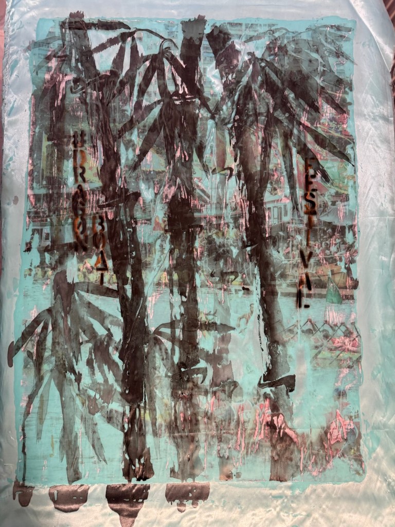
Think about using the green satin bamboo painting because the soft and light materials could float nicely onto the ground. Think about what background – white cube or outdoors? Perhaps an industrial background from the old Bristol docks? The delicate satin materials could be a good juxtaposition with the old heavy duty cranes by the harbour. The strips could fall inside the intricate metal structure of the cranes.
NEXT STEPS
Pause the ‘neat’ weaving of paintings for now, unless I want to use the process to enable thinking time.
Untangle a woven painting, set the strips (narratives) free in a free-falling way. Film their falling and piling up on the ground, if possible, do outdoors e.g. by the old Bristol dock.
Continue to explore cutting of paintings and see what that could add to my practice.
During my recent presentation on my research paper to my fellow students, I was asked why I talked about being transcultural and not intercultural. I talk about my transculturalism because I see it as a fusion process (as borrowed from physics) where two cultures come together and something completely new emerges (as per the definition by Homi K Bhabha). However, interculturalism is also applicable where I believe is when different cultures come together and intersect. It’s a process of weaving together rather than a fusion. I have not explored much about weaving cultures together although that is very much what I also do to navigate life. So I decided to investigate ways to weave my art to explore the idea of intercultural vs transcultural.
METHOD
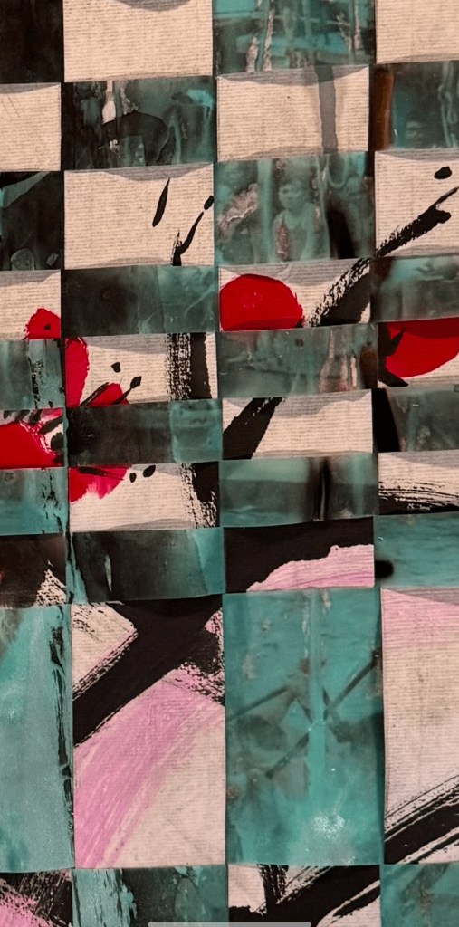
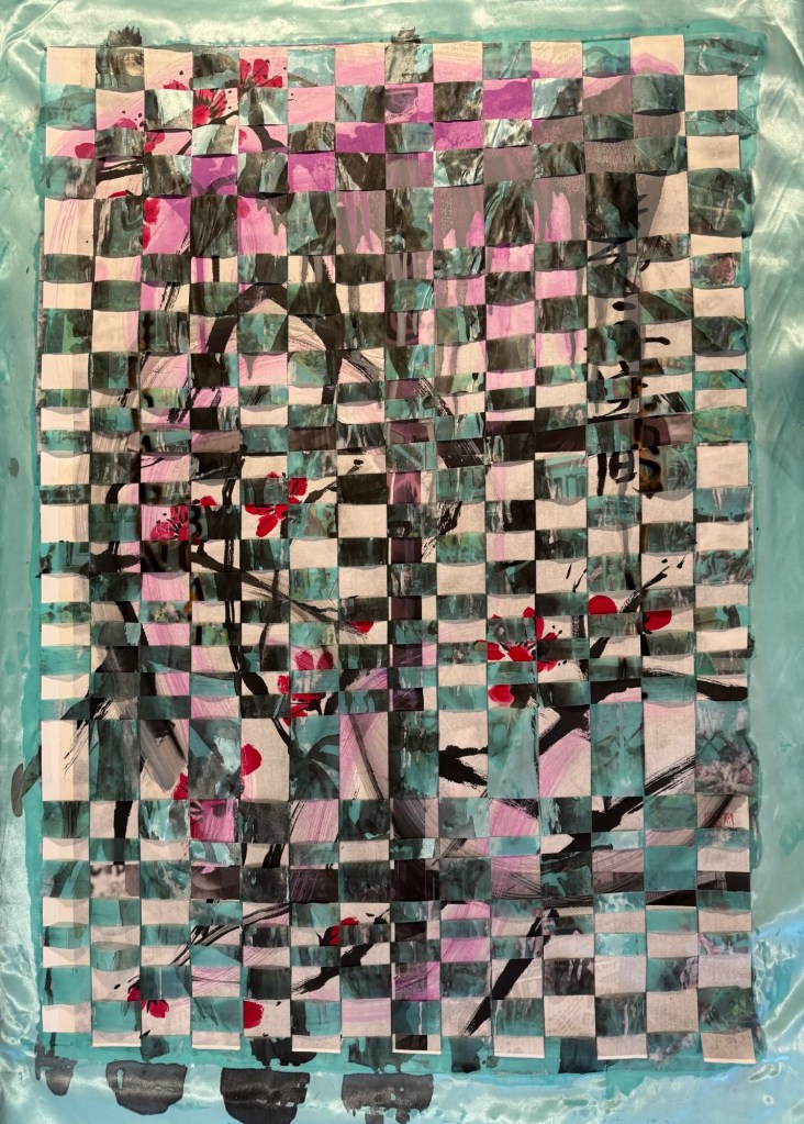
I chose two of my existing paintings for this project. To weave them together, I would need to cut them up first.
First chosen painting for cutting up – a piece of work from three years ago, Chinese ink on rice paper on inkjet printed paper:
I did some quick research on the definition of intercultural. The Spring Institute said, ‘Intercultural describes communities in which there is a deep understanding and respect for all cultures. Intercultural communication focuses on the mutual exchange of ideas and cultural norms and the development of deep relationships.’ Many definitions describe intercultural as the coming together of a group of people of different cultures. From the quick research, I did not find any reference to the intercultural experience occurring within one person. I.e. when one person experiences and navigates different cultures within their daily existence.
To help explain my thinking about intercultural vs transcultural, I need to borrow an analogy from A Level chemistry – the definition of a mixture vs a compound.
Mixtures are heterogeneous forms of matter. The composition of a mixture is variable with each components retaining its characteristic properties. Its components are easily separated. Examples of Mixtures: soil, ocean water, air, the cytosol of a cell.
In contrast, compounds are homogeneous forms of matter. The components of a compound do not retain their individual properties. E.g. both sodium and chlorine are poisonous; their compound, table salt (NaCl) is absolutely safe and essential to life. Another example of compounds is water (H2O).
It takes large inputs of energy to separate the components of a compound. Similarly, I have previously used the fusion concept from physics to explain the forming of transcultural characteristics. Fusion takes an immense amount of energy to take place. So learning from the analogies from science, I believe that for a transcultural person to go through the cultural transmutation process, it takes much energy and also time for the process to take place. Whereas I do believe that one can start to adapt to an intercultural life more readily. For example, an immigrant child moving to the UK with her family from say, Asia, could be adopting a full British style life at school during the day, then go home after school and be immersed back in her original culture in the home environment. That in my opinion is a form of an intercultural life.
REFLECTIONS
So where am I going with this?
Although I’m using science as analogies to explain intercultural vs transcultural, I am not asserting those thoughts as a definitive explanation, that would be grossly generalising and reductive. They are just ways of sense-making for me and to help me to think through the different cultural concepts. I could do more in depth academic research on the subject and I may well do so later. But for now, I am enjoying the thinking process based on my own experiences as I make art. I don’t believe I am anywhere near having answers, but I have started the thinking process on the subject.
How about the weaving? What did I get out of it?
My weaving experiment here was more of a technical exploration to see what happens when two paintings were woven together with a view of taking the learning to future works. Some questions that I asked myself in reflection were:
– How was the weaving process? It was quite easy and straightforward to execute, but that was because the width of each strip was fairly wide so quite easy to handle. I would like to try and weave with narrower or more irregular strips to challenge the process and create a less uniform pattern.
– What did I think of the outcome aesthetically? I wanted to see if the individual painting images would still be present but more ambiguous. I think I could say yes to this – I could make out the two original images but with missing details adding intrigue.
– How about the cutting process? That was very interesting! The cutting up of my paintings felt brutal but liberating. To not feel too precious about one’s work was definitely liberating. In previous blogs I’ve talk about how I valued the process of making more than the outcome. Once a piece of work is made, I usually feel quite detached about the piece of work. So I hope I will be prepared to cut up more paintings to investigate the weaving of work. Also, the cutting process helped me to release some of the anger and despair that has been building up for me regarding certain global issues going on right now.
– What am I really trying to achieve by the weaving process? I have struggled for some time to express my transculturality through my art. I have written about this before calling it the elusive ‘green’. I kept painting with blue and yellow (metaphorically) but couldn’t yield a satisfactory green. Meaning that I couldn’t come up with something that represented my transcultural / fusion process. When I was asked by my classmate ‘why not intercultural ?’, it occurred to me that interculturalism is also applicable to me, perhaps if I start with that, I might get more insight into the transculturality that I want to express. Imagine if the width of the cut-up painting strips were so narrow that the two images eventually became one, then that would be like a fusion process, or a ‘chemical compound’ would have been created where it’s no longer easy to separate or decipher the two original images. Hence like something new emerging in the third space.
Taking this idea further, I have in the last two years explored much about my transculturality, however, that is only a part of my identity. I consider myself a Hong Kong born British Chinese engineer artist woman business-leader and mother. In examining my identity as a transcultural person, I have not yet explored the dynamics between the engineer and the artist; or the experience of a woman and mother; or my voice as a business-leader vs that as an artist. In an earlier blog, I talked about wanting to re-explore an area that I have found comfort in the past (new objectivity industrial art). How do I combine that desire/need with my ongoing transcultural practice? They seem very different but are all part of me and my identity.
LEARNING
Since I exist in the intersection of multiple aspects of my life, I need to consider how I broaden my identity exploration beyond the current transcultural perspective. I cannot think of how I can express the different identity elements whilst remaining coherent. Perhaps I can make paintings about the different elements and then weave them together to see what images emerge. E.g. weaving together a Bristol streetscape with a Chinese ink painting, or an oil painting of my childhood family dinner with my expression of womanhood. What would that look like? This means instead of creating one image that embodies the different aspects of my intersectionality (like in Akunyili Crosby’s work as described in my research paper) which I have struggled to create satisfactorily, I can create multiple images and weave them together to see what comes out. This doesn’t mean I will adopt the weaving of paintings as a main process for my practice, but it might give me ideas and inspiration to create images (more abstract and ambiguous images) to express my overall identity. Importantly, it gives me a way forward when I’m feeling somewhat stuck with the complexity of too many ideas.
NEXT STEPS
– Cut up two more paintings with narrower strips then weave them together to see how the overall image develops. Use smaller size paintings like A4 so the experimental process can be quicker.
– If the above experiment is successful, then think about what to paint to really explore the different aspects of my identity and then weave the works together to see what comes out.
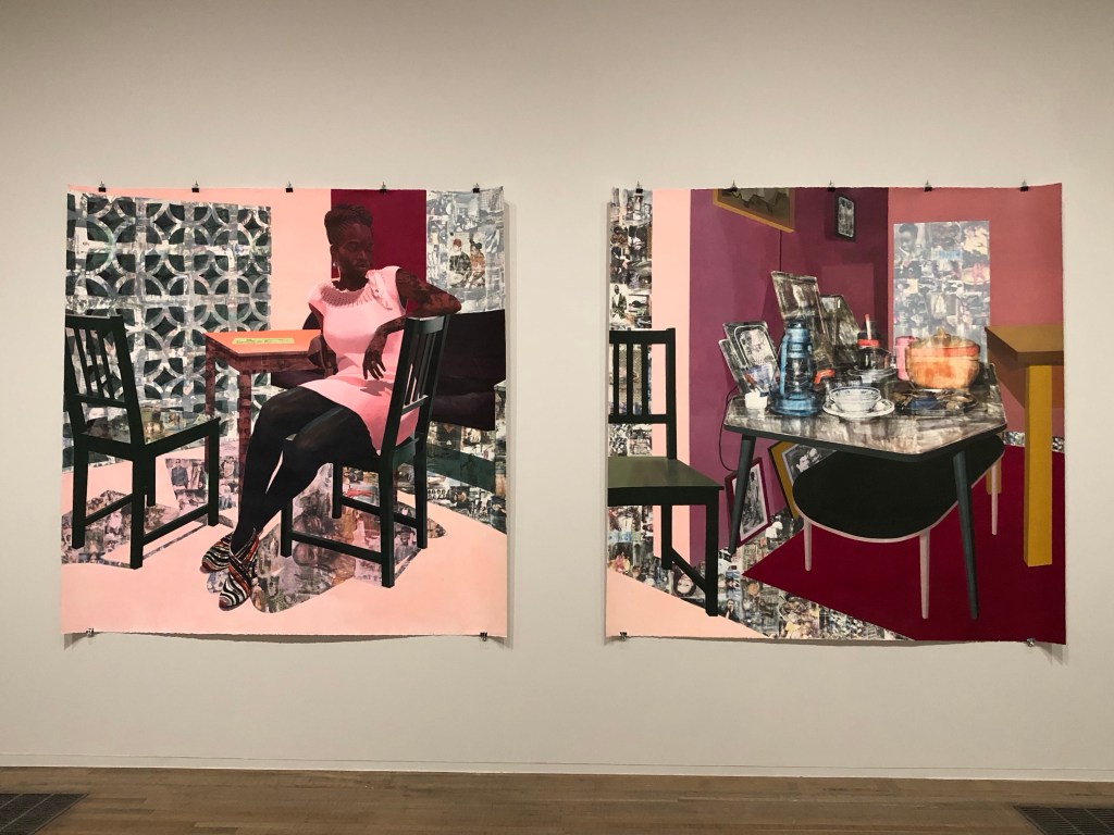
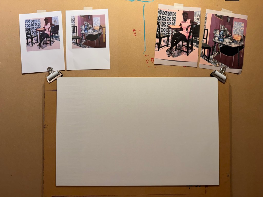
I had a tutorial with an Academic Support tutor from CSM and we discussed painting. I talked about one of my favourite transcultural artists Njideka Akunyili Crosby. I talked about how in awe I felt when I saw her large diptych at Tate Modern last year. The tutor suggested that I made a painting to respond to the work.
Akunyili Crosby’s work at Tate:
–
METHOD
I printed out Akunyili Crosby’s work to give me inspiration. A board canvas was chosen.
–
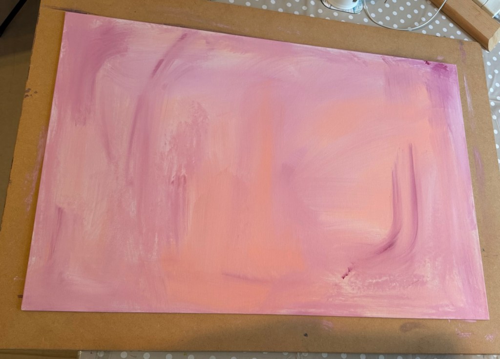
A thin acrylic wash of mixed colours was applied to cover the canvas.
–
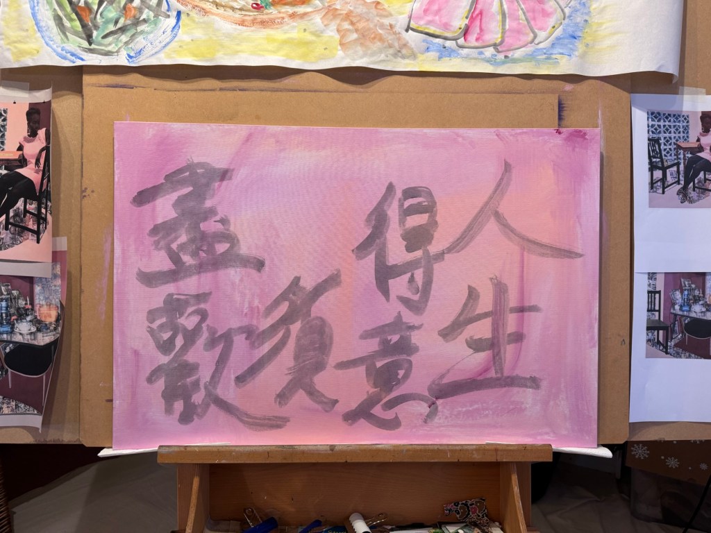
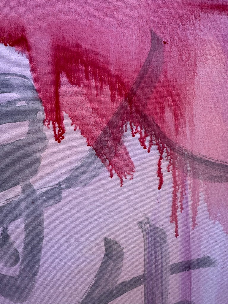
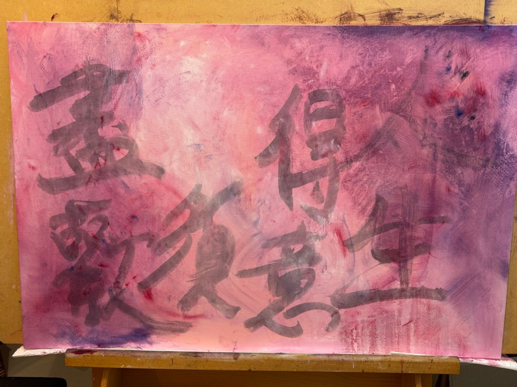
A line from a Chinese Tang Dynasty poem was chosen and written onto the canvas in Chinese ink to add some extra images onto the background. The line translates as – in life, when times are good, really celebrate.
–
Then very thin layers of oil paint were applied loosely with brushes. The canvas was kept vertically for the paint to run down.
–
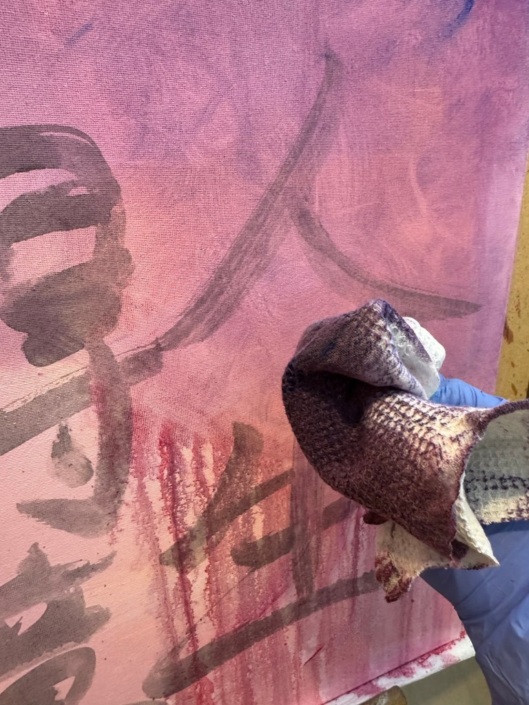
A piece of textured rag was used to experiment with creating patterns:
–
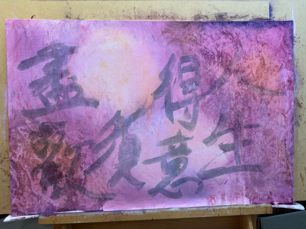
Work in progress, playing:
–
Playing some more:
–
Close up images to show the ragging effect. The oil was so thin that the background images were still coming through:
–
But what to paint?
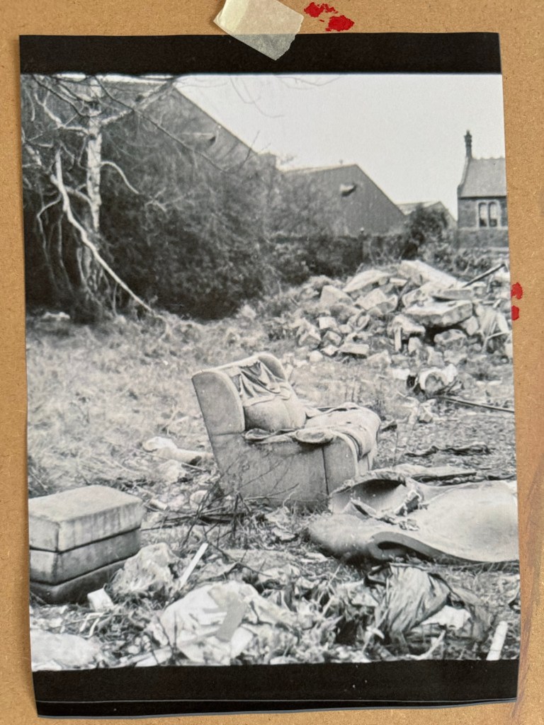
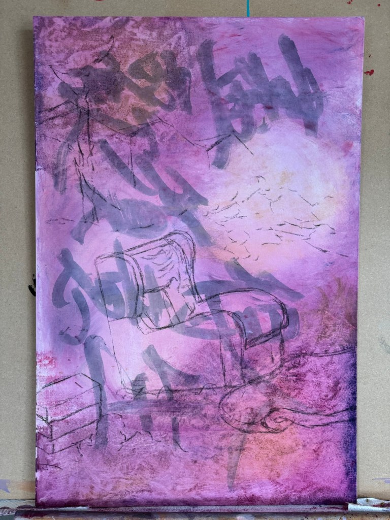
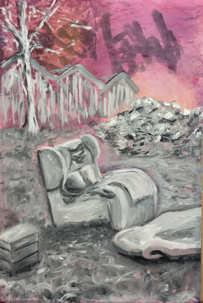
I decided to paint the ‘lone sofa’ photograph that I took when I went on a photography walk-about in Bristol. That was my favourite photo of the trip.
–
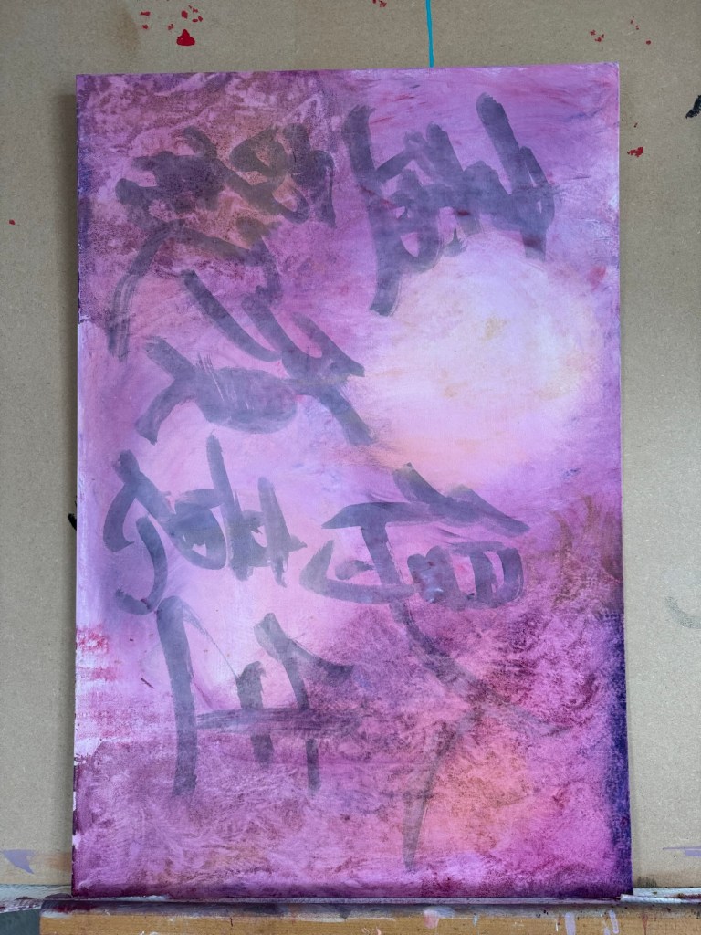
The canvas was put into portrait orientation.
–
Charcoal was used to layout the composition, choosing what to keep and what to leave out from the photo image.
–
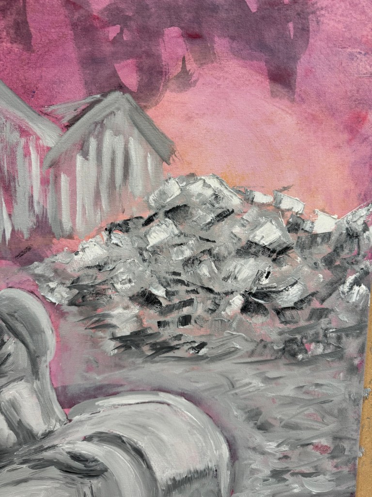
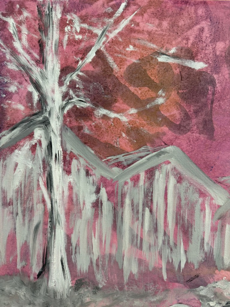
Close-up of areas of the finished painting:
A pile of rubbleA tree in winter
Finished painting:
–
REFLECTIONS
The oil experiments were not as useful as I had wanted – the outcomes were pretty much as expected and I can’t say I made much new discovery. So I need to do more research on this rather than just play.
The Chinese characters in the background were mostly hidden in the end. Again I could have used thinner oil. Or in this case, I feel it’s fine to obscure the background and use the Chinese characters as abstract patterns rather than to convey specific meaning.
The sofa scene – I mentioned in the last blog that I wasn’t feeling colourful so I opted for muted grey tones. That feels appropriate for this scene especially given the original photo was monochrome. I enjoyed the painting process which I tend to do most of the time. It was useful to focus on what to take out from the image composition, trying the less is more approach.
The piece of folded torn foam mattress on the floor was quite successful and also the pile of rubble. I think what was going through my mind was a dystopian scene and I wanted to create a dystopian effect to reflect my despair about the rapid change in world order, not sure if I really got that effect.
Although I started with wanting to do a response to Akunyili Crosby’s work. The outcome was quite far from that original intention. I think it’s because I made this painting over several weeks and my state of mind changed over that period and what I started off wanting to do didn’t seem relevant in the end. So I am comfortable with the change in direction.
LEARNING
To get more out of my exploration of oil, I need to do some research work, either online (YouTube) or books to gain new knowledge so I can take my experimentation to the next level.
It was only when I reflected afterwards that I was going for a dystopian theme. Perhaps if I had thought of that at the start then I could have created more of a dystopian atmosphere. I can research more about dystopian art. But how does that fit in with my transcultural practice? Should I go off on this tangent right now to risk having an incoherent body of work?
NEXT STEPS
Do research on oil painting techniques to learn new ways to use oil.
Do research on dystopian artists to see if that’s the vibe that I want to reflect my state of mind right now.
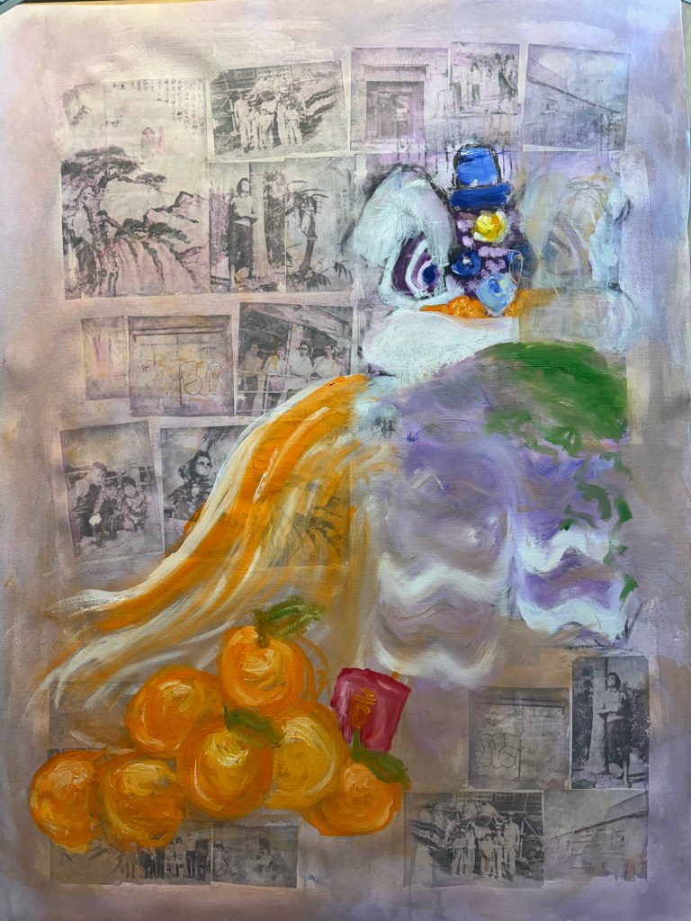
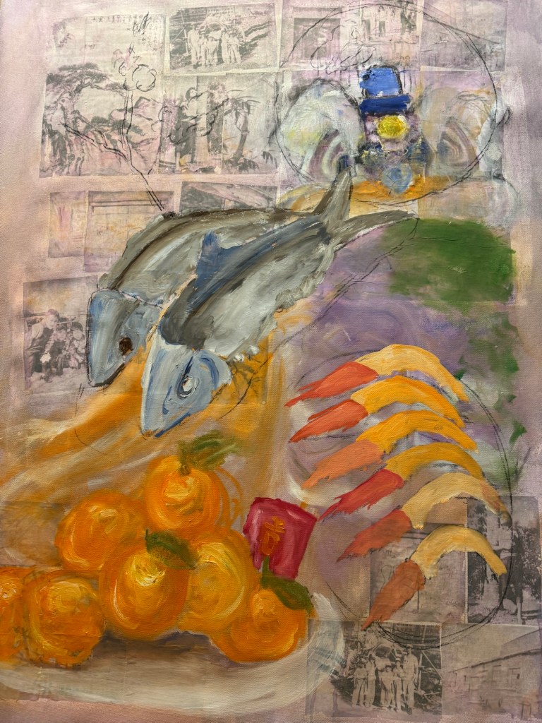
Following on from my Unit 2 feedback, I wanted to explore more ways of using oil. Also, from some photography work, I wanted to incorporate more photos into my work. So I started a new piece of work without knowing what I was going to do.
METHOD
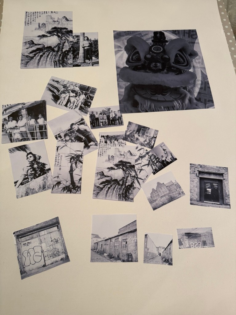
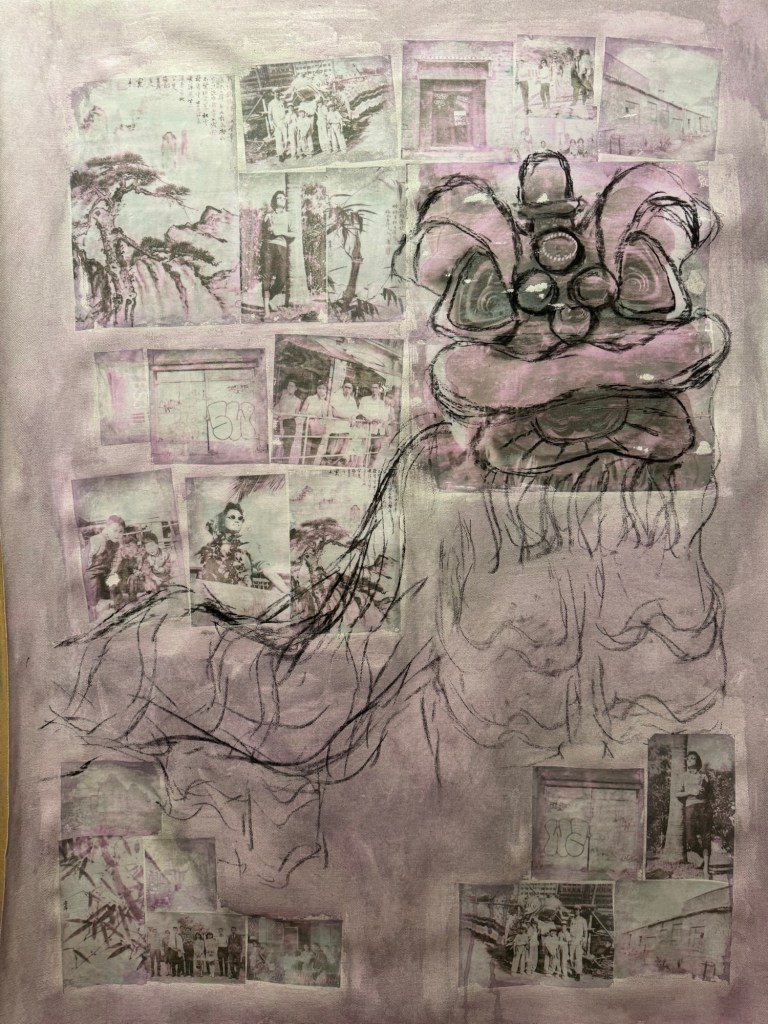
I made some black and white inkjet prints of various photos, some old family photos from Hong Kong and some recent Bristol streetscapes that I took with a medium format camera. Since it was around Chinese New Year time, I put in an image of a traditional Chinese Lion used for festive lion dance. I wanted to make that a dominant feature of the composition for the new year.
–
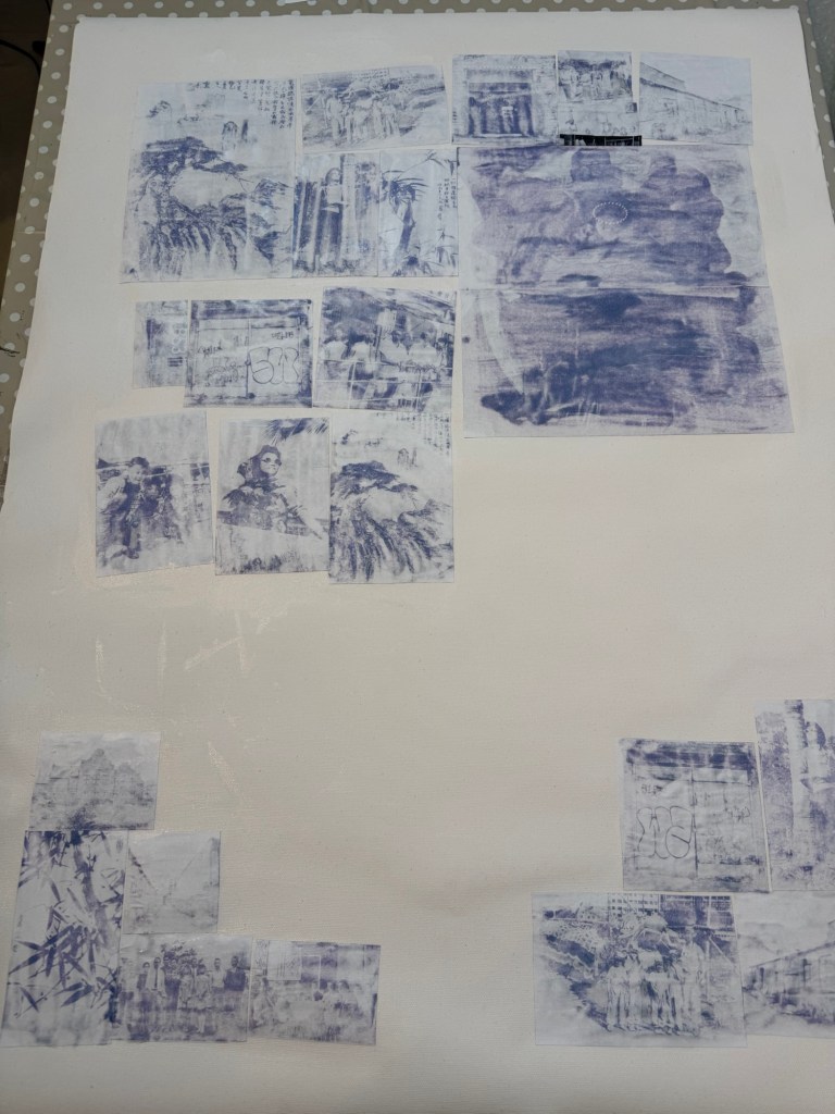
I used dispersion liquid to transfer the images onto a primed canvas:
Prints being stuck down using dispersion liquid
Printed images transferred onto the canvas. Due to the inkjet printer image, there was a pink / magenta tint to the transferred images.
–
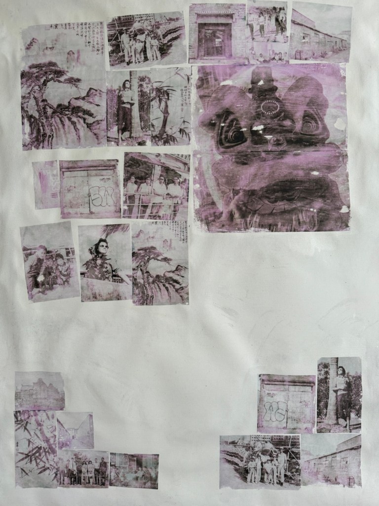
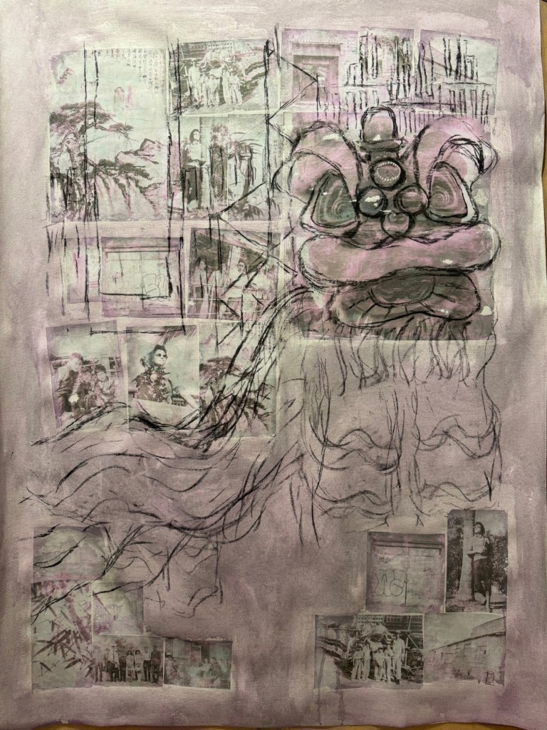
The canvas was covered in a thinned down acrylic wash:
–
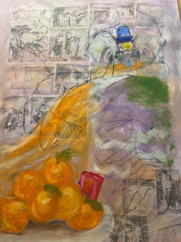
Charcoal was used to mark out the composition with the Lion being prominent.
–
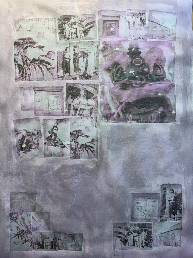
Some iconic buildings from my childhood Hong Kong were added to the background.
–
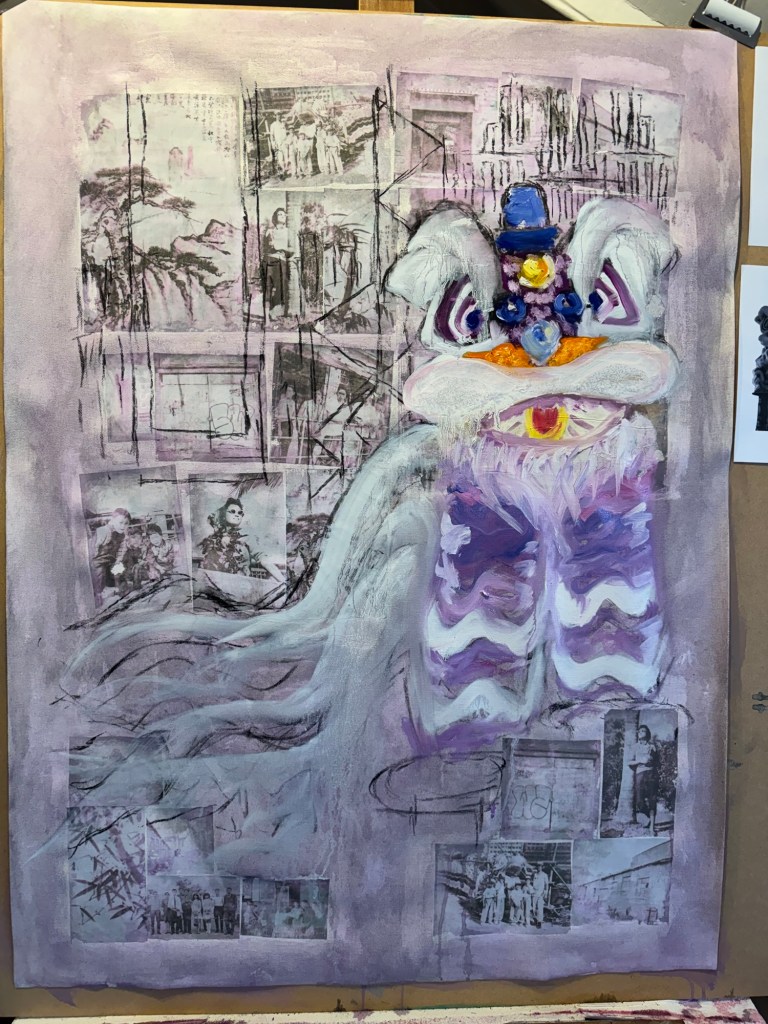
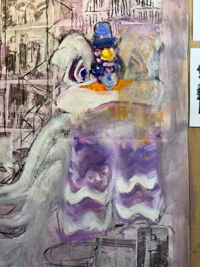
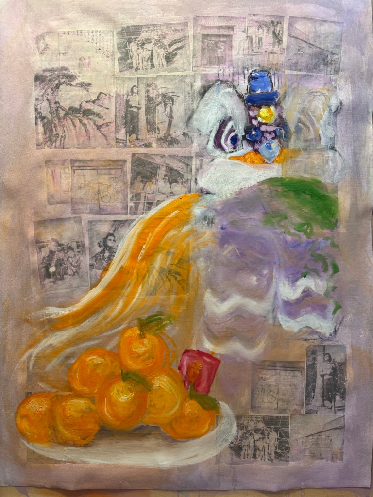
The lion head was painted in oil. But I was not happy with it, it looked too ‘cute’.
–
Since this was an experiment in oil, I started to wipe off parts of the image to create different effects.
–
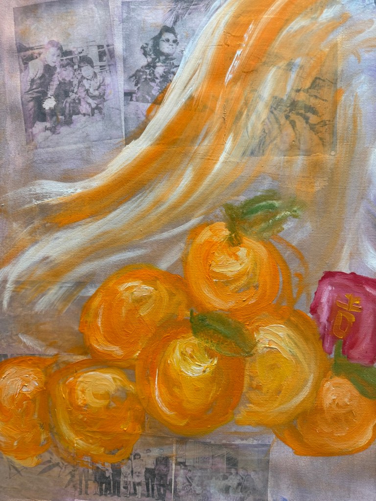
A pile of mandarin oranges were added as a traditional Chinese custom during New Year. I wanted to add typical Chinese New Year food to the composition in response to my decision after the Cheongsam series to do some Chinese food painting on a ‘normal’ 2D canvas:
–
I experimented with using looser brushstrokes and some thinned oil for the oranges:
––
I was still very unhappy with the lion and decided to replace it with a complete family dinner with symbolic dishes for Chinese New Year.
Charcoal marks for New Year food dishes
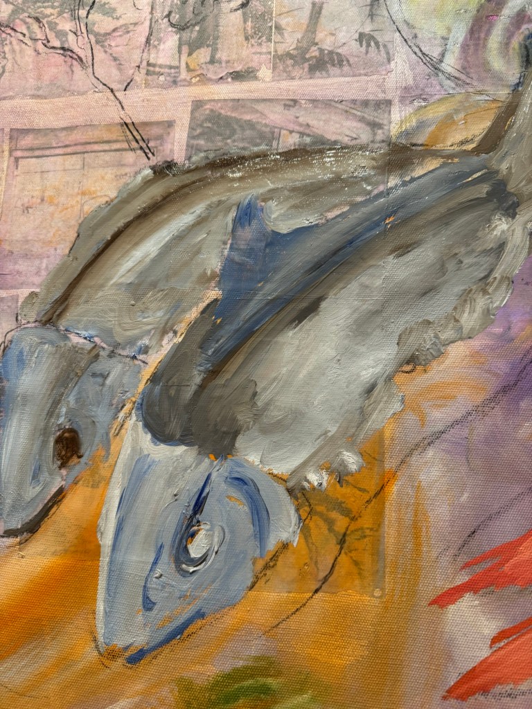
Thinned oil paint was used to mark out the shapes of the various dishes. Then more details were added to the fish first:
–Close up of fish (stuffed dace fish)
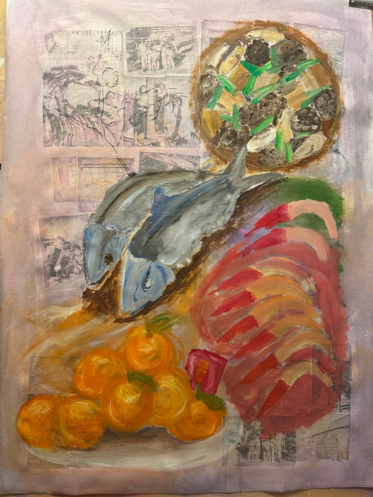
Other dishes were added:
–
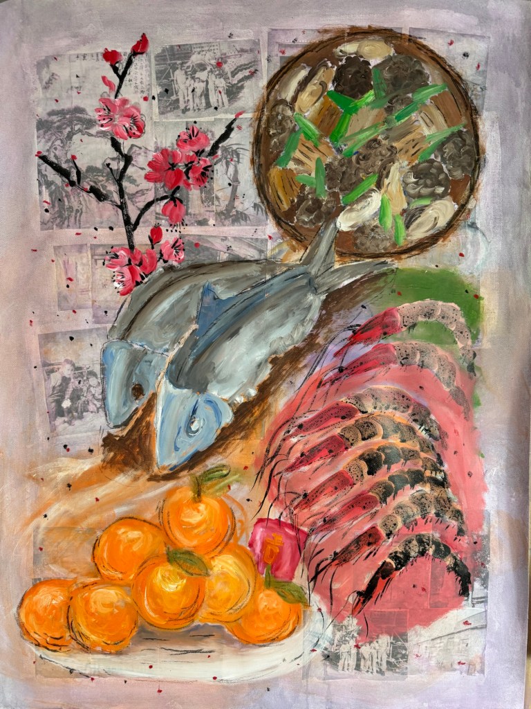
The prawns’ details were finished with Chinese ink and a peach blossom branch was added (also in Chinese ink) as it was traditional to have this plant at every home in Chinese New Year.
Finished painting – Chinese New Year dinner:
Mixed media on canvas. Size 102×75 cm
Menu:
Centre – stuffed dace fish. Symbol for having surplus meaning never falling short (of money). The word ‘fish’ sounds like surplus.
Top right – stew of shiitake mushrooms, dried oysters, pork belly and spring onions in fermented bean sauce. A traditional new year dish, a large pot is usually made and eaten over several days. ‘Dried oyster’ sounds like ‘good things’ meaning good things will happen.
Bottom right – prawns. Symbol for happiness. ‘Prawn’ sounds like laughter.
Bottom left – mountain of mandarin oranges with a red money packet (lai see), the phrase sounds like ‘gold mountain’ meaning good fortune.
Top left – peach blossoms, the blossoms opening signifies good luck and good fortune.
REFLECTIONS
I am glad I didn’t continue with the lion. It was not how I wanted as it was too detailed and cute. I was happier when the Chinese dinner idea started to develop. I was mindful that I wanted to experiment with Qi Baishi’s idea of painting between likeness and unlikeness. I was hoping the thinner paint and looser brushstrokes would give me more scope to express the unlikeness. I think I made some progress compared to the Family Dinners on the Cheongsam canvases, but there’s still some way to go.
I experimented with incorporating photographs but I think in the end they didn’t really add anything as most of the images were covered up. Perhaps even thinner oil would have left the photo images still partially visible.
I have never managed to combine oil and Chinese ink satisfactorily, I think using the combination on the prawns worked out well. I believe the thinned down oil helped the combination to work so worth bearing this in mind.
LEARNING
Try experimenting with even thinner oil paint and other techniques to apply paint.
Think more about what I want the photos to do (e.g. how much to be revealed) if incorporating photo images, then dilute the paint accordingly to achieve the effect. The experiment here was not fully thought through as I was just playing, but it provided good insight into how easily it was to fully obscure the photos.
Overall the painting was looser and less organised compared to Cheongsam Family Dinners, but I need to be more courageous about achieving unlikeness. Add more of myself to it and think about what feelings and intentions I have – not intentions regarding the composition, but what I’m trying to say.
NEXT STEPS
Experiment more with oil and different applications.