For the MA course, the guideline is to work on average 20 hours per week throughout the year, or 30 hours per week if only working during term time.
Work can be anything ranging from making, research or ideation. I am using the Toggl Track App on my phone to help me track my hours spent on the course and the hours are logged against the activity type. I plan to log a summary report at the end of each month to keep track of progress. However, the informal time spent thinking about my practice whilst going about day-to-day life is not recorded as they tend to ‘just happen’.
The purpose of monitoring my hours is to help me to establish a working rhythm so I know what it feels like to work the required hours for the course on an ongoing basis. It will also help me to plan and allocate time in my week to do the work. The analysis by activity type helps me to balance time for the different aspects of developing my practice so I can watch out for trends, e.g. spending too much time researching and not enough time making.
REPORTS
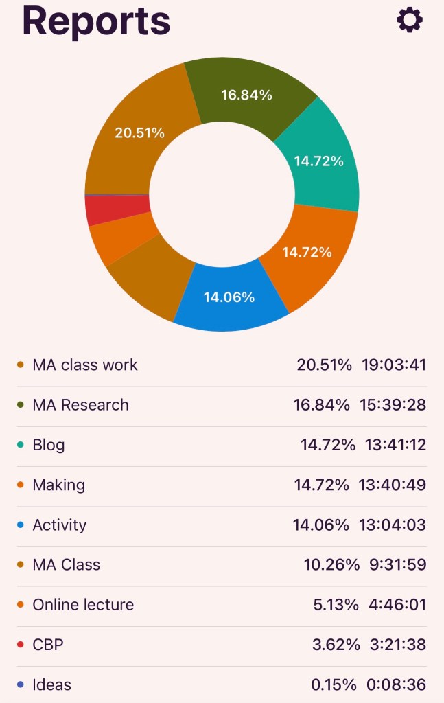
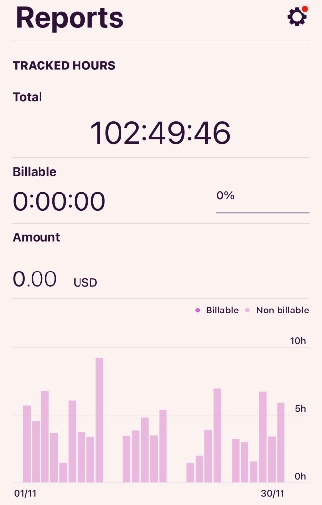
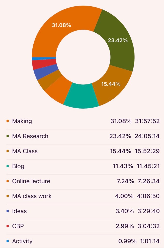
Each report will show the total number of hours worked per month and hours spent according to activity categories.
Key: ‘CBP’ is Chinese Brush Painting; ‘Activity’ is typically outside the studio such as visiting exhibitions or local artists group activities. The rest are self-explanatory.
The reports in this blog are listed in reverse chronological order.
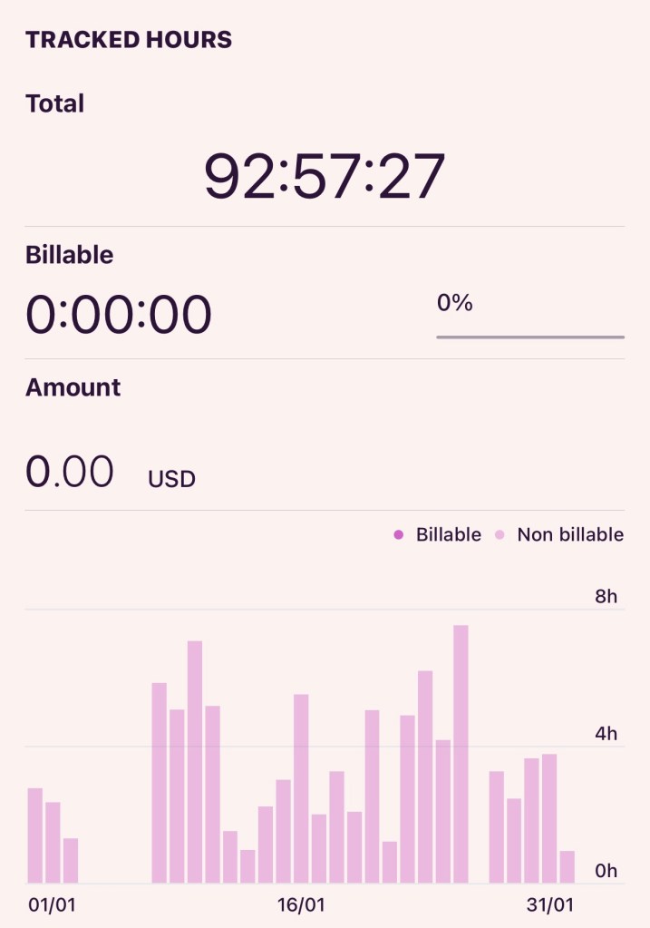
January 2024
A fair amount of time in January was spent on writing my study statement (captured under MA Class Work). For research work – I am reading a very informative book on The Modern History of Hong Kong which is a key part of my research on my heritage and the transcultural phenomena in the former British Colony. Also, I went to London for three days to attend a workshop at UAL LCF, to visit the CSM campus and two galleries (Tate Modern and The RA). As a result of these activities, the amount of time spent on making was less than I wanted for January. My plan for Feb is to really ramp up my making time because I expect to have less studio time in March due to the low residency in London.
–
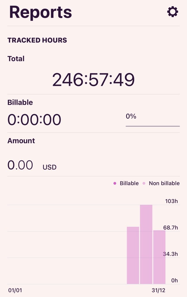
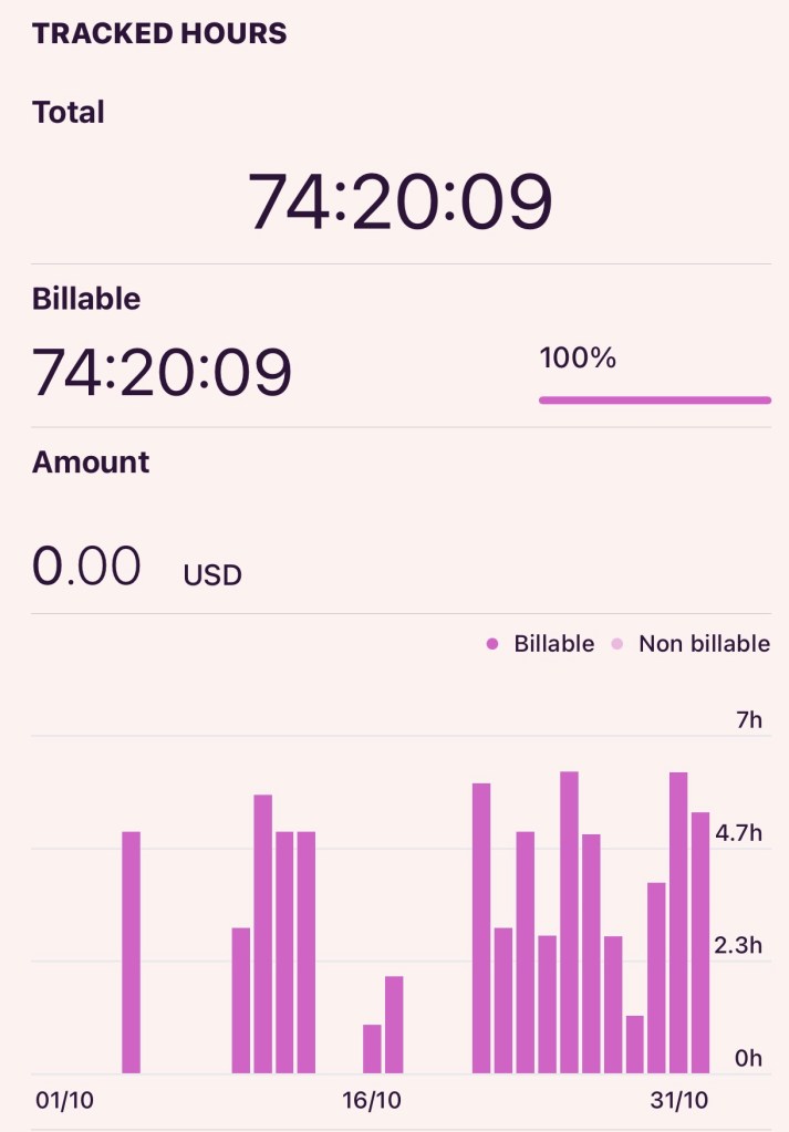
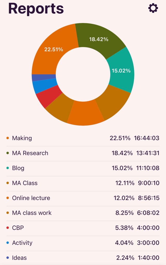
Report at the end of December 2023:
Below is the report for the total time spent during the first term, i.e. Oct, Nov and Dec 2023.
–
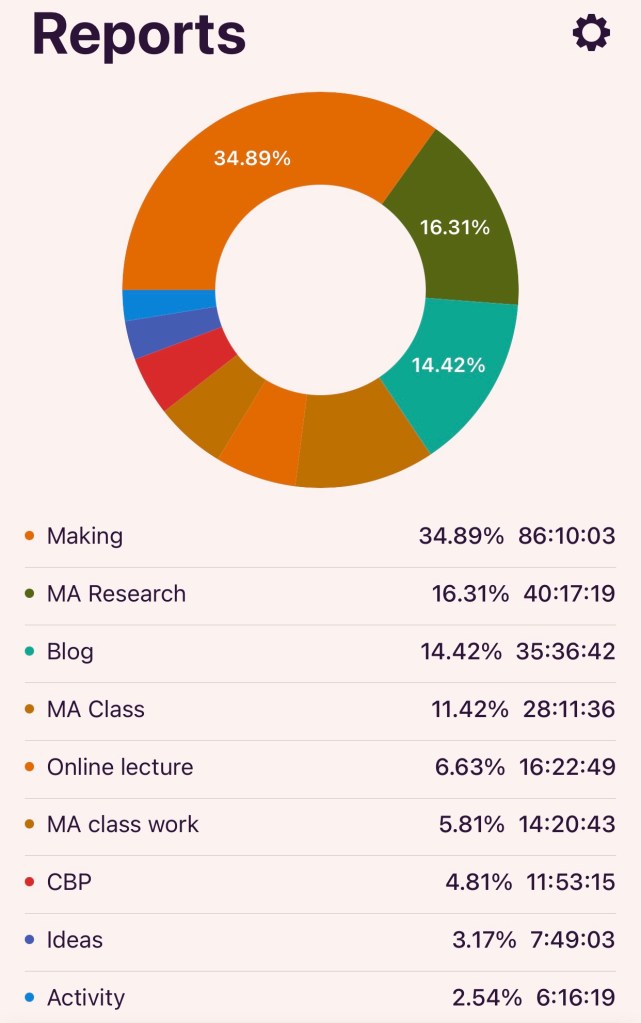
Below is the time and activity analysis for the first term:
–
Reflections (end of Dec 2023):
My reason for doing this time analysis was to establish a rhythm in order to make the most of the opportunity of this MA course. I am happy with the overall time spent and the split between the different activities. During the first term, I feel I have established a rhythm that is sustainable going forward and I plan to continue to monitor my progress using this tool.
November 2023
This is the first full month of the course and I didn’t have any trips away, so it was easier to fit in time for work. Below is report for the whole month of November.
–
Reflections (End of Nov 2023):
I have found the Toggl app very helpful and easy to use in tracking my time. I really want to make the most of the MA course so establishing a rhythm and knowing what the right rhythm feels like is useful for me. Having a way to meaningfully monitor my time is also assuring so I know I’m not spending too little or too much time on something. I know that time is a quantity measure and doesn’t reflect quality – but it’s a start in holding myself to account for the opportunity that I have with the course.
October 2023
October was the beginning of term and work on the course didn’t really get going until week 2 of the month.
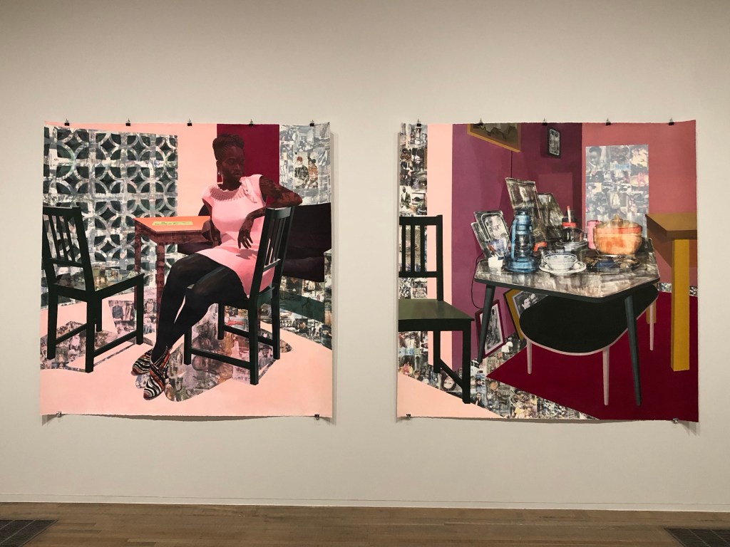
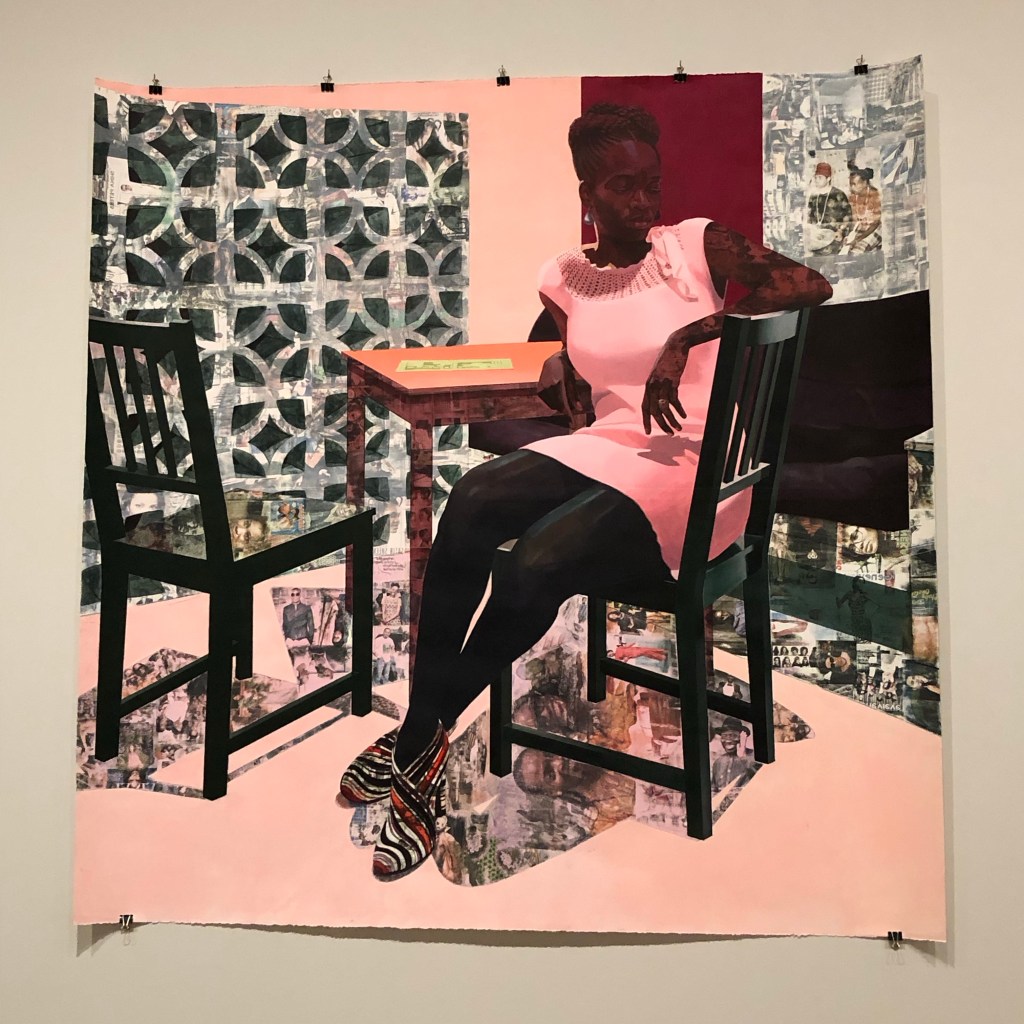
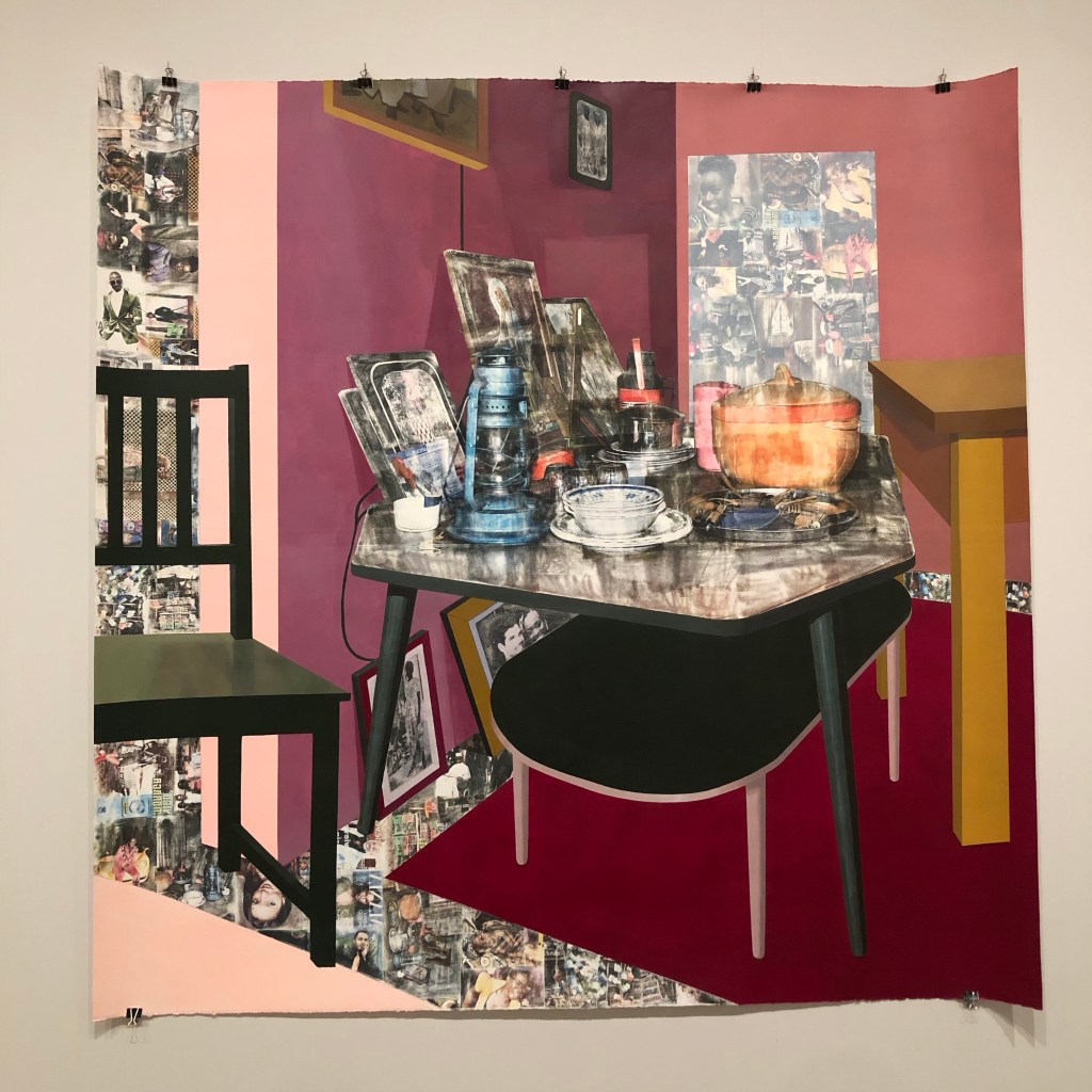
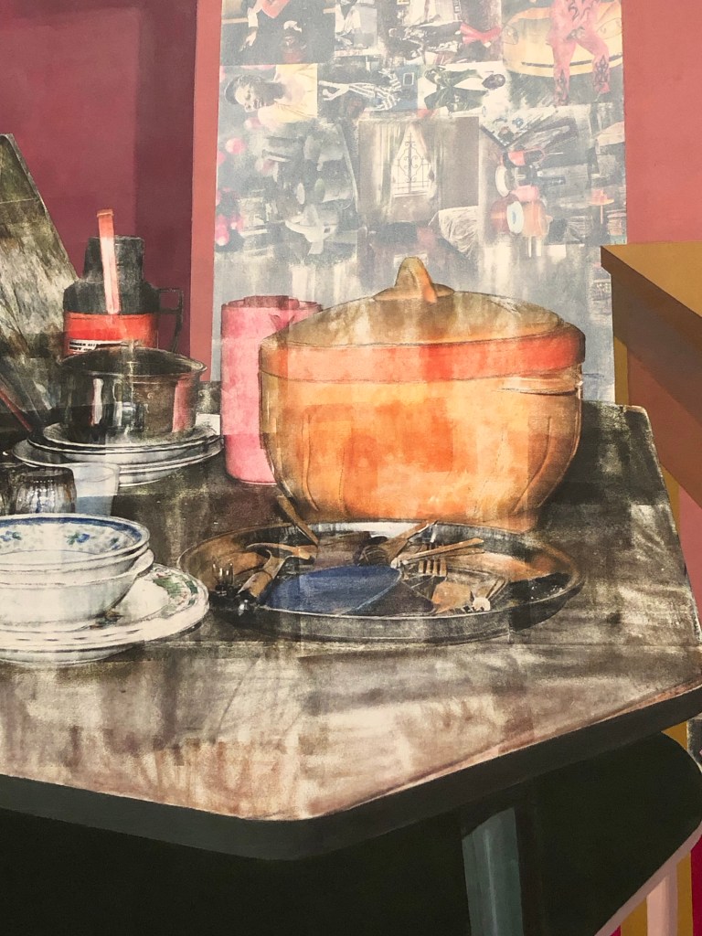
I visited the exhibition ‘Capturing the moment’ at Tate Modern. My main purpose of visiting was to see in person the work by Akunyili Crosby – a transcultural artist that I admire very much and I have learnt a lot from her work as well as her lectures. I have been researching her over the last two years and it was rather emotional seeing her large scale work exhibited at Tate Modern. This is a short blog to record that visit and to capture my feelings at the time.
Visit date: 15th January 2024
–
REFLECTIONS
My thoughts while analysing the work:
The use of photos denoting memory, mixed with hard-lined pieces of furniture such as the chairs from the reality of today is a good juxtaposition of a journey. Also items on the table with memory significance such as household items (I believe were from her grandmother’s house after the grandmother died), with faded images around photographs. A good metaphor for (fading) memories, journeys travelled and the present time.
My feelings – How do I feel seeing this in person for the first time after researching this artist for two years:
Emotional, overwhelmed, much more impactful than I ever expected, too much to take in, didn’t want to leave.
Size is much bigger than I expected: each piece is around 7ft x 7ft. Painting is on paper – I wouldn’t normally do such a large painting on paper so it was good to see how it could work and I liked the way it was hung – with clips around the edges. No framing or mounting which made the piece feel lively for me.
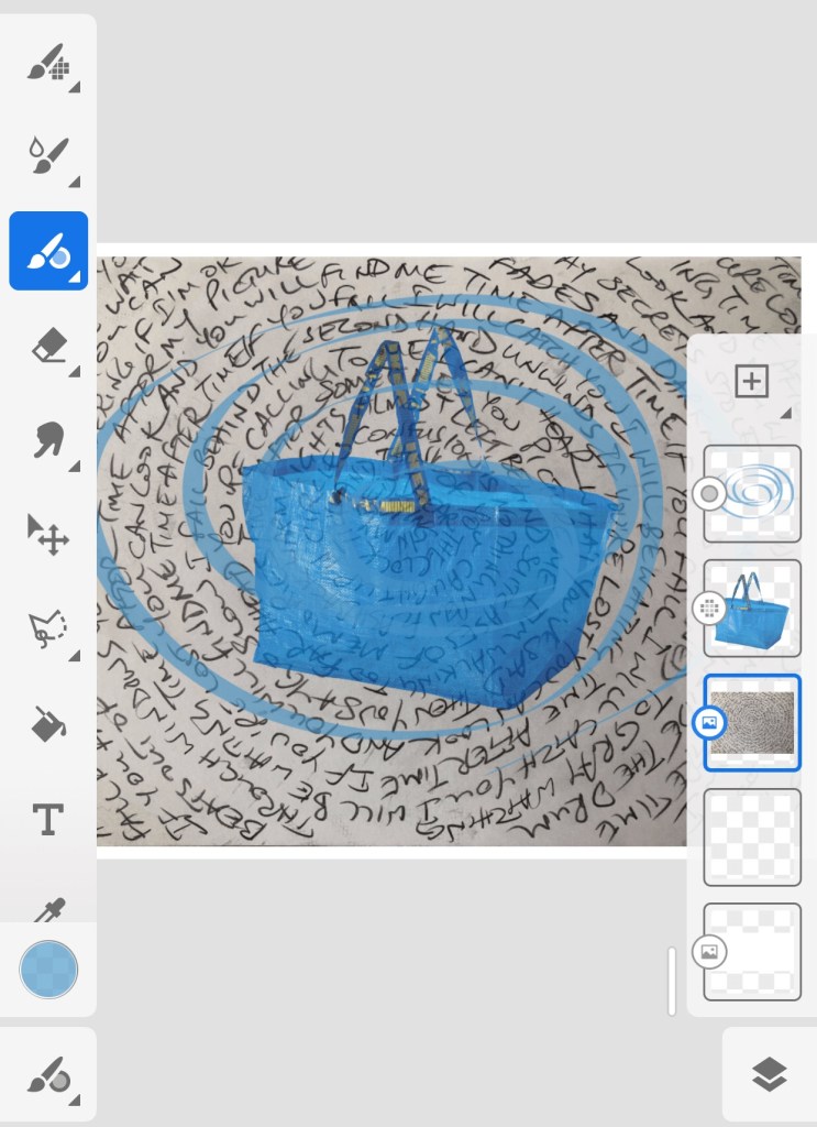
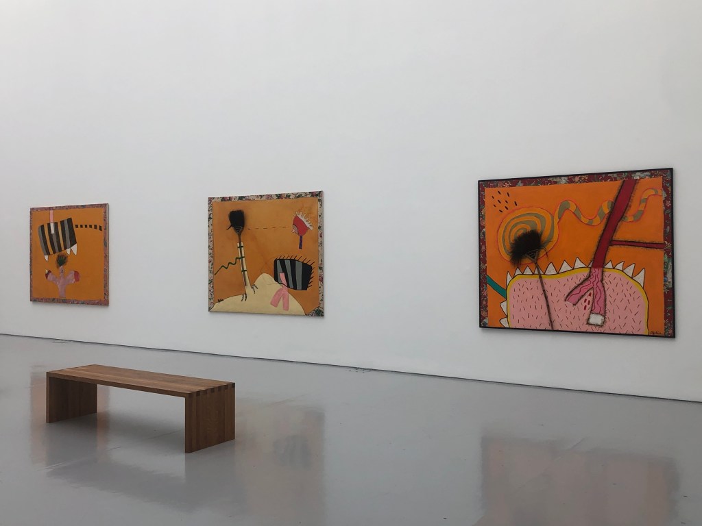
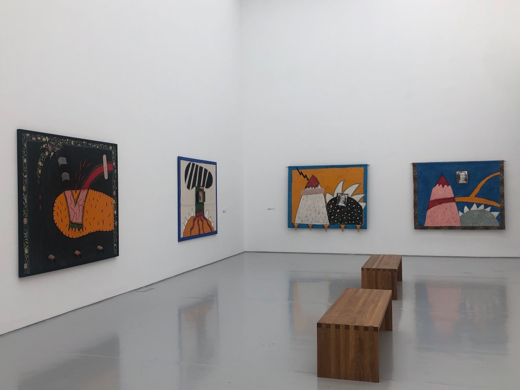
One of the two parallel development strands of my practice is to develop my narrative. It is my intention to maintain complete freedom in my making in this strand. Meaning that I am not going to overthink when making work here. If an idea comes to mind or something comes up and triggers a memory, then I’ll just go with my instinct and make work. I believe that is the best way to develop my narrative and capture as much of my thinking as possible through my art practice. Whereas the other strand of developing my style is a much more structured development path with planned explorations and experiments.
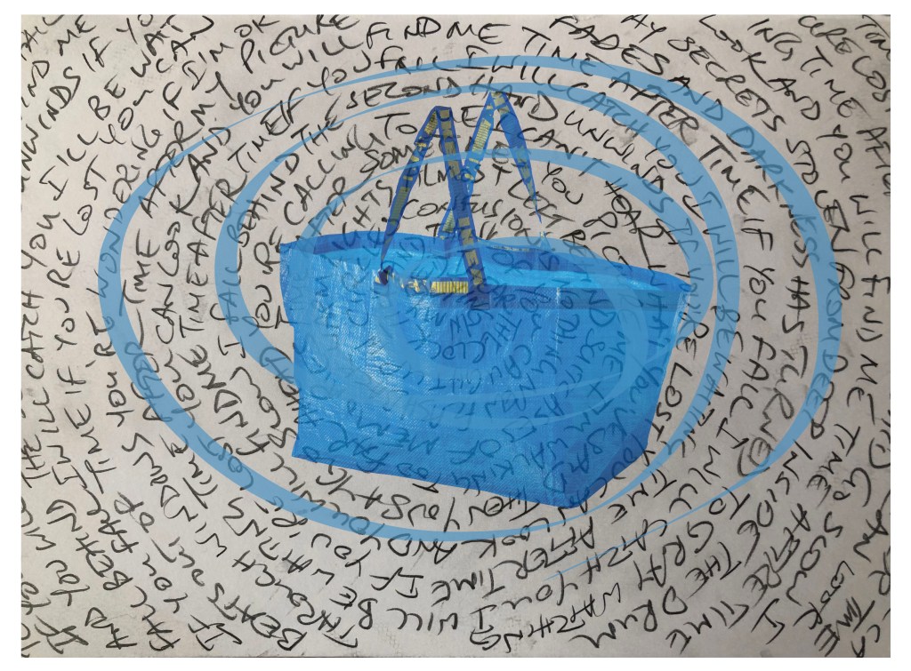
This piece of narrative work came about when I played one of my favourite songs from the 80s – Time after time by Cyndi Lauper. The song has always resonated with me. Its meaning is explained very well on this website:
The website describes this song as treading a fine line between hope and despair making it relatable.
This piece of work is a quick capture of an idea using my sketchbook and a digital drawing tool. This kind of work will form an ideas bank when I may come back to at a later stage to make more substantial work from.
Finished ‘quick capture’ work:
METHOD
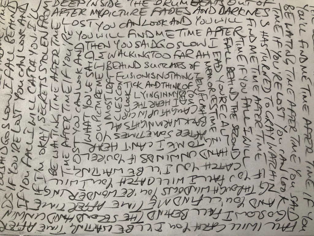
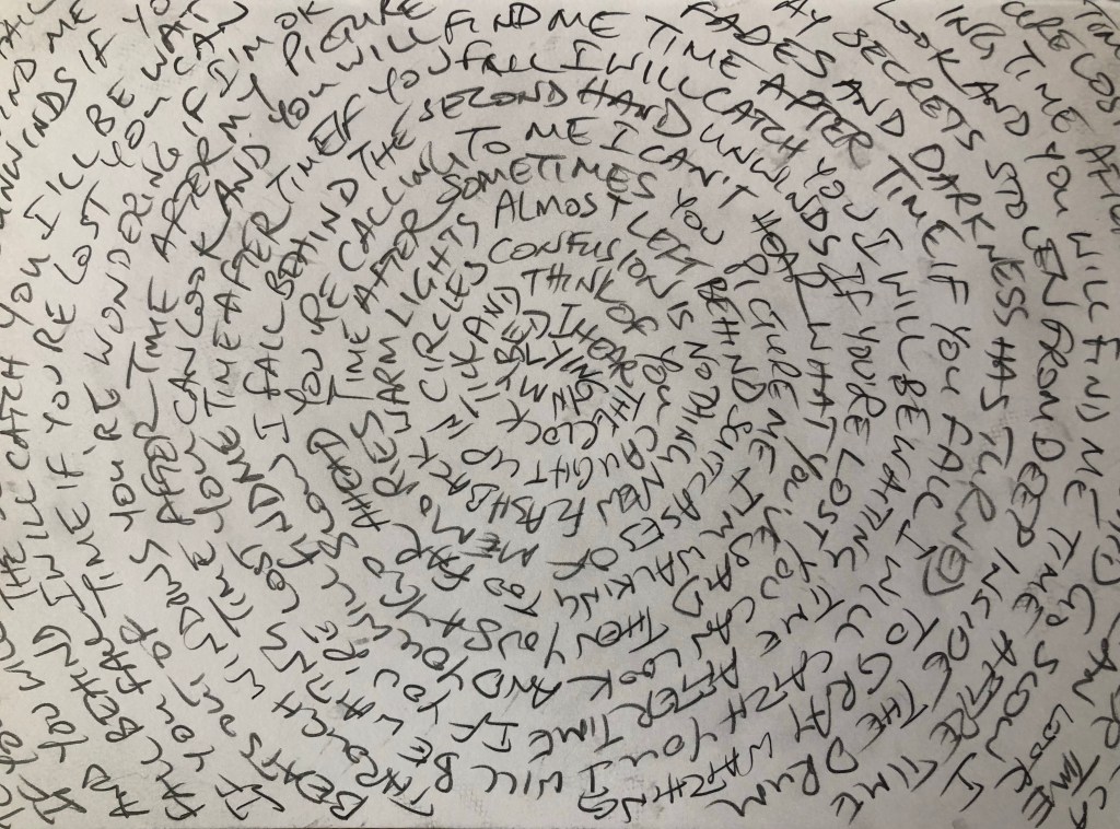
I felt compelled to write down the lyrics, it was a way to experience the lyrics. I wanted to write in a circular way to echo the time clock mentioned in the song. I experimented with two versions, one to fit the rectangular page of the sketchbook and another in a circle.
–
–
I preferred the circular version hence that image was chosen. A photo of that sketchbook page was imported into Adobe Fresco as the background of the piece. I wanted to overlay it with an image that represented the sense of moving from one place to another. I decided to use a blue IKEA bag which today symbolises moving one’s possessions around making it a contemporary and iconic image. Then a blue swirl was added using the Fresco digital paintbrush to represent the cyclical nature of my constantly moving around during that period of my life. Different parameter settings were tried for the Fresco paintbrush.
The image below shows the layers I created in Adobe Fresco for the finished work:
–
REFLECTIONS
– Considering the process: This was a more informal way of making compared to my usual work. I liked it as I was able to capture my thoughts quickly. Then the digital Fresco tool enabled me to capture the idea quickly to come up with the finished work. In the past, I would have drawn or painted the IKEA bag which would have taken time and perhaps if I didn’t like the idea part way through then I would have felt bad about abandoning the work. I am still getting to grips with tools like Fresco and it’s a good way to capture an idea and I may well come back to work on this more at a later stage – either to build on it digitally or create a physical painting from the idea.
– Considering my narrative: I struggled with this one. Digging deeper can be scary as it makes one feel vulnerable or remember periods of vulnerability. When this song was on the chart, I was moving between boarding schools and temporary lodgings during the holidays. I didn’t go home to my family during holidays, just because. So seeing Lauper (in the music video) going back to her Mum’s in times of troubles (in her case a heartbreak) was heart warming but perhaps heart warming was not the most accurate phrase, it seems insufficient. I recently learnt a Welsh word ‘hiraeth’ – it means a deep longing or nostalgia for something lost or departed. I wonder if I could extend it to include longing for something that one didn’t have. Hiraeth doesn’t have an equivalent English word (according to google search and the person who introduced the word to me who was a linguistic academic). I like the word hiraeth and it fits my narrative here more than any other word I could think of.
– A further thought about the use of language… when the word ‘hiraeth’ was introduced to me (by a UAL tutor), we discussed how languages can influence how we think because we can only think or describe things such as our feelings in words that we know. This made me think about the impact of the soft power of colonialism where the coloniser brought their language to the colonised and in many cases replaced the native language completely. What part of the native culture has been wiped out and lost as a result? ‘Hiraeth’ is a good example because Wales is part of the UK and English is the language spoken in most parts of Wales nowadays as the dominant language. Yet such a powerful and useful Welsh word has no equivalent in English.
LEARNING
– Using Fresco has really helped me to develop ideas quickly, especially experimenting with the different paint brush parameters was helpful. I must use this tool more.
– One of my objectives for developing my narrative is to capture as many of my stories as possible as input to my main making process. Since I’m a fairly slow maker when making physically, I am pleased to have discovered this digital tool as a quick capture tool but yet enabling me to finish the piece to a more complete state than say a traditional sketchbook drawing. It was particularly useful that in this case I could incorporate my sketchbook work as part of the piece.
– An increasing understanding of my new word ‘hiraeth’.
– For my personal narrative development, I need to have more courage in my exploration. Music has always been a good catalyst for stories, I need to explore that more.
– For a wider narrative development, more thinking and research are required in the impact of language as a colonial soft power. What words can I think of in Chinese where there are no English equivalents? E.g. words to describe food and tastes since the food culture is so different?
NEXT STEPS
– Continue to use Fresco to quickly and informally make work. Capture as many stories as possible as a key objective for developing my practice.
– Consider other pieces of music as catalyst or memory triggers for my stories.
– Research more about words that I know and feel strongly about but have no English equivalent to see if it would help me to delve deeper in my narrative.
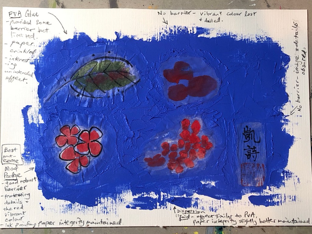
This is an experiment to complete one of the actions from an earlier blog – Exploring media – oil and cold wax Part 6. The action was to:
– Experiment with a barrier or masking fluid to prevent the oil from seeping into the Chinese brush painting images.
This experiment is required because the Xuan paper (rice paper) used for Chinese brush painting is very thin and absorbent, therefore if the paper was laid over materials such as oil in my transcultural layering work, the oil paint underneath would seep through and ruin the Chinese brush painting image as happened in Part 6 of this blog series.
METHOD:
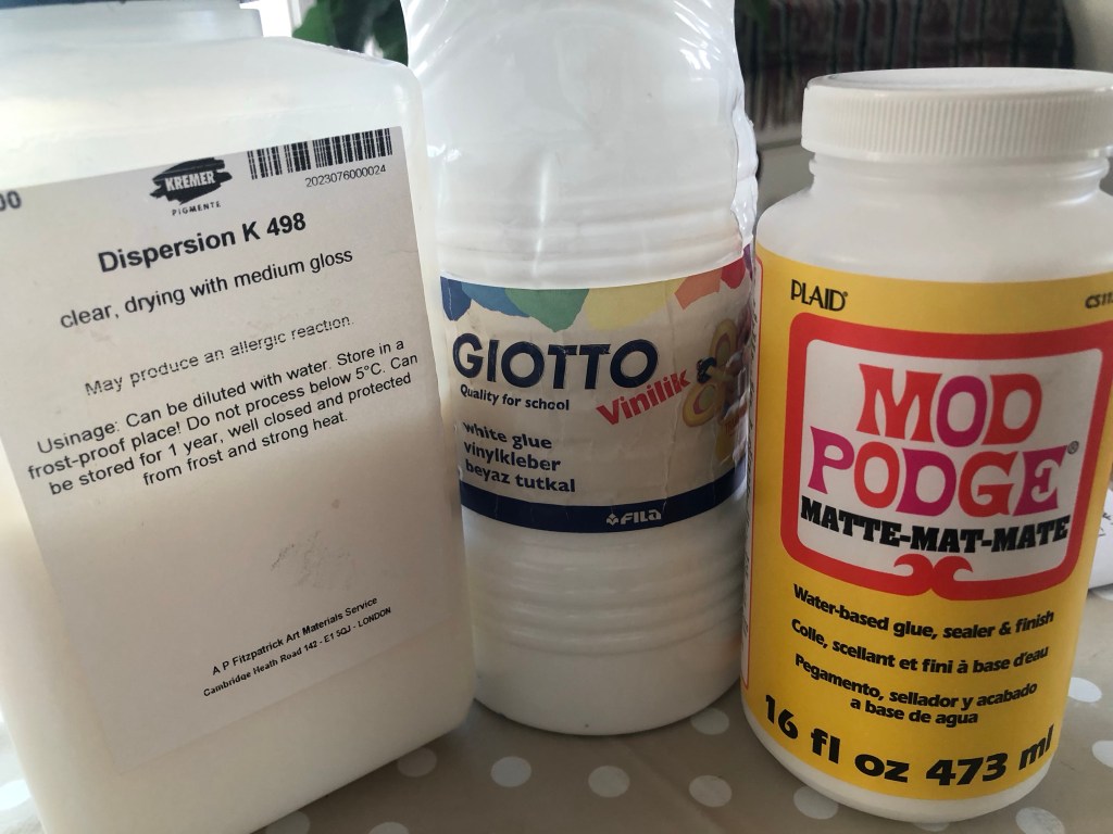
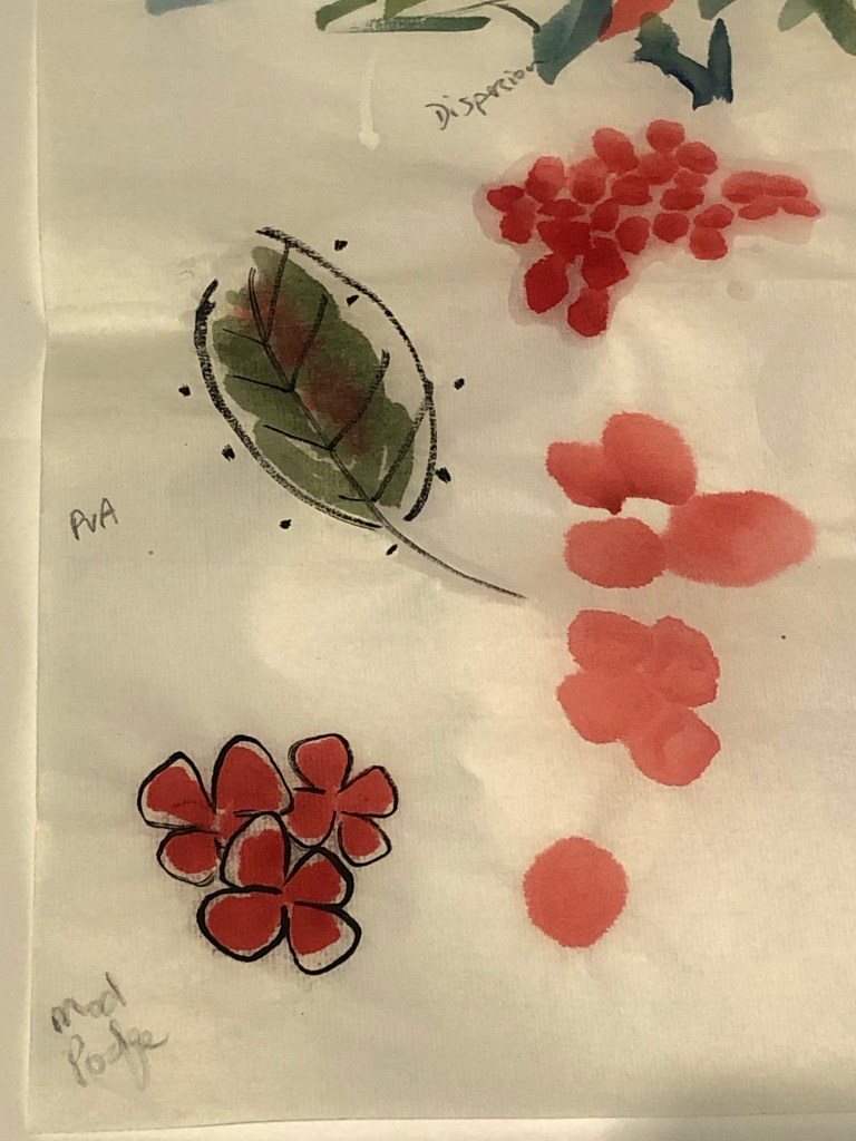
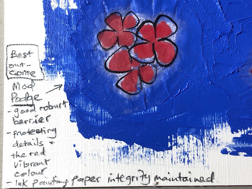
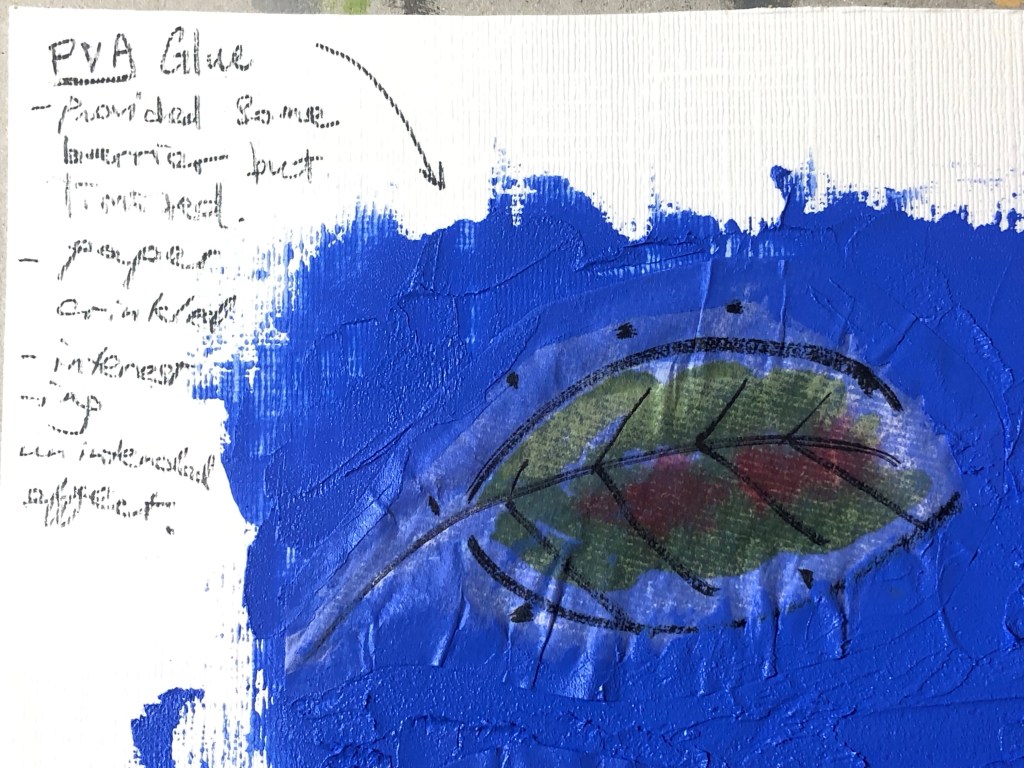
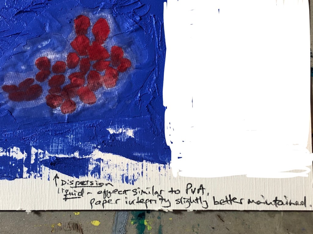
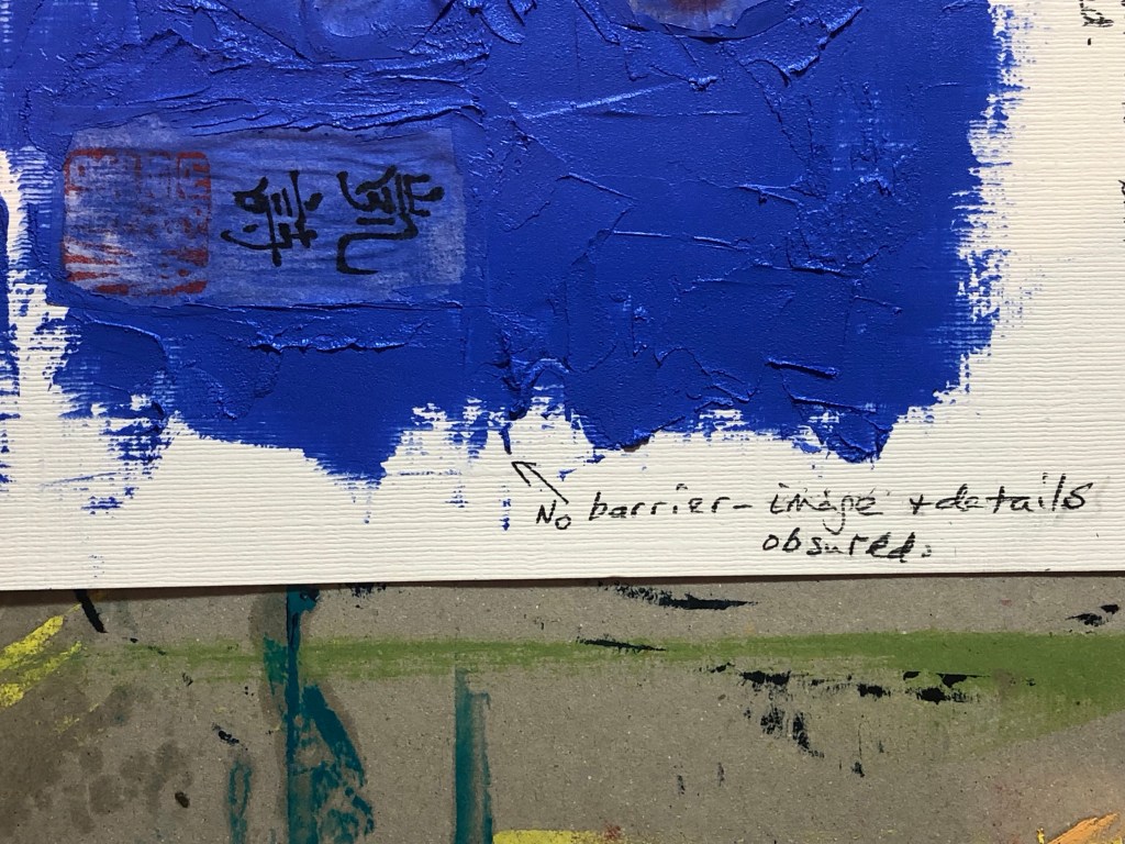
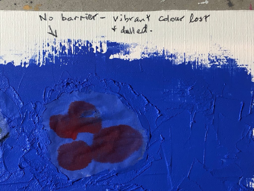
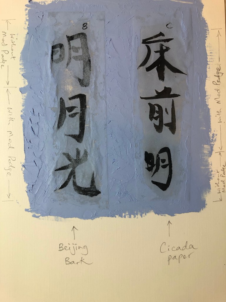
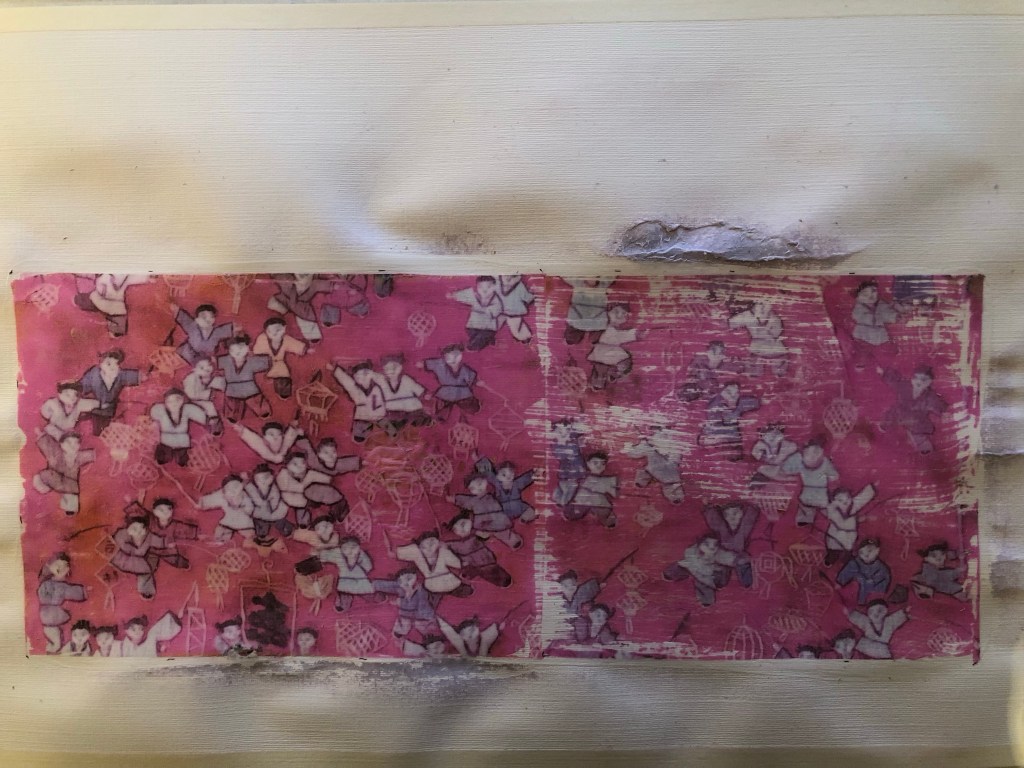
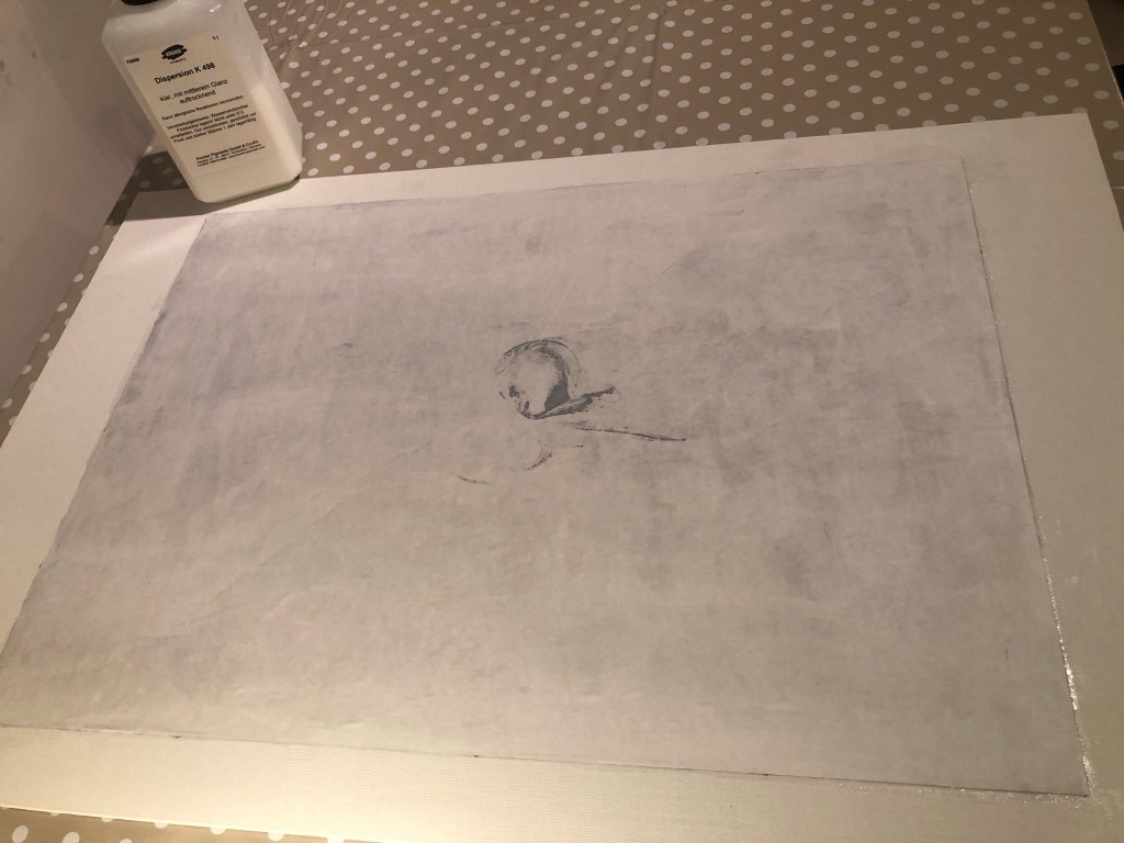
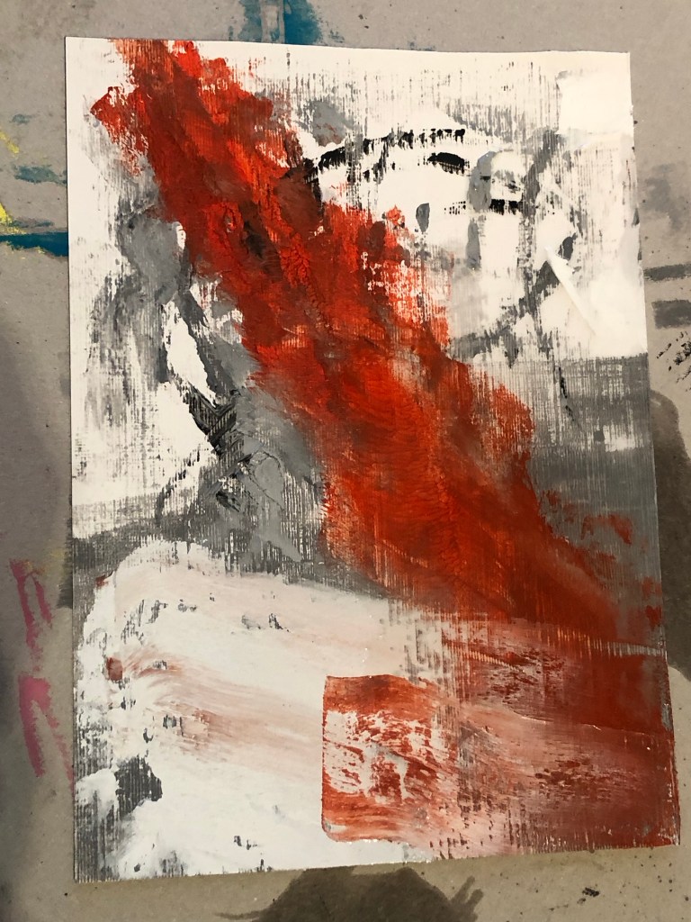
The three barrier fluids chosen for this experiment were: Dispersion liquid; PVA glue and matte Mod Podge.
Some small images painted using Chinese ink were used for this experiment. The back of each image was painted with one type of the barrier fluids with one image left bare as ‘control’ for the experiment.
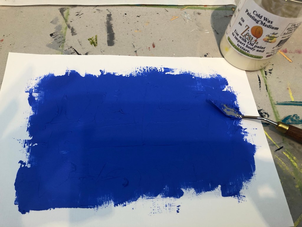
A paper canvas was painted with a mix of oil paint and cold wax:
The Chinese painted images were cut out and pressed onto the oil and cold wax. The images were pressed hard onto the painted canvas using a palette knife to robustly test the barrier performance.
Below is the result – an overall image followed by close-ups of each test area.
–
Result: The best outcome was the Mod Podge.
REFLECTIONS
I am happy with the outcome of this experiment. This was a quick experiment but a very important one because, as shown in this blog series, it has been challenging to incorporate Chinese brush painting onto oil or oil and cold wax – the latter being my chosen ‘Western’ medium for my current series of transcultural style development work. The outcome of this experiment has helped me to find a viable way forward and I can now move onto developing colour palettes and aesthetics for my style knowing that I have found a way to combine the materials from different cultural origins without losing any material integrity.
LEARNING
The learning here is a straight forward one. Mod Podge worked well as a barrier fluid to protect the Chinese ink work before incorporating it into the oil and cold wax ‘collage’.
NEXT STEPS
Pick up from the previous post (Part 6) and resume the next actions from there. The immediate next action will be to research and develop colour palettes that can help to communicate my transcultural narrative.
–
ADDITIONAL EXPERIMENT
I was given two pieces of specialist Chinese painting paper by my Chinese art teacher. They are:
– Beijing bark paper, and
– Cicada wing paper (because it’s so thin that it resembles the wings of cicadas).
Both types of paper are of beautiful quality and feel very delicate. They are both very thin which would be ideal for what I’m looking for in my transcultural layering work. I.e. overlaying Chinese brush painting onto a more viscous medium such as oil.
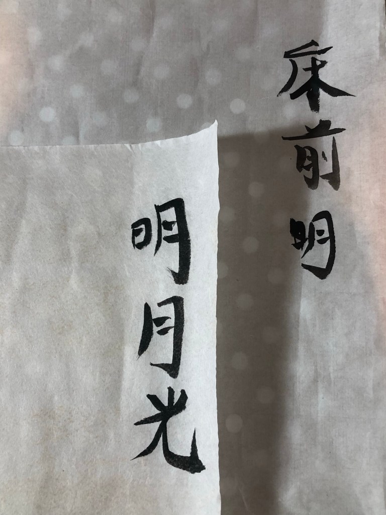
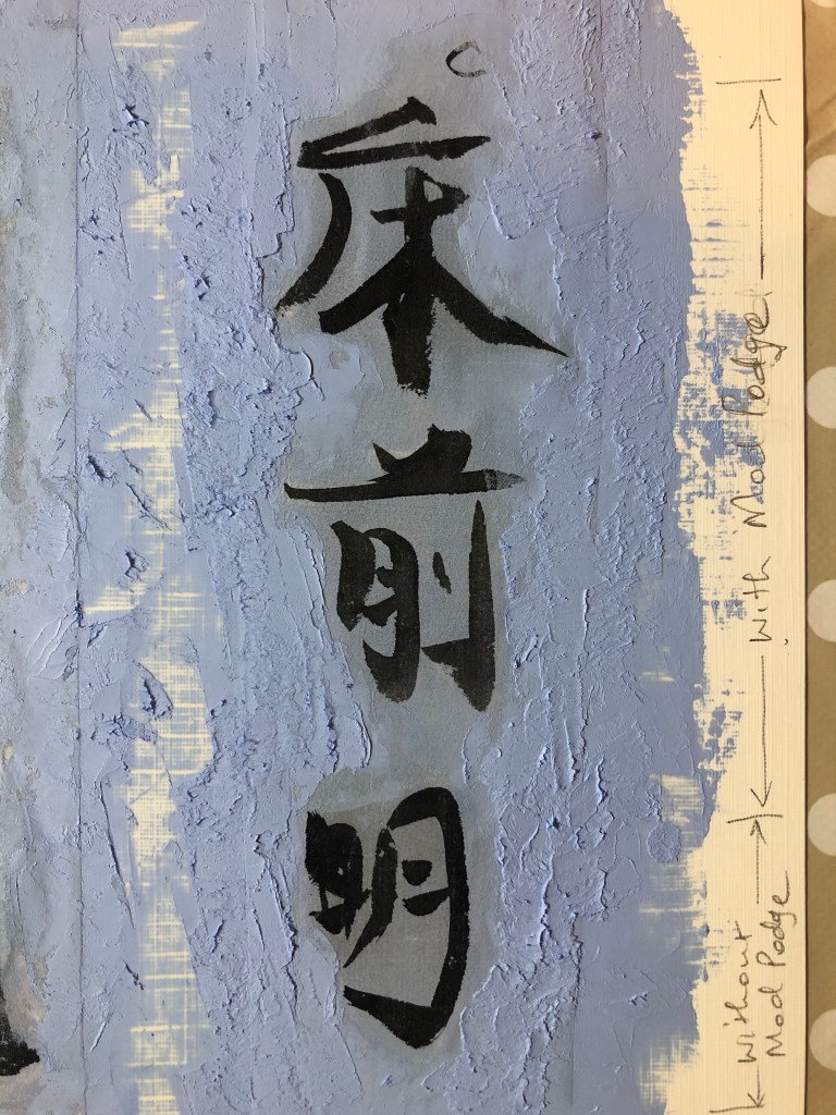
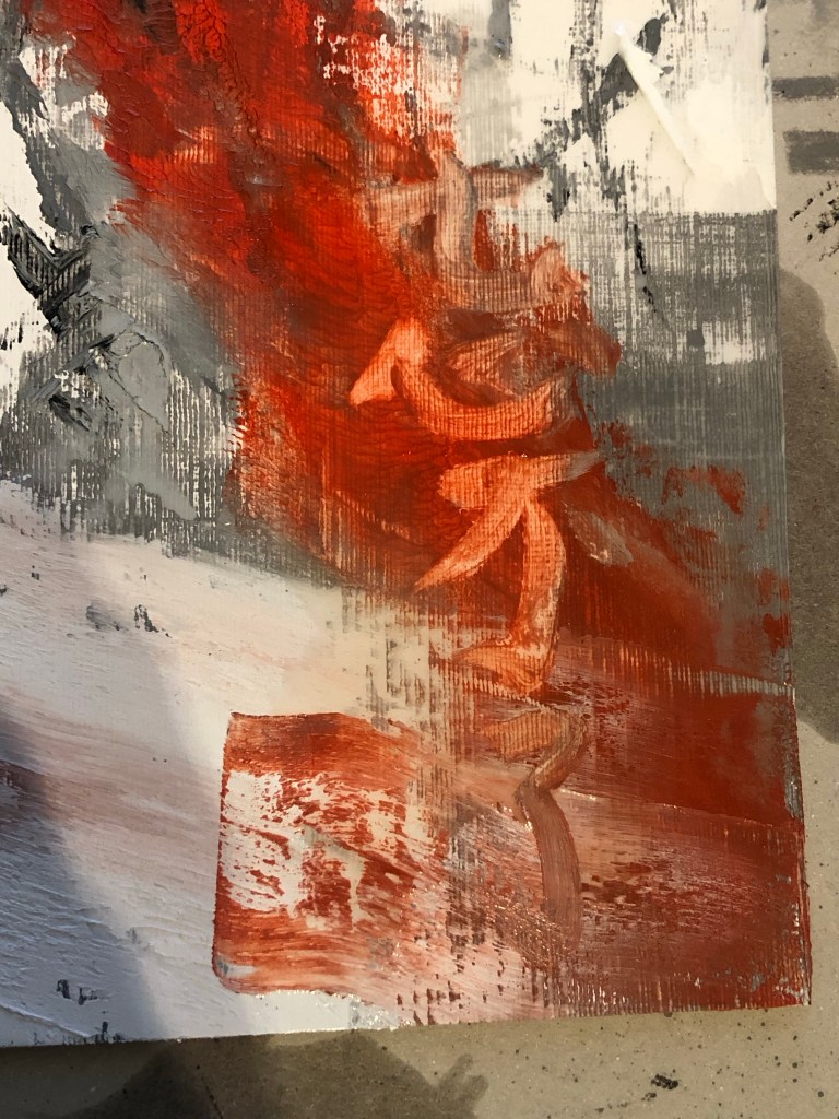
I repeated the above experiment with these papers. I wrote some Chinese calligraphy characters on each sheet:
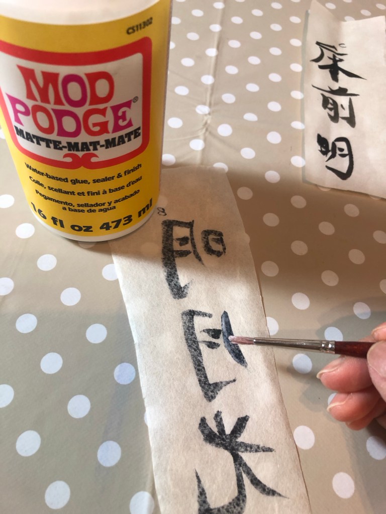
Then painted part of the image on the reverse side with Mod Podge as a barrier and leaving part of the image bare to compare:
Once the Mod Podge was dried. The two sheets were pressed onto a base layer of oil and cold wax. A palette knife was used for the edges, blending the paper with the oil paint to bury the edges. Then I used my finger to press the image into the oil:
Below is the outcome with the cicada paper performing well compared to the Beijing bark. The cicada paper appears to have an inbuilt barrier to protect the image, meaning that a barrier liquid would not be required as there was no perceivable difference whether Mod Podge was used.
Then more oil and cold wax was applied on top to blend in the image whilst avoiding the characters. Final result:
–
REFLECTIONS / LEARNING
Out of all the Chinese painting papers that I have tested in this series of exploration, the cicada paper was the best material for the purpose of my transcultural layering work involving Chinese brush painting and oil based medium.
Additionally, it was useful to discover that a barrier liquid (e.g. Mod Podge) would not be required with the cicada wing paper. This will help to reduce the process complexity.
NEXT STEPS
– Create a new piece of work that uses the new discovery with the cicada paper to refine the process and to learn more about the material.
– Source more cicada paper and find a long term supplier for this paper.
.
This experiment ends the series of blogs on ‘Exploring media – Oil and cold wax’.
This is my second visit to this exhibition and it was a guided tour by the curator. Below are the informal notes I took on the tour. I also noted some points for personal reflection and a question I posed myself to help my search for a unique transcultural style for my practice.
Notes made during tour:
Despite using textiles and stitching for her work, she hated sewing.
Landscape as a hostile environment. Threatening to nature:
Use trim of fabric to give cultural content (like this, note – to use for my work).
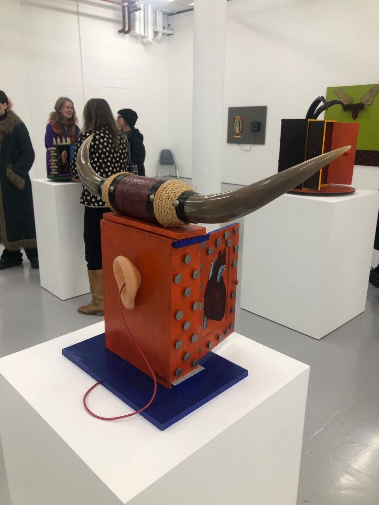
Plaster for healing. Landscape suffered violence. (Like the use of plaster, resonates with me.)
Above work has plaster also. The photo was a found image of a western morality philosopher from 17th-18th century. It was a photo she found in Times magazine and she felt the irony for the damage that had been done to the world.
Then her work changed to flatter colours. Started to bring in her hands (holding onto something) and ears:
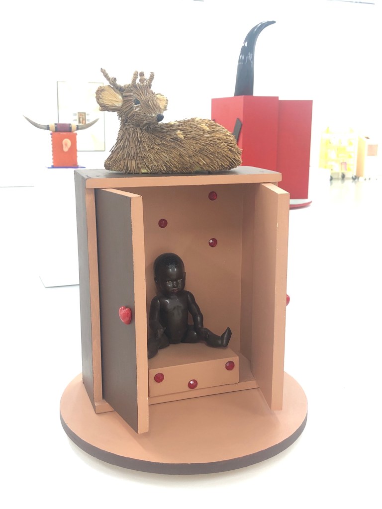
Above is a surrealist box. Note – like the idea of using a box to tell stories. Could use HK letter boxes with family photos. I can write letters or just have an envelope addressed to my family.
Idea – use my hand as image to reach out to my brother’s hand and tea in a piece of work that I had done recently.
Idea – use biology picture of heart, to take out the emotions of a symbolic ‘red heart’. A biological heart is symbolic for me.
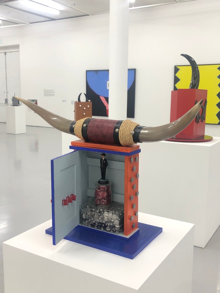
Boxes:
More plaster denoting healing wound in the violence in Latin America. Columbia being attacked, with God’s watchful eye (at the bottom). Bleeding heart is used a lot in her work:
Boxes bringing objects together trying to provoke conversation, with objects found in street market:
Boxes are like shrines or alters.
REFLECTIONS – some captured within notes.
Question: (to be answered)
What makes her style her style? Look at this series of work and analyse the elements that make her style unique and recognisable, then think how those points would apply to my style development.
Further notes:
All her work was about memory then she had dementia. It was like she knew…
-Try out more Chinese brush paint collage onto oil and cold wax to refine this part of the process.
-Try exposing a larger area of the background image to see if that can work with the abstraction approach on the top layer. Experiment to find the right balance between revealing the base layer image without losing the sense of abstraction on the top layer.
-Try spray painting on top of the oil and cold wax surface – try when wet and then when dried.
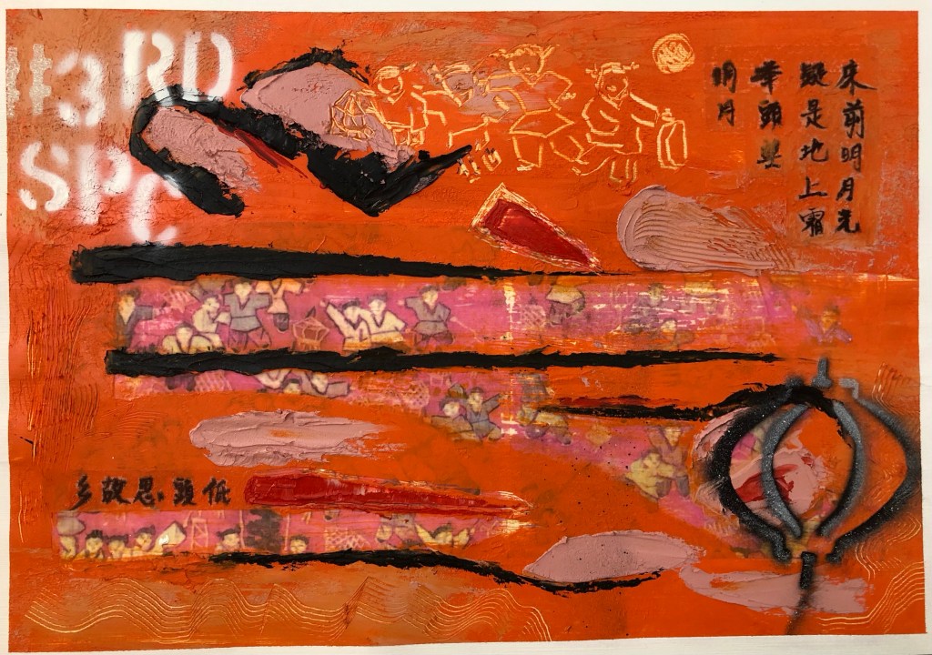
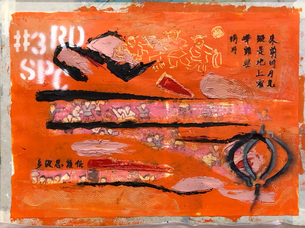
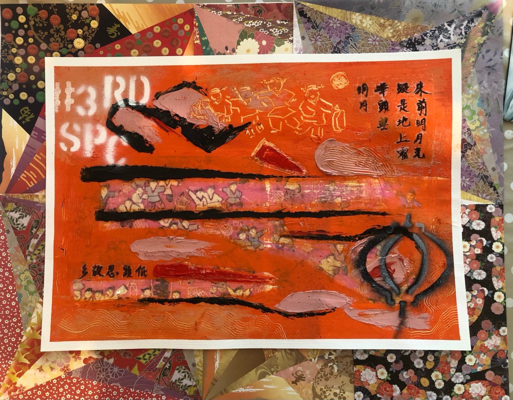
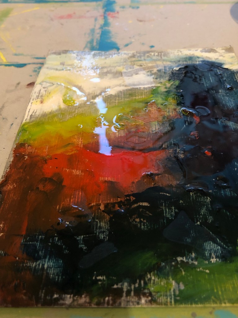
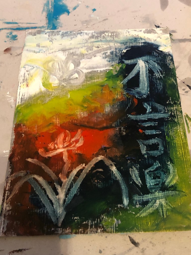
Finished work for Part 6:
Mixed media on paper, A3
METHOD
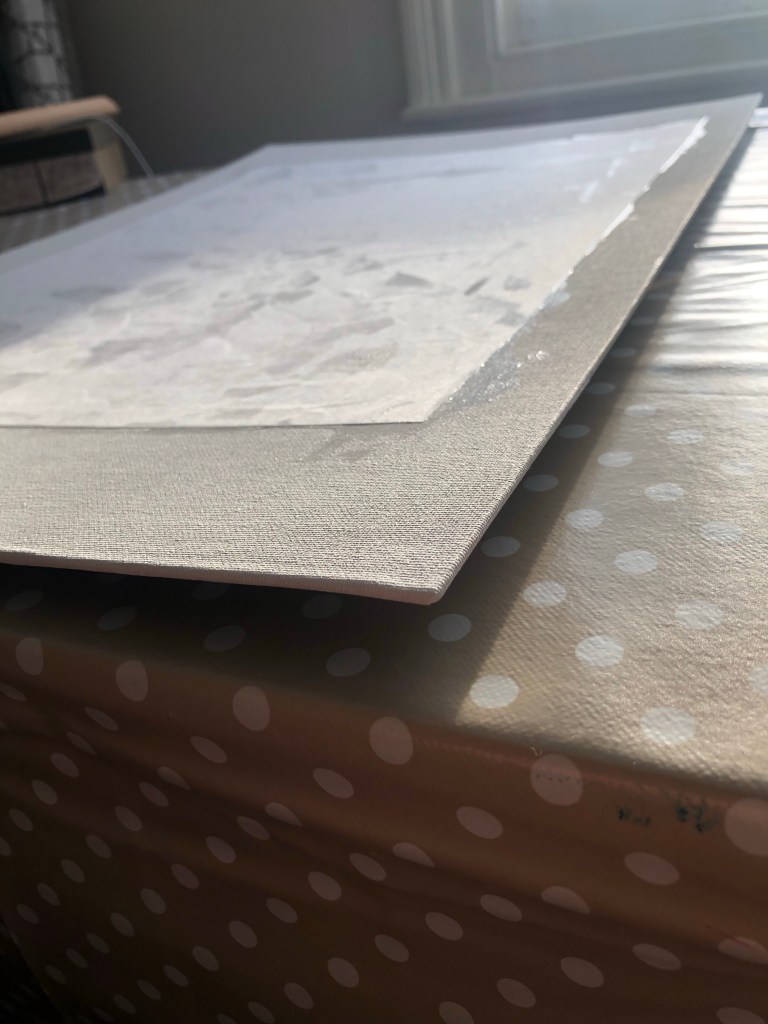
A printed photo image of a tapestry that was gifted to me by my brother many years ago was used as the based image for this piece. The image was transferred onto a paper canvas using dispersion liquid. The paper used was 250 gsm oil paper.
After the dispersion liquid dried, the printed image was rubbed off with a wet sponge to reveal the transferred image on the canvas. This was the first time a paper canvas (as opposed to a cotton canvas) was used in this series of experiments and it was clear that the paper canvas was not robust enough for the process. See below image for damage to paper. However, there was sufficient integrity in the paper canvas to continue the piece. I was hoping that a thick layer of oil and cold wax would hide the damaged areas. There was also excessive buckling on the paper canvas.
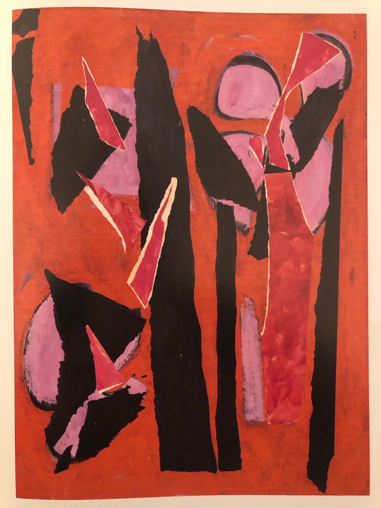
Recalling my disappointment with the colour palette that I chose for Part 5 (pink and grey), I decided to research into abstract paintings that I like to learn from the colours used. One of my favourite abstract artists is Lee Krasner and below is the painting that I decided to study and learn from in terms of the colour palette used.
Desert Moon (1955):
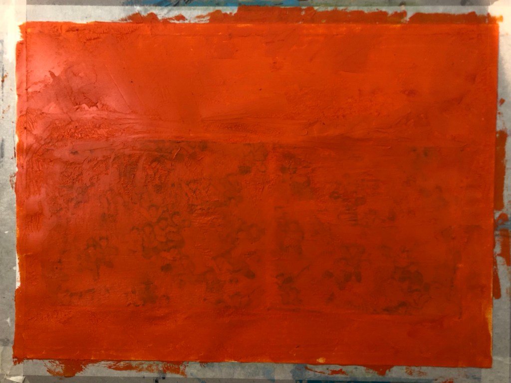
A layer of oil and cold wax was then applied to the canvas:
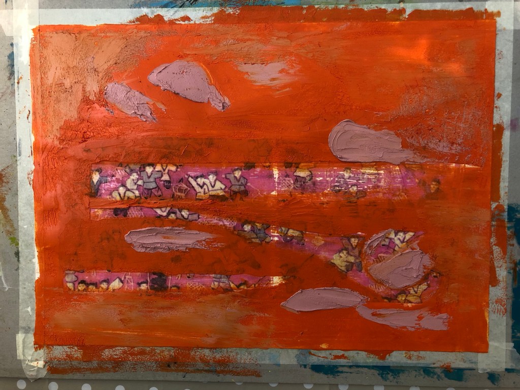
Areas were scraped off to reveal the base tapestry image. Learning from Part 5, I wanted to reveal a larger area so that it was clear what the base image was about. Then additional oil and cold wax colours were added:
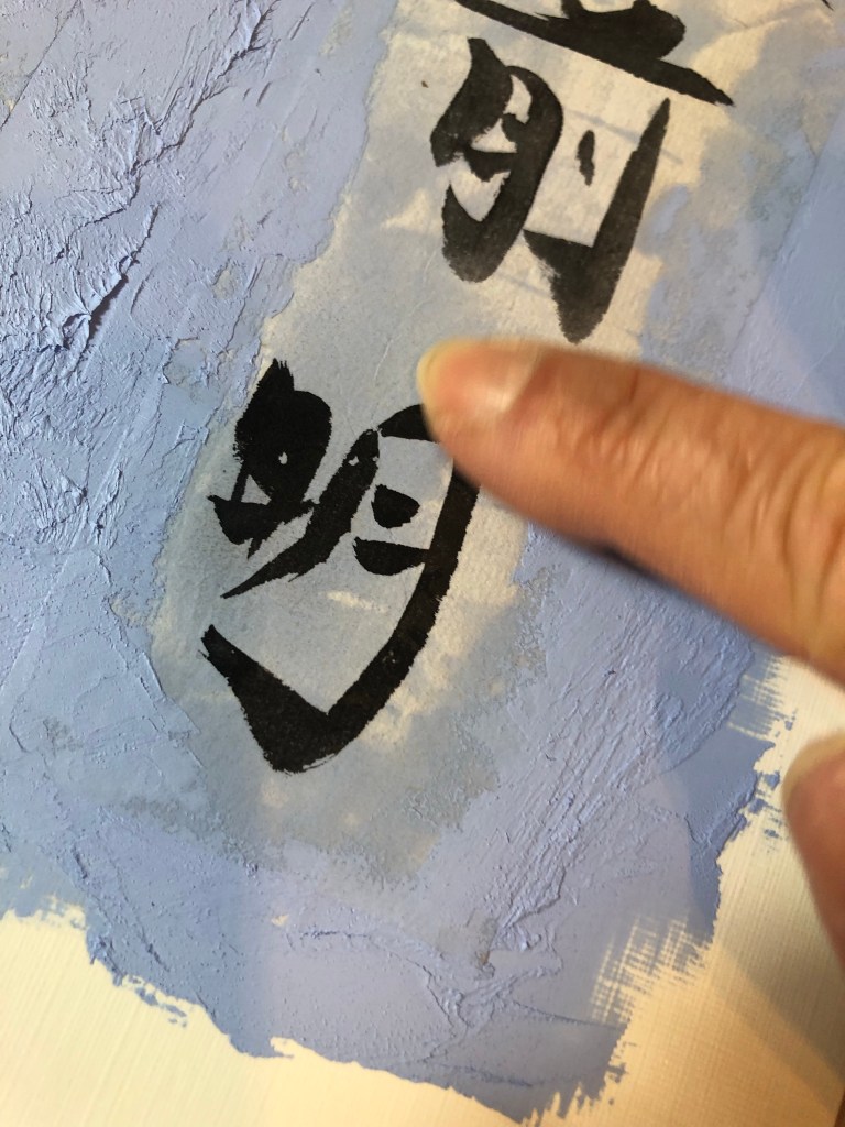
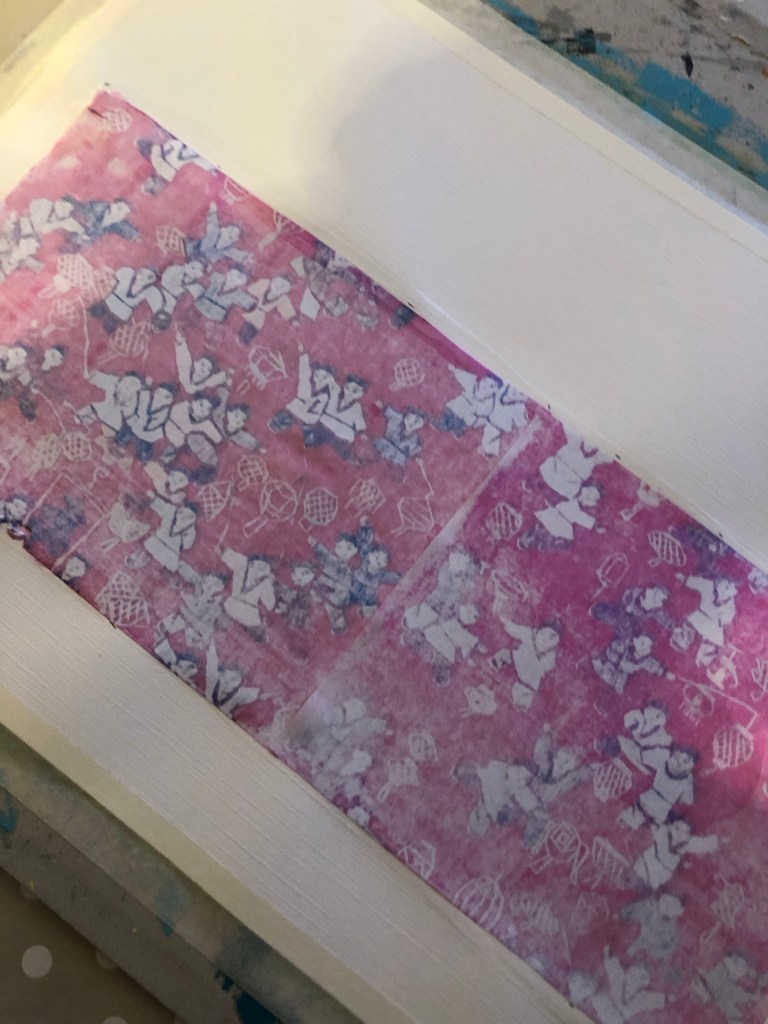
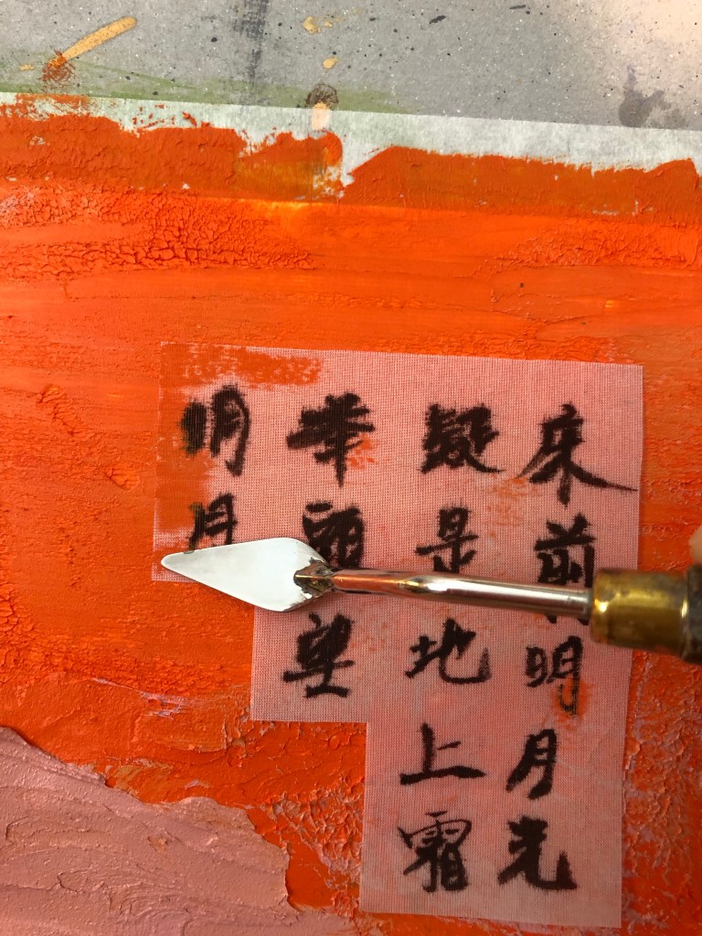
For the Chinese brush calligraphy, I chose a delicate silk fabric as a substrate that was almost transparent because I wanted the substrate to become as invisible as possible.
After writing the Chinese calligraphy onto silk, it was cut out and carefully pressed onto the oil and cold wax layer.
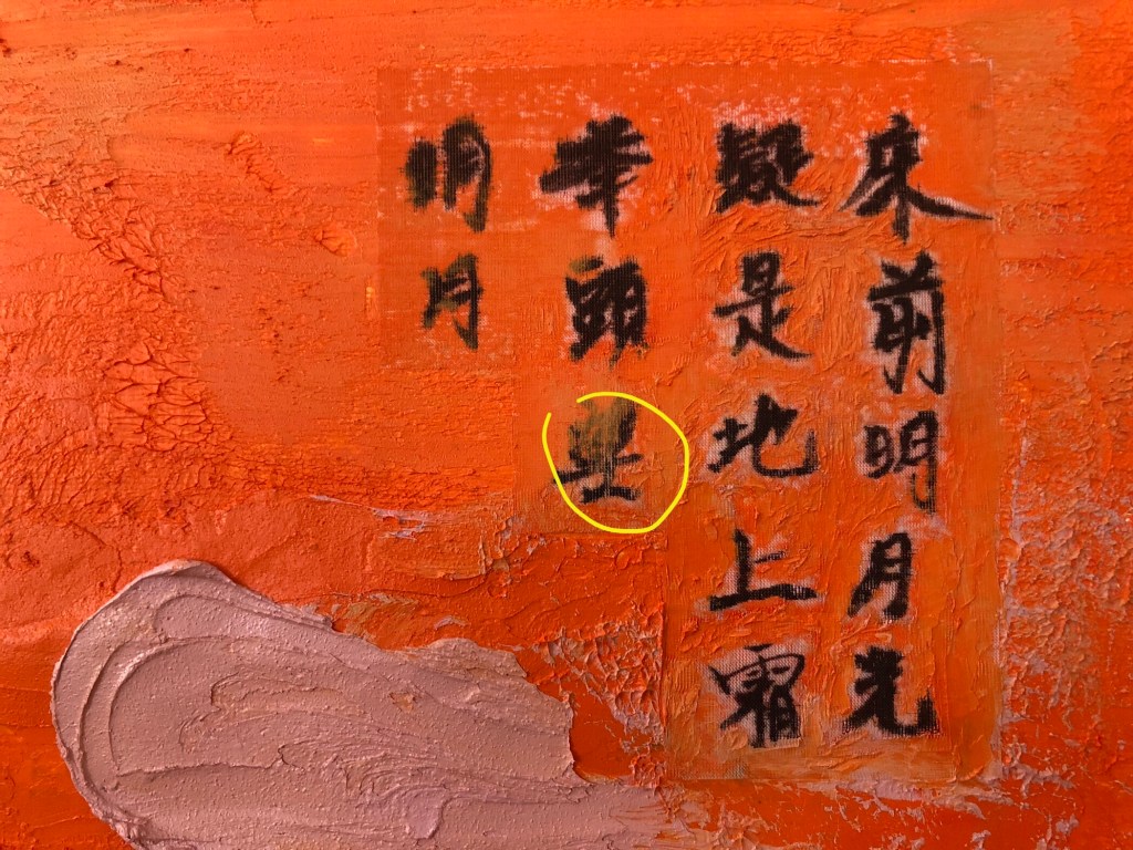
A small palette knife was used to press the silk into the oil and cold wax, taking care to avoid pressing the areas of the calligraphy characters which was challenging due to the complex shape of the characters. The yellow circle shows where part of the character was pressed into the oil and cold wax, partly obscuring the writing.
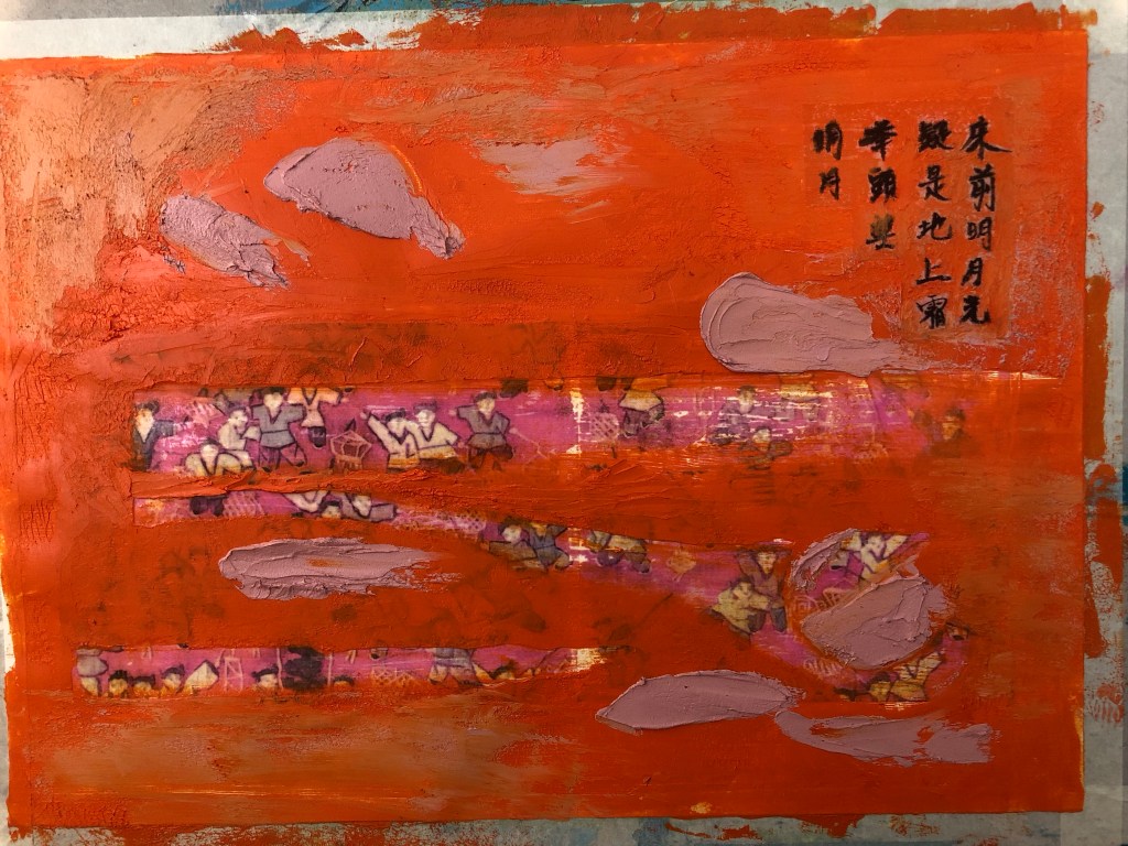
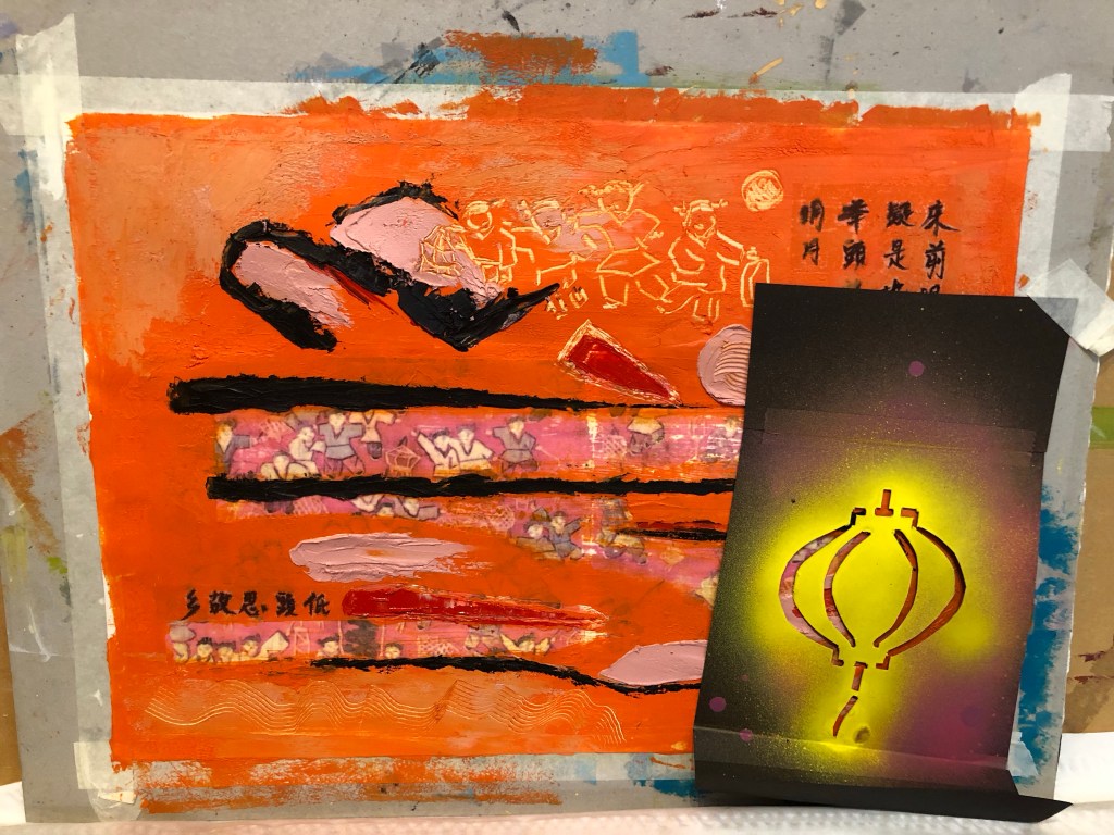
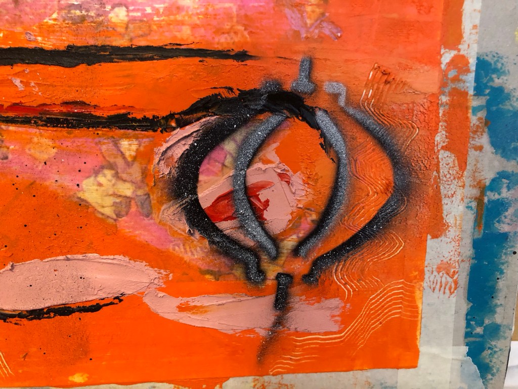
Additional marks were made – some were painted on and some were scratched off. The tapestry image was about children playing with lanterns and I have a lantern stencil that was made for previous work. So I wanted to experiment with spray painting onto wet oil and cold wax to see the effect.
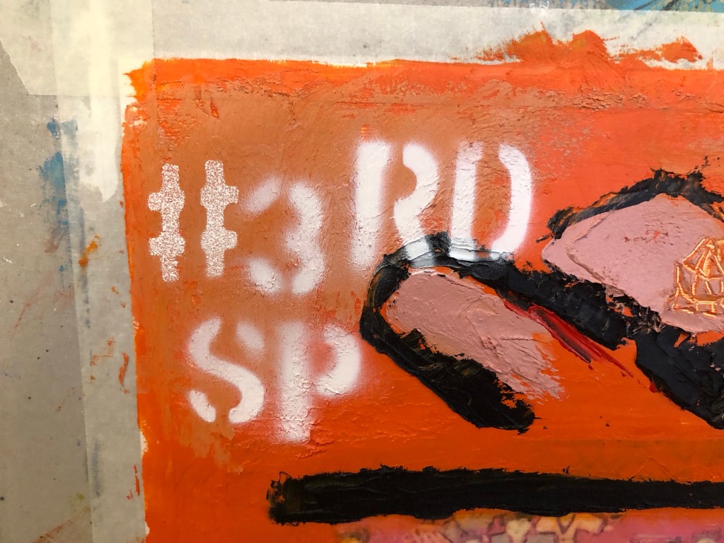
Further spray painting was done – the phrase #3RD SP (for third space) was sprayed onto a dryer corner of the painting. All spray paint used were Montana GOLD 312g aerosol cans as popularly used by street artists:
Finished work with border tidied up:
…
REFLECTIONS
I am happy with:
– The colour palette. I am much happier with this painting than the previous one in Part 5. A more considered approach in selecting the colour palette paid off here.
– The experiment with using an almost transparent substrate for the Chinese brush art worked well. The pieces (there were two in total) adhered well to the painted surface. Although the substrate was not completely invisible, it was acceptable as a solution.
– The scratched mark making especially the part at the top to echo the revealed based image of the children playing with lanterns.
– The overall look of the spray painting, especially the words – they added a contemporary feel to the piece which was what I was looking for.
– Feeling more confident using oil and cold wax as a medium.
I am not so happy with:
– The paper canvas, it was not robust enough. Although the damage by the image transfer process was covered up with oil and cold wax, it was clear that this would be the wrong material to use for this process.
– The spray painting of the lantern – it was sprayed onto very wet oil and cold wax. The outcome was not satisfactory – it felt and looked ‘gooey’ and not the intended effect. I believe this was partly due to my reluctance to place the stencil close to the wet oil paint as I didn’t want the back of the stencil to pick up the oil paint, causing the spray paint to loosely disperse around the stencilled image.
– Although I was happier with the colour palette, I felt there was more that could be done to add more complexity to the palette to increase depth to the piece.
General comment: the Chinese calligraphy is a famous ancient Chinese poem about being homesick. It is one of the few Chinese poems that I know as most children growing up in Hong Kong in my era were made to learn it, partly because it is a good poem and very easy to remember. Going forward, I feel that if I were to use more Chinese calligraphy then I should learn more about Chinese poetry so that I can use a wider variety of content in this respect. It will also help me to understand more about my Chinese heritage.
Other thoughts that came to me some time after completing this painting:
– Throughout the making process, my mind kept going back to celebrating the Mid Autumn Festival when I was a child in Hong Kong. The highlight as children was to be given a lantern each to play with. The choosing and buying of the lantern in preparation was always a source of excitement. The lanterns were lit with small candles. The children would use a long stick as handle for the lantern and go around the neighbourhood exploring with their lanterns, just like the children in my painting. The Mid Autumn Festival celebrated the fullest moon of the year and celebrations would only begin after dark when the full moon came out. Since we were not usually allowed out at night, it made the Festival especially popular with children. At times a lantern would catch fire which added much excitement. There would be lots of fruit and snacks laid out that were specific for the festival. I remember one year when we were older children (over ten years old), my brother and I went to a local park, sat on the swings and chatted all evening. It was when my family was going through a difficult period and to share that moment with him was very special, especially when we ended up spending most of the rest of our lives living in different countries. He gave me the children’s tapestry that I used for this painting which evoked all those memories while making this piece of work.
LEARNING
– More work is required to develop my sense in choosing an appropriate colour palette for the piece. This is increasingly important because my work is about storytelling as well as narrative and I believe having an appropriate colour palette helps to tell a story. So more research and experiments should be done in this respect.
– The silk substrate worked well for the Chinese calligraphy. However, I know there is a wide range of other delicate Chinese substrates and I will experiment with different materials to find the optimum.
– Layering the Chinese substrate onto oil is a risky process – as seen in the image with the yellow circle highlighting the part obscuring of the brush painting if pressed too much into the oil. To help with this, further experiments are required to improve this process. E.g. paint a barrier layer, such as a masking fluid that dries clear, onto the back of the Chinese brush painting or calligraphy to shield the image from the oil seeping in from underneath.
– Spray painting, especially words, adds a contemporary feel to the image which is a style that I want to incorporate into my work. This is relevant to me because I take much inspiration from the extensive street art scene in my home city of Bristol where many famous street artists work or have worked.
– Using the tapestry image evoked many memories, perhaps I could explore that more.
NEXT STEPS
– Research into colour palettes for the type of stories that I want to tell. Build confidence in this area.
– Continue to build experience and explore using oil and cold wax.
– Experiment with other transparent Chinese substrate materials to find one that is as close to invisible as possible when layered onto oil.
– Experiment with a barrier or masking fluid to prevent the oil from seeping into the Chinese brush painting images.
– Experiment with more spray painting – be bold and push boundaries.
– Ongoing learning – research into Chinese poetry to find more poems that resonate with me to use in future work.
– Explore the evoked memories.
ADDITIONAL WORK
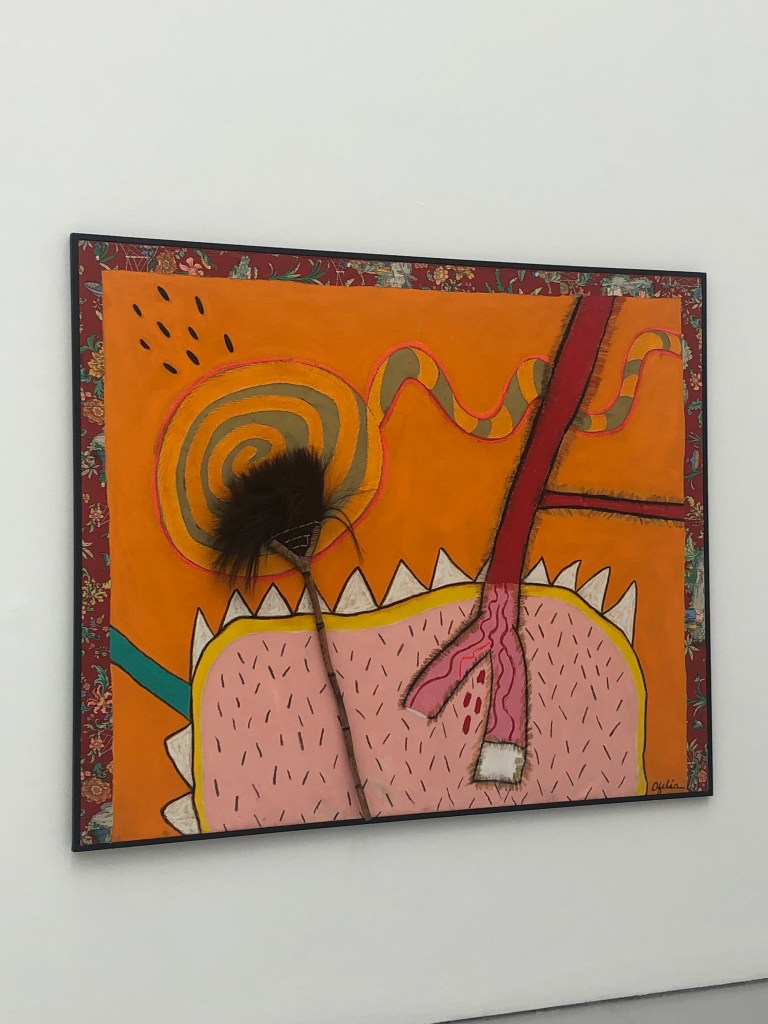
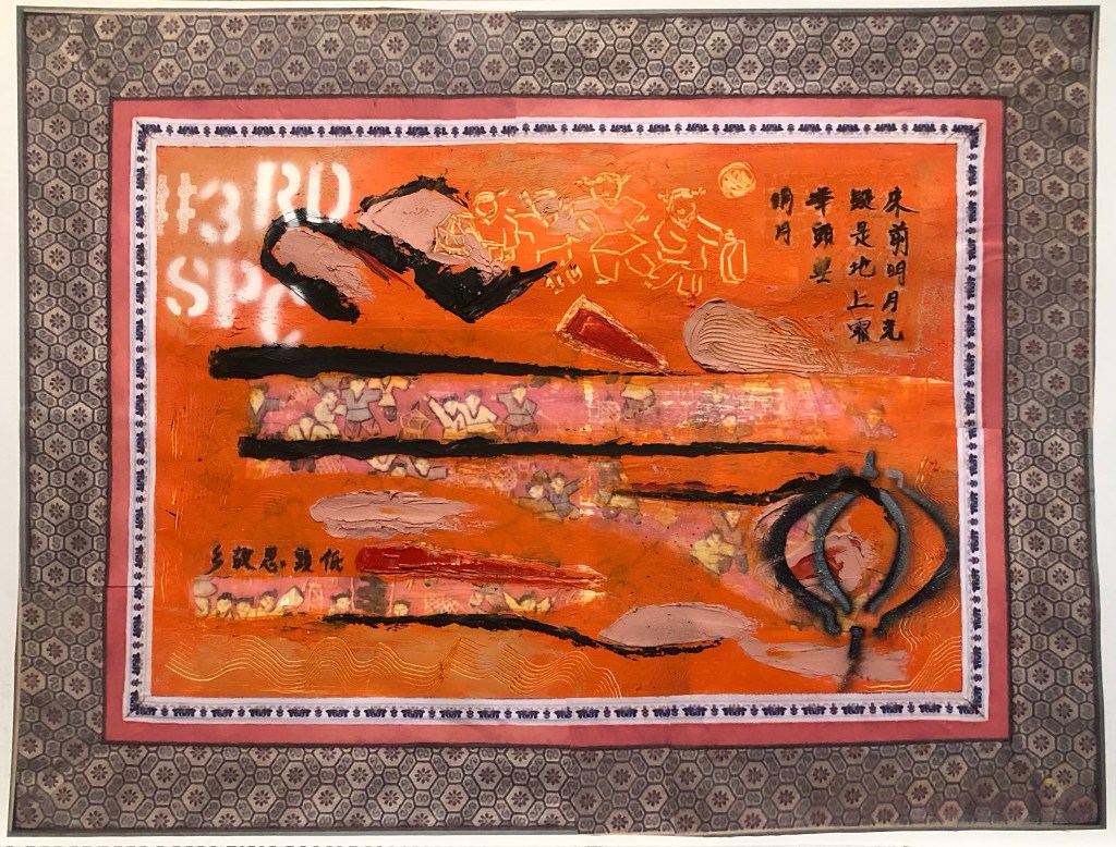
After visiting the exhibition of Ofelia Rodriguez again at Spike Island in Bristol, I was inspired by the way she used fabric as a border to her paintings.
This gave me the idea to try that with my work, especially to use Chinese imagery border for a recent piece of work to add to the transcultural narrative.
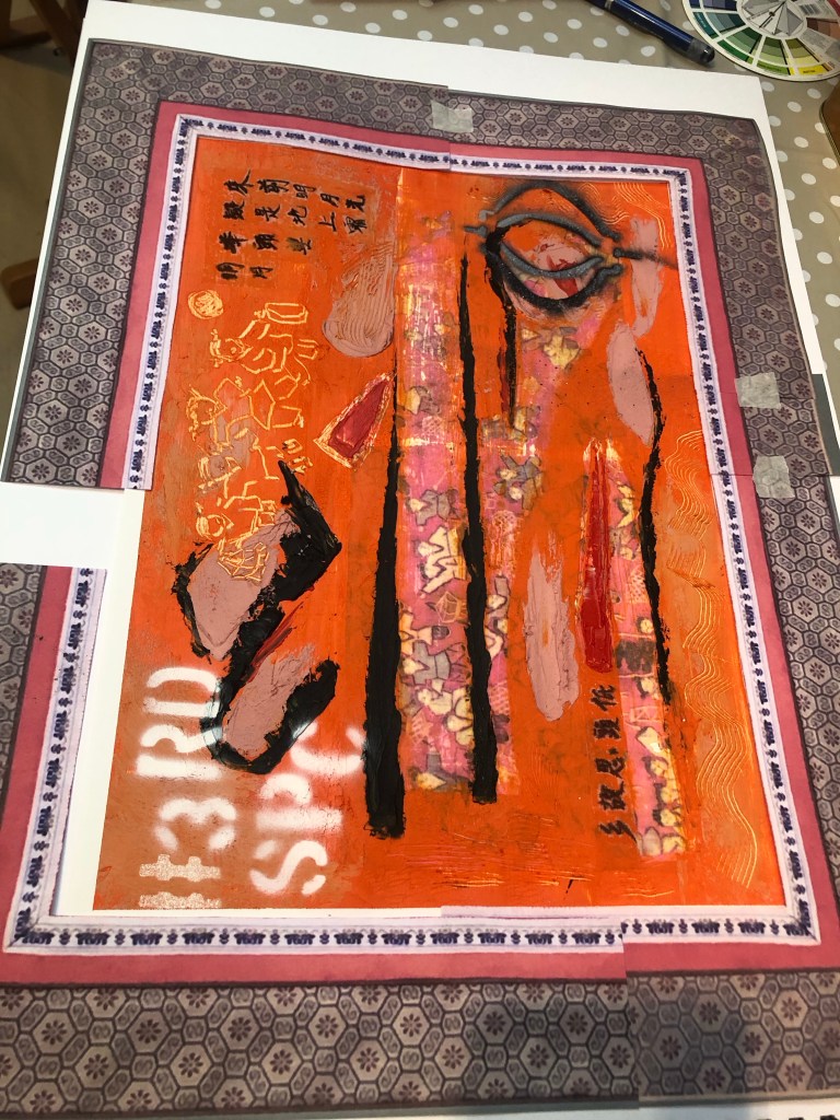
I started with some patterned paper that I had to make a collage frame. But I was not happy with the effect. It seemed too busy and rather random as an idea.
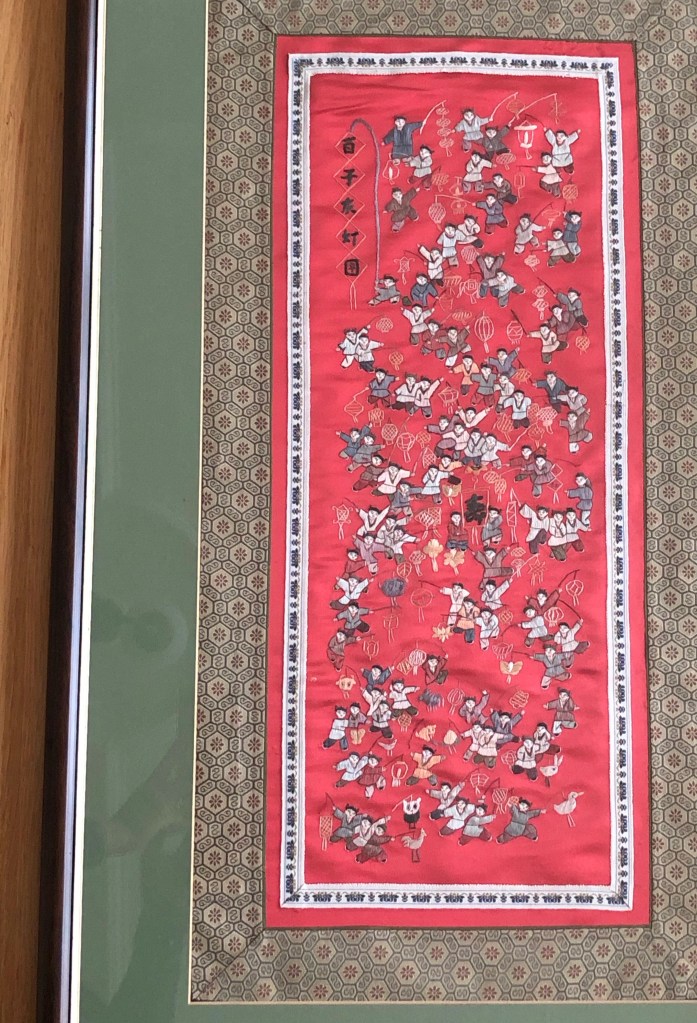
I then returned to the original tapestry that I used as the base image for the painting. It was a tapestry that was gifted to me by my brother many years ago.
Image to show the border of the tapestry
It is a typical border for small scale tapestries of this type. Then images of the border were printed and cut out to create a collage border for the painting:
Final finished work:
Mixed media on paper, 54 x 41.5 cm.
REFLECTIONS
I am very happy with the outcome of this experiment inspired by Rodrigues. It has completed the painting for me and added a more transcultural feel alongside the painted images such as the spray painted words.
To improve this approach, I would spray paint the # words to partly cover the tapestry image frame. I think that would increase the contemporary feel for the piece juxtaposing the traditional Chinese tapestry border.
Following on from a previous piece of digital art work where I researched and experimented with Procreate and Adobe Fresco, I chose to use Adobe Fresco for this piece of work because I found using my MS Surface Pro with the MS Stylus worked well; it was an enjoyable way to create art that is new to me.
This is part of my narrative development work from memory, where I make work when thoughts or scenes come into mind. In this case, it was a childhood memory. The trigger for this memory came from researching into Homi K. Bhabha’s book, The Location of Culture, where he talked about ‘mimicry’. Bhabha asserts that the colonised people would try to mimic the behaviour and culture of the coloniser in order to be more accepted by those in authority. According to Bhabha, the coloniser wanted the colonised to mimic them because it was a form of imposing soft power making the colonised adopt the coloniser’s culture and habits as a higher standard. To reinforce the power structure, the coloniser would demonstrate their power by judging good and bad mimicry. The coloniser did not want the colonised to be great at mimicking because it was important to maintain a differentiation between the two to justify the act of colonising.
Understanding Bhabha’s explanation of ‘mimicry’ reminded me of an incident that happened in my childhood in Hong Kong on a bowling green… It was a case of bad mimicry and I got into trouble for it.
There was a pristine lawn bowling green in front of our apartment block where the British would bowl on sunny weekend afternoons. As local kids, we were not allowed to go onto the green – it was forbidden. However, it was too tempting so one day, my siblings and I (three of us) went to play on the lawn. We were soon shouted at by a white British man. We didn’t know what he was saying but he was clearly shouting for us to get off (shouting and waving his arms dismissively). Kids innocently playing on grass where they shouldn’t do was no big deal, it happened all the time everywhere in the world. But on this occasion, our father who worked for the British HK Government was angry when he heard about what we did. He wouldn’t usually get involved with discipline for us and certainly not for something so trivial, that side of parenting was left to our mother. But he personally told us off as soon as he was home from the office. The fact that he scolded us as soon as he got home meant that he was informed of the incident at work; the news somehow reached him through an official channel. Now in hindsight, I believe we made him look bad at work because we showed that his family were poor mimics, we didn’t respect the bowling green like good British people would. Our poor mimicry as kids must have undone the good mimicry work that my father was working so hard to portray at his work. We were bad kids and made him look bad in front of his superiors.
Researching into Bhabha’s idea on mimicry reminded me of that incident and I wanted to make a piece of work about it.
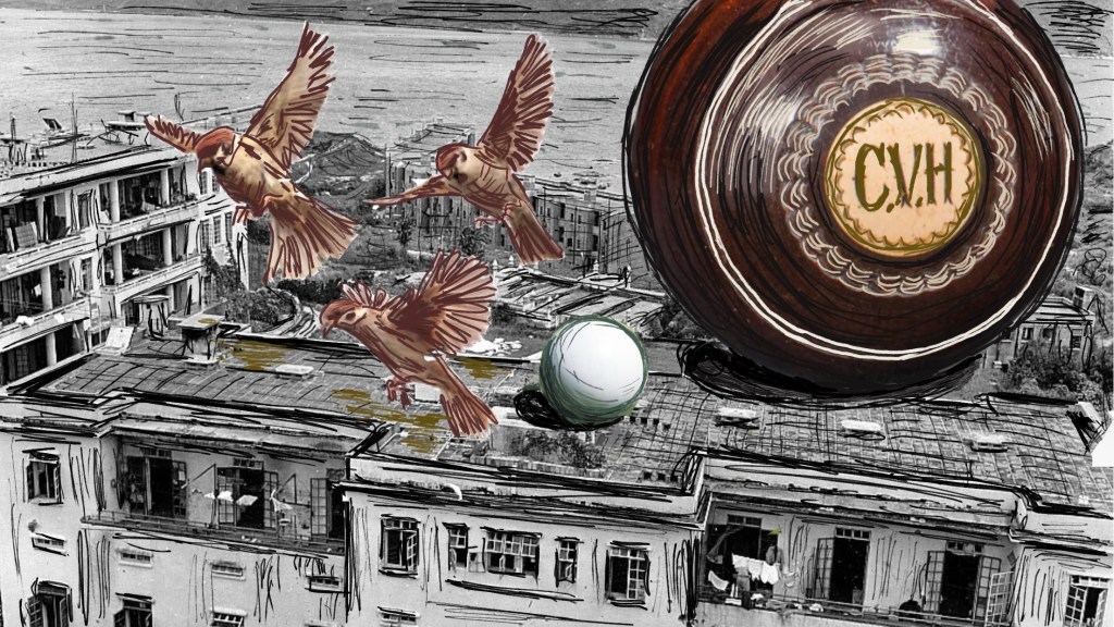
Finished work:
–
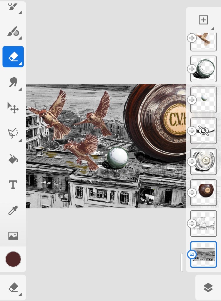
METHOD
Adobe Fresco was used for this work. Below are images showing the layers that were created – some were imported images and others were painted or drawn using the software. The three little sparrows were metaphors for me and my siblings. There were always lots of small tree sparrows on our balcony when we were young and I like using that as a metaphor for me as a child in my narrative art work.
The base layer image was a scene I found online of the said bowling lawn dated back to WWII during the 1940s – the lawn in the image is mostly obscured by the Prison Officers’ Club house in the foreground. My father worked for the HK Crown Prison (Correctional) Service and the apartment block on the left was where we lived – it was called Block K. Out flat was on the middle floor on the left side of the block. Seeing the photo brought back so many memories of my childhood at Flat No. K3.
The base layer photo was found in this blog and the blog details some very interesting history about the area which was used as a POW camp during WWII and our Block K housed Dutch and Norwegian POWs.
I have found Bhabha’s book, The Location of Culture, very insightful and I continue to enjoy using his theories to help me to make sense of my lived experiences as a transcultural person. This incident was an example of how this part of my learning worked.
I also enjoyed working with Adobe Fesco. I found the tool straight forward to use. I particularly like the fact that I can work on my phone on the go, then refine and build on my work when I’m at home with my Surface Pro. So I’ll continue to use Fesco as my go-to digital art tool.
Researching Bhabha’s theory of mimicry helped me to understand the incident and why my father was upset by what was a rather trivial act by his kids. A question I am asking myself is – how does doing narrative art work like this one help me? I do not have an answer yet but I want to note down this question as an ongoing enquiry.
LEARNING
Researching Bhabha’s work has inspired me to make work to develop my narrative. This is what I had hoped would happen so I’m happy with this progress and will continue this path of learning.
Adobe Fresco is a useful tool that I like, I should continue to explore its functionality.
I was unable to answer the question that I posed myself ‘How does my narrative work help me?’ – Why am I doing it? I need to give this more considered thoughts.
NEXT STEPS
– Keep going with research on The Location of Culture.
– Do another piece of work using Fresco, perhaps try the painting functions and not just drawing.
– Start to articulate my thoughts on how my narrative work helps me. I expect this to be a slow enquiry process…
UPDATE ON ENQUIRY
I have been thinking a lot about the above since posing those questions to myself ‘How does my narrative work help me?‘ and ‘Why am I doing it?’. In a recent Group Tutorial during our weekly MA online session, my group helped me to explore those questions. They also asked some additional useful questions, such as ‘Who am I doing it for?’ and ‘Has art ever solved any other problems for me?‘
Reflecting on the Group Tutorial, my latest thoughts are:
Firstly, ‘who am I doing it for?‘ My immediate answer was ‘for me, I am doing this for me’.
Why am I doing it? My response was that the exploration helped me to understand more about myself, my behaviour and response to situations.
How does my narrative work help me and has art ever solved any other problems for me? For this, my answer during the Group Tutorial was that art had never solved any problems for me but there have been cases where by exploring my narrative through my art practice, it had helped to crystalise or pinpoint a problem and brought better clarity. However, after the group discussion, I reflected further and felt that in fact on occasions, my art and practice research have helped me to find answers. Such as this case of the ‘bowling lawn incident’ – through my art making and research, I had a better insight into the colonial soft power structure that my father had to work in therefore giving me a better understanding of his environment and helped to explain some of his behaviour that impacted us all.
Although I have made some progress, I am aware that these answers are still quite close to the surface and I want to take more time to continue this line of enquiry, hence it is still ongoing…
I watched the last session of the online course with St Ives Painting School on exploring oil and cold wax which was useful in giving me more ideas to try. I want to then respond to the ‘next steps’ from Part 4 in this research experiment.
Finished work:
–
METHOD
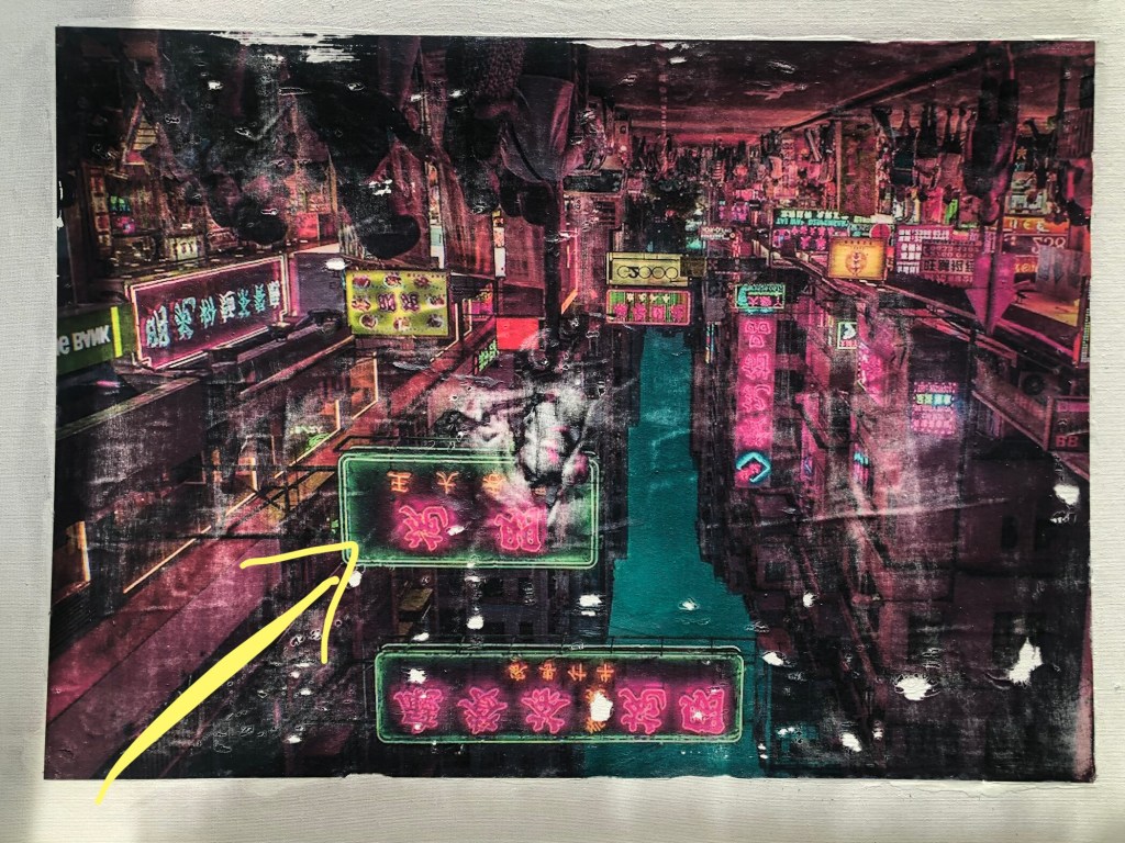
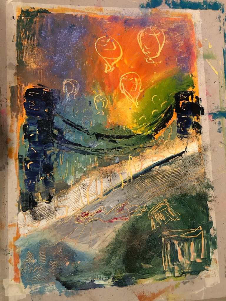
An A2 sized inkjet printed poster of a night time neon street signs scene of Hong Kong was chosen as the background of the piece. Dispersion liquid was used to transfer the image onto an A1 primed board canvas.
As the piece dried, I could see the canvas board was warped by the process – something to note.
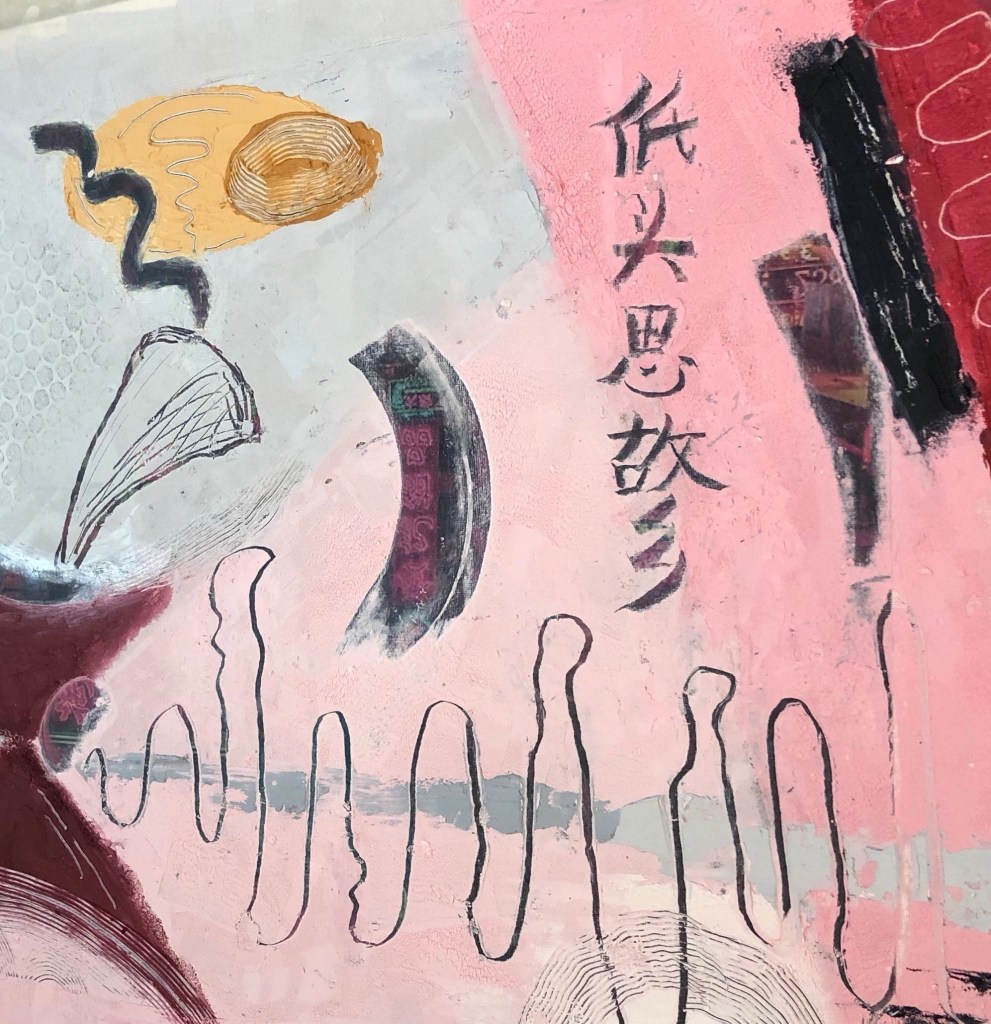
Below is the transferred image. I turned it upside down because I wanted a specific sign to appear at the point shown by the yellow arrow indicated:
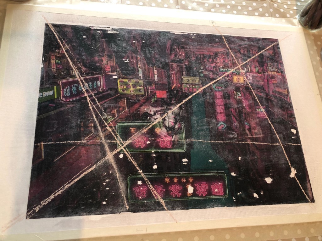
Axes were drawn in chalk to mark out the approximate plan for the composition. Also, some pencil marks were made on the edge of the canvas to indicate where a few of the specific neon signs were located that I planned to reveal later.
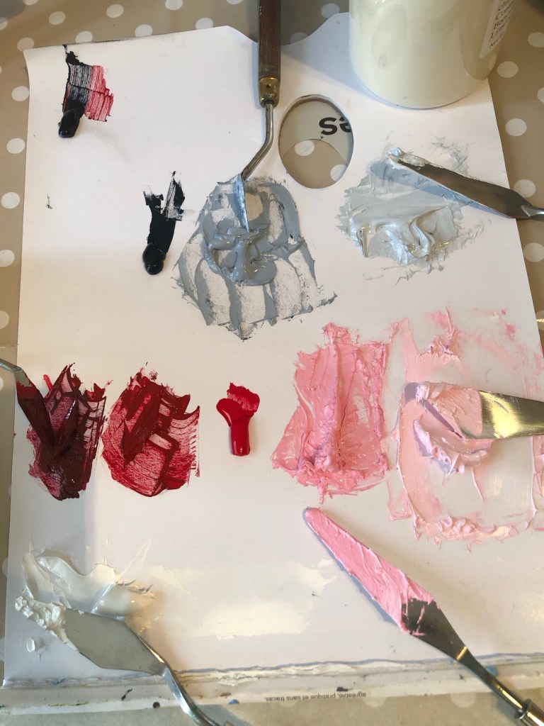
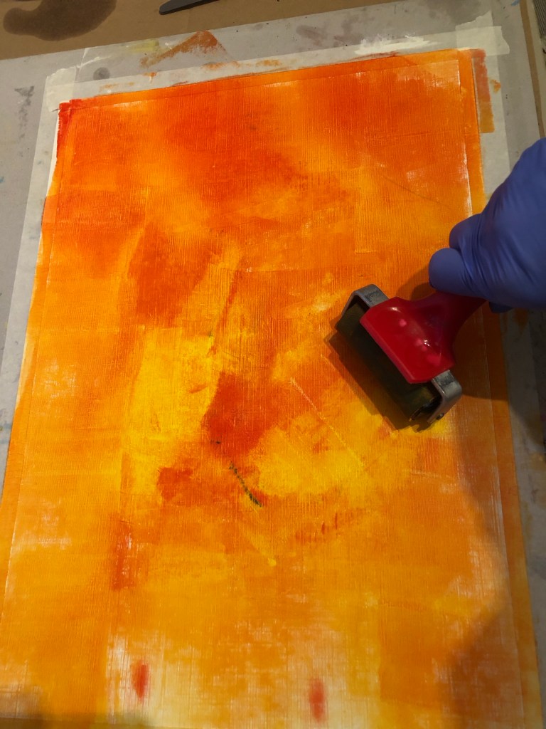
To complement the pink and dark colours of the background, I chose to use shades of grey and pink for the paint and cold wax coverage for the piece. So a palette of the different shades were mixed starting with red, black and white.
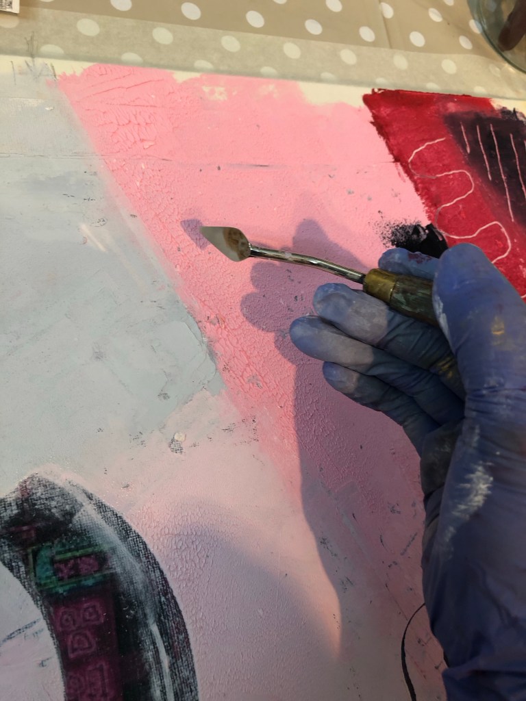
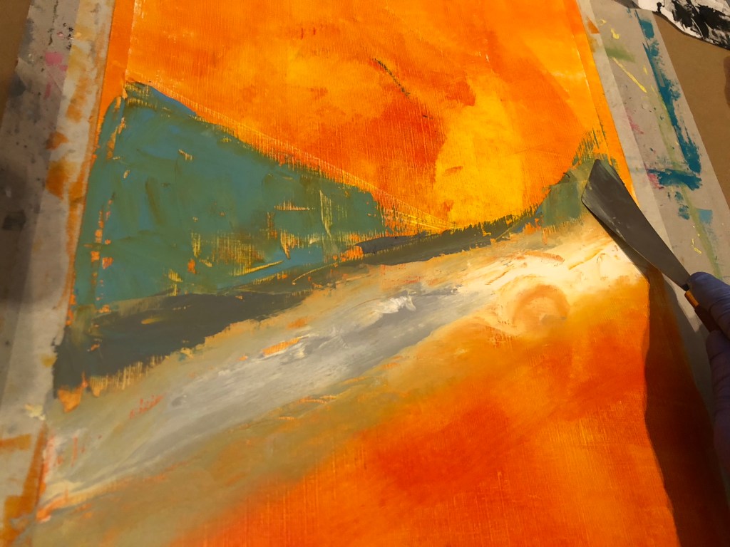
Since this was a practice research experiment on semi-abstraction with oil and cold wax, I started with various abstract shapes in the chosen colour palette. Then after using solvent to soften an area of paint and wax, I scraped off an area to reveal a specific neon sign according to the position marking that were made earlier:
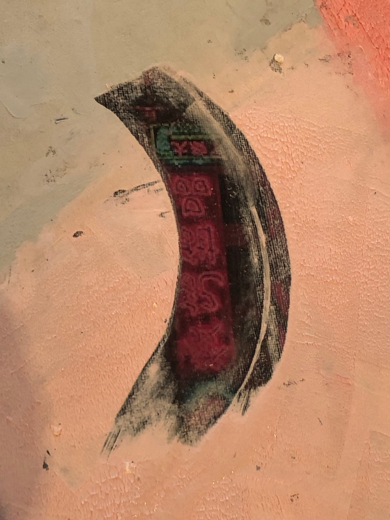
Various tools were used to scrap off paint as mark making. Also, using a small palette knife with a pointed end, Chinese calligraphy characters (last line of a famous ancient Chinese poem) were scraped into the work – this was an experiment to simulate a Chinese paint brush using a pointed palette knife:
Various tools were used to add more marks. Shapes of the Bristol Harbour Horn Bridge were put in because I liked the effect from a previous experiment. Pigment powder were scraped from a pigment bar to create a dusting effect. More areas of paint were removed to reveal the neon signs underneath – the later ones were just scraped off with a card or palette knife without the need for solvent which was unnecessary. Other lines from the ancient Chinese poem were written in Chinese ink on Xuen (rice) paper, then cut out and pressed onto the paint and cold wax on various areas of the painting.
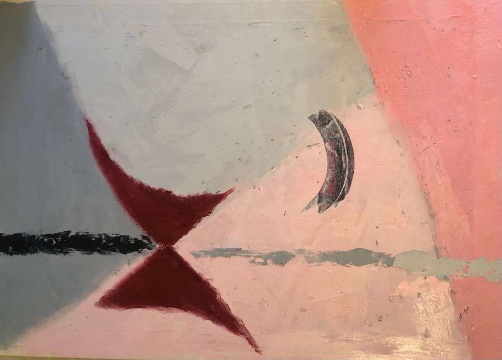
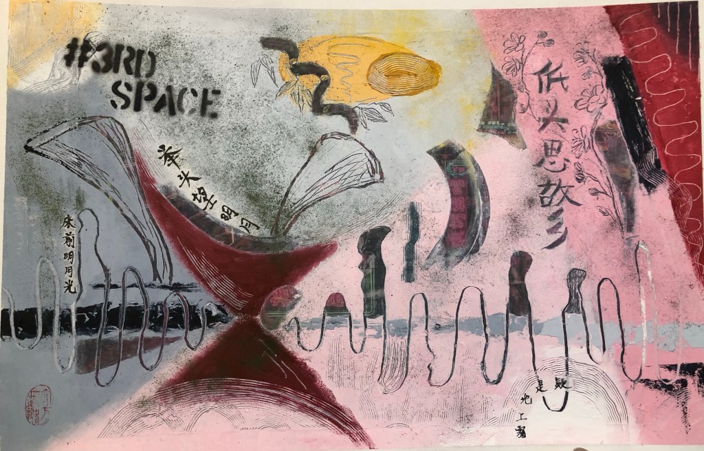
Finished work: Size A1, mixed media.
–
REFLECTIONS
I enjoyed the experiment and it was very helpful. Below are what I was and was not happy with.
I was happy with:
-The discovery that using Xuan paper to add Chinese brush painting or calligraphy worked very well. This is because the thinness of the Xuan paper was almost transparent when pressed onto the oil paint, so that it almost appears as though the calligraphy was on the oil surface. I would like to find more robust yet thinner materials (maybe silk or other paper of some kind) for this technique because the Xuan paper is delicate and could be prone to damage in the process. Since the paper is still partially visible and the temptation is to keep burying it into the paint and therefore risk damage. Hence an even thinner but more robust material would be better.
-Using the small palette knife to simulate a Chinese paint brush was successful but the effect is not as authentic as using the Xuan paper. However, I can see that the palette knife technique has its place if a semi-authentic effect was needed.
-Scarping the paint and wax off to reveal the background image worked well and the position markings on the side of the canvas were essential.
-I felt confident in manipulating the paint and cold wax materials, both in applying and mark making using tools. I continue to enjoy using these materials and can see more potential.
-The pigment powder sprinkling method worked well.
I was not happy with:
-The overall painting – I do not like it.
-There are too many neatly laid out symbols, hence it feels twee. I need to be more gestural in the mark making if I want to use abstraction as a form of expression. This requires more experimentation.
-The pink and grey palette added to the tweeness. So not satisfied with that.
-The vibrant neon-signed background did not get exposed sufficiently hence losing the energy that I wanted to bring into the piece with that image. Scraping small areas to reveal the symbols worked technically, but I feel larger areas needed to be revealed to make the background a true part of the painting.
LEARNING
-Out of all the different experiments carried out in this practice-based research series of work to incorporate Chinese brush art into oil paint, I believe this (using Xuan paper) was the most successful and I was happy with the outcome. So I will explore using a collage technique rather than brush paint ink onto oil. The next step will be to find the optimum material which would perform even better than Xuan paper. Ideally to find a selection of materials so I have some options to choose from.
-Oil paint and cold wax are still materials that I want to explore further for developing my style because I feel it provides a good based for semi-abstraction work that I want to explore. I can make abstract gestural and textural marks as well as use tools to depict symbols. Also it forms a good base for any collage work.
-Expose larger areas of the background image if the background is meant to be a key part of the work.
-One area that I have not experimented with yet is to spray paint onto oil and cold wax to see how that performs. I want to have the option to add street art onto my work.
NEXT STEPS
-Try out more Chinese brush paint collage onto oil and cold wax to refine this part of the process.
-Try exposing a larger area of the background image to see if that can work with the abstraction approach on the top layer. Experiment to find the right balance between revealing the base layer image without losing the sense of abstraction on the top layer.
-Try spray painting on top of the oil and cold wax surface – try when wet and then when dried.
ADDITIONAL EXPERIMENT
After the painting has dried, I spray painted the phrase ‘#3RD SPACE’ using a stencil onto the dried oil paint and cold wax. It worked well and I’m pleased that spray paint is an additional material that I can use here.
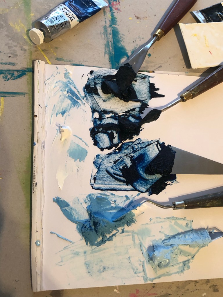
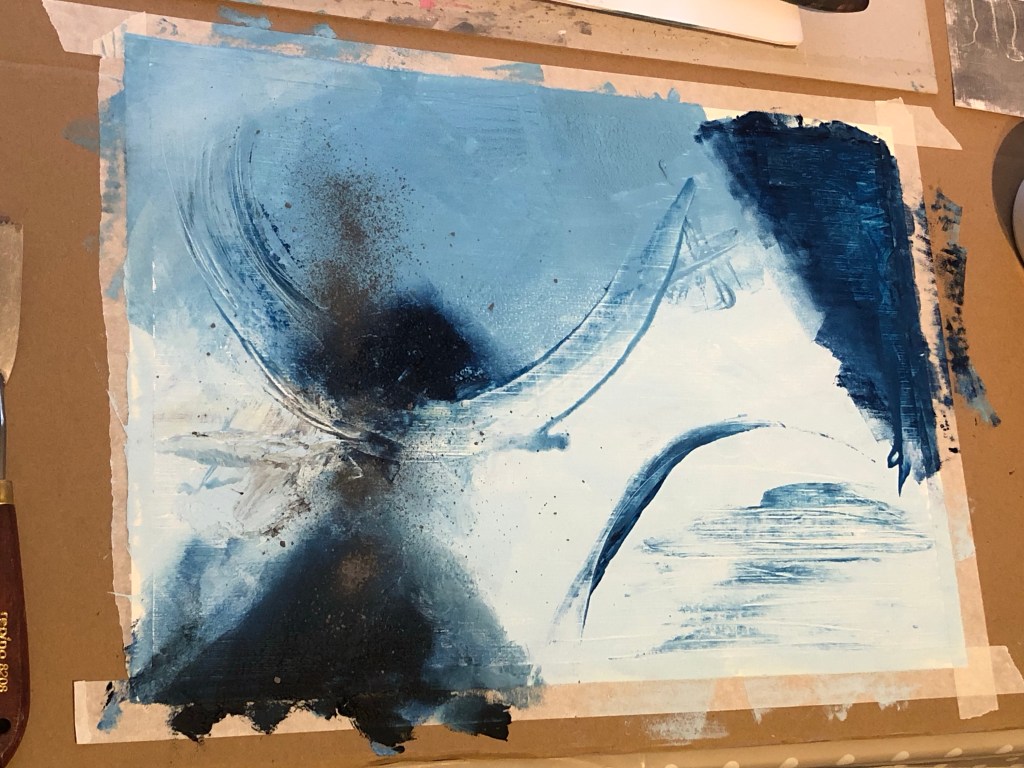
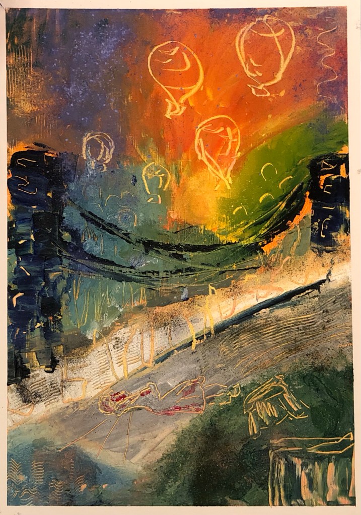
To improve my understanding of the oil and cold wax media, I started watching an online course by St Ives Painting School to learn techniques of painting with this chosen media. This is Part 4 of the series of material and media exploration. These experimental paintings were made with techniques that I learnt from the course, then adding other materials that I wanted to experiment with as I went along. Below is my favourite out of the work made during this part of the exploration.
The Horn Bridge, Bristol
METHOD
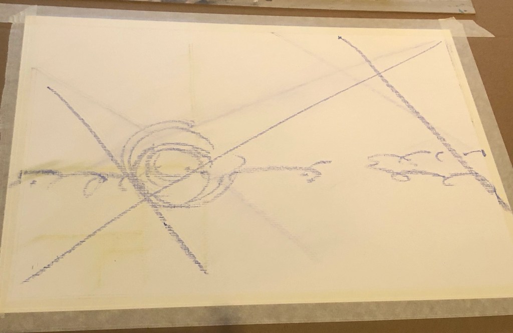
Experiment 1
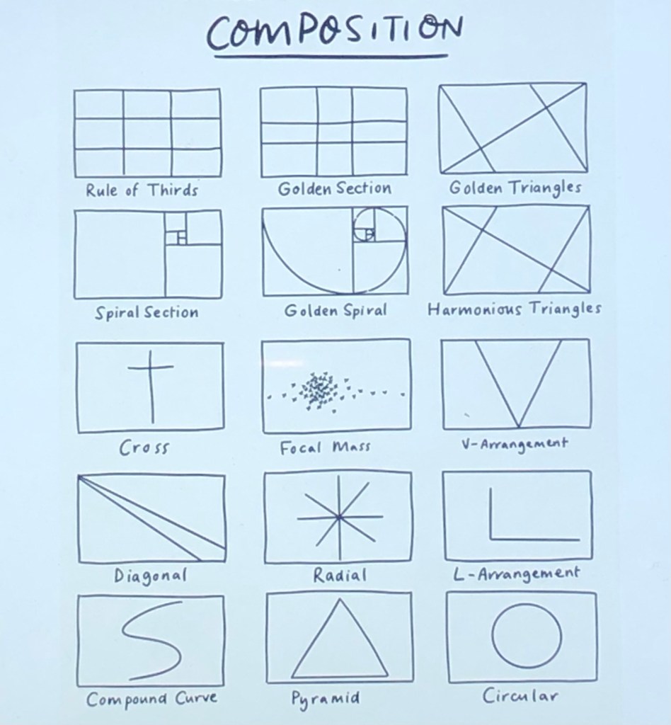
Basic composition was drawn out taking ideas from a list of compositions shared on the online course.
Shades of Prussian blue was mixed with cold wax:
Abstraction approach was used for the painting:
A sharp scraping tool used for clay was used to scratch The Horn Bridge image:
–
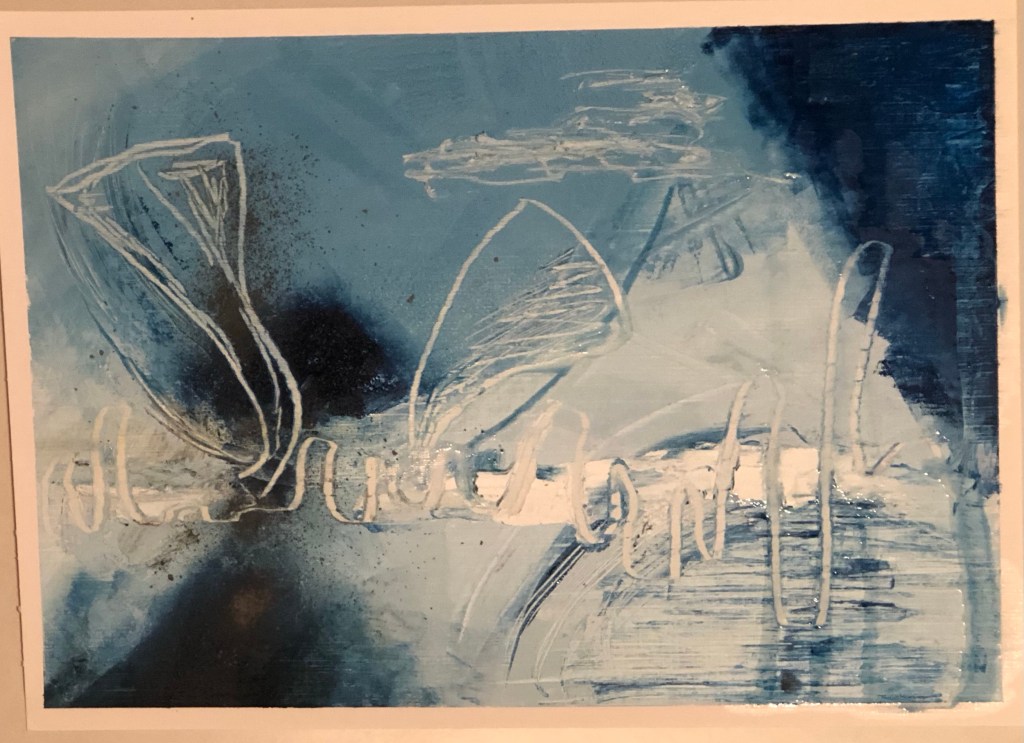
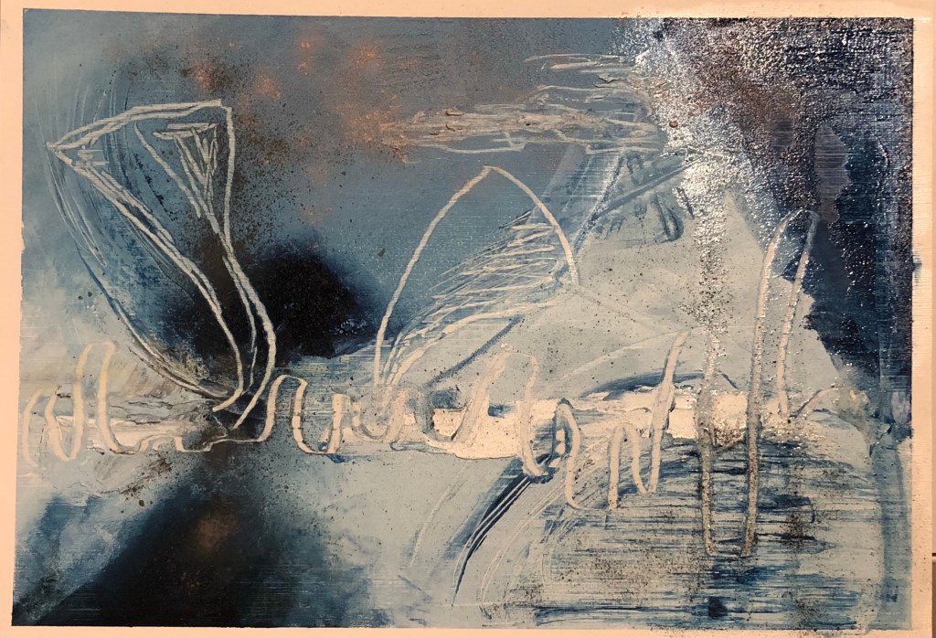
Experiment 2
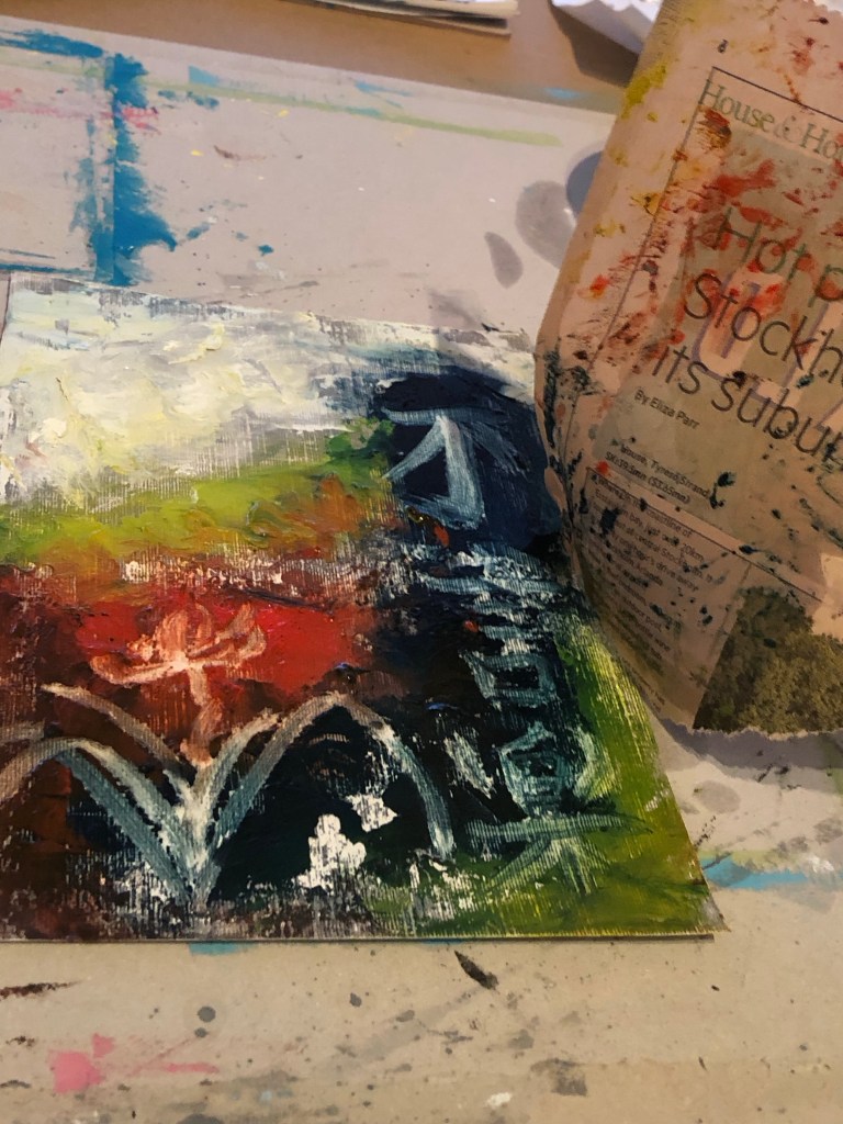
Experimenting with solvent on the oil and cold wax to loosen the paint then used a paint brush to do Chinese calligraphy so see if this effect would work to incorporate Chinese brush painting into the oil and cold wax medium:
–
Another experiment of using even more solvent to loosen the oil and cold wax to test the effect of Chinese brush art:
Using newspaper ‘tonking’ method to lift the excess paint off the canvas which is a process that I have always found to be effective:
–
Experiment 3
Applied oil and cold wax, then painted and scraped scenes of Bristol, my home town.
–
REFLECTIONS
I enjoyed the experiments. I don’t think the solvent method to loosen the paint for Chinese brush art worked very well, although one could see the Chinese calligraphy characters clearly, it was coarse and I was not satisfied with the result. So this part needs further experimentation.
I was very happy with the Prussian blue Horn Bridge painting – I believe that was the best one out of this batch of work. I liked the simplicity of the colour palette and the confident and defined lines depicting the bridge.
I was not satisfied at all with the last painting in Experiment 3 because there was too much going on and the images were too representational. It lacked the ‘edge’ and refinement of the abstraction as in the Prussian blue Horn Bridge painting.
Overall I enjoyed the exploration and felt that there is plenty to take forward to the next experiment.
LEARNING
– Need to try something different to incorporate the Chinese brush art into the oil based media. Using solvent here didn’t work satisfactorily.
– Abstraction or to be more precise, semi-abstraction with symbols, is a style that I want to explore more of because the abstraction part enables me to be more free in my gestural expression and the symbols help me to tell stories and communicate my narrative.
NEXT STEPS
– Watch the last part of the online session.
– Explore other ways to incorporate Chinese brush art into oil based media such as oil and cold wax which I enjoy working with.
– Continue to experiment with semi-abstraction with symbols.