I recently attended a Suminagashi workshop ran by artist Sarah Amatt. Suminagashi is an ancient Japanese method for marbling paper or washi by floating ink on water then absorbing the pattern onto the paper. Here is a video showing the process as demonstrated by Sarah:
Demonstration by artist Sarah Amatt
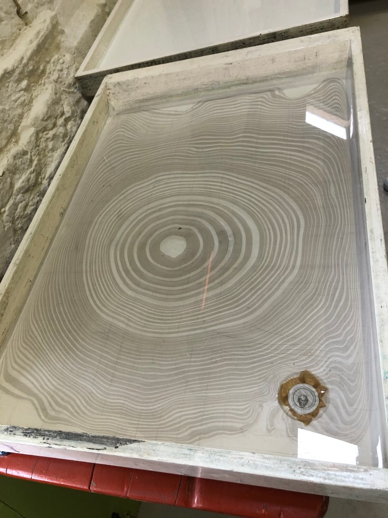
Below is an example of a marbling pattern floating on water ready for the paper to be presented:
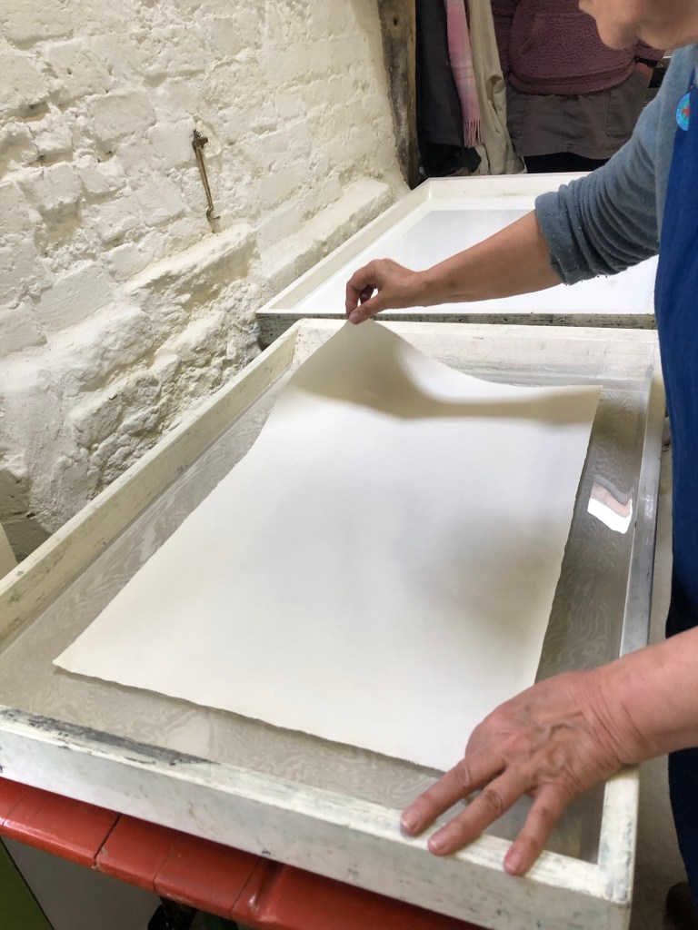
The next step is to place the paper carefully onto the water, either by ‘rolling’ it down from one corner, or holding the paper in a U shape and lowered down from the centre of the paper. This process should be done slowly with very steady hands so the paper floats and does not sink.
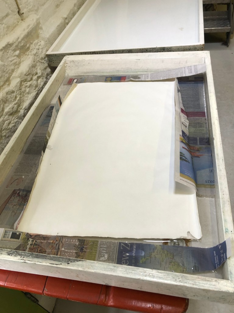
Strips of newspaper can be used to absorbed the extra exposed ink to keep the water as clean as possible for multiple uses.
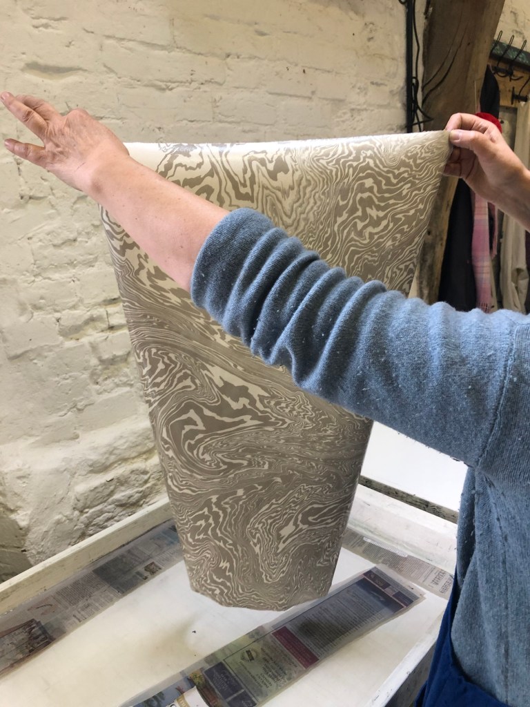
The paper is left on the water for a few seconds then lifted up carefully. It should be washed down with a few cups of clean water by a bucket or sink then put on a rack such as a clothes horse to dry.
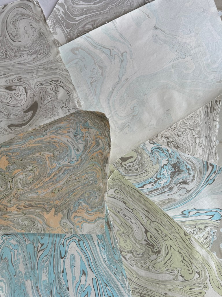
We made many sheets of various types and sizes of paper during the workshop:
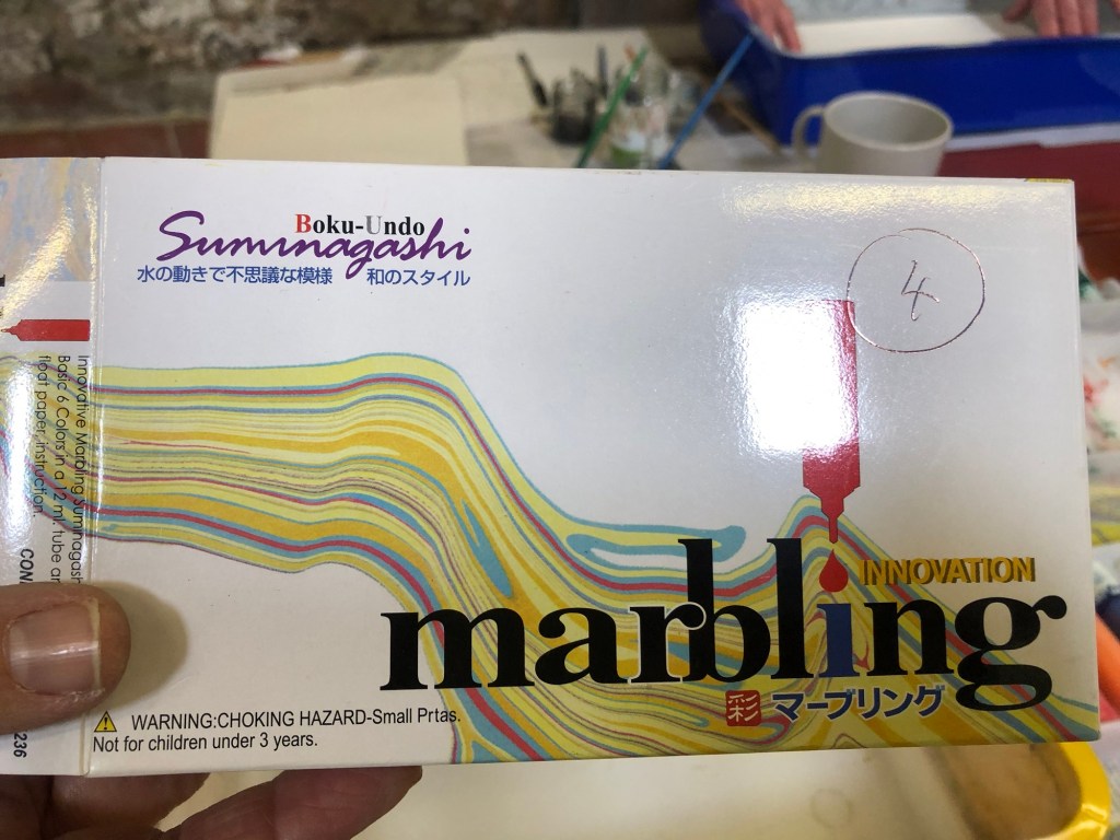
Here is an example of a starter kit of marbling ink:
–
REFLECTIONS & LEARNING
It was an enjoyable workshop. Sarah encouraged us to experiment which was great. I had no knowledge of the technique or history of Suminagashi beforehand so the workshop was a good learning opportunity.
My reason for attending was to make some patterned paper that I could use in my art practice to make books or sketchbooks. I came away with a good stock of marbled paper. So overall I achieved the objective, learnt some new techniques and enjoyed myself.
NEXT STEPS
Play and see what can be done with the paper and make some books.
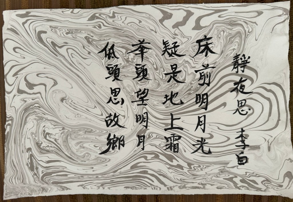
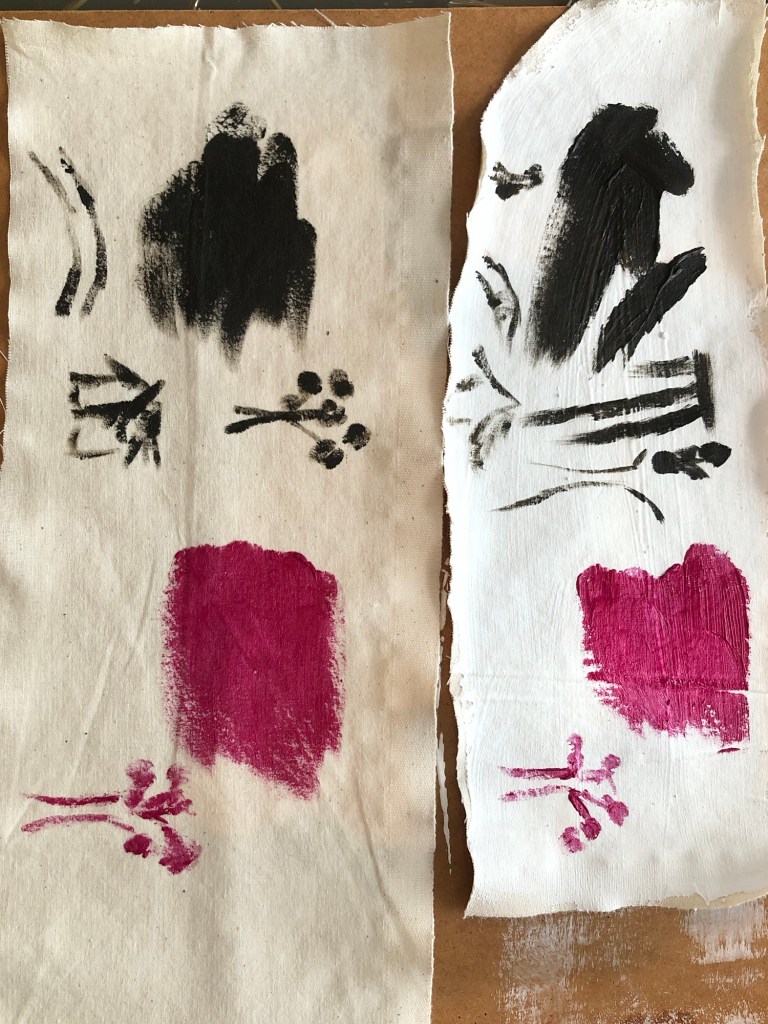
Below is an example of using the paper for Chinese calligraphy:
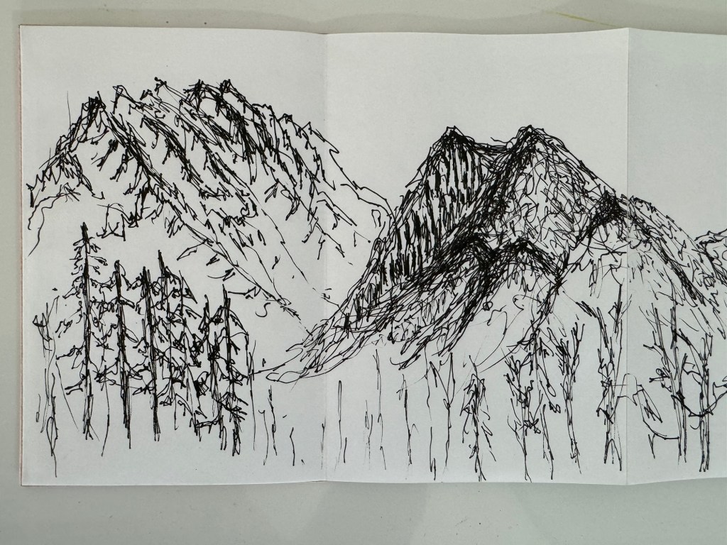
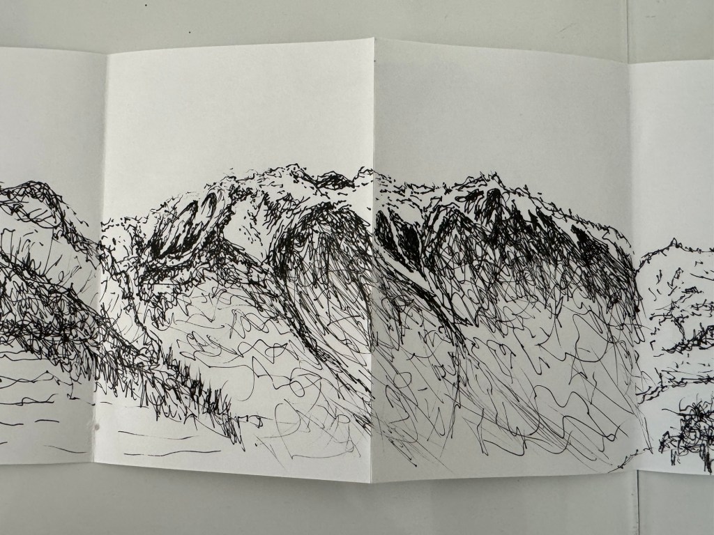
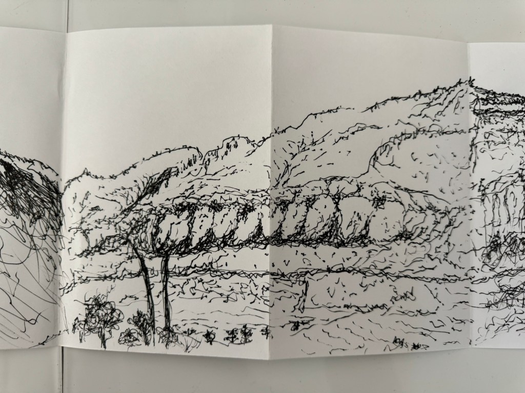
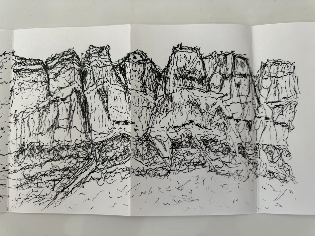
I have been travelling in North America including a wonderful 2-day train journey through the Canadian Rockies. Whilst on the train passing beautiful mountainous scenery, I decided to sketch with my non-dominant (left) hand.
Why use my non-dominant hand? Reasons were:
– I have been experimenting with drawing with my left hand recently and I have found it a rewarding experience.
– I was sketching live on the go and I had to sketch quickly as the train was passing through the scenery. I felt that using my right hand would be too slow as I would be prone to agonising or perfecting the drawings which would not be enjoyable.
– I really wanted to explore drawing with my non-dominant hand as a way to loosen up and free my mind.
A Pilot fine tip drawing pen was used with a Seawhite concertina sketchbook for live sketching on the go. Below is the outcome:
–
REFLECTIONS
I thoroughly enjoyed doing these sketches. Doing quick sketches with my left hand meant I didn’t have time to think or overthink which I am prone to doing with my dominant right hand. As a result, I feel my mark making was much more free than usual and I like the effect.
I enjoyed it so much that I kept drawing and didn’t want to stop. I also gained much confidence and I will not hesitate to draw with my non-dominant hand again. In fact, I prefer it.
LEARNING
I think I prefer this way of drawing because:
– I am prone to seeking perfection when drawing with my dominant hand and often over work a drawing, or feel disappointed with the outcome.
– I have little expectations when drawing with my non-dominant hand and in the case of these mountains, I felt pleasantly surprised and positive about the outcomes. I enjoyed the experience.
So the learning here is to step out of my comfort zone and explore new ways of making. Just explore without the shackles of expectations to free the mind. The outcome could be a positive surprise.
NEXT STEPS
Do more non-dominant hand drawing just for enjoyment and to exercise freeing of the mind.
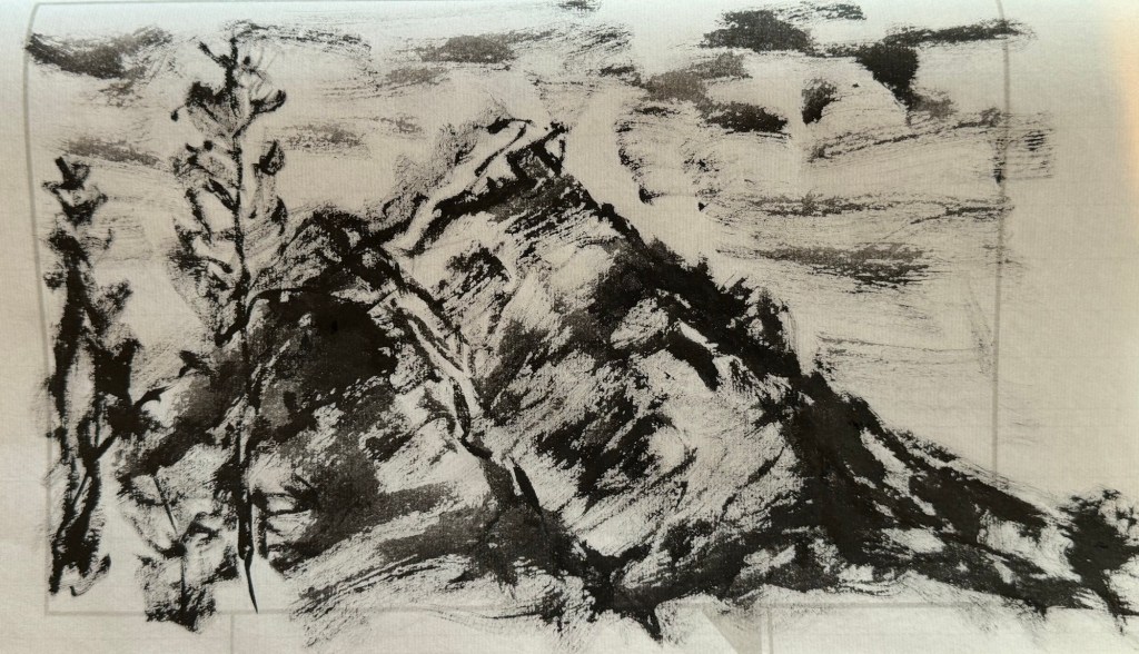
Try non-dominant hand painting, especially with Chinese brush painting. Just try to see what happens.
UPDATE
Below is my first attempt at non-dominant hand painting – Chinese brush painting with ink:
REFLECTIONS
The painting was started quickly and spontaneously, similar to the drawings that I did. But then I went onto touching it up wanting to improve it. So I was starting to use my non-dominant hand like my dominant hand. Meaning that I’m introducing the mental-barriers from my right hand to the left which would defeat the purpose of this exploration because my objective was to free my mind. So need to think through how to work differently with my left hand, otherwise, I might as well just paint with my right hand!
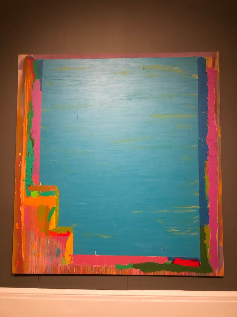
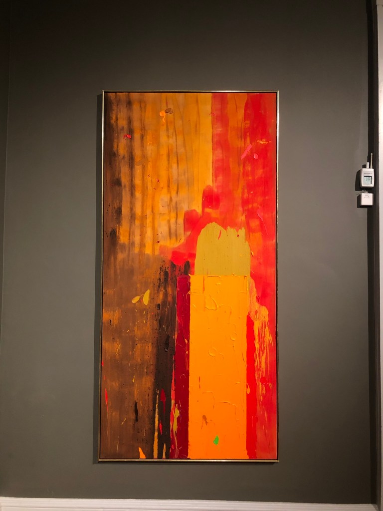
I recently visited an exhibition by John Hoyland at the Royal West of England Academy:
They also showed a 1970s BBC documentary about Hoyland where he was painting on a large canvas spontaneously over several days in his studio. I was inspired by his approach because I often over think and over plan my work and working like he did could help me to be more spontaneous. So I decided to set up a large canvas in my studio.
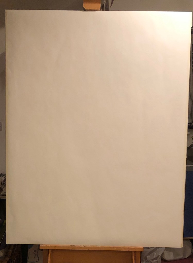
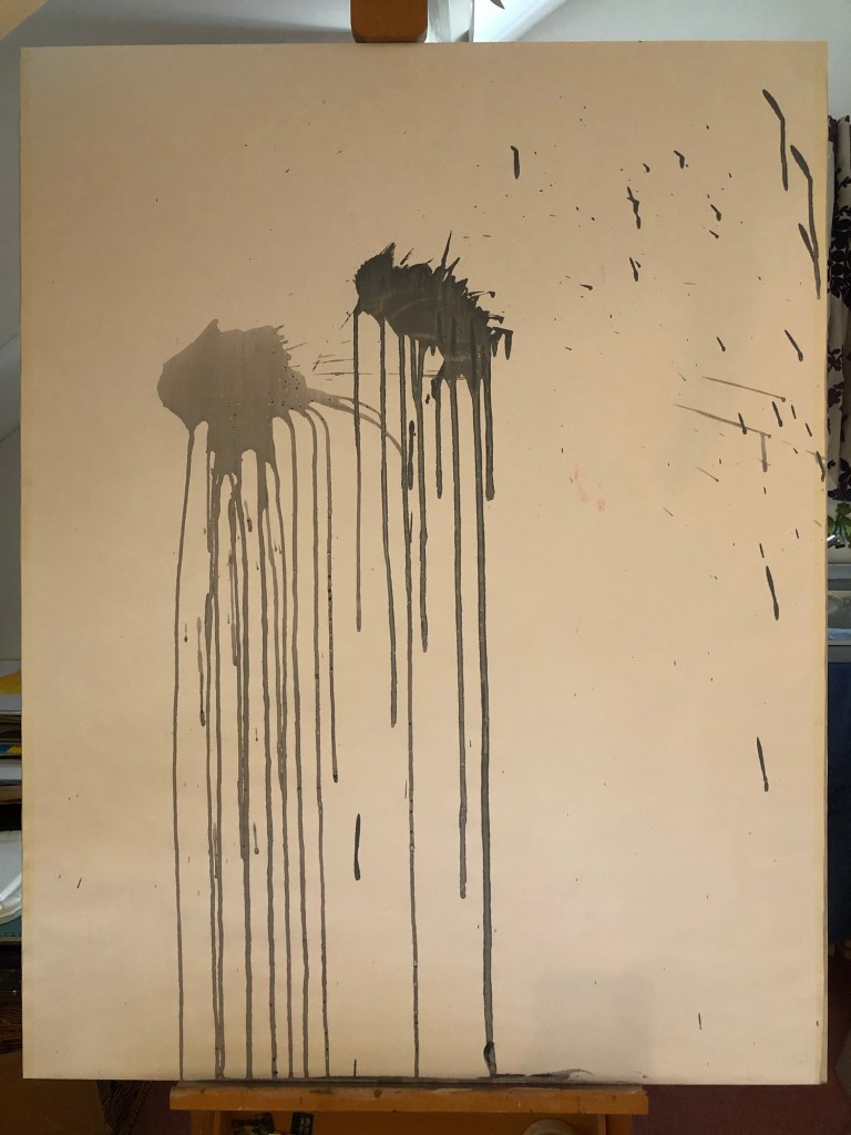
A few years ago during the COVID 19 pandemic, I bought a large roll of paper (Fabriano Accademia 200gsm paper by Fabriano SpA) but did not used any. So I decided to cut out a large piece, tape it to a board and cover it in gesso for some spontaneous painting work. Since the paper was only 200gsm, after covering it with gesso and the paper wrinkled, I had to face the fact that it was rather light weight for painting. I then wasn’t sure what to do with it and it became the elephant in the room and ‘stared back at me’. Then during one of our weekly MA sessions, we talked about how Duo Lingo, the language learning app, worked on a running streak to encourage ongoing progress. So I said to my colleagues that I would do a 21 day streak for the blank canvas. Since I said it aloud, I had to do it…
METHOD
The blank paper canvas was set up:
The idea of the ‘21 day streak’ was to do something on the canvas everyday (that I was at home) for 21 days, not to over think what to do. Just to make some mark, any mark. Below is what I did on day 1, splashes of diluted acrylic paint:
–
Below is an iMotion movie capturing progress of the 21 days:
–
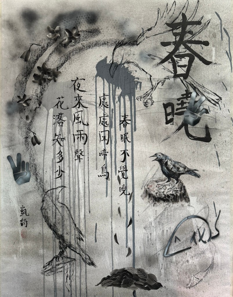
Finished work:
Mixed media on paper. H135 x W105 cm
–
REFLECTIONS
What I liked:
– I enjoyed the experiment and enjoyed responding to the canvas.
– The 21 day approach forced me to slow down the making process and not to rush to finish it as I am prone to doing.
– Doing something everyday was a good discipline, even if I didn’t have time or couldn’t think of anything to do, I had to do something such as drawing a few lines.
– Adhering to the ‘21 day streak’ process was like surrendering agency to the canvas; there was a strong sense of the to-ing and fro-ing of control between me and the canvas which was a new way of making for me. I liked it because it forced me to take time in my making. I needed this insight.
– I liked the Sumi-e painting collage of the fallen leaves.
– I liked the use of Chinese calligraphy.
What I didn’t like:
– I started off being more abstract and spontaneous. Then I started to do a collage by cutting out and pasting a crow from my Chinese painting work. That started the thought process about a composition. I resisted making it a properly composed figurative painting with crows, however, I felt that it became rather deliberately composed with the cut out crow being the turning point. I have mixed feelings about the meticulous style crow. It draws attention but perhaps too ‘meticulous’.
– I was disappointed that the canvas paper was too light weight for proper painting (I should have known). But I did enjoy having to take a more drawing approach and focusing on drawing style mark making which I have not done for a while, so all was not lost.
LEARNING
– Having a running streak is a good way to keep a discipline in a continuous making process.
– The crow was a turning point and then I sought out an ancient Chinese poem to fit the theme of the composition to bring the work to a conclusion which helped to bring the work to a neat finish. The poem talked about falling leaves which promoted the Sumi-e collage that I liked – but was that bordering on over thinking again? Am I over thinking about over thinking?! I think yes…
NEXT STEPS
I want to do another ‘21 day streak’ experiment. Having a blank canvas in the studio is a good idea for me to just ‘play’ spontaneously in parallel to my main line of work (making Cheongsam dress canvas paintings).
I will pay attention to not have a ‘meticulous crow’ moment too soon. I.e. not to put in an image that changes the course of the work too soon. Try to keep it loose, unplanned and spontaneous for as long as possible and surrender agency to the canvas.
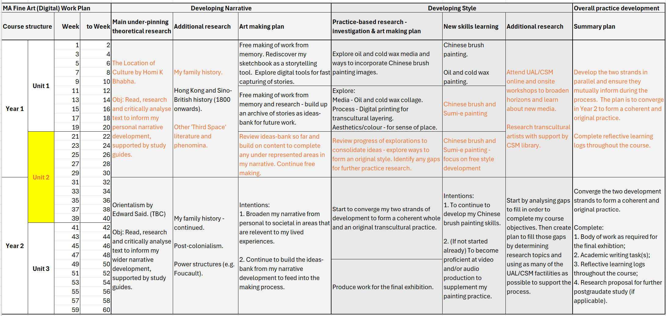
This blog details my preparation notes for Tutorial #3. It summarises my study plan and progress so far for this term (Y1 Summer term 2024).
STUDY PLAN
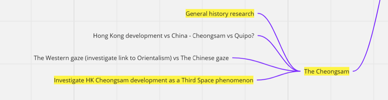
I refer to my Study Statement to review what I had planned for this term to see if the plan is still relevant. The orange highlights show the items I had planned for this term and that I am actually working on:
Overall, the topics listed in my Study Statement for this term are still largely relevant. For my making, I have some new creative ideas based on the Chinese Cheongsam as a result of an accidental find…
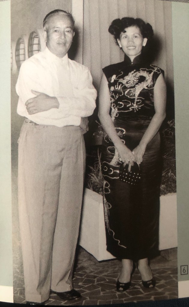
Finding two of my mother’s Cheongsams (also called Qipao – traditional Chinese dress) in my loft that I thought I had accidentally thrown away 23 years ago has given me new inspiration to make Cheongsam related art. My mother’s Cheongsams are of a modern mid-20th century design and is a ‘hybrid’ design combining the traditional Chinese style with European design of that era (tight fitting/figure hugging design inspired by Dior, Chanel etc.). I find the topic of an iconic Eastern-Western hybrid garment intriguing, exciting and I want to make art about it. It is also helping me to bring together my two development strands (narrative and style) – this convergence within my practice is happening earlier than I expected which may or may not be good. Time will tell..
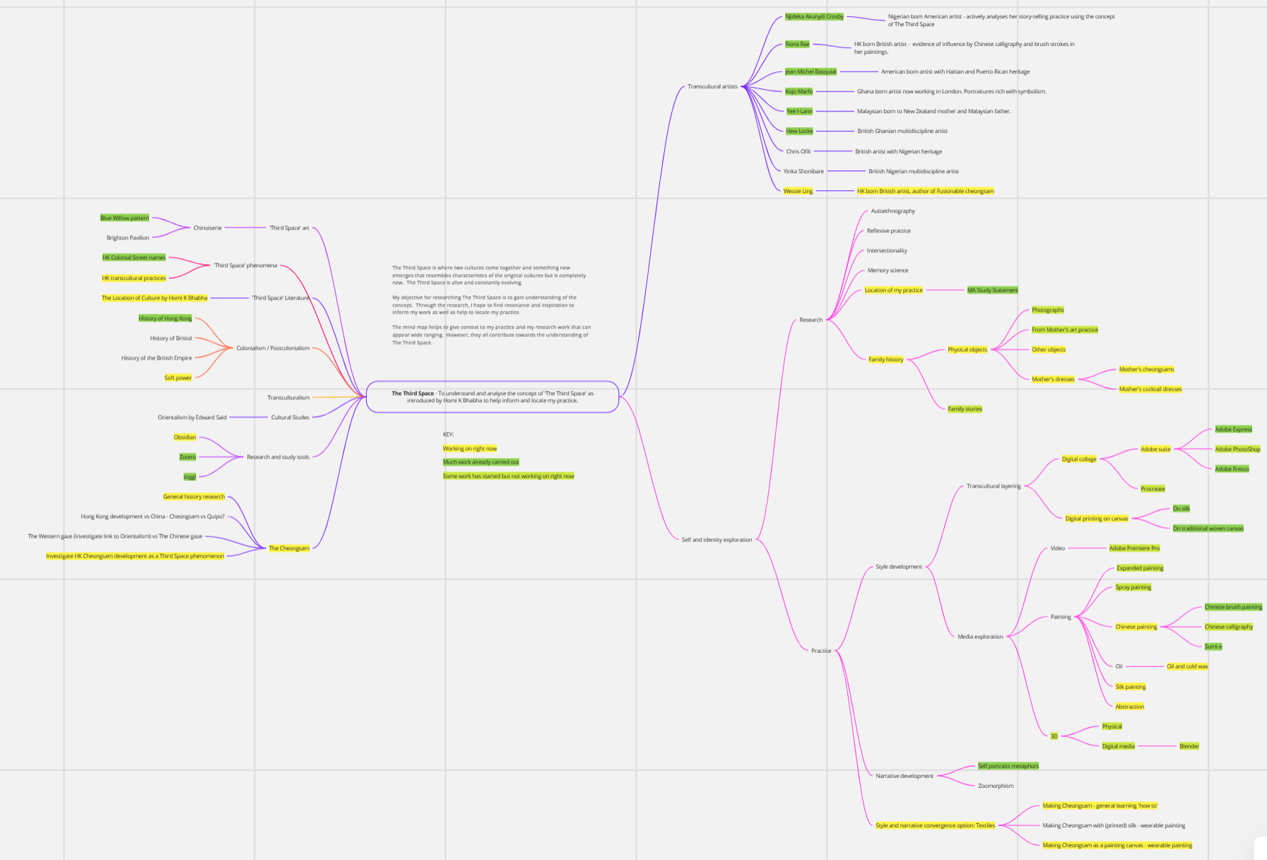
See below for the new activities added to my Mind Map as a result of this latest discovery:
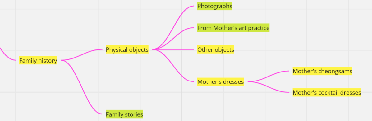
I added a light-green category to show work that I have started but not working on right now.
I have added the Cheongsam as a new topic for academic research and resources from the UAL libraries have been very useful:
I have added my mother’s dresses that I found in the loft as part of my family history research:
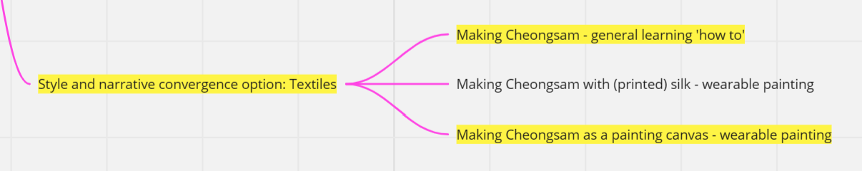
I also added Cheongsam to my list of making projects for this term. The plan is to make a series of wearable paintings:
–
PROGRESS(MAKING)
The progress of making during this term since discovering my mother’s Cheongsams are listed below:
– The first Cheongsam wearable painting was completed and documented in these two blogs:
– The blogs below show some earlier work that were carried out prior to the above paintings during the ‘thinking’ time that led to the idea of making a Cheongsam wearable painting:
I am close to finalising the title question. Details to be supplied separately to this blog.
TIME PLANNING FOR THIS TERM
I aim to split my time 50/50 between making and the research paper.
NOTES FROM TUTUORIAL #3
Date: 10th May 2024
Tutor: Jonathan Kearney
Notes: All the topics listed were discussed. Key points noted were:
– Out of the two similar titles for the Research paper – either is fine at this stage. Once more work is done then can decide on which route to go or maybe even something different.
– Homi K Bhabha’s book The Location of Culture – can quote from YouTube videos about the book. It’s ok to reference someone else’s interpretation of the text.
– Also look at TCK – Third Culture Kids texts.
– Positionality – not essential to declare for this type of research paper. But also ok to do, can be in introduction or conclusion. Although not essential, maybe interesting to declare for the reader in my case so they understand my motives for the research.
– We discussed how fixed I am about making a ‘wearable painting’ – my feeling was that I was not fixed on it. I don’t want the act of making it wearable (searching for washable paint and materials etc.) to distract from the making. It is a painting that can be wore (briefly for say a photo-shoot) and not intended to be a piece of proper garment. Keeping it as a painting also means I can use my usual artist grade paint and materials.
– What next to make – I have ideas for two pop art themed Cheongsam paintings based on food as metaphor about heritage and identity. I will make those and then hopefully to make more after that. I am excited about this concept. The vision is to make many (exact number to be determined) such ‘dress as a canvas’ paintings for them to be displayed on headless mannequins as a collective installation. I am excited by this vision!
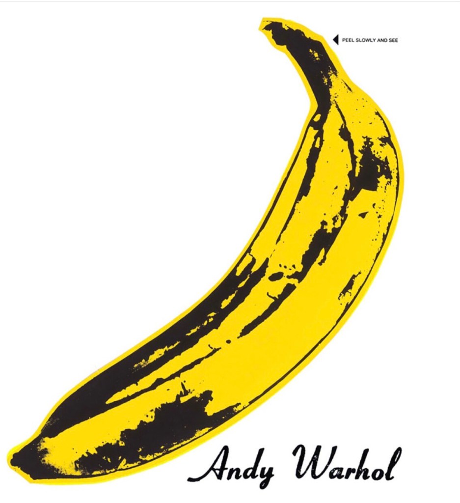
Following on from Cheongsam Series #4, where I made a 3D canvas in the form of a Cheongsam (traditional Chinese dress also known as Qipao) and I painted part of the Blue Willow pattern design on the canvas after researching its history. The reason for the Blue Willow design is explained in the Cheongsam Series #4 blog and after reflecting on the work, I decided that although I enjoyed the making process, I didn’t care enough about the Blue Willow pattern topic to make another painting on the subject to form a series. It was a very useful first attempt of that way of making (3D dress canvas) and I learnt a lot. I am keen to make another Cheongsam canvas but with a different approach to the design. I wanted something more vibrant and contemporary. Whilst mulling over ideas and looking for inspiration online, I was presented with an image of Andy Warhol’s banana:
I like the pop art banana and something about it made me want to paint it. Then I remembered the word ‘banana’ being used a lot in the 1980s and 90s to describe ‘Westernised’ Chinese people (yellow on the outside but white on the inside). I remember that very well and since my art practice is about exploring identity, Warhol’s banana image being presented to me online seemed like it was meant to be.
I researched to see if the word banana in this context is still being used. I found many articles about it and this blog from an East Asian reporter from Radio New Zealand was very interesting as it describes the background to the use of the word ‘banana’ in this context and also talks about why its use has become popular again as a result of the Hollywood film ‘Crazy Rich Asians’:
The article reminded me of how I was often called a banana by friends at boarding school and university. I didn’t find it offensive, it was a word that we talked and joked about a lot between ‘bananas’ during the 1980s and 90s. All those memories and the fact that the use of the word is on the rise again made me feel that I had to make this painting.
METHOD
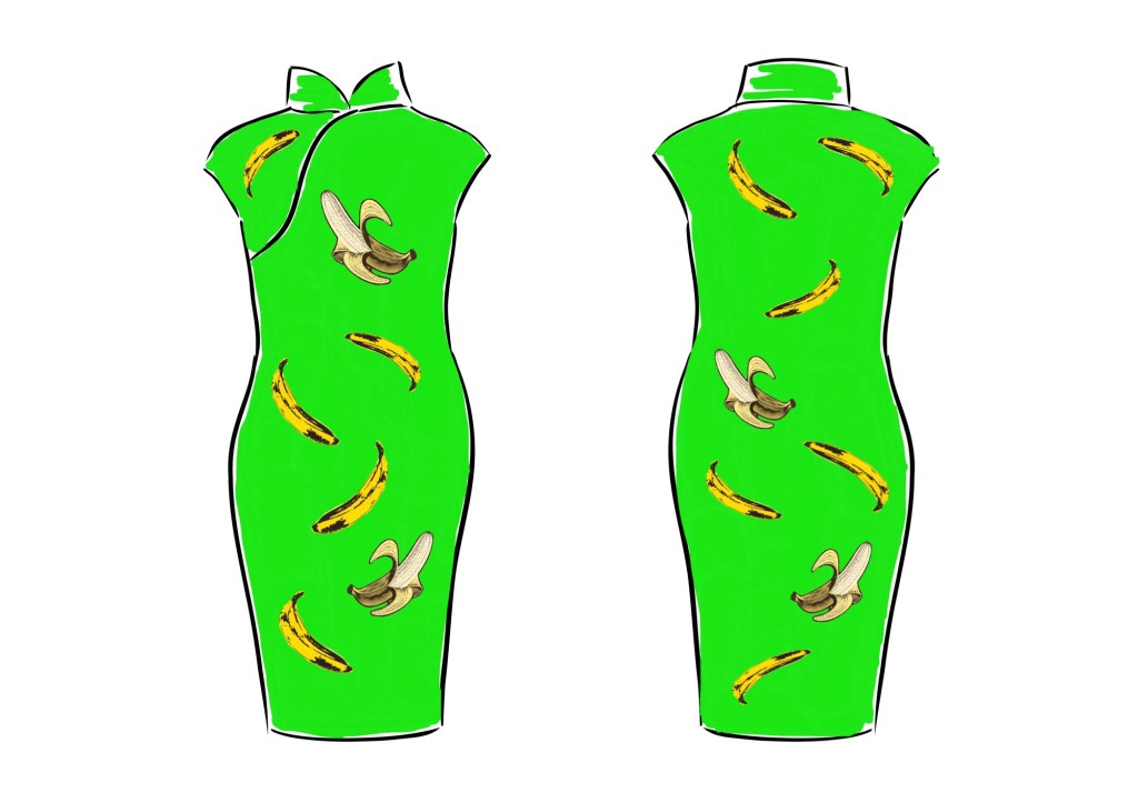
I have started to use Adobe Fresco as my digital sketchbook and I made a design using the Fresco app. I used images of Warhol’s banana as well as another image that I adapted to show a half peeled banana revealing the whiteness inside. I decided on a bright green colour (as close to neon green as I could get it) as the background because I wanted this to be a piece of pop art on a Chinese Cheongsam dress – an unlikely and unexpected combination that challenges traditions.
Below is the image creation process captured as a time-lapse video by Fresco:
–
REFLECTIONS
Although this is work-in-progress and I have only done the digital sketch so far, I was happy with how the time-lapse video worked in Fresco. Presenting my digital sketch work in this way was a suggestion in my MA Unit One feedback. I am pleased that I experimented with the Fresco function as I want to do more with video and moving images in my practice.
I recently showed ‘Cheongsam Series #4 – Appropriation. Appropriation.’ in our MA class group crit where my colleagues suggested I could try screen-printing for the next dress. Although screen-printing is well suited to this design, I decided to paint the dress like I did with the last dress because I enjoy painting. I haven’t had enough of painting on a dress canvas yet so I want to do more.
In a recent MA class discussion, we talked about the making process vs the product. The discussion made me realise how much more I enjoy and value the research and making process than the product. In fact, once I have finished a painting or a piece of art work, I often feel rather indifferent towards the product. I have no desire to display them in my home let alone think about selling them. I love the process of research, ideas generation, making and problem solving along the way. Once it’s finished then I want to move on for the next ‘fix’ – i.e. I find the process of creating addictive.
LEARNING
Reflecting on the MA class discussion about process vs product has helped me to understand why I have no interest in displaying my art and how I often just want to move onto starting the next project. However, I wonder if there’s more to it than that – why am I indifferent to my creations? I will log this thought and come back to thinking about it at a later stage.
NEXT STEPS
Make the banana dress painting and use the creative process to explore the identity of a ‘banana’.
In my last Chinese painting blog where I painted a heron, I questioned what makes a piece of art ‘Chinese art’. Is it about the materials used or does it have to possess certain stylistic or aesthetic characteristics to be considered ‘Chinese art’? Thinking about this reminded me of how I find the Blue Willow pattern irritating. I don’t find it appealing and it irritates me that many people consider it ‘Chinese’. The Blue Willow pattern technically comes under the category of Chinoiserie art which is an European interpretation and imitation of Chinese and other East Asian artistic traditions. It started in 17th century and became popular in the 18th century. As the British Empire and its naval prowess went from strength to strength during that period, the demand for Asian and East Asian artefacts back in Britain grew rapidly giving rise to the popular Blue Willow China. I do not intend to go into the details of that part of Empire history in this blog, what I plan to capture here is my personal feelings towards the Blue Willow pattern.
For me, the Blue Willow is a poor form of appropriation. It was originally designed by English designers Thomas Turner and Thomas Minton, they both worked for the Caughly factory. Spode was believed to be the first factory to mass produce Blue Willow China around 1790. So it was an English design that was meant to look Chinese. Over the years, I have had numerous people (non-Chinese) telling me that they love Chinese art and they love Blue Willow China. It is hard to explain my ambivalence. On the one hand, it is good that someone is interested in your culture, but to quote something that does not represent said culture can be irritating. I am not irritated by those who expressed such views, but irritated by the fact that Chinese culture (I consider that partly my cultural heritage) is so widely associated for so long with an unattractive and poor quality design, especially given the concept of orientalism and the related history.
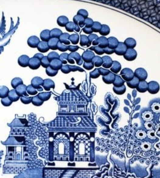
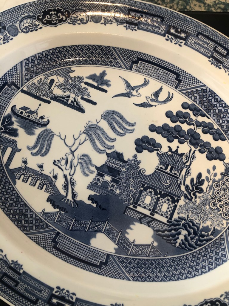
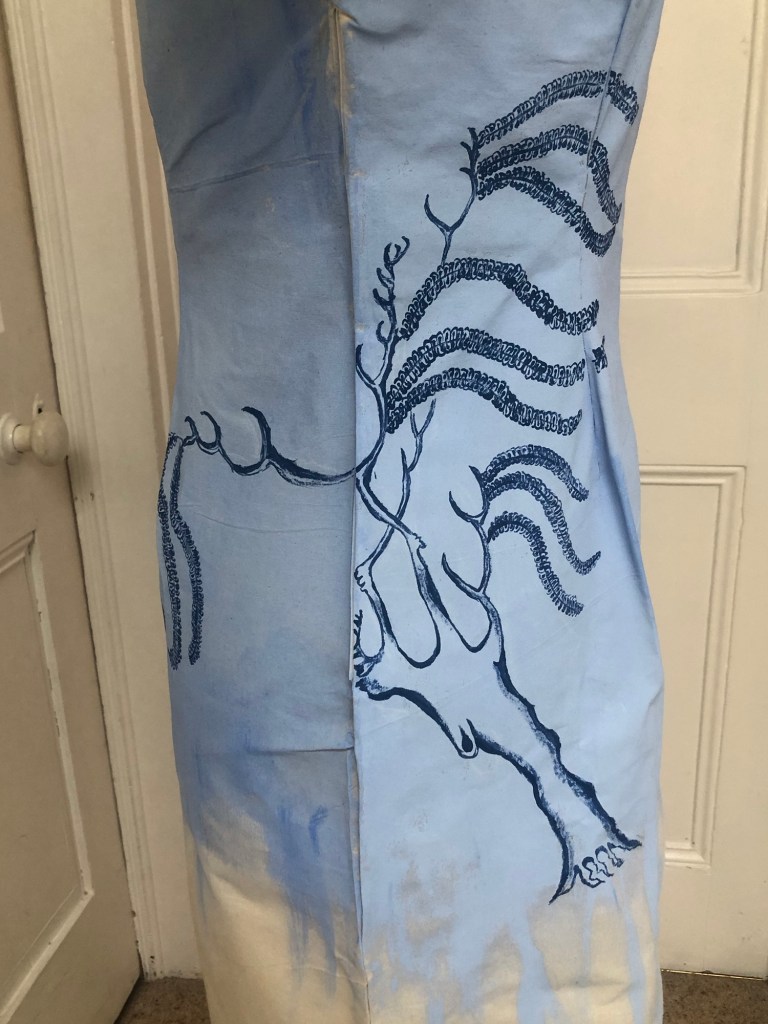
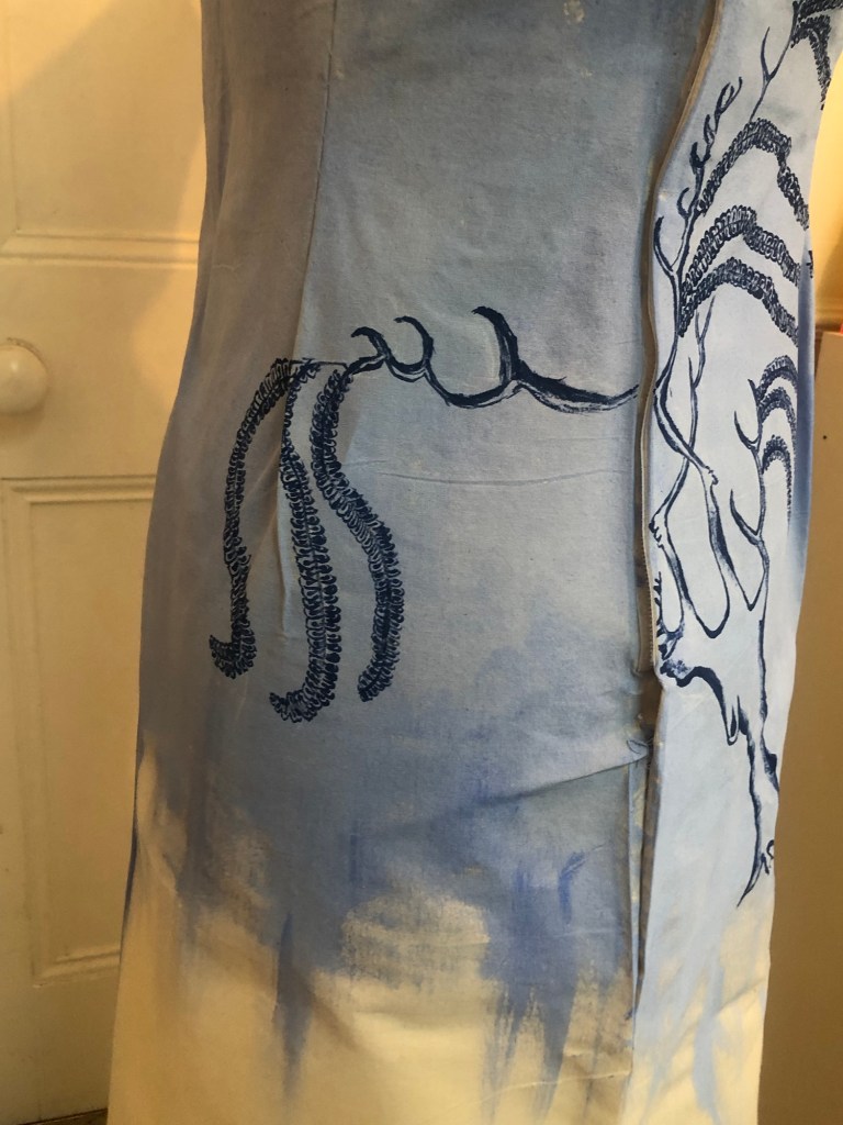
As a result of my ongoing ambivalence, I have became fascinated by the Blue Willow pattern. The more I research into its history, the more I feel amused by it. For example, a fictional story based in China was made up and marketed as the background history to the Blue Willow pattern in order to drive sales. It was apparently a successful campaign which was a clever marketing concept even in those days. I had never heard of such a story so I downloaded an e-copy to read because I was intrigued. It was not a particularly good story but it cleverly tied together all the elements of a typical Blue Willow pattern – good effort. Since starting my Blue Willow research, I have started to look out for Blue Willow China and have acquired some pieces to study from charity shops and street markets. The part that I find most amusing is the largest tree on the design bearing some large round shapes on its branches:
–
There are many theories published about what kind of tree this is – it is twice the height of a two storey pagoda, so too large for a fruit tree yet the round shapes look like fruit – so what is it? There are articles that claim it was possibly an apple, orange, pomegranate, peach or persimmon tree. None of those was really possible due to the size of the tree depicted unless it was a surrealist design which I don’t think it was. I believe it was in fact a Chinese pine tree which can grow up to 80 feet tall and were commonly depicted in Chinese paintings. The round shapes were meant to be clusters of pine needles that collectively can form a round or oval shaped silhouette. Often in Chinese paintings or carvings, pine needle clusters are done with a round or oval shadow then some individual needles are depicted to suggest their presence. It is possible that the designers of the original blue willow pattern either ignored the needles because they were so fine hence difficult to depict on porcelain, or someone who has travelled back from China having seen a similar design then described it and the original tree details got lost in translation (like a form of Chinese whispers ironically). It could also be that the tree design evolved over the years with the round shadows becoming the main form as simplification of the pine tree happened over time. As a result, the original pine tree details were lost. This is my opinion and I remain irritated that this design claiming association with Chinese art yet not much effort was made to get such basic details right. Hence my opinion that the Blue Willow design is a poor effort in appropriation; it is a case of an inferior product gaining success as a result of effective marketing to satisfy the demand for East Asian art during that period in history.
APPROPRIATION. APPROPRIATION.
As a result of my irritation as well as ambivalence towards the Blue Willow pattern and its history, I have been wanting to make a piece of work about it to explore my thoughts further. I also felt it would be ironic for me to appropriate the appropriation.
METHOD
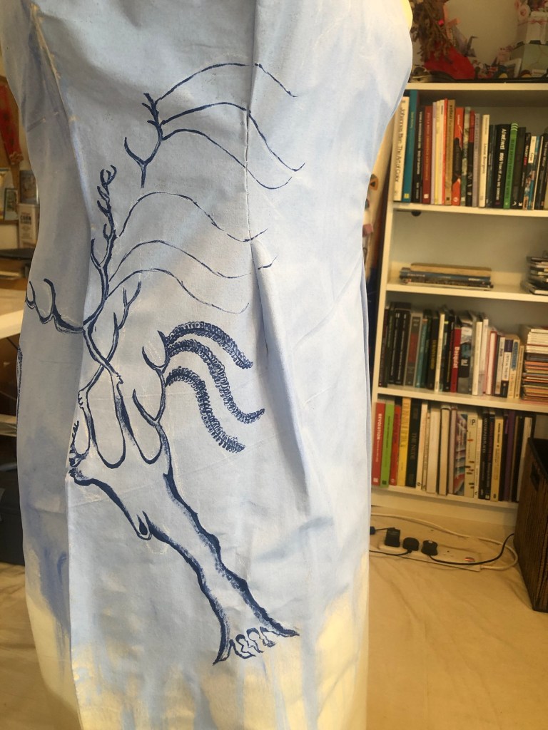
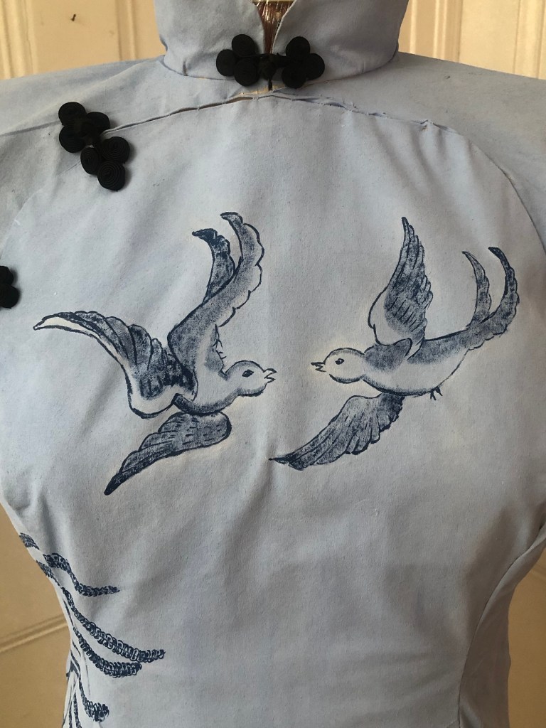
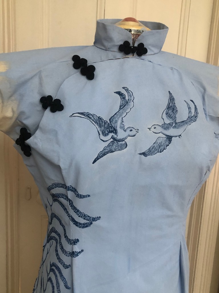
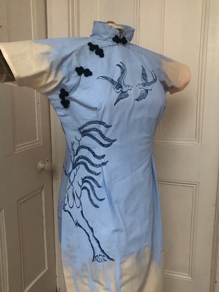
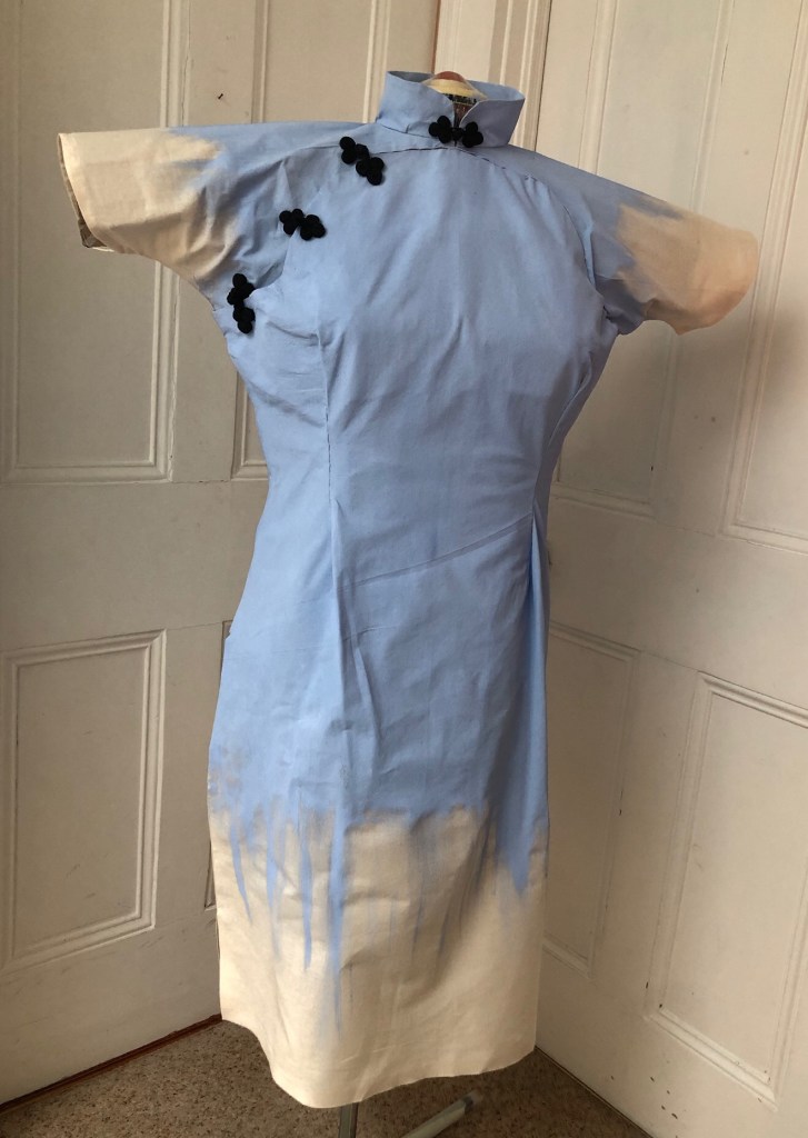
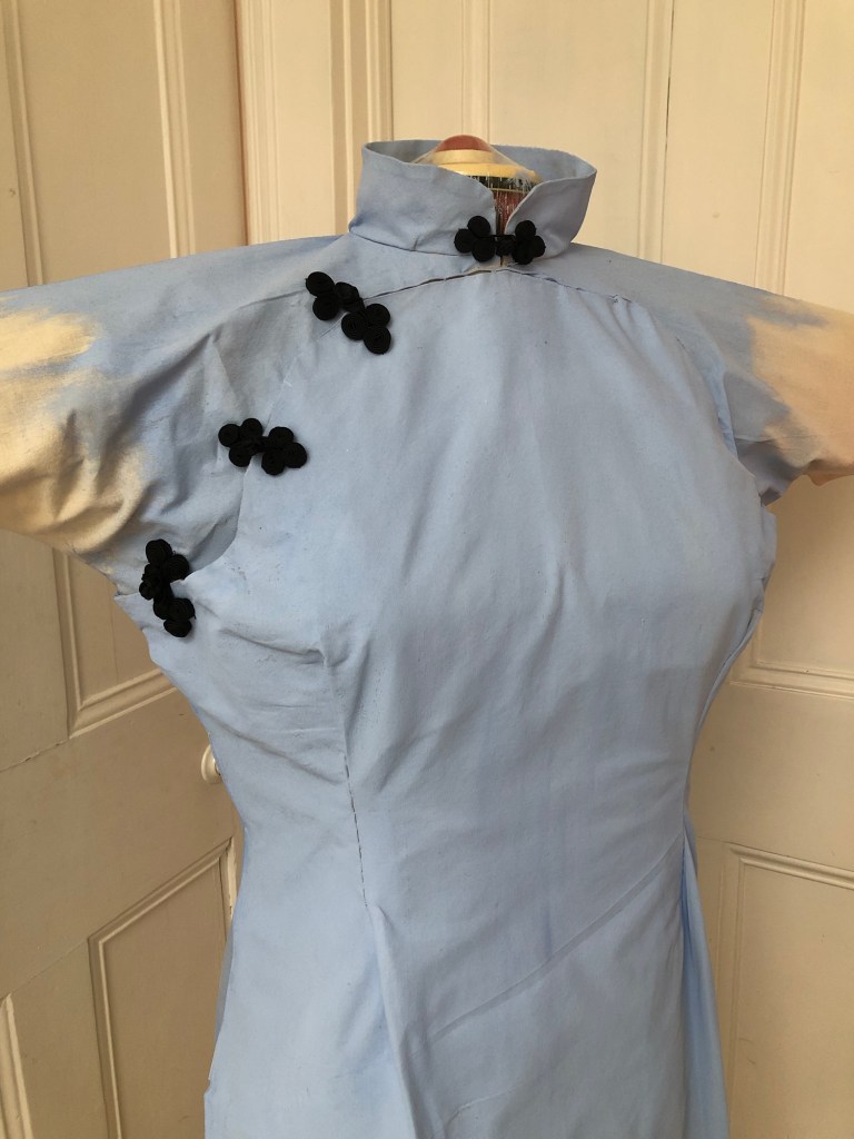
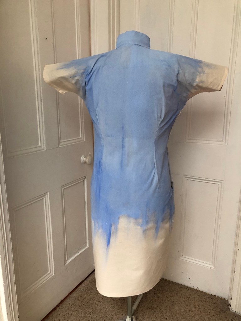
Following on from Cheongsam Series #3 where I had made a 3D canvas in the form of a wearable painting, I have decided to paint part of the Blue Willow pattern onto this canvas:
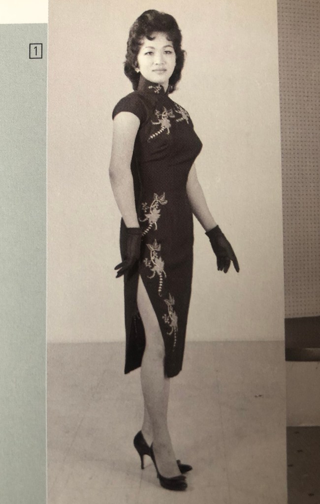
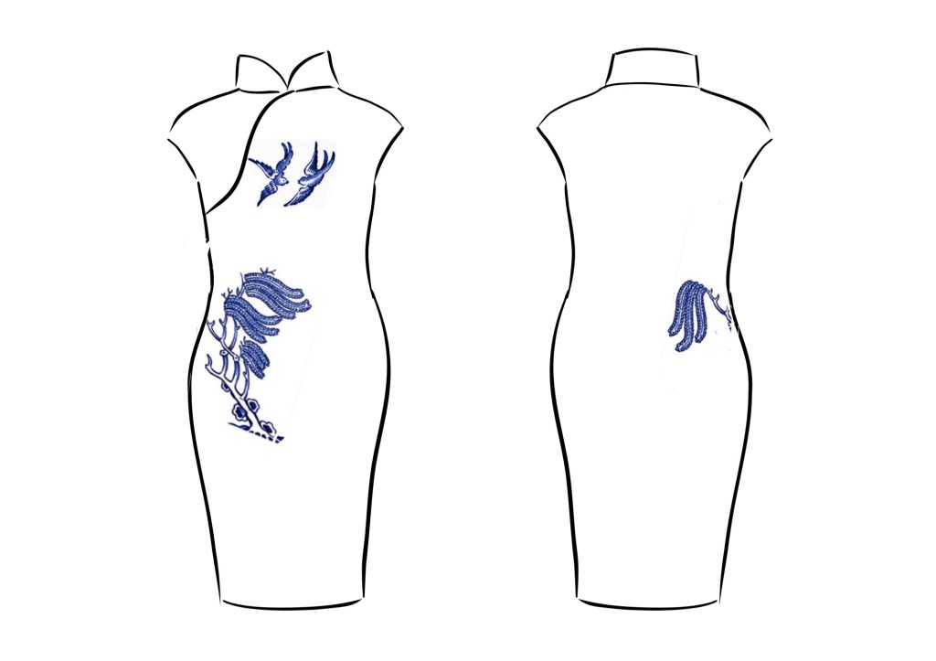
To decide where to place the images, I researched traditional Cheongsam designs and found the following images from the book In the mood for Cheongsam by Lee Chor Lin and Chung May Khuen, published by National Museum of Singapore. I particularly like these images where there are motifs on the chest and then the design runs down the right hand side of the wearer. I remember seeing such dresses when I was a child and thought the asymmetrical design was very elegant. So I want to create a similar design with this piece of work.
–
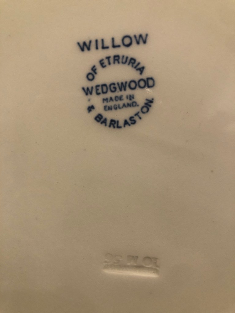
There are many variants to the Blue Willow pattern, I decided to use the one on an oval platter that I had bought at a London street market. The piece was made by Wedgewood and date stamped 1956.
–
Adobe Fresco was used to explore the composition and the design below was chosen:
White chalk was used to mark out the design on the canvas:
Partly through this project, I contacted the CSM paint and materials lab for advice on what paint and canvas materials to use for a wearable painting. The details of the advice is recorded at the end of this blog. Based on the advice, the design was painted with Pebeo fabric paint:
–
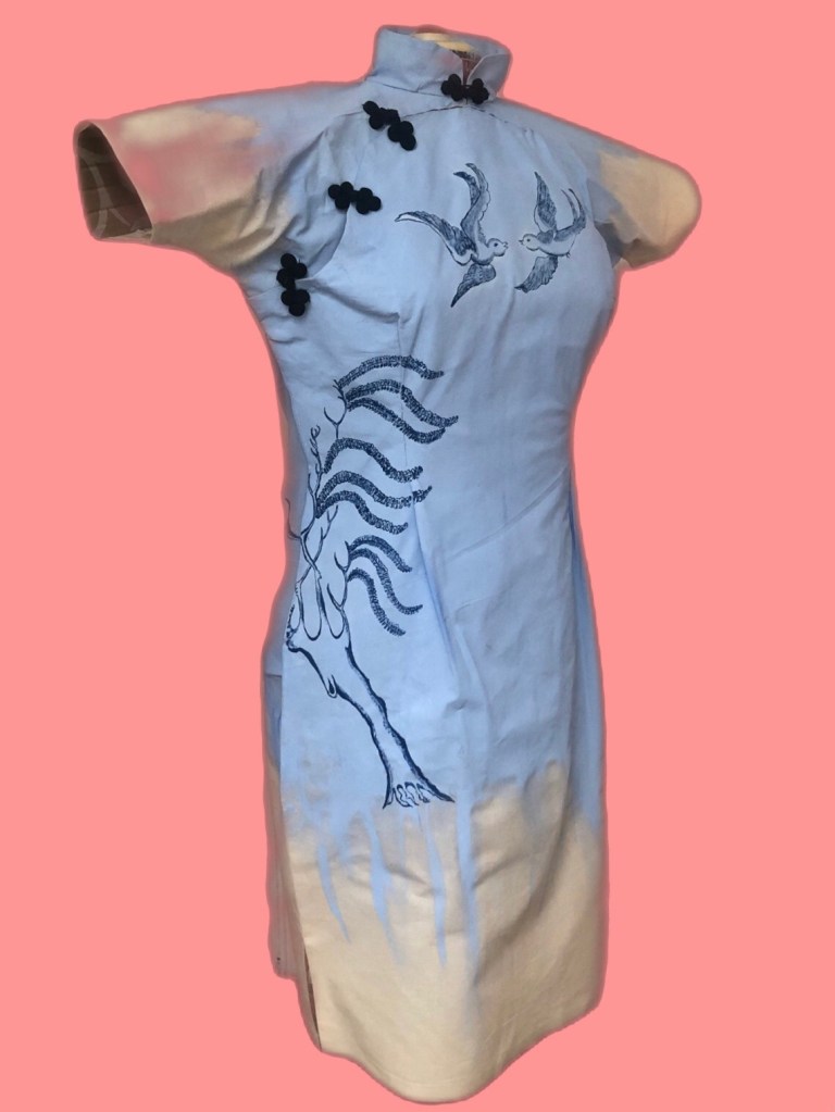
Finished painting:
Finished work – Appropriation. Appropriation. H110 x W75 x D30cm
–
REFLECTIONS
I believe the Blue Willow pattern is a Third Space phenomenon because it is the combination of two cultures but it is neither one culture nor the other, i.e. neither English or Chinese, but resembling characteristics of both of the originating cultures. This realisation made it even more relevant as a topic for my work.
I considered adding the pagoda and pine tree to the back of the dress as an additional feature, but instead of painting the big round ‘fruits’, I wanted to correct them and paint a proper Chinese pine tree instead. However, after completing the willow tree and the birds, I felt I had done enough on the painting and wanted to move on – either further research about the cheongsam or make another canvas because I had thought of other designs that I wanted to do.
Overall, I have enjoyed making this painting and felt that I have learnt a lot especially about dressmaking.
For this painting – what I was happy with:
– Making a dress from scratch from a sewing pattern. I enjoyed the process because dressmaking is both a technical and an artistic endeavour. I found the creative process satisfying.
– While I was making the dress, I recalled watching my mother designing and making clothes for the family when I was young. Through the sewing, I felt I was living her experience in a way. I wonder what she would say if she were here. I expect she would be giving me advice patiently. She was always patient when she was making and when teaching us. Thinking back, I can remember how she enjoyed designing and dressmaking when she was younger, then when she went onto painting in later life.
– I can see that incorporating sewing and costume making into my practice would give me an additional dimension to explore.
– I enjoyed painting the Blue Willow design onto a 3D canvas and exploring new materials such as the new fabric paint.
What I was not-so-happy with:
– The dressmaking was a bit rough-and-ready. It was a first attempt and I have learnt a lot, so I hope to do a better job for the next one.
– Although I enjoyed the process of painting the design onto the canvas, I felt rather indifferent about the Blue Willow pattern. I didn’t care as much as I had expected; nor did I get as much out of it as I wanted. I found myself asking ‘so what?’ I expect it’s because ultimately, my feelings towards the design and its back-sorry was not that strong. My feelings towards making the cheongsam was much stronger than towards the Blue Willow pattern. Having said that, I did enjoy researching and was amused by the history of the design.
LEARNING
Since this was a first attempt of this new idea, I was keen to get feedback so I put this work in for the group crit. The group was very supportive, gave me some advice and posed good questions. My takeaway from the crit were:
– Is it really a wearable painting if I haven’t used fabric paint throughout? Meaning that if it cannot be washed then can it be called wearable? This was a valid point. My idea was that it’s an item that could be worn but really only briefly for showing or photographing. It is not really a piece of garment as such. So I need to rethink what to call this type of work, either make it truly wearable and washable or just call it a 3D dress canvas.
– Think more about how to show this work. Such as how to present the piece and in what setting.
NEXT STEPS
– Make the next cheongsam canvas and develop the process further. Consider whether to make the paintings truly wearable or not.
– Research more about different cheongsam designs.
– Think more carefully about the subject and context of the painting. Something that is relevant to my research and thought provoking enough to sustain my interest beyond the making process to give me further scope for reflection. Also something to take onto the next piece of work.
– Think about how to present such type of work.
NOTES
I sought advice from the CSM paint and materials lab on what to use for a wearable painting. Their reply is captured here –
The calico or a lightweight canvas such as 8oz , 9oz or 10oz. Is a good flexible cloth to use, it Is a lighter weight cotton duck .
If you were using the painting workshop at Kings cross, I would recommend spraying the acrylic paint with a gravity gun and mixing your acrylic with an acrylic fabric medium, this makes the paint more flexible and permanent if washed .
Also paint that is thinner but highly pigmented can be more flexible, rather than using thick tube paint. I would recommend golden fluid acrylic and
If you use a white primer use a flexible primer which is not too thick like liquitex . Cheaper primers can crack .
Always dilute paint to a single cream consistency due to thinker paint cracking . Also a flexible canvas sealer can be used if you do not want a white ground .
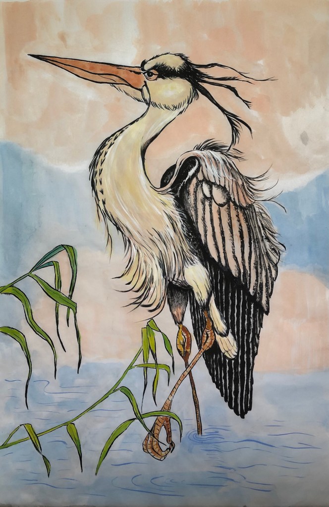
It has been a while since I last posted about my Chinese brush painting. I continue to attend my monthly Chinese painting class. After completing the Sumi-e classes, we have returned to meticulous style work. I prefer freestyle and would not usually do meticulous style by choice. However, the tutor is rightly insisting on starting a new topic with meticulous style work so that we pay close attention to the anatomy of the subject.
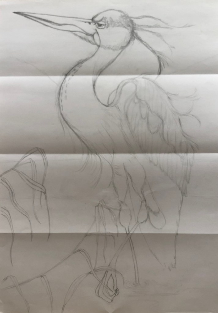
The subject this month is the heron – a beautiful stylish bird that is often depicted in Chinese paintings. The homework was a rather detailed image and we were asked to ‘go big’.
METHOD
To go big, I did a large pencil drawing of the heron so I can use it as a template for the painting. The tutor said that this method of making a template is not ‘cheating’ as long as the template drawing is done by ourselves, i.e. not just using a photocopy of an image for tracing.
Below is my A2 size pencil drawing:
–
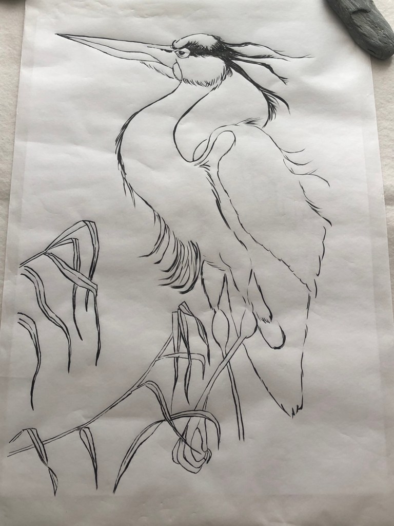
I chose to use Moon Palace paper for this drawing because it was the widest width Chinese painting paper that I have. The paper was laid over the pencil drawing and the outline of the bird was painted using Chinese ink and brush. The brush here was used in drawing mode for the outline, meaning that only the very tip of the Chinese brush was used like a pencil. This stage requires a very steady hand!
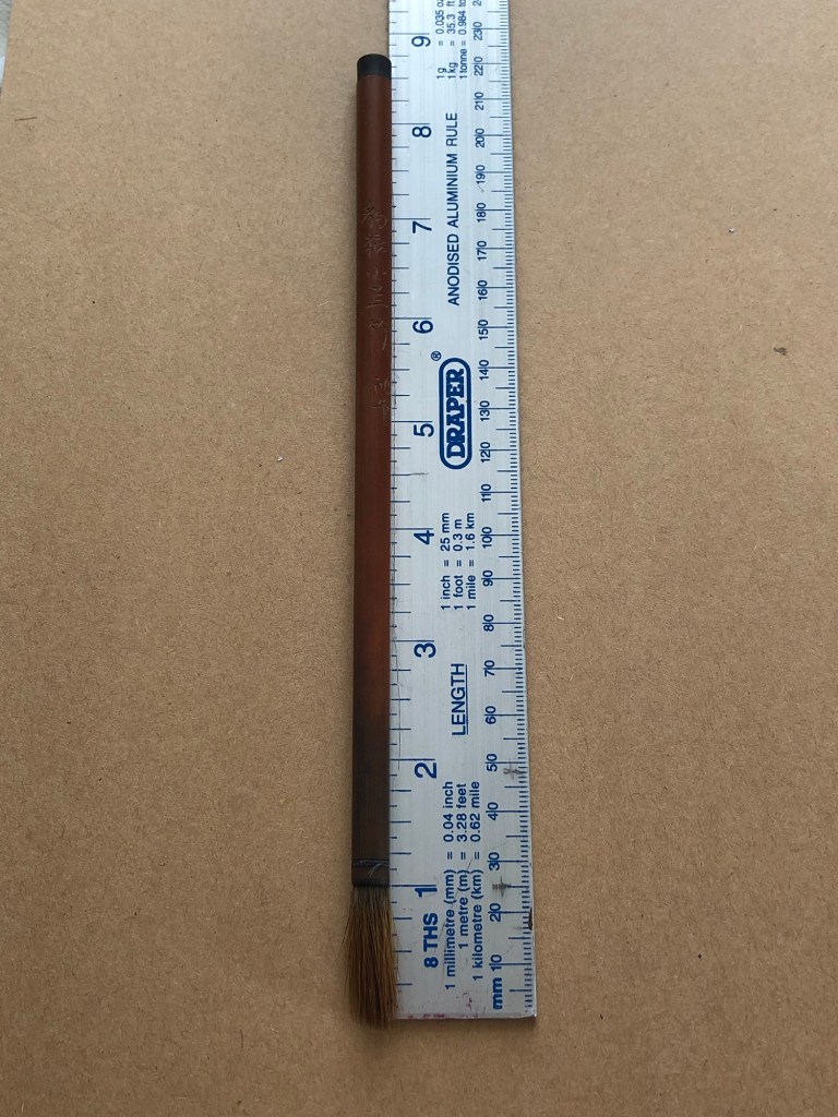
A 30 year old wolf hair brush that belonged to my mother was used for this painting:
Work in progress:
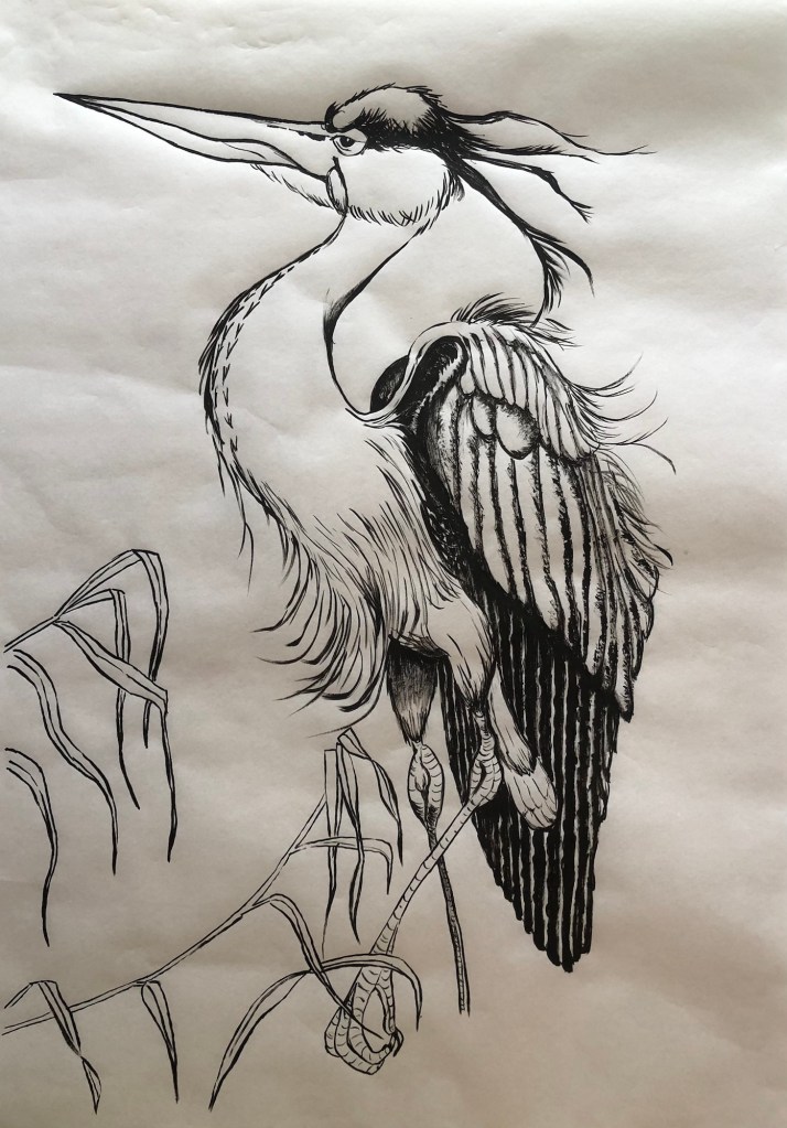
Painting completed with outlines and dark areas ready for colour painting:
Finished work:
Heron – Chinese ink on Moon Palace paper. Size H68cm x W45.5cm.
–
REFLECTIONS
This is a meticulous style figurative painting. There is technique involved especially in understanding the materials behaviour and working out the optimum process could be challenging. However for me, I feel the illustrative nature of this type of work does not demand the level of thinking or inquiry like making a piece of contemporary art would. So what can I reflect on?
The thought that kept coming to my mind during the making process was – the image seems ‘universal’, so what makes this a Chinese painting? I used Chinese materials (Chinese ink, moon palace paper and my mother’s Chinese wolf hair brush), but the composition in this case seems universal to me. So I posed a question to myself – what makes a painting a Chinese painting? Is it just the materials or does it have to ‘look Chinese’, meaning does it have to possess certain aesthetic qualities? What makes a piece of art ‘Chinese art’? I am puzzled by this and I don’t have an answer yet. It is something that I’ll continue to think about. I may pose this question at my next Chinese painting class and see what others think.
Following on from Cheongsam Series #2, the plan was to create a wearable painting in the form of a Cheongsam. I have little experience in dressmaking but I remember watching my mother make dresses when I was young. She was a very talented dressmaker and I used to enjoy watching her work. I vaguely remember my grandmother being a dressmaker, too, so I guess my mother must have been inspired by her mother. I also learnt sewing at school so I have some knowledge of the process. I started to research how to make a Cheongsam.
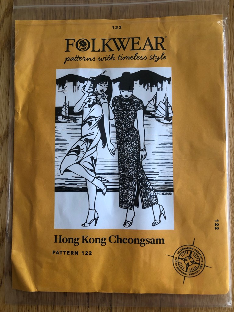
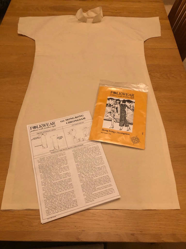
I researched different sewing patterns online looking for one that’s not too complicated and I managed to find one. The reviews of the pattern suggested it was easy to make and I ordered one.
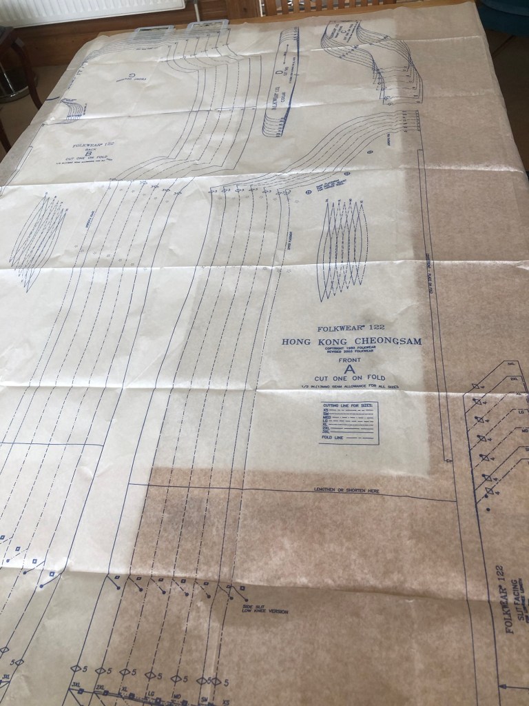
METHOD
–
The pattern seemed straightforward and simple which was a great way for me to learn to make a Cheongsam. I measured myself and chose a size on the pattern.
–
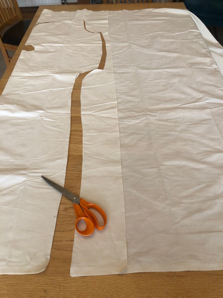
The fabric I used was a light weight calico cotton canvas material. I felt the light weight yet tough texture of the fabric was suitable for a wearable painting.
–
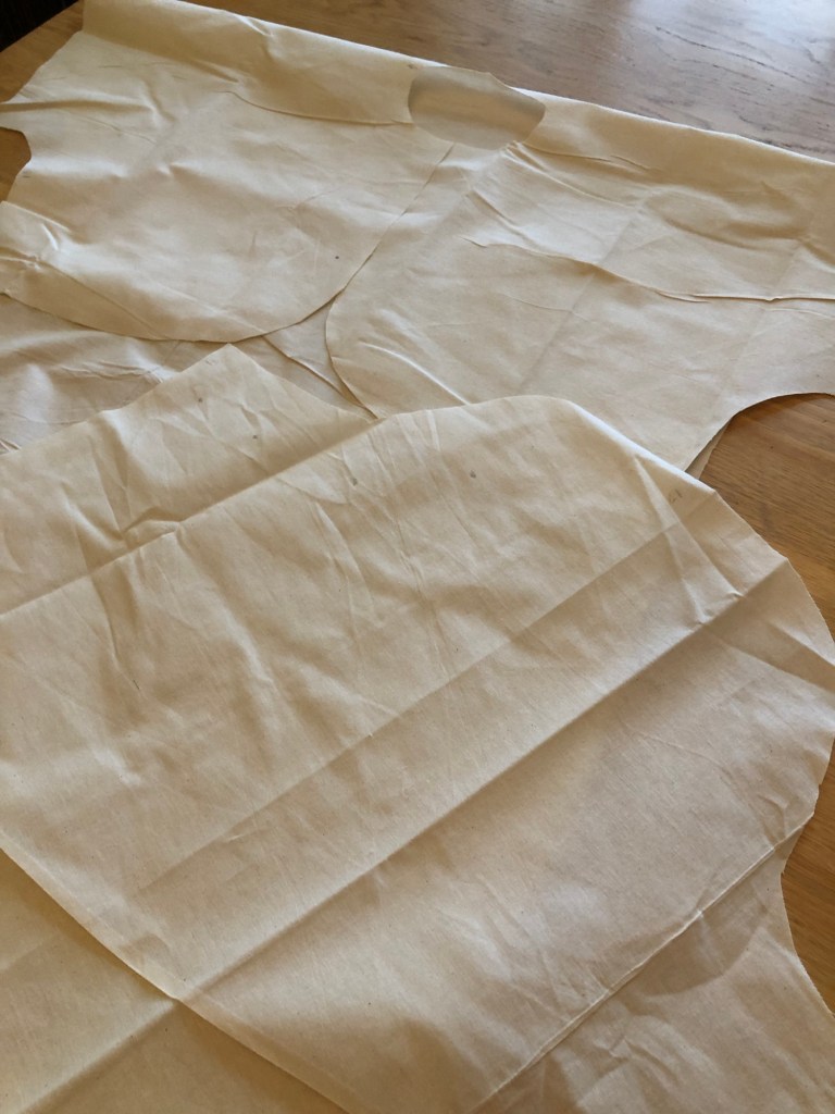
Pieces of canvas material was cut according to the pattern.
–
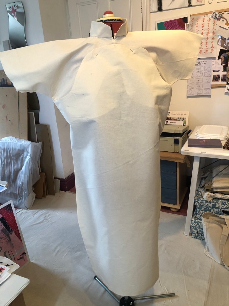
My 40 year old sewing machine which has not been used for many years refused to work due to years of neglect. So I had to hand sew the dress.
–
The canvas dress was put onto a dress maker’s mannequin for finishing.
–
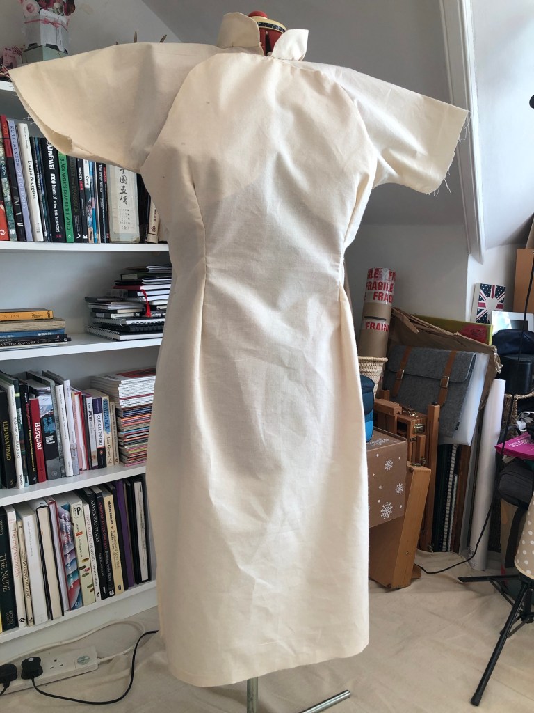
I was overly generous in my fabric cutting so the dress felt very large. The sewing pattern had provision for darts for a tighter fit. So I marked those out and sewn darts onto the front and back.
–
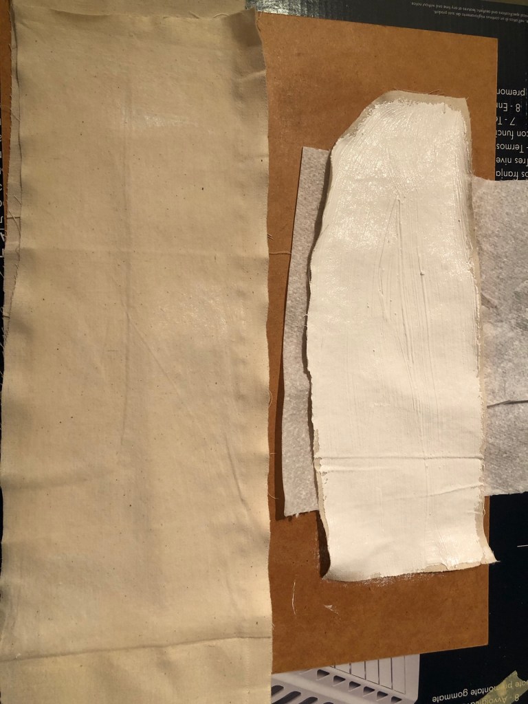
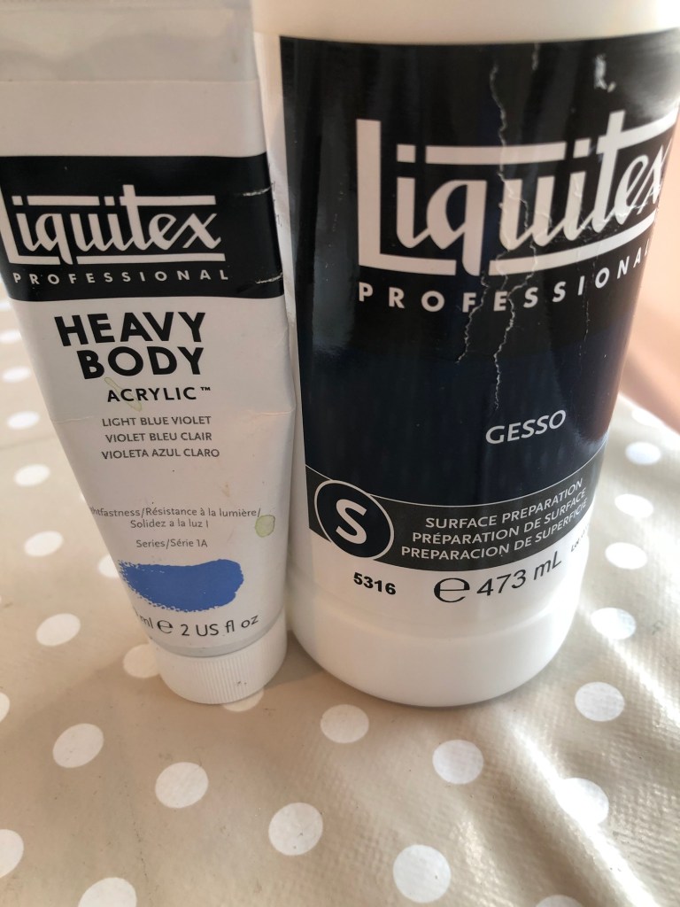
To decide on a primer for the canvas dress, both gesso and diluted white acrylic paint were painted onto fabric samples as experiments.
–
Once dried, acrylic paint was applied to both surfaces to see which would perform better. The gesso was preferred because it provided a smoother surface.
–
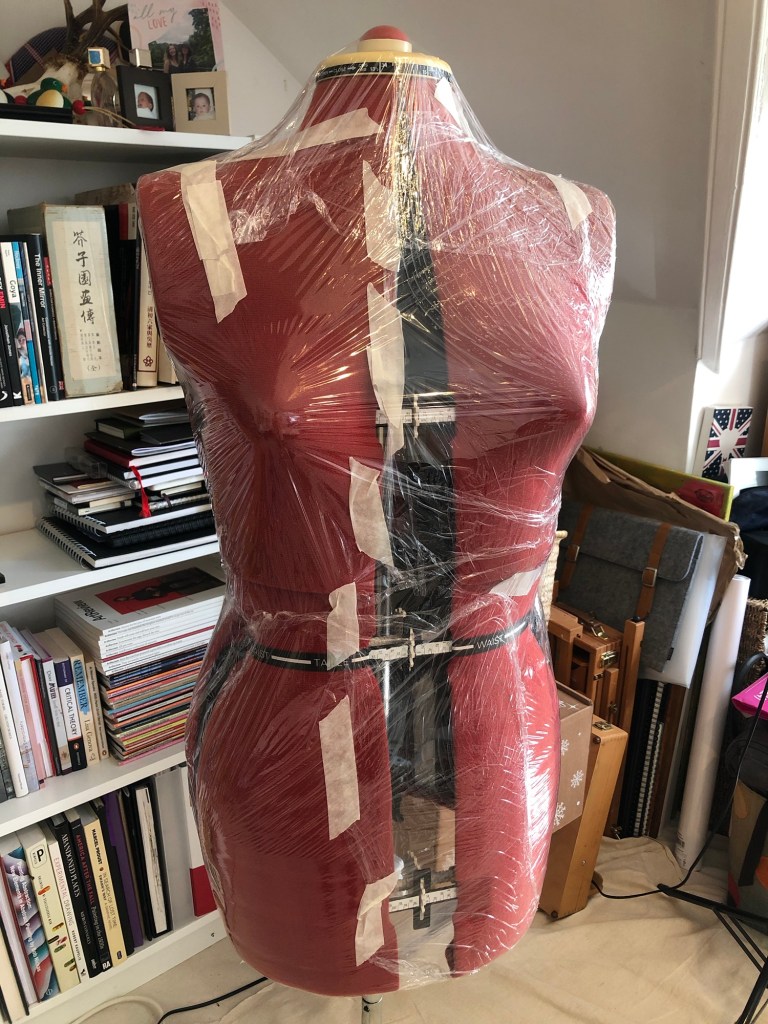
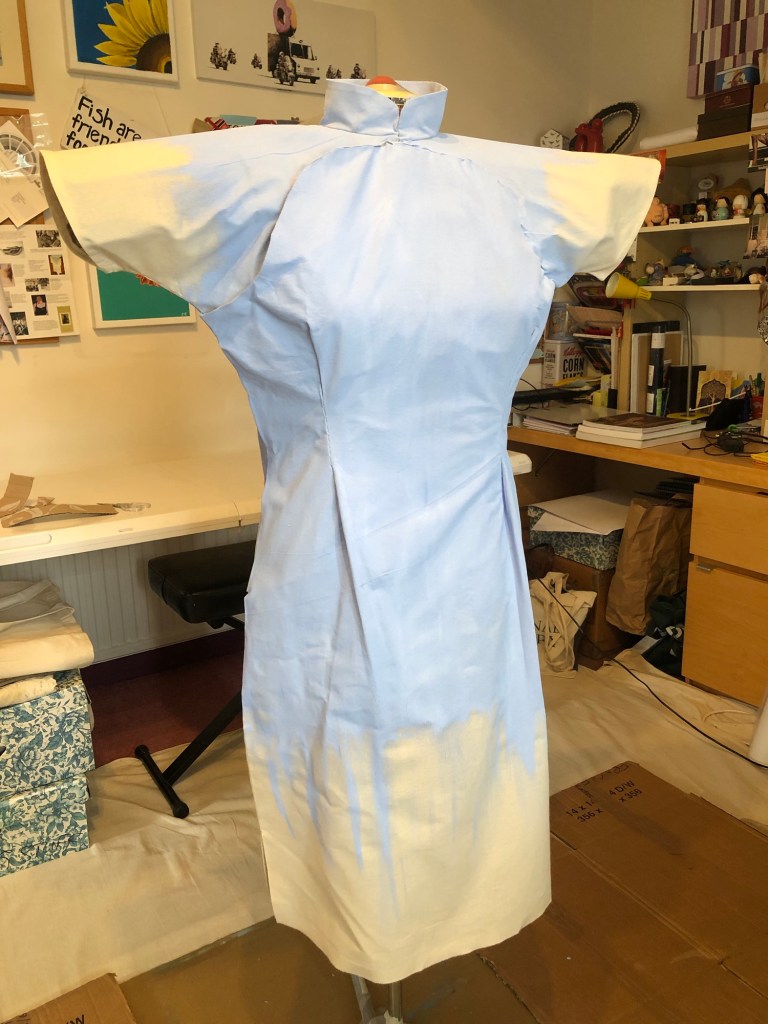
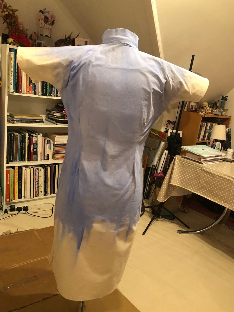
Since the fabric was light weight, the mannequin was wrapped in clingfilm for protection from the painting process.
–
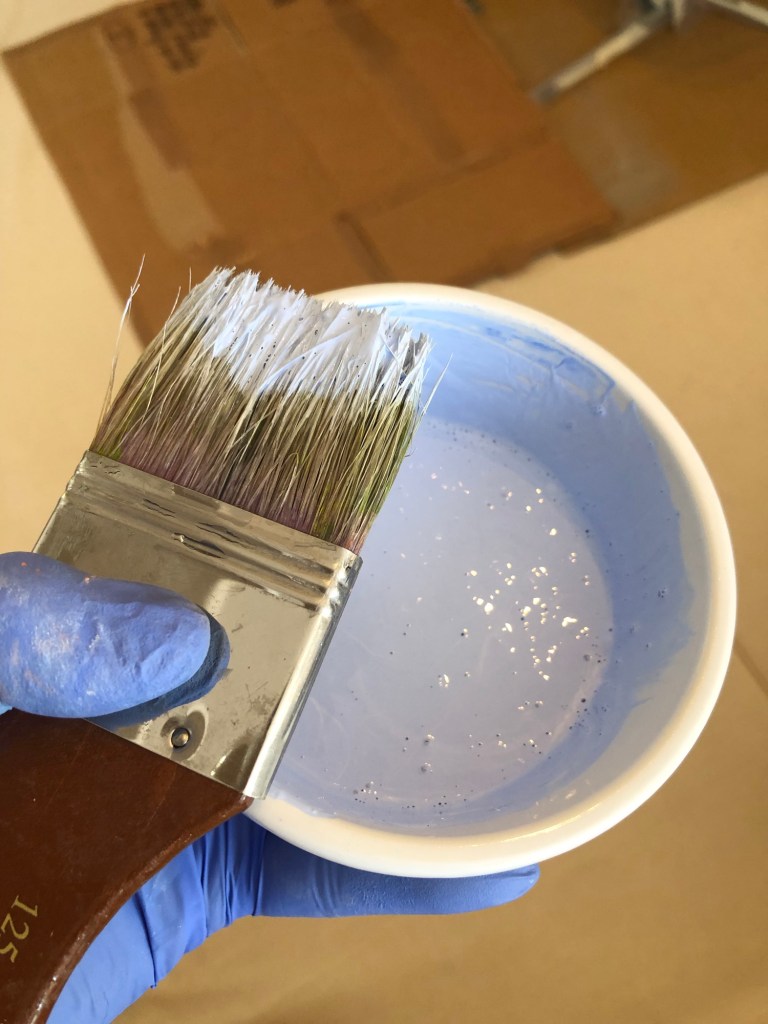
White gesso with acrylic blue tint were diluted as primer.
–
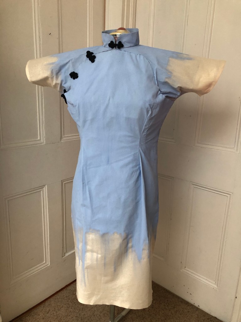
The canvas dress was primed on both sides. The tint worked well and I could use that as the background for the painting.
The final finishing step was to add the frogs (tradition fabric buttons or fasteners).
–
REFLECTIONS
I am pleased with the fact that I managed to make a canvas dress using a bought sewing pattern. This experience has given me confidence to take on other sewing or textile projects which will provide an addition dimension to my practice which I feel excited about. For now, I have made a 3D canvas in the shape of a Cheongsam and primed it. Although the painting was not yet finished, I wanted to pause and reflect on the progress so far and take time to consider what to paint on the dress.
The Cheongsam series started as a result of me finding my mother’s old Cheongsams in my loft, which triggered intrigue and inspiration for me to make work on the Cheongsam subject. I know little about the Cheongsam and I am starting to research about its history especially its evolution and how the style changed over time partly due to influences from the West. E.g. the Cheongsam started off as a loose fitting garment, however, as European designers such as Christian Dior marketed more figure-hugging dresses that were pinched at the waist, the Cheongsam started to evolve as Chinese women wanted to emulate European fashion. From around mid-20th century, the Cheongsam started to evolve as a result of the two cultures coming together and the new figure-hugging silhouette emerged which lasted till today. To this end, I believe the modern Cheongsam is a form of a Third Space phenomenon which fits in well with my overall research topic based on Homi K Bhabha’s book, The Location of Culture. My knowledge on the Cheongsam is very limited and I will be borrowing several books on the subject from CSM library. I look forward to finding out more to inform my Cheongsam series of work.
Having established that the modern Cheongsam is potentially a Third Space phenomenon, I would like to use the 3D canvas dress made here for a painting to show something about the Third Space, perhaps another Third Space phenomenon. I am considering making a series of Cheongsam canvases, each painted with a Third Space phenomenon and all as wearable paintings. I want to make them wearable so that they are metaphors for the uniform that transcultural people wear and the roles that they play as they navigate the different cultures in their environment. This work can help to inform my transcultural identity and heritage research.
LEARNING
I have learnt various techniques while making the dress and the experience will be useful as I go onto making other garments to feed into my practice.
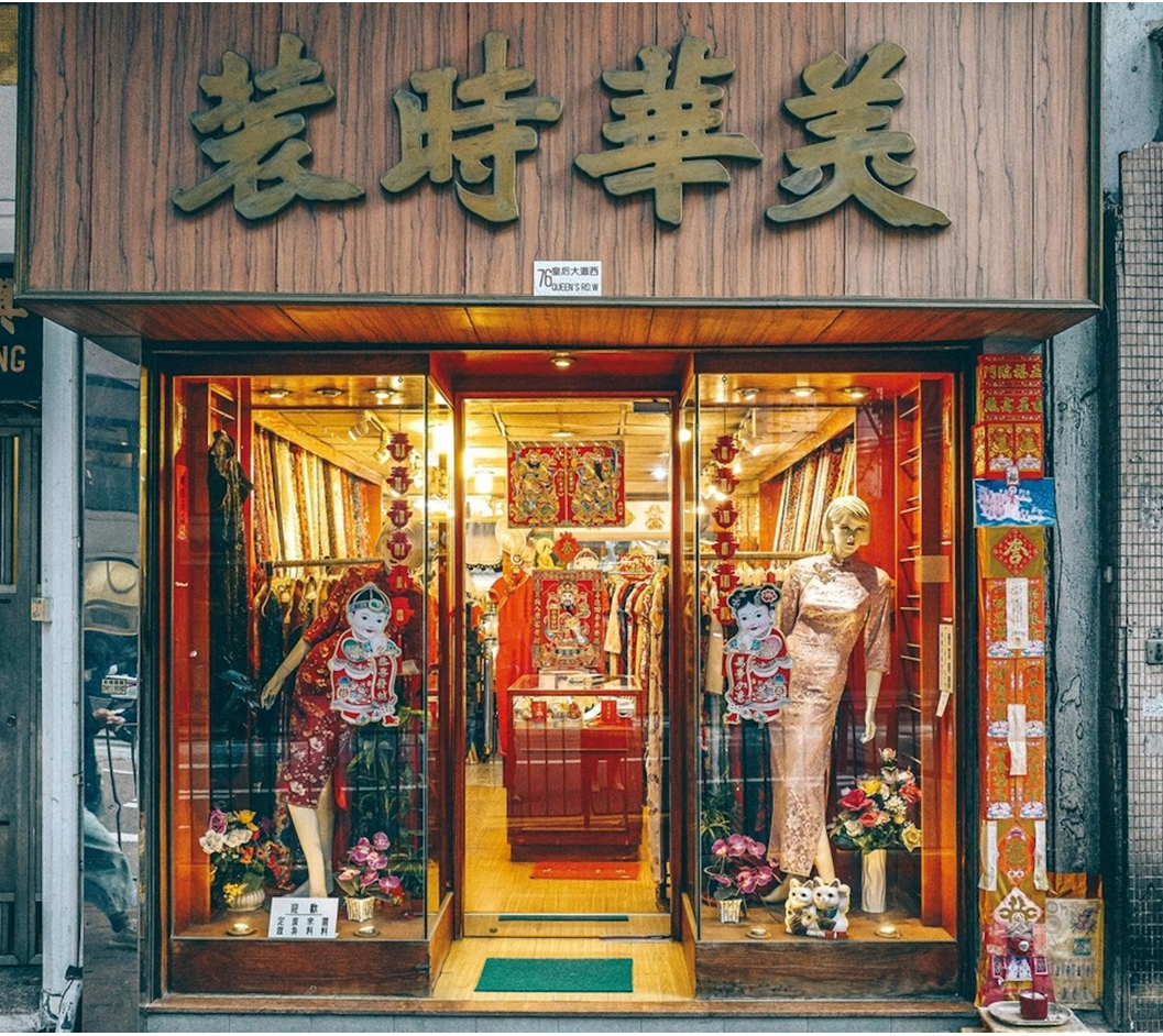
I need to learn more about the history of the Cheongsam because it intrigues me and is an interesting part of the Hong Kong heritage that will help inform my art practice. Especially with my late mother being a skilful dressmaker and I remember clearly the dress that I found being in her wardrobe for many years. My older sister remembers visiting the tailor’s shop with my mother to order the dress. In fact, she has recently found the history of the shop for me – it still exists in Hong Kong.
–
NEXT STEPS
Decide what to paint on the canvas and do the painting.
Research about Cheongsam to build on the series of work.
where I had made an abstract painting after finding my late mother’s Cheongsam in my loft, I was unsure of where to go from there. I enjoyed the making process in series #1 but didn’t feel like building on that particular piece of work. At the end of series #1, I said that I would make some informal work and have a play in my sketchbook. I studied the dress again to get inspiration. When nothing came to mind, I decided to do some drawings and use that time and the act of drawing to facilitate my thinking.
METHOD
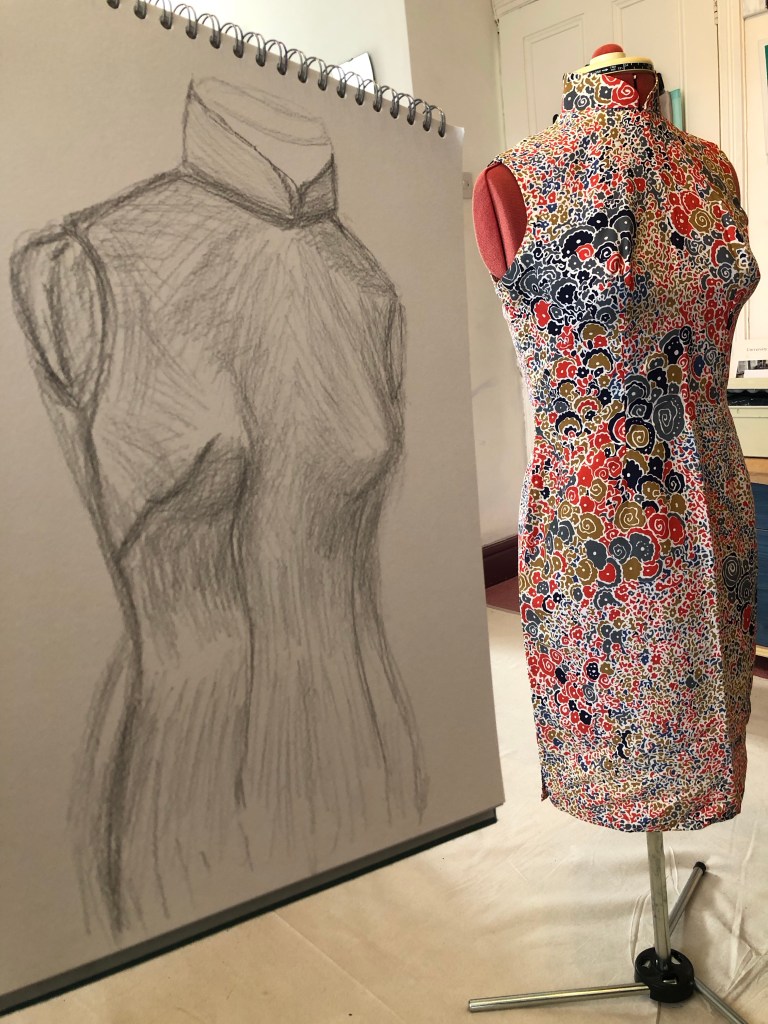
A pencil drawing studying the unique shape of the Cheongsam was made as a first exercise:
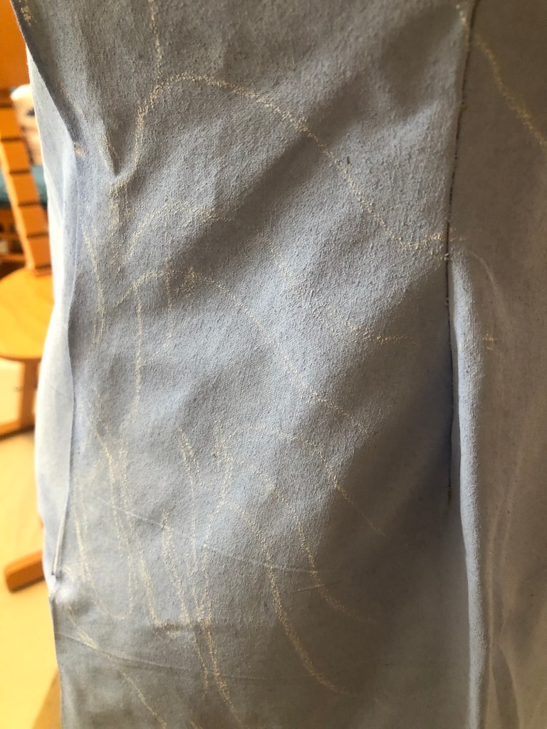
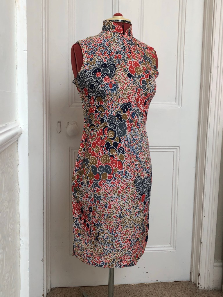
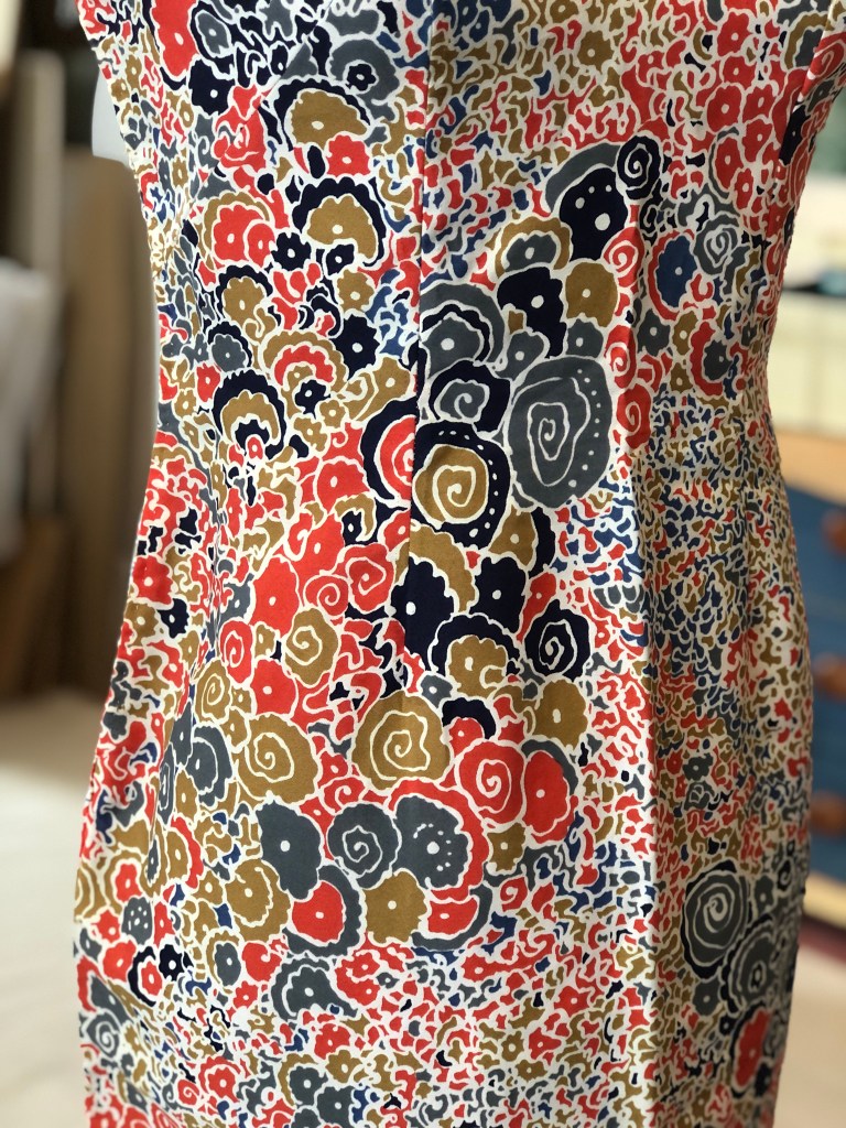
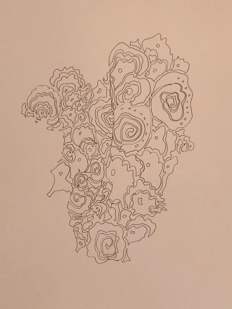
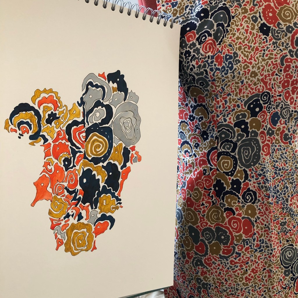
I have always been mesmerised by the pattern of this particular Cheongsam of my mother’s:
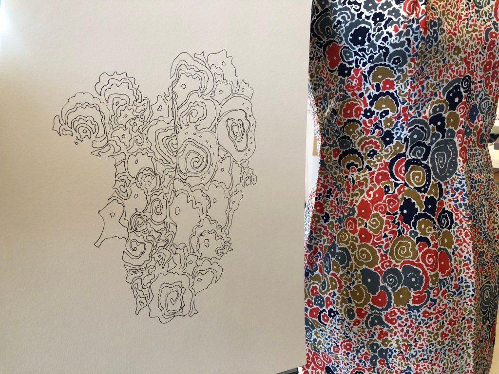
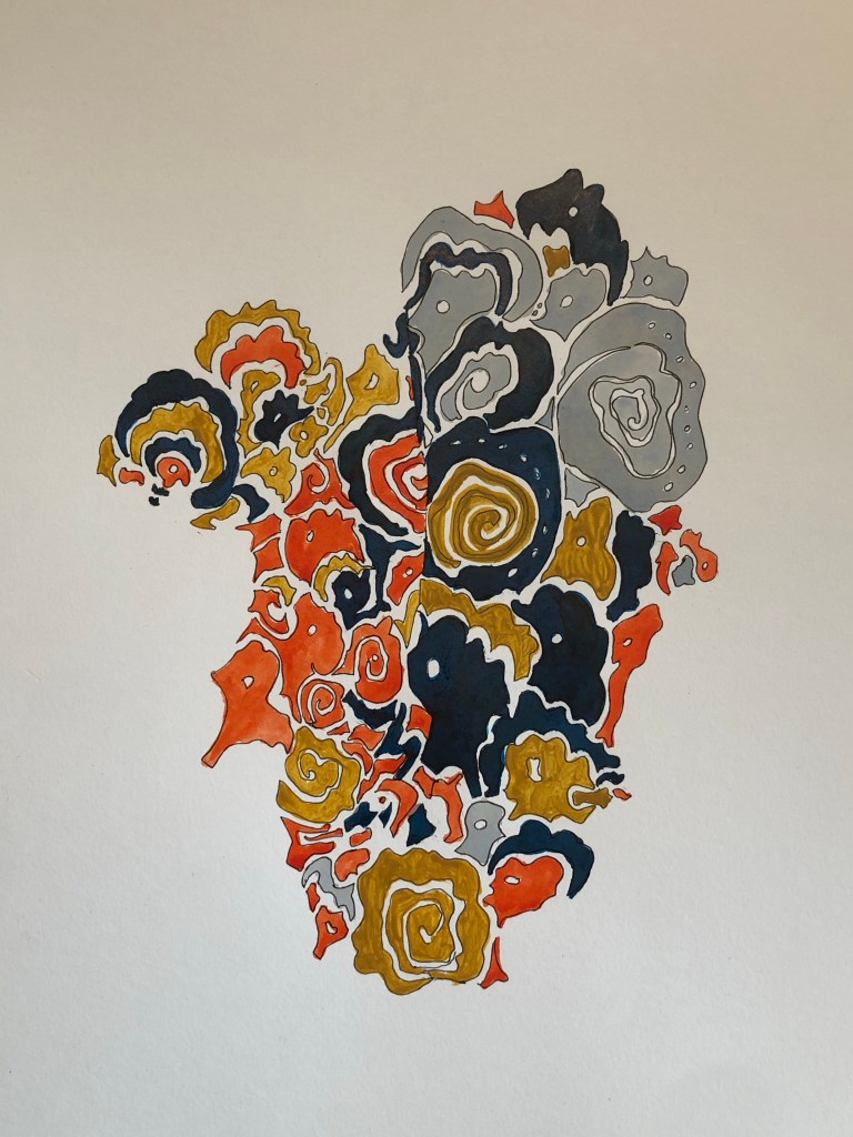
So I made a colour study of the most memorable part of the pattern. This area of the pattern has been imprinted on my mind since I was a little girl.
–
Since the fabric and the dress are so delicate, I wanted to use ink for the colour study. Any paint such as oil or acrylic would seem overly heavy.
–
The initial blue ink was too bright, so a darker blue ink (Quink) was used to complete the study.
A study of an abstract pattern on a mid-20th century Hong Kong cheongsam. Ink and pen drawing
REFLECTIONS
I was pleased that I managed to follow through on the plan I had set myself after the last painting – to make some informal work, hence the sketches. Also, I kept thinking about my tutor’s advice – just keep making, make anything – objects, images etc. I have not done much drawing since starting my MA and it was good to play in my sketchbook again.
During the drawing, my mind wandered onto what work to make next. I was so mesmerised by the cheongsam and the fabric pattern that I wanted to make one – to make a cheongsam. I didn’t just want to make a dress, I wanted to make a wearable painting cheongsam. I thought about making a cheongsam using a canvas material then painting on the 3D canvas dress. I have had many ideas about making wearable paintings in the past and that thought has just occurred to me again. So I think it’s time to do it.
Making a cheongsam is not easy and I’m not an experienced dress maker. So I researched online to find easy to make dress patterns. Also, I researched online the books available at UAL to find out more about the history of the cheongsam. I have reserved four books at CSM and also purchased one online. I’m looking forward to properly embarking on this research project to inform my cheongsam series of work.
LEARNING
– The drawing exercise was very useful and enjoyable. Since it was not a highly challenging piece of work, I was able to let my mind wander and came up with ideas of making wearable cheongsam paintings. I should use drawing more as a way to explore and think. I know it does work, I just need to do it more.
– I bought a book on the history of cheongsam online and realised I should have looked at the UAL library first. I was delighted by the library’s materials on the cheongsam and the facility to borrow books from other UAL college libraries was very useful. UAL also had a copy of the book I bought, so I could have saved some money – must remember to search the library first next time.
– I am excited about starting the next project on making a wearable painting with opportunities to research the dress’ history as well as the materials for this application.
NEXT STEPS
– Make a wearable cheongsam painting based on the ideas that came to mind during my sketching.
– Research the history of the cheongsam so I can be more informed in my making.