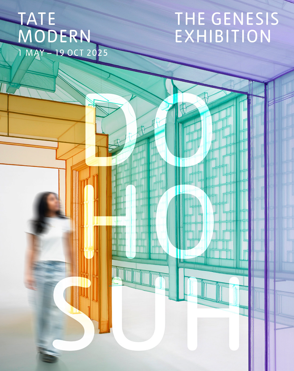
I was looking for an exhibition to go to with my daughter who lives abroad and was in London for the weekend. After reading a couple of reviews, I decided on ‘Do Ho Suh: Walk the House’ at Tate Modern.
The exhibition was very busy as it was the last weekend of the show after the end date was extended. As we walked between the monumental exhibits whilst navigating the crowd, I could hear frequent bleeping sounds. It was the threshold-wire sensors protecting the displays being triggered by keen viewers leaning too closely to examine the details.
A video playing on a small screen captured the artist working meticulously. A young couple standing next to me gave a running commentary in Cantonese about the intricate process and delicate materials used. It made me nostalgic because the artist’s hands reminded me of my brother’s when he worked on his wood board carving; they both use their slender but strong fingers with the same intensity. I was mesmerised by my own nostalgia.
A thin curtain separated a large area where a film was projected onto an entire wall. Two labels on the wall at the entrance to the area described the locations of the film. We couldn’t read the detailed descriptions as more people were pushing to come in. We gleamed the headlines and started watching. My daughter turned to me and said, ‘I’ve lived in places like that.’ I replied, ‘So have I.’ ‘Yeah, pretty universal,’ she muttered. I was not sure if she meant the experience or the place. Perhaps both.
We were drawn to a darker corner with intrigue. Looking through a gap between semi-transparent panels, I met eyes with another visitor. There was a momentary connection then we both looked away. My daughter called me over and said, ‘Look, Mum, there is a miniature toilet.’ We both laughed and took pictures of the toilet.
We returned to the exhibits in the main area. I felt my phone vibrate. It was my daughter posting a photo on the family chat of me staring intently at a display with the caption ‘When art meets electrical engineering. Rapt.’ We played who could name the country of origin of the pieces on display judging by the shape of the electric sockets. It then occurred to me that I moved away from home to another country when I was young and she has moved away from her home country, too. We now have that shared experience. I wonder where she calls home now.
Wading through a crowd watching another large film projection, some standing and some sitting on the floor, we reached the gift shop. The final few fridge magnets were half price. It’s the last weekend after all.
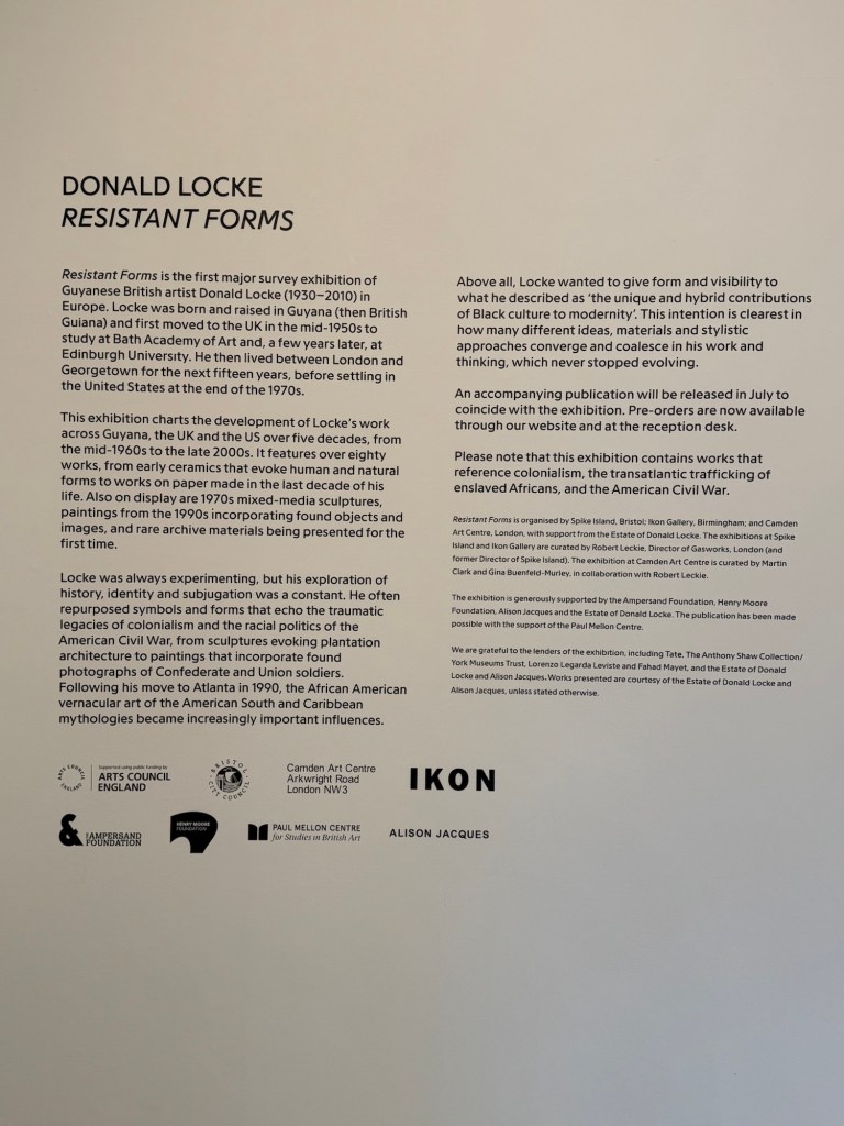
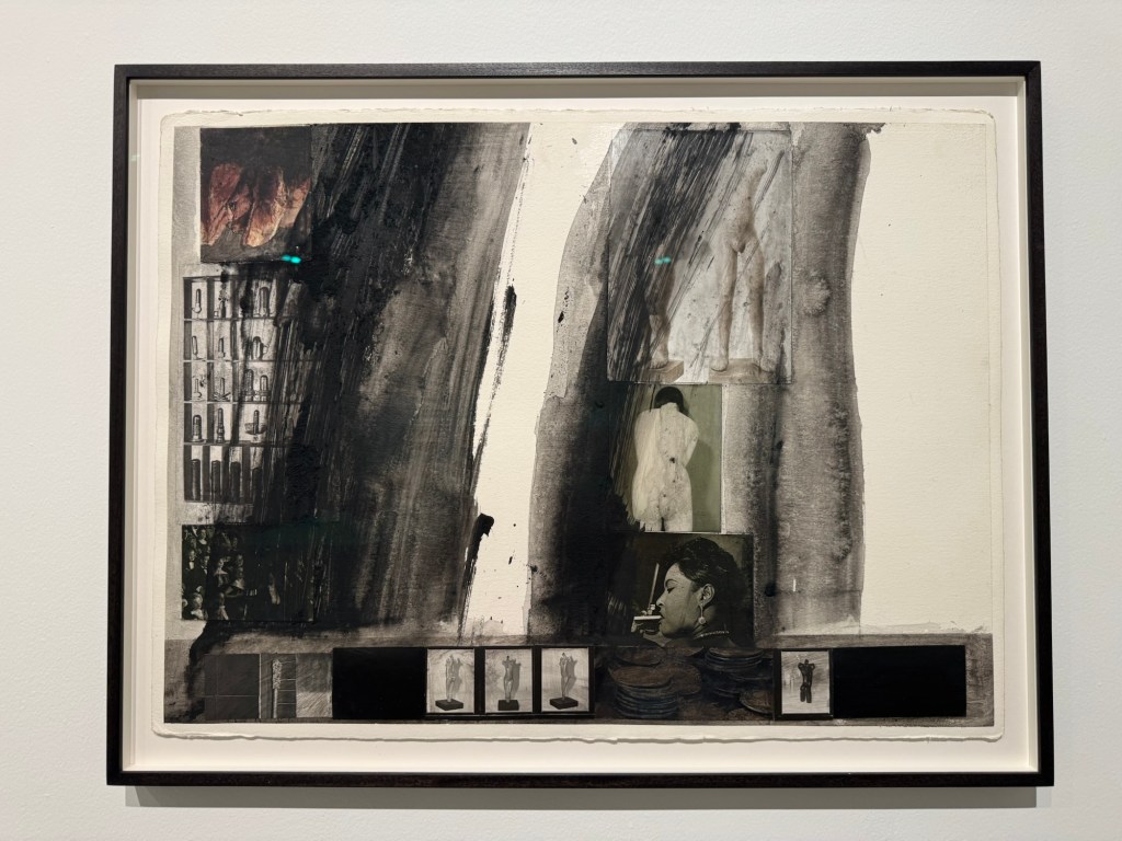
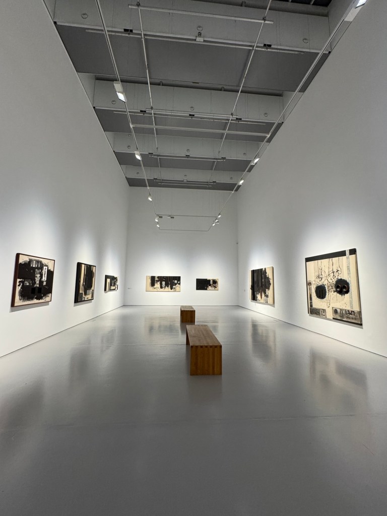
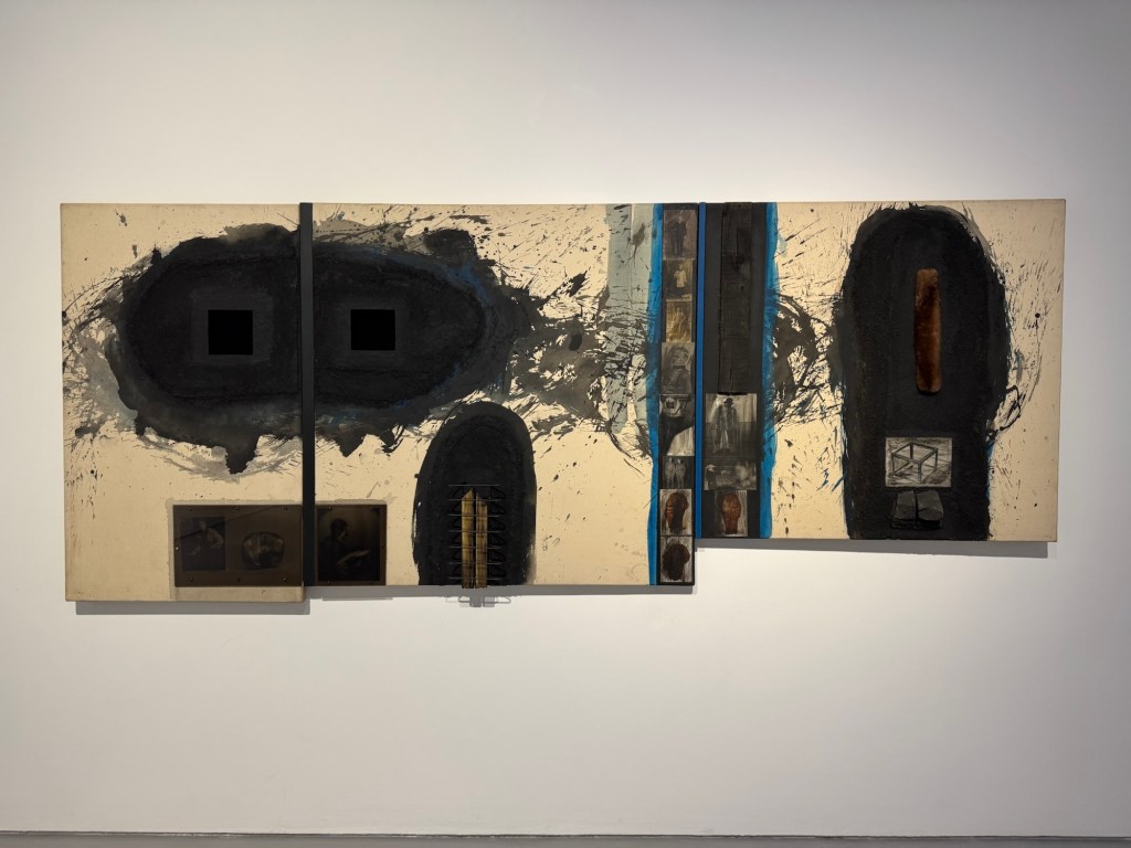
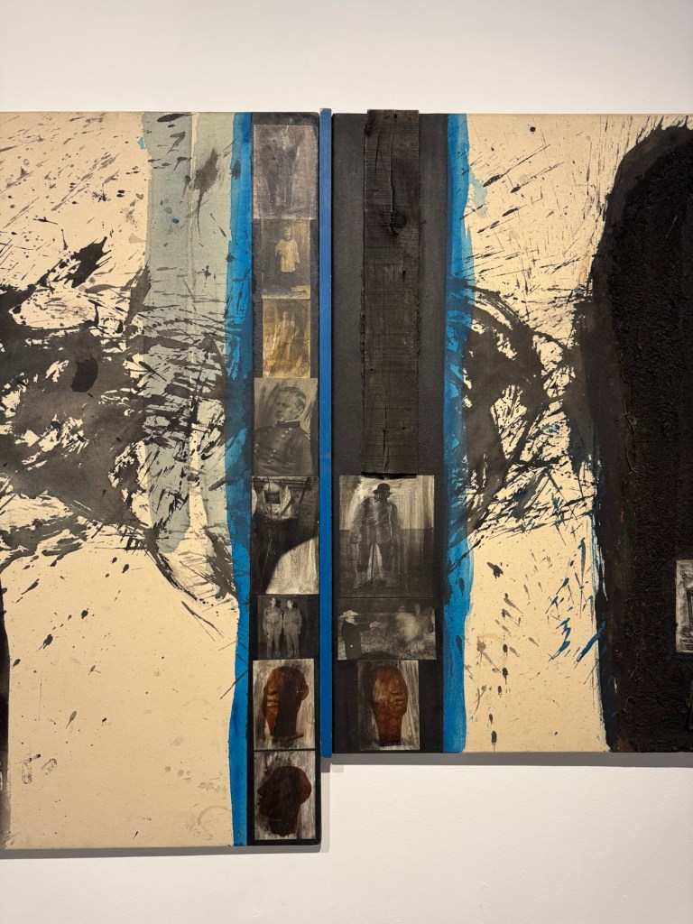
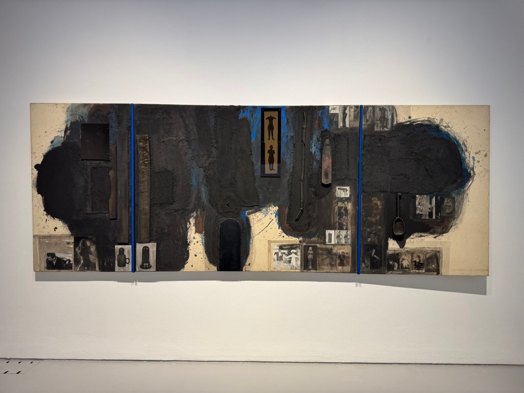
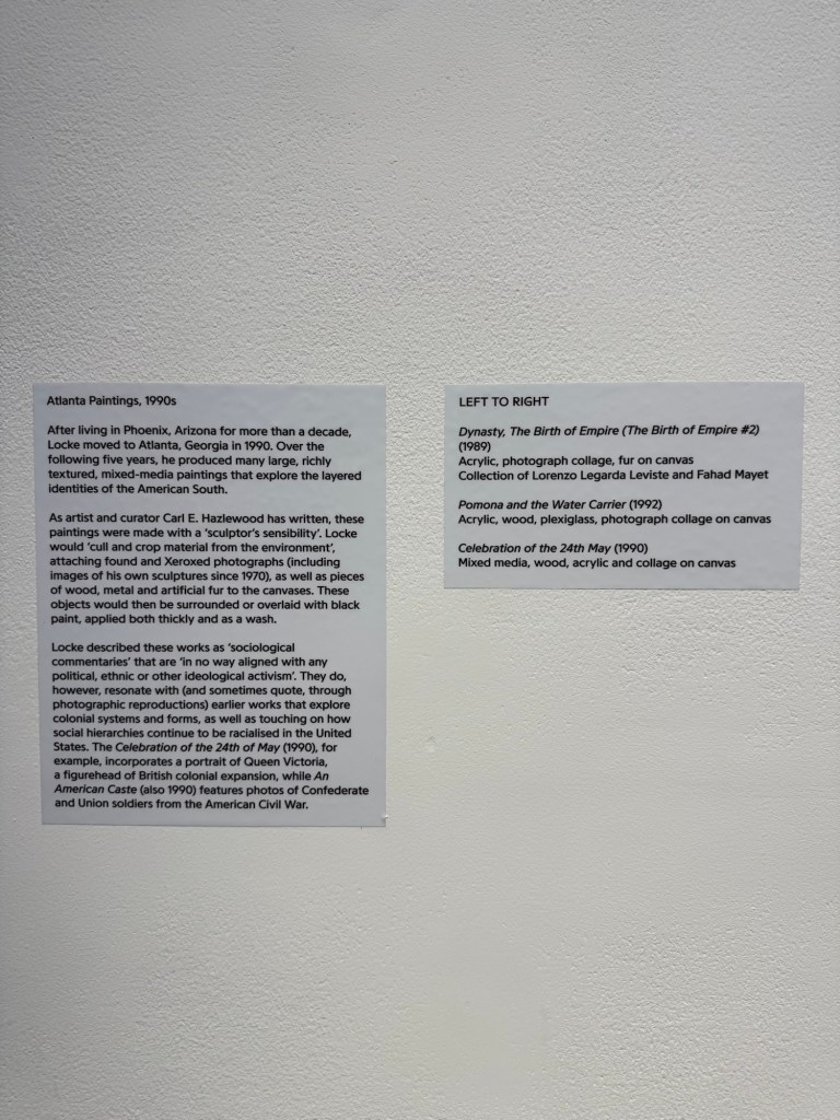
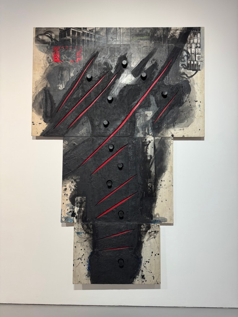
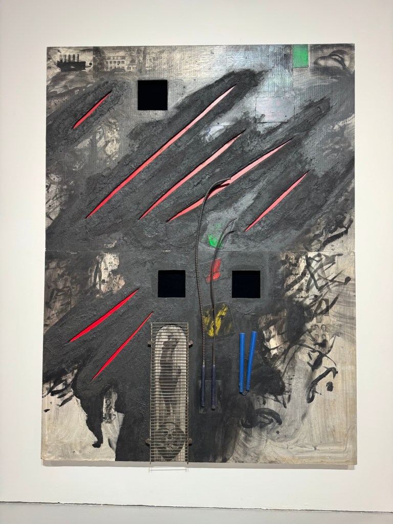
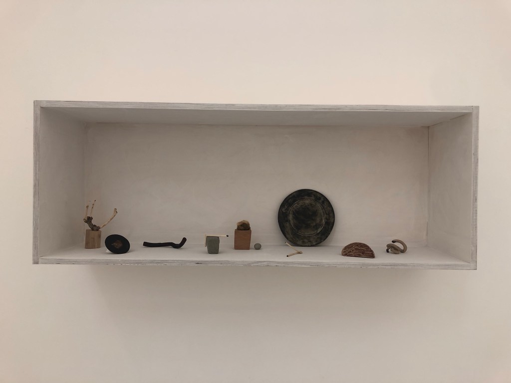
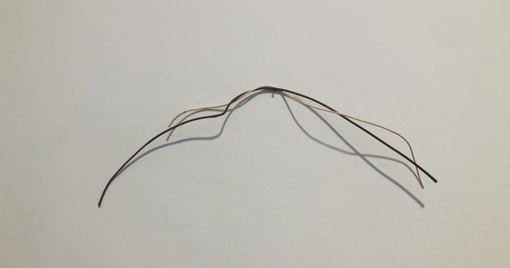
Today I visited Donald Locke’s exhibition Resistant Forms’ at Spike Island Bristol. Below are some of the photos I took to remind me of the work that I found particular resonance with.
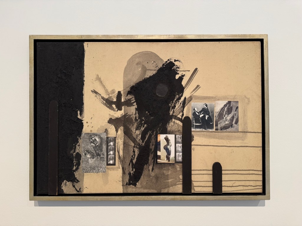
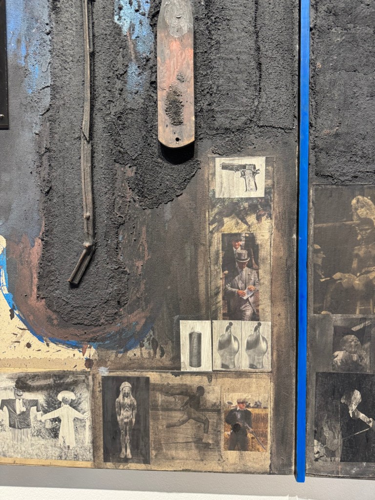
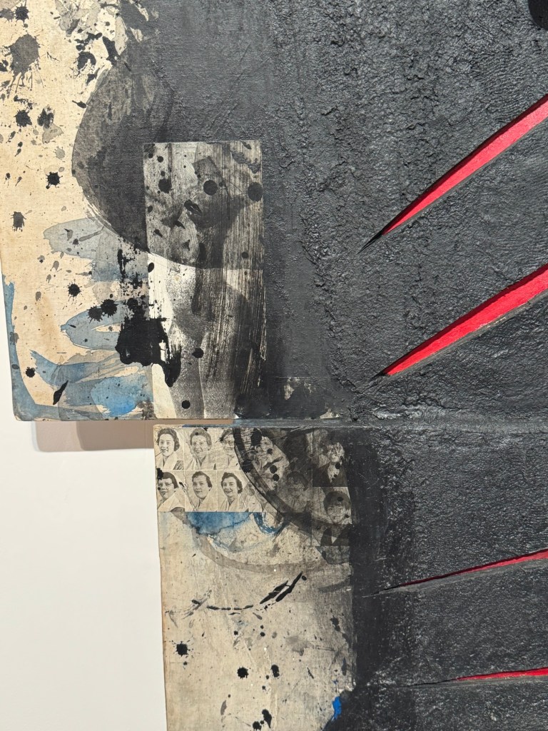
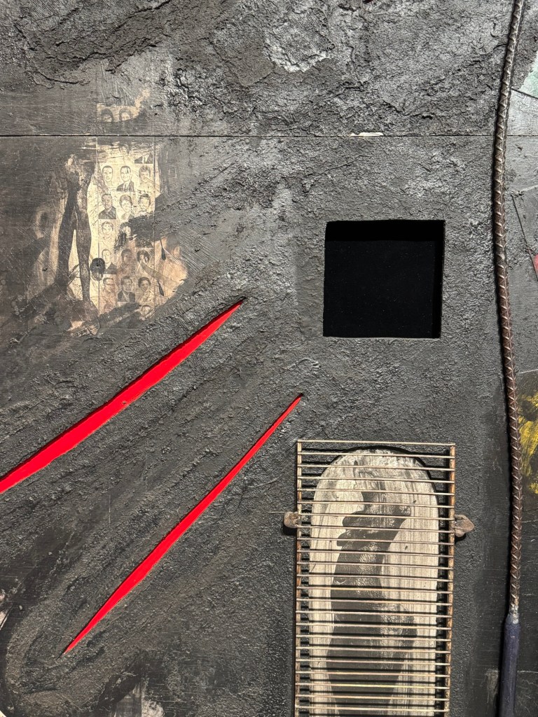
Use of collage, image looks like a crowUse of acrylic in a way that resembles inkAmbiguous use of photosLarge scale paintings with presence and energyClose up of the above showing photos collageUse of mixed media including metal grill mounted onto painting Placement of projector and understated size of projected image
REFLECTIONS
I want to capture ideas that came to me during the visit that made me think about how I could learn from Locke and build on my practice.
Use of mix media techniques:
On some of his paintings, the use of acrylic paint with ‘dry brushing’ to create the flying white effect like in Chinese painting energised the painting. It gave me the idea of trying my crow paintings in other medium, such as dilute oil, to see how that works. The use of different materials to create collage was also interesting. I could use ripped up newspapers to create collage effect on a canvas then paint on top. Locke also used items like metal grills to good effect. I can consider what objects, metal or otherwise, that could be incorporated to add meaning and texture to the work.
Use of photos:
Some old photos were used in the collage. I have many old family photos that I have been considering how to incorporate into my work. The way Locke used the photos were more random – a few here and there. Whereas I have tried too hard in the past; I could just use small images in a few places – I don’t need to tell the whole story in one painting. I must remember this. Also, he had just pasted / stuck the photos (copies of) onto the canvas. I always felt that I should photo-transfer the images onto the canvas – this is not necessary. Locke also used images or photos of his own work (sculptures) in his paintings – those images (e.g. female nude) appeared on multiple paintings and acted as a link to join the works together.
Use of projector understatedly
The projector was projecting at waist height with a not too large image. It was understated and effective. I often feel that projection has to be big and has to fill a wall. It clearly doesn’t have to at all. The projection was also placed in a way that you have to walk through the beam to get past. It was an interesting positioning which makes the viewer interact with it.
LEARNING
There are no major learning from the visit and mainly just ideas that came to me as I studied Locke’s work. The main take away for me was to think about experimenting beyond just painting on the whole piece of newspaper. The news headlines remain important to the body of work (News), but through the use of collages, the newspapers could be incorporated to maintain the theme while opening up the materials that I can use. Locke’s extensive use of black was very effective which resonated with me.
NEXT STEPS
Start to think about how I can start to make more complex and ambitious work with multi media materials yet remaining connected to the topic of News.
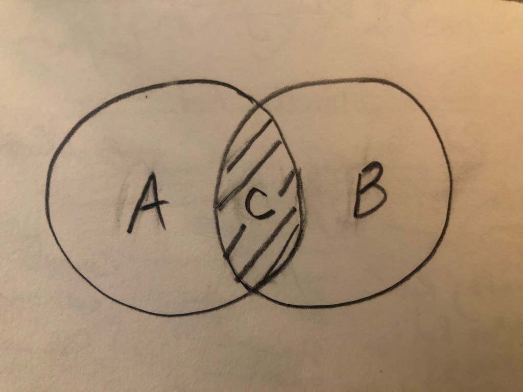
I talk and think about The Third Space a lot. From the first moment I came across this concept in a lecture by Nigerian-born American visual artist Njideka Akunyili Crosby, I found resonance and understood exactly what she meant. Then I started to research the original text about The Third Space in The Location of Culture by Homi K Bhabha. My understanding was further cemented. It is straightforward on the surface. When two cultures (let’s call them A and B) come together like in a Venn diagram, the overlap (let’s call it C) is The Third Space where something completely new emerges. It is neither one nor the other but has the characteristics of both of the original cultures. It is also alive and constantly evolving according to Bhabha.
Here is the Venn diagram:
–
Alternatively, if we use a mathematical formula to represent the concept, it will be:
A + B -> C
Meaning A and B giving rise to or leading to C. Not to be confused with:
A + B = C
because it is not a straightforward linear summation, it is a fluid concept. It is Art after all and not Maths. Maths would have been easy… In my experience, once a Mathematical problem is solved, you could sleep at night. But problems in art are rarely ‘neatly’ solved, or an answer often leads to the next question and I have spent many sleepless hours thinking about this. I get the Third Space concept in theory, but how do I locate myself in this context and express it in my art? This has been keeping me awake, a lot!
EXPERIENCE
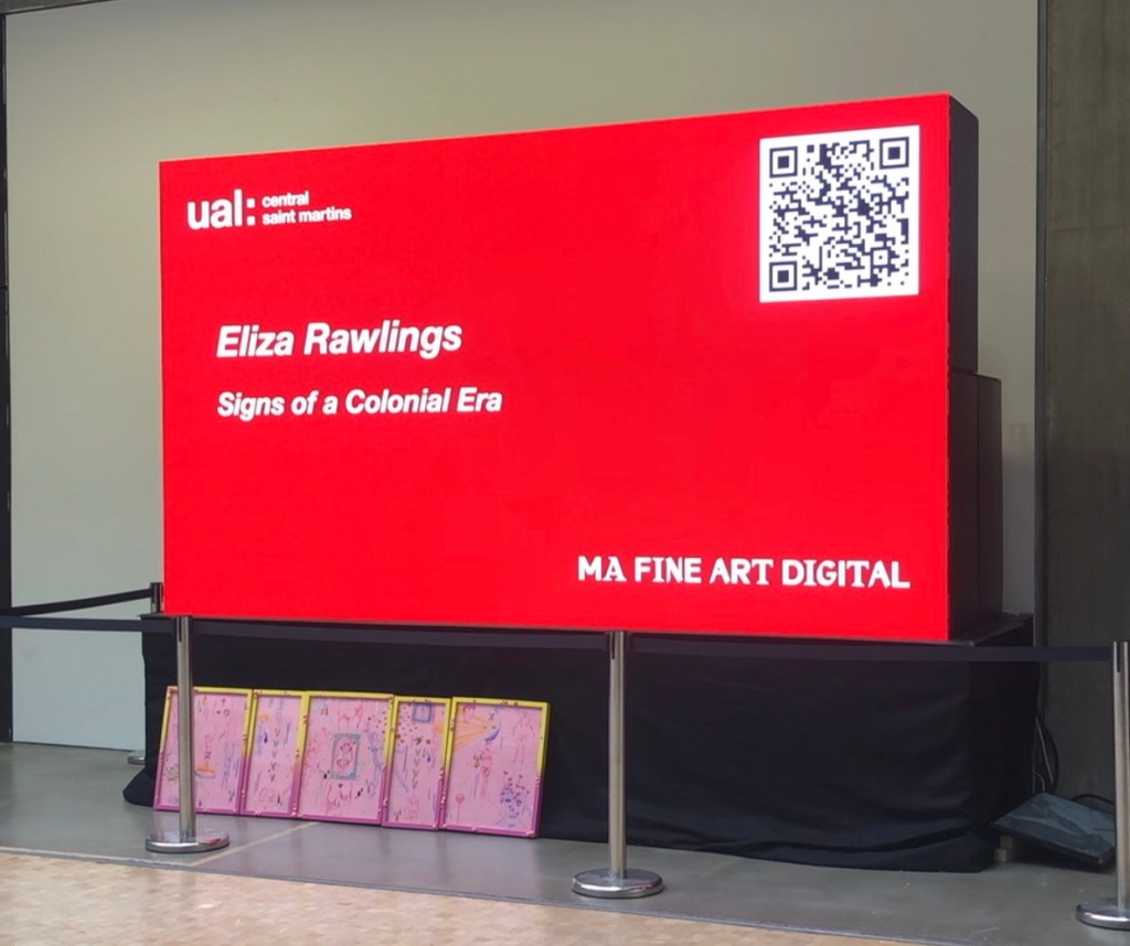
I recently exhibited at the MA Interim Show at Central Saint Martins, the making of my work was captured in this blog:
Making the work presented certain challenges. E.g. it was the largest Chinese brush painting that I have ever done (in A0) and painting on silk was very challenging (without a proper stretcher frame). Overall I was pleased with the outcome and it was an example of my transcultural layering work, however, I knew there was something lacking. I wanted it to represent something about my third space; but I have only created layers of A and B components, there was no C.
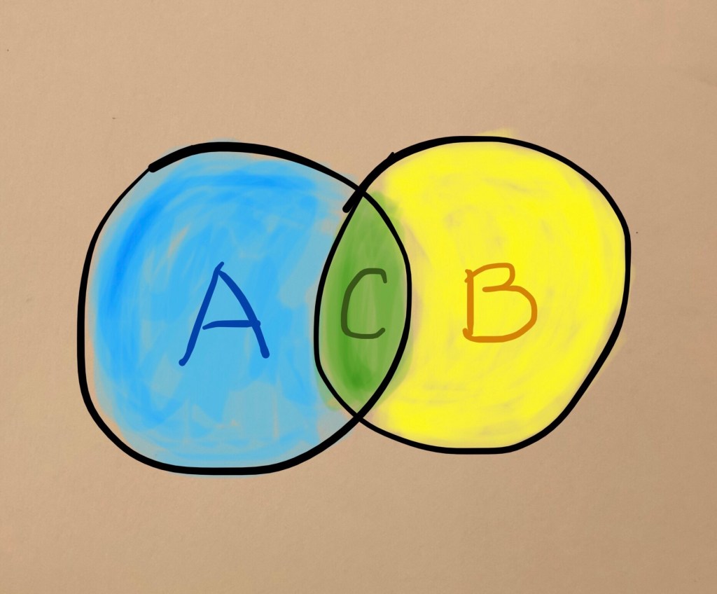
To explain this further, I have to introduce colours… If A is blue and B is yellow, then mixing the two gives green. Meaning C is green in this analogy.
–
What I had created in my silk piece for the show was equivalent to patches of blue and yellow, there was no green.
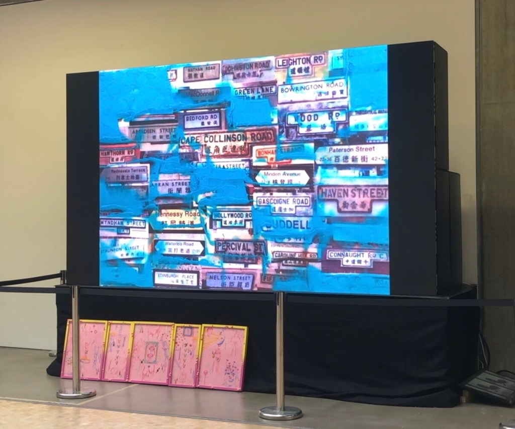
I always knew pinpointing my third space was going to be challenging and I have studied various transcultural artists’ work to learn from them – this is part of my ongoing research. I also tried to find other third space phenomena to help me in my understanding. The strongest example I have found so far was the street names in Hong Kong. It is explained in this blog and the video of me making the painting was also shown at the MA Interim Show:
I still have not managed to find how to truly express my C/green/third space… so where do I go from here?
I recently received some feedback from my tutor at the end of my MA Unit One, which followed by a discussion with him on this topic and my reflections are as follows:
– Some of my images are prone to being too illustrative. Meaning they are obvious elements of A and B; I know that just putting them together doesn’t automatically make C. I had hoped that layering those images might gradually yield C for me but it hasn’t happened yet and I haven’t found a way of making it happen.
– I was advised to just make work. Don’t overthink it, just keep making – images, painting, objects, anything. It’s ok to leave it vague and unresolved.
– I wonder – does ‘just make work’ actually work? If I don’t think it through in advance, would it work out? I acknowledge that years of institutionalised corporate strategic thinking means that I am programmed to always ‘start something with the end goal in mind’, then just keep working towards that goal with absolute focus. I know this approach is counterproductive in my art practice to the extent that it can be a barrier for creativity. Therefore I need to try harder to free myself to ‘just make’.
LEARNING
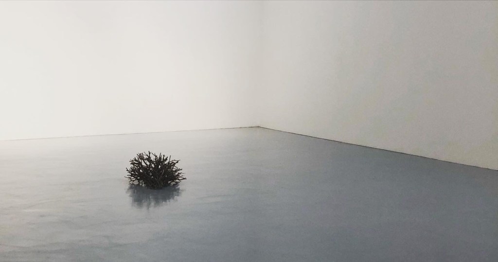
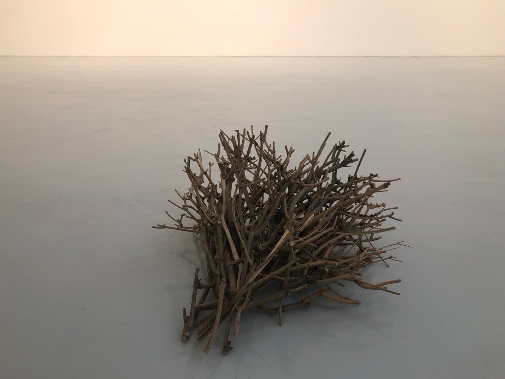
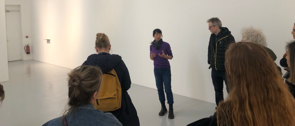
– I need to learn to trust myself to ‘just make’. My faith in this approach was reinforced by a gallery visit as part of the recent Low Residency week, where we visited an exhibition by the artist Maiko Tstutsumi:
–
We were very fortunate to meet the artist where she explained her practice. Having listened to her to understand her background and way of working, I started to see ‘her’ clearly in all her work. It was the strongest sense of the artist that I have felt in their work for some time. The last time I felt so strongly was at Paula Rego’s exhibition at Tate Britain in 2021. Rego’s work was vibrant, energetic and sometimes even violent (e.g. depicting victims of structural violence) which is a complete contrast to Tstutsumi’s serene exhibition. Despite the contrast, I could sense the artists in their work equally strongly. I believe that is because their work was ‘them’. To learn from these great artists, I need to make my work more ‘me’. I am the transcultural being, if I can work out how to make my work ‘me’ then I will have a better chance of locating C and creating my colour ‘green’.
– Prior to the show, I had started to explore a more abstract approach combined with symbols (inspired by Fiona Rae) to express my third space. I believe abstraction could help me to avoid being overly illustrative. Now that the interim show and the Low Residency is over, I am going to return to pick up that strand of exploration.
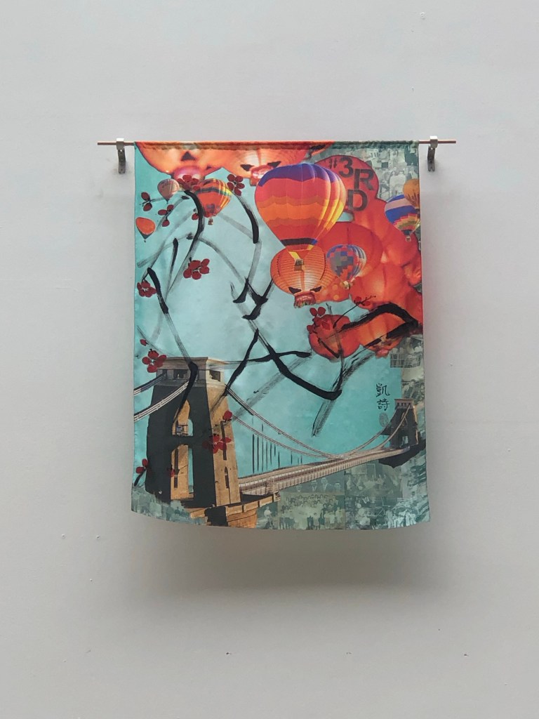
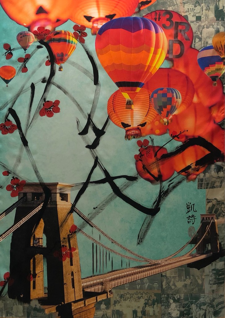
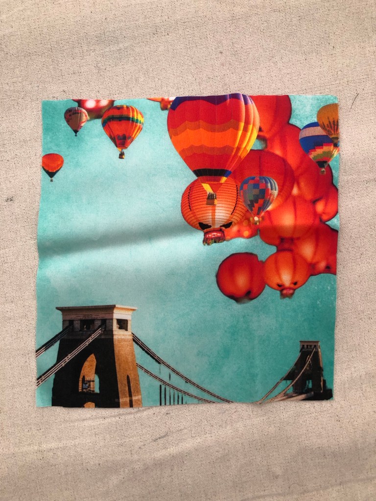
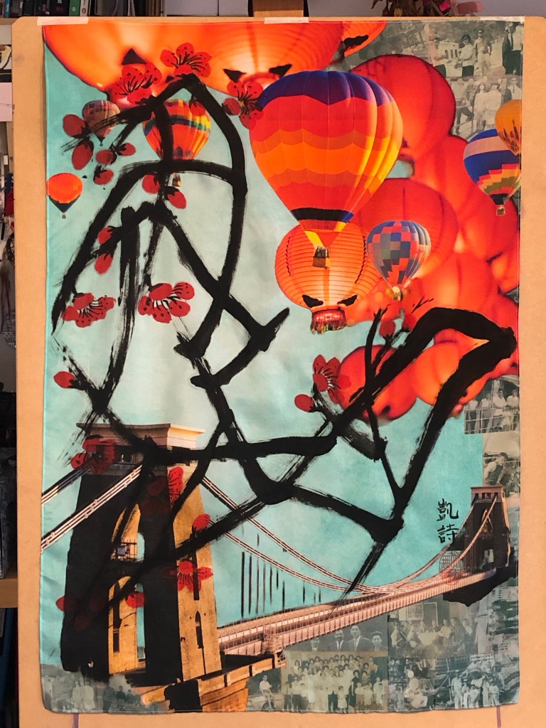
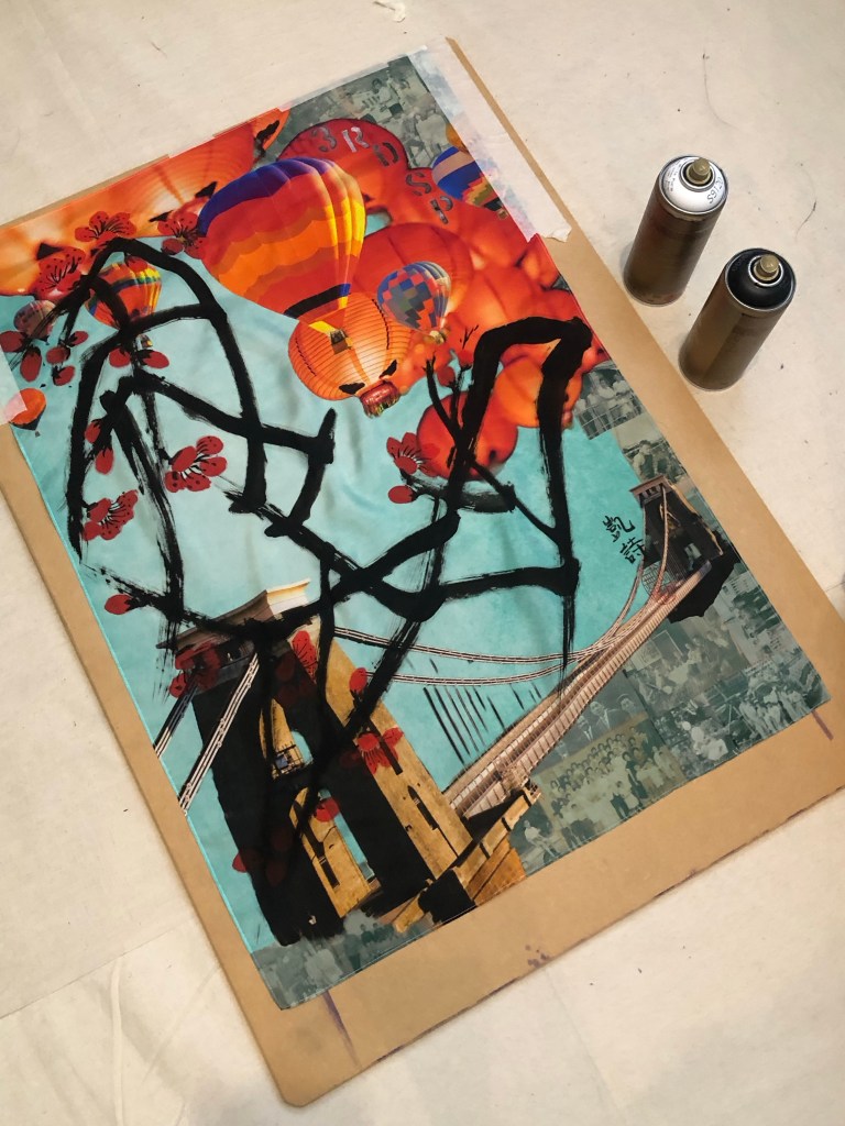
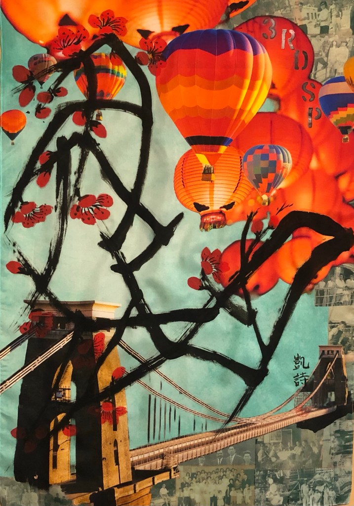
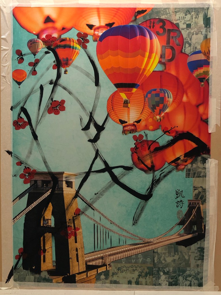
I ordered the silk printing from Contrado who provided an excellent service. The image I used was the final outcome from Part 1 – the Clifton suspension bridge, hot air balloons, Chinese lanterns and family photos collage. This blog describes the process I went through to do the Chinese painting on the printed silk. The largest Chinese painting I have done up to now had been A1 size and I ordered 1xA1 and 1xA0 for this experiment. The A0 piece was therefore by far the largest Chinese painting that I have attempted. The plan was to use this piece of work for the MA Interim show if it worked out.
Here is the finished painting and I will use it for the MA show:
METHOD
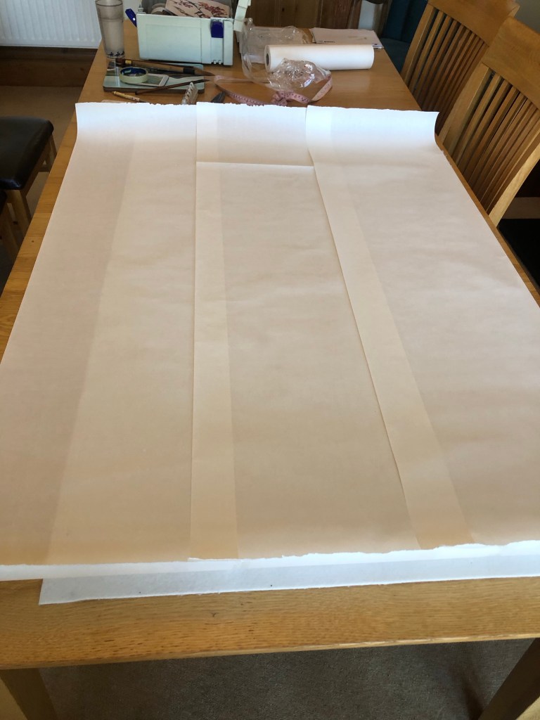
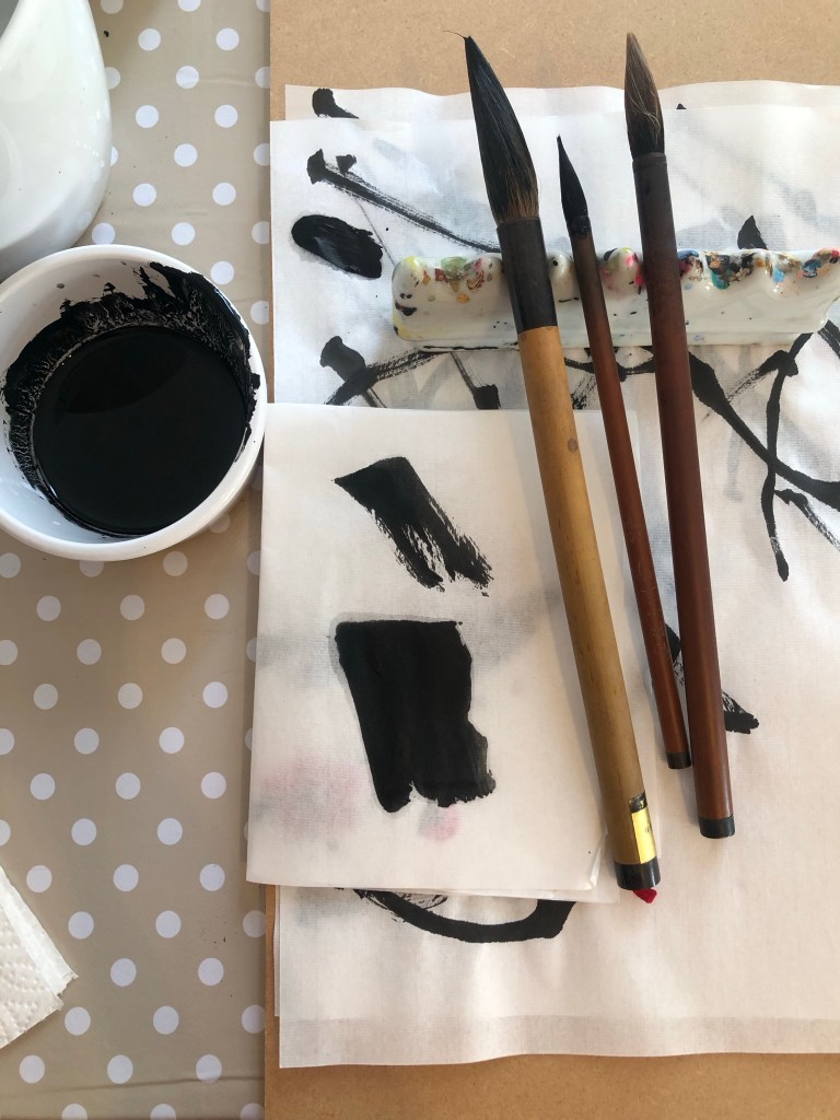
Since I have not done a Chinese painting of A0 size, I wanted to practice on paper before doing it on the silk. As mentioned in some of my Chinese painting blogs, Chinese brush painting is very unforgiving, you only get one go at doing a stroke, hence practicing was important.
Here is the set up with scrolls of Xuan paper stuck together to form a large sheet:
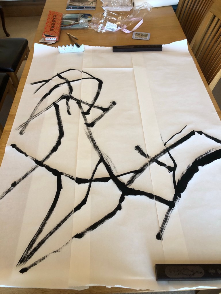
Using the brushes I selected in Part 1 and the composition that I practiced on A4, here is the attempt on A0 size after completing the wild plum tree branches:
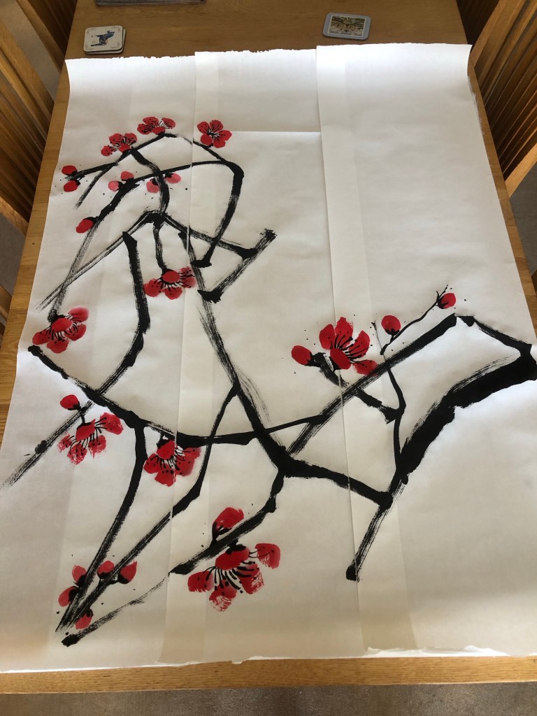
Then the plum blossoms were added:
Finished trial painting on paper:
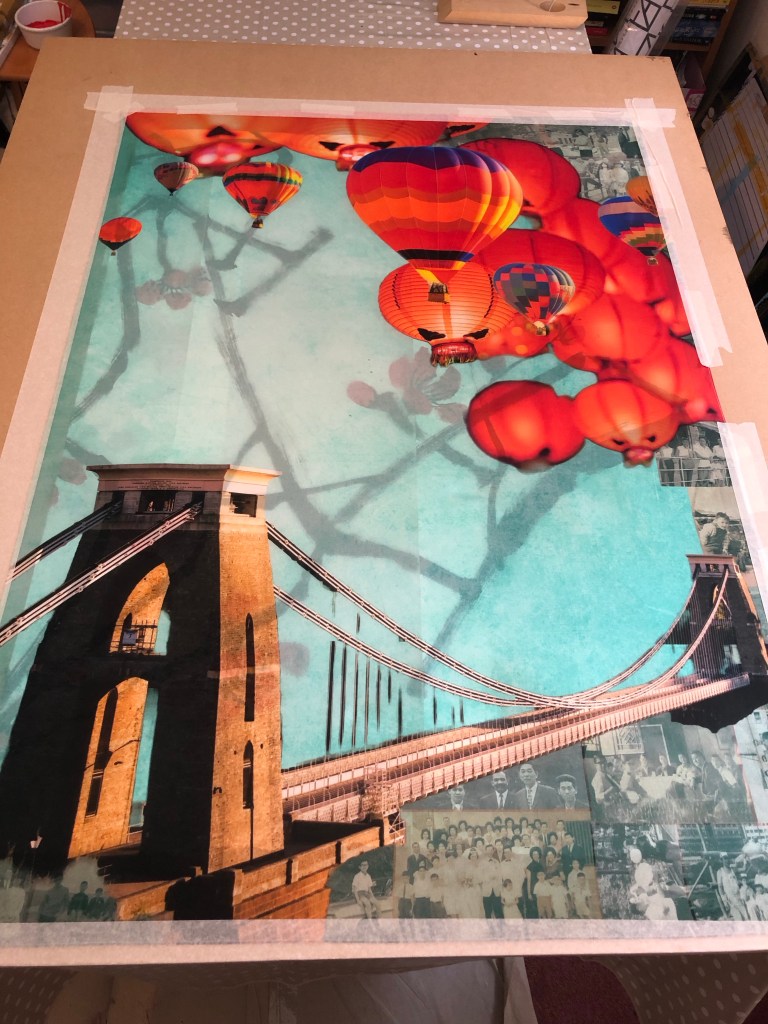
When ordering the printed silk, I had to decide whether to print a border. So I trimmed one of the printed samples to see what a borderless image would look like. I was happy with it and the prints were ordered without border, i.e. printing the image right up to the edge. I also ordered the option of hemmed edges.
Sample image cut without border
In addition, I ordered a small piece of printed silk to test what backing should be used (a piece of felt which is typically used as a backing for Xuan paper painting or just use Xuan paper). Also to test the amount of brush loading and how the brush glided along the surface.
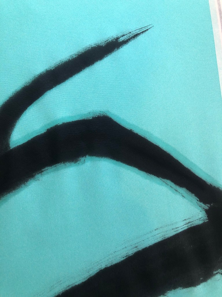
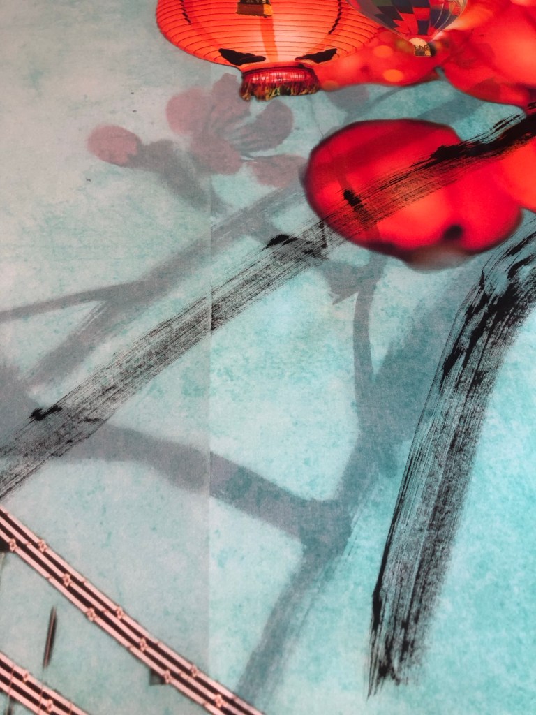
I was not happy with the felt backing because the moisture was not being absorbed fast enough and the silk therefore retained the moisture for too long and started to spread – as can be seen in the close up photo:
So the decision was to use Xuan paper as the backing material for painting on the silk. I started with the A1 piece as practice. Since I do not have a stretching frame for silk painting, I taped the whole piece onto a large board to stretch the fabric.
Below is the finished A1 painting. I was not happy with the painting because the brush loading was too heavy for the branches and as a result, the painting overly dominated the piece. I was disappointed in this but was pleased that I learnt this before doing the A0 piece.
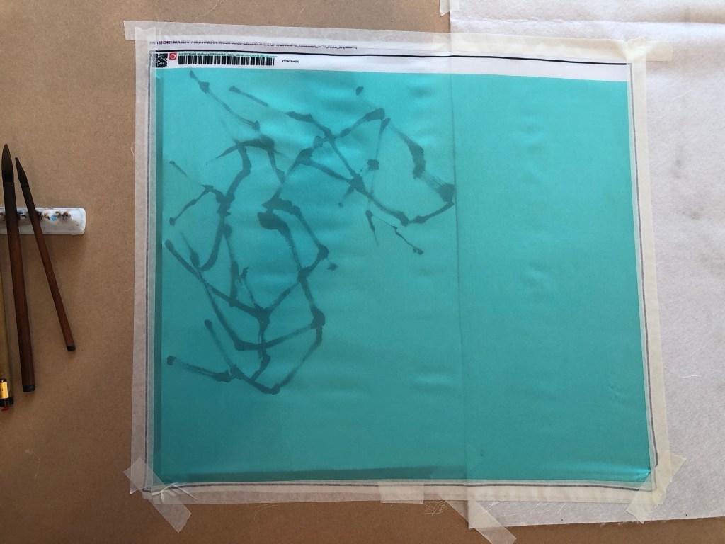
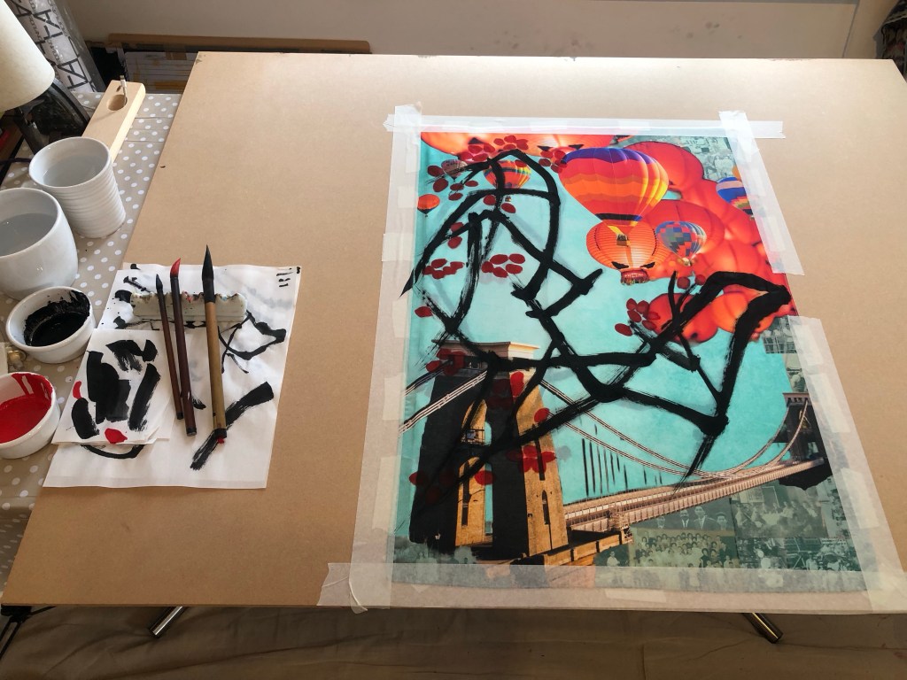
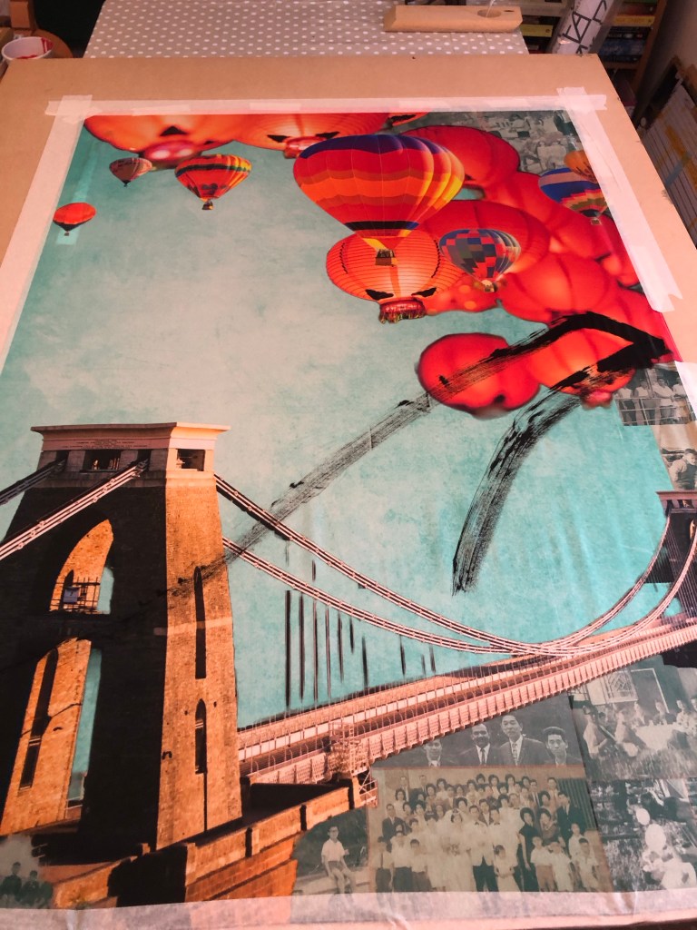
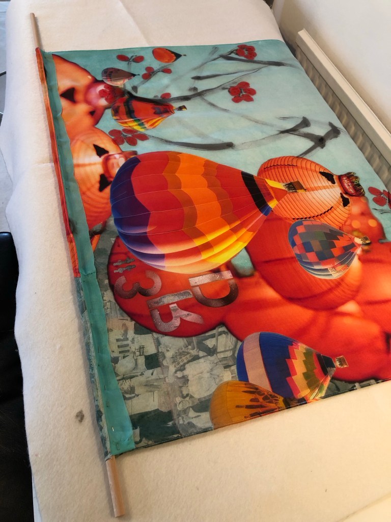
I used the ‘stuck together scrolls’ of Xuan paper from the earlier practice as the backing for painting the A0 piece. It also gave me some rough positions of the composition. The edges of the silk was taped down to ensure the material was sufficiently stretched.
After doing two strokes, I could see the ink picking up the seams of the paper underneath which was not good at all. Once I started painting I was reluctant to stop because it would interrupt my ‘energy flow’, however, I had no choice but to put down my brush and lift up the tapes partially to pull out all the Xuan paper underneath. This was not ideal but had to be done.
With all the backing paper removed, the painting process could resume but with no backing paper to help absorb the ink, there was only the MDF board underneath which was a risk because I hadn’t experimented on MDF before.
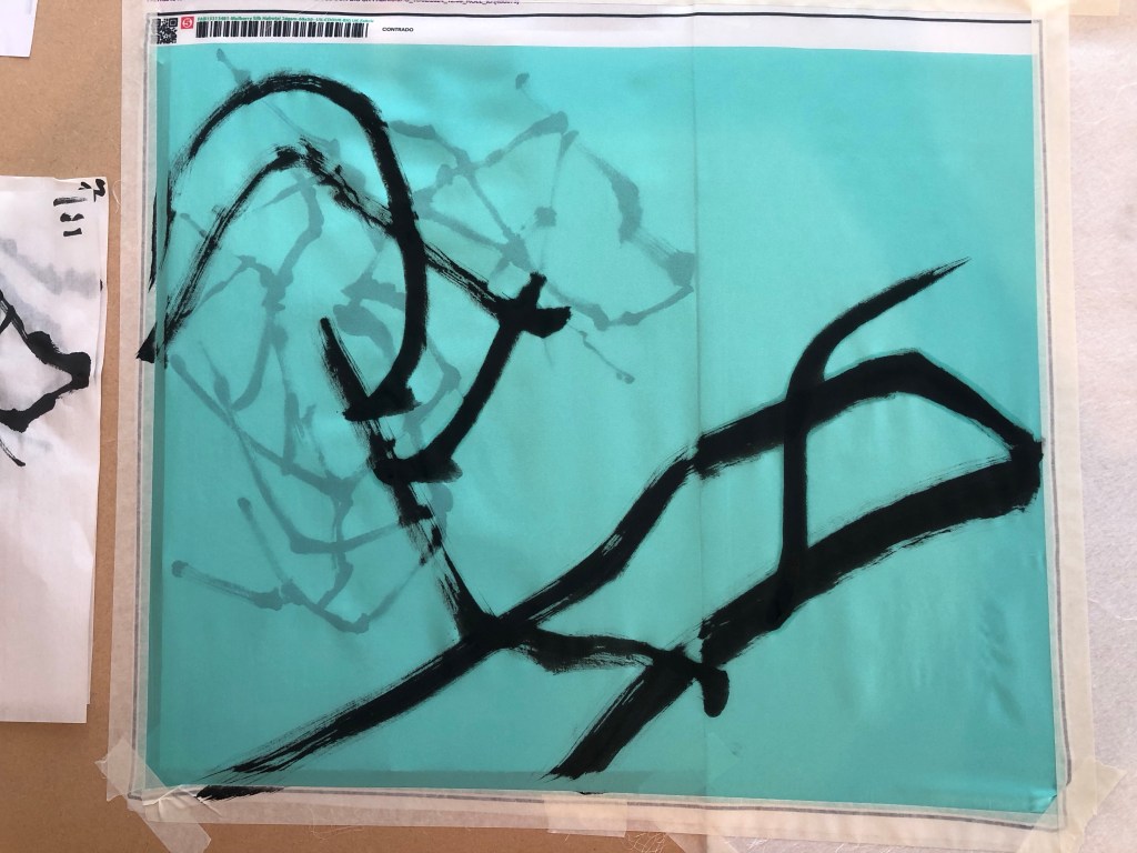
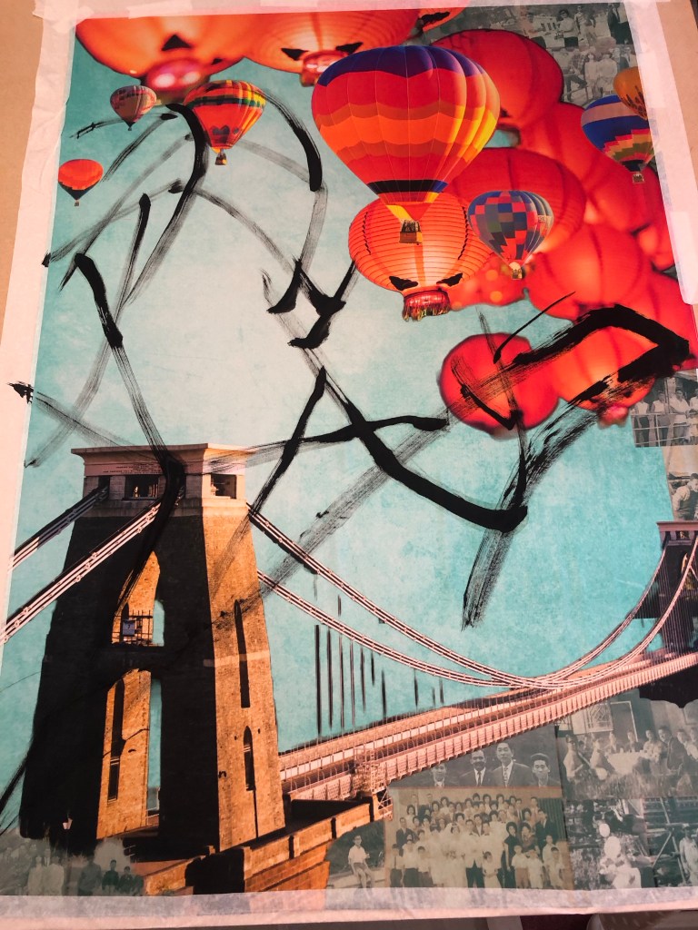
It worked fine and I reduced the brush loading as well as the number of branches planned for the composition because I didn’t want to overwhelm the overall image with too dark brush strokes.
The plum blossoms were then added. I also reduced the number of blossoms and tucked some between the balloons and lanterns. I wanted to leave sufficient negative space on the left of the painting to create tension on the canvas juxtaposing the busy right hand side of the image.
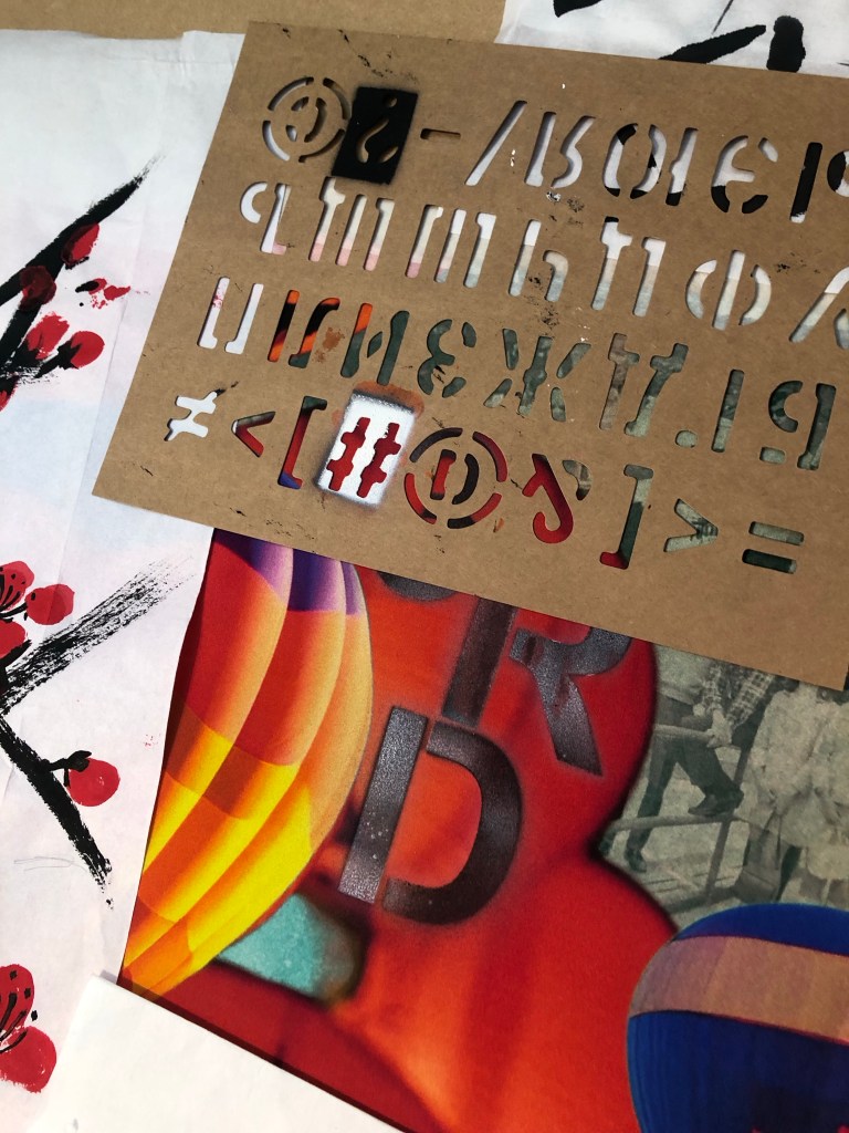
After completing the Chinese brush painting, I had the choice of finishing it there, or adding some spray painting. I like adding street art style spray painting to my work because of my home city of Bristol being home to many great street artists and the city is full of beautiful street art. Hence street art is a big part of my heritage.
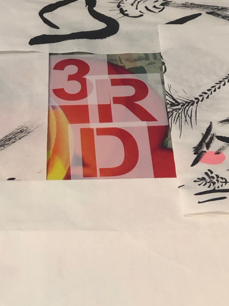
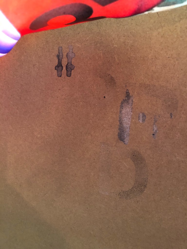
I was mindful that the canvas is already filled with images and I didn’t want to overdo it. Also I didn’t know how my spray paints would perform on silk. So I experimented with the A1 piece first:
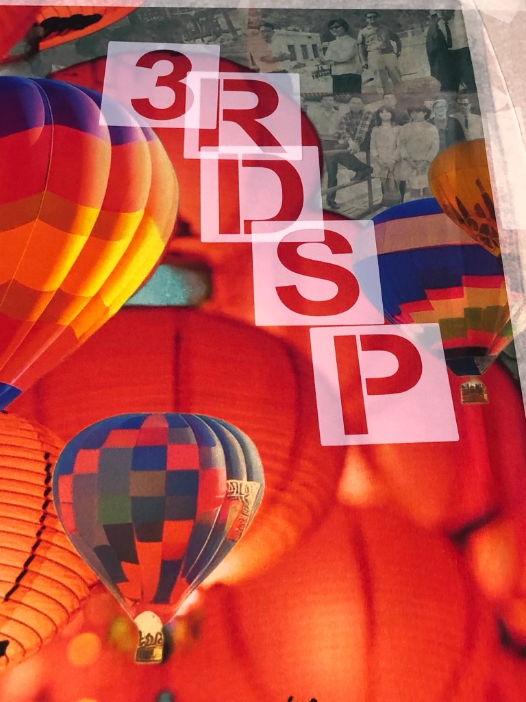
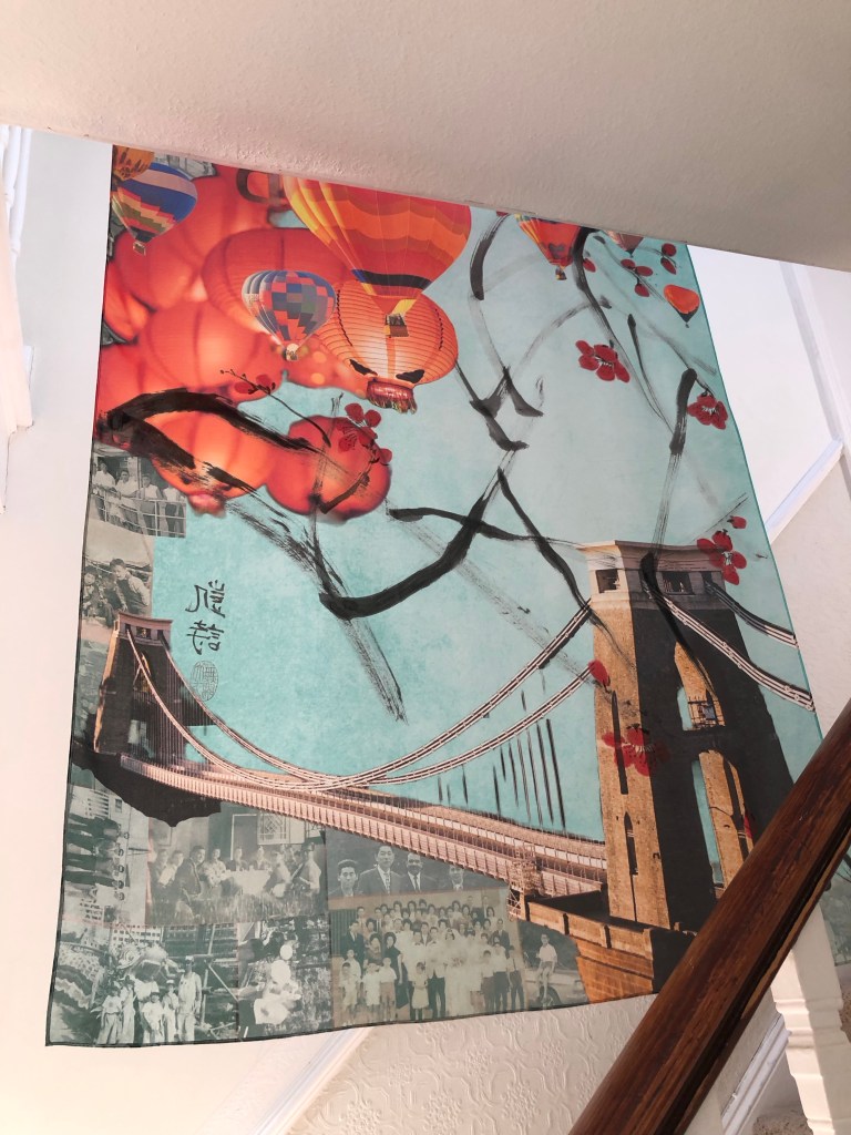
I sprayed some two tone black and white stencilled letters on two lanterns saying ‘3RD SP’ for Third Space:
I was happy with the outcome so I started to lay larger stencils on the A0 piece:
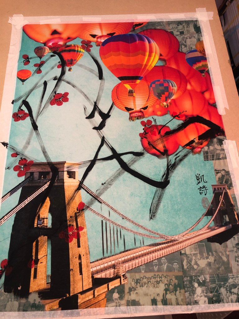
‘3RD SP’ was too much, so I went with just ‘3RD’. I masked off the area and proceeded to spray one letter at a time.
It worked out fine and to take further risk, I added a ‘#’ to proceed the lettering to add a contemporary feel.
After spraying, I found that for some parts, the spray paint seeped through the thin silk and nearly glued the material to the MDF underneath. The silk was rescued in time and was safely lifted off the board.
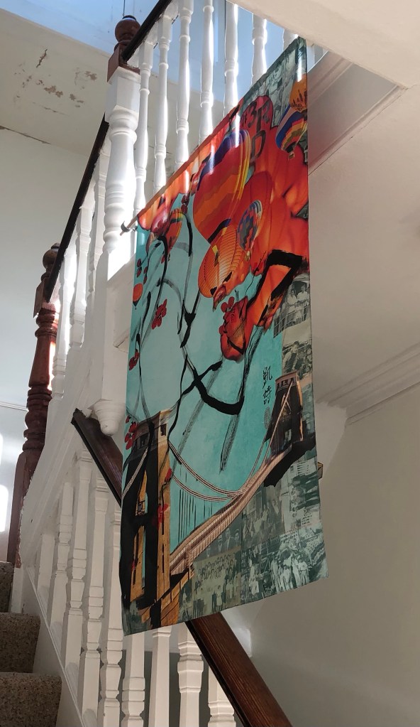
The finally finished work:
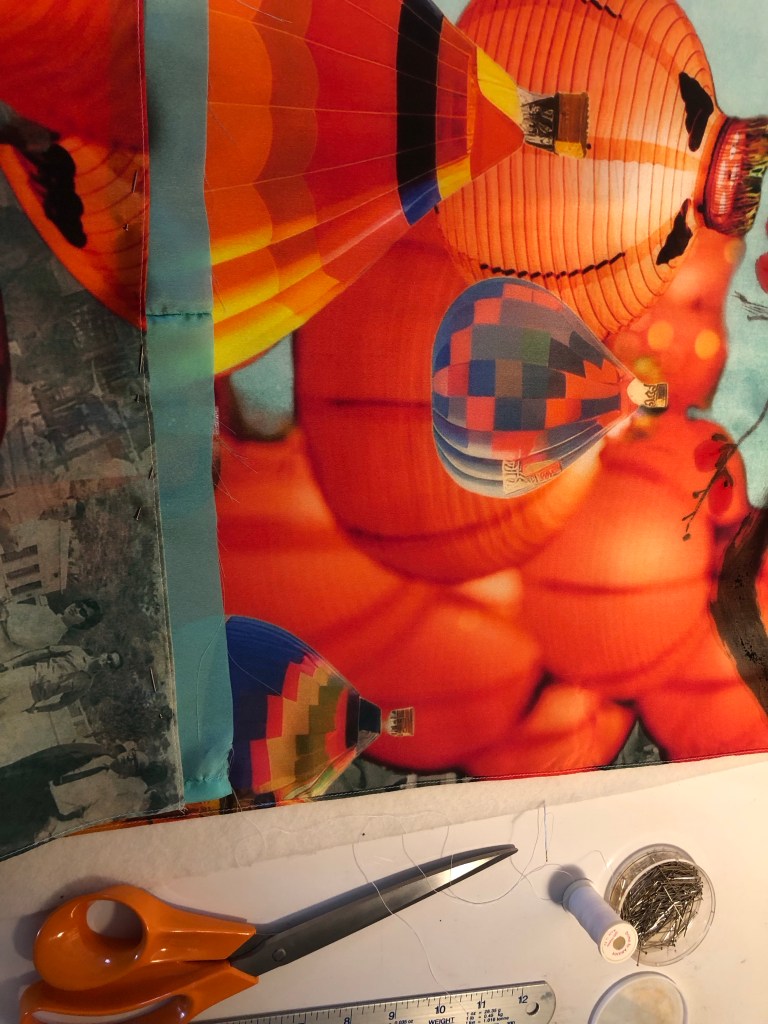
Since I have decided to use this piece for the MA interim show, I had to work out how to hang it.
I have chosen to hang it off a piece of 1 metre x 10mm diameter wooden dowel. this means I had to sew the header of the silk to make provision for the hang. I wanted to minimise losing the images at the top especially to avoid losing my father’s face on the top right photo, I added a piece of silk material ‘tape’ at the top as follows:
The sewing was complete and the silk painting was hung off two metal brackets to simulate how it would hang at the show:
One of the reasons for choosing a thin 38gsm silk material was that I wanted the image to be visible from both sides if it was hung in free air. This is how it looks from behind and I am happy that the image is still visible:
REFLECTIONS
This whole piece of work has turned out to be a much larger undertaking than I imagined because of:
– Using family photos in my digital collage: aside from the emotions involved (which I have not fully resolved yet), there was much work involved in ensuring the resolution was good enough for printing on A0. The print company Contrado was excellent in checking through my design before I placed the order.
– Using new materials: I learnt a lot from choosing the right kind of silk material but it was also very risky because I had not worked with silk before and the thinness of the fabric made it very fragile to work with. The whole process was new to me and I had to make it up as I went along. Due to the costs and lead time involved in purchasing the printed silk, I had to take extra care in the experimental process to minimise wastage of materials as well as time.
– Going large: I wanted to challenge myself to create something new for the MA interim show, hence I went for A0. I found it very challenging because I am still very new to Chinese brush painting and that lack of experience made the process much more stressful than if I had gone for medium that I’m familiar with such as oil paint or acrylic.
What I was happy with:
– I learnt a lot in making this piece of work, documented here and in Part 1. I learnt about new methods, materials and processes. All the practices and trials were essential.
– Starting to use old photos in my digital collage. I still have many photos in my archive that I could use when I feel ready and able to. I have to manage the emotions and fragility involved in using such precious materials. But I have made a start.
– I was happy with the final outcome and was relieved that I have something for the MA interim show.
What I was not happy with:
– I should have anticipated some of the mistakes along the way, it was all useful learning despite being stressful at the time.
– Since the A1 silk experiment didn’t go well with the branches being too dark (overloading of the brush), I was overly cautious with the subsequent A0 piece. Also, my paint brush was not quite large enough. It was one of my mother’s brushes. There was a larger one but it would have been far too large, also, its bristles were starting to fall out and I didn’t want to damage it further since I want to preserve my mother’s brushes as much as possible. So I made do with the smaller sized brush. I would have wanted thicker branches for the A0 piece. Additionally, I could have loaded the brush a little more but I was worried that it would turn out like the A1 piece. Hence I was being overly cautious. It all comes down to my inexperience with Chinese brush painting. I hope this will improve over time with more practice.
Further reflections:
I have spent much of my MA first term developing methods to work with oil and cold wax, however, when it came to the MA show, I went back to an earlier method of transcultural layering where digital collages were printed onto a thin fabric then a Chinese brush painting was layered on top. I thought I would be more familiar with this latter approach but the change of fabric to thin silk and going large made it more challenging than I expected. I am pleased I went with this because it has renewed my enthusiasm for this transcultural layering method and now I have several other ideas in mind to try. I want to continue to pursue both ways of transcultural layering for my practice, namely:
1. Western medium as the lead with oil or oil and cold wax as the top layer, scraped back to reveal images pre-printed on the canvas. The canvas here would be robust such as woven linen/cotton or board.
2. Chinese medium as the lead with digital collages printed on silk and Chinese brush painting or calligraphy layered on top.
Which one to use will depend on the context and the kind of painting I want to make. My current plan is to continue to work on both methods.
LEARNING
– I learnt a lot about working with silk and will continue to use this material. I need to look into buying or making a silk stretching / painting frame that can accommodate large pieces of silk, A0 or larger.
– I gained confidence with my Chinese brush painting and there are no short cuts there – practice and planning are key.
– From the aesthetics exploration perspective, I learnt a lot from the mistakes in the A1 painting. It’s easy to overwhelm an image and it showed once again for me that negative space is so important. Often less is more and leaving space on the canvas creates tension that engages the viewer. I was hesitant in adding the spray paint but I really wanted to do it to bring in that aspect of my Bristol heritage. I am pleased that I did it and managed to reign it in.
NEXT STEPS
– Look into a better set up for painting on silk such as a large stretcher frame.
– Source a few larger good quality Chinese paint brushes for larger scale work.
– Do a new piece of transcultural layering work with a new digital collage of family photos for use with another silk painting or oil and cold wax.
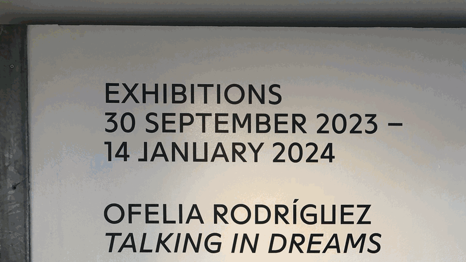
I visited Ofelia Rodriguez’s exhibition Talking in Dreams at Spike Island, Bristol. Below is a video summary of the visit compiled using the iMotion App. I learnt to use this app at a CSM online workshop and I wanted to experiment summarising a gallery or exhibition visit in this way:
REFLECTIONS
– Rodriguez’s work has really inspired me because I can relate to her work as someone who makes art about her homeland while living far away. In particular, I like her work with the bright colours and her chosen palette gave me a sense of the place she was describing. I feel I should explore a colour palette that describes my childhood home city of Hong Kong, this might help me when I am stuck on ideas about work to make.
– I was also inspired by the textiles used and the stitching in her work. Stitching into my paintings is not something that I have considered before but I have often thought about using fabric in my work. So this is an area that I will explore.
– Another thought arising from the above point… I have in the past made expanded paintings where I had eradicated the traditional canvas. I could make paint-based fabric to incorporate into my work.
– Rodriguez used a lot of found objects in her work which is fascinating to look at. However, right now, it is not an area that I am interested in because I already have several strands of enquiries going on and I feel I should make some progress before adding more variables. But I wouldn’t rule it out and I may come back to this at a later stage.
LEARNING
– Technically, I am happy with using iMotion in this way because in the past I often ended up uploading many photos from a show making the blog unnecessarily long. So I’m happy with this new discovery. Things to remember are to export the file as a GIF from iMotion to my Photos app to minimise file size and to upload the GIF to WordPress as an image and not a video. Also to give it time to upload.
– Other learning have been captured above under reflections.