BACKGROUND
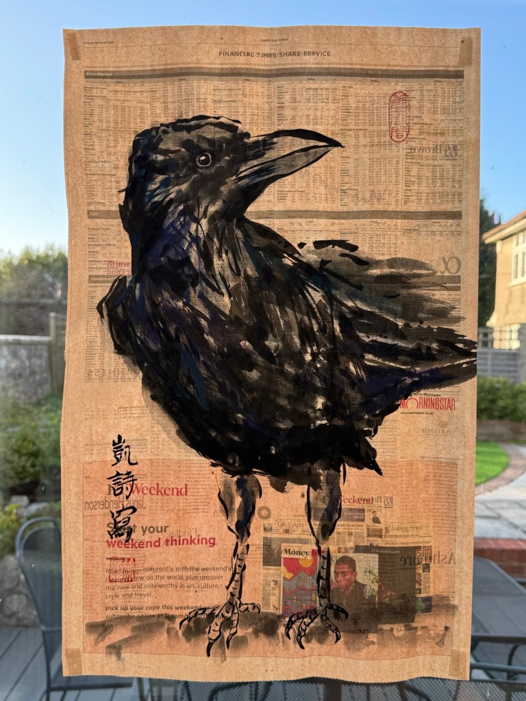
Since my recent re-evaluation of my art practice to enable me to respond to what has been happening in the world, I have been making a new body of work – ‘News’. I feel the urge to show my new work at my MA Degree Show. This blog is about the development of ideas and a plan for the Degree Show.
METHOD
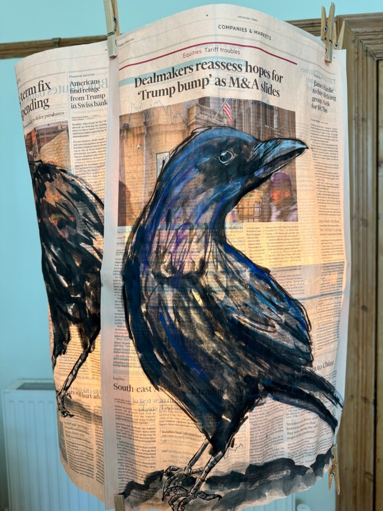
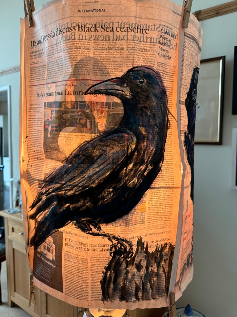
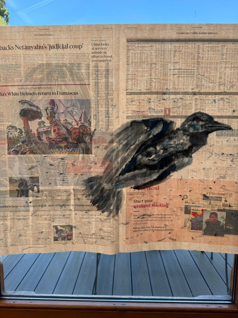
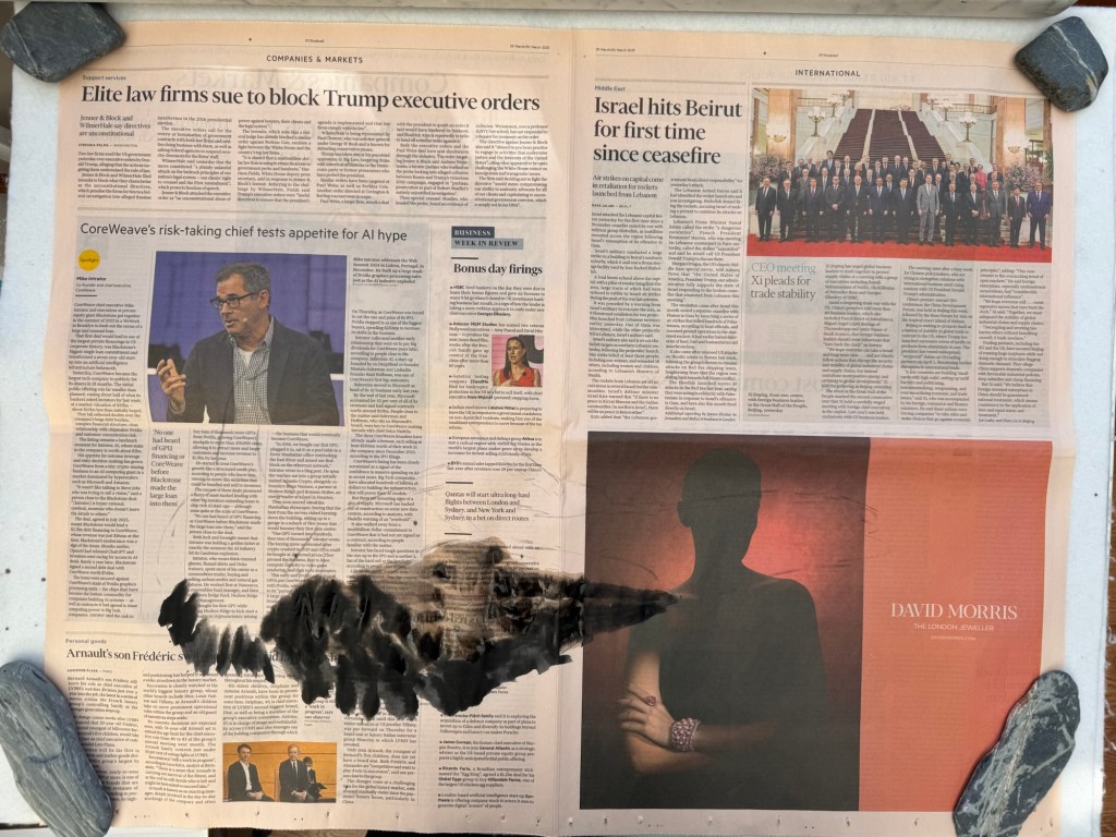
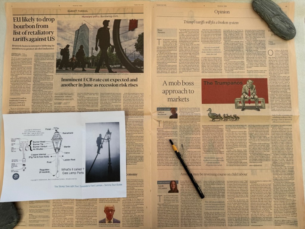
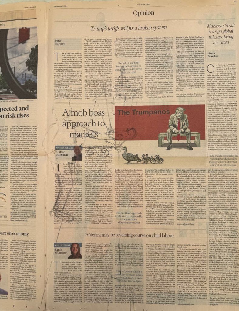
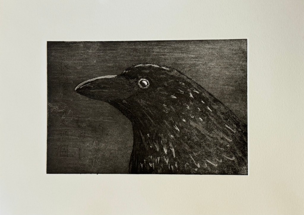
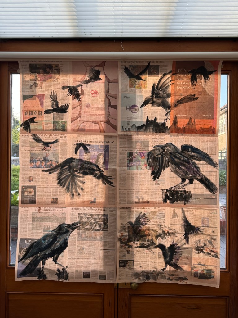
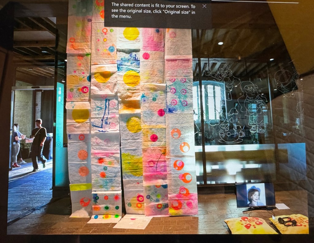
Firstly, I wanted to explore if combining multiple sheets of ‘News’ would make a good composition. Since each sheet was made as an independent painting, I needed to see if they would ‘make sense’ together. So I stuck together a few paintings and put them up against two glass doors to see how I felt. I was encouraged by what I saw and felt there was potential in the concept. I then proceeded to design the installation – how should the paintings be presented?
Below are some mock up ideas that I prepared to discuss with my tutor:
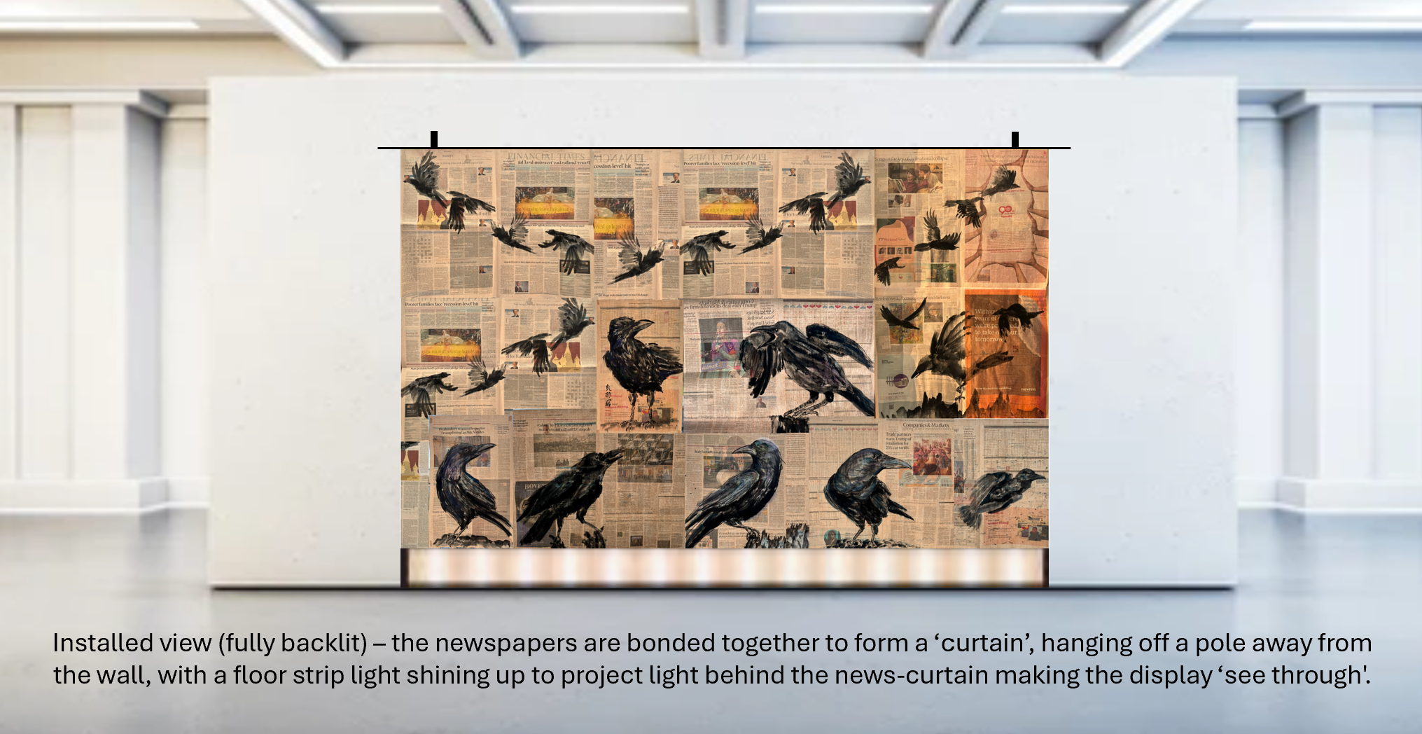
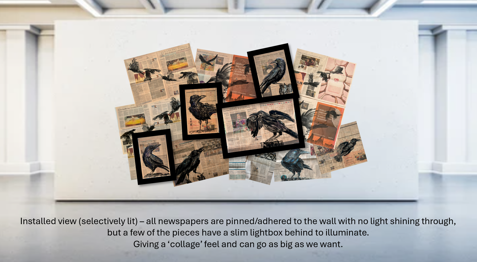
After discussing with my tutor, we felt that the first option had the most potential for the CSM site. So I proceeded to think about how to create one large painting by combining multiple newspaper paintings together that would be appropriate for the Show both in demonstrating the concept and that is robust enough for a public exhibition.
My tutor showed me an installation by a previous student who stitched together pieces of paper to form a long drop. I liked the idea of stitching together the pieces rather than just taping because I think it would be more robust and also reflect my wish to mend what’s happening in the world through my work – somehow.
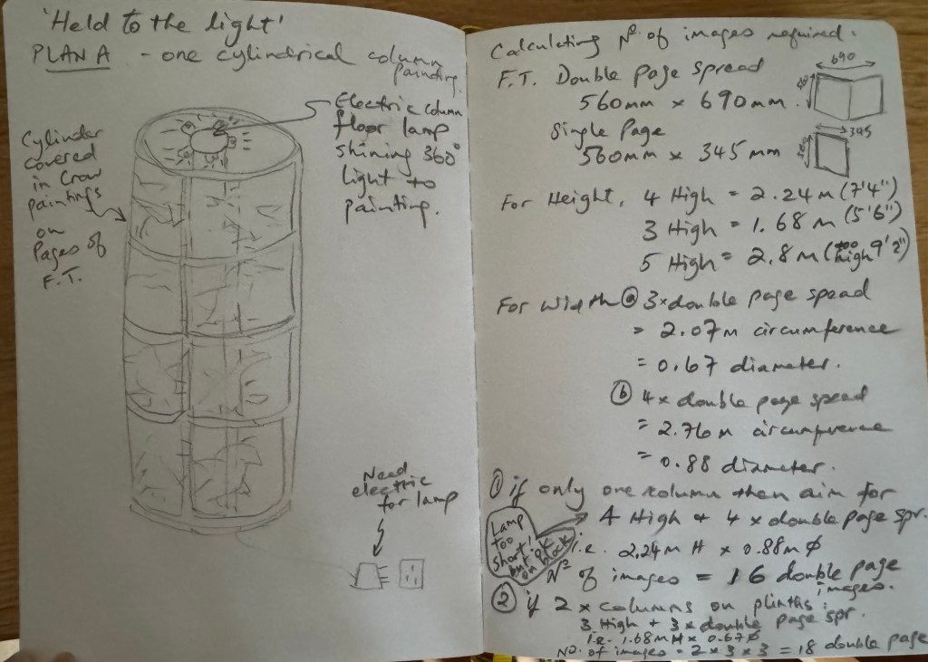
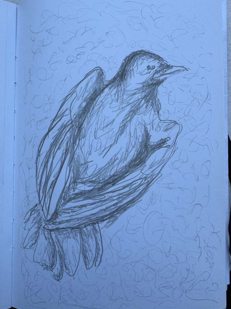
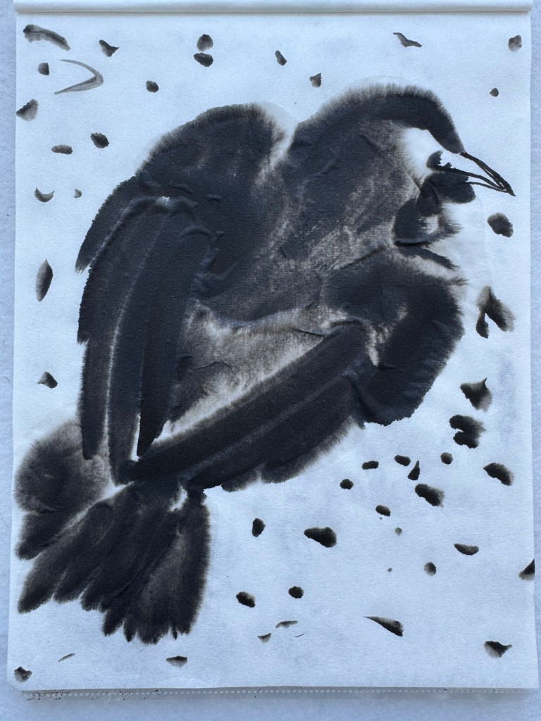
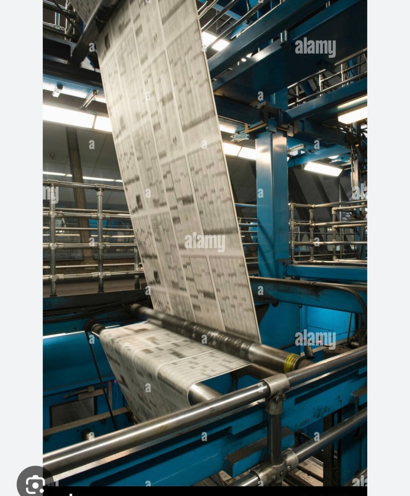
I then tried out different ideas on my sketch book and decided a narrower long drop (rather than a wide one as in the original idea) could work well to resemble how newspapers are printed and processed in the factory. Working so intensely with newspapers and examining newsprint so closely has reminded me of my time as a young engineer working on control systems for newspaper printing presses including many Fleet Street titles. I remember vividly how exhilarating and awe-inspiring it was to see the newspaper webs flying at high speed between feeder rollers around the monumental machines (see example image below). Since my art practice is about exploring my identity and engineering has been such a large part of my life (35+ years), I wanted to make an installation at the degree show that incorporated elements of my memory from those days.
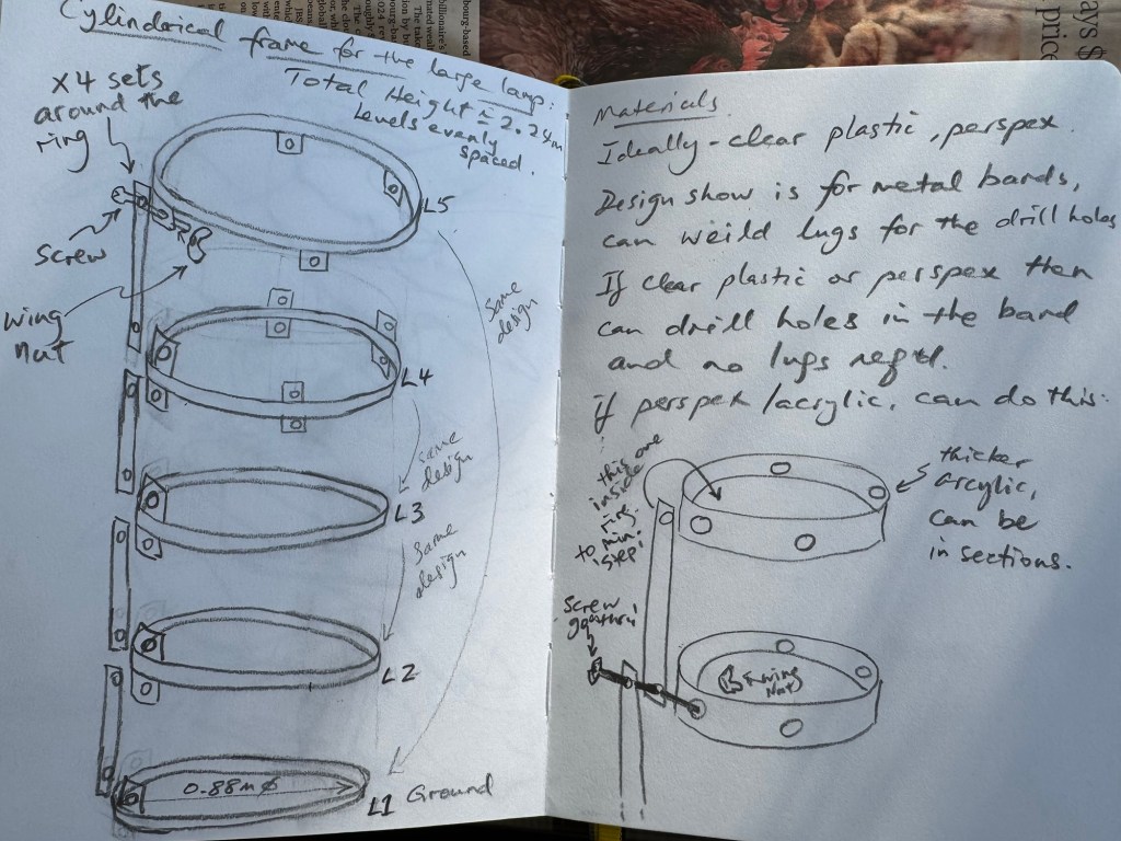
I experimented with the ideas of using three tubes to represent parts of the printing machine. Initially, I looked into buying used feeder rollers from printing press refurbishment companies but they were costly. Then I considered using mild steel tubes (not stainless steel as they would be too shiny). Below is an initial design idea which I used to get some costing. A key objective was the ease of installation knowing how busy the build up would be with such a big student show.
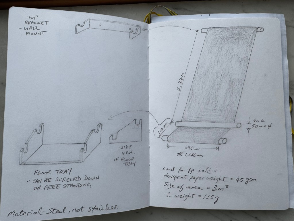
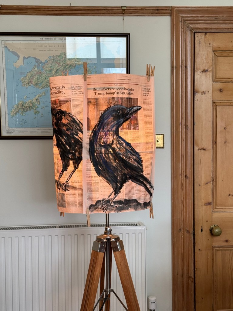
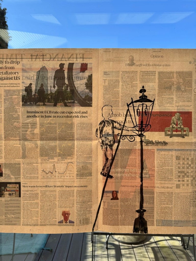
Then I wondered if three tubes would be too many and considered a two tubes design. In all cases, one or more flood lights would be used to illuminate the artwork from behind. Here is a two tubes design:
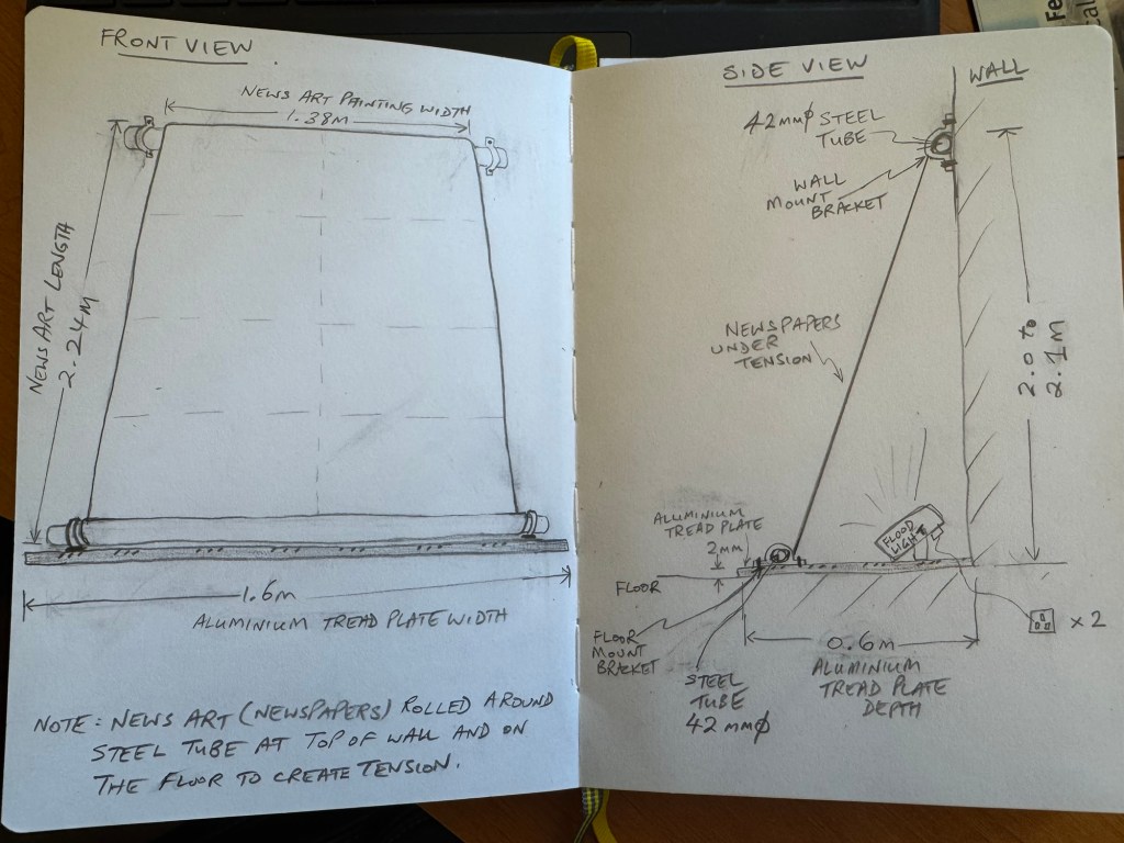
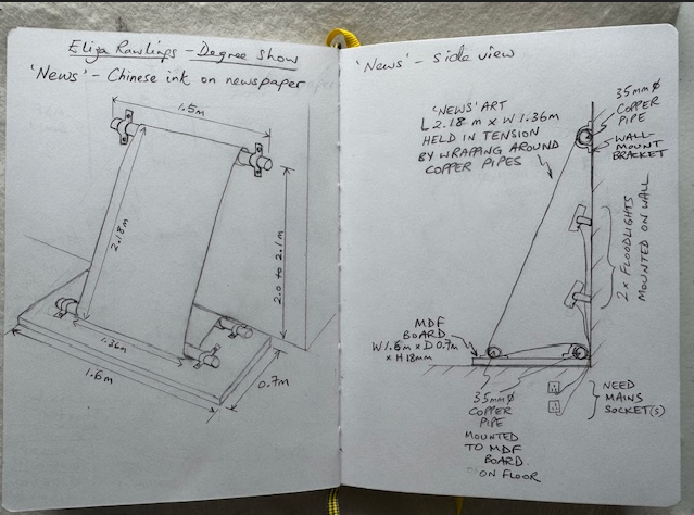
After further discussions and advice from my tutor, the final design was to use 3 x copper plumbing pipes as the copper colour would complement well the Financial Times’ salmon paper. The second pipe on the floor would be placed behind the painting giving the look of the newspaper feeding into the wall. I considered using two small flood lights, but I might go with a dimmable flood light instead because I have found that the back-illumination light level could be critical – too bright and the images became saturated and if too dim then the reverse side images would be hardly visible. Hence a dimmable unit would give more flexibility for an unfamiliar site with unknown ambient light level. Here is the final design:
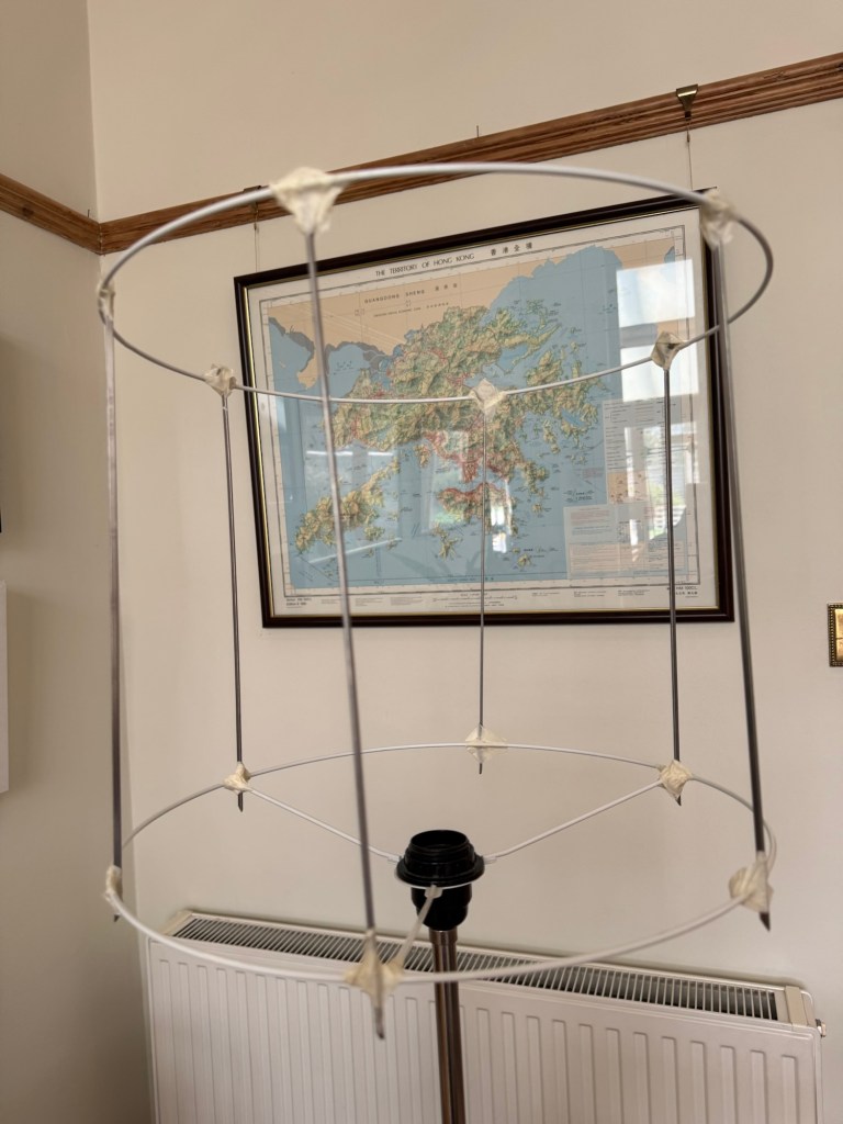
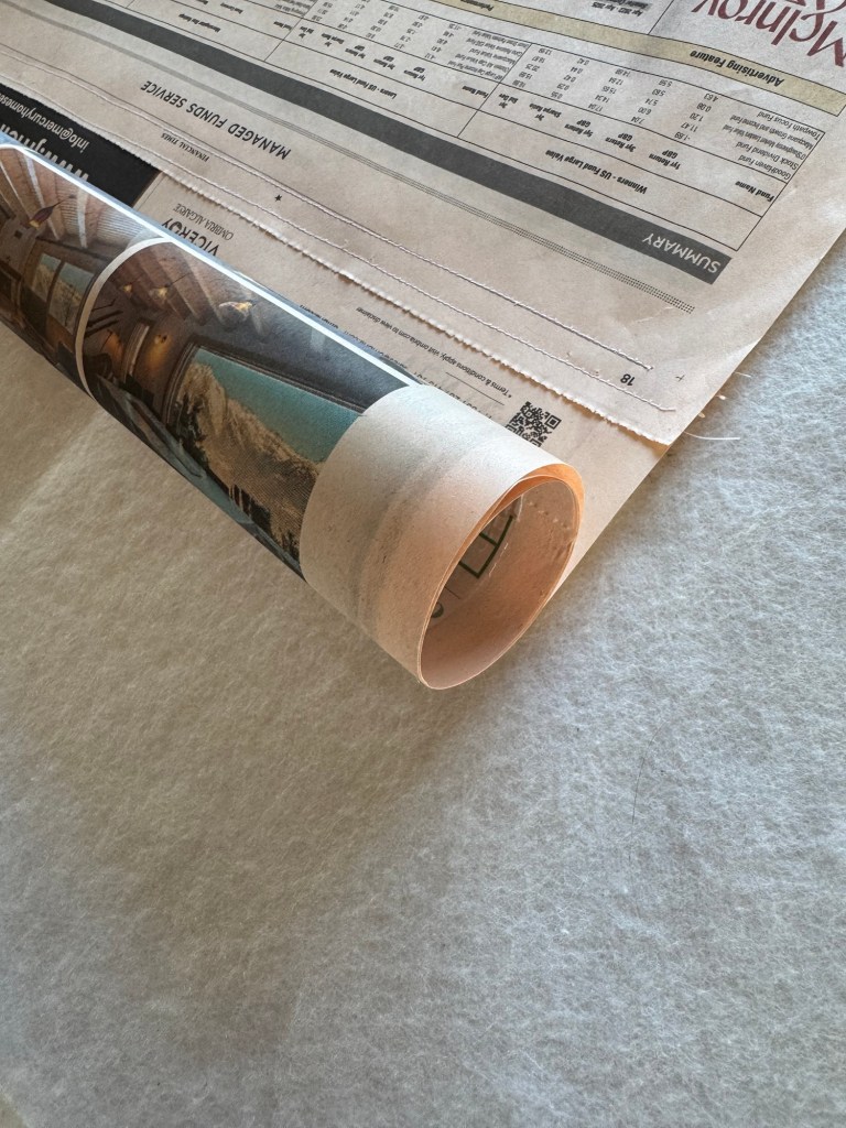
The next task was to test out the stitching and the wrapping of the newspaper around a pipe to see how the paper behaved. Also to determine the optimum pipe diameter to use.
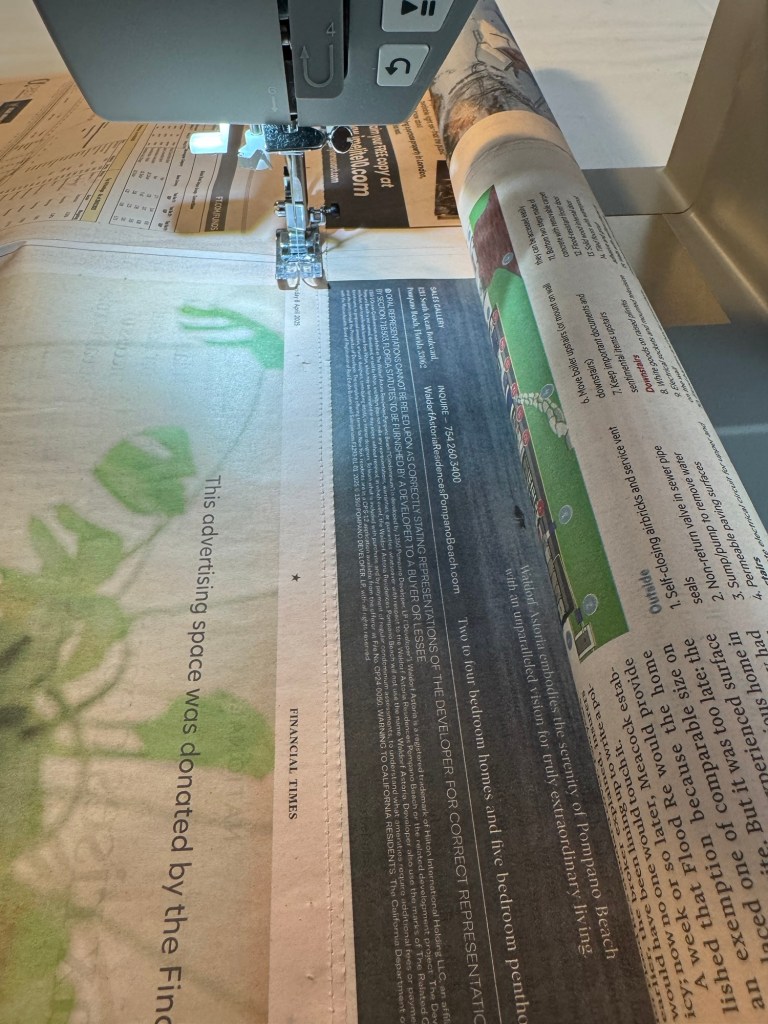
Using a sewing machine for large sheets of paper could be challenging because unlike fabric, the paper could not be bunched up to fit around the sewing machine body. Hence I rolled up the newspaper around a plastic tube and held the roll in place with a large paperclip so that it could be fed into the machine without damaging the paper. The two sheets of newspapers were held together using dressmaking pins just like I would do when binding fabrics.
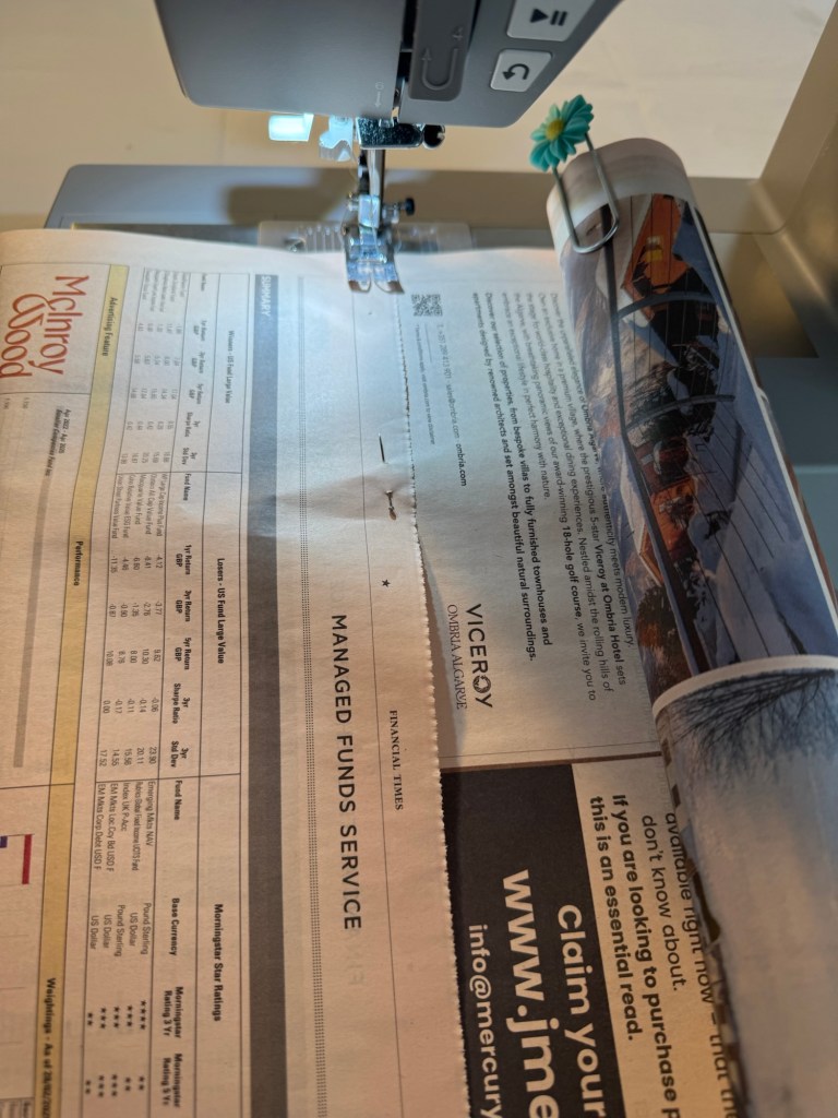
The machine settings were as follows with the stitch size fairly small for strength but not tiny as it might rip the paper:

The paper was then fed slowly into the machine for sewing. Two rows of stitches were made to ensure strength of the bind:
Completed sewing and with paper hanging vertically:
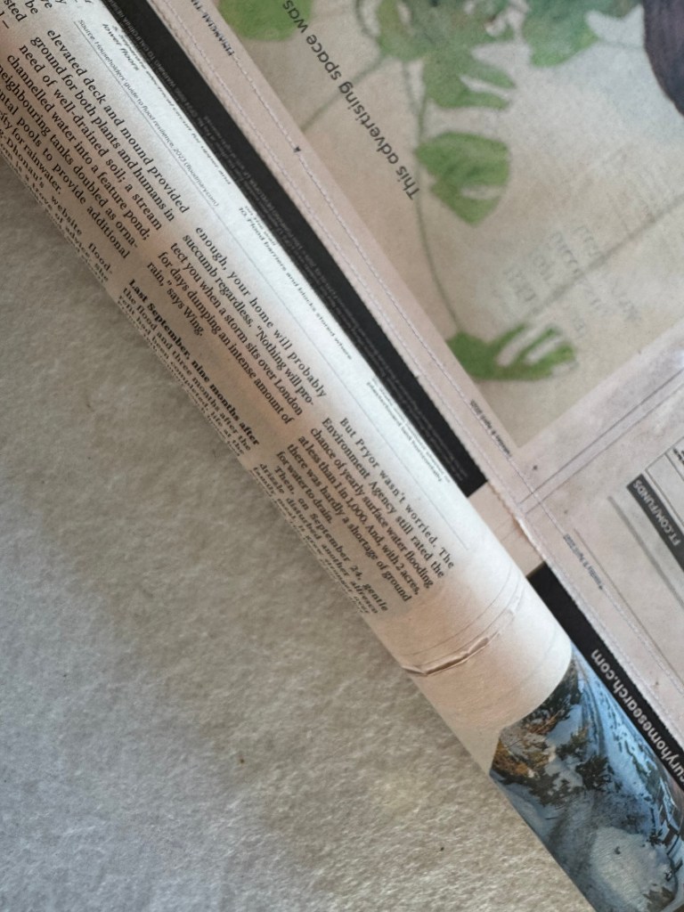
Below are close up images of the stitching and how the paper wrapped around the tube. This tube was of 40mm diameter and the paper wrapped well around it:
I tried wrapping around a smaller diameter tube (22mm) and it felt too tight and obviously would require more revolutions of wrapping and I felt that would introduce more risk in the paper not aligning and looking untidy:
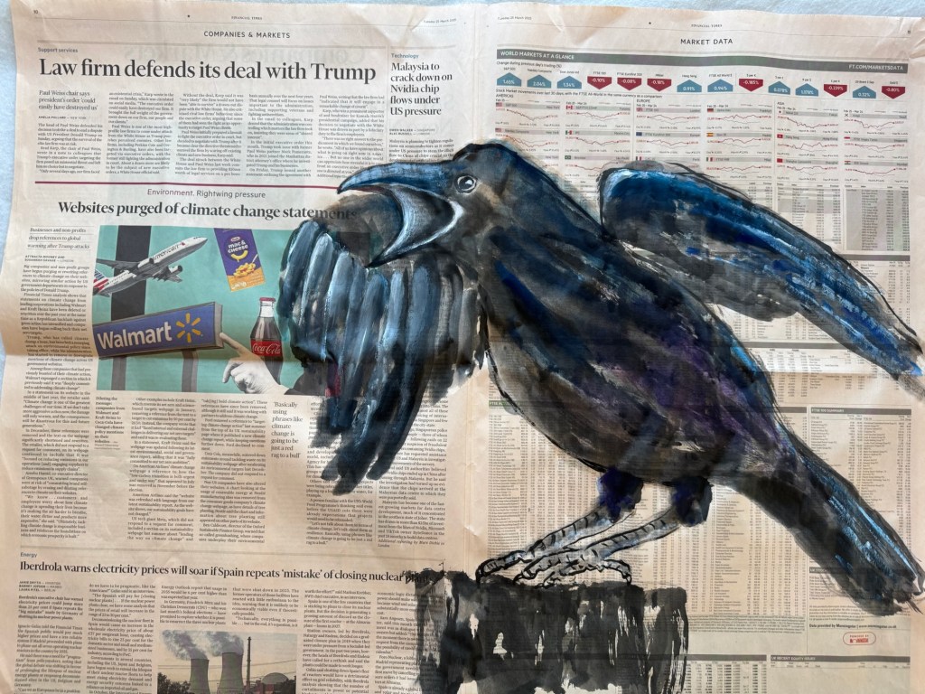
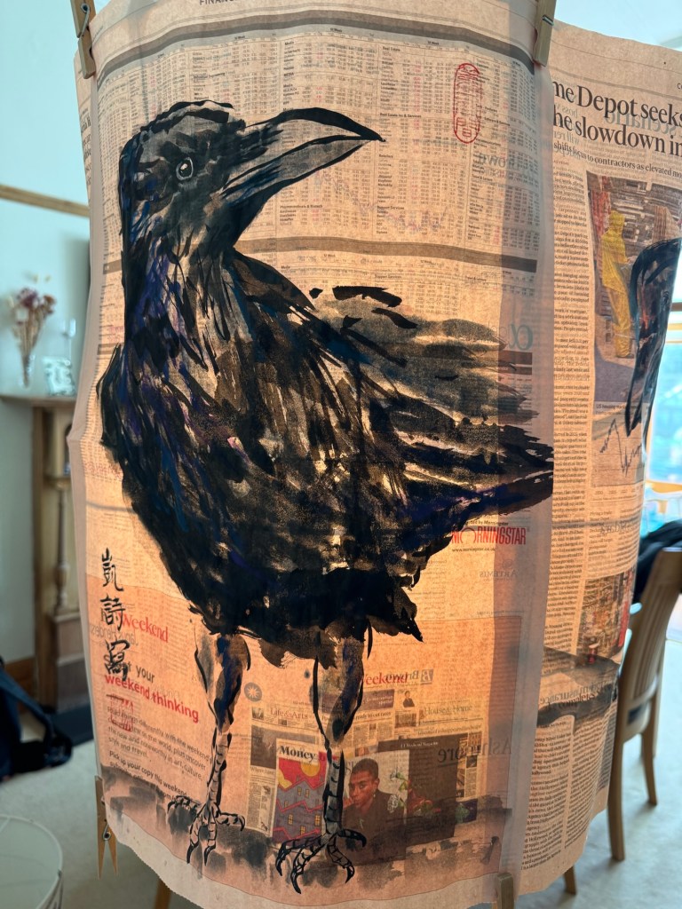
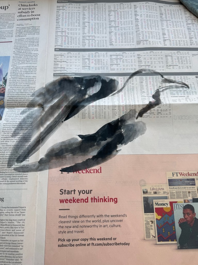
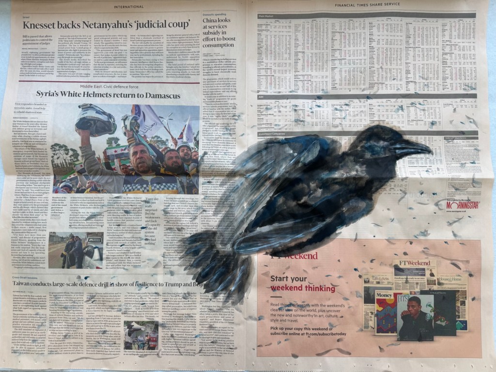
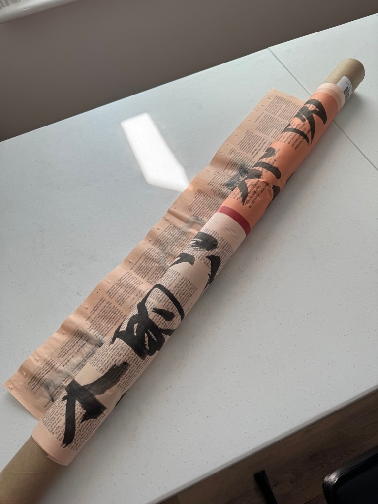
Another example of paper wrapped around a tube. This time with painted paper only as an experiment because the installation for the Show would only use unpainted paper to wrap around the tube.
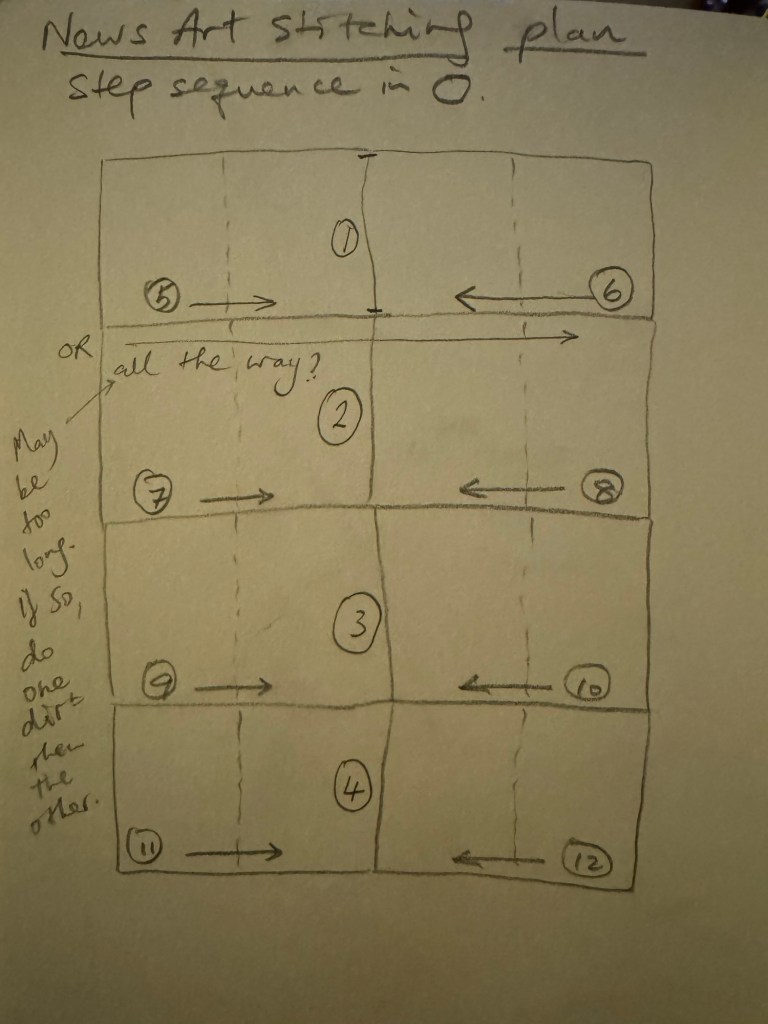
Since I am planning to create a painting size of 2 x double page spread broadsheets, that is approximately 1.36m wide and it would be difficult to feed into the sewing machine in one go, I created the following stitching plan to do the stitching half way, then turn around and do the other half from the opposite direction. I might try to do it all the way with some spare newspaper as an experiment to start with.
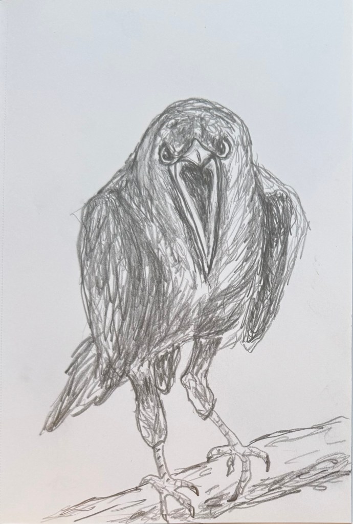
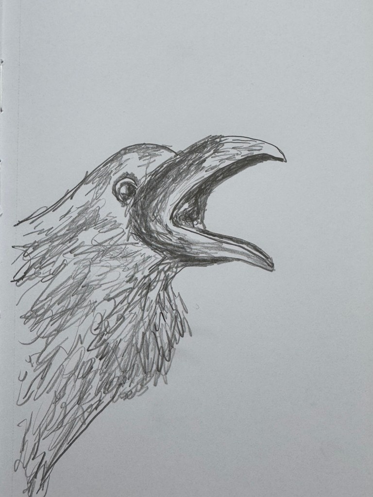
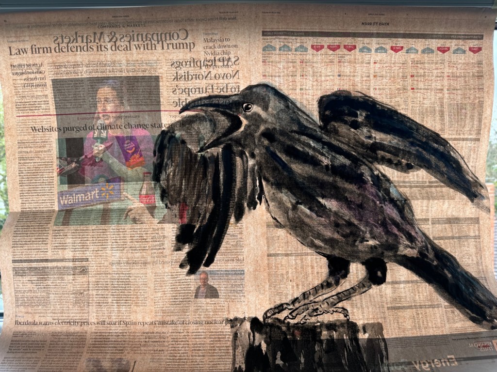
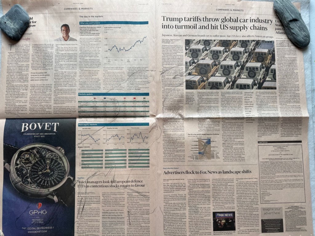
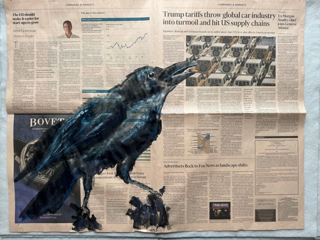
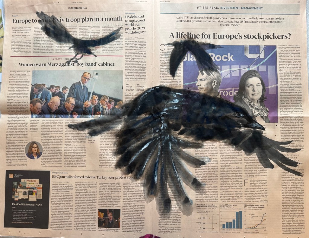
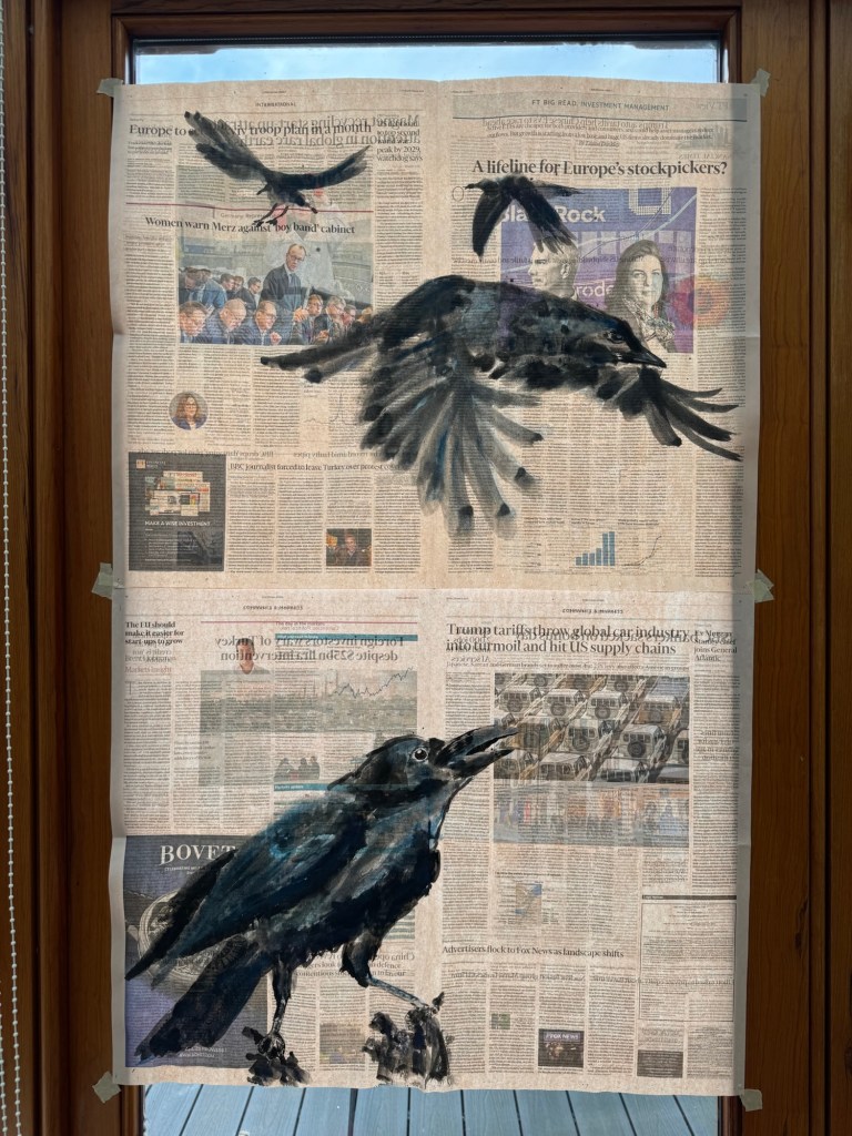
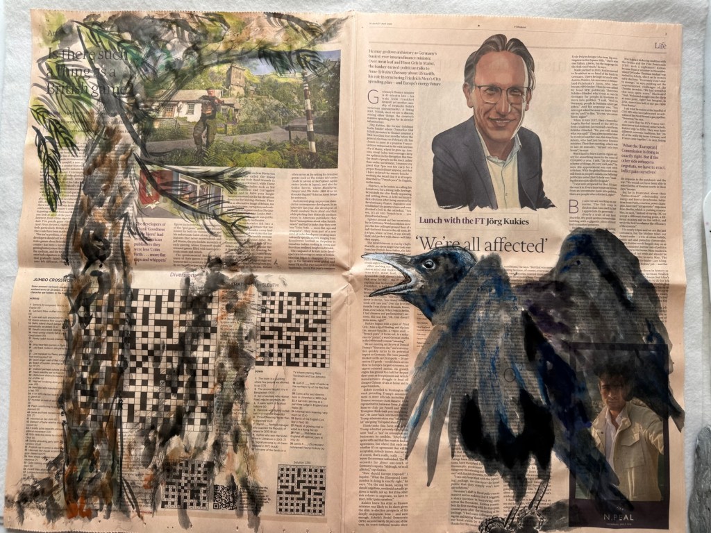
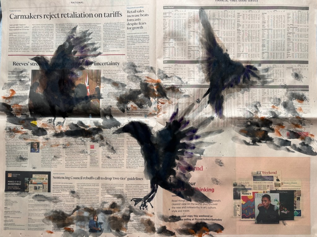
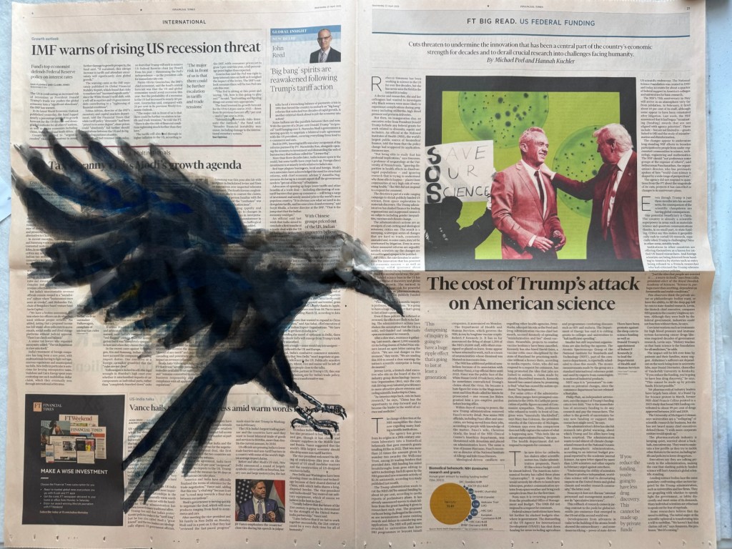
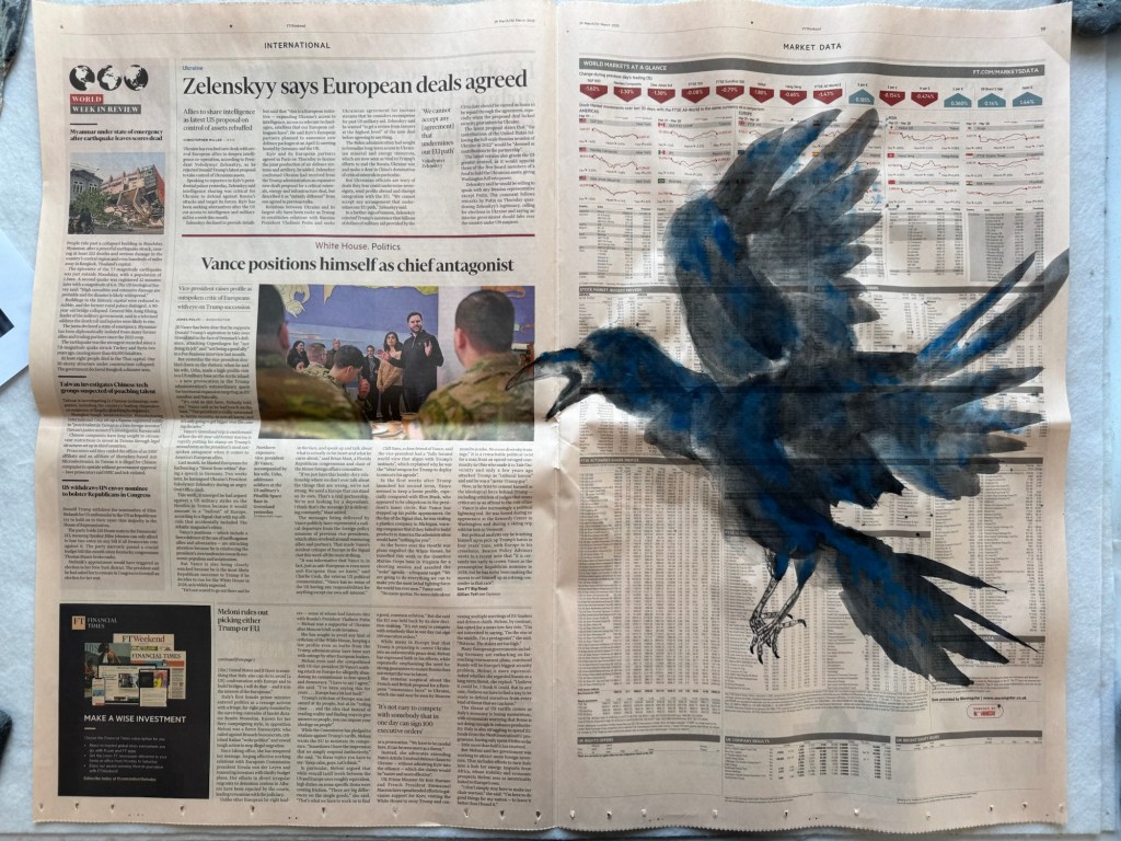
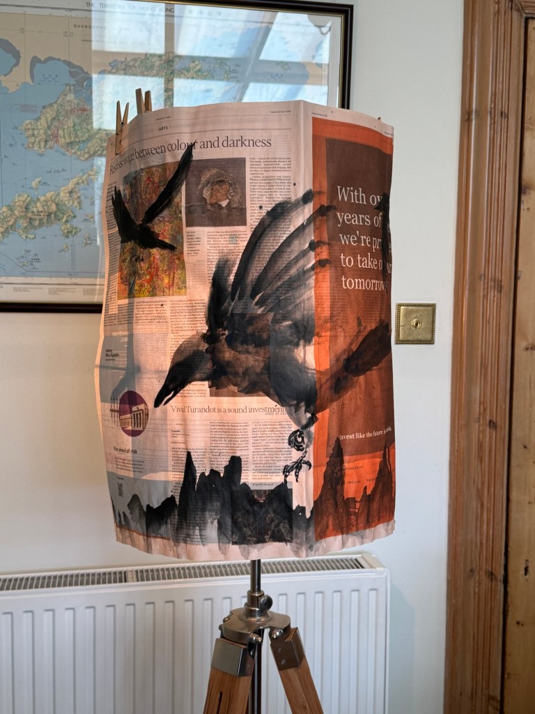
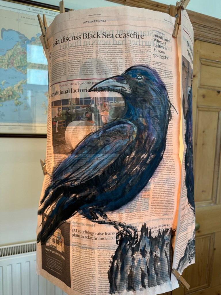
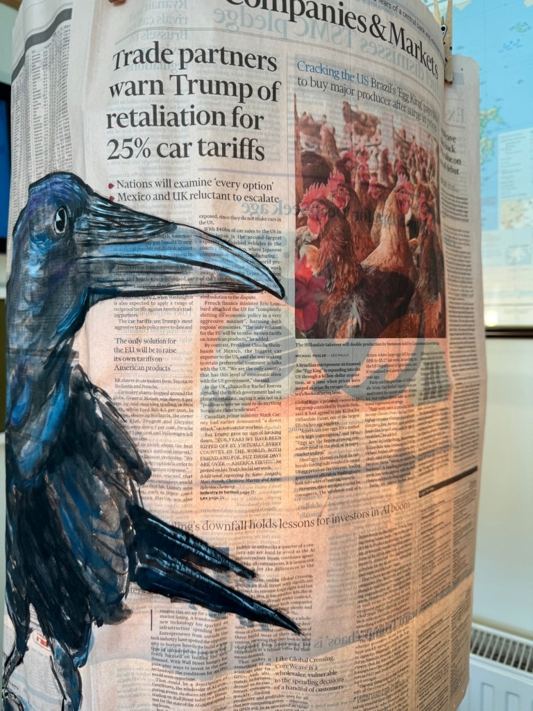
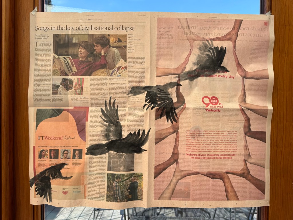
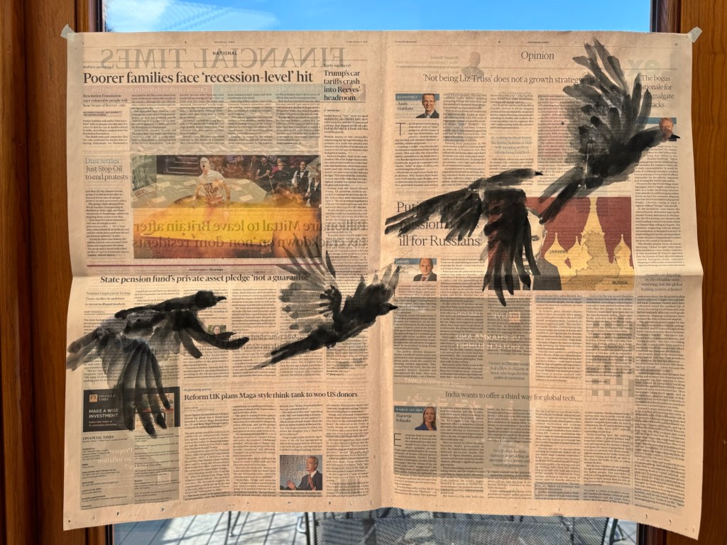
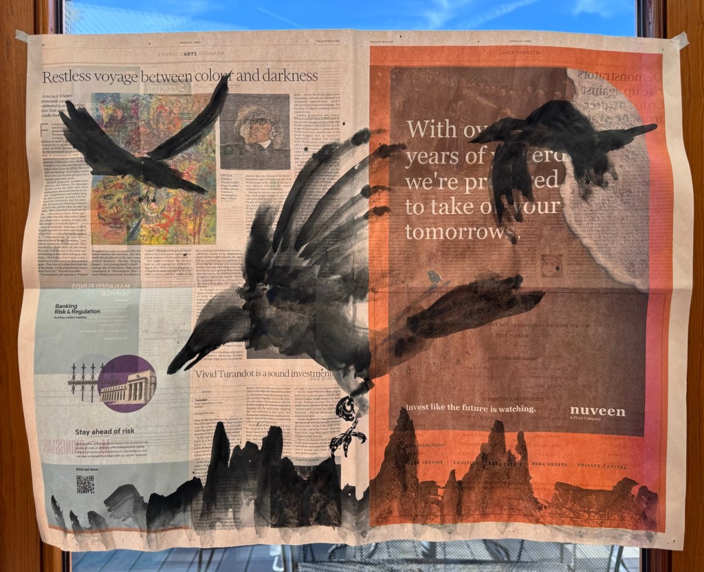
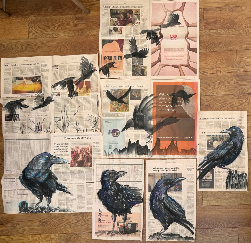
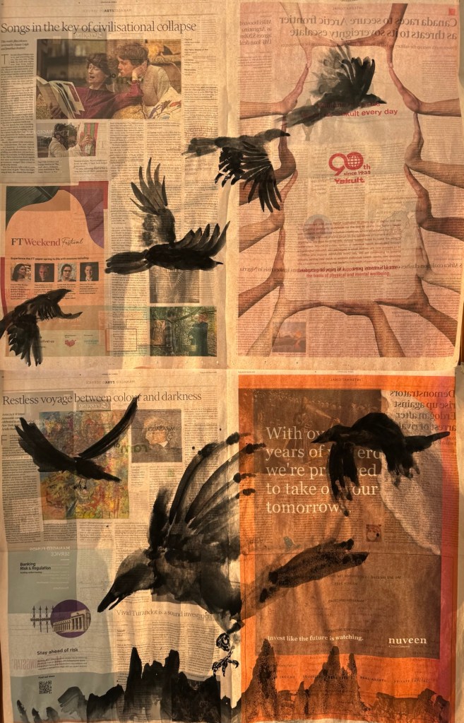
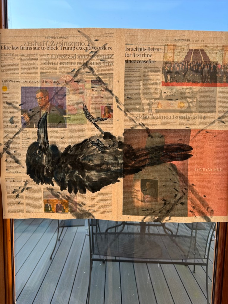
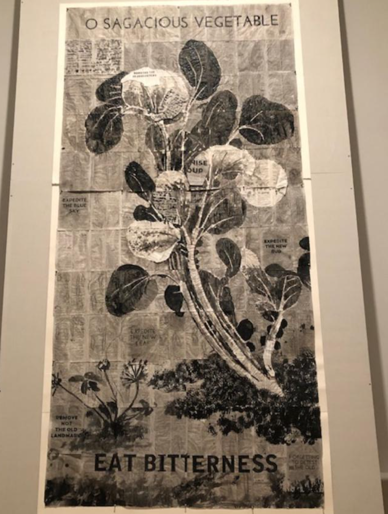
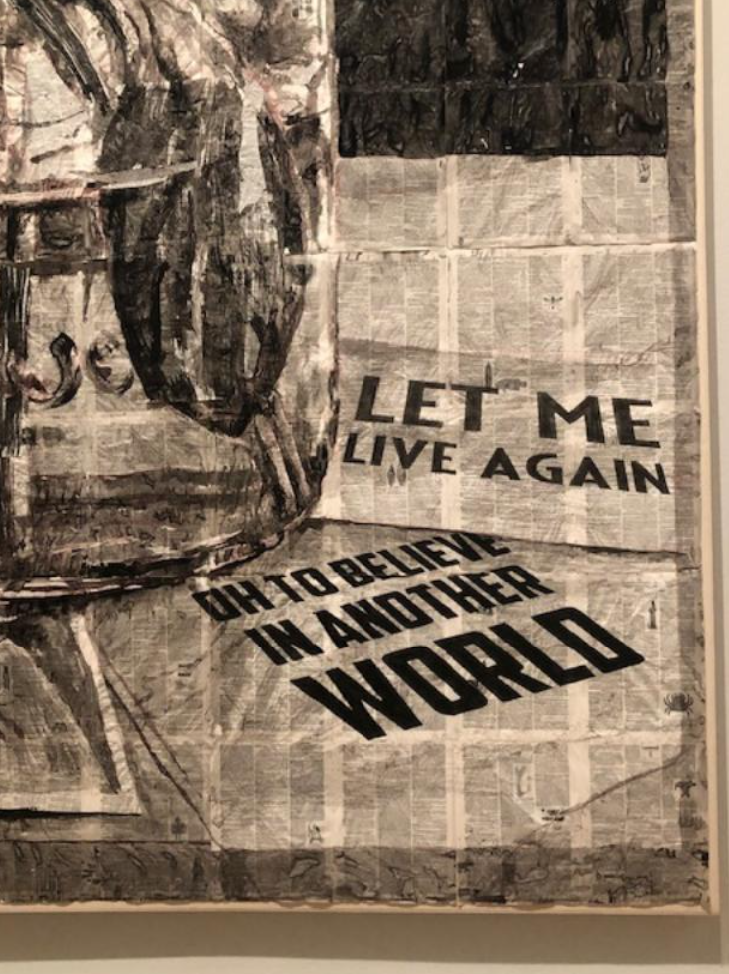
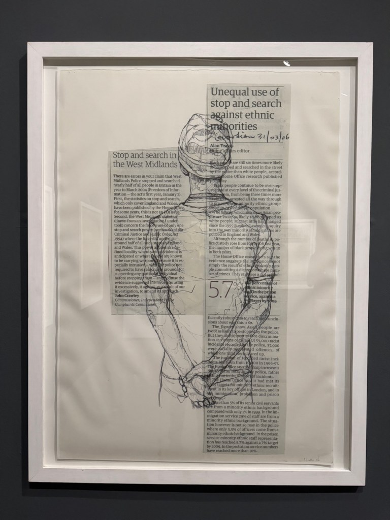
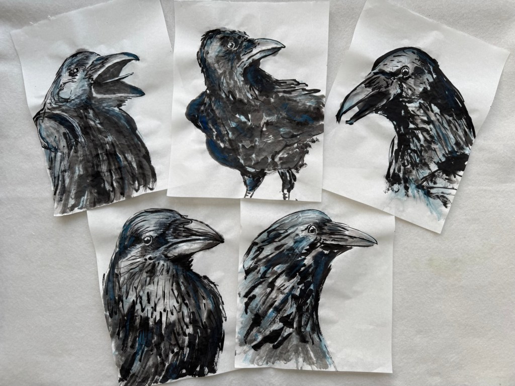
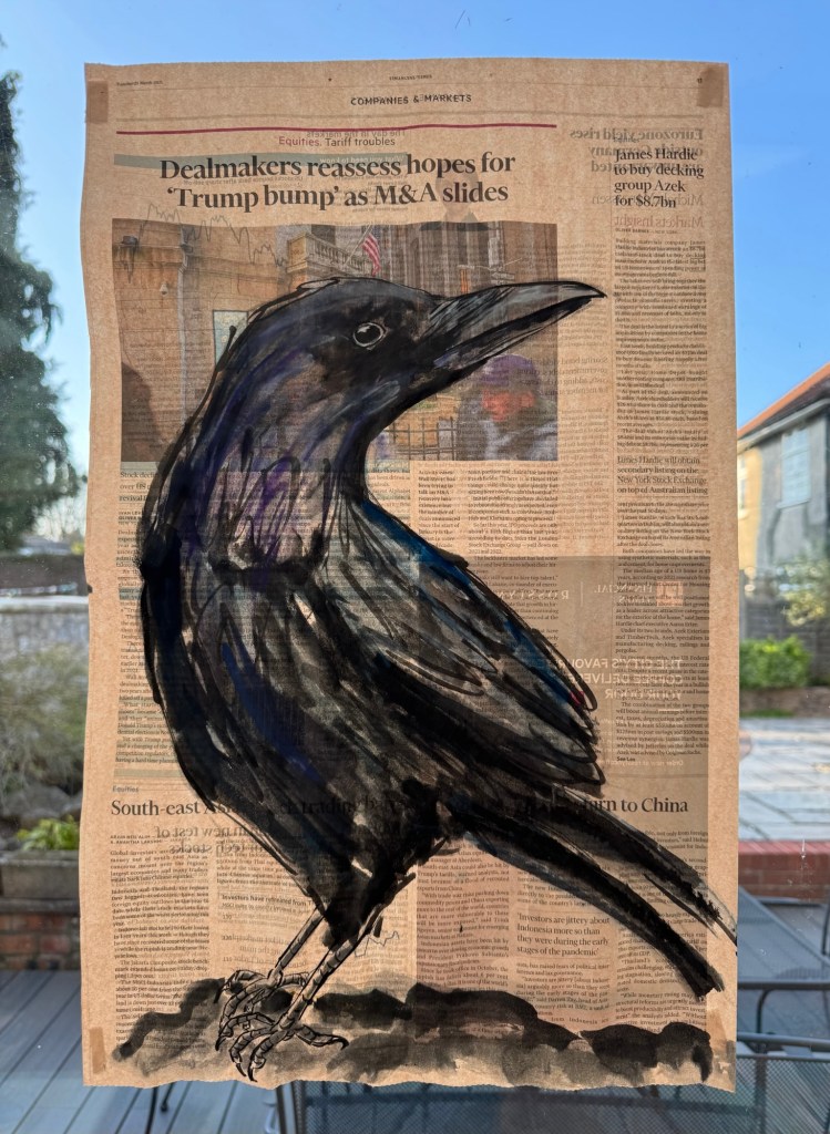
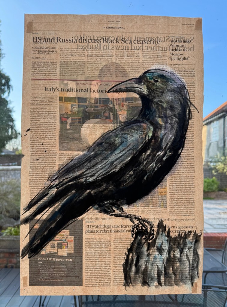
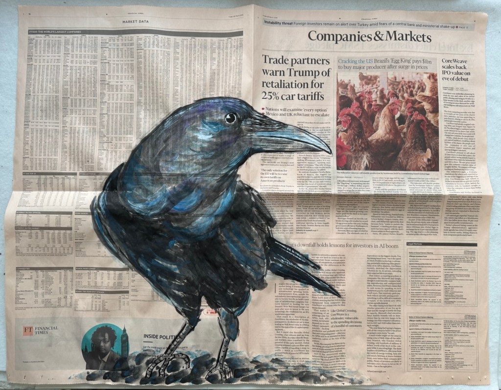
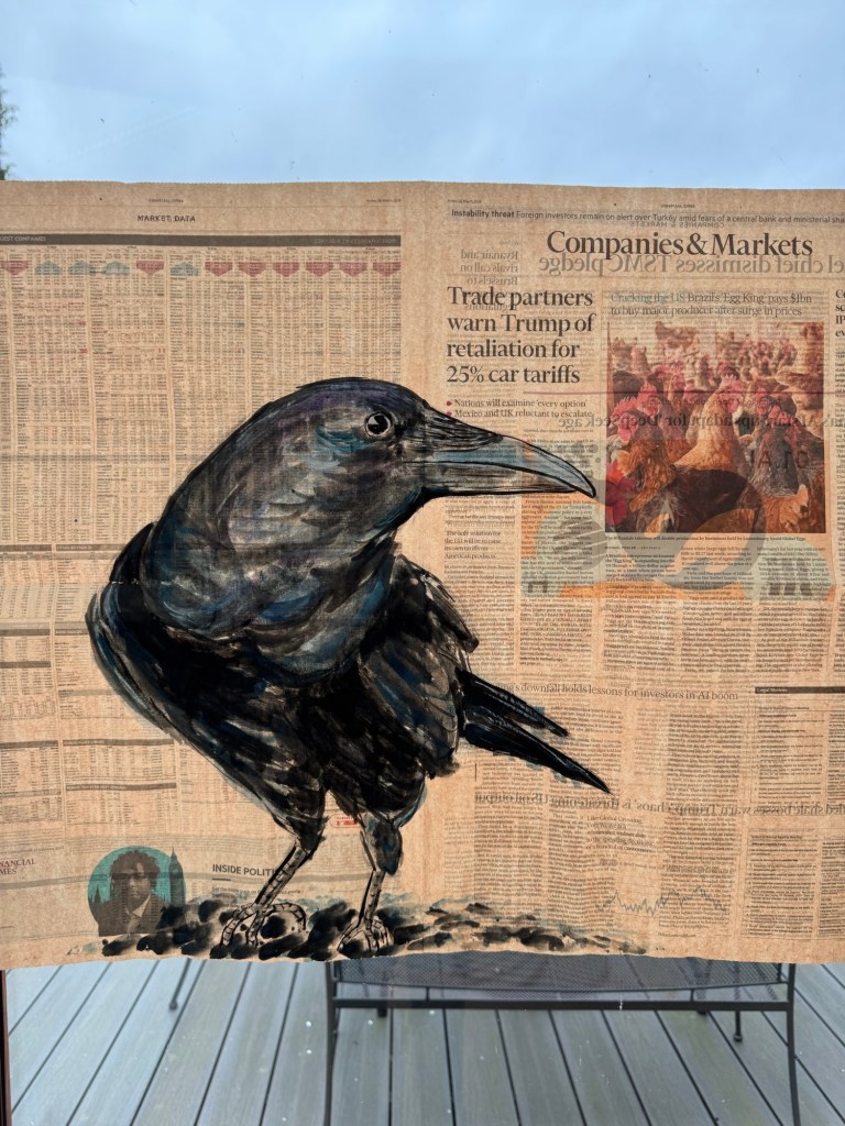
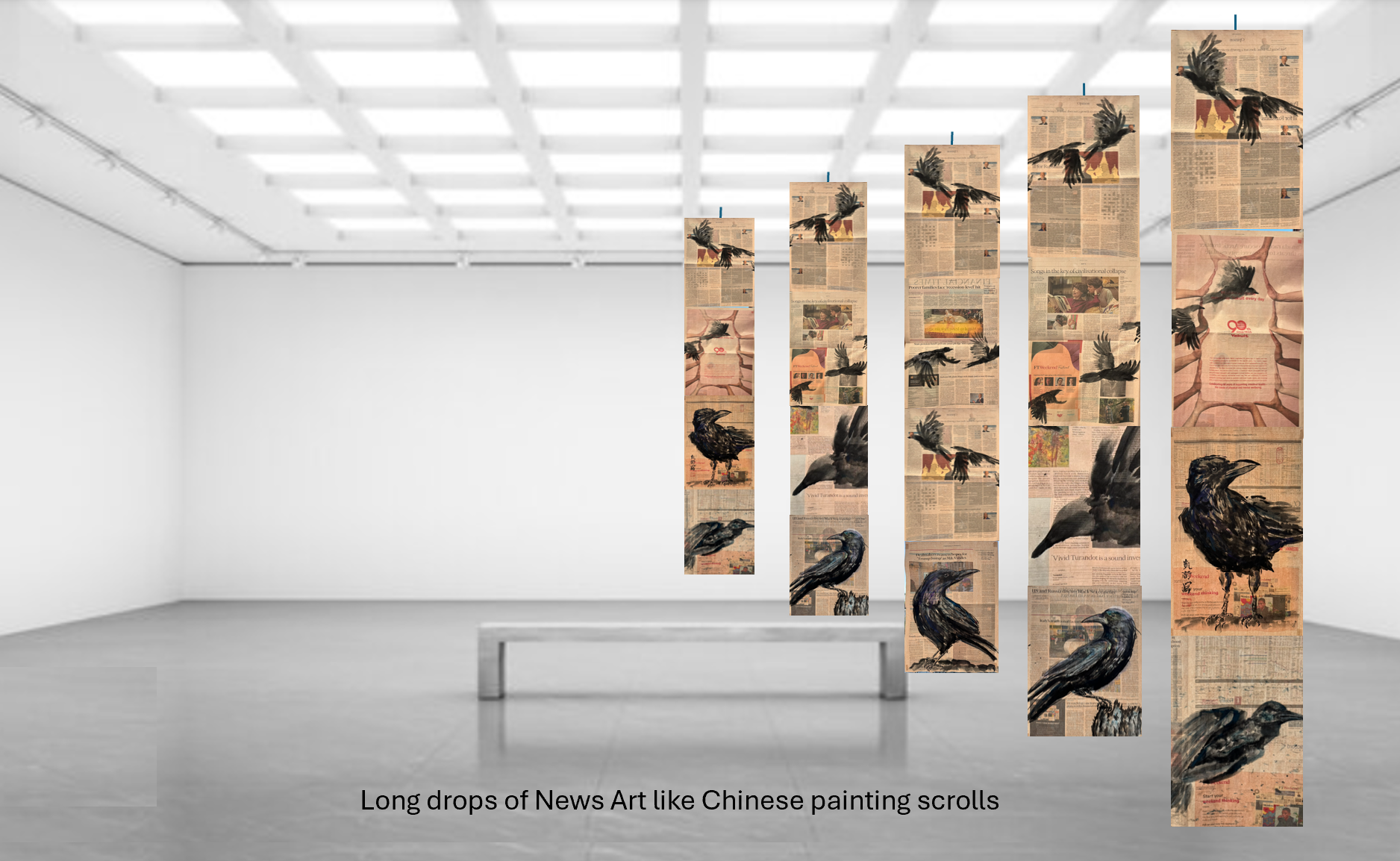
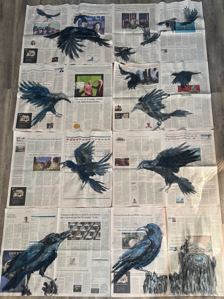
Final selection of eight paintings to form a composition for the Degree Show:
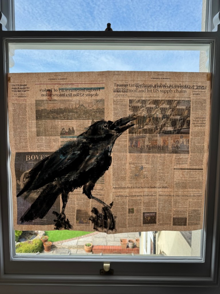
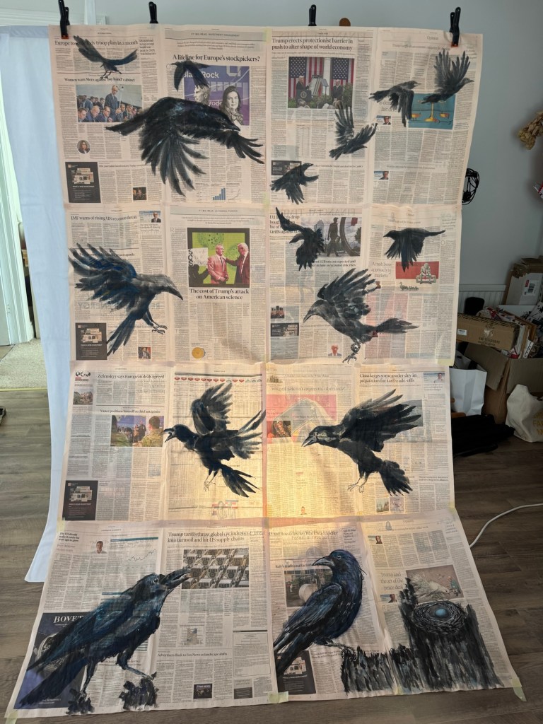
Mock up in front of flood light to test concept:
–
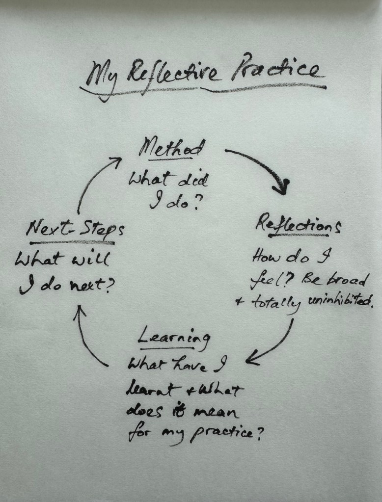
REFLECTIONS
I started to re-evaluate my art practice just before the Low Res in March and I started to make ‘News’ art at the end of March which is less than two months ago. I cannot believe how much has happened and that I am planning to show this new body of work at the Degree Show. During my recent tutorial, my tutor said that everything I have been doing as well as my commitment to interrogation have been leading to this and it does feel that way to me. I am feeling a momentum that I had not felt before and I am very excited (and somewhat nervous but in a good way) about showing this work at the Show. I do not know if it would work out or if it would present itself as I imagined. But I take confidence from what David Bowie said in this video where he was giving advice to artists:
https://youtu.be/JRtZc_Nmo5w?si=PYU871rvIuJu7wjo
My main takeaway from Bowie’s video was when he said, ‘…Always remember the reason you initially started working, you felt there was something inside yourself that if you could manifest it in some way then you would understand more about yourself and how you co-exist with the rest of society… If you feel safe then you are not working in the right area. Always go a little out of your depth, when you feel your feet are not quite touching the bottom then you are just about in the right place to do something exciting.’
I sincerely hope that Bowie is right and I look forward to finding out!
Another point that I have been reflecting on is that this new body of work is aesthetically and topically very different to my last body of work, The Cheongsam Series, where I was making oil paintings on dress-shaped canvases to explore my transcultural journey.
Much of my work in the last two years have been about my transcultural identity, but I knew that at some point I would want to go beyond just talking about my transcultural journey onto issues about society – issues that are still related to me, my lived experience but about other aspects of my identity. I mentioned this in my Study Statement from Unit 1 as my intention, but as I was making my transcultural work I have at times felt bounded to that topic and I was unsure of how to progress or transition onto the next body of work without seeming incoherent. Then when the ‘calling’ came to make work about the rapid change in world order and how people close to me were being affected, my urge to move onto the next body of work felt like a natural progression. Of course, there was much time spent on reflecting, agonising, experimenting, observing and reflective-writing that led me to making ‘News’ art. I am very pleased that I have gone through the transition process from one body of work to the next while I was still on the MA programme. This is because I felt safe and secure in trying something completely different in a supportive environment and I made it happen. I have learnt that I could do it and it wasn’t as scary as I thought it might be. Guided by my reflective process and taking it step by step meant that I felt in control of the transition – not necessary in control of the making but in control of the change process which gave me a solid platform to take risks in the making. This learning experience has been very important for me as I now feel confident to do that again independently after the course. I feel I can move onto the next body of work when the next ‘calling’ comes. I know I can rely on my instincts guided by my reflective process to make it happen. I expect I will return to my transculturality work at some point because there is still much to explore and I certainly have not exhausted the subject yet – far from it.
LEARNING
I have learnt that I now feel able to transition from one body of work to the next and take risks along the way. I will follow my instincts and use my reflective process to guide me. This has been an important realisation as I go forward to develop my practice.
As for the Degree Show, there has been a lot to think about in planning for the show and I have really enjoyed the challenge. Especially looking at sourcing the right materials for the installation – I learnt a lot in that process, such as to consider the materials’ behaviour, the aesthetics and planning for a site that I am not familiar with including all the contingencies to consider. It’s all good experience for any future exhibitions. Creating the paintings is only half the work, presenting it properly and all the site considerations require just as much work which is something to bear in mind in the future. Planning and allowing plenty of time is key!
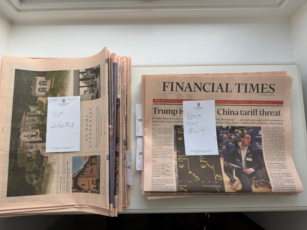
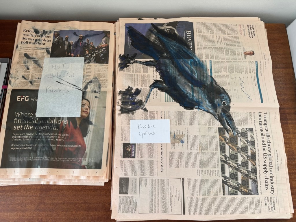
I have also learnt that I needed to introduce a new process of organising my materials – namely the newspapers! Especially considering news has a life span. My ‘News’ artwork needs to be about the here and now and can’t be left on the shelf for too long or the news story would have expired. So I needed to create a system to sort the newspapers so they don’t end up piling up in my studio. I decided to organise my newspapers as follows.
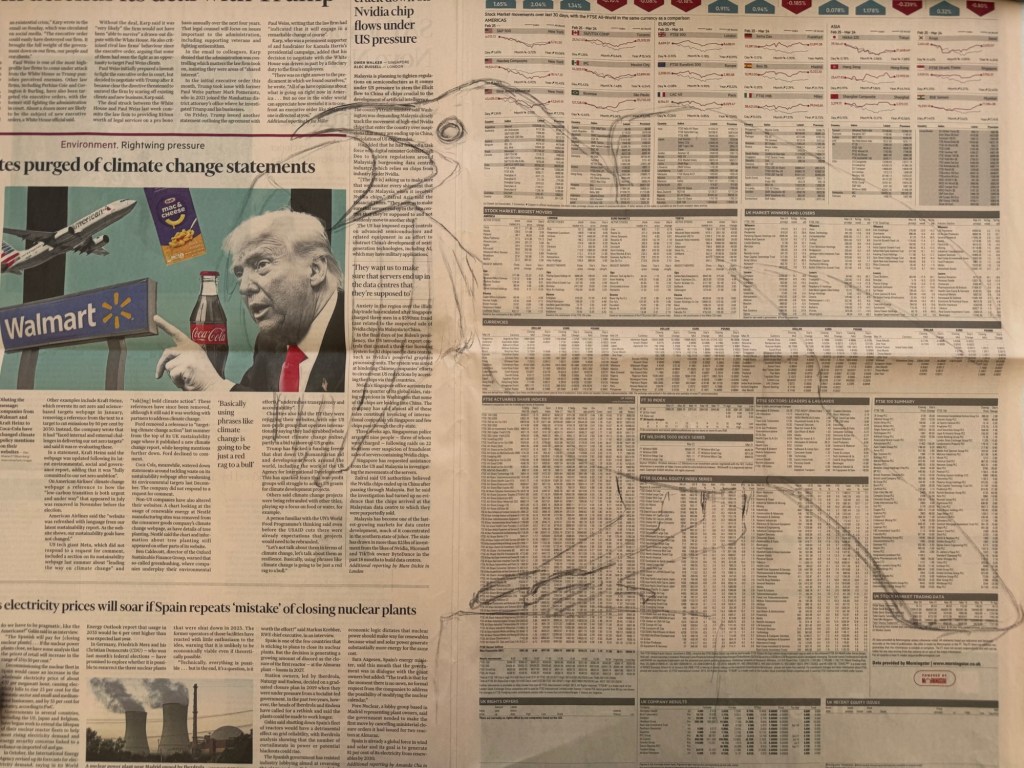
I found it helpful to have a specific topic for selecting the newspapers to paint on. In this case, it’s about the sudden change in world order due to the US Government’s drastic roll out of damaging policies.
So when I get a copy of the newspaper, I sort the pages into the following categories:
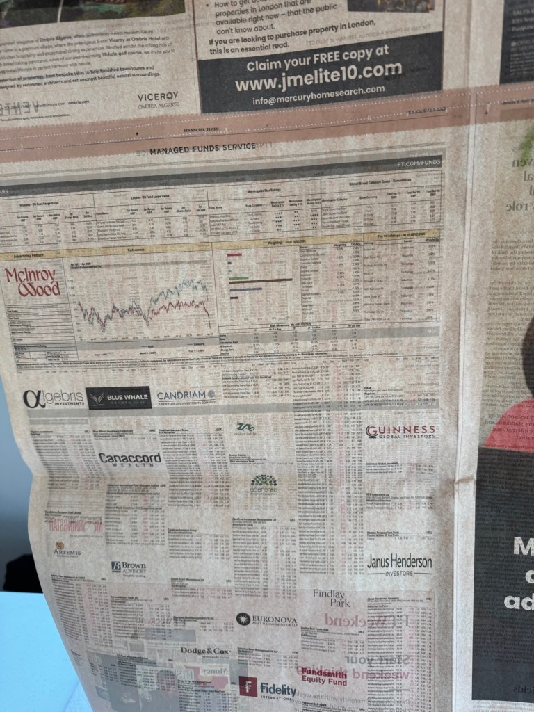
– Selected pages for painting – with the appropriate headline, perhaps an interesting image and not too much advertising especially not big dark blocks.
– Spares: top priority / second priority / good for practicing
– Not selected
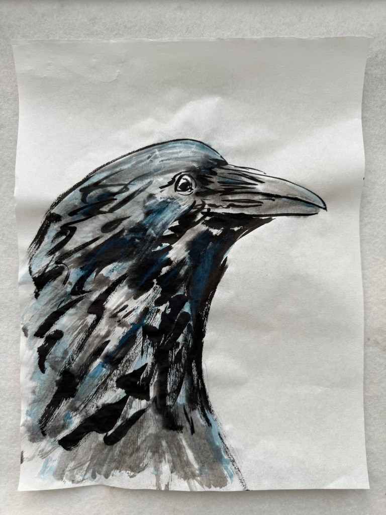
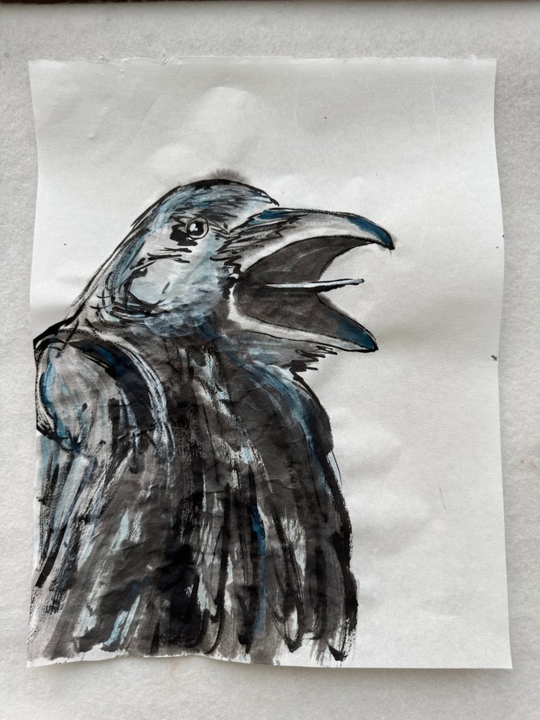
Out of all the ‘News’ paintings that I have created, they were sorted into ‘possibles’ for the show and ‘not selected’. Then I continued to make more paintings until I had enough ‘good’ ones that I was happy with for the Show.
NEXT STEPS
Make it happen for the Show!
Always remember Bowie’s advice!
Maintain my confidence, follow my instincts and reflective process to develop future bodies of work.