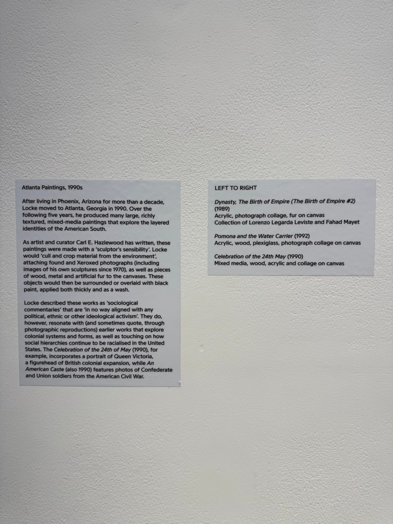
Today I visited Donald Locke’s exhibition Resistant Forms’ at Spike Island Bristol. Below are some of the photos I took to remind me of the work that I found particular resonance with.
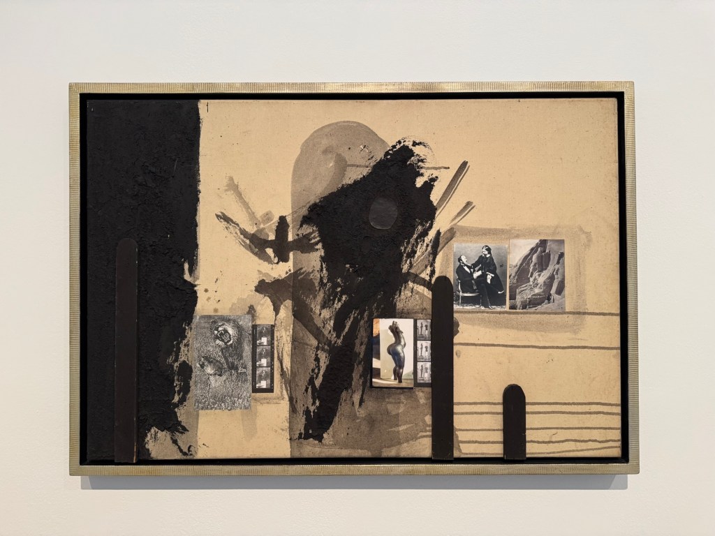
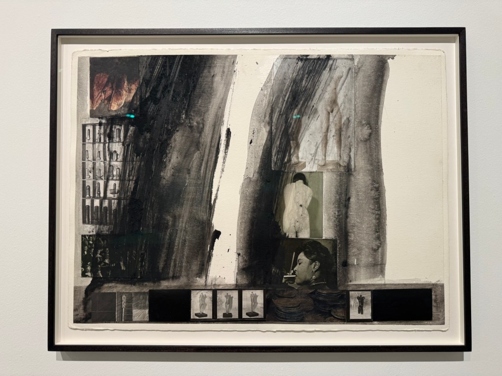
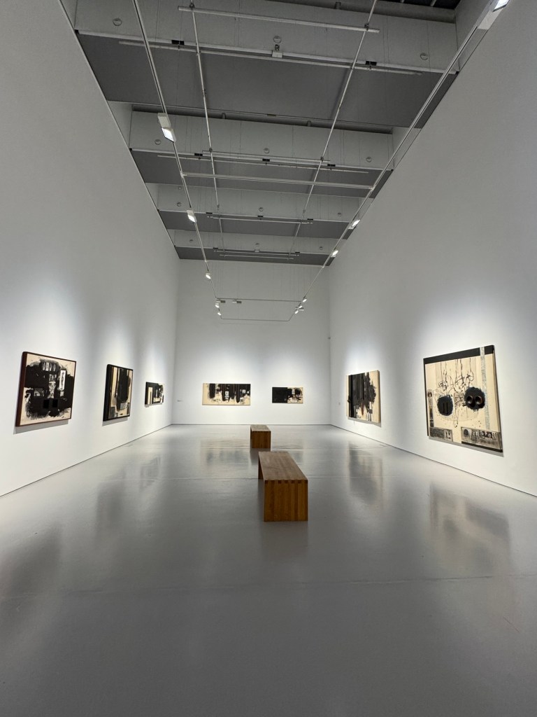
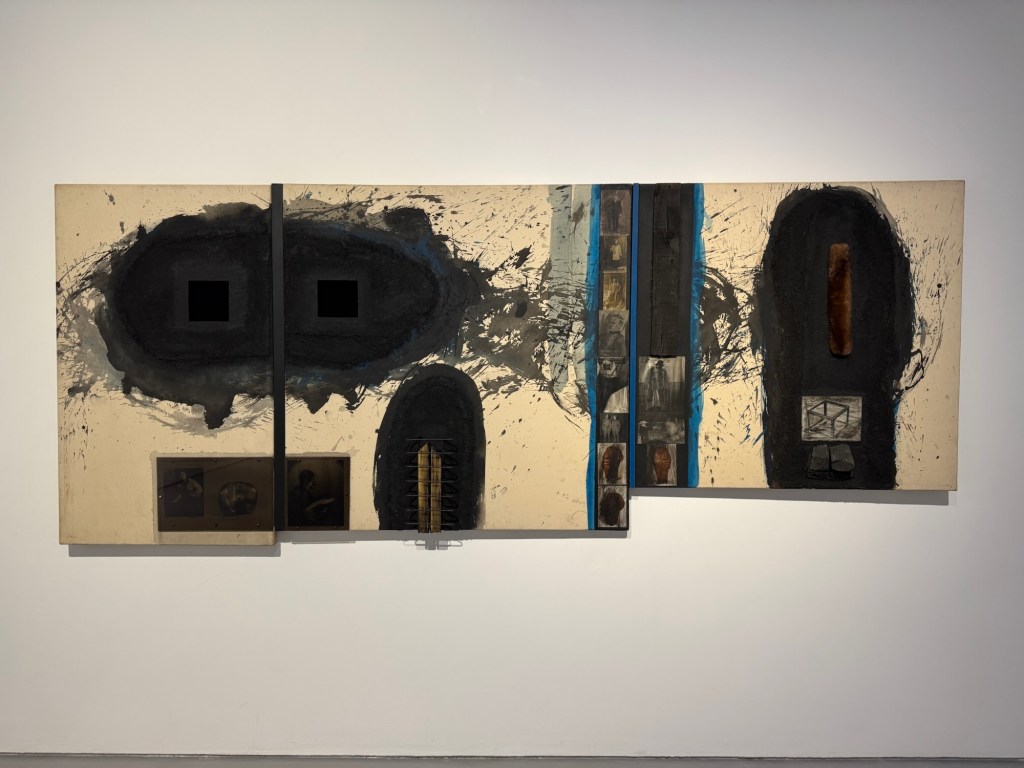
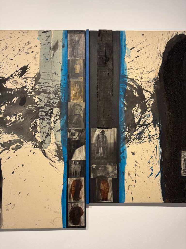
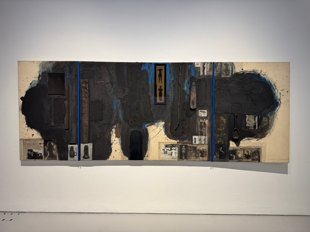
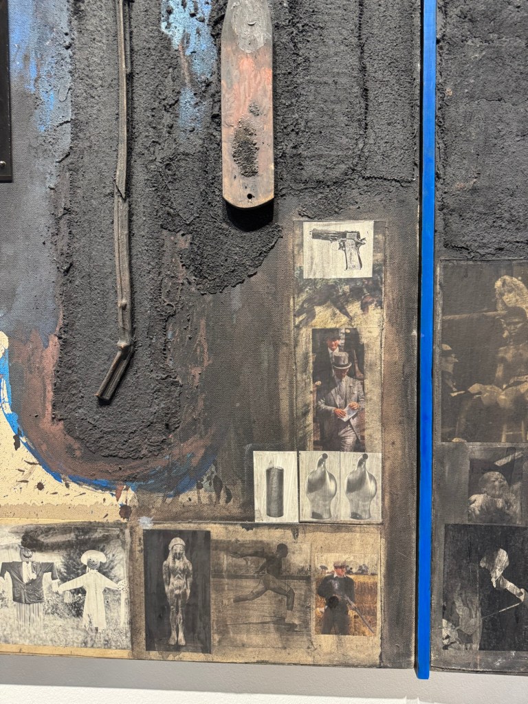
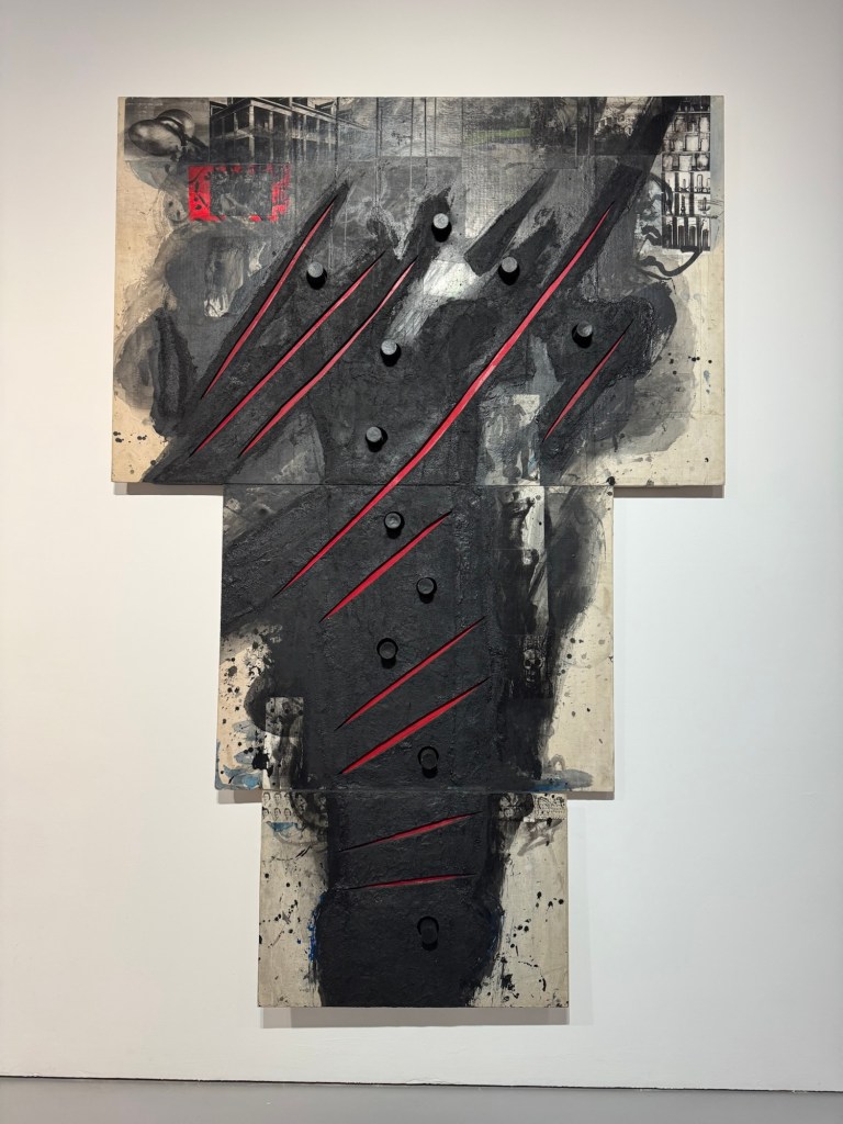
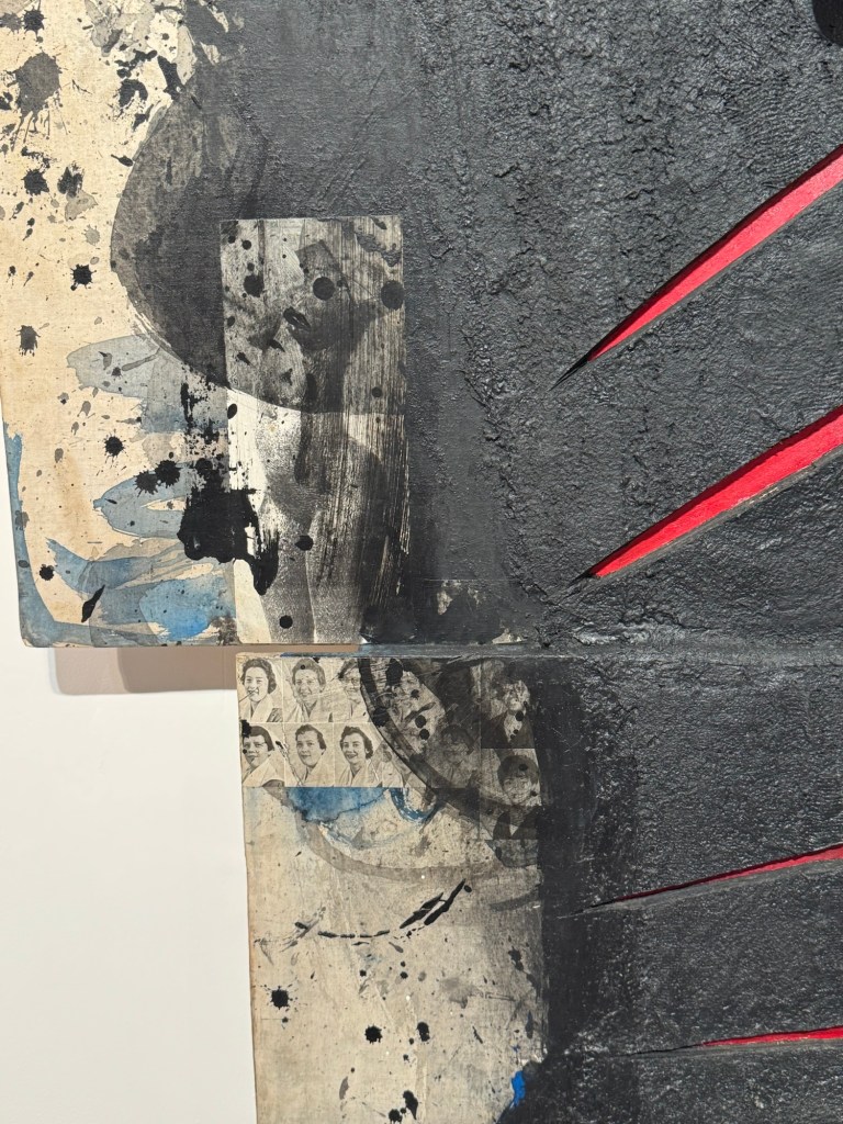
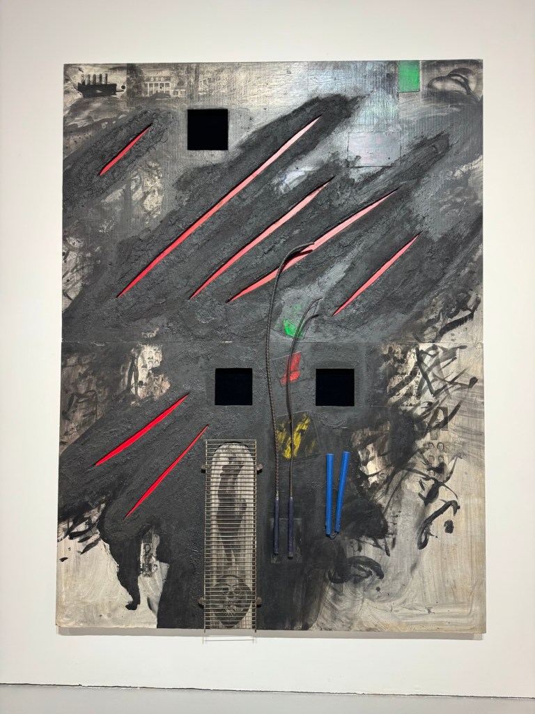
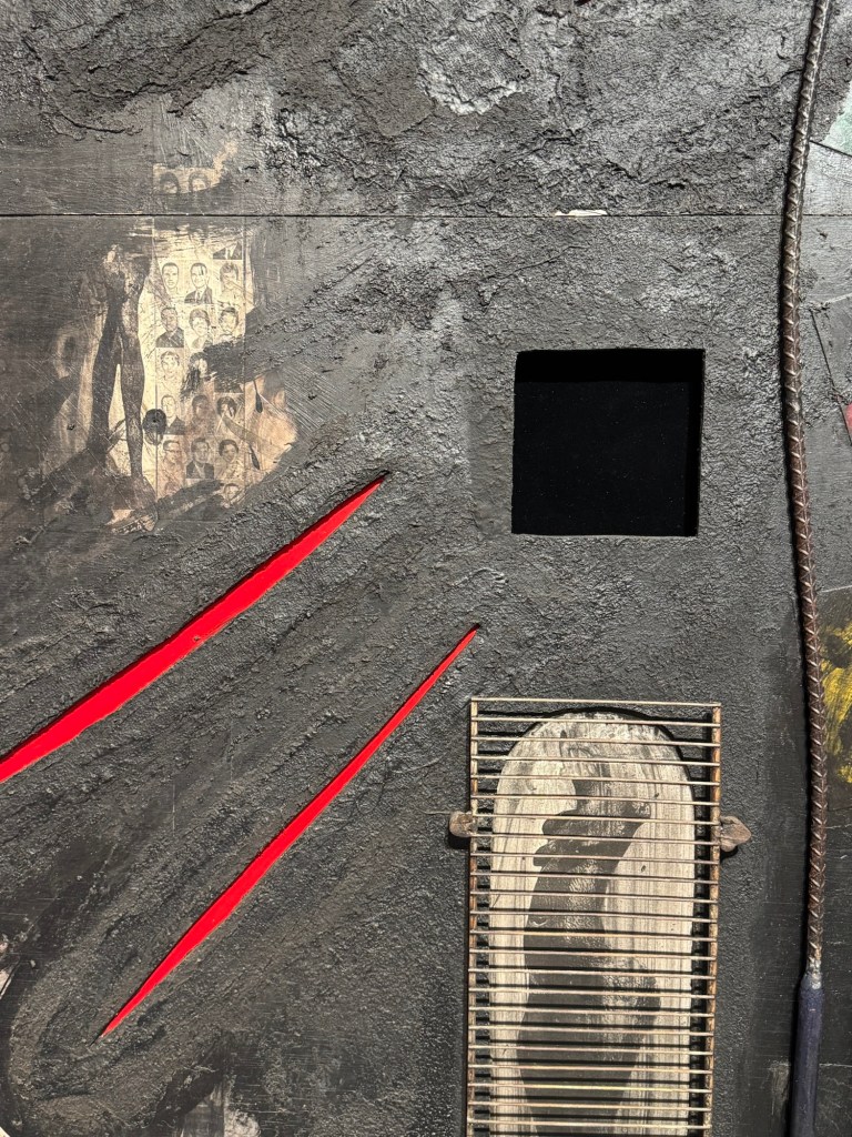
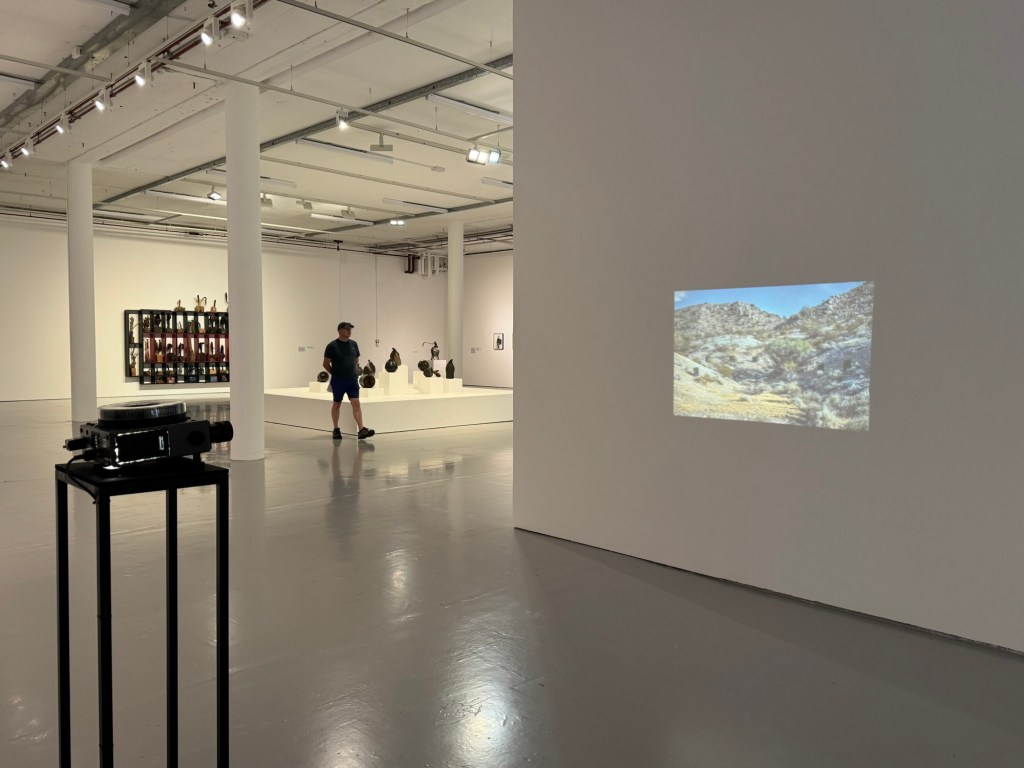
Use of collage, image looks like a crowUse of acrylic in a way that resembles inkAmbiguous use of photosLarge scale paintings with presence and energyClose up of the above showing photos collageUse of mixed media including metal grill mounted onto painting Placement of projector and understated size of projected image
REFLECTIONS
I want to capture ideas that came to me during the visit that made me think about how I could learn from Locke and build on my practice.
Use of mix media techniques:
On some of his paintings, the use of acrylic paint with ‘dry brushing’ to create the flying white effect like in Chinese painting energised the painting. It gave me the idea of trying my crow paintings in other medium, such as dilute oil, to see how that works. The use of different materials to create collage was also interesting. I could use ripped up newspapers to create collage effect on a canvas then paint on top. Locke also used items like metal grills to good effect. I can consider what objects, metal or otherwise, that could be incorporated to add meaning and texture to the work.
Use of photos:
Some old photos were used in the collage. I have many old family photos that I have been considering how to incorporate into my work. The way Locke used the photos were more random – a few here and there. Whereas I have tried too hard in the past; I could just use small images in a few places – I don’t need to tell the whole story in one painting. I must remember this. Also, he had just pasted / stuck the photos (copies of) onto the canvas. I always felt that I should photo-transfer the images onto the canvas – this is not necessary. Locke also used images or photos of his own work (sculptures) in his paintings – those images (e.g. female nude) appeared on multiple paintings and acted as a link to join the works together.
Use of projector understatedly
The projector was projecting at waist height with a not too large image. It was understated and effective. I often feel that projection has to be big and has to fill a wall. It clearly doesn’t have to at all. The projection was also placed in a way that you have to walk through the beam to get past. It was an interesting positioning which makes the viewer interact with it.
LEARNING
There are no major learning from the visit and mainly just ideas that came to me as I studied Locke’s work. The main take away for me was to think about experimenting beyond just painting on the whole piece of newspaper. The news headlines remain important to the body of work (News), but through the use of collages, the newspapers could be incorporated to maintain the theme while opening up the materials that I can use. Locke’s extensive use of black was very effective which resonated with me.
NEXT STEPS
Start to think about how I can start to make more complex and ambitious work with multi media materials yet remaining connected to the topic of News.
‘News’ in Chinese ink painted with chicken feather brush
As I am making more and more paintings on The FT, I want to consider more carefully how to display the work and also making the newspaper art archival.
METHOD
1- Online research
I have been researching online for ideas. There have been all kinds of suggestions. I find this post useful as there are different suggestions to try.
However, none of the suggested solutions are truly archival due to the nature of the newspaper material. One of the comments said that newspapers were a museum curator’s nightmare. I think that sums it up. The only suggestion that is truly archival is to make digital images and gyclee prints. That is something that I will consider.
2- Ask an expert
Another investigation route that I pursued was to ask a paper conservation specialist at UAL. His reply was as follows:
“Newsprint is made using mechanical wood pulp for the paper fibres. These are naturally rich in a chemical called lignin.
Lignin is not particularly stable. It breaks down with time with 2 effects:
Some breakdown products are strongly coloured, making the newsprint go increasingly yellow and eventually brown.
Some breakdown products are acidic, leading to the paper becoming increasingly fragile over time.
This breakdown will still happen in dark conditions, but the energy from light makes the breakdown progress much more quickly. Ultraviolet has more energy than visible light, so can do damage more quickly.
It’s not possible to make newsprint archival.
UV-proof glazing would be beneficial if the paper is to be displayed in a window where it’s subject to sunlight.
If the artwork is illuminated using artificial light, UV exposure will be less. Fluorescent lights and halogen spot lights emit some UV. LED lights typically emit no UV.
Most acrylics will filter out some UV due to being made with UV-stabilisers to help make the acrylic last longer.
Last time I checked (which was ages ago…) framers quality UV-filtering acrylics and glasses were similar in price.
For storage, I’d recommend keeping the papers between unbuffered, acid-free boards. Many archival boards are calcium carbonate buffered, which helps neutralise the acids created as lignin breaks down, but alkaline conditions can also increase the yellowing of lignin (through a different mechanism than the breakdown route).
Sandwiching newsprint between glass/plastic offers some benefits in isolating the paper from various environmental effects, but might also lead to a surrounding microclimate rich in acidic breakdown products.”
– End of expert’s reply –
This was a very helpful reply and the sentence that I highlighted in bold again confirms that there is no way of making newspaper archival which is a pity.
REFLECTIONS
After doing this research, I have to accept that it is not possible to make newspaper archival. I feel rather sad about that and the engineer in me thinks ‘there must be a way, it just has not been found yet!’ However, I need to employ a solution now to manage or show the work that I have been creating while continuing to find a long term solution which may or may not be possible. If museums around the world have not found a solution then maybe I won’t be able to either – not in the short to medium term anyway.
Making digital images and then gyclee prints is a very good and viable solution. I will definitely pursue that and learn how to photograph my News paintings properly. As a start, I will need a light box frame that I can wall mount.
I have also considered sandwiching the News paintings between UV proof acrylic panels and mounting it away from the wall with spacers to let light in from behind – this solution also requires further experimentation.
The above are ways to present the paintings for photographing. Once I have found a way of photographing the work then I can consider making limited edition gyclee prints from them.
Other ideas that I have had are photographing the news page, then printing it on silk or other thin fabric, then painting or embroidering on the image.
LEARNING
The main learning was that there was no known way of making newspaper archival. I have to accept that and consider how to find ways to capture the image and reproduce in archival materials. Also, if I were to sell the original work on newspaper then what advice should accompany the sale? How should it be framed, mounted and what life time is to be expected? Perhaps letting the News painting degrade over time is one of its unique feature? As long as it can stay safely in a frame then what harm is there? It will go yellow or brown over time – perhaps that adds value like a vintage bottle of wine or whisky!
The key is to have clarity of how to manage the life of the paintings and offer archival alternatives to the originals. Not that I am planning to sell my work at the moment, but if someone were to enquire then I need to have prepared a professional response.
NEXT STEPS
Immediately:
Investigate ways to mount the prints for displaying and photographing. E.g. light box frames or ‘acrylic sandwich’ mounted on spacers.
Investigate ways to take good quality digital photographs of the mounted work.
Investigate ways to make archival gyclee prints of the photographs – what method of printing and what paper would be best? Best options for framing?
Consider what advice to give with any original art work – recommended ways to mount and likely life before degrading occurs. Think of ways to articulate the value of a degrading or degraded piece of News art. i.e. make the non-archival nature of the art a feature of the work.
Longer term:
Investigate options to print on fabric then paint on the fabric or embroider to create original art. Or print painted News images on silk as an alternative to paper – need to think why use silk or fabric though.
After receiving my Unit 3 assessment feedback, I want to reflect on and respond to one of the points raised as I feel it is essential for progressing my current body of work ‘News’.
REFLECTIONS
Below is an extract from my assessment feedback that posed a question about my use of the crow as a metaphor:
‘…You talk about the crows being a metaphor for the awful events that are happening in today’s world but does a metaphor need to be more than that? In a novel or film it might be the timing of a crows arrival and departure in relation to events happening that turns it into a metaphor. Or in a poem it might be a detailed description of a crows behaviour? How might this impact on the way you continue painting crows? In what way, if at all, does the pose of each crow relate to the headlines on the actual page, either the front of the page or the reverse side that might be revealed by a light source behind?‘
The timing of this question was very appropriate because I have been thinking about this a lot. I chose the crow as a metaphor for my grief for the loss of a world order that I understood. The crow was inspired by the book ‘Grief is the thing with feathers’ by Max Porter. When I started this series of work, I just wanted to paint something as I felt a sense of urgency and the book came to mind with the crow as a metaphor for grief. Hence I started there. The black feathers worked well with my chosen medium of Chinese ink and the characterful crows gave me lots of ideas to work with. I started without thinking too much about the pose or the composition of the pieces, I just wanted to paint and express how I felt. Then I started to locate the bird more purposefully next to headlines or images and experimented with compositions. Now that I have done many such paintings, I started to get an idea of what I wanted to achieve with this body of work and with the crow.
I want to use the crows to bring attention to certain news headlines. I noticed that when people look at my News paintings, they usually start with the crow. They would study it for a while, then their eyes would wander around the news headlines or images nearby and then focus on the articles. It was important for me to choose a neutral or as unbiased as possible a newspaper because I don’t want to tell or preach to the viewer what they should think about the news piece; I want the viewers to decide for themselves and to show a factual headline or news article to trigger their thinking is my intention.
Reflecting on the questions posed in my feedback, I believe my use of the crow has several roles. Like in the novel I referred to, the crow as a metaphor revealed itself to me when I started to despair about situations in the world – that was when the crow ‘entered stage’ as in a theatre. In the last few weeks, there were times when I felt perhaps it was time to move on from the crow as perhaps world events were settling down. That feeling lasted at most a day when something else happened that enrages me again and I had to bring the crow back to centre-stage. There seems to be an endless supply of headlines at the moment which is energising for my art but absolutely draining for me as a human.
As for the point about the pose of the crow, it has been an interesting development and revelation for me. I remember when I first started studying art, a tutor at the time said that how we felt would inevitably come through to our work; our work was influenced by our subconscious. I didn’t quite believe that at the time but was happy to keep an open mind. Of course, I have since experienced that many times. There have been a few News paintings where some unconscious expressions came through that I only noticed afterwards. Below are two examples.
Example 1 –
In the painting below, I wanted to position the crow to look like it was going for the bottle of ‘tariff medicine’. But since I do not do a mark up drawing on the page (not anymore) and I just leave the painting to chance, I do not have control of exactly what comes out especially as I’m painting with my non-dominant hand. In this case, the crow ended up overshooting the medicine bottle and it ended with an ‘uh-oh’ or ‘oh no…’ expression which was not my intention but highly appropriate.
–
Example 2 –
In this case, the chosen headline and image on the newspaper was about the US VP. I intended to bring in the crow from the right hand side (enter stage right) pointing towards the photo image. Again, I didn’t have too much control over the exact depiction but the crow came out screaming at the photo and its feathers somewhat ruffled. It seems to reflect what goes on in my consciousness.
–
As for the back lighting of the images and what they reveal – I tried at one point to place the bird purposely to align with images on the reverse side, but they rarely work out satisfactorily. So now I choose a newspaper page where there are headlines that I want to respond to on the front and although I do look at the reverse side to make sure there is something interesting on the back, I tend to locate the bird according to the front page and then leave the reverse side to chance. This means I don’t pose the bird according to the reverse image purposely and just wait to see what happens when the painting is finished. By not being overly deliberate, it has provided some interesting compositions. It also contributes to the notion of uncertainty that continues to form a large part of this body of work.
Final reflections regarding using the crow as a metaphor… as I was writing this blog, I have started to use theatre stage language to describe how I use the crow and I feel that is appropriate. The crow has become my actor on stage to carry a message, it has been on stage throughout this series of work. It comes in and out of the spot light depending on what it wants to draw attention to. It accompanies me as I navigate the ‘new world order’ and represents me when I want to say something. One day, when the world is right again (I remain hopeful) then perhaps Crow would exit stage left. I have started exploring bringing in other creatures to broaden the repertoire. I have enjoyed using the Chinese ink as a medium and I have thought about using a rat but that seems to be very controversial. I have also thought about spiders because I was inspired by Louise Bourgeois’ spiders and how she used them to signify strength. I certainly feel that I need as much strength as I can summon up everyday just to read the horrendous news at the moment. This idea is only at an early stage. I will keep thinking.
LEARNING
In writing my reflections and response to the Unit 3 feedback, it has helped me to crystallise my reasons for using the crow in my work – why I use it and how I use it. I feel there is still much to achieve with my crow and there is still some way to go on this journey. So I will continue with it but will be more mindful of how and why I’m using the crow as a metaphor as I progress. I sense that the metaphor has already shifted somewhat and has gone beyond just grief. It is becoming my voice which is also an appropriate metaphor because the crow is intelligent (can read my mind) and vocal (speak for me). Also, in many cultures and mythologies, crows and ravens are depicted as messengers, not necessarily from another world, but rather from between different realms of existence. So using the crow as my messenger has become part of the metaphor.
I will continue to explore other creatures that has a metaphorical meaning for me and that works well with my chosen media of Chinese ink on newspaper. Spiders are one possibility that I am considering.
NEXT STEPS
Continue to use the crow in this series of work, News.
Consider more deeply about the metaphors that I use – how they apply as a metaphor and how they evolve along the journey.
Explore other creatures or metaphors to bring into the work. Be sensitive to what they mean and think broadly to avoid unintentionally offending people.
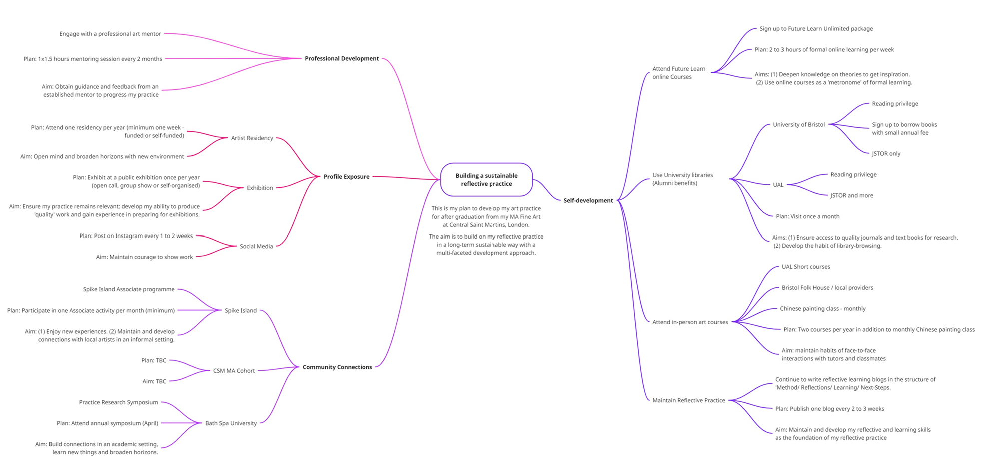
I have been planning how to continue to develop my art practice after I finish my MA. The key for me is to ensure I work in a way that maintains my interests with variety and balance to keep up the momentum so that it is sustainable in the long term.
As a starting point, I have created a MindMap where I have captured my aims as well as resources that are available to me. I have tried to create a balanced plan covering the following areas with a structure that I hope will help to establish a rhyme after my MA:
– Personal / Self-development: Attend in person classes, e.g. continuing my monthly Chinese painting lessons, as well as online learning. I have identified around one year’s content (with 3 to 4 hours per week starting with cultural theories) on Future Learn that I have just subscribed to and I plan to attend those online modules every Thursday afternoon in place of the MA weekly classes to keep up a learning rhythm.
– Reflective practice: A key part of my self-development has been my reflective practice. The structure that I have built into my blogs has been invaluable in helping me to develop my practice. It offers a safety framework that I can return to especially when I feel a bit lost or uncertain. Writing the reflective blogs has put me back on track time and again when I have been stuck. So I plan to continue with the blogs because they help me immensely and I have set myself a goal in the frequency of blogging.
– Professional development: I plan to engage with an art mentor having a session once every two months. I have been recommended a mentor used by several Spike Island Associates and I have connected with him. It’s my way of holding myself accountable and forms part of the rhythm.
– Profile exposure: I need goals to work towards in order to maintain my momentum and I have set myself targets such as attending one artist-residency per year – this could be self-funded if I do not get accepted onto a competitive one as I don’t want to give myself an excuse to not do it. I feel the act of attending a residency, making art away from my environment, would open my mind and expand my horizons. In addition, I want to show my work as a way to keep my thinking and my work ‘current’. I will look out for Open Calls that are aligned with my work and if that doesn’t work out then I would create my own ‘show’. That could be in whatever capacity, even just displaying my work in a park in my neighbourhood – the purpose is to have an event of some kind for me to make work for and aim towards.
– Community connections: Although I enjoy my own company and can happily make work in my studio without seeing anyone. I appreciate that being connected with other artists is important for my development and well being. Hearing others talk about their work always gives me inspiration. Talking about my work to others is also a healthy thing to do. I am fortunate to live in Bristol where there are many artist communities that I have always found to be friendly and supportive. So I will definitely continue to connect with them regularly (e.g. attend events with Spike Island Associates).
Below is my first draft MindMap plan showing my plans and aims for each element. Items within the map are there to feed into my art-making; to give me inspiration, to deepen my knowledge and to help me think.
The plan is work-in-progress and I will continue to build on it over time. I may not even fully follow it, but having a plan in place is important for me to have a starting point, so that I am not faced with a blank calendar and feeling lost the day after graduation!
I will follow the plan for as long as I enjoy it; if I stop enjoying it then I will revise it. I hope as I travel on this journey, other things will come up and the plan will evolve as my needs change. I will be very sad when my MA course ends but I am very excited to continue the journey with all the new skills, knowledge and friends that I have gained on the programme.
–
REFLECTIONS
A few things that were said to me recently have got me thinking about my MA…
A very good artist friend said that she noticed I have been talking about ‘my practice’ and about ‘being an artist’. I remember when I first joined the MA course, I would only describe myself as ‘an art student’. When asked if I were an artist, I would reply, ‘not really, I am just an art student’. Then sometime during the last two years and I don’t remember exactly when, I have started to talk about being an artist. I had not noticed it until my friend pointed it out to me and I am pleased to say that I feel comfortable about referring to myself as an artist now when I was certainly very hesitant two years ago. I believe it’s the MA course that has given me the confidence and encouragement to do so.
Another comment came from a photography tutor. I have attended a few one-off photography workshops locally and have got to know the tutor well. Earlier this year, she asked what I was planning to do after my MA and at the time I said I wasn’t sure – it was before I created the above MindMap and I was considering doing another taught MA. She said, ‘I am sure you are going to do something because you can’t waste an MA from Central Saint Martins.’ That really made me reflect on what an opportunity and a privilege it has been to do this course (in fact, to do further education of any kind). I do not have ambition to be a famous artist or to have gallery representation, that was not what I came here for. I came here to develop myself and to learn. I have thoroughly enjoyed the course and I am loving making art. So I am just going to keep on making and be true to myself in my art – as David Bowie said, ‘don’t make art to please other people’. I hope that is enough to not ‘waste’ this excellent learning opportunity that I have had the privilege to enjoy.
LEARNING
In addition to making art, I will continue to explore how I can use ‘my voice as an artist’ and I hope the MindMap plan will help me with this. I have always wanted to broaden my practice to examine societal issues so I plan to build on my ‘News’ art – my ambition is to make large scale industrial-style ‘News’ art installations. I am excited to see where all these will take me.
NEXT STEPS
– Follow the MindMap plan after graduation – revise it if needed. But always have a plan to maintain the rhythm.
– Explore how I can use ‘my voice as an artist’.
– Continue to make ‘News’ art – scale up.
– Keep on making art, be true to myself and keep on enjoying it!
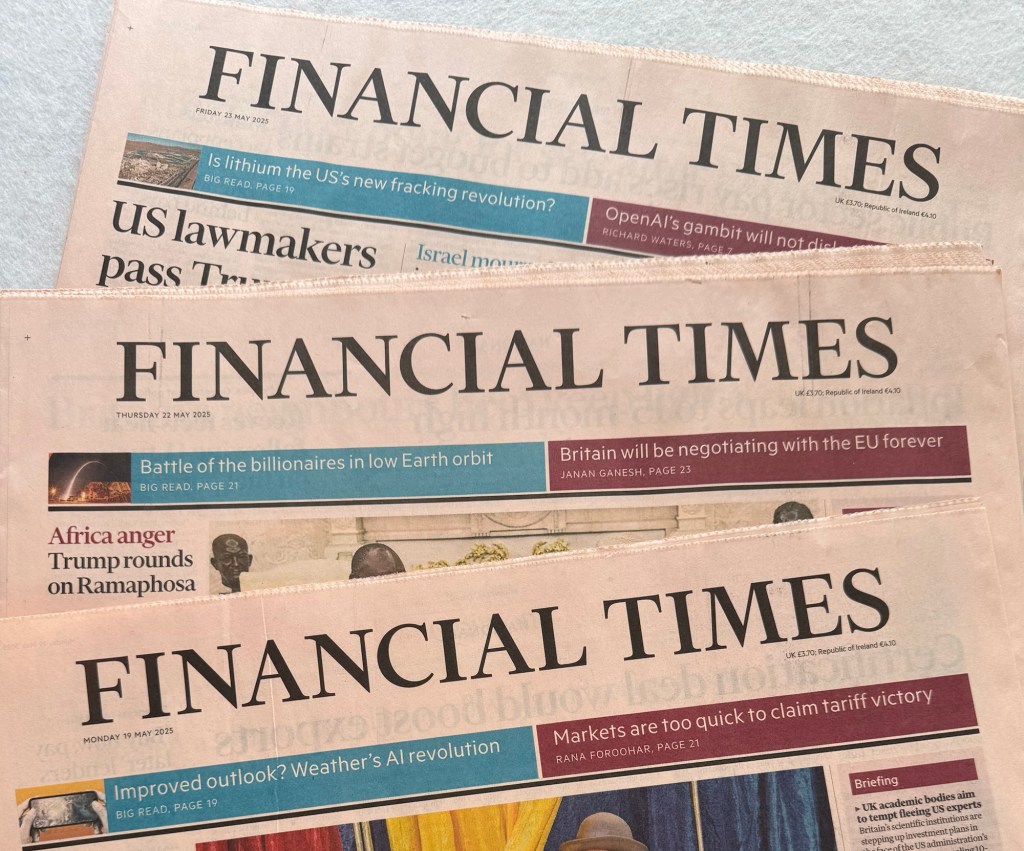
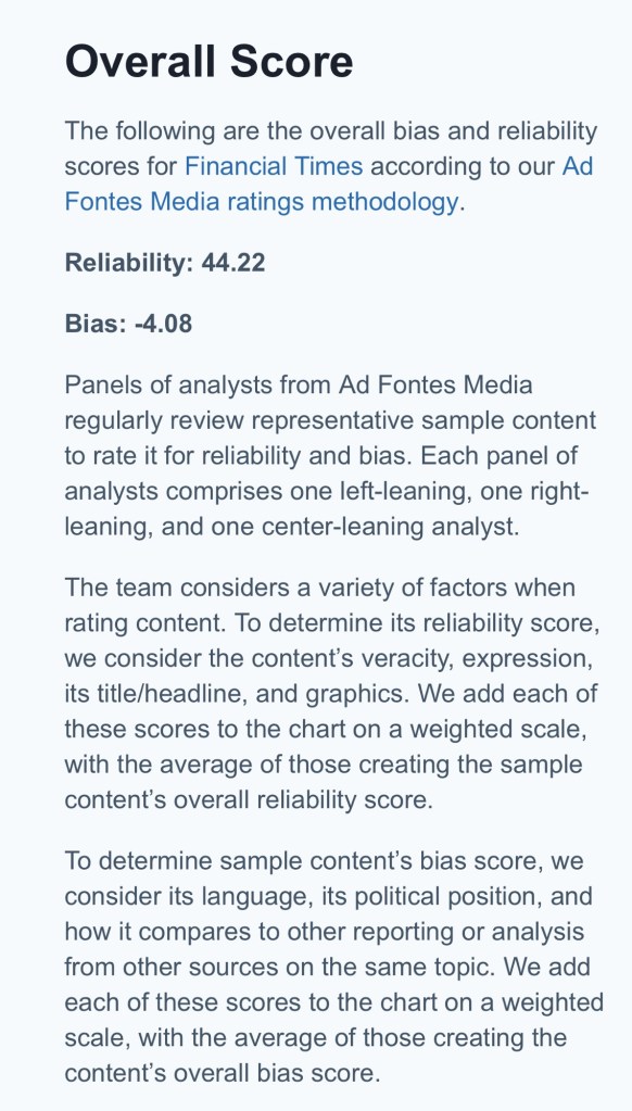
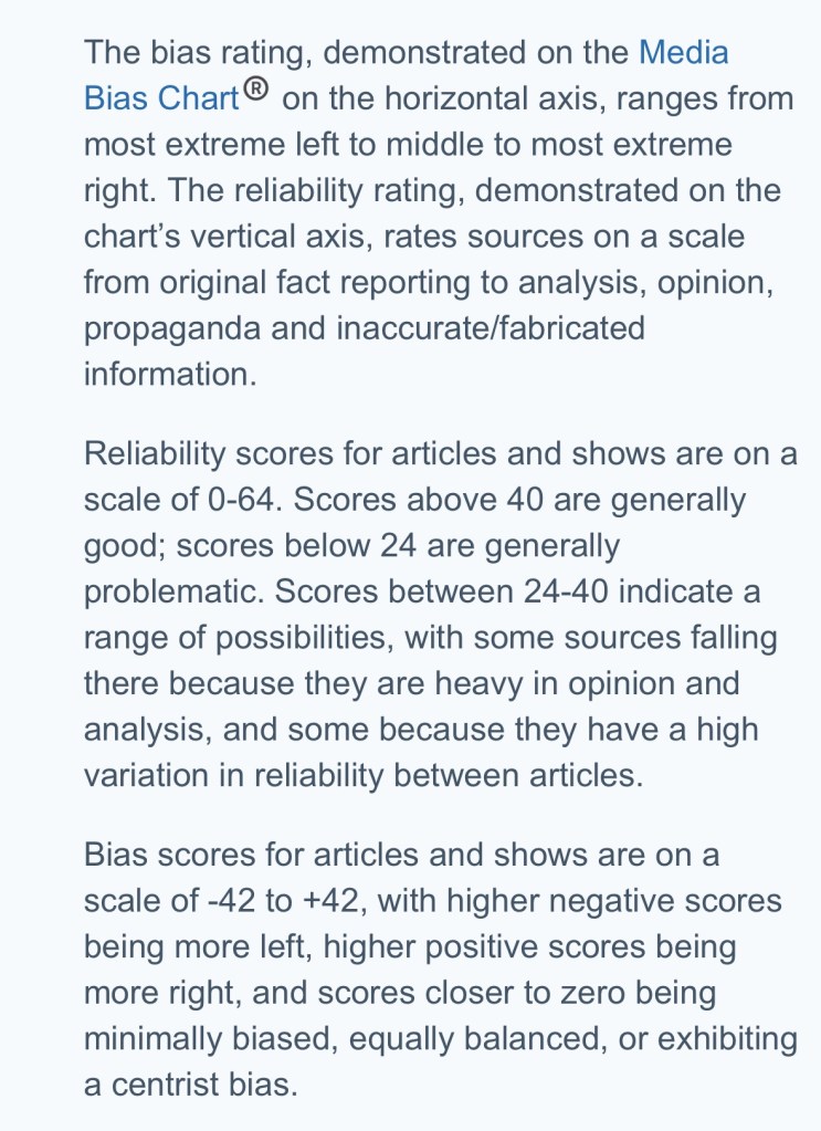
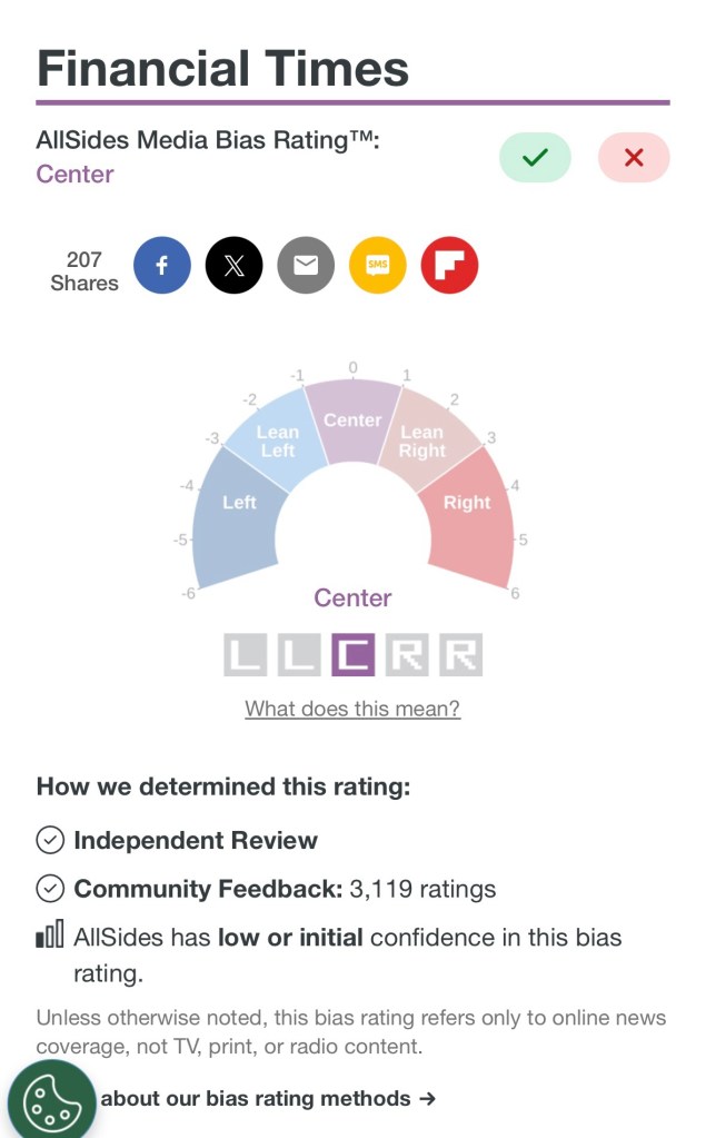
One of the key learning from my MA is to think carefully about our choice of materials and the content of our work. Especially if it is to be exhibited in public. We need to be sensitive to the audience and have reasons for the choices that we have made in our making. When I first started thinking about making work on newspapers, an important decision was which newspaper or newspapers to use. I have become very disillusioned with the news media in recent years so it was hard to choose. I have had a long relationship with The Financial Times (FT) because I always felt it was more balanced and factual than most media channels – it’s one of a few newspapers that I could bear to buy or read. I used to use The FT a lot for work when compiling economic reports about the UK for international meetings. I was happy to stand by its facts and figures as they were considered credible. I am increasingly tired of unsubstantiated claims by news media as well as those in public life, hence I crave a news channel that I feel I can trust. I wanted a non-controversial newspaper as I don’t want the choice of newspaper to dominate the conversation rather than the art.
Also, the salmon colour of the paper works very well with the Chinese black ink. I believe aesthetically it works better than the usual white newsprint paper. Hence I started to paint on The FT.
Now that the ‘News’ body of work is growing and I am committed to using The FT so much so that I have purchased a print-subscription, I feel I should do some more background research to ensure I have chosen the correct newspaper.
METHOD
I have become very aware that I should have a reason to choose certain materials in my making. Since the choice of newspaper is such a key part of this body of work, I feel I should retrospectively verify that my instinctive choice of The FT was correct.
I should start by considering what I would want from the newspaper in this body of art work:
– Trusted: My aim is to express my grief for the lost world order in recent months and to share the grief of those close to me whose lives have been deeply affected. I do not intend to be overtly political – my art is not a political campaign in an activism-way. I want to look for news headlines that are to do with this topic and bring attention to them but I will leave the viewers to decide for themselves how they feel about it. To do this, I need news headlines and articles that I can trust to be as factual as possible as I just want to present facts and figures. I am not planning to influence the viewers’ judgement. That means quality journalism with substantiated facts. I cannot fact-check every article, so I need a journal that I can trust in general. I don’t want to be anyone else’s mouthpiece.
– Uncontroversial / unbiased: I am despaired by the political polarisation that exists in our society and I do not want to contribute to that as it is not the aim of this body of work. Therefore, I want to choose a newspaper that is not too controversial, perhaps as politically-central and unbiased as possible accepting that it is not possible to be 100% unbiased when a newspaper has contributions from many people. The aim of the art work is to share what has caused my grief. If the newspaper has to have a leaning then a liberal leaning would be preferred especially regarding the topics in question.
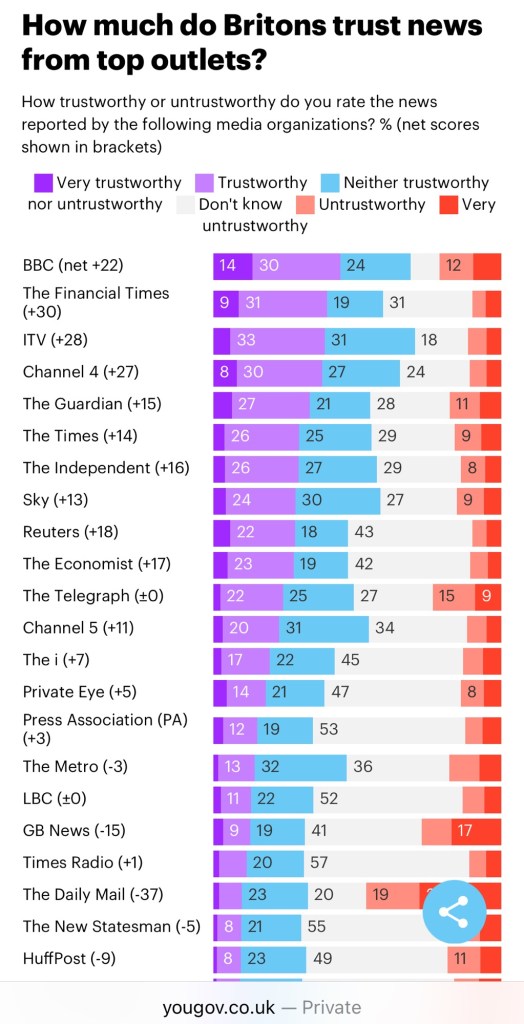
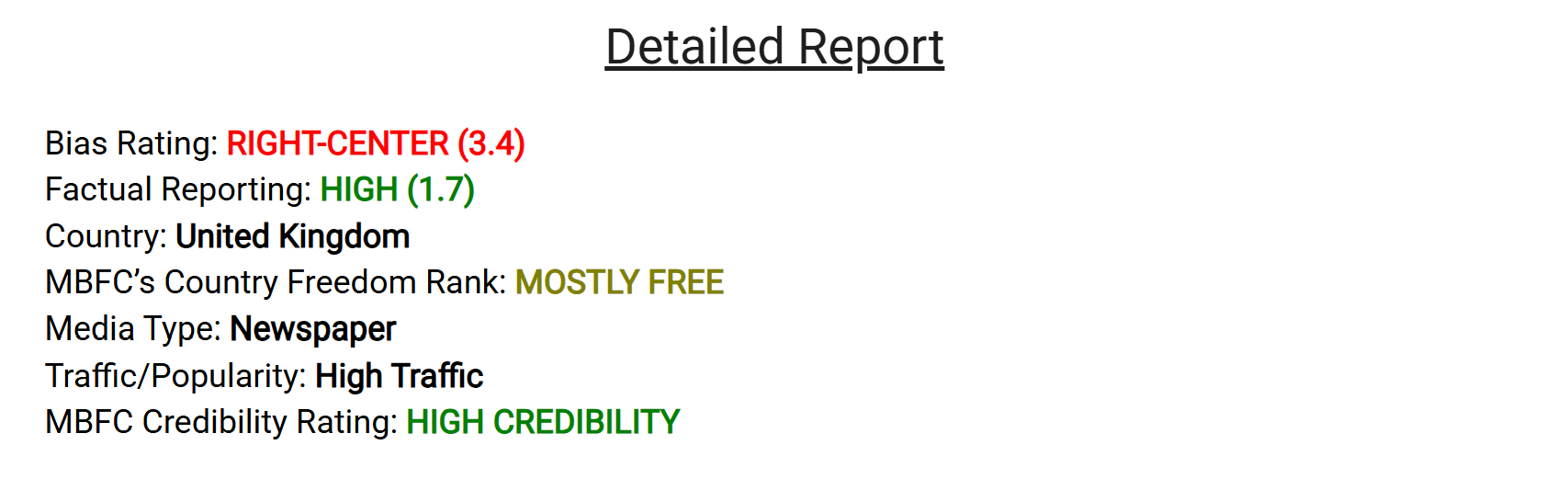
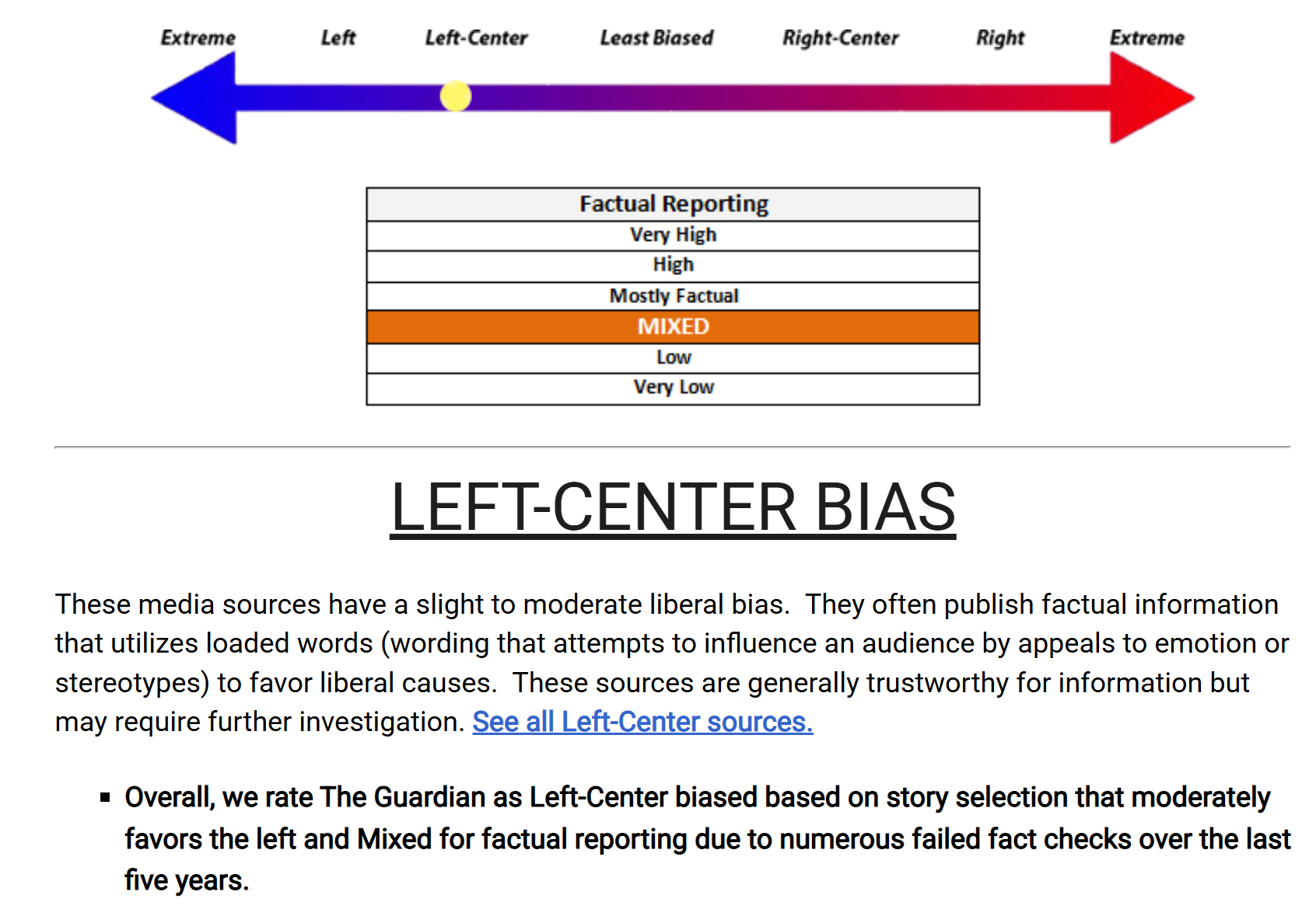
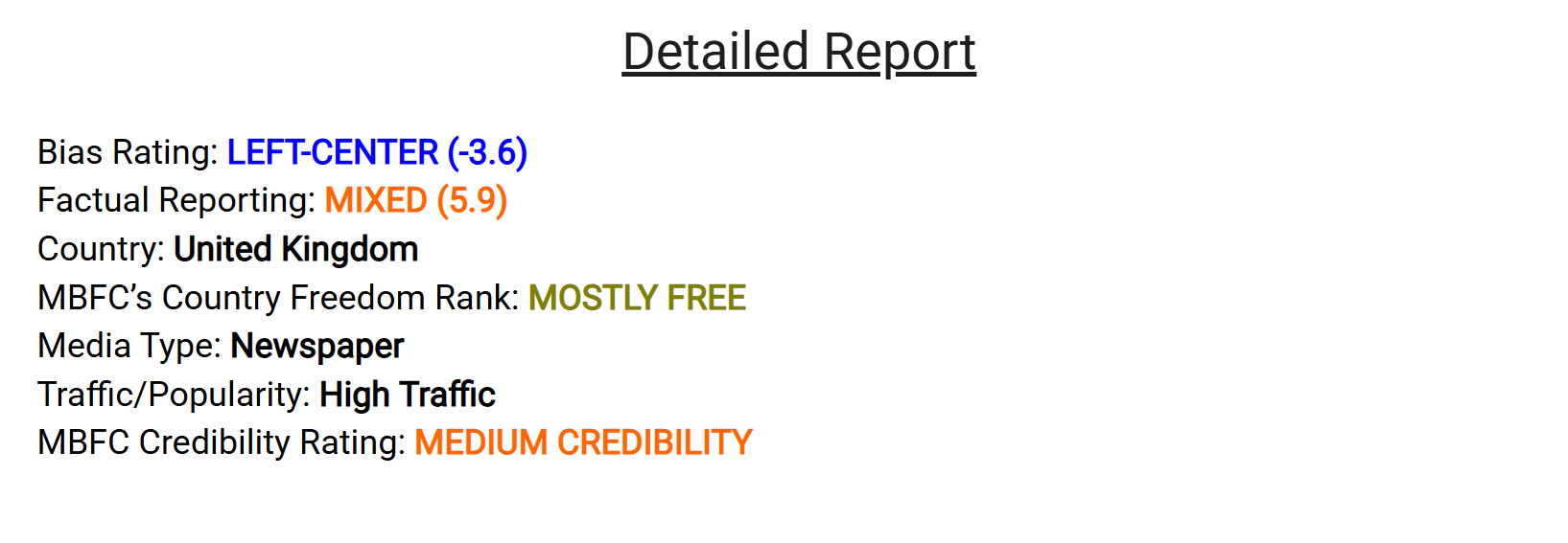
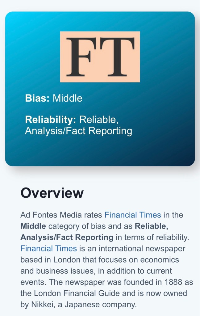
To start my research, I did several Google searches – for the most trusted and unbiased news media channel in the UK. Below are screen captures of some of my findings.
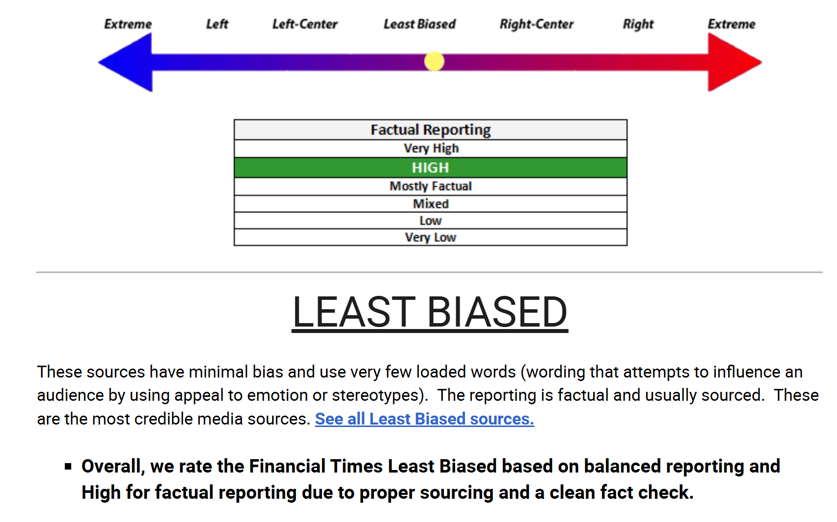
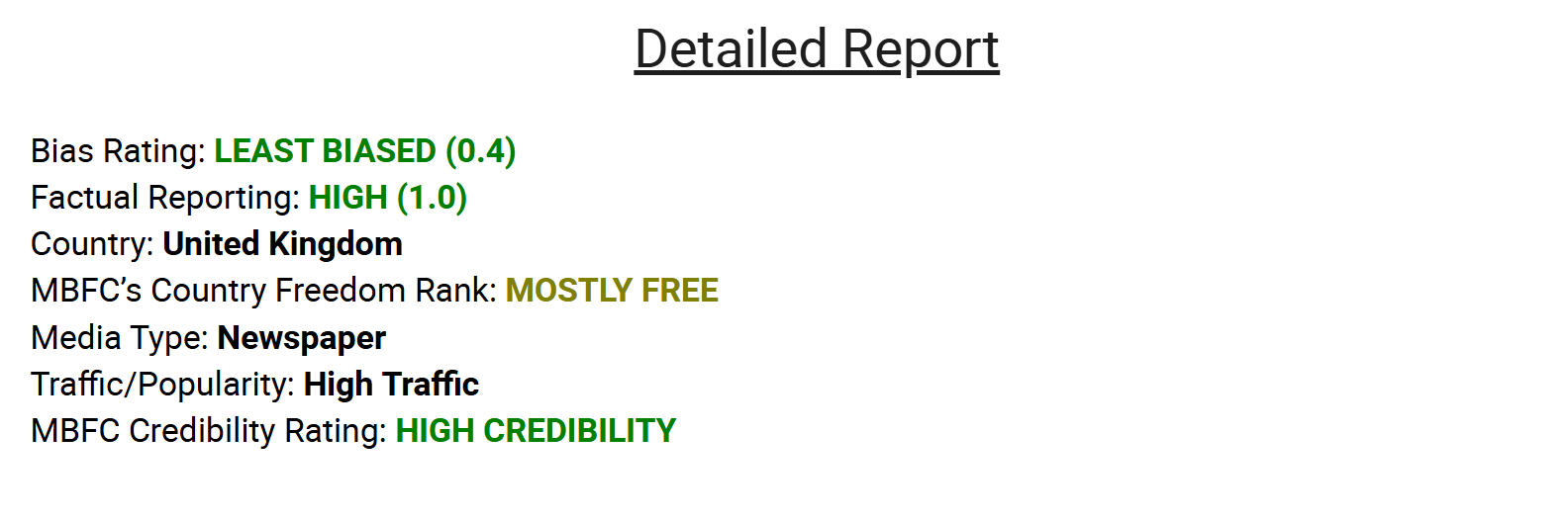
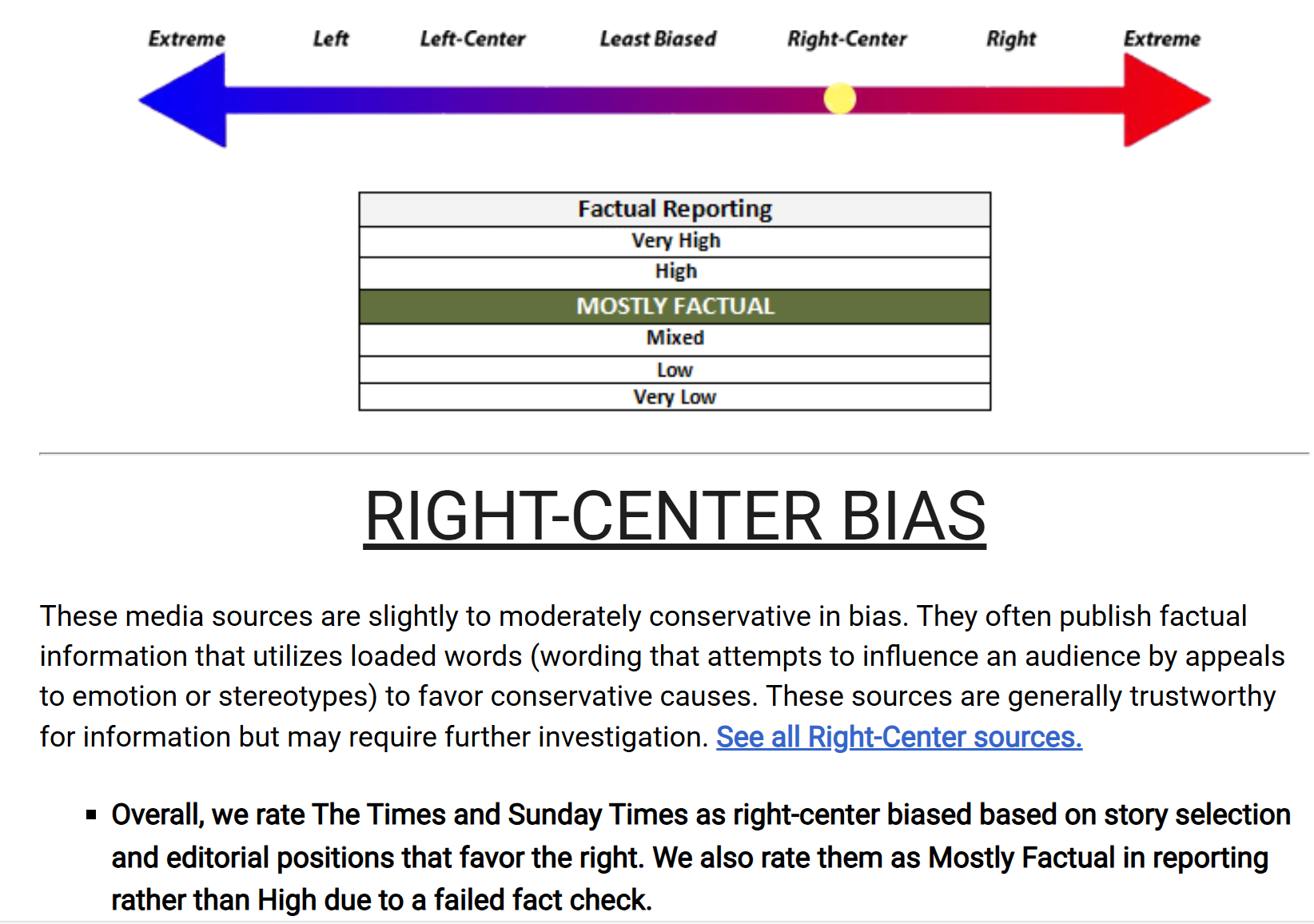
There are additional supplementary reports on The FT that largely reflect this finding and they are shown at the end of the blog.
From this quick online research, the findings showed that The FT was found to be the most trusted and unbiased UK newspaper relative to other newspapers (relative position as derived from the YouGov poll) with a central position politically.
REFLECTIONS
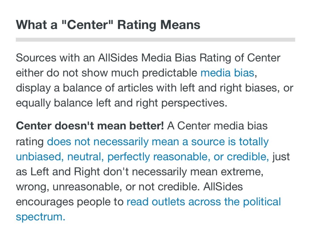
This research was done as a sense-check to ensure I have chosen the correct newspaper for the purpose of my art work – I believe I have because The FT findings showed that it addresses my requirements for a newspaper for this body of work.
However, as one of the reports said ‘central does not mean it is good’ and I feel that is an important point. It is not my intention to make this body of work overtly political, hence requiring a centrally positioned newspaper with a balanced view. One could argue that could contemporary art be truly central? I think my position on that point is that I am not ready to pick a political fight with the world – yet. I want to find my way into this part of the art world in a way that I feel I can manage especially given a lot of my ‘News’ art has been about my emotions and grieving – I need to process and make sense of that first. I am not ready for political debates. Hence remaining central is a stance that I want to adopt – for now. The most important thing is the trustworthiness and unbiased reporting of the newspaper which I believe I have with The FT.
Also, it is salmon colour. So I am relieved with my findings and satisfied with my choice. I will continue to use The FT whilst continuing to monitor its credibility.
LEARNING
I am glad I carried out the research. I believe that if I am going to show my art in a public place (Degree Show), I need to be doubly careful about the content and my reasons for choosing the materials. So this research has partly been to prepare me for the Show as I anticipate someone would ask me ‘Why The FT?’.
The main learning here is that researching all aspects of the materials used is essential. Especially when the subject matter could be sensitive, political or emotionally-triggering in any way. If I want to take my art practice onto addressing societal issues as I do, then I need to be more careful, considered, informed and mindful in these respects. I don’t want to rush into something that I am not ready to handle or my credibility as an artist could be called into question. Hence research and preparation is important. This is a key learning for me.
NEXT STEPS
– Continue to use The FT for my News art.
– Carefully consider all aspects of the materials I choose for my work and be thorough especially with exhibited work.
–
ADDITIONAL RESEARCH RESULTS
Below are additional reports found online on The FT.
Since my recent re-evaluation of my art practice to enable me to respond to what has been happening in the world, I have been making a new body of work – ‘News’. I feel the urge to show my new work at my MA Degree Show. This blog is about the development of ideas and a plan for the Degree Show.
METHOD
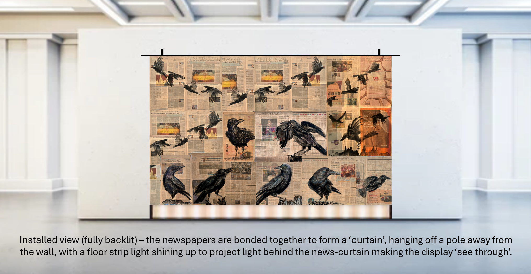
Firstly, I wanted to explore if combining multiple sheets of ‘News’ would make a good composition. Since each sheet was made as an independent painting, I needed to see if they would ‘make sense’ together. So I stuck together a few paintings and put them up against two glass doors to see how I felt. I was encouraged by what I saw and felt there was potential in the concept. I then proceeded to design the installation – how should the paintings be presented?
–
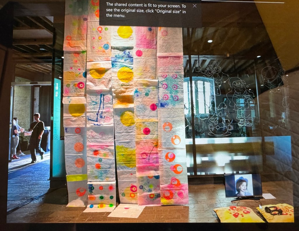
Below are some mock up ideas that I prepared to discuss with my tutor:
–––
After discussing with my tutor, we felt that the first option had the most potential for the CSM site. So I proceeded to think about how to create one large painting by combining multiple newspaper paintings together that would be appropriate for the Show both in demonstrating the concept and that is robust enough for a public exhibition.
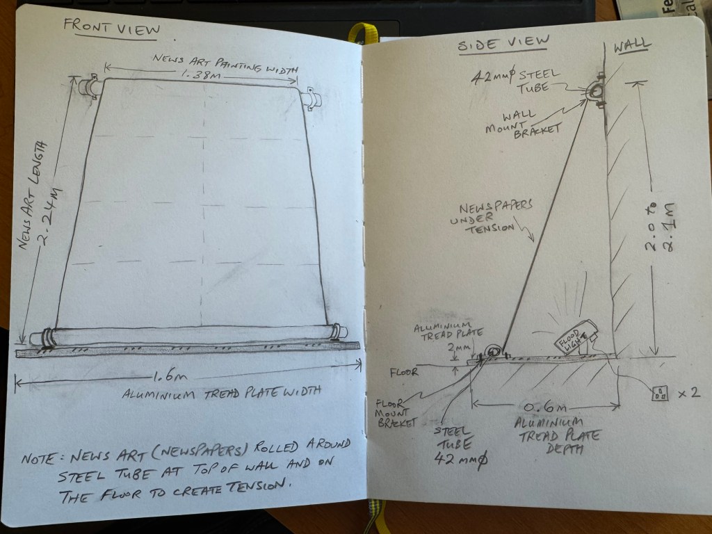
My tutor showed me an installation by a previous student who stitched together pieces of paper to form a long drop. I liked the idea of stitching together the pieces rather than just taping because I think it would be more robust and also reflect my wish to mend what’s happening in the world through my work – somehow.
–
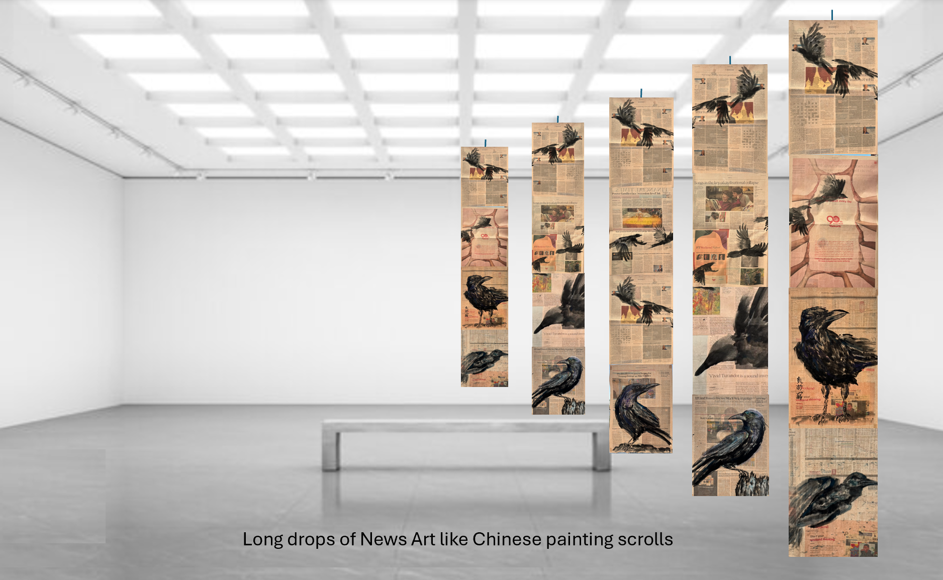
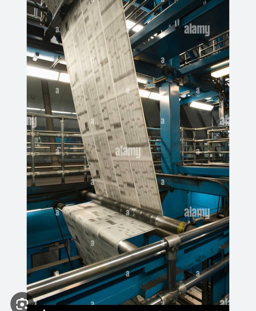
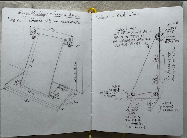
I then tried out different ideas on my sketch book and decided a narrower long drop (rather than a wide one as in the original idea) could work well to resemble how newspapers are printed and processed in the factory. Working so intensely with newspapers and examining newsprint so closely has reminded me of my time as a young engineer working on control systems for newspaper printing presses including many Fleet Street titles. I remember vividly how exhilarating and awe-inspiring it was to see the newspaper webs flying at high speed between feeder rollers around the monumental machines (see example image below). Since my art practice is about exploring my identity and engineering has been such a large part of my life (35+ years), I wanted to make an installation at the degree show that incorporated elements of my memory from those days.
–
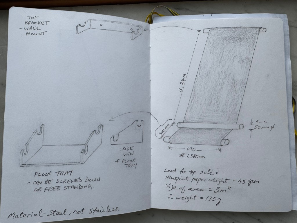
I experimented with the ideas of using three tubes to represent parts of the printing machine. Initially, I looked into buying used feeder rollers from printing press refurbishment companies but they were costly. Then I considered using mild steel tubes (not stainless steel as they would be too shiny). Below is an initial design idea which I used to get some costing. A key objective was the ease of installation knowing how busy the build up would be with such a big student show.
–
Then I wondered if three tubes would be too many and considered a two tubes design. In all cases, one or more flood lights would be used to illuminate the artwork from behind. Here is a two tubes design:
–
After further discussions and advice from my tutor, the final design was to use 3 x copper plumbing pipes as the copper colour would complement well the Financial Times’ salmon paper. The second pipe on the floor would be placed behind the painting giving the look of the newspaper feeding into the wall. I considered using two small flood lights, but I might go with a dimmable flood light instead because I have found that the back-illumination light level could be critical – too bright and the images became saturated and if too dim then the reverse side images would be hardly visible. Hence a dimmable unit would give more flexibility for an unfamiliar site with unknown ambient light level. Here is the final design:
–
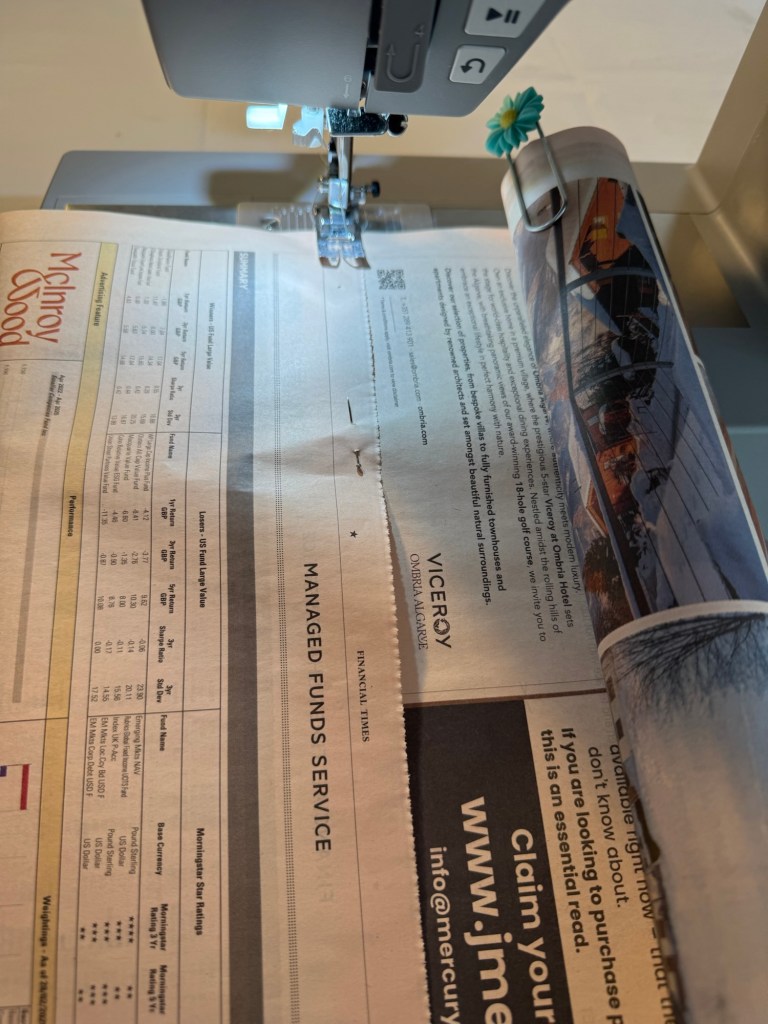
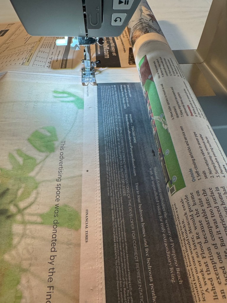
The next task was to test out the stitching and the wrapping of the newspaper around a pipe to see how the paper behaved. Also to determine the optimum pipe diameter to use.
Using a sewing machine for large sheets of paper could be challenging because unlike fabric, the paper could not be bunched up to fit around the sewing machine body. Hence I rolled up the newspaper around a plastic tube and held the roll in place with a large paperclip so that it could be fed into the machine without damaging the paper. The two sheets of newspapers were held together using dressmaking pins just like I would do when binding fabrics.
–
The machine settings were as follows with the stitch size fairly small for strength but not tiny as it might rip the paper:
–
The paper was then fed slowly into the machine for sewing. Two rows of stitches were made to ensure strength of the bind:
–
Completed sewing and with paper hanging vertically:
–
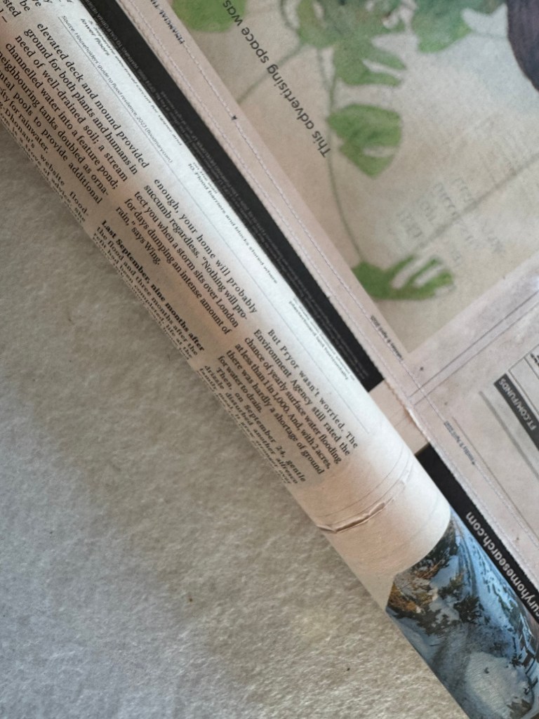
Below are close up images of the stitching and how the paper wrapped around the tube. This tube was of 40mm diameter and the paper wrapped well around it:
–
I tried wrapping around a smaller diameter tube (22mm) and it felt too tight and obviously would require more revolutions of wrapping and I felt that would introduce more risk in the paper not aligning and looking untidy:
–
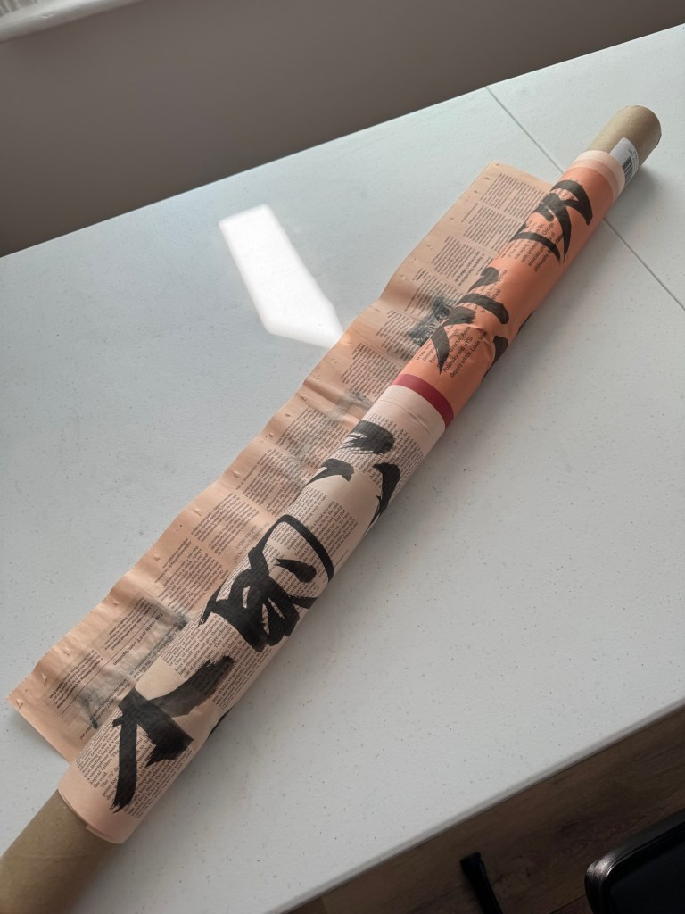
Another example of paper wrapped around a tube. This time with painted paper only as an experiment because the installation for the Show would only use unpainted paper to wrap around the tube.
–
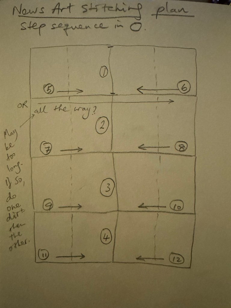
Since I am planning to create a painting size of 2 x double page spread broadsheets, that is approximately 1.36m wide and it would be difficult to feed into the sewing machine in one go, I created the following stitching plan to do the stitching half way, then turn around and do the other half from the opposite direction. I might try to do it all the way with some spare newspaper as an experiment to start with.
–
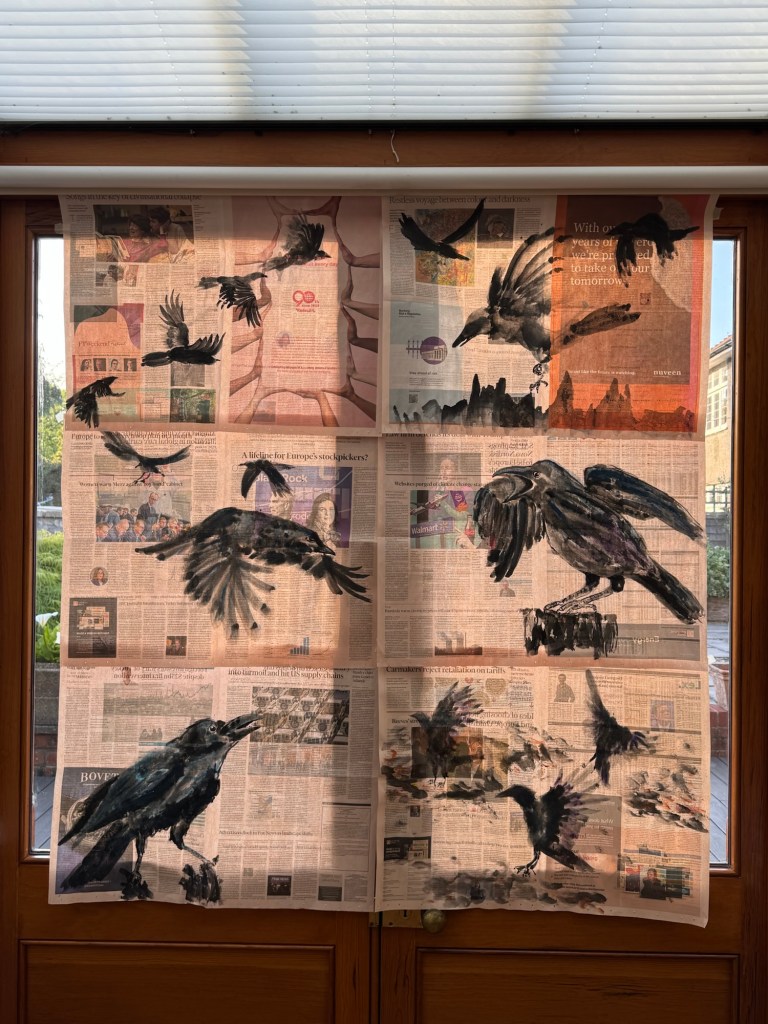
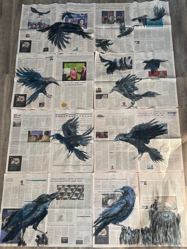
Final selection of eight paintings to form a composition for the Degree Show:
–
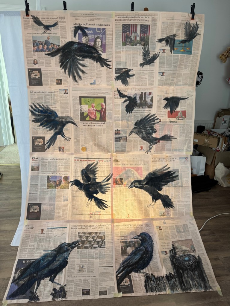
Mock up in front of flood light to test concept:
–
–
REFLECTIONS
I started to re-evaluate my art practice just before the Low Res in March and I started to make ‘News’ art at the end of March which is less than two months ago. I cannot believe how much has happened and that I am planning to show this new body of work at the Degree Show. During my recent tutorial, my tutor said that everything I have been doing as well as my commitment to interrogation have been leading to this and it does feel that way to me. I am feeling a momentum that I had not felt before and I am very excited (and somewhat nervous but in a good way) about showing this work at the Show. I do not know if it would work out or if it would present itself as I imagined. But I take confidence from what David Bowie said in this video where he was giving advice to artists:
My main takeaway from Bowie’s video was when he said, ‘…Always remember the reason you initially started working, you felt there was something inside yourself that if you could manifest it in some way then you would understand more about yourself and how you co-exist with the rest of society… If you feel safe then you are not working in the right area. Always go a little out of your depth, when you feel your feet are not quite touching the bottom then you are just about in the right place to do something exciting.’
I sincerely hope that Bowie is right and I look forward to finding out!
Another point that I have been reflecting on is that this new body of work is aesthetically and topically very different to my last body of work, The Cheongsam Series, where I was making oil paintings on dress-shaped canvases to explore my transcultural journey.
Much of my work in the last two years have been about my transcultural identity, but I knew that at some point I would want to go beyond just talking about my transcultural journey onto issues about society – issues that are still related to me, my lived experience but about other aspects of my identity. I mentioned this in my Study Statement from Unit 1 as my intention, but as I was making my transcultural work I have at times felt bounded to that topic and I was unsure of how to progress or transition onto the next body of work without seeming incoherent. Then when the ‘calling’ came to make work about the rapid change in world order and how people close to me were being affected, my urge to move onto the next body of work felt like a natural progression. Of course, there was much time spent on reflecting, agonising, experimenting, observing and reflective-writing that led me to making ‘News’ art. I am very pleased that I have gone through the transition process from one body of work to the next while I was still on the MA programme. This is because I felt safe and secure in trying something completely different in a supportive environment and I made it happen. I have learnt that I could do it and it wasn’t as scary as I thought it might be. Guided by my reflective process and taking it step by step meant that I felt in control of the transition – not necessary in control of the making but in control of the change process which gave me a solid platform to take risks in the making. This learning experience has been very important for me as I now feel confident to do that again independently after the course. I feel I can move onto the next body of work when the next ‘calling’ comes. I know I can rely on my instincts guided by my reflective process to make it happen. I expect I will return to my transculturality work at some point because there is still much to explore and I certainly have not exhausted the subject yet – far from it.
LEARNING
I have learnt that I now feel able to transition from one body of work to the next and take risks along the way. I will follow my instincts and use my reflective process to guide me. This has been an important realisation as I go forward to develop my practice.
As for the Degree Show, there has been a lot to think about in planning for the show and I have really enjoyed the challenge. Especially looking at sourcing the right materials for the installation – I learnt a lot in that process, such as to consider the materials’ behaviour, the aesthetics and planning for a site that I am not familiar with including all the contingencies to consider. It’s all good experience for any future exhibitions. Creating the paintings is only half the work, presenting it properly and all the site considerations require just as much work which is something to bear in mind in the future. Planning and allowing plenty of time is key!
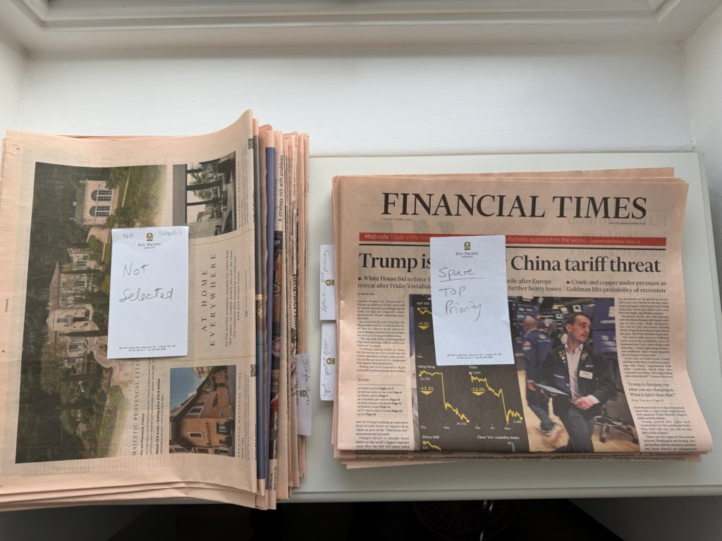
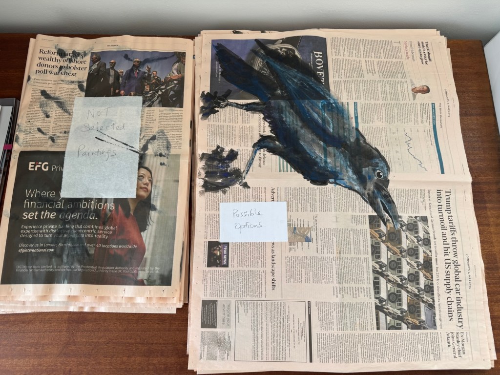
I have also learnt that I needed to introduce a new process of organising my materials – namely the newspapers! Especially considering news has a life span. My ‘News’ artwork needs to be about the here and now and can’t be left on the shelf for too long or the news story would have expired. So I needed to create a system to sort the newspapers so they don’t end up piling up in my studio. I decided to organise my newspapers as follows.
I found it helpful to have a specific topic for selecting the newspapers to paint on. In this case, it’s about the sudden change in world order due to the US Government’s drastic roll out of damaging policies.
So when I get a copy of the newspaper, I sort the pages into the following categories:
– Selected pages for painting – with the appropriate headline, perhaps an interesting image and not too much advertising especially not big dark blocks.
– Spares: top priority / second priority / good for practicing
– Not selected
Out of all the ‘News’ paintings that I have created, they were sorted into ‘possibles’ for the show and ‘not selected’. Then I continued to make more paintings until I had enough ‘good’ ones that I was happy with for the Show.
––
NEXT STEPS
Make it happen for the Show!
Always remember Bowie’s advice!
Maintain my confidence, follow my instincts and reflective process to develop future bodies of work.
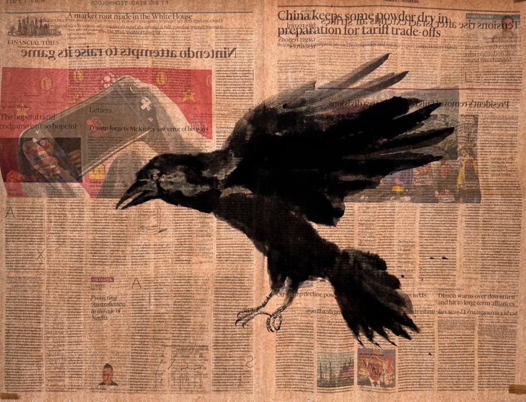
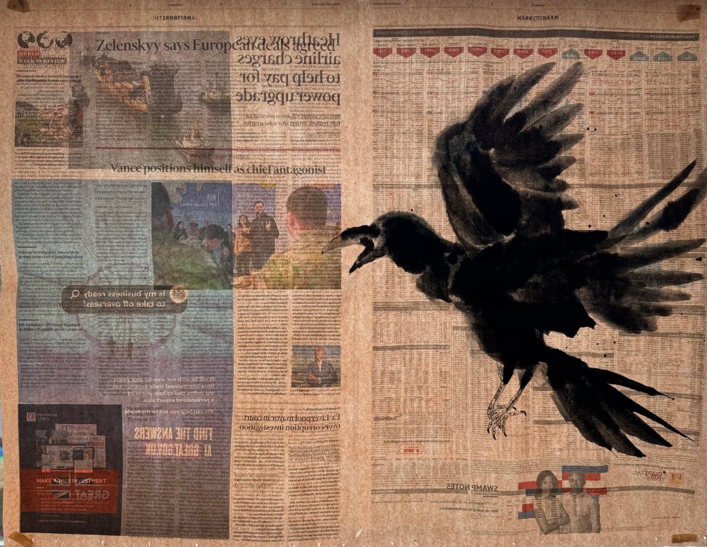
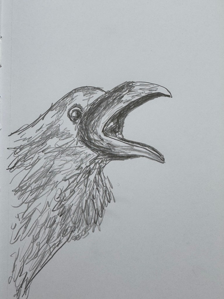
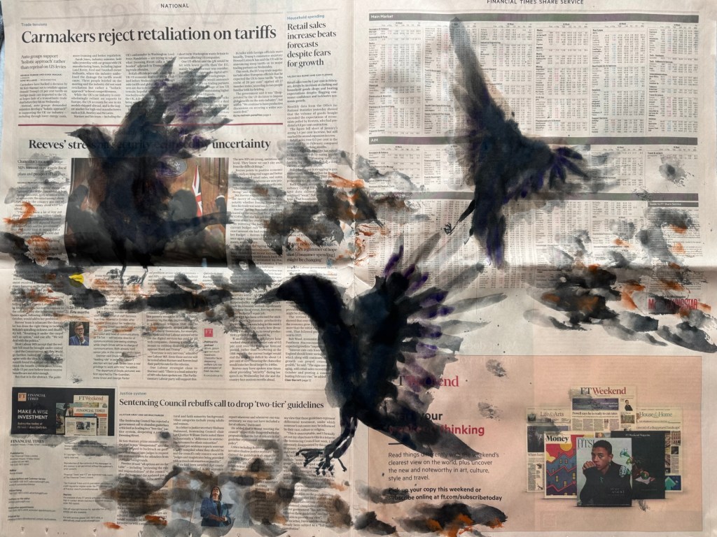
I have continued to work on my latest body of work – ‘News’. I decided to explore different crow expressions to use in my compositions. In particular, more expressive, angry or ones in flight. So that I have a wider variety of expressions to choose from when responding to news articles that I see.
METHOD
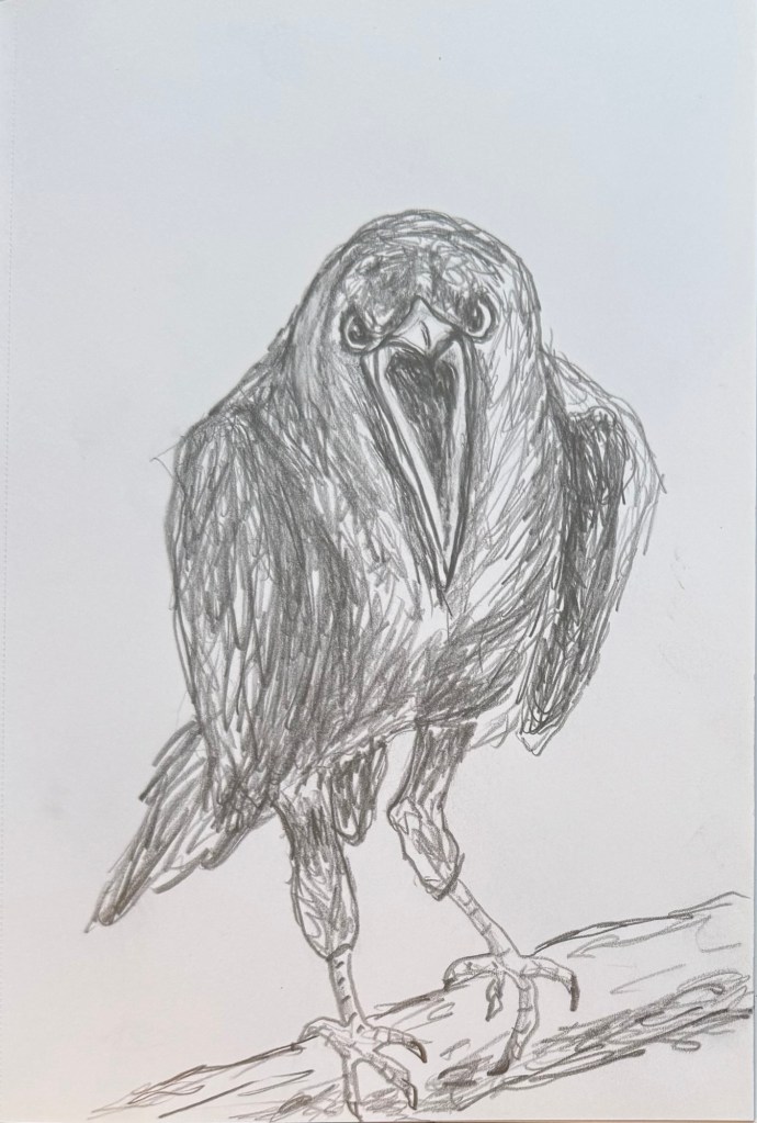
Lately, whenever I feel unsure about how to proceed then I have been returning to drawing. I find the process comforting and grounding. So I started with a few drawings on expressive crows using my non-dominant hand.
Angry crow:
–
This one was meant to be angry but actually looked anxious:
–
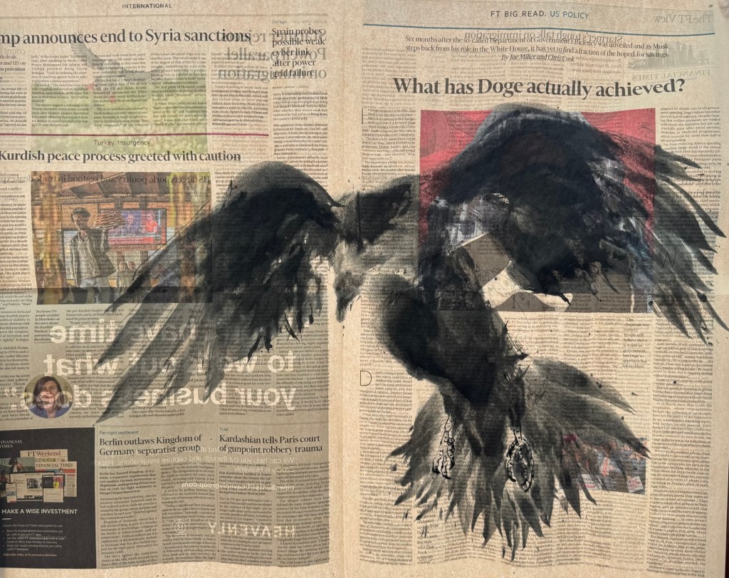
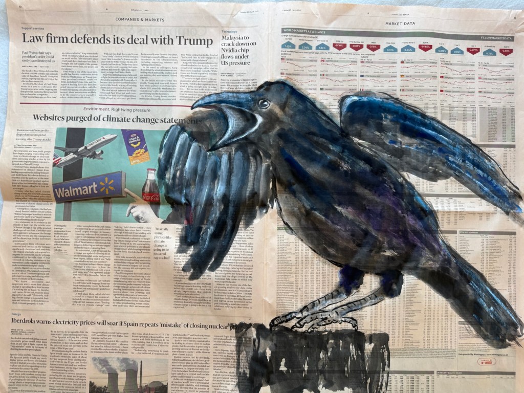
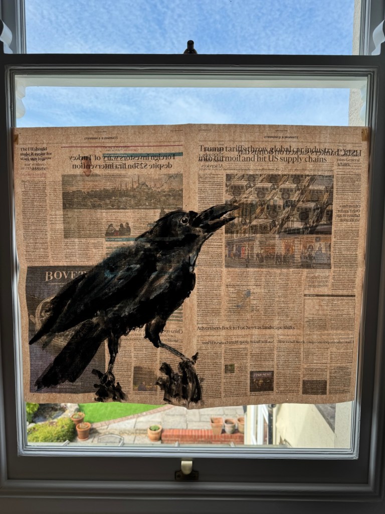
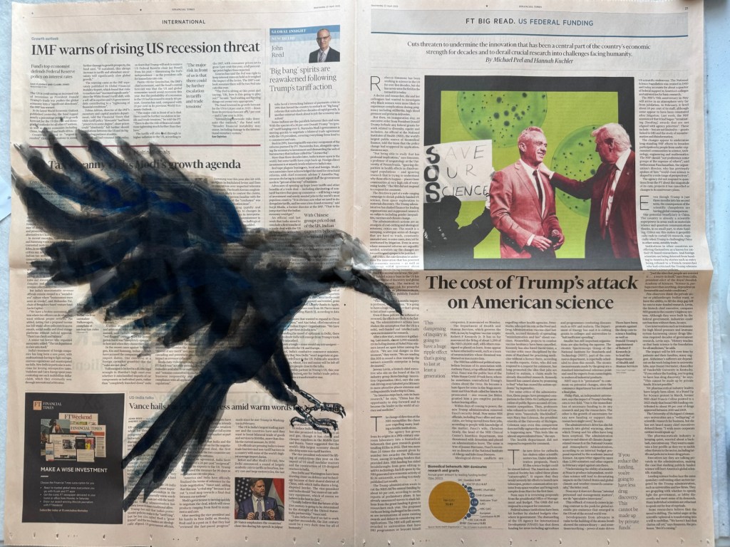
I then went onto painting on newspaper. I used charcoal to mark the outline of a crow that I wanted to paint. The newspaper was chosen especially for this composition – a shouting crow:
–
I then painted the crow – staying with my non-dominant hand. I was going to paint the wing behind the man’s head. But then decided to cover up the head. This was the finished work:
–
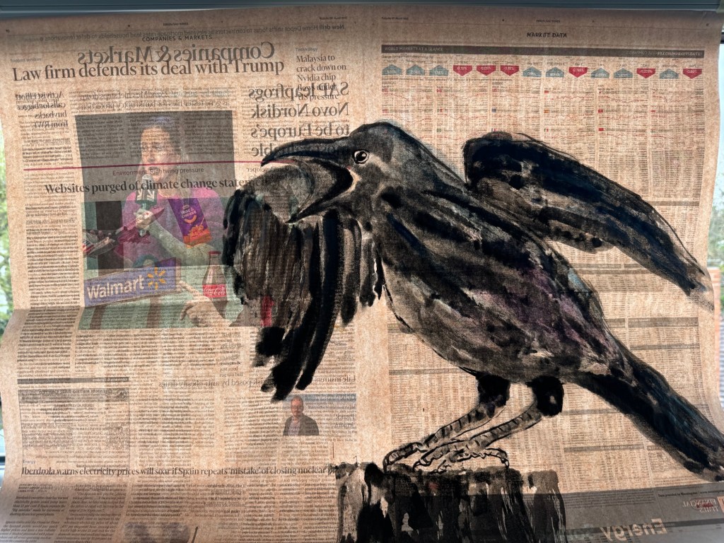
The painting was held up to the light. The man’s head was slightly visible despite being covered. What came through was a woman speaking on a microphone on the reverse side of the newsprint which made the composition more interesting.
–
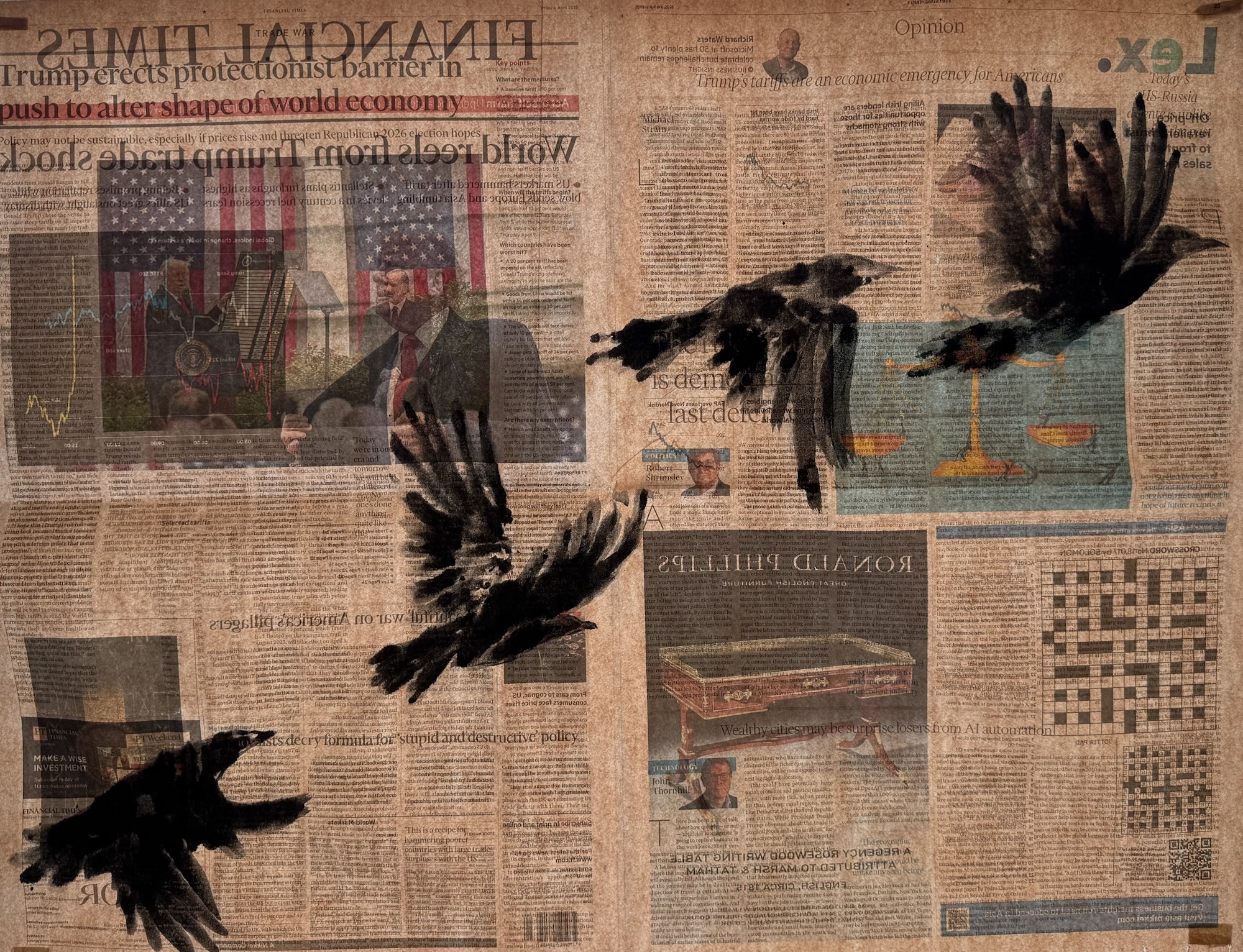
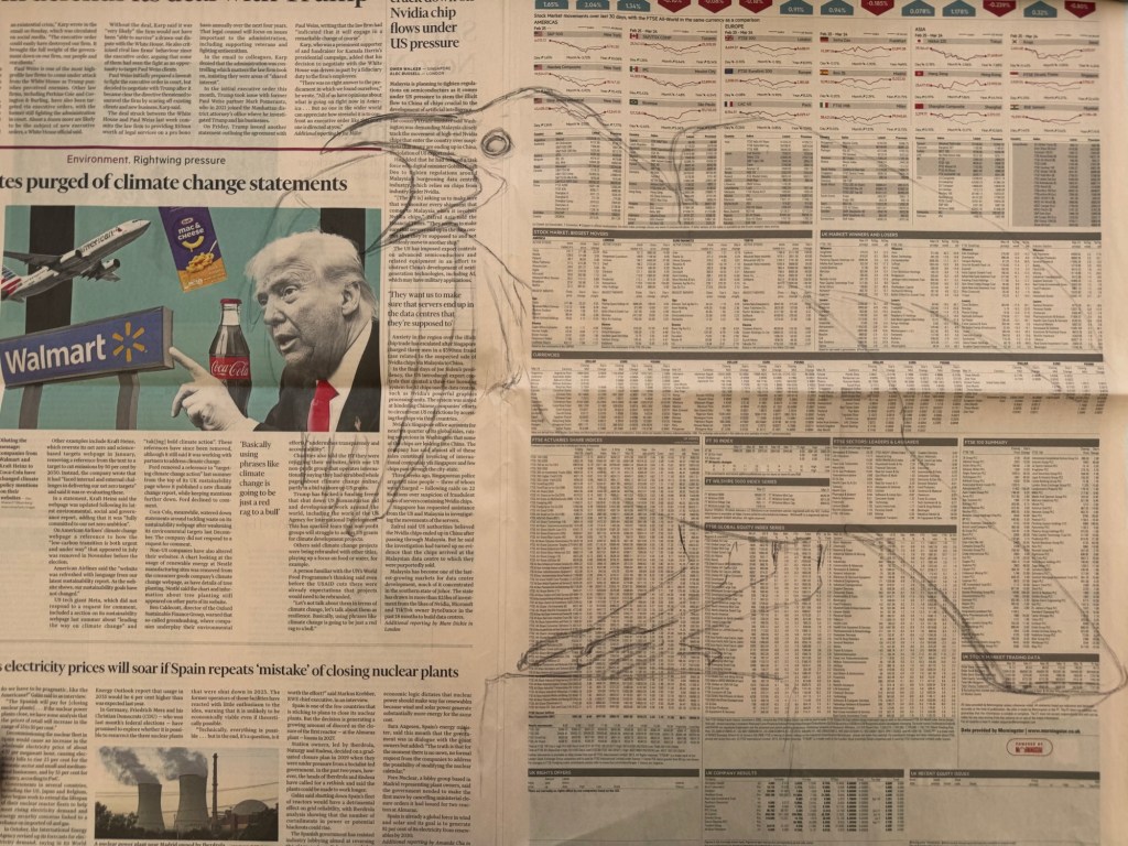
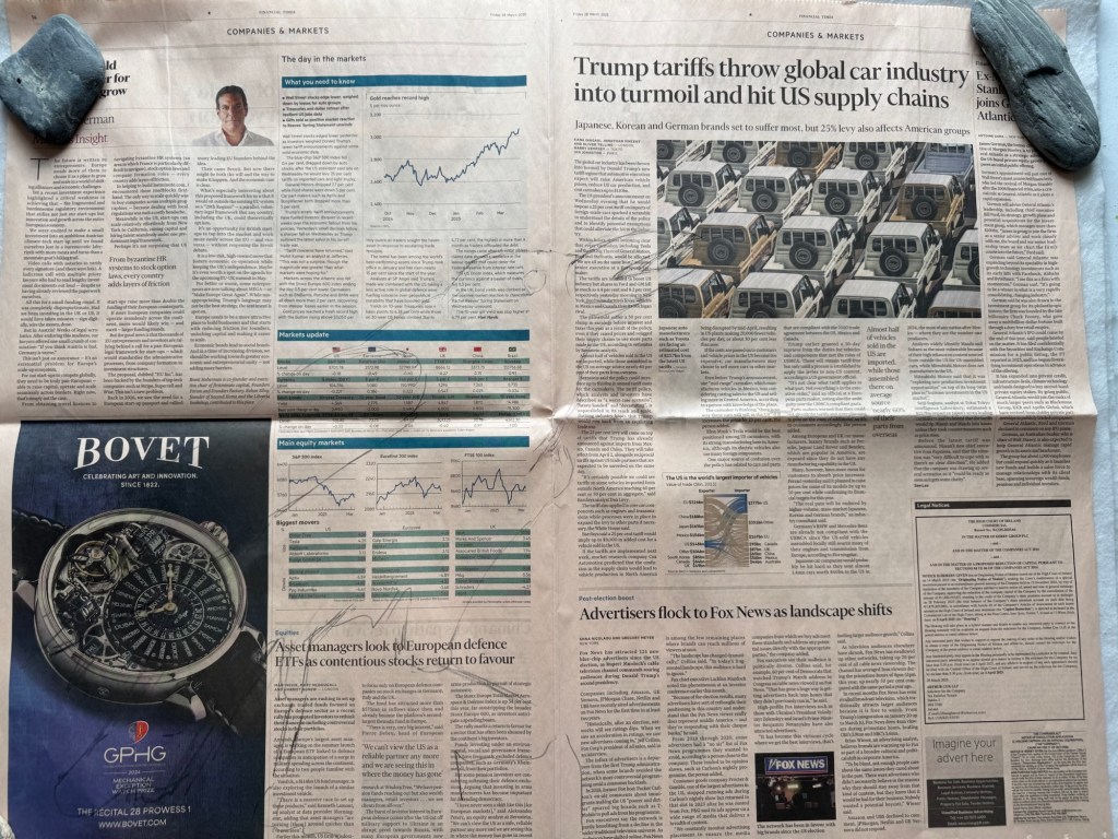
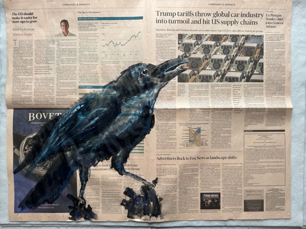
Then I experimented with a crow looking in despair up to an article about the tariff trade war. Perhaps it was not totally in despair, but certainly questioning what’s going on:
––
Again the finished painting was held up to the light as a metaphor for holding someone to account. The images on the reverse side made the photograph of the cars under the trade tariff headline more ambiguous.
–
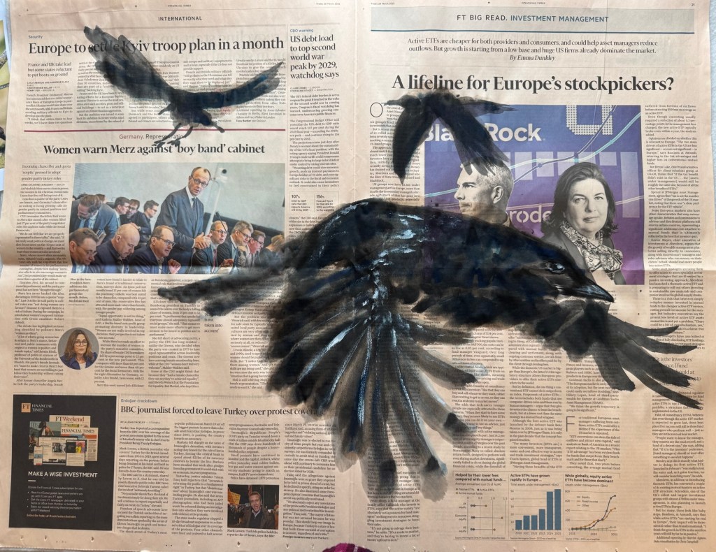
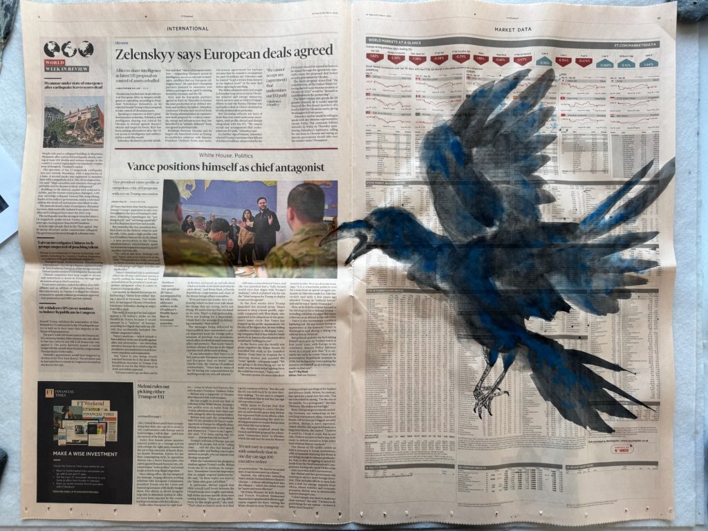
Crows in flight going in different directions:
–
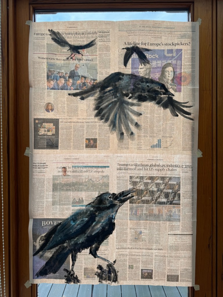
Putting together paintings to start exploring combined composition:
–
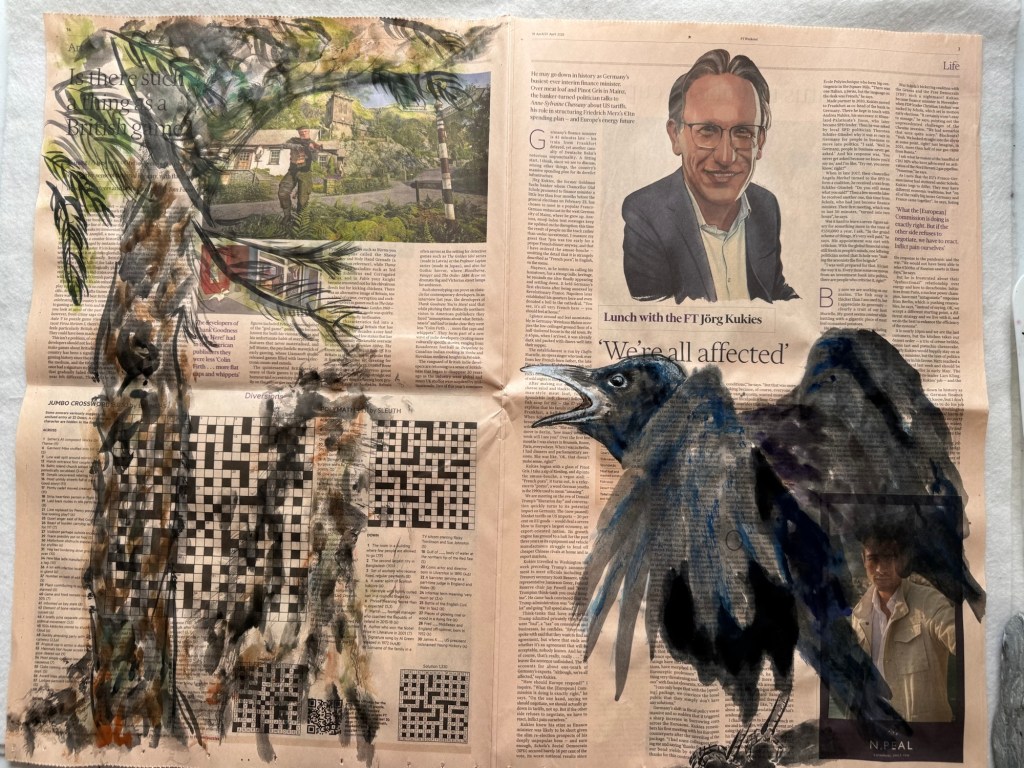
Another shouting crow under the headline ‘We are all affected’. The crow was in line with the gun held up by the man on the left page. Then I noticed a large capital letter ‘O’ on the crow’s body – like it had been shot by the man in the photo. I added a pine tree around the greenery on the photo on the left, but I don’t think it worked. It distracted too much from what the crow was going through.
–
A few landing crows:
–
A large landing crow going for a prey:
–
A screaming crow in flight aiming at a photo:
–
REFLECTIONS
As I made more work, I became more confident about this new body of work. My confidence increased in both the concept and the process. My recent tutorial was very useful in helping me to reflect on my thinking behind the work and the progress so far. My increased confidence meant I was able to go for a more freestyle approach to my Chinese ink painting in the work listed above. The freestyle approach enabled me to be more expressive and spontaneous. The last few paintings shown here were done without needing to use charcoal upfront to mark out the composition which I was pleased about.
I was not happy with every outcome here, some of the depictions were more aligned with my intentions, some not so. But I was trying not to overthink it at this stage. Just wanted to keep making as I know from my Chinese painting class that it would get better with practice.
I continue to find Chinese ink painting ‘unforgiving’. I have written about this before and it still has not changed – it is just part of that medium and again, practice helps. ‘Just keep making’ is the key.
Also, I believe painting with my non-dominant hand has helped me to not agonise over my work too much because it’s not meant to be perfect. It will be what it will be! I have found it liberating to paint in this way and I plan to continue this exploration.
LEARNING
I am gaining confidence in the making process through practise and more importantly – I am pleasantly surprised by my confidence in tackling a completely new body of work that is very different from my previous transcultural work. I am happy that this major change happened during my MA course because the guidance available gave me the courage to do something completely new and experimental.
Also, the structure of my reflective practice has really helped me to realise the concept knowing that if I got stuck then the reflective process would help me to find answers or a way forward.
I feel very excited about this new body of work and I am really enjoying this way of making. It continues to help me to respond to what’s happening in the world through my practice which is very important for me right now.
To build on this, I want to think more about why painting with my non-dominant hand has become so important to me. Also I want to understand more about my overall process – from buying the newspaper to completing a painting.
NEXT STEPS
Think more about my reasons for using my non-dominant hand – especially think about this as I paint.
Start to be more considered when moving from one step to the next in my process to better understand the process with the aim of future improvement and development.
Keep making and think about what to do for the degree show.
1. The main help that I need is to decide on what to exhibit at the Graduate Show. I have prepared some ideas that I will present at the tutorial.
2. I want to find a way to make newsprint (my newspaper art work) archival. Who is the best person or department at CSM/UAL that can help me please?
3. For Unit 3 learning outcomes – ‘evidence of plans for showing your work’. Is the graduation show sufficient or do we need more?
——-
General progress update –
Since our last discussion, I have continued to make art in response to the current issues I feel strongly about. I have been making a series of new work called News Art.
It started with this initial exploration – we have already reviewed the paintings; I have since completed the reflections and learning sections for the blog:
I have updated my study statement to include a few new objectives for my latest work since it is an exploration that I hadn’t planned to do at the beginning of the course. They are listed on the last two pages of the statement:
1. Graduate show – we discussed the different options I presented for the show. Key takeaways are:
– Cheongsam paintings and News Art are two different bodies of work and if we were to show both then they should be displayed separately. Think of them as two separate things.
– If we show the dresses then all will need to have identical mannequins. This I confirmed would be the case.
– News Art feels more urgent and remarkable. There is an energy and there is a voice (be it a quiet voice). Using non-dominant hand also adds to the work with a sense of risk and excitement. All the different layers together. My history in engineering working with newspaper printing presses also feature in this body of work.
– News Art – it feels like everything has been leading to this. A culmination of my commitment to interrogate.
– Practicalities – ceiling is 4m high. Same height throughout the site.
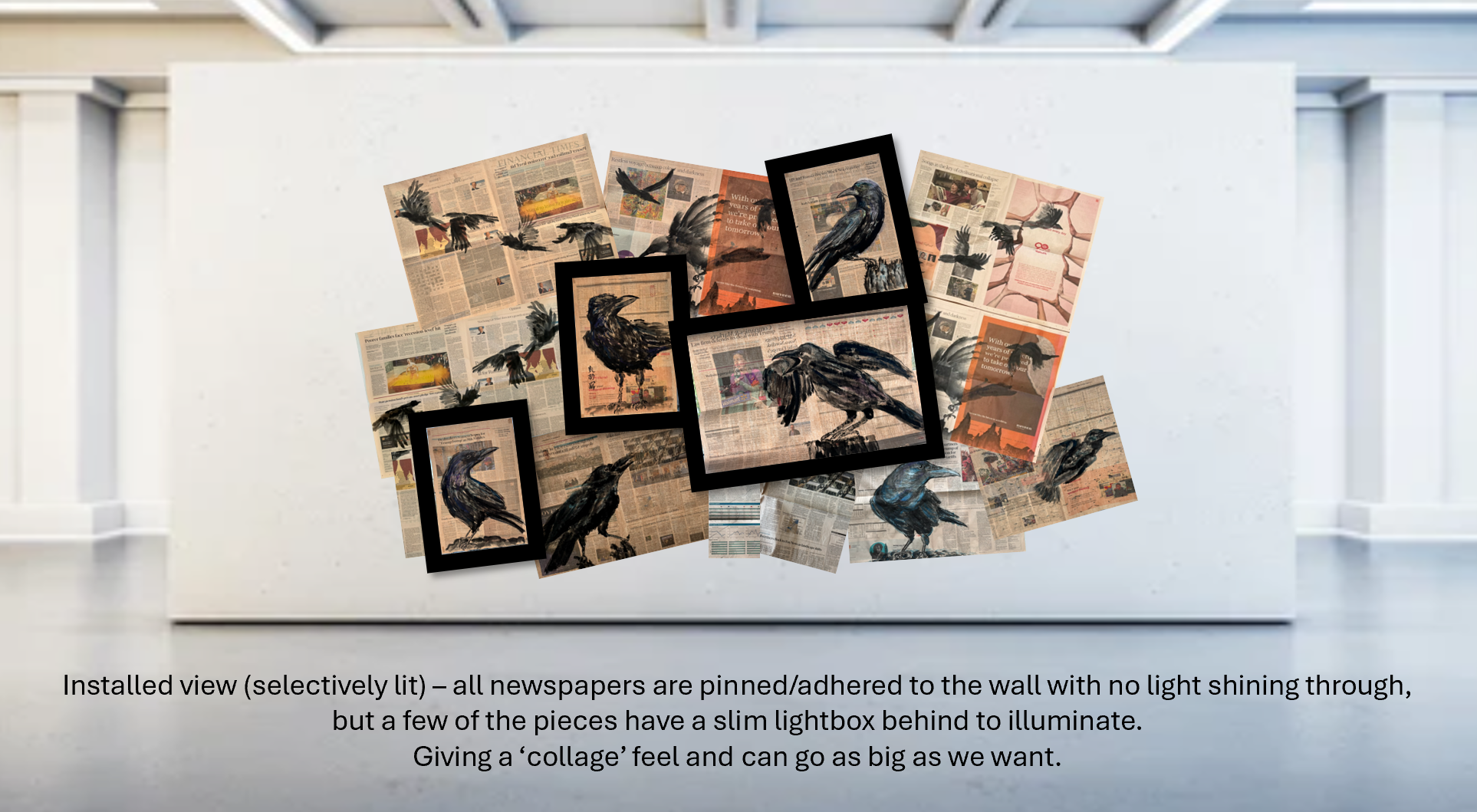
– If we go for a wall display, I could use a builder’s flood light to back-lit the newspapers. Can also have the newspaper coming out at an angle – anchored to the top of the wall but coming out a few feet from the wall at the bottom (like the side of a tent) – this also feels more confrontational. Can use the bottom of the newspapers to hide the flood light units.
– The pieces of newspapers can be stitched together.
– Do not go for an overall coordinated composition, leave it untidy and loose.
– Try flood lighting in day light to see how it looks when illuminated.
– Wall height is 2.4m, some can be 3m. Width can be 1.4m (2 x double page spread)
Other thoughts:
– Don’t rule out cylinder lights for future shows.
– LED light strips to go behind wall mount newspapers, looped around like a drawing.
2. Life after MA – ideas for how to show work:
– Group show.
– What’s going on in the city that might help other events, e.g. late opening of museums. Do a proposal for showing work alongside the event.
– Do not think about the audience, just focus on making work to a deadline, getting the work to a show quality and taking good photos.
– Propose to office spaces.
– Rent artists run spaces.
– Go outdoors! In my case, can go to The Downs where I go to see the crows. Can hang News Art from the trees, set up a table where I paint the crows. Take some crow food and maybe some human food for visitors, too.